Mossy Crypt gives a crochet mini cauldron a different starting point from standard black. Treat it as a deep, muted moss-green anchor: dark enough to keep the cauldron looking shadowy, but green enough to support swamp, graveyard, woodland, and potion-inspired accents.
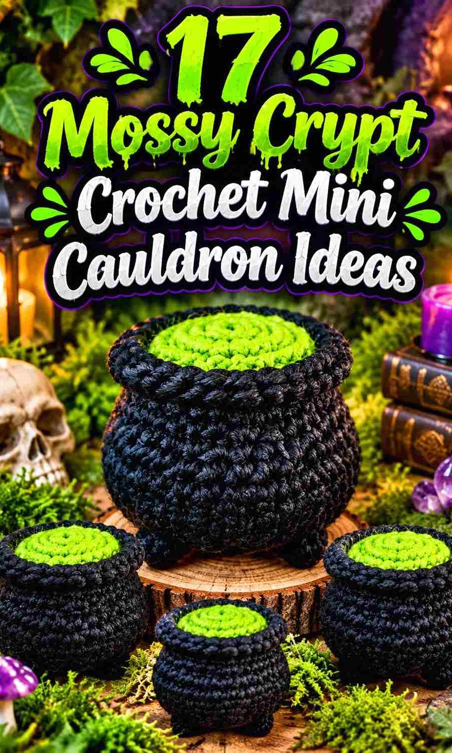
On a small cauldron, color placement matters because the body, rim, feet, handles, and potion opening compete within a limited visual area. Mossy Crypt can cover the rounded pot while black or brown deepens the structural details. A lighter neutral can expose the rim and feet, or an acidic green, orange, purple, or teal can be concentrated inside the opening so the “potion” becomes a clear focal point.
The tutorials below include small amigurumi cauldrons, pocket-size concepts, decorative pots, bubbling cauldrons, and two flat cauldron references that can inspire compact hanging or appliqué-style pieces. The Mossy Crypt palettes are independent color adaptations; they are not claims about the colors used by the tutorial creators.
Quick List
- Mossy Crypt Graveyard Black And Acid Green Crochet Mini Cauldron
- Mossy Crypt Bone Cream And Charcoal Crochet Mini Cauldron
- Mossy Crypt Tarnished Copper And Soot Black Crochet Mini Cauldron
- Mossy Crypt Aubergine And Fog Gray Crochet Mini Cauldron
- Mossy Crypt Rust Orange And Espresso Crochet Mini Cauldron
- Mossy Crypt Poison Lime And Graphite Crochet Mini Cauldron
- Mossy Crypt Dusty Plum And Parchment Crochet Mini Cauldron
- Mossy Crypt Midnight Teal And Bone White Crochet Mini Cauldron
- Mossy Crypt Burgundy And Ash Gray Crochet Mini Cauldron
- Mossy Crypt Mustard Ochre And Chestnut Crochet Mini Cauldron
- Mossy Crypt Antique Gold And Deep Brown Crochet Mini Cauldron
- Mossy Crypt Smoky Lavender And Black Crochet Mini Cauldron
- Mossy Crypt Terracotta And Oatmeal Crochet Mini Cauldron
- Mossy Crypt Pale Mint And Soot Crochet Mini Cauldron
- Mossy Crypt Storm Blue And Cream Crochet Flat Mini Cauldron
- Mossy Crypt Mulberry And Aged Ivory Crochet Flat Mini Cauldron
Let Mossy Crypt Define the Mini Cauldron Before Adding Potion Color
The safest place for Mossy Crypt is the largest uninterrupted area: the rounded cauldron body. Keeping the body mostly one color helps its curved silhouette remain readable, especially when the finished project also includes tiny feet, handles, bubbles, or a lid.
Treat the potion as a separate color decision. A vivid lime or orange needs only a small exposed area inside the rim to attract attention, while a muted plum or teal can cover more of the opening without overwhelming Mossy Crypt. If both the body and potion are dark, a contrasting rim can keep the opening from disappearing.
Use Mossy Crypt Contrast to Separate Rims, Feet, and Handles
Mini cauldron details can disappear when every structural section is equally dark. Mossy Crypt and black may create a deliberately shadowy result, but that also means a narrow handle or small feet may be difficult to see.
You can solve that without turning the whole cauldron multicolored. Repeat a lighter neutral at the rim, place a darker shade only on the feet, or use a warmer accent on the handle attachments. Check the project from normal display distance rather than judging contrast only while holding it close.
Keep Bright Potion Colors Smaller Than the Mossy Crypt Body
Acid green, poison lime, orange, gold, and pale mint can appear visually larger than the amount of yarn they actually occupy. On a mini cauldron, a cluster of bright bubbles may already provide enough color to balance a much larger Mossy Crypt body.
If the accent begins spreading across the rim, handles, feet, and body as well as the potion, the cauldron may stop reading as a Mossy Crypt project. Give the strongest color one main job and repeat it only where a small echo improves the composition.
1. Mossy Crypt Graveyard Black And Acid Green Crochet Mini Cauldron
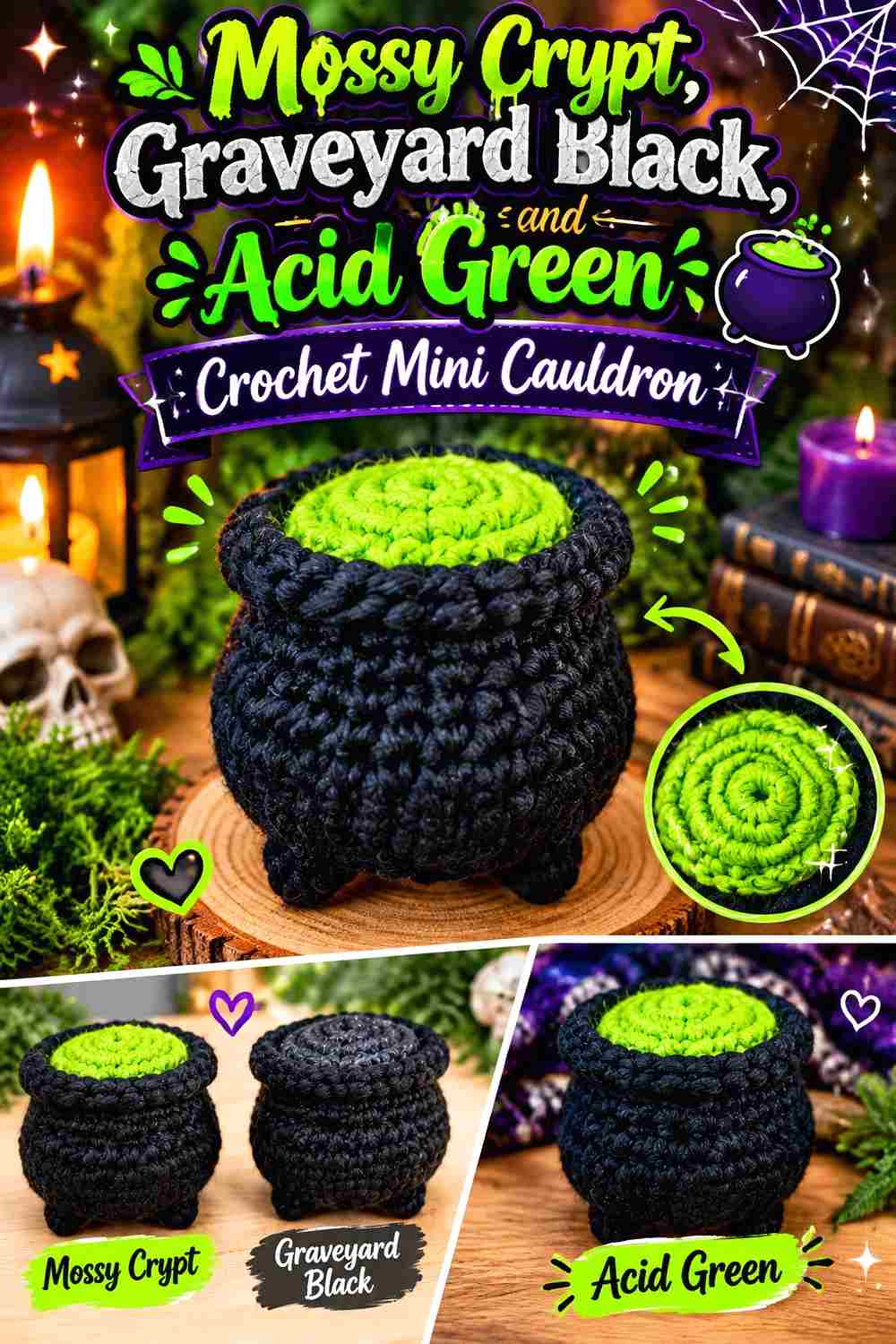
This is the darkest classic-witch palette in the collection. Mossy Crypt covers the rounded pot, Graveyard Black can deepen the feet and handle, and Acid Green is reserved for the potion surface or bubbles. The strong green contrast works especially well on a pocket-size cauldron because the potion remains noticeable even when its visible area is small.
Keep Mossy Crypt Across the Rounded Mini Cauldron Body
Let Mossy Crypt run continuously from the lower body toward the rim instead of interrupting it with black stripes. The dark green field makes the curved pot shape easy to recognize and gives the smaller structural details somewhere quiet to sit.
Use Graveyard Black mainly where you want additional shadow—feet, handle sections, or a restrained rim detail. Because the two colors are both dark, broad black areas can make the green body harder to identify.
Acid Green Should Glow From Inside the Mossy Crypt Rim
Concentrate Acid Green inside the cauldron rather than scattering it over the exterior. Potion bubbles, a visible top surface, or a small overflowing accent provide enough contrast to establish the magical theme.
If the acid shade begins covering the rim itself, compare the result with an all–Mossy Crypt rim. Keeping the edge dark often makes the bright potion look more contained and more deliberate.
Creator Credit: Nova Gnome Creations
2. Mossy Crypt Bone Cream And Charcoal Crochet Mini Cauldron
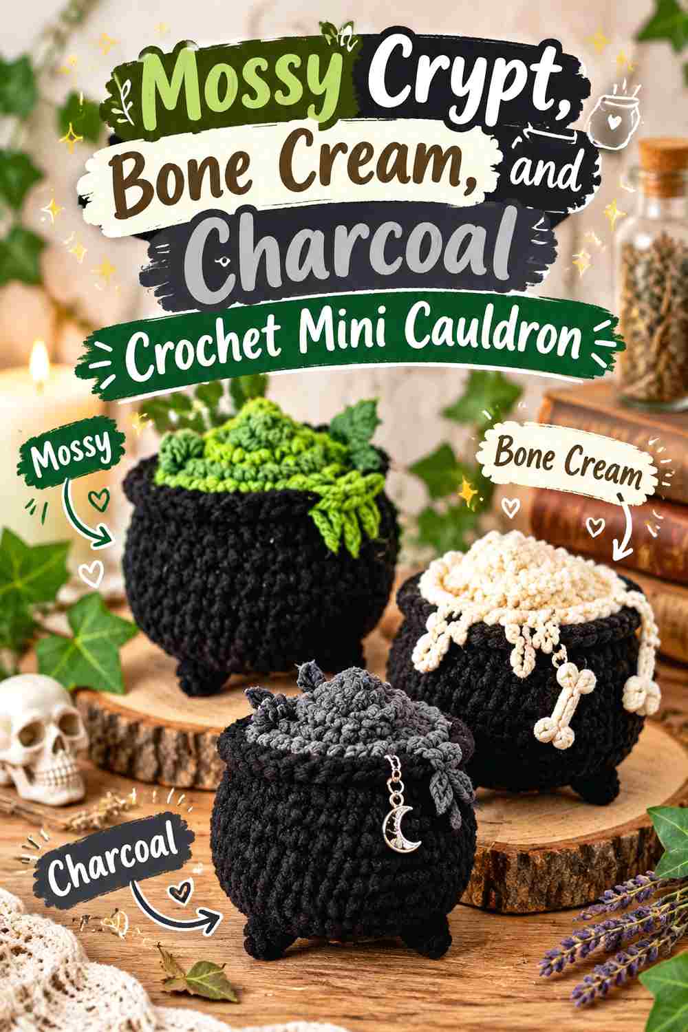
Bone Cream gives this Mossy Crypt cauldron a weathered graveyard direction without relying on a bright potion shade. Charcoal provides a softer dark structural color than pure black. Use Mossy Crypt for the pot, Bone Cream for a few aged-looking details, and Charcoal where the feet or handles need definition.
Bone Cream Can Expose the Mossy Crypt Rim Without Brightening the Whole Pot
A thin Bone Cream detail near the opening can clarify the top edge of a dark mini cauldron. Keep it narrow so the pale color reads as an accent rather than a cream lid sitting on a green base.
Bone Cream can also appear in one or two small bubbling details if you want a ghostlier potion treatment. Repeating it sparingly connects the top and center without covering the Mossy Crypt body.
Charcoal Gives Mossy Crypt Feet a Softer Shadow Than Black
Charcoal can define the lowest parts of the cauldron while maintaining the muted palette. This is useful when pure black creates more contrast than you want.
Check whether the Charcoal actually separates from Mossy Crypt under your display lighting. If the two merge, that can work for understated feet, but use Bone Cream elsewhere when an important detail must remain obvious.
Creator Credit: meowmeowcrafts
3. Mossy Crypt Tarnished Copper And Soot Black Crochet Mini Cauldron
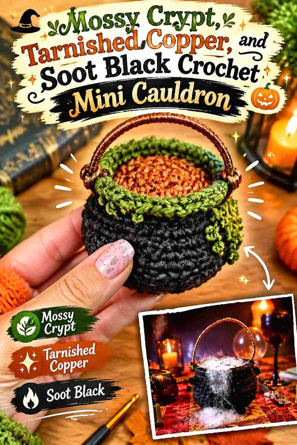
Tarnished Copper warms up Mossy Crypt without pushing the project toward bright Halloween orange. Soot Black can anchor the base, while copper is most useful around the rim, handle connections, or a few potion bubbles. This creates the impression of a dark pot with aged warm details rather than a highly graphic three-color toy.
Tarnished Copper Works Best as a Narrow Accent Against Mossy Crypt
Use copper where a small warm line can reveal construction—the rim, handle attachments, or selected raised details. It does not need to cover a large section because its temperature already separates it from the mossy green body.
Avoid alternating copper and Mossy Crypt across every round or surface. Larger uninterrupted green areas make the copper look more like intentional weathered hardware.
Soot Black Can Ground Mossy Crypt at the Mini Cauldron Base
Keep Soot Black around the feet or lowest edge when you want the pot to feel visually heavier at the bottom. The dark base can also make a copper rim feel less isolated by giving the palette both warm and neutral contrast.
If black occupies the entire lower half, reduce it. Mossy Crypt should still be the color that defines the cauldron when viewed from the front.
Creator Credit: Stitches n Scraps
4. Mossy Crypt Aubergine And Fog Gray Crochet Mini Cauldron
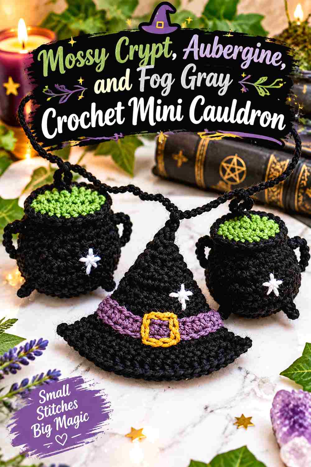
Aubergine adds deep purple without using a bright witchy violet, while Fog Gray gives the two dark colors enough separation. Mossy Crypt can dominate the pot, aubergine can fill the potion or selected bubbling areas, and gray can mark the rim or handle.
Aubergine Creates a Low-Light Potion Inside a Mossy Crypt Cauldron
Aubergine works well when you want the potion to look deep rather than luminous. Because it may be similar in value to Mossy Crypt, give the purple a clearly bounded area instead of using it for tiny dots that may disappear.
A Fog Gray rim between the green body and purple center can provide enough separation to make both colors readable.
Fog Gray Keeps Mossy Crypt and Aubergine From Collapsing Together
Use Fog Gray strategically where the two dark hues meet. A narrow rim or a few pale bubbles can do more for visibility than increasing the amount of aubergine.
Keep the gray secondary. Too much around the feet, rim, handles, and potion at once can make the cauldron look gray-led instead of Mossy Crypt-led.
Creator Credit: Molly
5. Mossy Crypt Rust Orange And Espresso Crochet Mini Cauldron
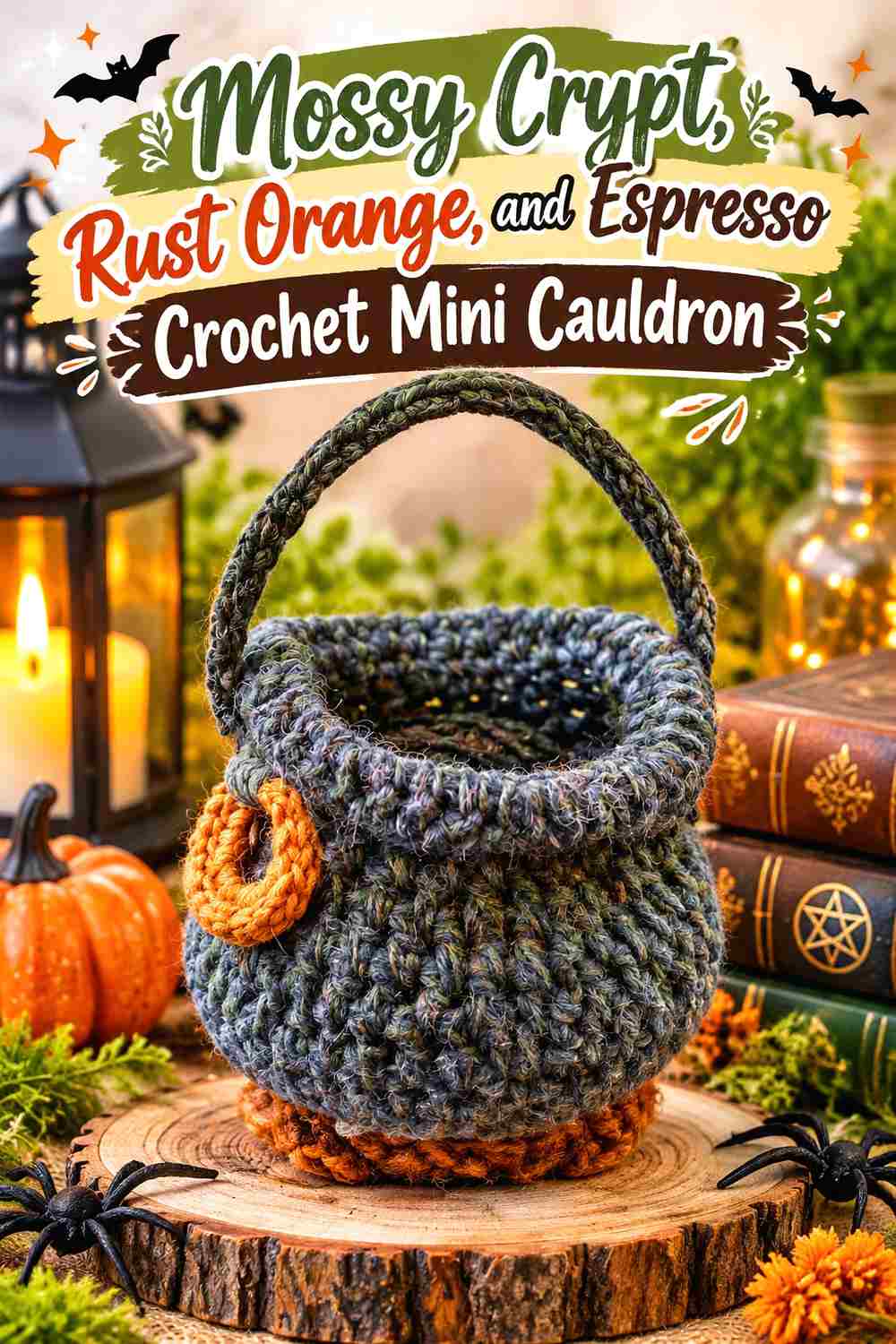
Rust Orange gives the palette an autumnal direction, while Espresso stays dark enough for feet and handles. Mossy Crypt remains the main pot color, letting the rust appear as bubbling potion, a narrow inner rim, or a few warm overflow details.
Rust Orange Makes a Mossy Crypt Potion Look Warmer Without Turning Bright
Use Rust Orange inside the opening or on a controlled bubble cluster. Its warmth contrasts with Mossy Crypt even when neither color is especially light.
For a more muted effect, avoid carrying rust down the body. Keeping it above the rim preserves the impression that the warm color belongs to the contents rather than the cauldron shell.
Espresso Can Define the Mossy Crypt Handle Without Harsh Black
Espresso provides dark structure but maintains the earthy character of the palette. It can be useful on a handle, tiny feet, or a narrow lower edge.
Repeat the brown in more than one small place if the project has several attachments. A single isolated Espresso handle may look unrelated, while matching feet create a clearer structural system.
Creator Credit: Last Minute Laura
6. Mossy Crypt Poison Lime And Graphite Crochet Mini Cauldron
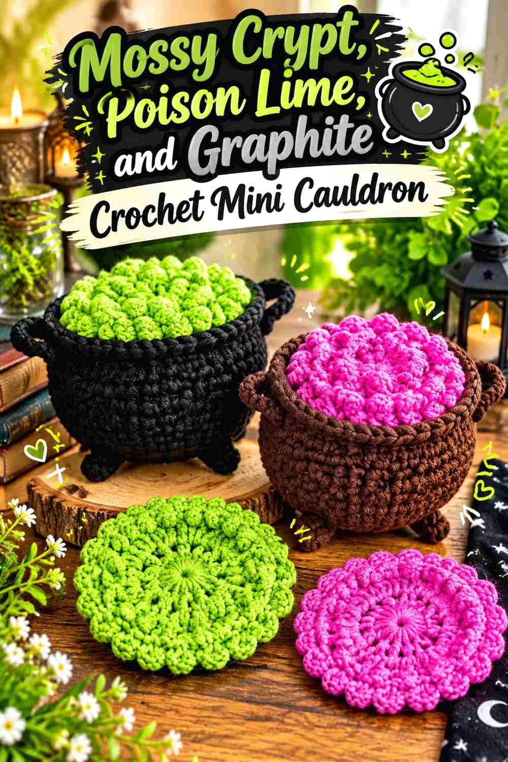
Poison Lime is the most vivid potion direction here. It needs very little space to become the focal point, which makes Graphite useful for keeping everything outside the potion subdued. Let Mossy Crypt cover the container, Graphite reinforce structural edges, and lime appear only where the contents should look active.
Poison Lime Needs a Dark Mossy Crypt Rim Around the Potion
A continuous Mossy Crypt rim gives Poison Lime a dark boundary. This makes even a small potion surface visually distinct and prevents the bright color from appearing to spread randomly into the pot.
If bubbles extend above the rim, keep some green body visible beneath them. Too many lime bobbles can conceal the cauldron’s upper shape.
Graphite Should Support Mossy Crypt Instead of Competing With Poison Lime
Graphite works for handles, feet, or a lid detail because it stays quiet beside the bright potion. Use it as a structural shadow rather than a third large color field.
If Graphite and Mossy Crypt become indistinguishable, that is less problematic here because Poison Lime supplies the necessary focal contrast.
Creator Credit: Make It Yourself By Papari
7. Mossy Crypt Dusty Plum And Parchment Crochet Mini Cauldron
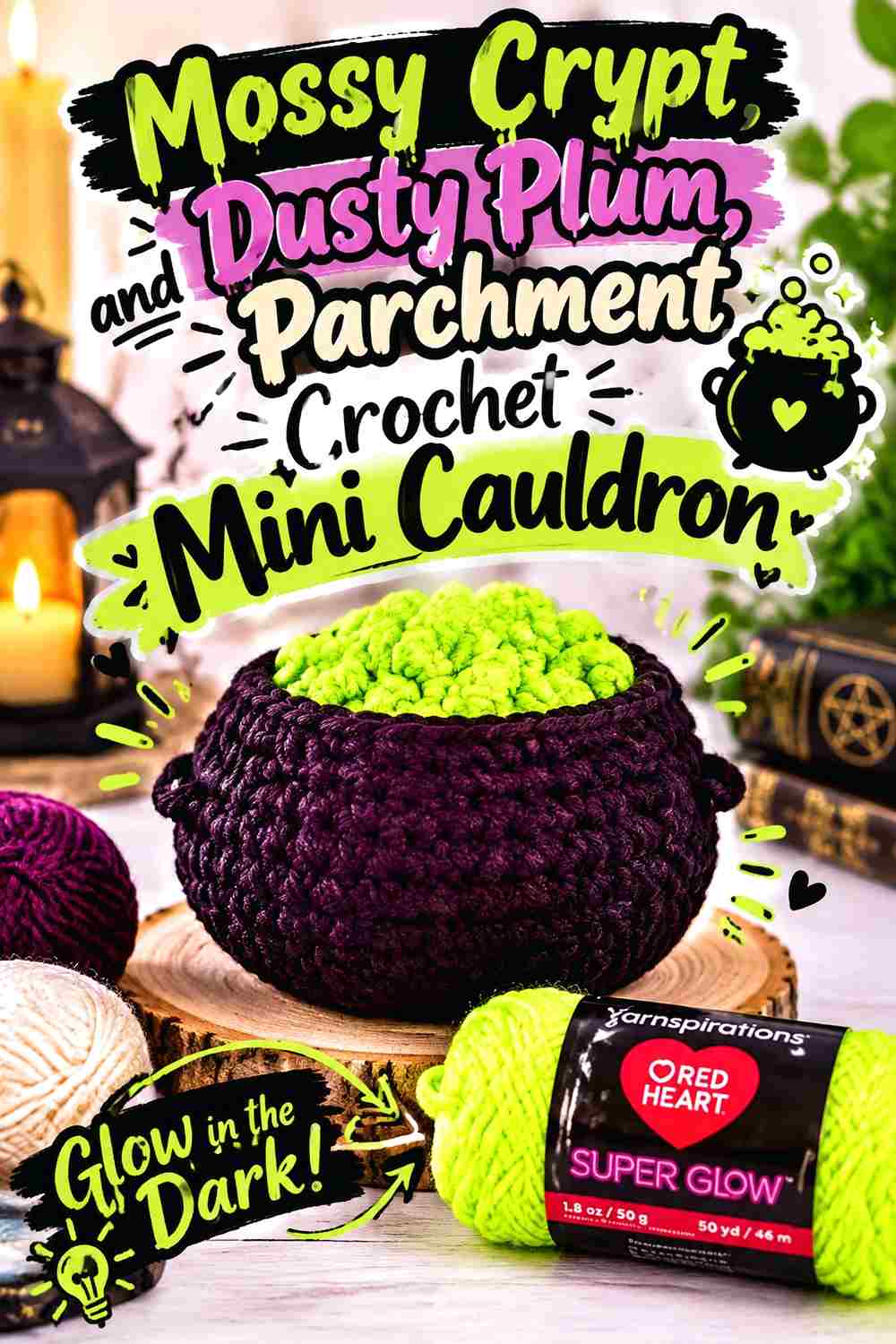
Dusty Plum creates a faded magical-potion direction, while Parchment introduces the lightest notes. This palette is especially useful on a cauldron with a lid or clearly defined upper section because each shade can be assigned a separate visual role rather than mixed across the body.
Dusty Plum Can Fill the Potion While Mossy Crypt Holds the Pot Shape
Keep Mossy Crypt continuous around the container and place Dusty Plum inside the opening or on bubbling sections. The muted relationship creates a softer effect than bright green potion while still separating the contents from the body.
If plum appears too dark, adding more of it may not improve visibility. A smaller Parchment accent can create the needed separation more efficiently.
Parchment Can Pick Out Small Mossy Crypt Lid and Rim Details
Parchment is useful for tiny highlights where shape needs to remain visible: a knob, narrow rim detail, or one or two bubbles.
Keep the pale color away from every outer edge. A fully outlined Mossy Crypt cauldron can feel more graphic and less weathered than this muted palette suggests.
Creator Credit: Tamara Kelly – Moogly
8. Mossy Crypt Midnight Teal And Bone White Crochet Mini Cauldron
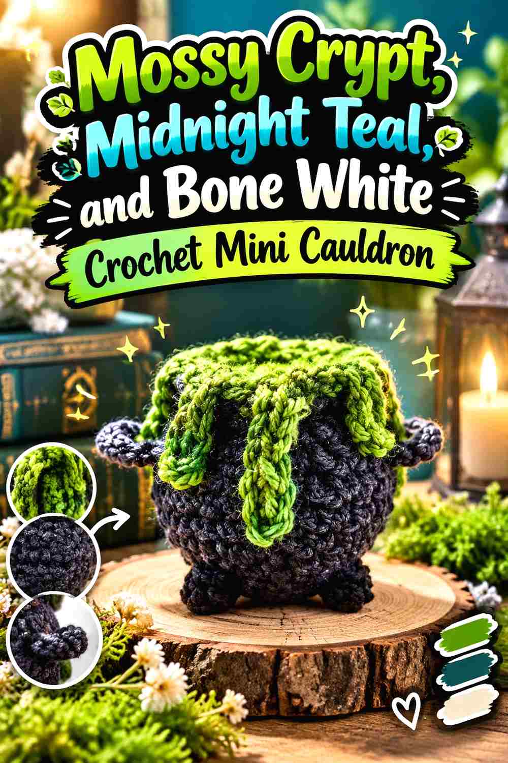
Midnight Teal creates a cool potion palette that stays dark, while Bone White prevents the tiny details from disappearing. Mossy Crypt should remain the clearly larger green field, with teal concentrated at the top and white limited to highlights.
Midnight Teal Should Stay Inside the Mossy Crypt Cauldron Opening
Teal and Mossy Crypt are both cool, green-adjacent colors, so separate them by placement. Keeping teal inside the pot and Mossy Crypt outside makes their roles understandable even if their values are fairly close.
A teal handle or teal feet would weaken that clean distinction. Let the potion own the blue-green accent.
Bone White Gives Mossy Crypt and Midnight Teal a Small Value Break
Use Bone White on a few bubbles or a narrow accent where teal meets the dark rim. The pale value makes the potion more legible without requiring a large white section.
If the miniature form is very compact, one or two light details can be enough. Too much white can become the dominant feature before the viewer notices Mossy Crypt.
Creator Credit: Crochet Crafters 1
9. Mossy Crypt Burgundy And Ash Gray Crochet Mini Cauldron
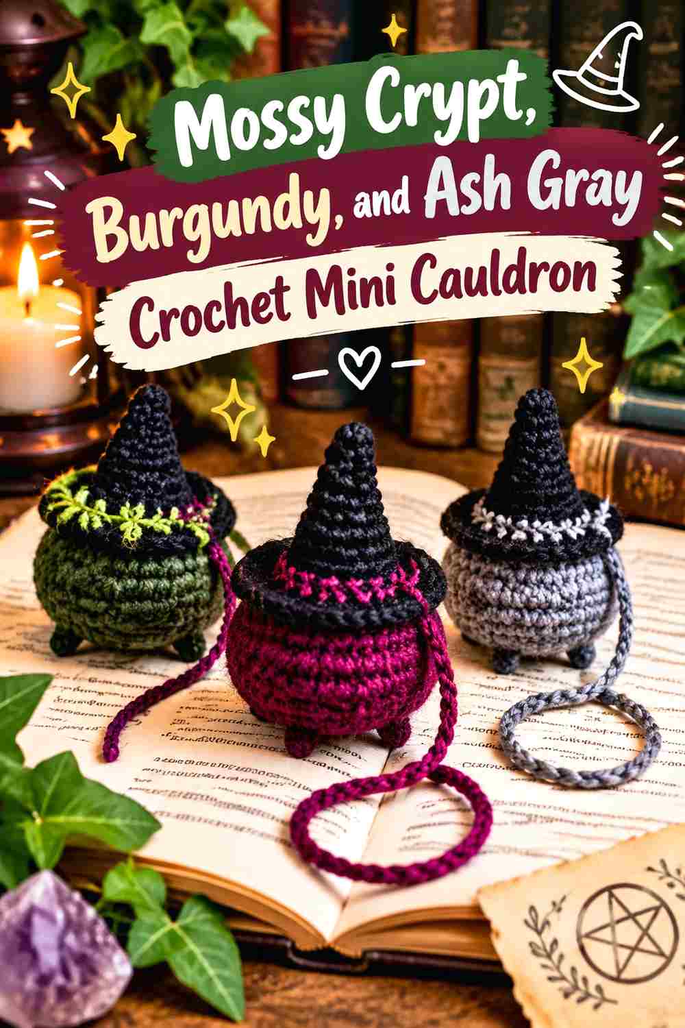
Burgundy creates a darker, less expected potion color, while Ash Gray can expose the silhouette of a compact cauldron motif. This palette is useful for a mini decorative or bookmark-style treatment where fine details have less physical depth to separate them.
Burgundy Needs a Clear Boundary Inside a Mossy Crypt Mini Cauldron
Keep burgundy grouped in one recognizable interior area rather than scattering tiny red-purple marks across the Mossy Crypt body. Concentrated color makes the potion easier to identify at small scale.
If the cauldron is worked flatter than an amigurumi pot, value contrast becomes even more important because shadows cannot do as much of the separation work.
Ash Gray Can Outline Mossy Crypt Details Without Using Bright White
Ash Gray can define a tiny handle, rim, or narrow accent while staying within the crypt-like muted palette.
Use the gray selectively. A complete pale outline around every edge could overpower the dark green body, especially on a flat miniature motif.
Creator Credit: Crochet con Lillo
10. Mossy Crypt Mustard Ochre And Chestnut Crochet Mini Cauldron
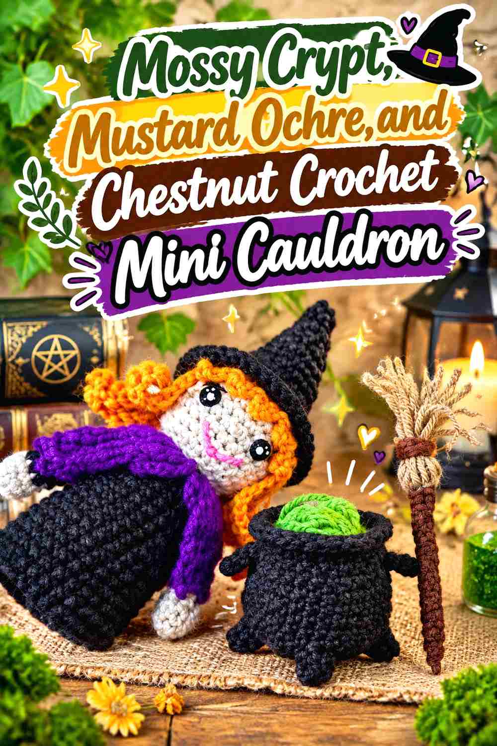
Mustard Ochre and Chestnut pull Mossy Crypt toward an old-apothecary color scheme. Mossy Crypt can dominate the pot, Chestnut can define its structural attachments, and ochre can become a small potion, ember, or magical highlight.
Mustard Ochre Gives Mossy Crypt a Muted Golden Focal Point
Use Mustard Ochre inside the opening or on a small decorative detail rather than making it an equal body color. Its warmth gives the eye somewhere to land while Mossy Crypt retains the largest area.
For a quieter effect, combine only a few ochre bubbles with a dark potion base instead of filling the entire opening.
Chestnut Connects Mossy Crypt Feet and Handles
Chestnut is especially useful when the cauldron has several small attachments. Repeating it on the feet and handle gives those pieces a shared visual role and prevents them from looking like unrelated accents.
Keep Chestnut narrower than Mossy Crypt. The goal is to frame the pot’s construction, not replace the moss-green shell with brown.
Creator Credit: Mariie Crochet
11. Mossy Crypt Antique Gold And Deep Brown Crochet Mini Cauldron
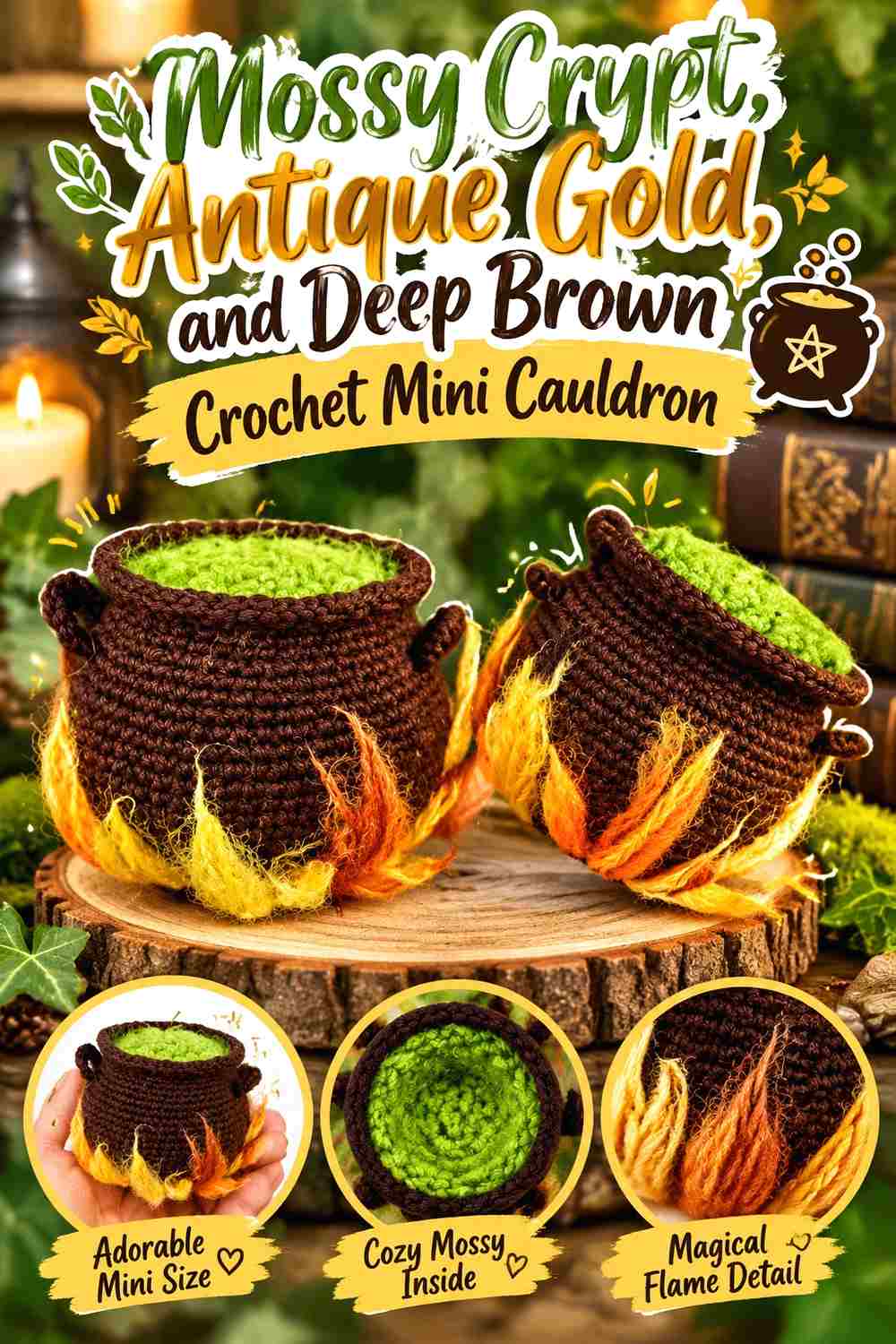
Antique Gold introduces aged ornamentation, while Deep Brown keeps the palette earthy rather than glossy. Mossy Crypt remains the pot body, with gold used for restrained rim or handle details and brown for the feet and lower shadows.
Antique Gold Should Highlight Mossy Crypt at Structural Points
Place Antique Gold where the cauldron already changes shape—a rim line, handle connection, or tiny decorative mark. Color contrast reinforces the construction without needing to spread gold over the rounded body.
One repeated gold detail on each side can create balance. Large gold panels would shift the project away from its Mossy Crypt foundation.
Deep Brown Grounds Mossy Crypt Without the Hardness of Black
Deep Brown can occupy the smallest lower sections, especially feet or a base edge. This creates depth while maintaining an organic, aged palette.
If you also use brown on the handle, leave the main rim Mossy Crypt or gold. Giving every structural part the same dark brown can make the green body look enclosed.
Creator Credit: Arte e Dicas Rceitas de Amigurumi
12. Mossy Crypt Smoky Lavender And Black Crochet Mini Cauldron
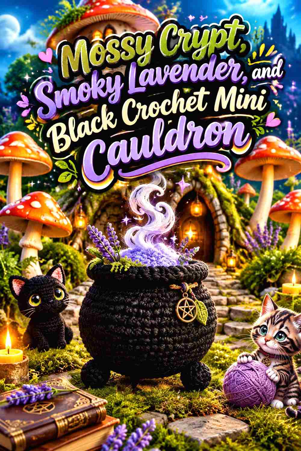
Smoky Lavender gives a softer supernatural accent than deep purple, while Black pushes the exterior shadows darker. This works well when the potion needs to remain visible but you do not want a bright fluorescent center.
Smoky Lavender Lightens the Potion Above a Mossy Crypt Body
Use lavender primarily inside the opening or in a cluster of bubbles. Its lighter value can reveal potion texture against the dark green shell without requiring cream or white.
Keep lavender out of the feet and handles. Restricting it to the magical contents makes the color’s role immediately understandable.
Black Should Deepen Mossy Crypt Only at the Mini Cauldron Edges
Black can reinforce the feet, handle, or lowest edge while allowing Mossy Crypt to remain the main exterior color.
Because both shades are dark, judge them from the distance at which the cauldron will be displayed. If black disappears into the green, use it as intentional shadow rather than adding more black to force a contrast.
Creator Credit: Créations au Crochet
13. Mossy Crypt Terracotta And Oatmeal Crochet Mini Cauldron
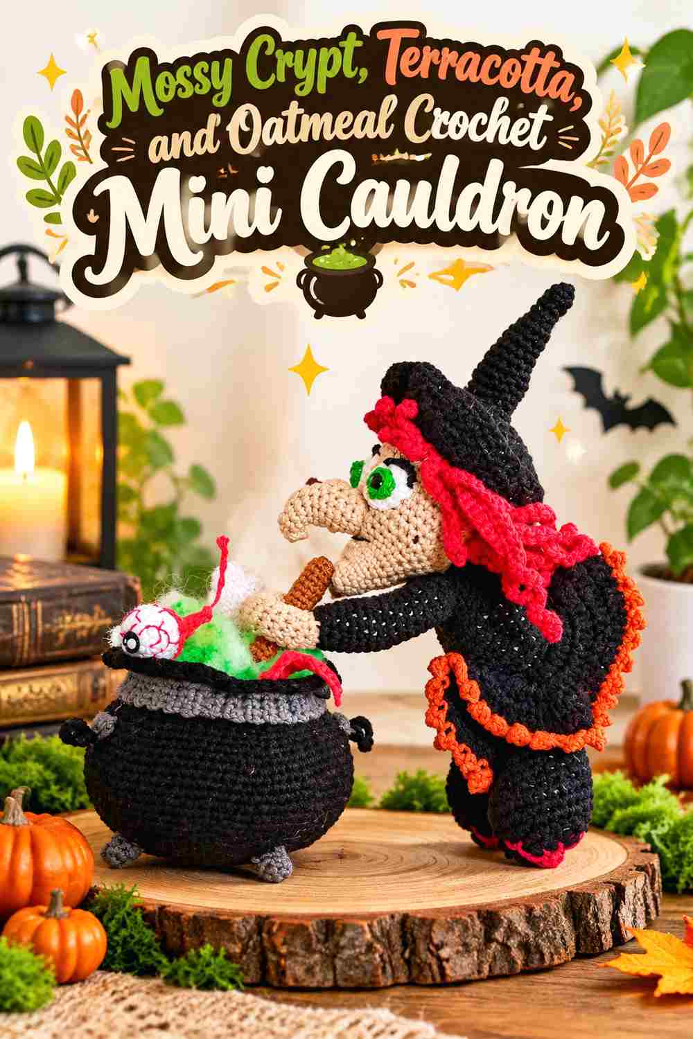
Terracotta creates a warm, earthy counterpoint to Mossy Crypt, and Oatmeal lightens the palette without the starkness of white. This combination can make a mini cauldron feel old and rustic rather than glossy or cartoon-bright.
Terracotta Warms the Potion Inside the Mossy Crypt Cauldron
Use Terracotta for a bubbling center, narrow overflow, or small repeated accent. Its orange-brown direction separates easily from Mossy Crypt while remaining muted.
Avoid turning the lower pot terracotta as well. Keeping the warm shade above the rim gives the palette a clearer body-versus-contents hierarchy.
Oatmeal Can Reveal Mossy Crypt Handles and Tiny Details
A little Oatmeal can clarify a small handle attachment, bubble highlight, or decorative mark where both terracotta and Mossy Crypt are too deep.
Keep the neutral scattered deliberately rather than evenly. One or two light checkpoints are usually enough on a miniature cauldron.
Creator Credit: Mamy So Crochet
14. Mossy Crypt Pale Mint And Soot Crochet Mini Cauldron
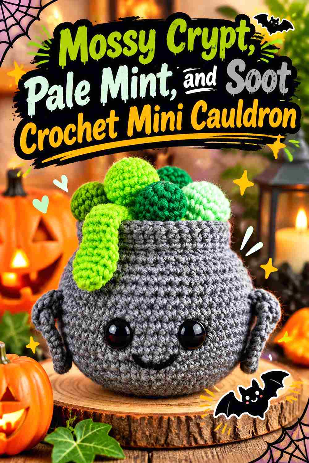
Pale Mint creates a ghostly potion effect while Soot keeps the cauldron’s attachments nearly black. The large value jump from Mossy Crypt to mint makes this palette readable even when the cauldron is viewed from farther away.
Pale Mint Can Bubble Clearly Above a Mossy Crypt Rim
Keep Pale Mint concentrated at the potion surface and on bubbles that project above the rim. The light green creates immediate separation while still relating to the Mossy Crypt base through hue.
Because mint is visually strong against a dark pot, do not automatically fill every raised detail with it. Leaving gaps of darker color keeps the bubble cluster from becoming one pale mass.
Soot Should Stay Secondary to the Mossy Crypt Exterior
Use Soot on the feet, handle, or a small underside section. That is enough to deepen the form without replacing the distinctive moss-green body with a conventional black cauldron.
If you want a black rim too, compare the total Soot area first. Dark accents work better here when Mossy Crypt remains visible around most of the circumference.
Creator Credit: Storybook Crochet
15. Mossy Crypt Storm Blue And Cream Crochet Flat Mini Cauldron
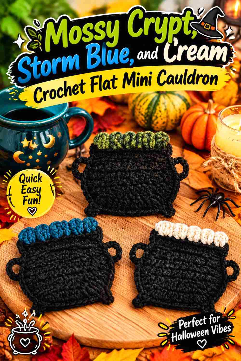
A flat cauldron reference offers a different way to use the palette for compact hanging decor, appliqué-style pieces, or other small decorative adaptations. Mossy Crypt can define the main cauldron silhouette, Storm Blue can occupy the potion area, and Cream can preserve visibility around details that would otherwise rely on three-dimensional shadow.
Storm Blue Needs Clear Placement Against a Mossy Crypt Flat Cauldron
On a flatter project, keep Storm Blue inside a clearly bounded potion area. Without a deep rim creating physical shadow, color placement has to communicate which section is the container and which is the contents.
A narrow Mossy Crypt band between the potion and outer edge helps preserve the cauldron shape.
Cream Can Keep Mossy Crypt Details Readable on a Flat Mini Form
Use Cream for only the smallest visibility problems: a bubble, rim accent, or tiny handle detail. Flat pieces often need slightly stronger value contrast than rounded amigurumi because dimensional shading is reduced.
Avoid tracing every Mossy Crypt edge in cream. That can make the outline more prominent than the cauldron itself.
Creator Credit: Chapter and Chains Co
16. Mossy Crypt Mulberry And Aged Ivory Crochet Flat Mini Cauldron
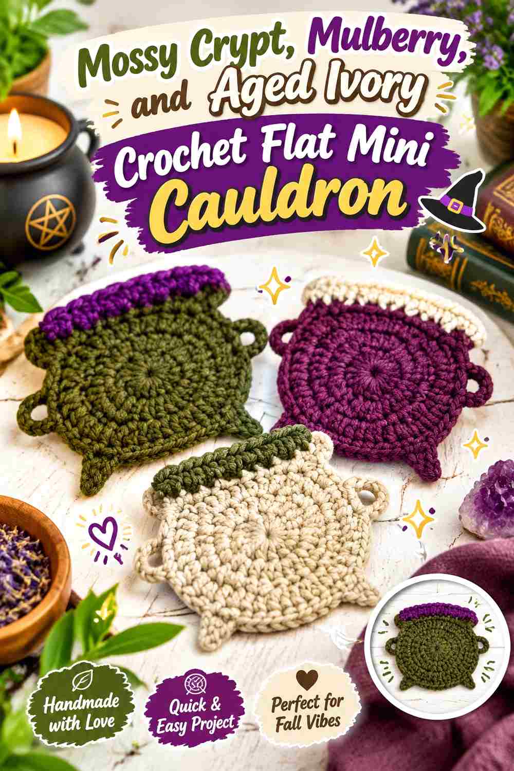
Mulberry gives the final palette a dark berry potion, while Aged Ivory creates controlled highlights. Applied to a small flat cauldron concept, Mossy Crypt should form the unmistakable pot silhouette while the two accents remain concentrated near the opening.
Mulberry Gives a Mossy Crypt Flat Cauldron a Dark Potion Center
Use Mulberry as one compact potion area rather than placing purple throughout the green pot. The neighboring dark hues create a rich palette, but their roles must be separated clearly because the piece has less physical depth.
If Mulberry merges into Mossy Crypt, add Aged Ivory at their boundary rather than expanding the purple area.
Aged Ivory Should Clarify Mossy Crypt Without Outlining Everything
A small Aged Ivory bubble or rim mark can provide the highest-value point in the piece and help both dark colors remain visible.
Keep the ivory irregular and limited if you want an aged, crypt-like effect. A continuous pale border would make the mini cauldron feel cleaner and more graphic.
Creator Credit: beautifulcrochetproduct
Comparing the 17 Mossy Crypt Crochet Mini Cauldron Palettes
For a classic dark witch-cauldron direction, Graveyard Black with Acid Green, Poison Lime with Graphite, and Pale Mint with Soot create the clearest body-and-potion distinction. These schemes keep the exterior shadowy while allowing the potion to carry the strongest contrast.
Bone Cream, Fog Gray, Parchment, Ash Gray, Stone Gray, and Aged Ivory are useful when you want Mossy Crypt details to remain visible without introducing another vivid hue. Their main role is separation, so they generally work better in narrow areas than across large portions of the body.
Tarnished Copper, Rust Orange, Mustard Ochre, Antique Gold, and Terracotta move Mossy Crypt toward an earthy or aged-apothecary direction. Concentrate these warm shades near rims, potion surfaces, or small hardware-like details so the mossy body remains dominant.
Aubergine, Dusty Plum, Burgundy, Smoky Lavender, Mulberry, Midnight Teal, and Storm Blue create darker magical contents. These combinations need more attention to value contrast because two different hues can still merge when both are deep.
Conclusion
Mossy Crypt is most effective on a crochet mini cauldron when it has a clear structural job. Let it establish the rounded body or flat pot silhouette first, then decide whether the secondary color should reveal the potion, strengthen the rim, define the feet, or emphasize the handle.
Choose Acid Green, Poison Lime, or Pale Mint when the bubbling contents should command attention. Rust, copper, ochre, gold, and terracotta create warmer aged effects. Plum, aubergine, burgundy, teal, and storm blue keep the palette darker and more mysterious, while cream and gray shades are useful when small details need clearer separation.
Before making a full group of cauldrons, test the colors together on one small sample or first finished piece. Miniature feet, handles, rims, and bubbles can behave very differently from large color blocks, so evaluate the palette from the distance where the cauldron will actually be displayed. Use each linked tutorial for its exact construction and treat the palettes here as adaptable color plans.
Frequently Asked Questions
What Colors Work With Mossy Crypt on a Crochet Mini Cauldron?
Mossy Crypt can be paired with black, charcoal, deep brown, or graphite for dark structural details; cream, parchment, gray, or ivory for separation; and green, orange, purple, teal, gold, or rust for potion accents. The most useful choice depends on whether you want the potion or the cauldron body to attract more attention.
How Do I Keep Mossy Crypt From Looking Almost Black in a Mini Cauldron?
Place it beside a genuinely darker shade such as black or Soot, or contrast it with a lighter potion or rim. Lighting also matters, so compare the finished combination where the project will be displayed. If Mossy Crypt remains intentionally very dark, let texture and shape do part of the separating work.
What Potion Color Gives Mossy Crypt the Strongest Contrast?
A light or vivid green such as Pale Mint, Acid Green, or Poison Lime can create strong contrast against a dark Mossy Crypt body. Creamy neutrals and bright warm shades can also stand apart clearly. Always compare the actual yarns because color names alone do not guarantee a specific light-dark relationship.
Should the Rim Match the Mossy Crypt Cauldron Body?
Matching the rim to Mossy Crypt can create a clean, continuous pot shape and strongly contain a bright potion color. A contrasting rim is useful when the opening disappears into a dark potion. Choose according to which boundary needs more definition rather than assuming the rim always needs another color.
Should Mossy Crypt Be Used on the Mini Cauldron Feet and Handles?
It can be, especially if you want a mostly monochromatic cauldron. Using black, brown, charcoal, or another dark accent on the feet and handles adds subtle structural separation. On a very small project, you may only need one contrasting structural area rather than changing every attachment.
How Can I Keep Bright Potion Bubbles From Overpowering Mossy Crypt?
Reduce either their number or their visible area. A small cluster of bright bubbles can attract more attention than a much larger muted cauldron body. Keep most of the rim dark and avoid repeating the potion color across unrelated parts of the exterior.
Can I Use Mossy Crypt for a Flat Crochet Cauldron Instead of Amigurumi?
Yes. On a flatter cauldron motif, color contrast becomes especially useful because there is less dimensional shadow to separate the rim, pot, and potion. Give Mossy Crypt the main silhouette and reserve lighter or brighter colors for clearly bounded interior details.