Cool blue and pearl gray create a restrained evening palette that can work especially well on a small crochet pouch. Cool blue can provide the stronger color identity, while pearl gray lightens borders, frames, flaps, drawstrings, or individual bead rows without introducing a high-contrast third yarn color.
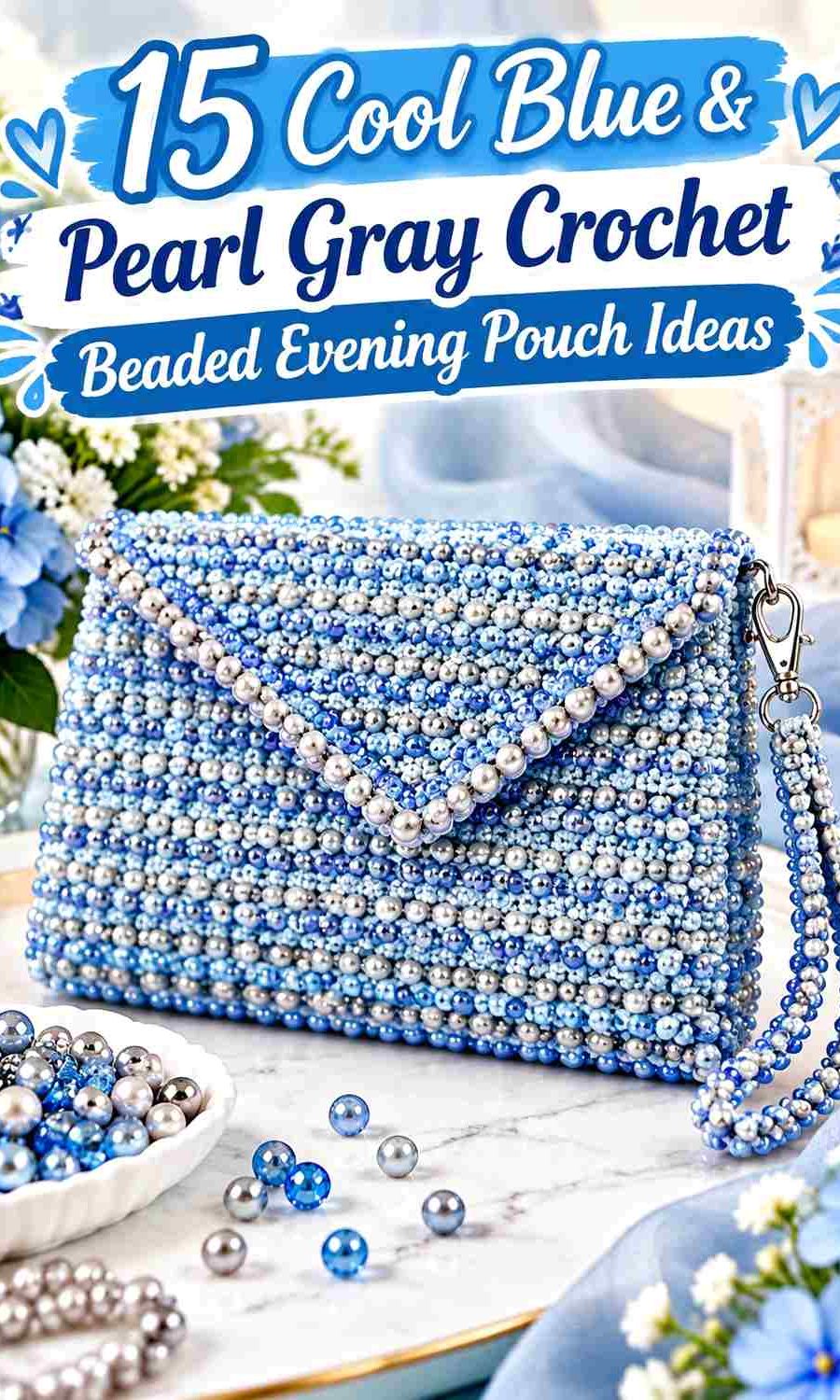
Beads add another visual layer, so the yarn colors need clear roles. A cool-blue pouch with pearl-gray beaded rows can feel organized and directional, while a pearl-gray pouch with a concentrated cool-blue bead field puts more attention on the embellishment. On a small evening accessory, changing both yarn color and bead placement everywhere at once can make the surface difficult to read.
The tutorials below provide the underlying purse, pouch, clutch, frame, or drawstring constructions. Some are specifically beaded projects and others provide a strong pouch construction that can be adapted with independent bead placement. The cool blue and pearl gray palettes are editorial adaptations rather than claims about the colors used by each creator.
Quick List
- Cool Blue Crochet Beaded Evening Pouch With Pearl Gray Rows
- Pearl Gray Crochet Beaded Bucket Evening Pouch With Cool Blue Accents
- Cool Blue Drawstring Crochet Evening Pouch With Pearl Gray Bead Ends
- Pearl Gray Structured Crochet Beaded Evening Pouch With Cool Blue Panels
- Cool Blue Pearl Style Crochet Evening Pouch With Pearl Gray Trim
- Pearl Gray Mini Crochet Beaded Evening Pouch With Cool Blue Bead Field
- Cool Blue Crochet Clutch Pouch With Pearl Gray Beaded Flap
- Pearl Gray Crochet Evening Clutch With Cool Blue Beaded Edge
- Cool Blue Shell Crochet Evening Pouch With Pearl Gray Bead Ribs
- Pearl Gray Frame Crochet Evening Pouch With Cool Blue Beaded Body
- Cool Blue Kiss Lock Crochet Evening Pouch With Pearl Gray Beads
- Pearl Gray Drawstring Crochet Beaded Evening Pouch With Cool Blue Band
- Cool Blue Rounded Crochet Evening Pouch With Pearl Gray Beaded Opening
- Pearl Gray Foldover Crochet Evening Pouch With Cool Blue Bead Accent
- Cool Blue Textured Frame Crochet Evening Pouch With Pearl Gray Bead Detail
Decide Whether Cool Blue or Pearl Gray Should Lead the Evening Pouch
Cool blue works well as the dominant yarn when you want the pouch to have a clear color identity before the beads are even considered. It can cover the body, shell panels, or flap while pearl gray is reserved for borders, frames, drawstrings, or small textured sections.
Pearl gray creates a quieter main field. Against that lighter neutral, a cool-blue band, beaded motif, flap, or lower panel can become the focal area without requiring another accent shade.
On a compact pouch, avoid automatically dividing both colors equally. One dominant yarn color plus a clearly assigned supporting color usually leaves more visual room for the beads.
Coordinate Cool Blue and Pearl Gray With Bead Placement
Treat bead distribution as part of the palette rather than as a final decoration step. If the pouch already alternates cool blue and pearl gray in several broad sections, a dense all-over bead pattern may compete with the color blocking. A narrow beaded band or concentrated front panel can be more effective.
If the yarn body is mostly one color, the beads can carry more repetition. Rows, scattered clusters, flap edges, frame lines, and drawstring ends all offer ways to introduce shine without covering the crochet fabric.
Before committing to a large number of beads, make a small swatch or sample section. The yarn color visible between beads affects how dense the embellishment appears.
Keep Cool Blue and Pearl Gray Crochet Texture Visible Beneath Beads
Beads can conceal smaller stitch details, especially when placed closely together. If the crochet fabric includes shells, crossed stitches, puffed texture, or pronounced ribs, decide whether texture or beadwork should be the primary surface feature.
Use fewer beads around highly textured areas when you want the crochet structure to remain recognizable. On simpler fabric, denser bead placement can provide the main surface detail instead.
1. Cool Blue Crochet Beaded Evening Pouch With Pearl Gray Rows
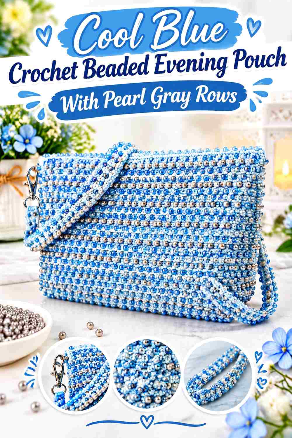
A true beaded purse construction is a natural starting point for this palette. Let cool blue cover most of the crochet body and organize pearl gray into selected horizontal rows or narrow sections. The cool blue remains the visual foundation while the gray gives the bead pattern breathing room.
Cool Blue Should Remain Visible Between Beaded Crochet Rows
Avoid placing beads so densely that the cool-blue yarn becomes little more than a background line. Leaving visible crochet between embellished rows keeps the handmade fabric part of the pouch’s appearance.
This is particularly useful on a small evening purse because separate bead rows create rhythm without making every square inch reflective.
Pearl Gray Can Separate Cool Blue Bead Sections
Use pearl gray for one or more unembellished or lightly beaded bands between stronger cool-blue sections. The lighter neutral can create a visual pause and make individual rows easier to distinguish.
If the pearl gray is already substantially lighter than the blue, it does not need equally dense bead coverage to remain noticeable.
Cool Blue Beads Should Not Hide Pearl Gray Structure
If you choose blue-toned beads over a pearl-gray yarn section, keep enough gray visible to explain why the color change is there. A completely bead-covered gray band may lose its role in the two-color composition.
Creator Credit: Crochet&Copy
2. Pearl Gray Crochet Beaded Bucket Evening Pouch With Cool Blue Accents
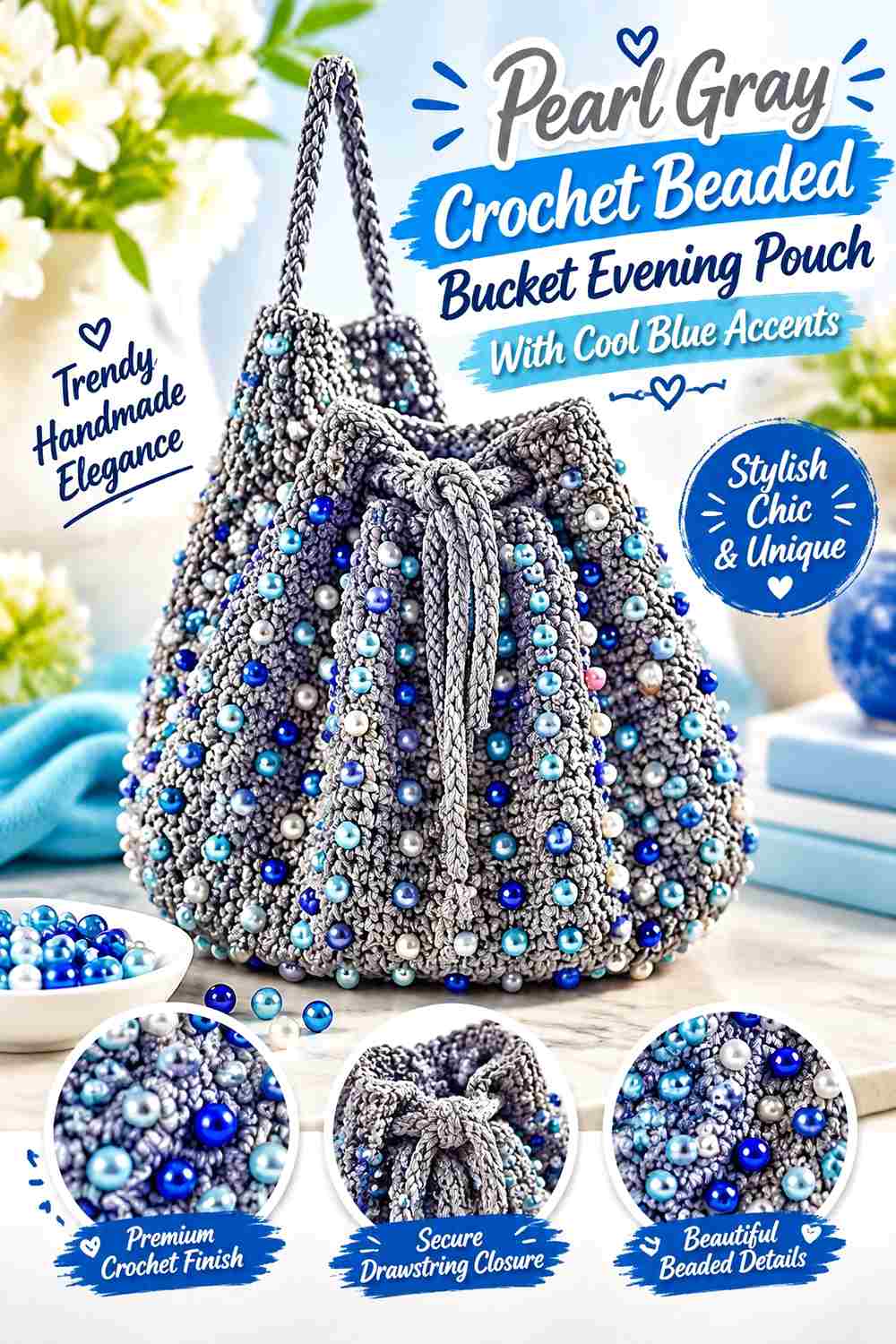
A beaded bucket construction gives the embellishment more vertical room than a flat clutch. Pearl gray can cover most of the body while cool blue appears in selected bead rows, the drawstring area, or a narrow lower band. For evening use, keep the overall adaptation compact rather than simply reproducing a larger daytime bag scale.
Pearl Gray Gives Repeated Crochet Bead Rows a Quiet Background
Use pearl gray throughout most of the bucket body when the bead arrangement already creates strong surface pattern. The neutral yarn prevents each embellished row from competing with an equally assertive background color.
This also gives cool blue more impact when it does appear.
Cool Blue Should Repeat in Controlled Areas of the Pearl Gray Pouch
Introduce cool blue in a repeated but limited way—for example, around the opening and again in a small lower band. Repetition connects the palette without turning the pouch into equal-width blue-and-gray stripes.
If the beads themselves carry noticeable cool blue, the yarn may need even less blue coverage.
Pearl Gray Can Keep Cool Blue Drawstring Details Refined
A cool-blue drawstring becomes a strong horizontal and vertical element once tied. Keeping the surrounding channel pearl gray helps the cord remain distinct without adding another bead-heavy section near the opening.
Creator Credit: Passionate Crafter
3. Cool Blue Drawstring Crochet Evening Pouch With Pearl Gray Bead Ends
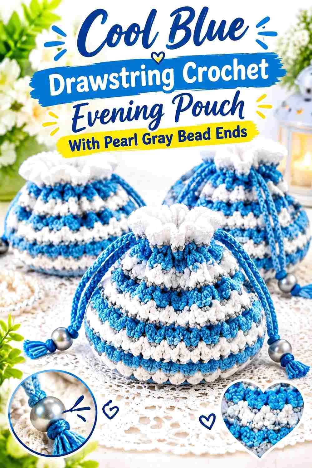
A small drawstring pouch works well when most of the fabric stays cool blue and the decorative attention shifts toward the closure. Pearl gray can appear around the upper channel and at the cord ends, where beads provide a deliberate finishing detail.
Cool Blue Keeps the Crochet Drawstring Pouch Body Uninterrupted
Use cool blue from the base through most of the body so the pouch retains one broad color field. This is especially useful when the gathered top already adds folds and shadow.
Avoid inserting several pearl-gray stripes into the body merely to use the second shade. The drawstring area can supply enough contrast.
Pearl Gray Can Frame the Cool Blue Crochet Opening
A pearl-gray upper band creates a clear transition before the pouch gathers. Because this area narrows when closed, choose a band deep enough to remain visible rather than hiding the entire color change inside the folds.
Pearl Gray Bead Ends Can Finish a Cool Blue Drawstring Cleanly
Beads placed at the cord ends create a small point of emphasis without covering the pouch body. Keep their scale appropriate to the cord so they appear integrated rather than disproportionately heavy.
Creator Credit: Yarn Craftee
4. Pearl Gray Structured Crochet Beaded Evening Pouch With Cool Blue Panels
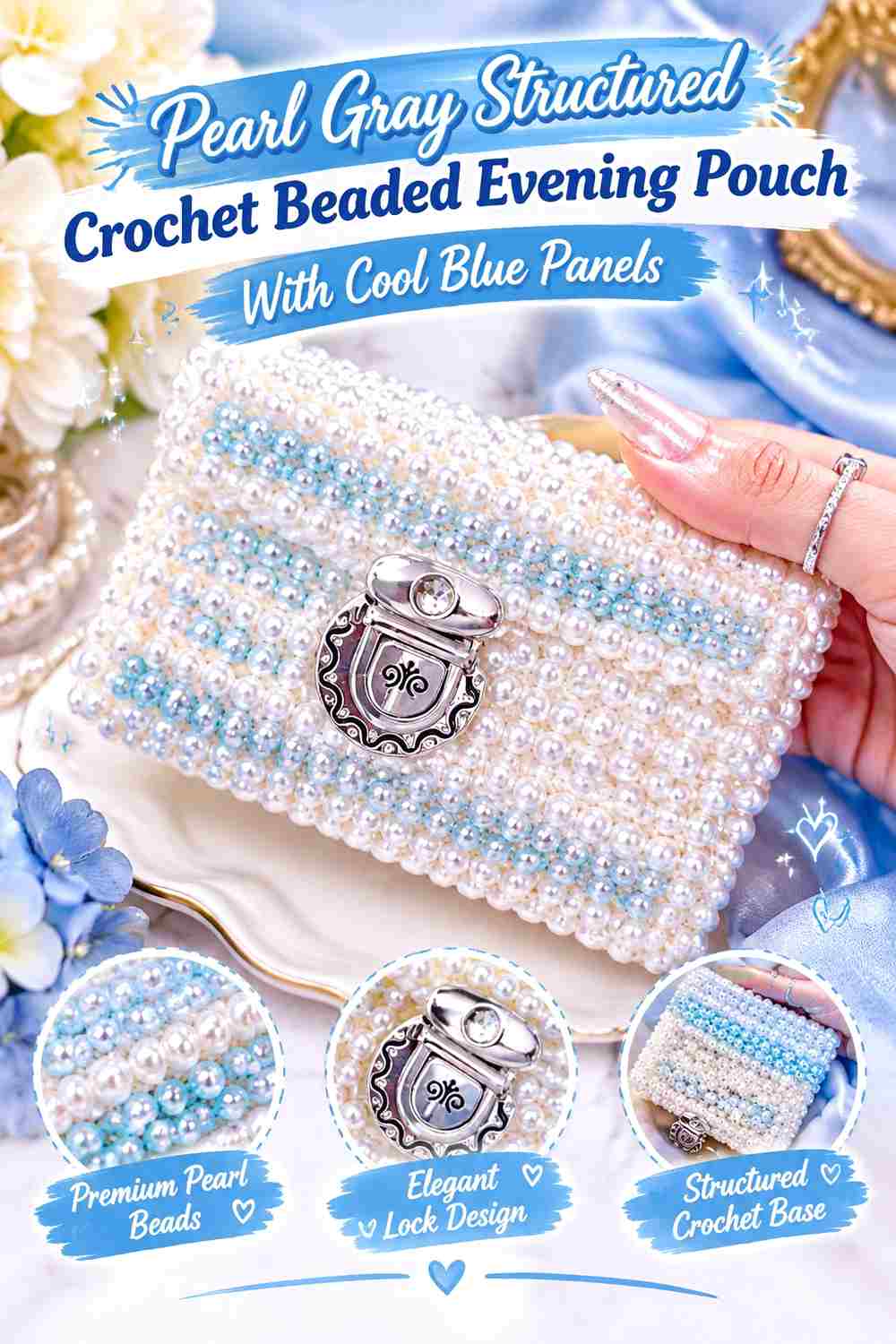
A structured beaded purse can handle stronger color blocking than a very soft drawstring pouch. Make pearl gray the surrounding field and use cool blue on one front panel, central section, or flap area before coordinating the beads with those boundaries.
Pearl Gray Can Provide a Clean Frame Around Cool Blue Crochet
Keep side sections, top edges, or the lower border pearl gray so the blue panel has a defined perimeter. This allows the structural shape of the pouch to remain visible even when the front includes dense embellishment.
Avoid making every structural piece a different alternating color.
Cool Blue Works Best as One Strong Beaded Evening-Pouch Panel
Concentrate the blue in a clear rectangular, central, or front-facing section instead of scattering small blue patches around the gray body. A single strong area gives the embellishment somewhere intentional to collect.
Pearl Gray Bead Spacing Should Support the Cool Blue Focal Area
If beads continue onto the pearl-gray sections, reduce their density compared with the main blue panel. The difference in bead concentration can reinforce the same dominant-supporting relationship established by the yarn colors.
Creator Credit: yoyo crochet
5. Cool Blue Pearl Style Crochet Evening Pouch With Pearl Gray Trim
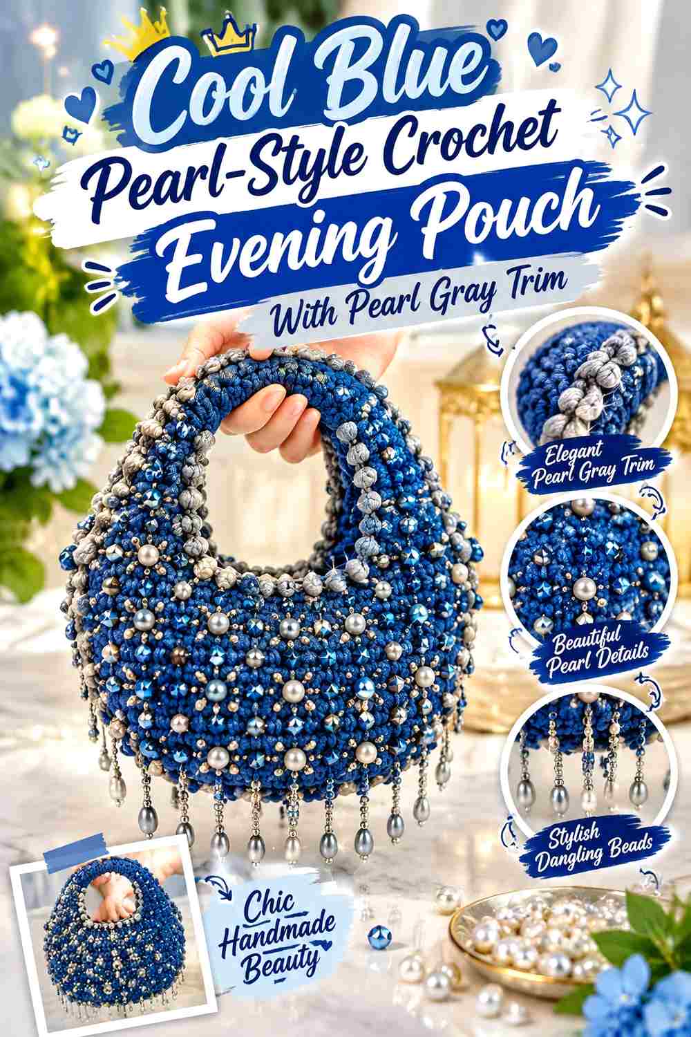
A pearl-embellished handbag concept translates naturally into a cool-blue evening pouch. Keep the main fabric blue and use pearl gray at the top edge, side borders, or handle attachment points so the neutral connects visually with lighter bead embellishment.
Cool Blue Gives Pearl-Style Crochet Beading a Colored Background
A continuous blue body makes lighter beads easier to distinguish than they would be on an equally pale yarn. Let the blue remain visible between beads so the surface still reads as crochet rather than a fully covered bead panel.
Pearl Gray Can Connect Light Beads Back to the Cool Blue Pouch
Use pearl gray in a narrow border or top section to bridge the visual gap between cool blue yarn and pale beadwork. This works particularly well if the beads are noticeably lighter than the body.
Keep the gray controlled; too much can reduce the blue from dominant shade to small accent.
Cool Blue Should Remain the Largest Area Around Pearl Gray Trim
Check the pouch once the border is complete. A deep pearl-gray top section plus dense light beadwork can make the original blue body appear smaller than expected, especially on a compact evening bag.
Creator Credit: Crochet World
6. Pearl Gray Mini Crochet Beaded Evening Pouch With Cool Blue Bead Field
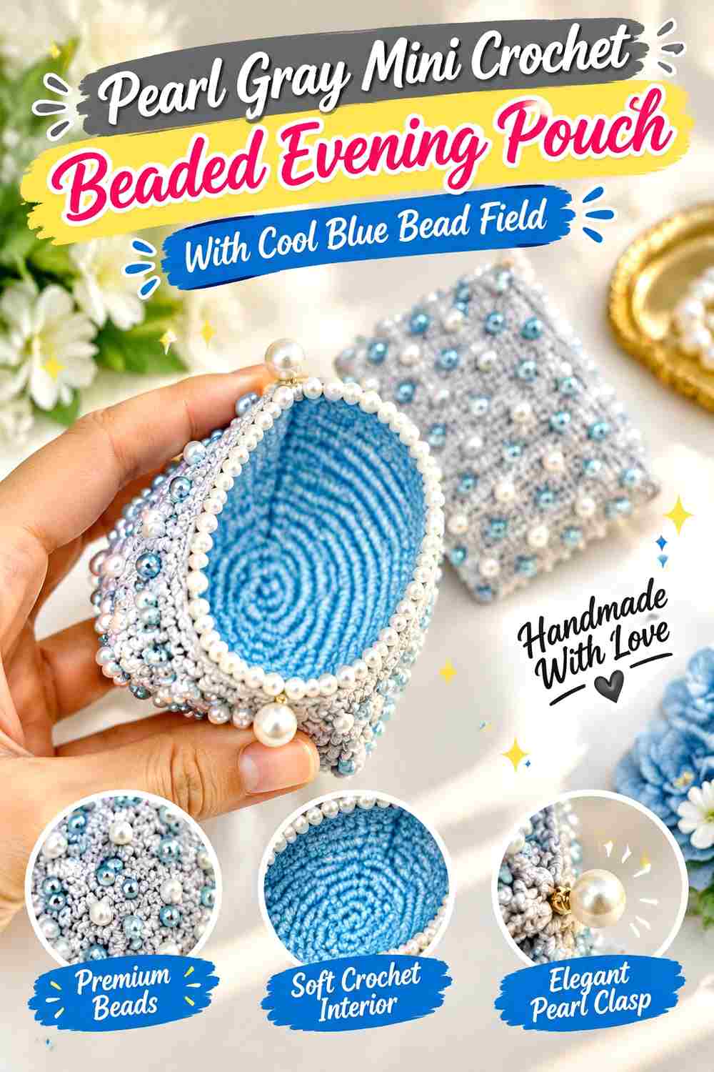
A miniature pearl-decorated pouch gives every bead more visual importance. Use pearl gray as the main yarn so the small body remains cohesive, then group cool blue into a defined bead field or narrow decorative panel rather than dispersing blue everywhere.
Pearl Gray Keeps the Mini Crochet Pouch From Looking Overloaded
A small pouch has limited open fabric between embellishments. Keeping the yarn mostly pearl gray reduces the number of visual changes and gives the bead layout room to become the feature.
Cool Blue Beads Need a Clear Shape on a Pearl Gray Background
Rather than placing individual blue accents randomly, organize them into a line, band, centered group, or repeated pattern. A recognizable arrangement makes the blue feel intentional even when it occupies little physical space.
Pearl Gray Should Remain Visible Around the Cool Blue Beaded Area
Leave a border of gray crochet around the embellishment. This negative space defines the bead field and prevents the small pouch from looking fully covered.
Creator Credit: Yarn Magic by Naila
7. Cool Blue Crochet Clutch Pouch With Pearl Gray Beaded Flap
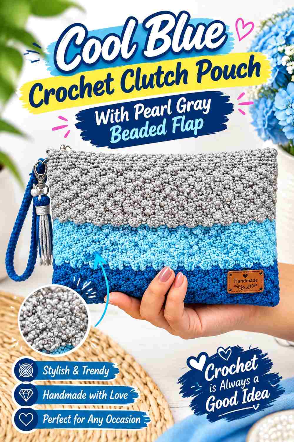
A rectangular clutch construction creates an obvious color zone in the flap. Use cool blue across the main pouch body and let pearl gray cover the foldover section, where a controlled bead arrangement can make the closure area the main evening detail.
Cool Blue Gives the Crochet Clutch Body a Strong Base
Keep the lower front and back cool blue so the pouch remains visually unified below the flap. A large uninterrupted blue section also prevents the bag from becoming overly busy once beads are added above.
Pearl Gray Makes the Cool Blue Clutch Flap Clearly Separate
Changing to pearl gray on the flap creates a visible boundary even before embellishment. Because the flap sits on top of the blue body when closed, the lighter shade naturally becomes a focal layer.
Pearl Gray Beads Should Follow the Cool Blue Clutch Flap Shape
Arrange beadwork so it respects the edge or direction of the flap rather than spreading randomly onto the lower body. A border, centered row, or repeated surface pattern can reinforce the geometry of the closure.
Creator Credit: SANG DEWI CRAFT
8. Pearl Gray Crochet Evening Clutch With Cool Blue Beaded Edge
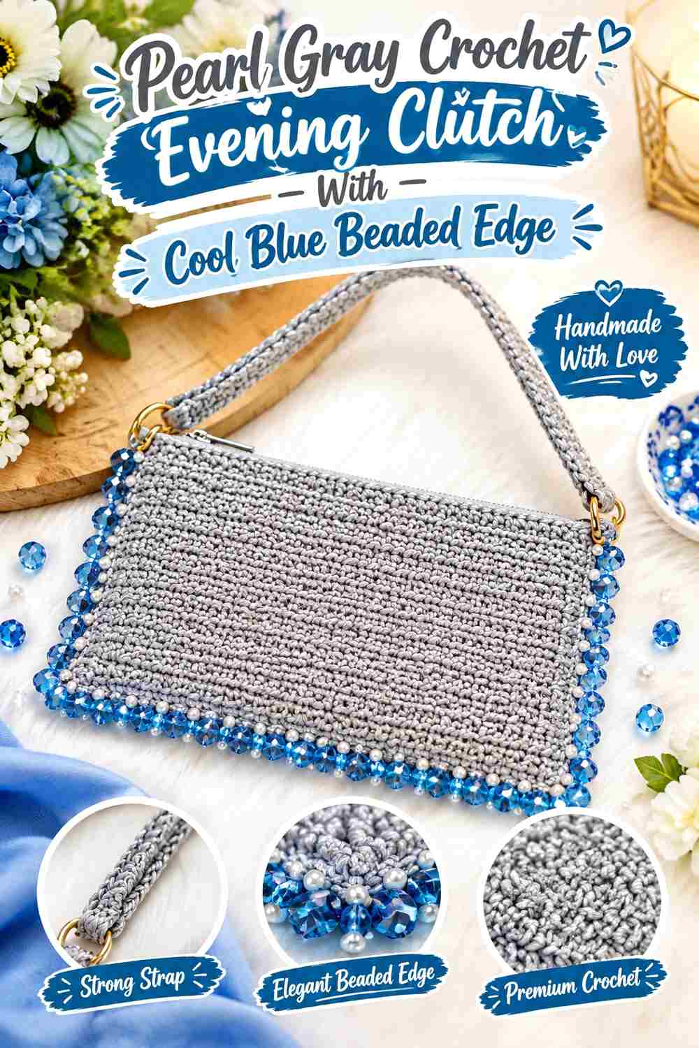
This clutch reverses the previous arrangement. Pearl gray covers most of the bag, while cool blue appears along an edge, strap area, or upper finishing line. Beads can follow the same boundary so color and embellishment act as one design feature.
Pearl Gray Lets Crochet Clutch Texture Stay Visible
Use pearl gray across the large body area when the construction already creates noticeable stitch texture. A single yarn color lets the stitch pattern read clearly rather than competing with multiple color changes.
Cool Blue Can Define the Pearl Gray Evening-Pouch Edge
A narrow cool-blue line near the opening, flap, or upper border adds definition without dividing the whole clutch into panels. Because it occupies a smaller area, the blue can be stronger in saturation without taking over the design.
Cool Blue Beads Can Extend a Pearl Gray Border Without Widening It
Instead of making the yarn border physically deeper, repeat the blue through selected beads immediately beside it. This can visually strengthen the edge while keeping most of the crochet fabric gray.
Creator Credit: KnitcroAddict
9. Cool Blue Shell Crochet Evening Pouch With Pearl Gray Bead Ribs
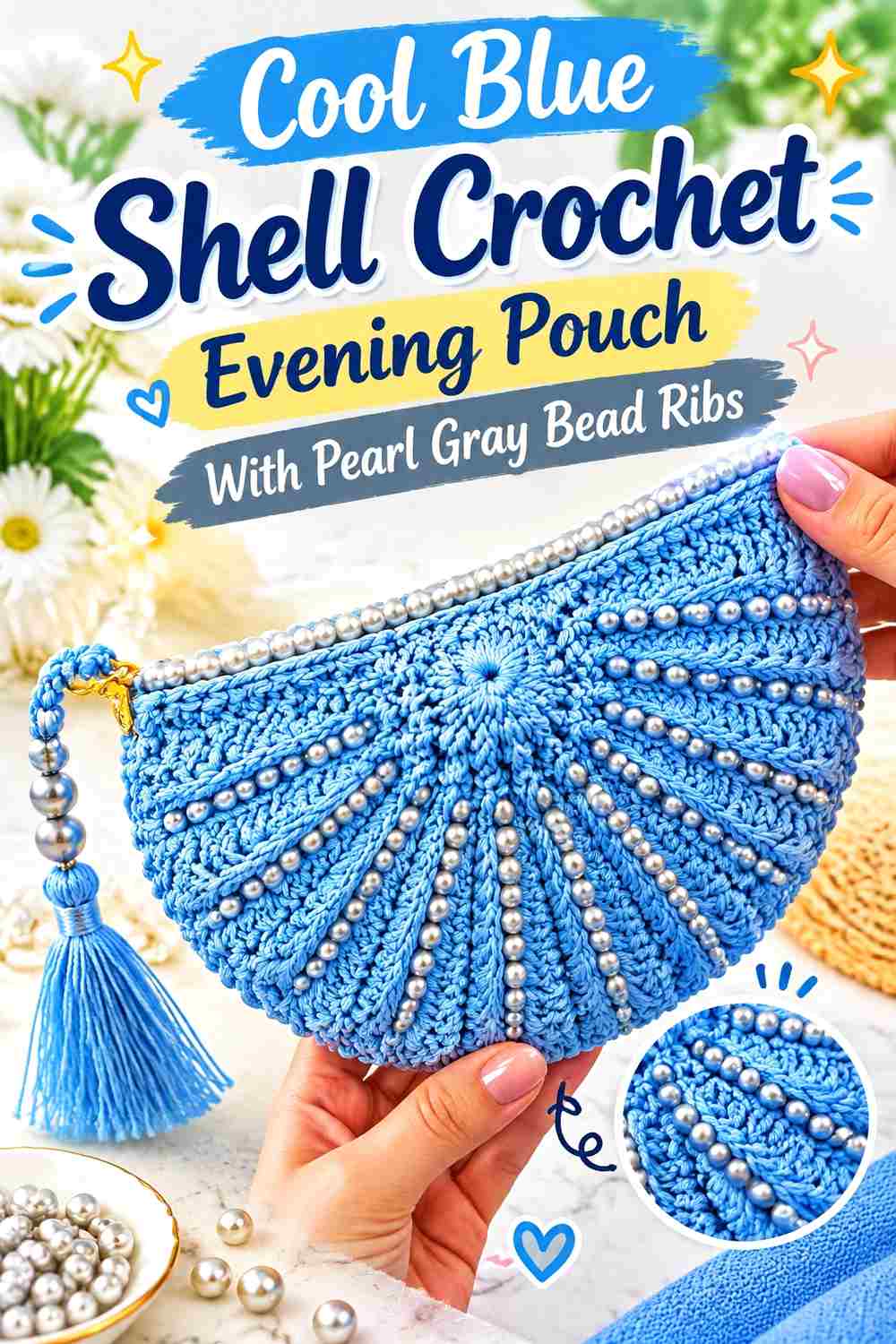
Shell texture already creates a strong decorative surface, so bead placement needs restraint. Let cool blue carry the shell fabric and place pearl gray or light-toned beads along selected ridges or the outer flap edge rather than covering every shell.
Cool Blue Should Keep the Crochet Shell Pattern Continuous
Work broad shell areas in blue so the curved stitch shapes remain easy to follow. Frequent gray color changes inside individual shells can compete with their natural texture.
Pearl Gray Can Emphasize Selected Cool Blue Shell Ridges
Use pearl gray around one boundary or selected ridge rather than outlining every shell. A few highlighted lines can make the texture more dimensional without creating an overly patterned surface.
Pearl Gray Beads Need Space Around Cool Blue Shell Texture
Place embellishment where it will not obscure the stitch openings or raised sections that define the shell pattern. When both texture and beads are prominent, reduce the amount of one rather than forcing both to cover the same area.
Creator Credit: Sirin’s Crochet
10. Pearl Gray Frame Crochet Evening Pouch With Cool Blue Beaded Body

A sewn-in purse frame already gives the pouch a clear upper boundary. Make the body pearl gray and use cool blue in a centered beaded panel, repeated vertical lines, or a lower color block rather than adding another contrasting yarn around the frame.
Pearl Gray Keeps the Crochet Frame Area Visually Light
Continue gray right up to the framed opening so the hardware remains separate from the stronger blue decoration below. This produces a cleaner transition than inserting several narrow color bands beneath the frame.
Cool Blue Can Concentrate Beadwork on the Pearl Gray Pouch Body
A centered cool-blue section gives the front of the purse a strong focal area. Keep the color away from the side seams if you want the panel to remain clearly front-facing.
Pearl Gray Space Around Cool Blue Beads Clarifies the Frame-Purse Shape
Leave visible gray around the blue embellishment, especially near the side curves and top edge. That open area allows the actual outline of the purse to remain readable instead of making the bead panel appear as large as the entire bag.
Creator Credit: HappyBerry Crochet
11. Cool Blue Kiss Lock Crochet Evening Pouch With Pearl Gray Beads
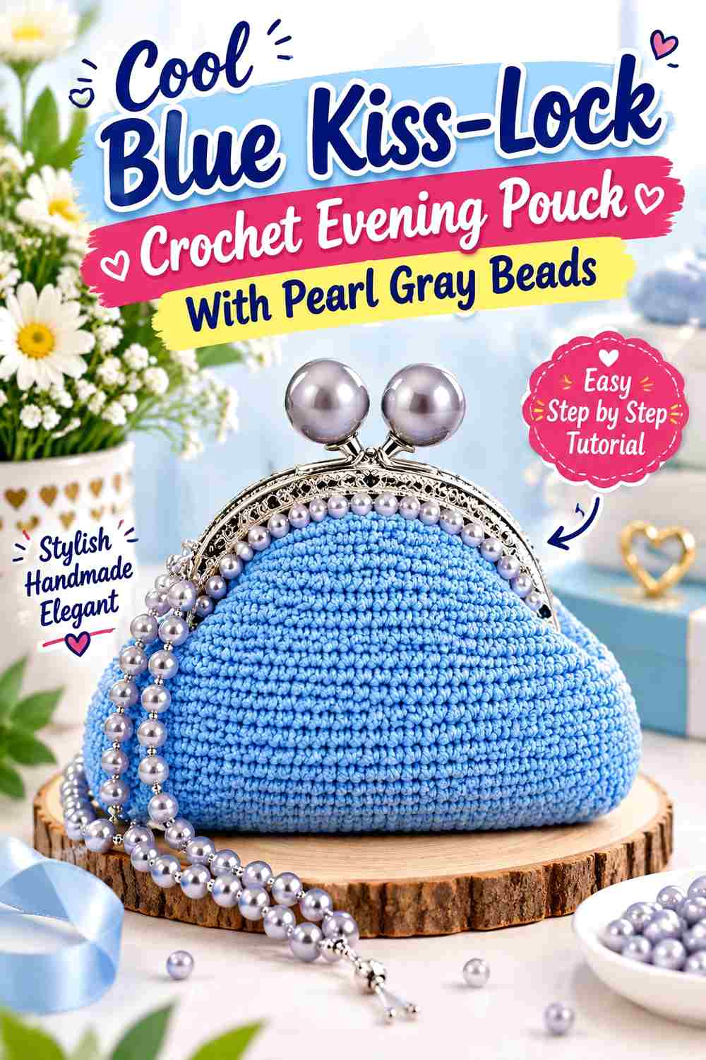
A kiss-lock frame gives a small evening pouch an immediately defined silhouette. Cool blue can cover the rounded body, while pearl gray and bead details sit closer to the frame or form a restrained pattern across the front.
Cool Blue Makes the Kiss-Lock Crochet Pouch Body Cohesive
Keep the rounded or softly shaped body blue so the curve remains easy to see beneath the rigid frame. Large blue areas are more effective here than multiple tiny alternating gray bands.
Pearl Gray Can Lighten the Cool Blue Pouch Near the Frame
Add pearl gray in a narrow top section if you want a softer transition into the hardware. Because the frame itself already creates a strong horizontal line, the gray does not need to cover much of the pouch.
Pearl Gray Beads Should Not Compete With the Cool Blue Kiss-Lock Shape
Use embellishment selectively near the front center or upper area. A densely beaded perimeter can make the eye follow the bead border instead of the distinctive framed silhouette.
Creator Credit: Lucy Hand Made
12. Pearl Gray Drawstring Crochet Beaded Evening Pouch With Cool Blue Band
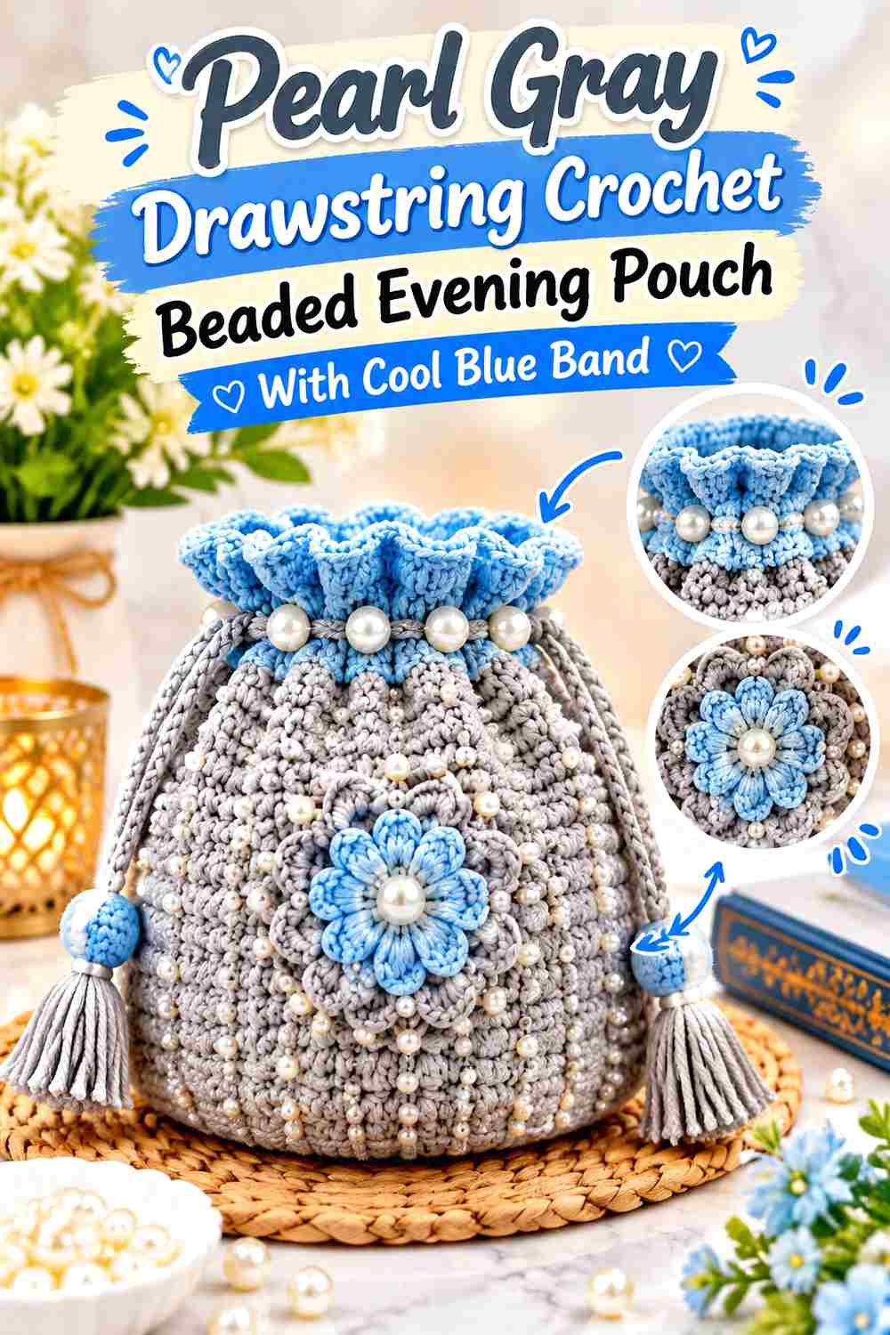
A straightforward drawstring pouch can become more evening-focused through a restrained two-color layout and carefully placed beads. Use pearl gray across most of the body, add one cool-blue band, and keep the beadwork aligned with that color change.
Pearl Gray Gives the Crochet Drawstring Pouch a Calm Main Field
Maintain gray across the lower body so the gathered top and bead details do not have to compete with several additional color changes. This also makes the blue band easier to recognize.
Cool Blue Should Form One Deliberate Band on Pearl Gray
Place the blue where it remains visible when the pouch is closed—usually below the most heavily gathered section. A band entirely inside the drawstring folds may disappear when the bag is in use.
Cool Blue Beads Can Repeat Above a Pearl Gray Pouch Band
If you want a second appearance of blue, use it through a small bead detail near the drawstring rather than adding another full yarn stripe. This repeats the accent while preserving pearl gray as the dominant shade.
Creator Credit: Crochet Craftsman
13. Cool Blue Rounded Crochet Evening Pouch With Pearl Gray Beaded Opening
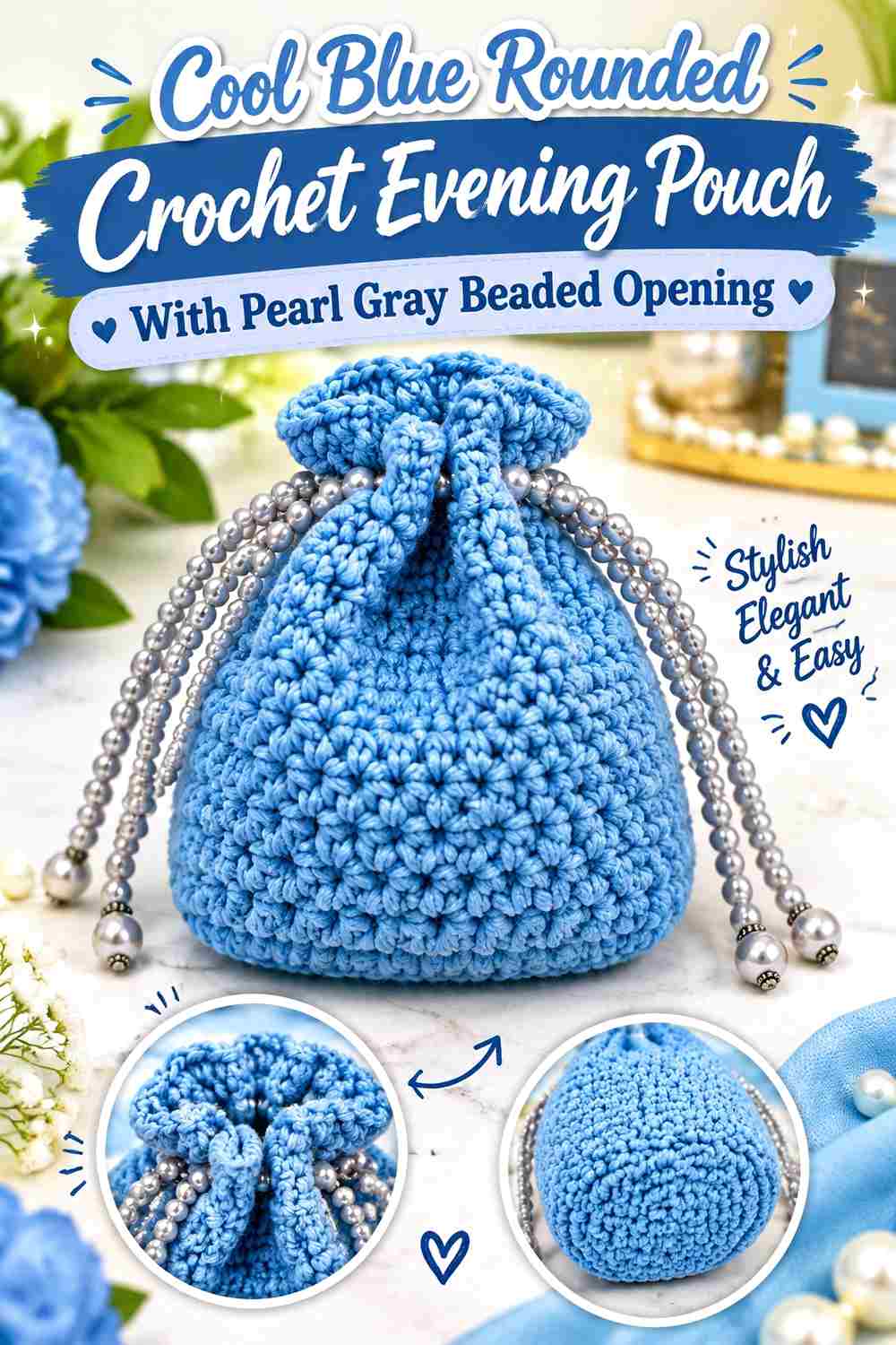
A basic rounded drawstring construction gives this palette a very clean direction. Cool blue can continue from the base almost to the top while pearl gray occupies the final rounds or opening area. Beads concentrated near that transition create a dressed-up finish without changing the uncomplicated body.
Cool Blue Should Cover Most of the Rounded Crochet Pouch
Let blue continue uninterrupted through the widest portion. Because the pouch expands when filled, broad color blocks are less disrupted by the changing shape than several narrow horizontal stripes would be.
Pearl Gray Gives the Cool Blue Opening a Defined Finish
A gray upper section separates the drawstring area from the main blue body. Make the section large enough that it remains visible after gathering.
Pearl Gray Beads Can Follow the Cool Blue Drawstring Channel
A restrained bead line around or below the channel can emphasize the opening. Keep heavy beads away from areas that must gather tightly if their placement interferes with the way the pouch closes.
Creator Credit: VivCrochets
14. Pearl Gray Foldover Crochet Evening Pouch With Cool Blue Bead Accent
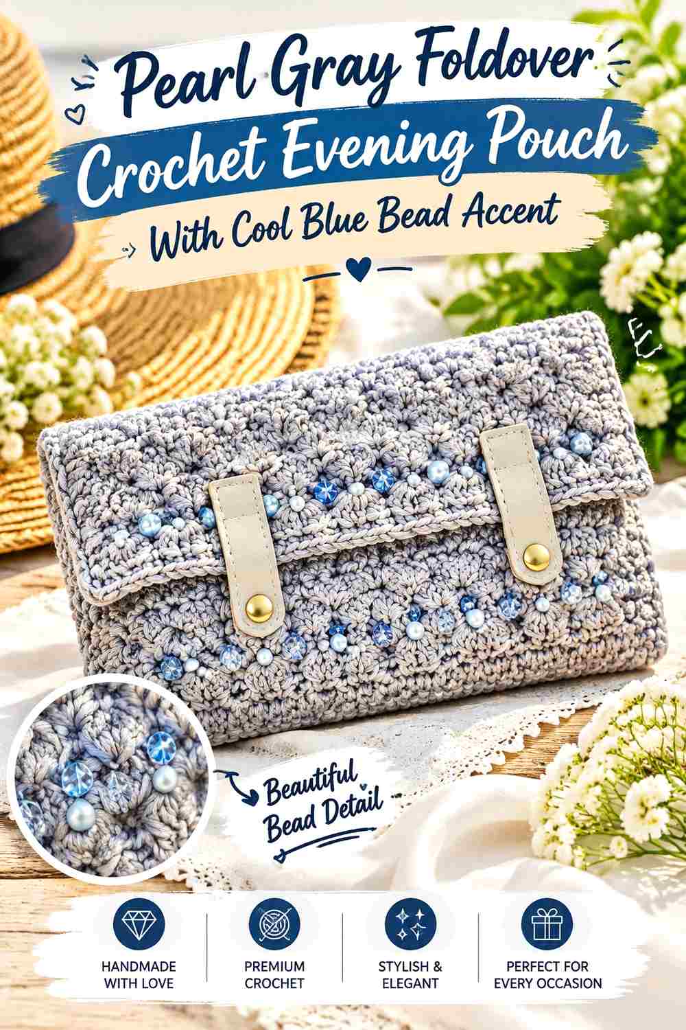
A foldover clutch creates one large front-facing flap, making it an ideal place for a single bead focal point. Use pearl gray over most of the pouch and reserve cool blue for a centered bead band, geometric detail, or narrow lower flap edge.
Pearl Gray Keeps the Foldover Crochet Pouch Visually Spacious
A large uninterrupted gray field prevents the folded front from looking crowded. The neutral color also allows both crochet texture and a modest bead accent to remain noticeable.
Cool Blue Should Be Concentrated on the Pearl Gray Foldover Flap
Place the blue where it is visible when the clutch is closed. A narrow line close to the fold itself may become hidden or distorted, while a central or lower placement is easier to see.
Cool Blue Beads Can Replace a Large Yarn Color Block on Pearl Gray
If you want the pouch to stay mostly gray, introduce blue through bead color instead of crocheting an entire blue panel. This creates a smaller but still deliberate accent and preserves the neutral-led evening direction.
Creator Credit: HanJan Crochet
15. Cool Blue Textured Frame Crochet Evening Pouch With Pearl Gray Bead Detail
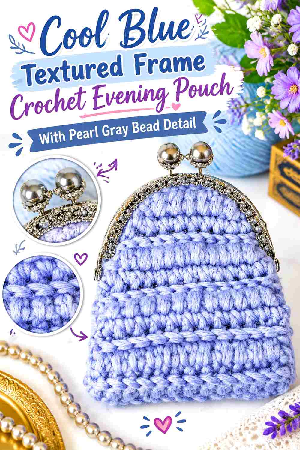
A textured frame purse provides a final option where crochet surface detail remains more important than dense embellishment. Let cool blue carry the textured body and restrict pearl gray and beads to the frame line, upper corners, or a single centered feature.
Cool Blue Lets the Crochet Frame-Pouch Texture Stay Connected
Use one continuous blue field through raised or patterned stitches so the texture remains readable. Alternating colors through every textured repeat could make the stitch design harder to follow.
Pearl Gray Should Highlight Only Selected Cool Blue Texture
Choose one place where gray genuinely improves definition—such as the top edge or a narrow section around the frame. Keeping the gray concentrated makes the color change meaningful.
Pearl Gray Beads Can Finish a Cool Blue Frame Without Covering the Texture
A short beaded line, centered cluster, or restrained edge detail adds evening shine while leaving most of the crochet surface exposed. This is a useful direction when the stitch texture already provides enough decoration.
Creator Credit: Stardust Gold Crochet
Comparing Cool Blue and Pearl Gray Crochet Beaded Evening Pouches
For the strongest color identity, start with a cool-blue-dominant idea. The shell pouch, framed purse, rounded drawstring pouch, and blue-body beaded purse all keep the cool shade across most of the visible crochet while pearl gray controls smaller boundaries or embellishment areas.
For a quieter evening palette, let pearl gray dominate. Gray clutch and foldover constructions leave more open neutral space around cool-blue bead bands, panels, or edge details.
If beadwork is meant to be the main feature, choose simpler pouch fabric and concentrate the embellishment into rows or a front field. If the crochet already has pronounced shell, crossed, or frame-purse texture, fewer beads will usually preserve more of the stitch definition.
Drawstring pouches are especially useful when you want embellishment concentrated around the top. Frame and foldover designs create stronger geometric boundaries, making them better suited to clear blue-and-gray color blocking.
Conclusion
Cool blue and pearl gray can create a beaded crochet evening pouch without requiring a complicated palette. The most effective arrangements give yarn color, crochet texture, and beads different responsibilities rather than asking all three to compete across the same surface.
Use cool blue as the main body when you want a stronger colored accessory, then reserve pearl gray for bead rows, frames, flaps, drawstrings, or borders. Reverse the hierarchy when you prefer a quieter neutral pouch with a smaller blue focal area.
For heavily textured crochet, keep bead placement restrained so shells, ridges, and raised stitches remain visible. On simpler fabric, beads can occupy more of the visual surface. Use each linked creator tutorial for its exact pouch construction, then adapt the cool blue, pearl gray, and bead distribution independently.
Frequently Asked Questions
Should cool blue or pearl gray dominate a crochet beaded evening pouch?
Either can dominate. Cool blue gives the pouch a stronger color identity, while pearl gray creates a quieter background for blue accents and beadwork. Choose one as the main body color and give the second shade a specific role such as the flap, opening, border, or decorative panel.
Where should pearl gray go on a cool blue beaded crochet pouch?
Useful locations include the top border, flap, drawstring channel, frame area, selected bead rows, or a narrow side panel. Pearl gray is especially useful where you want a lighter break without introducing a third yarn color.
How much beadwork should I add to a cool blue and pearl gray pouch?
Base the amount on the crochet surface. Simple fabric can support a denser bead pattern, while shells, puffs, crossed stitches, or other pronounced textures often benefit from more open space. Start with the area you want to emphasize instead of automatically covering the entire pouch.
Should beads match cool blue or pearl gray yarn?
They do not have to match exactly. Beads can repeat one of the yarn colors, sit close to the pearl-gray neutral, or provide a subtle reflective detail. What matters most is whether their placement supports the existing blue-and-gray hierarchy rather than making the two yarn colors difficult to see.
Does pearl gray mean I need to use pearl beads?
No. Pearl gray refers to the yarn color direction in this palette. The bead material and finish can be chosen separately. You can keep the embellishment subtle, coordinate it with either yarn shade, or use a restrained neutral bead treatment.
How can I keep bead rows straight on a two-color crochet pouch?
Plan the bead area before committing to the full pouch and check how the crochet fabric behaves when filled, folded, framed, or gathered. A row that looks straight on flat fabric can shift around a curved pouch or disappear into a drawstring fold.
How do I substitute different cool blue or pearl gray yarns?
Preserve their relationship. If cool blue is the dominant darker shade, choose another blue that still remains clearly distinct from the pearl gray. If you want a softer low-contrast evening palette, keep the two values closer while maintaining the blue-versus-gray distinction.