Cool blue and chocolate create an unusual balance for a crochet bucket bag. Blue brings the cooler visual direction, while chocolate supplies a deep neutral that can define the base, opening, strap, motifs, or textured sections without relying on black.
The important decision is not simply whether to use both colors, but how much space each one receives. A mostly cool blue bag with a chocolate base looks very different from a chocolate-led bucket bag with a slim blue rim. Stripes create another effect, while granny squares, scallops, shells, beads, and drawstring details give you additional places to control the palette.
These 14 ideas explore those differences while keeping the modern bucket-bag shape at the center. The linked tutorials support the crochet bag concepts and construction; the cool blue and chocolate combinations are color adaptations you can plan independently.
Quick List
- Cool Blue Body With A Chocolate Base Crochet Modern Bucket Bag
- Chocolate Body With A Cool Blue Drawstring Crochet Modern Bucket Bag
- Cool Blue And Chocolate Two Block Crochet Drawstring Bucket Bag
- Cool Blue Granny Square Crochet Bucket Bag With Chocolate Joins
- Chocolate Minimal Crochet Bucket Bag With A Cool Blue Rim
- Chocolate Crochet Bucket Bag With A Cool Blue Scalloped Edge
- Cool Blue Beaded Crochet Bucket Bag With Chocolate Anchors
- Cool Blue Shell Texture Crochet Bucket Bag With Chocolate Framing
- Dusty Cool Blue And Chocolate Narrow Band Crochet Modern Bucket Bag
- Cool Blue Crochet Bucket Bag With A Chocolate Gathered Top
- Chocolate Sack Style Crochet Bucket Bag With A Cool Blue Center Band
- Cool Blue Crochet Bucket Bag With A Slim Chocolate Accent Stripe
- Deep Cool Blue And Chocolate Crochet Modern Bucket Bag
Decide Whether Cool Blue or Chocolate Should Lead
Start by choosing the color you want to notice first from a few feet away. Giving cool blue most of the bag body makes the accessory read lighter and cooler, while chocolate taking the largest area produces a darker, more grounded result.
The smaller color can then do a specific job instead of competing for equal space. On a bucket bag, useful secondary locations include the base, top edge, drawstring area, strap, motif joins, textured bands, or a limited number of stripes.
Use Cool Blue and Chocolate Contrast Where the Bag Needs Definition
Different hues do not automatically create strong visual separation. A dark muted blue and deep chocolate can become surprisingly close in value, particularly once worked into dense crochet texture.
Compare the yarns side by side before committing to small motifs or narrow stripes. If their lightness is too similar, choose a paler cool blue or a deeper chocolate so the pattern remains readable. A quick grayscale photo can also help reveal whether the two shades separate clearly enough.
Keep Cool Blue and Chocolate Placement Connected
A modern two-color bucket bag usually looks more deliberate when the supporting color appears in more than one place. For example, a chocolate base can connect visually with a chocolate drawstring, strap detail, or narrow upper border.
The same approach works in reverse. When chocolate dominates the body, repeating cool blue near the opening and in a small lower band can keep the blue from looking like an isolated afterthought.
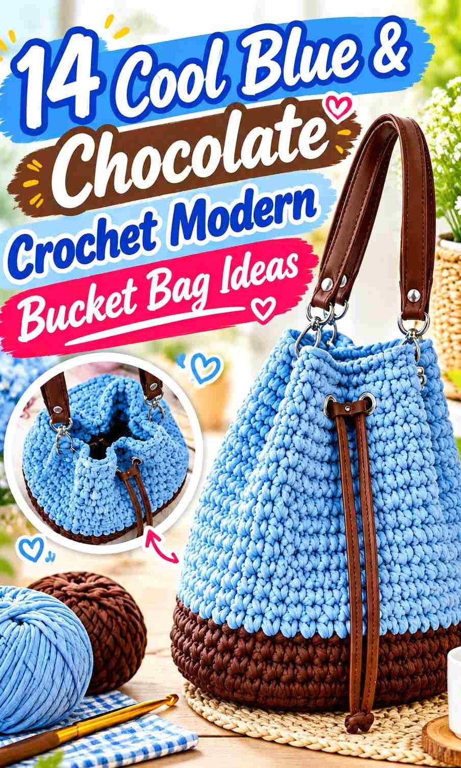
1. Cool Blue Body With A Chocolate Base Crochet Modern Bucket Bag
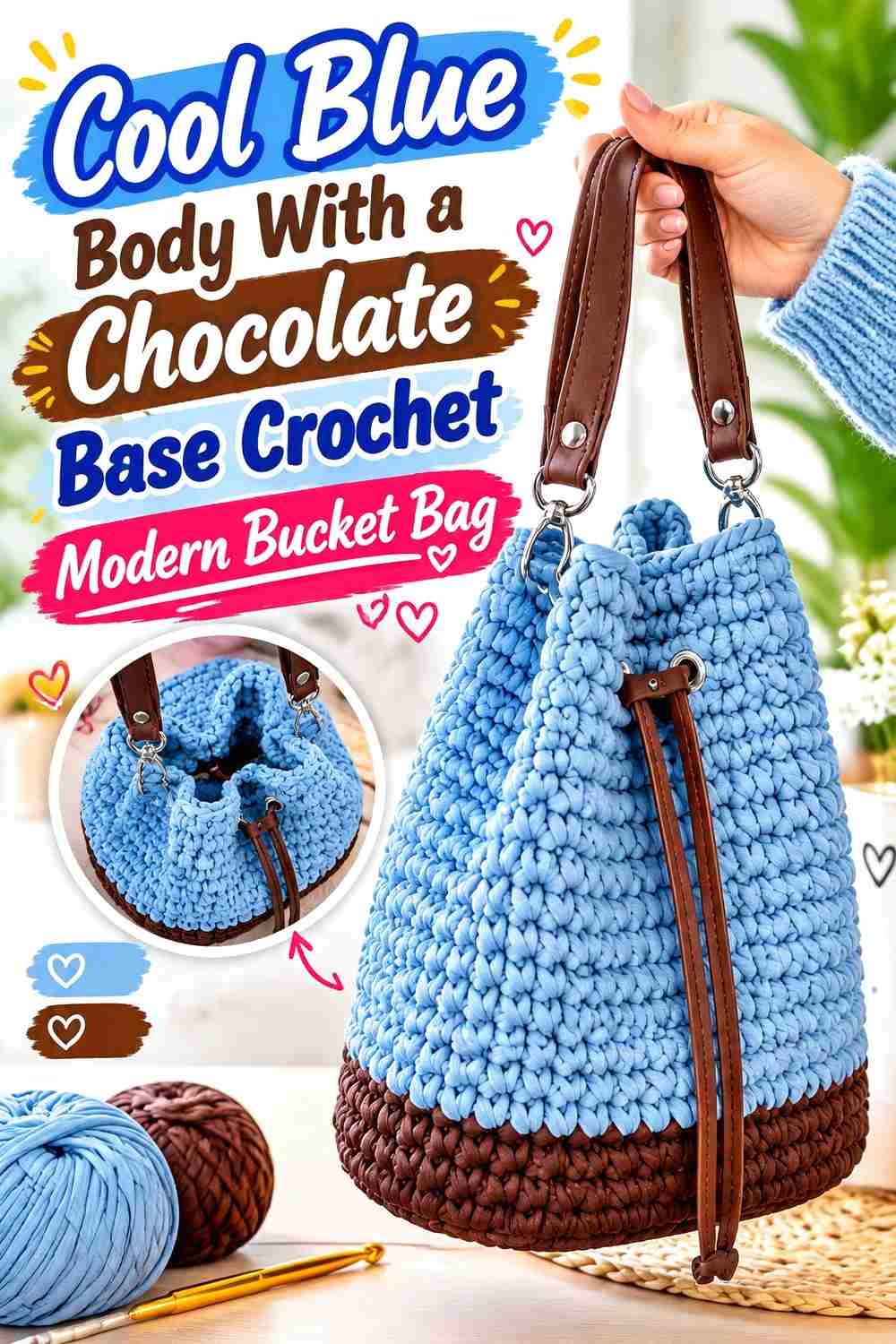
Let a light-to-medium cool blue cover most of this bucket bag, then place chocolate at the bottom where its darker value creates a defined visual foundation. Repeating chocolate in a strap attachment, drawstring, or narrow top edge can connect the base to the rest of the bag without taking attention away from the blue body.
Cool Blue Works Well Across the Largest Bucket Bag Surface
A broad field of cool blue makes the cylindrical bag body feel visually clean and gives you room to see the crochet surface without frequent color interruptions. If your blue is fairly pale, the individual stitches and any subtle texture can also remain easier to distinguish than they might in a very dark field.
Chocolate Can Give the Cool Blue Bag a Stronger Base
Chocolate is useful along the lower portion because the color change establishes a clear stopping point before the main blue body begins. Keep the transition deliberate rather than adding several unrelated brown bands; one concentrated chocolate section can create enough grounding on its own.
Repeat Chocolate Near the Cool Blue Opening
If chocolate appears only at the bottom, the palette can feel weighted toward the base. A small repeat near the opening, drawstring, or strap attachment helps distribute the dark neutral upward while allowing cool blue to remain dominant.
Creator Credit: Crochet with Julia
2. Chocolate Body With A Cool Blue Drawstring Crochet Modern Bucket Bag
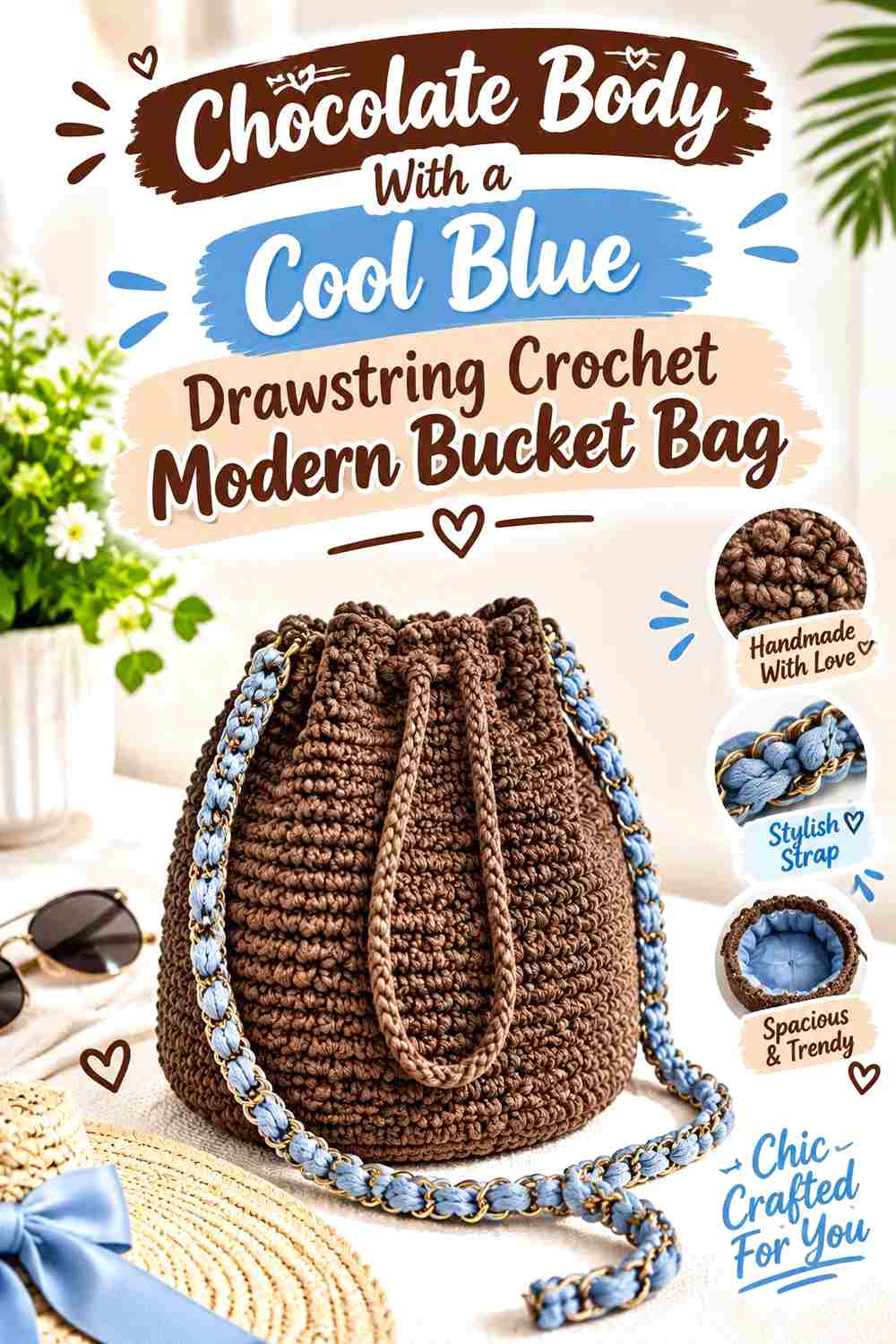
Reverse the balance by allowing chocolate to cover most of the bag while cool blue handles the opening area. This creates a darker everyday bucket bag in which the blue acts as controlled contrast rather than the main field.
Chocolate Can Carry the Main Bucket Bag Body
Chocolate has enough visual weight to define the full bucket silhouette without needing several additional colors. When it covers the body, pay particular attention to stitch texture and lighting because very deep browns can make small surface details less obvious.
Cool Blue Can Separate the Chocolate Drawstring Area
Place cool blue around the upper band or drawstring channel to create a visible break before the bag gathers. This location is especially useful because the cool blue remains noticeable even when the chocolate body is largely uninterrupted.
Keep the Cool Blue Accent Smaller Than Chocolate
A near-equal split can change the effect from chocolate-led to fully two-tone. If the goal is a dark modern bag, keep blue focused on the opening, cord, or one narrow band so chocolate still controls the overall visual direction.
Creator Credit: yarnTh3ory
3. Cool Blue And Chocolate Two Block Crochet Drawstring Bucket Bag
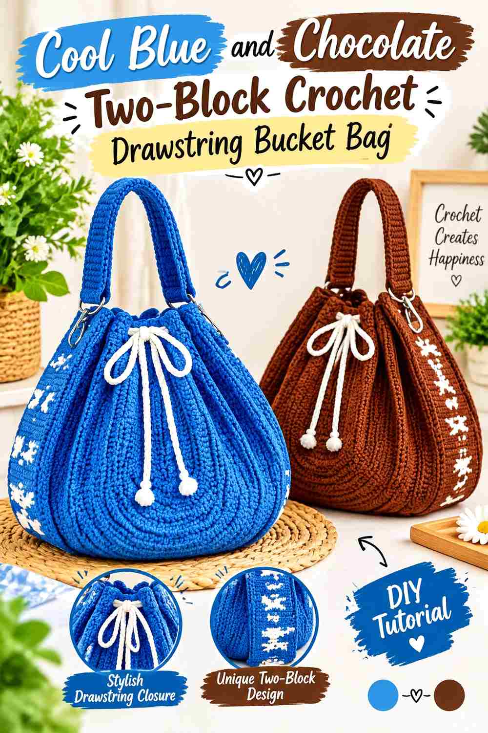
A simple color block is one of the cleanest ways to make the palette look modern. Work the lower portion in chocolate and allow cool blue to take over the upper body, creating one strong transition instead of repeated bands.
Chocolate Gives the Lower Bucket Bag Block More Weight
Keeping chocolate low emphasizes the base and lower walls of the bucket silhouette. This placement also leaves the darker shade away from the gathered top, where folds and drawstring details can already create plenty of visual activity.
Cool Blue Opens Up the Upper Bucket Bag Block
Cool blue across the upper section can make the area around the opening visually lighter. It also creates a clear background for a chocolate drawstring if you want the darker shade repeated without adding another full-width band.
Make the Cool Blue and Chocolate Divide Look Deliberate
Avoid placing the color change at an arbitrary point that leaves one block looking unintentionally short. Consider how the bag looks when carried as well as when standing upright; the lower chocolate section should still appear substantial enough to act as a purposeful base.
Creator Credit: Crochet.Box
4. Cool Blue Granny Square Crochet Bucket Bag With Chocolate Joins
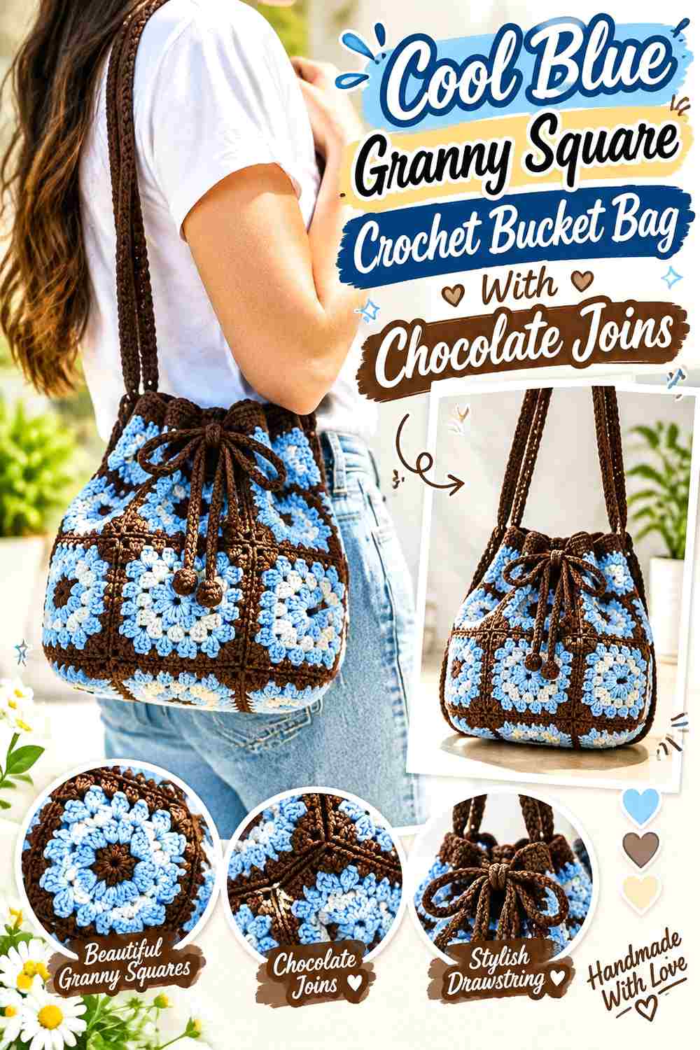
A granny-square bucket bag offers more detailed color placement because each motif can carry both shades. Use cool blue as the main square color and chocolate for joins, outer rounds, or selected centers to give the separate pieces a consistent framework.
Cool Blue Can Unify the Granny Square Faces
Repeating cool blue across every visible square gives the bucket bag continuity even when individual motifs include small variations. If you introduce a lighter and darker cool blue, keep their roles consistent so the bag does not lose the clear blue-and-chocolate direction.
Chocolate Joins Can Outline the Cool Blue Squares
Chocolate between motifs gives each cool blue square a distinct edge and makes the construction grid part of the color design. This works particularly well when the blue and brown have enough light-dark separation to keep the seams readable.
Keep Chocolate From Overpowering the Cool Blue Motifs
Wide dark joins plus dark motif borders can consume more visual area than expected. If cool blue should remain dominant, limit chocolate to one structural layer—such as the joining line or the outer motif round—instead of surrounding every blue section with several brown rows.
Creator Credit: Teia Crochet
5. Chocolate Minimal Crochet Bucket Bag With A Cool Blue Rim
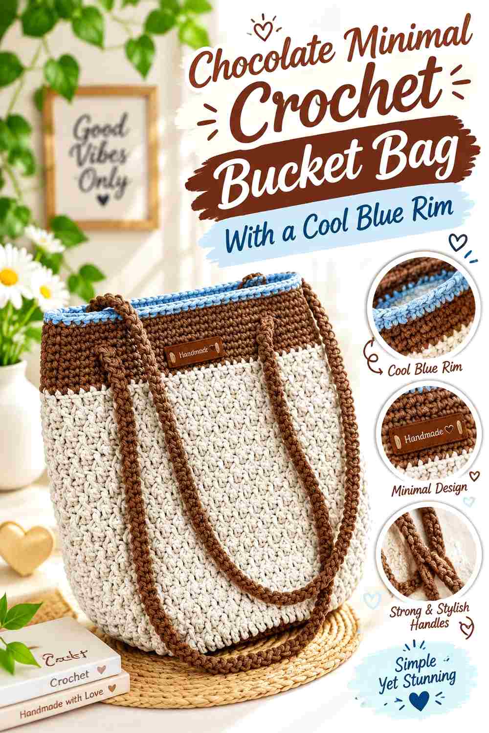
This version keeps the bag largely chocolate and introduces cool blue only at the top. It suits a cleaner color-block approach where the crochet silhouette remains the main feature and the cooler color functions as precise finishing.
Chocolate Keeps the Bucket Bag Body Visually Continuous
A mostly single-color chocolate body avoids breaking up the vertical walls with multiple color changes. That makes surface texture, shaping, and the outline of the bag more visually important than the color pattern itself.
Cool Blue Can Define the Bucket Bag Rim
A cool blue finishing band gives the opening a clear boundary against the darker body. It is particularly effective when the rim is a visible design feature because the blue immediately directs attention to the top edge.
Repeat Cool Blue Once Against the Chocolate Body
A tiny second repeat—perhaps on the drawstring or a small strap detail—can make the blue rim feel connected to the overall design. Avoid spreading blue into too many additional areas if the intention is to preserve the minimal chocolate-led look.
Creator Credit: Well Croche
6. Chocolate Crochet Bucket Bag With A Cool Blue Scalloped Edge
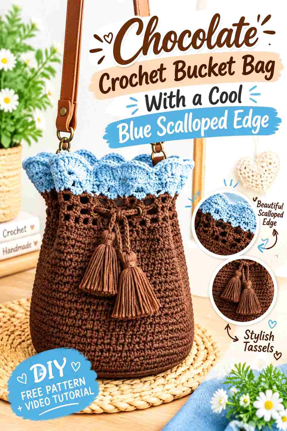
Use chocolate across the solid lower body and shift to cool blue where the upper texture becomes more decorative. The contrast helps a scalloped or open edge read as a separate design feature rather than blending into the body.
Chocolate Gives the Decorative Cool Blue Edge a Quiet Background
A relatively uninterrupted chocolate body allows the top treatment to become the focal point. This is useful when the bag already includes an interesting silhouette near the opening and does not need additional stripes competing below it.
Cool Blue Makes Scalloped Bucket Bag Details Easier to Notice
Placing cool blue directly on a shaped edge highlights the repeated curves. Choose a blue that separates clearly from the chocolate beneath it; if both colors are equally dark, some of the scallop definition can become less obvious.
Keep Cool Blue Tassels Connected to the Chocolate Bag
When tassels, ties, or cords are part of the look, decide whether they should continue the blue edge or return to chocolate. Repeating cool blue in those hanging details emphasizes the decorative top, while chocolate creates a quieter transition back to the main body.
Creator Credit: forthefrills
7. Cool Blue Beaded Crochet Bucket Bag With Chocolate Anchors
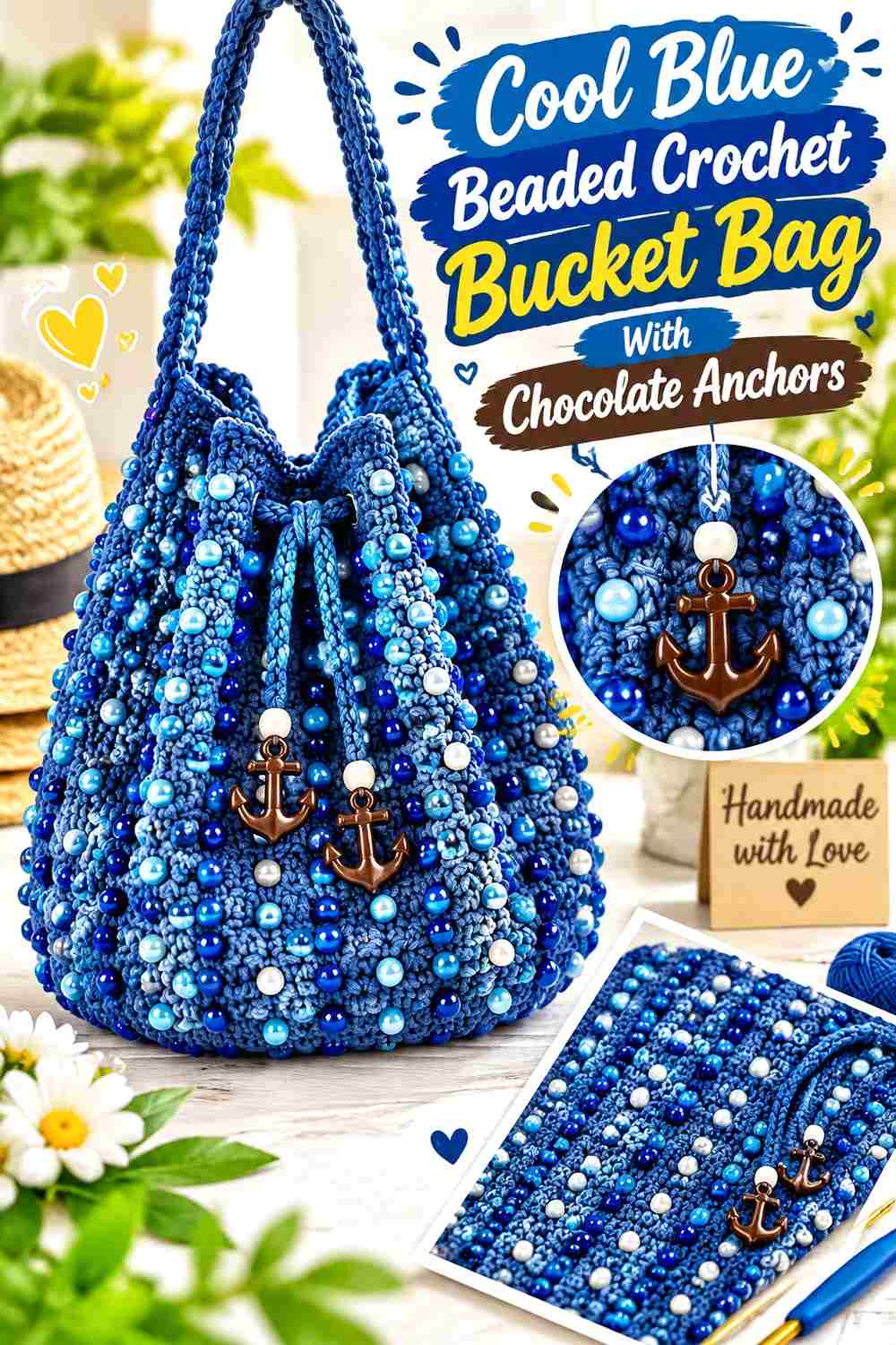
A beaded surface already contains substantial detail, so the two-color plan should remain controlled. Let cool blue cover the main beaded field and concentrate chocolate around the base, handle, drawstring, or another structural area.
Cool Blue Gives the Beaded Bucket Bag a Consistent Field
Using one cool blue through most of the decorative body prevents the yarn color and bead pattern from competing for equal attention. Before committing, check the actual yarn beside the chosen beads because their contrast will affect how clearly the surface pattern appears.
Chocolate Can Frame the Cool Blue Beaded Section
A chocolate base creates a distinct transition into the more decorative blue body. Repeating chocolate at the top or handle can visually contain the beaded section between darker elements instead of allowing the embellishment to spread everywhere.
Avoid Overloading Cool Blue and Chocolate With Extra Accent Colors
The beads already introduce another visual element, even if they are neutral. Adding several more yarn colors can make it harder to see the intended cool blue and chocolate hierarchy, so keep additional shades limited unless a deliberately multicolor effect is the goal.
Creator Credit: Passionate Crafter
8. Cool Blue Shell Texture Crochet Bucket Bag With Chocolate Framing
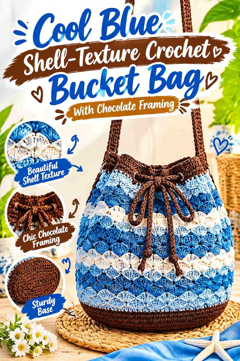
Shell-like crochet texture gives color more shadow and depth than a flat surface. Let cool blue cover the textured body, then use chocolate at simpler structural areas such as the base and upper finish.
Cool Blue Helps Shell Texture Stay Central to the Bag
A consistent cool blue across repeated textured sections allows the stitch pattern itself to create movement. Constant color changes inside an already detailed surface can make it harder to distinguish the texture from the palette.
Chocolate Can Frame the Cool Blue Texture Without Interrupting It
Place chocolate before the shell-textured body begins or after it ends. This treats brown like a visual frame rather than inserting it repeatedly through every textured section.
Compare Cool Blue and Chocolate After the Texture Is Crocheted
Raised and recessed stitches create shadows that can make a color appear deeper than it does in the skein. Test a small section if possible, especially when using a dark cool blue, to make sure the textured blue does not become too close in value to chocolate.
Creator Credit: August Craft & Crochet
9. Dusty Cool Blue And Chocolate Narrow Band Crochet Modern Bucket Bag
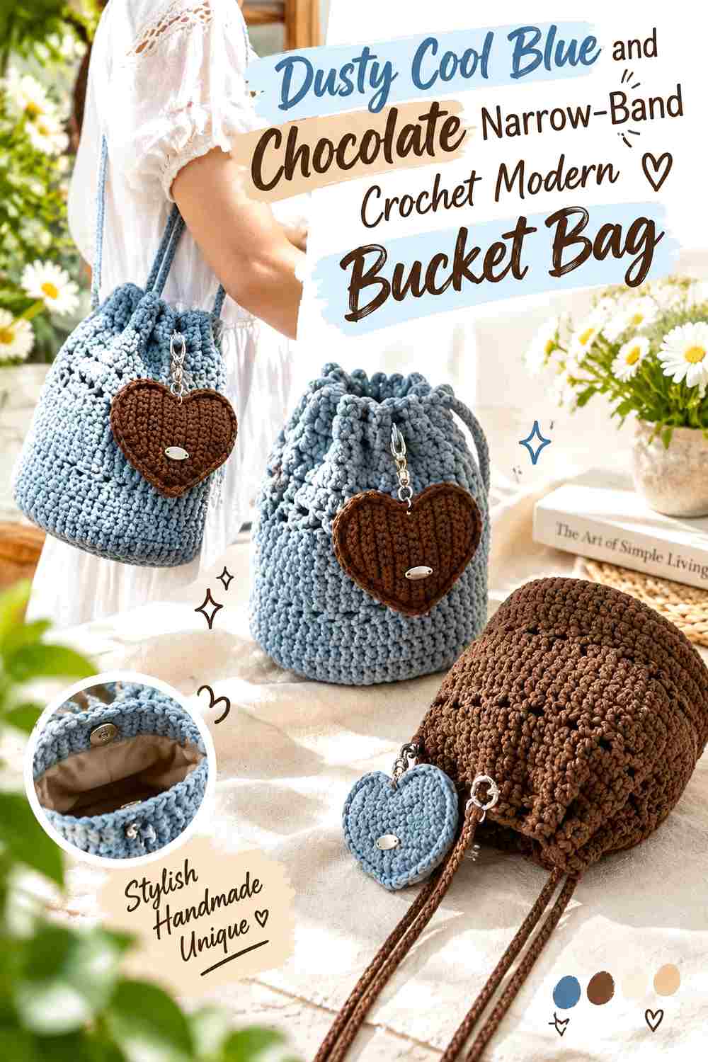
Choose a softened dusty cool blue for the main body, then work narrow chocolate bands at measured intervals. This is quieter than broad striping and keeps the bag primarily blue while still carrying the brown around the full circumference.
Dusty Cool Blue Keeps the Bucket Bag From Looking Too High-Contrast
A muted cool blue creates a gentler transition against chocolate than a highly saturated bright blue would. This can be useful when you want visible color separation without making every band the first thing you notice.
Chocolate Bands Should Stay Narrow Against Cool Blue
Keep the brown stripes smaller than the blue fields if blue is intended to dominate. Several wide chocolate sections can quickly turn a dusty-blue design into an evenly striped two-color bag, changing its visual character.
Space Chocolate Consistently Across the Cool Blue Body
Irregular band spacing can work, but it needs to look deliberate. If you want a restrained modern finish, repeat chocolate at predictable intervals or reserve it for only two or three defined positions such as the lower body, middle, and rim.
Creator Credit: CloudPusher
10. Cool Blue Crochet Bucket Bag With A Chocolate Gathered Top
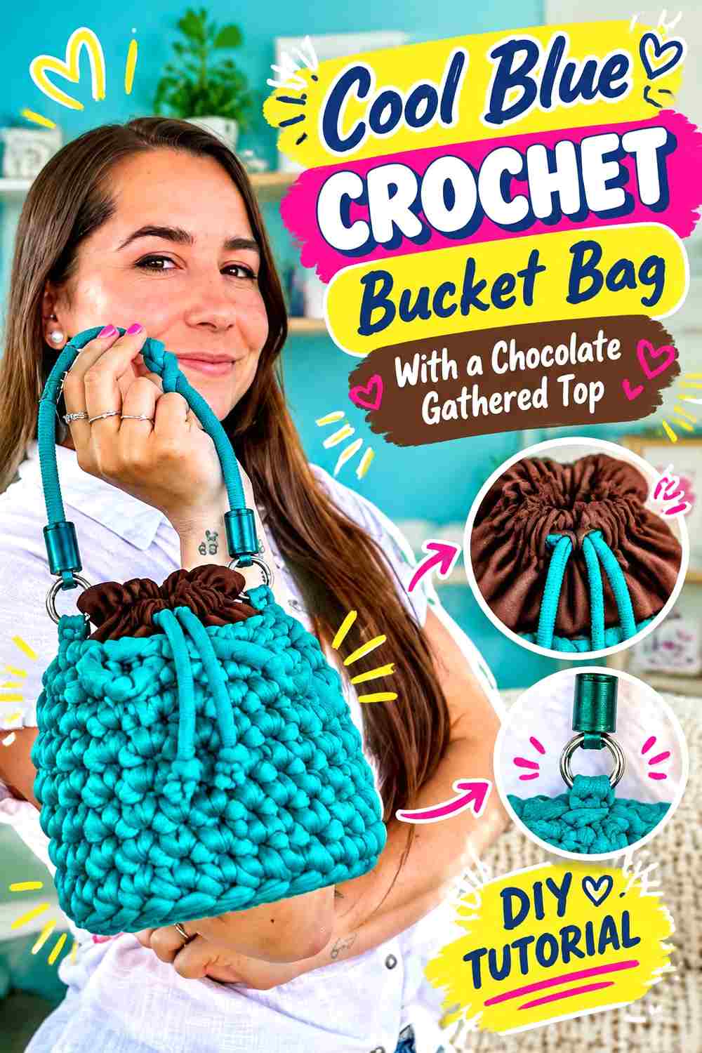
Keep the walls of this sack-style bucket bag cool blue and shift to chocolate close to the gathered opening. The color change emphasizes the point where the straight body begins to close inward.
Cool Blue Keeps the Main Bucket Bag Silhouette Clear
Using blue continuously from the base through most of the body creates an easy-to-read shape. It also gives any subtle crochet texture enough uninterrupted space to remain visible without being divided by frequent brown sections.
Chocolate Draws Attention to the Cool Blue Bag Opening
Chocolate around the gathered top creates a darker boundary precisely where the silhouette changes. A matching chocolate cord can reinforce that area without requiring another brown block lower on the bag.
Keep the Chocolate Section Shorter Than the Cool Blue Body
If the dark upper section extends too far downward, the bag can look visually divided in half. A more compact chocolate area keeps the cooler blue in charge while still giving the closure strong definition.
Creator Credit: Katia Yarns & Fabrics
11. Chocolate Sack Style Crochet Bucket Bag With A Cool Blue Center Band
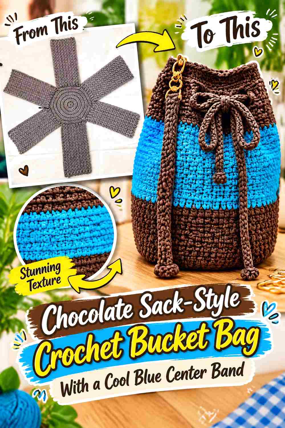
For a darker interpretation, work most of the bucket shape in chocolate and place cool blue through the center of the body. The blue becomes a clear horizontal focal area rather than a small finishing detail.
Chocolate Can Connect the Bucket Bag Base and Top
Using the same chocolate below and above the blue band creates visual continuity around the accent. This makes the center stripe appear intentionally inserted into one cohesive dark bag rather than dividing two unrelated sections.
Cool Blue Needs Enough Width to Hold the Center
A center band that is too thin can resemble piping rather than a true color block. Give cool blue enough height to establish a distinct middle section, particularly if the chocolate shade is deep and visually dominant.
Keep the Cool Blue Band Away From Busy Chocolate Details
If the bag has a textured closure or decorative trim, avoid crowding the center band too close to it. Leaving some plain chocolate between the blue and the top treatment gives each feature room to register separately.
Creator Credit: Jolie Maison Uncinetto
12. Cool Blue Crochet Bucket Bag With A Slim Chocolate Accent Stripe
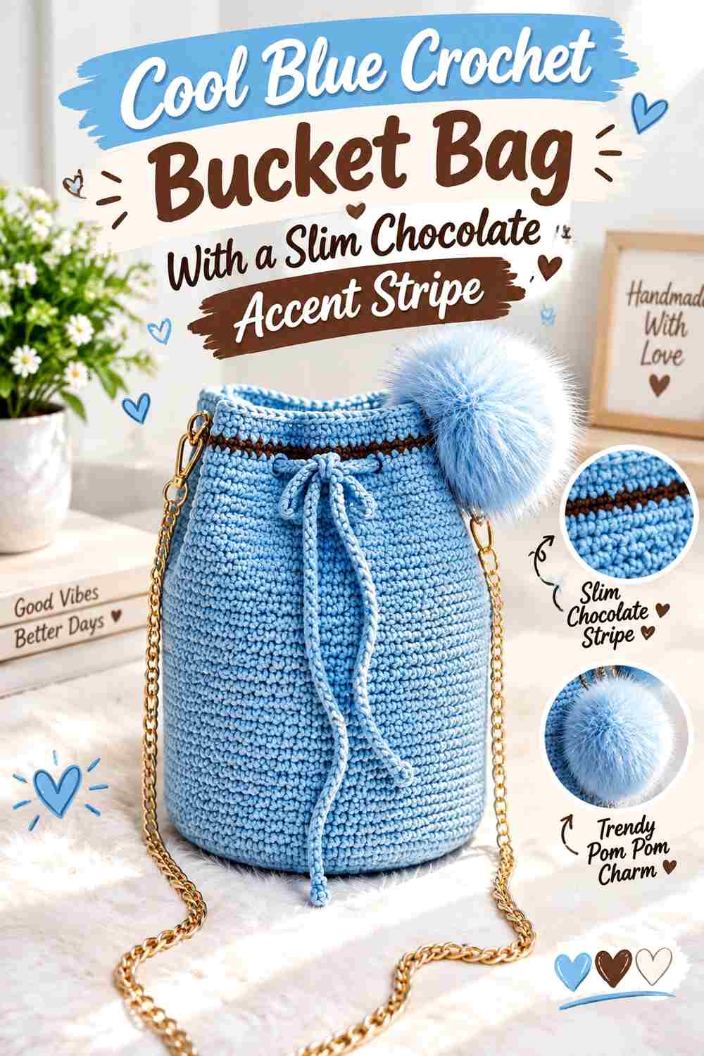
This idea uses chocolate sparingly. Work almost the entire bag in cool blue and introduce a single slim chocolate stripe around the body, then repeat brown in one small finishing area.
Cool Blue Should Remain Visually Unbroken Around Most of the Bag
The strength of this approach is restraint. A large uninterrupted blue area emphasizes the bucket silhouette and keeps the accessory easy to coordinate with neutral clothing while still having a distinct warm contrast.
Chocolate Works as a Precise Line Against Cool Blue
A narrow brown stripe can mark a transition in the bag without becoming a major block. Position it where it looks connected to the overall proportions—often around the lower or middle body rather than extremely close to another border.
Repeat Chocolate Once So the Cool Blue Stripe Plan Feels Finished
Echo the slim stripe in the drawstring, strap detail, or top edging. The repeat does not need to be large; its purpose is simply to make the chocolate line feel intentional rather than accidental.
Creator Credit: Le creazioni di Anna “Idee Uncinetto”
13. Deep Cool Blue And Chocolate Crochet Modern Bucket Bag
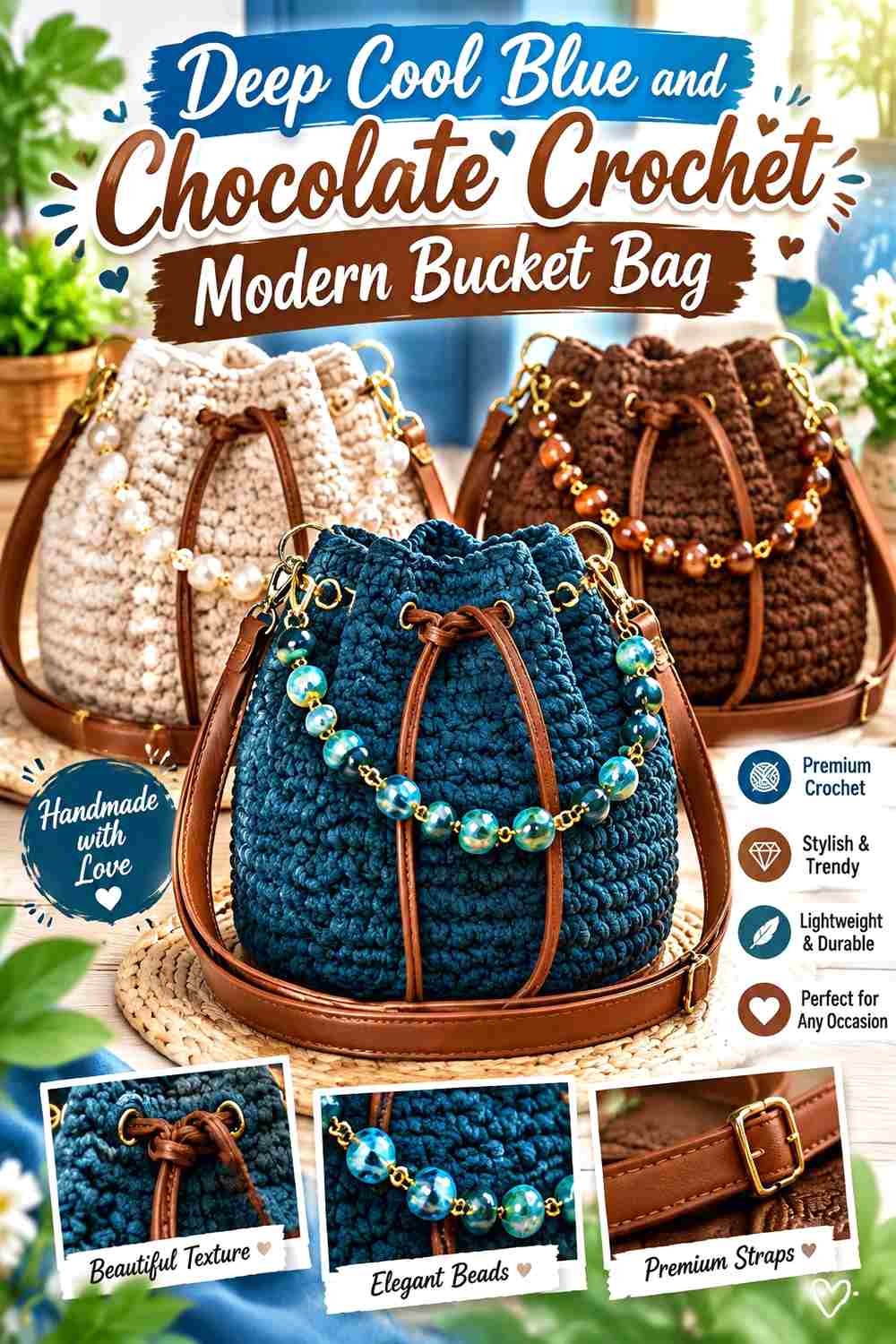
For the darkest scheme in the collection, pair a deeper cool blue with chocolate and use a small amount of soft gray or another quiet neutral only if extra separation is necessary. Because the two main shades can be close in value, placement matters more here than in the lighter combinations.
Deep Cool Blue Needs Clear Separation From Chocolate
Compare the two yarns from a distance before using them in narrow stripes or tiny motifs. If they merge visually, reserve one color for larger blocks or choose a slightly lighter blue so the two sections remain identifiable.
Chocolate Can Define the Deep Cool Blue Bucket Bag Base and Strap
Concentrating chocolate in structural areas gives the dark blue body a recognizable boundary. A chocolate base paired with a chocolate strap also creates a repeated framework around the cooler center.
Add a Light Neutral Only When Cool Blue and Chocolate Need Help
A thin gray, oatmeal, or soft cream separator can be useful when blue and brown are both very dark, but it should solve a contrast problem rather than become a third competing color. Keep the neutral narrow so the bag still reads primarily as cool blue and chocolate.
Creator Credit: Jolanda
How to Choose Between These Cool Blue and Chocolate Bucket Bag Palettes
For the lightest overall result, start with the cool-blue-led options where chocolate is limited to the base, rim, or one accent stripe. If you prefer a darker bag, the chocolate-led designs keep most of the visual weight in brown while using blue at the opening or through a controlled center band.
Choose the wide-striped, granny-square, beaded, or shell-textured versions when you want color placement to interact strongly with the crochet surface. For a cleaner modern direction, the two-block, narrow-band, rim-accent, and minimal versions rely on larger uninterrupted areas of color.
The most important checkpoint is value contrast. When your chosen cool blue is pale, it will separate naturally from deep chocolate. With navy-leaning or blue-gray shades, compare the yarns carefully before placing the colors in small details.
Conclusion
Cool blue and chocolate can produce several very different crochet bucket bags without changing the core two-color concept. The blue-led ideas feel lighter and put more emphasis on the crochet surface, while chocolate-led versions create a deeper visual base. Stripes and granny squares make the palette more graphic, and scallops, shells, beads, and gathered openings provide specific locations where color can emphasize texture.
Before starting, decide which shade should dominate and identify two or three places where the supporting color will repeat. That simple hierarchy usually gives a modern bucket bag more cohesion than distributing both colors everywhere in equal amounts.
Use the linked tutorials for their exact construction guidance, then adapt the color placement according to the effect you want from your finished bag.
Frequently Asked Questions
Should cool blue or chocolate dominate a crochet bucket bag?
Either can dominate, but choosing one before you begin makes the palette easier to control. Cool blue creates a lighter, cooler overall surface when it occupies most of the body, while chocolate produces a darker, more grounded result. Give the secondary color a defined job such as the base, rim, stripe, join, or drawstring.
How can I tell whether cool blue and chocolate have enough contrast?
Place the yarns beside each other and view them from several feet away. You can also photograph them in grayscale. If the colors become nearly identical in grayscale, small motifs and narrow stripes may not separate clearly, so consider using a lighter blue or darker chocolate.
Where should chocolate go on a mostly cool blue crochet bucket bag?
The base is one of the most effective locations because it visually grounds the bag without reducing much of the blue surface. Chocolate can then be repeated in a drawstring, upper edge, strap detail, or narrow band to connect the palette from bottom to top.
Can I add cream or gray to a cool blue and chocolate bucket bag?
Yes, but give the neutral a specific purpose. A narrow cream, oatmeal, or soft gray separator can increase visibility when blue and chocolate are similar in value. Keeping the third shade limited preserves the main two-color identity.
Do cool blue and chocolate work well in granny square bucket bags?
They can, especially when one color controls the motif faces and the other controls joins or borders. Check the blocked motifs before final assembly because thick chocolate joins can occupy more visual area than expected and may reduce the impact of the blue centers.
How should I substitute a different cool blue shade?
Preserve the role the original blue was meant to play. If it needs to contrast strongly with deep chocolate, choose another cool blue that remains noticeably lighter. If the intended effect is dark and tonal, a muted blue-gray or deeper blue may work as long as the two colors remain distinguishable where the bag needs definition.