Cinnamon and ultramarine create an interesting color problem on a small crochet drawer handle cover. Cinnamon brings a warm, earthy midtone, while ultramarine introduces a cooler, stronger blue. Because a handle cover has limited surface area, changing which color dominates, where the second color appears, or whether a neutral separates them can noticeably change the finished look.
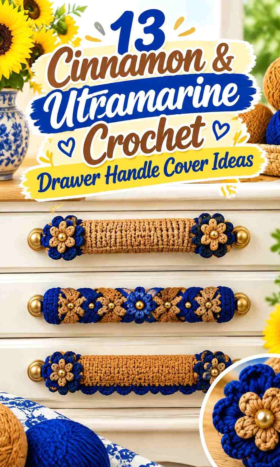
The ideas below explore different ways to distribute these two colors across drawer handles rather than simply repeating the same two-color sleeve. Some make cinnamon dominant, others give ultramarine more visual weight, and several introduce a small neutral or accent shade to control the contrast. The linked creator tutorials support handle-cover construction concepts; some are made for bag or refrigerator handles rather than drawer pulls, so compare the tutorial shape with your own hardware before adapting it.
Quick List
- Cinnamon Body And Ultramarine Edge Crochet Drawer Handle Cover
- Ultramarine Body And Cinnamon End Band Crochet Drawer Handle Cover
- Cinnamon Ultramarine And Ivory Crochet Drawer Handle Cover
- Cinnamon And Ultramarine Narrow Stripe Crochet Drawer Handle Cover
- Cinnamon Ultramarine And Antique Gold Crochet Drawer Handle Cover
- Cinnamon Ultramarine And Sage Crochet Drawer Handle Cover
- Cinnamon Ultramarine And Soft Coral Crochet Drawer Handle Cover
- Cinnamon Ultramarine And Charcoal Crochet Drawer Handle Cover
- Cinnamon Ultramarine And Dusty Blush Crochet Drawer Handle Cover
- Cinnamon Ultramarine And Mustard Crochet Drawer Handle Cover
- Cinnamon Ultramarine And Espresso Crochet Drawer Handle Cover
- Cinnamon Ultramarine And Stone Gray Crochet Drawer Handle Cover
- Reversed Cinnamon And Ultramarine Crochet Drawer Handle Cover Set
Decide Whether Cinnamon or Ultramarine Should Lead the Drawer Handles
A small handle cover usually reads as one main color with secondary details, even when two yarn colors are used in similar amounts. Decide which shade you want to notice first before planning stripes or edging. Cinnamon can connect the handles to warm wood tones and other earthy decor, while ultramarine can create a more obvious cool-colored interruption across a row of drawers.
The drawer face matters too. On a dark blue or similarly cool surface, ultramarine may blend more than expected, allowing cinnamon to become the stronger visual element. Against a warm wood or brown drawer, the opposite can happen. Hold the yarn directly against the furniture before deciding which shade deserves the larger area.
Check the Value Difference Between Cinnamon and Ultramarine
Cinnamon and ultramarine differ strongly in hue, but their lightness can vary depending on the particular yarns you choose. If both shades are similarly dark, small stripes and narrow edging may merge when viewed from across the room.
Place the yarns side by side or look at a quick grayscale photo before committing to tiny color details. When separation is weak, adding ivory, oatmeal, stone gray, or another noticeably lighter shade between cinnamon and ultramarine can keep the color divisions easier to read.
Repeat Cinnamon and Ultramarine Carefully Across Several Drawers
A single handle cover can carry several color changes without feeling crowded, but a whole bank of drawers multiplies every stripe and accent. If the furniture has six or eight handles, a complicated palette on every cover can produce much more visual activity than the same design on one handle.
One solution is repetition with hierarchy. Keep cinnamon and ultramarine consistent as the primary pair, then use any third color in a limited location such as one edge, center band, or alternating handle. The set will still look coordinated without making every small cover compete for attention.
1. Cinnamon Body And Ultramarine Edge Crochet Drawer Handle Cover
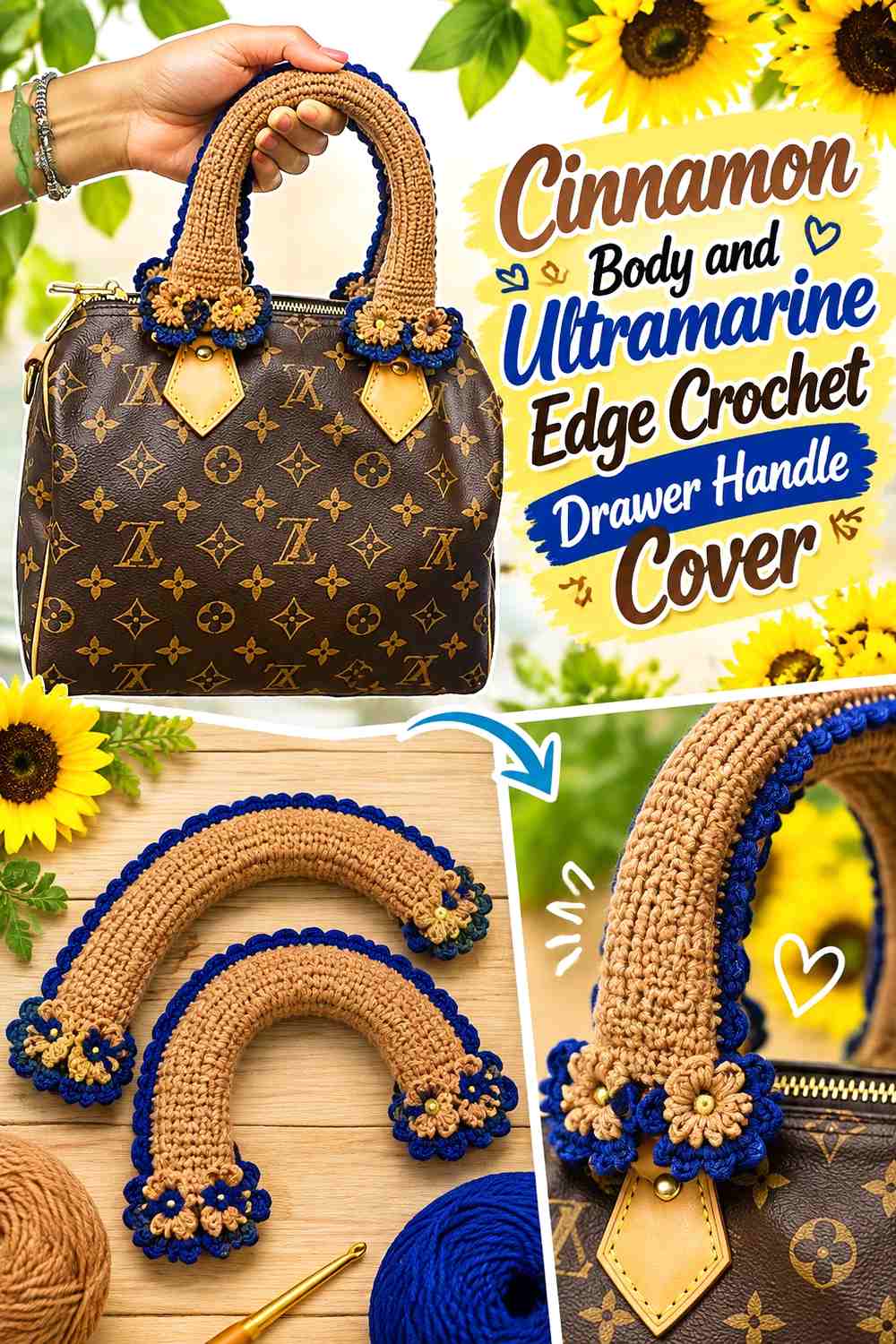
Make cinnamon the main surface color and reserve ultramarine for the visible edges of the handle cover. This keeps the warm shade prominent while the blue creates a narrow outline around it. On a row of drawer pulls, the repeated ultramarine edge can connect separate cinnamon covers without requiring equal amounts of both colors.
Let Cinnamon Cover the Main Drawer-Handle Grip
Cinnamon works well as the larger block when you want the color relationship to feel warm first and blue second. Keep most of the area touched by the hand in cinnamon, then move the color change toward the ends or outer edge.
This placement also gives you enough uninterrupted cinnamon fabric for stitch texture to remain part of the design. Too many narrow changes across such a small surface can make the handle cover read as stripes before the crochet texture is noticed.
Use Ultramarine to Define the Cinnamon Outer Edge
A narrow ultramarine finish can make the cinnamon section look more deliberately framed, especially when the drawer itself is a light neutral. Repeat that blue edge on every handle if you want a consistent line across several drawers.
If ultramarine already appears elsewhere in the room, the small edging can connect the furniture to that color without covering every handle in blue.
Creator Credit: Crocket Crochet
2. Ultramarine Body And Cinnamon End Band Crochet Drawer Handle Cover

Reverse the hierarchy by giving ultramarine most of the cover and moving cinnamon to the ends. This produces a cooler overall handle while retaining enough warm color to keep the palette from becoming a single blue block. It is especially useful when you want cinnamon to function as punctuation rather than the main field.
Let Ultramarine Dominate the Drawer Handle Surface
Using ultramarine across the center makes the blue immediately recognizable even on a narrow drawer pull. Keep this section relatively uninterrupted if you want the color itself, rather than a stripe sequence, to provide most of the visual impact.
Across multiple drawers, the repeated ultramarine centers create a stronger horizontal rhythm than scattered blue accents would.
Place Cinnamon at the Ultramarine Handle Ends
Cinnamon bands at the ends can visually mark where the cover finishes without breaking up the central grip. This is a useful placement when the middle of the handle is the most visible portion from straight ahead.
Keep the cinnamon bands similar in visual width across a set. Uneven end accents can become more noticeable when several drawer handles are aligned closely.
Creator Credit: Lollipop Crochet
3. Cinnamon Ultramarine And Ivory Crochet Drawer Handle Cover

Ivory can act as a separator between the two stronger colors. Rather than placing cinnamon directly beside ultramarine everywhere, use ivory in a narrow center or transition band so each main shade has clearer boundaries. This can be particularly useful when your chosen cinnamon and ultramarine yarns are similar in lightness.
Ivory Gives Cinnamon and Ultramarine More Separation
Keep ivory narrow enough that it supports rather than replaces the main palette. A slim ivory band between cinnamon and ultramarine can make both colors easier to distinguish on a small handle where there is little room for gradual transitions.
Ivory can also be repeated as the same dividing line on every drawer, making the three-color treatment look intentional rather than like unrelated color changes.
Keep Cinnamon and Ultramarine Larger Than the Ivory Accent
If cinnamon, ultramarine, and ivory all occupy equal areas, the design becomes a three-color scheme rather than a cinnamon-and-blue palette with a neutral helper. Decide which of the first two colors should dominate, then give ivory the smallest visual share.
This hierarchy is particularly useful across furniture with many handles because the neutral prevents the repeated warm-and-cool contrast from becoming too fragmented.
Creator Credit: Tanya craft channel
4. Cinnamon And Ultramarine Narrow Stripe Crochet Drawer Handle Cover

Alternating stripes give both colors repeated visibility instead of assigning one to the body and the other to the border. On a drawer handle, narrow stripes can create a lively rhythm, but they need enough difference to remain distinct from normal viewing distance.
Give Cinnamon Slightly More Space Than Ultramarine Stripes
A striped cover does not require equal stripe widths. Allowing cinnamon to occupy somewhat more surface area can keep the warm base recognizable while ultramarine provides repeated cool interruptions.
This unequal balance is useful when several handles will be covered because the finished furniture still reads as predominantly cinnamon rather than as an evenly mixed pattern.
Keep Ultramarine Stripes Visible Across the Drawer Row
Before repeating narrow ultramarine stripes on every handle, step away from the furniture and check whether the blue still registers. Tiny stripes that look clearly separated in your hands can visually disappear against a dark drawer front.
If that happens, reduce the number of color changes and make each ultramarine section more substantial rather than adding more stripes.
Creator Credit: Klungmai Shop
5. Cinnamon Ultramarine And Antique Gold Crochet Drawer Handle Cover
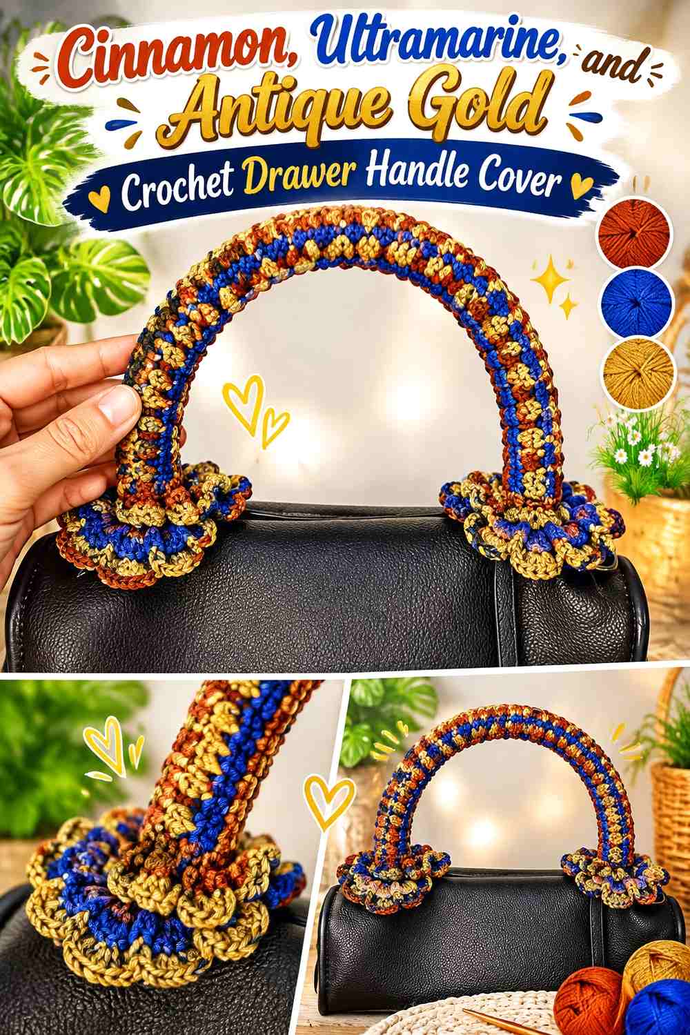
A muted antique-gold color can bridge some of the visual distance between earthy cinnamon and strong ultramarine. Use it sparingly so the scheme does not turn into three equally dominant colors. A narrow gold-toned detail is especially useful when the drawer hardware itself has a warm metal appearance.
Let Cinnamon Connect the Antique Gold to the Drawer Cover
Place cinnamon beside the gold-toned accent when you want a smoother warm transition before ultramarine appears. On a small handle, this can be as restrained as a cinnamon body with a narrow warm accent before the blue edge.
Keeping related warm colors adjacent gives the ultramarine a more clearly defined contrasting role.
Reserve Ultramarine for a Stronger Accent Against Antique Gold
Ultramarine can become the sharpest point of contrast in this palette, so it does not need to occupy as much area as cinnamon. Consider using it where the handle cover is most visible from the front rather than spreading tiny blue details around the entire piece.
If your furniture already has decorative hardware, keep the ultramarine placement simple so color does not compete with the handle shape.
Creator Credit: Denara Craft
6. Cinnamon Ultramarine And Sage Crochet Drawer Handle Cover

Sage introduces a muted green between the warm cinnamon and cooler ultramarine. It works best as a supporting shade rather than a third major block, particularly on compact drawer handles where three strong sections can feel crowded.
Use Sage to Soften the Jump From Cinnamon to Ultramarine
A small sage band can create a quieter transition between cinnamon and ultramarine. Place it between the two main colors when their direct contrast feels stronger than you want for the furniture.
This approach can suit drawer fronts that already contain several warm or natural finishes because the green acts as a restrained middle note rather than another intense accent.
Keep Ultramarine Stronger Than Sage on the Drawer Handle
Sage and ultramarine are both cooler than cinnamon, but they should not automatically receive equal space. Keep ultramarine more noticeable if the blue is an essential part of the article palette, and let sage occupy a narrower section or occasional repeated detail.
If sage begins to dominate, reduce its coverage rather than adding more cinnamon and blue to compensate. Fewer color blocks usually read more clearly on a small handle.
Creator Credit: อิ๋วโครเชต์ Rima Handmade
7. Cinnamon Ultramarine And Soft Coral Crochet Drawer Handle Cover

Soft coral stays on the warm side of the palette but differs enough from cinnamon to create a visible secondary accent. Used in the center of the cover, it can form a warm focal band with ultramarine supplying the cooler counterpoint.
Keep Cinnamon Larger Than the Soft Coral Accent
Treat coral as a highlight rather than allowing it to divide the handle into another equal color block. A cinnamon-led cover with a small coral section keeps the palette anchored while introducing a lighter warm note.
This is especially useful when multiple handles are aligned because a repeated narrow coral accent can create continuity without overwhelming the cinnamon base.
Place Ultramarine Where It Can Balance the Coral Warmth
Ultramarine can sit at the opposite edge or flank the warmer central section. The goal is not perfect symmetry but enough blue presence that the finished cover still reads as a cinnamon-and-ultramarine project.
Check the entire drawer front rather than one cover in isolation. Coral repeated across many handles can become more visually prominent than expected.
Creator Credit: Handmade4U
8. Cinnamon Ultramarine And Charcoal Crochet Drawer Handle Cover

Charcoal gives this palette a darker framing color. Instead of using a pale neutral to separate cinnamon and ultramarine, use charcoal around the edge or connection area to make the overall drawer-handle treatment deeper and more defined.
Let Ultramarine Remain Visible Beside Charcoal
Dark ultramarine and charcoal can become difficult to distinguish if their values are too close. Compare the two yarns before placing them in narrow neighboring bands.
If they merge visually, increase the ultramarine section or place cinnamon between them. The goal is to preserve the blue as a recognizable color rather than letting it disappear into the dark neutral.
Use Charcoal to Frame Cinnamon Without Covering It
Charcoal works effectively as a narrow outline around cinnamon because the warm center remains clearly visible. Keep the dark neutral concentrated at the edge, joining area, or ends instead of letting it take over the grip.
This gives darker furniture a defined handle treatment while preserving enough cinnamon to prevent the palette from becoming predominantly blue and gray.
Creator Credit: hugmai
9. Cinnamon Ultramarine And Dusty Blush Crochet Drawer Handle Cover

Dusty blush can lighten the warm side of the combination without creating the sharp contrast of ivory. It is useful when you want cinnamon to remain important but need a softer supporting color around small blue details.
Place Dusty Blush Near Cinnamon for a Softer Warm Transition
Keep blush beside cinnamon rather than scattering it between every ultramarine section. The close warm relationship makes those two shades feel like a grouped part of the palette.
On a drawer handle, this could mean a cinnamon center with blush toward one edge and ultramarine defining the opposite side.
Let Ultramarine Provide the Darker Visual Anchor
With two softer warm shades present, ultramarine can carry more of the visual definition. A single clear blue section may work better than several tiny blue marks because it prevents the warm colors from visually taking over.
Check the balance across the full set of handles. Even a modest ultramarine section can become a strong repeated feature when it appears on every drawer.
Creator Credit: Magic in loopz
10. Cinnamon Ultramarine And Mustard Crochet Drawer Handle Cover

Mustard intensifies the warm side of the scheme and can make ultramarine feel even more distinct. Because both cinnamon and mustard have visual presence, keep one subordinate so the handle cover does not split into three competing blocks.
Keep Mustard Narrow Beside a Larger Cinnamon Field
A thin mustard band can add warmth without replacing cinnamon as the main earthy color. Position it at the center, end, or just before the ultramarine section rather than repeating it everywhere.
This is particularly effective when the drawer face itself is plain, because a small warm accent has enough surrounding space to register clearly.
Use Ultramarine to Counter the Cinnamon and Mustard Warmth
Ultramarine should remain visually substantial in this palette. If cinnamon and mustard occupy nearly the entire cover, the blue may start to look like an afterthought.
Give ultramarine one clearly defined area—such as a broad edge or one side of the cover—so the warm/cool relationship remains intentional.
Creator Credit: Tan Handicraft
11. Cinnamon Ultramarine And Espresso Crochet Drawer Handle Cover

Espresso deepens the earthy side of cinnamon without introducing another unrelated hue. Used around the ends or underside of a cover, it can give the palette a darker foundation while ultramarine supplies the color contrast.
Let Cinnamon Separate Espresso From Ultramarine
Placing cinnamon between espresso and ultramarine helps prevent the two darker colors from merging into one heavy block. The warmer middle shade creates a more obvious visual transition.
This is useful on narrow drawer handles where there may not be enough room for several dark bands to remain individually recognizable.
Keep Ultramarine Away From an Overly Dark Espresso Edge
If ultramarine sits directly beside espresso, compare them from a distance before repeating the layout across multiple drawers. A very deep blue can lose definition beside dark brown.
You can correct this by giving ultramarine a wider area or by shifting cinnamon between the two darker shades.
Creator Credit: Irma Tri Austurina
12. Cinnamon Ultramarine And Stone Gray Crochet Drawer Handle Cover

Stone gray offers a quieter neutral than bright ivory while still helping cinnamon and ultramarine occupy separate visual zones. This palette can work particularly well when the furniture itself contains gray, black, or cool neutral details.
Use Stone Gray to Give Ultramarine Breathing Room
Place stone gray beside ultramarine if you want the blue to stand apart without using a bright white separator. The gray should remain noticeably different in value from the blue so the boundary does not disappear.
A narrow gray band can be enough on each handle; repeating that small separation across the drawer row creates consistency.
Keep Cinnamon Visible Against the Stone Gray Neutral
Cinnamon may look more muted beside stone gray than beside ivory, so give it enough surface area to remain recognizable. A broad cinnamon section can prevent the neutral from making the handle cover feel predominantly blue-gray.
If the drawer face itself is gray, check the finished palette against the furniture before deciding how much stone gray to use.
Creator Credit: Maariyah Creative Arts
13. Reversed Cinnamon And Ultramarine Crochet Drawer Handle Cover Set

Instead of giving every drawer handle the same color arrangement, make two coordinated versions: one cinnamon-led and one ultramarine-led. Alternating them across the furniture creates variation while keeping the same two-color vocabulary.
Alternate Cinnamon-Led Covers Across the Drawer Row
Use cinnamon as the main color on every other handle and reserve ultramarine for the edge or center accent. This creates a warm repeating beat without making every cover identical.
The alternating arrangement works most clearly when the color locations stay simple. Too many secondary accents can hide the intended cinnamon-led versus ultramarine-led pattern.
Reverse Ultramarine and Cinnamon Rather Than Adding More Colors
On the alternate handles, swap the visual hierarchy instead of introducing another accent shade. Let ultramarine take the main surface while cinnamon moves into the smaller detail.
This gives the furniture variety using only the original pair and can be especially useful when you want a coordinated set without a repetitive one-layout look.
Check Cinnamon and Ultramarine Balance Across the Whole Furniture Piece
Stand back before deciding that both versions need exactly equal numbers. A tall dresser, asymmetrical cabinet, or furniture piece with differently sized drawers may look more balanced with one arrangement repeated more often.
Judge the entire row or column of handles rather than treating each cover as an isolated color project.
Creator Credit: Sabs Crochet Arts
Which Cinnamon and Ultramarine Drawer Handle Palette Should You Choose?
For the warmest overall result, start with the cinnamon-led body, narrow-stripe, or espresso-supported ideas. If you want the blue to be noticed first, the ultramarine-body or charcoal-framed versions give it more visual weight.
Ivory, dusty blush, and stone gray are useful when you want more breathing room between the two main colors. Mustard, coral, sage, and antique gold introduce a stronger third-color direction, so they work better when you deliberately want the drawer handles to become a visible decorative feature.
For furniture with many identical handles, the reversed two-color set is a useful way to create variation without expanding the palette. Whatever arrangement you choose, test one finished color layout against the actual drawer front before repeating it across the whole piece.
Conclusion
Cinnamon and ultramarine can produce very different crochet drawer handle covers depending on which shade leads and how much visual space each receives. A cinnamon body with a blue edge feels substantially different from an ultramarine body with cinnamon ends, even though the same two core colors are involved.
Choose a lighter neutral such as ivory when you need stronger separation, or a darker shade such as charcoal or espresso when you want more framing. Sage, coral, mustard, and antique gold are more noticeable additions and work best when they have a clearly limited role.
For the cleanest two-color treatment, keep the palette to cinnamon and ultramarine and vary their placement instead. Use the linked tutorials for their original construction details, then confirm the shape and clearance of your own drawer hardware before adapting any handle-cover concept.
Frequently Asked Questions
Should cinnamon or ultramarine be the main color on a crochet drawer handle cover?
Either can lead. Cinnamon creates a warmer overall handle, while an ultramarine-dominant cover puts the cooler blue forward. Check both yarns against the actual drawer front before deciding because the furniture color can change which shade appears more prominent.
How can I tell whether cinnamon and ultramarine have enough contrast?
Place the yarns side by side and view them from farther away. A grayscale photo can also help reveal whether their light/dark values are too similar. If the boundary becomes difficult to see, insert a lighter neutral or increase the size of each color block.
What neutral works between cinnamon and ultramarine?
Ivory creates a clearer light break, while stone gray gives a quieter transition. Charcoal provides darker framing instead of separation. Choose the neutral according to whether you want the finished drawer handle to look lighter, softer, or more strongly outlined.
Can I use three colors on a small crochet drawer handle cover?
Yes, but give the colors different roles. Cinnamon and ultramarine can remain the main pair while the third shade appears only in a center band, edge, or small repeated accent. Equal amounts of three strong colors can make a compact handle look busier than intended.
Should every drawer handle use the same cinnamon and ultramarine arrangement?
Not necessarily. You can repeat one design for a uniform look or alternate cinnamon-led and ultramarine-led versions. If you alternate them, keep the placement rules consistent so the variation still looks planned across the furniture.
How should I adapt a handle-cover tutorial to a drawer pull?
Compare the tutorial’s finished construction with the shape, length, and clearance of your own hardware before making the cover. A bag or refrigerator handle can differ considerably from a drawer pull, so use the creator’s tutorial for its intended construction while planning your adaptation around the actual drawer handle. Make sure the finished cover does not interfere with normal drawer operation.