Iris Blue and Sesame create a useful light-and-deep pairing for a crochet key bowl liner. Iris Blue can give the center stronger visual definition beneath keys, while Sesame can lighten the outer area and separate the crochet from a darker bowl. Reverse those roles and the same two colors produce a much lighter-looking catchall liner with blue reserved for the rim or smaller details.
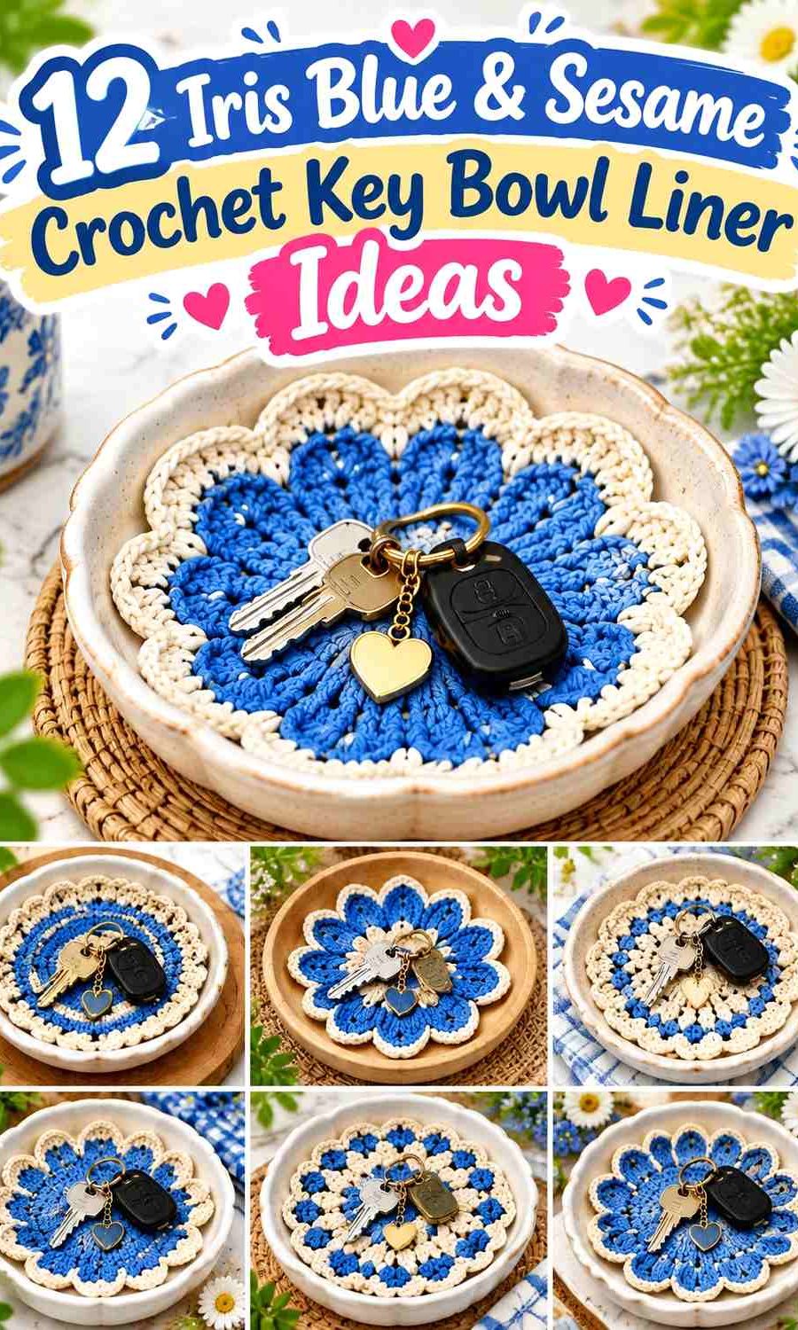
A key bowl liner also needs a different color strategy from a decorative doily. Keys, rings, coins, and other small objects can cover much of the center, so the most important accent does not always belong there. Borders, concentric bands, and outer motifs may remain more visible during everyday use.
The linked tutorials provide flat-circle, coaster, placemat, doily-coaster, or round-base construction references suitable for adapting to the liner concept. The Iris Blue and Sesame palettes below are independent color directions rather than claims that the creators used these exact shades.
Quick List
- Iris Blue center with Sesame rim
- Sesame center with Iris Blue rim
- Broad Iris Blue and Sesame concentric bands
- Sesame field with fine Iris Blue rings
- Iris Blue medallion with Sesame middle and blue edge
- Sesame medallion with Iris Blue middle and neutral edge
- Half Iris Blue and half Sesame liner
- Alternating Iris Blue and Sesame radial sections
- Iris Blue liner with a Sesame key-drop center
- Sesame liner with an Iris Blue perimeter
- Marled Iris Blue and Sesame liner with a solid edge
- Graduated Iris Blue and Sesame ring liner
Plan Iris Blue and Sesame Around What Keys Will Cover
Before choosing the dominant color, think about how the bowl is actually used. The center may spend much of the day underneath keys, while the outer inch or two of the liner remains visible. If Iris Blue is the color you most want to see, using all of it in a small center can hide the strongest part of the palette once the bowl is occupied.
For a liner that usually holds several objects, repeating Iris Blue at the rim or in an outer band can keep the palette recognizable. For a bowl that is often empty and displayed openly, a contrasting center motif can have more impact.
Keep Iris Blue and Sesame Texture Practical Under Keys
A flat, relatively continuous center is worth considering when keys will be dropped onto the liner frequently. Highly open or heavily raised details may give key teeth, split rings, or small hardware more places to catch.
That does not mean the liner has to be visually plain. Iris Blue and Sesame can create interest through ring width, radial sections, borders, and color hierarchy without requiring a highly dimensional center.
Use Iris Blue and Sesame Contrast to Define the Bowl Shape
Compare your actual yarns before deciding how fine the color details should be. If Iris Blue is noticeably darker than Sesame, even a relatively narrow blue ring may remain clear. If their light/dark values are closer, broader blocks can communicate the palette more effectively.
A quick grayscale photo can help separate hue differences from value differences. This is particularly useful when planning small concentric rings or narrow edging.
1. Iris Blue Center and Sesame Rim Crochet Key Bowl Liner
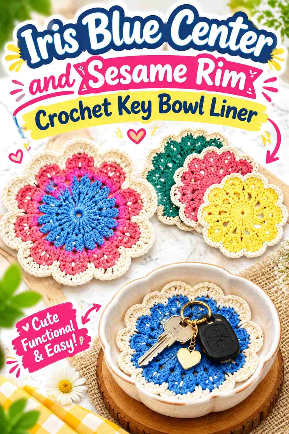
This straightforward layout gives Iris Blue most of the central surface while Sesame surrounds it with a lighter outer ring. It works well when you want the bowl to read as blue when relatively empty but still retain a visible Sesame boundary once keys cover the middle.
Iris Blue Can Anchor the Main Key Bowl Liner Center
Use Iris Blue across a substantial central circle rather than limiting it to a tiny dot. The larger field keeps the deeper shade recognizable around the edges of a pile of keys.
If the bowl usually holds many objects, extend Iris Blue far enough outward that some of it remains visible instead of disappearing completely under the contents.
Sesame Can Separate Iris Blue From the Key Bowl Rim
A Sesame outer ring creates a lighter transition between the blue center and the bowl itself. This can be especially useful when the bowl is already dark and an Iris Blue edge would otherwise visually merge with it.
Keep the Sesame width proportional to the liner. A very wide neutral border can change the design from Iris Blue-dominant to nearly equal two-color blocking.
Creator Credit: ElyseCrochets 💌
2. Sesame Center and Iris Blue Rim Crochet Key Bowl Liner
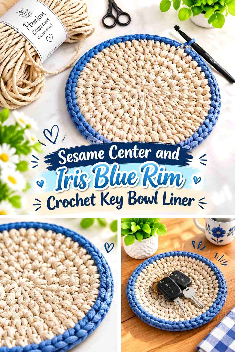
Reverse the first color hierarchy by letting Sesame cover the main key-drop area and concentrating Iris Blue around the perimeter. This keeps the liner visually light while ensuring the deeper color remains visible even when the center is occupied.
Sesame Keeps the Main Crochet Key Bowl Liner Light
A broad Sesame center gives keys and other small objects a neutral-looking background while preserving a clear contrast with the outer blue ring.
Keep the center largely uninterrupted if everyday function matters more than intricate colorwork. The color difference at the edge is already enough to give the liner visual structure.
Iris Blue Gives the Sesame Key Bowl Liner a Defined Boundary
Place Iris Blue in the final outer section so it follows the bowl’s circular shape. Because the rim often remains visible around stored keys, this location can make a relatively small amount of Iris Blue look important.
If your bowl itself is close to Iris Blue in value, increase the Sesame area near the transition rather than assuming the dark border will always remain clearly separated.
Creator Credit: yarnTh3ory
3. Broad Iris Blue and Sesame Concentric-Band Crochet Key Bowl Liner
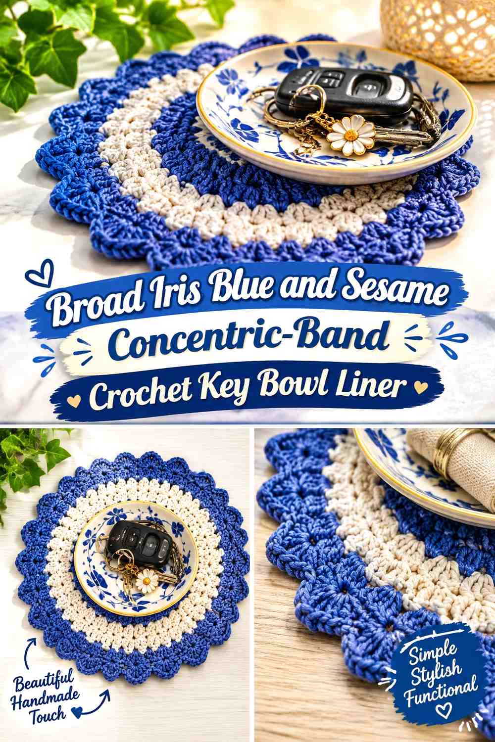
Alternate several substantial Iris Blue and Sesame rings from the center outward. Broad bands give each color enough space to remain identifiable and create a clearer graphic effect than very fine striping.
Iris Blue Broad Rings Need Enough Sesame Between Them
Separate major Iris Blue bands with visible Sesame intervals. If the dark rings sit too close together, they can visually merge and make the liner appear mostly blue.
Look at the piece from the same distance at which the key bowl is normally seen. A stripe rhythm that looks obvious close up may simplify considerably from across a room.
Sesame Bands Can Control the Visual Weight of Iris Blue
Widening Sesame produces a lighter overall liner without changing the actual shades. Increasing the Iris Blue bands produces a deeper result.
The outermost band deserves particular attention because it remains visible when the center is covered. Choose its color deliberately instead of treating it as whichever shade happens to come next.
Creator Credit: lerugi crochets
4. Sesame Crochet Key Bowl Liner With Fine Iris Blue Rings
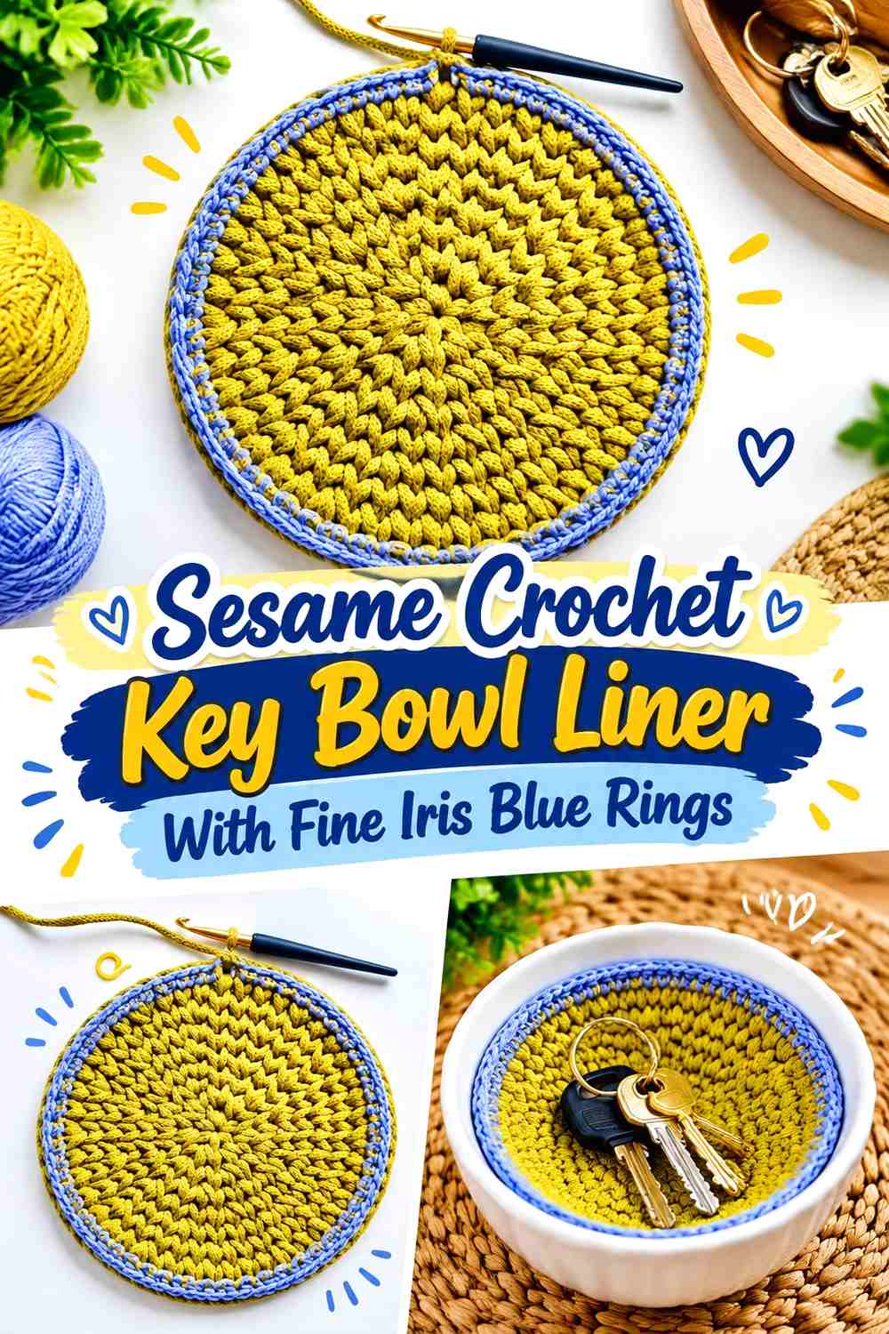
Make Sesame the continuous field and introduce Iris Blue as narrow concentric lines. This provides repeated contrast without dividing the small liner into several equally dominant color blocks.
Iris Blue Fine Rings Need Predictable Spacing Across Sesame
Repeat Iris Blue at clear intervals instead of adding isolated lines wherever a color change feels convenient. A consistent rhythm helps the narrow accents look deliberate after keys partially cover them.
From a distance, multiple thin Iris Blue lines may visually merge. Check the liner before adding more rings, especially if the bowl itself is small.
Sesame Should Remain Visible Between Every Iris Blue Ring
Give the lighter shade enough width to remain the obvious background. If the spaces become too narrow, the pattern can start reading as evenly striped instead of Sesame-led.
When the two yarns have modest value contrast, slightly wider Iris Blue bands may work better than extremely fine lines.
Creator Credit: Cheerful Crickets Craft
5. Iris Blue Medallion and Sesame Field Crochet Key Bowl Liner
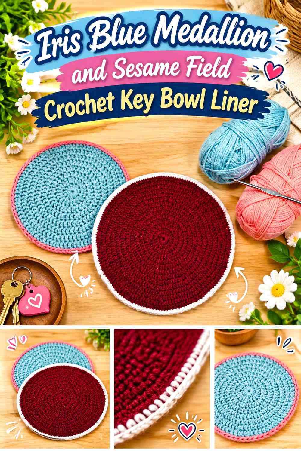
Use Iris Blue as a distinct central medallion, surround it with a larger Sesame field, and repeat Iris Blue once more near the outer edge. Repeating the deeper shade prevents the blue center from becoming visually disconnected from the rest of the liner.
Iris Blue Can Repeat From the Center to the Outer Edge
Start with an Iris Blue focal center, then bring the same color back at the perimeter. This creates a visual relationship between two areas that remain visible under different bowl conditions.
When the keys cover the central medallion, the outer blue repeat still preserves the original palette.
Sesame Gives the Two Iris Blue Areas Useful Separation
Keep a substantial Sesame field between the center and perimeter rather than allowing the two blue zones to dominate most of the liner.
The lighter middle also provides a calm section where everyday contents can sit without competing with multiple small motifs.
Creator Credit: Happy stockist
6. Sesame Medallion and Iris Blue Field Crochet Key Bowl Liner
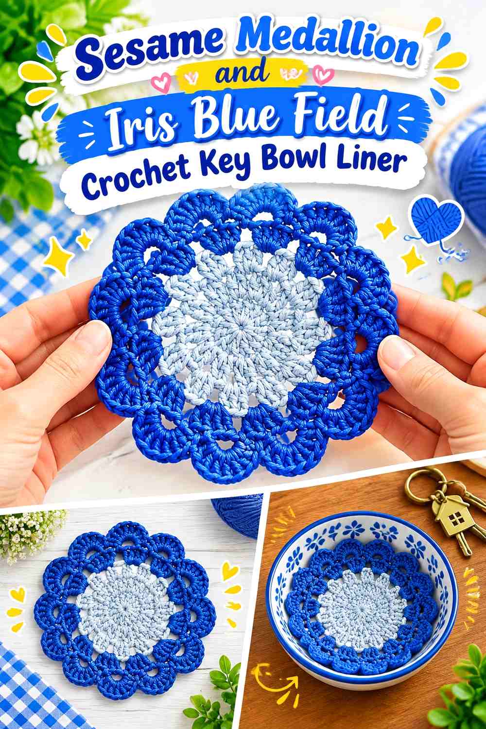
This version places a light Sesame medallion in the middle, surrounds it with a broader Iris Blue field, and brings Sesame back near the edge. The layout keeps Iris Blue dominant while preventing the center and rim from becoming one uninterrupted dark surface.
Sesame Creates a Clear Focal Point Inside the Iris Blue Liner
Make the Sesame center large enough to remain recognizable between or beneath a small group of keys.
A very tiny Sesame center may disappear during use, so consider the normal amount of bowl contents before deciding on the medallion scale.
Iris Blue Can Carry Most of the Area Between Sesame Accents
Use Iris Blue broadly through the middle of the liner. This gives the palette a strong blue identity even though Sesame appears in two strategically visible locations.
Repeat Sesame near the perimeter only if it helps connect the center to the edge. Too many additional neutral bands would weaken the large Iris Blue field.
Creator Credit: Laura Moon
7. Half Iris Blue and Half Sesame Crochet Key Bowl Liner
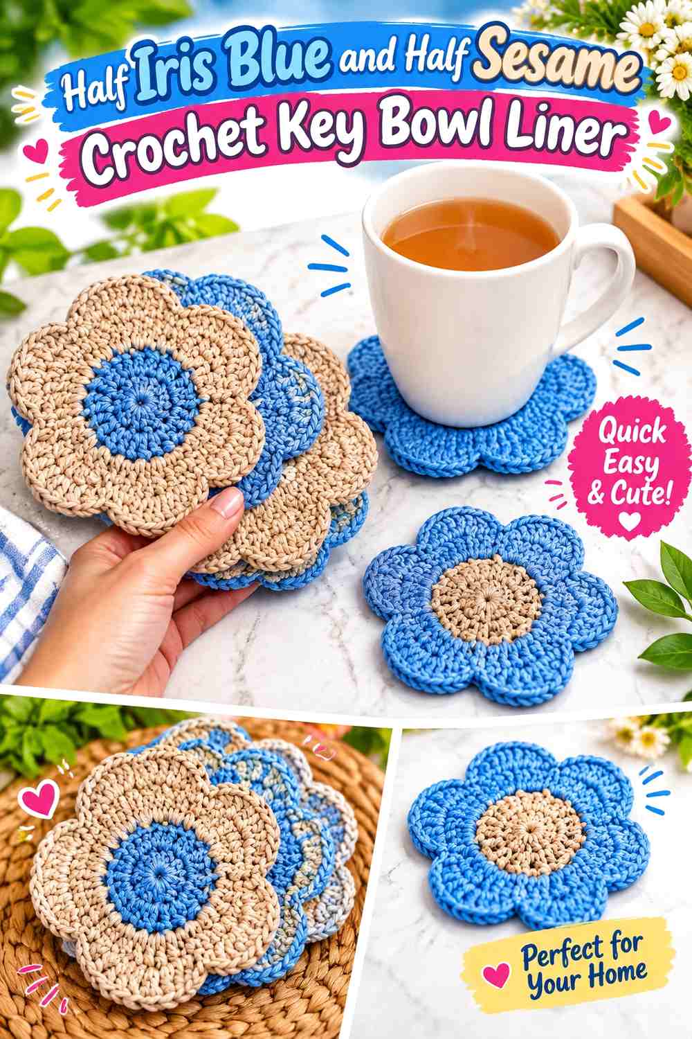
Divide the circle into two substantial color regions instead of building the palette from rings. A half-and-half treatment gives Iris Blue and Sesame similar importance and creates the clearest directional color block in the collection.
Iris Blue Needs a Complete Section Beside Sesame
Give Iris Blue a large uninterrupted area extending from the center toward the edge. Keeping the color intact makes the split easy to understand even when some of the liner is hidden under keys.
A scattered arrangement of smaller blue patches would create a much busier visual effect.
Sesame Should Meet Iris Blue Along a Deliberate Divide
Keep the color boundary clean and purposeful. Because the liner is round, the dividing line becomes an important graphic element rather than just a routine color change.
Rotate the finished liner inside the bowl before settling on its display position. The split can appear horizontal, vertical, or diagonal depending on how it is oriented.
Creator Credit: VivCrochets
8. Radial Iris Blue and Sesame Crochet Key Bowl Liner
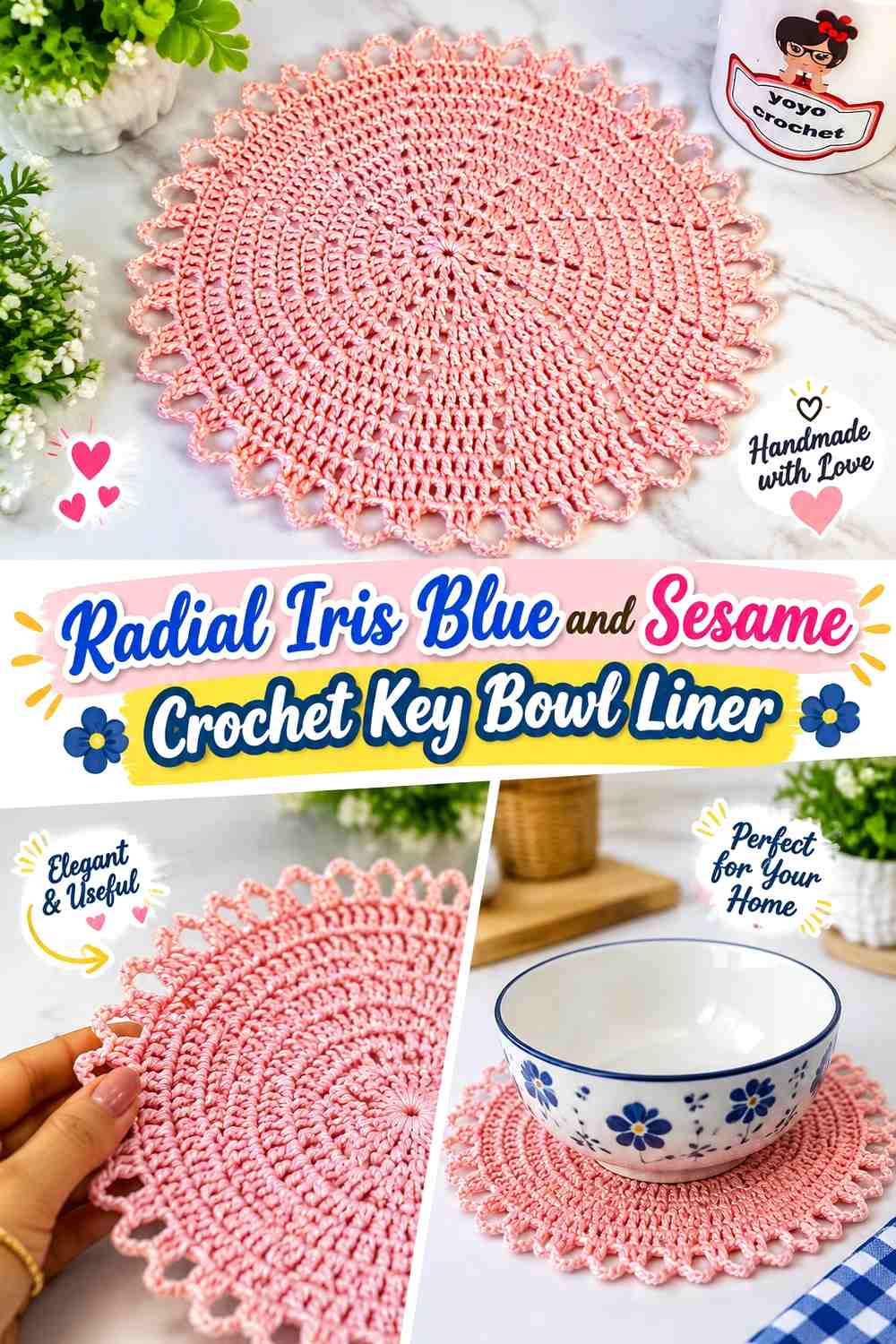
Instead of concentric bands, divide the liner visually into wedge-like sections radiating outward from the center. Alternating Iris Blue and Sesame gives the small circle movement without relying on raised texture.
Iris Blue Radial Sections Should Repeat Clearly Against Sesame
Use a consistent sequence so the Iris Blue wedges feel connected to one another. Irregularly scattered dark sections can become confusing once keys obscure part of the center.
Broader sections generally remain easier to identify than numerous tiny wedges on a small liner.
Sesame Can Keep Iris Blue Radial Blocking From Becoming Too Dense
Let Sesame occupy enough of the circle to preserve visible breaks between blue areas. The lighter sections are especially useful around the outer perimeter, where the wedge pattern is easiest to see.
If the center becomes visually crowded, simplify the meeting point instead of adding another decorative feature.
Creator Credit: yoyo crochet
9. Iris Blue Crochet Key Bowl Liner With a Sesame Key-Drop Center
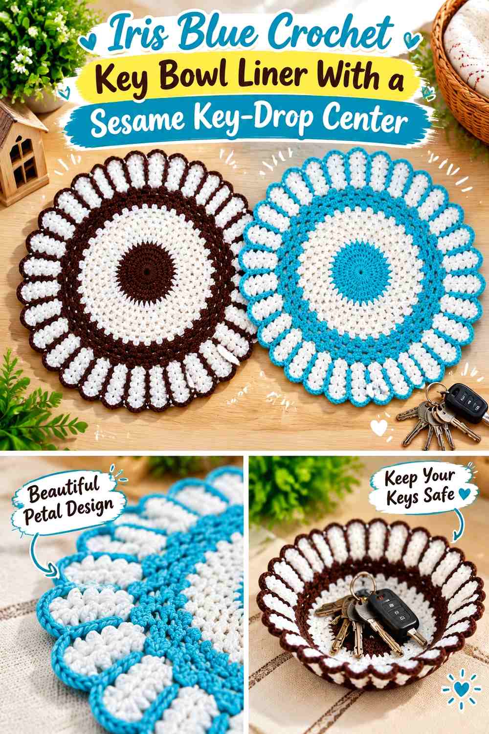
Keep almost the entire liner Iris Blue but reserve one compact Sesame circle in the exact middle. The central neutral works as a focused color break rather than a traditional border.
Sesame Can Define the Center of an Iris Blue Key Bowl Liner
Make the Sesame section large enough to remain visible when the bowl contains only one or two keys. It gives the eye a clear center point within the large blue field.
For a heavily used key bowl, remember that this is also the part most likely to be covered. Choose this palette when you are comfortable with the liner appearing almost entirely Iris Blue while full.
Iris Blue Should Stay Uninterrupted Around the Sesame Center
Avoid adding several additional neutral rings if the main goal is a concentrated center accent. A broad uninterrupted Iris Blue field makes the small Sesame circle more meaningful.
If the outer edge needs additional definition, use texture or a subtle finishing change rather than automatically introducing more Sesame.
Creator Credit: Alka Crochet and Knitting
10. Sesame Crochet Key Bowl Liner With a Strong Iris Blue Perimeter
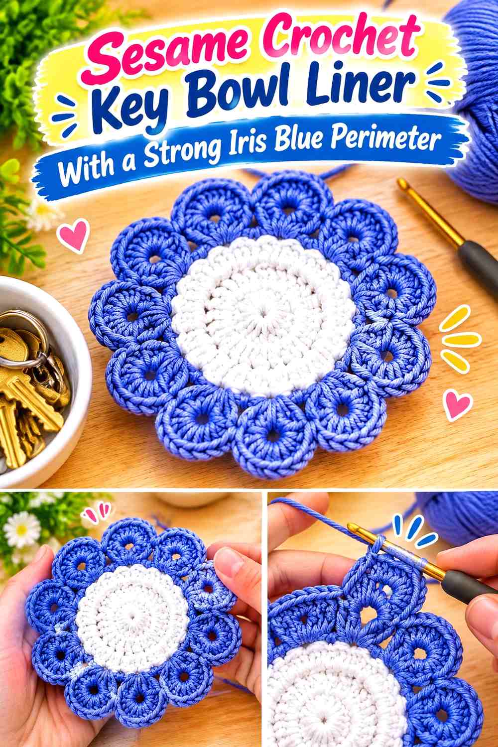
This design is deliberately rim-focused. Sesame fills nearly the entire interior, while Iris Blue appears in one substantial outer ring that remains visible around keys and small objects.
Sesame Keeps the Interior of the Key Bowl Liner Visually Quiet
Use Sesame from the center through most of the liner so keys sit against one continuous color field.
This is useful when the bowl itself or the objects stored inside already create plenty of visual detail and the crochet does not need a complicated center motif.
Iris Blue Can Make the Sesame Perimeter the Main Color Feature
Give the outer blue ring enough width to read as a deliberate frame. Because the perimeter is less likely to be completely covered, the accent can stay noticeable during everyday use.
Check the border against the actual bowl. If the bowl is also very dark, leaving a narrow Sesame transition at the extreme edge can provide additional separation.
Creator Credit: karma crochet
11. Marled Iris Blue and Sesame Crochet Key Bowl Liner

A marled approach mixes Iris Blue and Sesame throughout the surface instead of giving each shade separate territory. The effect is more blended than the striped and color-blocked ideas, so a solid border becomes helpful for restoring a defined outer shape.
Iris Blue and Sesame Need a Swatch Before You Blend Them
Test the colors together and look at the sample from the distance at which the key bowl will normally be viewed. The two shades should still look intentionally mixed rather than collapsing into an indistinct middle color.
If your blending method changes the thickness of the crochet fabric, also check that the finished liner still sits flat inside the bowl.
Solid Iris Blue Can Frame a Mixed Iris Blue and Sesame Center
Use Iris Blue alone around the perimeter when you want a stronger edge around the blended field.
Sesame could take the border role instead for a lighter finish, but using both as separate outer borders may add more visual divisions than the marled center needs.
Creator Credit: Lanas y ovillos
12. Graduated Iris Blue and Sesame Ring Crochet Key Bowl Liner
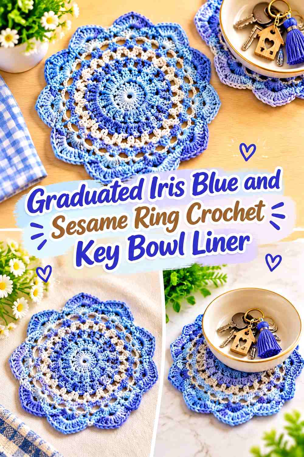
Create a directional change from Iris Blue toward Sesame by altering the width of successive rings. The center can begin blue-heavy, the middle can become more balanced, and the perimeter can finish Sesame-heavy without introducing any intermediate yarn colors.
Iris Blue Rings Can Narrow as Sesame Gains More Space
Begin with a substantial Iris Blue center or inner band and progressively reduce the visual share of blue.
Make each change large enough to be understood on a compact liner. Tiny differences in ring width can disappear once keys and the curved bowl sides interrupt the view.
Sesame Should Become Clearly Stronger Toward the Iris Blue Perimeter
Increase the Sesame areas as you move outward so the finished liner visibly transitions toward a lighter edge.
This arrangement is particularly useful when you want Iris Blue to remain noticeable in an empty bowl while Sesame stays visible around the contents during everyday use.
Creator Credit: Kristines Crochets
Which Iris Blue and Sesame Key Bowl Liner Should You Choose?
For a clearly Iris Blue-dominant liner, Ideas 1, 6, and 9 give the deeper shade most of the surface. Ideas 2, 4, and 10 use Sesame as the larger background while keeping Iris Blue visible through edges or repeated rings.
Ideas 3 and 7 give both colors substantial visual weight, although they do so differently: concentric bands create circular repetition, while the half-and-half layout creates a single graphic division. Idea 8 changes direction completely with radial color placement.
Choose Idea 5 when you want the same accent color repeated at both the center and edge, Idea 11 for the most blended treatment, and Idea 12 when you want the color proportions to change gradually from the center outward.
Conclusion
Iris Blue and Sesame can change a crochet key bowl liner substantially without requiring more than two yarn colors. The main decision is not simply which shade you prefer, but which part of the liner will remain visible after keys and other small objects are placed inside the bowl.
Put Iris Blue at the perimeter when you want the deeper shade visible during everyday use. Use it broadly through the center when a stronger blue foundation matters more. Sesame can lighten large areas, separate blue bands, frame a center motif, or keep the outer edge distinct from a dark bowl.
Whichever palette you choose, test the finished color distribution inside the actual bowl rather than judging it only as a flat crochet circle. Follow the credited tutorials for their exact construction details and adapt the finished diameter to the bowl you intend to line.
Frequently Asked Questions
Should Iris Blue or Sesame Be the Main Color in a Crochet Key Bowl Liner?
Either can lead. Iris Blue produces a deeper-looking liner and works well as a center field or strong perimeter. Sesame creates a lighter overall result and can make smaller Iris Blue rings or borders more prominent.
Where Should Iris Blue Go If Keys Usually Cover the Center?
Consider moving some Iris Blue toward the perimeter, an outer ring, or repeated bands. A center-only accent may disappear once several keys are placed in the bowl, while an outer blue section can remain visible.
How Can I Check Whether Iris Blue and Sesame Have Enough Contrast?
Place the actual yarns together under normal room lighting and compare them in a grayscale photo. If they remain noticeably different in grayscale, small rings and narrow borders should be easier to distinguish visually. If they are similar in value, use larger color blocks.
Is Openwork a Good Choice for an Iris Blue and Sesame Key Bowl Liner?
It can work decoratively, but consider what will be stored in the bowl. Key teeth, rings, and small hardware may interact more easily with large openings or prominent raised details. A flatter center can be more practical when the liner will see frequent everyday use.
Should the Iris Blue and Sesame Border Match the Bowl?
It does not have to match. Instead, consider whether you want the liner edge to blend with the bowl or remain clearly distinct from it. Sesame can create separation against a dark bowl, while Iris Blue can provide a stronger frame against a light interior.
Can I Substitute Other Colors for Iris Blue and Sesame?
Yes. Preserve the relationship that makes your chosen layout work. Replace Iris Blue with another medium-to-deep blue or blue-violet if you want to maintain its anchoring role, and replace Sesame with a light warm neutral when you want similar contrast. The light/dark relationship matters especially for narrow rings and detailed borders.