Jade gives crochet a clear green focal point that can shift from crisp and graphic to earthy or jewel-toned depending on the supporting shade. Pairing Jade with ivory or cream makes stitch boundaries easier to see, while terracotta and antique gold add warmth. Navy, charcoal, and burgundy create deeper combinations, and dusty rose or soft lilac move the palette in a lighter, less expected direction.

Placement matters just as much as the pairing. Jade can cover broad cardigan panels, blanket sections, or a pillow face, while secondary colors define cuffs, borders, handles, brims, necklines, and other smaller areas. These 14 Jade crochet ideas use different projects and different color relationships so the main shade has a clear role in every design.
Quick List
- Jade And Ivory Crochet Cardigan
- Jade And Terracotta Crochet Market Bag
- Jade And Sand Crochet Bucket Hat
- Jade And Soft Pink Crochet Blanket
- Jade And Warm White Crochet Pillow
- Jade And Camel Crochet Scarf
- Jade And Charcoal Crochet Ribbed Hat
- Jade And Cream Crochet Vest
- Jade And Antique Gold Crochet Handbag
- Jade And Dusty Rose Crochet Cowl
- Jade And Navy Crochet Headband
- Jade And Soft Lilac Crochet Top
- Jade And Burgundy Crochet Shawl
- Jade And Oatmeal Crochet Basket
Decide Whether Jade Should Dominate the Crochet Project
Jade can comfortably cover most of a cardigan, vest, blanket, pillow, or shawl because those larger projects provide enough surface for a strong main color. A smaller amount of ivory, cream, pink, or another support shade can then identify edges, stripes, motif changes, and finishing details without competing with the Jade field.
On smaller accessories, the balance needs more control. A bucket hat, headband, or handbag can look fragmented if two or three strong colors are divided into many tiny areas. Keeping Jade on one obvious structural section and concentrating the support color elsewhere usually produces a clearer hierarchy.
Check Light and Dark Contrast Around Jade Crochet Details
Different hues do not automatically create enough contrast for crochet texture. Jade and terracotta, for example, may look distinctly different in hue while still having similar lightness depending on the yarns selected. That softer contrast can work across broad sections but may make a very small border or motif less visible.
Place the yarns side by side before committing to detailed colorwork. If necessary, view a photo in grayscale. When two shades become almost indistinguishable, reserve them for larger color areas and use a lighter or darker yarn around small details that need more definition.
1. Jade And Ivory Crochet Cardigan
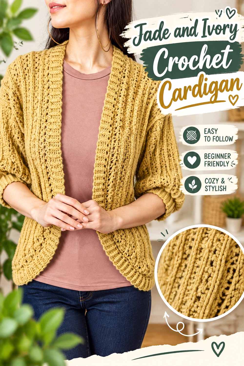
Jade can carry the cardigan body while ivory identifies the areas where the garment changes structure. Keeping the main panels predominantly Jade makes the color feel continuous across the torso, while ivory can define cuffs, front edging, or the neckline without splitting the garment into too many equal sections.
Let Jade Cover the Main Crochet Cardigan Panels
Use Jade across the largest body sections when you want the cardigan to read as primarily green. Large areas also let stitch texture remain part of the surface rather than competing with frequent high-contrast stripes.
If you want more ivory than a narrow trim provides, repeat it in two or three finishing areas rather than inserting unrelated blocks through the center of the cardigan.
Ivory Gives Jade Crochet Cardigan Edges Clear Definition
Ivory can make cuffs, neckline finishing, and front edging noticeably lighter than the Jade body. That separation is useful where one structural part meets another and you want the finished outline to remain easy to see.
Keep the ivory placement consistent. A neckline plus matching cuffs will usually look more connected than a single isolated ivory detail.
Creator Credit: TCDDIY
2. Jade And Terracotta Crochet Market Bag
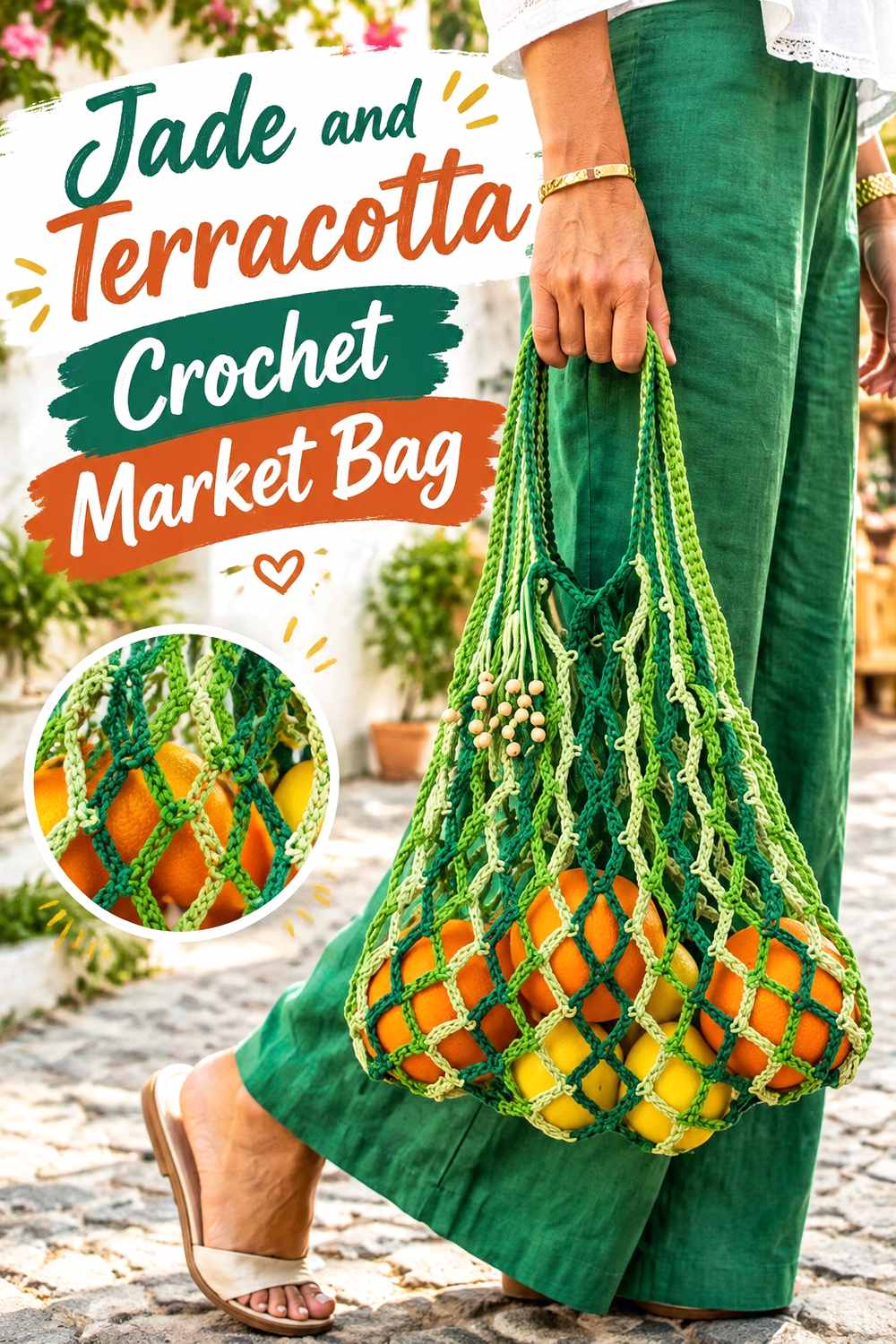
Terracotta adds a warm counterpoint to Jade, making this palette more colorful than a green-and-neutral bag. Because a market bag may already contain open spaces or strong structural lines, use the two colors in broad areas rather than alternating them constantly.
Keep Jade Dominant Across the Crochet Market Bag Body
Use Jade for most of the central bag area so the open fabric retains one clear main color. Numerous narrow color changes can become visually scattered once the bag is filled and the fabric changes shape.
A larger Jade field also gives terracotta a stronger purpose when it appears around the top or handles.
Terracotta Can Define Jade Crochet Market Bag Handles
Handles and the upper edge are natural places for terracotta because those parts already differ from the bag body. The warm accent then frames the Jade rather than interrupting it.
If Jade and terracotta appear similar in lightness, use terracotta in a substantial handle or border area instead of relying on tiny decorative details.
Creator Credit: Home Handwork Diy
3. Jade And Sand Crochet Bucket Hat
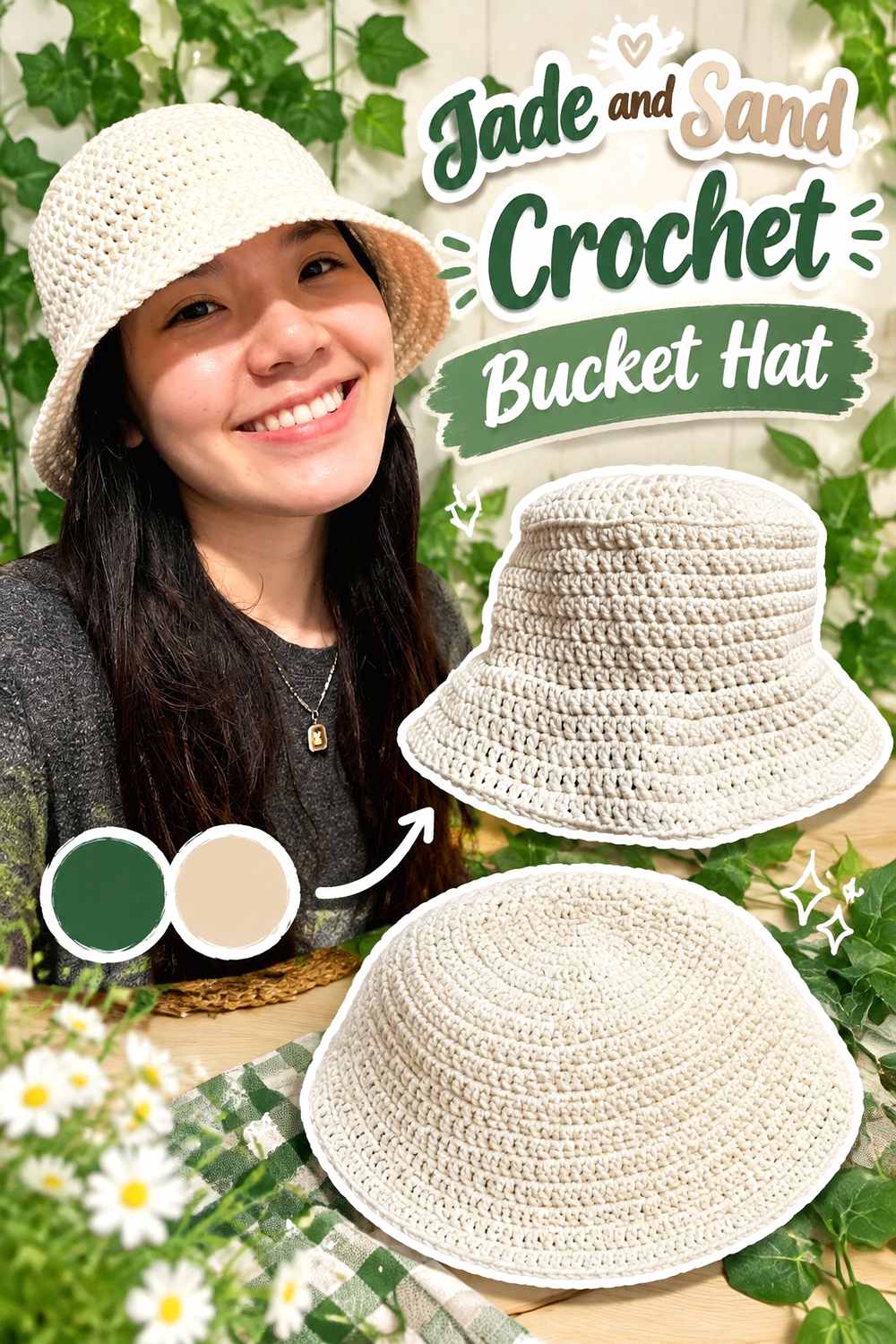
A bucket hat has three visually useful zones: crown, sides, and brim. Jade can dominate the upper two sections while sand creates a lighter brim that makes the change in shape more obvious.
Jade Keeps the Crochet Bucket Hat Crown Visually Continuous
Use Jade through the crown and most of the side section if you want the finished hat to remain strongly Jade-led. A continuous upper area also lets the rounded shaping stay visible without additional stripes breaking it apart.
For a subtler two-color design, keep only the final brim section in sand.
Sand Separates the Brim From the Jade Crochet Bucket Hat
A sand brim gives Jade a light lower boundary and emphasizes the part of the hat that projects outward. Because the shape already changes at the brim, the color transition feels intentional rather than arbitrary.
You can also repeat a narrow sand detail above the brim if you want the support color to appear more than once without overtaking Jade.
Creator Credit: VivCrochets
4. Jade And Soft Pink Crochet Blanket
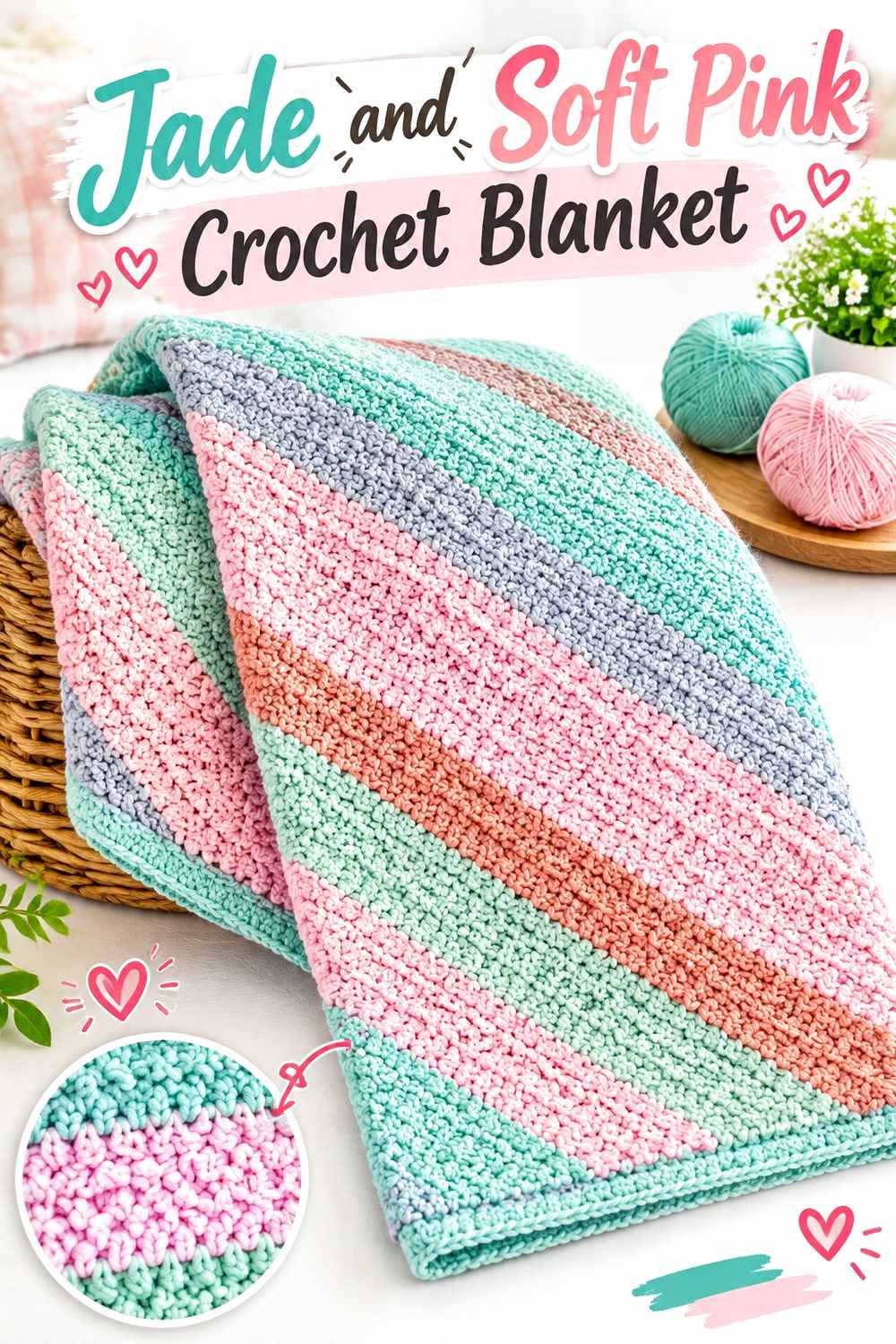
Jade and soft pink create a warmer, gentler contrast than Jade with bright white. A blanket provides enough room to repeat both colors across larger sections, so the palette can be balanced through stripes, blocks, or repeated color intervals rather than small isolated accents.
Give Jade More Crochet Blanket Repeats When It Is the Main Color
If the blanket is meant to feel Jade-centered, give Jade either wider sections or more frequent repetition than the soft pink. Equal distribution changes the effect into a true two-color blanket.
Planning that hierarchy before starting prevents the support color from gradually occupying more visual area than intended.
Soft Pink Can Separate Jade Crochet Blanket Sections
Use soft pink between repeated Jade areas to create a visible break without adding a neutral. This works particularly well when the blanket has a repetitive surface and color is being used to clarify where one visual section ends and another begins.
If the selected pink is close to Jade in value, test the two yarns before depending on the contrast for small details.
Creator Credit: Daisy Farm Crafts
5. Jade And Warm White Crochet Pillow

A pillow gives Jade a large decorative surface where texture and color need to cooperate. Jade can cover most of the face, while warm white highlights borders or selected raised areas without dividing the pillow into too many competing sections.
Let Jade Carry the Main Crochet Pillow Surface
Use Jade across most of the pillow face when texture is already providing visual movement. A single dominant color prevents color changes from fighting with bobbles, ridges, or other noticeable surface details.
If the back is visible in your intended setting, decide whether it should repeat Jade or carry more of the supporting neutral before starting the cover.
Warm White Reveals Details Against a Jade Crochet Pillow
Warm white can outline a border, motif, or other feature that would disappear in a darker green-on-green scheme. Because a pillow is usually viewed from several feet away, this stronger value separation can help smaller surface details remain recognizable.
Keep the light color concentrated around features worth emphasizing rather than distributing it randomly.
Creator Credit: Crochet With Samina
6. Jade And Camel Crochet Scarf
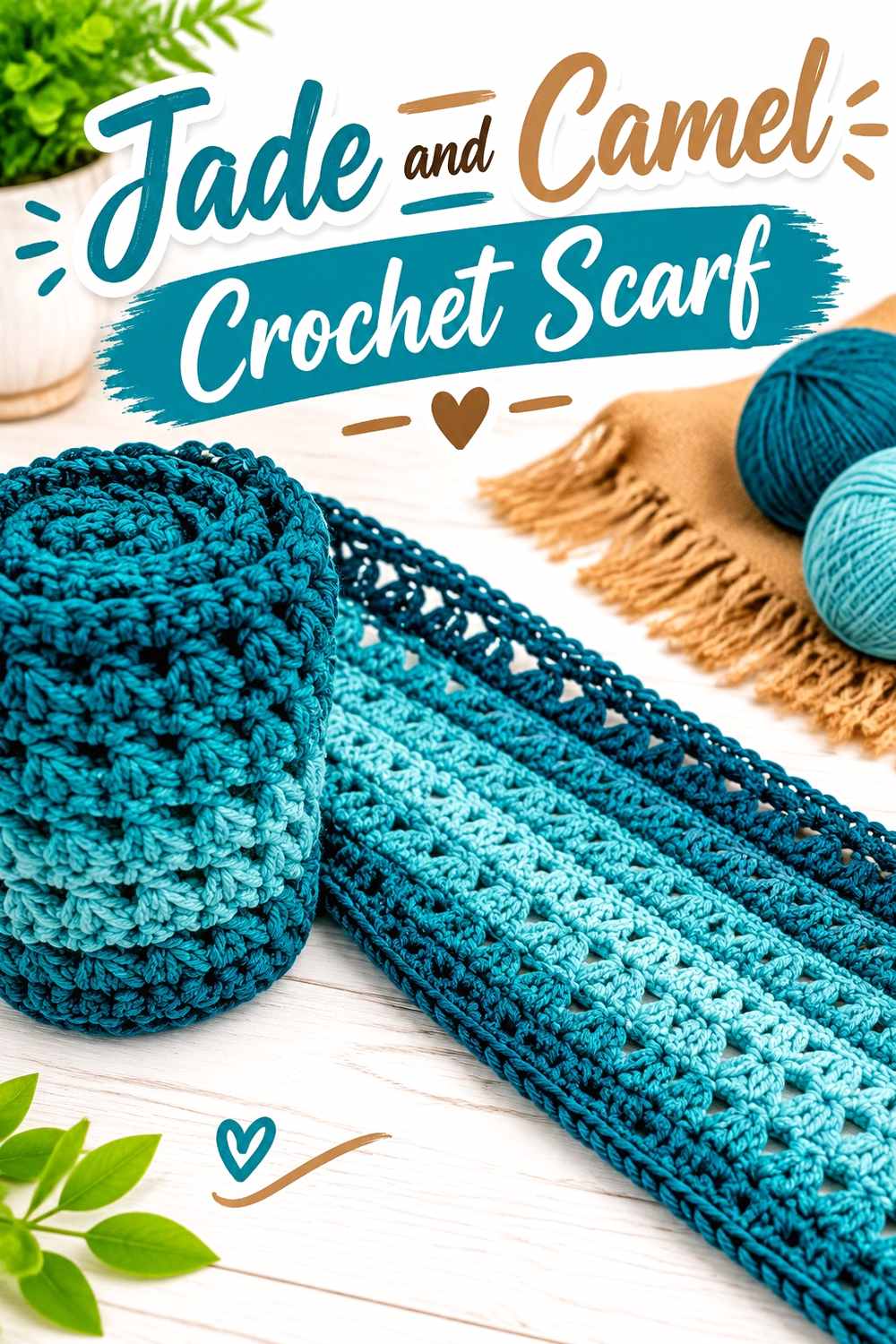
Camel introduces warmth without creating as sharp a contrast as ivory. On a scarf, Jade can appear in broader stretches while camel repeats at deliberate intervals, keeping the main color recognizable even when the scarf is wrapped or folded.
Use Wider Jade Sections Across the Crochet Scarf
A scarf changes appearance depending on how it is worn, so very narrow alternating stripes can become visually scattered. Wider Jade sections preserve the main color even when portions of the fabric overlap.
If Jade is intended to dominate, make the camel repeats narrower or less frequent.
Camel Warms the Transitions Between Jade Crochet Scarf Sections
Camel works well as a repeated transition color rather than a one-time accent at a single end. Repeating it creates a more connected palette and gives the warm shade an intentional rhythm through the Jade fabric.
When adding fringe or another finishing detail, decide whether it should reinforce Jade dominance or repeat camel before committing.
Creator Credit: Bag-O-Day Crochet
7. Jade And Charcoal Crochet Ribbed Hat

Charcoal darkens the Jade palette and creates a useful option when cream or white would provide more contrast than you want. The hat can remain primarily Jade while charcoal defines the fold-over band or another lower section.
Keep Jade Across the Main Crochet Ribbed Hat Crown
Use Jade continuously through the crown so the ribbed surface remains visually uninterrupted. Frequent stripes can compete with the strong vertical or horizontal lines already created by ribbed texture.
A large Jade area also makes the smaller charcoal section appear deliberately structural.
Charcoal Grounds the Band on a Jade Crochet Ribbed Hat
Place charcoal around the fold-over band or lower edge to give the Jade crown a darker base. This creates depth without introducing a bright accent.
Because charcoal and a deep Jade may be close in value, compare them first. If they nearly merge, use a wider charcoal band so the tonal shift remains noticeable.
Creator Credit: MJ’s Off The Hook Designs
8. Jade And Cream Crochet Vest
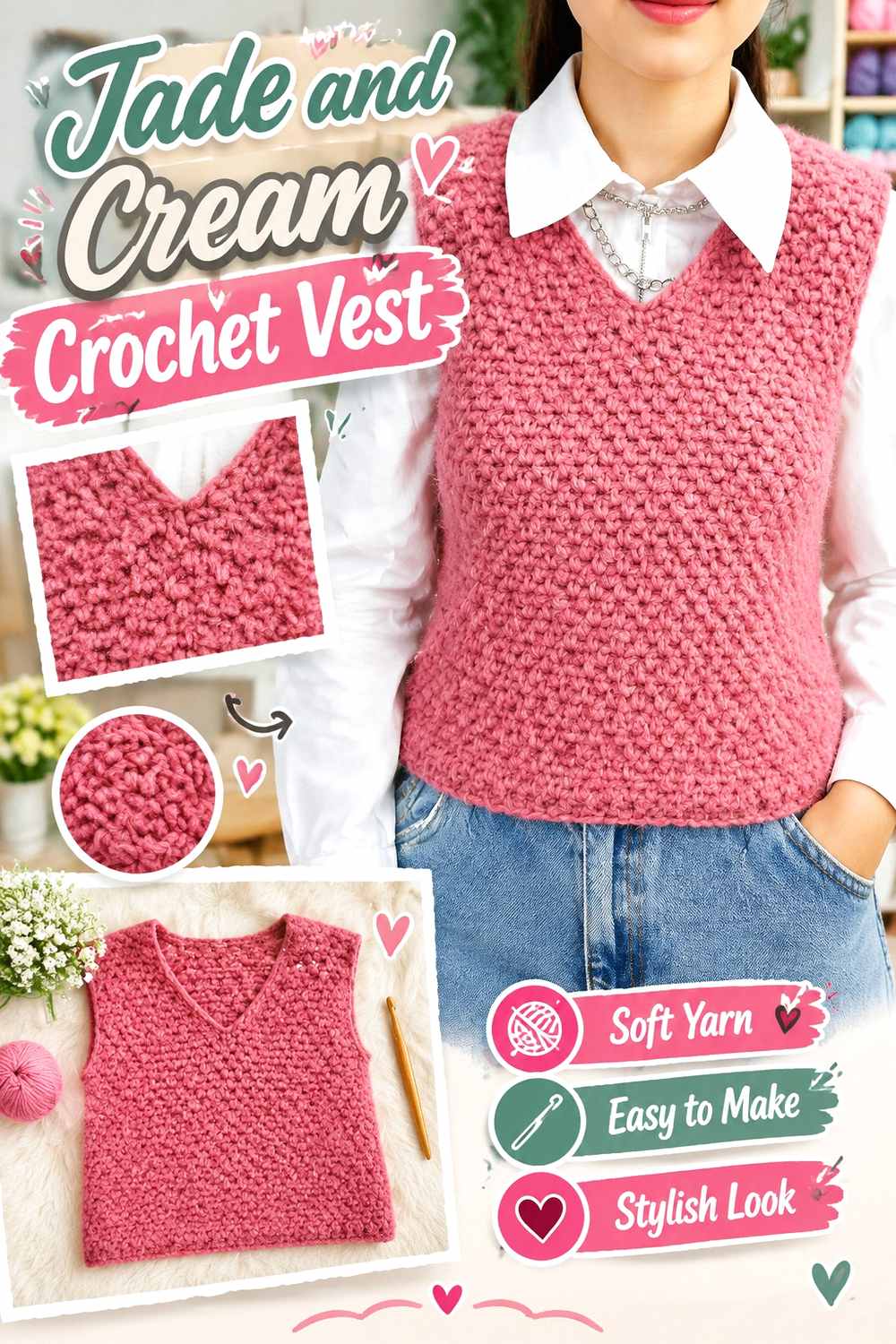
A vest has several important boundaries—neckline, armholes, hem, and often separate body panels—making cream a useful support color. Jade can dominate the torso while cream provides lighter finishing lines around openings.
Jade Creates a Strong Main Field Across the Crochet Vest
Keep Jade on the major body areas if you want the vest to look cohesive across the front and back. This is particularly useful when the construction already introduces seams, joins, or separate sections that naturally divide the garment.
Avoid inserting cream into every available transition; a few repeated finishing areas are usually enough.
Cream Defines the Openings Around a Jade Crochet Vest
Cream can outline armholes and the neckline where a darker Jade edge might visually merge with the body. The lighter color creates an obvious boundary and can also be repeated at the hem for balance.
If you want less contrast, choose a warmer or deeper cream rather than adding an entirely new third color.
Creator Credit: Sirin’s Crochet
9. Jade And Antique Gold Crochet Handbag
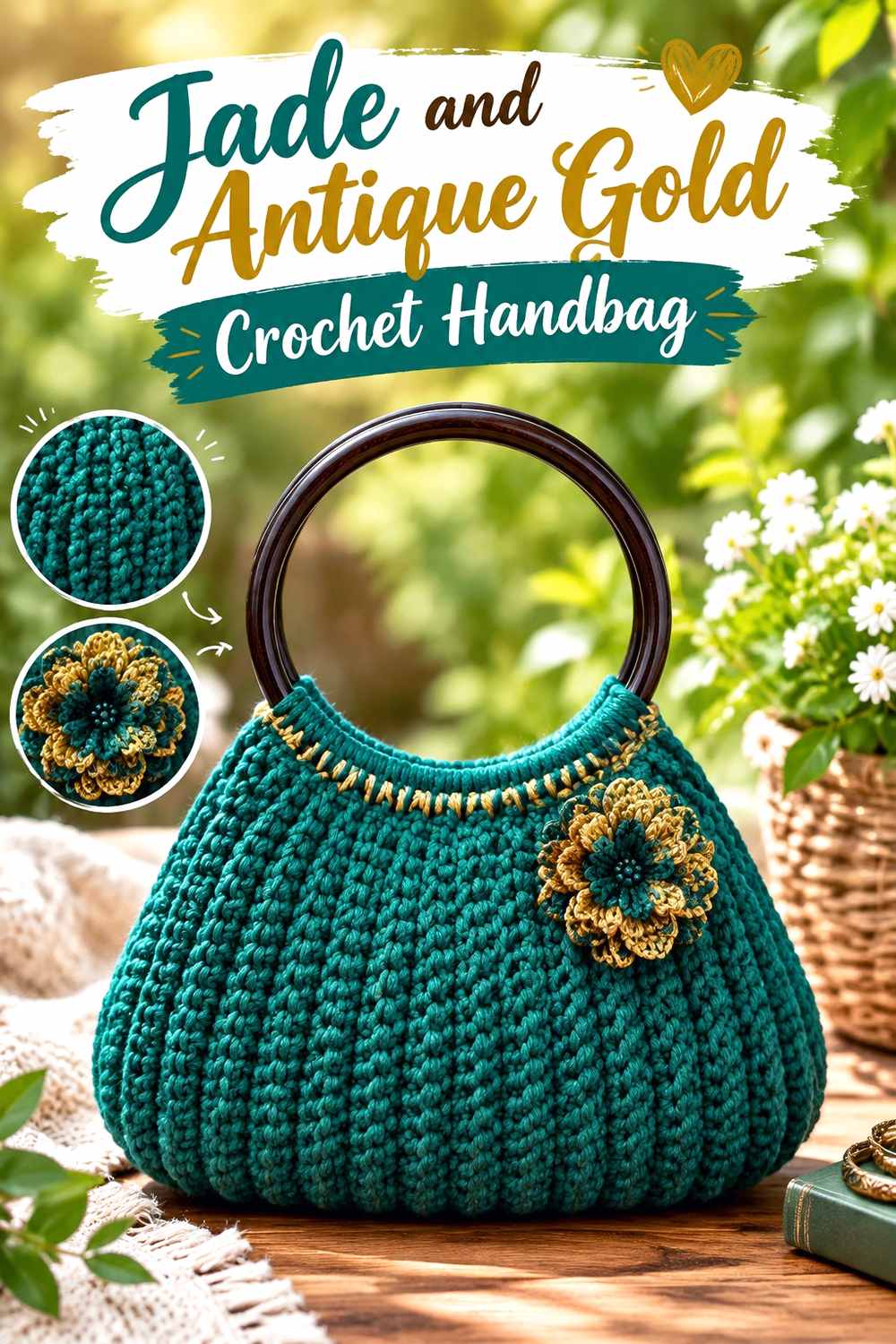
Jade and antique gold create a richer two-color direction in which both shades can attract attention. To avoid competition, let Jade cover the bag body and restrict antique gold to smaller structural or decorative areas.
Keep Jade Dominant Across the Crochet Handbag Body
Use Jade on the broad front and back sections so the bag has one clear visual anchor. This is especially useful on a compact handbag, where equal blocks of two strong colors can quickly make the surface feel divided.
Larger Jade sections also create a background against which the gold-toned accent can be controlled.
Antique Gold Should Accent the Jade Crochet Handbag
Reserve antique gold for handles, an upper border, closure area, or another feature that benefits from emphasis. A smaller amount will usually have more impact than splitting the entire handbag evenly between Jade and gold.
If the two yarns have similar values, keep the gold detail broad enough to be recognizable.
Creator Credit: Naztazia
10. Jade And Dusty Rose Crochet Cowl
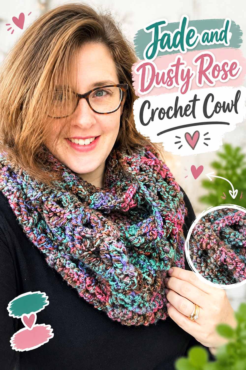
Dusty rose softens Jade with a muted warm contrast. Because a cowl folds and bunches when worn, color placement needs to remain understandable even when only part of the fabric is visible.
Let Jade Occupy the Larger Crochet Cowl Sections
Broader Jade areas keep the main green visible after the cowl is folded or doubled. Tiny alternating stripes may appear more mixed once the fabric gathers around the neck.
Use dusty rose as a deliberate break between larger Jade sections if you want a clear dominant-supporting relationship.
Dusty Rose Softens the Contrast Around Jade Crochet Cowl Texture
Place dusty rose near texture you want to distinguish without introducing the brightness of cream. The pink-green hue difference creates visual change while the muted character can keep the palette from becoming overly sharp.
Check that the dusty rose is light enough to remain visible beside the specific Jade yarn you choose.
Creator Credit: Rich Textures Crochet
11. Jade And Navy Crochet Headband

Navy gives Jade a darker, cooler companion and works well on the limited surface of a headband. Rather than splitting the narrow band into numerous stripes, assign Jade to the main texture and navy to an edge or central finishing feature.
Keep Jade Central on the Crochet Headband
Let Jade cover the widest portion of the headband so its stitch texture remains uninterrupted. On a narrow accessory, even a small amount of secondary color can carry considerable visual weight.
Keeping Jade central therefore allows navy to stay clearly supportive.
Navy Gives the Jade Crochet Headband a Darker Outline
Use navy along an edge, seam area, or another defined section to create a dark frame around Jade. The effect will be stronger when the Jade yarn is medium or light in value.
If your Jade is already very dark, compare the yarns first so the navy does not disappear into it.
Creator Credit: B.Hooked Crochet
12. Jade And Soft Lilac Crochet Top

Soft lilac gives Jade a cooler pastel accent and moves the palette away from traditional green-and-neutral combinations. On a top, Jade can dominate the torso while lilac identifies sleeves, neckline finishing, or another repeated detail.
Jade Should Lead Across the Crochet Top Body
Use Jade across most of the torso to establish one strong color field. Garments already contain natural divisions around sleeves and openings, so the body does not need numerous extra color blocks to create interest.
This approach also gives the softer lilac more impact when it appears.
Soft Lilac Lightens the Edges of a Jade Crochet Top
Place lilac around sleeve details, neckline finishing, or another smaller area where a lighter cool color can separate from Jade. Repeat it at least once elsewhere if the design allows so the accent does not look isolated.
For lower contrast, choose a muted lilac rather than a very pale lavender.
Creator Credit: forthefrills
13. Jade And Burgundy Crochet Shawl

Burgundy creates a deep warm contrast with Jade and produces one of the darkest palettes in this collection. A shawl offers enough surface area for both colors to appear in substantial sections, which is useful when their light-dark difference is modest.
Give Jade the Broadest Area of the Crochet Shawl
If Jade is the main shade, use it through a central field or repeat it more frequently than burgundy. Shawls fold and drape in several directions, so a main color needs enough surface area to remain apparent in different positions.
Avoid relying on a few small Jade stripes to establish the palette.
Burgundy Can Frame the Outer Edge of a Jade Crochet Shawl
A burgundy border or broader outer section can visually deepen the edge around a Jade center. This placement lets the darker warm color act like a frame rather than compete throughout the entire shawl.
If Jade and burgundy look similar in grayscale, use larger sections instead of intricate tiny color details.
Creator Credit: Fiber Flux
14. Jade And Oatmeal Crochet Basket

Oatmeal provides a light neutral that can make a Jade basket’s opening and handles easier to distinguish. Jade can cover the substantial side walls while oatmeal is concentrated around the areas that define the top of the container.
Use Jade Across the Main Crochet Basket Walls
Keeping the side walls Jade gives the basket a solid visual base. Baskets already gain interest from their three-dimensional form and crochet texture, so the body does not need numerous small color changes.
A consistent Jade body also lets the lighter upper details remain easy to identify.
Oatmeal Defines Handles Against the Jade Crochet Basket
Use oatmeal around handles, the upper edge, or both. Because those areas mark the opening of the basket, a lighter color can reinforce the structure without taking much visual space away from Jade.
If you want a softer result, choose an oatmeal close to the warmth of surrounding room neutrals rather than introducing a stark white.
Creator Credit: Jayda InStitches
Comparing These Jade Crochet Color Schemes
For the clearest light-dark contrast, start with Jade and ivory, warm white, cream, sand, or oatmeal. These palettes make sense when edges, brims, handles, or textured details need obvious visual separation.
Terracotta, camel, antique gold, dusty rose, and burgundy move Jade toward warmer combinations. Terracotta produces strong hue contrast, camel is quieter, antique gold works well in smaller amounts, dusty rose creates a softer pairing, and burgundy gives the palette considerably more depth.
Charcoal and navy create darker Jade schemes. They work especially well around hat bands or narrow edges where a dark frame is useful, but very dark Jade yarn should be compared with them before starting.
Soft pink and soft lilac provide lighter colorful alternatives to neutrals. They can keep Jade dominant while introducing another hue without making every supporting area cream or beige.
Conclusion
Jade can play several different roles in crochet, but the strongest color plans give it a clear job before the project begins. Use it across large cardigan, vest, blanket, pillow, and shawl surfaces when you want Jade to lead. On bags, hats, headbands, and baskets, supporting colors are often most effective around handles, brims, bands, openings, and borders.
Choose ivory, cream, warm white, sand, or oatmeal when definition is the priority. Terracotta, camel, antique gold, dusty rose, and burgundy add warmth at different depths. Navy and charcoal produce darker framing, while soft pink and lilac bring in lighter color without relying on a neutral.
The most important checkpoint is value contrast. If two yarns look almost identical in grayscale, use them in larger sections for a softer blend. If a border, motif, or textured detail needs to stay obvious, increase the light-dark difference around that particular area.
Frequently Asked Questions
What Colors Work Well With Jade Crochet?
Jade can pair with ivory, cream, oatmeal, sand, camel, terracotta, dusty rose, soft pink, lilac, navy, charcoal, burgundy, and gold-toned colors. The useful choice depends on whether you want strong contrast, a warm pairing, a dark frame, or a softer tonal effect.
How Can I Make Jade Crochet Texture Easier to See?
Use a lighter or darker supporting shade beside important textured areas instead of relying only on hue difference. On pillows, garments, hats, and borders, this can make ridges, edging, and raised details easier to distinguish.
Does Jade Crochet Work Better With Cream or Bright White?
Both can provide strong contrast, but cream generally creates a warmer transition while a clearer white produces a sharper one. Compare the actual yarns rather than choosing only from their color names.
Can Jade and Pink Be Used in the Same Crochet Project?
Yes. Soft pink creates a lighter contrast, while dusty rose gives Jade a more muted, deeper pairing. Give one color a larger role so the finished piece does not look unintentionally divided into equal competing areas.
Can Jade and Navy Crochet Look Too Dark Together?
They can if the Jade itself is very deep. Check the two yarns side by side and in grayscale. If they nearly merge, use navy for a broader band or edge instead of a small detail that needs sharp visibility.
What Is a Good Warm Accent for Jade Crochet?
Terracotta, camel, antique gold, and burgundy each offer a different warm direction. Terracotta creates more obvious hue contrast, camel is quieter, antique gold works well as a controlled accent, and burgundy creates a deeper palette.
How Do I Substitute a Color in a Jade Crochet Palette?
Replace the color according to its role. If it is there to provide light contrast, choose another shade noticeably lighter than Jade. If it is supposed to frame the project, preserve its darker value. For a warm accent, keep a similar warmth and visual strength so Jade remains the intended dominant color.