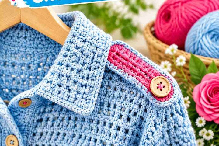
Wasabi brings a lively yellow-green direction to crochet, but the exact shade can vary from muted and earthy to much brighter green. That makes the supporting color especially important. Cream and oatmeal can lighten Wasabi, navy and charcoal give it a darker frame, while coral, plum, terracotta, and lilac introduce stronger hue contrast.
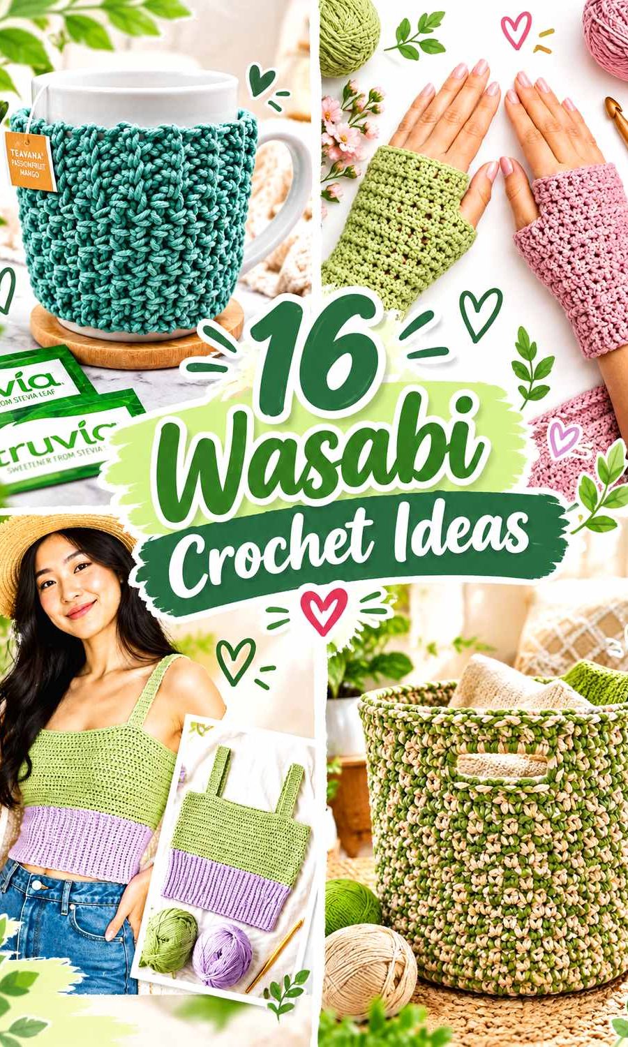
The most effective placement also changes with the crochet item. A cardigan can carry Wasabi across large body panels, while a handbag may need only one continuous Wasabi body with a contrasting handle or border. Granny squares can repeat Wasabi between motif rounds, whereas smaller accessories such as headbands and mug cozies benefit from a simpler dominant-and-accent structure.
Quick List
- Wasabi And Cream Crochet Cardigan
- Wasabi And Terracotta Crochet Tote Bag
- Wasabi And Oatmeal Crochet Bucket Hat
- Wasabi And Dusty Blue Crochet Blanket
- Wasabi And Charcoal Crochet Ribbed Hat
- Wasabi And Chocolate Brown Crochet Handbag
- Wasabi And Soft Plum Crochet Cowl
- Wasabi And Navy Crochet Headband
- Wasabi And Soft Lilac Crochet Top
- Wasabi And Burgundy Crochet Shawl
- Wasabi And Warm Beige Crochet Basket
- Wasabi And Coral Crochet Granny Square
- Wasabi And Pewter Crochet Phone Bag
- Wasabi And Cream Crochet Mug Cozy
- Wasabi And Deep Teal Crochet Slippers
- Wasabi And Dusty Rose Crochet Fingerless Gloves
Decide Whether Wasabi Should Lead or Accent the Crochet Project
Wasabi has enough visual presence to become the dominant color on larger crochet surfaces. Cardigans, blankets, shawls, tops, and baskets can carry substantial Wasabi sections without needing several other colors to create interest. In these projects, supporting colors are often most useful around borders, cuffs, openings, handles, or repeated secondary sections.
Smaller projects need more restraint. If Wasabi, coral, navy, and another strong shade all occupy similar amounts on a headband or phone bag, the limited surface can become visually crowded. Give Wasabi the largest area or one clearly defined structural role, then let the secondary color support it.
Check Value Contrast Around Wasabi Crochet Texture
Different hues can still have similar lightness. A medium Wasabi and medium terracotta may look obviously different in color but blend more than expected when used around small crochet details. Cream, charcoal, navy, or another clearly lighter or darker shade can provide stronger separation when a border or texture needs definition.
Compare the actual yarns before starting. Viewing them side by side from a distance—or checking a grayscale photo—can reveal whether the difference is strong enough for motifs, ribbing, edging, and other details that need to remain visible.
1. Wasabi And Cream Crochet Cardigan

Wasabi can cover the main cardigan panels while cream creates lighter boundaries around the garment. This approach keeps the cardigan unmistakably Wasabi-led but gives cuffs, neckline finishing, and front edging enough separation to remain distinct from the body.
Let Wasabi Cover the Main Crochet Cardigan Panels
Use Wasabi across the front and back body sections when you want a continuous main color. Large areas allow stitch texture and panel shape to stay visible without frequent color changes dividing the torso.
If the cardigan has separate sleeves and body panels, repeating Wasabi across both helps connect those pieces visually.
Cream Defines the Edges of a Wasabi Crochet Cardigan
Reserve cream for cuffs, neckline edging, or the front opening. The lighter value can outline these structural areas without competing with the larger Wasabi field.
Repeating cream in several finishing locations usually looks more deliberate than placing one isolated cream section in the middle of the cardigan.
Creator Credit: TCDDIY
2. Wasabi And Terracotta Crochet Tote Bag
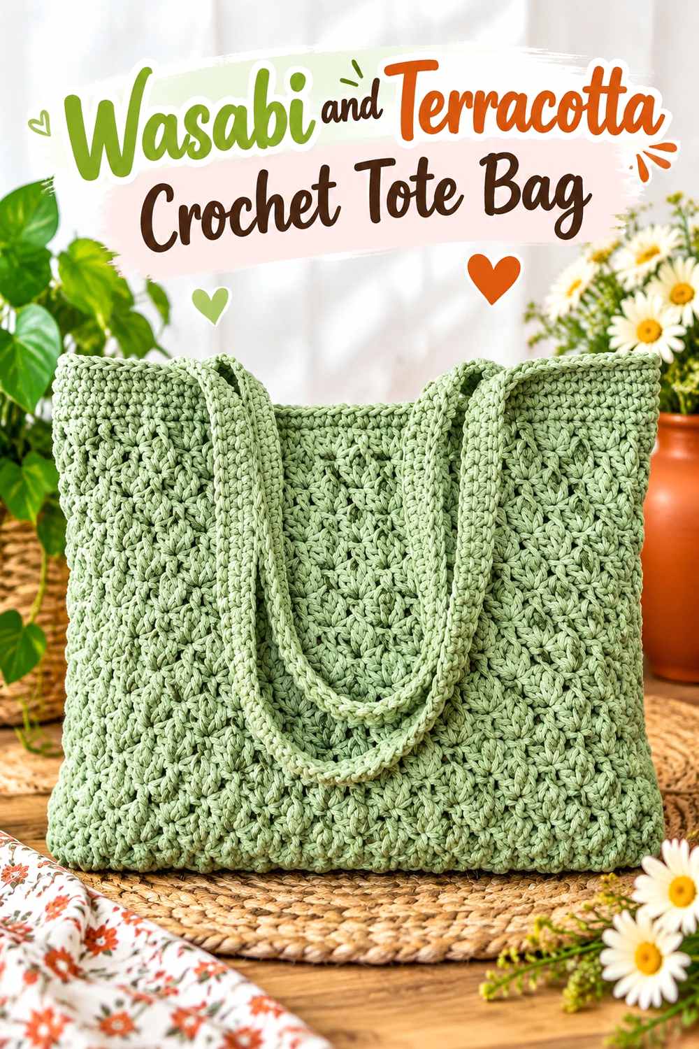
Terracotta gives Wasabi a warm, earthy counterpoint that works especially well when the two colors have clearly different jobs. Keep Wasabi on the main tote body and concentrate terracotta around the handles, opening, or another defined section.
Keep Wasabi Dominant Across the Crochet Tote Body
Use Wasabi on the broad front, back, and lower portions of the bag. A large continuous field prevents the tote from looking unnecessarily segmented, particularly when the crochet fabric already contains noticeable texture.
Wasabi also provides a consistent background against which the warmer handle color can stand out.
Terracotta Can Frame Wasabi Crochet Tote Handles
Handles and upper edging are useful locations for terracotta because those parts already differ structurally from the body. This lets the warm accent define the opening instead of appearing as unrelated small patches.
If Wasabi and terracotta are similar in value, keep the terracotta section large enough to read clearly.
Creator Credit: Kristines Crochets
3. Wasabi And Oatmeal Crochet Bucket Hat

A bucket hat gives Wasabi and oatmeal straightforward placement choices through the crown, sides, and brim. Use Wasabi across the upper portion, then introduce oatmeal where the brim begins to create a lighter visual break.
Wasabi Keeps the Crochet Bucket Hat Crown Connected
Keeping Wasabi through the crown and side wall creates one continuous upper section. This works particularly well when the shaping itself already adds enough visual change and extra stripes would make the hat look busier.
For a Wasabi-centered palette, let the green occupy more area than oatmeal.
Oatmeal Separates the Brim on a Wasabi Crochet Bucket Hat
Use oatmeal across the brim or only its outer portion. Because the brim changes the hat’s silhouette, placing the secondary color there reinforces an existing structural transition.
A narrow oatmeal repeat elsewhere can connect the palette if the brim otherwise feels visually isolated.
Creator Credit: VivCrochets
4. Wasabi And Dusty Blue Crochet Blanket

Dusty blue cools Wasabi without introducing a neutral. A blanket provides enough area to repeat both shades in broader sections, making this a useful combination for stripes, blocks, or recurring color intervals.
Give Wasabi More Crochet Blanket Area When It Should Lead
Make Wasabi sections wider or repeat them more frequently than dusty blue if you want the blanket to remain Wasabi-centered. Dividing the two colors evenly creates a more balanced two-color result.
Planning that distribution before crocheting a large surface prevents the supporting color from gradually becoming dominant.
Dusty Blue Gives Wasabi Crochet Blanket Repeats a Cooler Break
Place dusty blue between larger Wasabi areas to interrupt the yellow-green without using cream or beige. The contrast in hue can make repeated sections noticeable even when the light-dark difference is moderate.
If small motifs need stronger definition, test whether the two yarns provide enough value separation first.
Creator Credit: Daisy Farm Crafts
5. Wasabi And Charcoal Crochet Ribbed Hat

Charcoal gives Wasabi a dark anchor and is particularly useful on a ribbed hat where the main stitch texture should remain uninterrupted. Keep Wasabi on the crown and use charcoal around a lower or fold-over band.
Keep Wasabi Continuous Across the Crochet Ribbed Hat Crown
Use Wasabi through most of the crown so the ribbed lines remain visually connected. Alternating colors too frequently can compete with the stitch direction and make the surface harder to read.
A larger Wasabi crown also establishes the main color before the darker band begins.
Charcoal Grounds the Band of a Wasabi Crochet Ribbed Hat
Place charcoal around the lower edge or fold-over section. The dark neutral creates a defined base and can make a bright Wasabi appear more contained.
If your Wasabi yarn is unusually deep, compare it with charcoal first to make sure the boundary remains visible.
Creator Credit: MJ’s Off The Hook Designs
6. Wasabi And Chocolate Brown Crochet Handbag

Chocolate brown pulls Wasabi toward a deeper earthy palette. Because a handbag has relatively limited surface area, let Wasabi dominate the body while brown is used for handles, an upper edge, or another concentrated feature.
Wasabi Works Best Across the Main Crochet Handbag Body
Keep the broad front and back sections Wasabi so the handbag has one obvious color anchor. Dividing a compact bag equally between Wasabi and dark brown can make the construction appear more fragmented.
A continuous green surface also gives any darker trim more impact.
Chocolate Brown Frames Wasabi Crochet Handbag Details
Use chocolate brown around handles, a closure area, or the upper border. The darker shade can define those functional elements without interrupting the middle of the Wasabi body.
Repeat brown in one additional small location if a single dark feature feels disconnected.
Creator Credit: Naztazia
7. Wasabi And Soft Plum Crochet Cowl

Soft plum creates a cooler purple counterpoint to Wasabi and gives the cowl more color contrast than a green-and-neutral palette. Because cowls fold and bunch when worn, broader sections are easier to control than many narrow stripes.
Let Wasabi Occupy the Larger Crochet Cowl Sections
Use wider Wasabi areas so the green remains recognizable after the fabric folds over itself. Tiny alternating Wasabi and plum stripes can blend into a much busier surface once the cowl is gathered.
Keeping one shade visibly dominant gives the finished accessory more hierarchy.
Soft Plum Breaks Up Wasabi Crochet Cowl Texture
Use soft plum between larger Wasabi sections or around a textured area that needs a change in color. The purple-green contrast adds variation without requiring white or gray.
Check the two yarns in grayscale if small stitch details need to remain sharply separated.
Creator Credit: Rich Textures Crochet
8. Wasabi And Navy Crochet Headband

Navy provides a strong dark frame for Wasabi and works well on the narrow proportions of a headband. Keep Wasabi across the main textured portion and use navy sparingly around edges or the joining area.
Keep Wasabi Central on the Crochet Headband
Use Wasabi on the widest section so the stitch texture remains visible across an uninterrupted field. Because the accessory is narrow, even small amounts of navy will have noticeable visual weight.
This distribution keeps the headband clearly Wasabi-led.
Navy Outlines a Wasabi Crochet Headband Without Crowding It
A navy edge on one or both sides can define the shape without turning the headband into multiple equal stripes. The dark boundary is especially useful when the Wasabi yarn is bright or relatively light.
Keep the navy narrow when you want Wasabi to remain the obvious focal color.
Creator Credit: B.Hooked Crochet
9. Wasabi And Soft Lilac Crochet Top

Soft lilac creates an unexpected cool pastel contrast against Wasabi. On a crochet top, Wasabi can cover most of the body while lilac is reserved for straps, neckline finishing, or another smaller garment feature.
Wasabi Gives the Crochet Top a Strong Main Color Field
Keep Wasabi across the torso when you want a clean visual foundation. A top already has natural divisions around straps, neckline, and hem, so the body does not need numerous extra color blocks.
The uninterrupted Wasabi also allows texture to remain part of the design.
Soft Lilac Lightens the Edges of a Wasabi Crochet Top
Place lilac around straps or neckline finishing where a lighter color can separate those narrower pieces from the Wasabi body.
Repeat lilac at the hem or another small area if you want the accent to feel connected rather than confined to one location.
Creator Credit: For The Frills
10. Wasabi And Burgundy Crochet Shawl

Burgundy gives Wasabi a dark red-purple contrast and creates one of the richest palettes in this collection. A shawl offers enough surface area to use both colors in substantial sections rather than depending on small accents.
Give Wasabi the Broadest Area of the Crochet Shawl
Use Wasabi across a central field or repeat it more frequently than burgundy. Because a shawl folds and drapes in several directions, the main shade needs enough visual area to remain apparent from different angles.
Small Wasabi stripes alone may be overwhelmed by a much darker border.
Burgundy Creates a Deep Frame Around a Wasabi Crochet Shawl
Reserve burgundy for the outer area or another broad finishing section. This placement gives Wasabi a darker visual boundary while keeping the center lighter and more energetic.
If the two yarns are unexpectedly close in value, use larger blocks rather than relying on tiny colored details.
Creator Credit: Fiber Flux
11. Wasabi And Warm Beige Crochet Basket

Warm beige gives Wasabi a softer light-neutral partner than a bright white. A basket can use Wasabi on its substantial side walls while beige defines the opening, handles, or upper border.
Use Wasabi Across the Main Crochet Basket Walls
Keep the basket sides predominantly Wasabi to establish a solid base. Three-dimensional form and crochet texture already provide plenty of visual interest, so frequent striping is not necessary.
A continuous Wasabi body also makes the lighter upper section easier to identify.
Warm Beige Defines Handles Against a Wasabi Crochet Basket
Place beige around the rim or handles to distinguish them from the Wasabi walls. These are useful areas for contrast because they mark the basket opening and carrying points.
If you prefer lower contrast, use beige only on the rim and continue Wasabi through the handles.
Creator Credit: Jayda InStitches
12. Wasabi And Coral Crochet Granny Square
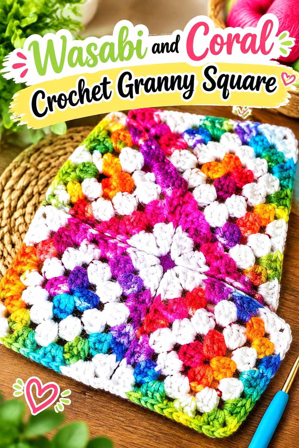
Coral creates one of the strongest hue contrasts with Wasabi in this list. A granny square is particularly suitable for the pairing because color can repeat in centers, intermediate rounds, and outer framing areas rather than being divided randomly.
Repeat Wasabi Through More Than One Crochet Granny Square Area
If Wasabi is the focal color, use it in more than one visible part of the square. A single Wasabi center surrounded by several strong coral sections may allow coral to dominate the finished motif.
Repeating Wasabi nearer the outer portion keeps the green visually connected.
Coral Should Accent the Wasabi Crochet Granny Square Deliberately
Give coral a specific role, such as a central detail or intermediate color area. Avoid making every color section equal when you want Wasabi to remain the main direction.
For a project containing many squares, keep the outer color consistent if you want the motifs to connect visually after joining.
Creator Credit: Hooked by Robin
13. Wasabi And Pewter Crochet Phone Bag
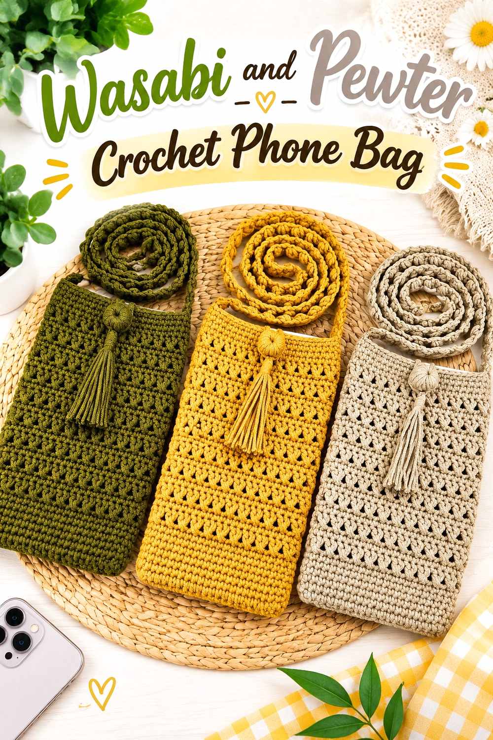
Pewter tones down Wasabi without introducing a warm neutral. A phone bag has little room for complicated color distribution, so keep Wasabi across the body and use pewter for the strap, upper border, or flap.
Let Wasabi Cover the Main Crochet Phone Bag Body
Use Wasabi across the largest front and back sections so the compact project has one obvious main color. This keeps the surface from looking divided into several unrelated pieces.
A simple Wasabi body is also useful if the stitch pattern itself creates noticeable texture.
Pewter Separates the Strap From a Wasabi Crochet Phone Bag
Place pewter on the strap or upper edge to distinguish it from the main body. The gray support color can reduce the overall brightness while still allowing Wasabi to remain the focal point.
If Wasabi and pewter look close in value, use pewter over a larger structural area instead of a very narrow line.
Creator Credit: Chenda DIY
14. Wasabi And Cream Crochet Mug Cozy

A mug cozy has such a small surface that every color change carries considerable visual weight. Wasabi can handle the central textured band, while cream defines an edge, closure area, or smaller embellishment.
Keep Wasabi Central on the Crochet Mug Cozy
Use Wasabi through most of the wrap so the project does not become visually chopped into several tiny areas. A continuous center also provides space for texture to show clearly.
If the cozy includes a closure, keep its surrounding area simple so function and color do not compete.
Cream Highlights the Edges of a Wasabi Crochet Mug Cozy
Use cream around the border or closure when you want a clear light-dark break. The lighter color can identify those small details more effectively than another medium green.
Because the cozy is compact, a narrow amount of cream may be enough to frame the Wasabi.
Creator Credit: love.life.yarn. by Amanda Saladin
15. Wasabi And Deep Teal Crochet Slippers

Deep teal keeps this palette within the green-blue side of the color wheel but gives Wasabi a much darker companion. On slippers, consistent placement across the pair matters more than adding numerous small color changes.
Use Wasabi Across the Main Crochet Slipper Surface
Keep the toe and primary foot area Wasabi so both slippers share one continuous dominant shade. Using the same distribution on each foot also prevents the pair from looking unintentionally mismatched.
The brighter green can carry most of the visible surface while teal remains structural.
Deep Teal Anchors the Opening of Wasabi Crochet Slippers
Use deep teal around the ankle opening or another clearly defined upper section. A dark boundary can frame the Wasabi without cutting through the central foot area.
If the contrast feels too heavy, narrow the teal section rather than adding a third shade.
Creator Credit: Littlejohn’s Yarn
16. Wasabi And Dusty Rose Crochet Fingerless Gloves

Dusty rose softens Wasabi with a muted warm contrast that is more restrained than bright coral. Fingerless gloves provide obvious areas for color placement through the main hand section, cuffs, and thumb opening.
Keep Wasabi Across the Main Crochet Fingerless Gloves
Use Wasabi through the largest hand area so the stitch texture remains visually connected. Small accessories can become crowded quickly when several colors are given equal space.
Mirror the same Wasabi placement on both gloves to keep the pair coordinated.
Dusty Rose Softens the Cuffs of Wasabi Crochet Fingerless Gloves
Place dusty rose around the cuffs where the color change naturally marks a new structural section. This adds warmth without interrupting the main Wasabi area around the hand and thumb.
If the dusty rose and Wasabi are similar in lightness, use a substantial cuff rather than expecting a very narrow stripe to remain obvious.
Creator Credit: Cherilyn Q
Comparing the 16 Wasabi Crochet Color Directions
For the clearest contrast, Wasabi with cream, oatmeal, warm beige, charcoal, or navy gives you straightforward light-dark separation. These combinations work especially well when cuffs, hat bands, basket rims, borders, and other structural details need to remain obvious.
Terracotta, chocolate brown, and burgundy pull Wasabi toward an earthy or deeper warm palette. Terracotta creates stronger hue contrast, brown gives it a grounded neutral partner, and burgundy provides a darker colored frame.
Dusty blue, lilac, plum, pewter, and deep teal shift Wasabi toward cooler combinations. Pewter is the most neutral of these choices, while plum and lilac create more noticeable color contrast.
Coral and dusty rose both introduce pink-red tones but behave differently. Coral creates the stronger visual statement and is useful in controlled motif areas, while dusty rose produces a quieter transition suitable for cuffs or repeated accents.
Conclusion
Wasabi can carry an entire crochet project or work as one strong part of a broader palette, but the most useful schemes give it a clear visual role first. Large cardigan, blanket, shawl, top, and basket surfaces can accommodate substantial Wasabi areas. Smaller hats, bags, gloves, slippers, and mug cozies usually benefit from concentrating secondary colors around structural details.
Choose cream, oatmeal, or beige when you want a lighter break. Navy, charcoal, chocolate brown, burgundy, and deep teal provide darker framing. Dusty blue, plum, lilac, coral, terracotta, and dusty rose introduce more colorful contrasts.
Before committing to a detailed border or motif, compare the actual yarns for light-dark separation. Wasabi shade names can vary, so preserving the intended dominant, supporting, and accent relationships matters more than matching a color name exactly.
Frequently Asked Questions
What Colors Work Well With Wasabi Crochet?
Cream, oatmeal, beige, charcoal, navy, brown, burgundy, teal, dusty blue, lilac, plum, coral, terracotta, dusty rose, and gray can all work with Wasabi. The better choice depends on whether you want a light neutral, dark anchor, warm contrast, or cooler accent.
How Can I Make Wasabi Crochet Look Less Bright?
Pair Wasabi with a substantial amount of charcoal, chocolate brown, navy, pewter, warm beige, or another muted neutral. Keeping the secondary shade around borders, bands, straps, and other structural areas can reduce the overall intensity without hiding Wasabi completely.
Does Cream Work Better Than White With Wasabi Crochet?
Cream generally creates a slightly warmer and softer transition, while a clearer white can produce sharper contrast. Neither is universally preferable; compare them against your actual Wasabi yarn and choose according to how defined you want the border or detail to appear.
Can Wasabi and Pink Work Together in Crochet?
Yes. Coral produces a stronger warm contrast, while dusty rose creates a softer result. Keep one color dominant rather than dividing a small project evenly between both shades unless an intentionally balanced two-color design is your goal.
Can Wasabi and Navy Be Used in the Same Crochet Project?
Yes. Navy can give Wasabi a strong dark frame and works particularly well around headband edges, garment trim, bag details, or other areas where definition is useful. Check very dark Wasabi yarn against navy first to ensure enough separation.
How Can I Keep Wasabi Crochet Texture Visible?
Use light-dark contrast around the texture you most want noticed. Cream can highlight details on a medium or dark Wasabi, while navy or charcoal can define edges against a lighter Wasabi. On a single-color project, uninterrupted areas can also help stitch texture remain readable.
How Do I Substitute a Color in a Wasabi Crochet Palette?
Preserve the color’s role rather than trying to match its name exactly. Replace a light support shade with another noticeably lighter yarn, a dark anchor with another deep shade, and a warm or cool accent with a color that maintains a similar relationship to Wasabi.