Persimmon brings a warm orange-red direction to a crochet sweater, but the supporting colors determine whether the finished garment feels soft, earthy, graphic, tonal, or strongly contrasted. The most useful decisions are not simply which colors to combine. You also need to decide which shade covers the most surface, where the accent belongs, whether the values separate clearly, and how the palette interacts with crochet texture.

The ideas below use persimmon as the connecting color while changing its partners, proportions, and placement across bodies, sleeves, cuffs, necklines, stripes, ribbing, and textured sections. The credited tutorials support the sweater construction concepts; the persimmon palettes are independent color plans, so the creators are not being credited with colors they may not have used.
Quick List
- Persimmon And Cream Crochet Mesh Sweater
- Persimmon And Chocolate Brown Crochet Raglan Sweater
- Persimmon And Oatmeal Crochet Oversized Pullover
- Persimmon And Charcoal Crochet Classic Sweater
- Persimmon And Deep Teal Crochet V Neck Sweater
- Persimmon And Mustard Crochet Scrap Stripe Raglan Sweater
- Persimmon And Cream Crochet Ribbed Turtleneck Sweater
- Persimmon And Camel Crochet Textured Sweater
- Persimmon And Sage Crochet Striped Sweater
- Persimmon And Dusty Rose Crochet Pullover
- Persimmon And Black Crochet Color Block Sweater
- Persimmon And Burgundy Crochet Cropped Sweater
- Persimmon And Olive Crochet Alpine Texture Sweater
- Persimmon And Warm White Crochet Everyday Sweater
- Persimmon And Navy Crochet Striped Pullover
How to Keep Persimmon in Control on a Crochet Sweater
Persimmon has enough visual strength to lead a sweater without needing equal amounts of every supporting color. For a calmer garment, let persimmon cover the body or the majority of the panels, then restrict the second shade to cuffs, ribbing, neckline edging, selected stripes, or smaller color blocks.
If the sweater has a prominent construction feature such as a V-neck, raglan line, turtleneck, or oversized sleeve, decide whether the accent color should emphasize that feature. A dark V-neck border attracts attention to the neckline; contrasting cuffs make the sleeve ends more prominent; a second color across the entire sleeve creates much more visual weight.
Use Value Contrast to Keep Persimmon Crochet Texture Visible
Color names alone do not tell you whether two yarns will separate clearly. Persimmon and another medium-value shade can be different hues yet still blend when worked into small stitches or busy texture.
Place your yarns beside each other before committing, then make a swatch using the actual stitch pattern. A grayscale photo is another useful check: if both shades turn into nearly the same gray, fine stripes, small motifs, or narrow borders may not show as distinctly as expected.
Balance Warm and Cool Colors Around Persimmon
Cream, camel, mustard, burgundy, and brown keep a persimmon sweater strongly warm and earthy. Sage and olive retain an organic direction but add green contrast, while teal and navy create a clearer warm-cool division.
Neither approach is automatically better. The useful question is where you want the eye to land. A nearby warm shade can create a blended sweater surface, while a dark cool shade can turn a neckline, stripe, cuff, or color block into a sharper focal point.
1. Persimmon And Cream Crochet Mesh Sweater
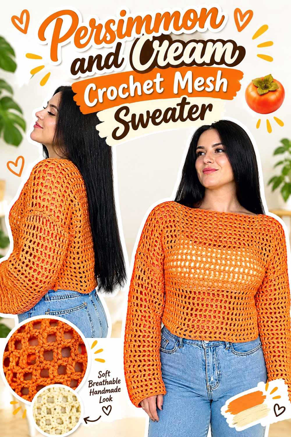
A mesh sweater gives persimmon plenty of open space, so the color can remain dominant without creating an overly solid field. Use persimmon through most of the body and sleeves, then place cream where you want the open construction to look more defined—such as the neckline, cuffs, hem, or a limited set of stripes. Because mesh exposes the layer underneath, also judge the palette over the clothing you expect to wear beneath it.
Let Persimmon Carry Most of the Crochet Mesh Sweater
Keeping persimmon across the larger mesh sections creates a continuous color field despite the open spaces. Breaking the body into equal cream and persimmon sections would make the color changes compete with the mesh pattern itself. If you want a quieter result, keep cream narrow and let persimmon connect the front, back, and sleeves visually.
Cream Gives Persimmon Crochet Mesh a Clearer Edge
Cream can be especially useful at the outer boundaries of a persimmon mesh sweater. A cream cuff, neckline, or hem creates a lighter visual stop where the open fabric ends. Before using it in tiny mesh details, check the values side by side so the contrast remains visible once the colors are separated by open spaces.
Creator Credit: ElyseCrochets 💌
2. Persimmon And Chocolate Brown Crochet Raglan Sweater
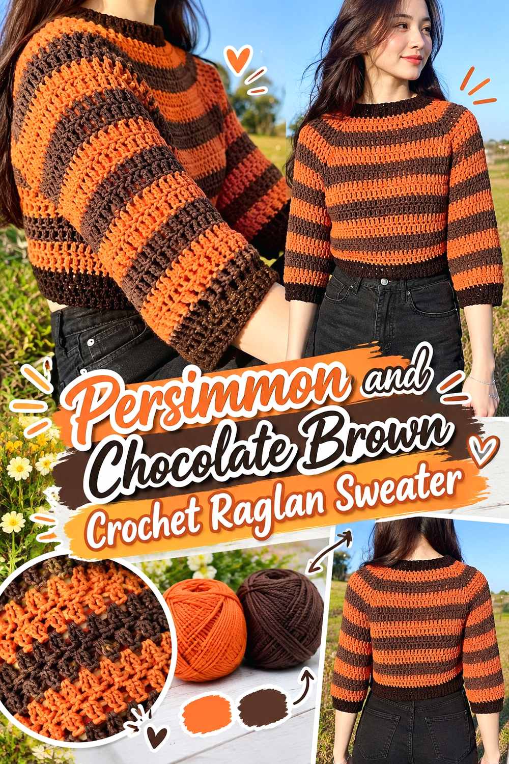
Persimmon and chocolate brown create a deep earthy palette that suits the directional lines of a raglan sweater. Persimmon can cover most of the torso and sleeves while brown defines selected edges or upper-body details. The darker brown gives the sweater a visual anchor without requiring another bright accent.
Keep Persimmon Dominant Across the Crochet Raglan Body
A raglan already has visible lines moving from neckline toward underarm, so the palette does not need many additional divisions. Let persimmon cover broad areas of the body and sleeves if you want those construction lines to remain readable rather than turning the garment into a patchwork of equal color blocks.
Chocolate Brown Can Frame Persimmon Raglan Details
Use chocolate brown where a darker outline is useful: the neckline, cuffs, hem, or a narrow section following the upper sweater. Brown against persimmon provides stronger value contrast than another medium orange or rust. If the brown is very dark, keep its share smaller unless you intentionally want the sweater to become brown-led.
Creator Credit: Cherilyn Q
3. Persimmon And Oatmeal Crochet Oversized Pullover

An oversized sweater creates a large uninterrupted surface, so color proportion matters more than it would on a smaller garment. Persimmon can easily carry that surface, while oatmeal gives the eye lighter resting points around ribbing, sleeves, or the neckline. The result stays warm without pushing both colors toward equally strong contrast.
Keep Persimmon Broad on an Oversized Crochet Pullover
Large sweater panels make even a moderate color block look substantial. If persimmon is meant to define the garment, use it across the main body instead of dividing the torso into numerous small sections. That also gives stitch texture more continuity across the wide silhouette.
Oatmeal Softens Persimmon at Crochet Cuffs and Ribbing
Oatmeal is useful when cream feels too bright and brown feels too heavy. Try it on cuffs, hem ribbing, or a collar so the finishing areas separate from the persimmon body without becoming the strongest elements. Choose an oatmeal shade that remains visibly lighter than persimmon after both yarns are worked up.
Creator Credit: it’s erin b.
4. Persimmon And Charcoal Crochet Classic Sweater
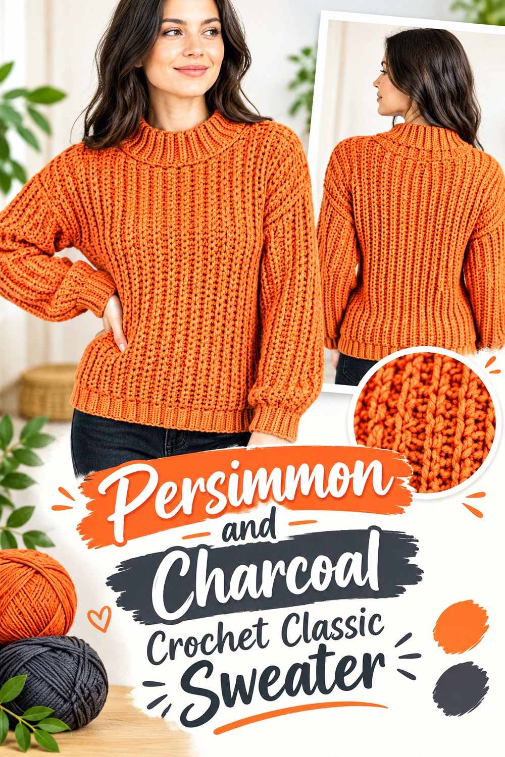
Charcoal moves a persimmon sweater in a more graphic direction. The dark neutral can sharply define the neckline and finishing details, while persimmon keeps the garment from becoming visually heavy. This combination is particularly useful when you want strong contrast without introducing another saturated hue.
Charcoal Gives Persimmon Crochet Necklines Strong Definition
A charcoal neckline immediately creates a dark frame around persimmon. That can work well on a sweater with a simple silhouette because the color change supplies the focal point. If you repeat charcoal at the cuffs, keep the repetitions deliberate so the dark elements feel connected rather than isolated.
Keep Persimmon Larger Than Charcoal on the Crochet Sweater
Charcoal carries considerable visual weight. Equal areas of charcoal and persimmon can make the sweater read as a two-color block design rather than a persimmon sweater with dark accents. If persimmon should remain the main idea, give it clearly more surface on the torso and sleeves.
Creator Credit: TCDDIY
5. Persimmon And Deep Teal Crochet V Neck Sweater

Deep teal creates one of the clearest cool contrasts with persimmon. A V-neck makes an especially useful location for the teal because the neckline already forms a strong geometric feature. Persimmon can remain uninterrupted across most of the sweater while teal provides a controlled focal point.
Deep Teal Can Define a Persimmon Crochet V-Neck
Use deep teal around the V when you want the neckline shape to read immediately. A darker teal produces stronger separation; a softer medium teal creates a gentler transition. Check the two yarns in the actual neckline stitch because narrow edging needs enough value difference to remain visible.
Repeat Persimmon Beyond the Crochet V-Neck Focal Point
If teal appears at the neckline and again on large sleeve sections, it can begin to compete with persimmon. One option is to keep sleeves mostly persimmon and repeat teal only at narrow cuffs. That lets the V remain the strongest cool-colored feature while persimmon ties the garment together.
Creator Credit: forthefrills
6. Persimmon And Mustard Crochet Scrap Stripe Raglan Sweater

Persimmon and mustard sit close enough in temperature to create a strongly warm sweater, but they still need hierarchy. Add mustard in selective stripes or scrap-inspired bands while allowing persimmon to recur often enough that the sweater does not lose its central color direction.
Persimmon Needs the Largest Share in a Mustard Crochet Stripe Plan
When both colors are warm and saturated, equal-width stripes can make them compete. Give persimmon either wider bands or more frequent repetition. This establishes a main color without requiring every stripe to have the same width.
Repeat Persimmon to Connect Mustard Crochet Scrap Sections
Scrap-style color changes can look disconnected if the main shade disappears for long stretches. Bring persimmon back between mustard sections or use it at the neckline and cuffs. Repetition gives the eye a consistent reference even when stripe widths change.
Creator Credit: made in the moment
7. Persimmon And Cream Crochet Ribbed Turtleneck Sweater

A ribbed turtleneck gives color multiple directional surfaces: vertical body texture, cuffs, hem, and the tall neckline. Persimmon works well as the uninterrupted main shade because ribbing already supplies visual movement. Cream is most effective when it clarifies one or two finishing zones instead of appearing everywhere.
Persimmon Lets Crochet Ribbing Create the Main Surface Interest
If the ribbed texture is a major feature, keeping the body primarily persimmon prevents frequent color changes from cutting across those directional lines. A single warm field makes the raised and recessed texture easier to notice from a distance.
Cream Can Separate Persimmon at the Crochet Turtleneck and Cuffs
A cream turtleneck against a persimmon body places the lightest shade close to the face and clearly distinguishes the collar construction. If that feels like too much contrast, keep the turtleneck persimmon and move cream to narrower cuffs or hem details instead.
Creator Credit: Chenda DIY
8. Persimmon And Camel Crochet Textured Sweater

Persimmon and camel create a closely related earthy palette rather than a high-contrast one. That makes stitch texture especially important: if the two colors are too similar in value, small color details may disappear. Use their similarity intentionally for broad sections instead of expecting tiny camel accents to read sharply.
Persimmon and Camel Need Enough Contrast for Crochet Details
Place the two yarns beside each other and check whether camel is clearly lighter or darker than persimmon. If their values nearly match, use camel in larger sleeve or panel sections where a subtle transition makes sense. For narrow outlines or small motifs, choose a camel with greater value separation.
Keep Persimmon Around the Crochet Texture You Want Noticed
If one textured panel is the garment’s main feature, persimmon can help unify that entire section. Moving back and forth between two similar warm shades inside complex texture may make both the stitch pattern and color changes harder to read. Use camel instead to frame the textured area or distinguish adjacent sections.
Creator Credit: KnitcroAddict
9. Persimmon And Sage Crochet Striped Sweater
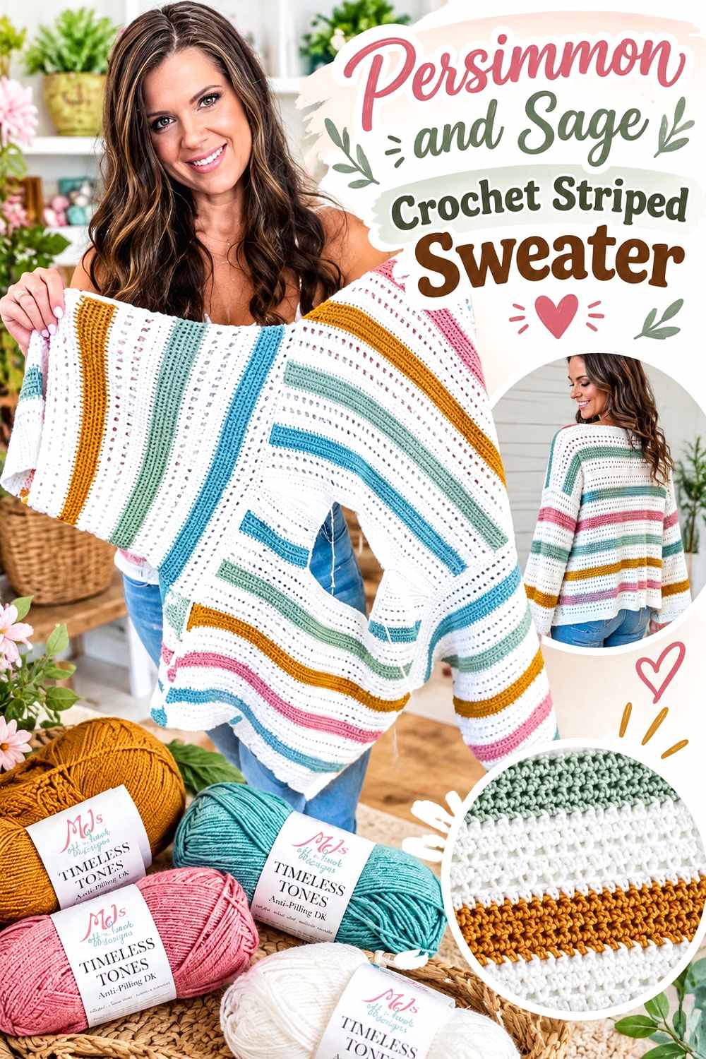
Sage cools persimmon without creating the depth of teal or navy. That makes this a useful palette when you want visible color change but not extremely sharp stripes. Persimmon can take the wider bands while sage acts as a softened secondary color.
Make Persimmon the Stronger Crochet Sweater Stripe
Persimmon naturally attracts attention beside muted sage, so take advantage of that instead of forcing equal visual weight. Wider persimmon stripes with narrower sage bands maintain the title color and keep the body from looking evenly divided.
Sage Keeps Persimmon Crochet Stripes Softer
Sage works particularly well when the green is muted rather than highly saturated. If the sage becomes too bright, both hues may compete. Compare the yarns before starting and preserve the relationship: persimmon should remain the warmer, stronger color while sage provides a quieter counterpoint.
Creator Credit: MJ’s Off The Hook Designs
10. Persimmon And Dusty Rose Crochet Pullover
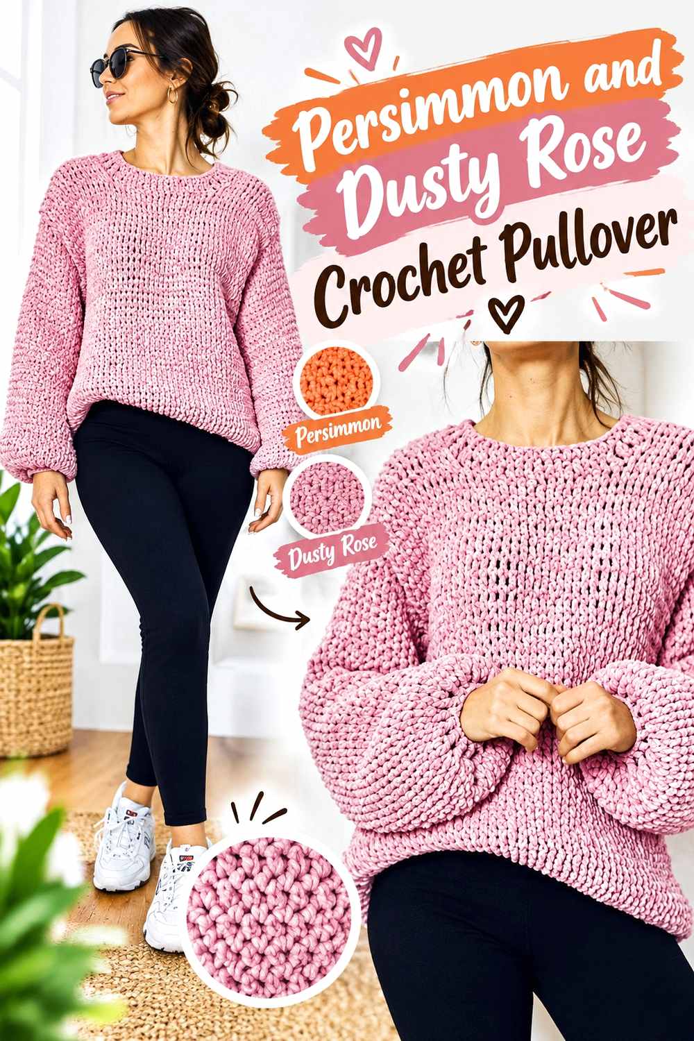
Dusty rose moves persimmon in a softer direction without introducing a neutral. Because both shades contain warmth, their relationship depends heavily on lightness. A noticeably lighter dusty rose can separate cuffs or sleeves from the persimmon body; two similarly dark versions may merge more than expected.
Give Persimmon More Area Than Dusty Rose on the Crochet Pullover
Persimmon should cover the torso or another clearly dominant section if you want the sweater to read as persimmon first. Use dusty rose as a secondary sleeve section, neckline detail, stripe, or hem instead of splitting the garment exactly in half.
Dusty Rose Softens Persimmon Around Crochet Sleeves and Necklines
A dusty rose cuff or neckline creates less contrast than black, charcoal, or cream. That makes it useful when you want color variation without sharply outlining the garment. Choose a softened pink that remains distinguishable from persimmon once both colors are seen under the same lighting.
Creator Credit: By StellaM
11. Persimmon And Black Crochet Color Block Sweater

Black gives persimmon its most graphic treatment in this group. The contrast can make block edges and geometric divisions immediately visible, so placement needs to be deliberate. Large black sections create a much stronger effect than narrow black ribbing.
Black Gives Persimmon Crochet Color Blocks a Hard Edge
Use black when you want the boundaries between sweater sections to be unmistakable. A black sleeve section beside a persimmon torso creates a bold division, while black at only the neckline and cuffs acts more like a frame. Decide which effect you want before assigning the color proportions.
Protect Persimmon From Being Outweighed by Black on the Crochet Sweater
Black can visually dominate even when it occupies less space. To preserve persimmon as the main shade, keep the largest central surfaces—especially the front and back body—in persimmon and use black more selectively.
Creator Credit: ByKaterina Designs
12. Persimmon And Burgundy Crochet Cropped Sweater
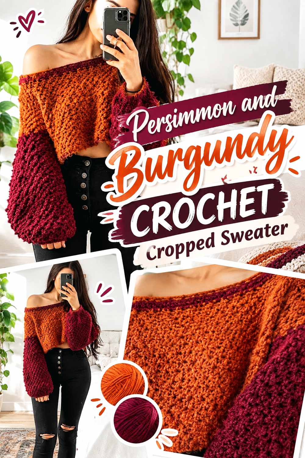
Burgundy deepens the palette without leaving the warm color family. On a cropped sweater, where the body surface is shorter, a dark accent can occupy a noticeable share very quickly. Persimmon is useful for keeping the garment from becoming visually dark from neckline to hem.
Persimmon Keeps a Burgundy Crochet Crop From Feeling Too Dark
Use persimmon through most of the cropped body if you want the shorter silhouette to retain warmth and brightness. A large burgundy torso block can visually compress the garment further, while persimmon gives the compact shape more color presence.
Burgundy Can Anchor Persimmon Crochet Cuffs and Hem Details
Burgundy works well at sleeve cuffs or a narrow hem because those locations give the deepest color a controlled role. Repeating burgundy in two finishing areas can feel more connected than placing one isolated dark stripe across the sweater body.
Creator Credit: Dana B
13. Persimmon And Olive Crochet Alpine Texture Sweater
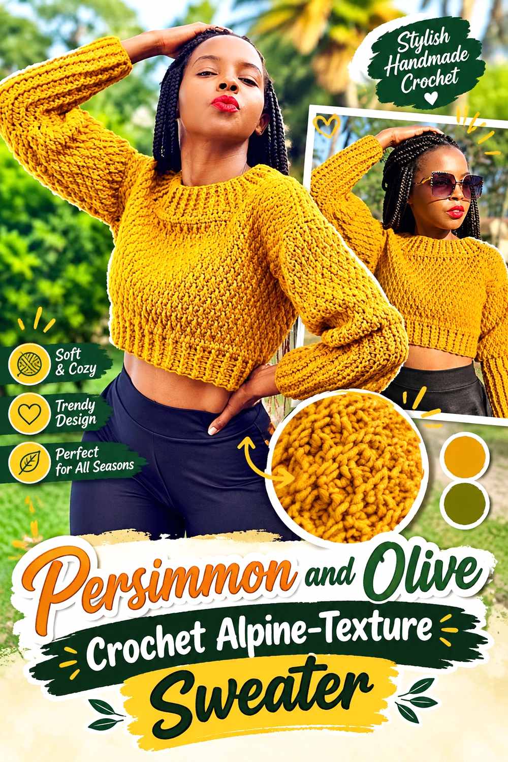
Raised alpine-style texture already creates shadow and surface depth, so the palette does not need constant color changes. Persimmon can cover the textured body while olive appears in ribbing or secondary sections, creating an earthy two-color sweater without hiding the stitch relief.
Persimmon Lets Crochet Alpine Texture Stay Easy to Read
A continuous persimmon field gives raised texture room to create its own light and shadow. Switching colors too frequently across a strongly textured section can divide the surface and make the stitch pattern less immediately legible.
Olive Should Support Persimmon Without Breaking Up Crochet Texture
Place olive where the stitch structure changes naturally, such as cuffs, hem, or a neckline. That gives the secondary color a logical boundary. If you want olive inside the textured body, use a larger intentional block instead of scattering small sections that interrupt the pattern.
Creator Credit: AC Crochets
14. Persimmon And Warm White Crochet Everyday Sweater

Warm white gives persimmon a cleaner, lighter contrast than oatmeal while avoiding the harder effect of black or charcoal. This palette works especially well when you want simple sweater construction to remain visible through carefully placed edging rather than broad color blocking.
Warm White Gives Persimmon Crochet Edges Clear Separation
Use warm white at the neckline, hem, or cuffs when you want those areas to read distinctly against the persimmon body. Because the value difference is strong, even a relatively narrow border can be visible, so there is usually no need to make every finishing section equally wide.
Keep Persimmon Continuous Across the Main Crochet Sweater Panels
Warm white becomes more effective when it has persimmon to frame. If large areas of the body and sleeves stay persimmon, the light trim looks intentional. Too many alternating white sections can shift the sweater toward a striped or color-block design rather than a persimmon-led everyday pullover.
Creator Credit: Brunaticality
15. Persimmon And Navy Crochet Striped Pullover
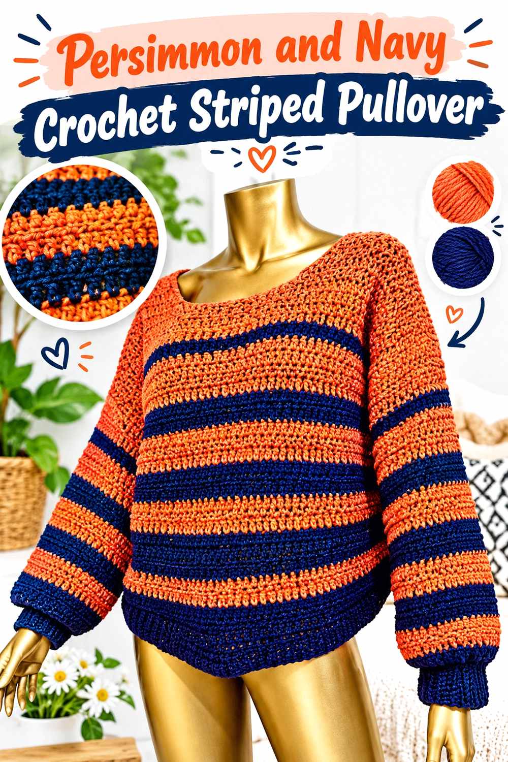
Navy gives persimmon a dark cool partner with less starkness than black. On a striped pullover, it creates strong band definition and can make the orange-red quality of persimmon appear more pronounced by contrast. Keep the stripe plan organized so the two saturated colors do not compete equally everywhere.
Navy Makes Persimmon Crochet Stripes More Graphic
A dark navy stripe produces clear value separation from persimmon, making stripe boundaries easy to see. Use similar widths for an intentionally bold two-color sweater, or make navy narrower when persimmon should remain the dominant reading.
Repeat Persimmon at Crochet Necklines or Cuffs to Connect the Stripes
If the final body stripe ends in navy, repeating persimmon at the collar or cuff can bring the main shade back into the finishing areas. Conversely, navy ribbing can create a darker frame. Decide which color you want to visually close the garment rather than letting the stripe sequence determine the finish by accident.
Creator Credit: Shyler crochets
How to Narrow the 15 Persimmon Crochet Sweater Palettes
For a softer sweater, start with persimmon and oatmeal, camel, dusty rose, warm white, or cream. These combinations reduce the amount of dark contrast and put more attention on the persimmon surface and stitch texture.
For an earthy autumn direction, chocolate brown, mustard, olive, sage, and burgundy keep the palette connected to warm or natural-looking shades. If you want the strongest definition, charcoal, black, navy, and deep teal give persimmon clearer boundaries around stripes, necklines, cuffs, and blocks.
Conclusion
The strongest persimmon crochet sweater palette depends on what you want the color to do. If persimmon should cover the garment quietly, combine it with oatmeal, camel, dusty rose, or warm white and keep the secondary shade around finishing details. If you want earthy color variation, brown, olive, sage, mustard, and burgundy can divide panels or sleeves without leaving the warm overall direction.
For a more graphic sweater, pair persimmon with charcoal, black, navy, or deep teal and use that contrast where you deliberately want attention: the V-neck, raglan lines, stripes, cuffs, or color-block boundaries. Before committing to any palette, compare the yarns in the actual stitch pattern and confirm that both the color relationship and texture remain visible.
Frequently Asked Questions
What colors work well with persimmon in a crochet sweater?
Cream, oatmeal, camel, chocolate brown, olive, sage, dusty rose, burgundy, mustard, charcoal, navy, teal, black, and warm white can all create useful directions. The better choice depends on whether you want tonal warmth, an earthy palette, soft contrast, or a sharper graphic effect.
How much of a crochet sweater should be persimmon?
If the project is meant to read clearly as a persimmon sweater, give persimmon the largest uninterrupted areas, such as the front and back body or most of the sleeves. Supporting colors can then appear through ribbing, cuffs, necklines, stripes, or selected panels.
Is cream or white better with a persimmon crochet sweater?
Cream usually creates a softer transition with persimmon, while a lighter white produces sharper value contrast. Warm white falls between those effects. Place the yarns together before choosing because the exact lightness matters more than the label on the shade.
How can I check whether two colors have enough contrast for a persimmon sweater?
Compare the yarns side by side, crochet a swatch in the intended stitch pattern, and view them from a short distance. You can also photograph the swatch and convert the image to grayscale. If both colors become nearly the same gray, small details may not separate clearly.
Where should I put an accent color on a persimmon crochet sweater?
Useful locations include cuffs, hem ribbing, the neckline, narrow stripes, raglan details, sleeve sections, and clearly defined color blocks. Choose areas that already have a structural reason to change rather than scattering the accent randomly across the sweater.
Can a persimmon striped crochet sweater use several additional colors?
Yes, but give the palette a hierarchy. Let persimmon recur often enough to remain the connecting shade, then limit other colors by width, frequency, or placement. Repeating a smaller accent in several deliberate locations usually creates more cohesion than introducing a new color only once.