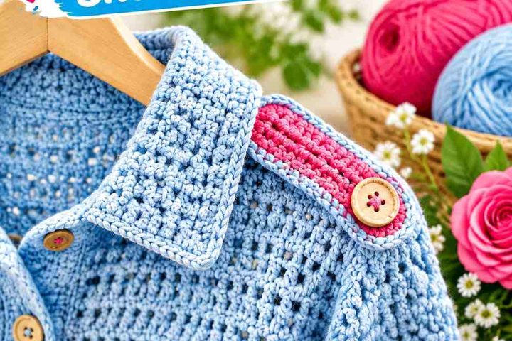
Terracotta gives a crochet shrug a warm, earthy base without limiting you to an all-autumn palette. Pair it with a pale neutral and the shrug can look lighter and more relaxed; place it beside charcoal or navy and the same warm shade gains much stronger definition. The important decision is not simply which second color you choose, but how much of it appears across the back, sleeves, cuffs, edging, and openwork.

These 14 terracotta crochet shrug ideas use different palette relationships and color-placement strategies. The linked tutorials support the shrug or bolero construction concepts, while the proposed terracotta color schemes are independent adaptations and should not be assumed to match the colors used by the creators.
Quick List
- Terracotta And Cream Mesh Crochet Shrug
- Terracotta And Sage Lace Crochet Shrug
- Terracotta And Dusty Rose Crochet Bolero Shrug
- Terracotta And Charcoal Ribbed Crochet Shrug
- Terracotta And Mustard Cocoon Crochet Shrug
- Terracotta And Olive Cocoon Crochet Shrug
- Terracotta And Oatmeal Crochet Wrap Shrug
- Terracotta And Navy Mesh Crochet Shrug
- Terracotta Blush And Cream Lace Crochet Shrug
- Terracotta And Chocolate Brown Crochet Shrug
- Terracotta And Muted Lavender Crochet Bolero Shrug
- Terracotta And Black Crochet Shrug
- Terracotta Rust And Peach Blanket Crochet Shrug
Keep Terracotta in a Clear Dominant Role
Terracotta can easily lose its identity when several similarly strong colors share the same amount of space. On a shrug, the simplest way to keep the palette clear is to let terracotta cover the main back or body area, then use the supporting shade more selectively on cuffs, edging, sleeve sections, granny details, or repeated stripes.
The balance can change when the secondary color is much lighter or darker. Cream needs relatively little space to create separation against terracotta, while muted sage can occupy a larger area without creating the same sharp division.
Check Contrast Around Shrug Cuffs, Edges, and Openwork
Color contrast matters most where the crochet structure already creates visual changes. A dark cuff against a terracotta sleeve can create a strong stopping point, while a cream edge gives the garment a lighter outline. In mesh or lace, the clothing underneath also shows through, so the perceived palette includes more than the yarn itself.
Before committing to a large second-color section, compare the yarns beside each other and from a few feet away. If their lightness is nearly identical, the transition may look softer than expected even when the hues are clearly different.
1. Terracotta And Cream Mesh Crochet Shrug

A terracotta-and-cream mesh shrug works well when terracotta remains the main visual field and cream is reserved for areas that need definition. Because open crochet already introduces empty space, using two colors in equal amounts can make the garment feel busier than necessary. Terracotta across the central body and sleeves, followed by narrow cream cuffs or edging, creates a clearer hierarchy.
Terracotta Should Lead Across the Mesh Shrug Body
Keep most of the openwork in terracotta if you want the shrug to read immediately as a terracotta piece. The repeated warm color helps connect the open spaces visually instead of breaking the mesh into competing blocks.
If you want more cream, introduce it symmetrically near both wrists or around the neckline rather than scattering isolated cream sections across the mesh.
Terracotta and Cream Need Clear Placement at the Shrug Edges
Cream is noticeably lighter than terracotta, so even a small amount can strongly outline cuffs and outer edges. This can be especially useful when the mesh itself has little solid surface area for a second color.
Avoid adding a thick cream border everywhere unless you want the light neutral to become nearly as important as terracotta. Narrow repeated accents usually preserve the warmer overall direction.
Creator Credit: VivCrochets
2. Terracotta And Sage Lace Crochet Shrug

Terracotta and sage create a muted warm-and-cool combination that suits a lace shrug particularly well. Let terracotta cover the main lace area, then use sage where the garment needs a quieter transition, such as cuffs, neckline finishing, or a repeated narrow band. Neither shade needs extremely high saturation for the pairing to remain distinct.
Terracotta Keeps Sage From Taking Over the Lace Shrug
Use terracotta through the largest uninterrupted lace section so the eye follows one consistent warm color across the shoulders and back. Sage can then soften smaller areas without dividing the garment into two equally weighted halves.
This is especially useful with lace because the stitch pattern already creates plenty of visual detail. A simple color hierarchy keeps that texture from competing with an overly complicated palette.
Terracotta and Sage Should Stay Distinct Around Lace Details
If your terracotta and sage yarns are similar in lightness, delicate lace details may not show a sharp transition where the colors meet. Compare the yarns in grayscale or from a distance before using sage for small motifs or very narrow bands.
When more separation is wanted, choose a sage that is clearly lighter or darker than the terracotta rather than simply choosing a greener shade.
Creator Credit: Chenda DIY
3. Terracotta And Dusty Rose Crochet Bolero Shrug
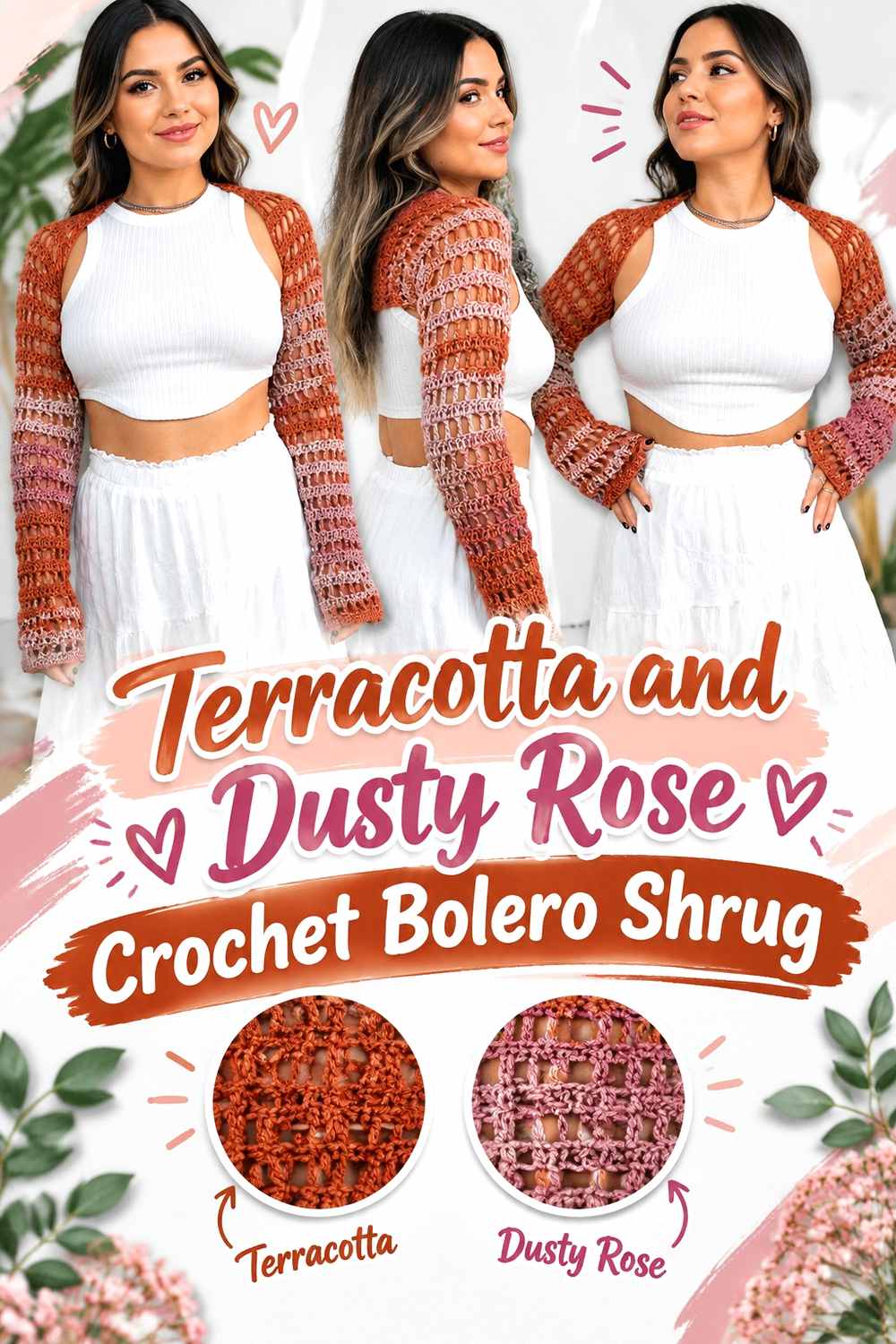
Terracotta and dusty rose stay within a warm, softened color family, making this one of the more tonal options in the collection. A bolero-style shrug gives you useful placement points at the sleeves and front edges, so the two related colors do not have to alternate across the entire garment.
Terracotta Needs More Surface Area Than Dusty Rose
Let terracotta dominate the sleeves and back while dusty rose appears in narrower sections near the cuffs or front opening. Because both shades can sit relatively close together visually, equal amounts may make the color structure harder to read.
Using dusty rose as a supporting shade rather than a co-dominant color keeps the shrug from becoming one continuous reddish block.
Terracotta and Dusty Rose Benefit From a Value Check
Do not rely only on the fact that one yarn looks orange-brown and the other pink. If both have similar lightness, small stripes or textured sections can merge when viewed from farther away.
For clearer definition, choose a dusty rose that is visibly lighter than the terracotta or keep the two shades in larger, simpler areas rather than narrow alternating rows.
Creator Credit: Cherilyn Q
4. Terracotta And Charcoal Ribbed Crochet Shrug
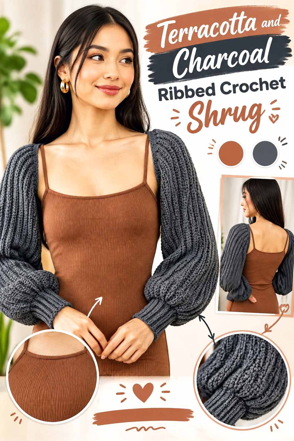
Charcoal creates one of the strongest dark contrasts for terracotta without introducing another saturated hue. On a short, ribbed shrug, that difference can be used to emphasize cuffs, edges, and other compact finishing areas while terracotta keeps the garment warm.
Terracotta Works Better Across the Main Ribbed Shrug Panels
Use terracotta over the larger body and sleeve sections so the ribbing remains easy to read as part of one continuous surface. Charcoal can then define the ends of those areas instead of interrupting them repeatedly.
A charcoal-heavy body would make the finished shrug substantially darker, so reverse the proportions only if that is the intended direction.
Terracotta and Charcoal Create Strong Cuff Definition
Charcoal cuffs against terracotta sleeves make the wrist transition very noticeable. This is useful when you want the finishing to look intentional without adding a third shade.
Because charcoal is visually heavy, repeat it in at least one other small location, such as the neckline or front edge, if large dark cuffs otherwise seem disconnected from the rest of the shrug.
Creator Credit: TCDDIY
5. Terracotta And Mustard Cocoon Crochet Shrug
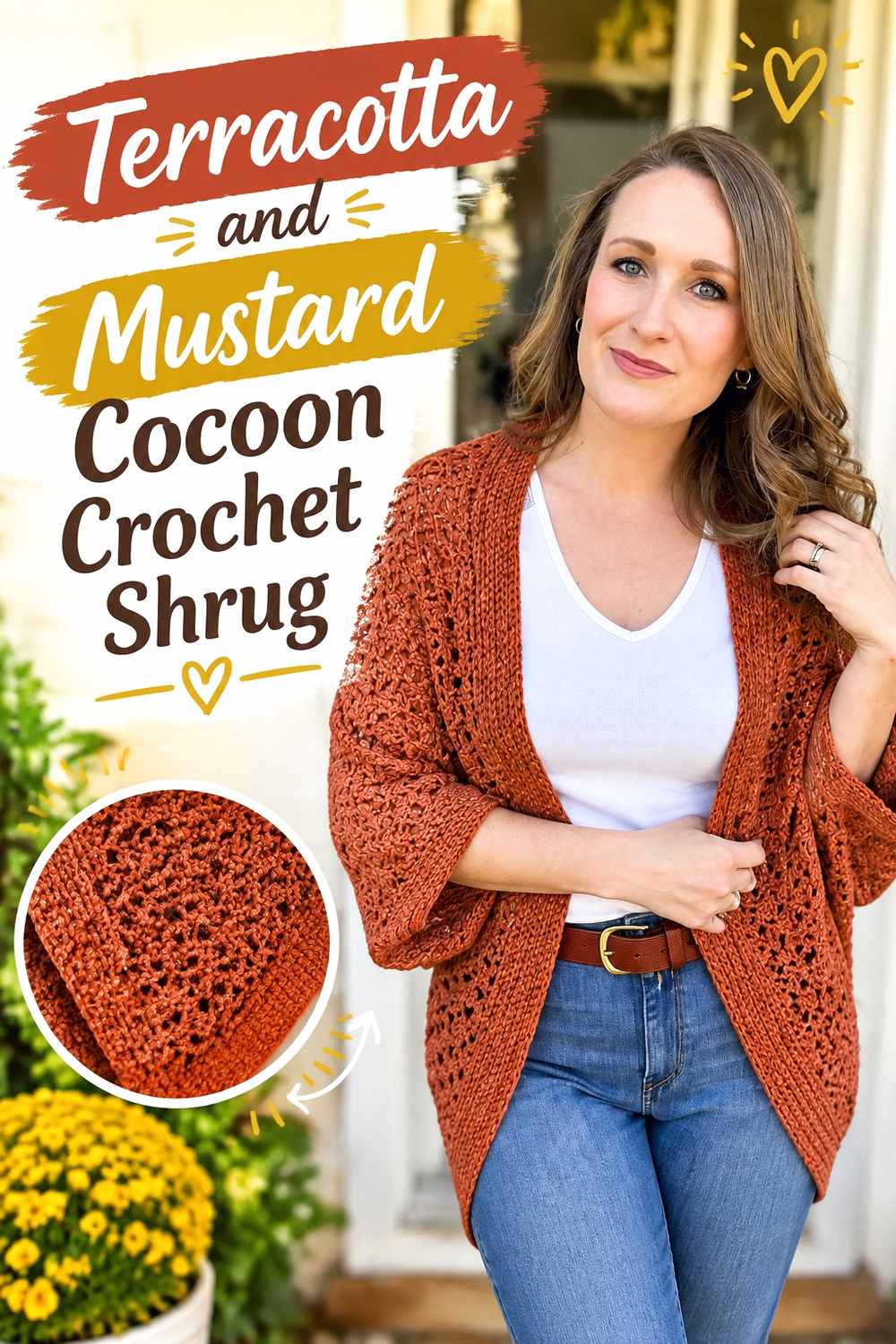
Terracotta and mustard create a concentrated warm palette. A cocoon shrug offers a broad back surface, so the main challenge is preventing the two warm colors from competing for attention across a large area.
Terracotta Should Anchor the Cocoon Shrug Back
Use terracotta over most of the broad central section. This creates a single visual anchor across the back and lets mustard function as a controlled accent rather than turning the shrug into equally weighted warm blocks.
Mustard can be effective around cuffs or as a repeated border because those placements naturally occupy less space.
Terracotta and Mustard Need Enough Light-Dark Separation
Warm colors are not automatically contrasting colors. A deep terracotta paired with a medium mustard may separate clearly, while two mid-value shades may blend more than expected.
Place the yarns side by side before deciding on narrow mustard details. If the values are too close, use mustard in larger areas where hue difference is easier to see.
Creator Credit: HanJan Crochet
6. Terracotta And Olive Cocoon Crochet Shrug
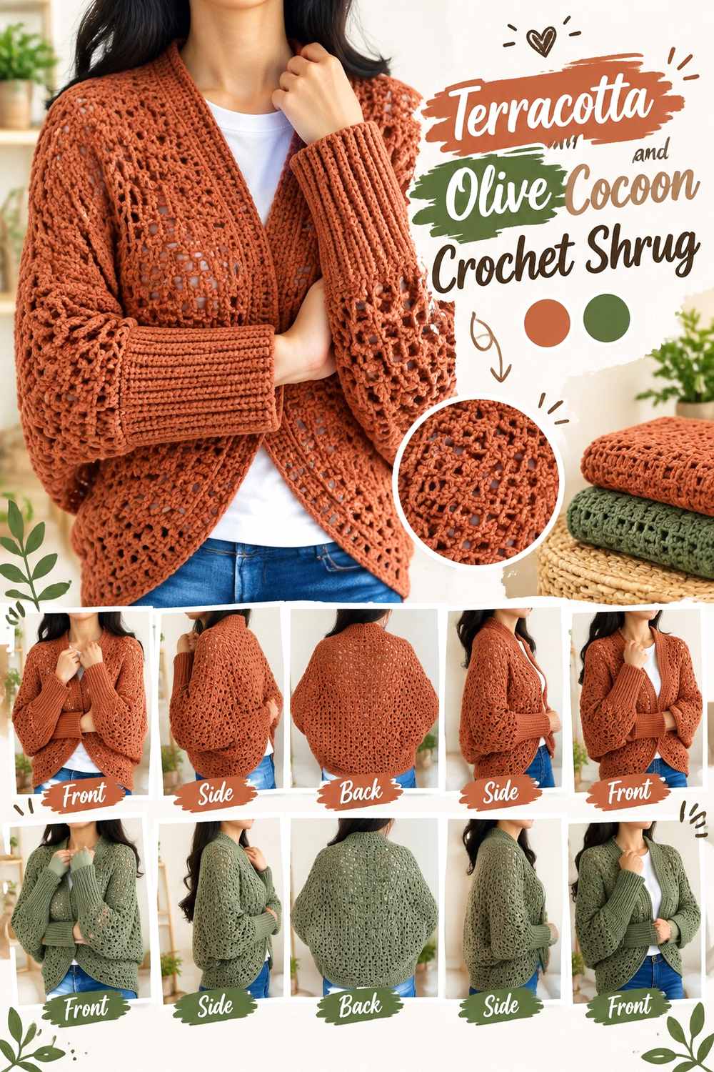
Terracotta and olive create an earthy combination with less contrast than terracotta and teal. That makes the palette useful when you want visible color variation without creating a sharp division across a large cocoon shrug.
Terracotta Can Cover the Largest Cocoon Shrug Area
Keep terracotta across the broad back or main square so the garment retains one recognizable base color. Olive can work around the opening, cuffs, or selected outer sections where its deeper green-brown quality visually grounds the warm center.
This distribution also keeps the back from looking chopped into several similarly weighted earthy blocks.
Terracotta and Olive Need Careful Contrast in Textured Sections
Muted olive and terracotta can have surprisingly similar values. If the shrug uses noticeable texture, too little value difference may cause the color change and stitch definition to compete rather than reinforce each other.
When the two yarns look similar in grayscale, reserve olive for wider borders or cuffs instead of small textured accents.
Creator Credit: Anutha – The Crochet World
7. Terracotta And Oatmeal Crochet Wrap Shrug

Oatmeal creates a softer light contrast than a crisp pale neutral, making it a useful partner when you want terracotta to remain warm and understated. A wrap-style shrug can carry oatmeal around the outer frame while keeping terracotta through most of the central crochet fabric.
Terracotta Looks More Continuous With Narrow Oatmeal Edging
Use oatmeal around selected edges rather than dividing the entire shrug into broad light and dark sections. The lighter neutral can outline the shape while leaving terracotta visually uninterrupted across the shoulders and back.
This approach is especially useful when the crochet fabric already has a strong stitch pattern and does not need additional color fragmentation.
Terracotta and Oatmeal Can Share the Shrug Without Equal Coverage
Oatmeal does not need half the garment to be noticeable. Against terracotta, even a restrained amount can brighten the cuffs or opening.
If the oatmeal starts to dominate, reduce it to repeated finishing areas instead of removing it completely. Repetition keeps the supporting color connected while restoring terracotta as the main shade.
Creator Credit: Bag-O-Day Crochet
8. Terracotta And Navy Mesh Crochet Shrug

Navy adds deep, cool contrast while staying less stark than black. In an open mesh shrug, use navy strategically because dark yarn can become especially noticeable where it outlines open spaces.
Terracotta Should Carry Most of the Mesh Shrug
Keeping the primary mesh in terracotta allows the openwork pattern to remain consistent from sleeve to sleeve. Navy can then create focused definition around the wrists, neckline, or another small repeated section.
Alternating terracotta and navy too frequently can make the mesh pattern itself harder to follow visually.
Terracotta and Navy Need Balanced Dark Accents
A navy cuff can look much heavier than an equally sized terracotta section because of the value difference. If one dark area seems isolated, repeat a smaller navy accent somewhere across the opposite edge or neckline.
The goal is not perfect symmetry in every row, but enough repetition that navy looks integrated rather than added at the end.
Creator Credit: 75 emma
9. Terracotta Blush And Cream Lace Crochet Shrug
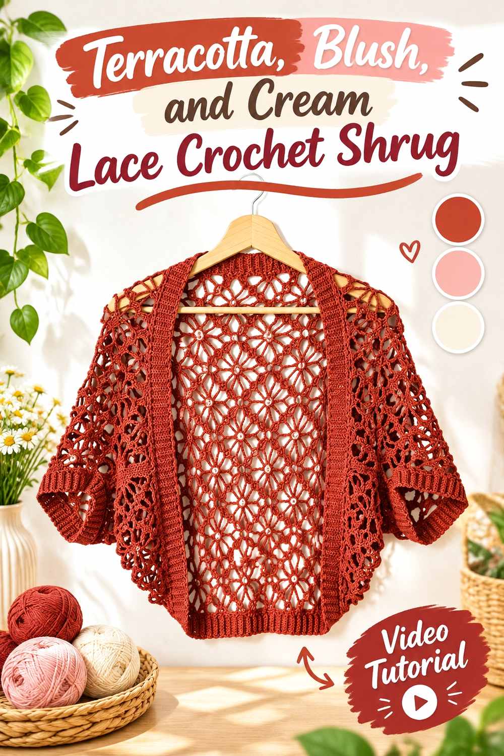
Adding both blush and cream gives this terracotta lace shrug a three-color hierarchy. Terracotta can stay dominant, blush can bridge the warm main shade and pale neutral, and cream can provide the clearest light contrast around delicate details.
Terracotta Should Remain the Largest Color in the Three-Shade Shrug
Give terracotta the broadest section so the palette does not turn into three unrelated bands. Use blush in a smaller supporting role, then reserve cream for the lightest and most selective details.
That progression creates a clearer visual hierarchy than giving all three colors the same amount of space.
Terracotta, Blush, and Cream Need Different Jobs in the Lace
Cream is useful near small lace details because it creates the strongest light break. Blush works better as a transitional shade around cuffs or wider sections where its softer relationship with terracotta remains visible.
If blush and terracotta are nearly the same value, keep cream between them where you want sharper separation.
Creator Credit: MyCrochetory
10. Terracotta And Chocolate Brown Crochet Shrug

Chocolate brown makes terracotta deeper without pulling the palette away from an earthy direction. This combination works particularly well when the brown is used to define edges and cuffs while terracotta occupies the larger body surface.
Terracotta Needs More Space Than Chocolate Brown
A dark brown can visually outweigh terracotta even when less yarn is used. Keep chocolate brown concentrated around the cuffs, opening, or another framing area if you want the finished shrug to remain clearly terracotta.
For a darker overall garment, expand the brown deliberately across the sleeves rather than adding unrelated dark patches.
Terracotta and Chocolate Brown Can Define Crochet Texture Differently
When a textured stitch continues across a color change, the darker brown may make shadows and raised areas appear stronger than they do in terracotta. Consider whether you want that extra definition at the garment edge or through a major body section.
If texture is the main feature, a narrow chocolate border often gives enough framing without distracting from the terracotta surface.
Creator Credit: Frisian Knitting tutorials
11. Terracotta And Muted Lavender Crochet Bolero Shrug
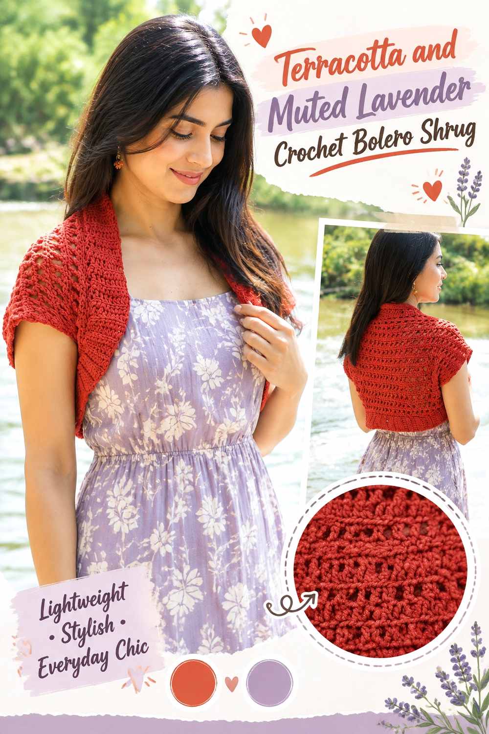
Muted lavender gives terracotta an unexpected cooler partner without creating the forceful contrast of bright purple. Keeping both shades softened makes the palette easier to distribute across a small bolero silhouette.
Terracotta Should Establish the Bolero Before Lavender Appears
Use terracotta for the main rectangle, back, or largest continuous section. Introduce muted lavender at the cuffs or edging so the cooler color reads as a deliberate secondary element.
This also makes shade substitution easier: the lavender does not need to match one exact hue as long as it stays visibly cooler and remains subordinate to the terracotta.
Terracotta and Muted Lavender Need Controlled Saturation
A very vivid purple can overpower a muted terracotta quickly. If you want this softer direction, choose lavender with a subdued character rather than simply choosing a lighter purple.
Compare the yarns together before crocheting a large section. The supporting color should add cool contrast without becoming the first color the eye notices.
Creator Credit: Jennyandteddy crochet.
12. Terracotta And Black Crochet Shrug

Black gives terracotta the most graphic dark framing in this collection. That makes placement particularly important: small black finishing areas can create substantial definition, while large black panels can quickly change the garment from terracotta-led to dark-neutral-led.
Terracotta Should Dominate Before Black Is Added
Build the largest visual areas in terracotta first, then decide how much black is actually needed. Cuffs, a neckline edge, or narrow finishing bands can create a clear frame without overwhelming the warmer yarn.
If you want more black, expand it in one intentional area rather than adding small dark sections in many unrelated places.
Terracotta and Black Make Shrug Edges Much More Visible
Black sharply separates the outer edge from the clothing underneath, especially when the shrug is worn over pale layers. That can make cuffs and the front opening more prominent than the central crochet texture.
Use a narrower black edge when you want terracotta texture to stay dominant, and a broader dark edge when a more graphic outline is the goal.
Creator Credit: Crochet Jewel
13. Terracotta Rust And Peach Blanket Crochet Shrug
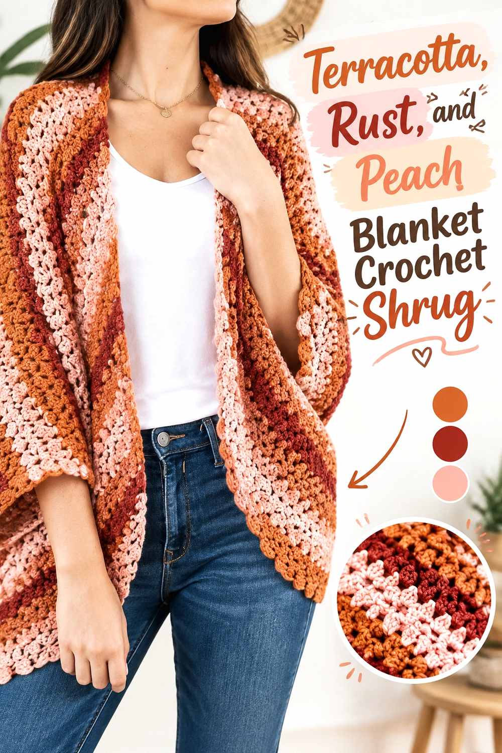
A terracotta, rust, and peach palette stays closely related in hue while creating variation through lightness and depth. The generous surface of a blanket-style shrug gives the three colors enough room to appear in wider sections without requiring tiny, repetitive stripes.
Terracotta Should Sit Between Rust and Peach Visually
Use terracotta as the middle anchor, with rust providing the deepest warm note and peach supplying the lighter break. This three-level relationship is easier to read when each color occupies a meaningful section instead of switching every few stitches.
Terracotta can cover most of the center while rust and peach appear toward outer sections, cuffs, or borders.
Terracotta, Rust, and Peach Need Noticeably Different Values
Three related warm hues can collapse into one blended field if their values are too similar. Before starting the full shrug, compare the three yarns together and make sure peach remains clearly lighter and rust visibly deeper than the terracotta.
If two shades merge, replace one based on its role rather than searching for an exact named color. Preserve the light-medium-dark relationship and the tonal concept will remain intact.
Creator Credit: Jewels & Jones
Comparing the Terracotta Crochet Shrug Palettes
For the lightest contrast, terracotta with cream or oatmeal gives the warm base more breathing room around cuffs and edges. Terracotta with dusty rose, olive, or rust stays more tonal and creates gentler color transitions, so value differences become especially important.
Sage, teal, muted lavender, and navy introduce cooler contrast in different strengths. Sage is the quieter option, while teal is more color-forward and navy relies heavily on dark value contrast. Charcoal, chocolate brown, and black are useful when you want stronger framing around the shrug rather than another competing hue.
For three-color planning, terracotta with blush and cream gives you a warm-to-light progression, while terracotta with rust and peach creates a more closely related tonal sequence.
Conclusion
Terracotta can support much more than one rustic or autumn-inspired shrug palette. Pairing it with cream or oatmeal keeps the garment lighter; sage, olive, and muted lavender add softer color contrast; teal and navy create stronger warm-cool separation; and charcoal, brown, or black place more emphasis on framing.
Before choosing a palette, decide what you want the second color to do on the actual shrug. A supporting shade may belong only on cuffs and edges, while a tonal companion can comfortably cover a larger sleeve or body section. For multicolor versions, give every shade a clear role instead of dividing the garment automatically into equal amounts.
Use the linked creator tutorials for the exact crochet construction details, then plan the terracotta color placement separately around the finished shrug shape.
Frequently Asked Questions
What colors go well with a terracotta crochet shrug?
Cream, oatmeal, sage, olive, dusty rose, teal, navy, charcoal, brown, black, muted lavender, peach, and rust can all create useful relationships with terracotta. The more important question is whether you want a light neutral contrast, a tonal earthy palette, a cool counterpoint, or a dark frame.
Should terracotta be the dominant color in a terracotta crochet shrug?
Usually, yes, if you want the finished garment to read clearly as terracotta. Let it cover the largest body or sleeve area and place secondary shades on cuffs, borders, edges, or selected sections. A different balance is possible, but the visual emphasis will change accordingly.
How can I tell whether two colors have enough contrast for a terracotta shrug?
Place the yarns beside each other and look at them from a short distance. You can also view them in grayscale to compare light and dark value. Two different hues may still blend visually when their values are very similar.
Is cream or black better for edging a terracotta crochet shrug?
They create very different results. Cream gives the edge a lighter break and can help small details stand apart, while black creates a strong, graphic outline. Choose according to how much attention you want the cuffs or outer edge to receive.
Can I combine three colors in a terracotta crochet shrug?
Yes, but assign clear roles. Terracotta can dominate, a second color can support larger secondary areas, and a third can be limited to small accents or edging. Equal amounts of three strong colors can make a small shrug look busier than intended.
What should I substitute if I cannot find the exact terracotta shade?
Preserve the role of the color rather than trying to match a specific commercial yarn name. Choose another warm, earthy orange-brown that still maintains the intended contrast with the supporting shade.
Why can terracotta look different in mesh and dense crochet shrugs?
Openwork allows more of the clothing underneath to show through, so the perceived palette includes both the yarn and the background layer. Dense crochet creates a more continuous field of terracotta, making secondary yarn colors themselves responsible for most of the visible contrast.