Cinnamon gives crochet a warm reddish-brown base that can move from earthy and understated to much more colorful depending on the shades placed beside it. Soft ivory and warm white bring out stitch definition, while Petrol Blue, deep teal, navy, and forest green provide cooler contrast. Blush and lilac soften the palette, while Antique Gold and Mulberry create richer warm and jewel-toned directions.
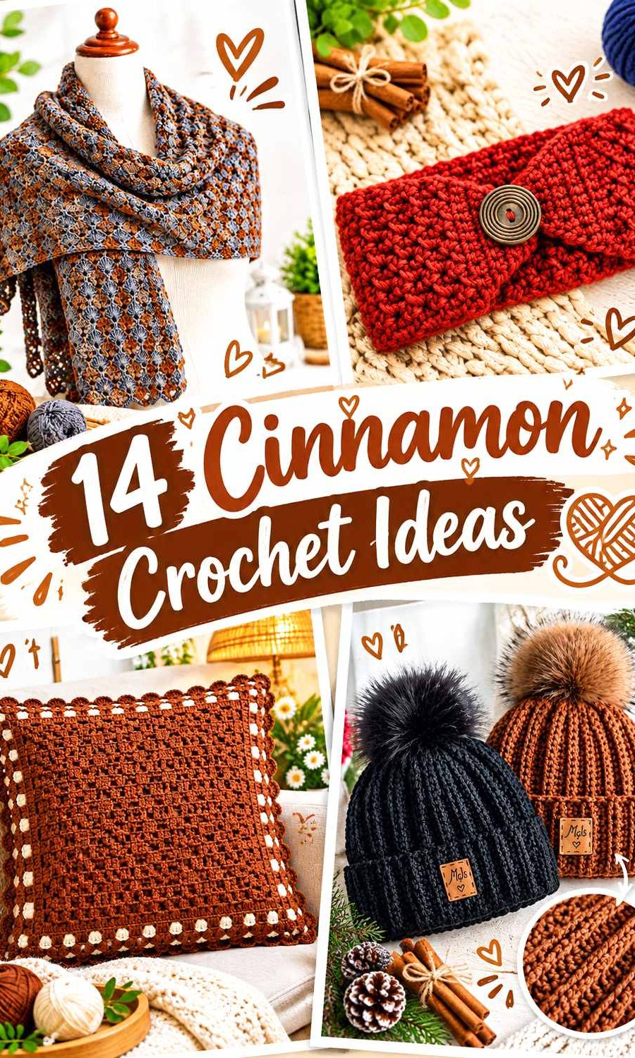
The most useful color placement depends on the crochet item. Large cardigans, blankets, pillows, and shawls can carry Cinnamon across broad surfaces, while a secondary color defines cuffs, borders, stripes, or edging. Smaller bags, hats, cowls, and headbands usually benefit from concentrating the support color around handles, brims, bands, or other structural areas instead of dividing every surface evenly.
The tutorials below support the crochet construction concepts. The Cinnamon palettes are independent editorial adaptations and are not claims that the creators used these exact colors.
Quick List
- Cinnamon And Soft Ivory Crochet Cardigan
- Cinnamon And Petrol Blue Crochet Tote Bag
- Cinnamon And Oatmeal Crochet Bucket Hat
- Cinnamon And Dusty Sage Crochet Blanket
- Cinnamon And Warm White Crochet Pillow
- Cinnamon And Deep Teal Crochet Scarf
- Cinnamon And Charcoal Crochet Ribbed Hat
- Cinnamon And Blush Crochet Vest
- Cinnamon And Antique Gold Crochet Handbag
- Cinnamon And Mulberry Crochet Cowl
- Cinnamon And Navy Crochet Headband
- Cinnamon And Soft Lilac Crochet Top
- Cinnamon And Pewter Gray Crochet Shawl
- Cinnamon And Forest Green Crochet Basket
Use Contrast Where Cinnamon Crochet Needs Definition
Cinnamon often sits in the middle-to-dark part of a palette, so another medium shade may create obvious hue contrast without providing much light-dark separation. That distinction matters around small motifs, narrow borders, ribbing, and raised texture.
If details need to remain easy to see, place a lighter or darker yarn next to them. Ivory, oatmeal, and warm white can brighten Cinnamon edges, while charcoal or navy can define a lighter Cinnamon yarn. When two colors seem different but still visually merge, a grayscale photo can help reveal how close they are in value.
Decide How Much Cinnamon the Crochet Item Should Show
Large crochet surfaces can handle substantial Cinnamon coverage because there is enough room for an accent to appear without competing with the main shade. On garments, support colors can stay around cuffs, necklines, hems, and openings. On blankets and shawls, repeated bands or outer borders create natural secondary-color zones.
Smaller pieces need tighter control. A Cinnamon hat, headband, handbag, or cowl can become visually busy when several strong shades occupy equal amounts. Keeping Cinnamon on the largest surface and giving the accent one clear structural role usually creates a stronger hierarchy.
1. Cinnamon And Soft Ivory Crochet Cardigan

Cinnamon can cover the cardigan’s main body and sleeves while soft ivory identifies the garment’s edges. This pairing gives the warm brown-red enough uninterrupted space to remain dominant while preventing cuffs and front finishing from disappearing into the body.
Keep Cinnamon Dominant Across the Crochet Cardigan Panels
Use Cinnamon across the front, back, and most of the sleeves when you want one continuous warm field. Large Cinnamon sections also allow cables, ribbing, or other stitch texture to remain visible without frequent color changes competing with them.
Keep the ivory portions relatively narrow if Cinnamon should remain the first color noticed.
Soft Ivory Gives Cinnamon Crochet Cardigan Edges Clearer Definition
Place soft ivory around cuffs, neckline finishing, or the front opening. These areas already mark construction changes, so the lighter shade reinforces the cardigan’s shape instead of appearing as a random contrasting stripe.
A warmer ivory can soften the transition while still remaining noticeably lighter than Cinnamon.
Creator Credit: TCDDIY
2. Cinnamon And Petrol Blue Crochet Tote Bag

Petrol Blue gives Cinnamon a strong blue-green counterpoint. On a tote, the cleanest balance is often a Cinnamon body with Petrol Blue concentrated around handles or the upper opening, where the contrast also helps define the structure.
Keep Cinnamon Across the Main Crochet Tote Bag Body
Use Cinnamon through the front, back, and lower bag sections so the tote has one stable warm base. If the crochet fabric already contains openwork or obvious texture, a continuous Cinnamon field keeps color from competing with the construction.
The broader main color also means Petrol Blue can have impact without covering much surface.
Petrol Blue Frames Cinnamon Crochet Tote Handles and Openings
Use Petrol Blue for the handles or upper border, where the bag naturally changes from body to carrying structure. That placement gives the cool shade a practical visual job.
If the Petrol Blue is very dark, make the accent wide enough to remain easy to distinguish from Cinnamon.
Creator Credit: Kristines Crochets
3. Cinnamon And Oatmeal Crochet Bucket Hat
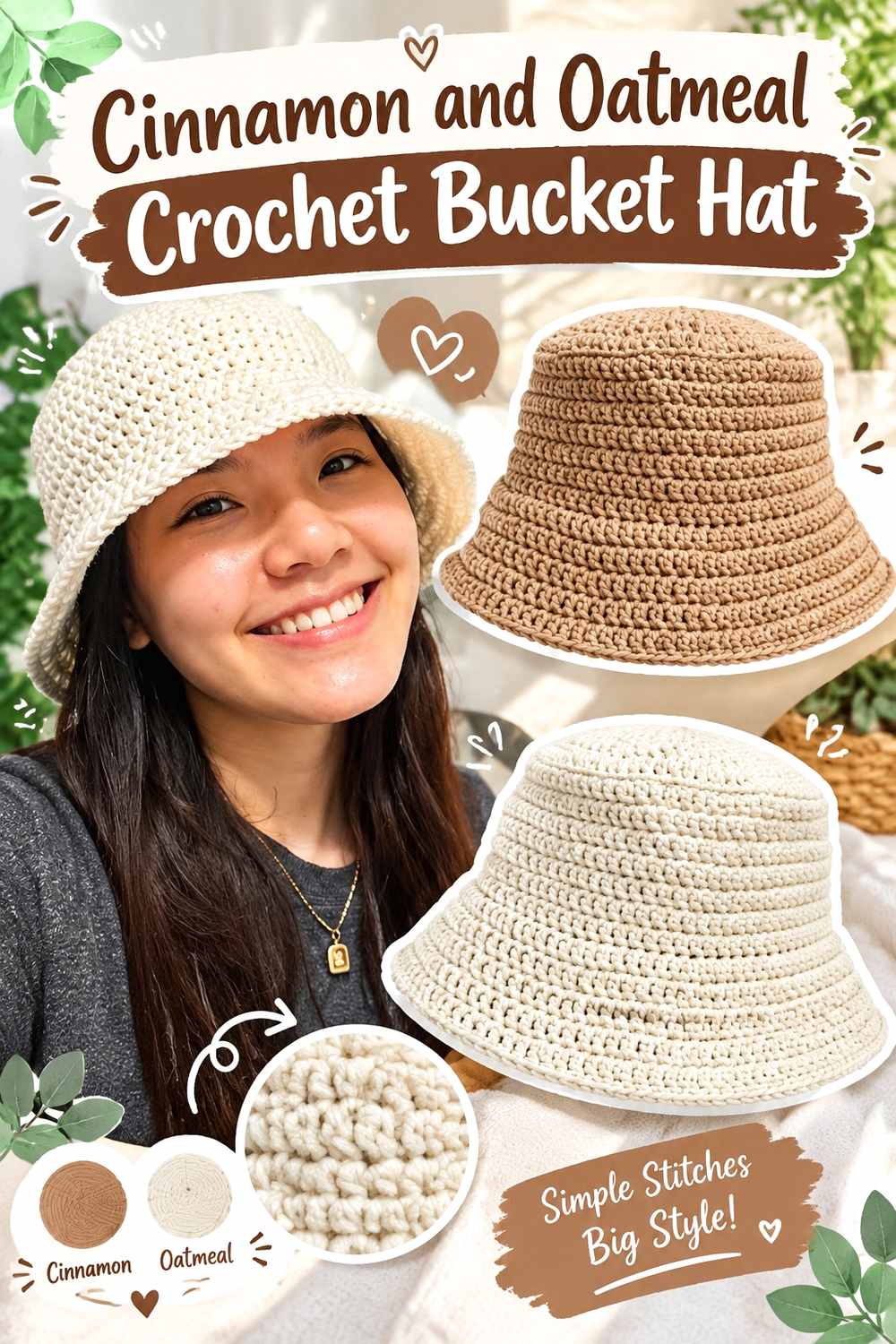
Oatmeal provides a light neutral break that keeps the hat warm without making it stark. A bucket hat already divides naturally into crown, sides, and brim, giving the two colors straightforward placement options.
Keep Cinnamon Continuous Across the Crochet Bucket Hat Crown
Use Cinnamon through the crown and most of the side wall so the rounded upper shape remains visually connected. The shaping itself creates enough variation that repeated stripes are not necessary.
Keeping those areas Cinnamon also ensures the hat remains centered on the main warm color.
Oatmeal Defines the Brim of a Cinnamon Crochet Bucket Hat
Place oatmeal over the brim or just the outer portion. Because the brim projects away from the hat body, the lighter shade reinforces an existing change in silhouette.
For a subtler result, continue Cinnamon into the brim and introduce oatmeal only near its edge.
Creator Credit: VivCrochets
4. Cinnamon And Dusty Sage Crochet Blanket

Dusty sage cools Cinnamon and creates a muted earthy palette rather than a sharp complementary contrast. A blanket provides enough surface area for both colors to appear in broad repeats without making the fabric look crowded.
Give Cinnamon More Area Across the Crochet Blanket
Make Cinnamon sections wider or repeat them more frequently when it should remain the dominant color. Equal coverage naturally creates a more balanced Cinnamon-and-sage blanket.
Planning that proportion before beginning helps prevent the supporting green from gradually occupying more space than intended.
Dusty Sage Softens Cinnamon Crochet Blanket Repeats
Use dusty sage between larger Cinnamon areas to create a quiet color transition. This works particularly well when the stitch texture already provides strong visual interest.
If a small border or motif needs crisp definition, check whether the sage differs enough in value from Cinnamon before assigning it to that detail.
Creator Credit: Daisy Farm Crafts
5. Cinnamon And Warm White Crochet Pillow

A pillow gives Cinnamon one broad decorative surface where texture can remain the main feature. Warm white can then highlight selected raised stitches, motifs, or the border instead of dividing the entire pillow face into multiple blocks.
Let Cinnamon Cover the Main Crochet Pillow Face
Use Cinnamon across most of the pillow front when the surface already includes noticeable texture. One consistent main color allows stitch shadows and raised details to add visual movement.
If the pillow back is visible, repeating Cinnamon there can keep the entire cover connected.
Warm White Reveals Texture Against a Cinnamon Crochet Pillow
Place warm white beside the border or raised feature you most want emphasized. The lighter value can make a textured section easier to distinguish from across a room.
Keep the white focused around specific details rather than scattering tiny accents over every Cinnamon area.
Creator Credit: Crochet With Samina
6. Cinnamon And Deep Teal Crochet Scarf
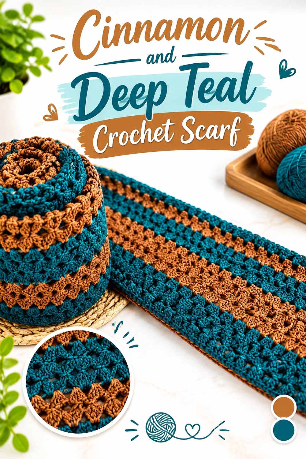
Deep teal creates a richer cool contrast against Cinnamon and can make the warm red-brown look more pronounced by comparison. A scarf gives both shades room to repeat, but broader sections keep the palette easier to read when the fabric is wrapped.
Use Wider Cinnamon Sections Across the Crochet Scarf
Give Cinnamon the larger repeats if it should remain the main color. Wider areas stay more visible when the scarf overlaps itself around the neck.
They also provide uninterrupted space for stitch texture instead of making every few rows another color transition.
Deep Teal Adds Depth Between Cinnamon Crochet Scarf Sections
Repeat deep teal at intentional intervals rather than adding one isolated block. This connects the cool accent throughout the scarf while leaving enough Cinnamon between sections to maintain hierarchy.
If the teal and Cinnamon are close in value, larger blocks will remain easier to distinguish than very thin stripes.
Creator Credit: Bag-O-Day Crochet
7. Cinnamon And Charcoal Crochet Ribbed Hat

Charcoal darkens the Cinnamon palette without introducing another strong hue. A ribbed hat is especially suitable for this tonal structure because the stitch lines already supply plenty of visual movement.
Keep Cinnamon Across the Crochet Ribbed Hat Crown
Use Cinnamon continuously through the crown so the ribbing remains visually uninterrupted. Frequent color changes can cut across the directional texture and make the surface harder to read.
A broad Cinnamon crown also establishes the warm shade before the darker band begins.
Charcoal Grounds the Band of a Cinnamon Crochet Ribbed Hat
Place charcoal around the lower or fold-over band. The dark neutral gives the Cinnamon crown a clear base without creating the sharp contrast of white.
If your Cinnamon is especially deep, compare the yarns first and make the charcoal band wider when the transition is subtle.
Creator Credit: MJ’s Off The Hook Designs
8. Cinnamon And Blush Crochet Vest
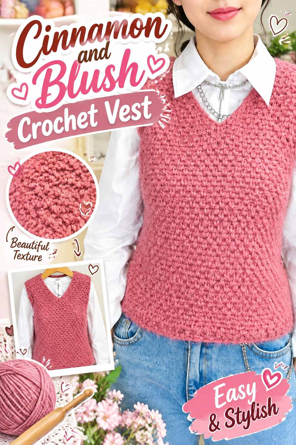
Blush creates a softer warm relationship that lightens Cinnamon without moving the vest into a neutral-only palette. Armholes and neckline edging are practical locations for the pale accent because those areas already need visual definition.
Keep Cinnamon Across the Main Crochet Vest Panels
Use Cinnamon through the torso so the front and back feel connected despite seams or separate construction pieces. A broad main field also keeps the vest grounded when lighter blush appears around several edges.
Avoid adding blush throughout every panel if Cinnamon should stay dominant.
Blush Softens Cinnamon Crochet Vest Openings
Place blush around the armholes, neckline, or lower edge. The lighter pink can reveal these boundaries while keeping the overall color direction warm.
Choose a blush noticeably lighter than Cinnamon if narrow edging needs to remain obvious from a distance.
Creator Credit: Sirin’s Crochet
9. Cinnamon And Antique Gold Crochet Handbag
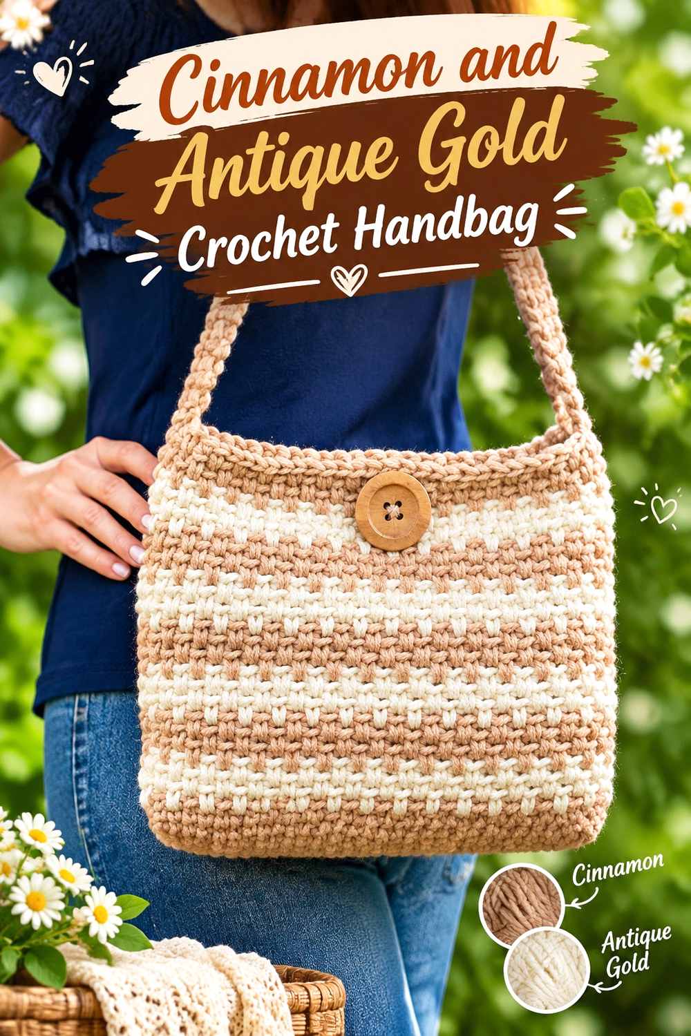
Antique Gold stays within the warm side of the palette but adds a yellower note against Cinnamon’s red-brown base. Since both colors have visual strength, keeping the gold-toned yarn around limited structural features prevents competition.
Keep Cinnamon Dominant Across the Crochet Handbag Body
Use Cinnamon across the broad front and back surfaces so the compact handbag has one clear main color. Small bags can look fragmented quickly when two strong warm shades divide the surface evenly.
A continuous Cinnamon body also gives Antique Gold more impact in smaller areas.
Antique Gold Highlights Cinnamon Crochet Handbag Details
Reserve Antique Gold for handles, an upper border, or the closure area. These components already differ from the bag body, so the color change reinforces the structure.
If the two yarns sit close in value, use enough Antique Gold to make the accent recognizable rather than limiting it to a very thin line.
Creator Credit: naztazia
10. Cinnamon And Mulberry Crochet Cowl

Mulberry brings a berry-purple depth to Cinnamon and creates a rich warm-to-cool transition. Since cowls fold and bunch when worn, broad sections are more useful than many narrow alternating stripes.
Give Cinnamon the Larger Crochet Cowl Sections
Use wider Cinnamon repeats so the warm main color stays recognizable after the fabric gathers around the neck. Equal narrow sections may visually blend into a general dark warm palette.
Giving Cinnamon more width preserves the intended hierarchy.
Mulberry Deepens Cinnamon Crochet Cowl Texture
Place Mulberry beside selected textured areas or use it as a repeated broader band. The dark berry shade can make Cinnamon appear warmer without adding a neutral.
If the Mulberry is especially deep, avoid using it only for fine detail that could disappear next to Cinnamon.
Creator Credit: Rich Textures Crochet
11. Cinnamon And Navy Crochet Headband

Navy gives Cinnamon a strong cool-dark frame that works well on a narrow headband. Because the project has little surface area, even slim navy borders will carry substantial visual weight.
Keep Cinnamon Central on the Crochet Headband
Use Cinnamon across the widest center section so ribbing, cables, or another textured stitch remains uninterrupted.
Keeping the central field consistent also prevents the small accessory from becoming unnecessarily divided.
Navy Frames Cinnamon Crochet Headband Edges
Place navy along both long edges or around the joining section. A dark symmetrical outline can sharpen the shape while leaving Cinnamon as the obvious focal shade.
If the Cinnamon yarn itself is quite dark, check that navy remains sufficiently distinct before using it as very narrow trim.
Creator Credit: B.Hooked Crochet
12. Cinnamon And Soft Lilac Crochet Top
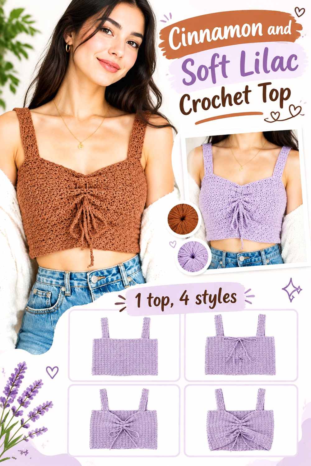
Soft lilac creates a cooler pastel contrast against Cinnamon and moves the palette away from an entirely earthy direction. The lighter purple works best around narrower areas while Cinnamon covers the main torso.
Let Cinnamon Lead Across the Crochet Top Body
Use Cinnamon over the largest body section so the garment has one coherent warm foundation. Neckline, sleeve, or strap construction already creates visual divisions, reducing the need for extra blocks across the torso.
A broad Cinnamon field also makes the lilac accent more noticeable.
Soft Lilac Lightens Cinnamon Crochet Top Edges
Place soft lilac around straps, sleeves, or neckline finishing where a lighter color can clarify narrow structural details.
Repeat the lilac at a second edge when practical so the color feels intentionally distributed around the Cinnamon top rather than isolated in one place.
Creator Credit: For The Frills
13. Cinnamon And Pewter Gray Crochet Shawl
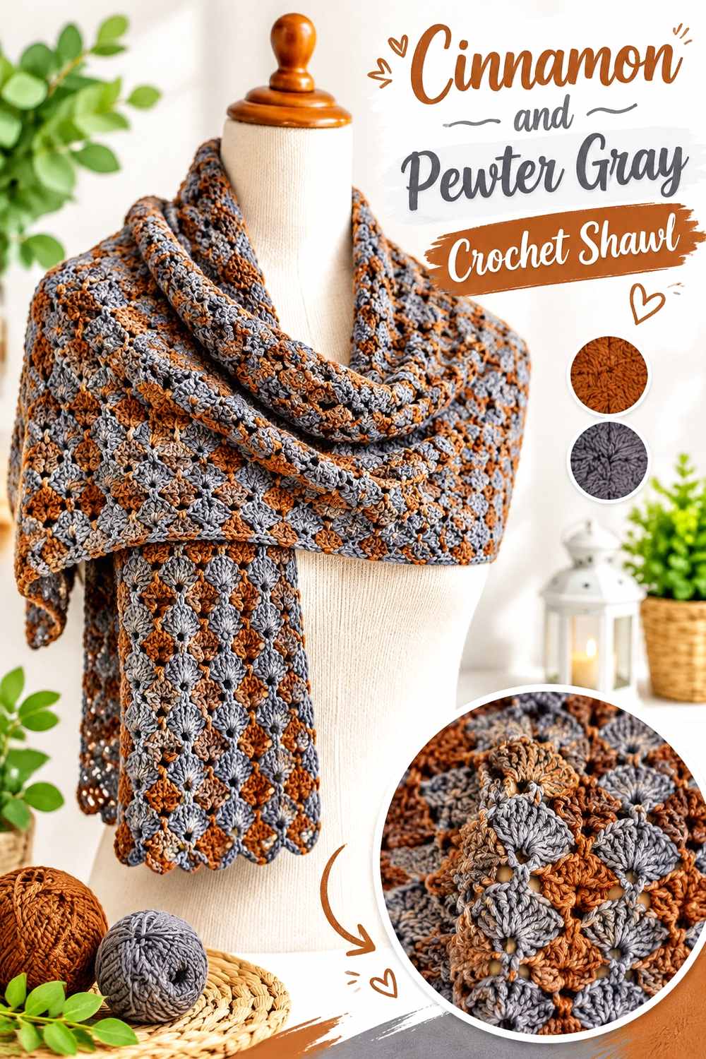
Pewter Gray cools Cinnamon without introducing a strong blue or green hue. A shawl provides enough area for this quieter relationship to appear in broad sections where moderate contrast is appropriate.
Give Cinnamon the Broadest Area of the Crochet Shawl
Use Cinnamon through the main field or repeat it more frequently than Pewter Gray. A shawl folds and drapes in several directions, so the main shade needs enough area to remain obvious after portions overlap.
Large Cinnamon areas keep the finished piece visibly warm even with a cool neutral border.
Pewter Gray Frames Cinnamon Crochet Shawl Sections
Place Pewter Gray toward the outer section or border to calm the warmth and give the edge a cooler finish.
If both yarns are close in lightness, use gray in a substantial area rather than depending on it for tiny openwork details that need crisp separation.
Creator Credit: Fiber Flux
14. Cinnamon And Forest Green Crochet Basket

Forest Green gives Cinnamon a deep botanical contrast that works naturally on a basket. Keeping Cinnamon across the walls and green near the handles or upper rim creates clear structural color placement.
Use Cinnamon Across the Main Crochet Basket Walls
Keep the substantial side areas Cinnamon so the basket has one warm, stable base. The three-dimensional form and crochet texture already provide surface interest without the need for frequent color changes.
A broad Cinnamon body also allows Forest Green to remain a focused accent.
Forest Green Defines Handles Against a Cinnamon Crochet Basket
Place Forest Green around the handles or upper rim where the object changes from storage body to opening. This makes the strong green contrast useful instead of decorative for its own sake.
If both yarns are dark, use Forest Green across the full handle or a broad rim so the transition stays visible.
Creator Credit: Jayda InStitches
Comparing the 14 Cinnamon Crochet Color Directions
For the clearest light-dark contrast, pair Cinnamon with soft ivory, oatmeal, warm white, or blush. These combinations are especially useful around cardigan edges, hat brims, pillow texture, and garment openings that need stronger definition.
Petrol Blue, deep teal, navy, and forest green create the strongest cool contrasts. Petrol Blue and teal give Cinnamon a rich blue-green counterpoint, navy works well as dark framing, and Forest Green moves the palette toward a deeper botanical direction.
Dusty sage and Pewter Gray are quieter options. Sage creates a muted earthy relationship, while Pewter Gray cools Cinnamon without adding another saturated color.
Antique Gold, Mulberry, and soft lilac each change the warm shade differently. Antique Gold keeps the palette warm, Mulberry deepens it with berry-purple tones, and lilac introduces a lighter cooler contrast that works especially well around garment edges.
Conclusion
Cinnamon works best when its role changes with the crochet item rather than following the same color formula every time. Cardigans, blankets, pillows, scarves, tops, and shawls can carry broad Cinnamon areas. Tote bags, hats, cowls, headbands, handbags, and baskets generally benefit from placing the supporting shade around structural details such as handles, brims, bands, borders, and openings.
Choose ivory, oatmeal, warm white, or blush when stitch visibility is the priority. Petrol Blue, teal, navy, sage, and forest green introduce cooler contrast. Charcoal and Pewter Gray create more restrained schemes, while Antique Gold and Mulberry provide richer warm and jewel-toned directions.
When substituting yarn colors, preserve their purpose. A light supporting shade should remain clearly lighter than Cinnamon, a dark framing shade should maintain enough depth, and a saturated accent should stay controlled enough that Cinnamon remains the main visual color.
Frequently Asked Questions
What Colors Work Well With Cinnamon Crochet?
Cinnamon can pair with ivory, oatmeal, warm white, blush, Antique Gold, Mulberry, lilac, sage, Forest Green, Petrol Blue, teal, navy, charcoal, and Pewter Gray. The useful choice depends on whether you want light contrast, an earthy palette, a cool counterpoint, or deeper tonal color.
How Can I Keep Cinnamon Crochet From Looking Too Dark?
Use lighter shades around structural features such as cuffs, brims, borders, necklines, motifs, and openings. Ivory, oatmeal, warm white, blush, and soft lilac can all break up a dark Cinnamon surface without replacing it as the main color.
Does Cinnamon Crochet Work Better With Cream or White?
Both can provide useful contrast. A warm cream or ivory keeps the palette closely connected to Cinnamon’s earthy character, while a clearer white creates a sharper boundary. Compare the actual yarns because Cinnamon shades can vary considerably in depth.
Can Cinnamon and Blue Be Used Together in Crochet?
Yes. Petrol Blue creates a rich blue-green contrast, deep teal adds a darker cool direction, and navy works well as a framing shade. When both yarns are dark, larger blocks are usually easier to distinguish than tiny details.
Can Cinnamon and Green Work Together in Crochet?
Yes. Dusty sage creates a softer earthy pairing, while Forest Green gives Cinnamon a deeper botanical contrast. If the two yarns have similar values, keep them in larger areas rather than relying on their hue difference to define small motifs.
Does Cinnamon Work With Purple Crochet Accents?
Yes. Mulberry gives Cinnamon a deep berry-purple relationship, while soft lilac creates a much lighter contrast. Use the darker purple across broader cowl or scarf sections and reserve pale lilac for edges or narrower garment details when stronger definition is wanted.
How Can I Make Cinnamon Crochet Texture Easier to See?
Place a noticeably lighter or darker shade beside raised stitches, ribbing changes, borders, or motifs that need emphasis. On a single-color Cinnamon project, larger uninterrupted surfaces can also help stitch shadows show more clearly.
How Do I Substitute a Color in a Cinnamon Crochet Palette?
Preserve the role of the shade you are replacing. Substitute a light accent with another clearly lighter yarn, a dark frame with another sufficiently deep color, and a warm or cool accent with a shade that creates a similar visual relationship to Cinnamon.