Cobalt Blue and Oatmeal give a crochet tablet sleeve a clear saturated-and-neutral color relationship. Cobalt Blue can define the front panel, opening, closure, seams, or geometric details, while Oatmeal can lighten larger surfaces and give textured stitches enough visual space to remain readable.

Tablet sleeves also need color planning around their finished shape. A design that looks balanced as a flat crochet panel can change considerably after the sides are joined and a tablet fills the interior. Side seams become narrower, closures move forward, and part of the upper edge may be hidden by the device.
Texture is another important factor. Jasmine stitch, bean stitch, clusters, granny motifs, and raised surface crochet already introduce considerable visual detail. Those constructions often benefit from broad Cobalt Blue and Oatmeal fields rather than frequent color changes.
The credited tutorials below include direct tablet-case tutorials along with e-reader, book, and laptop sleeves whose basic rectangular construction can inform a tablet-sized adaptation. Measure your own device and follow the individual creator’s instructions for construction and fit rather than assuming one sleeve size will suit every tablet.
Quick List
- Cobalt Blue And Oatmeal Spike Detail Crochet Tablet Sleeve
- Oatmeal And Cobalt Blue Graphic Band Crochet Tablet Sleeve
- Cobalt Blue And Oatmeal Button Flap Crochet Tablet Sleeve
- Oatmeal And Cobalt Blue Chunky Textured Crochet Tablet Sleeve
- Cobalt Blue And Oatmeal Bean Stitch Crochet Tablet Sleeve
- Oatmeal And Cobalt Blue Textured Crochet Tablet Sleeve
- Cobalt Blue And Oatmeal Minimal Crochet Tablet Sleeve
- Oatmeal And Cobalt Blue Front Pocket Crochet Tablet Sleeve
- Cobalt Blue And Oatmeal Drawstring Crochet Tablet Sleeve
- Oatmeal And Cobalt Blue Cluster Stitch Crochet Tablet Sleeve
- Cobalt Blue And Oatmeal Jasmine Stitch Crochet Tablet Sleeve
- Oatmeal And Cobalt Blue Surface Motif Crochet Tablet Sleeve
- Cobalt Blue And Oatmeal Floral Granny Crochet Tablet Sleeve
- Oatmeal And Cobalt Blue Contrast Seam Crochet Tablet Sleeve
- Cobalt Blue And Oatmeal Wrap Strap Crochet Tablet Sleeve
Decide Whether Cobalt Blue or Oatmeal Should Own the Tablet Sleeve Front
Cobalt Blue has much stronger visual intensity, so it can remain prominent even when Oatmeal covers more of the sleeve. A mostly Oatmeal case with a Cobalt Blue closure band and side seams can still feel distinctly blue because those darker saturated sections outline the construction.
For a Cobalt-led sleeve, let blue occupy the main front and use Oatmeal around the opening, button loop, side frame, or selected texture. The neutral then provides separation without competing with the saturated body.
If you want both colors to carry similar weight, divide the sleeve into broad blocks or motifs instead of using many narrow stripes. Tablets provide enough front-facing area for two substantial color zones.
Use Oatmeal to Separate Cobalt Blue Texture
Dark or highly saturated yarn can make small stitch details less immediately obvious, particularly when the fabric includes several raised elements close together. Oatmeal can provide a lighter field beside Cobalt Blue bean stitches, clusters, surface motifs, or granny centers.
You can also reverse the relationship by crocheting the texture in Oatmeal and framing it with Cobalt Blue. This works well when you want the stitch pattern—not the deepest color—to control the largest part of the front.
When the stitch pattern itself is elaborate, avoid switching colors inside every small repeat. A clear Cobalt Blue panel next to an Oatmeal panel usually preserves both texture and color hierarchy more effectively.
Plan Cobalt Blue and Oatmeal Around the Tablet Opening and Closure
The opening deserves deliberate color placement because it remains close to the visible edge of the device. An Oatmeal upper band can lighten a Cobalt Blue sleeve, while a Cobalt Blue opening can provide a crisp endpoint on a neutral case.
Buttons, loops, flaps, drawstrings, and wrap straps can repeat whichever shade occupies less of the main body. That gives the secondary color another meaningful role without introducing unrelated decoration.
Check the sleeve with the tablet inserted before making final color judgments. The device may cover part of the upper field or stretch the crochet enough to change the apparent proportions.
1. Cobalt Blue And Oatmeal Spike Detail Crochet Tablet Sleeve
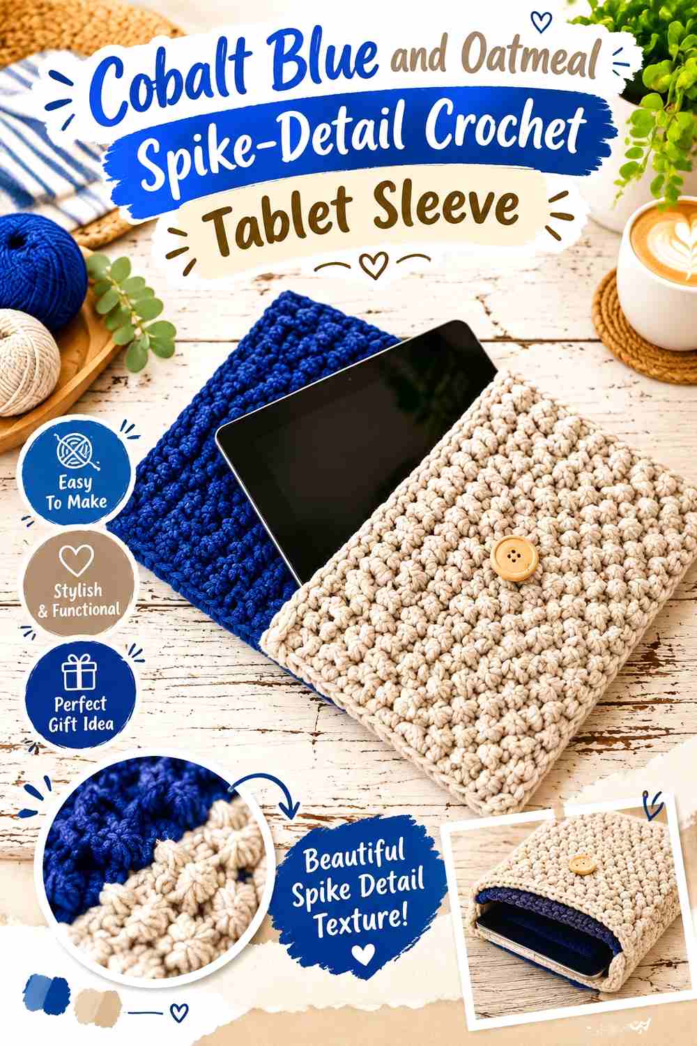
Use Cobalt Blue across most of the tablet case and place Oatmeal in a broad geometric or spike-detail section. The lighter stitches can interrupt the saturated surface while still following the underlying crochet structure.
A flat, seamed tablet-case construction is particularly suitable for this treatment because you can assess the front panel before assembly and position the contrasting section where it will remain visible.
Cobalt Blue Should Remain Broad Around the Oatmeal Spike Detail
Give Cobalt Blue enough uninterrupted space above and below the lighter section that it remains the clear dominant color.
If Oatmeal appears in several equally wide bands, the sleeve can become conventionally striped rather than emphasizing the stitch detail.
Oatmeal Can Make Cobalt Blue Geometric Texture Easier to Read
Place Oatmeal where the stitch pattern changes height, direction, or surface emphasis.
The neutral contrast helps distinguish the design without requiring an additional accent color.
Creator Credit: Katia Yarns & Fabrics
2. Oatmeal And Cobalt Blue Graphic Band Crochet Tablet Sleeve
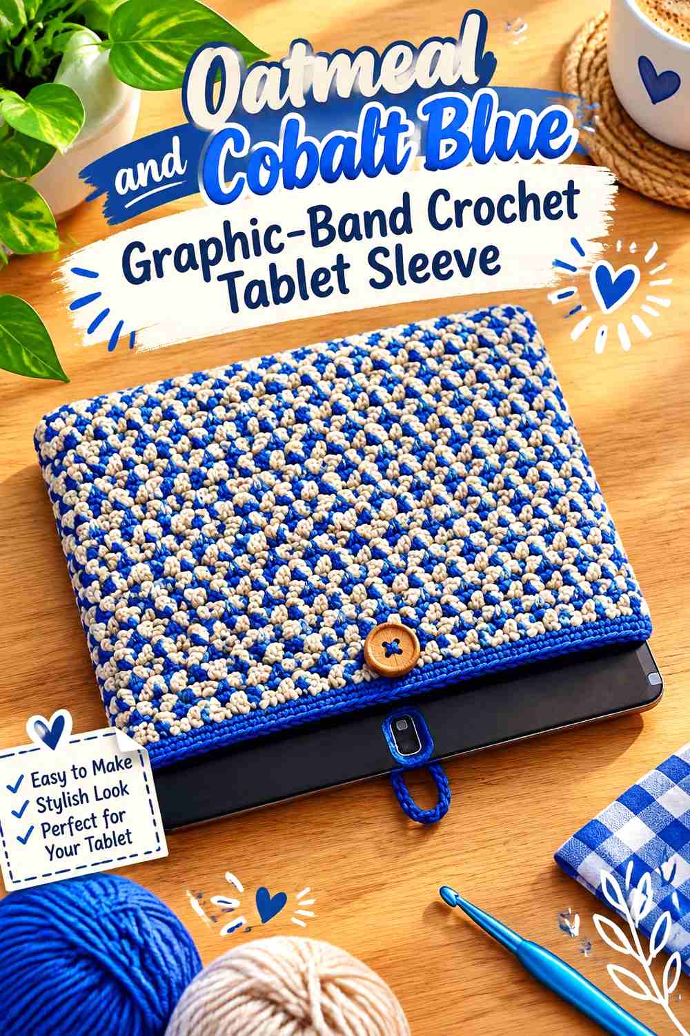
This version makes Oatmeal the primary background and uses one large Cobalt Blue band across the center or lower third. The saturated blue becomes a graphic feature while the neutral keeps most of the tablet sleeve visually quiet.
Position the band based on the closed sleeve rather than choosing its location only from the flat crochet.
Oatmeal Should Stay Visible Above and Below the Cobalt Blue Band
Allow enough neutral fabric on both sides of the blue section for the color block to remain distinct.
If Cobalt Blue occupies nearly the entire front, the design changes from an Oatmeal-led graphic sleeve into a blue sleeve with neutral edging.
Cobalt Blue Should Sit Where Oatmeal Cannot Hide It Behind the Tablet
Keep the strongest blue section below the uppermost opening area if the inserted device will obscure part of the fabric.
A visible mid-front band gives Cobalt Blue a clearer role in the finished sleeve.
Creator Credit: ViVi Berry Crochet
3. Cobalt Blue And Oatmeal Button Flap Crochet Tablet Sleeve
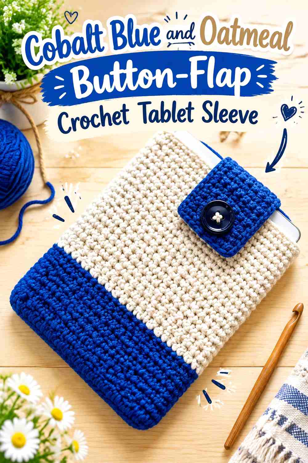
Use Cobalt Blue for the main sleeve and Oatmeal for a button flap, loop area, or upper closure band. Concentrating the neutral around the fastening makes the color change directly relevant to how the case functions.
The lighter top also creates separation between the saturated body and the visible edge of the tablet.
Cobalt Blue Should Control the Main Oatmeal-Flap Sleeve Body
Keep the broad rectangular section blue so the closure remains a true accent.
If Oatmeal extends far down the front, the upper section can become a second body panel rather than a defined fastening area.
Oatmeal Can Clarify the Cobalt Blue Button Closure
Use Oatmeal around the loop or flap where the closure needs to remain easy to identify visually.
If the closure detail itself is small, repeat Oatmeal once around the top edge so it does not look isolated.
Creator Credit: ahooka
4. Oatmeal And Cobalt Blue Chunky Textured Crochet Tablet Sleeve

A thicker sleeve surface benefits from larger color areas. Use Oatmeal across the main textured body and reserve Cobalt Blue for the upper section and button area.
Because larger stitches already create strong surface movement, narrow alternating stripes are unnecessary.
Oatmeal Should Carry Most of the Cobalt Blue Chunky Texture
Let the neutral remain continuous through the largest textured area.
This gives the stitches space to create shadows and prevents the strong Cobalt Blue from competing with every raised section.
Cobalt Blue Can Give the Oatmeal Sleeve a Strong Upper Endpoint
Use blue around the opening or fastening so the top of the sleeve has a clear visual boundary.
Keep the Cobalt Blue area proportional to the sleeve height, particularly when working with thick yarn that makes even a few rows visually substantial.
Creator Credit: Jarful Of Knots
5. Cobalt Blue And Oatmeal Bean Stitch Crochet Tablet Sleeve

Bean-stitch texture provides enough surface detail that Cobalt Blue can remain uninterrupted through most of the body. Use Oatmeal at the opening, closure loop, or one narrow lower border.
This keeps the raised stitch field cohesive instead of dividing each textured repeat into a separate color event.
Cobalt Blue Should Stay Continuous Through the Oatmeal-Framed Bean Texture
Use Cobalt Blue across the broad central surface when the bean stitch is the main feature.
Several Oatmeal stripes through the same field could make the texture harder to follow and create more visual activity than a tablet sleeve needs.
Oatmeal Can Frame the Cobalt Blue Opening and Closure
Repeat the neutral at the top and around a small closure detail.
Those two related placements are enough to establish Oatmeal as a purposeful secondary color without covering much of the textured body.
Creator Credit: Maria’s Blue Crayon
6. Oatmeal And Cobalt Blue Textured Crochet Tablet Sleeve
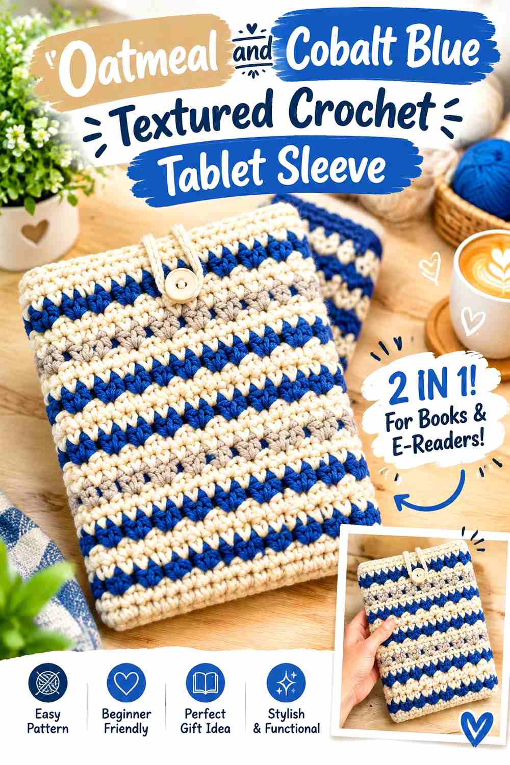
Reverse the texture hierarchy by letting Oatmeal cover the main sleeve and using Cobalt Blue around the lower edge, opening, or a selected front detail. The neutral surface allows a patterned stitch to remain visible while blue supplies stronger definition.
This direction suits a sleeve where the crochet texture should be noticeable before the color blocking.
Oatmeal Should Remain the Largest Cobalt Blue-Accented Texture Field
Keep the main front neutral and continuous.
The more texture the stitch pattern already contains, the less need there is to add several equally strong Cobalt Blue bands.
Cobalt Blue Can Mark the Oatmeal Sleeve’s Structural Edges
Use blue around the top or bottom instead of scattering it randomly across the center.
Structural color placement makes the two-tone plan look connected to the sleeve construction.
Creator Credit: The Turtle Trunk
7. Cobalt Blue And Oatmeal Minimal Crochet Tablet Sleeve
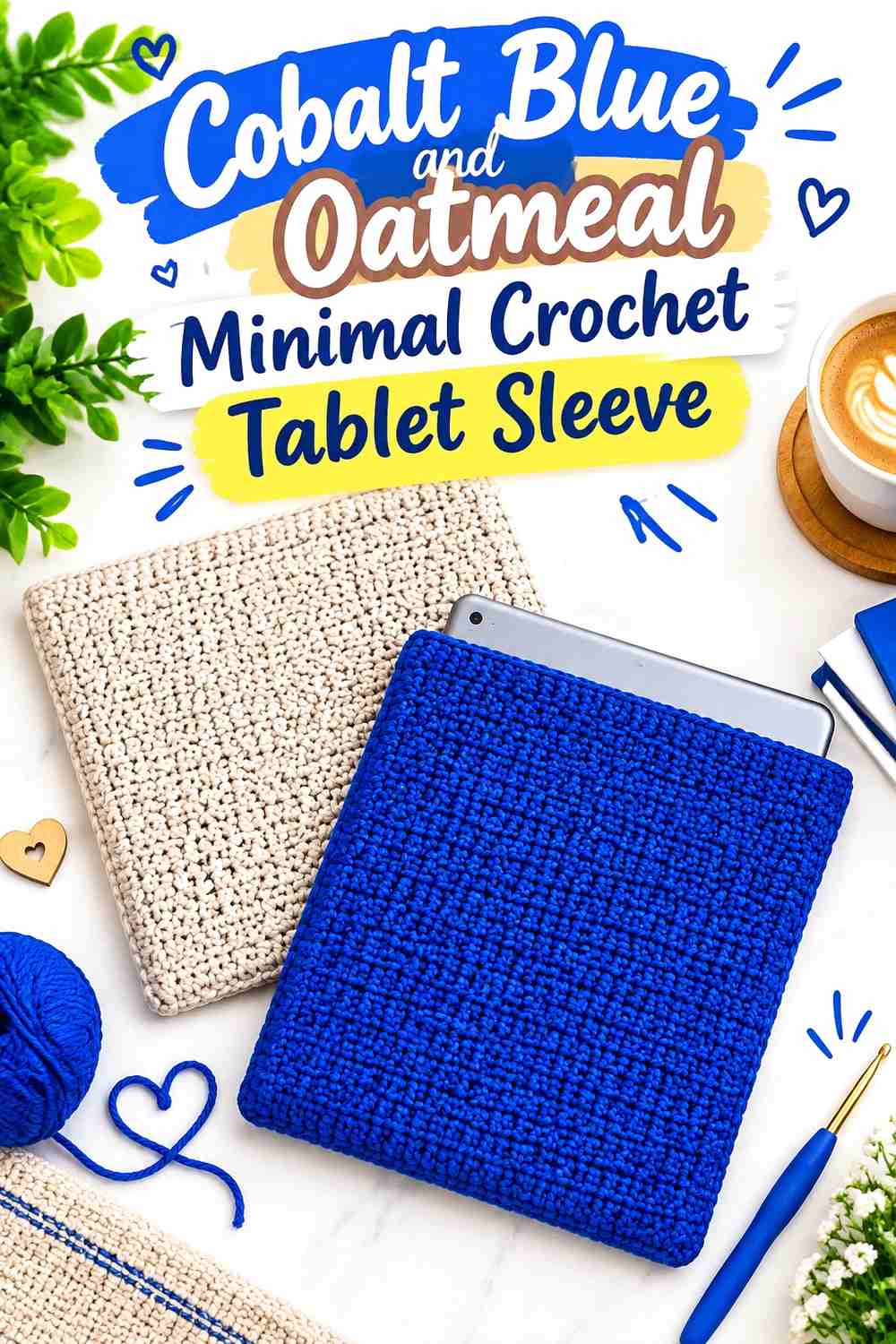
A simple rectangular sleeve gives color blocking more responsibility for the finished look. Make the main case Cobalt Blue and place one Oatmeal section near the top or along one side.
The contrast can stay deliberately restrained because there is no need to manufacture extra variety with unrelated motifs.
Cobalt Blue Should Create a Clean Oatmeal-Accented Front
Use the saturated blue continuously across most of the front and back.
A large uninterrupted field makes a basic sleeve feel intentional rather than unfinished.
Oatmeal Should Have One Clear Job Beside Cobalt Blue
Choose the opening, one side seam, or one upper band for the neutral.
Using Oatmeal in many tiny disconnected areas would weaken the minimal direction.
Creator Credit: ElyseCrochets 💌
8. Oatmeal And Cobalt Blue Front Pocket Crochet Tablet Sleeve

A sleeve with an additional front pocket gives the two colors obvious separate surfaces. Keep the tablet sleeve Oatmeal and make the smaller front pocket Cobalt Blue.
This arrangement lets blue create a strong focal block while leaving the larger protective body neutral.
Oatmeal Should Surround the Cobalt Blue Front Pocket
Leave enough Oatmeal visible above, below, and beside the smaller blue panel.
The contrast works best when the pocket looks intentionally placed on a neutral field rather than nearly filling the entire front.
Cobalt Blue Can Make the Oatmeal Pocket Area a Focal Feature
Use the saturated shade only on the additional pocket when you want its function to remain visually obvious.
If the sleeve includes a button closure, consider keeping that detail Oatmeal so the front pocket remains the primary Cobalt Blue feature.
Creator Credit: Strong Earth Creations
9. Cobalt Blue And Oatmeal Drawstring Crochet Tablet Sleeve
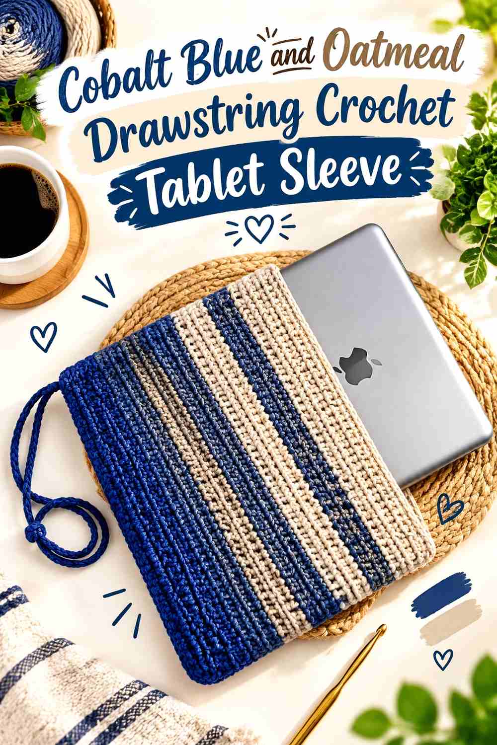
A drawstring sleeve gives the secondary color an obvious functional role. Use Cobalt Blue for the main case and Oatmeal around the upper casing or drawstring area.
The neutral top separates the closure from the body and keeps the strong blue from continuing uninterrupted to the opening.
Cobalt Blue Should Remain Broad Beneath the Oatmeal Drawstring Section
Keep the main storage area blue so the sleeve retains a clear dominant color.
A tall Oatmeal upper section could shift the palette toward equal blocking when the intended feature is only the closure.
Oatmeal Can Make the Cobalt Blue Drawstring Area Easier to Identify
Use the neutral around the opening and cord area rather than adding it to unrelated body stripes.
That placement gives Oatmeal a functional visual purpose.
Creator Credit: Ophelia Talks
10. Oatmeal And Cobalt Blue Cluster Stitch Crochet Tablet Sleeve

Raised cluster texture creates a strong surface, so make Oatmeal the main stitch field and use Cobalt Blue for a lower frame or opening band. The lighter neutral allows shadows between the clusters to remain visible.
A broad blue border can then provide enough contrast without interrupting every textured repeat.
Oatmeal Should Keep the Cobalt Blue Cluster Field Visually Open
Use Oatmeal continuously through the raised front-post or cluster-rich section.
The lighter surface allows the texture itself to provide detail rather than relying on frequent blue changes.
Cobalt Blue Can Anchor the Oatmeal Cluster Sleeve at One Edge
Choose the top or bottom for the broadest Cobalt Blue section.
Using one strong border usually gives the textured neutral field more room than enclosing it inside equally deep blue bands on every side.
Creator Credit: Lyza Walters
11. Cobalt Blue And Oatmeal Jasmine Stitch Crochet Tablet Sleeve

Jasmine stitch creates a dense floral-like texture that can become the main design feature. Keep the large stitch field Cobalt Blue and use Oatmeal only around the opening, button loop, or final edge.
The neutral finishing area gives the rich blue texture a clean boundary.
Cobalt Blue Should Stay Continuous Through the Oatmeal-Edged Jasmine Texture
Avoid changing colors inside every jasmine cluster if you want the stitch pattern to remain cohesive.
One saturated field lets the repeated shapes connect across the tablet sleeve.
Oatmeal Can Give the Cobalt Blue Jasmine Sleeve a Lighter Opening
Use Oatmeal around the top where the device enters the case.
This light edge creates separation from the dense blue surface without competing with the stitch pattern itself.
Cobalt Blue Can Return in a Small Oatmeal Closure Detail
If the upper Oatmeal band feels visually detached, bring Cobalt Blue into a small loop or center fastening area.
Keep the repeat limited so the neutral opening remains easy to distinguish.
Creator Credit: VVStudio
12. Oatmeal And Cobalt Blue Surface Motif Crochet Tablet Sleeve
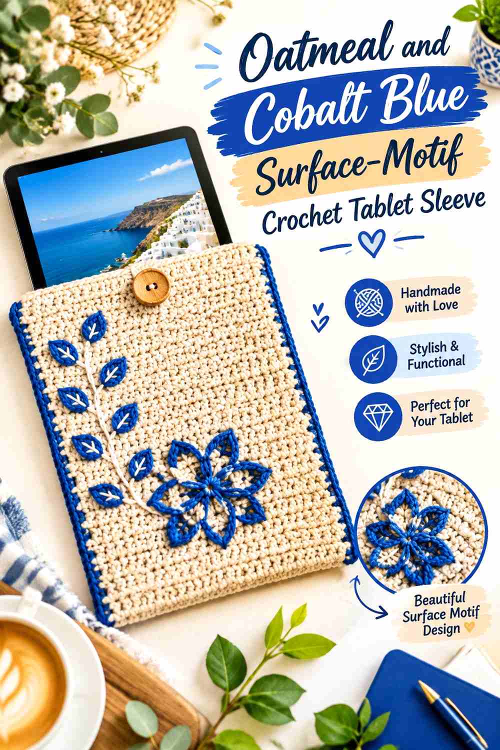
Surface crochet makes it possible to keep the base sleeve Oatmeal and draw a Cobalt Blue flower, leaf, line, or simple geometric motif over the finished fabric. This produces color detail without dividing the underlying construction into multiple yarn sections.
The motif should remain proportionate to the tablet front and leave enough Oatmeal around it.
Oatmeal Should Create Negative Space Around the Cobalt Blue Surface Motif
Keep the neutral field relatively uninterrupted so the added blue lines remain easy to recognize.
A large number of additional Cobalt Blue stripes or borders can make the surface motif compete with the rest of the sleeve.
Cobalt Blue Motifs Should Sit Centrally on the Oatmeal Tablet Front
Check the motif location after folding and seaming the sleeve.
A centered drawing on the original rectangle may shift visually if part of the fabric becomes a side seam.
Oatmeal Can Separate Cobalt Blue Motifs From Contrast Seams
If you also use Cobalt Blue for the joins, preserve a neutral margin between the motif and the side edges.
That spacing keeps the artwork from visually merging into the frame.
Creator Credit: Happy Heartsy
13. Cobalt Blue And Oatmeal Floral Granny Crochet Tablet Sleeve
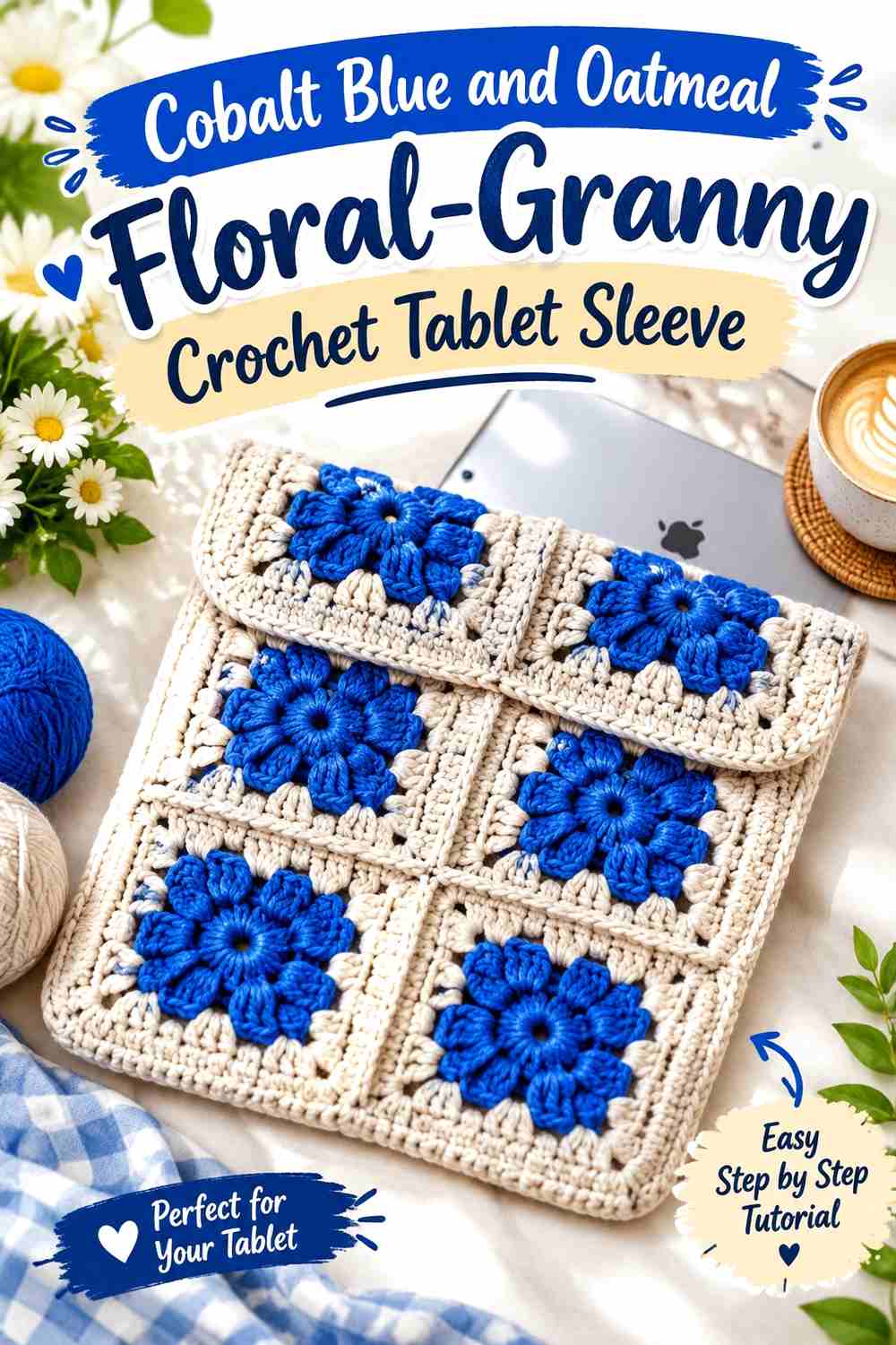
Floral granny motifs give each shade a repeated job. Use Cobalt Blue in the flower centers or petal areas and Oatmeal on the outer motif sections so adjacent squares connect through the lighter neutral.
The repeated structure creates color variation without using conventional horizontal stripes.
Cobalt Blue Floral Centers Need Broad Oatmeal Granny Borders
Leave enough Oatmeal around each blue center that individual motifs remain recognizable after joining.
If Cobalt Blue extends to every square edge, neighboring flowers can visually merge into one large saturated grid.
Oatmeal Joins Can Organize Cobalt Blue Motifs Across the Tablet Sleeve
Using the neutral in the outer sections or seams creates consistent spacing between the saturated motifs.
This is particularly useful on the front panel, where several squares may be visible simultaneously.
Cobalt Blue Can Return at the Oatmeal Sleeve Opening
A narrow blue top edge can repeat the floral-center color at a structural point.
Keep the upper band relatively small so it does not visually connect all the Cobalt Blue motifs into one heavy frame.
Creator Credit: The Yarnling
14. Oatmeal And Cobalt Blue Contrast Seam Crochet Tablet Sleeve

This version makes the seam itself part of the palette. Work the main sleeve in Oatmeal and join or edge the sides in Cobalt Blue, creating a strong outline around an otherwise neutral tablet case.
The color treatment is particularly effective on a folded rectangular sleeve because the dark side lines reinforce the finished shape.
Oatmeal Should Remain Broad Inside the Cobalt Blue Seams
Give the neutral center enough width that the saturated joining color feels like an outline rather than a second body panel.
The side treatment should clarify the sleeve boundaries, not visually compress the front.
Cobalt Blue Seams Can Frame the Oatmeal Tablet Sleeve Consistently
Use comparable blue depth on both sides if a symmetrical result is intended.
Strong contrast makes differences in seam width or color placement easier to notice.
Oatmeal Can Continue Through the Cobalt Blue-Framed Opening
Keeping the top neutral creates a less enclosed look if both side seams are already strongly blue.
If you prefer a fully framed sleeve, repeat Cobalt Blue narrowly at the opening instead of making the top band as wide as the sides.
Creator Credit: Woodland Stitchcraft
15. Cobalt Blue And Oatmeal Wrap Strap Crochet Tablet Sleeve
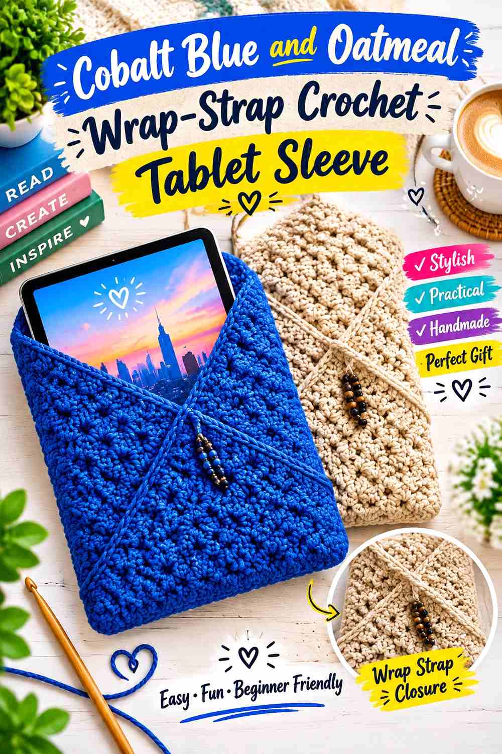
The final idea uses the closure strap as the main contrast feature. Keep the sleeve Cobalt Blue and crochet the wrap-around strap in Oatmeal so the neutral crosses visibly over the front when the case is closed.
Because the strap travels across a substantial part of the sleeve, Oatmeal can remain visually important without covering a large body panel.
Cobalt Blue Should Provide a Quiet Background for the Oatmeal Wrap Strap
Keep the main sleeve largely blue rather than adding several neutral stripes underneath the closure.
The solid background gives the Oatmeal strap a clear path across the front.
Oatmeal Strap Placement Should Stay Visible Against Cobalt Blue
Test the wrap with the tablet inside before settling on its final position.
The strap should cross enough Cobalt Blue surface to remain an obvious part of the design instead of disappearing along an edge.
Cobalt Blue Can Repeat at the Oatmeal Strap End
A small blue finishing detail can connect the closure back to the main body.
Keep that repeat minor so the Oatmeal strap remains the primary contrasting element.
Creator Credit: Kendall Tai
Comparing the Cobalt Blue and Oatmeal Crochet Tablet Sleeve Directions
For a Cobalt-Blue-dominant sleeve, the spike-detail, button-flap, bean-stitch, minimal, drawstring, jasmine-stitch, and wrap-strap versions keep saturated blue across most of the visible surface. Oatmeal is used around closures, openings, texture boundaries, or crossing details.
For an Oatmeal-led result, the graphic-band, chunky-textured, textured, front-pocket, cluster-stitch, surface-motif, and contrast-seam ideas give the neutral more front-facing space. Cobalt Blue remains prominent because it is concentrated in clear blocks, motifs, borders, or seams.
The floral-granny version distributes the colors differently by repeating them inside individual motifs. This is useful when you want the sleeve body itself to carry a regular pattern rather than keeping one shade almost entirely in the trim.
Texture should guide the choice. Jasmine, bean, and cluster stitches generally benefit from uninterrupted fields, while surface crochet and granny squares naturally support repeated two-color details. Simple sleeve fabric can handle stronger blocks, bands, seams, and closure contrasts.
Conclusion
Cobalt Blue and Oatmeal can produce crochet tablet sleeves ranging from clean minimal cases to highly textured jasmine, bean-stitch, cluster, granny, and surface-crochet designs without introducing another yarn color.
For a bold sleeve, keep the front predominantly Cobalt Blue and use Oatmeal around the opening, button, strap, or edge. For a lighter result, let Oatmeal cover the larger surface and concentrate Cobalt Blue in seams, pockets, motifs, or a single graphic band.
The construction should determine where the colors change. A drawstring gives you a natural upper accent, a wrap strap creates a line across the front, granny squares organize repeated motifs, and textured stitches usually look clearer when allowed to continue through larger single-color areas.
Most importantly, plan the finished sleeve around the actual device. Check width, height, opening position, closure placement, and visible color proportions with the tablet inserted. Use the credited tutorials for their exact construction and sizing methods, then adapt the Cobalt Blue-and-Oatmeal distribution to the sleeve you are making.
Frequently Asked Questions
Should Cobalt Blue or Oatmeal dominate a crochet tablet sleeve?
Either can lead. Cobalt Blue creates a stronger saturated surface, while Oatmeal gives the sleeve a lighter neutral field. Decide which shade should cover the main front before assigning the second color to seams, borders, openings, motifs, or closures.
Where should Oatmeal go on a Cobalt Blue crochet tablet sleeve?
Oatmeal works well around the opening, button flap, drawstring area, side border, wrap strap, textured panel, or selected motif. Give the neutral a specific construction-related purpose rather than scattering small Oatmeal sections randomly.
How can I keep Cobalt Blue texture visible on a tablet sleeve?
Use broader uninterrupted Cobalt Blue areas and place Oatmeal beside the textured section rather than constantly inside it. The neutral boundary can help bean stitches, jasmine stitch, clusters, or other raised details remain visually organized.
Can I resize a Kindle or laptop sleeve tutorial for a tablet?
Some rectangular sleeve constructions can be adapted, but do not assume the original dimensions will fit your device. Measure the tablet and follow any customization guidance provided by the tutorial creator. Account for the actual crochet fabric and intended closure as well as the tablet’s dimensions.
Can Cobalt Blue and Oatmeal work in a granny-square tablet sleeve?
Yes. Give the colors consistent motif roles, such as Cobalt Blue centers with Oatmeal outer sections. Repetition helps the joined squares look like one coordinated tablet case rather than unrelated motifs.
Should the opening of a Cobalt Blue and Oatmeal tablet sleeve be a contrast color?
It can be. An Oatmeal opening lightens a Cobalt Blue sleeve, while Cobalt Blue can provide a strong upper boundary on an Oatmeal body. The opening is a useful contrast zone because it has a clear structural purpose.
How can I keep a Cobalt Blue and Oatmeal tablet sleeve from looking too busy?
Let texture and color share the work instead of competing. Highly textured stitches usually need larger single-color areas, while simple crochet fabric can support bolder bands, contrasting seams, pockets, or motifs. Limit each color to a few recognizable roles.