Forest Green gives crochet a deep botanical base that can move from quiet and earthy to dramatic or colorful depending on the shades placed beside it. Ivory, oatmeal, cream, and warm white create useful light-dark separation, while terracotta, Cinnamon, Antique Gold, and mustard add warmth. Navy, Petrol Blue, powder blue, lilac, and Smoked Lilac push the palette toward cooler combinations.
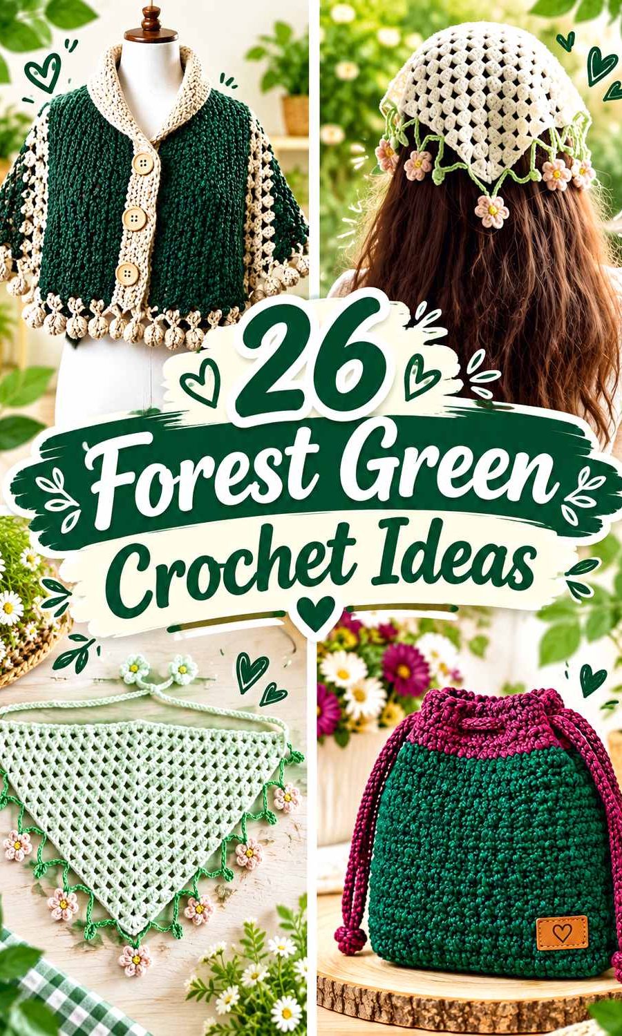
Because Forest Green can be quite dark, placement matters. Large cardigan panels, blanket sections, pillow faces, sweaters, and shawls can carry substantial Forest Green without needing many extra colors. On compact projects, stronger supporting shades are usually most effective around handles, cuffs, brims, straps, borders, openings, or motif rounds where they also help explain the construction.
The linked tutorials support the underlying crochet constructions. The Forest Green palettes below are independent color adaptations rather than claims that the creators used these exact combinations.
Quick List
- Forest Green And Soft Ivory Crochet Cardigan
- Forest Green And Camel Crochet Tote Bag
- Forest Green And Oatmeal Crochet Bucket Hat
- Forest Green And Dusty Rose Crochet Blanket
- Forest Green And Warm White Crochet Pillow
- Forest Green And Burnt Orange Crochet Scarf
- Forest Green And Charcoal Crochet Ribbed Hat
- Forest Green And Blush Crochet Vest
- Forest Green And Antique Gold Crochet Handbag
- Forest Green And Mushroom Taupe Crochet Cowl
- Forest Green And Midnight Navy Crochet Headband
- Forest Green And Soft Lilac Crochet Top
- Forest Green And Pewter Gray Crochet Shawl
- Forest Green And Terracotta Crochet Basket
- Forest Green And Cream Crochet Granny Square
- Forest Green And Muted Coral Crochet Phone Bag
- Forest Green And Powder Blue Crochet Fingerless Gloves
- Forest Green And Aubergine Crochet Balaclava
- Forest Green And Mustard Crochet Sweater
- Forest Green And Mulberry Crochet Drawstring Bag
- Forest Green And Flax Crochet Poncho
- Forest Green And Smoked Lilac Crochet Mittens
- Forest Green And Petrol Blue Crochet Scrunchie
- Forest Green And Burgundy Crochet Coaster
- Forest Green And Soft Mint Crochet Bandana
Protect Forest Green Crochet Texture With Value Contrast
Forest Green can hide shallow ribbing, raised stitches, and small motif boundaries when the neighboring yarn is another deep shade. A different hue is not always enough. Forest Green beside navy, Burgundy, Petrol Blue, or Aubergine can look colorful while still remaining relatively close in lightness.
Use a lighter yarn near details that need immediate definition. Ivory, oatmeal, cream, powder blue, and soft mint can make edging and texture easier to distinguish. Darker or similarly valued companions can still work well, but they are generally better across larger bands, panels, handles, or borders where softer separation is intentional.
Give Forest Green a Clear Role on Every Crochet Item
Forest Green can comfortably dominate large surfaces. On cardigans and sweaters, it can cover the torso while accents stay around cuffs and necklines. On blankets and shawls, broad Forest Green fields can alternate with less frequent supporting sections. Home-decor pieces such as pillows and baskets can use the green across their primary visible surfaces.
Smaller accessories need stricter color organization. A bucket hat, phone bag, glove, mitten, or scrunchie can quickly become crowded when every component changes color. Keep Forest Green on the largest area and let one supporting shade identify an obvious structural feature.
1. Forest Green And Soft Ivory Crochet Cardigan
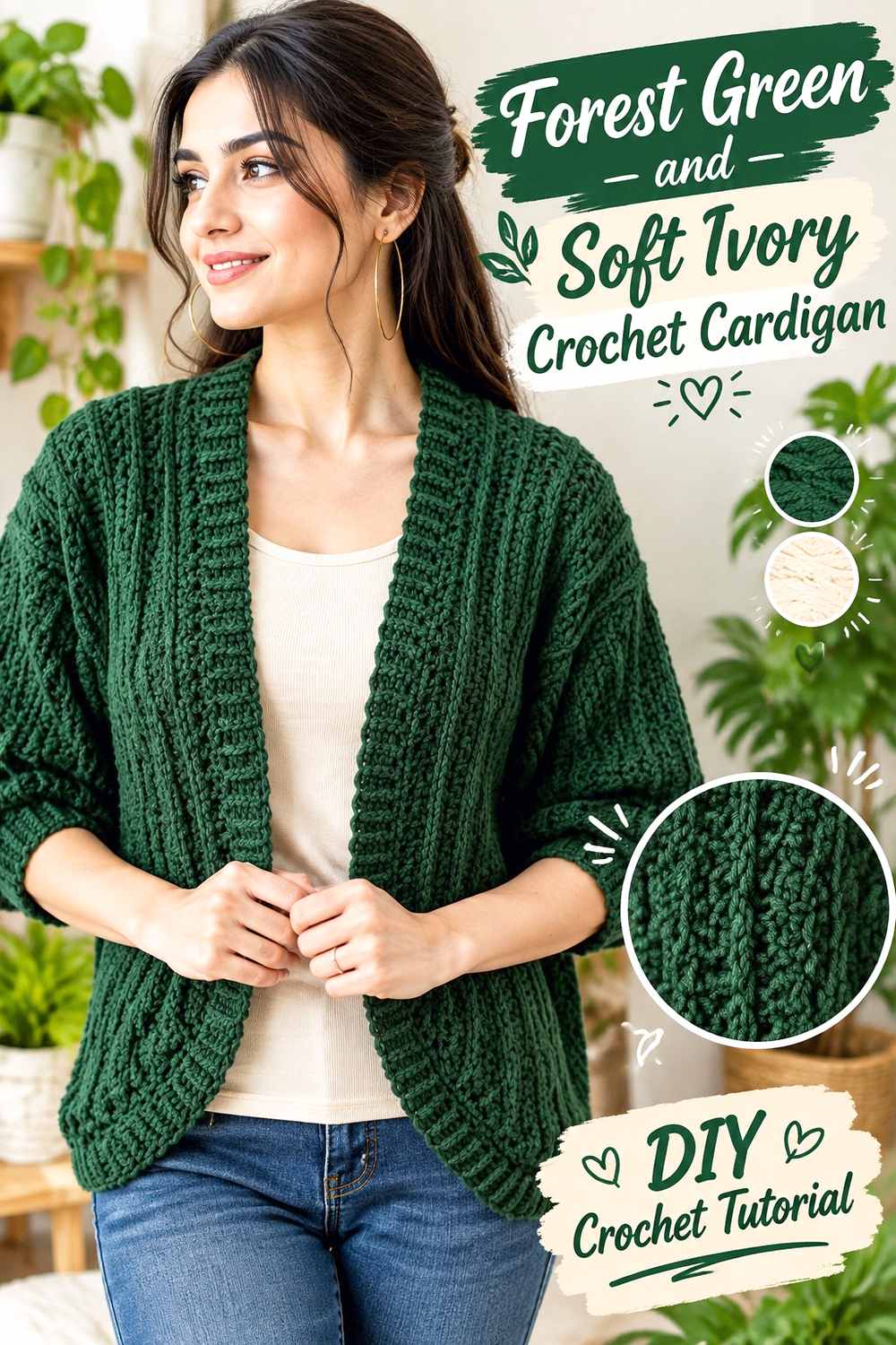
Forest Green can cover the cardigan’s main panels while soft ivory defines its openings and finishing areas. The light neutral is particularly useful beside deep green because cuffs, neckline trim, and front edging can otherwise merge visually with the body.
Keep Forest Green Dominant Across the Crochet Cardigan Panels
Use Forest Green throughout the front, back, and most of the sleeves so the garment retains one continuous botanical field. Large uninterrupted areas also give cables, ribbing, or other stitch texture more room to show without repeated pale stripes interrupting the surface.
Keep ivory concentrated around finishing details if Forest Green should remain the first color noticed.
Soft Ivory Gives Forest Green Crochet Cardigan Edges More Definition
Place ivory around cuffs, the front opening, or neckline finishing. These areas already mark structural changes, so the contrast helps the cardigan’s construction remain visually clear.
If pale ivory feels too sharp, choose a warmer off-white while maintaining enough light-dark separation from Forest Green.
Creator Credit: TCDDIY
2. Forest Green And Camel Crochet Tote Bag
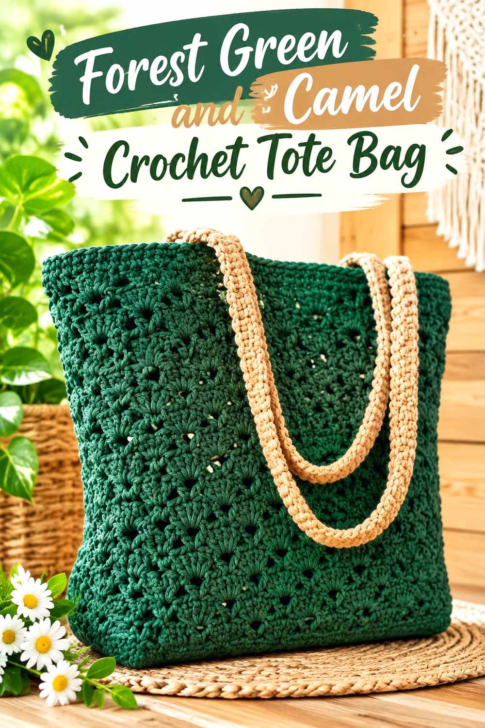
Camel warms Forest Green without producing an especially bright contrast. A tote gives the pairing natural structural roles: Forest Green can cover the broad body while camel identifies handles or the upper opening.
Keep Forest Green Across the Main Crochet Tote Bag Body
Use Forest Green through the front, back, and lower section so the tote has one stable dark-green foundation. This is especially effective when the crochet fabric already contains openwork or visible texture.
A broad green body also allows a relatively small amount of camel to remain noticeable.
Camel Warms Forest Green Crochet Tote Handles
Place camel around handles or the upper rim, where the bag naturally changes from storage body to carrying structure. The warmer neutral provides separation without cutting through the central Forest Green surface.
If the camel yarn is fairly deep, use it across a full handle instead of relying on a narrow line.
Creator Credit: Kristines Crochets
3. Forest Green And Oatmeal Crochet Bucket Hat

Oatmeal gives Forest Green a warm light-neutral companion and makes it easy to distinguish the brim from the rest of the hat. Keeping the crown green preserves the depth of the palette while the lower edge becomes lighter.
Keep Forest Green Continuous Across the Crochet Bucket Hat Crown
Use Forest Green through the crown and most of the side wall. The rounded shaping already gives the hat enough visual movement, so frequent contrasting stripes are not necessary.
Keeping the upper section solid also makes Forest Green clearly dominant even if the brim is entirely oatmeal.
Oatmeal Defines the Brim of a Forest Green Crochet Bucket Hat
Place oatmeal across the brim or only along its outer portion. Because the brim projects away from the sides, the lighter shade reinforces a genuine change in silhouette.
For less contrast, carry Forest Green into the brim and introduce oatmeal only near the final edge.
Creator Credit: VivCrochets
4. Forest Green And Dusty Rose Crochet Blanket

Dusty rose adds muted warmth against Forest Green without becoming as strong as coral or orange. A blanket provides enough surface for both shades to develop in broad sections rather than small competing stripes.
Give Forest Green More Area Across the Crochet Blanket
Make Forest Green sections wider or more frequent if the finished blanket should remain green-led. An equal division of Forest Green and dusty rose will create a more balanced two-color design.
Planning the proportion in advance can keep the support shade from gradually occupying more visual area than intended.
Dusty Rose Softens Forest Green Crochet Blanket Repeats
Use dusty rose between broad Forest Green areas to warm the palette and prevent the dark green from covering the entire surface.
If small motifs need crisp boundaries, compare the specific yarns first. A deeper dusty rose may be closer to Forest Green in value than expected.
Creator Credit: Daisy Farm Crafts
5. Forest Green And Warm White Crochet Pillow
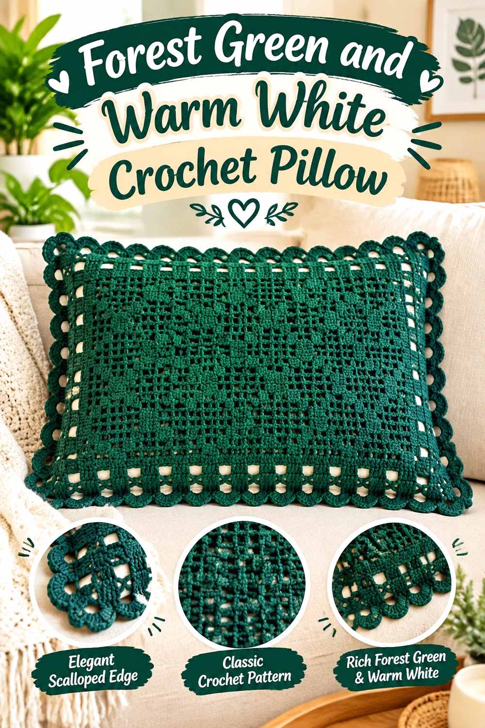
A pillow gives Forest Green enough uninterrupted surface to become a strong decorative base. Warm white can then reveal selected raised details, motifs, or borders instead of dividing the entire pillow into equal color blocks.
Let Forest Green Cover the Main Crochet Pillow Face
Use Forest Green across most of the front when the surface already includes bobbles, ridges, or other texture. One consistent dark background lets stitch shadows provide the visual movement.
If the pillow back is visible, repeating Forest Green there can help the cover remain cohesive from several angles.
Warm White Reveals Forest Green Crochet Pillow Texture
Place warm white beside the border or raised section you most want emphasized. The strong value contrast can make subtle stitch detail easier to recognize from across a room.
Keep the white concentrated around purposeful features rather than scattering tiny accents throughout the Forest Green surface.
Creator Credit: Crochet With Samina
6. Forest Green And Burnt Orange Crochet Scarf
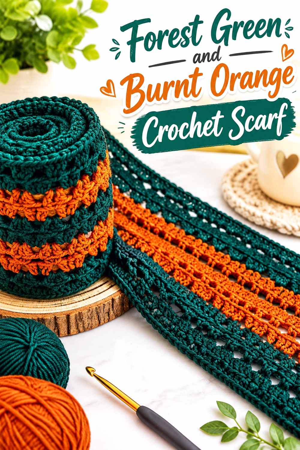
Burnt orange gives Forest Green a strong warm contrast and creates one of the most autumnal directions in the collection. Broad sections help both saturated colors remain distinct after the scarf is wrapped.
Use Wider Forest Green Sections Across the Crochet Scarf
Give Forest Green the larger repeats so the deep botanical shade remains recognizable when sections overlap around the neck. Numerous equal narrow stripes can make orange visually stronger than expected.
Wide Forest Green areas also give stitch texture more uninterrupted space.
Burnt Orange Adds Warmth Between Forest Green Crochet Scarf Sections
Repeat burnt orange at deliberate intervals rather than placing it only at one end. Consistent repetition connects the warm accent while Forest Green still covers most of the length.
If the scarf includes fringe, repeat one of these existing colors rather than introducing another saturated shade.
Creator Credit: Bag-O-Day Crochet
7. Forest Green And Charcoal Crochet Ribbed Hat

Charcoal gives Forest Green a deliberately deep, understated partner. On a ribbed hat, the limited value contrast allows the stitch lines to stay more prominent than the color change.
Keep Forest Green Across the Crochet Ribbed Hat Crown
Use Forest Green continuously through the crown so the ribbing remains visually uninterrupted. Strong striping can compete with the directional texture that already gives the hat character.
A broad green crown also establishes the main color before the darker neutral band begins.
Charcoal Grounds the Band of a Forest Green Crochet Ribbed Hat
Place charcoal around the fold-over or lower band for a dark neutral base. Expect a more tonal effect than you would get with cream.
If Forest Green and charcoal almost merge in grayscale, increase the width of the charcoal section so the color change remains intentional.
Creator Credit: MJ’s Off The Hook Designs
8. Forest Green And Blush Crochet Vest
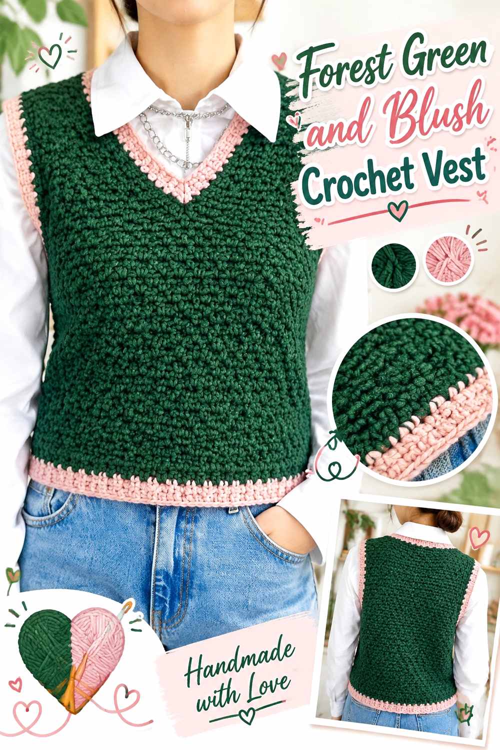
Blush lightens Forest Green while adding a soft warm note. A vest provides natural locations for the contrast around armholes, neckline finishing, and the lower edge.
Keep Forest Green Across the Main Crochet Vest Panels
Use Forest Green through the torso so front and back areas remain visually connected even when separate pieces or joins are part of the construction.
A large green body also prevents blush from becoming equally dominant across the garment.
Blush Softens Forest Green Crochet Vest Openings
Place blush around armholes or the neckline where the lighter shade can identify the garment’s boundaries. The pink-green contrast adds color while remaining softer than bright white.
Repeat blush at more than one edge if possible so it feels intentionally connected around the Forest Green body.
Creator Credit: Sirin’s Crochet
9. Forest Green And Antique Gold Crochet Handbag
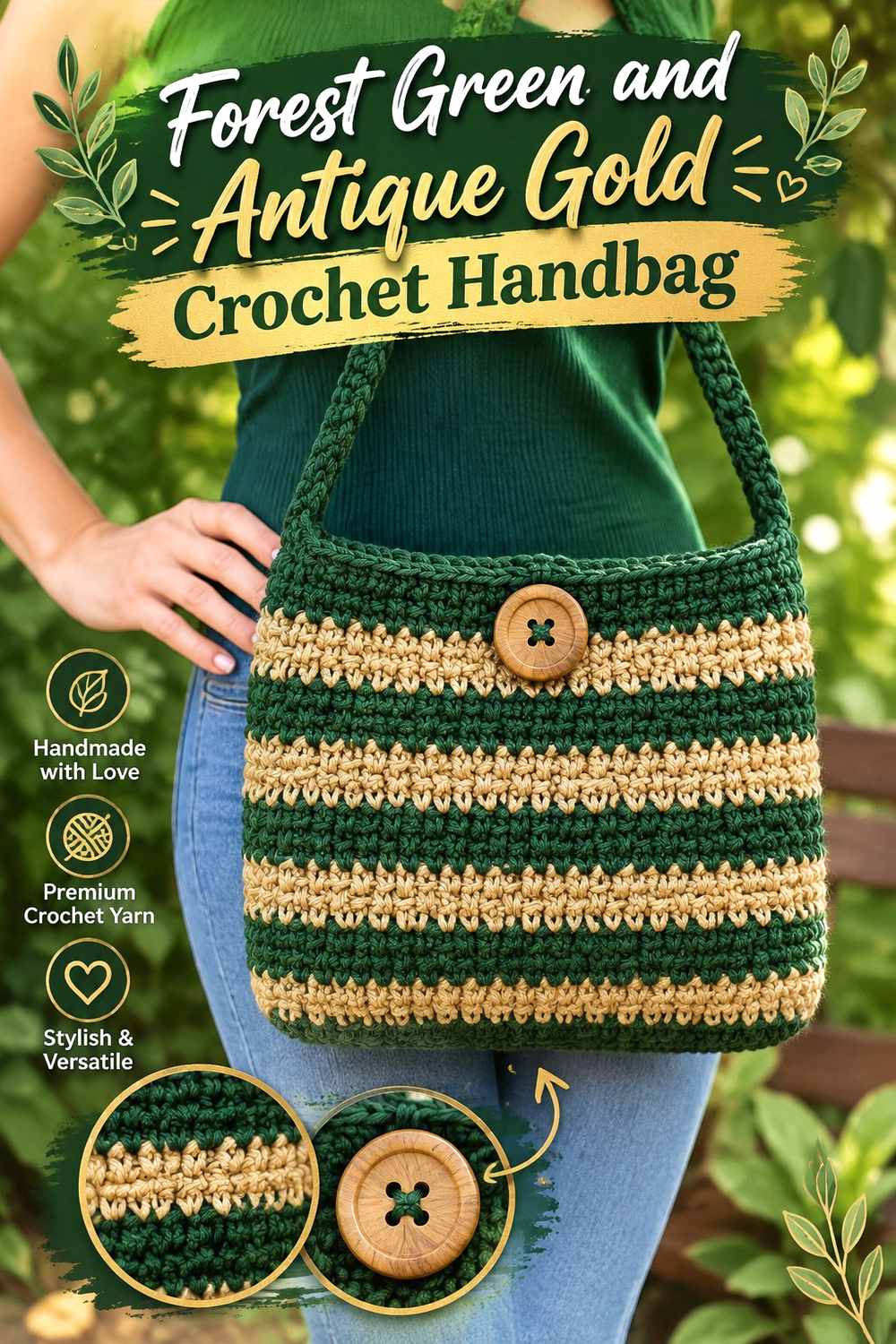
Antique Gold gives Forest Green a rich warm accent and can attract attention quickly. Keeping the gold-toned shade around handles or the closure prevents it from competing with the main green surface.
Keep Forest Green Dominant Across the Crochet Handbag Body
Use Forest Green across the broad front and back sections so the compact handbag has one clear visual foundation. Small bags can become fragmented when two saturated colors occupy equal areas.
The dark green field also gives relatively small Antique Gold details more impact.
Antique Gold Highlights Forest Green Crochet Handbag Details
Reserve Antique Gold for handles, the upper border, or a closure-related feature. These structural areas give the warmer shade a specific reason to appear.
If the gold yarn is dark or muted, use enough width for it to remain visible against Forest Green.
Creator Credit: Naztazia
10. Forest Green And Mushroom Taupe Crochet Cowl
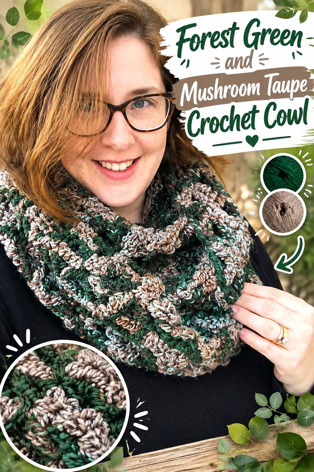
Mushroom Taupe quiets Forest Green and creates an earthy neutral-heavy palette. Since a cowl bunches around the neck, broad sections allow the muted taupe and deep green to remain distinguishable after folding.
Give Forest Green the Larger Crochet Cowl Sections
Use broad Forest Green repeats so the main shade stays visible when only parts of the cowl are exposed. Tiny alternating green-and-taupe stripes can blend into a generally dark neutral surface.
Keeping Forest Green wider protects the intended hierarchy.
Mushroom Taupe Softens Forest Green Crochet Cowl Texture
Place Mushroom Taupe beside textured areas or use it as a repeated band. The softer neutral can break up the green without the sharper contrast of ivory.
Choose a taupe noticeably lighter than Forest Green if raised stitches need extra definition.
Creator Credit: Rich Textures Crochet
11. Forest Green And Midnight Navy Crochet Headband
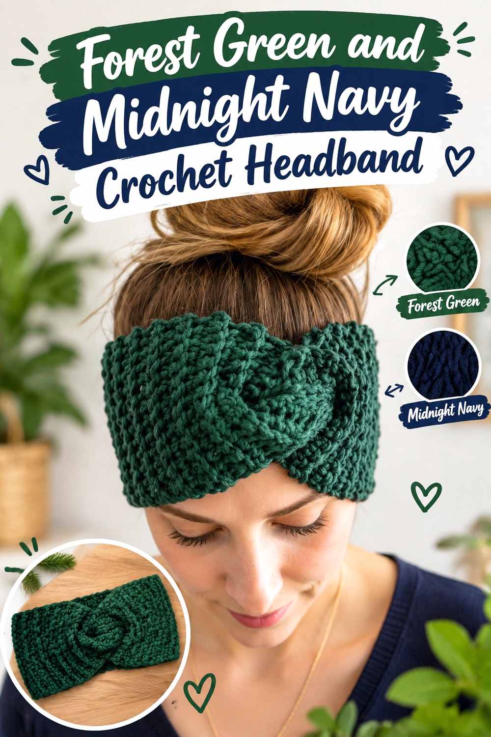
Midnight navy creates one of the darkest Forest Green combinations in the article. Because a headband has little surface area, use navy as a controlled frame rather than dividing the whole accessory between two deep colors.
Keep Forest Green Central on the Crochet Headband
Use Forest Green across the widest central section so ribbing, cables, or another textured stitch remains visually continuous.
A broad green center also leaves enough contrast space for narrow navy edges without making the accessory feel overworked.
Midnight Navy Frames Forest Green Crochet Headband Edges
Place navy along the long edges or joining area. The result will be intentionally tonal, so check the two yarns in grayscale if a visible border is important.
If they nearly merge, widen the navy frame or use a lighter accent instead.
Creator Credit: B.Hooked Crochet
12. Forest Green And Soft Lilac Crochet Top

Soft lilac gives Forest Green a cooler pastel contrast and creates a less expected pairing than green with cream. The lighter purple works particularly well around sleeves, straps, or neckline finishing.
Let Forest Green Lead Across the Crochet Top Body
Use Forest Green across the torso so the top has one strong central field. Neckline, straps, and sleeve construction already provide natural divisions, reducing the need for extra color blocking through the body.
This larger green surface also lets smaller lilac details remain noticeable.
Soft Lilac Lightens Forest Green Crochet Top Edges
Place soft lilac around straps, sleeves, or neckline trim where a pale accent can separate narrow garment details from the dark body.
Repeat lilac at a second edge when practical so the color looks connected around the Forest Green top.
Creator Credit: For The Frills
13. Forest Green And Pewter Gray Crochet Shawl

Pewter Gray gives Forest Green a cool neutral companion and creates a restrained alternative to cream or white. A shawl has enough surface area for the gray to appear in broad framing sections.
Give Forest Green the Broadest Area of the Crochet Shawl
Use Forest Green across a substantial central field so it remains visible after the shawl folds or drapes. Small green sections can easily disappear when different parts overlap.
A broad green center keeps the finished piece strongly botanical even with gray at the perimeter.
Pewter Gray Frames Forest Green Crochet Shawl Sections
Place Pewter Gray toward the outer portion or border. The neutral can lighten or cool the edge without becoming a bright outline.
If the gray is close to Forest Green in value, keep it in larger sections instead of relying on tiny openwork details for contrast.
Creator Credit: Fiber Flux
14. Forest Green And Terracotta Crochet Basket
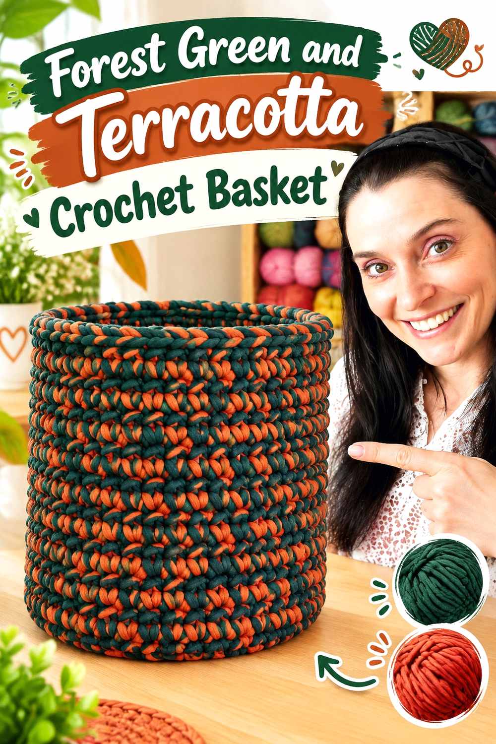
Terracotta gives Forest Green an earthy warm counterpoint that suits a storage basket particularly well. The basket walls can remain green while the handles or rim carry the warmer shade.
Use Forest Green Across the Main Crochet Basket Walls
Keep Forest Green through the substantial side areas so the basket has one stable visual base. Its three-dimensional shape and crochet texture already provide enough surface interest without repeated striping.
The continuous green body also makes terracotta details feel more purposeful.
Terracotta Defines Handles Against a Forest Green Crochet Basket
Place terracotta around the rim or handles where the basket changes from body to opening and carrying structure.
If the colors are similar in value, use terracotta across an entire handle or broader rim so the warm-green contrast remains clearly visible.
Creator Credit: Jayda InStitches
15. Forest Green And Cream Crochet Granny Square
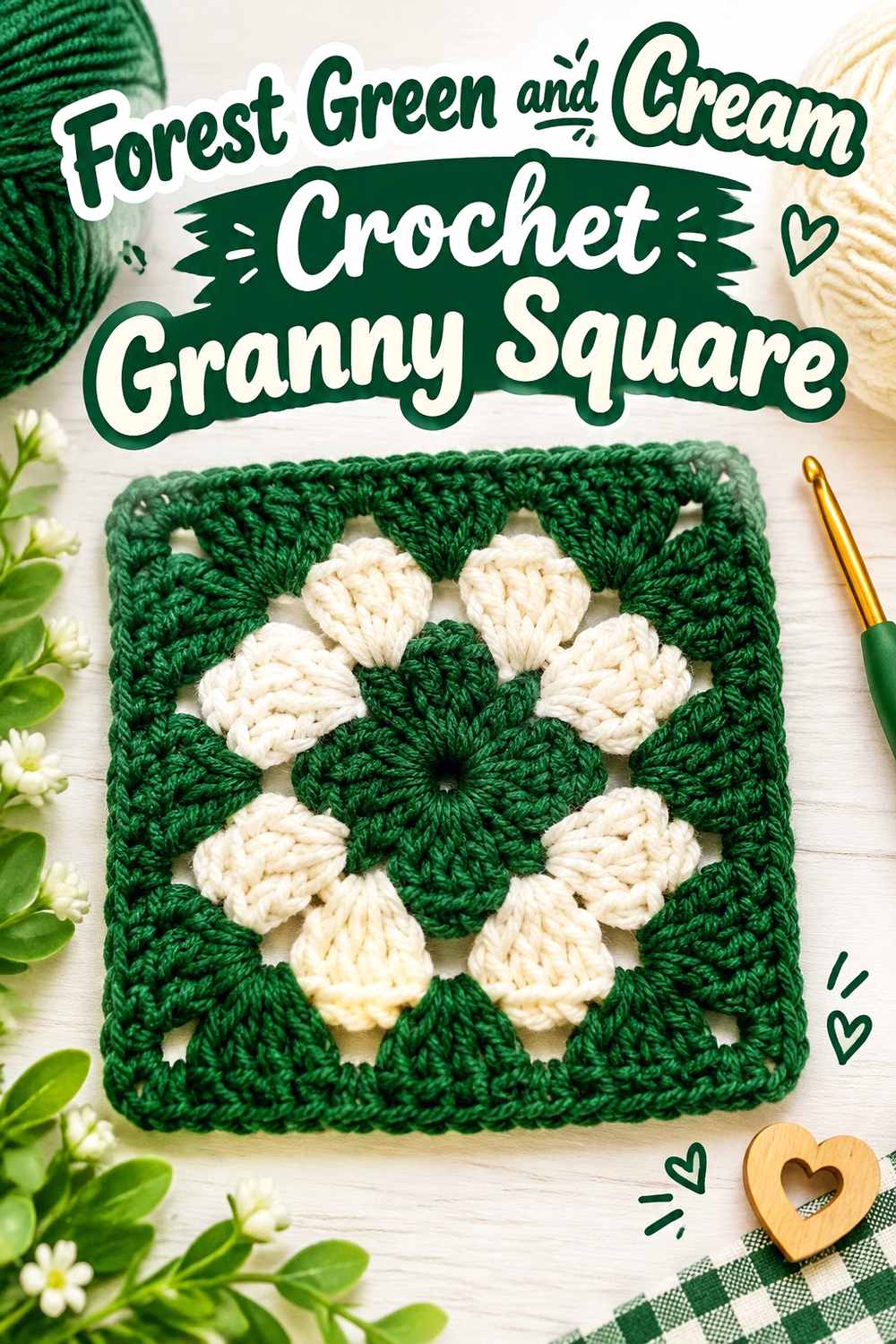
Cream creates strong value contrast and is especially useful in a granny square because it can separate deep Forest Green motif sections cleanly. Repeating the green prevents the lighter neutral from taking over the square.
Repeat Forest Green Through More Than One Crochet Granny Square Area
Use Forest Green in the center and repeat it again nearer the outside when the motif should remain green-led. A tiny Forest Green center surrounded by several cream areas may make the finished square read primarily as light neutral.
Repeating green also creates useful rhythm across multiple joined squares.
Cream Separates Forest Green Crochet Granny Square Sections
Use cream at a motif transition where stronger visual separation is useful. The light neutral can make each Forest Green area more distinct without adding several competing colors.
For joined motifs, decide whether Forest Green or cream should remain consistent around the outermost edge.
Creator Credit: Hooked by Robin
16. Forest Green And Muted Coral Crochet Phone Bag
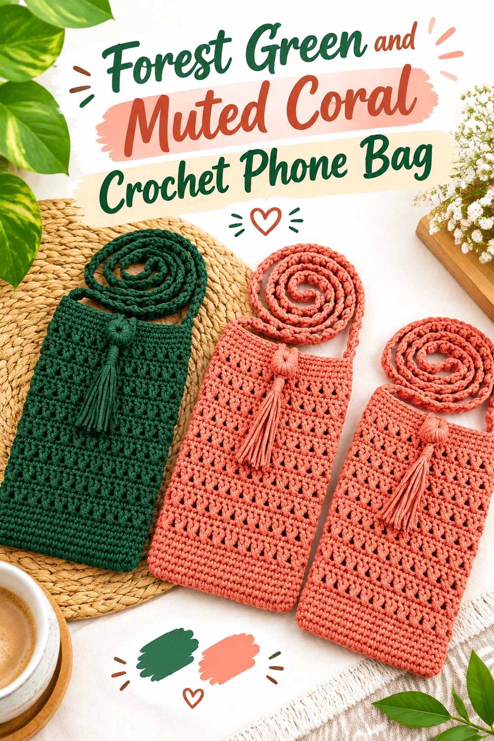
Muted coral adds a warm pink-orange contrast that gives a small Forest Green phone bag more color without requiring several accents. The body can remain green while coral identifies a strap, flap, or opening.
Keep Forest Green Across the Main Crochet Phone Bag Body
Use Forest Green on the largest front and back areas so the compact bag remains visually cohesive.
A continuous green field also gives any outer flap or attached detail a stable background.
Muted Coral Highlights Forest Green Crochet Phone Bag Details
Place muted coral around the strap, flap edge, or upper opening. Because the project is small, a controlled coral section can provide enough warmth without spreading across the whole body.
If the coral is dark, use a larger accent area rather than a very narrow line.
Creator Credit: Chenda DIY
17. Forest Green And Powder Blue Crochet Fingerless Gloves
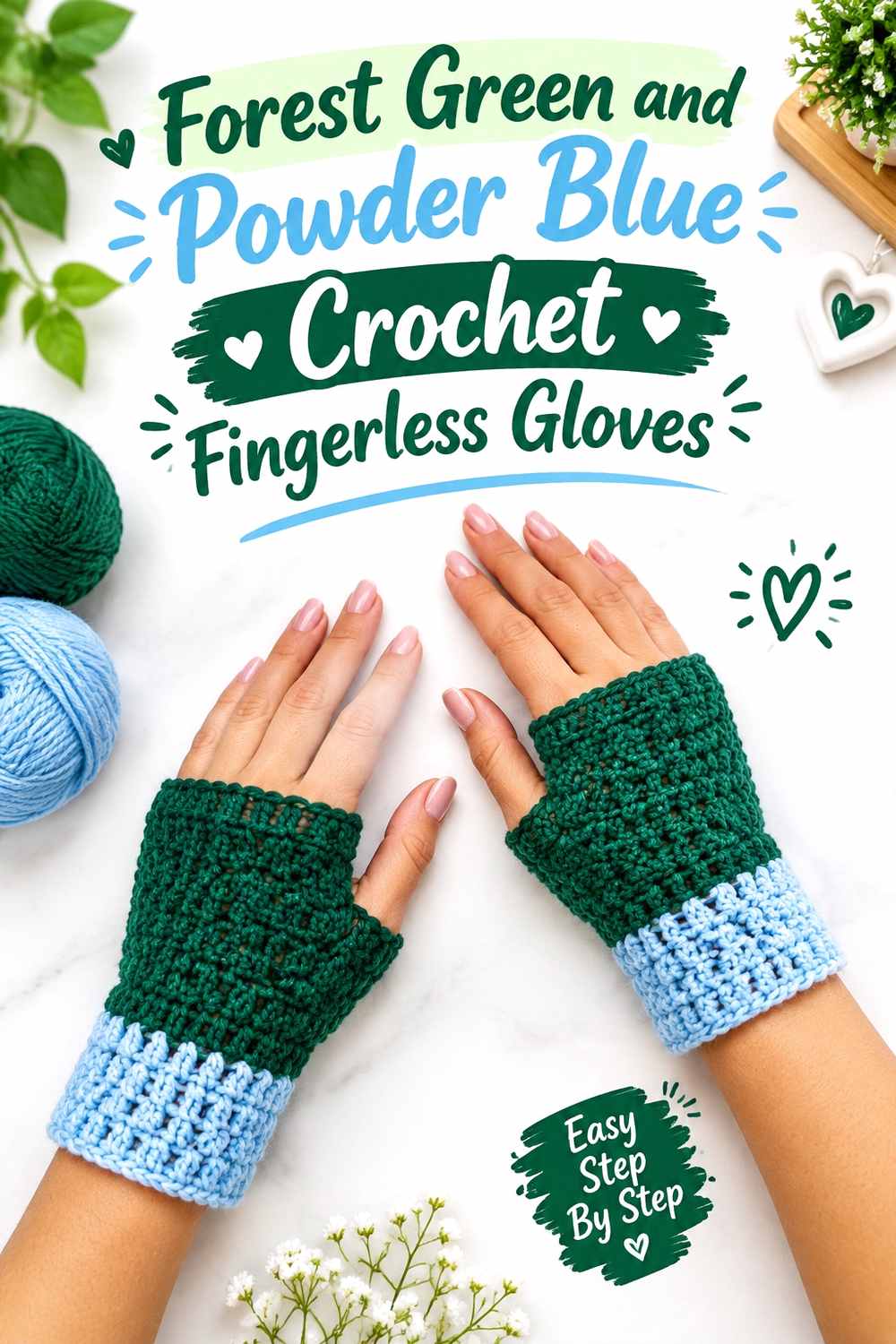
Powder blue gives Forest Green a light cool contrast that can make glove cuffs especially easy to distinguish. Keeping Forest Green through the hands preserves a strong botanical main color.
Keep Forest Green Across the Main Crochet Fingerless Gloves
Use Forest Green through the hand and thumb-opening areas so the stitch pattern remains visually continuous. Repeat the same placement on both gloves to keep the pair coordinated.
A solid main field also prevents these small accessories from becoming visually fragmented.
Powder Blue Defines Forest Green Crochet Fingerless Glove Cuffs
Place powder blue around the wrists, where the color change corresponds to a clear structural transition.
The pale blue can make ribbing or another cuff texture easier to see against Forest Green without using a neutral.
Creator Credit: Cherilyn Q
18. Forest Green And Aubergine Crochet Balaclava
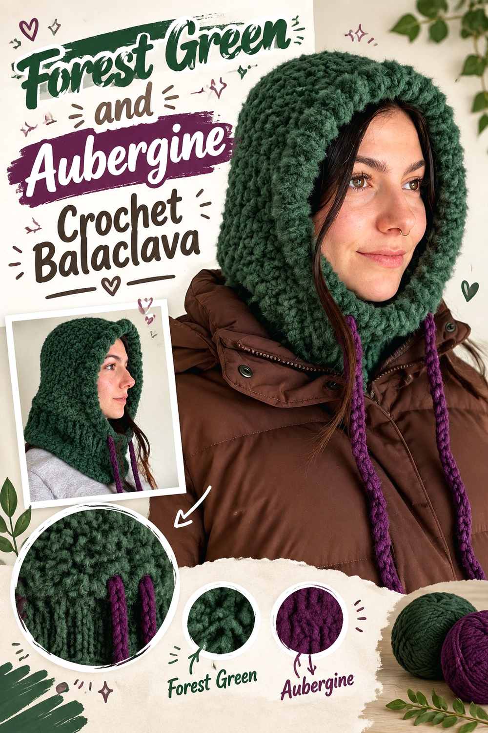
Aubergine gives Forest Green a deep purple contrast and creates a dramatic low-light palette. The face opening or lower edge provides a useful place for the purple because the rest of the balaclava can remain uninterrupted green.
Keep Forest Green Across the Main Crochet Balaclava Surface
Use Forest Green through the crown and larger surrounding areas so shaping and ribbing remain visually continuous.
Keeping most of the piece green also prevents the dark purple from making the entire balaclava look nearly black from a distance.
Aubergine Frames Forest Green Crochet Balaclava Openings
Place Aubergine around the face opening or lower finishing area. Since both shades can be very dark, compare them in grayscale before relying on a thin border.
A broader Aubergine section will make the intentional color shift clearer.
Creator Credit: Natalie
19. Forest Green And Mustard Crochet Sweater
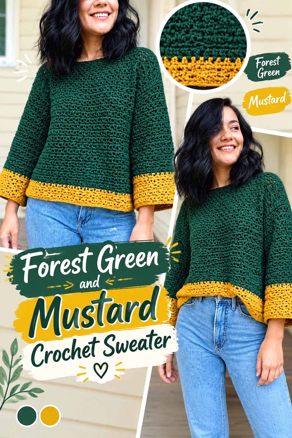
Mustard gives Forest Green a strong warm yellow accent that can quickly become visually prominent. Restricting it to cuffs, neckline finishing, or another repeated edge keeps the sweater Green-led.
Let Forest Green Dominate the Crochet Sweater Body
Use Forest Green across the torso and most of the sleeves so the large wearable retains one coherent field. Broad dark-green areas also allow stitch texture to become part of the design.
Keeping mustard away from the center prevents the accent from competing with the main body.
Mustard Brightens Forest Green Crochet Sweater Edges
Repeat mustard around cuffs and the neckline, where the warmer color can identify construction boundaries.
Because the hue contrast is already strong, narrow mustard sections may be enough to influence the palette without reducing the amount of visible Forest Green substantially.
Creator Credit: KnitcroAddict
20. Forest Green And Mulberry Crochet Drawstring Bag
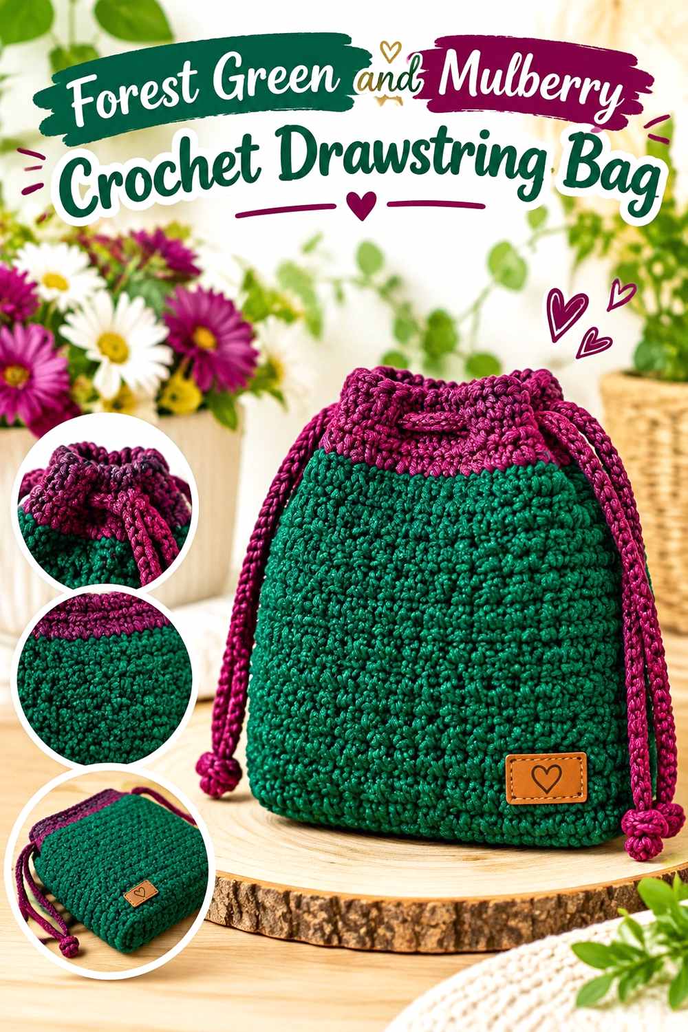
Mulberry gives Forest Green a rich berry-purple accent that works particularly well around a drawstring closure. Keeping the body green and the closure darker keeps the compact bag organized.
Keep Forest Green Across the Crochet Drawstring Bag Body
Use Forest Green across most of the pouch so the gathered shape remains cohesive. A continuous main field also prevents color changes from competing with the drawstring construction.
Mulberry Highlights Forest Green Crochet Drawstring Details
Use Mulberry around the upper edge, cord, or another closure-related area. The dark berry accent directs attention to the drawstring structure while Forest Green continues to occupy most of the bag.
If both colors are deep, use enough Mulberry for the distinction to remain visible.
Creator Credit: SANG DEWI CRAFT
21. Forest Green And Flax Crochet Poncho

Flax gives Forest Green a light natural contrast that suits the large draped surface of a poncho. Broad color areas are particularly important because narrow stripes can appear overly busy across such a wide garment.
Let Forest Green Carry the Main Crochet Poncho Field
Use Forest Green across the largest sections so the dark green remains obvious after the poncho folds around the body.
A substantial continuous area also lets texture and drape provide visual movement without relying on frequent color changes.
Flax Breaks Up Broad Forest Green Crochet Poncho Sections
Use flax around the neckline, outer edge, or another substantial repeated section. A natural light neutral can prevent a very large Forest Green surface from becoming visually heavy.
Keep the flax areas proportional to the poncho’s scale rather than reducing them to tiny accents.
Creator Credit: Handwork diy
22. Forest Green And Smoked Lilac Crochet Mittens
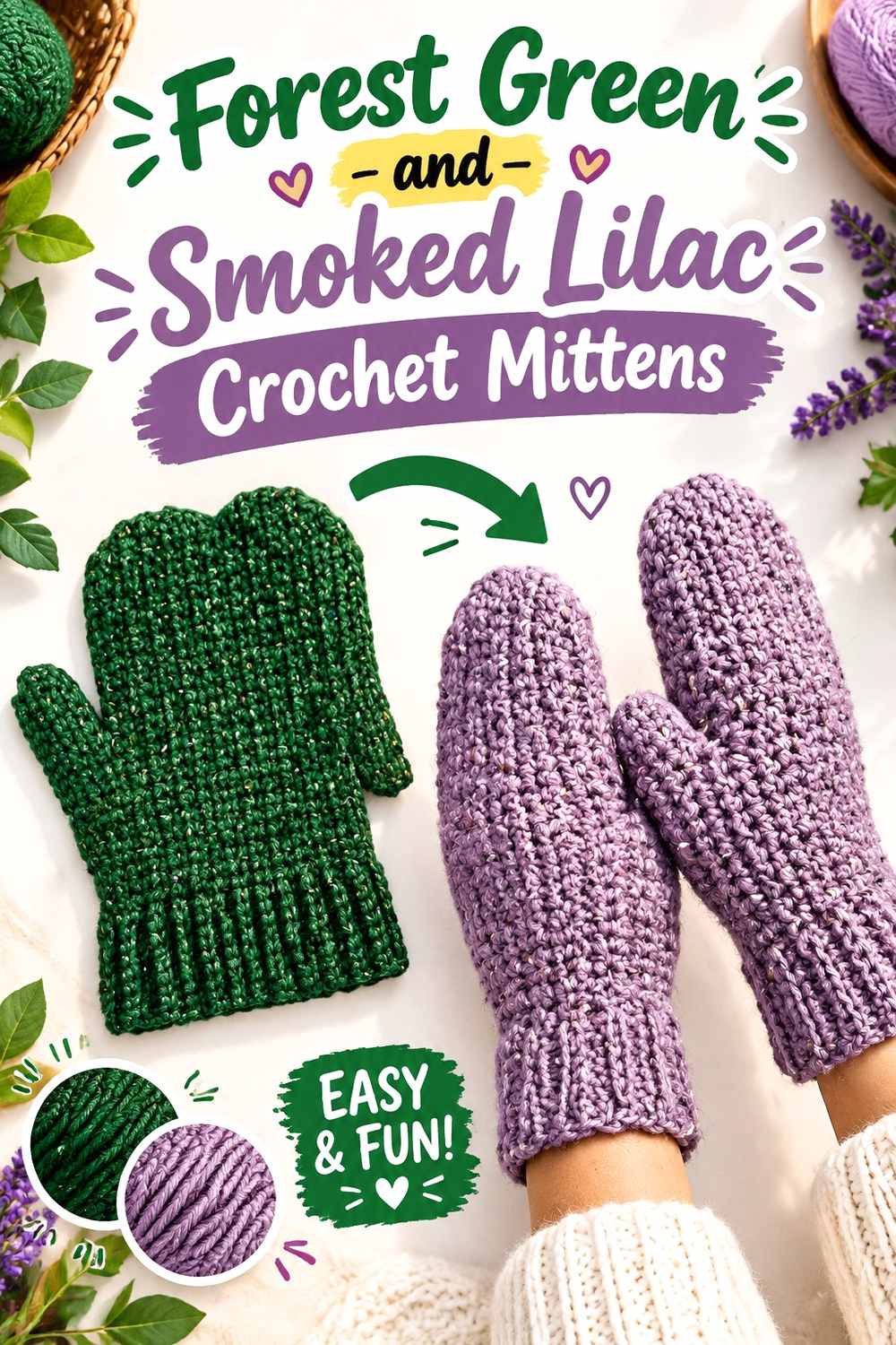
Smoked Lilac gives Forest Green a muted purple contrast that is softer than bright lavender. Mittens have limited space, so the cuffs are the most useful location for the supporting color.
Keep Forest Green Across the Main Crochet Mitten Hands
Use Forest Green through the hand and thumb areas on both mittens. Consistent placement gives the pair one dominant field and allows shaping to remain easier to follow.
Avoid adding several additional color bands to the compact mitten body.
Smoked Lilac Softens Forest Green Crochet Mitten Cuffs
Place Smoked Lilac around the wrist cuffs. The muted purple-green relationship introduces color without the sharp value contrast of cream.
If the Smoked Lilac is fairly dark, choose a wider cuff so it remains recognizable against Forest Green.
Creator Credit: Brunaticality
23. Forest Green And Petrol Blue Crochet Scrunchie

Petrol Blue creates a deep cool pairing that suits a more restrained scrunchie. Because gathered fabric hides parts of each color, Forest Green needs the larger share if it should remain visible after the ruffle compresses.
Keep Forest Green Visible Across the Main Crochet Scrunchie Ruffle
Give Forest Green most of the crocheted surface so the main shade remains apparent between folds. Tiny green sections can disappear once the ruffle gathers around the elastic.
A larger green field also prevents the dark Petrol Blue from taking over.
Petrol Blue Deepens the Edge of a Forest Green Crochet Scrunchie
Use Petrol Blue around an outer ruffle or another repeated finishing section. The subtle blue-green shift creates depth rather than bright contrast.
If the two shades nearly merge, use a slightly lighter Petrol Blue or increase the width of the accent section.
Creator Credit: ElyseCrochets 💌
24. Forest Green And Burgundy Crochet Coaster

Burgundy creates a dark red contrast against Forest Green and gives a small coaster a rich two-color direction. Keeping green in the center and Burgundy at the perimeter makes the limited surface easier to organize.
Let Forest Green Fill the Main Crochet Coaster Center
Use Forest Green across most of the central area so the compact project has one clear focal field.
A continuous center also gives the stitch pattern enough room to remain readable without several small color rings competing for attention.
Burgundy Frames the Edge of a Forest Green Crochet Coaster
Use Burgundy around the outer border. The red-green hue difference creates visible color variation even if the yarns are relatively close in value.
If both shades are extremely dark, make the Burgundy border substantial enough to remain intentional.
Creator Credit: Crochet MC
25. Forest Green And Soft Mint Crochet Bandana
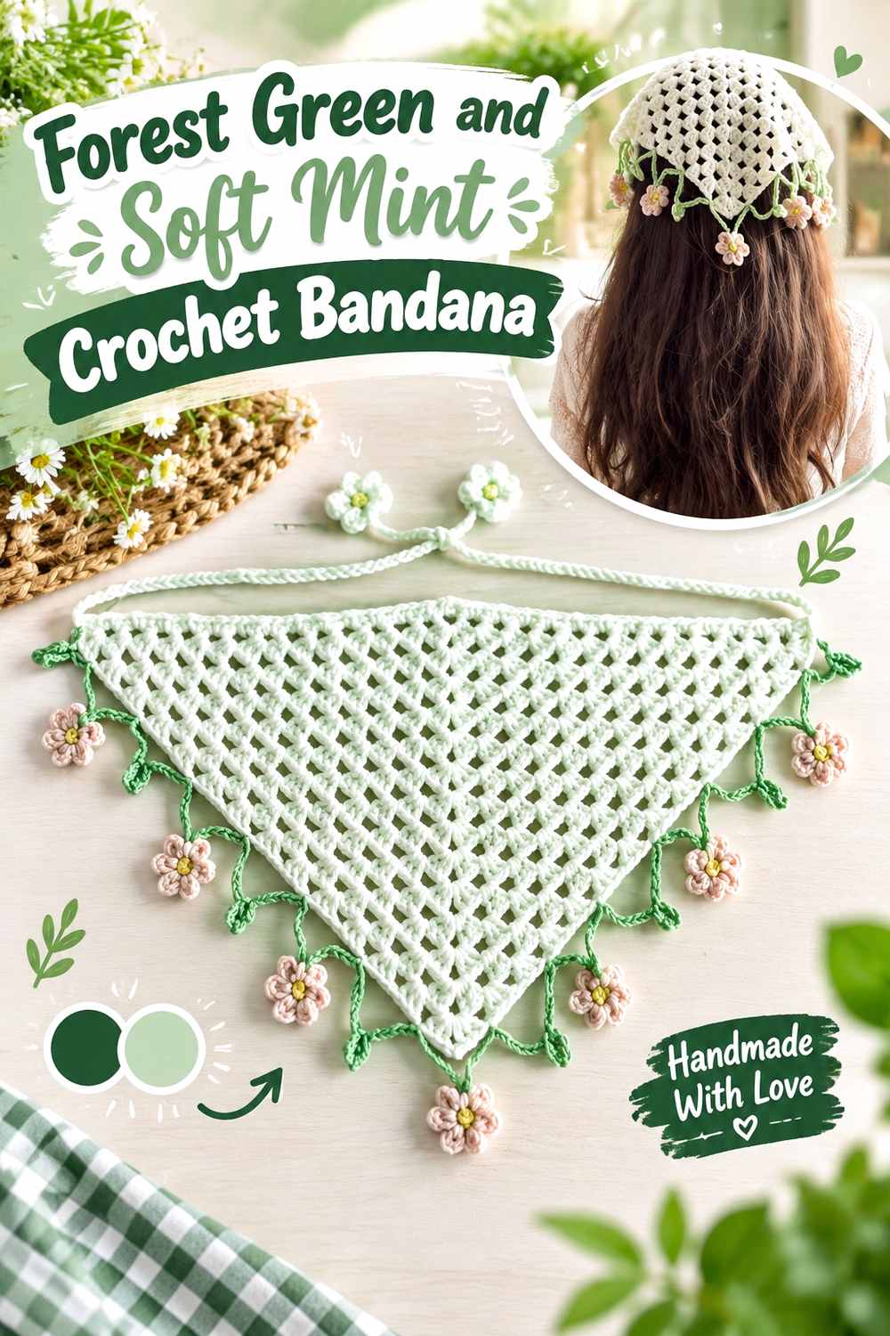
Soft mint creates a lighter green-on-green palette that relies on tonal contrast rather than a completely different hue. A bandana’s triangular center and narrow edging provide clear places to separate the two values.
Keep Forest Green Across the Main Crochet Bandana Triangle
Use Forest Green across most of the central triangle so the lacy or textured surface remains visually connected.
A broad dark-green field also ensures the bandana remains Forest Green-led even when mint appears around several edges.
Soft Mint Defines Forest Green Crochet Bandana Edges and Ties
Use soft mint around the border and ties where a lighter related green can clarify the triangular outline.
Because the colors already belong to the same family, make sure the mint remains noticeably lighter than Forest Green if you want narrow ties and edging to stand out.
Creator Credit: Plakshi Jain | Crochet
Comparing the 26 Forest Green Crochet Color Directions
For the clearest light-dark separation, Forest Green pairs especially well with soft ivory, oatmeal, warm white, cream, powder blue, flax, and soft mint. These shades are useful around borders, brims, cuffs, straps, neckline finishing, and other details that need immediate visibility.
Camel, Cinnamon, Antique Gold, terracotta, burnt orange, mustard, and muted coral introduce different degrees of warmth. Camel is the quietest, while orange and mustard provide the strongest warm contrast. Cinnamon and terracotta keep the palette earthy, and Antique Gold creates a richer golden direction.
Blush and dusty rose soften Forest Green with pink tones, while Mulberry, Burgundy, Aubergine, Smoked Lilac, and soft lilac move the palette toward purple and berry combinations. Lighter lilac is useful for edges; the deeper berry shades generally work better across broader bands or framing sections.
Pewter Gray, charcoal, Mushroom Taupe, midnight navy, and Petrol Blue produce the most restrained palettes. Gray and taupe neutralize the green, while navy and Petrol Blue deepen its cool character. These low-contrast combinations benefit from larger blocks rather than tiny details.
Conclusion
Forest Green can anchor both highly contrasted and tonal crochet palettes, but the most effective placement follows the actual item. Cardigans, sweaters, blankets, shawls, ponchos, pillows, and tops can carry broad green fields where stitch texture becomes part of the design. Hats, bags, gloves, mittens, slippers, headbands, scrunchies, and other compact accessories benefit from keeping contrast around structural details.
Choose ivory, oatmeal, cream, warm white, powder blue, flax, or mint when definition matters most. Camel, Cinnamon, gold, terracotta, orange, coral, and mustard add warmth. Lilac, rose, Mulberry, Burgundy, and Aubergine introduce purple or red contrast, while gray, taupe, navy, and Petrol Blue keep the palette darker and more restrained.
When substituting yarn, preserve each color’s job. A light supporting shade should remain clearly lighter than Forest Green, a deep frame needs enough value difference to remain recognizable, and a strong warm or berry accent should occupy controlled areas if Forest Green is intended to stay dominant.
Frequently Asked Questions
What Colors Work Well With Forest Green Crochet?
Forest Green can pair with ivory, oatmeal, cream, warm white, camel, Cinnamon, terracotta, burnt orange, mustard, Antique Gold, blush, dusty rose, coral, Mulberry, Burgundy, Aubergine, lilac, Smoked Lilac, powder blue, mint, Petrol Blue, navy, gray, charcoal, and Mushroom Taupe. The useful choice depends on whether you want light contrast, warmth, a colorful accent, or a dark tonal effect.
How Can I Keep Forest Green Crochet From Looking Too Dark?
Repeat a lighter supporting shade around structural areas such as cuffs, borders, brims, handles, motif edges, straps, and openings. Ivory, oatmeal, cream, powder blue, flax, and soft mint can interrupt a large dark-green surface without replacing Forest Green as the main color.
Does Forest Green Crochet Work Better With Cream or White?
Both can create strong contrast. Cream gives Forest Green a warmer, softer boundary, while a cleaner white creates a sharper break. Compare the actual yarns because some Forest Green shades are substantially darker or bluer than others.
Can Forest Green and Pink Work Together in Crochet?
Yes. Blush creates a lighter soft contrast, dusty rose gives the pairing more muted warmth, and muted coral creates a stronger red-orange direction. Give one shade a clear dominant role so the two colors do not compete equally on small projects.
Can Forest Green and Blue Be Used Together in Crochet?
Yes. Powder blue creates light contrast, while Petrol Blue and midnight navy give Forest Green much deeper cool relationships. When both colors are dark, use larger separate sections rather than expecting narrow borders to remain highly visible.
Does Forest Green Work With Purple Crochet Accents?
Yes. Soft lilac gives Forest Green a pale cool contrast, Smoked Lilac creates a muted effect, and Aubergine or Mulberry produces a deeper jewel-toned palette. The darker purple shades generally work more clearly in broad sections than tiny details.
What Warm Colors Work With Forest Green Crochet?
Camel, Cinnamon, Antique Gold, terracotta, burnt orange, mustard, and coral can all warm Forest Green. Use stronger colors such as orange and mustard in controlled areas when you want Forest Green to remain the main shade.
How Can I Make Forest Green Crochet Texture Easier to See?
Place a noticeably lighter yarn beside raised stitches, motif borders, ribbing transitions, or edging that needs emphasis. On an all-Forest Green item, keeping large areas uninterrupted can also make natural stitch shadows easier to read.
How Do I Substitute a Color in a Forest Green Crochet Palette?
Preserve its visual function. Replace a pale accent with another clearly lighter shade, a dark frame with another sufficiently deep color, and a warm or cool accent with a yarn that creates comparable contrast against Forest Green. Maintaining that hierarchy matters more than matching an exact commercial shade.