Persimmon and plum create a warm, saturated crochet palette with enough color difference to feel layered without relying on a strong light-versus-dark contrast. Persimmon brings an orange-red direction, while plum shifts toward deep red-purple. Depending on the yarns you choose, however, the two shades can be surprisingly close in value.

That makes placement important. Broad color blocks can show off both shades clearly, while small motifs, narrow stripes, or detailed textures may need cream, oatmeal, blush, or another lighter shade to keep the colors separated. You can also change the personality of the pairing by deciding whether persimmon or plum covers most of the finished piece.
The 18 ideas below use different crochet projects and different color strategies, from persimmon-led blankets to plum-heavy wearables and balanced two-color accessories.
Quick List
- Persimmon, Plum, and Cream Striped Crochet Blanket
- Plum-Led Persimmon Crochet Cardigan
- Persimmon Crochet Market Bag with Plum Handles
- Plum and Persimmon Textured Crochet Pillow
- Plum Crochet Beanie with Persimmon Contrast
- Plum Filet Crochet Shawl with Persimmon Edging
- Persimmon and Plum Checkerboard Crochet Vest
- Persimmon Crochet Bucket Hat with Plum Brim
- Persimmon and Plum Oversized Crochet Scarf
- Plum Crochet Mesh Shopping Bag with Persimmon Accents
- Persimmon Crochet Sweater with Plum Ribbing
- Persimmon Crochet Headband with Plum Stripes
- Plum Crochet Poncho with Persimmon Border
- Plum and Persimmon Color-Block Crochet Skirt
- Persimmon Crochet Bandana with Plum Trim
- Plum Crochet Handbag with Persimmon Panels
- Persimmon Crochet Crossbody Bag with Plum Flap
- Plum and Persimmon Crochet Hanging Basket
Balance Persimmon and Plum by Value, Not Just Hue
Persimmon and plum are clearly different hues, but that does not guarantee strong stitch definition. A deep burnt persimmon beside a medium plum may have almost the same lightness, causing small stripes or motifs to blend from a distance. Before committing to a complicated layout, place the yarns together and check them in grayscale. If they become difficult to distinguish, use wider color areas or introduce a noticeably lighter separator.
This matters most on crochet textures that depend on shadows and raised surfaces. Dense cables, bobbles, ribbing, and dimensional motifs already create visual activity, so using two similarly dark colors in tiny alternating sections can make both the texture and the palette harder to read.
Decide Whether Persimmon or Plum Should Lead the Project
Equal amounts of persimmon and plum create an assertive two-color result, but equal distribution is not the only option. Letting one shade dominate can make the palette easier to control.
For wearables, you might use plum across large body panels and repeat persimmon at cuffs, borders, pockets, or motif centers. On bags and home decor, persimmon can cover the main surface while plum defines handles, bases, joins, or outer edges. The important point is repetition: if an accent appears only once, it can look disconnected from the rest of the item.
Add a Light Neutral When Persimmon and Plum Need Separation
Cream, oatmeal, warm beige, or another light neutral can be useful when persimmon and plum are both fairly deep. You do not need to divide every color change with a neutral. Instead, reserve the lighter shade for areas where definition matters most, such as motif borders, narrow stripes, textured stitch sections, joins, or outer edging.
A neutral can also reduce the visual weight of an all-saturated project. If the finished piece already contains large areas of persimmon and plum, keeping the neutral to smaller repeated sections usually preserves the two-color identity.
1. Persimmon, Plum, and Cream Striped Crochet Blanket
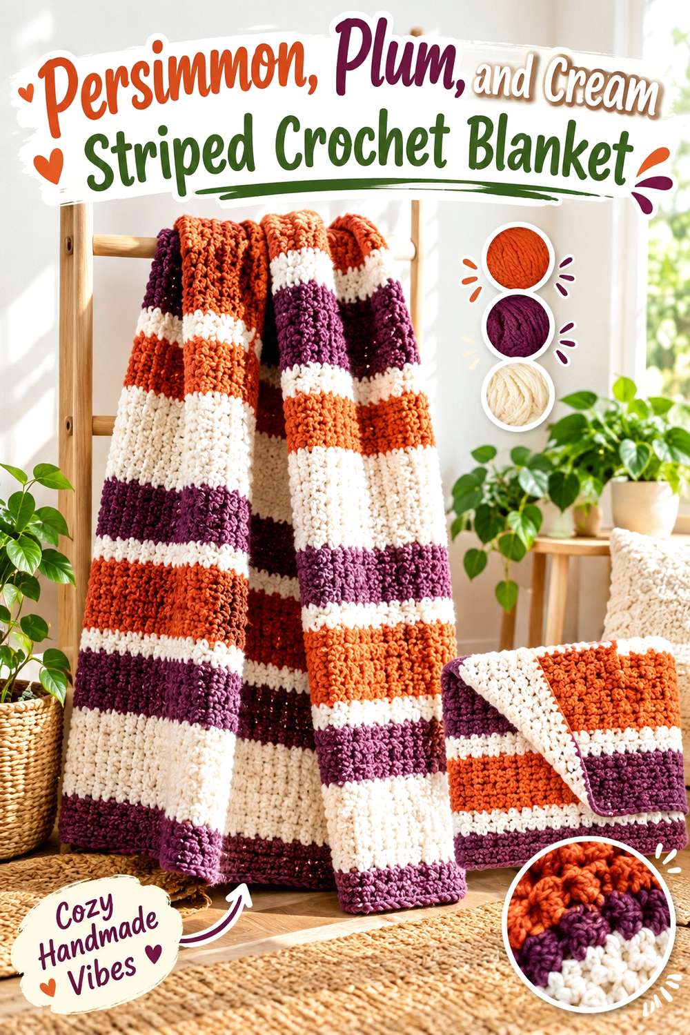
A striped blanket gives persimmon and plum enough uninterrupted surface area to be appreciated separately. Let persimmon take slightly more space if you want the blanket to read warmer overall, then place plum in substantial bands rather than narrow lines. Cream can appear between selected transitions to prevent the two saturated colors from merging into one dark field.
Let Persimmon Carry the Wider Crochet Blanket Stripes
Wider persimmon bands give the blanket a warm foundation and allow stitch texture to remain visible without excessive color interruption. Instead of alternating persimmon and plum at identical intervals, vary their visual weight so the design has a clear dominant shade.
If your persimmon yarn is quite dark, check it beside plum before planning the stripe widths. When the values are similar, broader sections will usually separate more clearly than many narrow stripes.
Use Cream Between Persimmon and Plum Where Contrast Drops
Cream does not need to appear after every stripe. It is more useful as an occasional divider where a plum band meets a particularly dark persimmon section.
Repeating cream in a border can then connect those small separators to the outside of the blanket. This keeps the neutral from looking like an unrelated third color.
Creator Credit: Daisy Farm Crafts
2. Plum-Led Persimmon Crochet Cardigan
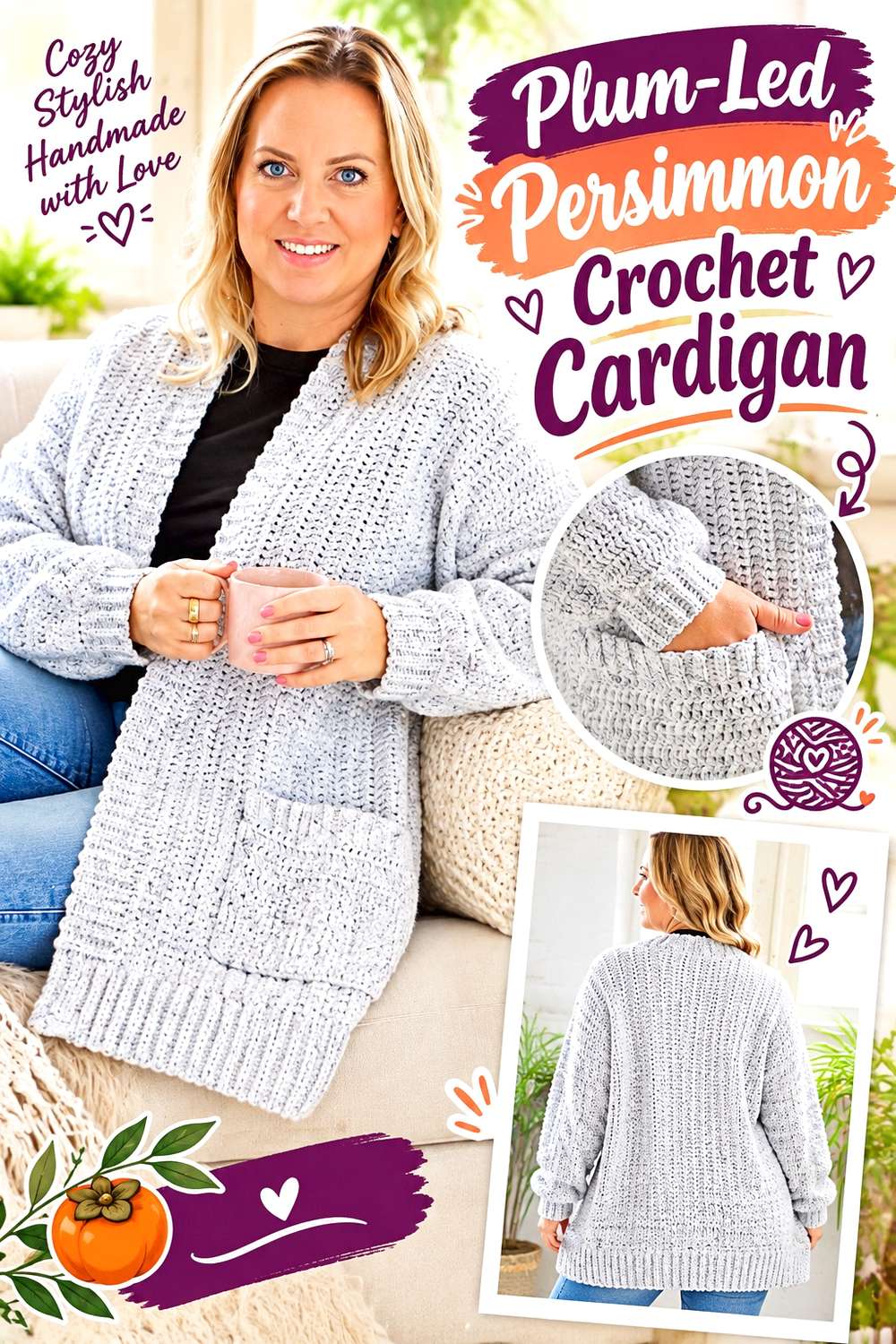
A cardigan offers several natural places to separate these colors: body panels, sleeves, cuffs, pockets, neckline, and outer edging. Using plum across most of the body produces a deeper wearable, while persimmon can warm the cardigan through repeated details rather than splitting the garment into two equal halves.
Keep Plum Across the Main Crochet Cardigan Panels
Using plum on the large front and back areas gives the cardigan a consistent visual base. That makes persimmon easier to introduce at smaller structural points without making the garment look fragmented.
For a less saturated result, you could also keep the body plum while using a softer persimmon rather than a bright orange-red.
Repeat Persimmon on Crochet Cardigan Cuffs and Edging
Cuffs are useful for persimmon because the color appears on both arms, creating intentional repetition. Carrying the same persimmon into the neckline or front edging can tie those cuffs back into the whole garment.
Avoid adding persimmon to only one isolated pocket or one small section unless asymmetry is deliberately part of the plan.
Creator Credit: Bella Coco Crochet
3. Persimmon Crochet Market Bag with Plum Handles
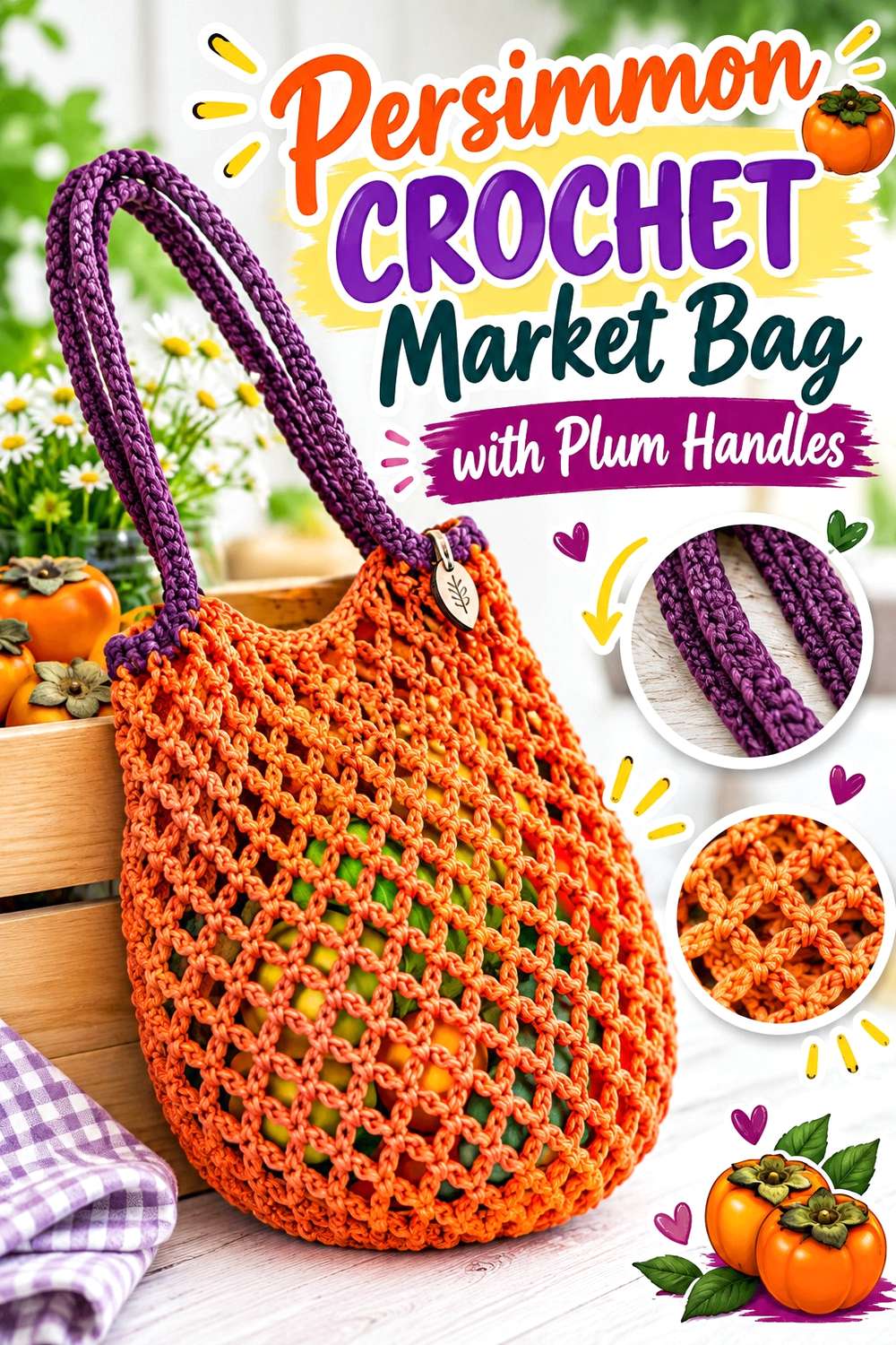
An open market bag can handle a strong main color because the negative space in the fabric already breaks up the visual mass. Persimmon can lead the bag body, while plum gives the upper edge and handles a darker frame.
Let Persimmon Dominate the Open Crochet Bag Body
Persimmon works well across the largest part of the bag because open crochet prevents the color from appearing as one solid block. The repeated holes also make the warm color interact with whatever is visible through the bag.
If you want a calmer result, use one continuous persimmon field rather than frequently alternating colors through the mesh.
Put Plum Where the Crochet Market Bag Needs Visual Definition
Plum can mark the top edge, handles, or transition from body to handle. Those areas naturally form the bag’s outline, so the darker-looking shade can give the shape more definition.
Repeat plum in at least one additional small area if the handles otherwise feel visually separate from the persimmon body.
Creator Credit: Crochet with Julia
4. Plum and Persimmon Textured Crochet Pillow
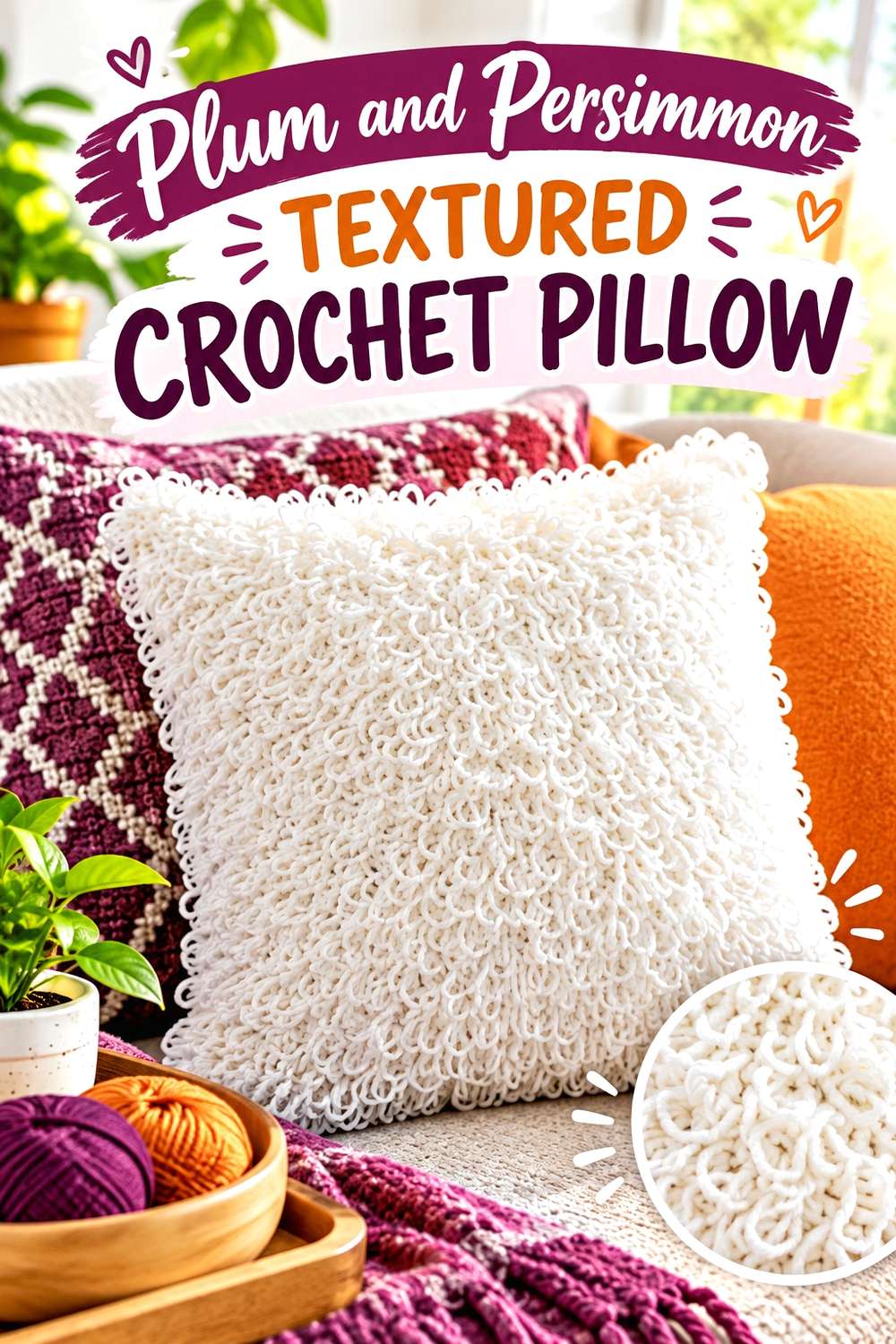
Strong surface texture already creates shadows across a crochet pillow, so this is one project where limiting the number of color changes can improve the result. Plum can establish the main pillow face while persimmon highlights selected textured zones or the outer edge.
Give Plum Enough Space Around the Crochet Pillow Texture
If the pillow contains loops or other raised details, a broad plum field lets those shadows do part of the visual work. Constantly alternating plum and persimmon inside every textured repeat can make both the texture and colors compete.
A single plum-dominant face with strategically placed persimmon usually reads more clearly from across a room.
Use Persimmon to Frame the Plum Crochet Pillow Face
Persimmon edging can warm a dark plum pillow without interrupting the center texture. This approach works particularly well when the pillow is intended to sit among cream, beige, brown, or other quieter furnishings.
If the persimmon is much brighter than the plum, keep the edge relatively controlled so it frames rather than overwhelms the center.
Creator Credit: MJ’s Off The Hook Designs
5. Plum Crochet Beanie with Persimmon Contrast

A beanie has a compact surface, so too many small color changes can make the shape look busy. One effective arrangement is a plum crown with a persimmon brim, or a mostly plum hat with persimmon concentrated in one repeated textured section.
Anchor the Crochet Beanie with a Plum Brim or Crown
Plum is useful where you want the hat to feel visually grounded. A plum brim creates a strong lower edge, while a plum crown makes the darker color more dominant when viewed from above.
Choose between those placements before adding smaller persimmon details so the beanie has a clear hierarchy.
Keep Persimmon Visible Across the Crochet Beanie Ribbing
If the brim has pronounced ribbing, persimmon can make that structural area noticeably different from the crown. Because ribbing creates its own lines, a single persimmon section is often clearer than alternating persimmon and plum within every ridge.
When the two yarns are similar in darkness, test the ribbed fabric before committing to narrow two-color repeats.
Creator Credit: Rich Textures Crochet
6. Plum Filet Crochet Shawl with Persimmon Edging
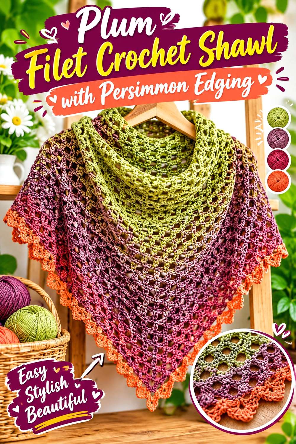
Filet and mesh crochet leave plenty of open space, allowing rich colors to feel less visually heavy than they might in dense fabric. A plum-dominant shawl can therefore support a saturated persimmon edge without needing much neutral.
Keep Plum Continuous Through the Crochet Shawl Mesh
A mostly plum mesh lets the openwork itself remain the dominant pattern. Frequent persimmon changes inside small mesh sections may break up the lines that make filet crochet recognizable.
If you do want persimmon inside the body, use it in wider bands that follow the shawl’s overall geometry.
Let Persimmon Define the Outer Crochet Shawl Edge
A persimmon border can create a warm outline around the darker plum center. It also gives you a place to repeat persimmon continuously rather than scattering tiny accents across the mesh.
Before choosing the edge color, compare both yarns against the clothing you are most likely to wear beneath the openwork, because the background will remain visible through the fabric.
Creator Credit: Fiber Spider
7. Persimmon and Plum Checkerboard Crochet Vest
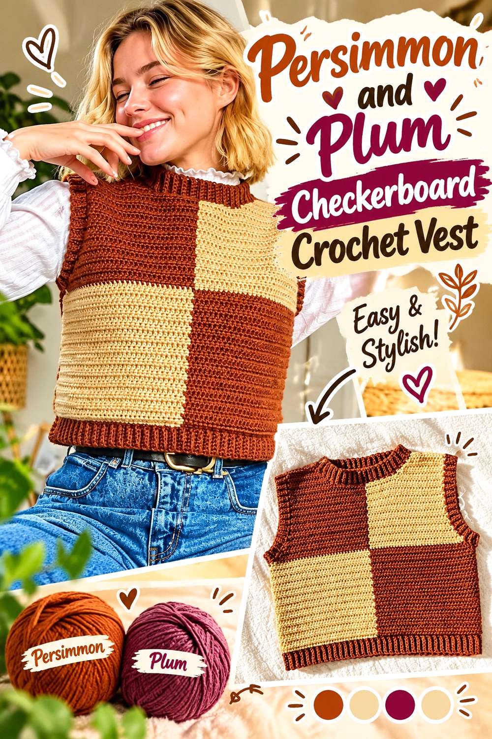
Checkerboard colorwork gives persimmon and plum nearly equal visual importance, making this one of the boldest uses of the pairing. Because both colors repeat in large blocks, you can let the checkerboard itself supply the organization and keep extra shades minimal.
Check Persimmon and Plum Value Before Making Crochet Squares or Blocks
A checkerboard depends on visible block boundaries. If persimmon and plum are too close in lightness, the pattern may become much subtler than expected even though the hues look different in the skein.
A quick grayscale photo can help you decide whether the selected shades create the block definition you want.
Use Plum or Persimmon Consistently on the Crochet Vest Ribbing
Choose one of the checkerboard colors for the neckline, armholes, and lower edging rather than switching the trim repeatedly. A consistent plum trim makes the vest feel darker and more framed, while persimmon trim pushes the warmer shade forward.
This is also an effective way to break an exact 50/50 color balance if the checkerboard body feels too evenly divided.
Creator Credit: Hayhay Crochet
8. Persimmon Crochet Bucket Hat with Plum Brim
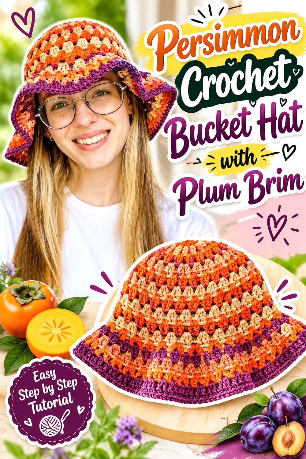
A bucket hat naturally divides into crown, sides, and brim, making color placement easier to plan than on an uninterrupted hat shape. Persimmon can dominate the upper hat while plum creates a clearly defined brim.
Carry Persimmon Through the Crochet Bucket Hat Crown
Keeping the crown and most of the side section persimmon gives the hat a consistent warm main color. It also prevents repeated color changes from making the rounded crown look segmented.
If you want more plum near the top, one controlled band is usually easier to read than many thin alternating rounds.
Let Plum Visually Widen the Crochet Bucket Hat Brim
A plum brim creates a strong change exactly where the hat shape begins to flare outward. That placement makes the color transition reinforce the construction rather than compete with it.
For a more connected look, repeat a narrow plum detail higher on the hat instead of introducing the brim color only once.
Creator Credit: PassioKnit Kelsie
9. Persimmon and Plum Oversized Crochet Scarf

A long scarf provides room for larger color sections, which is useful when persimmon and plum are similar in value. Rather than alternating every few rows, use substantial blocks so each color has time to establish itself.
Use Longer Persimmon Sections on the Crochet Scarf
Long persimmon sections keep the warm color recognizable even when the scarf is folded or wrapped several times. Very short stripes can disappear once the fabric overlaps around the neck.
Planning broader sections also reduces the risk of a busy barcode effect.
Place Plum Where the Crochet Scarf Will Repeat When Wrapped
Consider how the scarf will look in use, not only when laid flat. If plum is concentrated near both ends, it can appear repeatedly around the front once the scarf is wrapped.
If you want more even color distribution, alternate larger persimmon and plum zones along the full length rather than placing all of one shade at a single end.
Creator Credit: Yarnspirations
10. Plum Crochet Mesh Shopping Bag with Persimmon Accents
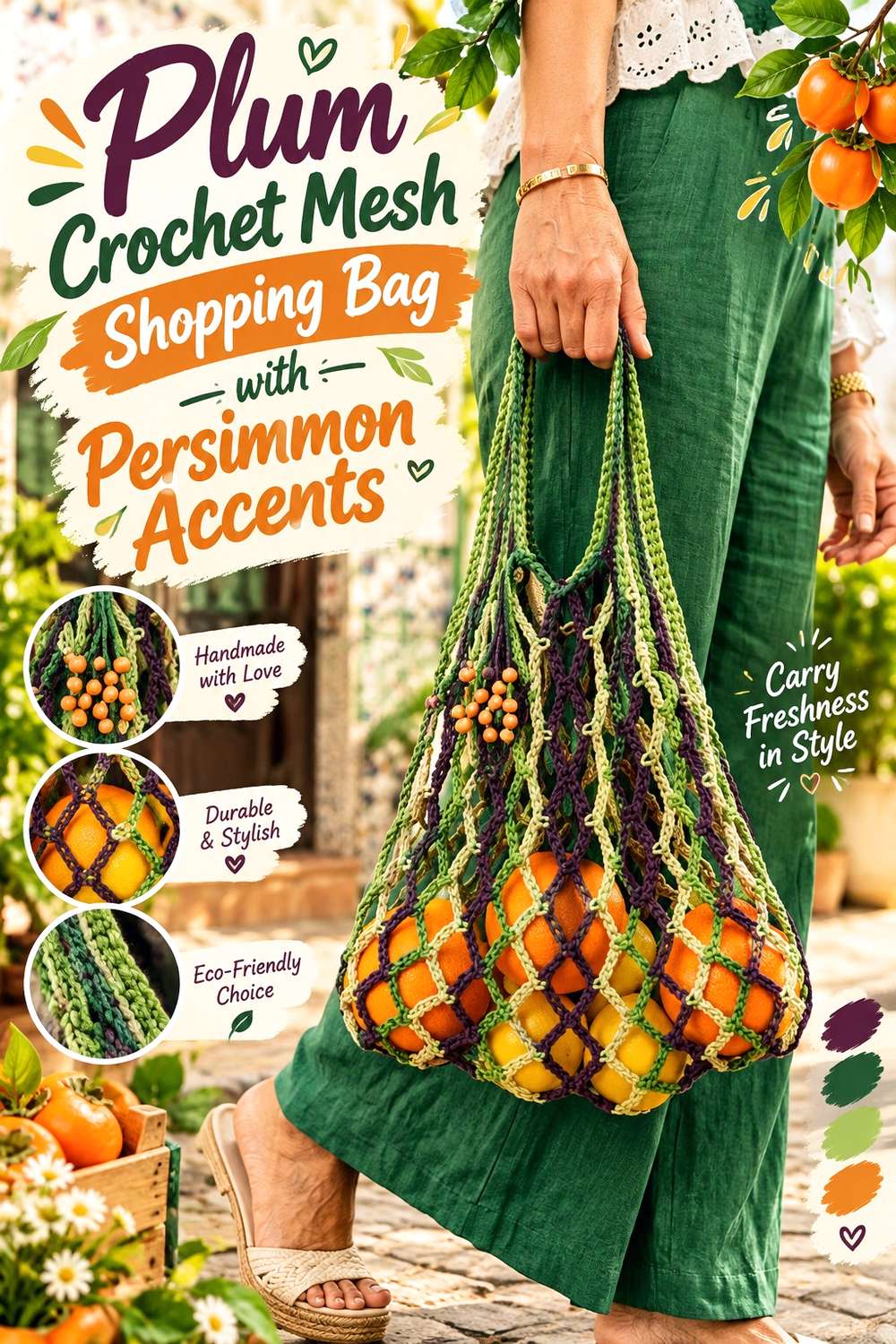
This version reverses the hierarchy of the earlier market bag idea. Plum takes most of the openwork body, while persimmon appears at selected color changes, the upper edge, or handle details.
Let Plum Make the Crochet Mesh Bag Visually Deeper
A plum-dominant mesh bag feels darker even though much of the finished surface is open space. That makes it a useful option when you like the persimmon-and-plum pairing but do not want orange-red to control the whole accessory.
Keep large areas plum so the openwork remains easy to read.
Repeat Persimmon at More Than One Point on the Crochet Shopping Bag
Persimmon works well as a repeated accent around the opening and in a second smaller section lower on the bag. That repetition prevents the warm shade from looking like an afterthought.
If you add another color, keep it quieter than persimmon and plum so it does not compete with the main pairing.
Creator Credit: Home Handwork Diy
11. Persimmon Crochet Sweater with Plum Ribbing
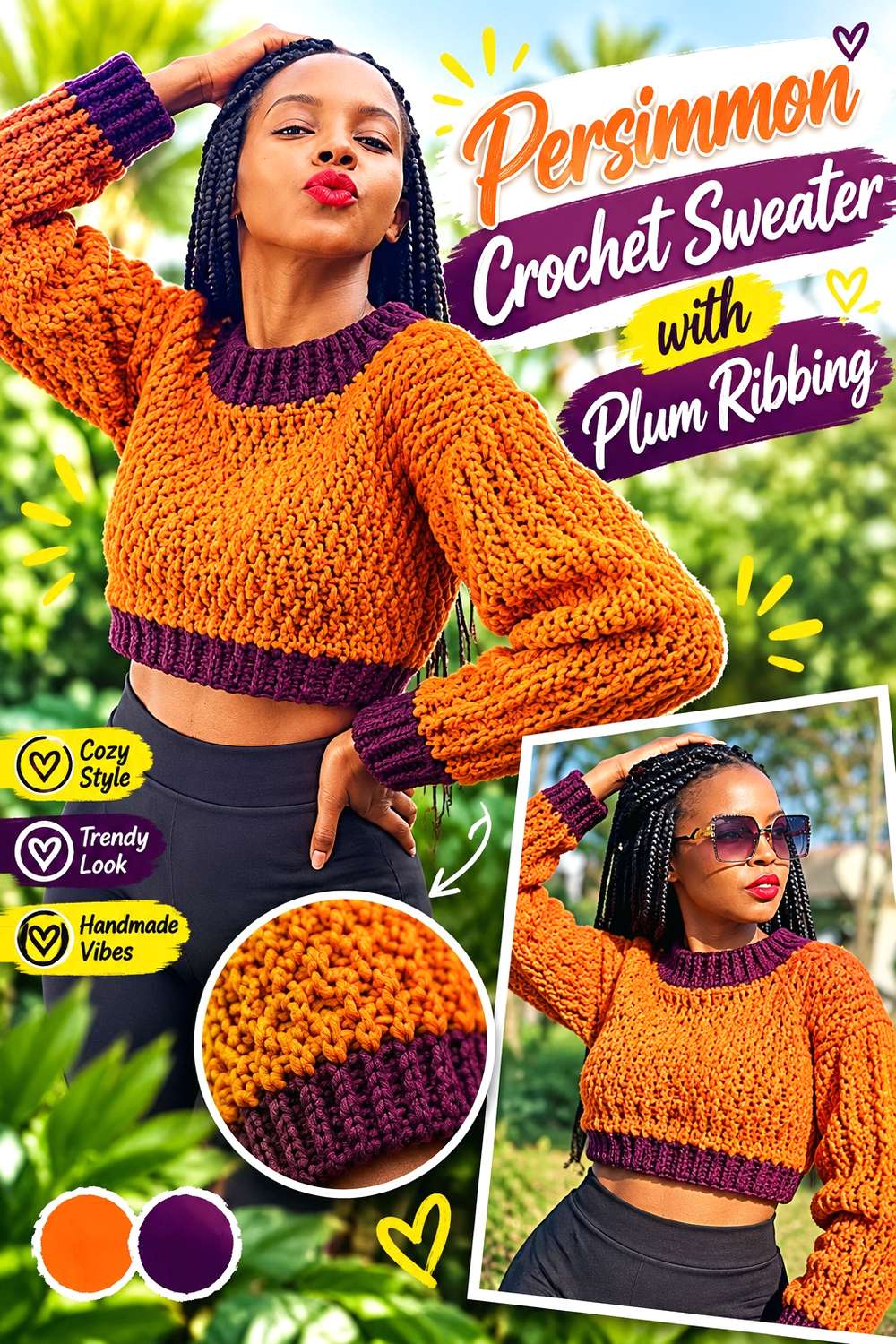
A textured sweater can use persimmon across the main panels and reserve plum for places that already have structural emphasis, including cuffs, waistband, and neckline. This gives the two colors different jobs rather than distributing them randomly.
Keep Persimmon Across the Main Crochet Sweater Texture
When the body already contains noticeable stitch texture, maintaining one primary color helps the raised surface remain readable. Persimmon can carry the front, back, and sleeves while plum stays out of the most detailed areas.
This also prevents multiple color changes from competing with the sweater’s existing texture.
Use Plum to Connect Crochet Sweater Cuffs, Neckline, and Hem
Repeating plum on several ribbed edges creates a strong visual framework. Because those areas are separated across the garment, using the same shade on each one makes the color scheme feel deliberate.
A single plum cuff with no repetition elsewhere would be much harder to integrate.
Creator Credit: AC Crochets
12. Persimmon Crochet Headband with Plum Stripes

A headband is small enough that persimmon and plum can become visually crowded if every row changes color. Wider persimmon sections with occasional plum stripes keep the accessory recognizable as a two-color piece without overwhelming the stitch texture.
Give Persimmon Most of the Crochet Headband Width
Persimmon can occupy the center of the band while plum appears closer to the outer edges. This placement keeps the warm color dominant when the headband is viewed from the front.
If you reverse the arrangement, the accessory will immediately feel darker and more plum-led.
Keep Plum Crochet Headband Stripes Wide Enough to Be Seen
Very thin plum stripes can disappear into a dark persimmon yarn, particularly when the stitch pattern itself creates shadows. Give plum enough width to remain visible from normal viewing distance.
When the colors have similar value, one substantial plum section may be more effective than several narrow ones.
Creator Credit: naztazia
13. Plum Crochet Poncho with Persimmon Border
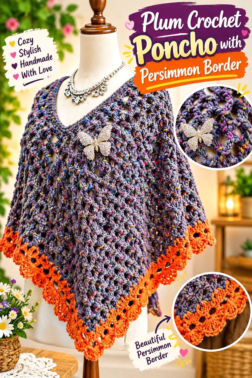
A poncho creates a large uninterrupted field, so it can support a rich plum main color without looking fragmented. Persimmon is especially useful around the neckline or lower edge, where it can emphasize the garment’s outline.
Let Plum Cover the Main Crochet Poncho Surface
Using plum across most of the body keeps the broad drape visually unified. Since ponchos already create a large silhouette, breaking the surface into many small persimmon sections can make the overall shape feel busier.
If you want both colors inside the body, use broad bands rather than scattered small accents.
Use Persimmon Along the Crochet Poncho’s Strongest Edge
A persimmon border can create a clear finish at the lower edge while also warming the plum-dominant garment. Repeating persimmon at the neckline can connect the upper and lower parts of the poncho.
Keep the border proportionate to the body so it defines the edge without becoming the main visual mass.
Creator Credit: Bag-O-Day Crochet
14. Plum and Persimmon Color-Block Crochet Skirt

A crochet skirt provides a long vertical surface where color placement can influence how the garment is visually divided. Plum can anchor the waistband and upper portion while persimmon warms the lower section, or the arrangement can be reversed for a brighter overall result.
Put Plum Near the Crochet Skirt Waist for a Darker Anchor
A plum waistband creates a clear starting point for the garment and can transition naturally into a larger persimmon body. Repeating plum again near the hem prevents the top color from feeling isolated.
Avoid adding a completely unrelated border shade unless it is also repeated somewhere else.
Keep Persimmon Color Blocks Large on the Crochet Skirt
Persimmon benefits from larger areas where the fabric can show its full warmth. Too many narrow persimmon-and-plum stripes may make the skirt look visually divided into many horizontal sections.
Broad blocks create a calmer result and make it easier to preserve a clear dominant color.
Creator Credit: Chenda DIY
15. Persimmon Crochet Bandana with Plum Trim

A crochet bandana has a clear center field, border, and ties, which makes two-color planning straightforward. Persimmon can fill most of the main fabric while plum outlines the shape and continues into the ties.
Keep Persimmon Across the Crochet Bandana Center
A consistent persimmon center prevents the small triangular accessory from becoming over-sectioned. This is particularly useful when the stitch pattern already contains open spaces or decorative edging.
If the persimmon is bright, the darker plum border will provide enough interruption without requiring a third color.
Extend Plum from the Crochet Bandana Border into the Ties
Using plum for both edging and ties connects the functional parts of the bandana to the decorative outline. It also creates repeated plum at each side of the head when the bandana is worn.
If the trim is very narrow, choose a plum shade with enough value difference from persimmon to remain visible.
Creator Credit: VivCrochets
16. Plum Crochet Handbag with Persimmon Panels
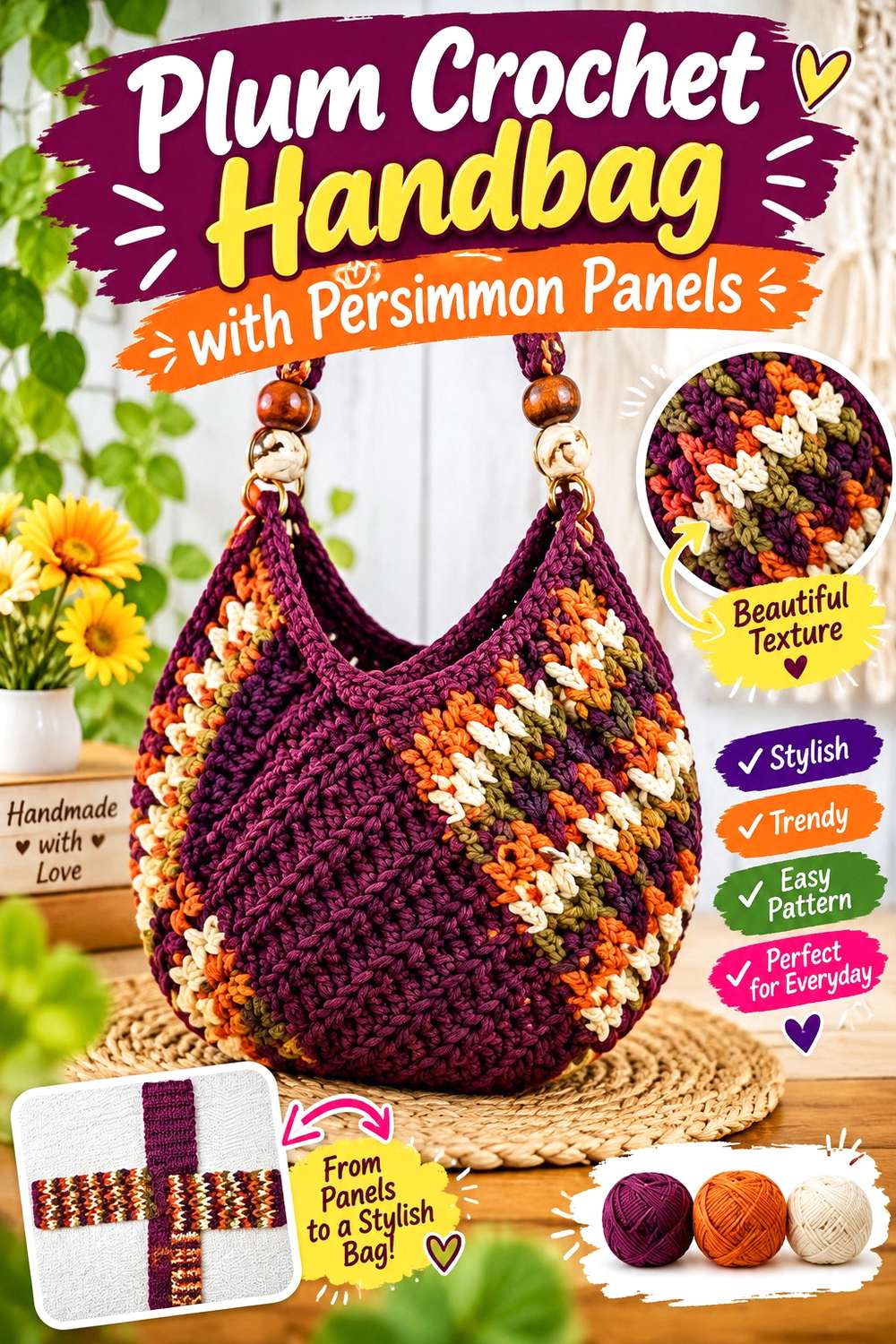
A more structured handbag gives color blocks defined boundaries. Plum can handle the base, upper opening, or selected panels while persimmon fills larger central areas.
Use Plum on Crochet Handbag Areas That Need Visual Weight
Plum naturally creates a darker-looking base when paired with a lighter persimmon. Using it along the bottom or upper edge can frame the body without requiring black or brown.
If your chosen plum is not actually darker in value, test the two colors first rather than assuming it will provide stronger definition.
Repeat Persimmon Across More Than One Crochet Handbag Panel
Persimmon works best when it appears as part of a planned sequence rather than one isolated block. Repeating the warm shade on opposite or neighboring panels keeps the bag balanced from several viewing angles.
Remember to consider the sides of the bag as well as the front before finalizing the color layout.
Creator Credit: Brunaticality
17. Persimmon Crochet Crossbody Bag with Plum Flap

A shoulder, messenger, or crossbody-style bag creates several useful color zones: body, flap, border, and strap. Persimmon can dominate the bag body while a plum flap creates a strong focal area near the opening.
Keep Persimmon Across the Main Crochet Crossbody Bag Body
Using one main persimmon field keeps the bag from looking patchy when worn against different outfits. It also provides a clear background for a darker flap or border.
If you add extra color changes, keep them away from already busy areas such as closures or decorative edging.
Carry Plum from the Crochet Bag Flap into the Strap
A plum flap can feel disconnected if it is the only dark section on the bag. Repeating plum along the strap, side edging, or another small detail links the front focal point to the rest of the accessory.
You can reverse the palette for a quieter version, using plum on the body and reserving persimmon for the flap.
Creator Credit: mahum 🎀
18. Plum and Persimmon Crochet Hanging Basket

A hanging basket is a useful place to try this palette in home decor without covering a large area. Plum can visually ground the bottom while persimmon occupies the upper walls or hanging section, creating a clear vertical color transition.
Put Plum at the Crochet Basket Base for a Darker Foundation
Using plum low on the basket gives the bottom a visually substantial finish. This can be especially effective when the basket will hang against a light wall, where the darker lower color remains easy to see.
Continue plum slightly up the sides rather than changing color exactly at the base seam if you want a less abrupt division.
Let Persimmon Carry the Crochet Basket’s Upper Section
Persimmon can brighten the visible upper portion of the basket and make the hanging piece easier to coordinate with warm wood, cream, beige, or similarly subdued surroundings.
If both colors are highly saturated, avoid adding several additional strong shades. A small neutral detail is usually enough if more separation is needed.
Creator Credit: Winding Road Crochet
Which Persimmon and Plum Crochet Direction Should You Choose?
For the strongest two-color statement, the checkerboard vest, color-block skirt, and broad-striped scarf give persimmon and plum substantial visual space. These options work particularly well when the two yarn shades have enough value difference to remain distinct.
For a more controlled palette, use one color as the dominant field and move the second into trim. The plum poncho with persimmon edging, persimmon sweater with plum ribbing, and plum cardigan with repeated persimmon details all use that approach.
If you want home decor, the striped blanket and textured pillow give the colors more surface area, while the hanging basket is a smaller way to test the combination. For accessories, the bandana, beanie, bucket hat, and headband allow you to experiment with the palette before committing to a larger project.
Whichever project you adapt, compare the actual yarns rather than relying only on the shade names. Persimmon and plum can vary considerably from one yarn line to another, and preserving the right contrast relationship matters more than finding an exact commercial color.
Frequently Asked Questions
Do persimmon and plum work well together in crochet?
They can work particularly well when you want a warm, saturated palette. Persimmon leans toward orange-red, while plum moves toward red-purple, so the pairing has clear hue variation. The main thing to check is lightness: some versions of persimmon and plum are close enough in value that small details may visually merge.
How can I tell whether persimmon and plum have enough contrast?
Place the two yarns side by side and look at them from several feet away. You can also photograph them and view the image in grayscale. If they become nearly identical in grayscale, use larger color areas or introduce a lighter separator where detail needs to remain visible.
Should persimmon or plum be the dominant crochet color?
Either can lead. Persimmon dominance creates a warmer, brighter overall direction, while a plum-dominant project usually appears deeper. Choose the main shade according to the finished item and then repeat the secondary color in several deliberate places.
What neutral works with persimmon and plum crochet?
Cream, oatmeal, warm beige, and other light neutrals can separate the two colors without competing strongly with them. The most useful neutral is one that remains noticeably lighter than both persimmon and plum.
Can I use only persimmon and plum without adding a neutral?
Yes. Broad stripes, checkerboards, color blocks, and clearly separated garment sections can work with only the two colors. A neutral becomes more useful when the persimmon and plum are close in value or when small motifs need extra separation.
How can I substitute a different persimmon shade?
Focus on the role of the shade rather than matching a specific name. If persimmon is supposed to be the warmer or lighter part of the palette, choose another orange-red or warm reddish-orange yarn that preserves that relationship with the plum.
What if my plum and persimmon yarns look muddy together?
First check whether they are too similar in value or both very muted. Increasing the light/dark difference can help. You can also reduce the amount of one color, place a light neutral between selected sections, or use the colors in larger blocks instead of repeatedly mixing them in narrow stripes.