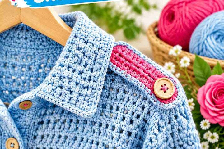
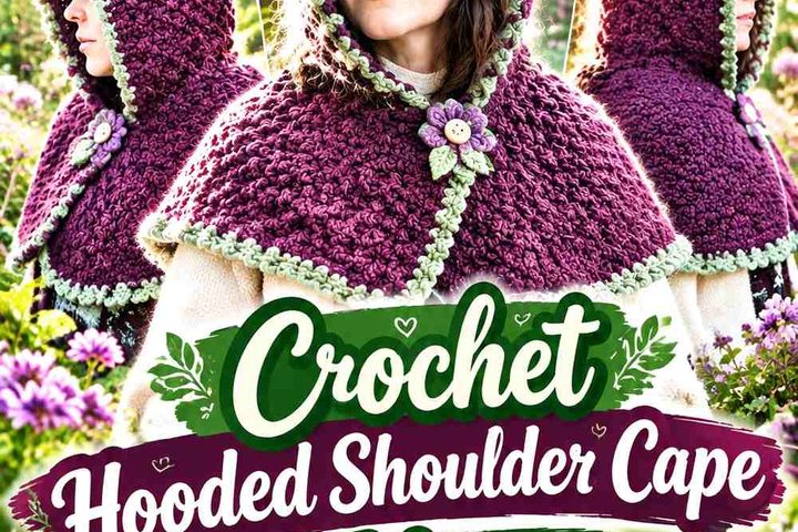
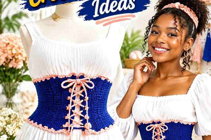
Plum Noir gives a crochet cardigan a dark purple foundation without limiting the project to an all-dark palette. It can carry the body of a cardigan, define granny-square borders, frame an open front, or appear repeatedly through sleeves and cuffs while lighter colors create separation.
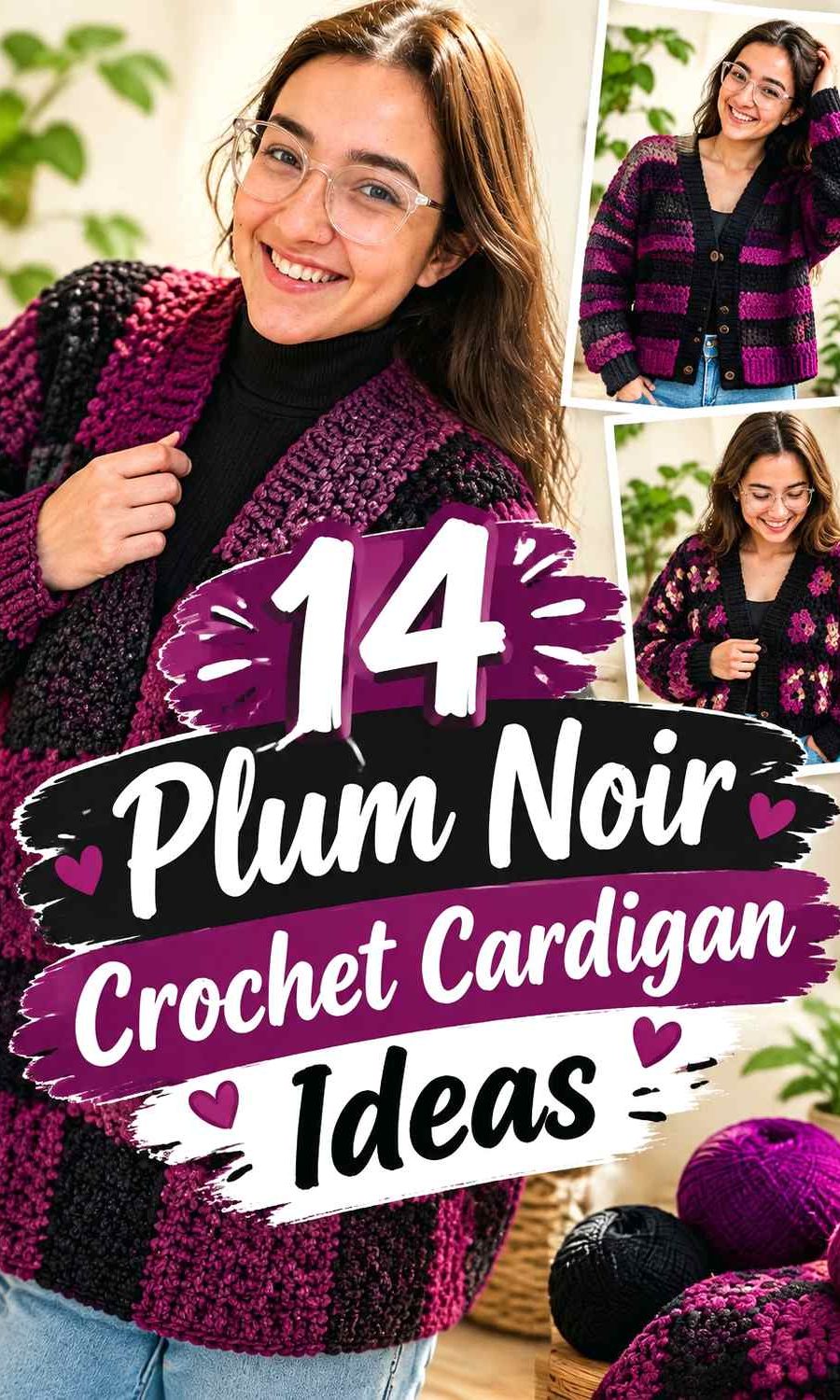
The main decision is how much visual weight Plum Noir should have. Pairing it with cream or silver gray produces obvious light-dark contrast, while charcoal or black creates a quieter near-monochrome effect. Muted pinks and lilacs extend the purple family, whereas sage, rust, gold, and teal push the cardigan in more contrasting directions.
The palettes below are editorial color adaptations. The linked tutorials support the crochet cardigan construction concepts and do not necessarily use the proposed Plum Noir colors.
Quick List
- Plum Noir And Cream Patchwork Crochet Cardigan
- Plum Noir And Dusty Rose Patchwork Crochet Cardigan
- Plum Noir And Oatmeal Patchwork Crochet Cardigan
- Plum Noir And Silver Gray Mesh Crochet Cardigan
- Plum Noir And Sage Panel Crochet Cardigan
- Plum Noir And Charcoal Drop Shoulder Crochet Cardigan
- Plum Noir And Mauve Raglan Crochet Cardigan
- Plum Noir And Black Granny Stitch Crochet Cardigan
- Plum Noir And Antique Gold Cropped Crochet Cardigan
- Plum Noir And Mushroom Collar Crochet Cardigan
- Plum Noir And Lilac Hexagon Crochet Cardigan
- Plum Noir And Rust One Piece Crochet Cardigan
- Plum Noir And Teal Textured Crochet Cardigan
- Plum Noir And Blush Buttoned Crochet Cardigan
Make Plum Noir the Dominant Cardigan Color Deliberately
Plum Noir has enough visual weight to dominate a cardigan even when it does not occupy every panel. Decide before crocheting whether it will be the main body color, the repeated framing color, or a smaller accent.
For a mostly Plum Noir cardigan, lighter shades can be reserved for cuffs, borders, motif centers, stripes, or selected sleeves. In a multicolor patchwork cardigan, repeating Plum Noir around several motifs or across the edging can connect colors that would otherwise feel unrelated.
Avoid dividing every color into identical amounts by default. A clear dominant, supporting, and accent relationship usually makes the finished garment easier to read from a distance.
Use Value Contrast to Keep Plum Noir Crochet Details Visible
Because Plum Noir is dark, another dark shade can disappear into it even when the two yarns are different hues. That matters around granny-square borders, narrow stripes, textured cuffs, joins, and other places where the color change is supposed to define a detail.
Place the yarns beside each other before committing. A quick grayscale photo can also reveal whether two colors have enough light-dark separation. If an important motif loses its outline, make the supporting color lighter rather than simply choosing a different hue at the same depth.
Low contrast is not automatically a problem. It works well when you intentionally want a blended cardigan, but it should not be accidental.
Plan Plum Noir Across Cardigan Panels, Sleeves, Cuffs, and Edging
A cardigan has several natural color zones, so a palette does not have to be distributed evenly. Plum Noir can cover the back and front panels while a second shade defines ribbing, or it can repeat through cuffs and edging to frame a more colorful body.
Sleeves deserve separate attention because they create a large moving block of color. If both sleeves are significantly lighter than a Plum Noir body, they can become the first thing the eye notices. Repeating Plum Noir at the cuffs or incorporating it within the sleeve design can reconnect them visually with the body.
For motif cardigans, plan the full layout before joining. A color arrangement that looks balanced in individual squares can become uneven once those squares are spread across the back, fronts, and sleeves.
1. Plum Noir And Cream Patchwork Crochet Cardigan
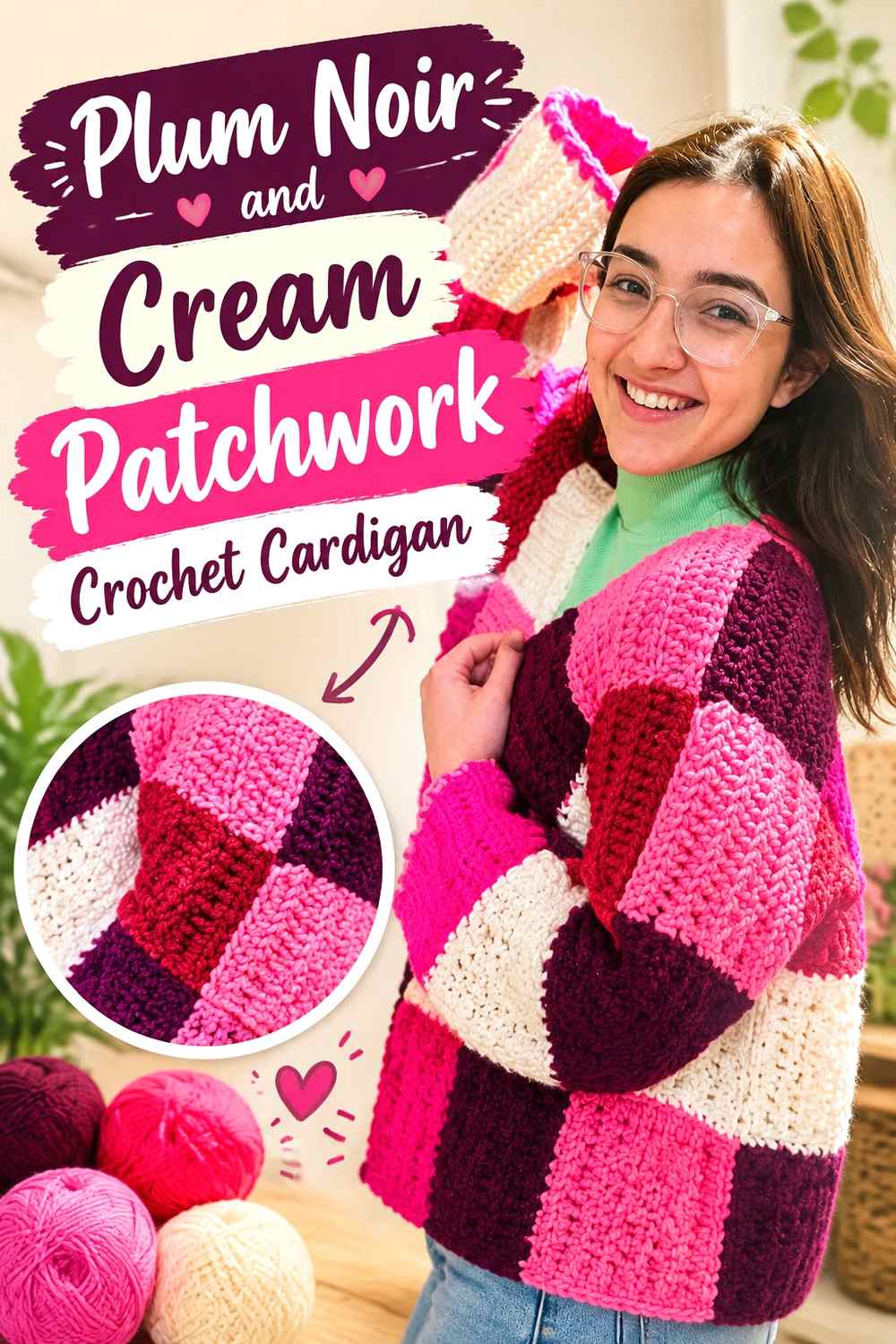
This scheme makes Plum Noir the visual anchor while cream supplies the clearest light contrast in the collection. On a patchwork cardigan, use Plum Noir across a substantial share of the squares rather than scattering it randomly. Cream can then open up selected motifs, sleeve sections, or front-panel blocks. The contrast is strong enough that joins and square placement become especially noticeable, so lay out the cardigan before assembly and check that cream is not concentrated entirely on one side.
Let Plum Noir Repeat Across the Patchwork Cardigan
Instead of putting Plum Noir into one isolated cluster of squares, distribute it through the back, fronts, and sleeves. Repetition gives the darker color a structural role and prevents cream sections from appearing disconnected from one another. If the patchwork includes additional shades, Plum Noir can also serve as the recurring color that ties those smaller accents together.
Cream Gives Plum Noir Crochet Squares Clearer Separation
Cream is especially useful around small motif centers or along selected outer rounds where you want the geometry to remain readable against Plum Noir. If the cardigan starts looking divided into dark and light halves, reduce the size of some cream areas and repeat smaller cream details elsewhere rather than adding another new color.
Creator Credit: Crochet with Karu
2. Plum Noir And Dusty Rose Patchwork Crochet Cardigan
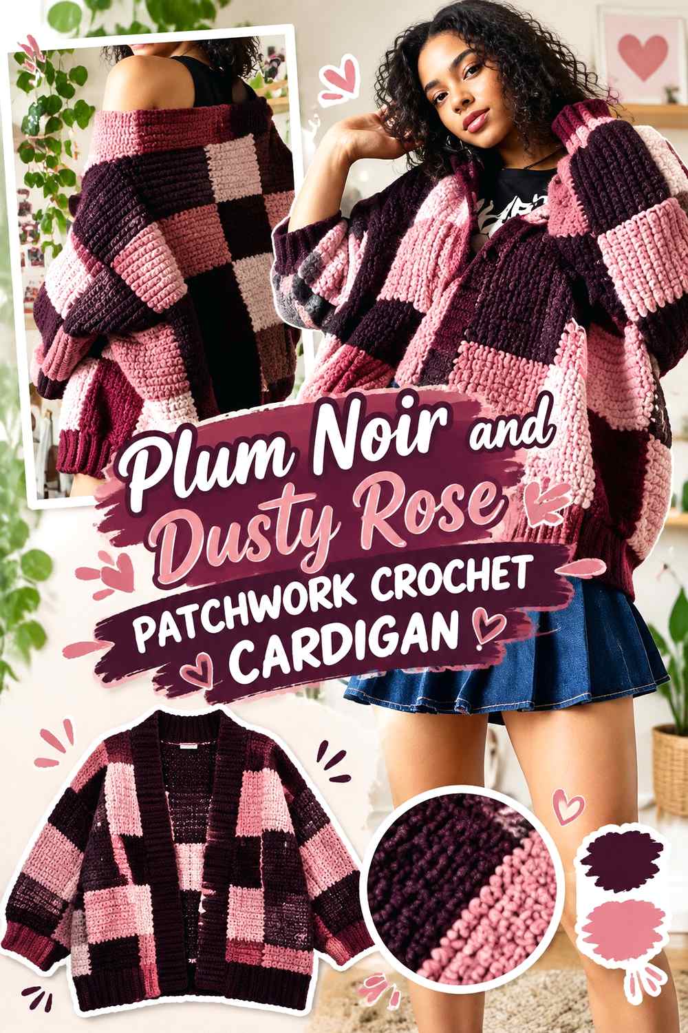
Dusty rose gives Plum Noir a softer transition than cream while still moving the cardigan away from an all-dark palette. This pairing suits patchwork particularly well because Plum Noir can frame the arrangement and dusty rose can appear inside selected blocks. Keep the pink softened rather than extremely bright if you want the cardigan to retain its deep, muted direction. Before joining the pieces, check whether the rose is noticeably lighter than Plum Noir; similar values can make separate squares merge visually.
Use Plum Noir Around Dusty Rose Crochet Blocks
Plum Noir works well as a repeated outer color around dusty rose sections because the darker edge defines the patchwork without requiring a third neutral. That framing can be repeated at the cuffs or opening band so the body and finishing details feel related.
Keep Dusty Rose Lighter Than Plum Noir Where Motifs Need Definition
If dusty rose becomes too dark, its contrast with Plum Noir can weaken considerably. Preserve a visible difference in lightness when the color change needs to show a square edge or motif center. For a more blended cardigan, closer values are workable, but use them intentionally rather than expecting a sharp patchwork effect.
Creator Credit: ikoxun
3. Plum Noir And Oatmeal Patchwork Crochet Cardigan
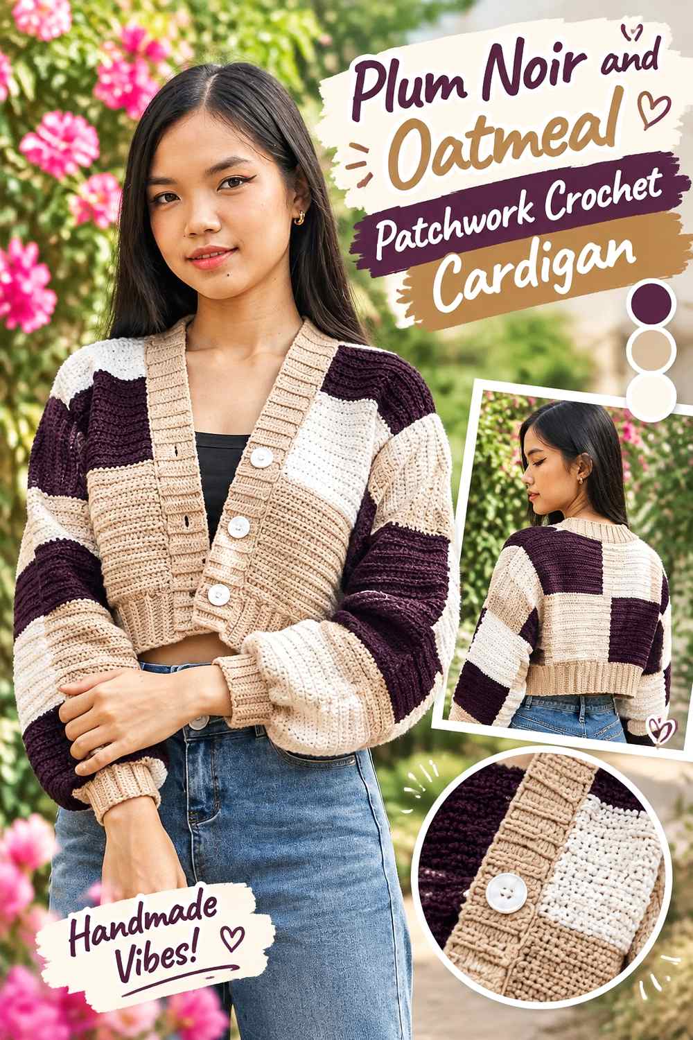
Oatmeal offers a softer neutral break than bright cream, giving Plum Noir patchwork a lower-key contrast. It can work particularly well when you want the cardigan to stay earthy and wearable while still showing individual blocks clearly. Let Plum Noir occupy the larger or more frequently repeated areas, then use oatmeal to create breathing room around the front opening, selected sleeve blocks, or motif centers.
Oatmeal Softens the Contrast Around Plum Noir Patchwork
Because oatmeal is less stark than a very bright neutral, transitions can look calmer across large groups of squares. Use it where you want the patchwork grid to remain visible without turning every color boundary into a strong graphic line.
Plum Noir Can Define Oatmeal Cardigan Edging and Cuffs
Repeating Plum Noir at the cuffs, hem, or front band can bring the darker color back around the perimeter of the cardigan. This is useful when several oatmeal blocks sit near an outer edge; the Plum Noir finish prevents the lighter sections from becoming visually detached from the darker body.
Creator Credit: Chenda DIY
4. Plum Noir And Silver Gray Mesh Crochet Cardigan
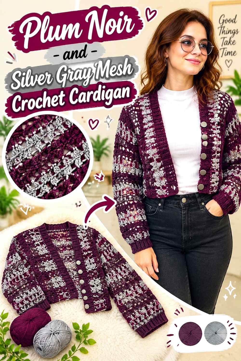
A mesh cardigan exposes the clothing underneath, so the yarn palette is only part of the final color effect. Plum Noir gives the openwork a dark outline, while silver gray can highlight cuffs, lower edging, or selected panel sections without introducing a warm color. Because open spaces reduce the visual mass of the yarn, even a dark Plum Noir cardigan can read differently over a light layer than over black or another dark base.
Use Plum Noir Where the Mesh Crochet Cardigan Needs Definition
Keeping Plum Noir around the front edges and other structural boundaries can make an open mesh fabric easier to read. If silver gray is used through the body, repeating Plum Noir along the perimeter prevents the cardigan from losing its dark focal color.
Silver Gray Helps Plum Noir Openwork Stay Visible
Silver gray can separate adjacent sections when the openwork itself creates plenty of visual movement. Keep the color placement relatively broad rather than changing shades too frequently; too many narrow alternations can compete with the mesh pattern instead of clarifying it.
Creator Credit: Brunaticality
5. Plum Noir And Sage Panel Crochet Cardigan
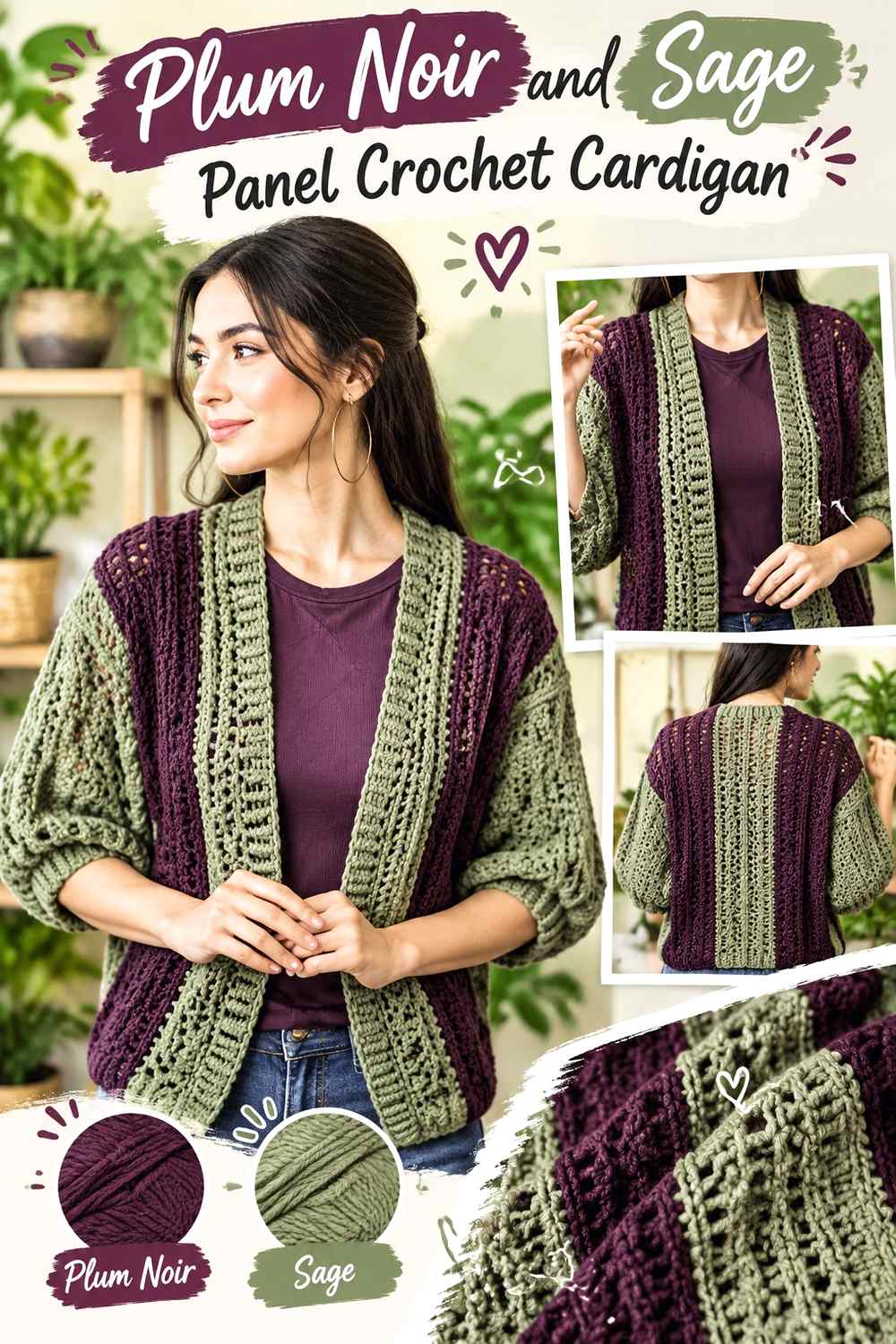
Sage moves Plum Noir toward a muted botanical palette without relying on another purple or neutral. On a paneled cardigan, Plum Noir can cover the back and one or both front sections while sage is reserved for sleeves, cuffs, bands, or deliberate color blocks. Because both colors can be relatively subdued, check their value difference before committing if a seam or border needs to remain obvious.
Let Plum Noir Carry Most of the Crochet Cardigan Panels
A larger Plum Noir body gives sage a clear supporting role instead of allowing the garment to split into two equally competing color masses. Small sage repeats at the cuffs or front edge can be enough to connect sage sleeves or panels back to the main cardigan.
Keep Sage Distinct From Plum Noir at Cardigan Seams
If the chosen sage is fairly deep, the boundary against Plum Noir may become subtle. A slightly lighter muted green will give panel changes more definition. If you specifically want a blended, low-contrast cardigan, keep the values closer and rely on the panel construction rather than the color change for separation.
Creator Credit: TCDDIY
6. Plum Noir And Charcoal Drop Shoulder Crochet Cardigan
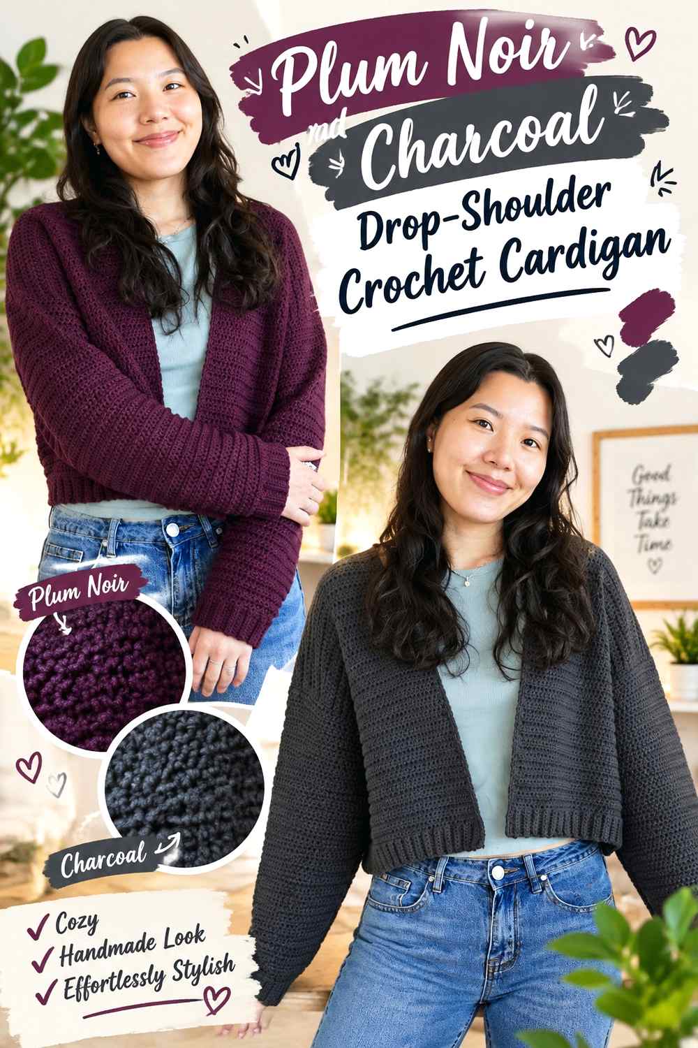
Plum Noir and charcoal create one of the darkest combinations in the list. That makes the palette useful when you want a nearly monochromatic cardigan but still want a slight distinction between the purple body and neutral finishing. A simple drop-shoulder shape can carry this restrained scheme without requiring frequent color changes. The important check is whether the charcoal actually remains distinguishable from Plum Noir in the yarns you choose.
Use Charcoal as a Quiet Frame Around Plum Noir
Charcoal can sit on ribbed cuffs, a hem, or a front band where a dramatic contrast would feel too abrupt. Because both shades are dark, this works more as subtle framing than as an outline visible from across a room.
Protect Plum Noir Texture From Disappearing Into Charcoal
If raised texture or ribbing is an important design feature, extremely similar dark values can hide it. Compare a worked Plum Noir swatch beside charcoal rather than judging only from untouched skeins. If the distinction is too small, move the charcoal slightly lighter before committing to all the finishing.
Creator Credit: VivCrochets
7. Plum Noir And Mauve Raglan Crochet Cardigan
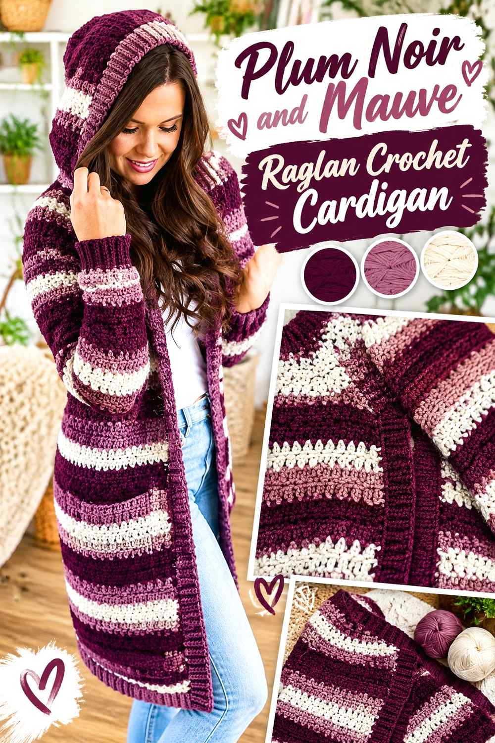
Mauve extends the purple family while staying lighter and softer than Plum Noir, producing a tonal cardigan rather than a strongly contrasting one. A raglan construction gives several logical places for controlled color distribution: body, sleeves, cuffs, hem, and collar. Plum Noir can dominate the torso while mauve lightens the sleeves, or mauve can be kept to the finishing for an even darker result.
Keep Plum Noir Continuous Through the Raglan Cardigan Body
Using Plum Noir consistently through the main body creates a stable dark center. If mauve enters the sleeves, repeat a small amount near the collar, hem, or cuffs so the lighter purple does not look isolated at the arms.
Mauve Should Stay Noticeably Lighter Than Plum Noir for Tonal Contrast
The palette depends more on value difference than hue difference because both colors belong to a similar family. If mauve is too deep, the finished garment may read almost solid from a distance. Choose a softer, lighter mauve when you want the raglan sections or finishing to remain visibly distinct.
Creator Credit: MJ’s Off The Hook Designs
8. Plum Noir And Black Granny Stitch Crochet Cardigan
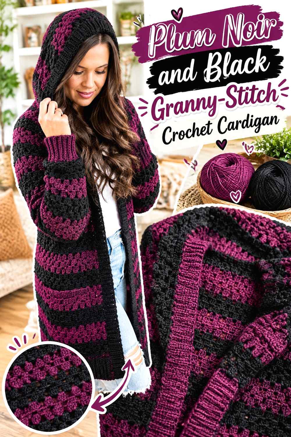
Black takes Plum Noir into an intentionally shadowy direction. In a granny-stitch cardigan, the open spaces already produce visual texture, so the color difference does not need to do all the work. Plum Noir can fill the majority of the fabric while black appears in occasional stripes, cuffs, or edging. Avoid alternating the two too narrowly if you expect each stripe to be clearly visible, because the shades may merge at normal viewing distance.
Let Plum Noir Lead the Granny-Stitch Cardigan
Keeping most of the granny-stitch fabric Plum Noir preserves the purple identity of the cardigan. Use black in fewer, larger placements rather than distributing both colors equally unless a very dark striped effect is the goal.
Black Can Deepen Plum Noir Edging Without Creating a Hard Color Break
Black at the cuffs, lower edge, or front opening creates a finish that feels darker without introducing a competing hue. Check the two colors in daylight before choosing this strategy; some Plum Noir yarns may appear close enough to black that the border becomes almost invisible.
Creator Credit: AC Crochets
9. Plum Noir And Antique Gold Cropped Crochet Cardigan
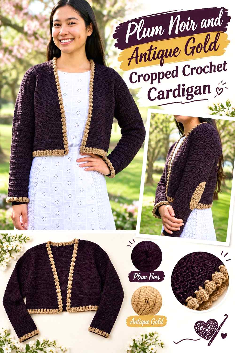
Antique gold introduces a warm accent that can stand apart clearly from Plum Noir without taking over the whole cardigan. On a cropped silhouette, concentrate the gold where it can repeat in a controlled way: textured cuffs, neckline details, a lower band, or small panel accents. Keeping Plum Noir across the body prevents the warmer shade from visually shortening or fragmenting the garment.
Plum Noir Keeps Antique Gold From Dominating the Cropped Cardigan
Use Plum Noir across the broadest surfaces and treat antique gold as a smaller accent. The dark main color gives the shorter cardigan a cohesive field, while gold can direct attention toward the finishing rather than dividing the body into too many competing sections.
Antique Gold Can Highlight Plum Noir Crochet Cuffs and Edging
Warm gold is particularly useful where the cardigan already has a change in texture. A cuff or neckline detail gives the accent a reason to exist instead of making it appear randomly placed. Repeat the gold at least once elsewhere if the first accent area is substantial.
Creator Credit: forthefrills
10. Plum Noir And Mushroom Collar Crochet Cardigan
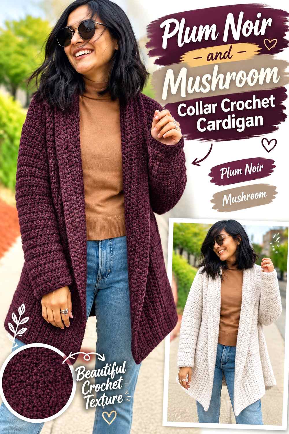
Mushroom is a subdued brown-gray neutral that reduces the contrast against Plum Noir compared with cream while remaining lighter enough to define a collar or front opening. This palette works well when the cardigan has a strong finishing band because the neutral can emphasize that shape without becoming the main event. Plum Noir should still dominate the main panels and sleeves.
Use Mushroom to Outline a Plum Noir Crochet Cardigan Collar
A lighter collar running around a dark Plum Noir body naturally draws attention to the cardigan opening. If that outline becomes stronger than you want, repeat mushroom sparingly at the cuffs or hem so the collar is connected to the rest of the garment rather than functioning as a single isolated stripe.
Keep Plum Noir Dominant When Mushroom Reaches the Cardigan Cuffs
Once mushroom appears in several finishing areas, it can begin to compete with Plum Noir. Keep those areas relatively narrow if the goal is a dark cardigan. For a more neutral-led result, widen the mushroom finishing intentionally rather than adding unrelated third colors.
Creator Credit: KnitcroAddict
11. Plum Noir And Lilac Hexagon Crochet Cardigan
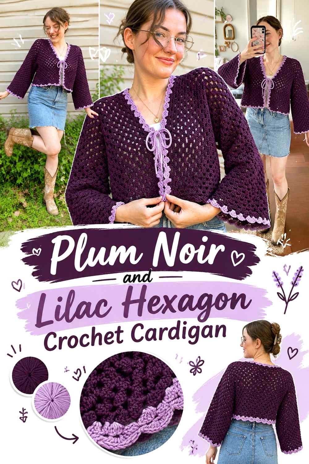
Lilac creates the widest purple-family jump in this collection. It preserves a clear connection to Plum Noir while giving hexagon construction enough contrast for the granny clusters and shaping to remain visible. One useful approach is to keep Plum Noir around outer portions of the hexagons and use lilac closer to selected centers, although the relationship can be reversed when a lighter cardigan is preferred.
Repeat Plum Noir Across Both Crochet Cardigan Hexagons
Because the two large hexagon sections form most of the garment, their color distribution should relate to each other. Repeat Plum Noir in comparable locations rather than allowing one side to become dramatically darker unless asymmetry is deliberate.
Lilac Gives Plum Noir Granny Clusters More Visual Separation
A clearly lighter lilac can prevent adjacent Plum Noir cluster sections from blending into one dark field. Before extending the same sequence through the sleeves, fold the hexagons into cardigan shape and check the whole garment; a color rhythm that works flat can appear different once the sleeves and body align.
Creator Credit: HayHay Crochet
12. Plum Noir And Rust One Piece Crochet Cardigan
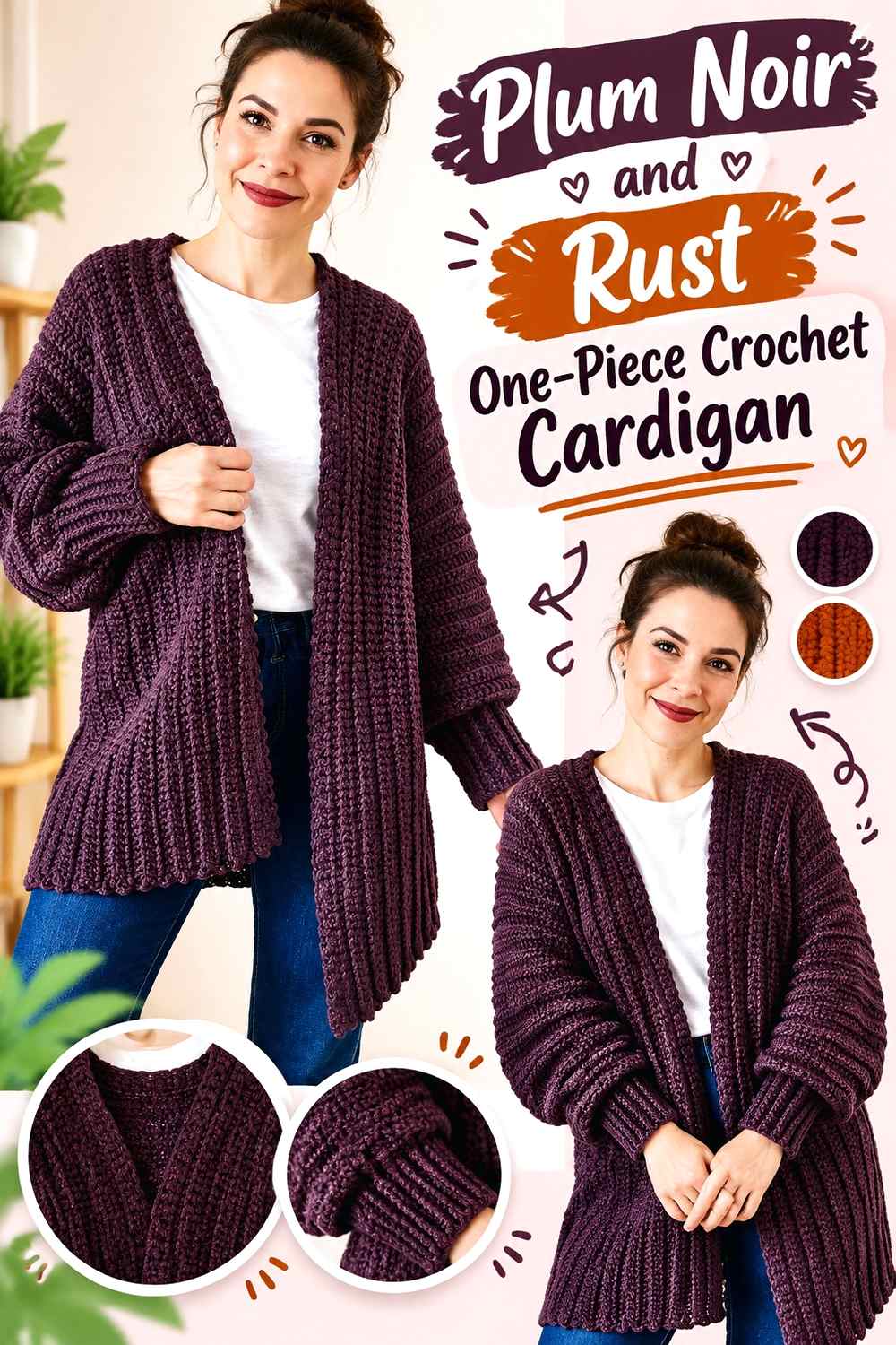
Rust brings a distinctly warm, earthy contrast to Plum Noir. On a one-piece cardigan, broad color blocks generally give these strong shades more room to work than many narrow changes. Plum Noir can form the main continuous body while rust is introduced toward the sleeves, edging, or lower portion. Because both shades can carry substantial visual weight, choosing one clear leader is important.
Keep Plum Noir Continuous Through Most of the One-Piece Cardigan
One-piece construction can make a large uninterrupted color field especially effective. Let Plum Noir provide that field, then add rust in planned areas instead of switching colors repeatedly just because the construction allows it.
Rust Needs Controlled Repetition Against Plum Noir
If rust appears only on one sleeve or one small edge, it may look accidental. Repeat it on both cuffs, across a lower band, or in another balanced location. If the rust is very dark, compare it with Plum Noir in grayscale to make sure the intended boundary remains visible.
Creator Credit: Kiri Kiri
13. Plum Noir And Teal Textured Crochet Cardigan
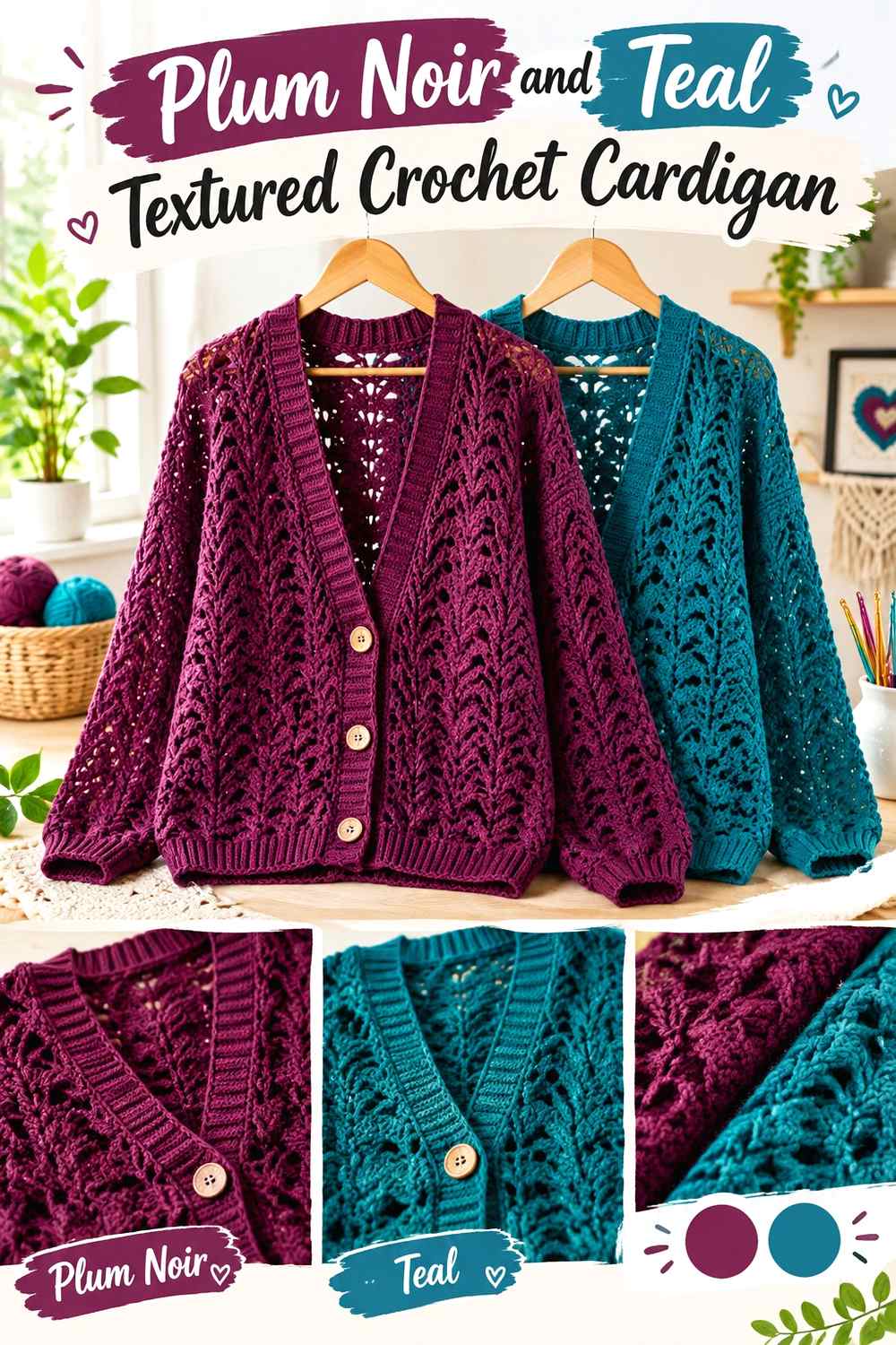
Plum Noir and teal create a saturated dark pairing that can feel richer than a neutral-based scheme, but the two colors may be similar in lightness. That makes placement particularly important on a textured cardigan. Use the lighter of your two selected yarns around stitch details you want to emphasize, and keep the deeper color across larger areas where texture rather than color provides the main interest.
Plum Noir Should Not Hide the Cardigan’s Raised Texture
Work a small swatch before committing large textured areas to Plum Noir. Very dark yarn can make shadows within raised crochet less obvious, particularly at a distance. If the texture becomes difficult to read, reserve Plum Noir for flatter panels or edging and let teal occupy selected textured sections.
Teal Needs Enough Value Difference to Separate From Plum Noir
Hue alone will not guarantee visible contrast. A dark teal and Plum Noir may merge even though one is blue-green and the other purple. Choose a somewhat lighter teal when you want obvious color blocking, or keep both shades deep when a blended jewel-tone effect is intentional.
Creator Credit: crochet-crosia
14. Plum Noir And Blush Buttoned Crochet Cardigan
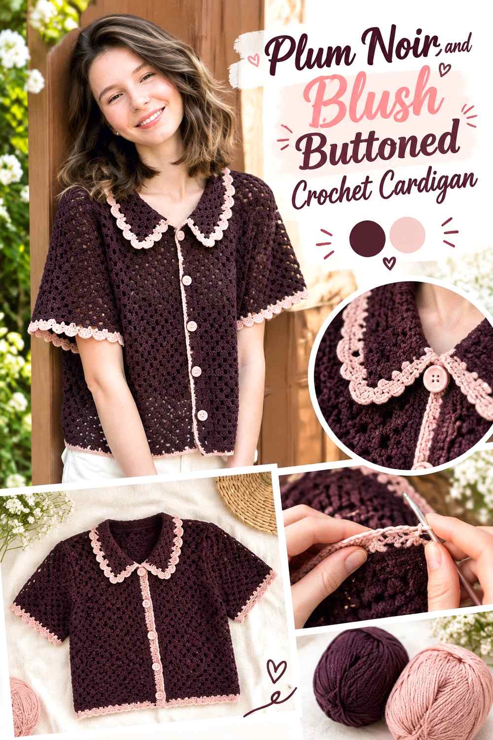
Blush produces the lightest pink direction in the collection, giving Plum Noir a noticeably softer counterpart around a buttoned front. Keep Plum Noir on the main body if you want the cardigan to remain predominantly dark, then use blush strategically at the collar, opening band, cuffs, or narrow accents. Because the front edges sit close together when buttoned, their color can strongly influence the center line of the entire garment.
Plum Noir Keeps a Blush Buttoned Cardigan From Becoming Too Light
When blush appears around the neckline and front band, it can occupy more visual space than expected. Keeping the front and back body panels Plum Noir ensures the dark main color remains obvious whether the cardigan is worn open or closed.
Blush Can Define the Plum Noir Front Opening
A blush band creates a clear vertical frame against Plum Noir and can make the opening easier to distinguish. If that contrast feels too strong, keep the blush band narrow and repeat small blush details at the cuffs rather than widening the front treatment.
Creator Credit: namekamilla
Conclusion
The right Plum Noir crochet cardigan palette depends on how much contrast you want around the dark main color.
For the clearest separation, cream, oatmeal, silver gray, and blush give Plum Noir obvious light-dark contrast. Mauve, dusty rose, and lilac keep the cardigan within a related purple-and-pink family while still allowing different panels or motifs to show. Charcoal and black create the most understated combinations, so they work better when subtle color shifts are intentional.
Sage and mushroom move Plum Noir toward muted, grounded palettes. Rust and antique gold add more warmth, while teal provides a darker saturated contrast.
Before committing to a full cardigan, compare the actual yarns together and check the combination in the stitch texture you plan to use. The original tutorials linked with each idea should remain the reference for exact construction, while the palette can be adjusted according to the amount of contrast and color distribution you want.
Frequently Asked Questions
What colors work well with Plum Noir in a crochet cardigan?
Cream, oatmeal, gray, mushroom, dusty pinks, mauve, lilac, sage, rust, gold, teal, charcoal, and black can all create useful directions. The more important question is how light or dark the second yarn is compared with Plum Noir and what role it will play on the cardigan.
How can I keep Plum Noir crochet stitches from looking too dark?
Use a lighter supporting shade near texture you want to emphasize, especially around ribbing, motifs, borders, or raised details. Working a swatch is useful because the appearance of a color can change once shadows form between crochet stitches.
Should Plum Noir be the main color of the cardigan?
It works particularly well as the dominant shade when the article’s goal is a recognizably Plum Noir cardigan. Let it cover the largest surfaces or repeat it consistently across panels and sleeves. Supporting colors can then define cuffs, edging, motifs, stripes, or selected blocks.
How can I tell whether a second yarn contrasts enough with Plum Noir?
Place both yarns side by side and look at them from a short distance. A grayscale photo can also help reveal differences in lightness. If the two shades become almost identical in grayscale, important small details may not separate clearly.
Can I pair Plum Noir with black in the same crochet cardigan?
Yes, especially when you want a low-contrast or near-monochrome result. Because black and Plum Noir can be very close in value, use the pairing where subtle framing is appropriate rather than where a highly visible color boundary is essential.
Where should I place a lighter color on a Plum Noir crochet cardigan?
Good locations include cuffs, the front opening, collar, motif centers, selected granny-square rounds, a lower band, or controlled sleeve sections. Choose placements that repeat logically across the garment instead of adding isolated light patches with no visual connection.
What should I preserve if I cannot find the exact Plum Noir shade?
Look for a similarly deep plum or purple-black direction and preserve its relationship with the supporting color. If the original plan depends on strong contrast, the replacement should remain clearly darker than the accent. For a tonal palette, preserve the smaller light-dark difference instead of trying to match an exact commercial shade name.