Wasabi can give crochet a distinctive green focal point without requiring the entire project to use the same shade. Depending on the yarn, Wasabi may appear brighter, more muted, more yellow-green, or more earthy, so the actual skein should guide how much contrast the project needs.

A light neutral can give Wasabi breathing room, while charcoal, plum, burgundy, or chocolate brown can make the palette feel deeper. Muted supporting colors such as dusty rose, camel, or mushroom taupe create a softer transition.
The most useful approach is to give Wasabi a specific job. It can dominate a blanket field, bag body, scarf, or motif, or it can appear in brims, cuffs, borders, flower petals, and other smaller structural areas.
The credited tutorials support the crochet construction concepts. The Wasabi color schemes below are independent palette adaptations rather than claims about the colors used by the tutorial creators.
Quick List
- Wasabi And Cream Crochet Baby Blanket
- Wasabi And Charcoal Crochet Bucket Hat
- Wasabi And Oatmeal Crochet Scarf
- Wasabi And Plum Crochet Shawl
- Wasabi And Dusty Rose Crochet Granny Squares
- Wasabi And Camel Crochet Tote Bag
- Wasabi And Mushroom Taupe Crochet Basket
- Wasabi And Burgundy Crochet Crop Top
- Wasabi And Chocolate Brown Crochet Mittens
- Wasabi And Ivory Crochet Cowl
- Wasabi And Antique Gold Crochet Pillow Cover
Give Wasabi Enough Space to Read Clearly
Wasabi can lose some of its character when it appears only in tiny scattered sections. On larger projects, use it across a complete field, panel, border, or repeated motif position so the green looks intentional.
When Wasabi is the accent rather than the dominant color, repeat it in related structural locations. A brim plus edging, cuffs on both sleeves, or repeated motif centers will usually look more connected than isolated green patches.
Choose Wasabi Supporting Colors by Contrast, Not Name Alone
Color names do not tell you how light or dark the yarn actually is. A muted Wasabi and medium Camel may be similar in value, while a deeper Wasabi beside Cream can create very strong separation.
Place the yarns together before committing. If the colors merge from several feet away, enlarge the contrasting section instead of relying on very thin stripes.
1. Wasabi And Cream Crochet Baby Blanket

Wasabi can cover the main blanket field while Cream frames the perimeter. This creates strong separation without interrupting the center repeatedly, making it useful when the blanket already has noticeable stitch texture.
Wasabi Can Carry the Main Crochet Baby Blanket Field
Use Wasabi through most of the blanket when clusters, bobbles, or another textured stitch already provides enough visual movement.
A broad Wasabi surface allows the color and texture to work together instead of competing with frequent changes.
Cream Can Clarify Wasabi Crochet Baby Blanket Texture
Place Cream around the outside when you want a lighter stopping point around the green field.
If your Wasabi yarn is relatively light, use enough Cream to maintain a recognizable frame rather than relying on one very narrow line.
Creator Credit: Daisy Farm Crafts
2. Wasabi And Charcoal Crochet Bucket Hat
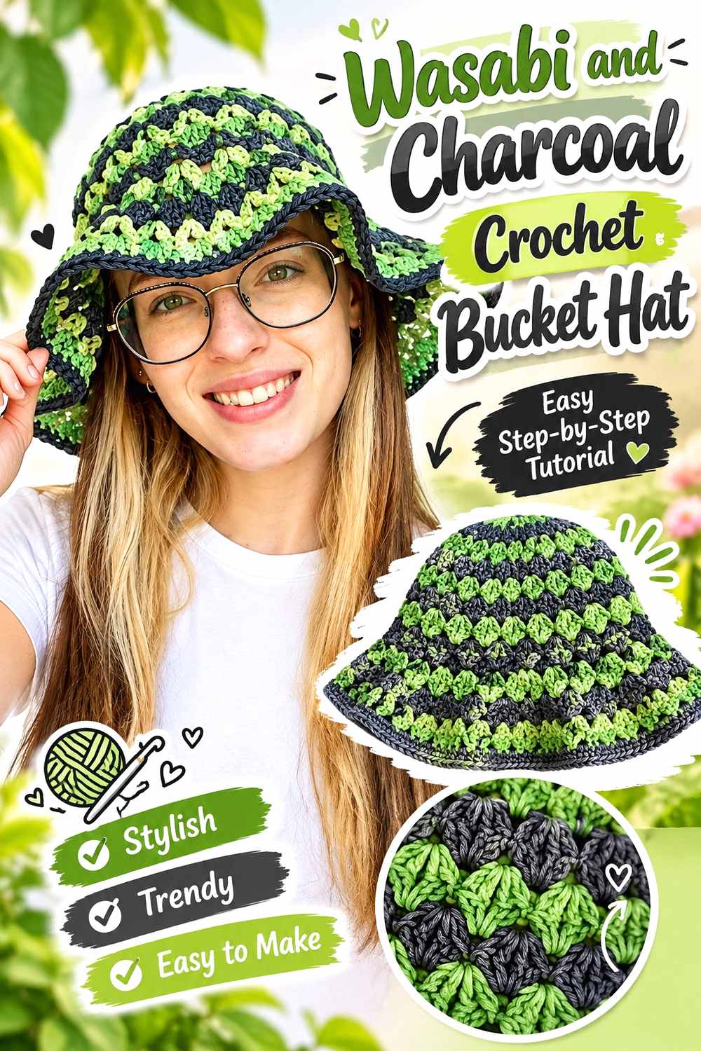
A Wasabi crown paired with a Charcoal brim gives the green the largest visible area while the dark neutral grounds the widest part of the hat.
Wasabi Can Keep the Crochet Bucket Hat Crown Distinct
Use Wasabi continuously through the crown when you want the unusual green shade to remain the first feature noticed.
Keeping the crown in one color also gives the rounded silhouette and stitch texture enough space to remain clear.
Charcoal Can Ground a Wasabi Crochet Bucket Hat Brim
Use Charcoal around the brim for stronger value contrast and a darker lower boundary.
Judge the balance after shaping because a projecting Charcoal brim can look visually heavier than the same amount of yarn on a flat swatch.
Creator Credit: PassioKnit Kelsie
3. Wasabi And Oatmeal Crochet Scarf

A Wasabi scarf with Oatmeal end blocks keeps green across most of the length while introducing a soft neutral at two balanced points.
Wasabi Can Lead the Crochet Scarf Center
Use Wasabi through the central length when ribbing or another textured stitch should supply most of the surface interest.
The broad green area also prevents the palette from becoming a series of narrow alternating stripes.
Oatmeal Can Soften Both Ends of a Wasabi Crochet Scarf
Repeat Oatmeal at both ends for a clear symmetrical layout.
Check the scarf while wrapped because those neutral sections can sit near each other during wear and appear more prominent than they do when the scarf is flat.
Creator Credit: B.Hooked Crochet
4. Wasabi And Plum Crochet Shawl
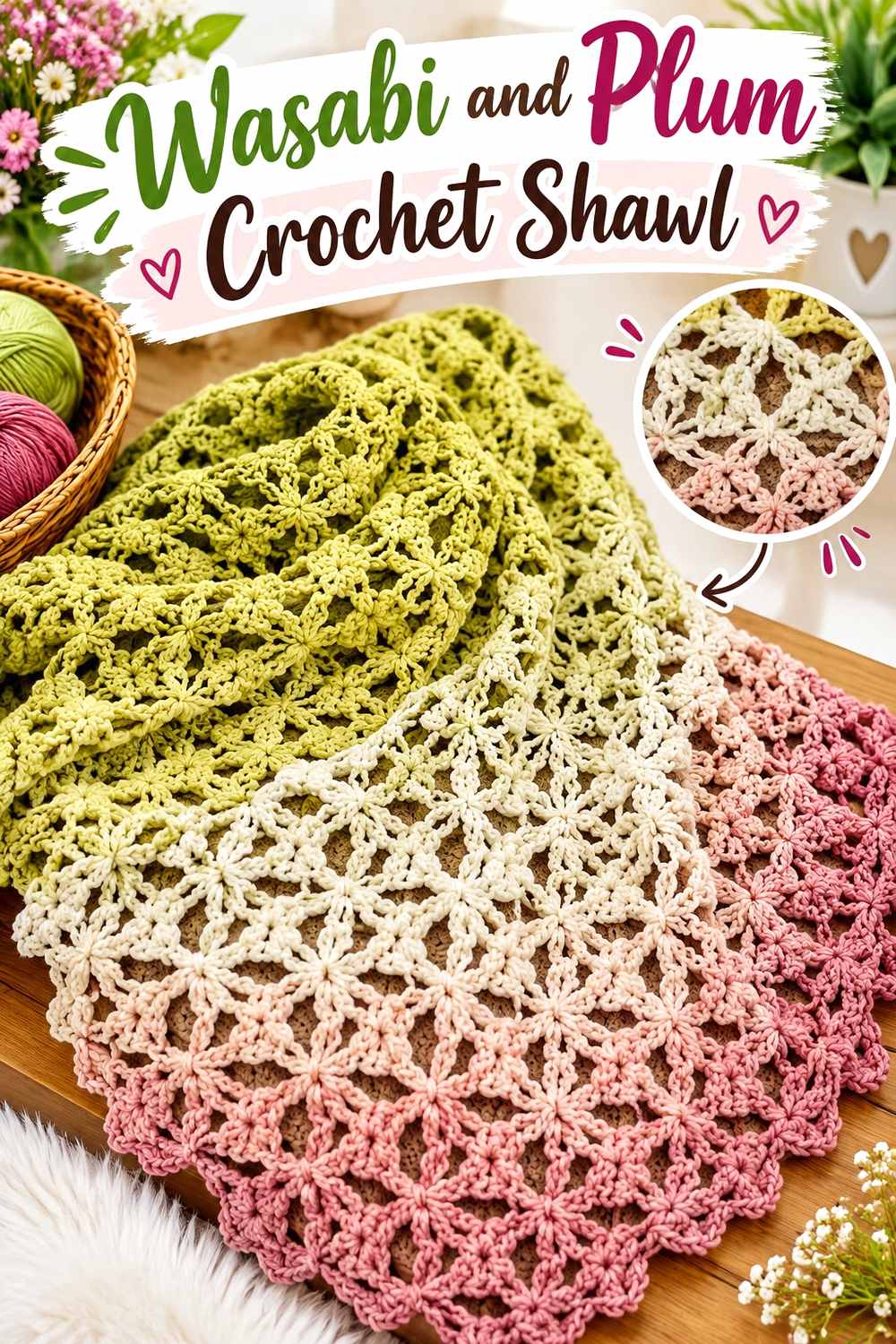
Wasabi and Plum create a stronger hue contrast than a neutral pairing. Let Wasabi cover most of the shawl and move Plum to the outer section so the two saturated colors do not compete throughout the entire surface.
Wasabi Can Keep the Crochet Shawl Body Continuous
Use Wasabi across the main body when lace or openwork already provides substantial visual detail.
A continuous field helps the stitch structure remain readable instead of dividing it with many Plum bands.
Plum Can Give a Wasabi Crochet Shawl a Deeper Border
Place Plum around the expanding outer edge when you want the shawl to finish with greater depth.
If your Plum and Wasabi are close in value, make the Plum section broad enough that the hue change remains obvious from normal viewing distance.
Creator Credit: Fiber Spider
5. Wasabi And Dusty Rose Crochet Granny Squares
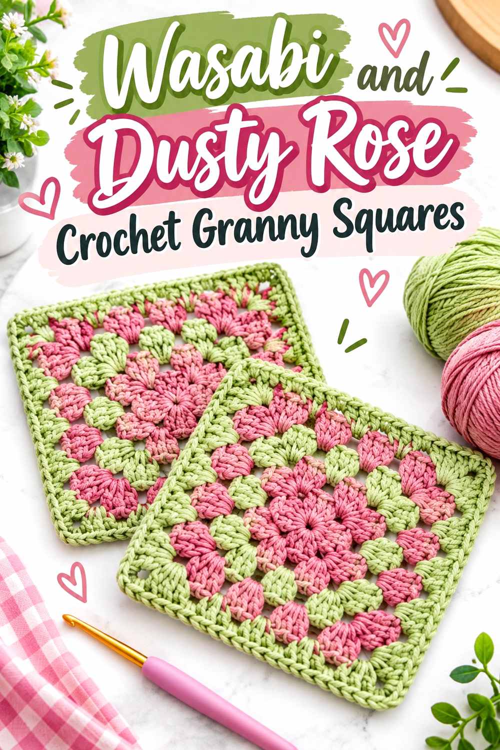
Wasabi and Dusty Rose can create a softer complementary-style contrast across granny-square motifs. Switching which color appears in the center noticeably changes the balance.
Wasabi Centers Can Anchor Dusty Rose Crochet Granny Squares
Place Wasabi in the center when you want every motif to contain a concentrated green focal point.
Make several squares before enlarging the Wasabi area because small repeated centers can become visually strong across a complete blanket or garment.
Dusty Rose Can Give Wasabi Crochet Granny Squares Softer Outer Rounds
Move Dusty Rose toward the outer rounds when you want the motifs to become softer toward their edges.
Reverse the arrangement if you want the project to appear more Wasabi-forward, since outer rounds normally occupy more visible area than the center.
Creator Credit: Bella Coco
6. Wasabi And Camel Crochet Tote Bag

A Wasabi tote body with Camel at the base and handles gives the warm neutral two structural locations while keeping the green uninterrupted across the main panels.
Wasabi Gives the Crochet Tote Its Main Color Field
Use Wasabi across the front and back panels when you want the green to remain most visible while the bag is carried.
Keeping those broad surfaces consistent also lets openwork or texture remain organized.
Camel Can Connect a Wasabi Crochet Tote Base and Handles
Repeat Camel at the bottom and handles rather than placing one isolated tan stripe through the center.
That repetition frames the Wasabi body and makes the second color look connected to the tote construction.
Creator Credit: crochet daniela
7. Wasabi And Mushroom Taupe Crochet Basket

A Wasabi basket with a Mushroom Taupe rim creates an earthy decor direction without removing the distinctive green from the main surface.
Wasabi Can Keep the Crochet Basket Walls Unified
Use Wasabi through the base and walls when you want the basket to remain clearly green from most viewing angles.
A continuous body color also prevents additional color changes from competing with textured stitches.
Mushroom Taupe Can Soften a Wasabi Crochet Basket Rim
Place Mushroom Taupe around the opening where the neutral follows an existing construction boundary.
If the basket includes handles or tabs, repeating Mushroom Taupe there can connect the upper details while leaving the Wasabi walls uninterrupted.
Creator Credit: Naztazia
8. Wasabi And Burgundy Crochet Crop Top

A Wasabi crop-top body with Burgundy at selected edges creates a strong green-red contrast without dividing the entire garment equally between two saturated colors.
Wasabi Can Carry the Crochet Crop Top Body
Use Wasabi across the torso when you want the green to control the overall wearable.
This works particularly well when openwork already creates enough visual variation across the small garment.
Burgundy Can Define Wasabi Crochet Crop Top Edges
Repeat Burgundy at two related areas, such as straps and the lower edge, rather than adding one isolated dark section.
Keep the Burgundy controlled if Wasabi should remain dominant; outlining every boundary could shift too much attention away from the body.
Creator Credit: KnitcroAddict
9. Wasabi And Chocolate Brown Crochet Mittens

Chocolate Brown can cover the hands while Wasabi forms matching cuffs, creating a darker pair with the green concentrated where it can repeat cleanly.
Chocolate Brown Can Give Wasabi Crochet Mittens a Dark Main Field
Use Chocolate Brown through the hands, thumbs, and fingertips when you want the pair grounded by a deep warm neutral.
Keeping the shaped areas in one shade also avoids complicated small color changes.
Wasabi Cuffs Can Brighten Chocolate Brown Crochet Mittens
Repeat Wasabi at equivalent wrist sections so the green immediately connects the pair.
Consider how much cuff will remain visible beneath sleeves. A broader Wasabi section may be useful if much of the wrist will normally be covered.
Creator Credit: Brunaticality
10. Wasabi And Ivory Crochet Cowl
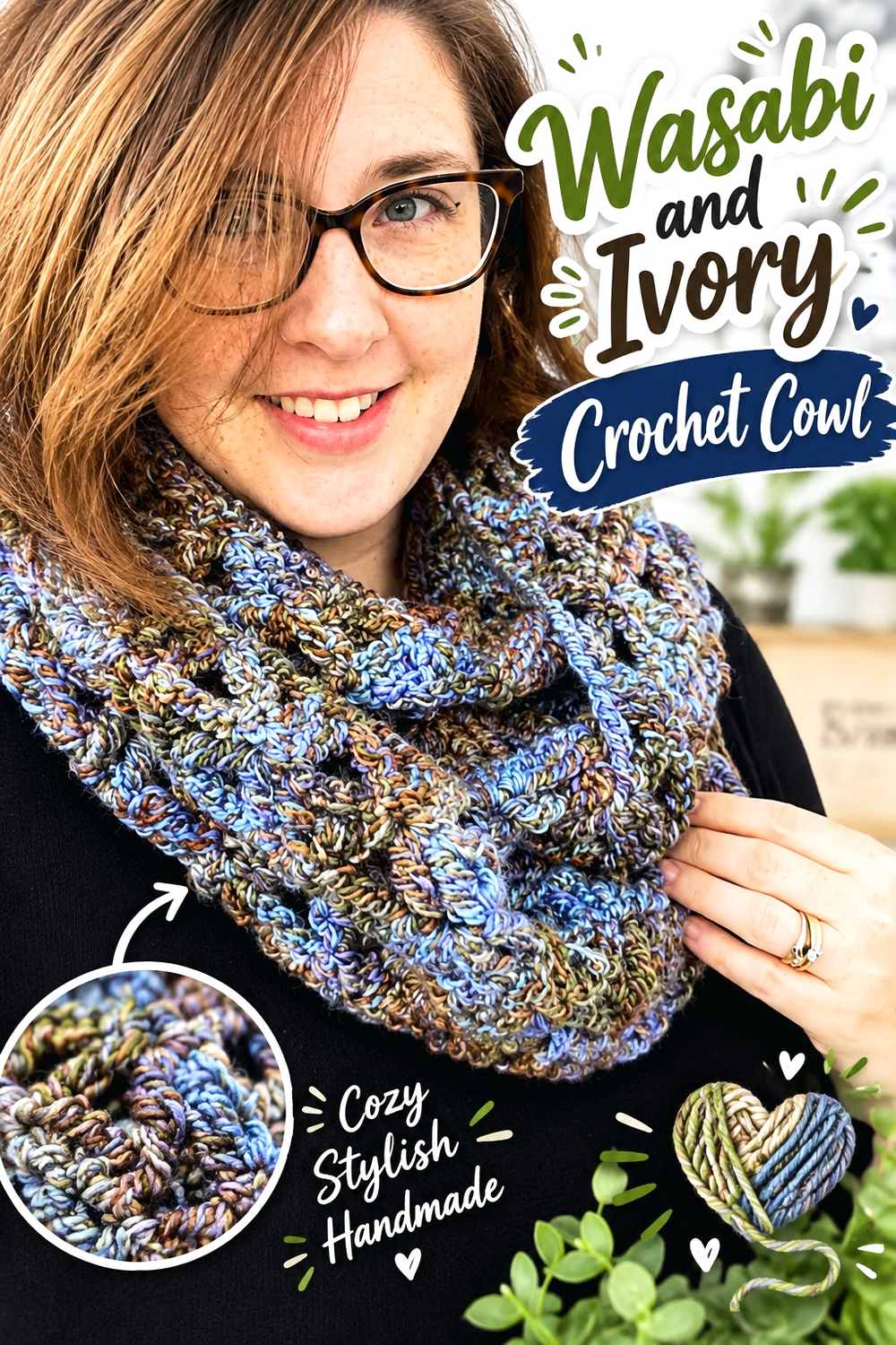
A Wasabi cowl body with Ivory around both openings gives the green a broad textured surface and places the lighter neutral at two related boundaries.
Wasabi Can Keep the Crochet Cowl Center Cohesive
Use Wasabi through the main body when ribbing, raised stitches, or another texture should provide most of the internal movement.
A continuous green field also prevents a compact cowl from looking crowded by several short color bands.
Ivory Can Frame Both Wasabi Crochet Cowl Openings
Repeat Ivory along the top and bottom so the lighter shade has two clear structural positions.
Drape the cowl before deciding the final border width because folding can bring both Ivory areas much closer together.
Creator Credit: Rich Textures Crochet
11. Wasabi And Antique Gold Crochet Pillow Cover

A Wasabi pillow face with Antique Gold framing creates a warmer decor variation. Wasabi remains the main front-facing color while Antique Gold gives the perimeter a muted golden finish.
Wasabi Can Give the Crochet Pillow Face a Strong Main Field
Use Wasabi across most of the front when bobbles, cables, or another raised texture should remain the main decorative feature.
View a sample from typical room distance because texture and green intensity can look different from across a sofa than they do close to the hook.
Antique Gold Can Frame Wasabi Crochet Pillow Texture
Place Antique Gold around the visible front perimeter to create a warm boundary.
If the gold begins competing with the Wasabi center, move more of it onto the sides or back rather than widening the front frame.
Creator Credit: Yarn Stash with Marching North
Comparing Different Wasabi Crochet Directions
For a light, fresh Wasabi direction, Cream, Oatmeal, Ivory, Mushroom Taupe, and Camel provide quieter supporting colors that give the green plenty of space to lead.
For stronger contrast, Charcoal, Plum, Burgundy, and Chocolate Brown can make Wasabi appear sharper or brighter by placing a deeper shade beside it.
Dusty Rose, Soft Pink, and Antique Gold create warmer alternatives when you want Wasabi to feel less neutral-driven while still avoiding a crowded multicolor palette.
Conclusion
Wasabi works particularly well in crochet when it has a clear role rather than appearing in random small accents. It can dominate blanket fields, scarf centers, bag panels, shawls, and pillow faces, or become a smaller focal color at cuffs and motif details.
If your Wasabi yarn is bright, quieter neutrals can keep the project balanced. If it is muted, deeper colors such as Plum, Burgundy, Charcoal, or Chocolate Brown can provide stronger separation.
Always compare the actual yarns before committing to narrow colorwork. Color names alone cannot tell you whether the two shades will have enough value contrast.
Use the credited tutorials for the project construction concepts, then adapt the Wasabi palette according to the item’s scale, texture, and natural structural boundaries.
Frequently Asked Questions
What colors work well with Wasabi crochet?
Cream, Ivory, Oatmeal, Camel, Mushroom Taupe, Charcoal, Chocolate Brown, Plum, Burgundy, Antique Gold, Dusty Rose, and Soft Pink can all create different directions with Wasabi. The actual yarn shades determine how strong the contrast will be.
Should Wasabi dominate a crochet project?
It can. Using Wasabi across the largest surface makes the green the clear focal color. For a quieter result, use Wasabi only in cuffs, brims, motif centers, borders, or other repeated details.
How can I keep Wasabi crochet from looking too bright?
Pair Wasabi with muted neutrals such as Mushroom Taupe, Oatmeal, Camel, or Chocolate Brown and give the supporting color a meaningful structural role.
How can I make Wasabi crochet look more dramatic?
Place Wasabi beside a deeper shade such as Charcoal, Burgundy, Plum, or Chocolate Brown. Use broad enough sections that the darker color remains clearly visible.
Can Wasabi work in crochet granny squares?
Yes. Wasabi can occupy motif centers, outer rounds, joining areas, or borders. Make several sample squares and view them together before deciding the final placement.
Does Wasabi work for crochet home decor?
Yes. Blankets, baskets, pillows, coasters, and motifs can all use Wasabi effectively. Neutral borders or framing are useful when you want the green to remain strong without dominating the entire room palette.
Can I add a third color to a Wasabi crochet palette?
Yes. Keep the third shade secondary if Wasabi should remain the focus. A light neutral can add separation, while a muted warm accent can make the palette more layered without overwhelming the main green.