Wine red gives a crochet sweater a deep red foundation that can shift from soft and tonal to sharply contrasted depending on the supporting colors. Cream and ivory make the red easier to separate around textured stitches, dusty rose and plum stay closer to the same color family, while sage, teal, mustard, and forest green create more obvious hue differences.

Sweaters also give color much more surface area than smaller crochet accessories. A supporting shade used across both sleeves may become nearly as dominant as wine red, while a narrow contrasting neckline can have a strong effect despite using very little yarn. Front and back panels, yokes, cuffs, hems, collars, granny squares, and stripes all need to be considered as part of the same color plan.
The tutorials paired with these ideas support the underlying sweater constructions. The wine red palettes are independent color adaptations and do not imply that the tutorial creators used these exact color combinations.
Quick List
- Wine Red And Cream Crochet Mesh Sweater
- Wine Red And Camel Crochet Raglan Sweater
- Wine Red And Oatmeal Crochet Raglan Sweater
- Wine Red And Lavender Crochet Turtleneck Sweater
- Wine Red And Dusty Rose Crochet Off Shoulder Sweater
- Wine Red And Ivory Crochet Off Shoulder Sweater
- Wine Red Blush And Cream Crochet V Neck Sweater
- Wine Red And Rust Crochet Cropped Sweater
- Wine Red And Charcoal Crochet Chunky Sweater
- Wine Red And Sage Crochet Striped Pullover Sweater
- Wine Red And Mustard Crochet Textured Crop Sweater
- Wine Red Cream And Camel Crochet Granny Square Sweater
- Wine Red And Denim Blue Crochet Crop Sweater
- Wine Red And Soft Gray Crochet Knit Look Crop Sweater
- Wine Red And Teal Crochet Granny Stitch Sweater
- Wine Red And Sand Crochet Comfy Sweater
- Wine Red Oatmeal And Sage Crochet Mesh Sweater
- Wine Red And Black Crochet Super Chunky Sweater
- Wine Red Forest Green And Cream Crochet Granny Square Sweater
- Wine Red Plum And Oatmeal Crochet Granny Square Sweater
Keep Wine Red Dominant Across Crochet Sweater Panels
Decide whether the finished garment should read as a wine red sweater or as a multicolor sweater that happens to contain wine red. For a wine-red-led design, give the shade either the greatest surface area or a consistent structural role. It might cover both body panels, repeat in every stripe sequence, frame every granny square, or return at the neckline, cuffs, and hem.
Sleeves deserve particular attention because two full sleeves represent a large amount of visible fabric. A contrasting sleeve color can quickly become as important as the torso color, especially on oversized or balloon-sleeve constructions.
Use Contrast to Keep Wine Red Crochet Texture Visible
Wine red can sit close in value to charcoal, black, deep teal, plum, forest green, and dark denim even though the hues are different. When those colors meet in narrow stripes or detailed textured stitches, the boundary may become difficult to see.
Cream, ivory, oatmeal, sand, and soft gray provide clearer light-dark separation. Use those lighter shades near stitch patterns, granny-square centers, neckline details, or borders when preserving definition matters more than creating a blended dark palette.
Repeat Wine Red at Crochet Sweater Cuffs, Necklines, and Hems
Finishing colors can reconnect a sweater whose body contains several shades. Wine red cuffs can bring purple-red back into contrasting sleeves, while a wine red collar can anchor a striped or granny-square body.
The finishing does not always need to match. A cream neckline can lighten a very dark sweater, while wine red edging can contain a lighter body. Make the choice after comparing the completed body and sleeve colors rather than treating the neckline and hem as separate decisions.
1. Wine Red And Cream Crochet Mesh Sweater

A wine red and cream mesh sweater uses strong value contrast without covering the entire garment in solid color. Wine red can dominate the body and sleeves, while cream identifies selected bands, cuffs, or neckline areas. Because mesh reveals the layer worn underneath, keeping the crochet palette simple helps the actual yarn colors remain clear.
Keep Wine Red Across the Largest Mesh Sweater Sections
Use wine red for longer uninterrupted areas if you want the sweater to remain clearly red from a distance. Cream can then appear in narrower repeated sections without visually taking over the openwork body.
If the sleeves include cream, return to wine red at the cuffs so the lighter sections still end inside the main color framework.
Use Cream to Define Wine Red Mesh Edges
Cream is particularly useful around the neckline or hem because a narrow pale edge remains easy to see against wine red. It can clarify the shape without requiring multiple accent colors.
Consider the clothing worn beneath the mesh as well. A highly contrasting underlayer can change how both wine red and cream appear through the openings.
Creator Credit: ElyseCrochets 💌
2. Wine Red And Camel Crochet Raglan Sweater
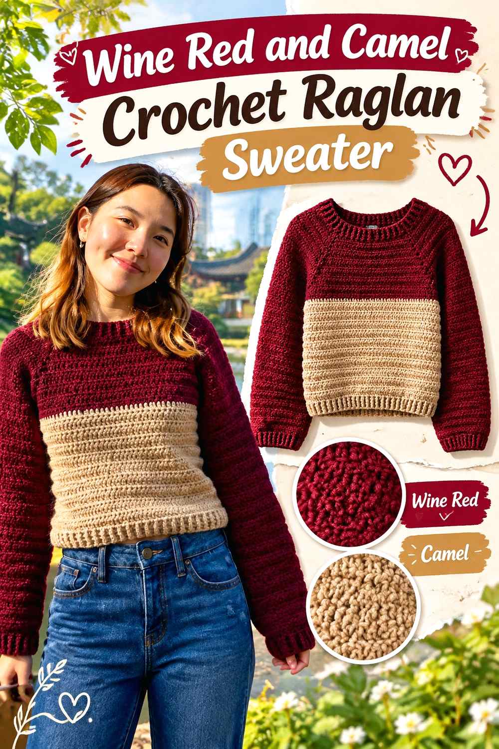
Camel gives wine red a warm neutral partner with less contrast than cream. On a raglan sweater, color can follow the upper body and sleeves in a continuous way, so repeated camel areas can connect naturally through the garment.
Keep wine red dominant through the torso while camel appears in selected sleeve sections, neckline finishing, or broader bands.
Let Wine Red Anchor the Raglan Sweater Body
A mostly wine red torso establishes the dominant shade before camel is introduced elsewhere. This is useful when the sleeves contain noticeable camel sections because the center of the garment remains visually stable.
Repeat wine red near the wrists if camel occupies a large part of the sleeves.
Use Camel to Warm Wine Red Without Sharp Contrast
Camel creates a gentler break than ivory or white, so it works well when you want color separation without a graphic light-dark effect.
If the chosen camel is fairly dark, compare it directly with wine red before making narrow stripes. A lighter camel will preserve more visible distinction.
Creator Credit: VivCrochets
3. Wine Red And Oatmeal Crochet Raglan Sweater

Oatmeal lightens wine red while keeping the palette softer than bright cream. It can work around the neckline, yoke, lower body, or cuffs without making the sweater look sharply color-blocked.
This combination is useful when wine red should remain rich and dominant but the garment needs enough pale space to keep the upper construction visually open.
Keep Wine Red Repeating Through the Raglan Yoke
If oatmeal is introduced near the upper body, repeat wine red between lighter sections so the yoke does not become visually detached from the torso.
The same wine red can continue down the sleeves or return at the cuffs to connect all major garment areas.
Use Oatmeal to Separate Wine Red Crochet Details
Oatmeal provides enough contrast to make ribbing, neckline finishing, or a stripe boundary more noticeable without becoming extremely bright.
If you substitute the neutral, preserve its lighter value. A medium beige may reduce the separation more than expected.
Creator Credit: Cherilyn Q
4. Wine Red And Lavender Crochet Turtleneck Sweater
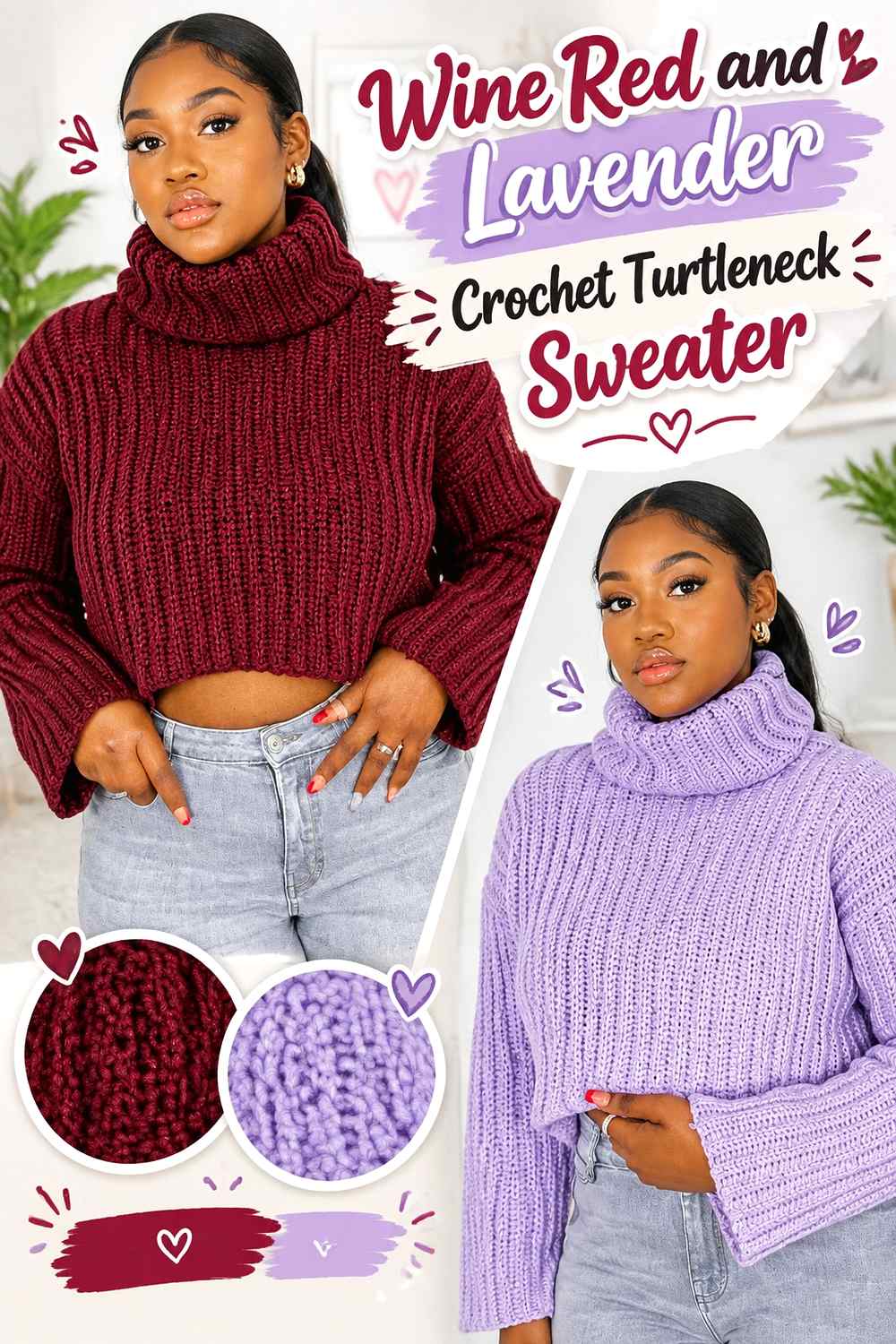
Lavender keeps the palette within a red-purple family while giving wine red a visibly lighter companion. A turtleneck creates a substantial color area near the face, so using lavender there can change the sweater more dramatically than a narrow neckline trim would.
Wine red can remain on the torso and sleeves while lavender is concentrated around the neck and selected finishing areas.
Keep Wine Red on the Main Turtleneck Sweater Body
A solid wine red torso lets the deeper shade carry most of the visual weight. Lavender can then lighten the turtleneck without turning the entire sweater into a pale-purple piece.
Wine red cuffs can reinforce the main color if lavender also appears on the sleeves.
Choose Lavender That Remains Lighter Than Wine Red
A dark violet may sit too close to wine red once worked into crochet fabric. If you want the turtleneck to stand apart, preserve a clear difference in lightness.
For a more tonal sweater, closer values can work, but use larger blocks so each shade still has enough area to register.
Creator Credit: 🧶Mihankushea🧶
5. Wine Red And Dusty Rose Crochet Off Shoulder Sweater
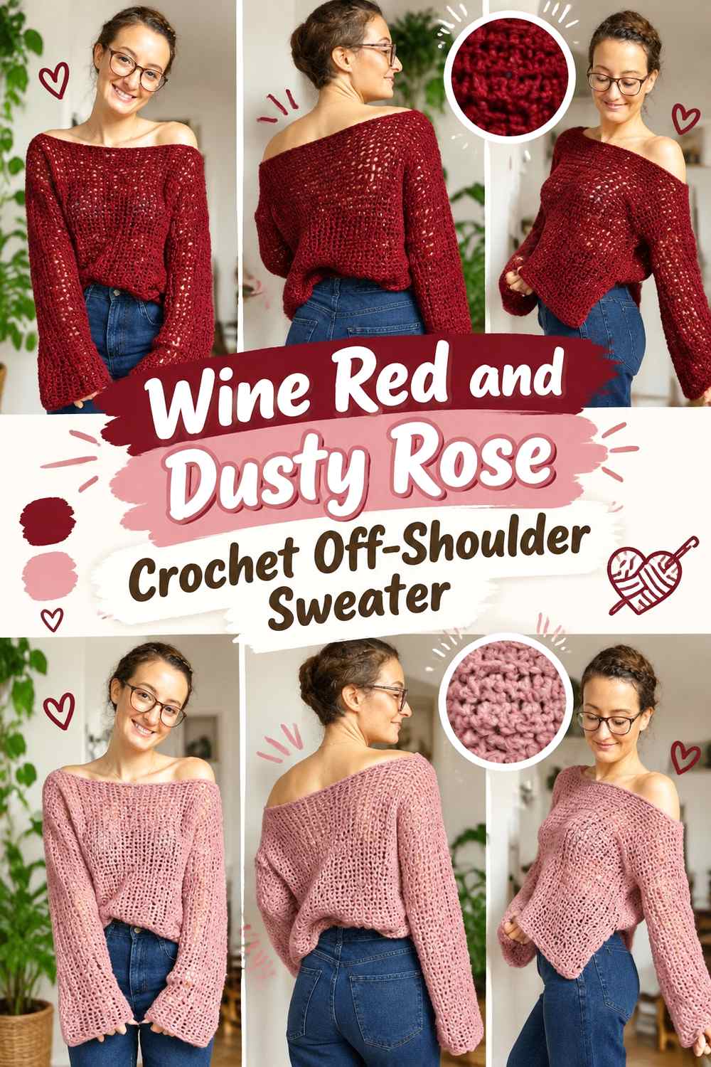
Dusty rose gives wine red a softer tonal transition that suits an off-shoulder neckline particularly well. The lighter rose can define the upper band while wine red covers the larger body and sleeves.
Because the neckline is broad and highly visible, dusty rose does not need to appear across every section to become an important part of the palette.
Keep Wine Red Below the Dusty Rose Shoulder Line
Let wine red take over directly beneath a dusty rose neckline so the body remains clearly anchored in the deeper color. Repeating wine red at the top edge can also create a darker outline around the rose section.
Avoid making the entire upper body rose unless you intentionally want a more evenly divided two-color sweater.
Keep Dusty Rose Distinct From Wine Red
Muted rose shades vary considerably in darkness. A deeper rose may merge with wine red in shadows around the neckline and sleeve folds.
Choose a lighter dusty rose when visible separation is important, or use the close values intentionally for a blended tonal effect.
Creator Credit: JeggoCrochet
6. Wine Red And Ivory Crochet Off Shoulder Sweater

Ivory creates much stronger definition around wine red than dusty rose does. On an off-shoulder sweater, an ivory upper band can create a clear frame while leaving the torso and sleeves largely wine red.
This palette works best when the ivory is controlled because a wide pale neckline already carries significant visual weight.
Keep Wine Red Dominant Under the Ivory Shoulder Band
Use wine red across the front, back, and most of the sleeves so the ivory remains an upper finishing feature rather than becoming the second main body color.
If the neckline band is especially wide, wine red cuffs can restore more of the darker shade at the ends of the sleeves.
Use Ivory to Sharpen Wine Red Sweater Edges
Ivory is useful where you want a visible boundary around the neckline or hem. Even a narrow line can remain clear against wine red.
Avoid adding ivory to every available edge unless a strongly framed two-color design is the goal.
Creator Credit: vivi e cuci
7. Wine Red Blush And Cream Crochet V Neck Sweater

Blush and cream give wine red two levels of contrast. Blush can soften the movement away from the deep red, while cream provides the lightest definition around a V-neck or narrow trim.
The three shades work better when they have separate roles rather than occupying equal areas across the sweater.
Let Wine Red Frame the V-Neck Sweater Body
Wine red can cover the main panels and form the darkest boundary around the V shape. Blush can sit beside it in wider areas while cream remains a smaller highlight.
This keeps the neckline readable without allowing pale colors to take over the torso.
Use Cream Between Wine Red and Blush Where the V-Neck Needs Clarity
If blush is muted and relatively dark, it may not provide enough contrast beside wine red at a narrow neckline.
A small cream transition can separate the two. Use that lightest shade strategically rather than repeating it through every body section.
Creator Credit: forthefrills
8. Wine Red And Rust Crochet Cropped Sweater

Rust brings a warm orange-brown direction to wine red while keeping the sweater rich rather than bright. On a cropped body, color proportions matter because every band occupies a larger percentage of the visible torso.
Keep wine red across the main front and back and let rust enter through sleeve sections, cuffs, or controlled body bands.
Give Wine Red More Cropped Sweater Surface Than Rust
A broad rust stripe can become dominant quickly on a short torso. Start with larger wine red sections if the garment should still read primarily as red.
Rust can carry more of the sleeve area because wine red on the torso will continue to anchor the finished look.
Repeat Wine Red Around Rust Sleeve Accents
Bring wine red back at the wrists after a rust sleeve section. This prevents the warmer accent from looking like a separate sleeve color unrelated to the body.
The same idea can be used at the lower hem when rust appears near the waist.
Creator Credit: Dana B
9. Wine Red And Charcoal Crochet Chunky Sweater
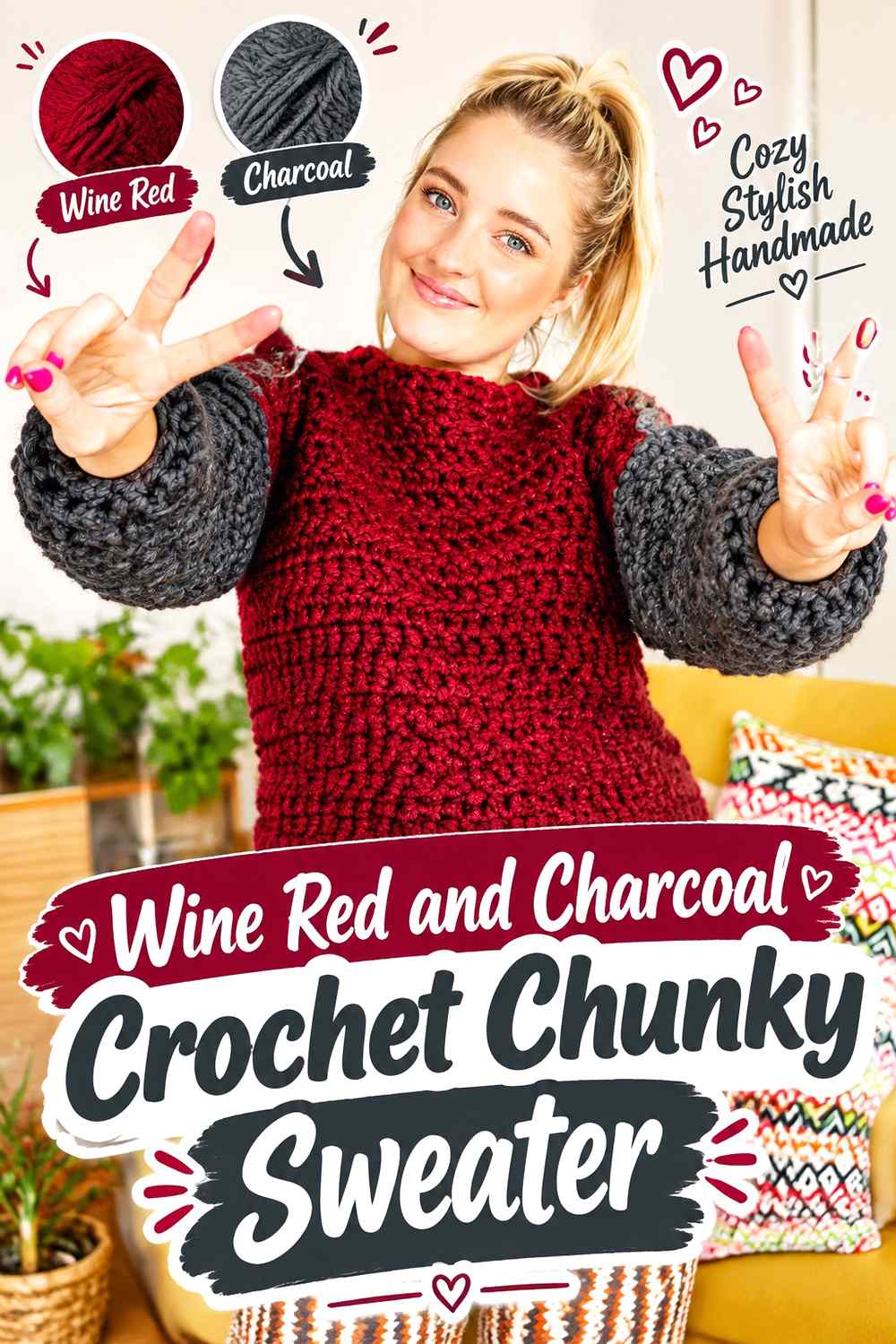
Charcoal and wine red create a dark, low-contrast sweater where texture may be more noticeable than the color change. A chunky construction increases shadow between stitches, making two already-dark shades look even closer.
Use larger blocks rather than relying on narrow charcoal details that may disappear into the wine red surface.
Keep Wine Red Larger Than Charcoal on the Chunky Sweater
Use wine red across the main body while charcoal appears at cuffs, hem, neckline, or broad sleeve sections. This keeps the deep red recognizable despite the dark supporting shade.
Equal large blocks will create a more balanced two-color sweater rather than a wine-red-led one.
Check Wine Red and Charcoal in Chunky Crochet Texture
Compare a worked sample rather than judging the loose yarn alone. Deep stitch shadows can reduce the visual difference between the colors.
If more separation is needed, introduce soft gray in a small finishing area or shift charcoal into larger blocks.
Creator Credit: Katieree
10. Wine Red And Sage Crochet Striped Pullover Sweater
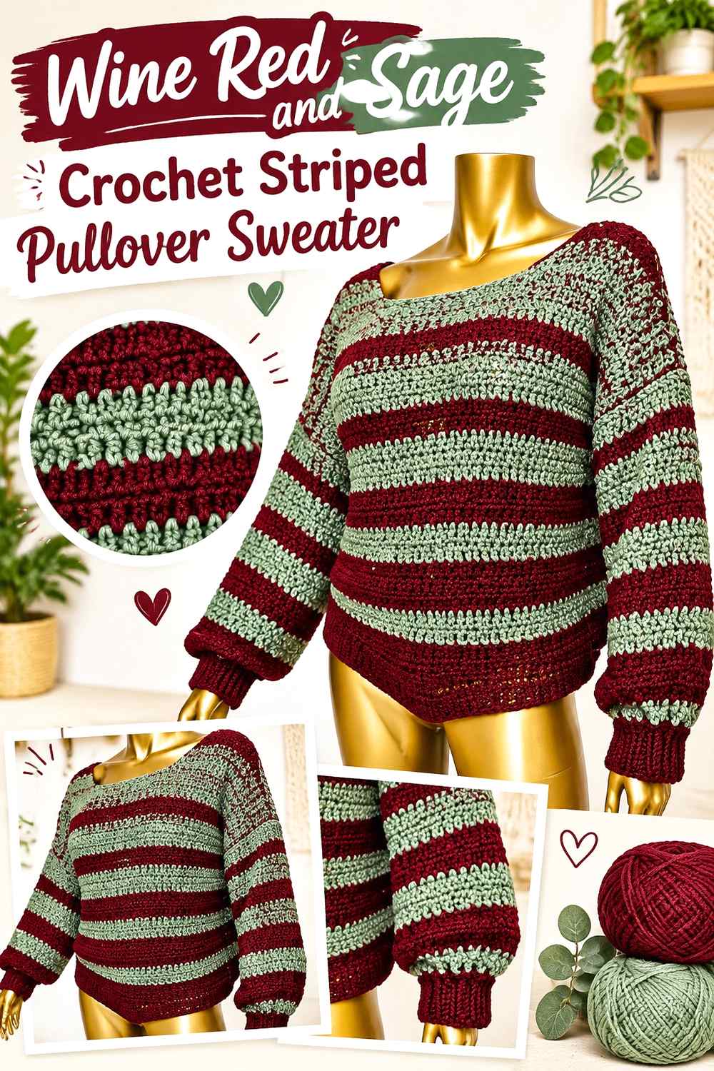
Sage provides a muted green contrast that is noticeable without being as intense as a bright complementary shade. Stripes naturally repeat both colors through the torso and sleeves, so the main decision is how wide and frequent the sage bands should be.
For a wine-red-led pullover, make the red bands wider or more frequent.
Make Wine Red Stripes Wider Than Sage
Equal-width stripes produce a balanced two-color sweater. Wider wine red sections give the eye more time in the main color and keep sage in a supporting role.
Carry the same proportion into the sleeves so the color hierarchy does not suddenly reverse.
Finish Sage Stripes With Wine Red Cuffs
Ending striped sleeves with wine red gives both arms a strong final anchor. A wine red neckline or hem can repeat the same framing strategy.
This is especially useful when the final body stripe happens to be sage.
Creator Credit: Shyler crochets
11. Wine Red And Mustard Crochet Textured Crop Sweater

Mustard gives wine red a strong warm contrast and can draw immediate attention to raised or textured crochet. On a cropped sweater, even small mustard sections can become prominent because the body contains less vertical space.
Keep most texture wine red and use mustard to identify selected areas rather than dividing the whole sweater equally.
Let Wine Red Carry the Main Textured Crop Sweater
Wine red across a large textured panel allows shadows and raised stitches to create variation without constant color changes.
Mustard can then appear at cuffs, neckline, or one controlled section where the contrast will be intentional.
Keep Mustard Smaller Than Wine Red Around Crochet Texture
A strong mustard accent does not need much surface area to remain visible. Restricting it can help the stitch pattern and the main wine red color share attention instead of competing.
If mustard starts dominating, reduce its body coverage before changing the palette entirely.
Creator Credit: AC Crochets
12. Wine Red Cream And Camel Crochet Granny Square Sweater
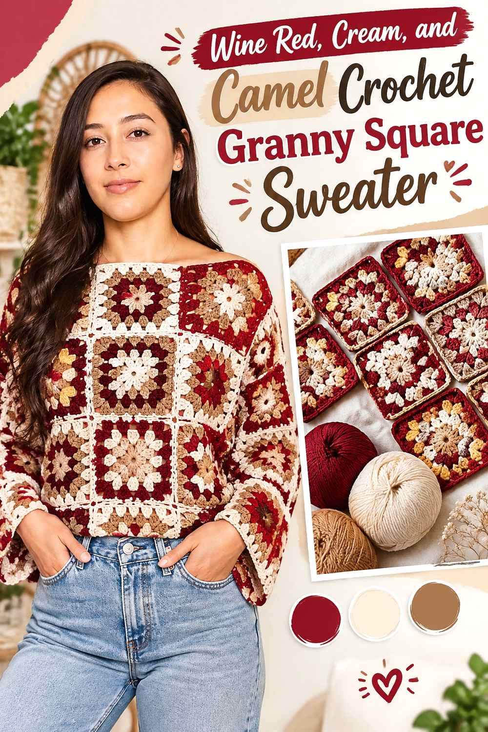
This three-color granny square palette gives each shade a clear role: wine red can frame the motifs, camel can add warm midtone areas, and cream can provide the lightest centers or separators.
Consistency across the motifs is important because a sweater contains many repeated squares and small placement changes multiply across the garment.
Put Wine Red on the Outer Granny Square Rounds
A repeated wine red outer round creates a common edge around cream and camel centers. When the motifs are assembled, the sweater retains a strong red framework even though lighter colors appear in every square.
Wine red can also continue into the cuffs or neckline for additional continuity.
Use Cream to Separate Wine Red and Camel Granny Square Details
Camel can be fairly deep, so a small cream section can keep the inner rounds easier to distinguish.
Do not use equal amounts automatically. Cream can be the smallest color while still providing the strongest value contrast.
Creator Credit: Amanda Love Santos
13. Wine Red And Denim Blue Crochet Crop Sweater
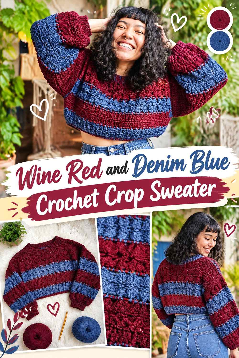
Denim blue cools wine red without creating an extremely bright contrast. A medium denim can work across sleeves or broad body sections, while wine red remains the main torso color.
This palette benefits from larger blocks because very dark denim may sit close to wine red in value.
Carry Wine Red From the Crop Sweater Body Into the Sleeves
If denim covers much of each sleeve, repeat wine red near the wrists or upper arms. That creates a visible link with the torso rather than making the sleeves look like separate blue pieces.
A wine red neckline can reinforce the same connection.
Choose Denim Blue That Separates From Wine Red
Medium denim will generally create clearer blocking than a deep navy-like blue. If you prefer darker denim, use broad sections instead of narrow stripes.
View the colors from a distance before committing to the entire sweater.
Creator Credit: Maya Lyna Corazon
14. Wine Red And Soft Gray Crochet Knit Look Crop Sweater

Soft gray creates a cool neutral contrast that suits a sweater where stitch direction and ribbed-looking texture are important. It can lighten the neckline, cuffs, or hem without the warmth of cream or oatmeal.
Wine red should still occupy the largest knit-look surfaces when the deeper shade is intended to lead.
Keep Wine Red Across the Main Knit-Look Sweater Panels
Large uninterrupted wine red sections let the directional crochet texture remain the main surface feature. Soft gray can then outline edges without breaking the panel into many visual pieces.
This is especially useful on a cropped body where frequent color changes could make the torso feel fragmented.
Use Soft Gray to Clarify Wine Red Ribbed Edges
A gray cuff or narrow hem creates clear separation while staying subdued. Repeat the gray in more than one location so it feels integrated rather than accidental.
If you prefer a darker sweater, keep the gray narrow and return to wine red quickly.
Creator Credit: Madeleine Shirley
15. Wine Red And Teal Crochet Granny Stitch Sweater

Teal gives wine red a deeper jewel-toned partner. Granny stitch creates repeated open clusters and color opportunities, so the two shades can alternate without needing rigid geometric blocks.
Because deep teal can be close to wine red in value, the palette works best when one color clearly repeats as the anchor.
Repeat Wine Red Consistently Through Teal Granny Stitch Rows
Use wine red at regular intervals or keep it in the wider color sections. That repetition helps maintain the main color even when teal appears throughout the body and sleeves.
Wine red ribbing can also contain a multicolor granny-stitch body.
Check Wine Red and Teal Before Using Narrow Granny Stitch Changes
If both colors are dark, single narrow color bands may blend from a distance. Wider sections allow the hue difference to register more clearly.
A lighter teal can increase contrast without requiring a neutral third shade.
Creator Credit: MJ’s Off The Hook Designs
16. Wine Red And Sand Crochet Comfy Sweater
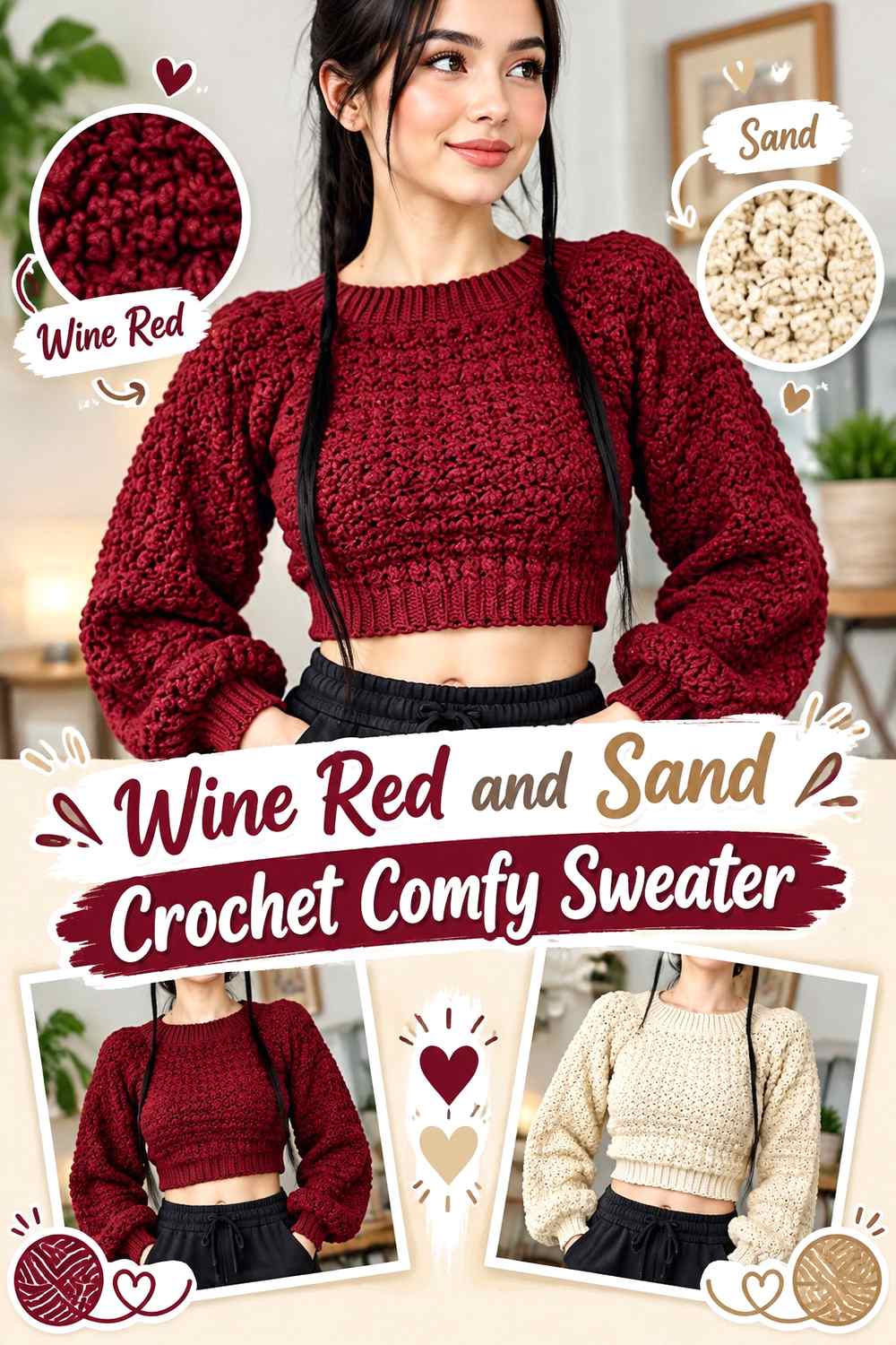
Sand gives wine red a warm pale counterpoint that feels softer than ivory. It works well when you want the body to remain dark but need enough contrast around cuffs, collar, or lower finishing to keep the sweater visually open.
Use wine red for the main panels and sand in carefully limited structural areas.
Let Wine Red Cover the Main Comfy Sweater Panels
Keeping the broad front, back, and sleeve areas wine red makes the overall garment read as a solid rich red even when sand appears around its edges.
A sand neckline can provide enough lightness without requiring body stripes.
Use Sand to Break Up Wine Red Around the Sweater Edges
Sand can lighten cuffs and hems where several dark panels meet. Repeating it at the neckline gives the neutral a clear reason to appear elsewhere.
If the sweater already feels light enough, keep the sand to one or two finishing areas rather than forcing it into the body.
Creator Credit: TCDDIY
17. Wine Red Oatmeal And Sage Crochet Mesh Sweater
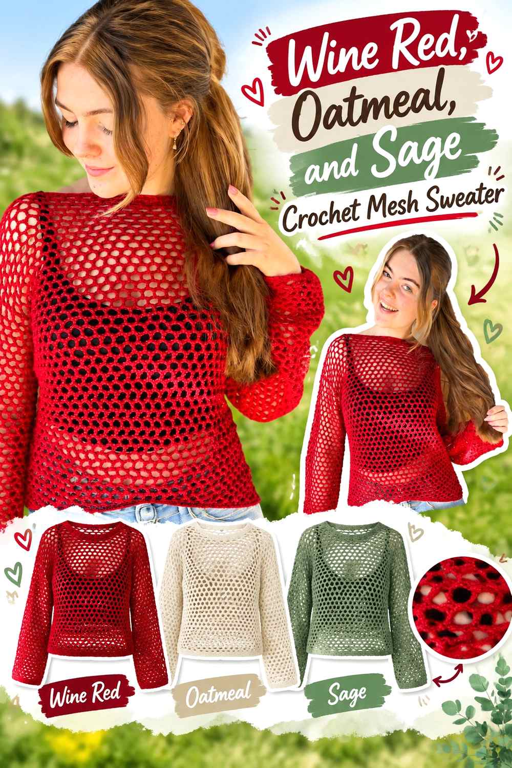
This palette combines a deep anchor, a light neutral, and a muted green. Wine red can lead across the mesh body, sage can create secondary bands, and oatmeal can separate the two where stronger definition is needed.
The three colors should not be distributed equally unless an intentionally balanced multicolor sweater is the goal.
Keep Wine Red as the Largest Mesh Sweater Color
Wine red should occupy the broadest mesh areas if you want the garment to remain visibly red over different underlayers.
Sage can appear in selected body or sleeve sections, while oatmeal stays limited to the places where contrast needs a boost.
Place Oatmeal Between Wine Red and Sage Mesh Sections
A narrow oatmeal transition can make muted sage easier to distinguish from wine red, especially when the green is medium-dark.
Use the neutral as a separator rather than inserting it between every color change. That keeps the three-color mesh from becoming too busy.
Creator Credit: Crochet with Linni
18. Wine Red And Black Crochet Super Chunky Sweater

Wine red and black create the darkest palette in this collection. Super chunky stitches already produce deep shadows, so black accents should be positioned where they can remain identifiable rather than disappearing into wine red texture.
A wine red body with black cuffs, waistband, or collar keeps the color relationship simple and graphic.
Give Wine Red More Super Chunky Sweater Surface Than Black
Black can become visually dominant even when it does not cover the majority of the garment. Keep it to finishing areas or selected sleeve sections if wine red should remain the first color the eye notices.
A full wine red torso provides a reliable dark-red anchor.
Keep Black Away From Small Wine Red Texture Details
Tiny black accents may disappear between thick wine red stitches. Use broader black bands when you want the color to be visible.
If you need fine detail, a soft gray separator can provide more usable contrast than adding additional black.
Creator Credit: Cat Kemble
19. Wine Red Forest Green And Cream Crochet Granny Square Sweater

Forest green gives wine red a deep seasonal contrast, while cream prevents the two dark shades from collapsing into one heavy surface. Granny squares make it possible to repeat all three colors in a controlled order.
Wine red can frame the motifs, forest green can occupy centers or secondary rounds, and cream can separate the two where necessary.
Keep Wine Red Around Forest Green Granny Squares
Wine red outer rounds create a consistent garment-wide frame even when the amount of forest green varies inside each motif.
That repeated red boundary is especially useful across sleeves, where mixed motifs can otherwise look more random than they do on a flat layout.
Use Cream to Separate Wine Red and Forest Green
Both dark shades can be similar in value. A small cream round or center provides enough contrast to make the motif structure easier to read.
Keep the cream area smaller when you want the final sweater to remain rich and dark overall.
Creator Credit: Hooked on Homemade Happiness
20. Wine Red Plum And Oatmeal Crochet Granny Square Sweater

Plum keeps the final palette close to wine red while oatmeal supplies the lighter contrast needed to distinguish the two berry shades. This creates a tonal granny-square sweater without making every motif visually flat.
Use wine red as the repeated anchor, plum for secondary depth, and oatmeal for selected centers or separating rounds.
Make Wine Red More Repetitive Than Plum Across Granny Squares
Wine red does not have to be dramatically more abundant, but it should appear predictably if it is the main shade. Use it on every outer round, every join, or another consistent motif position.
Plum can then vary more freely through the centers and secondary rounds.
Place Oatmeal Where Wine Red and Plum Need Separation
A light oatmeal round can stop the two dark berry shades from merging. It is particularly useful around small centers where subtle color changes are otherwise hard to see.
Avoid inserting oatmeal automatically into every boundary. Direct wine red-and-plum transitions can still work well across larger areas.
Creator Credit: Zeens And Roger Crochet
How to Compare These Wine Red Crochet Sweater Palettes
For the clearest light-dark contrast, compare wine red with cream, ivory, oatmeal, sand, or soft gray. These palettes make neckline finishing, cuffs, granny-square details, and textured edges easier to distinguish.
For a softer tonal result, dusty rose, blush, lavender, and plum stay closer to the wine red family. Camel and rust warm the palette without creating a bright neutral contrast.
Sage, forest green, teal, mustard, and denim blue introduce stronger hue changes. Charcoal and black create the darkest sweaters and benefit most from large color blocks rather than narrow details.
Conclusion
Wine red can function as much more than a single solid sweater color. It can anchor a cream mesh pullover, frame lavender or blush details, balance muted sage stripes, define granny squares, or sit beside charcoal and black in a much darker garment.
Start by deciding where wine red should remain uninterrupted. The torso is the clearest place to establish dominance, but repeating the shade through cuffs, neckline, hem, or motif borders can be just as important when the sleeves and body contain several colors.
Before committing to a full sweater, compare the actual yarns in crochet fabric and check the palette from a distance. Similar dark values often behave differently once texture and shadow are added. Follow the original creator tutorial for the exact sweater construction, measurements, shaping, stitches, and assembly.
Frequently Asked Questions
What colors work well with wine red in a crochet sweater?
Cream, ivory, oatmeal, sand, soft gray, camel, dusty rose, blush, lavender, plum, sage, forest green, teal, mustard, rust, denim blue, charcoal, and black can all work with wine red. The most useful choice depends on how much light-dark contrast you want.
How can I keep wine red as the dominant sweater color?
Give wine red either the largest surface area or the most consistent repeated position. It can cover the torso, appear in every stripe repeat, frame every granny square, or return at the neckline, cuffs, and hem.
How do I tell whether another dark color has enough contrast with wine red?
Place the yarns side by side and view them from a distance. A grayscale photo can also help reveal whether they have similar lightness. If the colors merge, use larger blocks or introduce a lighter separator.
Should a wine red crochet sweater have matching cuffs and neckline?
They do not have to match, but repeating wine red in both places can give a multicolor sweater a stronger frame. Contrasting cuffs or necklines are useful when you want those areas to become more prominent.
How can I make a wine red crochet sweater look lighter?
Increase the share of cream, ivory, oatmeal, sand, soft gray, blush, or lavender. Place lighter colors near the neckline, upper body, or sleeves where they will have more visual impact rather than adding small amounts only at the lower hem.
How many colors should I use in a wine red granny square sweater?
Two or three colors are often enough to establish clear roles, but there is no fixed limit. The important point is hierarchy. Let wine red serve as a repeated anchor, give the second shade a supporting role, and use the lightest or strongest accent where extra motif separation is needed.