Currant Red and Cloud Blue give a crochet jewelry travel pouch a useful contrast between a deeper warm shade and a lighter, cooler one. Currant Red can visually anchor the base, closure, or main pouch body, while Cloud Blue can make drawstring channels, borders, and smaller details easier to separate. Reversing those roles creates a lighter pouch with controlled red accents.
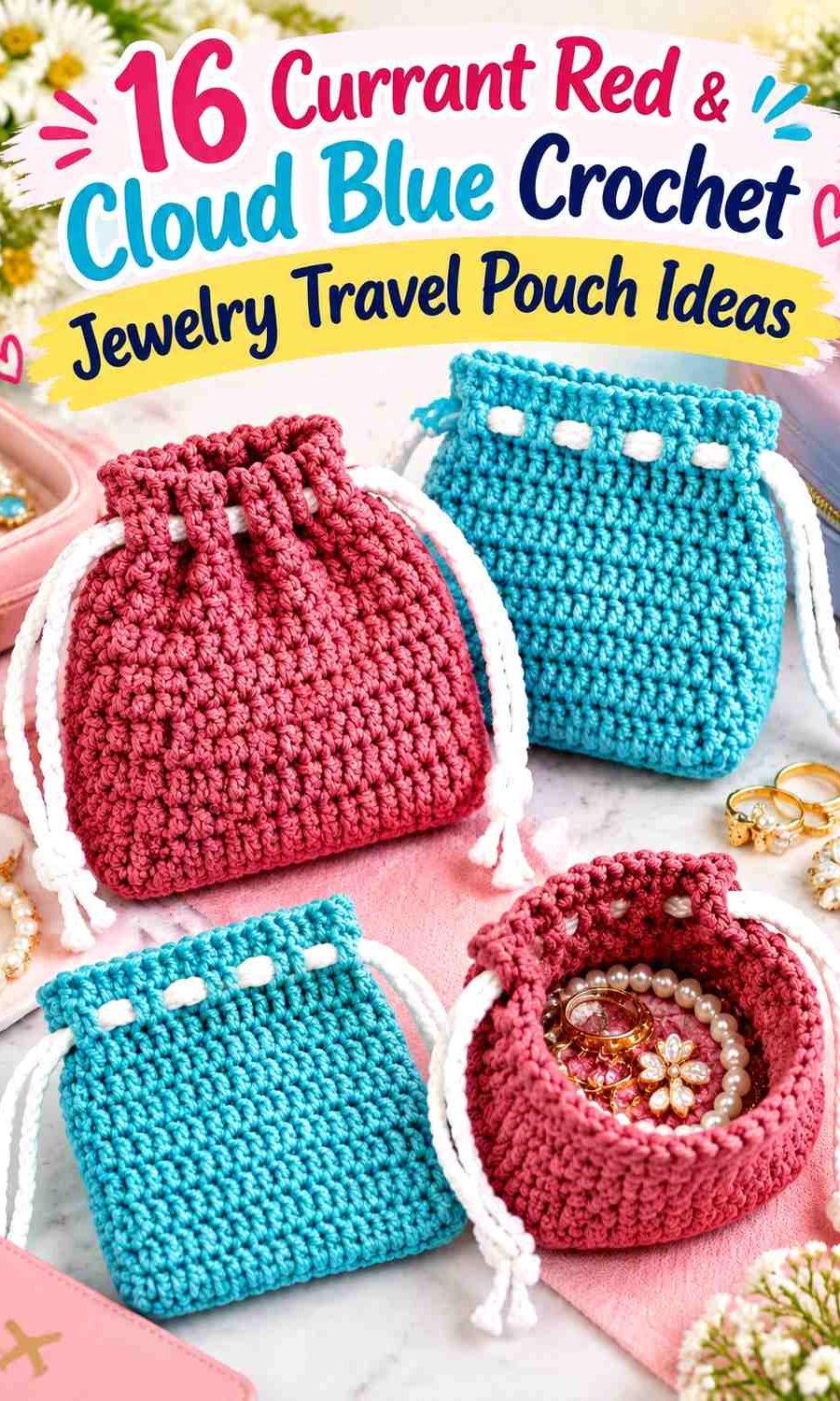
Color placement matters on a travel pouch because much of the body may disappear inside luggage or a larger organizer. The closure, upper edge, and drawstrings often remain the easiest areas to identify, while the base becomes more noticeable only when the pouch is unpacked. If you plan to make several jewelry pouches, changing these visible color zones can also help distinguish them without introducing additional colors.
For very small jewelry, consider the fabric itself as well as the palette. Large openings can be less practical for tiny earring backs or fine pieces, and a single pouch will not automatically prevent delicate chains from tangling together. Choose or adapt a construction appropriate for what you plan to store.
The credited tutorials include mini drawstring pouches and compact coin-purse constructions suited to small-item storage. Currant Red and Cloud Blue are independent editorial adaptations rather than claims that the creators used this exact palette.
Quick List
- Currant Red body with Cloud Blue drawstring channel
- Cloud Blue body with Currant Red drawstring channel
- Currant Red base with Cloud Blue pouch body
- Cloud Blue base with Currant Red pouch body
- Half Currant Red and half Cloud Blue pouch
- Currant Red center panel with Cloud Blue sides
- Cloud Blue center panel with Currant Red sides
- Broad Currant Red and Cloud Blue travel-pouch bands
- Fine Currant Red stripes on Cloud Blue
- Currant Red body with Cloud Blue drawstrings
- Cloud Blue body with Currant Red drawstrings
- Currant Red clasp pouch with Cloud Blue edge
- Cloud Blue clasp pouch with Currant Red edge
- Cloud Blue motif pouch with Currant Red definition
- Marled Currant Red and Cloud Blue pouch
- Graduated Currant Red and Cloud Blue pouch
Plan Currant Red and Cloud Blue Around the Jewelry Pouch Opening
The upper part of a small travel pouch deserves special attention because it stays visible while the pouch is being opened and closed. Cloud Blue around a Currant Red body can make the opening easier to distinguish visually, while Currant Red can give a pale Cloud Blue pouch a stronger upper boundary.
If the design uses a drawstring, consider the drawstring and channel separately. Matching them creates a quieter finish; contrasting them makes the closure a more deliberate part of the two-color palette.
Use Currant Red and Cloud Blue to Identify Different Travel Pouch Zones
A jewelry pouch does not need multiple construction compartments to have useful visual zones. The base can use one color, the body another, and the closure can repeat the base color to connect the design.
This becomes especially useful when making several pouches for different small items. One can be Cloud Blue-dominant and another Currant Red-dominant while still belonging to the same coordinated travel set.
Check Currant Red and Cloud Blue Contrast Before Adding Small Motifs
Compare the actual yarns rather than relying only on their names. If Currant Red and Cloud Blue differ clearly in light/dark value, small borders or motifs can remain distinct. If they are closer in value, larger panels and bands will usually communicate the palette better.
A grayscale photo is a simple check. This is particularly useful on a small pouch where tiny color changes can visually merge from normal viewing distance.
1. Currant Red and Cloud Blue Crochet Jewelry Travel Pouch With a Blue Drawstring Channel
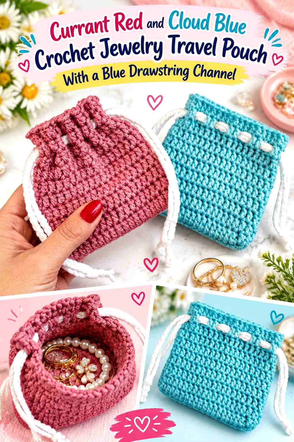
Let Currant Red cover most of this compact jewelry pouch and reserve Cloud Blue for the upper drawstring area. The red body remains the dominant color when the pouch is packed, while the lighter top visually identifies the opening.
Currant Red Should Lead Across the Main Jewelry Pouch Body
Keep Currant Red uninterrupted through most of the storage section when you want the pouch to read as red first. A continuous body also gives stitch texture room to show without repeated color changes competing with it.
If the pouch will normally sit inside a larger travel bag, make sure enough Currant Red remains visible below the closure when the top is gathered.
Cloud Blue Can Separate the Currant Red Body From the Drawstring Opening
Use Cloud Blue in the upper channel or finishing area to give the opening a clear visual break.
Keep this section controlled if Currant Red should remain dominant. On a mini pouch, even a few contrasting rounds can occupy a significant portion of the visible surface.
Creator Credit: Claudetta Crochet YouTube tutorial
2. Cloud Blue and Currant Red Crochet Jewelry Travel Pouch With a Red Drawstring Channel
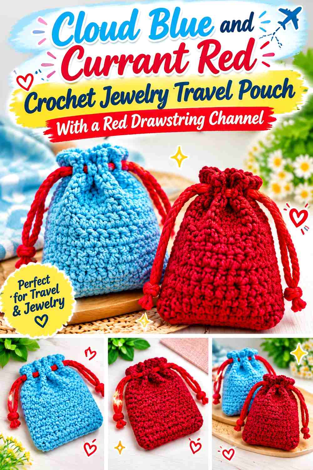
Reverse the color hierarchy by using Cloud Blue through most of the travel pouch and Currant Red around the opening. The lighter body keeps the pouch visually airy, while the deeper red creates a strong closing boundary.
Cloud Blue Keeps the Main Crochet Jewelry Pouch Light
Give Cloud Blue most of the pouch body when you want the pale shade to remain the obvious background.
This can also make darker jewelry visually easier to spot against the pouch when it is open, although the actual usefulness will depend on how much of the inner crochet surface is visible.
Currant Red Can Give the Cloud Blue Opening Stronger Definition
Place Currant Red around the drawstring channel or top edge rather than scattering it through every section.
A concentrated red top can remain visible even when the pouch is gathered, giving the secondary color more impact without requiring equal surface area.
Creator Credit: VivCrochets YouTube tutorial
3. Currant Red Base and Cloud Blue Crochet Jewelry Travel Pouch
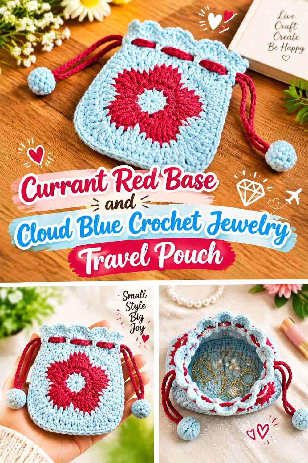
Make Currant Red responsible for the pouch foundation and let Cloud Blue rise through most of the sides. The darker base gives the design a defined lower anchor without interrupting the larger light-colored body.
Currant Red Can Ground the Cloud Blue Jewelry Pouch Base
Extend Currant Red far enough up the lower sides that the color remains visible when the pouch is standing or lying on its side.
If the red exists only on the hidden underside, it will contribute very little to the visible two-color scheme.
Cloud Blue Should Cover Most of the Pouch Above the Currant Red Base
Keep Cloud Blue continuous through the main storage area to emphasize the contrast with the darker foundation.
You can leave the top Cloud Blue as well for a simple base-versus-body composition rather than automatically repeating Currant Red at the closure.
Creator Credit: Mi’s Handmade Hobbies YouTube tutorial
4. Cloud Blue Base and Currant Red Crochet Jewelry Travel Pouch
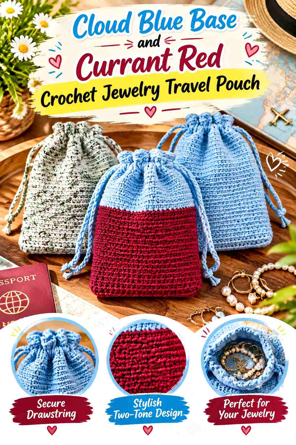
A Cloud Blue foundation beneath a Currant Red body produces the opposite effect: a lighter visual base supporting a richer main field. This layout keeps the blue present without breaking up the central storage section.
Cloud Blue Can Lighten the Bottom of the Currant Red Pouch
Use Cloud Blue through the base and a small amount of the lower side so the contrast can still be seen when the pouch is closed.
A narrow visible blue foundation is often enough because the darker Currant Red above it naturally carries more visual weight.
Currant Red Can Remain Continuous Through the Jewelry Storage Area
Keep the body mostly Currant Red when you want a rich, uninterrupted travel-pouch surface.
If the construction includes noticeable stitch texture, the solid color also prevents the lower Cloud Blue from competing with that texture higher on the pouch.
Creator Credit: Sunflower Cottage Crochet YouTube tutorial
5. Half Currant Red and Half Cloud Blue Crochet Jewelry Travel Pouch
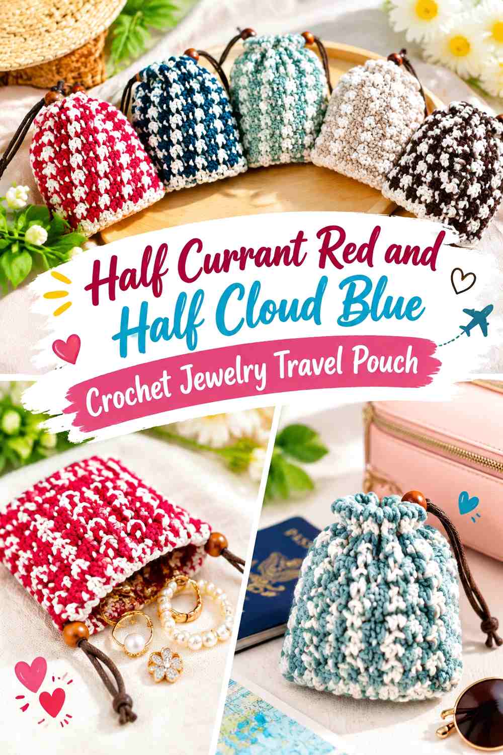
Divide the pouch into two substantial color fields rather than assigning one shade to a narrow border. This gives Currant Red and Cloud Blue nearly equal importance and produces one of the clearest two-color travel-pouch designs.
Currant Red Needs a Full Jewelry Pouch Section Beside Cloud Blue
Give Currant Red enough uninterrupted area to remain unmistakable after the pouch is gathered or partially covered inside luggage.
Avoid scattering the same amount of red through several tiny bands if you want to preserve the clean two-block effect.
Cloud Blue Should Meet Currant Red at One Deliberate Pouch Transition
Keep the boundary between the colors clear. The simplicity of this scheme comes from seeing two large fields rather than multiple intermediate stripes.
If the pouch has a distinct front and back, the division can be vertical or horizontal depending on which view you want emphasized.
Creator Credit: LiLi nana* YouTube tutorial
6. Currant Red Center-Panel and Cloud Blue Side Crochet Jewelry Travel Pouch
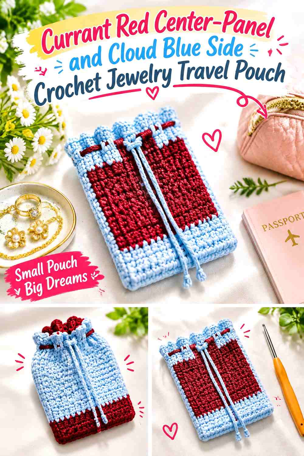
Use a substantial Currant Red panel across the most visible center and keep Cloud Blue around the surrounding sides. This is particularly useful for flatter pouch constructions where a central panel remains easy to see.
Currant Red Can Create the Main Focal Panel on Cloud Blue
Give the red section meaningful width instead of reducing it to a narrow stripe. A larger panel remains more legible when the pouch flexes or contains jewelry.
It can also provide a clear visual area for identifying the pouch within a larger organizer.
Cloud Blue Can Frame the Currant Red Jewelry Pouch Panel
Use Cloud Blue along both sides so the deeper center does not extend across the entire pouch.
If much of one side folds toward the back, judge the palette from the pouch’s normal packed shape rather than from a perfectly flat layout.
Creator Credit: Anutha – The Crochet World YouTube tutorial
7. Cloud Blue Center-Panel and Currant Red Side Crochet Jewelry Travel Pouch
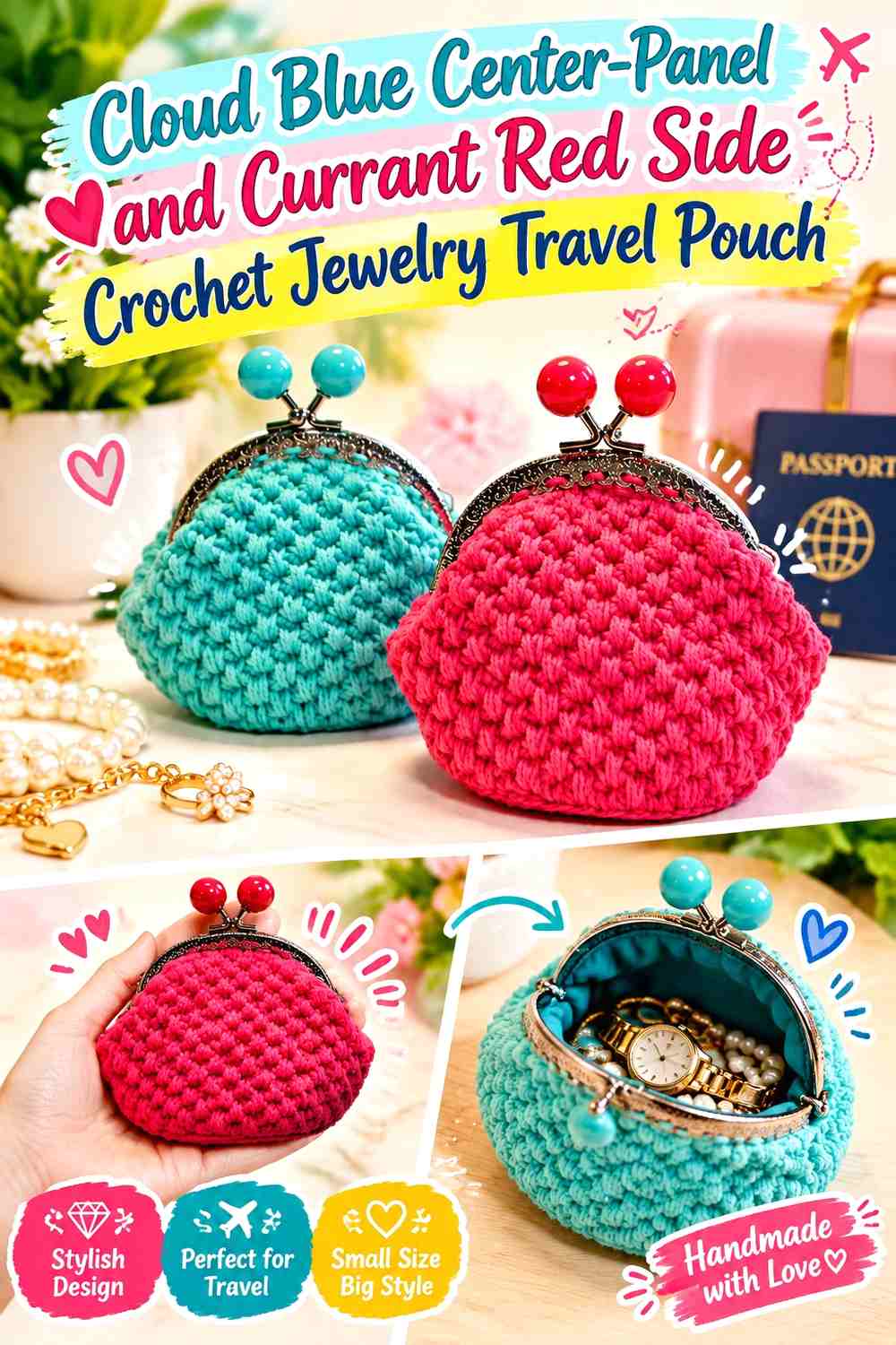
Reverse the panel placement by putting Cloud Blue through the center and Currant Red around the sides. This produces stronger outer definition while keeping the center visually lighter.
Cloud Blue Can Open Up the Center of the Currant Red Pouch
Make the blue panel wide enough that the red side sections do not visually close around it.
A broad Cloud Blue center is especially useful when you want the lighter shade clearly visible without giving it the entire pouch body.
Currant Red Side Sections Can Define the Cloud Blue Panel
Keep Currant Red connected around the sides or outer sections to create a clear visual frame.
If the pouch is extremely small, simplify the layout rather than narrowing Cloud Blue into a tiny center line that disappears when filled.
Creator Credit: Hook & Loop Crochet Tutorials YouTube tutorial
8. Broad Currant Red and Cloud Blue Band Crochet Jewelry Travel Pouch
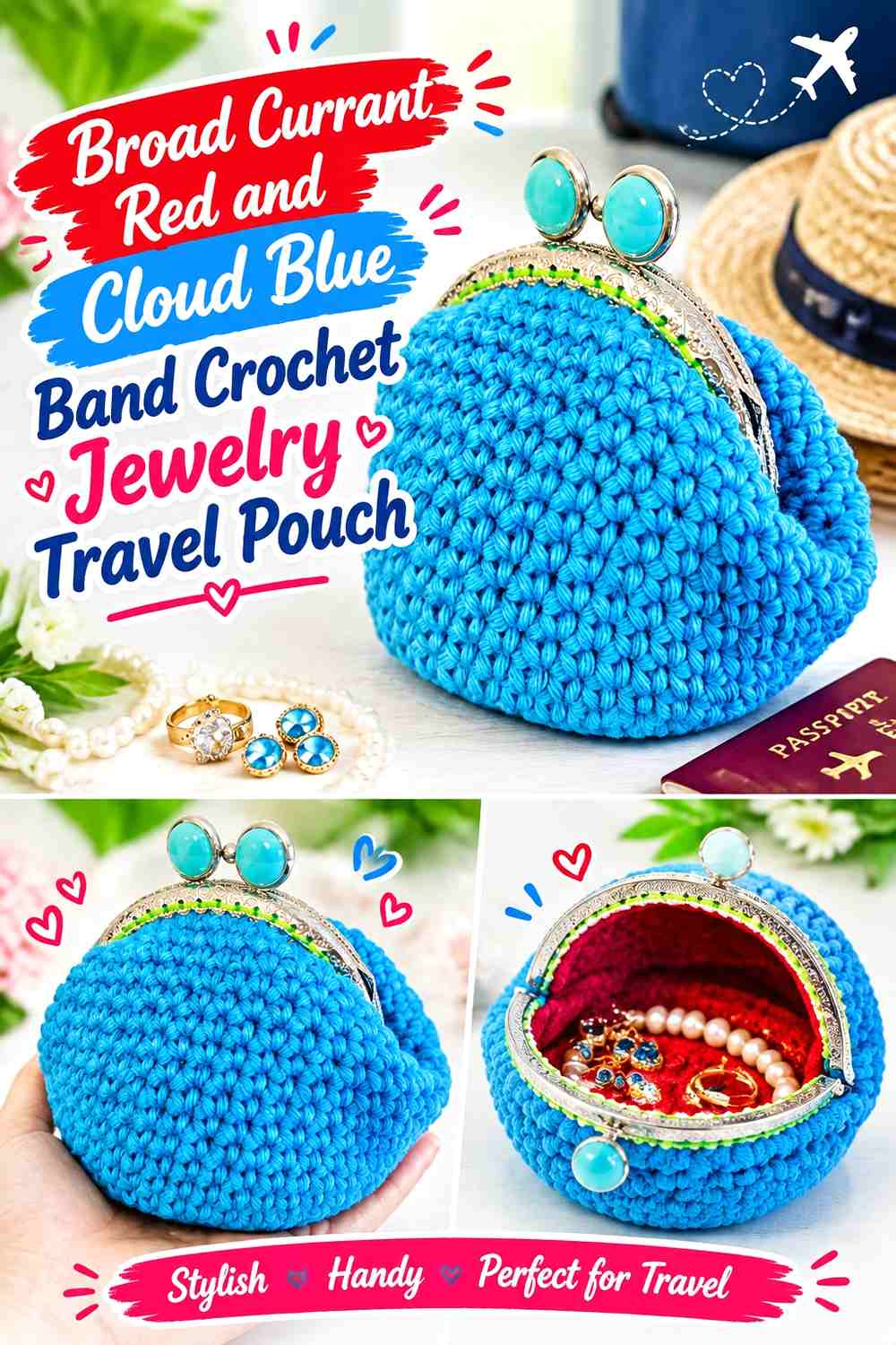
Alternate several broad bands around the pouch. Wide sections let both colors remain recognizable while creating more repetition than a simple half-and-half design.
Currant Red Broad Bands Need Clear Cloud Blue Separation
Leave enough Cloud Blue between red sections that neighboring bands do not visually merge into one large dark field.
A small travel pouch may need only a few substantial bands. Too many can make the proportions hard to read once the top gathers.
Cloud Blue Band Width Controls the Weight of Currant Red
Wider Cloud Blue bands make the finished pouch look lighter, while increasing Currant Red gives the palette a richer overall direction.
Pay attention to the final band near the closure, because that section remains especially visible during use.
Creator Credit: Mary Matthews Handmade YouTube tutorial
9. Cloud Blue Crochet Jewelry Travel Pouch With Fine Currant Red Stripes
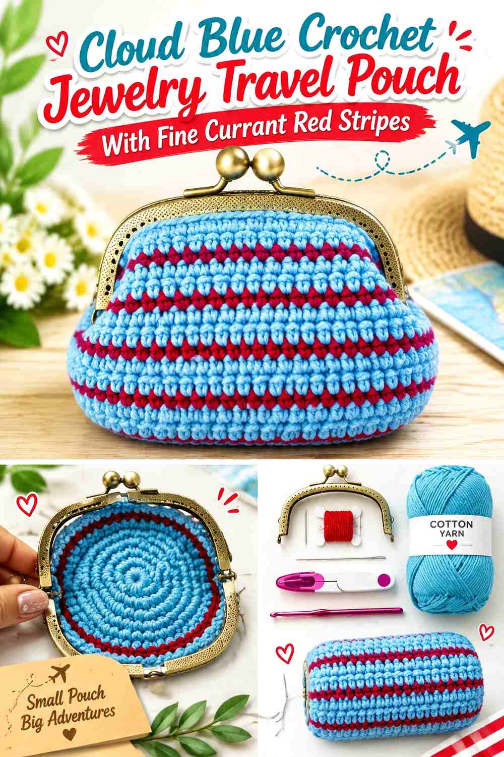
Make Cloud Blue the main field and introduce Currant Red as narrow repeated stripes. This creates more detail than broad banding without giving the red an equal share of the surface.
Currant Red Pinstripes Need Consistent Spacing Across Cloud Blue
Repeat the narrow red accents at a predictable rhythm. Irregular tiny stripes can look especially busy when the pouch is cinched closed.
View the finished piece from normal travel-bag distance rather than only close up, because several fine red lines may visually merge.
Cloud Blue Should Remain Visible Between Every Currant Red Stripe
Leave enough light blue space for the background to remain obvious.
If the two yarns are close in light/dark value, broaden the Currant Red sections instead of increasing the number of tiny stripes.
Creator Credit: Melanie Ham YouTube tutorial
10. Currant Red Crochet Jewelry Travel Pouch With Cloud Blue Drawstrings
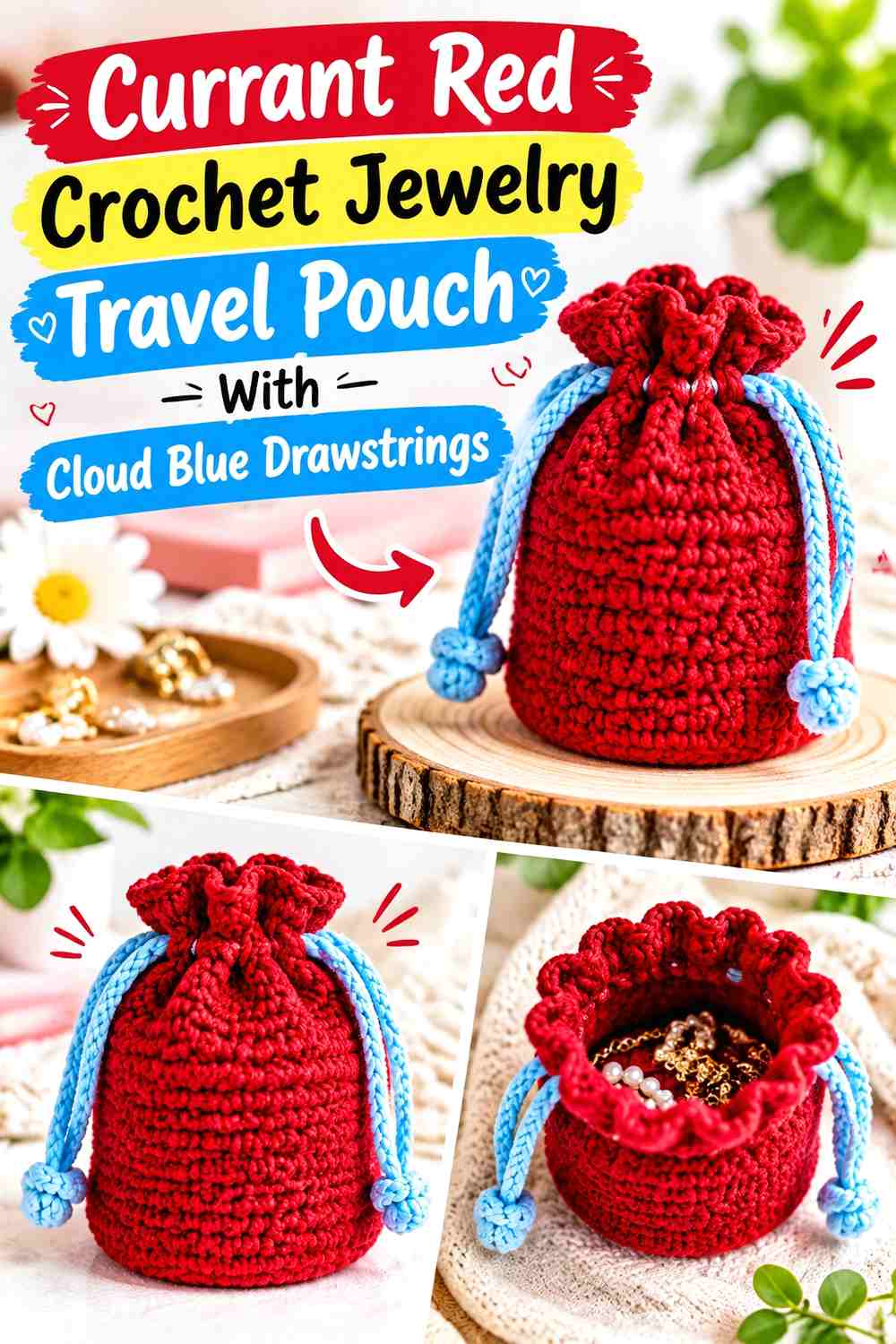
Keep the complete pouch body Currant Red and move Cloud Blue to the closure cords. This makes the color distinction functional as well as decorative without interrupting the main storage fabric.
Currant Red Can Keep the Jewelry Pouch Body Visually Simple
Use Currant Red from base to upper channel when you want one uninterrupted main field.
This works particularly well when the stitch pattern already creates enough visual texture and does not need additional body stripes.
Cloud Blue Can Make the Currant Red Drawstrings Easy to Distinguish
Use Cloud Blue for the visible closure cords so they remain separate from the red body when the pouch is tightened.
If the drawstrings mostly disappear inside the channel when closed, consider a small Cloud Blue top detail as well rather than spreading blue through unrelated body areas.
Creator Credit: Nicki’s Homemade Crafts YouTube tutorial
11. Cloud Blue Crochet Jewelry Travel Pouch With Currant Red Drawstrings
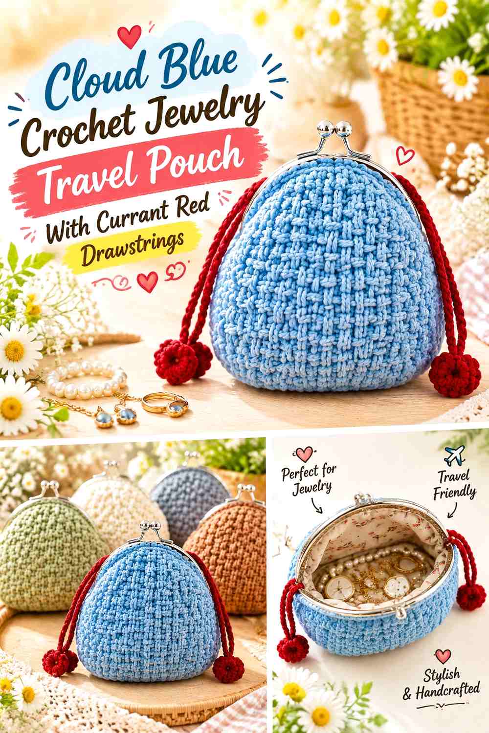
This version keeps the storage pouch light and reserves Currant Red for the cords. The concentrated darker color makes the drawstring system a more visible part of the finished accessory.
Cloud Blue Should Stay Continuous Across the Travel Pouch Body
Let Cloud Blue cover the base and sides when you want the lighter shade to remain visually dominant.
A single field also makes it easier to judge whether the pouch fabric is dense enough for the small jewelry you plan to carry without color changes distracting from the surface.
Currant Red Can Give the Cloud Blue Drawstrings Stronger Visual Weight
Currant Red cords create a clear line against the lighter body, especially where they cross or gather at the top.
Keep the contrast connected to the closure instead of repeating red throughout the body if you want this idea to remain clearly drawstring-focused.
Creator Credit: Chompu Handicrafts YouTube tutorial
12. Currant Red and Cloud Blue Crochet Jewelry Travel Pouch With a Framed Closure

Use a compact framed or clasp-style pouch concept with Currant Red covering the body and Cloud Blue defining the crochet immediately below the closure. This gives the top of the jewelry pouch a clear second-color boundary.
Currant Red Can Carry the Main Clasp-Pouch Body
Keep Currant Red broad beneath the frame so the deeper color remains visible when the pouch is shut.
A continuous body also makes the hardware and Cloud Blue upper detail easier to distinguish as separate design elements.
Cloud Blue Can Separate Currant Red From the Pouch Closure
Place Cloud Blue near the upper edge rather than through the entire body. The lighter line can visually bridge the dark pouch and the hardware.
Do not assume a particular clasp color will coordinate the same way with every yarn. Compare the actual hardware, Currant Red, and Cloud Blue together before finalizing the placement.
Creator Credit: DIYmoda withEmíl YouTube tutorial
13. Cloud Blue and Currant Red Crochet Jewelry Travel Pouch With a Dark Framed Edge
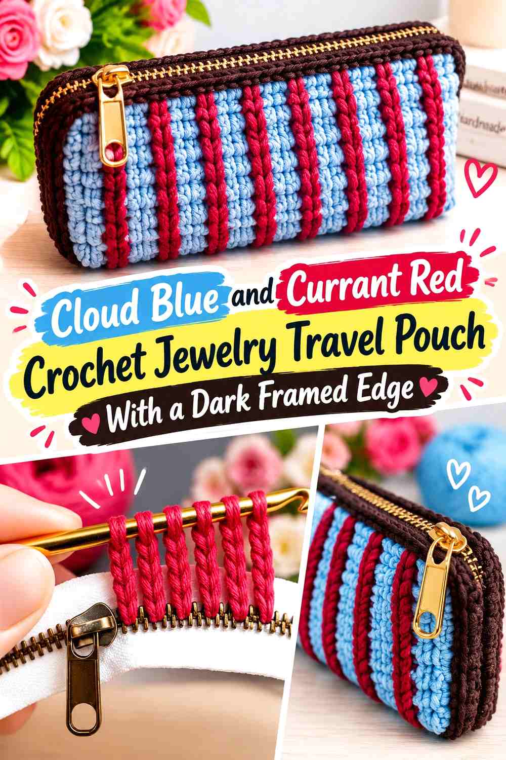
Reverse the framed palette by making Cloud Blue the main body and Currant Red the upper edge. The result keeps the pouch light while giving the closure a stronger visual anchor.
Cloud Blue Can Keep the Main Jewelry Pouch Surface Light
Use Cloud Blue broadly below the closure rather than dividing it with additional red bands.
This gives the darker upper section more emphasis without allowing it to dominate the full pouch.
Currant Red Can Define the Cloud Blue Closure Edge
Keep Currant Red close to the frame or opening so its purpose is visually clear.
Because the closure itself introduces another material, a single controlled red section is usually enough; additional stripes can make the small pouch visually crowded.
Creator Credit: Knitting Love YouTube tutorial
14. Cloud Blue Motif and Currant Red Crochet Jewelry Travel Pouch
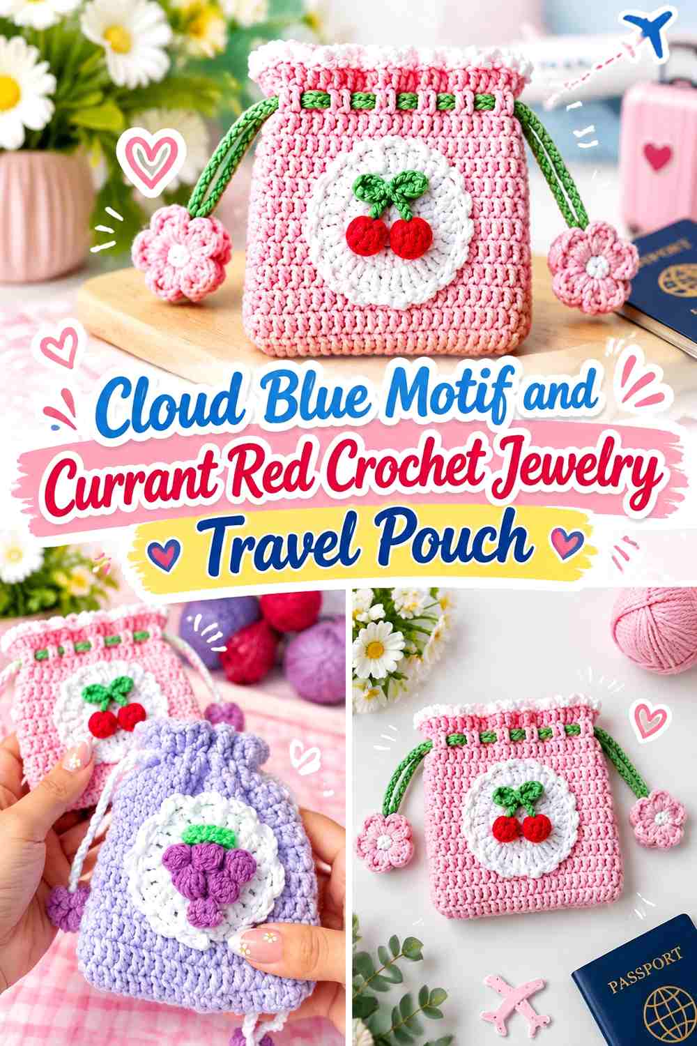
A motif-based mini pouch offers another way to distribute the palette. Use Cloud Blue across the larger motif field and Currant Red at motif borders, joins, or surrounding areas so the deeper color clarifies the structure without filling every small section.
Cloud Blue Can Keep the Main Jewelry Pouch Motif Readable
Give Cloud Blue meaningful space inside the motif rather than alternating colors at every small stitch group.
Larger color areas keep the motif easier to understand once the pouch is assembled and filled.
Currant Red Can Define Cloud Blue Motif Edges and Joins
Use Currant Red around selected boundaries when you want the shape of the motif to remain visible.
If the red starts appearing around every individual detail, reduce it to the outer borders or joining areas. The small pouch does not need every line emphasized equally.
Creator Credit: Tejerella YouTube tutorial
15. Marled Currant Red and Cloud Blue Crochet Jewelry Travel Pouch
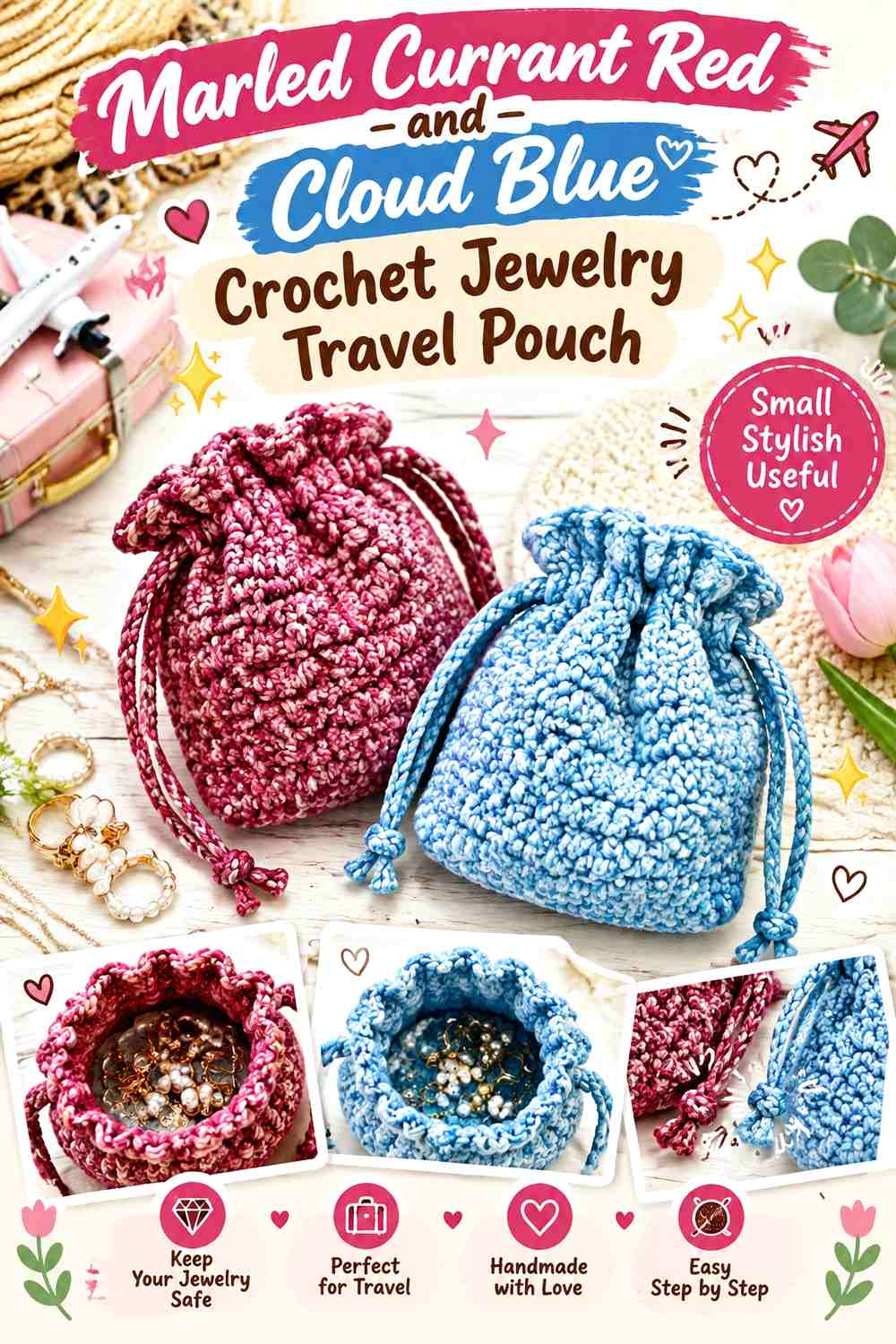
Blend both colors throughout the pouch instead of separating them into bands. This creates the softest boundary in the collection, so a solid rim or drawstring can restore some visual structure around the mixed body.
Currant Red and Cloud Blue Need a Swatch Before Marling the Pouch
Test the colors together and inspect the result from normal viewing distance. The mixture should still look deliberately two-colored rather than collapsing into an unclear middle tone.
If combining strands changes the thickness of the crochet fabric, make sure that change still suits the small pouch construction you plan to follow.
Solid Currant Red Can Define the Mixed Currant Red and Cloud Blue Opening
A Currant Red upper edge gives the marled body a clear stopping point and reconnects the blend to one of its original shades.
Cloud Blue can take the same role when you prefer a lighter finish, but one solid border will usually keep the small pouch cleaner than stacking both colors at the top.
Creator Credit: Crochet Chronicles YouTube tutorial
16. Graduated Currant Red and Cloud Blue Crochet Jewelry Travel Pouch
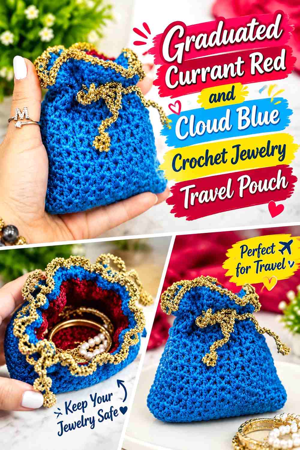
Change the balance of the two colors gradually from base to closure. The lower portion can begin Currant Red-heavy, middle bands can become more balanced, and the top can finish Cloud Blue-heavy without introducing intermediate yarn shades.
Currant Red Can Recede as Cloud Blue Moves Up the Jewelry Pouch
Start with a broad Currant Red base or lower band and reduce the red share as the pouch rises.
Make the progression obvious enough to survive the gathering at the top. Very subtle stripe-width changes can disappear once the drawstring is tightened.
Cloud Blue Should Expand Clearly as Currant Red Narrows
Increase Cloud Blue through the upper portion so the pouch genuinely moves from a red-dominant base toward a lighter closure area.
You can reverse the direction when you want Currant Red around the opening, but keep the changing proportions deliberate rather than simply alternating equal bands.
Creator Credit: atolye_masal YouTube tutorial
Which Currant Red and Cloud Blue Jewelry Travel Pouch Should You Choose?
Choose Ideas 1, 4, 10, or 12 when you want Currant Red to carry most of the visible pouch. Ideas 2, 3, 9, 11, and 13 make Cloud Blue the larger field while using Currant Red to define closures, stripes, bases, or drawstrings.
Ideas 5 and 8 give the two shades more comparable visual importance. The half-and-half design creates one bold division, while broad bands repeat the contrast throughout the body. Ideas 6 and 7 are better when you prefer a defined central panel rather than horizontal color changes.
For a motif-led pouch, Idea 14 lets color clarify borders and joins. Idea 15 provides the most blended interpretation, while Idea 16 gives the palette a visible direction from one end of the pouch to the other.
Conclusion
Currant Red and Cloud Blue can create 16 meaningfully different crochet jewelry travel pouches simply by changing which construction areas carry each shade. Currant Red can anchor a base, frame an opening, define a closure, or dominate the pouch body. Cloud Blue can lighten the main storage area, distinguish drawstrings, separate a dark body from hardware, or give motifs more breathing room.
For travel use, consider visibility and storage needs together. A color placed only on the bottom may disappear inside luggage, while a contrasting drawstring or upper border remains easier to identify. Also consider the jewelry itself: very small parts need an appropriately dense or otherwise suitable pouch, and pieces that tangle easily may benefit from being separated rather than placed together in one compartment.
Use the credited tutorials for exact construction details and apply these Currant Red and Cloud Blue ideas as independent color-planning directions.
Frequently Asked Questions
Should Currant Red or Cloud Blue Be the Main Color in a Crochet Jewelry Travel Pouch?
Either can lead. Currant Red creates a deeper, richer pouch body, while Cloud Blue produces a lighter overall surface. Give the secondary color a defined job at the base, closure, drawstring channel, border, or motif rather than distributing it randomly.
Where Should Cloud Blue Go on a Mostly Currant Red Jewelry Pouch?
Cloud Blue works well around the drawstring channel, at the base, on the closure edge, in a center panel, or on the cords themselves. Choose the location according to which part of the pouch will remain most visible during travel.
How Can I Check Whether Currant Red and Cloud Blue Have Enough Contrast?
Compare the actual yarns under normal lighting and take a grayscale photo if needed. If they stay clearly different in grayscale, small borders and narrow stripes should remain easier to distinguish. If their values are similar, use broader blocks.
Is Open Crochet Fabric Practical for a Currant Red and Cloud Blue Jewelry Pouch?
It depends on what you plan to store. Large openings may be less suitable for tiny earring backs, narrow pendants, or other small components. Choose a denser pouch construction or another appropriate containment method when small pieces could work through the crochet openings.
Can Currant Red and Cloud Blue Help Organize Different Jewelry Pouches?
Yes. You can reverse the dominant color or change where the accent appears. For example, one pouch can use a Currant Red body with Cloud Blue cords while another uses a Cloud Blue body with Currant Red cords, giving the pair a coordinated but distinguishable look.
Will a Crochet Jewelry Travel Pouch Keep Chains From Tangling?
A basic single-compartment pouch does not automatically keep separate chains from tangling together. If that is important, store delicate chains individually or choose a design with suitable separation rather than relying on color or crochet texture alone.
What Can I Substitute for Currant Red and Cloud Blue?
Preserve the contrast relationship rather than matching the names exactly. Currant Red can be replaced with another deep muted red or berry shade, while Cloud Blue can be replaced with a lighter softened blue. Keep enough value difference for the borders, stripes, panels, or motifs in your chosen design.