Ocean Ink and Vanilla give a crochet cutlery roll a useful dark-and-light palette for separating its functional parts. Ocean Ink can define individual utensil pockets, the outer panel, ties, or edging, while Vanilla can lighten the interior and make pocket divisions easier to see. Reversing those roles creates a lighter roll with dark definition concentrated where it matters.
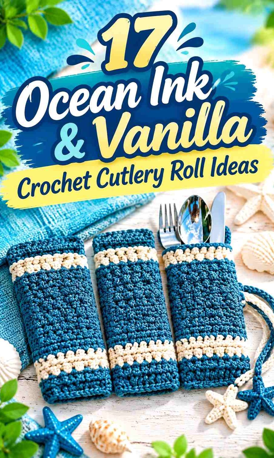
A cutlery roll also changes appearance dramatically between its open and closed positions. When open, the utensil pockets and dividers become important parts of the color scheme. Once rolled, much of that interior disappears and the outer panel, fold-over flap, edging, and ties take over visually. A strong two-color plan should work in both states.
Some of the credited tutorials are exact crochet cutlery or silverware holders. Others demonstrate crochet roll-up organizers and pocketed cases whose panel, pocket, flap, or closure construction can inform a cutlery-roll adaptation. The Ocean Ink and Vanilla palettes are independent editorial color directions rather than claims that the creators used these shades.
Quick List
- Ocean Ink exterior with Vanilla utensil pockets
- Vanilla exterior with Ocean Ink utensil pockets
- Ocean Ink body with Vanilla fold-over flap
- Vanilla body with Ocean Ink fold-over flap
- Ocean Ink pockets with Vanilla dividers
- Vanilla pockets with Ocean Ink dividers
- Ocean Ink center pocket row with Vanilla side panels
- Half Ocean Ink and half Vanilla cutlery roll
- Broad Ocean Ink and Vanilla striped cutlery roll
- Vanilla cutlery roll with fine Ocean Ink stripes
- Ocean Ink exterior with Vanilla interior
- Vanilla exterior with Ocean Ink interior
- Ocean Ink cutlery roll with Vanilla ties
- Vanilla cutlery roll with Ocean Ink ties
- Ocean Ink and Vanilla block-accent cutlery roll
- Marled Ocean Ink and Vanilla cutlery roll
- Graduated Ocean Ink and Vanilla cutlery roll
Plan Ocean Ink and Vanilla Around the Cutlery Pockets
Start with the utensils you intend to carry. Forks, spoons, reusable straws, and knives may need different pocket widths, so the color plan should support those divisions rather than obscure them. A contrasting Vanilla divider on an Ocean Ink pocket panel can make each slot visually distinct, while Ocean Ink divisions can give a pale Vanilla interior stronger structure.
Check the color layout with the actual utensils inserted. Metal cutlery may cover much of a narrow pocket, leaving only the pocket edge and divider lines visible.
Keep Ocean Ink and Vanilla Useful When the Cutlery Roll Is Closed
The interior palette can nearly disappear after the organizer is rolled. If you want both shades visible during transport, repeat the interior accent on the exterior edge, flap, or ties.
This does not require equal amounts of both colors. A mostly Ocean Ink exterior can still show Vanilla clearly through one closure tie or border, while a Vanilla roll may need only a narrow dark edge to retain definition.
Use Ocean Ink and Vanilla Contrast to Clarify Pocket Dividers
Compare the actual yarns before relying on fine divider lines. If Ocean Ink is considerably darker than Vanilla, narrow seams and edging can remain clear. If their values are closer than expected, broader pocket sections will communicate the palette more effectively.
Keep practical containment in mind as well. Pocket depth and roll closure should suit the actual cutlery, and any knife included should sit securely rather than leaving an exposed tip or edge when the organizer is handled.
1. Ocean Ink and Vanilla Crochet Cutlery Roll With Light Utensil Pockets
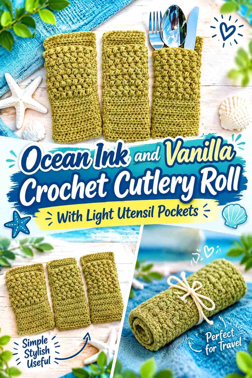
Use Ocean Ink across the main supporting panel and make the utensil pockets Vanilla. When the roll is open, the lighter pockets clearly separate from the dark background; after rolling, Ocean Ink can take over most of the exterior.
Vanilla Can Keep the Ocean Ink Cutlery Pockets Easy to Read
Use Vanilla across the pocket strip when you want each fork, spoon, or reusable utensil to sit against a lighter field. The contrast is especially useful along the tops of neighboring pockets, where the individual slots need to remain visually understandable.
Keep the Vanilla area relatively simple if several pieces of cutlery will already create visual detail.
Ocean Ink Can Give the Vanilla Pocket Panel a Strong Outer Frame
Let Ocean Ink remain visible above and around the Vanilla pockets so the organizer still has a clear dark structure when fully opened.
If the roll includes a fold-over section, repeating Ocean Ink there can also connect the upper and lower parts without adding another color.
Creator Credit: Wigston Family
2. Vanilla and Ocean Ink Crochet Cutlery Roll With Dark Utensil Pockets
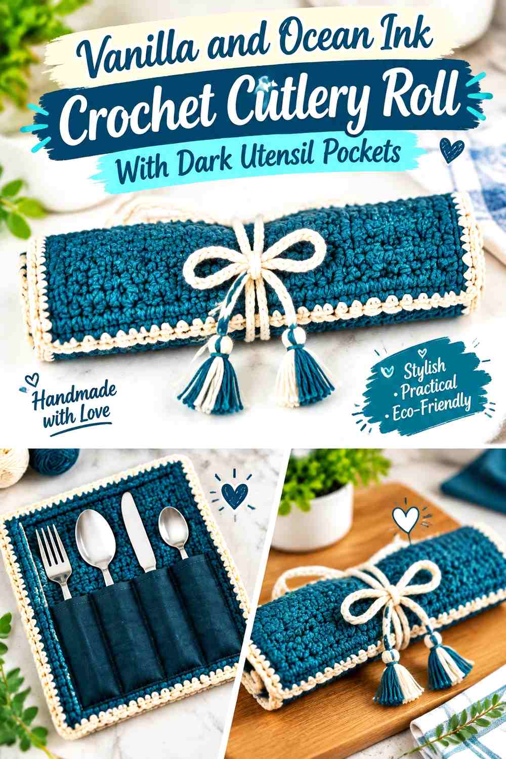
Reverse the hierarchy by placing Ocean Ink on the pocket section and Vanilla across the supporting panel. This keeps the overall roll lighter while giving the actual storage slots more visual weight.
Ocean Ink Can Anchor the Utensil Slots Against Vanilla
A dark pocket panel makes the storage area easy to locate when the roll opens. Keep enough Vanilla visible above the pocket tops so the dark slots do not visually merge with the entire backing.
Ocean Ink is particularly effective when you want the lower portion of the open organizer to feel more structured.
Vanilla Can Keep the Ocean Ink Cutlery Roll From Looking Too Heavy
Use Vanilla across the larger background panel rather than breaking it up with many extra blue details.
Once the organizer is rolled, decide whether some Ocean Ink should remain visible at an edge or closure so the interior pocket color does not disappear completely.
Creator Credit: Crochet With Julie
3. Ocean Ink Crochet Cutlery Roll With a Vanilla Fold-Over Flap
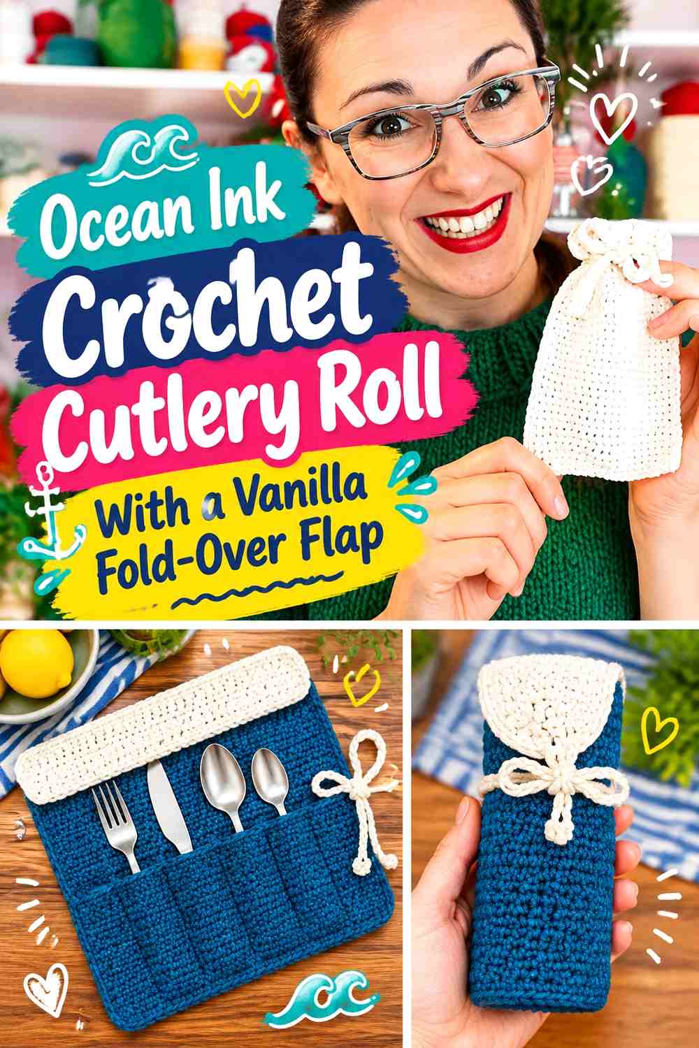
Keep the main roll Ocean Ink and reserve Vanilla for the upper flap that folds over utensil handles before rolling. The contrast gives that protective section a separate visual role rather than making it disappear into the main panel.
Vanilla Can Make the Ocean Ink Fold-Over Flap Easy to Identify
Use Vanilla across most of the flap if you want its boundary to remain obvious when the roll is fully opened.
This placement is practical because the flap often remains visible even after utensils fill the pockets, unlike a small accent placed low on the interior.
Ocean Ink Should Connect the Main Cutlery Panel and Pocket Area
Keep Ocean Ink continuous through the larger body so the Vanilla flap looks intentionally attached to one darker structure.
When the roll closes, check which part of the Vanilla flap remains visible. If very little shows, a small Vanilla repeat at the outer edge can preserve the two-color relationship.
Creator Credit: Hobbii Germany
4. Vanilla Crochet Cutlery Roll With an Ocean Ink Fold-Over Flap
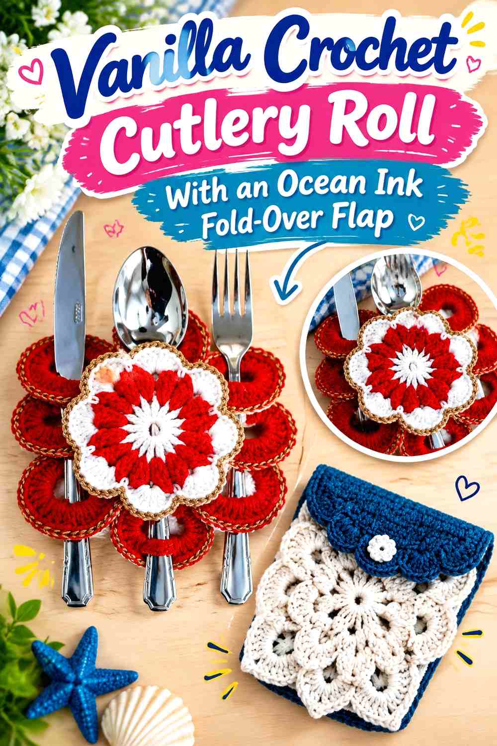
A Vanilla main panel creates a lighter organizer, while Ocean Ink at the top forms a darker cap over the utensil handles. The result gives the fold-over section more authority without making the entire cutlery roll dark.
Ocean Ink Can Define the Top of the Vanilla Cutlery Roll
Let the flap carry a substantial Ocean Ink section rather than reducing the color to a tiny trim. The flap already has a functional reason to be visually separate.
Check how far it folds over the utensils so the dark area does not cover more of the Vanilla interior than you intended.
Vanilla Should Remain Broad Beneath the Ocean Ink Flap
Use Vanilla through most of the backing and pockets if the overall roll should stay light.
A broad neutral field also gives the inserted utensils room to remain visually separate from the dark top section.
Creator Credit: Rhosângella Arte Crochê
5. Ocean Ink Pocket and Vanilla Divider Crochet Cutlery Roll
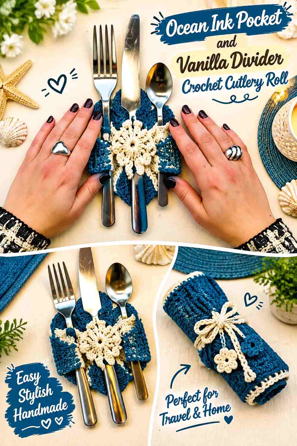
Make the full pocket strip Ocean Ink, then use Vanilla specifically along the lines that distinguish individual utensil slots. This puts the lighter color exactly where organization needs to be visible.
Vanilla Can Clarify Individual Ocean Ink Utensil Pockets
Use Vanilla along pocket divisions or other flat separating lines so adjacent slots do not visually merge into one dark panel.
Keep the contrast narrow enough that Ocean Ink still reads as the pocket color rather than becoming a series of alternating equal-width stripes.
Ocean Ink Should Stay Continuous Between Vanilla Dividers
A connected Ocean Ink field gives the lower half of the roll visual stability. It also makes the Vanilla lines more useful because each one has a clear reason to exist.
Before finalizing divider positions, check them against the actual utensils instead of spacing color lines purely for symmetry.
Creator Credit: Material Grrrlz
6. Vanilla Pocket and Ocean Ink Divider Crochet Cutlery Roll
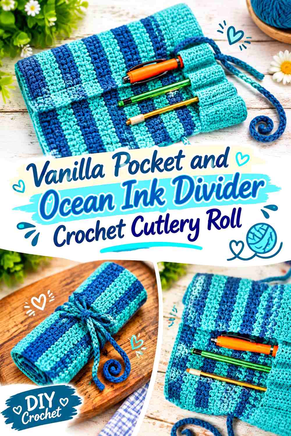
This variation uses Vanilla across the pocket panel and Ocean Ink specifically at the divisions. The darker lines become an organizing grid against a light interior.
Ocean Ink Can Give Vanilla Pocket Dividers Strong Definition
Use the blue at each real pocket boundary rather than adding decorative lines between slots that do not exist.
This allows the palette to explain the construction visually: every dark line signals a change from one utensil space to the next.
Vanilla Can Keep the Ocean Ink Divider System From Feeling Crowded
Leave enough Vanilla between the dark lines for individual pockets to remain broad, clear color fields.
If narrow utensils create very closely spaced pockets, consider emphasizing only the major divisions instead of making every small seam visually dominant.
Creator Credit: HobbyPerline.com
7. Ocean Ink Center-Pocket and Vanilla Side-Panel Crochet Cutlery Roll
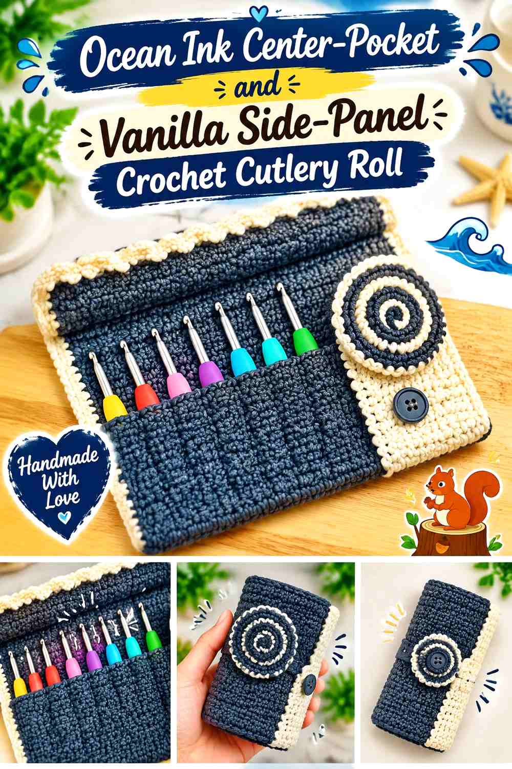
Place Ocean Ink across the central storage zone and use Vanilla on either side. This directs attention toward the utensil row while giving the open roll lighter margins.
Ocean Ink Can Concentrate Attention on the Cutlery Storage Zone
Keep the central Ocean Ink section wide enough to hold the full visual pocket system rather than turning it into a narrow decorative stripe.
When utensils are inserted, the blue should still remain visible between and around them.
Vanilla Side Panels Can Give Ocean Ink More Breathing Room
Use Vanilla outside the main pocket area to lighten the open organizer and provide clear outer boundaries.
Once rolled, these side panels may wrap over the Ocean Ink center and become more visible than expected, so test the color arrangement in the closed position as well.
Creator Credit: It’s all in a Nutshell Crochet
8. Half Ocean Ink and Half Vanilla Crochet Cutlery Roll
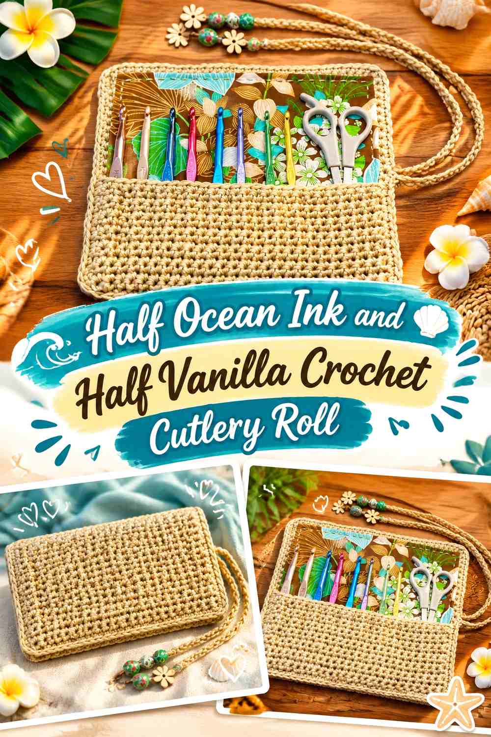
Divide the open organizer into two substantial color fields. One side can be Ocean Ink and the other Vanilla, creating a direct graphic split rather than a dominant color with trim.
Ocean Ink Needs a Complete Cutlery-Roll Section Beside Vanilla
Give Ocean Ink enough uninterrupted area to remain a true color block when the organizer is open.
If the split runs across several pockets, make sure it does not make pocket boundaries harder to understand. Construction should remain clearer than the decorative division.
Vanilla Should Meet Ocean Ink at a Deliberate Roll Boundary
Keep the main color transition clean rather than inserting multiple narrow intermediary stripes.
Roll the organizer from both directions before choosing which side starts the wrap. The color on the outermost section can dominate the appearance of the closed bundle.
Creator Credit: Bag-O-Day Crochet
9. Broad Ocean Ink and Vanilla Stripe Crochet Cutlery Roll
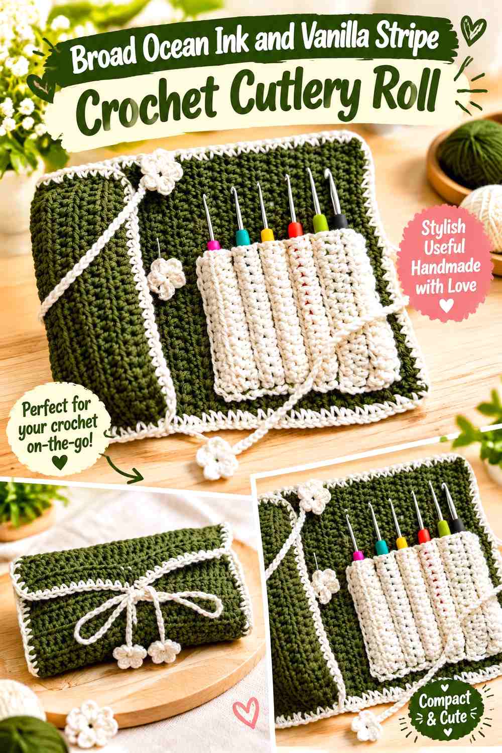
Use a small number of substantial bands across the open panel. Broad stripes let each shade remain recognizable while creating more repetition than a single half-and-half division.
Ocean Ink Broad Bands Need Enough Vanilla Separation
Leave meaningful Vanilla space between dark sections so neighboring Ocean Ink stripes do not visually combine into one large field.
Consider how the bands cross the pocket row. A stripe that lands exactly on pocket tops or dividers can either clarify the construction or make it harder to read depending on its width.
Vanilla Bands Can Control How Dark the Ocean Ink Roll Looks
Increasing Vanilla makes the open organizer visually lighter, while broader Ocean Ink sections create a deeper overall effect.
Check which band becomes the outside face after rolling. One exterior stripe may influence the closed appearance more than all the others combined.
Creator Credit: Alice’s Crochet Corner
10. Vanilla Crochet Cutlery Roll With Fine Ocean Ink Stripes
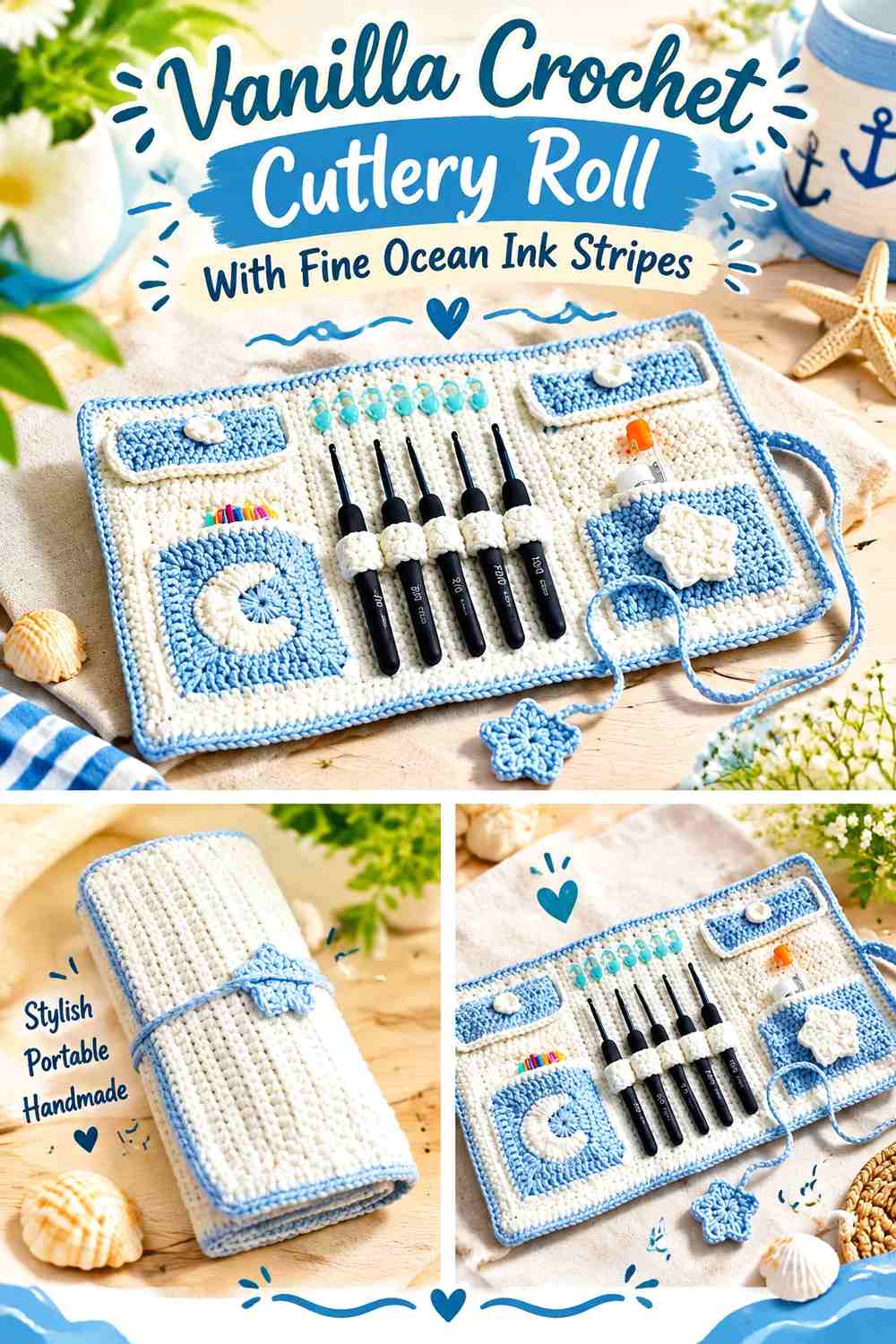
Let Vanilla remain the continuous background and repeat narrow Ocean Ink bands at controlled intervals. This creates more surface detail without giving the darker shade an equal share.
Ocean Ink Pinstripes Need Predictable Spacing Across Vanilla
Repeat the dark lines consistently rather than adding them wherever empty space appears.
Fine stripes can become visually dense once the organizer is rolled and several bands overlap, so check both open and closed views before increasing their number.
Vanilla Should Remain Clearly Visible Between Ocean Ink Lines
Keep enough light space between every Ocean Ink stripe for Vanilla to remain the main field.
If your yarns are closer in value, slightly broader blue bands may work better than very fine lines that lose definition from normal viewing distance.
Creator Credit: sweetloopdreams
11. Ocean Ink Exterior and Vanilla Interior Crochet Cutlery Roll
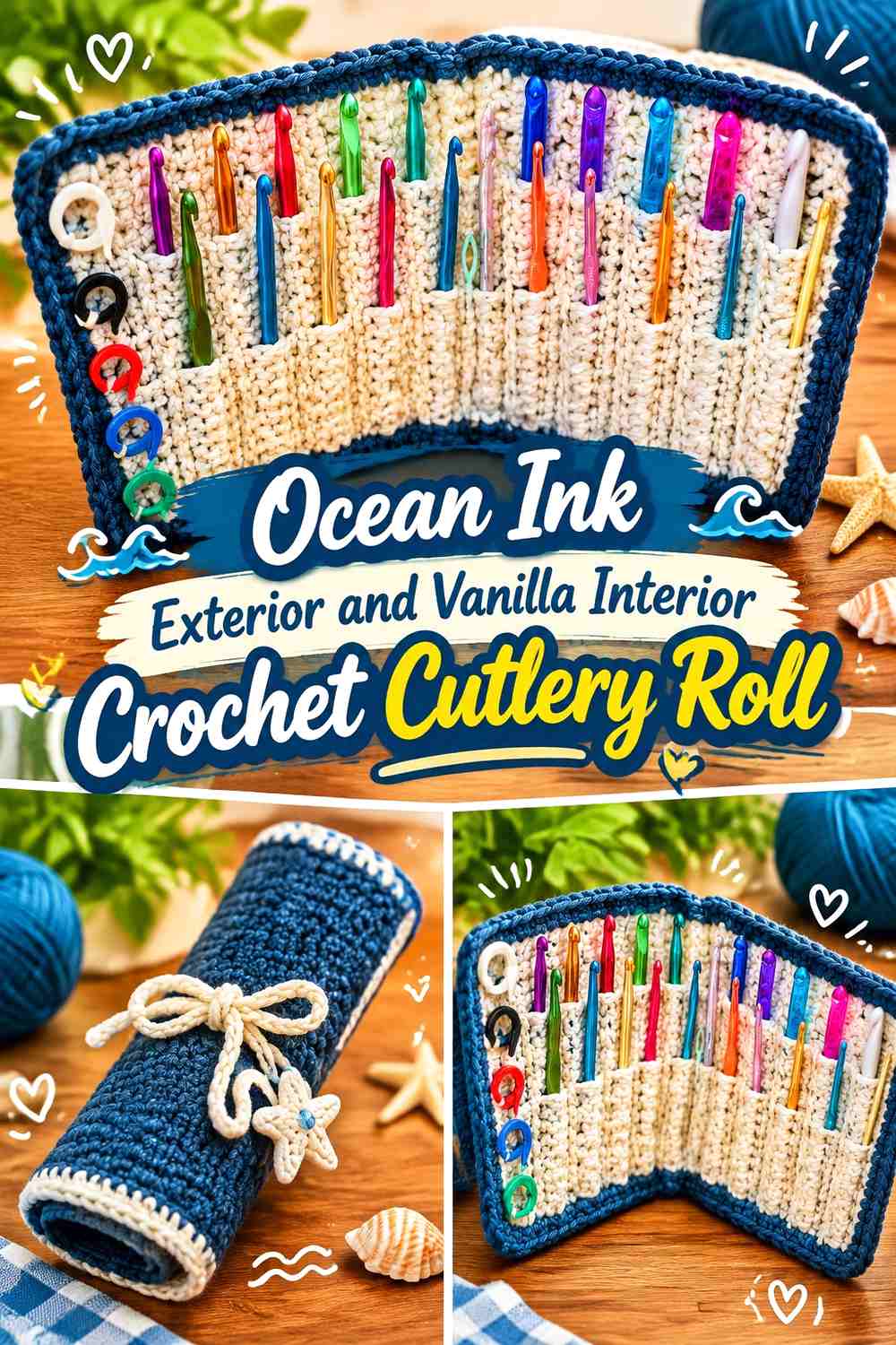
Separate the palette by function: Ocean Ink covers the outward-facing side, while Vanilla occupies the interior panel and pockets. Closed, the roll looks predominantly blue; opened, it changes to a lighter storage surface.
Ocean Ink Can Keep the Closed Cutlery Roll Visually Consistent
Use Ocean Ink across the full exterior when you want the traveling or picnic bundle to look simple from the outside.
A solid outer surface also allows the ties or border to become the only additional visible details when the roll is closed.
Vanilla Can Brighten the Interior Against Ocean Ink
Use Vanilla where the cutlery actually sits so the open organizer changes character completely.
Pay attention to edges and pocket tops where the two faces meet. A clean transition reinforces the intentional exterior-versus-interior color strategy.
Creator Credit: naztazia
12. Vanilla Exterior and Ocean Ink Interior Crochet Cutlery Roll

Reverse the two-face strategy so the roll looks light when closed and reveals a darker pocketed interior after opening. This puts Ocean Ink where the utensil organization becomes most important.
Vanilla Can Keep the Closed Ocean Ink Cutlery Roll Light
Make Vanilla the uninterrupted outer panel when you want the packed roll to remain visually neutral.
If the tie is also Vanilla, consider whether a small Ocean Ink edge should remain visible so the second color does not vanish completely when closed.
Ocean Ink Can Give the Vanilla Roll a Defined Storage Interior
Use Ocean Ink across the pockets and backing area where forks, spoons, and other utensils sit.
If your utensils are dark or have colored handles, compare them directly against Ocean Ink before deciding whether a Vanilla pocket edge would improve separation.
Creator Credit: Ninja Bunny Crochet
13. Ocean Ink Crochet Cutlery Roll With Vanilla Ties
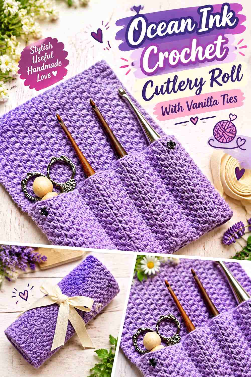
Keep the main body and pocket system Ocean Ink, then reserve Vanilla for the ties or closure cords. This is one of the most restrained ways to introduce the lighter shade.
Ocean Ink Can Stay Uninterrupted Across the Main Cutlery Roll
Use the dark shade through the exterior, interior backing, or both when you want one strong primary color.
Because the roll itself is visually simple, pocket seams and utensil shapes become more noticeable without repeated color bands competing with them.
Vanilla Can Make the Ocean Ink Closure Easy to Locate
Contrasting ties remain visible against the dark rolled bundle and give Vanilla a clear functional role.
Make sure the tie position suits the way the organizer closes. Color should follow the actual closure rather than requiring an extra cord solely for decoration.
Creator Credit: Rich Textures Crochet
14. Vanilla Crochet Cutlery Roll With Ocean Ink Ties
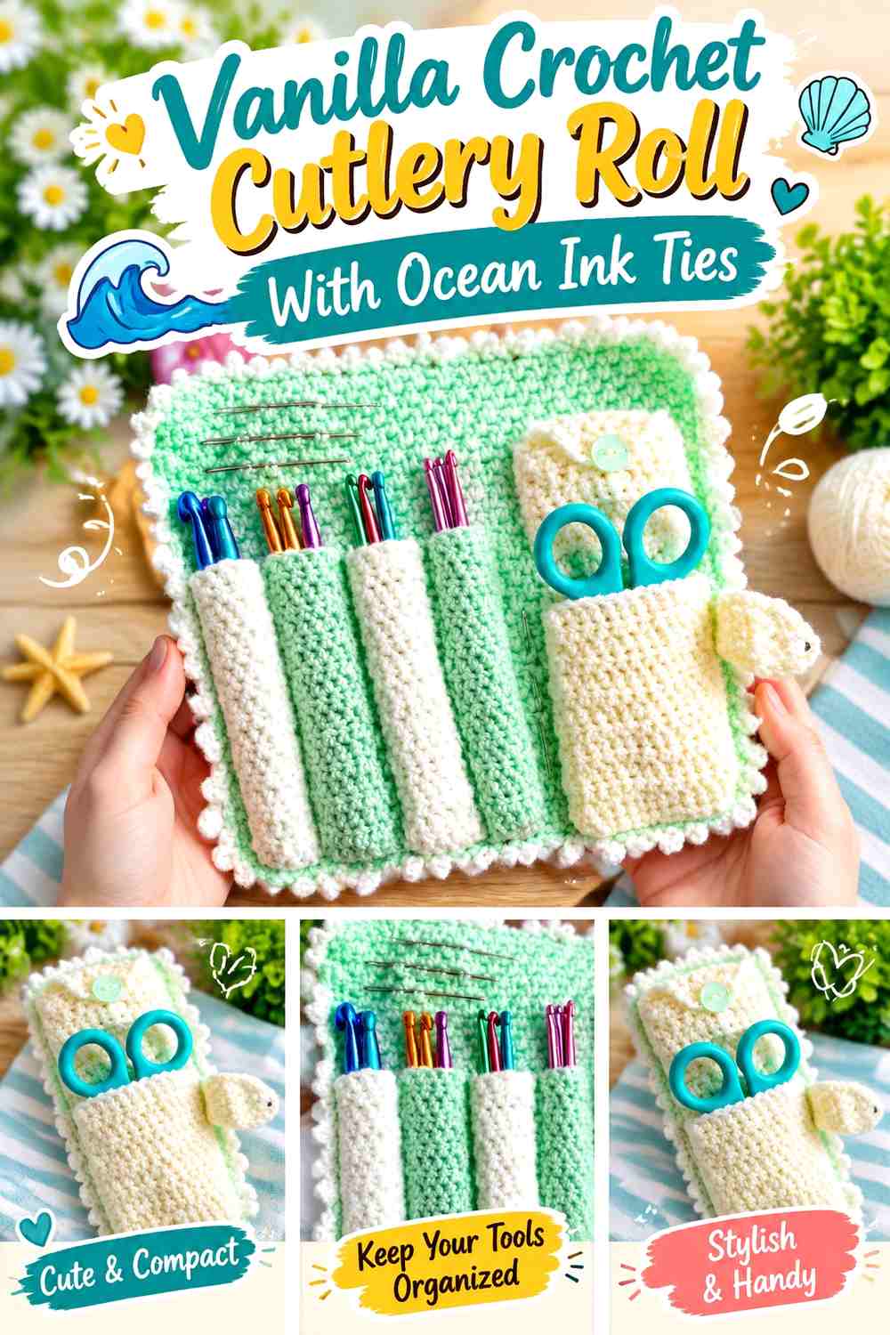
A Vanilla-dominant organizer can use Ocean Ink only at the closure. The dark ties provide strong visual punctuation while leaving the panel, pockets, and flap lighter.
Vanilla Can Keep the Main Cutlery Roll Visually Quiet
Use Vanilla broadly when the inserted utensils and pocket divisions already provide enough visual complexity.
This direction also makes Ocean Ink more powerful because it appears in only one concentrated functional location.
Ocean Ink Can Anchor the Vanilla Roll at the Closure
Use Ocean Ink for the ties or fastening section so the closed roll has a dark line crossing or surrounding the light bundle.
If the construction uses a button, loop, or another closure instead of ties, apply Ocean Ink to that real feature rather than inventing a different fastening method.
Creator Credit: thisfairymade
15. Ocean Ink and Vanilla Block-Accent Crochet Cutlery Roll
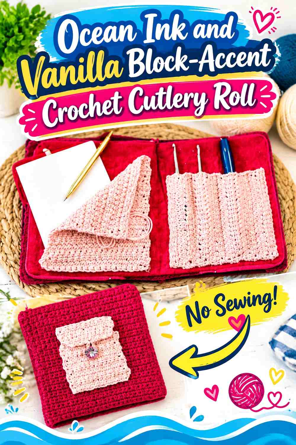
Use larger irregular blocks instead of stripes. Ocean Ink can occupy the primary panel while a few substantial Vanilla sections mark the flap, selected pockets, or exterior corners.
Vanilla Blocks Should Have Clear Jobs Within Ocean Ink
Place each Vanilla area on a real part of the organizer, such as a pocket group or flap, instead of scattering light patches randomly.
Larger blocks remain easier to understand after the roll is folded and wrapped around itself.
Ocean Ink Should Connect the Vanilla Blocks Into One Cutlery-Roll Design
Keep enough Ocean Ink between the light areas for the blue to remain a continuous base.
If Vanilla begins appearing in every pocket and panel, the layout will lose its block-accent character and become a balanced patchwork instead.
Creator Credit: Nicki’s Homemade Crafts
16. Marled Ocean Ink and Vanilla Crochet Cutlery Roll

Blend Ocean Ink and Vanilla through the main panel instead of assigning them separate sections. The mixed surface can then be paired with a solid pocket strip or border so the organizer still has clearly defined functional areas.
Ocean Ink and Vanilla Need a Test Before You Blend the Main Panel
Work a sample and look at it from both close range and normal viewing distance. The two colors should still read as an intentional mixture instead of becoming a visually muddy intermediate shade.
If combining strands changes the thickness of the fabric, confirm that the roll can still fold or wrap in the way the chosen construction requires.
Solid Ocean Ink Can Give a Marled Ocean Ink and Vanilla Roll Structure
Use Ocean Ink alone for pocket tops, an outer edge, or another flat boundary to give the mixed panel a stronger frame.
Vanilla can serve the same role for a lighter finish, but one solid defining color is usually enough around an already blended surface.
Creator Credit: Juliet Barber
17. Graduated Ocean Ink and Vanilla Crochet Cutlery Roll
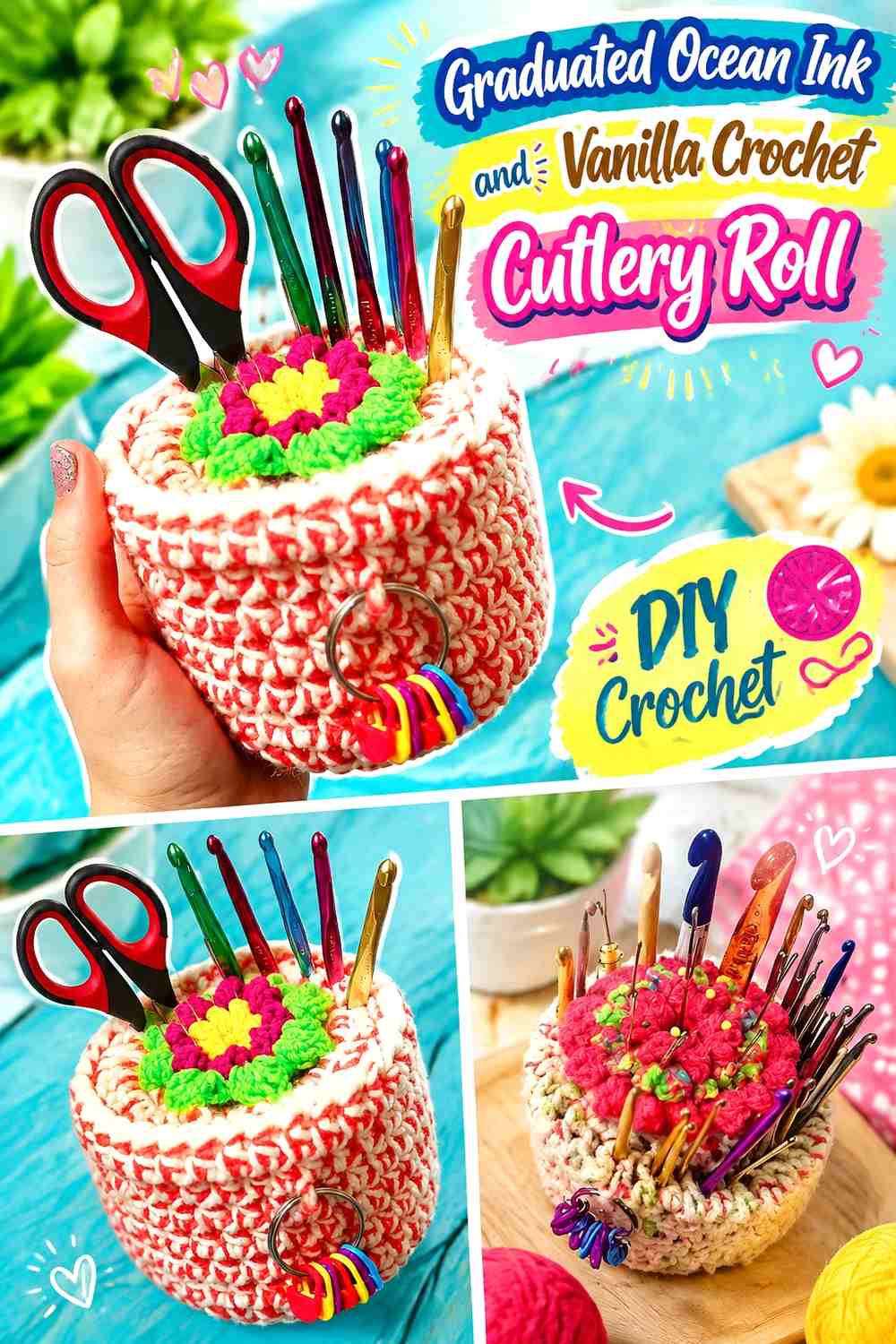
Change the proportion of the two colors across the organizer so one side begins Ocean Ink-heavy and the other finishes Vanilla-heavy. This creates a directional transition using only the requested palette.
Ocean Ink Can Recede as Vanilla Crosses the Cutlery Roll
Begin with a broad Ocean Ink area and gradually reduce its share through later bands or panels.
Make each change large enough to remain visible once utensils interrupt the open surface. Very subtle differences can disappear when the roll is in use.
Vanilla Should Expand Clearly as Ocean Ink Narrows
Increase Vanilla enough that the opposite end genuinely reads lighter instead of looking like another ordinary striped section.
Consider which end becomes the outside layer when the organizer is rolled. Starting the wrap from the Ocean Ink or Vanilla side will change which part of the gradient dominates the closed bundle.
Creator Credit: Mariie Crochet
Which Ocean Ink and Vanilla Crochet Cutlery Roll Should You Choose?
For an Ocean Ink-dominant organizer, Ideas 1, 3, 5, 7, and 13 keep the darker shade in control while using Vanilla to clarify pockets, flaps, or closures. Ideas 2, 4, 6, 10, and 14 create a lighter direction with Ocean Ink supplying stronger definition.
Ideas 8 and 9 are better when you want both shades to occupy substantial visible space. The half-and-half option gives one bold division, while broad bands repeat the relationship across the roll.
Ideas 11 and 12 are especially useful when you want the closed and opened organizer to look different. Idea 15 uses larger graphic blocks, Idea 16 gives the palette its softest blended treatment, and Idea 17 creates the strongest directional change from one end to the other.
Conclusion
Ocean Ink and Vanilla can change a crochet cutlery roll substantially without requiring a larger palette. Ocean Ink works particularly well for pocket systems, outer panels, dividers, edges, and closures that need stronger visual definition. Vanilla can lighten an interior, separate dark pockets, distinguish a fold-over flap, or make closure details visible against an Ocean Ink body.
The most useful layout depends on how the organizer looks both open and rolled. Before finalizing the colors, insert the actual utensils, fold any protective flap, and roll the piece into its travel position. That check shows which colors disappear, which dividers remain visible, and which shade ultimately controls the exterior.
Use the credited tutorials for their demonstrated cutlery-holder or pocketed-organizer construction concepts, and adjust a compatible design only after checking the size and containment needs of the utensils you intend to carry.
Frequently Asked Questions
Should Ocean Ink or Vanilla Be the Main Color in a Crochet Cutlery Roll?
Either can lead. Ocean Ink gives the organizer a deeper overall appearance and is useful for defining pockets and exterior panels. Vanilla creates a lighter roll and lets smaller Ocean Ink details such as pocket divisions, ties, or borders carry more visual weight.
Where Should Vanilla Go on a Mostly Ocean Ink Crochet Cutlery Roll?
Useful locations include utensil pockets, pocket dividers, the fold-over flap, edging, or closure ties. Choose one or two clear roles rather than scattering Vanilla through every section if Ocean Ink is supposed to remain dominant.
How Can Ocean Ink and Vanilla Help Separate Individual Cutlery Pockets?
Use one color for the pocket field and the other along real pocket divisions or pocket tops. Strong light/dark contrast can make the slots easier to distinguish visually when the roll is open. Plan those divisions around the actual utensils rather than choosing spacing based only on appearance.
Should the Ocean Ink and Vanilla Ties Match the Exterior?
They can, but they do not have to. Matching ties create a quieter closed bundle, while a contrasting tie keeps the secondary color visible after the interior has been rolled out of sight.
Can Ocean Ink and Vanilla Be Used in Equal Amounts?
Yes. Half-and-half blocking or broad alternating bands can give both shades comparable importance. Test the organizer after rolling it, though, because the outermost layer may cause one color to dominate even when the open panel is evenly balanced.
How Do I Adapt the Ocean Ink and Vanilla Pockets to My Own Cutlery?
Use the actual utensils as the sizing reference and confirm that each planned pocket can hold its intended item before final assembly. Different forks, spoons, knives, and reusable utensils can vary substantially, so avoid relying on an assumed universal pocket width.
What Should I Check Before Carrying a Knife in a Crochet Cutlery Roll?
Make sure the chosen construction holds the knife securely and does not leave a sharp tip or edge exposed through the pocket or rolled bundle. If the crochet construction cannot contain that particular utensil appropriately, store the knife separately rather than depending on decorative color placement or a loose pocket.