Persimmon sits between orange, coral, and warm red, which gives it enough visual strength to lead a crochet palette without requiring several other saturated colors. The key is deciding where persimmon should dominate and where a lighter, darker, cooler, or more muted shade should interrupt it.

These 20 persimmon crochet ideas use cardigans, bags, hats, blankets, accessories, and home décor to show different ways to handle that balance. Each linked tutorial supports the crochet project or construction concept; the persimmon color schemes below are independent palette ideas, so the creators are not being credited with colors they did not necessarily use.
Quick List
- Persimmon and Oatmeal Crochet Cardigan
- Persimmon, Cream, and Olive Crochet Tote Bag
- Persimmon and Deep Teal Crochet Bucket Hat
- Persimmon, Camel, and Espresso Crochet Beanie
- Persimmon, Blush, and Cream Crochet Halter Top
- Persimmon and Charcoal Crochet Sweater
- Persimmon and Dusty Rose Crochet Scrunchie
- Persimmon and Espresso Crochet Slippers
- Persimmon and Sage Crochet Mug Cozy
- Persimmon and Ivory Crochet Coasters
- Persimmon and Navy Crochet Vest
- Persimmon, Burgundy, and Cream Crochet Pillow
- Persimmon and Plum Crochet Shawl
- Persimmon, Soft Gold, and Cream Crochet Baby Blanket
- Persimmon, Olive, and Mustard Crochet Flower Appliqués
- Persimmon and Denim Blue Crochet Scarf
- Persimmon and Black Crochet Handbag
- Persimmon and Ecru Crochet Bandana
- Persimmon and Seafoam Crochet Market Bag
- Persimmon and Mauve Crochet Pouch
Make Persimmon the Anchor, Not the Only Color
Persimmon is strong enough to cover a large part of a crochet project, but using it everywhere can make borders, ribbing, motifs, and raised texture merge into one visual field. Decide what should attract attention first. On a cardigan that may be the body panels; on a tote it may be the motif faces; on a pillow it may be the center surface.
Supporting colors should then perform a job. A pale neutral can expose stitch definition, a dark shade can frame an edge, and a muted cool shade can interrupt persimmon without competing with it. Giving colors different amounts of space usually creates more order than distributing every shade equally.
Check Light-Dark Contrast Before Committing to a Persimmon Palette
Color difference and value difference are not the same thing. Persimmon and another medium-depth color can look distinct as yarn balls yet become less separated once both are worked into textured crochet.
Place candidate yarns together and view them from a little distance. A grayscale photo can also help reveal whether small motifs, stripes, edges, or joins have enough light-dark separation. This matters most when persimmon sits beside another strong midtone such as burgundy, olive, or mauve.
1. Persimmon and Oatmeal Crochet Cardigan

Let persimmon dominate the cardigan body while oatmeal handles selected borders, cuffs, or pocket details. The pale neutral creates a clear break around a large wearable, so persimmon remains the identity of the cardigan without covering every visible surface. This direction works especially well when you want the garment construction and edging to remain easy to distinguish.
Let Persimmon Lead the Crochet Cardigan Body Panels
Use persimmon across the largest body areas before deciding how much oatmeal to introduce. Keeping the front and back visually connected prevents the light neutral from chopping the cardigan into several equally strong blocks.
Oatmeal Keeps Persimmon Crochet Cuffs and Edging Distinct
Oatmeal can mark cuffs, lower edging, or pocket edges where a lighter value helps separate finishing details from the persimmon body. If the contrast feels too sharp, replace bright cream with a warmer oatmeal or beige while keeping it noticeably lighter than persimmon.
Creator Credit: forthefrills
2. Persimmon, Cream, and Olive Crochet Tote Bag
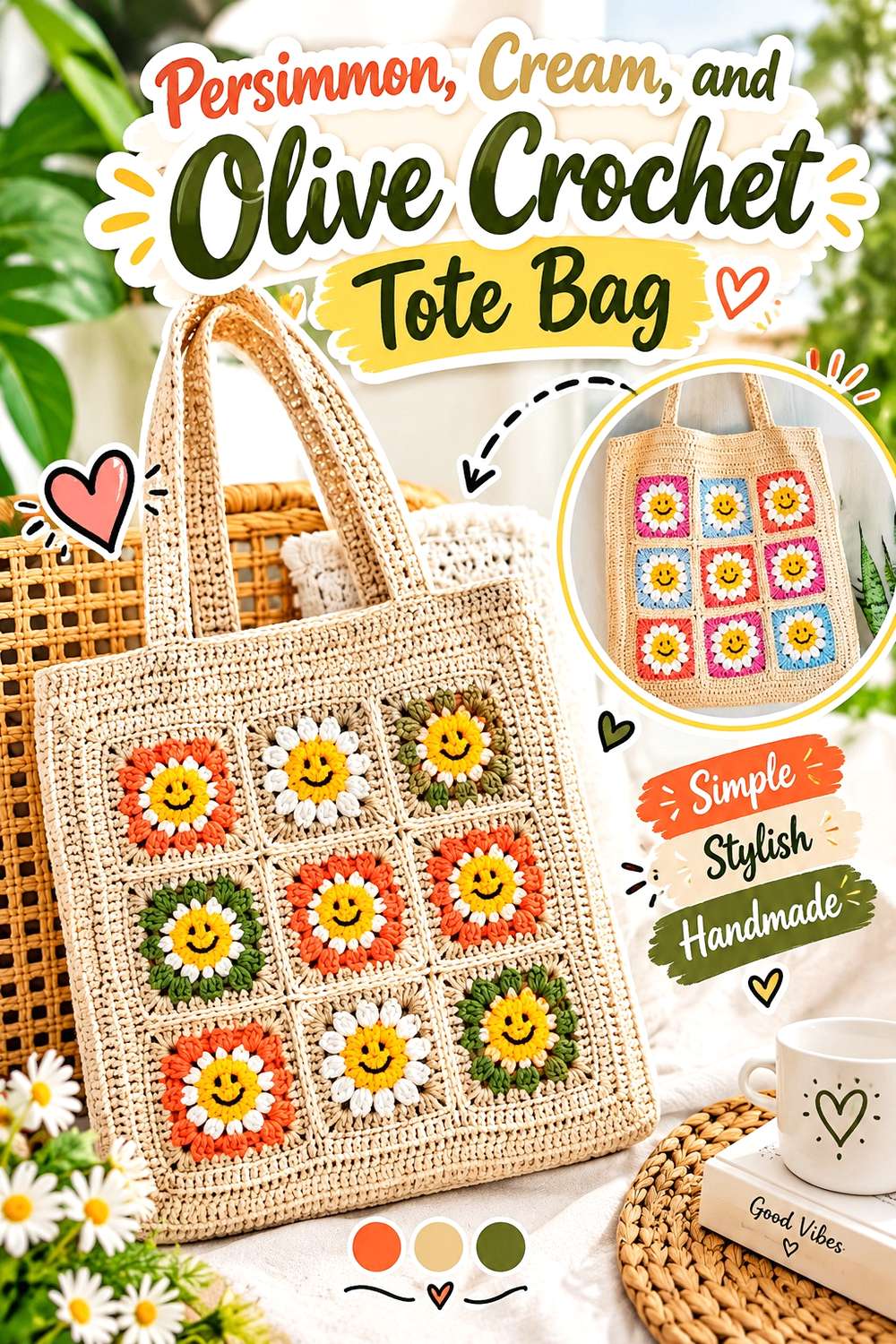
For a motif-based tote, persimmon can provide the recurring warm color, cream can separate shapes, and olive can add a muted botanical contrast. Avoid giving all three colors identical coverage. A persimmon-led arrangement with smaller olive areas and strategic cream breaks keeps the bag from becoming visually scattered.
Keep Persimmon Dominant Across the Crochet Tote Motifs
Repeat persimmon in the major motif areas or across most of the bag body rather than using it only once. Repetition is particularly useful on a tote because separate squares or panels need a common color to feel related after joining.
Cream Can Separate Persimmon and Olive Crochet Details
Persimmon and olive can both carry substantial visual weight, so a cream round, join, or border can stop adjacent motifs from blending into a dense block. If you prefer less contrast, choose a warm cream instead of a stark white.
Creator Credit: Chenda DIY
3. Persimmon and Deep Teal Crochet Bucket Hat
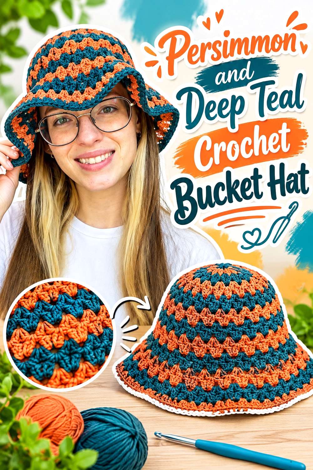
Deep teal gives persimmon a cooler, darker partner without turning the bucket hat into a neutral palette. Because a hat has limited surface area, the two shades need a deliberate hierarchy. Persimmon can cover most of the crown and brim while teal appears as controlled bands or smaller repeated sections.
Give Persimmon Most of the Crochet Bucket Hat Surface
A larger persimmon area keeps the hat readable as a persimmon project. If teal occupies half the crown and half the brim, the result becomes a two-color hat rather than a clearly persimmon-led scheme.
Deep Teal Can Define Persimmon Around the Crochet Hat Brim
A darker teal near the brim can create a strong finishing line against persimmon. You can also repeat a smaller amount closer to the crown so the dark accent does not appear disconnected from the rest of the hat.
Creator Credit: PassioKnit Kelsie
4. Persimmon, Camel, and Espresso Crochet Beanie

This palette stays warm but creates depth through value. Persimmon provides the recognizable color, camel supplies a quieter transition, and espresso can mark the darkest details. On a compact beanie, keeping espresso limited prevents the darkest shade from visually shrinking the persimmon sections.
Repeat Persimmon Clearly Across the Crochet Beanie
Make persimmon the main body color or repeat it often enough that camel does not become the dominant neutral. This is especially important on a small item where even one broad contrasting band can change the overall color balance.
Espresso Can Frame Persimmon Crochet Ribbing Without Taking Over
Use espresso where a narrow dark line can clarify an edge or band. If espresso feels too severe beside persimmon, shift toward a softer dark brown while preserving the light-dark difference that gives the beanie definition.
Creator Credit: MJ’s Off The Hook Designs
5. Persimmon, Blush, and Cream Crochet Halter Top
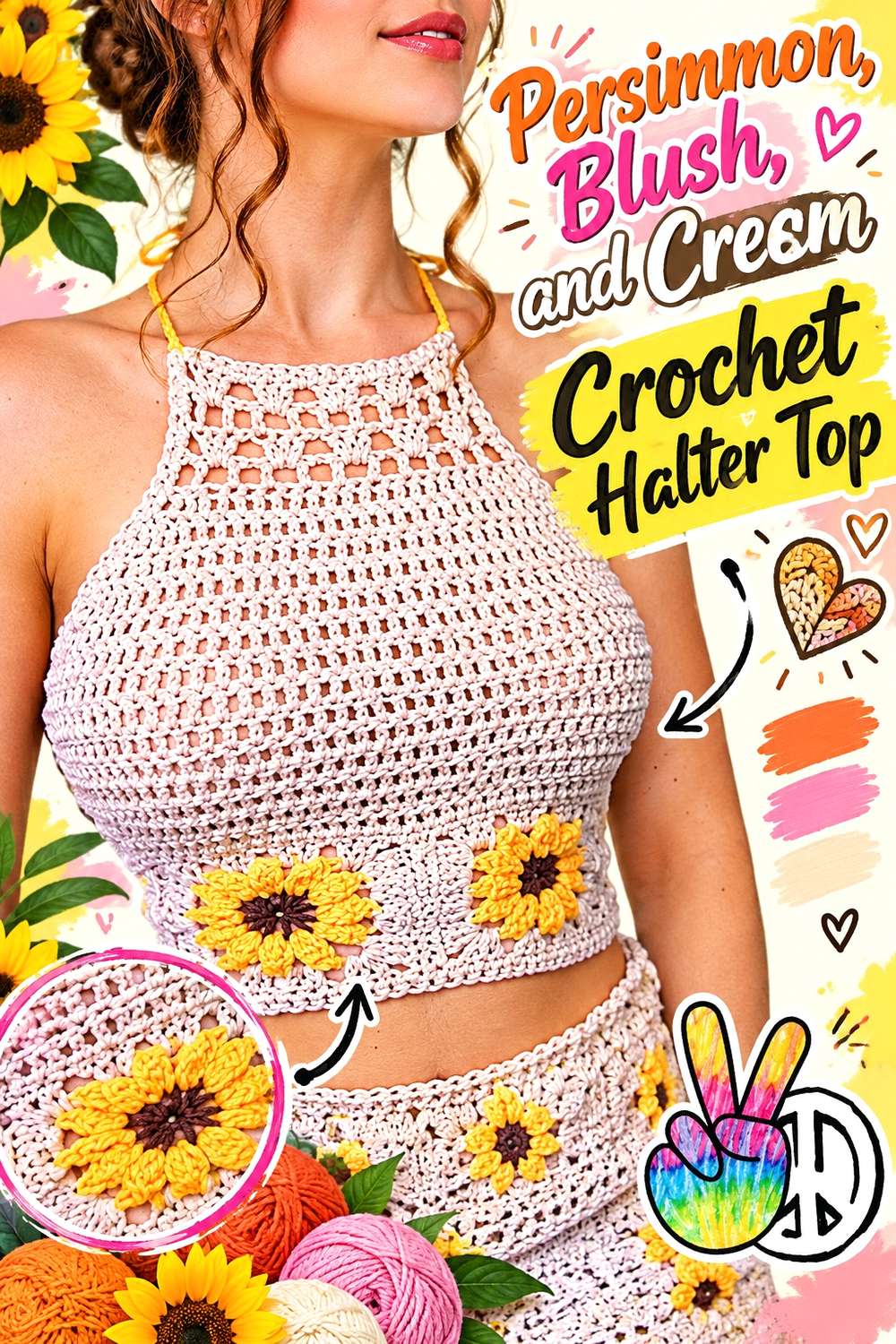
Blush gives persimmon a softer neighboring hue while cream creates the separation the two warm colors may need. Persimmon can lead the main top, with blush used selectively and cream reserved for edges or transitions. This prevents two related warm shades from merging across the garment.
Keep Persimmon Strongest Across the Crochet Halter Top
Use persimmon where you want the main visual block rather than splitting the body evenly between persimmon and blush. A dominant color makes the finished top easier to coordinate with simple neutral layers or bottoms.
Cream Separates Persimmon and Blush Crochet Sections
If persimmon and blush look too similar once crocheted, a narrow cream section can create a clearer boundary. Preserve that value difference when substituting colors: the separator should remain lighter than both warm shades.
Creator Credit: Brunaticality
6. Persimmon and Charcoal Crochet Sweater
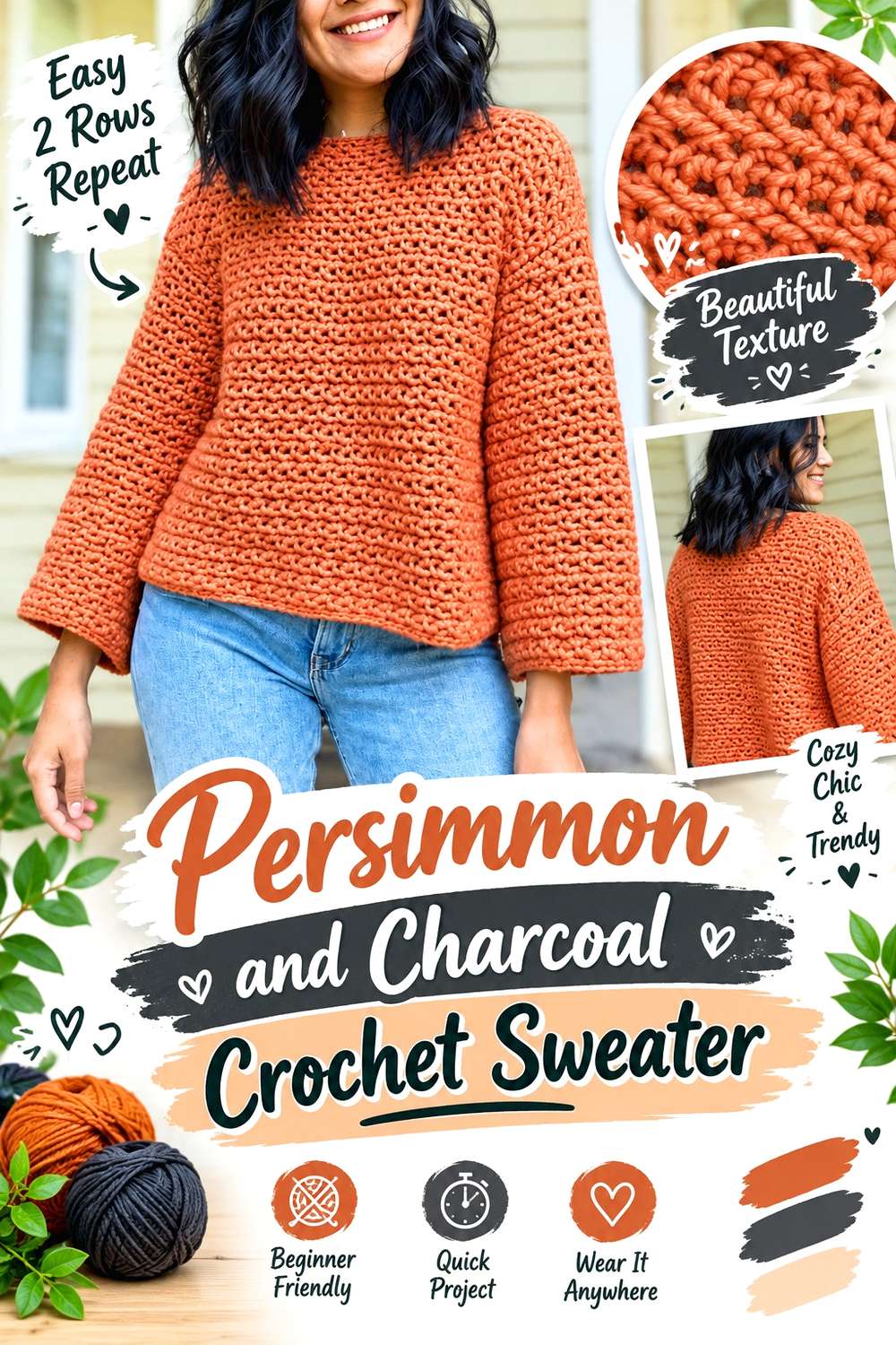
Charcoal changes persimmon from an all-warm palette into a sharper, more graphic wearable. Let persimmon occupy the sweater body and use charcoal where structural edges benefit from darker definition. Because charcoal has considerable visual weight, small amounts can influence the sweater more than an equally sized cream accent would.
Persimmon Works Well as the Crochet Sweater’s Main Field
Keeping the broad front and back areas persimmon makes the garment feel cohesive. If you introduce charcoal in large blocks on both body and sleeves, compare the balance before continuing so the dark shade does not become the visual lead.
Charcoal Gives Persimmon Crochet Cuffs and Neckline a Strong Frame
Cuffs, neckline edging, or a restrained hem treatment are useful places for charcoal because they create boundaries around the larger persimmon field. For a softer version, substitute a medium-dark gray while maintaining enough contrast to keep those finishing areas visible.
Creator Credit: KnitcroAddict
7. Persimmon and Dusty Rose Crochet Scrunchie
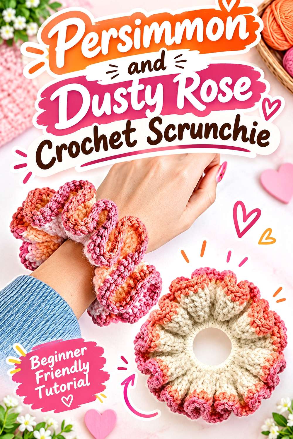
A scrunchie gives you very little space for a complicated hierarchy, so two related colors are enough. Persimmon can provide the stronger ruffled surface while dusty rose softens selected sections. The combination stays warm without relying on a dark outline.
Let Persimmon Cover More of the Crochet Scrunchie Ruffle
Give persimmon the larger share if you want the accessory to read clearly from a distance. Small projects can lose a main color quickly when several shades are divided into equal amounts.
Dusty Rose Softens Persimmon Without Hiding Crochet Texture
Choose a dusty rose that is visibly lighter or more muted than the persimmon. If both shades have almost the same depth and saturation, the ruffled construction may visually merge instead of showing two deliberate color areas.
Creator Credit: ElyseCrochets 💌
8. Persimmon and Espresso Crochet Slippers
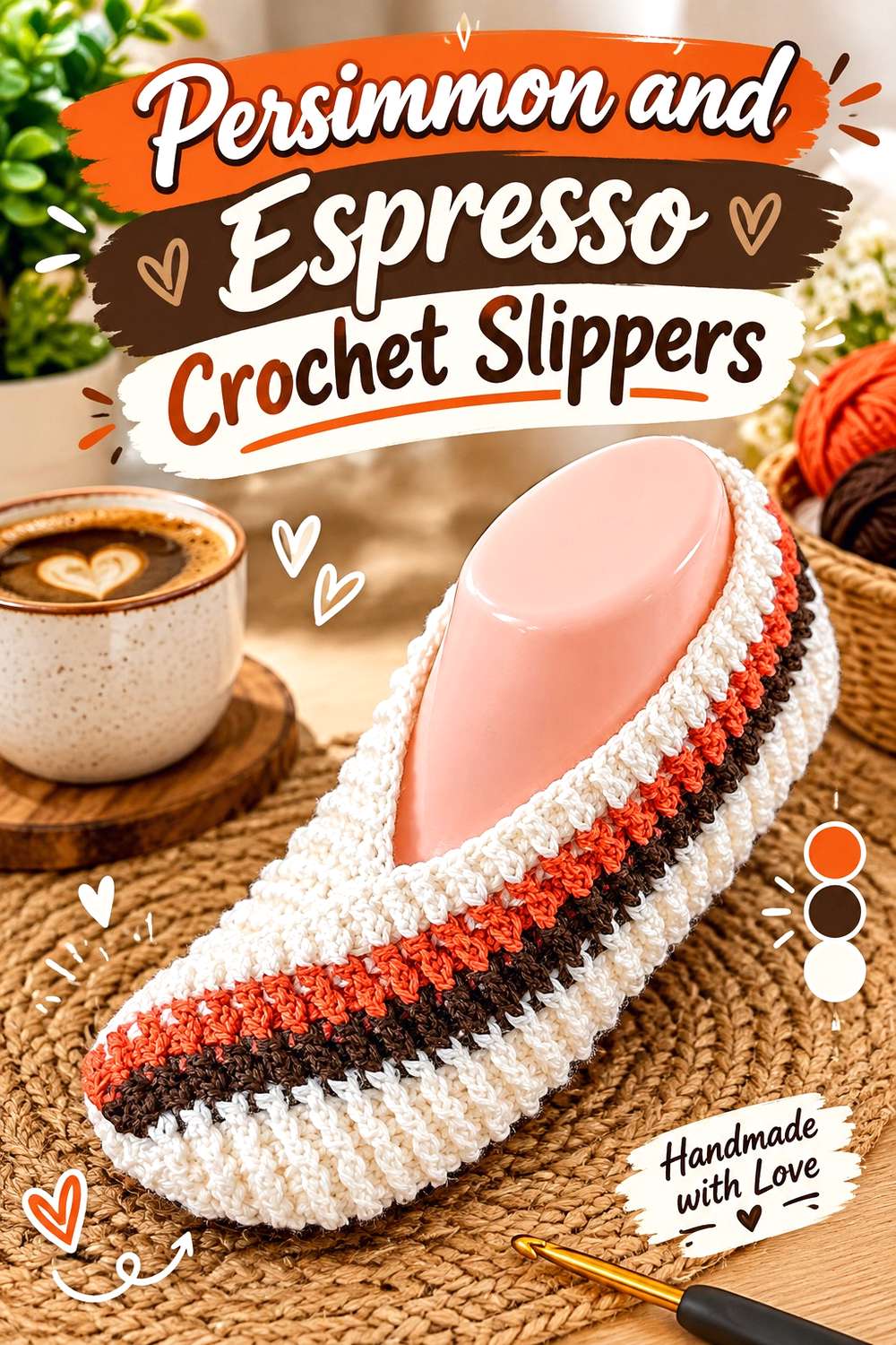
Persimmon can cover the upper portion of the slippers while espresso provides a darker visual base or narrow finishing detail. Keeping the same color distribution on both slippers also matters: inconsistent accent placement can make a matched pair appear less connected.
Persimmon Keeps the Crochet Slipper Upper Visually Consistent
Use persimmon across the largest visible upper sections so both slippers clearly belong to the same palette. If you add stripes or blocks, repeat their position across the pair rather than improvising each slipper independently.
Espresso Can Ground Persimmon Around Crochet Slipper Edges
A dark brown edge can provide definition without introducing another bright hue. Keep espresso relatively narrow if you want persimmon to remain dominant, particularly around areas where a dark section would otherwise occupy a large share of the visible slipper.
Creator Credit: Di’s Handicrafts (Crochet and Knitting)
9. Persimmon and Sage Crochet Mug Cozy
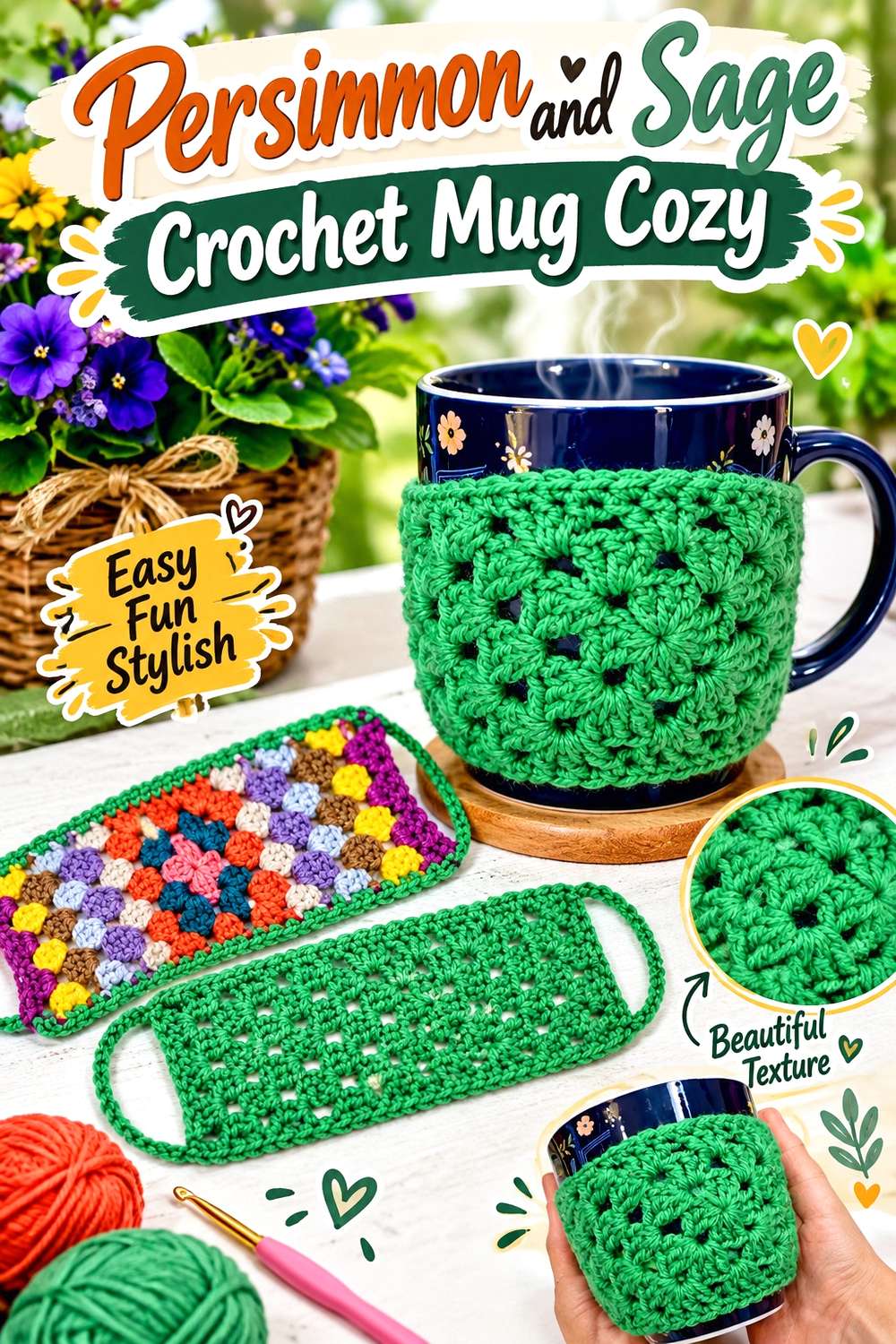
Sage gives persimmon a muted green counterpoint that works well on a small home accessory. Persimmon can lead the main surface, while sage appears around selected granny-style details, edges, or fastening areas. The muted green prevents the two-color combination from becoming overly saturated.
Keep Persimmon Central on the Crochet Mug Cozy
Place persimmon across enough of the central surface that the cozy still looks persimmon-led when wrapped around a mug. If sage is used in every surrounding section, reduce its share rather than adding a third strong color.
Sage Gives Persimmon Crochet Details a Cooler Break
A muted sage edge can interrupt the warmth of persimmon without creating the stark contrast of black or white. Choose a sage with enough value difference to stay visible against persimmon, especially where the crochet detail is small.
Creator Credit: Katia Creates
10. Persimmon and Ivory Crochet Coasters
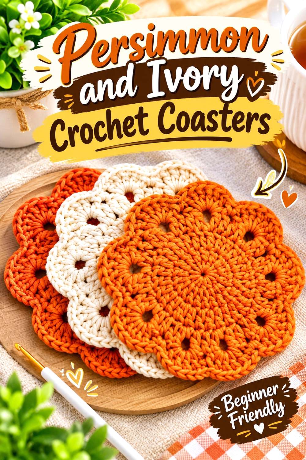
Persimmon and ivory make a simple two-color home palette where the contrast can do most of the work. Persimmon can occupy the center or strongest decorative section, while ivory reveals outer stitch shapes and gives the coaster a lighter visual frame.
Persimmon Works Well at the Center of a Crochet Coaster
A persimmon center creates a clear focal point without requiring multiple accent shades. Repeat the same placement across a set if you want several coasters to look coordinated even when small details vary.
Ivory Keeps Persimmon Crochet Stitch Shapes Easy to Read
Use ivory near textured or scalloped outer details when those shapes disappear in a solid persimmon version. A warm ivory usually creates a gentler transition than bright white while maintaining useful light-dark separation.
Creator Credit: Designs by Phanessa
11. Persimmon and Navy Crochet Vest
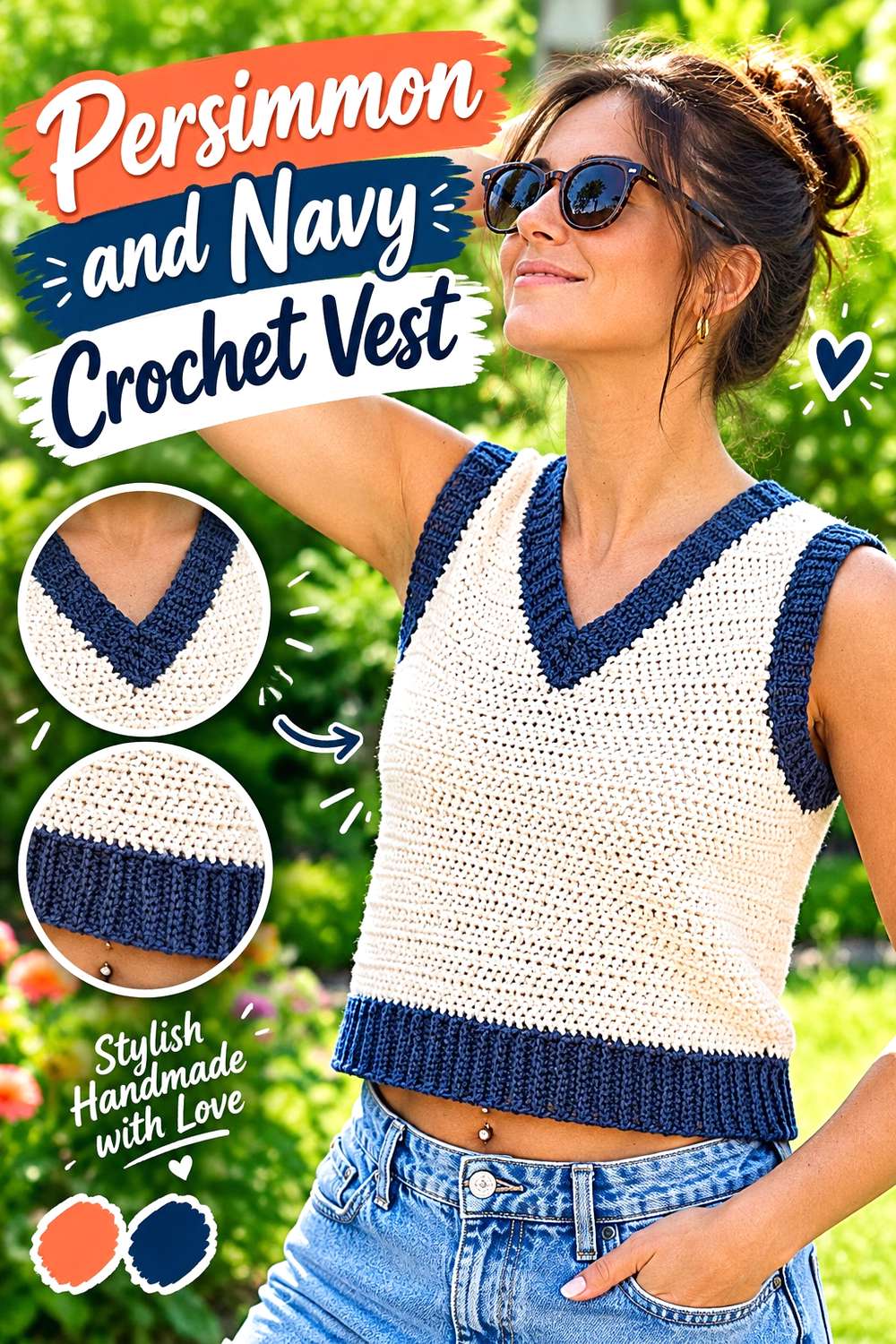
Navy gives persimmon a dark, cool partner that can clarify the edges of a wearable. Let persimmon fill most of the front and back panels, then use navy strategically around finishing areas rather than dividing the vest into equal orange and blue blocks.
Persimmon Makes the Crochet Vest Body the Main Color Block
A broad persimmon body gives the sleeveless shape a clear identity and leaves room for the darker accent to perform a structural role. Check the front and back together before adding more navy so the garment stays visually balanced from both sides.
Navy Can Frame Persimmon Crochet Necklines and Armholes
Navy around a neckline or armhole can create a crisp boundary against persimmon. If the dark trim begins to dominate, repeat a smaller navy detail near the lower edge instead of simply widening every border.
Creator Credit: Leelee Knits
12. Persimmon, Burgundy, and Cream Crochet Pillow
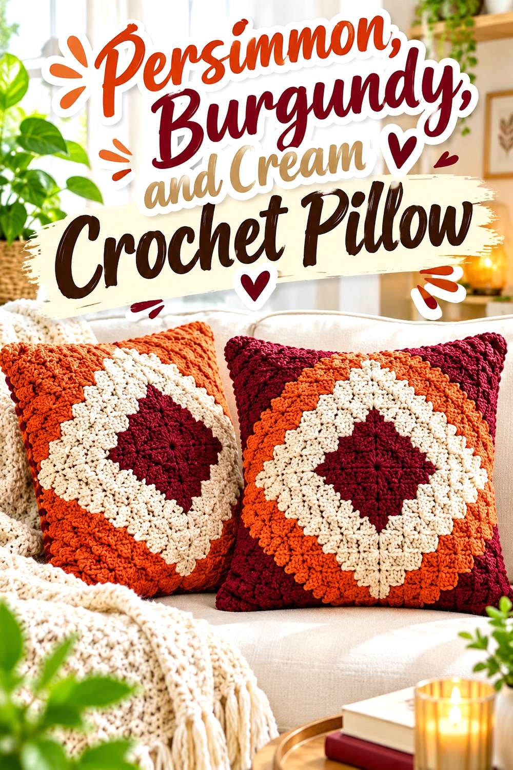
Persimmon and burgundy create a rich warm combination, but their values can be close enough to reduce clarity in a textured or block-based pillow. Cream provides the necessary breathing room. Keep persimmon across most of the pillow face, use burgundy more selectively, and allow cream to separate important shapes.
Persimmon Should Occupy Most of the Crochet Pillow Face
A larger persimmon field lets the pillow coordinate easily with surrounding beige, brown, cream, or wood-toned décor. Burgundy can then supply depth without turning the entire cushion into a very dark warm block.
Cream Keeps Burgundy and Persimmon Crochet Blocks Separate
Place cream wherever persimmon and burgundy details need clearer boundaries, particularly around smaller blocks or an outer frame. If you remove cream entirely, compare the two warm shades in grayscale first to see whether enough value contrast remains.
Creator Credit: The Crochet Crowd
13. Persimmon and Plum Crochet Shawl

Plum pushes a persimmon shawl toward a deeper, more dramatic color direction. Because both colors are substantial, persimmon should retain more surface area while plum acts as a repeating accent or outer section. This keeps the shawl warm overall without making the darker shade feel accidental.
Persimmon Can Form the Warm Base of the Crochet Shawl
Start with persimmon as the dominant visual field and decide where plum should interrupt it. On a large shawl, repeated smaller plum areas often feel more integrated than a single dark section appearing only at one edge.
Plum Adds Depth Without Outweighing Persimmon Crochet Sections
If the plum is especially dark, use proportion rather than another new color to control it. Reducing the amount of plum can preserve the contrast while keeping persimmon visually dominant.
Creator Credit: Bag-O-Day Crochet
14. Persimmon, Soft Gold, and Cream Crochet Baby Blanket
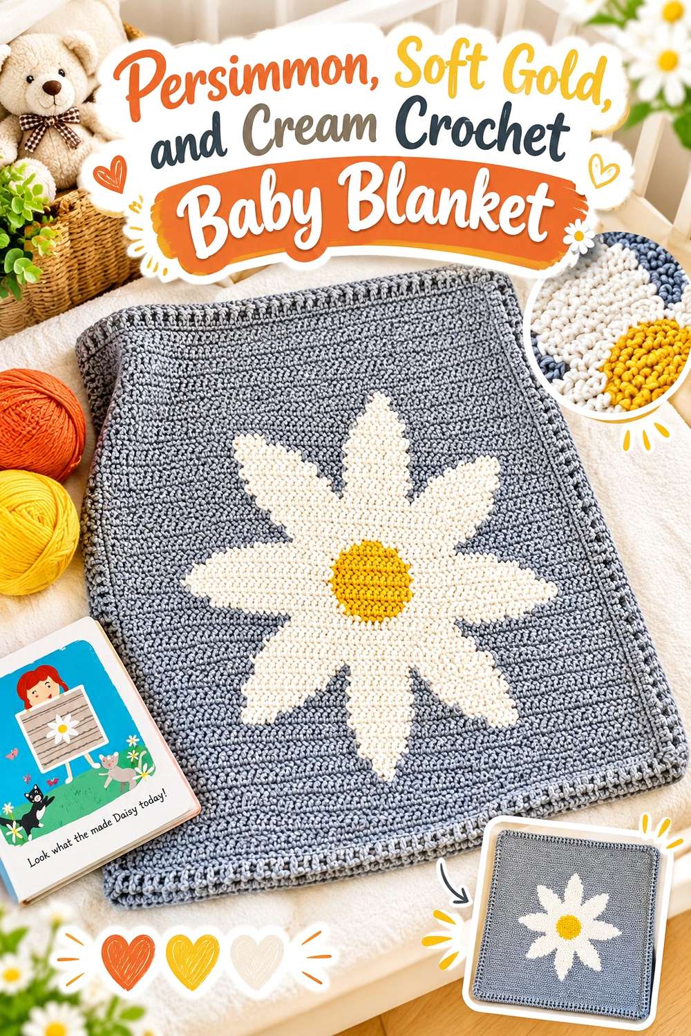
For a blanket, persimmon has enough area to be repeated without covering every row or motif. Cream creates lighter breathing space, while soft gold extends the warm palette without duplicating persimmon exactly. The most useful distinction is role: persimmon leads, cream separates, and gold connects the two.
Give Persimmon More Cream Space in the Crochet Baby Blanket
Instead of placing persimmon beside another strong color continuously, interrupt it with cream. The lighter sections make repeated crochet texture and color changes easier to distinguish across the broad blanket surface.
Soft Gold Can Bridge Persimmon and Cream Crochet Repeats
Use soft gold in smaller repeated areas to make the transition between saturated persimmon and pale cream less abrupt. Keep gold visibly different from persimmon; if the shades are too close, the intended three-color hierarchy can collapse into two similar warm tones plus cream.
Creator Credit: Daisy Farm Crafts
15. Persimmon, Olive, and Mustard Crochet Flower Appliqués

Small flower motifs give you an opportunity to place three earthy colors in clearly defined roles. Persimmon can form the petals, olive can handle selected centers or surrounding details, and mustard can appear as a smaller warm highlight. Because each flower is compact, strong value separation is more important than adding additional shades.
Persimmon Crochet Petals Need Clear Contrast at the Flower Center
If persimmon covers the petals, choose an olive or mustard center that remains visibly distinct. Compare the yarns before making a full set because small centers can disappear when their value is too close to the surrounding petals.
Repeat Persimmon Across Crochet Flower Appliqués to Connect the Set
When flowers are used as separate appliqués, repeating persimmon in each one creates continuity. Olive and mustard can change positions or proportions, but the recurring persimmon keeps the group from looking like unrelated leftover-yarn motifs.
Creator Credit: HappyBerry Crochet
16. Persimmon and Denim Blue Crochet Scarf

Denim blue gives persimmon a relaxed cool contrast without the darkness of navy. On a long scarf, alternating the two shades in controlled sections can create movement, but persimmon should still occupy the greater visual share if it is meant to remain the main color.
Persimmon Can Carry Most of the Crochet Scarf Length
Use longer persimmon sections or repeat persimmon more frequently than denim blue. A scarf offers enough length for color changes, so decide the hierarchy before crocheting rather than letting leftover yarn quantities determine the final balance.
Denim Blue Gives Persimmon Crochet Texture a Cooler Break
Place denim beside sections where the stitch texture would benefit from a visible color shift. If the blue and persimmon are similar in value, lighten or darken the denim rather than automatically introducing a third color.
Creator Credit: Fiber Flux
17. Persimmon and Black Crochet Handbag
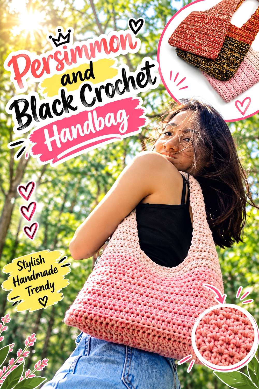
Black creates the strongest contrast in this collection, so it needs less surface area than persimmon. Use persimmon for the bag body and reserve black for edges, handles, or carefully repeated details. Too much black can quickly change the project from persimmon-led to graphic two-tone.
Keep Persimmon Across the Main Crochet Handbag Body
Large persimmon panels make the color unmistakable and prevent black from visually splitting the bag into heavy sections. This also gives any dark handle or edge treatment a clear background against which to stand out.
Black Can Define Persimmon Crochet Handles and Edges in Small Amounts
Limit black to locations where definition is useful. If a solid black border feels too severe, repeat a narrow black detail elsewhere or substitute charcoal for slightly softer contrast while leaving persimmon unchanged.
Creator Credit: ABoC Studio
18. Persimmon and Ecru Crochet Bandana
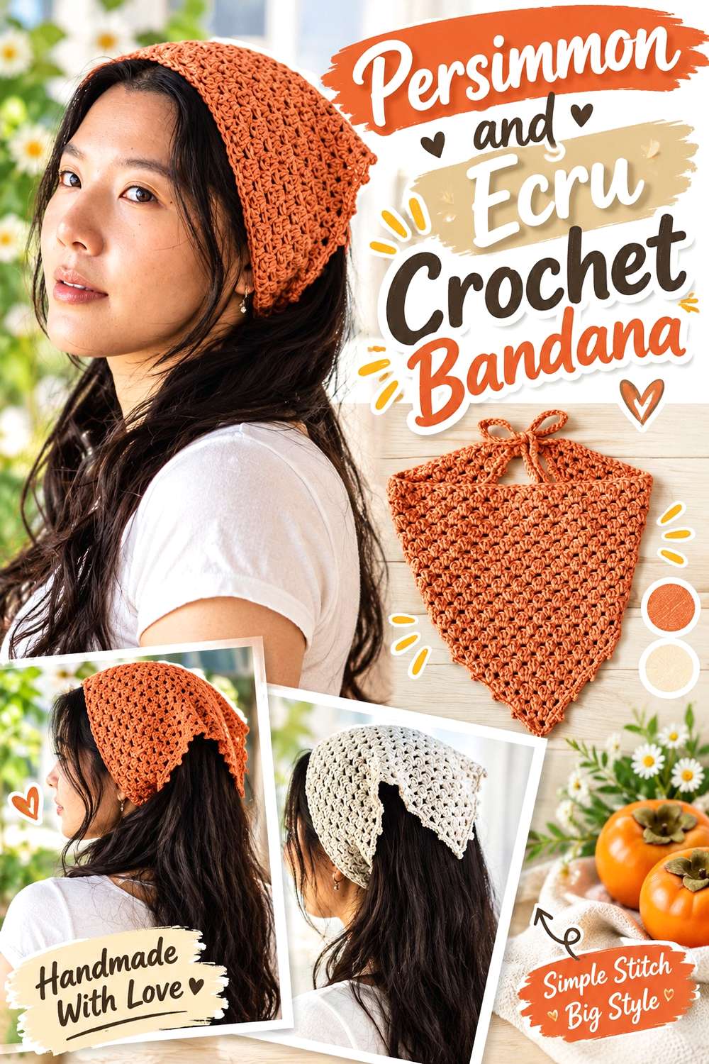
Ecru creates a softer neutral pairing than pure white, which suits a small wearable where every contrasting row or edge is noticeable. Persimmon can fill most of the bandana body while ecru marks the ties, border, or a restrained repeated detail.
Persimmon Works Well as the Main Crochet Bandana Color
Keeping the central fabric persimmon gives the triangular or shaped bandana a strong uninterrupted color area. If you add ecru within the body, repeat it deliberately instead of inserting isolated light sections.
Ecru Can Lighten Persimmon Crochet Ties and Decorative Edges
Use ecru where narrow details would otherwise disappear against a persimmon body. If you want an even more tonal effect, choose a warm beige that remains light enough to separate from persimmon at the edge.
Creator Credit: VivCrochets
19. Persimmon and Seafoam Crochet Market Bag
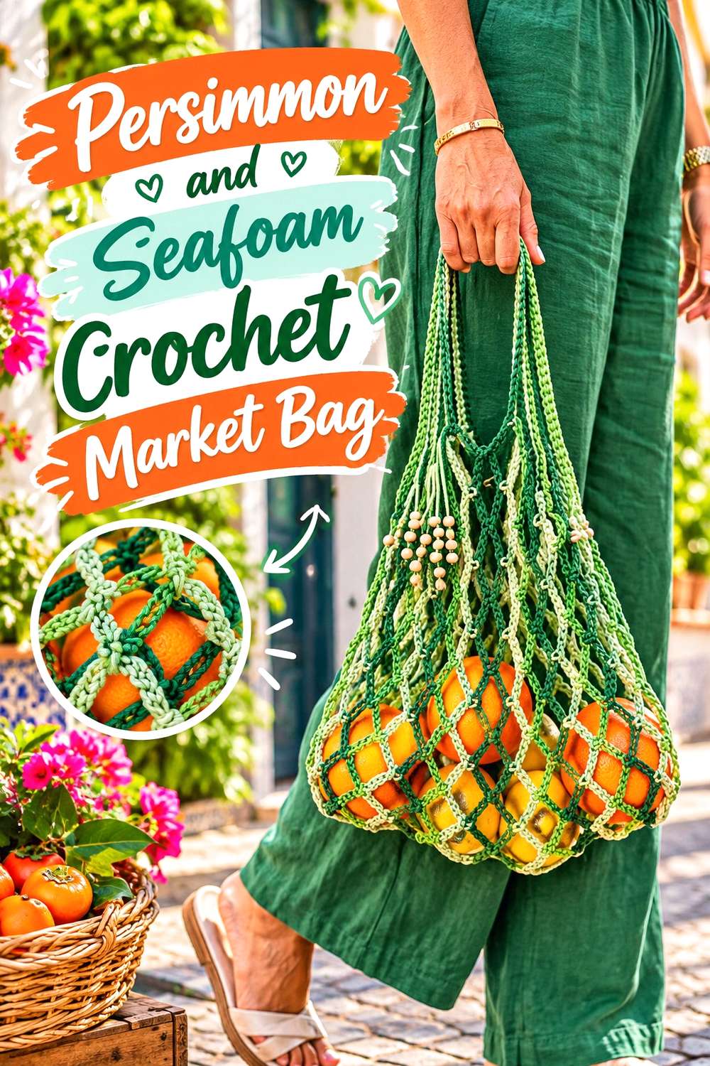
Seafoam moves persimmon into a lighter, cooler palette that feels very different from the brown, burgundy, and charcoal combinations. With an openwork market bag, color appears in smaller strands and openings rather than one solid surface, so repetition becomes especially important.
Repeat Persimmon Consistently Through the Crochet Market Bag
Use persimmon often enough through the body that open spaces do not break its visual continuity. If you alternate colors, avoid introducing too many short sections, which can make an openwork surface look busier than a dense crochet fabric.
Seafoam Gives Persimmon Crochet Handles and Openwork a Cooler Contrast
Seafoam can appear in selected body sections or handles to create a light interruption against persimmon. Choose a seafoam that is clearly lighter or cooler so the colors remain distinct when viewed through the open structure of the bag.
Creator Credit: Home Handwork Diy
20. Persimmon and Mauve Crochet Pouch

Mauve provides a muted red-purple partner that is softer than burgundy and less pale than blush. On a compact pouch, persimmon can cover the main panel while mauve marks a flap, border, or limited decorative area. Keeping one shade clearly dominant prevents the small item from becoming visually divided.
Persimmon Works Best Across the Main Crochet Pouch Panel
A broad persimmon panel gives the pouch a strong central color before any border or closure-area contrast is added. If the pouch has a flap, decide whether it should continue persimmon or become the main mauve accent rather than changing colors without a clear purpose.
Mauve Can Soften Persimmon Around Crochet Flaps and Borders
Use mauve where you want separation without the sharpness of black or navy. If persimmon and mauve look too similar in depth, choose a dustier, lighter mauve so the border or flap remains visible.
Creator Credit: Crochet Chronicles
Conclusion
Persimmon can move in several directions depending on what you place beside it. Oatmeal, ivory, cream, and ecru keep the result lighter and place more attention on crochet texture. Charcoal, espresso, navy, and black give persimmon stronger definition around garment edges, borders, and handles.
For cooler contrast, deep teal, denim blue, sage, and seafoam break up persimmon without removing its warmth. Burgundy, plum, dusty rose, blush, mauve, mustard, and soft gold stay closer to the warm side of the palette, so those combinations benefit from careful attention to value and color proportion.
Whichever direction you choose, decide the dominant color before starting. Let persimmon occupy the places that define the project, then use supporting shades to reveal texture, frame edges, separate motifs, or connect repeated details. Follow the original creator tutorial for the exact crochet construction while treating the palettes here as color-planning adaptations.
Frequently Asked Questions
What Colors Work Well With Persimmon in Crochet?
Cream, oatmeal, ivory, ecru, brown, charcoal, navy, teal, sage, denim blue, plum, dusty rose, mauve, olive, and muted gold can all support persimmon in different ways. Rather than choosing by color name alone, compare lightness and saturation so the second shade performs the role you need.
How Can I Keep Persimmon Crochet Texture Visible?
Texture can become less obvious when every section has similar color and value. Introduce a lighter or darker shade around raised stitches, borders, motifs, or other details you want to emphasize, or keep highly textured areas in a more uninterrupted persimmon field.
Does Persimmon Need to Be the Darkest Crochet Color?
No. Persimmon can sit between a pale neutral and a darker shade such as espresso, navy, charcoal, or black. What matters is maintaining a clear hierarchy so the darkest accent does not accidentally occupy enough area to become the dominant color.
Can Persimmon Crochet Be Combined With Burgundy or Mustard?
Yes, but these colors can sit relatively close to persimmon visually. Give them different roles and compare their light-dark values before committing. Cream or another light neutral can also separate two warm colors when individual motifs or details are becoming difficult to distinguish.
How Do I Substitute Another Orange for Persimmon in a Crochet Palette?
Preserve the relationship between the colors rather than searching for an identical name. Choose an orange or orange-red with similar warmth and depth, then check that it remains lighter or darker than the supporting shades in the same way the original persimmon did. That keeps the palette structure intact even when the exact color changes.