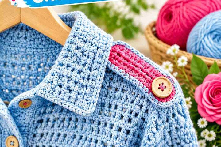
Copper gives a granny square cardigan a warm, earthy starting point, but the supporting colors determine whether the finished garment feels light, dark, muted, colorful, tonal, or sharply contrasted. The most useful approach is to decide where copper should dominate before choosing colors for motif centers, outer rounds, joins, sleeves, cuffs, and front edging.
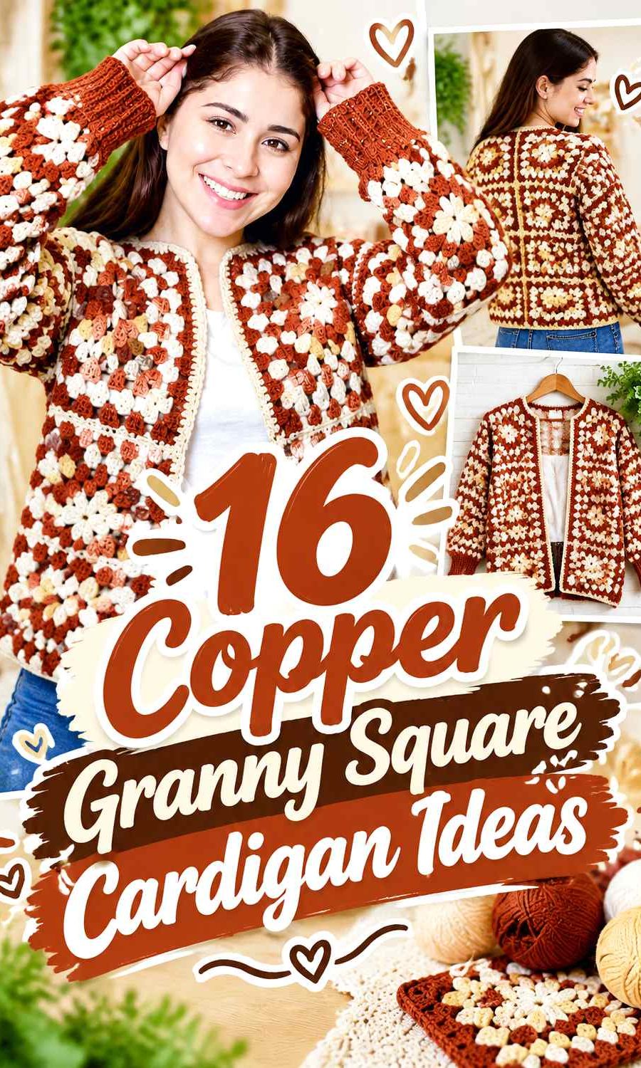
The 16 ideas below keep copper central while changing its supporting shades and color placement. The linked tutorials support the cardigan construction concept; the proposed copper palettes are independent color adaptations and should not be assumed to be the colors used by the creators.
Quick List
- Copper And Cream Crochet Granny Square Cardigan
- Copper And Espresso Brown Crochet Granny Square Cardigan
- Copper And Olive Green Crochet Granny Square Cardigan
- Copper Sage And Oatmeal Crochet Granny Square Cardigan
- Copper And Deep Teal Crochet Granny Square Cardigan
- Copper And Navy Crochet Granny Square Cardigan
- Copper And Dusty Blue Crochet Granny Square Cardigan
- Copper And Charcoal Crochet Granny Square Cardigan
- Copper Black And Cream Crochet Granny Square Cardigan
- Copper And Burgundy Crochet Granny Square Cardigan
- Copper And Plum Crochet Granny Square Cardigan
- Copper Mustard And Camel Crochet Granny Square Cardigan
- Copper And Forest Green Crochet Granny Square Cardigan
- Copper Blush And Ivory Crochet Granny Square Cardigan
- Copper Terracotta And Rust Crochet Granny Square Cardigan
- Copper Turquoise And Cream Crochet Granny Square Cardigan
Let Copper Lead Without Losing the Granny Square Pattern
Copper can cover the largest visual area, but using it everywhere at the same intensity can make individual granny squares blend into one broad field. A lighter or darker supporting shade around motif centers and outer rounds gives the square structure more definition. On a cardigan, that separation matters particularly across the back panel and sleeves, where several motifs are viewed together.
Think about the whole garment rather than planning every square independently. Repeating copper in a consistent position—such as the middle rounds, outer rounds, or alternating full squares—can connect the front, back, and sleeves even when several supporting colors are used.
Check Copper Contrast Before Joining the Cardigan
Two yarn colors can look different in the skein yet become less distinct after they are crocheted into textured motifs. Place the planned copper beside each supporting shade and compare them from several feet away. A grayscale photo can also help reveal whether the light-and-dark values are sufficiently different when clear motif separation is the goal.
Pay special attention to joining yarn, cuffs, and front edging. Those areas form long uninterrupted lines, so their color can visually frame the entire cardigan more strongly than a small amount of the same shade inside individual squares.
1. Copper And Cream Crochet Granny Square Cardigan

Copper can take the dominant role across the granny squares while cream opens up the cardigan visually. Use cream in motif centers, selected outer rounds, or the joining line so the warm copper does not merge into one uninterrupted block. This combination is especially useful when you want the square layout itself to remain easy to read.
Cream Gives Copper Granny Squares Clearer Separation
Place cream next to copper around smaller motif details when you want the square construction to remain obvious from a distance. The light-dark difference can prevent neighboring copper sections from visually running together, particularly across a large back panel.
Keep Copper Dominant on the Cardigan Sleeves and Edging
If cream occupies too many full squares, it can become the visual lead instead of copper. Keep copper repeated through the sleeves, cuffs, or front opening so the cardigan still reads as a copper garment rather than a cream cardigan with occasional warm accents.
Creator Credit: Brunaticality
2. Copper And Espresso Brown Crochet Granny Square Cardigan

Pairing copper with a very dark brown creates a low-brightness, earthy cardigan. Copper should carry enough surface area to keep the garment from becoming visually heavy, while espresso can define outer motif rounds, joins, cuffs, or the neckline.
Espresso Brown Can Frame Copper Granny Squares
Use espresso around selected copper motifs when stronger outlines would help the cardigan layout read more clearly. A dark perimeter is especially effective where multiple squares meet because it separates one warm copper area from the next.
Copper Needs Enough Space Beside Espresso Brown
Avoid dividing the cardigan evenly between two dark-looking shades if you want copper to remain noticeable. Let copper occupy larger motif sections, then use espresso in thinner repeated bands or garment finishing so the darker brown acts as structure rather than competition.
Creator Credit: HayHay Crochet
3. Copper And Olive Green Crochet Granny Square Cardigan
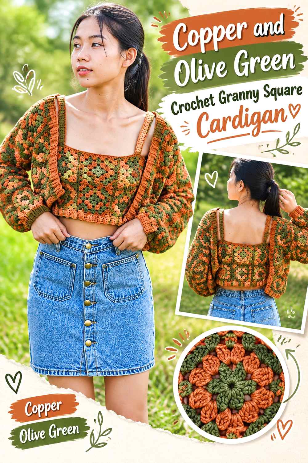
Copper and olive create an earthy two-color direction without relying on a pale neutral. Copper can lead the body panels, while olive works well as a repeating secondary color in motif centers, outer rounds, sleeve sections, or ribbed finishing.
Olive Green Breaks Up Large Copper Cardigan Panels
Repeat olive at predictable intervals rather than scattering it randomly. A controlled rhythm across the front and back panels helps the green look intentional and prevents individual olive squares from appearing disconnected from the rest of the copper cardigan.
Keep Copper More Visible Than Olive Green at the Sleeves
Sleeves contain a narrower field than the body, so equal amounts of copper and olive can create stronger striping or blocking than expected. Carry copper through several sleeve motifs or the cuffs if you want the sleeves to remain visually connected to a copper-dominant torso.
Creator Credit: Chenda DIY
4. Copper Sage And Oatmeal Crochet Granny Square Cardigan

This three-color palette softens copper with two quieter supporting shades. Copper can remain the strongest color, sage adds a muted green transition, and oatmeal provides the lightest value for separating detailed granny-square sections.
Oatmeal Keeps Copper and Sage Granny Squares Distinct
Place oatmeal between copper and sage when the two muted colors appear too close in value. A lighter round around the motif center or near the square edge can keep all three colors readable without requiring a dark joining yarn.
Repeat Copper Across the Cardigan Before Adding More Sage
With three colors, equal distribution can make the garment look busier than planned. Decide first where copper will recur—such as every square or every second outer round—then fit sage and oatmeal around that framework so copper remains the visual anchor.
Creator Credit: Emma Warrender
5. Copper And Deep Teal Crochet Granny Square Cardigan
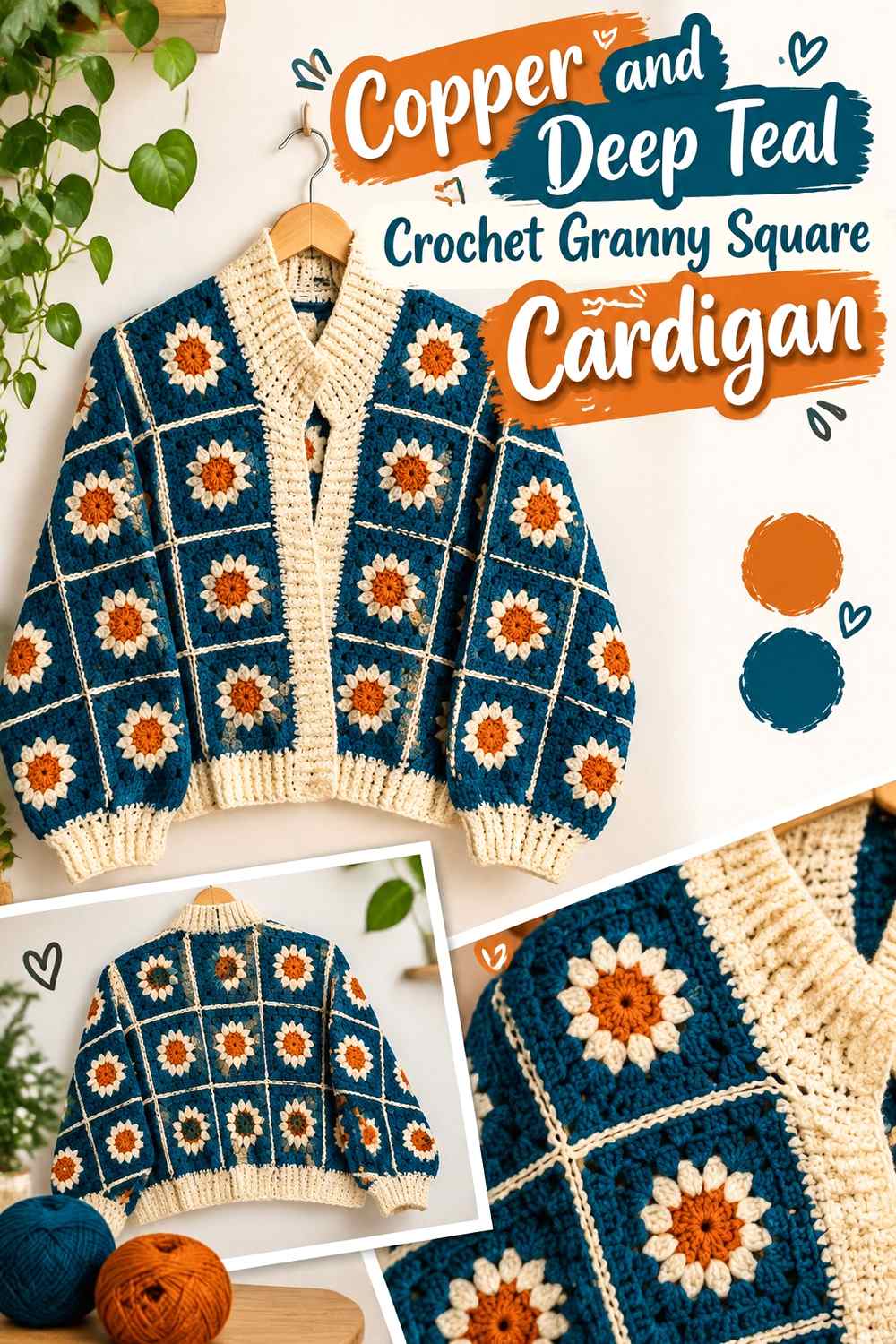
Deep teal introduces a cool counterpoint to copper while retaining a fairly rich overall palette. The contrast works particularly well when copper occupies the broader motif areas and teal appears in controlled repeats rather than taking over entire garment sections.
Deep Teal Gives Copper Granny Squares a Cooler Counterpoint
Try teal in motif centers or narrow outer rounds where it can interrupt repeated copper without replacing it. This placement lets the cool shade register across the cardigan while preserving copper as the main surface color.
Copper Can Reconnect Teal Sleeves to the Cardigan Body
If you use more teal toward the sleeves, repeat copper at the cuffs or at regular sleeve intervals. Carrying copper across both body and sleeves prevents the garment from looking like separately planned sections joined at the armholes.
Creator Credit: Dreamcrochets
6. Copper And Navy Crochet Granny Square Cardigan
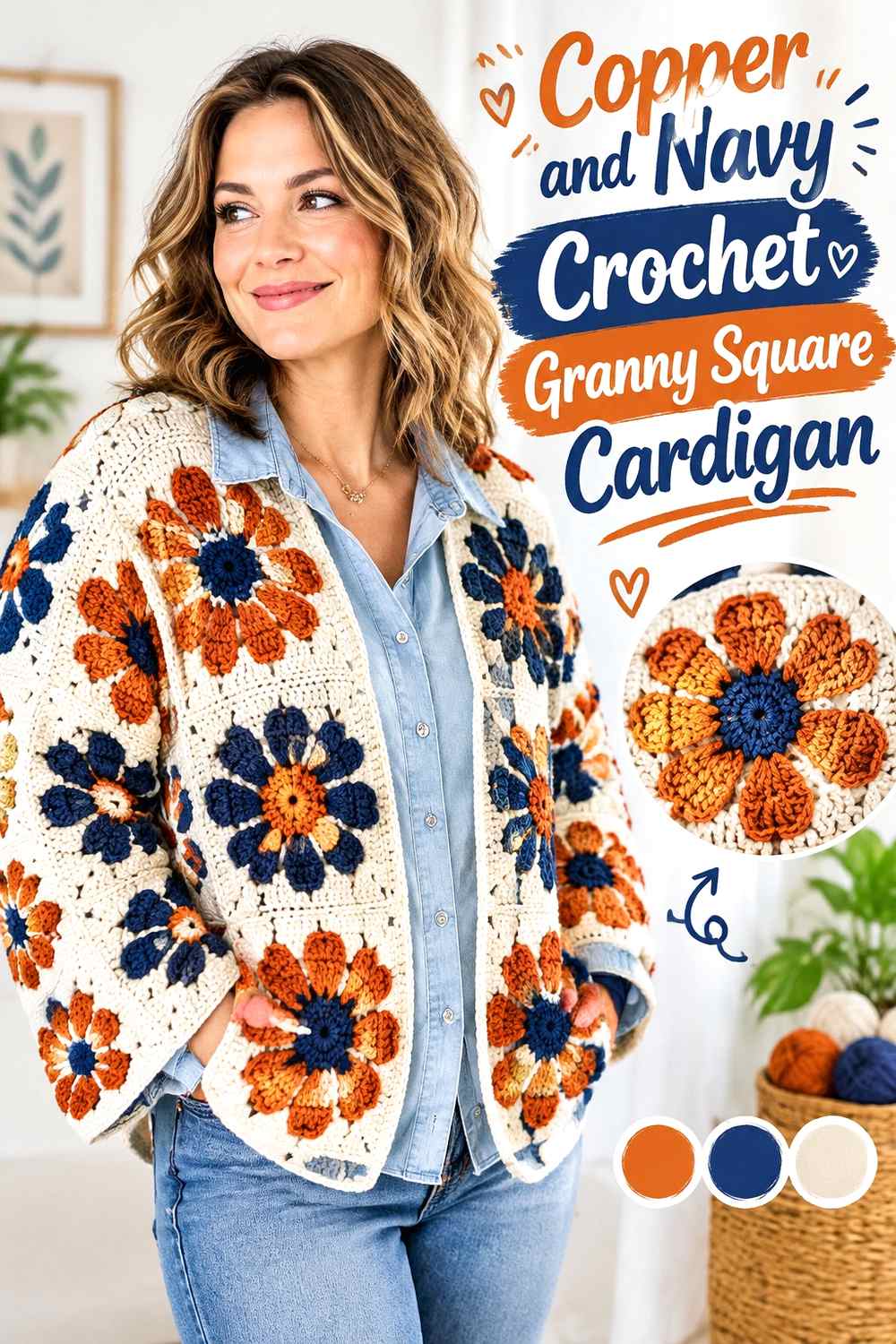
Navy gives copper a darker, cooler frame than brown while keeping the cardigan easy to coordinate with simple wardrobe neutrals. Because navy can carry considerable visual weight, smaller amounts can still influence the whole garment.
Navy Can Define the Outer Edge of Copper Granny Squares
Consider navy for joins or outer motif rounds when you want each copper square to remain visibly separate. A consistent dark edge can also organize a cardigan that uses slightly different copper placements from square to square.
Keep Copper Around the Cardigan Front Opening
Using copper at the front bands or neckline keeps the main color close to the face of the garment and visually connects both front panels. If navy is used for every long finishing edge, the cardigan can begin to read as navy-framed rather than copper-led.
Creator Credit: Frisian Knitting tutorials
7. Copper And Dusty Blue Crochet Granny Square Cardigan
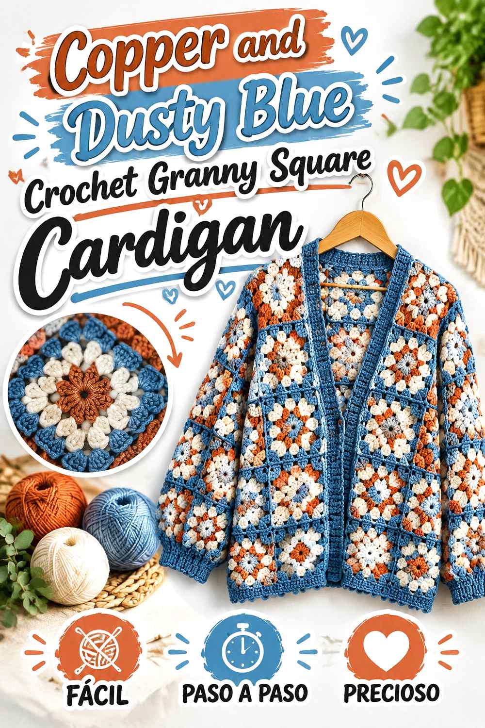
Dusty blue produces a gentler cool contrast than navy or teal. It is useful when you want a multicolor cardigan but do not want the secondary shade to overpower copper or create extremely sharp motif boundaries.
Dusty Blue Softens the Contrast Between Copper Granny Squares
Use dusty blue through selected middle rounds rather than only as a border. That placement allows the blue to become part of each motif while copper still controls the overall field across the back and front panels.
Copper Should Anchor Dusty Blue Cardigan Cuffs
A dusty blue sleeve can feel detached if copper stops at the shoulder. Reintroduce copper near the wrist or in alternating sleeve motifs so the color path continues through the full garment rather than ending at the body.
Creator Credit: DiMar DiMax Crochet
8. Copper And Charcoal Crochet Granny Square Cardigan
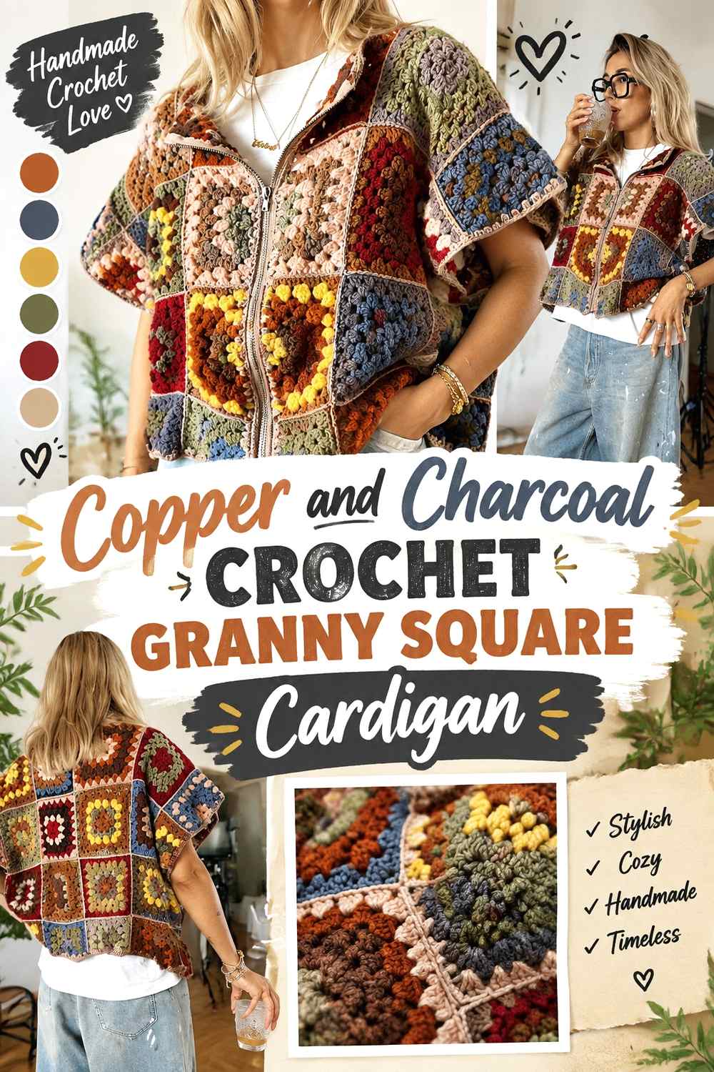
Charcoal creates a strong dark-neutral partner for copper without the absolute contrast of black. This palette suits a cardigan where the motif arrangement should remain structured but the color combination should stay relatively restrained.
Charcoal Gives Copper Cardigan Joins More Definition
Using charcoal consistently for joining can turn the grid itself into part of the color design. This is most effective when the join is visible enough to create separation but not so visually dominant that it overwhelms the copper motifs.
Copper Needs Repetition Across Charcoal Cardigan Finishing
If charcoal appears in the joins, cuffs, hem, and neckline, it can quickly become the cardigan’s strongest continuous color. Repeat copper in at least some finishing areas or maintain a larger copper share inside the squares to protect the intended hierarchy.
Creator Credit: BELINA BELLWOOD
9. Copper Black And Cream Crochet Granny Square Cardigan
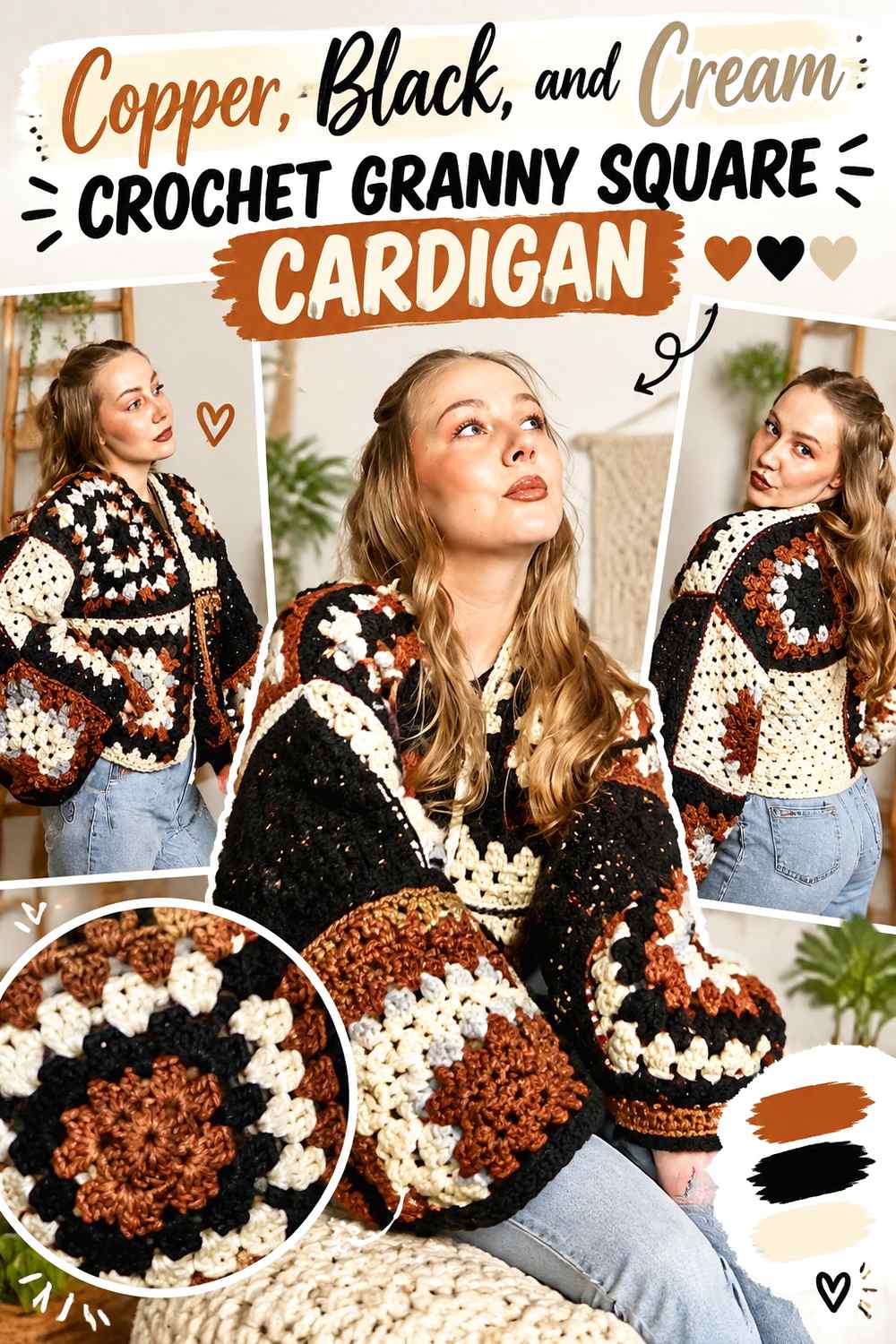
Black and cream create the strongest light-dark framework in this collection, with copper providing the warm middle color. This scheme works well when you want the granny-square grid to look crisp and deliberately graphic.
Cream Stops Copper and Black Granny Squares From Feeling Too Dense
Use cream around smaller centers or as an occasional outer round so black does not sit directly against copper everywhere. The lighter breaks create breathing room across a back panel containing many repeated motifs.
Copper Should Bridge the Black and Cream Cardigan Sections
Rather than placing black squares on one side and cream squares on another, repeat copper throughout both groups. Copper acts as the shared color that makes the high-contrast neutrals look like one planned cardigan rather than two separate palettes.
Creator Credit: DIYGuru
10. Copper And Burgundy Crochet Granny Square Cardigan
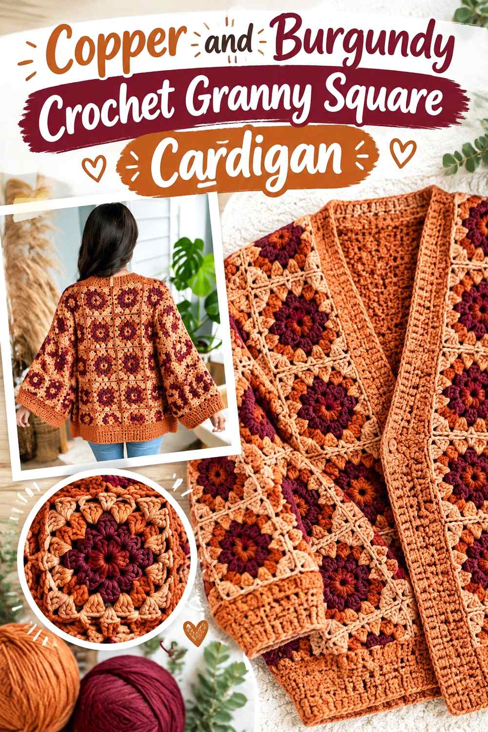
Copper and burgundy create a deep warm palette with less hue contrast than copper and blue or green. Because both shades can appear visually rich, value separation becomes more important if you want small granny-square details to remain obvious.
Burgundy Works Best Beside Clearly Visible Copper Sections
Avoid switching between copper and burgundy in very narrow bands if the two yarns appear similar from a distance. Larger color areas or a neutral separator can make the intended two-color design easier to see.
Copper Can Lighten a Burgundy-Heavy Cardigan Border
If burgundy dominates the joins or outer motif rounds, use copper at the cuffs, hem, or front edging to keep those finishing lines from becoming uniformly dark. Repeating copper along garment edges also reinforces the title color outside the squares themselves.
Creator Credit: MJ’s Off The Hook Designs
11. Copper And Plum Crochet Granny Square Cardigan

Plum shifts the cardigan away from strictly earthy colors without introducing a bright accent. Copper remains warm and grounded, while plum can add a darker red-purple direction in motif centers, sleeve accents, or outer rounds.
Plum Can Add Depth to Copper Granny Square Centers
A plum center surrounded by copper makes the darker color a focal detail instead of a competing field. Repeating that center arrangement across the cardigan can create consistency even when the surrounding copper placement varies.
Keep Copper Present Around Plum Cardigan Sleeves
Plum can become visually dominant quickly if several sleeve squares use large dark sections. Increase the copper share around those motifs or use copper cuffs so the sleeves support the main body palette rather than becoming a separate plum feature.
Creator Credit: Alt Knots
12. Copper Mustard And Camel Crochet Granny Square Cardigan
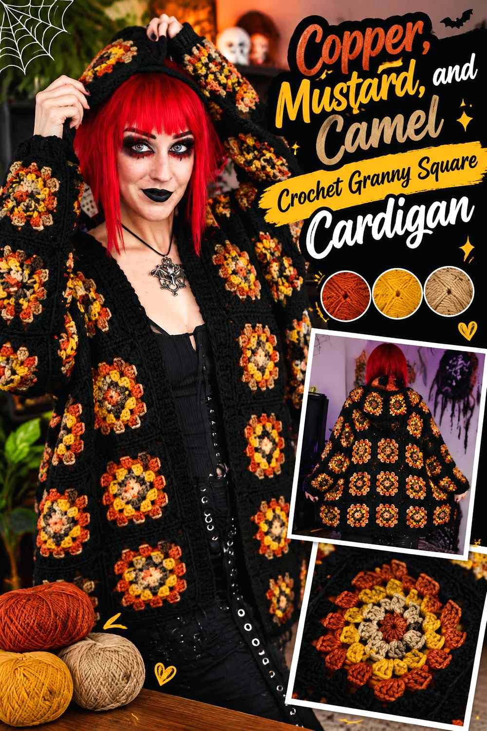
Copper, mustard, and camel stay within a warm range but still offer differences in brightness and saturation. The challenge is creating enough distinction between the three shades for the granny-square pattern to remain visible.
Mustard Needs Clear Placement Beside Copper Granny Squares
Use mustard as a deliberate accent rather than scattering equal amounts through every round. Concentrating it in centers or occasional squares makes the yellow-gold note noticeable without making it compete with copper across the entire cardigan.
Camel Can Separate Copper From Mustard on the Cardigan
When copper and mustard feel too intense side by side, camel can provide a quieter transitional area. It can work especially well in outer rounds, joins, or edging where a neutralized warm shade keeps the garment cohesive.
Creator Credit: ÖRGÜ MÜ DEDİNİZ
13. Copper And Forest Green Crochet Granny Square Cardigan

Forest green produces a deeper, more dramatic green pairing than olive or sage. Let copper cover most of the motif surface and use forest green strategically where you want darker definition.
Forest Green Can Ground Copper Granny Square Borders
A forest-green outer round can clearly frame a copper-centered motif, especially if neighboring squares contain similar copper sections. Repeating that edge treatment establishes a dependable grid across the cardigan.
Copper Keeps Forest Green Sleeves From Looking Too Heavy
Large dark-green sleeve sections can visually outweigh a warmer body. Carry copper through the sleeve motifs or cuffs to distribute the main color evenly from shoulder to wrist.
Creator Credit: Natki_Creative_Studio
14. Copper Blush And Ivory Crochet Granny Square Cardigan

Blush and ivory take copper in a softer direction. Ivory supplies the clearest light value, blush provides a muted bridge, and copper gives the cardigan enough warmth and definition to keep the pale colors from taking over.
Ivory Makes Copper Granny Square Details Easier to Read
Use ivory beside copper around centers or decorative motif sections that would otherwise disappear into the surrounding warm colors. A relatively small amount can provide enough separation without turning the cardigan into an ivory-dominant garment.
Blush Can Transition Between Copper and Ivory Cardigan Sections
Blush works well when a direct copper-to-ivory change feels sharper than you want. Place it in intermediate rounds or selected squares so the progression from dark warm copper to light ivory feels more gradual across the garment.
Creator Credit: Lyubava
15. Copper Terracotta And Rust Crochet Granny Square Cardigan

A tonal copper palette relies on closely related warm shades rather than strong contrast. The appeal comes from gradual variation, so the main planning challenge is making sure copper, terracotta, and rust remain distinguishable after they are crocheted.
Copper Needs Value Separation From Terracotta and Rust
Compare all three shades before committing to many motifs. If they collapse into nearly the same value, assign each color to larger blocks or introduce a subtle neutral join so the cardigan’s square structure does not disappear.
Repeat Copper Consistently Through the Tonal Cardigan
Because the three shades are closely related, a predictable copper position can organize the palette. For example, maintaining copper in the same part of many motifs gives the eye a repeated reference point while terracotta and rust provide controlled variation.
Creator Credit: JuttaAliisa
16. Copper Turquoise And Cream Crochet Granny Square Cardigan
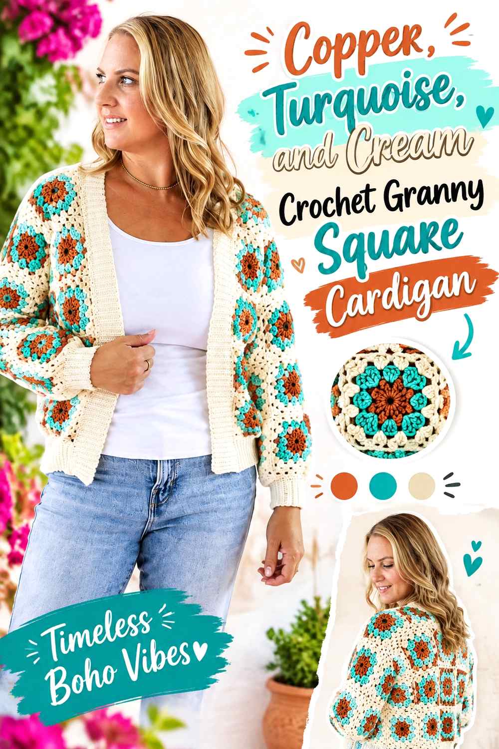
Turquoise gives copper the strongest colorful contrast in this group, while cream prevents the pairing from becoming visually relentless. This palette is particularly effective when you want individual granny squares to read as obvious multicolor motifs.
Turquoise Should Accent Copper Without Taking Over the Cardigan
A saturated turquoise can command attention even in smaller amounts. Try concentrating it in centers, occasional outer rounds, or selected squares rather than giving turquoise and copper identical coverage across every panel.
Cream Can Separate Copper and Turquoise Granny Square Repeats
Cream provides a useful buffer when direct copper-and-turquoise repetition feels too intense. Using it consistently in one motif round or in parts of the join can make the palette easier to follow while keeping both stronger colors visible.
Creator Credit: Bella Coco
Conclusion
A copper granny square cardigan can move in several very different directions without changing the underlying garment concept. Cream, oatmeal, blush, and dusty blue give copper more visual space and softer contrast. Espresso, charcoal, black, navy, plum, and forest green create stronger definition around the motifs. Olive, sage, mustard, terracotta, and rust keep the garment closer to an earthy or tonal range, while teal and turquoise introduce clearer cool-color contrast.
Before committing to a full set of squares, make a small group using the planned color distribution and view them together rather than evaluating one motif at a time. Check whether copper still reads as the main color once the squares, joining color, cuffs, and edging are considered as a complete cardigan. Use the credited tutorials for their exact construction directions and adapt only the color placement that suits your chosen palette.
Frequently Asked Questions
What colors work with copper in a granny square cardigan?
Copper can be paired with light neutrals such as cream and oatmeal, dark neutrals such as charcoal or espresso, greens such as olive and forest green, cooler blues such as dusty blue and navy, or closely related warm shades such as terracotta and rust. The more important question is how much of each color is used and whether the values provide the amount of motif separation you want.
How do I keep copper as the main color in a multicolor granny square cardigan?
Give copper the largest repeated visual role. It can occupy more rounds inside each square, appear in every motif while other colors rotate, or continue through the cuffs, edging, and sleeves. Looking at all the squares together before assembly helps reveal whether another color is beginning to dominate.
Should copper be used for the granny square centers or outer rounds?
Either can work. Copper centers create repeated warm focal points, while copper outer rounds make neighboring squares feel more connected once they are joined. Decide whether you want copper to emphasize each individual motif or unify the cardigan as a larger surface.
What should I do if copper and another yarn color look too similar?
Compare the colors side by side and, if useful, view a photo in grayscale. If their values are very close, use the colors in larger sections rather than tiny alternating details, or place a lighter or darker shade between them to increase separation.
Should the joining color match the copper granny squares?
It does not have to. A copper join can make the grid quieter and more continuous, while cream, charcoal, brown, or another contrasting join can make individual squares easier to distinguish. Because joins run throughout the garment, test the color across several connected motifs before using it everywhere.
How can I make a copper granny square cardigan look less busy?
Reduce the number of colors that receive equal visual space. Let copper dominate, choose one supporting shade, and reserve any third color for smaller repeated details. Keeping the join, cuffs, and edging consistent can also provide a visual frame around more varied motifs.
Can I substitute a different shade for copper?
Yes. Preserve the role copper plays in the palette rather than trying to match an exact commercial yarn name. If copper is the dominant warm medium-dark shade, choose a substitute with a similar visual weight and then recheck its contrast against the supporting colors before making the full cardigan.