Crochet zigzags are a useful way to bring a 90s-inspired color direction to hair accessories because the pattern naturally separates bold shades into visible bands. A hot-pink-and-black headband can feel graphic and high contrast, while aqua, lilac, and white create a lighter version of the same idea. Scrunchies, bandanas, barrettes, scarves, and narrow tie headbands each give the zigzag a different amount of space.
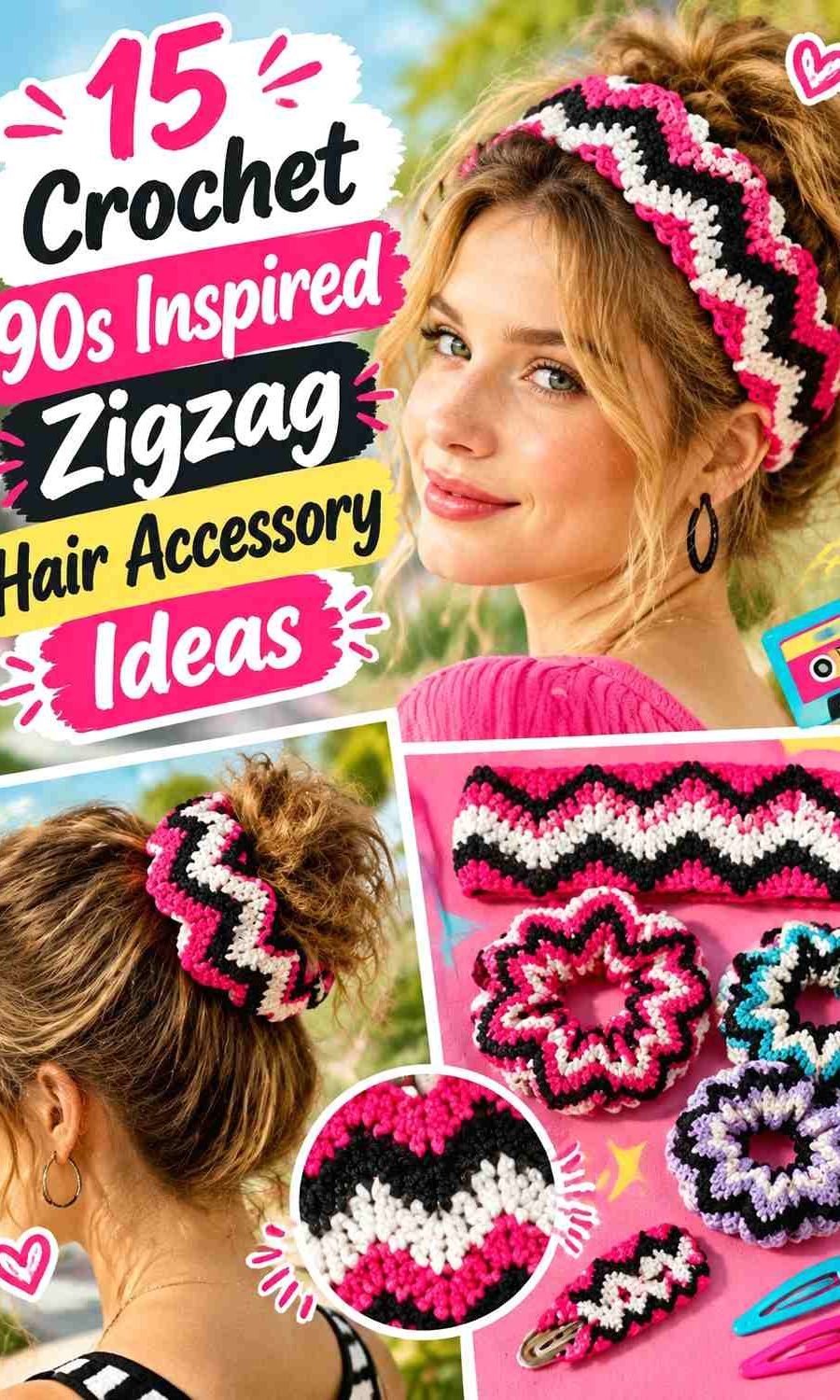
The main color decision is hierarchy. Three bright shades used in equal amounts can make a small hair accessory difficult to read, especially once it sits against hair. Let one color lead the zigzag, repeat a second shade consistently, and use the strongest accent in narrower peaks, borders, ties, or edge details.
The tutorials credited below support the underlying headbands, bandanas, scrunchies, scarves, and hair clips. The zigzag patterns and 90s-inspired palettes are independent adaptations rather than claims that the creators used these exact colors.
Quick List
- Hot Pink, Black, and White Crochet Zigzag Headband
- Purple, Aqua, and Lime Crochet Zigzag Bandana
- Cobalt Blue, White, and Red Crochet Zigzag Tie Headband
- Neon Lime, Black, and Purple Crochet Zigzag Oversized Scrunchie
- Bubblegum Pink, Turquoise, and White Crochet Zigzag Scrunchie
- Orange, Fuchsia, and Black Crochet Zigzag Ruffle Scrunchie
- Denim Blue, Mustard, and Burgundy Crochet Zigzag Hair Scarf
- Teal, Cream, and Brick Red Crochet Zigzag Triangle Bandana
- Lavender, Mint, and Soft Pink Crochet Zigzag Ponytail Scrunchie
- Cherry Red, Navy, and White Crochet Zigzag Mini Scrunchie
- Aqua, Black, and Magenta Crochet Zigzag Tie Headband
- Plum, Chartreuse, and Cream Crochet Zigzag Wrap Headband
- Sky Blue, Lilac, and Charcoal Crochet Zigzag Headscarf
- Neon Pink, Cobalt, and Black Crochet Zigzag Flower Barrette
- Turquoise, Purple, and Lime Crochet Zigzag Hair Clip
Give Crochet Zigzags Enough Contrast to Stay Visible in Hair
Zigzag colorwork depends on visible peaks and changes in direction. If two yarns are nearly identical in lightness, the pattern can become less obvious once the accessory is worn, even when the colors look different in the skein.
Check the yarn against the intended hair color and view the combination from farther away. Black, cream, white, navy, or another noticeably lighter or darker shade can give two brighter colors enough separation without becoming the dominant part of the accessory.
Use 90s-Inspired Brights in Unequal Amounts
A bold palette does not require every color to cover the same area. On a narrow headband, one bright shade can form most of the zigzag while black or white creates the boundary. On a larger bandana, you have enough surface to repeat three colors without making each section tiny.
Treat the 90s direction as styling inspiration rather than a claim that these exact crochet accessories reproduce documented period pieces. The practical goal is a clear zigzag, controlled contrast, and a palette that remains readable when worn.
1. Hot Pink, Black, and White Crochet Zigzag Headband
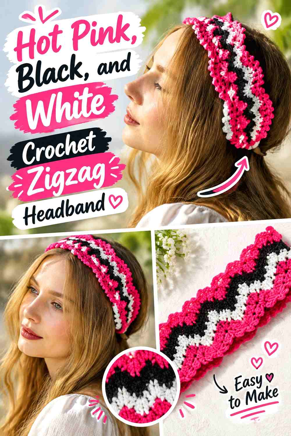
Hot pink can dominate this crochet headband, with black forming the strongest zigzag boundary and white providing occasional lighter breaks. The headband’s narrow width makes three equal stripes unnecessarily busy, so let pink occupy the broadest sections and keep black consistent enough that the zigzag remains recognizable from across the room.
Hot Pink Should Carry Most of the Crochet Zigzag Headband
Use hot pink through the larger peaks or central band so the accessory has one unmistakable leading color. If pink appears only in tiny alternating sections, black may visually take over even when the yarn amounts are similar.
On dark hair, hot pink also provides a useful visible outer edge.
Black Should Separate Hot Pink and White Zigzags Clearly
Keep black between selected pink and white areas when those lighter shades would otherwise touch repeatedly. A controlled dark line can sharpen the direction changes without making the entire headband black-heavy.
Use white more sparingly at the tips, ties, or occasional stripe if you want hot pink to remain dominant.
Creator Credit: DIYGuru
2. Purple, Aqua, and Lime Crochet Zigzag Bandana

A triangle bandana provides more room for repeated color changes than a narrow headband. Purple can form the main field, aqua can repeat through the middle-value zigzags, and lime can appear in fewer narrow sections where you want the brightest contrast.
Purple Should Anchor the Crochet Zigzag Bandana
Keep purple returning across the full triangle instead of concentrating it only near the top. Repetition from the center toward the edges helps separate the stronger lime accents into intentional intervals.
If the ties are also purple, the dominant color will continue naturally beyond the patterned triangle.
Lime Should Punctuate Purple and Aqua Zigzags Rather Than Equal Them
Lime has enough visual strength to remain noticeable in smaller amounts. Use it every few zigzag bands or around selected edge sections rather than assigning one-third of the bandana to lime.
Aqua can handle the transition between purple and lime and keep the palette bright without creating constant maximum contrast.
Creator Credit: Petite Hook
3. Cobalt Blue, White, and Red Crochet Zigzag Tie Headband
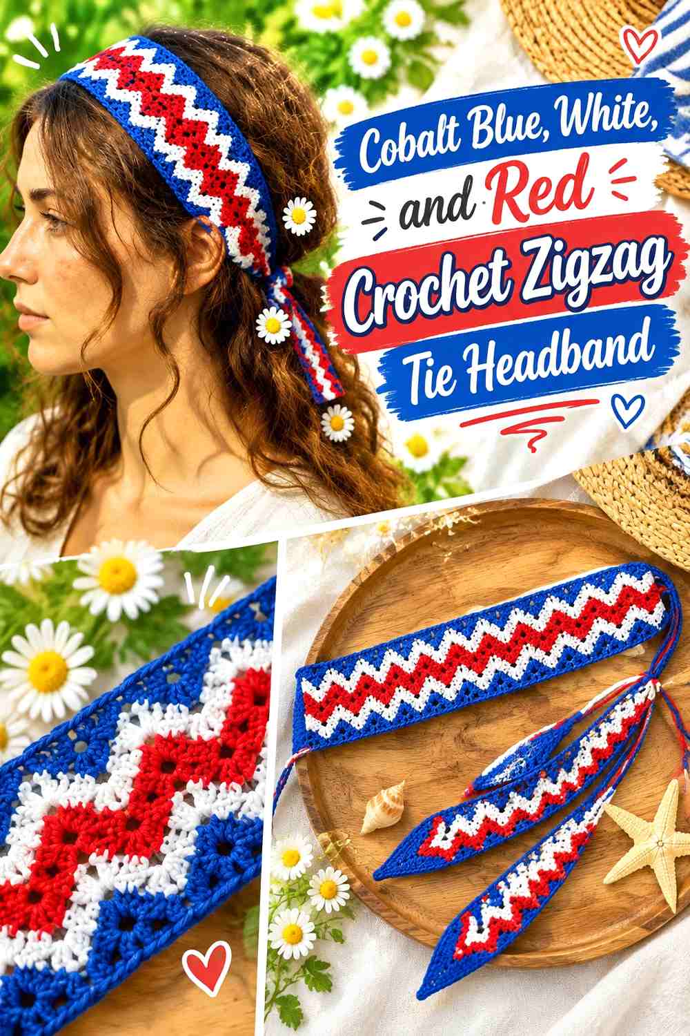
Cobalt blue provides a saturated cool base, white gives the zigzag its clearest separation, and red adds a smaller warm accent. This combination works particularly well when the ties remain mostly cobalt so the patterned central section stays visually connected to the ends.
Cobalt Blue Should Continue From the Zigzag Headband Into the Ties
Using cobalt in both the patterned body and tie sections prevents the accessory from looking like a multicolor patch attached to unrelated cords.
Let blue form the largest share of the zigzag and allow the white and red sections to interrupt it rather than replace it.
White Should Keep Cobalt Blue and Red Zigzags From Competing
Place white between some of the strongest blue-and-red sections. The lighter neutral gives the peaks clearer boundaries and prevents the two saturated hues from becoming one dense block at normal viewing distance.
Creator Credit: 1YUMAKLAGELENLER
4. Neon Lime, Black, and Purple Crochet Zigzag Oversized Scrunchie
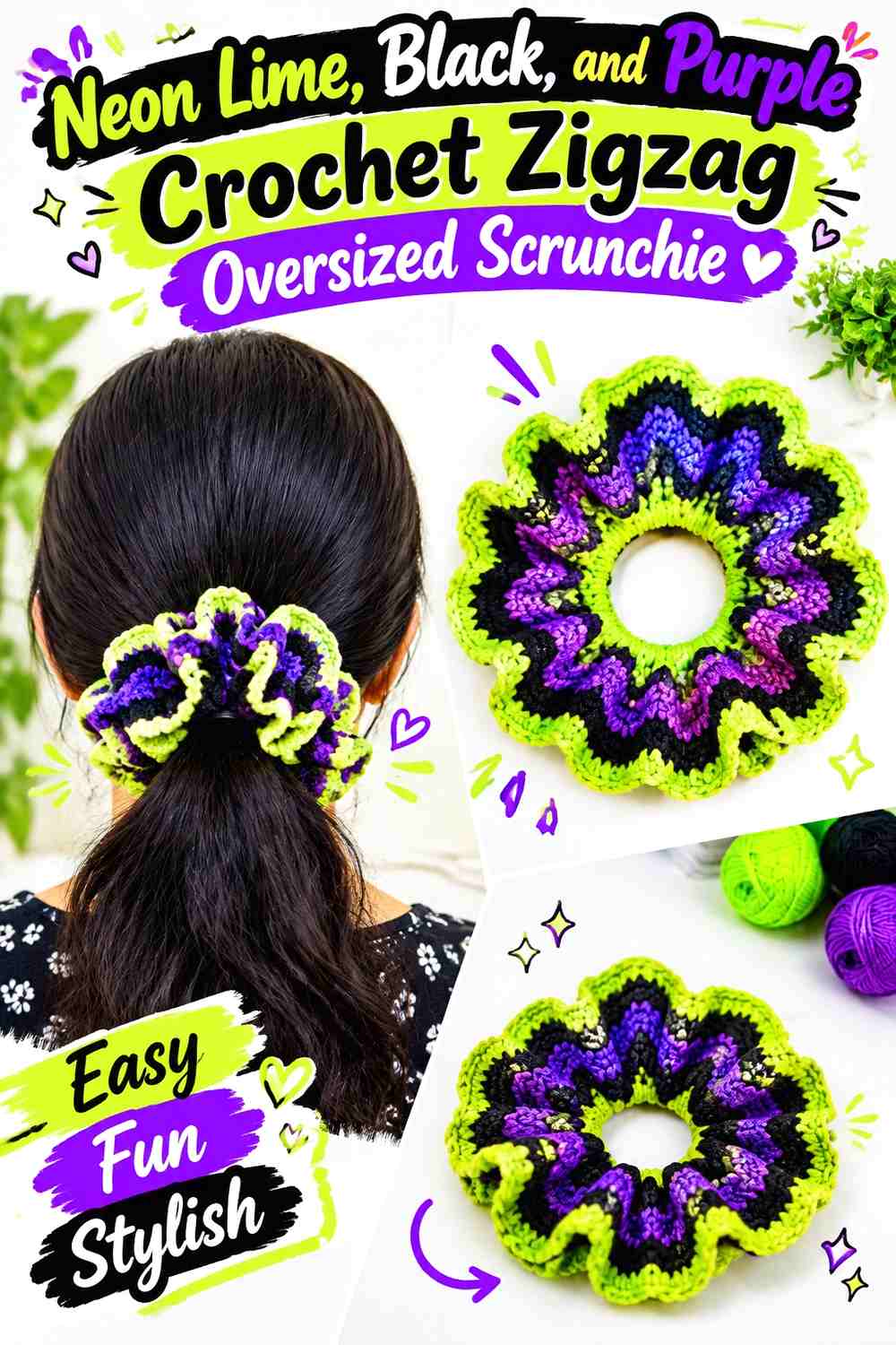
An oversized scrunchie gives zigzag colorwork enough gathered surface to stay visible even after the fabric bunches around the elastic. Neon lime can become the standout shade, black can organize the pattern, and purple can supply a second strong color without matching lime’s brightness.
Neon Lime Needs Broad Crochet Zigzags on an Oversized Scrunchie
Make lime sections wide enough that they remain visible after gathering. Very narrow color changes can disappear into folds, especially when the scrunchie compresses around a ponytail.
Repeat lime around the full circumference instead of concentrating it on one side.
Black Can Keep Neon Lime and Purple Scrunchie Zigzags Legible
Use black as the visual separator rather than another equal color field. A consistent dark zigzag can make lime and purple easier to distinguish after the fabric folds.
On very dark hair, keep enough lime or purple along the outer ruffle so the accessory silhouette remains visible.
Creator Credit: Hopeful Turns
5. Bubblegum Pink, Turquoise, and White Crochet Zigzag Scrunchie
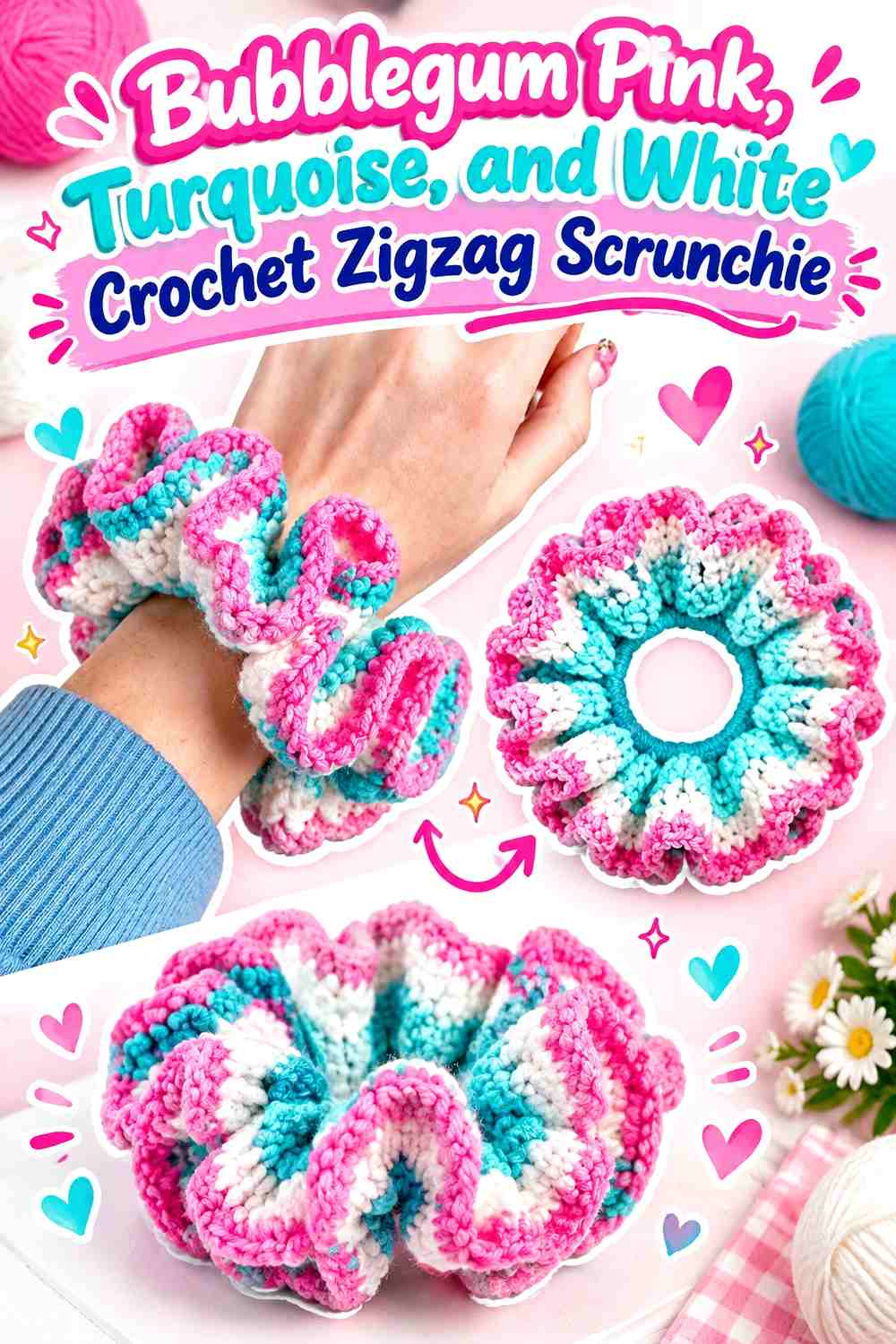
Bubblegum pink and turquoise create the main 90s-inspired color contrast here, while white prevents the two bright shades from filling every fold. Use pink as the dominant color and repeat turquoise in slightly narrower bands.
Bubblegum Pink Should Stay Visible Through the Gathered Crochet Scrunchie
Give pink enough consecutive surface area that several folds can hide part of a stripe without eliminating the color completely.
If your zigzag changes colors too frequently, the gathered result may look speckled rather than intentionally chevroned.
White Can Open Up Bubblegum Pink and Turquoise Zigzags
Use white at controlled intervals instead of edging every color change. The light neutral is most helpful where pink and turquoise meet repeatedly and need extra value separation.
Creator Credit: ElyseCrochets 💌
6. Orange, Fuchsia, and Black Crochet Zigzag Ruffle Scrunchie
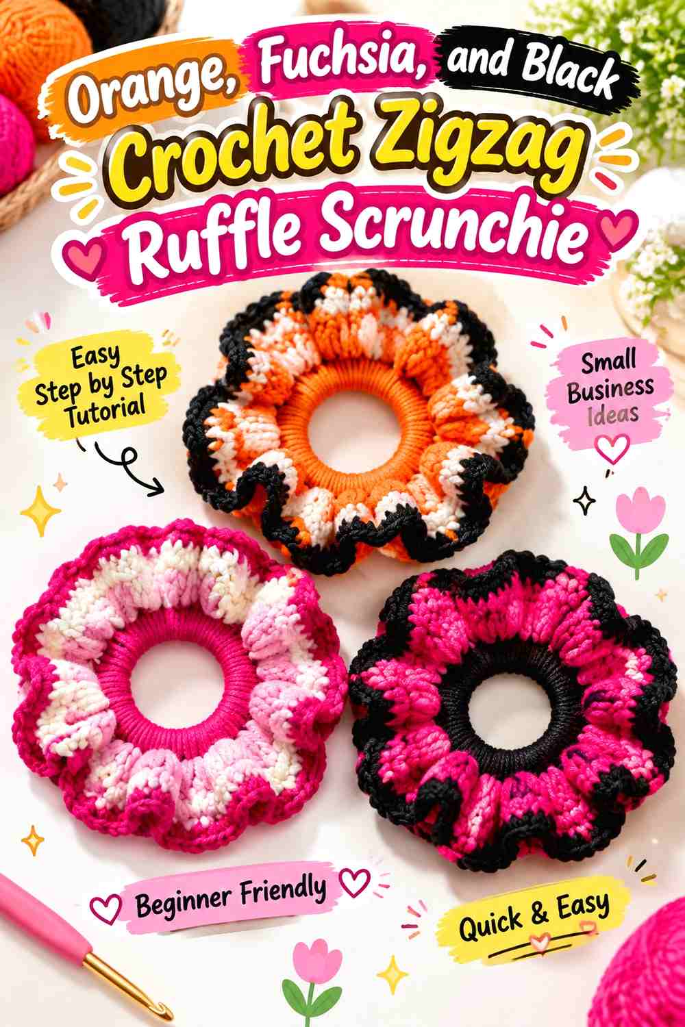
Orange and fuchsia can both demand attention, so black has an important organizing role. Let fuchsia cover more of the ruffled surface, repeat orange in fewer zigzag sections, and reserve black for defined separators or an inner band.
Fuchsia Should Lead the Orange Crochet Zigzag Ruffle
Use fuchsia over the widest peaks so the scrunchie has a clear main bright color. Orange can then become a repeating secondary stripe rather than competing for equal surface area.
This hierarchy remains especially useful once the ruffles overlap.
Black Should Ground Orange and Fuchsia Scrunchie Zigzags
A narrow black section can create definition between saturated colors while making the ruffle edges easier to read.
Avoid making black equally broad unless you want a much darker accessory; visually, it can outweigh both bright colors quickly.
Creator Credit: Crochet Chronicles
7. Denim Blue, Mustard, and Burgundy Crochet Zigzag Hair Scarf
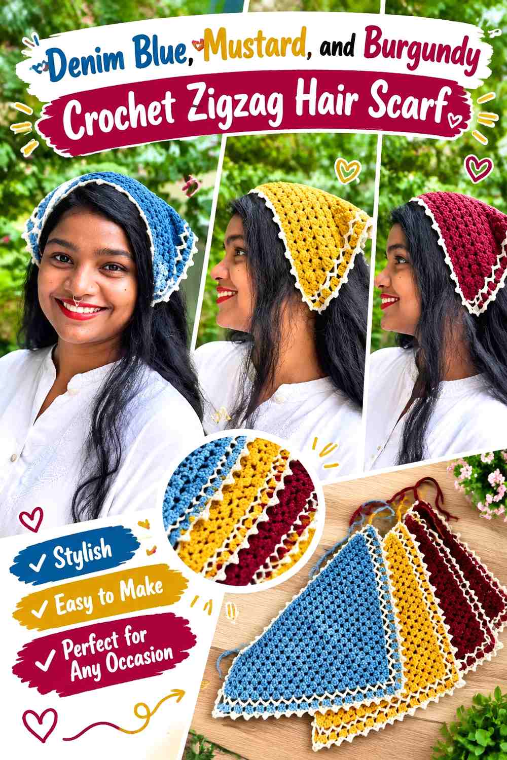
This is a more muted 90s-inspired palette. Denim blue can cover most of the hair scarf, mustard can create warm zigzag peaks, and burgundy can add the darkest accent along selected bands or ties.
Denim Blue Should Create the Main Crochet Zigzag Hair Scarf Field
Use blue continuously enough that the scarf remains easy to coordinate as one accessory. Larger denim-blue sections also give the smaller mustard and burgundy bands plain space around them.
On dark hair, mustard can be moved toward the outer edge for clearer contrast.
Mustard Can Brighten Denim Blue While Burgundy Defines the Zigzag
Use mustard where you want the peaks to attract attention and burgundy where the pattern needs depth. Avoid alternating all three colors in identical widths, which can make the scarf read as regular stripes rather than a color hierarchy.
Creator Credit: Crochet by Amrita
8. Teal, Cream, and Brick Red Crochet Zigzag Triangle Bandana

Teal gives this triangle bandana a deep main field, cream supplies the lightest contrast, and brick red brings a controlled warm interruption. The triangular shape gives enough room for the zigzags to widen visually as the accessory expands.
Teal Should Repeat Across the Full Crochet Zigzag Bandana
Keep teal present from the upper section through the wider lower area. If it disappears for several bands, the accessory can feel divided into separate color zones rather than one coherent triangle.
Cream Should Separate Teal and Brick Red Zigzag Bands
Cream works particularly well between the two darker colors because it preserves each peak’s outline. Brick red can then appear less frequently as the warm focal color.
If the border is cream, keep the ties teal or brick red so the edge does not become visually detached from the main triangle.
Creator Credit: Yarn Stash with Marching North
9. Lavender, Mint, and Soft Pink Crochet Zigzag Ponytail Scrunchie
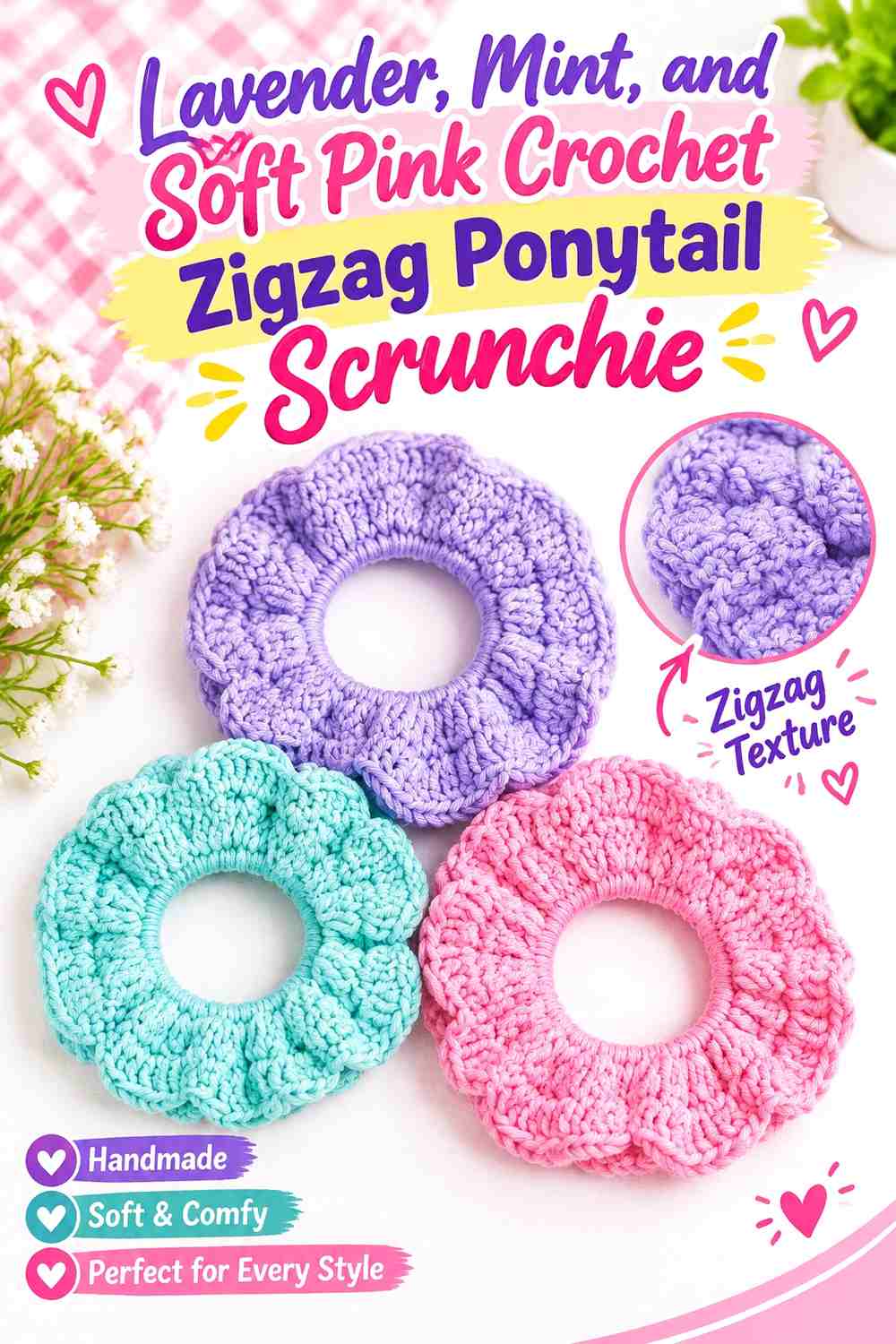
This pastel version relies on hue differences more than strong value contrast. Lavender can lead, mint can provide the coolest supporting band, and soft pink can repeat in narrower sections. Because all three shades are light, make the zigzag sections broad enough to stay visible when gathered.
Lavender Should Dominate the Pastel Crochet Zigzag Scrunchie
Give lavender the largest share so the accessory has one clear base color. Equal pastel stripes can blur together once the yarn folds around the hair elastic.
Mint Needs Space From Soft Pink in Lavender Zigzags
Use lavender between some mint and pink areas when those two pale accents begin to merge visually. You can also compare the yarns in grayscale; similar values are fine if you want a blended effect, but the actual zigzag will appear softer.
Creator Credit: Treasurie
10. Cherry Red, Navy, and White Crochet Zigzag Mini Scrunchie
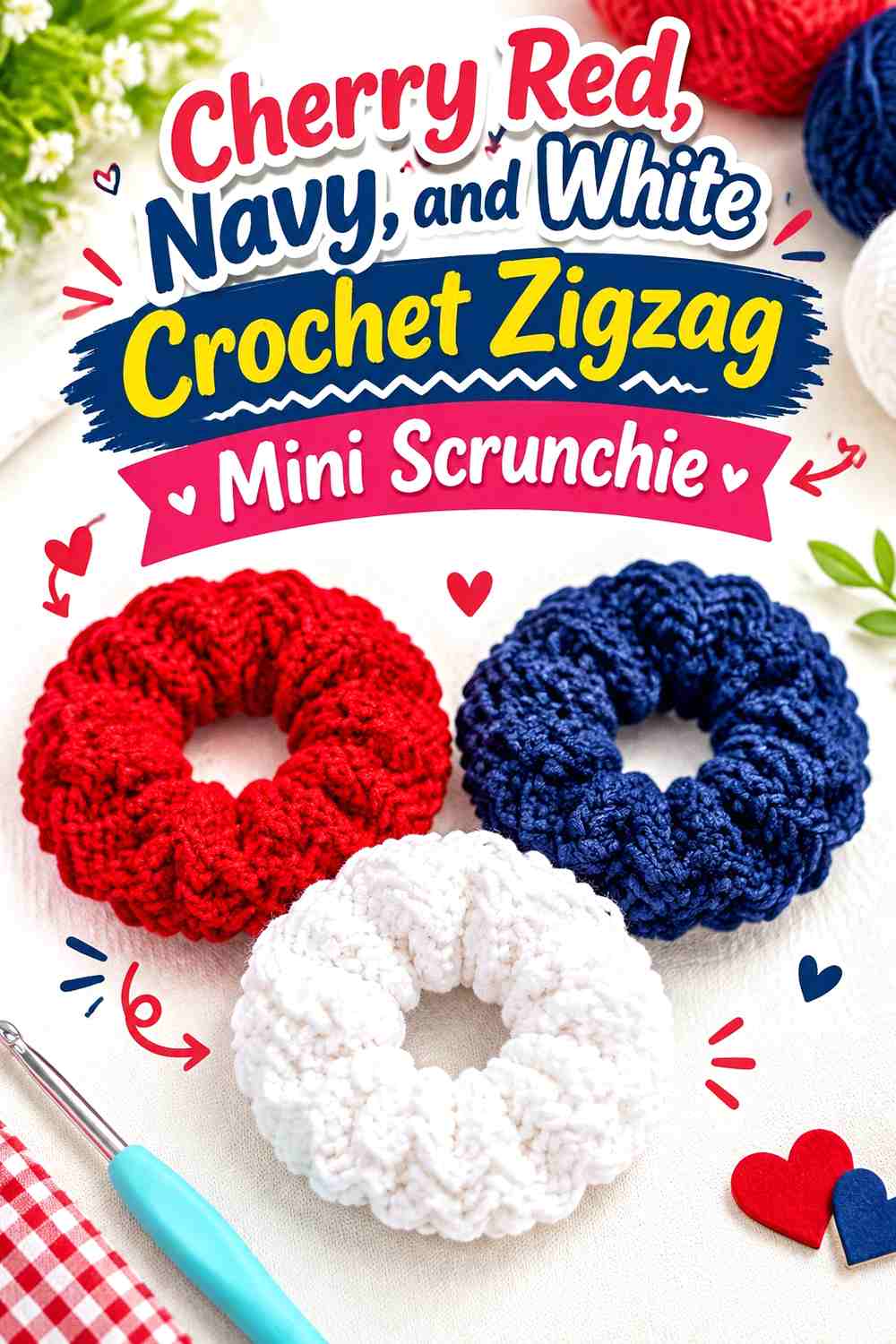
A smaller scrunchie has less visible surface, so the palette needs simpler distribution. Cherry red can dominate the outer portion, navy can provide narrow dark zigzags, and white should be restricted to a few lighter interruptions.
Cherry Red Needs Enough Width on the Crochet Mini Scrunchie
Use broader red areas than you might on an oversized scrunchie. Tight gathering can hide very small color sections completely.
Keeping red as the largest surface also prevents navy from making the accessory visually smaller.
White Can Keep Cherry Red and Navy Zigzags From Looking Too Dense
Insert white strategically where two strong colors meet. A little light yarn can make the change of direction more obvious without turning the mini scrunchie into a three-way equal stripe pattern.
Creator Credit: RadCrochet
11. Aqua, Black, and Magenta Crochet Zigzag Tie Headband
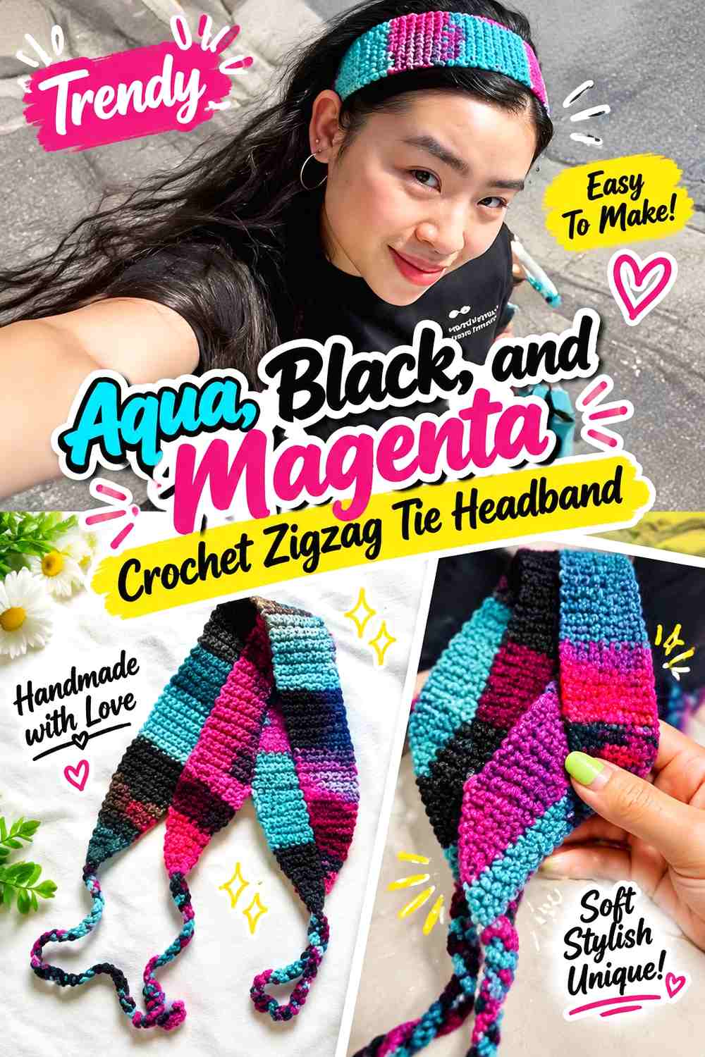
Aqua creates the main bright field, black establishes a crisp zigzag framework, and magenta supplies a smaller saturated accent. The long tie ends can stay mostly aqua or black so the busy pattern remains concentrated across the top of the head.
Aqua Should Carry the Main Crochet Zigzag Headband Width
Keep aqua in the broadest bands where the accessory is most visible. This gives magenta room to function as an accent instead of forcing both bright colors into constant competition.
Black Should Frame Aqua and Magenta Zigzag Peaks
Use black in narrow, repeated sections to define each color shift. Against dark hair, allow aqua to reach part of the outer edge so the headband remains clearly outlined.
Creator Credit: Triple Capricorn
12. Plum, Chartreuse, and Cream Crochet Zigzag Wrap Headband
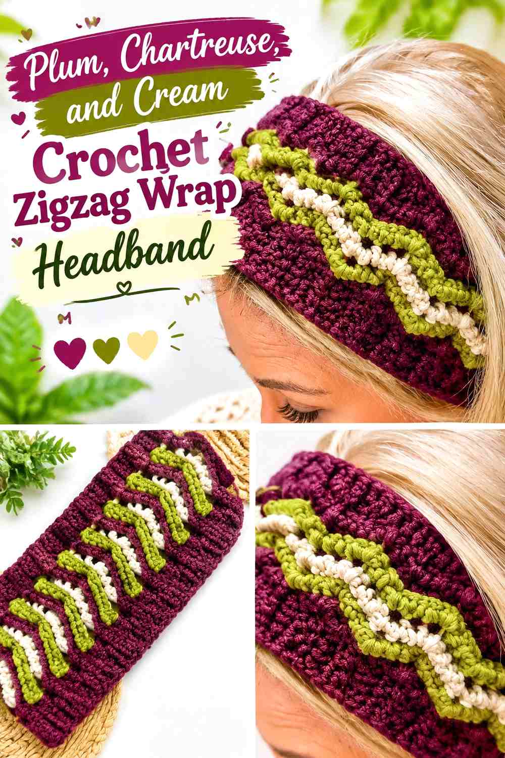
Plum gives this headband a dark foundation, chartreuse supplies the brightest 90s-inspired accent, and cream provides a calmer transition. Since chartreuse naturally attracts attention, it can occupy far less area than plum.
Plum Should Keep the Crochet Zigzag Wrap Headband Grounded
Use plum through most of the headband width and repeat it around any overlap or wrap area. A consistent dark base prevents the chartreuse accent from making the accessory feel visually top-heavy.
Chartreuse Should Punctuate Plum and Cream Zigzags
Limit chartreuse to narrow peaks or a few repeated bands. Cream can sit between chartreuse and plum where a softer transition is useful.
If the headband already has a prominent twisted or wrapped front, avoid concentrating all chartreuse there; spread small repetitions across the band.
Creator Credit: Di’s Handicrafts (Crochet and Knitting)
13. Sky Blue, Lilac, and Charcoal Crochet Zigzag Headscarf

Sky blue and lilac create a cooler soft-color pairing, while charcoal gives the zigzag enough depth to remain obvious over hair. Let sky blue dominate the triangle and use charcoal less frequently than either colored shade.
Sky Blue Should Form the Main Crochet Zigzag Headscarf Area
Repeat sky blue throughout the triangle rather than reserving it only for the border. That keeps the scarf visually light even when charcoal is introduced.
Charcoal Can Protect Sky Blue and Lilac Zigzag Definition
Use charcoal as a narrow divider, edge, or occasional band where the two lighter hues blend too closely. Because charcoal is much darker, small amounts can provide substantial contrast.
On dark hair, lilac or sky blue should remain visible along part of the outer edge rather than allowing charcoal to form the entire perimeter.
Creator Credit: VivCrochets
14. Neon Pink, Cobalt, and Black Crochet Zigzag Flower Barrette

A small barrette does not have room for many full-width zigzags, so concentrate the pattern inside the flower or backing motif. Neon pink can lead, cobalt can form a secondary chevron-like color layer, and black can anchor the piece around the clip.
Neon Pink Should Dominate the Crochet Zigzag Barrette Surface
Give pink the largest petal or backing area so the accessory remains visible even when partly covered by hair. Tiny equal sections of three colors would make the zigzag harder to identify on such a compact piece.
Cobalt Can Contrast Neon Pink While Black Grounds the Barrette
Use cobalt in one repeated inner or outer section and keep black close to the base or narrow boundaries. On dark hair, black can visually recede, leaving the two brighter colors as the visible zigzag relationship.
Creator Credit: Meladora’s Creations for Crochet
15. Turquoise, Purple, and Lime Crochet Zigzag Hair Clip
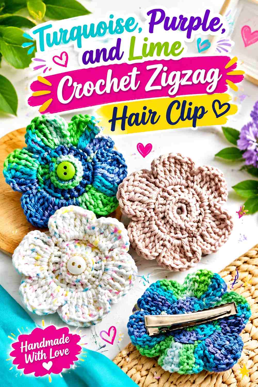
Turquoise can create the main crochet surface of this hair clip, purple can define the repeated zigzag change, and lime can become the smallest but brightest accent. Since the finished piece is compact, the zigzag should read through broad color blocks rather than many narrow stripes.
Turquoise Should Cover Most of the Crochet Zigzag Hair Clip
Use turquoise across the largest visible section so the clip retains a recognizable base color. This also gives purple enough plain space to create a visible change in direction.
Lime Should Highlight Turquoise and Purple Zigzag Details Sparingly
Place lime at selected peaks, centers, or edge points rather than across an equal third of the clip. Its brightness lets it remain noticeable in very small quantities.
If turquoise and purple are similar in value, lime can also act as the small visual break that keeps the pattern from flattening.
Creator Credit: Wizard of Loops
Which 90s-Inspired Crochet Zigzag Palette Should You Choose?
For the strongest graphic contrast, start with hot pink, black, and white; neon lime, black, and purple; or aqua, black, and magenta. Black gives the zigzag a clear framework and lets the brighter shades remain highly visible.
For a softer 90s-inspired direction, lavender with mint and pink or sky blue with lilac creates a lighter palette. These combinations benefit from broader zigzags because their values are closer together.
If you prefer deeper colors, try denim blue with mustard and burgundy, teal with cream and brick red, or plum with chartreuse and cream. These palettes keep the zigzag noticeable while relying less on neon color.
Conclusion
A crochet zigzag hair accessory works best when the color pattern remains readable after the piece is tied, gathered, folded, or clipped into the hair. That means the ideal stripe width for a flat bandana may be too narrow for a scrunchie, where folds can hide parts of the motif.
Choose one dominant shade first, then decide whether your second color should support it or strongly contrast with it. Use a third shade only where it adds useful separation or a controlled pop of color. For a coordinated set, repeat one or two colors across different accessories rather than making every headband, scrunchie, clip, and scarf a completely unrelated palette.
Use the credited tutorials for their construction concepts, then adapt the zigzag placement and colors independently for the 90s-inspired look you want.
Frequently Asked Questions
What colors work well for a 90s-inspired crochet zigzag hair accessory?
Hot pink, aqua, purple, lime, cobalt, turquoise, black, white, orange, magenta, denim blue, and other bold or contrasting combinations can all work. The strongest palette is one where the zigzag remains visible rather than one that simply contains the most bright colors.
How many colors should I use in a crochet zigzag headband?
Two or three colors are usually enough. One can dominate the band, a second can create the repeated zigzag contrast, and a third can be limited to narrower peaks, borders, or ties.
How can I keep zigzags visible on a crochet scrunchie?
Make the color sections broad enough to survive gathering. Narrow stripes that look clear when the crochet is flat can disappear into folds once the scrunchie wraps around an elastic.
Should black be the dominant color in a neon crochet hair accessory?
It can be, but it does not have to be. Black often works especially well as a separator because a narrow dark section can give neon pink, lime, aqua, or purple much stronger definition.
Can pastel colors work for a 90s-inspired zigzag accessory?
Yes. Lavender, mint, soft pink, sky blue, and lilac can create a softer direction. Because pastel shades may have similar lightness, use broader color bands or add one darker accent if you want the zigzag to stay clearly visible.
How do I choose zigzag colors for dark hair?
Include at least one color that separates clearly from the hair around the accessory’s visible outer edge. Bright pink, aqua, cream, lime, or another lighter shade can help a dark-bordered accessory remain defined.
How do I substitute colors without losing the zigzag effect?
Preserve their roles. Replace the dominant bright shade with another similarly strong color, keep the separator noticeably lighter or darker, and choose an accent that still stands apart from both. Maintaining contrast is more important than matching an exact shade name.