Forest green gives a crochet pullover enough depth to work as a strong main color, but the supporting shades determine whether the finished garment looks soft, earthy, graphic, tonal, or richly layered. Because a pullover has several natural color-placement areas—the body, sleeves, cuffs, neckline, hem, yoke, and textured sections—you can change the entire visual direction without changing the basic sweater concept.
The most useful question is not simply which colors match forest green. Decide whether forest green should dominate the body, share space with another color, or sit inside a more complex stripe or tonal arrangement. Then consider whether the secondary shade creates enough light-and-dark separation to keep crochet texture visible.
Quick List
- Forest Green And Cream Raglan Crochet Pullover
- Forest Green And Oatmeal Oversized Crochet Pullover
- Forest Green And Camel Classic Crochet Pullover
- Forest Green Rust And Ivory Striped Crochet Pullover
- Forest Green And Sage Mesh Crochet Pullover
- Forest Green And Charcoal Diamond Texture Crochet Pullover
- Forest Green And Mustard Crochet Pullover
- Forest Green And Terracotta Textured Crochet Pullover
- Forest Green And Dusty Rose V Neck Crochet Pullover
- Forest Green Burgundy And Cream Eyelet Crochet Pullover
- Forest Green And Denim Blue Crochet Pullover
- Forest Green And Soft Lilac Puff Stitch Crochet Pullover
- Forest Green Black And Ivory Crochet Pullover
- Forest Green Moss And Olive Tonal Crochet Pullover
How to Keep Forest Green Crochet Pullover Details Visible
Forest green can sit fairly dark in a palette, so closely related dark colors may reduce the visibility of ribbing, raised stitches, openwork, or decorative color changes. Before committing to a second shade, place the yarns beside each other and look at them from several feet away. A quick grayscale photo can also show whether two different hues actually have enough value contrast.
On a pullover, lighter contrast is especially useful around smaller visual areas such as the neckline, cuffs, hem, or narrow stripes. If the entire body is forest green, a lighter edge can separate the sweater silhouette while allowing the green to remain dominant.
Texture matters too. Forest green can make pronounced crochet texture look rich and dimensional, but very dark supporting colors may visually merge with it. When stitch definition is an important part of the design, reserve the clearer light/dark contrast for the most detailed sections.
Where to Place Accent Colors on a Forest Green Crochet Pullover
A pullover gives you several ways to introduce another shade without dividing the garment into equal blocks. For a forest-green-led sweater, the secondary color can be restricted to the neckline, sleeve cuffs, hem, shoulder area, or a repeated stripe. This keeps the main body cohesive while still making the palette intentional.
If you want a stronger two-color effect, carry the second shade onto the sleeves or across the yoke. Repeating an accent in at least two areas—such as cuffs and neckline—usually feels more connected than placing an unrelated color in only one small spot.
For three-color pullovers, give the colors clear jobs. Forest green can dominate, a neutral can create separation, and the third color can provide smaller accents. This is particularly useful when the third shade is strong enough to compete with forest green.
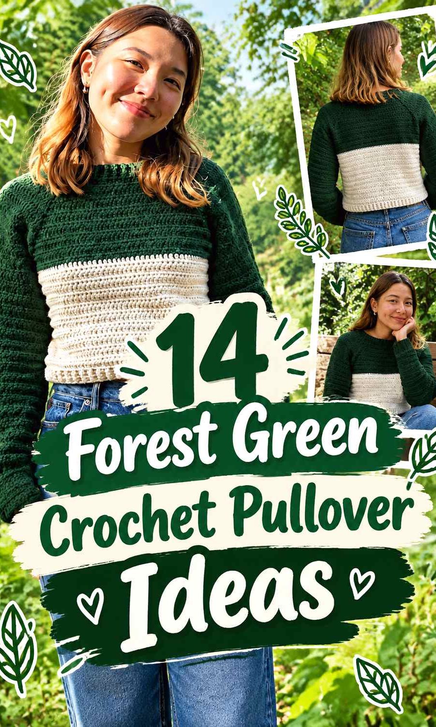
1. Forest Green And Cream Raglan Crochet Pullover

Forest green and cream create one of the clearest ways to show raglan shaping without turning the pullover into a heavily multicolored piece. Let forest green cover most of the body and sleeves, then use cream around the neckline, cuffs, hem, or selected yoke details. The lighter neutral gives the darker green a defined edge and can make construction lines easier to see.
Let Forest Green Lead the Raglan Pullover Body
Keep forest green across the largest uninterrupted areas when you want the pullover to read primarily as green. The front, back, and most of the sleeves are natural places for it. Concentrating the main shade there also prevents cream from breaking the garment into too many separate visual sections.
Use Cream to Separate Forest Green Around the Raglan Yoke
Cream can be most useful near the upper body, where raglan lines and neckline details occupy less space. A lighter accent around this area provides clearer separation against forest green. If the yoke already has visible construction detail, avoid scattering cream randomly; repeat it in an organized band or finishing area instead.
Repeat Forest Green and Cream at the Pullover Cuffs
When cream appears near the neckline, carrying it into the cuffs or hem helps the contrast feel deliberate. Forest green should still occupy enough of each sleeve to connect visually with the body. If cream becomes too dominant at both ends of the garment, reduce its width rather than introducing another color.
Creator Credit: VivCrochets
2. Forest Green And Oatmeal Oversized Crochet Pullover
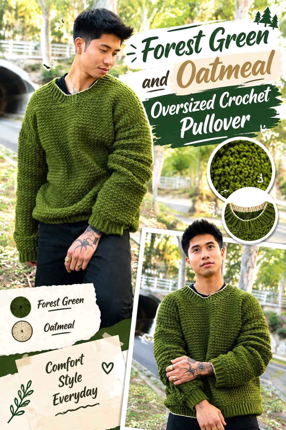
Oatmeal gives forest green a softer neutral partner than a bright white or very pale cream. That makes this combination well suited to an oversized pullover where broad body panels already create a large visual field. Forest green can dominate the main rectangles while oatmeal softens ribbing, sleeve ends, or a narrow lower-body section.
Keep Forest Green Across the Oversized Pullover Panels
Large pullover panels can make two equally strong colors look blocky, so give forest green the larger share of the body. An uninterrupted green front and back allow the oversized silhouette and stitch texture to remain the main features instead of turning the garment into color blocking.
Let Oatmeal Soften the Forest Green Pullover Edges
Oatmeal works well where you want contrast without a sharp outline. Try it conceptually at the neckline, hem, or cuff rather than through the entire body. Its softer value transition can be useful when you want the forest green to remain substantial but not visually severe.
Check Forest Green and Oatmeal Contrast Before Crocheting Ribbing
Not every oatmeal shade is equally light. If your oatmeal yarn is medium or gray-brown, compare it directly with the forest green before assigning it to ribbing. Enough value difference is helpful when you want the ridged structure around cuffs or the lower band to remain noticeable.
Creator Credit: it’s erin b.
3. Forest Green And Camel Classic Crochet Pullover
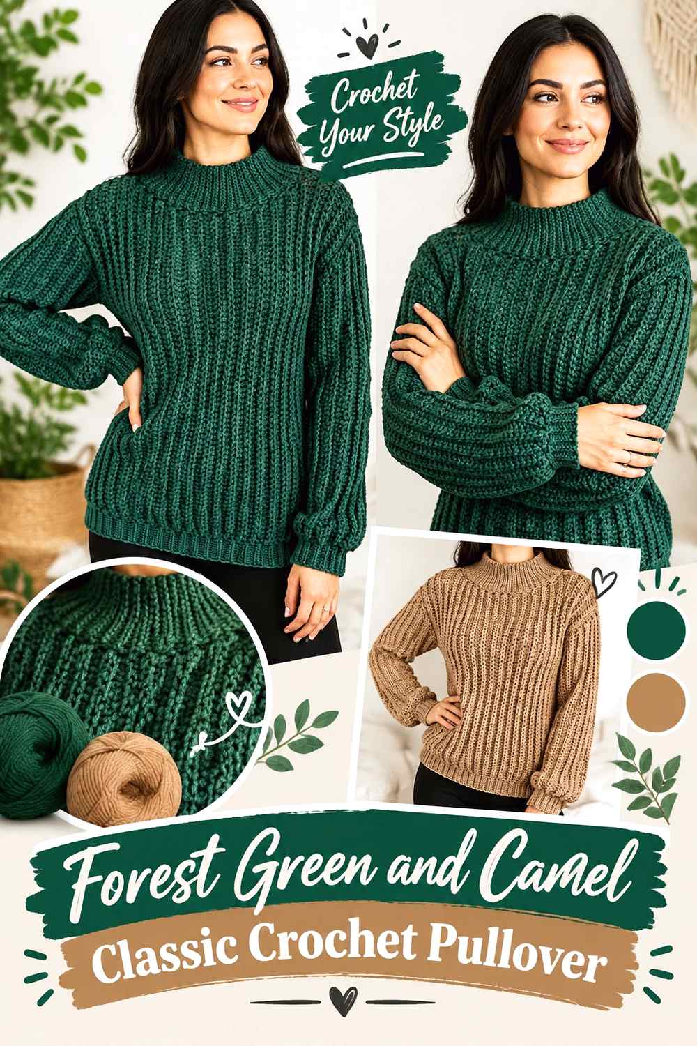
Forest green with camel creates a warmer, earthier direction without relying on a bright accent. Camel can frame a classic pullover through cuffs, neck edging, or a controlled shoulder detail while forest green stays responsible for most of the visual weight. The combination works especially well when you want noticeable contrast that remains muted.
Make Forest Green the Main Classic Pullover Color
For a straightforward sweater silhouette, keeping the torso predominantly forest green prevents the warmer camel from becoming the focal point. This lets the dark green establish the garment while camel functions as finish and definition.
Use Camel to Warm the Forest Green Pullover Sleeves
A camel cuff or narrow sleeve band can shift the palette warmer without separating the sleeves from the body. If you add camel higher on the sleeve, repeat it near the neckline or hem so the warm color does not look isolated.
Keep Camel Narrower Than Forest Green Around the Pullover Collar
A wide camel collar can visually outweigh the green body because it sits close to the face and upper chest. When forest green is meant to remain dominant, use camel as a narrower frame. For lower contrast, choose a deeper camel; for clearer separation, choose one that is visibly lighter than the forest green.
Creator Credit: TCDDIY
4. Forest Green Rust And Ivory Striped Crochet Pullover
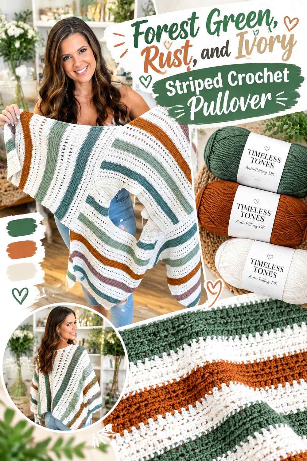
Rust adds a warm accent to forest green, while ivory prevents the two stronger colors from competing directly across every stripe. On a striped pullover, forest green can remain the anchor shade, rust can provide occasional warm bands, and ivory can act as visual space between them.
Give Forest Green the Widest Pullover Stripes
When all three colors appear in equal-width stripes, the garment can become visually busy. Make forest green the most repeated or widest stripe so the pullover still reads clearly as a forest-green design. This is particularly effective through the torso, where wide horizontal bands have the greatest visual impact.
Use Ivory Between Forest Green and Rust Stripes
Forest green and rust are both substantial colors, so an ivory stripe can create useful separation when they feel too heavy side by side. Ivory does not need to appear between every color change; a few repeated light bands can be enough to keep the sequence readable.
Repeat Rust Sparingly Against Forest Green Sleeves
Rust can work as an accent stripe around the sleeves, but avoid giving it a larger share there than on the body unless you deliberately want contrast-heavy sleeves. Repeating the same rust placement on both sleeves can keep a striped forest green pullover visually balanced.
Creator Credit: MJ’s Off The Hook Designs
5. Forest Green And Sage Mesh Crochet Pullover
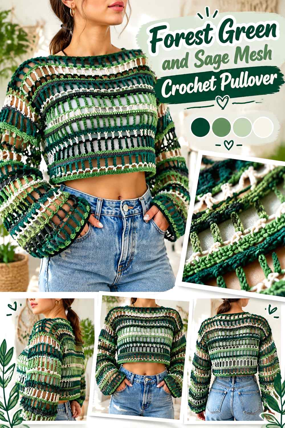
Forest green and sage keep the palette within the green family while creating enough tonal change to emphasize an open or mesh-like surface. Forest green can provide the stronger framework, while sage lightens selected panels or bands. The success of this combination depends more on value difference than on the fact that both colors are green.
Keep Forest Green Around the Strongest Mesh Pullover Areas
Use forest green where you want the structure of the pullover to appear most defined. On openwork fabric, the darker shade can give edges and larger solid sections more visual weight, which helps the garment avoid looking uniformly pale or delicate.
Place Sage Beside Forest Green Where the Mesh Needs Separation
Sage is useful in sections where you want a lighter break while remaining within the botanical palette. It can occupy a sleeve band, alternating area, or smaller section of the body. Make sure the sage is visibly lighter than your forest green if you want the color changes to remain clear through open stitches.
Avoid Forest Green and Sage Shades That Merge From a Distance
Two greens can look clearly different in skeins but nearly identical once crocheted. Place a small swatch or sample of the colors beside each other and view it from a distance. If the distinction disappears, choose either a lighter sage or a deeper forest green rather than adding a third color simply to correct the problem.
Creator Credit: Kenikse Crochet
6. Forest Green And Charcoal Diamond Texture Crochet Pullover

Forest green and charcoal produce a dark, restrained palette that puts more emphasis on stitchwork than on bright color contrast. Because the two shades can be relatively close in value, placement matters. Forest green should usually cover most textured areas, while charcoal works better as a controlled frame or detail.
Let Forest Green Carry the Diamond-Texture Pullover Surface
If the pullover includes open diamond-like texture or another repeated stitch pattern, forest green can cover the main body so the stitch rhythm remains continuous. Breaking the texture too frequently with charcoal may distract from the pattern itself.
Keep Charcoal Separate From Forest Green in Narrow Pullover Details
Charcoal is useful around cuffs, neckline ribbing, or a narrow hem because these areas have clear boundaries. Placing charcoal directly into small forest-green texture may make the detail less visible if both yarns have similar darkness.
Test Forest Green and Charcoal in Grayscale Before Committing
This is a palette where a grayscale check is particularly useful. If forest green and charcoal become nearly the same gray value, use their similarity deliberately for a subtle result. If you need clearer color blocking, shift the charcoal lighter or choose a forest green with noticeably different depth.
Creator Credit: ByKaterina
7. Forest Green And Mustard Crochet Pullover

Mustard creates a stronger warm accent than camel or oatmeal, so it needs more controlled placement against forest green. On a pullover, a small amount at the cuffs, neckline, shoulder line, or one body band can make a clear difference without dividing the garment into competing blocks.
Keep Forest Green Dominant When Mustard Is Saturated
A vivid mustard can attract attention even when it covers less area than forest green. Keep the torso and most of the sleeves green if you want the garment to remain grounded. Treat mustard as a deliberate highlight instead of matching the green stitch for stitch across the whole pullover.
Repeat Mustard Against Forest Green in Two Pullover Areas
If mustard appears only on one cuff or one isolated band, it may look disconnected. Repeating it at the neckline and cuffs, or at the hem and sleeve ends, gives the accent a visible pattern without requiring more colors.
Protect Forest Green Texture From Too Many Mustard Details
If the pullover already uses noticeable stitch texture, let that texture and the color contrast share the visual work. Small mustard lines can define an edge, but frequent accent changes across raised stitches may make both the texture and color distribution harder to read.
Creator Credit: Brunaticality
8. Forest Green And Terracotta Textured Crochet Pullover
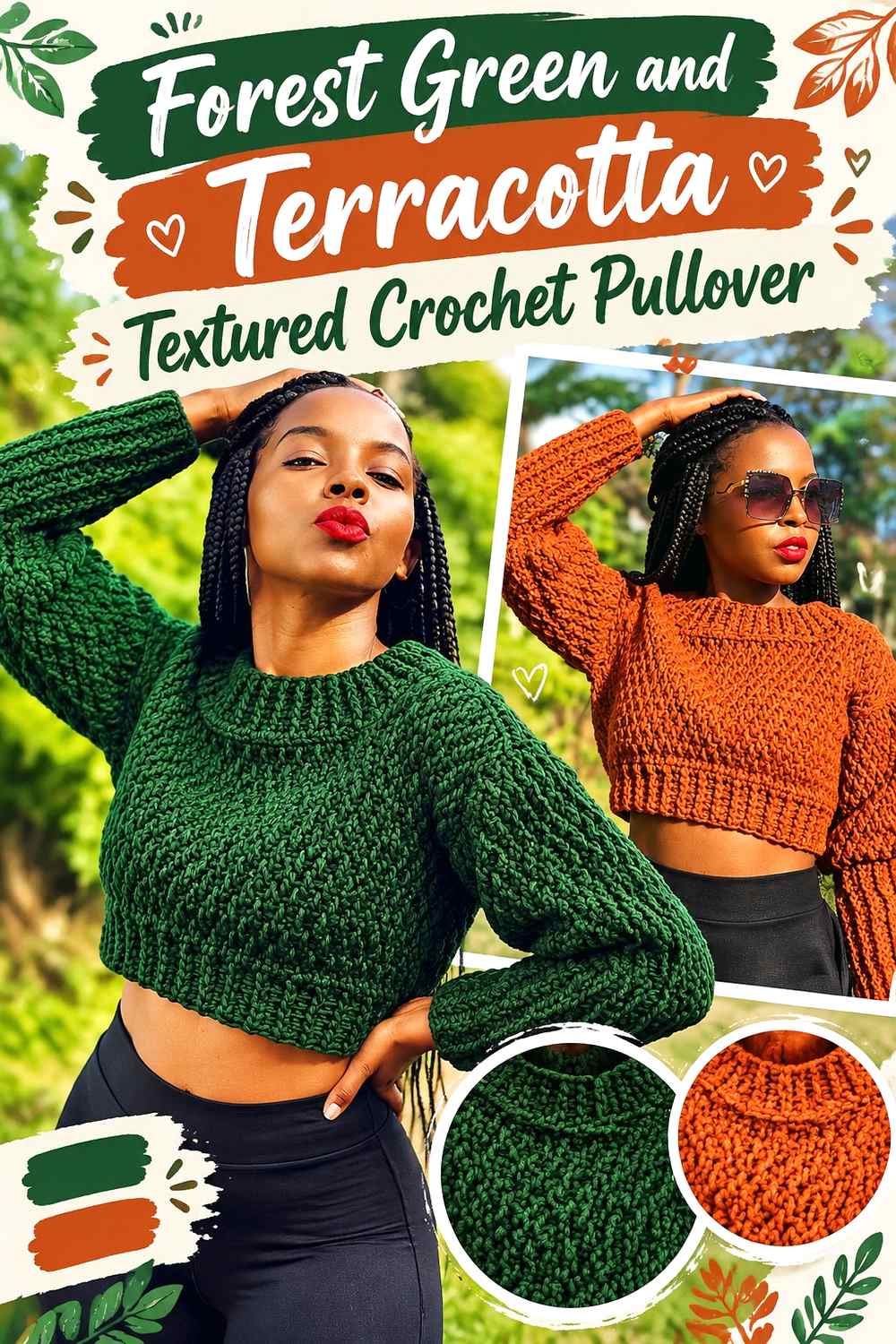
Terracotta gives forest green an earthy warm counterpart with less brightness than a strong orange. This is particularly useful on a textured pullover, where both color and raised stitchwork are already competing for attention. Forest green can stay across the main textured surface, while terracotta marks ribbing or selected sections.
Use Forest Green Across the Main Textured Pullover Panels
Raised crochet texture is often easiest to appreciate when it is not interrupted too frequently. Keeping the body forest green allows shadows within the stitches to provide variation naturally, while terracotta can be reserved for simpler finishing areas.
Put Terracotta Beside Forest Green at Pullover Cuffs and Hem
Cuffs and hems create natural boundaries for warm terracotta. Using it there can frame the forest-green body without interfering with central texture. If the terracotta is fairly dark, compare it against the green first to make sure the color change will remain distinct.
Keep Forest Green Visible When Adding Terracotta to a Cropped Pullover
A shorter body gives every color band more visual weight. If a terracotta hem becomes too deep, it can reduce the amount of forest green substantially. Use the warm shade more narrowly when the sweater is cropped so the main green field remains obvious.
Creator Credit: AC Crochets
9. Forest Green And Dusty Rose V Neck Crochet Pullover

Dusty rose softens forest green without turning the palette into a high-saturation contrast. A V-neck gives you a particularly useful place to apply the pink because the neckline naturally creates a visual frame. Forest green can remain across the body and sleeves while dusty rose is repeated through smaller finishing details.
Frame Forest Green With Dusty Rose at the V-Neck
A narrow dusty rose neckline can make the V shape clearer against a dark forest-green body. Because the neckline already directs attention toward the center of the pullover, it usually needs less accent color than the hem or sleeves.
Keep Forest Green Across Most of the V-Neck Pullover Body
Dusty rose works most effectively here as support rather than an equal partner. Keeping the large body panels green avoids shifting the sweater into a pink-and-green color-block design unless that is specifically the goal.
Repeat Dusty Rose Against Forest Green at the Pullover Cuffs
Small dusty rose cuffs can connect the neckline color to the sleeves. If you want a quieter finish, use forest green for the hem rather than adding rose to every border. That creates repetition without outlining the entire garment in the accent shade.
Creator Credit: forthefrills
10. Forest Green Burgundy And Cream Eyelet Crochet Pullover
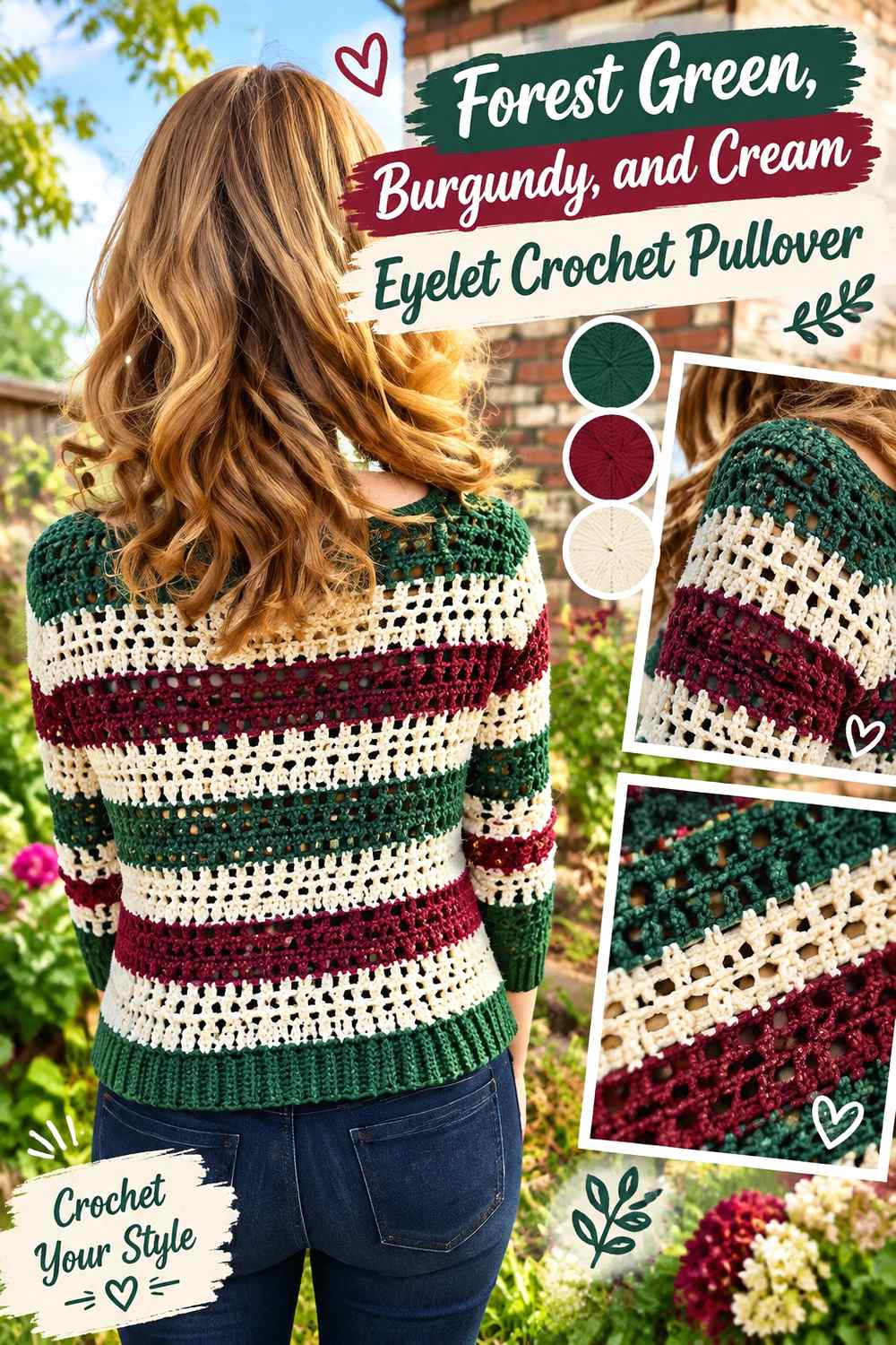
Forest green and burgundy are both deep colors, so cream becomes the useful separator in this three-color palette. On an eyelet pullover, forest green can cover the main solid sections, burgundy can add selective depth, and cream can protect smaller openwork or trim from visually disappearing.
Let Forest Green Anchor the Eyelet Crochet Pullover
Keep forest green across the largest body areas so the pullover has one clear foundation. If the design includes both solid and open sections, green can connect them while the secondary colors are restricted to edges or repeated bands.
Use Cream Between Forest Green and Burgundy Pullover Sections
Forest green and burgundy can become difficult to distinguish when both are dark. A narrow cream section placed between them can create clearer boundaries. This is particularly useful near openwork, where too little value contrast may make the color pattern harder to recognize.
Keep Burgundy Smaller Than Forest Green on the Pullover
Burgundy has enough visual weight to compete with forest green even in moderate amounts. Consider it for cuffs, a lower band, or a controlled sleeve detail rather than half of the body. Cream can then be repeated in a smaller finishing role to keep the deep colors separated.
Creator Credit: Hooked on Homemade Happiness
11. Forest Green And Denim Blue Crochet Pullover

Forest green and denim blue create a cooler color direction than the brown, rust, and mustard palettes. Because medium denim blue may sit relatively close to green in value, the combination works well when the colors occupy clearly defined pullover sections rather than very small alternating details.
Keep Forest Green Across the Main Pullover Torso
Using forest green through the torso gives this cool palette a strong anchor. Denim blue can then appear on sleeves, cuffs, or a controlled stripe without making the sweater look evenly split between two similarly weighted colors.
Separate Forest Green and Denim Blue With Clear Pullover Boundaries
Instead of changing colors every few stitches, consider larger defined areas. A sleeve band or wide stripe gives the eye enough space to read forest green and blue independently, even when their value contrast is moderate.
Check Denim Blue Against Forest Green Before Using It for Ribbing
Ribbing relies on shadow as well as color. If your denim blue is as dark as the forest green, the transition may be more subtle than expected. Choose a slightly faded or lighter denim direction when you want the neckline or cuffs to stand out clearly.
Creator Credit: HanJan Crochet
12. Forest Green And Soft Lilac Puff Stitch Crochet Pullover

Soft lilac introduces a cooler light accent that contrasts with forest green without relying on another neutral. On a pullover with puff or raised details, lilac can be concentrated around selected texture while forest green holds the main fabric together.
Use Forest Green as the Background for Puff-Stitch Pullover Texture
Forest green provides a dark field that can make a lighter accent easier to notice. If puff stitches or raised details already create strong shadows, keep most of the surrounding fabric green so the surface does not become visually fragmented.
Place Soft Lilac Beside Forest Green in Controlled Pullover Bands
A lilac band across the upper body, sleeve, or hem can introduce the color clearly. Avoid scattering single lilac details across every part of the sweater unless the design specifically calls for a speckled appearance.
Repeat Forest Green Between Soft Lilac Pullover Accents
When more than one lilac section is used, return to forest green between them. This creates visual rhythm and keeps the main shade dominant. It also helps prevent the puff texture and color blocking from competing for equal attention.
Creator Credit: Wilma Westenberg
13. Forest Green Black And Ivory Crochet Pullover

Black and ivory give forest green a more graphic three-color direction. Black deepens the palette, while ivory provides the value contrast needed to stop the dark shades from merging. Forest green should remain the main field if you want the result to read as a green pullover rather than a black-and-white sweater with green accents.
Keep Forest Green Between Black and Ivory Pullover Sections
Forest green can act as the central color that connects the extreme dark and light shades. Use it across most of the body and allow black and ivory to appear at defined edges, stripes, or sleeve areas rather than alternating all three equally.
Use Ivory to Separate Forest Green From Black
Black placed directly next to a deep forest green may create only subtle contrast. Introducing ivory near one of those boundaries can make the color arrangement easier to read. Even a relatively narrow ivory line can provide enough visual separation without taking over the sweater.
Limit Black So Forest Green Still Leads the Crochet Pullover
Black can quickly make the overall garment look darker. Use it strategically at cuffs, a neckline, or selected stripe rather than across most of the torso. When black already appears at several edges, keep the hem forest green or ivory instead of outlining every section in black.
Creator Credit: B.Hooked Crochet
14. Forest Green Moss And Olive Tonal Crochet Pullover

A tonal green palette relies on differences in value, temperature, and saturation rather than dramatic hue contrast. Forest green can serve as the darkest anchor, moss can provide a middle step, and olive can introduce a warmer green note. This approach works particularly well when you want stitch texture to remain more important than obvious color blocking.
Make Forest Green the Darkest Tonal Pullover Anchor
Place forest green across a substantial part of the body or along areas that need visual definition. The darkest green can establish the overall silhouette while the lighter greens create transitions rather than sharp breaks.
Use Moss to Bridge Forest Green and Olive Pullover Sections
Moss works well as the middle tone when forest green and olive look too different side by side. It can appear in a central stripe, sleeve area, or transitional band. The purpose is not to use all three colors equally, but to build a readable progression.
Keep Forest Green, Moss, and Olive Distinct in Crochet Texture
Three green yarns can easily collapse into one visual shade after stitching. Compare the actual yarns in daylight and, ideally, in a small sample before deciding where each belongs. If two shades look nearly identical from a distance, replace one with a noticeably lighter, darker, warmer, or more muted green.
Creator Credit: Evelyn And Peter Crochet
Choosing Between These Forest Green Crochet Pullover Palettes
For a lighter, neutral-led pullover, forest green with cream or oatmeal gives the clearest route. Camel adds more warmth while remaining subdued.
Rust, mustard, and terracotta move forest green toward an earthier, warmer direction. These stronger accents generally work better when forest green still occupies most of the torso and sleeves.
Charcoal, burgundy, and black create darker combinations. In those palettes, a lighter separator such as cream or ivory can be useful when two deep shades begin to merge.
Denim blue and soft lilac take forest green in a cooler direction, while sage, moss, and olive keep the sweater botanical and tonal. The tonal palettes need careful value checking because several greens can appear much more similar after they are crocheted.
Conclusion
Forest green can support very different crochet pullover styles depending on what you place beside it. Cream and oatmeal make the color easier to separate from borders and ribbing, while camel, rust, mustard, and terracotta introduce warmer contrast. Burgundy, charcoal, and black create deeper combinations that benefit from deliberate value separation. Denim blue and lilac cool the palette, while sage, moss, and olive keep the sweater within a layered green family.
Before choosing a final scheme, decide where forest green should have the largest uninterrupted area. Then test the supporting shade beside it and check whether the neckline, cuffs, stripes, texture, or openwork remain visible. Use the credited tutorials for their original construction guidance and apply the color direction separately to suit the pullover you want to make.
Frequently Asked Questions
What colors work well with a forest green crochet pullover?
Cream, oatmeal, camel, rust, terracotta, mustard, dusty rose, burgundy, denim blue, lilac, charcoal, black, sage, moss, and olive can all create useful directions. The more important question is whether the supporting shade gives you the amount of value and saturation contrast you want.
How can I keep forest green crochet texture from looking too dark?
Good lighting and enough value separation around important details help. If the pullover has raised stitches, ribbing, or eyelets, compare forest green with the supporting yarn in a small sample. A lighter cuff, border, or adjacent section can also help define darker texture.
Should forest green cover most of a crochet pullover?
It should if you want the finished garment to read clearly as a forest green pullover. Forest green can cover the body and most of the sleeves while secondary colors are reserved for cuffs, neckline, stripes, yoke details, or the hem. Equal color distribution is also possible, but it creates a stronger color-block effect.
Can black and forest green be used together in a crochet pullover?
Yes, but both can be dark in value. If they visually merge, use them in larger clearly separated sections or introduce a lighter shade such as ivory between them. A grayscale photo can quickly show how much light-and-dark contrast your particular yarns provide.
How do I replace forest green if I cannot find the exact shade I want?
Preserve its role rather than chasing an exact color name. Choose another deep green that still has enough contrast with the planned supporting colors. Pay attention to whether the substitute is lighter, darker, warmer, cooler, more muted, or more saturated than the original forest green direction.
How should I test a forest green pullover palette before starting?
Place the yarns together in natural light, photograph them in color and grayscale, and make a small sample when possible. Check the combination from a distance as well as close up. Colors that look very different as skeins can become surprisingly similar once worked into crochet texture.