Rust is especially useful in a granny square sweater because it can do more than provide an autumn color theme. It can become the repeated shade that connects individual squares, define cuffs and edging, or create a warm base for lighter and darker accents.

The main decision is not simply what color to pair with rust. Granny square sweaters have several competing visual areas—the square centers, outer rounds, joining lines, sleeves, cuffs, neckline, and front edging. Giving rust a clear role in those areas keeps the garment from turning into an unplanned collection of colors.
The tutorials linked with these ideas support the crochet sweater or cardigan construction concept. The rust-centered palettes are independent color adaptations, so use each creator’s original tutorial for the exact construction instructions while planning your own color distribution.
Quick List
- Rust And Cream Crochet Granny Square Sweater
- Rust And Olive Crochet Granny Square Sweater
- Rust Oatmeal And Cocoa Crochet Granny Square Sweater
- Rust And Dusty Rose Crochet Granny Square Sweater
- Rust Mustard And Chocolate Brown Crochet Granny Square Sweater
- Rust Sage And Cream Crochet Granny Square Sweater
- Rust And Charcoal Crochet Granny Square Sweater
- Rust Deep Teal And Cream Crochet Granny Square Sweater
- Rust Navy And Camel Crochet Granny Square Sweater
- Rust Plum And Oatmeal Crochet Granny Square Sweater
- Rust Moss And Muted Gold Crochet Granny Square Sweater
- Rust Black And Tan Crochet Granny Square Sweater
- Rust Blush And Burgundy Crochet Granny Square Sweater
- Rust Denim Blue And Ivory Crochet Granny Square Sweater
Use Rust as a Repeating Color Across Granny Square Sweaters
A multicolor granny square sweater becomes easier to read when one shade appears consistently. Rust can fill that role by repeating in the same round of every square, appearing in most square borders, or continuing into the cuffs and front edging.
You do not need identical squares to create continuity. Even when the centers change from square to square, repeating rust around the outside can visually connect the sweater panels and prevent the body and sleeves from looking like unrelated patchwork sections.
Check Rust Contrast Before Joining the Sweater
Different colors do not automatically create strong contrast. Rust and another medium-value shade can look distinct in the skein but blend once they are divided into small crochet clusters.
Before making the full sweater, place the proposed colors together and view them from a distance. A grayscale photo can also help reveal whether cream, charcoal, navy, or another supporting color provides enough light-dark separation for the granny-square pattern you want to emphasize.
Plan Rust Placement Across the Body and Sleeves
The sweater should be considered as one surface before the squares are permanently joined. If every rust-heavy square ends up on the body while lighter motifs fill one sleeve, the imbalance can become more obvious once the garment is worn.
Arrange the squares in the intended front, back, and sleeve positions first. Rust does not have to be perfectly symmetrical, but repeating it at several points across both sleeves and both sides of the body gives the palette a deliberate rhythm.
1. Rust And Cream Crochet Granny Square Sweater

Rust and cream create one of the clearest ways to emphasize granny-square structure without introducing many competing shades. Let rust occupy most of the colored surface, then use cream around selected motif rounds, joining areas, cuffs, or the front edge. Because cream is considerably lighter, it can prevent a rust-dominant sweater from reading as one uninterrupted block of warm color.
Use Rust Across the Main Granny-Square Rounds
Repeating rust in the larger outer rounds gives the sweater body a consistent warm field even when the square centers vary. This is particularly useful across front and back panels, where repeated rust borders can visually connect the motifs after joining.
If you want a more patchwork appearance, reverse some centers while keeping rust present in every motif. The important point is maintaining enough rust repetition that the body and sleeves still belong to the same color plan.
Let Cream Separate Rust at the Sweater Cuffs and Edging
Cream works well where the sweater needs visual separation. A cream cuff, narrow edge, joining line, or light round beside rust can make the individual square boundaries easier to see.
Avoid scattering tiny cream accents everywhere without a pattern. Concentrating cream around selected details creates clearer hierarchy and lets rust remain the dominant shade.
Creator Credit: HayHay Crochet
2. Rust And Olive Crochet Granny Square Sweater

Rust and olive keep the sweater firmly in an earthy direction while giving the granny squares two distinct hues. Because both colors can carry substantial visual weight, the palette works better when one clearly dominates. Rust can lead across the body while olive appears in centers, selected outer rounds, or controlled sleeve sections.
Keep Rust Stronger Than Olive Across the Sweater Body
Using equal amounts of rust and olive in every motif can make the sweater feel visually divided. Instead, let rust occupy more of the granny-square surface and use olive to interrupt it at planned intervals.
One practical approach is to keep rust in the same round across most squares while moving olive between centers and smaller supporting rounds. The repetition gives the sweater continuity without requiring every motif to match.
Use Olive to Ground Rust Around the Sleeves
Olive can be useful on sleeves because it gives rust a darker, quieter companion without creating the harder outline that black would produce. Repeat olive in both sleeves rather than concentrating it entirely on one side.
If your chosen rust and olive look similar in lightness, introduce a lighter join or small neutral detail so the granny-square pattern remains visible.
Creator Credit: Nora Moon – handmade clothes with love
3. Rust Oatmeal And Cocoa Crochet Granny Square Sweater
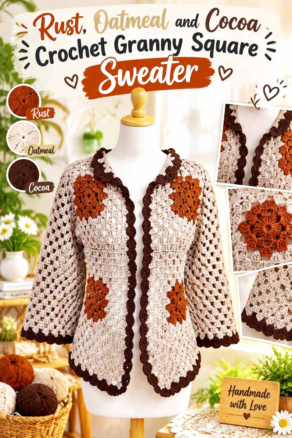
This three-color scheme gives rust both a light and a dark partner. Oatmeal creates breathing room around the warm main shade, while cocoa can add definition at selected borders, joins, or cuffs. The sweater can remain rust-led without relying on high-saturation contrast.
Place Oatmeal Beside Rust Where Granny-Square Detail Needs Clarity
Use oatmeal around smaller motif areas when rust begins to dominate too much of the sweater surface. Its lighter value can separate rust clusters and make square corners easier to distinguish once the motifs are joined.
Oatmeal is especially useful around the upper body or front panels, where the granny-square arrangement remains highly visible while the sweater is worn open.
Keep Cocoa Smaller Than Rust on the Sweater
Cocoa can become visually heavy if it occupies the same amount of area as rust. Reserve it for selected outer rounds, joining lines, cuffs, or a narrow neckline finish when you want more definition.
Repeating small cocoa details throughout the garment is usually more cohesive than putting all the darkest color into one large panel.
Creator Credit: Nati Crochet
4. Rust And Dusty Rose Crochet Granny Square Sweater
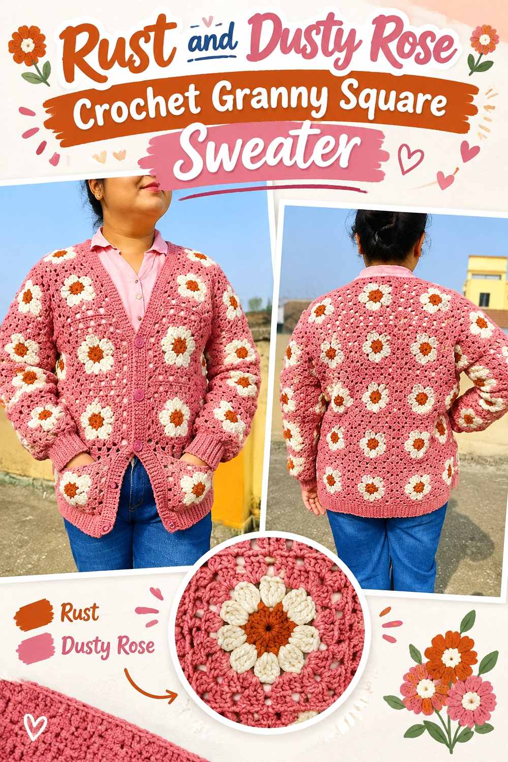
Dusty rose changes rust without fighting its warmth. The two hues can create a softer transition than rust paired with cream or charcoal, making this useful when you want the square layout visible but not sharply outlined.
Let Rust Define the Outer Granny-Square Rounds Around Dusty Rose
Dusty rose can work well in motif centers while rust forms the later rounds. That arrangement gives each square a softened center while allowing rust to connect the garment visually from square to square.
Check the two yarns side by side before committing. If the dusty rose is almost as dark as the rust, the internal color changes may appear much subtler after crochet texture breaks them into small sections.
Repeat Dusty Rose Through the Rust Sweater Instead of Isolating It
A few dusty rose squares placed in only one area can look accidental. Carry the pink through the front, back, and sleeves in smaller repeated amounts so the relationship with rust feels planned.
Rust can still remain dominant through cuffs, outer motif rounds, or edging even when dusty rose appears throughout the garment.
Creator Credit: Cute Crochet
5. Rust Mustard And Chocolate Brown Crochet Granny Square Sweater

Rust and mustard provide two warm hues, while chocolate brown gives the sweater a darker anchor. Because all three colors are substantial, the main challenge is preventing them from occupying equal visual space.
Keep Rust Dominant When Mustard Brightens the Granny Squares
Use mustard selectively in square centers or narrow internal rounds rather than covering the same amount of surface as rust. Smaller mustard areas can draw attention to the motif centers without breaking the rust-led sweater into competing blocks.
Repeat mustard often enough that it looks intentional, particularly across the sleeves and upper body, but keep rust present around or beside it.
Use Chocolate Brown to Frame Rust and Mustard
Chocolate brown works well around outer square rounds, joins, cuffs, or the lower edge because it can contain the two warmer colors visually. A dark frame also helps distinguish neighboring motifs when both rust and mustard have similar warmth.
Keep the brown placement consistent. Random dark patches can pull attention toward individual squares instead of supporting the sweater as a whole.
Creator Credit: Danielle Villanueva
6. Rust Sage And Cream Crochet Granny Square Sweater
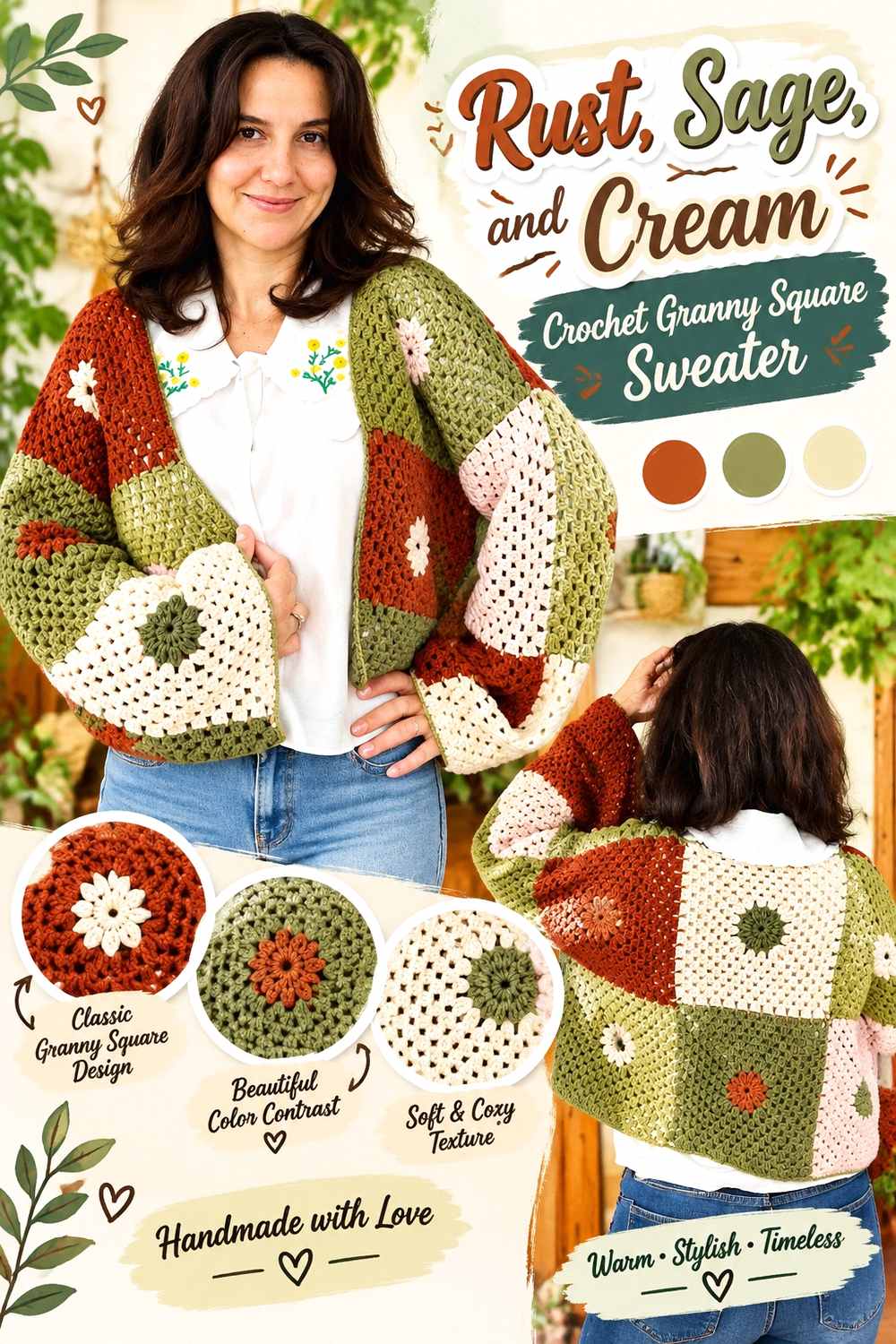
Sage gives rust a quieter green contrast than deeper olive, while cream creates the lightest point in the palette. This combination works well when you want three clearly different color roles: rust for warmth, sage for soft variation, and cream for separation.
Let Rust Carry More Sweater Surface Than Sage
Keep rust on larger motif areas or repeat it in every square while using sage on selected centers and middle rounds. That prevents the garment from becoming an even rust-and-green checkerboard.
On the sleeves, repeat the same rust-to-sage relationship used on the body so they feel integrated rather than added after the panels were planned.
Place Cream Between Rust and Sage When the Motifs Need More Separation
A cream round between rust and sage can keep the two muted colors from visually merging. This is especially helpful if the sage is medium-dark rather than pale.
Cream can also continue into narrow front edging or cuffs, but repeating it in the motifs first helps the finishing details feel connected to the sweater rather than newly introduced.
Creator Credit: Sirin’s Crochet
7. Rust And Charcoal Crochet Granny Square Sweater
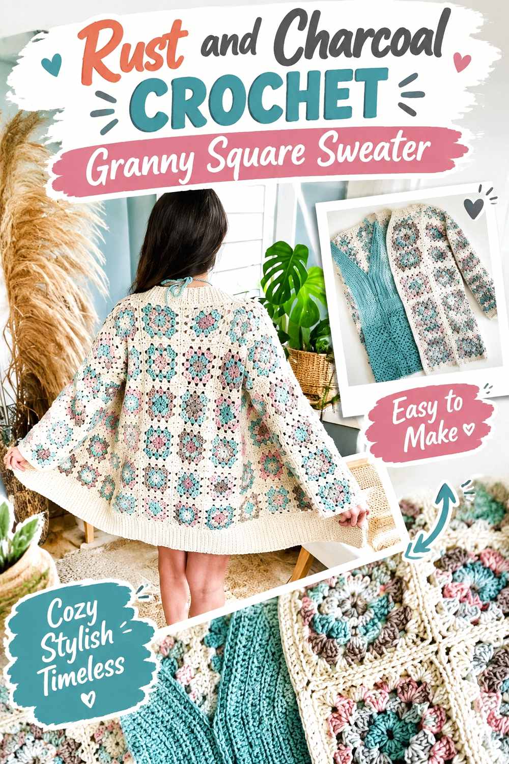
Charcoal creates one of the strongest dark anchors for rust without the absolute contrast of pure black. It can give a traditional granny-square sweater a more graphic grid when used for joins, outer rounds, ribbing, or cuffs.
Keep Rust Inside Charcoal-Framed Granny Squares
Rust centers or middle rounds surrounded by charcoal create clear motif boundaries across the sweater. This placement is particularly effective when the squares themselves are the main visual feature and you want their geometry obvious from a distance.
Avoid letting charcoal cover so much of the garment that rust becomes a minor accent. If rust is the theme, it should remain visible across most major sweater areas.
Repeat Charcoal Beside Rust at the Cuffs and Front Edge
Using the same charcoal from the granny squares again at the cuffs or front finish can unify the garment. It also gives the darker outline a reason to continue beyond the motif grid.
If the result feels too heavy, increase rust in the body rather than introducing an unrelated third color late in the project.
Creator Credit: MJ’s Off The Hook Designs
8. Rust Deep Teal And Cream Crochet Granny Square Sweater

Deep teal gives rust a cooler counterpart, making this palette more pronounced than an all-earth-tone combination. Cream is useful here because it can prevent the two stronger colors from meeting everywhere and competing for attention.
Use Cream to Buffer Rust and Deep Teal in the Granny Squares
Consider placing a cream round between rust and teal rather than alternating the two strong shades directly through every part of the square. The neutral break keeps both hues recognizable when the motifs are viewed together across the sweater.
This is especially helpful around the chest and upper sleeves, where many square edges can meet within a relatively small visual area.
Keep Rust Repeating More Often Than Deep Teal Across the Sweater
Deep teal can command attention quickly, so it does not need as much surface area as rust. Repeat rust across most motifs and reserve teal for selected centers, stripes of square rounds, or controlled sleeve accents.
If teal appears on cuffs or edging, echo it somewhere inside the granny squares so it does not look disconnected from the main body.
Creator Credit: HanJan Crochet
9. Rust Navy And Camel Crochet Granny Square Sweater
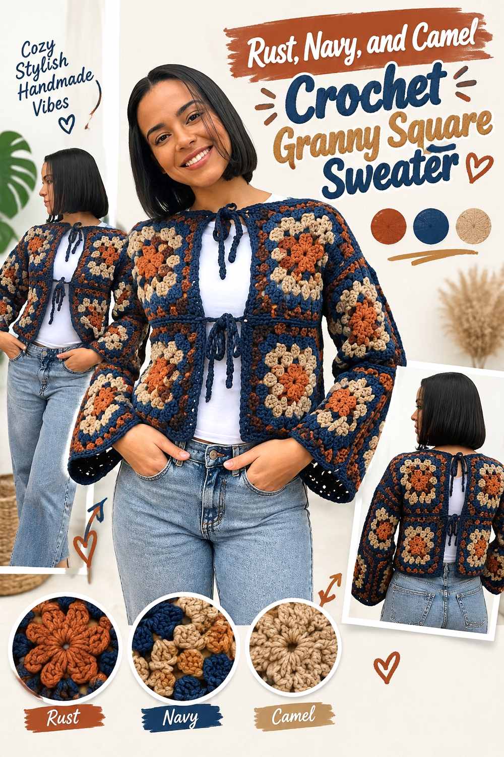
Navy provides a deep cool anchor while camel bridges the visual gap between navy and rust. This makes the palette useful for a sweater that needs strong contrast without relying on black or bright white.
Let Camel Transition Between Rust and Navy Granny-Square Areas
Camel can sit beside rust without creating a sharp break, then provide a warmer transition before the darker navy appears. Use it in middle motif rounds or recurring centers to keep the three-color palette connected.
Because camel and rust can sometimes be similar in value, check them together before making a large batch of motifs.
Reserve Navy to Define the Rust Sweater Structure
Navy is most effective when it has a job: outlining selected squares, defining cuffs, or giving the joining grid a darker edge. Scattering navy randomly through every part of the sweater can overpower the warmer rust-and-camel relationship.
A consistent navy finishing detail can also make the front edge and sleeves feel more deliberate.
Creator Credit: VIARA – tutoriales de crochet
10. Rust Plum And Oatmeal Crochet Granny Square Sweater
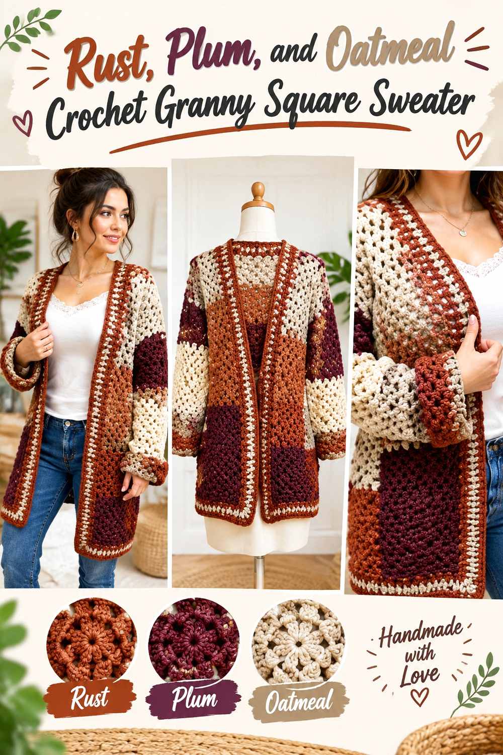
Plum gives rust a richer neighboring color while oatmeal keeps the combination from becoming too dark. The result can feel more layered than a simple two-color sweater because the light neutral separates two substantial hues.
Keep Oatmeal Visible Between Rust and Plum Granny-Square Sections
Placing oatmeal between rust and plum can make each color easier to read. This is helpful when the square design includes several rounds and you want the color sequence to remain visible after the motifs are joined.
Oatmeal can also appear in joins or selected finishing areas, but it should repeat enough inside the squares to feel intentional.
Let Rust Cover More Sweater Area Than Plum
Plum can be effective in motif centers, lower sleeve accents, or selected outer rounds, but rust should continue across the larger body if it is meant to define the sweater.
If the overall garment becomes darker than planned, reduce plum rather than adding another light shade. Increasing oatmeal slightly can restore contrast without complicating the palette.
Creator Credit: rosa parlato
11. Rust Moss And Muted Gold Crochet Granny Square Sweater
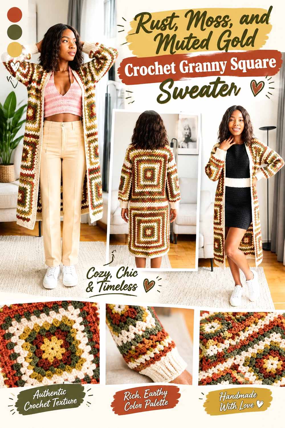
Rust, moss, and muted gold create a strongly autumnal palette without needing every shade to be dark. Moss gives rust an earthy green partner, while muted gold can highlight smaller motif areas.
Let Muted Gold Highlight Rust Granny-Square Centers
Gold can attract attention even in small quantities, so use it where you actually want the eye to land. Granny-square centers are a practical choice because the accent can repeat regularly without taking over the sweater.
Surrounding those centers with rust gives the garment stronger continuity and keeps the gold tied to the main color.
Use Moss Beside Rust Without Splitting the Sweater in Half
Avoid assigning rust entirely to the body and moss entirely to the sleeves. Instead, repeat smaller moss sections through the body and continue rust into the sleeves.
That distribution keeps the sweater cohesive while still allowing moss to provide enough contrast to distinguish different motif arrangements.
Creator Credit: Simply Angel Tiah
12. Rust Black And Tan Crochet Granny Square Sweater
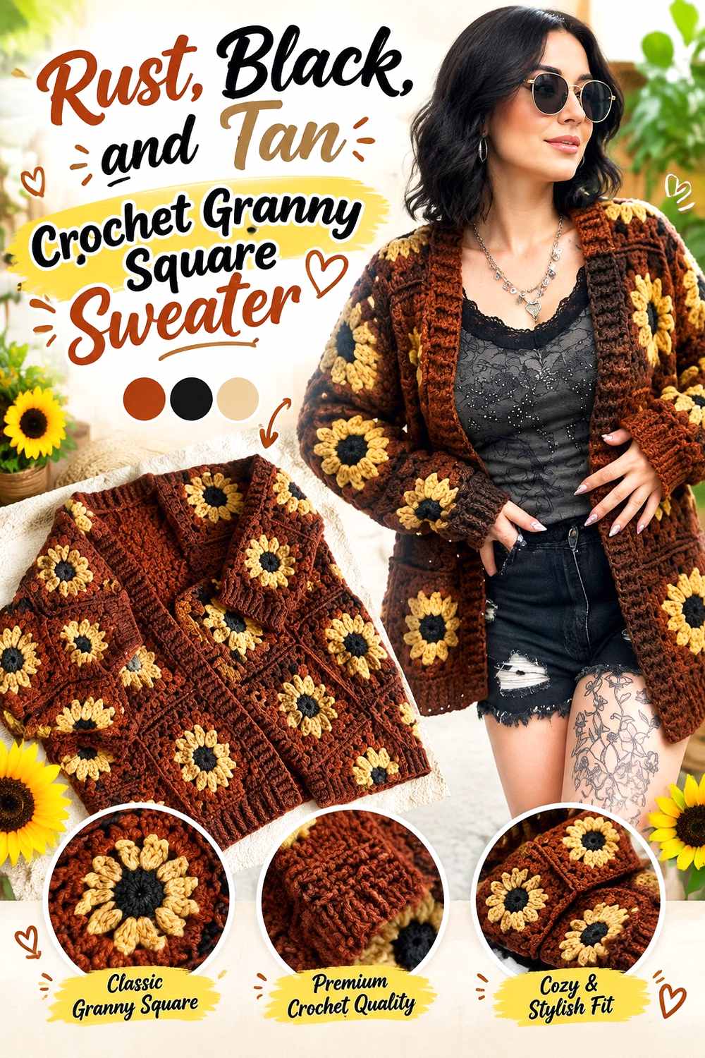
Black creates a graphic framework for rust, while tan softens the jump between very dark outlines and the warm main color. This palette suits granny squares particularly well because the joining grid can become an intentional design feature.
Use Black Sparingly to Outline Rust Granny Squares
A black final round or joining line makes each motif clearly visible, but it also adds substantial visual weight. Keep rust on the larger internal portions of the squares so the garment still reads as rust rather than black patchwork.
The same black can reappear in cuffs or edging if you want the strong outline to continue around the sweater.
Place Tan Near Rust to Keep the Sweater From Becoming Too Stark
Tan can sit inside the motifs between rust and black, reducing the sharpness of the contrast. It can also lighten selected squares on the chest or sleeves without introducing the stronger brightness of cream.
Keep tan noticeably distinct from rust. If the two are nearly the same value, their separate rounds may disappear in the finished texture.
Creator Credit: The Great Maddy Ride | Maddy B
13. Rust Blush And Burgundy Crochet Granny Square Sweater
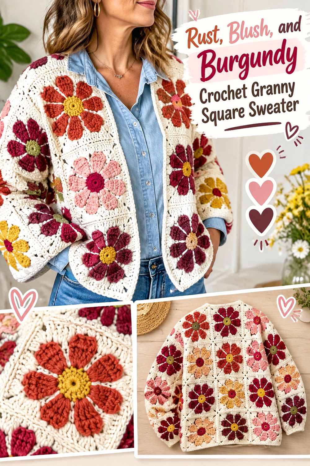
This palette stays within a warm red-based family but still provides three different visual weights. Blush creates the lightest points, rust takes the central role, and burgundy can define smaller dark details.
Let Blush Open Up the Rust Granny-Square Motifs
Use blush around centers or selected middle rounds when a rust-heavy square needs lighter space. The contrast can make repeated floral or traditional granny details easier to distinguish across the sweater.
Blush does not need to cover large panels. Small, repeated areas can be enough to prevent the rust-and-burgundy combination from feeling too dense.
Keep Burgundy Smaller Than Rust Around the Sweater Edges
Burgundy works well as a controlled dark accent, especially near square borders, cuffs, or the neckline. Using too much can shift the sweater away from rust and toward an overall wine-red appearance.
Repeat burgundy in several locations instead of concentrating it in one sleeve or one front panel so the darker accents feel distributed.
Creator Credit: Frisian Knitting tutorials
14. Rust Denim Blue And Ivory Crochet Granny Square Sweater
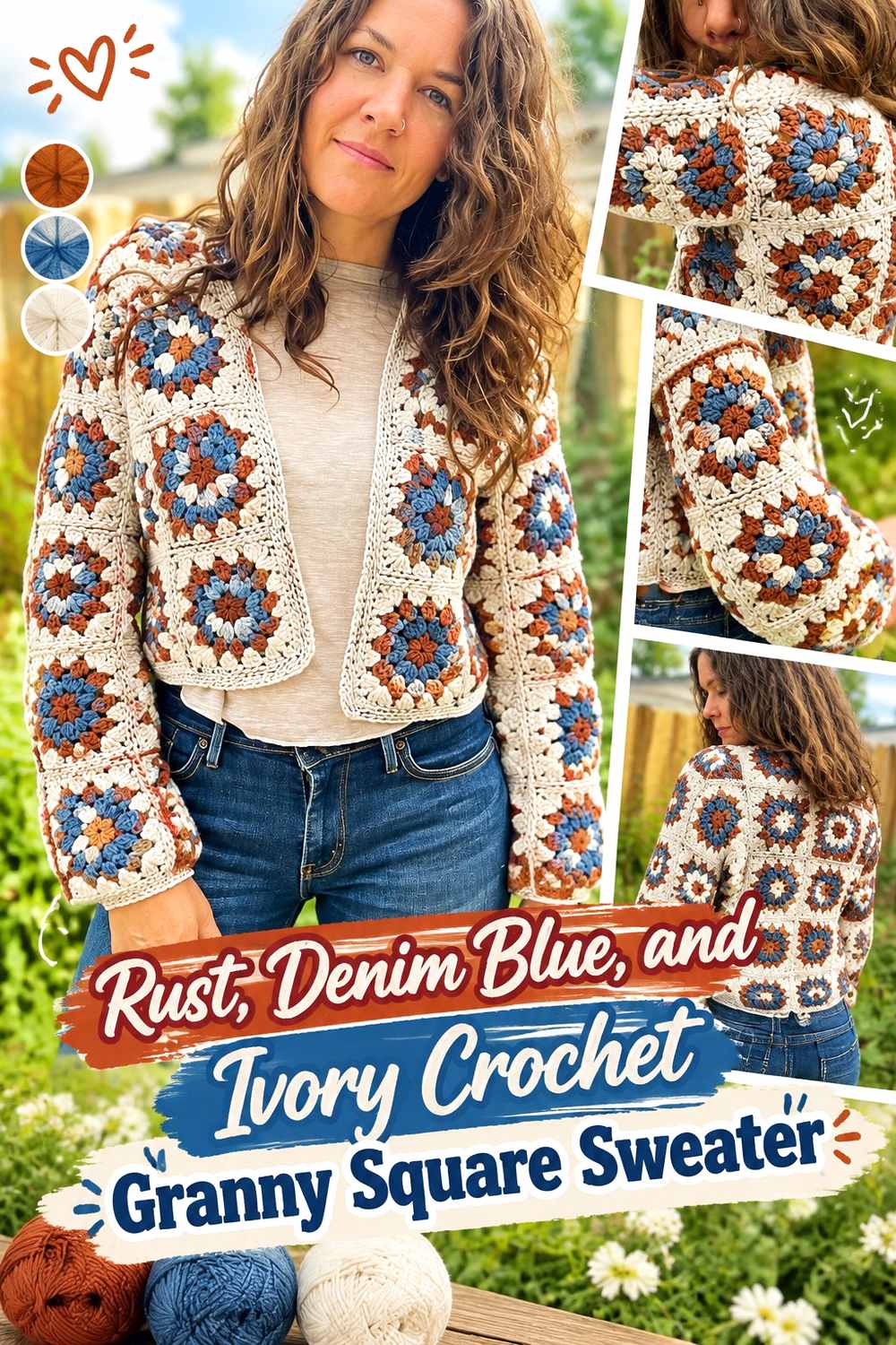
Denim blue gives rust a relaxed cooler contrast, while ivory creates enough light separation to keep both colors distinct. This palette can make the same granny-square structure feel less traditionally autumnal than rust with olive, mustard, or brown.
Separate Rust and Denim Blue With Ivory Granny-Square Details
Ivory can be particularly helpful when rust and denim blue have similar medium values. Place it in centers, narrow intervening rounds, or consistent outer details to prevent the two main hues from visually merging across a crowded square layout.
Repeating ivory in the front edging can extend that separation into the overall sweater outline.
Carry Rust Across the Body and Denim Blue Through the Sleeves
Instead of making solid blue sleeves, mix a controlled amount of denim blue into sleeve motifs while maintaining rust repetition. Continue some denim blue into the body as well so the sleeves do not look detached from the rest of the sweater.
For a quieter version, reduce the blue surface area while keeping the rust-and-ivory relationship consistent.
Creator Credit: Off the Beaten Hook
How to Choose Between These Rust Granny Square Sweater Palettes
For the lightest contrast around rust, cream, oatmeal, ivory, blush, and tan provide useful separation without making the sweater depend on several strong hues. The rust-and-cream or rust-sage-and-cream directions are good starting points when clearly visible granny-square structure matters more than dramatic color blocking.
Olive, moss, mustard, cocoa, and gold keep rust within a predominantly earthy range. These combinations work particularly well when you want the garment to feel warm throughout, but value contrast deserves extra attention because several earthy shades can sit close together in lightness.
Charcoal, black, navy, teal, plum, and burgundy create stronger anchors. Use these darker or deeper shades in controlled areas—such as outer rounds, cuffs, joins, or selected centers—when you want rust to remain the identifying color instead of sharing equal visual weight with every accent.
Conclusion
The strongest rust granny square sweater palette is the one with a clear color hierarchy before the squares are joined. If you want rust to dominate, repeat it across most motifs or use it consistently around the outer rounds. Then decide whether the other colors need to lighten the sweater, darken its framework, or simply add variation.
Cream, oatmeal, sage, and blush give rust a softer direction. Olive, moss, mustard, and brown emphasize its earthy side. Charcoal, navy, black, teal, plum, and burgundy create stronger definition.
Whichever palette you choose, arrange the completed motifs across the planned body and sleeve layout before final assembly. Granny squares make color distribution unusually visible, so this is the point where an uneven accent pattern is easiest to correct. Follow the original tutorial for exact sweater construction and treat the color scheme as a separate planning layer.
Frequently Asked Questions
What colors work well with rust in a granny square sweater?
Cream, oatmeal, ivory, tan, olive, sage, brown, charcoal, navy, teal, mustard, dusty rose, plum, burgundy, and muted blue can all create useful relationships with rust. The more important question is what role the second color should play: a light separator, dark anchor, related earthy tone, or contrasting accent.
Should rust be the dominant color in a rust granny square sweater?
Usually, rust should appear often enough that it clearly defines the garment. That does not require every square to be mostly rust. Repeating rust in the same motif round, border, join, cuff, or edging area can create continuity even in a multicolor sweater.
How can I tell if rust and another yarn color have enough contrast?
Place the yarns side by side and view them from farther away rather than only close up. You can also take a grayscale photo. If the shades become almost indistinguishable in grayscale, the granny-square details may appear softer than expected even if the hues look different.
Should rust be used in the granny-square centers or outer rounds?
Either can work, but they create different emphasis. Rust centers make the warm color the focal point of each motif, while rust outer rounds can connect neighboring squares and make the entire sweater read more consistently as rust.
What joining color works with a rust granny square sweater?
A joining shade already present in the palette usually creates the easiest visual connection. Cream or oatmeal can make the grid lighter, while charcoal, brown, navy, or black can make it more defined. Rust itself can also be used when you want the joins to blend more closely with the dominant color.
How do I stop a multicolor rust granny square sweater from looking too busy?
Give the colors unequal roles. Let rust dominate, choose one supporting shade for regular repetition, and limit stronger accent colors to smaller areas. Laying out the body and sleeve squares before joining also helps you catch clusters of accents that would otherwise make one section look much busier than another.