A crochet paw print pet blanket can stay playful without depending on bright color. Cream, oatmeal, camel, taupe, mushroom, gray, chocolate, and charcoal create enough variation for paw motifs to remain recognizable while giving the blanket a quieter look that can sit comfortably with everyday home decor.

Neutral palettes still need hierarchy. A cream paw on an oatmeal background may look distinct in loose yarn but merge once worked into a textured square. Charcoal against warm gray will create much stronger definition. The right choice depends on whether you want the paw prints to become the main feature or appear more subtly across the blanket.
The construction can vary too. Paw prints can be worked into granny squares, built with filet openings, incorporated through tapestry colorwork, added as appliqués, or formed as raised texture. The linked tutorials below support those paw-print techniques and several useful pet-blanket or square-joining concepts. The neutral palettes are separate editorial adaptations.
Quick List
- Oatmeal and Charcoal Paw Print Crochet Pet Blanket
- Cream and Camel Paw Print Granny Square Crochet Pet Blanket
- Warm Gray and Ivory Filet Paw Print Crochet Pet Blanket
- Mushroom and Cream Filet Paw Print Crochet Pet Blanket
- Taupe, Ivory, and Espresso Tapestry Paw Print Crochet Pet Blanket
- Natural Cream and Cocoa Appliqué Paw Print Crochet Pet Blanket
- Stone and Oatmeal Paw Print Square Crochet Pet Blanket
- Mocha and Cream Raised Paw Print Crochet Pet Blanket
- Flax and Chocolate Paw-Motif Crochet Pet Blanket
- Greige and Ivory Appliqué Paw Print Crochet Pet Blanket
- Warm Beige and Cocoa 3D Paw Print Crochet Pet Blanket
- Soft Gray and Cream Paw Print Crochet Pet Blanket
- Camel and Ivory Granny Square Paw Print Crochet Pet Blanket
- Oatmeal and Mushroom Crochet Pet Blanket With Paw Print Accents
- Charcoal and Natural Cream Crochet Pet Blanket With Paw Print Panels
- Sand and Warm Gray Crochet Pet Blanket With Neutral Paw Prints
- Putty, Cream, and Cocoa Granny Square Paw Print Crochet Pet Blanket
Give Neutral Paw Prints Enough Contrast
Neutral does not have to mean low contrast. A charcoal paw against oatmeal, cocoa paw against cream, or taupe paw against ivory can stay completely neutral while making the motif easy to recognize.
If you prefer a softer result, work with neighboring shades but increase the size of the color areas. A broad camel paw against cream is easier to read than tiny camel details surrounded by several similar beige shades.
Plan Paw Placement Before Joining the Pet Blanket
A repeated paw motif can look busier once several squares sit together. Before final joining, arrange the motifs across the complete blanket and check whether dark paws are collecting in one corner or whether every row has exactly the same visual weight.
You can alternate paw orientation, leave occasional plain neutral squares, or repeat one joining color across the entire layout. The important point is to make the full blanket feel intentional rather than judging each paw square by itself.
Keep Borders Quieter Than the Paw Print Pattern
The border can finish the blanket without adding a new focal color. Repeating the background, joining shade, or darkest existing neutral usually creates a cleaner result than introducing an unrelated fourth color.
For pet use, also consider how decorative finishing will behave in everyday use. If dangling trim or loose embellishments are likely to attract chewing or snagging, a simpler securely finished edge may be the more practical choice.
1. Oatmeal and Charcoal Paw Print Crochet Pet Blanket
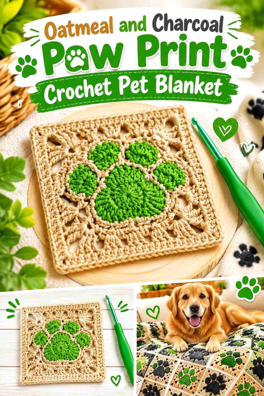
Oatmeal gives this blanket a light neutral field, while charcoal makes every paw immediately readable. Use oatmeal for most square backgrounds and blanket joins, then repeat charcoal consistently inside the paw motifs. This high-value contrast works particularly well when the paw itself has dimensional or clustered texture, because the darker yarn reinforces the motif without requiring extra colors.
The supporting tutorial demonstrates a complete paw-print granny-square motif that can be repeated for blankets and other pet-themed projects. YouTube
Let Oatmeal Cover Most of the Charcoal Paw Print Blanket
Keeping oatmeal dominant prevents a full grid of charcoal paws from making the blanket feel overly dark. If the motifs are closely spaced, use oatmeal through both the square background and the joins so the dark paws appear to float across one continuous neutral surface.
Use Charcoal Where Oatmeal Paw Details Need Definition
Charcoal works best when it stays inside the paw rather than appearing equally in borders, joins, and backgrounds. Concentrating the darkest shade gives the motif a clear visual job and keeps the outer blanket edge calmer.
Creator Credit: Hook & Loop Crochet Tutorials
2. Cream and Camel Paw Print Granny Square Crochet Pet Blanket
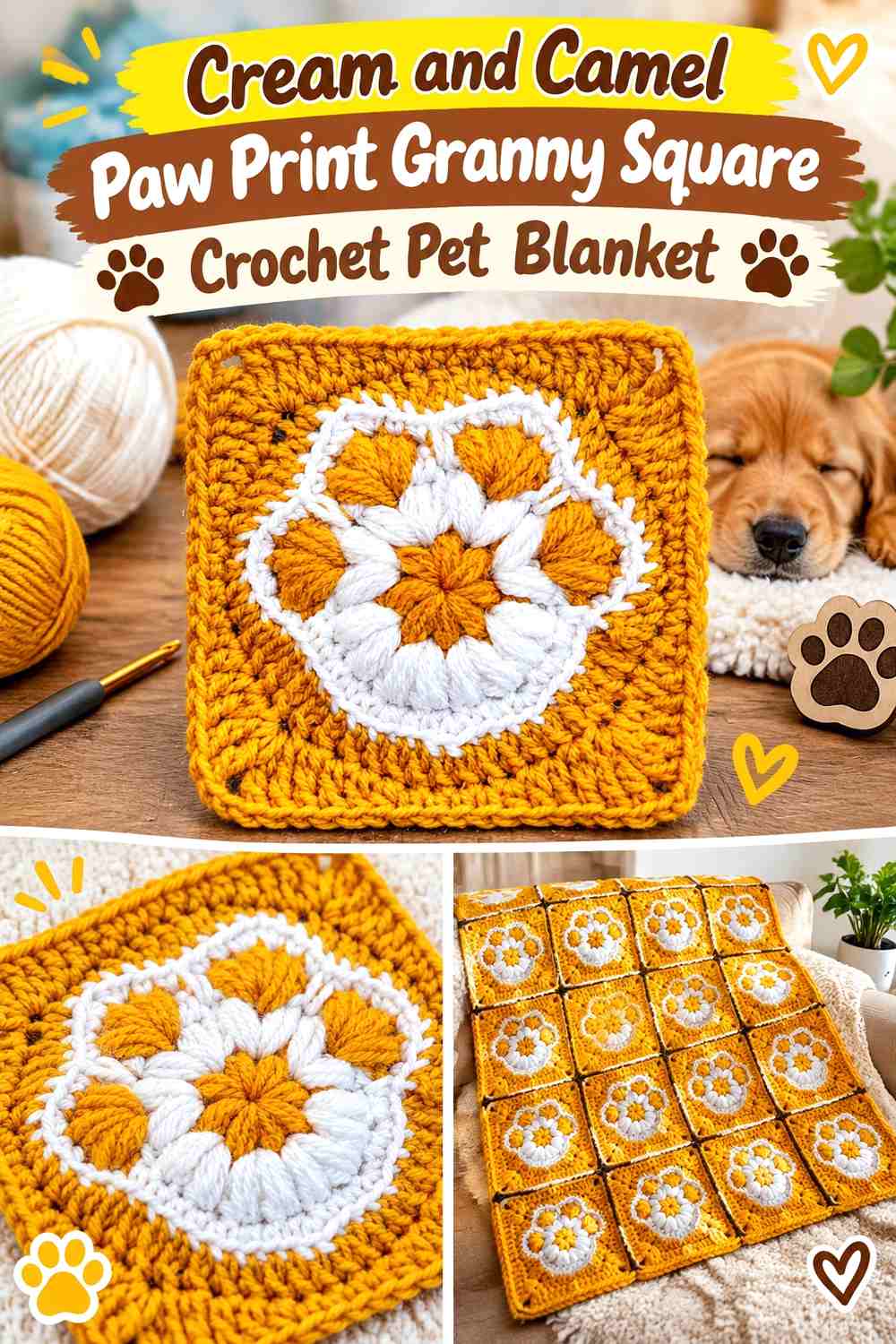
Cream and camel create a softer neutral contrast. Camel can form the paw, while cream covers the surrounding square and final border. Because the two colors are less separated than black and white, the paw should remain a substantial shape rather than being broken into tiny accent stitches.
The supporting source directly demonstrates a paw-print granny square suitable for repeating into a modular blanket. YouTube
Keep Camel Paw Prints Large Against Cream Squares
Camel needs enough uninterrupted area to remain distinct once several cream squares are joined. Let the paw pad and toes carry the warm tan color instead of introducing camel only as a narrow outline.
Repeat Cream Through the Camel Paw Print Joins
Cream joins make separate squares feel like one blanket rather than a checkerboard of outlined blocks. If you want the grid more visible, use camel only around the outer blanket border instead of through every internal seam.
Creator Credit: Crochet Bits
3. Warm Gray and Ivory Filet Paw Print Crochet Pet Blanket
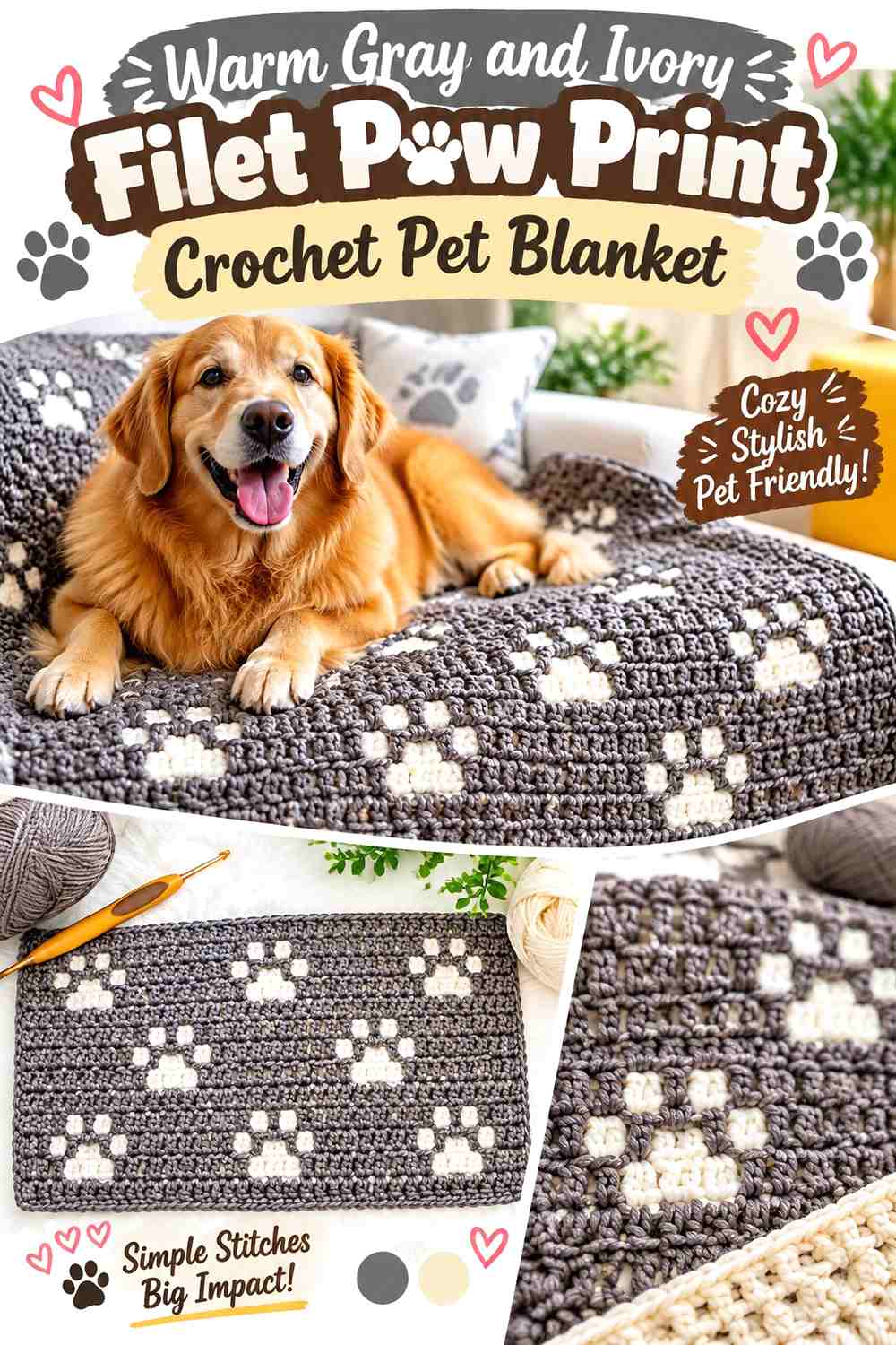
This idea lets the paw emerge from open and solid crochet rather than a separate colored motif. Warm gray can carry the main fabric, while ivory appears in the border or occasional solid sections. Because the paw is created through stitch structure, the palette can remain particularly restrained.
The supporting tutorial demonstrates a filet-style paw-print stitch and specifically explains using the motif in scarf or blanket layouts. YouTube
Let Warm Gray Show the Filet Paw Print Through Texture
Keep the main paw field in one warm-gray color when the stitch structure itself creates the motif. Adding color changes inside every paw opening would compete with the clean geometric effect.
Use Ivory to Frame the Warm Gray Paw Print Blanket
Ivory can form the outer border or a wider beginning and ending section. This gives the gray field a lighter boundary without interfering with the filet paw pattern running through the center.
Creator Credit: Play Hooky with Me
4. Mushroom and Cream Filet Paw Print Crochet Pet Blanket
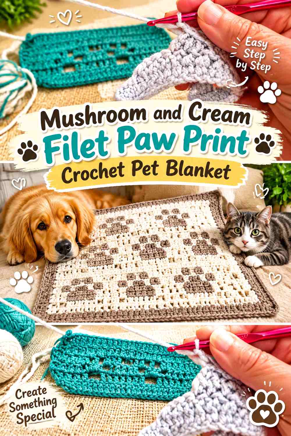
Mushroom creates an earthier version of the filet paw blanket. Cream can lighten the ends or border, while most of the paw pattern stays mushroom so the openwork design rather than frequent color switching carries the decoration.
The supporting tutorial demonstrates another filet paw-print stitch suitable for extending into an afghan-style fabric. YouTube
Keep Mushroom Continuous Through the Crochet Paw Print Rows
A continuous mushroom field helps repeated filet paws read as part of one fabric. If the neutral is medium-dark, the natural openings in the stitch can create enough visual variation without a second color inside every motif.
Put Cream Around the Mushroom Paw Print Outer Edge
A cream border visually lightens the blanket and clearly separates the last paw row from the finished edge. If you repeat cream inside the body, keep those sections broad so the palette does not become narrowly striped.
Creator Credit: CrochetAtoZ
5. Taupe, Ivory, and Espresso Tapestry Paw Print Crochet Pet Blanket
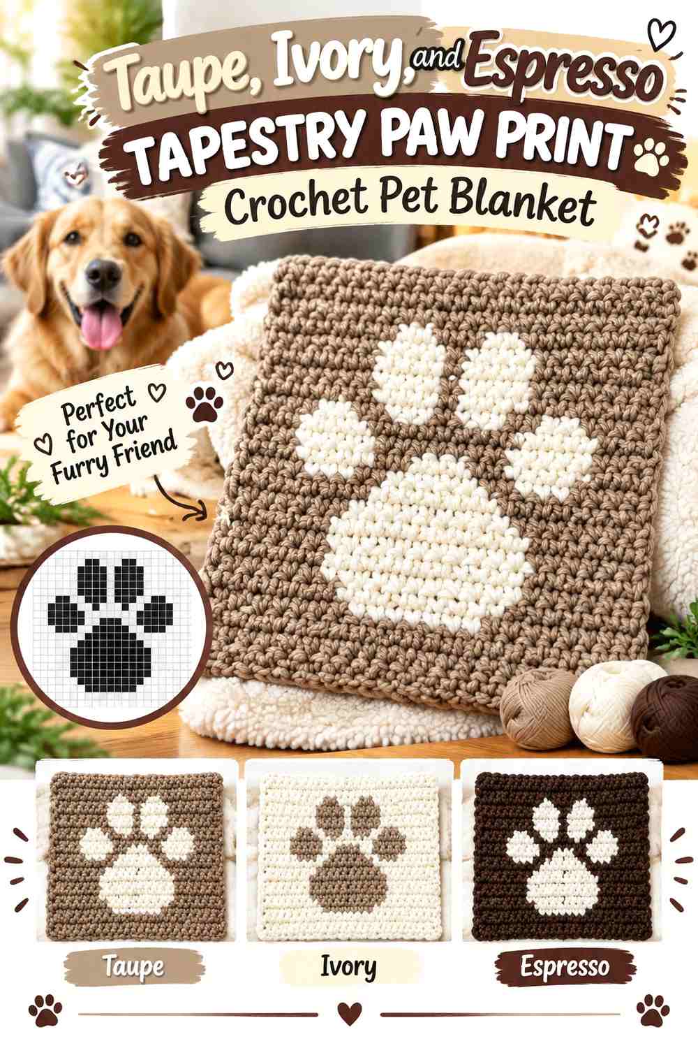
Tapestry colorwork allows the paw itself to become a flat graphic shape. Taupe can cover the main blanket field, ivory can form the paw prints, and espresso can be reserved for a narrow border or selected smaller motifs. The hierarchy keeps a three-neutral scheme from turning into three equally competing blocks.
The supporting tutorial demonstrates tapestry crochet using a dog-paw graphic, making it a direct technique reference for this colorwork direction. YouTube
Use Ivory Paw Prints to Break Up a Taupe Crochet Blanket
Ivory should occupy enough of each paw to stay recognizable across the flat colorwork. Against taupe, it creates a softer graphic effect than bright white but still gives the motif a visible value change.
Reserve Espresso for the Taupe and Ivory Blanket Border
Espresso can frame the finished panel without running through every paw. Keeping the darkest color at the edge gives the tapestry field definition while allowing taupe and ivory to remain the primary blanket colors.
Creator Credit: CrochetAmateur SaMi
6. Natural Cream and Cocoa Appliqué Paw Print Crochet Pet Blanket
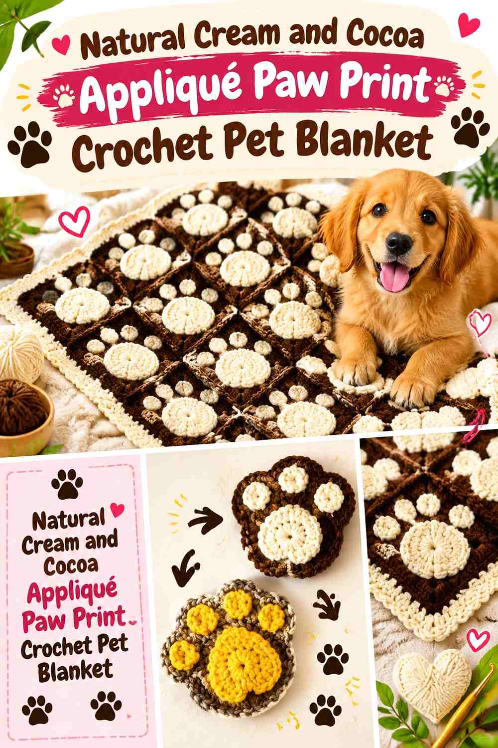
A plain natural-cream blanket can become paw-themed through securely attached cocoa appliqués. This approach gives you flexibility over paw spacing because the motifs can be positioned after the main blanket fabric is complete.
The supporting tutorial demonstrates a crocheted paw-print appliqué rather than a complete blanket, so use it for the motif and attach the finished paws only after planning the overall blanket layout. YouTube
Space Cocoa Paw Prints Carefully Across Natural Cream
Before attaching the appliqués, lay every cocoa paw on the cream blanket and view the arrangement from a distance. Wider spacing creates a quieter neutral surface, while dense repetition turns the paws into an all-over pattern.
Keep Natural Cream Visible Around Cocoa Appliqué Edges
Do not let neighboring paws crowd one another. Cream negative space helps each toe and central pad remain recognizable and prevents the appliqués from visually joining into one irregular brown area.
Creator Credit: Dream Weaver Crochet
7. Stone and Oatmeal Paw Print Square Crochet Pet Blanket
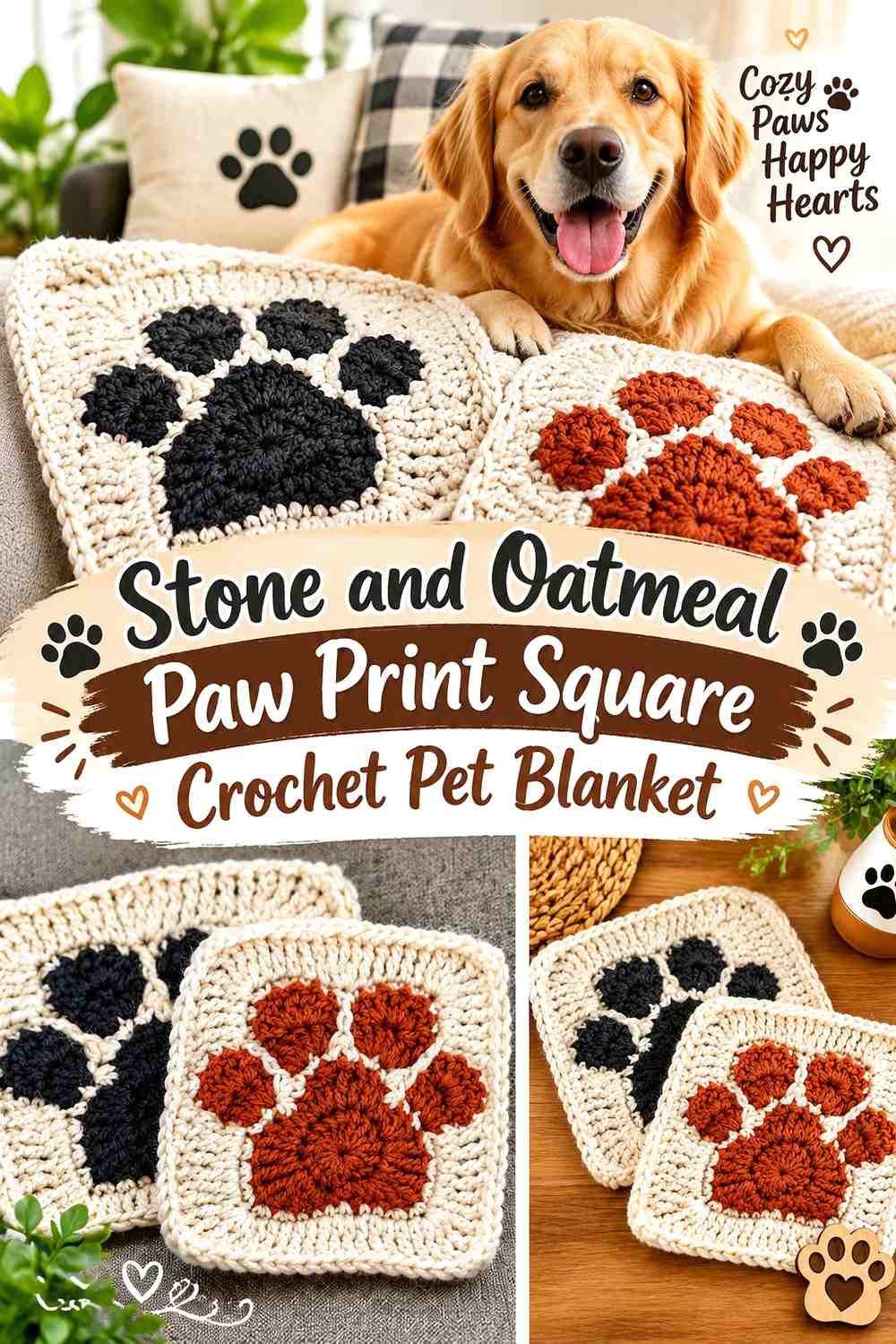
Stone and oatmeal create a tonal blanket with much less contrast than charcoal and cream. Let stone form the paw and oatmeal create the surrounding square. The result works best when the motif itself has strong enough shape and texture to compensate for the softer value difference.
The supporting tutorial demonstrates a complete paw-print crochet square that can be repeated and joined into a blanket. YouTube
Keep Stone Paw Shapes Uninterrupted Against Oatmeal
Avoid adding several tiny neutral shades inside the same paw. A single stone motif reads more clearly against oatmeal than a paw divided among stone, taupe, and gray.
Use Oatmeal Joins to Soften the Stone Paw Print Grid
Matching the join to the oatmeal background reduces the tiled appearance and gives the blanket one continuous light field. Stone can return at the final edge if the blanket needs a little more definition.
Creator Credit: Yiddzy
8. Mocha and Cream Raised Paw Print Crochet Pet Blanket
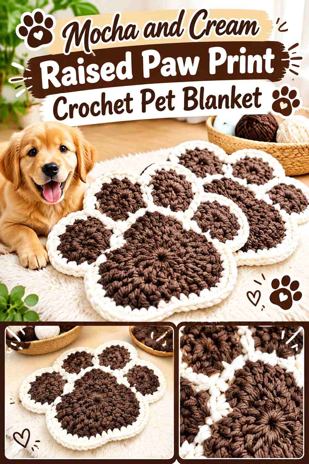
Mocha gives raised paw details a warm dark-neutral appearance, while cream provides the strongest light background. The dimensional paw texture already creates shadows, so the blanket does not need an additional accent shade.
The supporting tutorial demonstrates a complete crocheted paw motif with distinct pad and toe shapes that can be adapted as raised blanket elements. YouTube
Place Mocha Raised Paws on Broad Cream Areas
Give every mocha paw enough cream around its outer edge so the dimensional toes remain separate. Paws placed too close together can make the blanket surface feel crowded, particularly when the motifs stand above the base fabric.
Keep Cream Dominant Around Mocha Paw Texture
Cream should remain the visual majority. Mocha already gains emphasis through both its darker value and raised surface, so it does not need to cover the joins and border as well.
Creator Credit: RonariCrochet
9. Flax and Chocolate Paw-Motif Crochet Pet Blanket
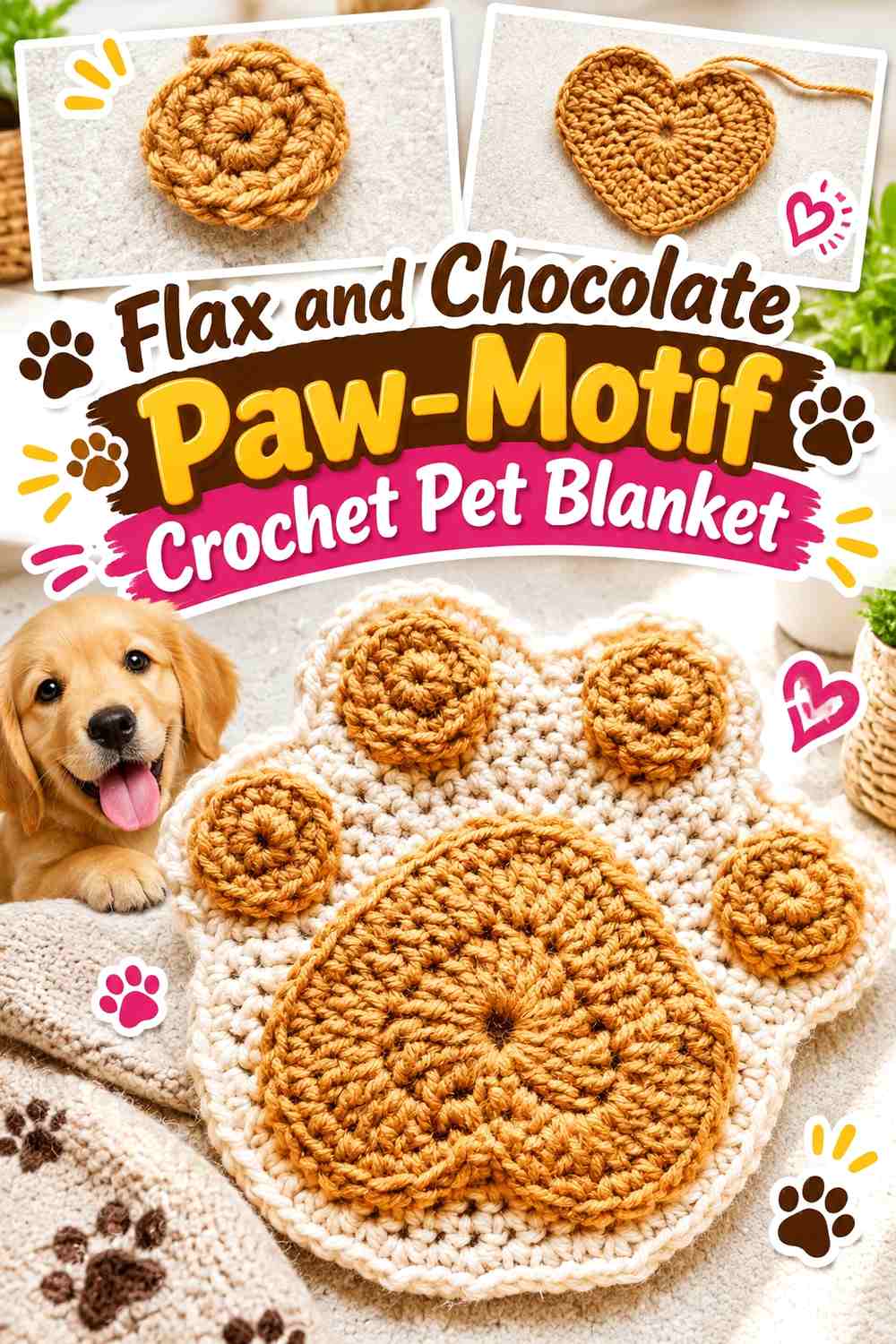
Flax creates a warmer base than ordinary cream, while chocolate supplies a strong but natural-looking contrast. Paw motifs can be repeated as appliqués or incorporated into blocks, depending on the blanket construction you choose.
The supporting tutorial demonstrates a separate paw motif with the larger pad and smaller toe components, which can be adapted for blanket embellishment. YouTube
Let Flax Create Space Around Chocolate Crochet Paws
Because chocolate has substantial visual weight, the blanket does not need many closely packed motifs. A more generous flax background makes each paw clearer and keeps the finished piece light enough to show the surrounding stitch texture.
Repeat Chocolate at the Flax Blanket Edge Only When Needed
If the chocolate paws already dominate visually, finish the edge in flax. Add a chocolate border only when the outer shape needs stronger definition against the surrounding room or pet bed.
Creator Credit: Easy Crochet
10. Greige and Ivory Appliqué Paw Print Crochet Pet Blanket

Greige gives the main blanket a balance of gray and beige, while ivory keeps the paw motifs light and visible. This reversed arrangement—lighter paws on a darker neutral background—creates a softer result than using black or espresso motifs.
The supporting paw-print tutorial teaches an appliqué-style motif that can be added to a separately crocheted blanket. Your Crochet
Make Ivory Paw Prints Wide Enough Against Greige
A small ivory appliqué may visually disappear within the blanket texture, especially if the greige is relatively light. Larger paw shapes or more open spacing between motifs give the lighter neutral enough presence.
Keep Greige Visible Between Ivory Paw Print Clusters
Avoid covering most of the base with pale motifs. Greige is what provides the contrast, so preserve substantial uninterrupted areas between the paws and around the border.
Creator Credit: Mary J Handmade
11. Warm Beige and Cocoa 3D Paw Print Crochet Pet Blanket
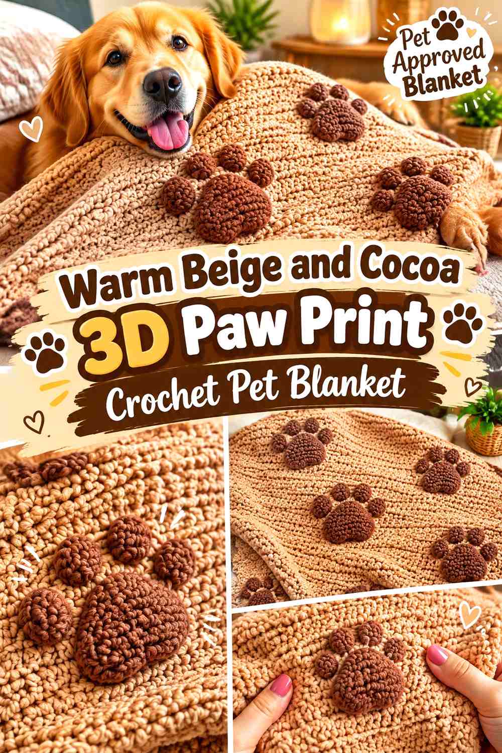
Warm beige and cocoa suit a raised paw-print blanket because their contrast is clear without looking stark. Beige can carry the full blanket fabric, while cocoa forms the raised cat- or dog-paw texture.
The supporting source demonstrates a complete crochet blanket with dimensional cat-paw impressions, making it one of the closest full-blanket construction references in the collection. Your Crochet
Let Cocoa 3D Paw Prints Create the Texture Against Warm Beige
Keep cocoa consistent inside the raised motif so the shape remains readable even where the texture casts additional shadows. The color difference and surface height already provide two kinds of contrast.
Finish the Warm Beige Paw Blanket With a Quiet Beige Edge
A matching beige border keeps attention on the repeated paws. If you want stronger framing, a very narrow cocoa finish can connect the edge back to the motifs without creating another large dark area.
Creator Credit: Esperanza y Ana Celia Rosas (Tejiendo Perú)
12. Soft Gray and Cream Paw Print Crochet Pet Blanket

Soft gray gives a classic neutral background, while cream creates easily recognized paw motifs. This works particularly well for a blanket where the paw pattern is built directly into the fabric rather than added later.
The supporting tutorial demonstrates a complete paw-print crochet blanket, so it provides a direct blanket-level construction reference for this color adaptation. YouTube
Use Cream Paw Prints as Clear Breaks in Soft Gray
Cream should stay lighter enough than gray to preserve the pad and toe shapes. If the chosen gray is very pale, move toward a warmer or slightly deeper gray rather than switching to a bright non-neutral accent.
Repeat Soft Gray Around the Cream Blanket Border
A soft-gray border keeps the dominant shade running around the entire piece and stops cream motifs from visually spilling into the edge. A small cream finishing round can be added if the border needs a little separation.
Creator Credit: Kristin Omdahl
13. Camel and Ivory Granny Square Paw Print Crochet Pet Blanket

Camel paw prints against ivory squares create a warm two-neutral blanket. A raised or dimensional paw benefits from this combination because the shadows reinforce a contrast that is softer than chocolate against cream.
The supporting tutorial demonstrates a paw-print granny square with dimensional toe details and is suitable for repeating into a modular blanket. YouTube
Let Camel Paw Toes Stand Out Against Ivory
Keep the camel paw cohesive rather than mixing the toes among several tans. The raised texture should be supported by one consistent warm shade so every motif reads similarly across the blanket.
Join Ivory Squares Without Adding Another Camel Grid
Ivory joins maintain a calm field behind the camel paws. If the seams are also camel, the eye may notice the grid before the motif, especially when every square uses the same paw placement.
Creator Credit: Sara Sach Crochet Designs
14. Oatmeal and Mushroom Crochet Pet Blanket With Paw Print Accents
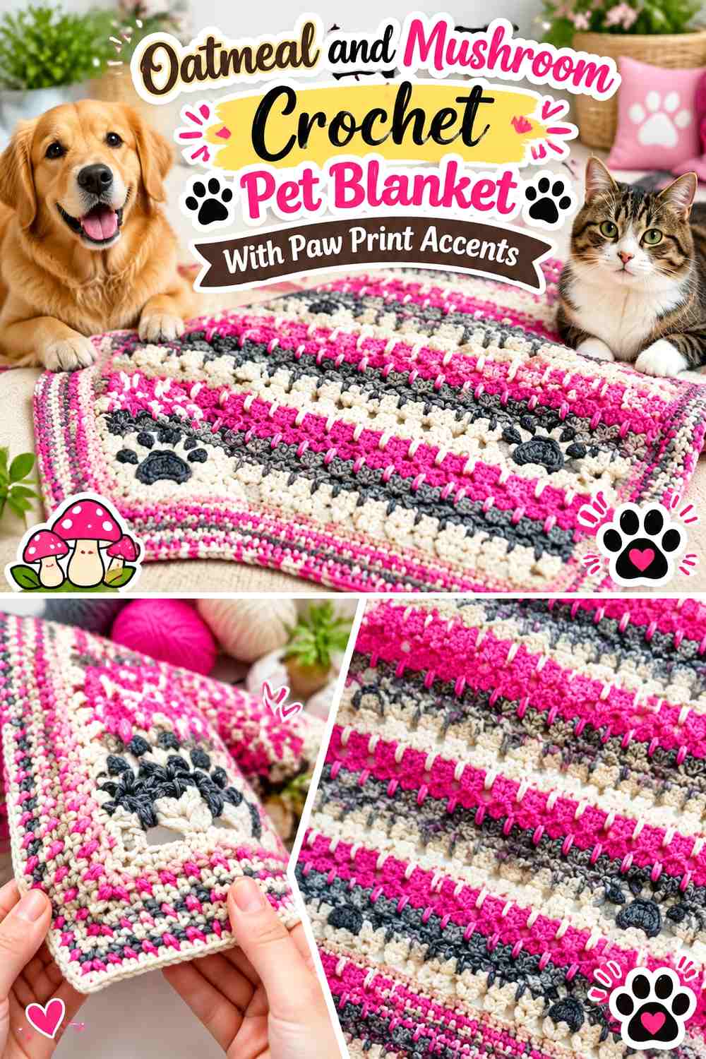
This idea begins with a practical pet-size blanket structure and adds paw motifs separately. Oatmeal can cover the main field, while mushroom paws are attached or incorporated afterward. The similar neutral values create a subtle pet-themed result rather than a graphic pattern.
The supporting source demonstrates a complete cat blanket rather than a paw-print blanket, so use it for the pet-blanket construction and add a separately chosen paw motif only after confirming the placement works with the finished fabric. YouTube
Give Mushroom Paw Prints Enough Contrast Against Oatmeal
If both yarns look nearly identical once crocheted, deepen mushroom slightly. The goal is still a tonal blanket, but every toe should remain separable from the oatmeal background.
Keep Oatmeal Open Around Mushroom Paw Accents
Use fewer paws when contrast is subtle. More empty oatmeal fabric gives the motifs enough surrounding space to be recognized instead of becoming faint texture scattered everywhere.
Creator Credit: Sirin’s Crochet
15. Charcoal and Natural Cream Crochet Pet Blanket With Paw Print Panels
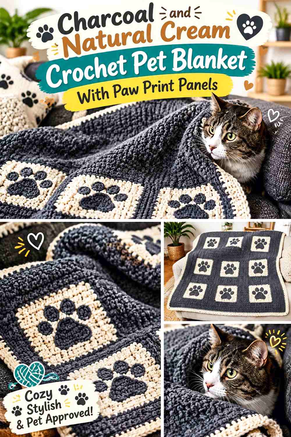
Charcoal and natural cream create a stronger neutral option for a pet blanket built from dense, practical fabric. Cream can cover most of the blanket while charcoal paw panels or motifs become selected focal areas rather than an all-over repeat.
The supporting tutorial demonstrates a cat blanket designed with a relatively closed fabric. It does not include paw prints, so treat it as a pet-blanket construction reference and add the paw treatment separately. YouTube
Keep Charcoal Paw Panels Smaller Than the Natural Cream Field
A few charcoal paw sections can carry substantial visual weight. Limiting them to selected positions keeps the cream blanket lighter and makes each paw panel easier to notice.
Use Natural Cream to Separate Charcoal Paw Print Areas
If multiple dark motifs appear in the same section, leave cream rows or open background between them. This prevents neighboring charcoal paws from merging visually into one large block.
Creator Credit: Left Hand Crochet & Knit Tutorials
16. Sand and Warm Gray Crochet Pet Blanket With Neutral Paw Prints
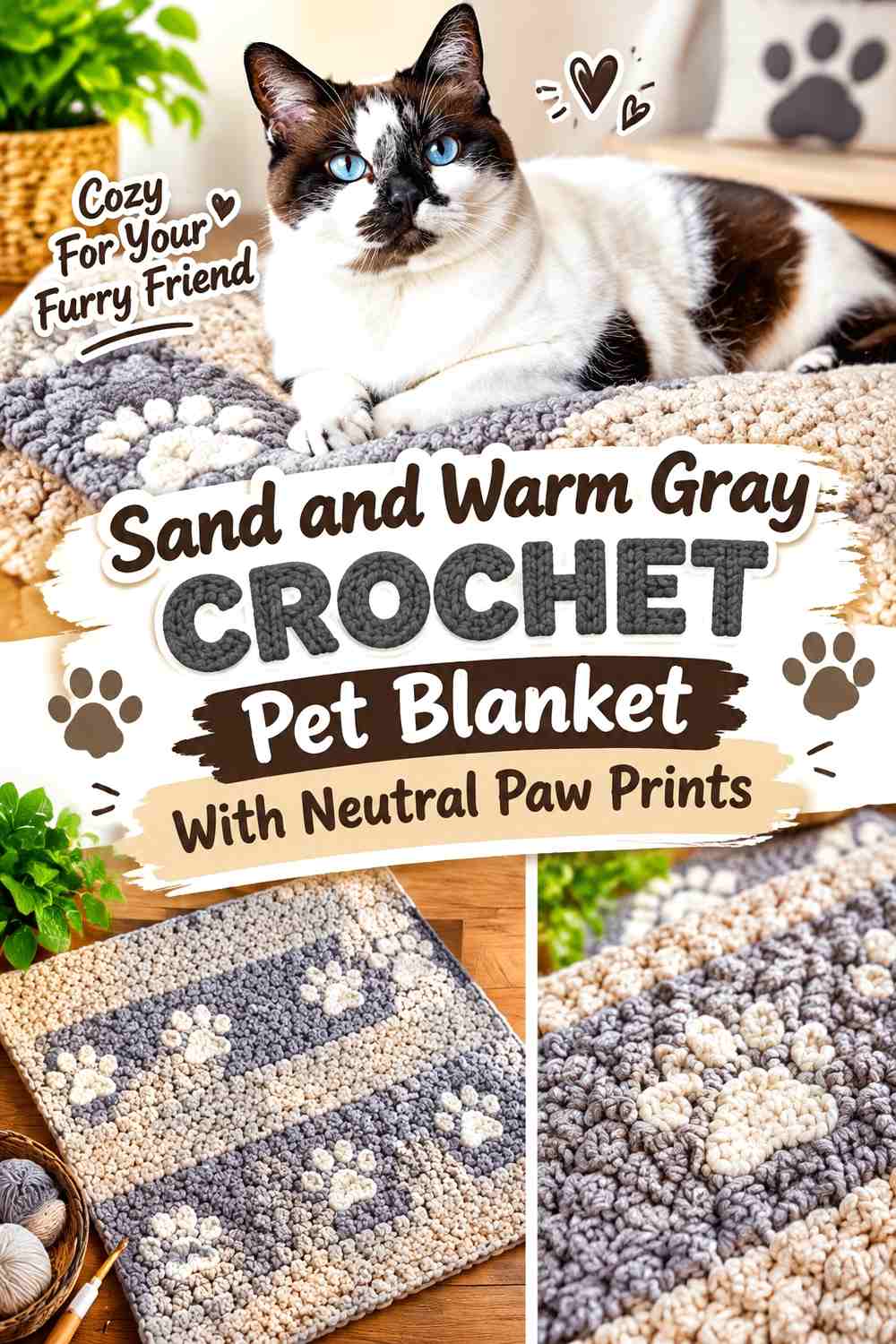
Sand provides the warm dominant color, while warm gray creates quieter paw prints than charcoal or chocolate. This is useful for a pet-size blanket where you want the animal motif visible at close range but not highly graphic across the room.
The supporting source demonstrates a rectangular crochet pet mat for cats or small dogs rather than a paw-print blanket. Use its compact pet-textile construction as an adaptation reference and plan the paw motif independently. YouTube
Let Sand Dominate Around Warm Gray Paw Prints
Keep most of the surface sand so the small pet blanket stays visually calm. Warm-gray paws can be placed through the center or repeated in a limited pattern rather than filling every row.
Repeat Warm Gray in a Narrow Sand Blanket Border
A small gray edge can connect the motif color to the perimeter. Avoid an oversized dark border if the central paw pattern is intentionally subtle.
Creator Credit: First The Coffee Crochet
17. Putty, Cream, and Cocoa Granny Square Paw Print Crochet Pet Blanket

Putty, cream, and cocoa create a three-neutral modular blanket. Cream can carry the paw itself, putty can form most square backgrounds, and cocoa can define the join or selected border sections. Giving each color a single clear role prevents the final grid from becoming unnecessarily busy.
The supporting tutorial demonstrates how separate granny-square designs can be assembled into a complete blanket and finished with a border. Use that joining concept with your chosen paw-print squares rather than treating the source’s floral motifs as paw designs. YouTube
Keep Cream Paw Prints Consistent Across Putty Squares
Using the same cream paw in every motif gives the blanket a repeating visual anchor even if you introduce slight variations in the putty backgrounds.
For more variety, change the position or orientation of the paw rather than adding several additional neutrals.
Use Cocoa Carefully Around Putty and Cream Granny Square Joins
Cocoa joins create a strong visible grid. That can work when you want every paw square clearly framed, but if the grid begins to overpower the cream motifs, switch the internal joins to putty and save cocoa for the outer border.
Creator Credit: Jo to the World Creations
Which Neutral Paw Print Pet Blanket Palette Should You Choose?
For the clearest paw motifs, choose oatmeal with charcoal, cream with cocoa, or soft gray with cream. These combinations create enough value contrast that paw pads and toes remain easy to identify even when the blanket has additional stitch texture.
For a softer tonal result, cream with camel, stone with oatmeal, oatmeal with mushroom, or sand with warm gray keeps the differences quieter. Those palettes benefit from larger paw motifs and more negative space between repeats.
If you prefer the warmest neutrals, camel, mocha, flax, warm beige, and cocoa work well together. Gray-led palettes feel cooler, while putty, greige, and mushroom sit between brown and gray and are useful when you want the blanket to avoid leaning strongly in either direction.
Conclusion
A neutral crochet paw print pet blanket can have just as much visual structure as a brightly colored version. The difference comes from controlling value, motif size, texture, and repetition rather than adding more hues.
Use charcoal, chocolate, cocoa, or espresso when you want paws to stand out clearly. Camel, taupe, mushroom, stone, and warm gray create softer motifs, while cream, ivory, oatmeal, flax, and natural shades make useful backgrounds and joins.
Choose the paw-print technique that fits the look you want: granny-square motifs for a modular blanket, filet paws for a continuous fabric, tapestry crochet for flat graphic paws, or appliqués when you want to decide placement after the blanket is made. Follow each creator for the technique or blanket construction actually demonstrated, then apply the neutral palette and final paw layout independently.
Frequently Asked Questions
Which neutral colors give crochet paw prints the clearest contrast?
Light-and-dark pairings such as oatmeal with charcoal, cream with chocolate, or ivory with espresso provide the strongest definition. Softer combinations such as cream and camel or oatmeal and mushroom can work when the paw motifs are larger and clearly shaped.
Should the paw prints be darker than the pet blanket background?
They do not have to be. Dark paws on a light background create a strong graphic effect, while cream paws on taupe, gray, or mocha can look softer. The important factor is maintaining enough value difference for the toes and central pad to remain recognizable.
What joining color works well for a neutral paw print granny-square blanket?
Use the background color when you want the squares to blend into one continuous field. Use cocoa, charcoal, or another darker existing shade when you want the grid itself to become part of the design. Avoid introducing an unrelated join color unless it adds a clear visual purpose.
Can I add crochet paw appliqués to a plain pet blanket?
Yes. A plain blanket can serve as the base for separately crocheted paw motifs. Arrange the complete set before attaching them so you can check spacing and balance, and make sure any added components are securely finished for the way the blanket will be used.
How can I make low-contrast neutral paw prints easier to see?
Increase the size of the paw, give it more empty background around the edges, or choose shades with a slightly greater light/dark difference. Raised texture can also help, but do not rely on texture alone if the two yarn colors visually merge.
Should the border match the paw prints or the blanket background?
Matching the background usually produces a quieter finish and keeps attention on the paw motifs. Matching the paw color creates a stronger frame. If the blanket already contains many repeated dark paws, a lighter background-colored border may create better balance.
What should I consider when making a crochet blanket specifically for a pet?
Think about how the pet is likely to use the blanket and keep finishing practical. Avoid loosely attached decorative pieces if they may be pulled or chewed, secure appliqués carefully, and check the care instructions for the yarn you actually use rather than assuming every fiber can be cleaned the same way.