Cool blue gives a crochet hooded sweater a clear color identity without forcing the whole garment into a bright or highly saturated palette. Depending on the supporting shade, cool blue can look crisp beside soft white, deeper beside navy or charcoal, gentler with frost blue or lavender, or more contrasted beside warmer camel, dusty rose, and burgundy.

The hood makes color placement especially important. A contrasting hood occupies a large visible area when it rests across the back, while contrast edging around the face can create a strong front detail even when very little accent yarn is used. Cuffs, hems, pockets, drawstring areas, front bands, and sleeve sections give you additional places to repeat the secondary shade.
These 13 ideas keep cool blue central while changing contrast, color temperature, saturation, and placement. The credited tutorials support the hooded sweater or hooded cardigan construction concepts; the cool-blue palettes are independent color directions that can be adapted to compatible projects.
Quick List
- Cool Blue And Soft White Crochet Pullover Hooded Sweater
- Cool Blue And Navy Crochet Oversized Hooded Sweater
- Cool Blue And Silver Gray Crochet Pouch Pocket Hooded Sweater
- Cool Blue And Frost Blue Crochet Granny Stitch Hooded Sweater
- Cool Blue And Charcoal Crochet Zip Front Hooded Sweater
- Cool Blue And Cream Crochet Classic Hooded Sweater
- Cool Blue And Lavender Crochet Buttoned Hooded Sweater
- Cool Blue And Burgundy Crochet Long Hooded Sweater
- Cool Blue And Camel Crochet Relaxed Hooded Sweater
- Cool Blue And Deep Teal Crochet Textured Hooded Sweater
- Cool Blue And Sage Crochet Longline Hooded Sweater
- Cool Blue And Dusty Rose Crochet Textured Pullover Hooded Sweater
- Cool Blue And Black Crochet Chunky Hooded Sweater
Let Cool Blue Lead the Hood, Body, or Both
A hood is large enough to change how the entire sweater reads. If cool blue covers the torso but the hood is completely charcoal, burgundy, or black, the contrast color may become much more prominent from the back than it appears from the front.
For a clearly cool-blue sweater, repeat blue through both the body and at least part of the hood. The second color can line the hood edge, form a narrow outer border, or appear on a drawstring area instead of replacing the entire hood.
If you want a deliberately contrast-colored hood, repeat that shade somewhere lower on the garment—such as the cuffs or pocket edge—so it does not look disconnected from the sweater body.
Use Contrast to Define Cool Blue Hood Edging and Ribbing
Small finishing areas often need more value separation than large color blocks. Cool blue and another medium-value shade can look clearly different in separate skeins yet visually merge when one becomes a narrow cuff or hood border.
Compare the yarns side by side and from several feet away. A grayscale photo can also help you judge light-dark value. Soft white, black, or a sufficiently deep navy can create clear definition, while frost blue, sage, lavender, or silver gray may produce a quieter transition.
Neither result is automatically better. Use stronger separation when the hood opening or ribbing should be obvious, and closer values when you want the finishing to blend into the main sweater.
Repeat Cool Blue Across Sleeves, Cuffs, and Pockets
A hooded sweater has several visually separate zones, so repetition helps the color plan stay connected. If cool blue dominates the torso, continue it through most of both sleeves rather than introducing an entirely different sleeve palette without a clear reason.
Pockets deserve particular attention because a kangaroo or pouch pocket can cover a substantial part of the front. A contrasting pocket immediately becomes a focal point. A cool-blue pocket with contrast edging is quieter and often leaves more room for the hood or cuffs to carry the accent.
1. Cool Blue And Soft White Crochet Pullover Hooded Sweater
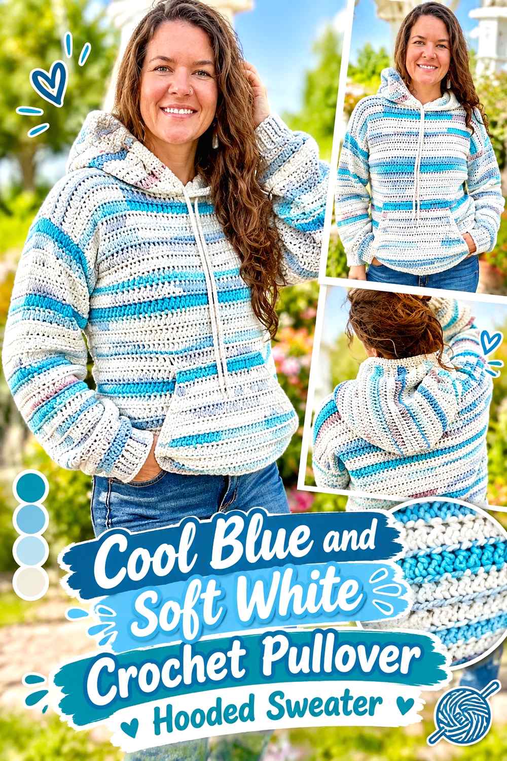
Soft white gives cool blue a clear light contrast without requiring multiple accent colors. Let cool blue cover the torso, sleeves, and most of the hood, then use soft white around the hood opening, cuffs, or pocket edge. Because the hood sits directly around the face when worn up, even a narrow white finish can establish the entire two-color palette.
Cool Blue Should Cover Most of the Soft White Hooded Sweater
Keep the largest body and sleeve areas cool blue if you want the garment to read immediately as blue. Soft white works better as a separator around structural features than as an equal block when the goal is a blue-led pullover.
If the lower hem, cuffs, hood edge, and pocket are all white, the accent may begin to surround the blue body. Consider leaving at least one major finishing area cool blue to prevent an overly framed effect.
Cool Blue Hood Edging Gains Definition From Soft White
A soft-white border around a cool-blue hood can make the hood opening clearer without changing the entire hood color. This also allows the back of the hood to stay connected to the blue body when it is worn down.
If your cool blue is very pale, place the yarn directly beside soft white first. A small value difference produces a delicate transition, while a medium or darker blue gives the white border more definition.
Cool Blue Pockets Can Carry a Smaller Soft White Accent
Instead of making the entire pouch pocket white, keep it cool blue and use white along the upper opening or another narrow edge. The pocket then remains integrated into the body while still repeating the hood color.
Creator Credit: Off the Beaten Hook
2. Cool Blue And Navy Crochet Oversized Hooded Sweater
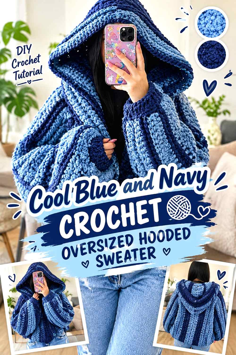
Navy gives cool blue a deeper related shade, making this a useful tonal palette for an oversized hoodie. Cool blue can cover the broad body and sleeves while navy defines selected edges. Because oversized garments contain more visible fabric, dark navy sections can become visually heavy faster than they would on a fitted sweater.
Cool Blue Needs Broad Areas Around Navy Oversized Details
Keep the front, back, and most sleeve length in cool blue so the oversized silhouette does not become dominated by the darker accent. Navy can then concentrate around the cuffs, hood opening, or lower edge.
A wide navy hem plus wide cuffs and a full navy hood would substantially reduce the visual share of blue. Choose the places where dark definition matters most instead of repeating navy around every edge.
Cool Blue and Navy Need Separation Around the Hood
Cool blue and navy belong to the same general color family, so the result depends heavily on value. If the cool blue is already dark, a medium navy may not create enough separation around a narrow hood border.
Compare the yarns in grayscale. When clear edging is important, preserve a noticeable light-dark difference even though both colors remain blue.
Cool Blue Sleeves Can Keep Navy Cuffs From Feeling Heavy
Let cool blue run nearly to the wrist before introducing navy. That uninterrupted sleeve area gives each dark cuff enough surrounding blue to read as a deliberate endpoint rather than the start of another large color block.
Creator Credit: Dana B
3. Cool Blue And Silver Gray Crochet Pouch Pocket Hooded Sweater
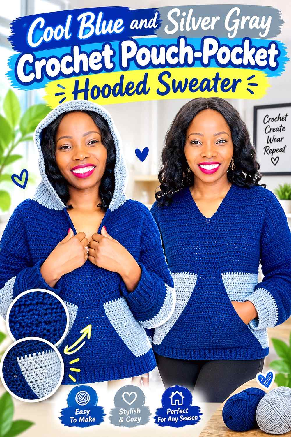
Silver gray supports cool blue without introducing a second strong hue. This palette works well when the hood, pocket, and overall sweater shape should receive more attention than dramatic color blocking. Use cool blue across the body and sleeves, with gray around the pouch opening, cuffs, or hood edge.
Cool Blue Should Stay Visible Across the Silver Gray Pouch Pocket
A large silver-gray pouch can become one of the strongest blocks on the sweater front. For a more integrated approach, crochet the main pocket area in cool blue and reserve gray for the pocket opening or narrow border.
That placement still makes the pocket easier to distinguish while keeping the center front connected to the body.
Cool Blue and Silver Gray Need a Value Check Around the Hood
Cool blue and gray may sit very close in lightness, particularly when both are muted. A narrow gray hood edge can disappear even though the yarns look different when held separately.
Decide whether that blended effect is intentional. If the hood border needs to remain obvious, choose a silver gray that is noticeably lighter or darker than the cool blue.
Cool Blue Cuffs Can Balance Silver Gray Sweater Details
If gray already appears on the hood and pocket, keep the cuffs predominantly cool blue. This limits the supporting neutral and returns the main color to the ends of the sleeves.
Creator Credit: Simply Angel Tiah
4. Cool Blue And Frost Blue Crochet Granny Stitch Hooded Sweater
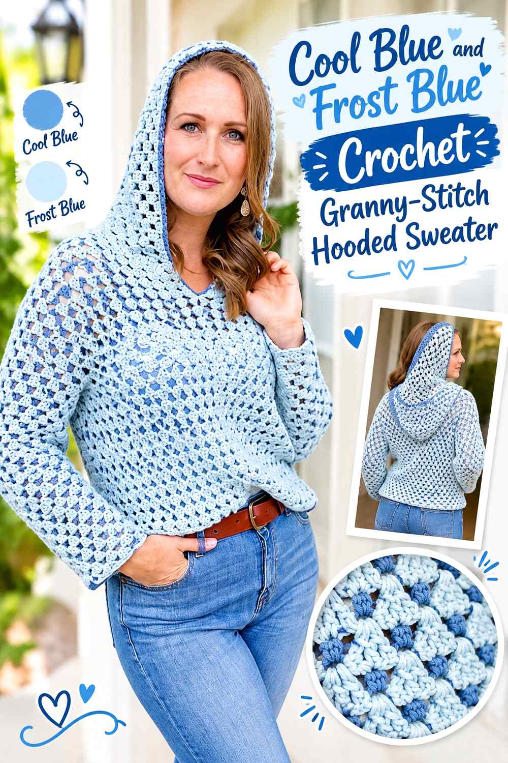
Frost blue creates a lighter tonal partner for cool blue rather than a completely different hue. On a granny-stitch hooded sweater, this allows color changes to remain visible without overpowering the open rhythm of the crochet surface. Use cool blue for the broader body sections and frost blue for selected rows, hood details, or sleeve accents.
Cool Blue Should Form the Main Field of Frost Blue Granny Stitch
If the sweater should remain cool-blue-led, give cool blue more repeated surface than frost blue. Broad cool-blue areas interrupted by narrower frost-blue changes create a clear hierarchy.
Equal alternation creates a more balanced two-blue sweater, which is a valid option but produces a different result from a cool-blue sweater with lighter tonal accents.
Cool Blue and Frost Blue Can Separate Granny Texture Without Dark Edges
A lighter frost blue can define changes in the granny-stitch surface without adding navy, charcoal, or black. This keeps the sweater visually cool and relatively soft.
Before repeating the palette through the whole garment, check several rows together. If both blues are extremely close, the color changes may disappear once the openwork pattern creates additional light and shadow.
Cool Blue Hood Sections Can Anchor Frost Blue Sleeve Changes
If frost blue appears repeatedly on the sleeves, keep substantial cool blue in the hood. The larger solid-looking blue area around the upper sweater can anchor lighter sleeve variation and prevent the tonal palette from feeling scattered.
Creator Credit: HanJan Crochet
5. Cool Blue And Charcoal Crochet Zip Front Hooded Sweater
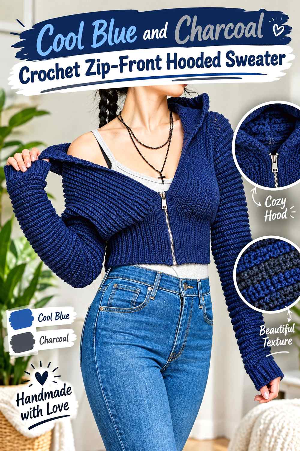
Charcoal creates a strong neutral frame around cool blue and suits a zip-front design particularly well because the center opening already forms a clear vertical division. Keep cool blue across the front panels, back, and sleeves, with charcoal concentrated around the zipper area, hood edge, or cuffs.
Cool Blue Should Border the Charcoal Zip-Front Area
Keep the main sections directly beside the front opening cool blue. Charcoal can then form a controlled narrow line at the center rather than spreading into broad dark panels on both sides.
The visual width of two dark front edges adds up when the sweater is worn open, so assess both sides together before deciding how much charcoal to use.
Cool Blue Hood Panels Can Soften Charcoal Front Edging
If charcoal already frames the zipper, make most of the hood cool blue rather than extending charcoal across the entire hood. A narrow charcoal outer edge can connect the hood with the front opening without making the upper back significantly darker than the sweater body.
Cool Blue Sleeves Need Space Between Charcoal Cuffs and Body Details
When charcoal appears on the cuffs, leave enough uninterrupted cool blue through the sleeve for the dark finishing to remain separate from other accents. Repeated dark bands close together can make the sleeve look more segmented than the body.
Creator Credit: TCDDIY
6. Cool Blue And Cream Crochet Classic Hooded Sweater
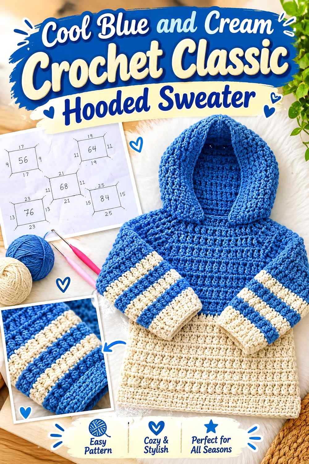
Cream gives cool blue a warmer light neutral than bright white. It can soften the contrast around the hood, cuffs, and hem while leaving the sweater clearly blue. This palette is useful when you want light definition without making every finishing line look crisp or graphic.
Cool Blue Should Remain Continuous Around Cream Sweater Finishing
Let cool blue run through the main body and sleeve panels before introducing cream. A cream cuff or hood edge has more impact when it interrupts a substantial area of blue rather than sitting among several other light sections.
If cream already appears around the hood, consider keeping the lower hem cool blue so the main shade remains continuous from torso to bottom edge.
Cool Blue Hood Edging Looks Softer Beside Cream
Cream produces a warmer boundary around cool blue than a stark white would. Use it when you want the hood opening to be visible but not sharply outlined.
The same cream can be repeated in a narrow pocket edge or drawstring area to connect the front of the sweater with the hood without requiring a full cream pocket.
Cool Blue Cuffs Can Keep Cream From Framing the Entire Sweater
If the hood edge and hem are already cream, use cool-blue cuffs. This breaks up the light perimeter and prevents the supporting neutral from appearing around every outer boundary.
Creator Credit: Zahra’s Crochet Art
7. Cool Blue And Lavender Crochet Buttoned Hooded Sweater
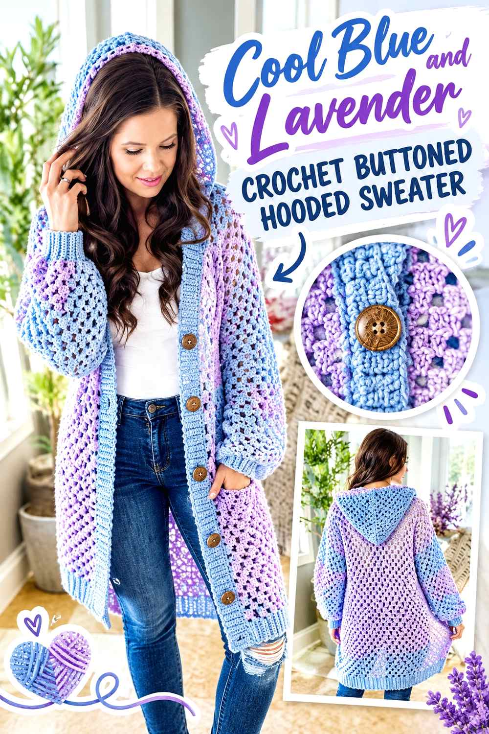
Lavender keeps the palette cool while introducing a purple direction. On a buttoned open-front hooded sweater, cool blue can dominate the body and sleeves while lavender moves into selected hood sections, front edging, or cuffs. Because the opening creates two vertical bands, even a muted lavender can become noticeable when repeated on both sides.
Cool Blue Should Lead Beside Lavender Button Bands
Keep the front panels predominantly cool blue so lavender edging does not visually narrow them too much. A slim lavender band can provide enough color variation along the opening without becoming equal to the body color.
If lavender also appears in the hood, repeat it selectively rather than automatically increasing the width of the front border.
Cool Blue and Lavender Need Contrast Around the Hood
Muted cool blue and lavender can have nearly identical value. That creates a sophisticated blended effect in large areas but can make a narrow hood border hard to see.
If the hood edge needs stronger definition, choose a lavender that is distinctly lighter, darker, or slightly more saturated while keeping the same purple direction.
Cool Blue Sleeves Can Separate Lavender Cuffs From the Hood
Leave most of each sleeve cool blue before introducing lavender at the wrists. The blue space between hood and cuffs allows the accent to repeat without creating a continuous purple frame around the garment.
Creator Credit: MJ’s Off The Hook Designs
8. Cool Blue And Burgundy Crochet Long Hooded Sweater
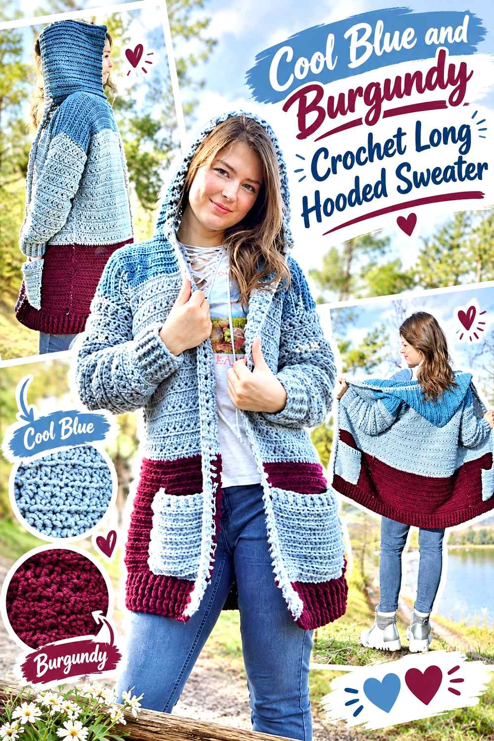
Burgundy creates a deeper warm contrast against cool blue. On a longer hooded sweater, repeated burgundy areas can accumulate over a large garment surface, so keep cool blue consistent from the shoulders through the lower body. Burgundy works well as a controlled edge, pocket detail, or hood accent rather than automatically occupying large panels.
Cool Blue Should Continue Through the Length of the Burgundy Hooded Sweater
A long garment benefits from a repeated main-color path. Keep cool blue moving through both front sections and the back rather than allowing burgundy to collect heavily near the bottom.
If you introduce burgundy near the hem, repeat only a smaller amount elsewhere so the lower sweater does not appear visually heavier than the hood and shoulders.
Cool Blue Hood Panels Can Contain Burgundy Edging
Keep most of the hood cool blue and use burgundy around the outer edge when you want warmth near the face without replacing the entire hood color. This also ensures the hood remains connected to the long blue body when viewed from the back.
Cool Blue Pockets Can Use Burgundy as a Smaller Highlight
A fully burgundy pocket can become a large focal point, particularly on an otherwise solid blue front. Keeping the pocket blue and using burgundy only along its opening gives the warm accent a functional placement without turning the center front into a dark block.
Creator Credit: Colour Ceilidh Crochet
9. Cool Blue And Camel Crochet Relaxed Hooded Sweater
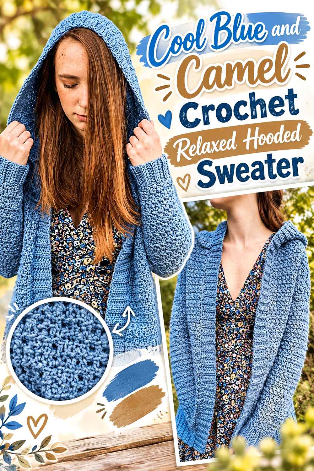
Camel warms cool blue while staying quieter than rust, mustard, or orange. On a relaxed hooded sweater, this warm neutral can work around the cuffs, pocket edges, or hood opening without competing heavily with the blue body.
Cool Blue Should Cover the Relaxed Sweater Body Beside Camel
Keep broad front and back areas cool blue and treat camel as finishing. The roomy shape already creates a large visual surface, so a wide camel lower band can have more impact than expected.
A smaller camel hood edge or pair of cuffs may be enough to establish the warm-cool relationship.
Cool Blue Hood Sections Can Make Camel Edging More Intentional
A camel edge is more effective when it clearly borders a blue hood rather than mixing through several unrelated upper-body sections. Use the warm neutral to define the perimeter, then allow cool blue to remain dominant across the hood itself.
Cool Blue Pockets Can Repeat Camel Without Becoming Contrast Blocks
Keep pockets mostly cool blue and introduce camel at the opening or another small edge. This provides a second warm repeat below the hood while allowing the pocket to remain integrated into the sweater front.
Creator Credit: Hey Carrie
10. Cool Blue And Deep Teal Crochet Textured Hooded Sweater
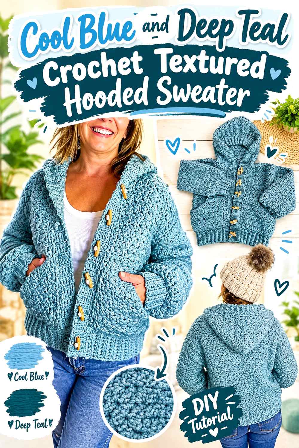
Deep teal gives cool blue a richer blue-green partner. Both shades can remain within a cool palette while still producing enough hue variation to emphasize textured sections. Cool blue should cover the broad sweater areas, with teal reserved for selected edges, pockets, or blocks where deeper color adds definition.
Cool Blue Texture Needs Enough Separation From Deep Teal
Texture creates its own shadows, so similar dark values can make a blue-and-teal change less obvious than expected. Test the two yarns in the actual crochet texture when color separation matters.
If teal disappears into the blue, increase the value difference rather than adding a third color immediately.
Cool Blue Hood Panels Can Balance Deep Teal Front Details
If teal is used around the front opening or closure area, keep most of the hood cool blue. A small teal hood edge can repeat the accent without allowing the darker shade to take over the entire upper sweater.
Cool Blue Cuffs Can Prevent Too Much Deep Teal at the Outer Edges
When teal already appears along the hood and front, blue cuffs give the sleeves a quieter finish. If more repetition is needed, add only a narrow teal line rather than making the entire cuff dark.
Creator Credit: Mermaids and Hooks
11. Cool Blue And Sage Crochet Longline Hooded Sweater
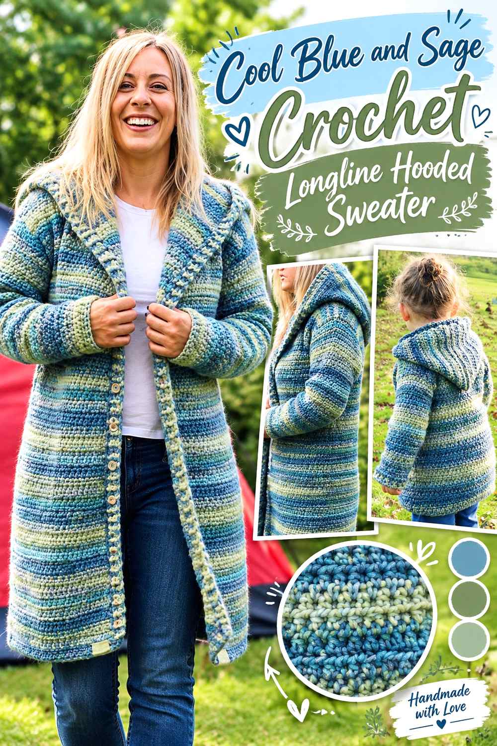
Sage introduces a muted green that sits comfortably beside cool blue without creating the strong warm-cool contrast of camel or burgundy. A longline hooded sweater gives both colors substantial room, so decide early whether sage will appear as narrow repeating sections or one larger supporting area.
Cool Blue Should Remain the Longline Sweater’s Main Vertical Color
Keep cool blue moving from the upper body toward the lower hem so the long silhouette has a continuous main shade. Large sage sections placed only near the bottom can visually divide the garment and make the lower half look separate.
For a blue-led design, use sage in smaller repeated zones rather than one dominant lower block.
Cool Blue and Sage Need a Value Check Around the Hood
Muted blue and green can look different by hue while sharing almost the same lightness. That may be useful for a subtle hood border, but it is less effective if you want the hood edge clearly defined.
Compare the colors at normal viewing distance before repeating sage around a large hood opening.
Cool Blue Cuffs Can Anchor Sage Longline Accents
If sage appears several times through the long body, finish the sleeves predominantly in cool blue. This gives the main shade another continuous area and prevents green from occupying every finishing point.
Creator Credit: Peanut & Plum
12. Cool Blue And Dusty Rose Crochet Textured Pullover Hooded Sweater
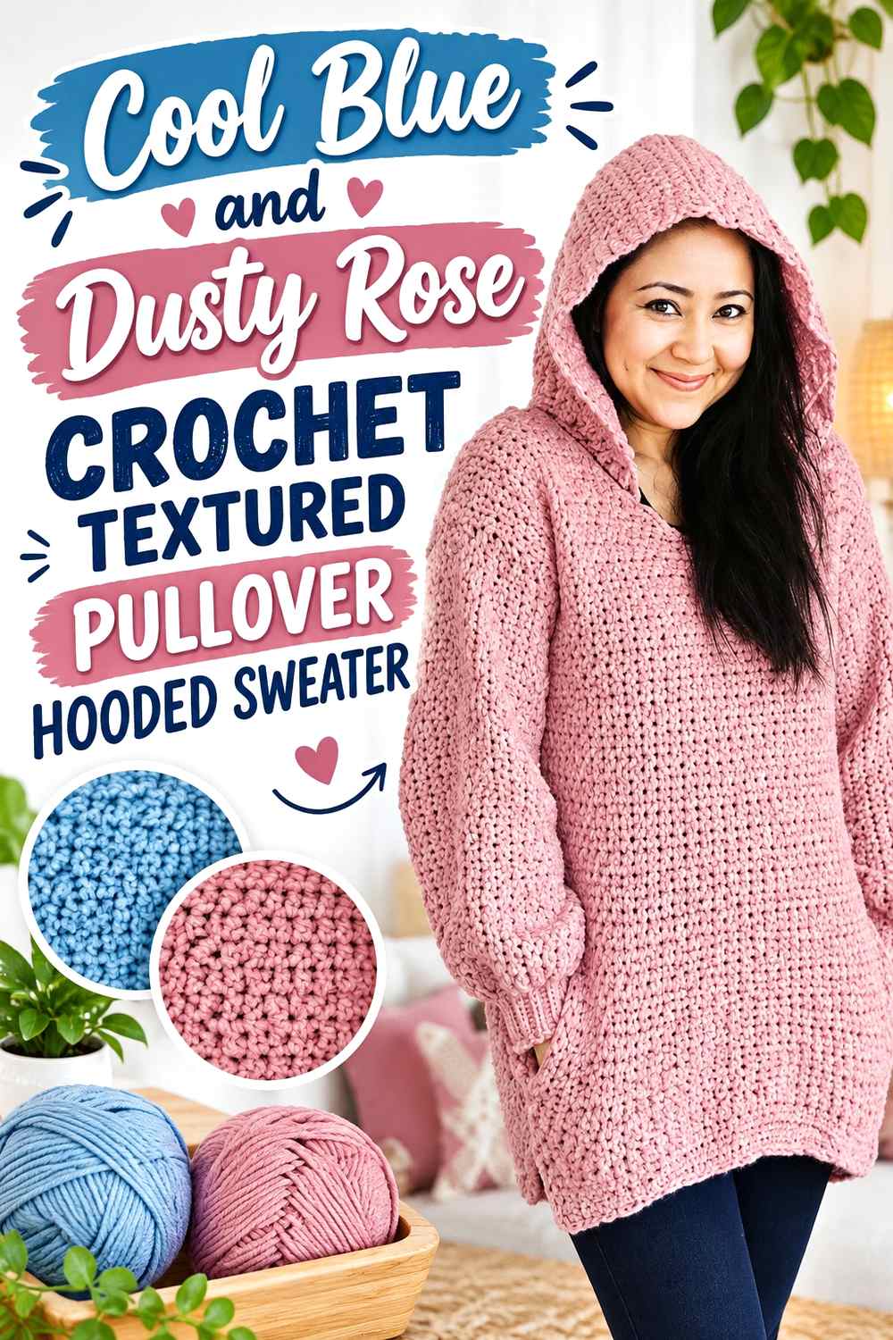
Dusty rose adds a softened warm accent to cool blue without creating the intensity of a vivid pink. On a textured pullover, keep cool blue across the largest stitch areas so texture and color remain readable, then place dusty rose around controlled finishing sections.
Cool Blue Texture Should Stay Dominant Beside Dusty Rose
Large textured stitches can already create substantial visual movement. Keep the main textured torso cool blue and avoid switching between pink and blue too frequently unless a deliberately patterned surface is the goal.
Dusty rose works well as a quieter contrast at the wrists, hood edge, or pocket opening.
Cool Blue Hood Panels Can Use Dusty Rose as a Warm Outline
A narrow rose border around a cool-blue hood introduces warmth close to the face while allowing the large back of the hood to remain connected to the sweater body.
If the dusty rose is very pale, check that it is visibly distinct from the cool blue before assigning it to narrow edging.
Cool Blue Pocket Areas Can Limit Dusty Rose Visual Weight
If dusty rose already outlines the hood and cuffs, keep the pouch pocket cool blue. A narrow rose edge can repeat the accent without placing another large warm block in the center of the pullover.
Creator Credit: The Knotty Lace
13. Cool Blue And Black Crochet Chunky Hooded Sweater

Black creates the strongest dark contrast in the collection. On a chunky hooded sweater, where each stitch and color area already carries significant visual weight, use black selectively. Cool blue can dominate the broad body, hood, and sleeves while black defines closures, cuffs, pocket borders, or selected edging.
Cool Blue Needs Broad Areas Around Black Chunky Details
Keep large stretches of cool blue between black sections. A chunky black hood edge, cuff, and pocket trim can already create strong definition without adding broad black body panels.
If black begins appearing around every boundary, the sweater may read as black-framed rather than blue-led.
Cool Blue Hood Panels Should Balance Black Front Edging
When black already defines the front opening, leave most of the hood cool blue. Carrying the black edge only around the hood perimeter can connect the two areas without creating a completely black hood.
This is particularly useful when the hood is large and visible across much of the upper back.
Cool Blue Pockets Can Keep Black Accents Controlled
A cool-blue pocket with black edging maintains the body color across the center front while making the pocket boundary visible. Solid black pockets create a much stronger graphic effect and work better when black is intentionally a co-dominant part of the palette.
Creator Credit: AC Crochets
Comparing the 13 Cool Blue Crochet Hooded Sweater Palettes
Soft white and cream create the clearest light-neutral options. Soft white gives the hood, pocket, or cuffs a crisper boundary, while cream makes the transition warmer and slightly softer.
Navy, charcoal, deep teal, and black move in the darker direction. Navy keeps the garment strongly blue, charcoal creates a neutral frame, deep teal introduces blue-green saturation, and black produces the strongest graphic separation.
Frost blue, silver gray, lavender, and sage create quieter transitions. These combinations depend more heavily on checking light-dark value because different hues can still merge when their values are similar. They suit sweaters where you want texture, hood shape, or construction to remain more visually important than sharp color blocking.
Camel, dusty rose, and burgundy introduce warmer contrast. Camel is the quietest warm-neutral option, dusty rose gives the sweater a softer pink shift, and burgundy creates a deeper accent with greater visual weight.
Conclusion
Start by deciding how much attention the hood should receive. If you want it to blend with the sweater, keep most of the hood cool blue and use the second color only around the opening. If you want the hood to become a stronger design feature, give the supporting shade a larger role and repeat it at the cuffs, pocket, or front edging so the change looks connected.
For lighter contrast, soft white and cream provide clear separation. Frost blue, silver gray, lavender, and sage produce softer transitions. Navy, charcoal, deep teal, and black add darker definition, while camel, dusty rose, and burgundy introduce warmth at different intensities.
The pocket also deserves the same attention as the hood. A fully contrasting pouch can become a major color block, while a cool-blue pocket with contrast edging keeps the front calmer. Whatever direction you choose, judge the body, hood, sleeves, cuffs, and pocket together before committing to repeated accent sections.
Use the credited tutorials for the creators’ exact construction, sizing, hood shaping, assembly, and finishing information, while treating these cool-blue palettes as independent color-planning directions.
Frequently Asked Questions
What colors work well with Cool Blue on a crochet hooded sweater?
Soft white, cream, silver gray, charcoal, navy, and black provide neutral or near-neutral options. Frost blue and deep teal keep the palette strongly cool, while lavender and sage create softer color transitions. Camel, dusty rose, and burgundy add warmer contrast without requiring the main blue to change.
Should the hood be the same Cool Blue as the sweater body?
It can be, and matching the hood to the body is one of the simplest ways to keep cool blue dominant. A contrasting hood creates a stronger feature because it occupies substantial visual space, particularly from the back. Another option is a cool-blue hood with contrast edging, which adds color variation without separating the hood from the body.
What color should I use around a Cool Blue hood opening?
Use soft white or cream for lighter definition, navy or charcoal for darker definition, or frost blue and lavender for a softer tonal edge. The useful choice depends on how visible you want the hood opening to be. Check actual yarn values because color names alone do not guarantee contrast.
How should I color a pouch pocket on a Cool Blue hooded sweater?
A cool-blue pocket blends into the body and keeps attention on the hood or sweater texture. A fully contrasting pocket becomes a focal point because it occupies a substantial part of the center front. For a middle ground, keep the pocket cool blue and use the accent color only along its opening or border.
Can warm colors be combined with Cool Blue on a hooded sweater?
Yes. Camel, dusty rose, and burgundy can introduce warm contrast while cool blue remains dominant. Keep stronger accents controlled around the hood edge, cuffs, pocket opening, or another structural feature rather than automatically dividing the entire sweater into equal color areas.
How can I tell if navy, teal, or gray has enough contrast with Cool Blue?
Place the yarns together and look at them from several feet away. A grayscale photo can also help you compare light-dark value. If the colors merge and you need the hood edge, cuffs, or pocket to remain visible, choose a supporting shade with a clearer value difference.
How do I keep a multicolor Cool Blue hooded sweater from looking too busy?
Give each shade a defined role. Let cool blue cover the largest body, sleeve, or hood areas, use one supporting color for major finishing, and keep any additional accent limited to smaller details. Repeating the same accent at two or three structurally related points—such as the hood edge and cuffs—usually creates more continuity than scattering it randomly across the garment.