Powder blue gives a crochet winter tote a light, cool foundation that can support both soft neutral accents and much darker winter contrasts. It works across solid bag panels, granny squares, mesh, textured stitches, and structured tote bodies without requiring a complicated palette.
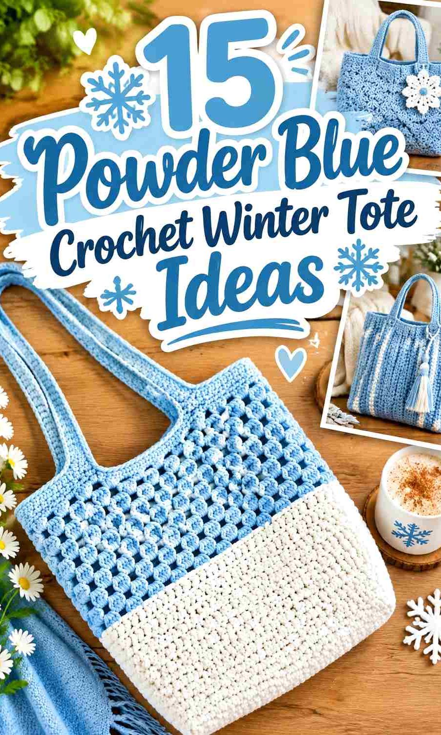
On a tote, the second color has several useful places to go. Winter white can clarify a snowy border, navy can strengthen the base, silver gray can organize textured panels, and charcoal can give straps or edging more definition. Warmer shades such as oatmeal and blush can soften the cool blue without replacing it as the dominant color.
The 15 ideas below keep powder blue as the recurring anchor while changing construction, color balance, texture, strap treatment, and winter styling. The credited tutorials support the tote constructions; the powder-blue palettes are independent editorial adaptations.
Quick List
- Powder Blue And Winter White Crochet Classic Winter Tote
- Powder Blue And Silver Gray Crochet Origami Winter Tote
- Powder Blue And Navy Crochet Mesh Winter Tote
- Powder Blue And Pearl Ivory Crochet Granny Square Winter Tote
- Powder Blue And Charcoal Crochet Modular Winter Tote
- Powder Blue And Dusty Blush Crochet Checkerboard Winter Tote
- Powder Blue And Oatmeal Crochet Square Panel Winter Tote
- Powder Blue And Deep Teal Crochet Structured Winter Tote
- Powder Blue And Soft Gray Crochet Chunky Winter Tote
- Powder Blue And Winter White Crochet Nature Walk Tote
- Powder Blue And Misty Navy Crochet Granny Winter Tote
- Powder Blue And Frost Gray Crochet Market Winter Tote
- Powder Blue And Cream Crochet Solid Body Winter Tote
- Powder Blue And Steel Gray Crochet Rich Texture Winter Tote
- Powder Blue And Deep Cranberry Crochet Beach Style Winter Tote
Let Powder Blue Cover Enough of the Winter Tote
A tote has enough surface area for a second shade to become substantial very quickly. If powder blue is the focus, give it the largest uninterrupted area across the body, panels, or motifs before deciding where another color belongs.
This is especially helpful on textured bags. Strong stitches, mesh openings, granny motifs, or thick cord construction already create visual variety, so frequent color changes may compete with the tote structure instead of helping it.
Use Darker Colors to Ground Powder Blue Bases and Straps
A darker base can visually anchor a pale tote and make the lower edge easier to distinguish. Navy, charcoal, steel gray, and deep teal work especially well in that role.
Straps are another high-impact area because they extend beyond the bag body. If you use a dark contrast on both the base and handles, keep other accent areas smaller so powder blue remains dominant.
1. Powder Blue And Winter White Crochet Classic Winter Tote
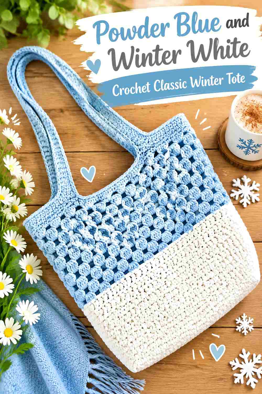
This straightforward palette keeps powder blue across the main tote body while winter white appears around the opening, handles, or one narrow stripe. The light contrast gives the bag a snowy winter direction without breaking the body into many color blocks.
Powder Blue Should Dominate the Classic Winter Tote Body
Keep the broad front, back, and side surfaces powder blue so the tote has one clear visual identity.
A simple bag construction benefits from uninterrupted color because the silhouette itself does not need extra striping to remain interesting.
Winter White Can Brighten the Powder Blue Tote Opening
Use white along the upper edge or a narrow handle detail when you want a pale winter finish.
If the handles are entirely white, keep the body border blue so the supporting shade does not spread across too many areas.
Creator Credit: Kristines Crochets
2. Powder Blue And Silver Gray Crochet Origami Winter Tote
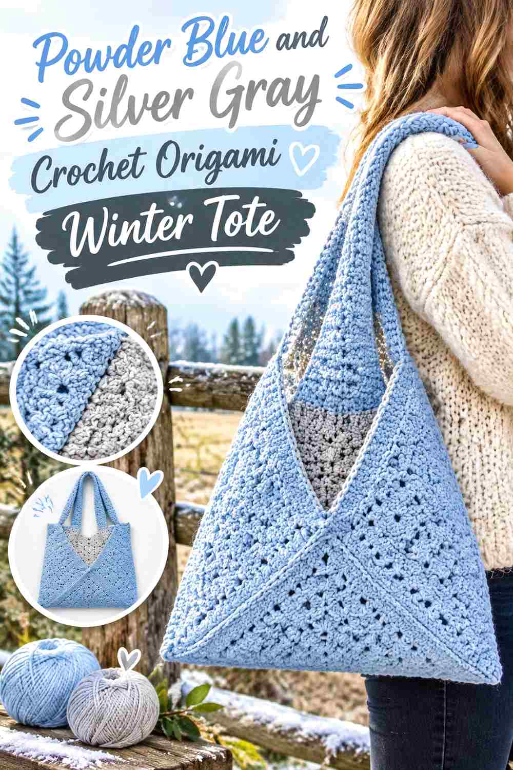
An origami-style tote already has distinctive folds and panel lines, so silver gray should support rather than compete with that construction. Powder blue can remain the main body while gray outlines one edge or selected joining areas.
Powder Blue Should Connect the Origami Tote Panels
Use powder blue across the largest folded sections so the finished geometry reads as one bag rather than several differently colored pieces.
The shaping will already create shadow and direction changes across the surface.
Silver Gray Can Define Powder Blue Origami Seams
A narrow silver-gray seam or border can make important joins easier to see without producing a harsh dark outline.
Keep the gray concentrated around structural lines so its placement has a clear reason.
Creator Credit: Hey Carrie
3. Powder Blue And Navy Crochet Mesh Winter Tote
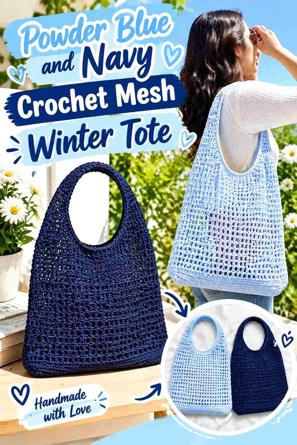
Mesh gives the body natural lightness, which makes navy useful at the base and straps. Powder blue can cover most of the open mesh while the darker shade provides a stronger visual frame.
Powder Blue Should Stay Continuous Through the Mesh Tote Body
Use blue through the main mesh section so the openings create pattern without additional stripe changes.
A continuous pale field also keeps the tote visually lighter despite a darker base.
Navy Can Ground the Powder Blue Mesh Tote
Use navy around the bottom or handles where strength of contrast helps explain the structure.
Avoid carrying navy through every mesh band unless you intentionally want a striped bag, because the dark color can dominate openwork quickly.
Creator Credit: VivCrochets
4. Powder Blue And Pearl Ivory Crochet Granny Square Winter Tote

Granny squares offer several opportunities for color, but a winter palette works best when powder blue repeats consistently. Use pearl ivory in centers, outer rounds, or joins while keeping blue in the same structural role across the bag.
Powder Blue Should Repeat Consistently Across Granny Squares
Place powder blue in the same round or background position from motif to motif so the tote feels coordinated.
Randomly shifting the blue around each square can make the project look more like a scrap bag than a powder-blue winter tote.
Pearl Ivory Can Separate Powder Blue Motifs at the Joins
Use ivory around outer rounds or connecting sections when you want each square to remain distinct.
Keep the join narrow enough that ivory does not become the largest visible color once all the squares are assembled.
Creator Credit: 니팅스완 (knitting swan)
5. Powder Blue And Charcoal Crochet Modular Winter Tote
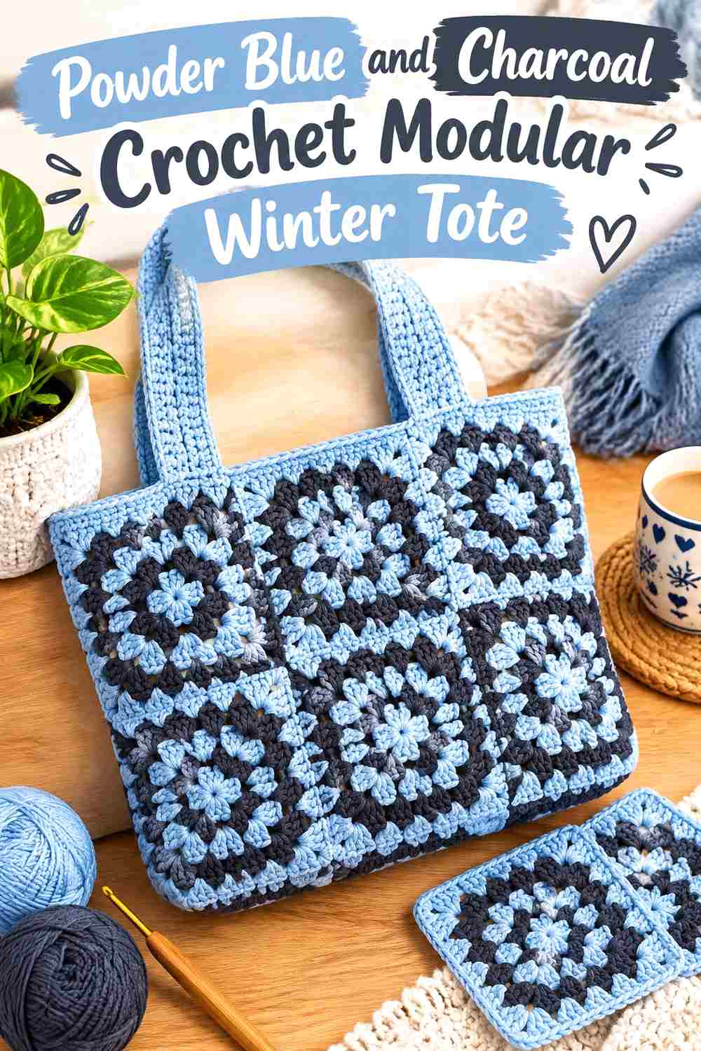
A modular square tote can handle stronger contrast because the joins already create a geometric surface. Powder blue should dominate the individual panels, with charcoal used at borders or handles.
Powder Blue Should Fill Most Modular Tote Squares
Keep each main square powder blue so the repeated shape creates a calm background.
If charcoal fills entire alternate panels, the tote becomes equal parts dark and light rather than a powder-blue design.
Charcoal Can Give Powder Blue Panels Stronger Definition
Use charcoal around selected joins or the upper edge when you want a more graphic winter tote.
A dark handle can repeat the border color without requiring additional charcoal stripes through the body.
Creator Credit: Crafted by Cat
6. Powder Blue And Dusty Blush Crochet Checkerboard Winter Tote

Dusty blush gives powder blue a softer warm-cool contrast. On a checkerboard or granny-style tote, keep blue slightly more prominent so the winter character does not shift into an equal pastel palette.
Powder Blue Should Outnumber Dusty Blush Tote Sections
Use powder blue on more squares or larger surrounding areas so the bag still reads as blue first.
That uneven hierarchy also makes the blush blocks feel more intentional.
Dusty Blush Can Warm the Powder Blue Winter Tote
Place blush in selected centers or alternating motifs rather than around every border and handle.
The softer pink already stands apart from blue through hue, so it does not need large amounts of surface area.
Creator Credit: August Craft & Crochet
7. Powder Blue And Oatmeal Crochet Square Panel Winter Tote
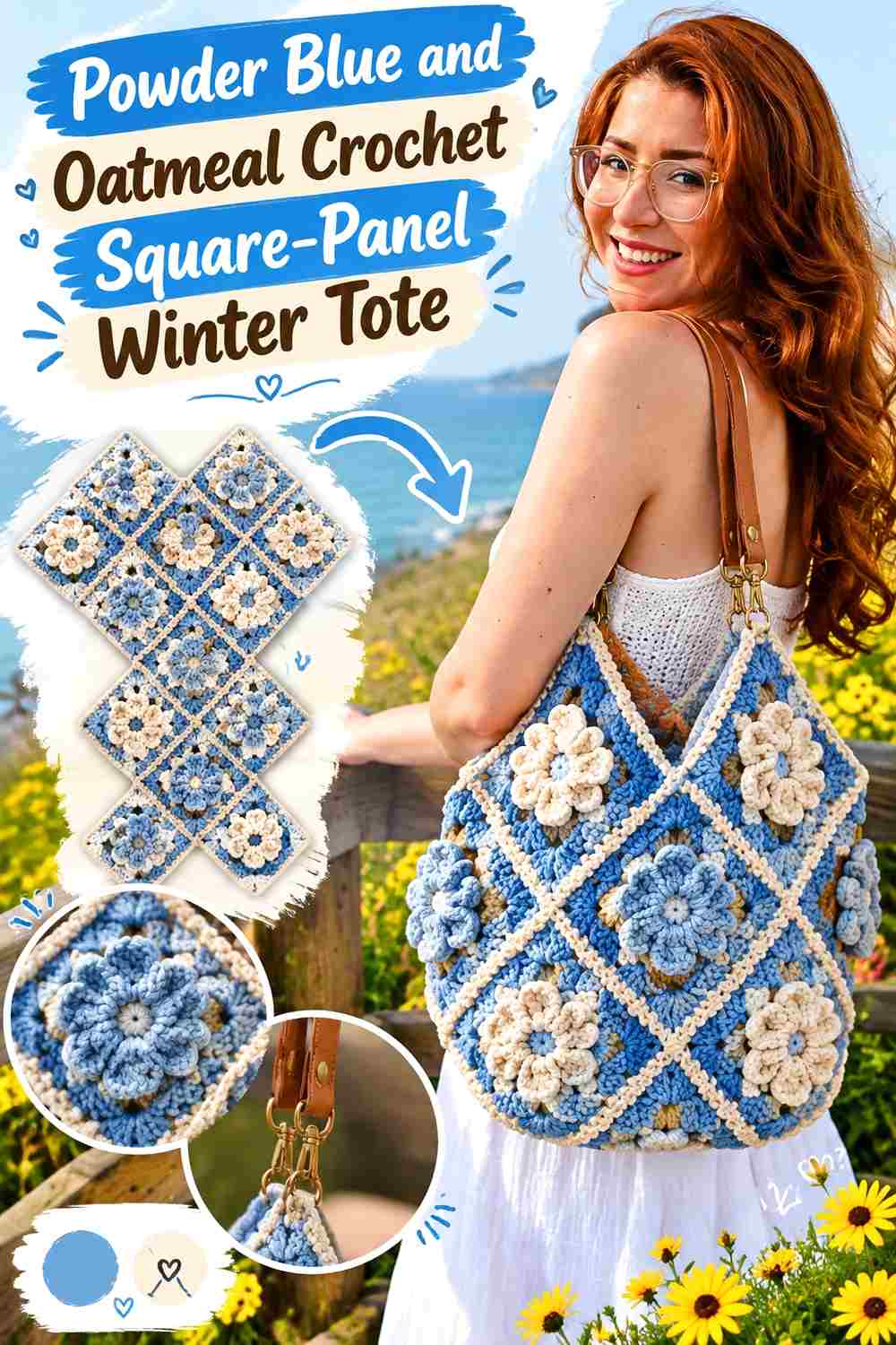
Oatmeal softens powder blue while keeping the palette quiet and wearable. A square-panel tote can use blue across most motifs with oatmeal around joins, handles, or selected blocks.
Powder Blue Should Connect the Square-Panel Tote
Use powder blue repeatedly across the panels so the modular body feels unified after assembly.
Even when individual squares have decorative texture, one recurring main color can hold the finished bag together.
Oatmeal Can Warm Powder Blue Around the Tote Handles
An oatmeal handle creates a softer contrast than white while still separating clearly from many pale blues.
If the handles are already oatmeal, reduce the neutral around the body so the accent does not become too widespread.
Creator Credit: Brunaticality
8. Powder Blue And Deep Teal Crochet Structured Winter Tote
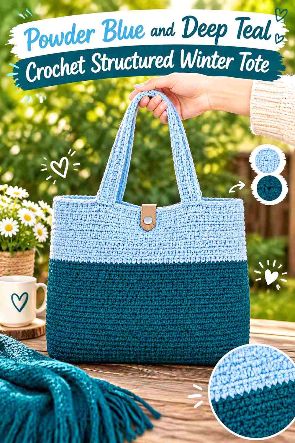
Deep teal stays within the cool color family while providing enough darkness to define a sturdy tote base. Powder blue can cover the body and teal can concentrate at the lower section and handles.
Powder Blue Should Remain the Largest Structured Tote Field
Use blue across the broad front and back surfaces so the dark teal does not make the bag look bottom-heavy.
A structured silhouette already creates visual weight, so the palette can remain simple.
Deep Teal Can Anchor a Powder Blue Tote Base
Use teal around the lowest section where the dark shade provides a deliberate foundation.
Repeating teal on narrow handles can connect the top and bottom without dividing the center.
Creator Credit: naztazia
9. Powder Blue And Soft Gray Crochet Chunky Winter Tote
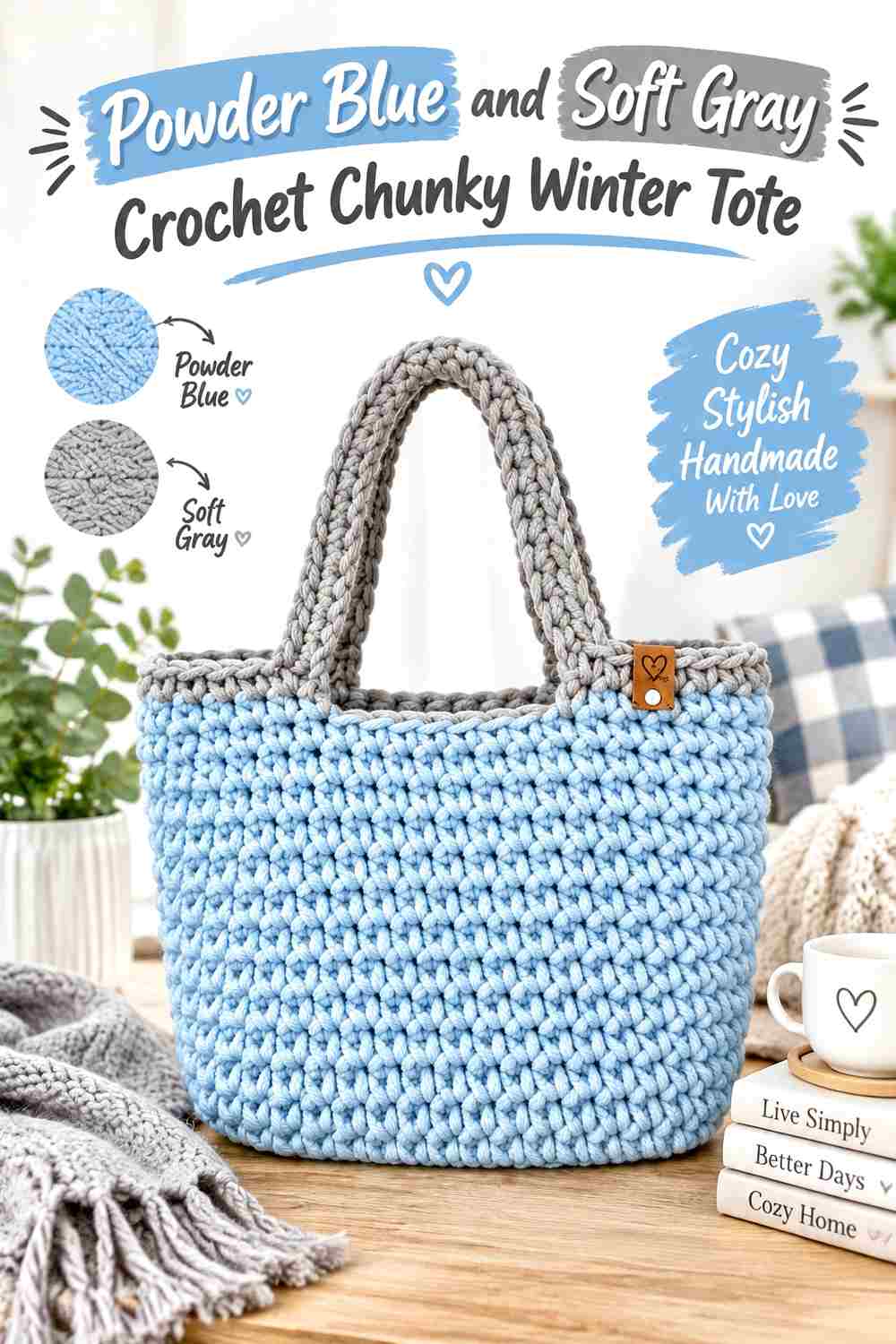
A chunky tote already has thick visual texture, making soft gray a better supporting shade than several additional colors. Let powder blue cover the main body and gray define the straps or base.
Powder Blue Should Keep the Chunky Tote Visually Light
Use blue throughout most of the thick crochet so the bag retains a cool, airy appearance despite its substantial surface.
Frequent gray bands can make a chunky construction look heavier than intended.
Soft Gray Can Frame Powder Blue Without Strong Contrast
Use gray around handles or a shallow lower section when you want quiet definition.
The tonal relationship is especially useful if stitch thickness already supplies plenty of shadow.
Creator Credit: Made by Lunda
10. Powder Blue And Winter White Crochet Nature Walk Tote
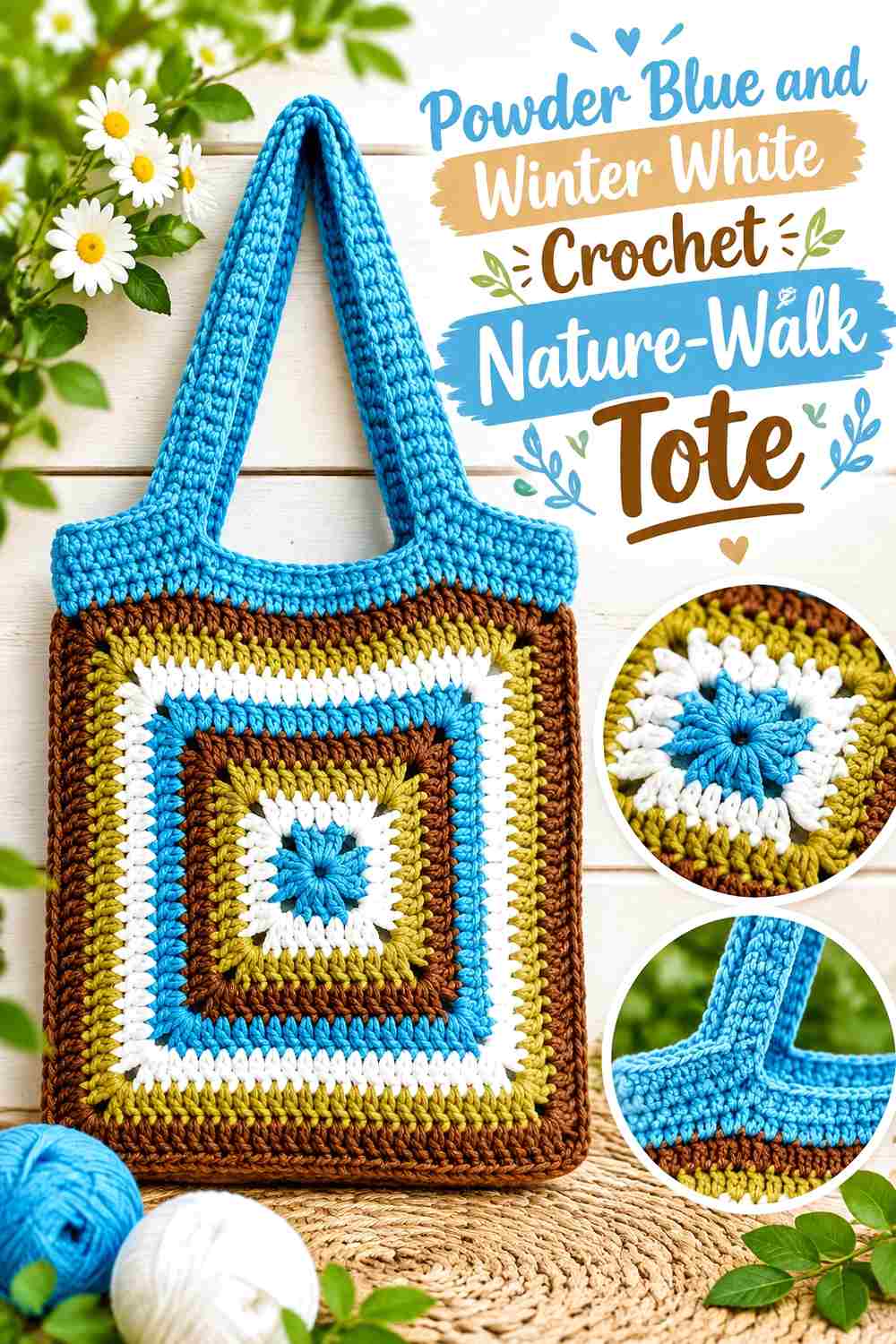
A two-panel tote gives winter white a useful role around the handles or narrow horizontal sections. Powder blue can remain dominant across both panels so the front and back feel connected.
Powder Blue Should Match Across Both Tote Panels
Keep the main color consistent before joining the sections so the finished bag reads as one continuous design.
If the panels contain different color arrangements, repeat powder blue in the same broad role on both.
Winter White Can Lighten the Powder Blue Tote Handles
Use white around the handle area when you want a pale finish that remains distinct from the main panels.
A narrow white band near the opening can repeat the color without creating excessive striping.
Creator Credit: Fiber Flux
11. Powder Blue And Misty Navy Crochet Granny Winter Tote
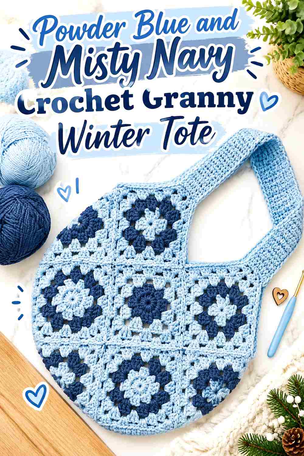
Misty navy gives a granny-square tote stronger definition without the near-black weight of very dark navy. Powder blue can remain the recurring motif field while navy appears in borders or joins.
Powder Blue Should Stay Visible Across Every Granny Tote Section
Keep enough blue in each visible motif that the repeated squares belong to one winter palette.
Large navy outer rounds on every square can visually reduce the blue center, so check the overall assembled balance rather than judging one motif alone.
Misty Navy Can Outline Powder Blue Granny Squares
Use navy where the motifs join if you want the grid itself to become part of the design.
Keep the handles blue or neutral if the dark joins already create enough contrast.
Creator Credit: Bella Coco
12. Powder Blue And Frost Gray Crochet Market Winter Tote
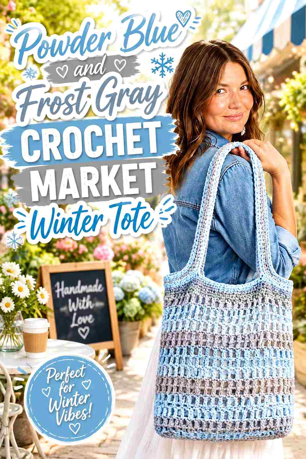
A market tote with mesh sections gives frost gray a natural role on the solid base and upper border. Powder blue can stay through most of the open center.
Powder Blue Should Lead the Mesh Market Tote Body
Keep the main openwork section blue so the tote retains its light winter color even when items inside are visible through the fabric.
Avoid alternating gray through every mesh row because that can interrupt the airy surface.
Frost Gray Can Support the Powder Blue Tote at the Base
A gray bottom creates a muted foundation without the strong contrast of charcoal or navy.
Repeat gray at the upper edge only if you want the tote framed at both ends.
Creator Credit: The Crochet Crowd
13. Powder Blue And Cream Crochet Solid Body Winter Tote
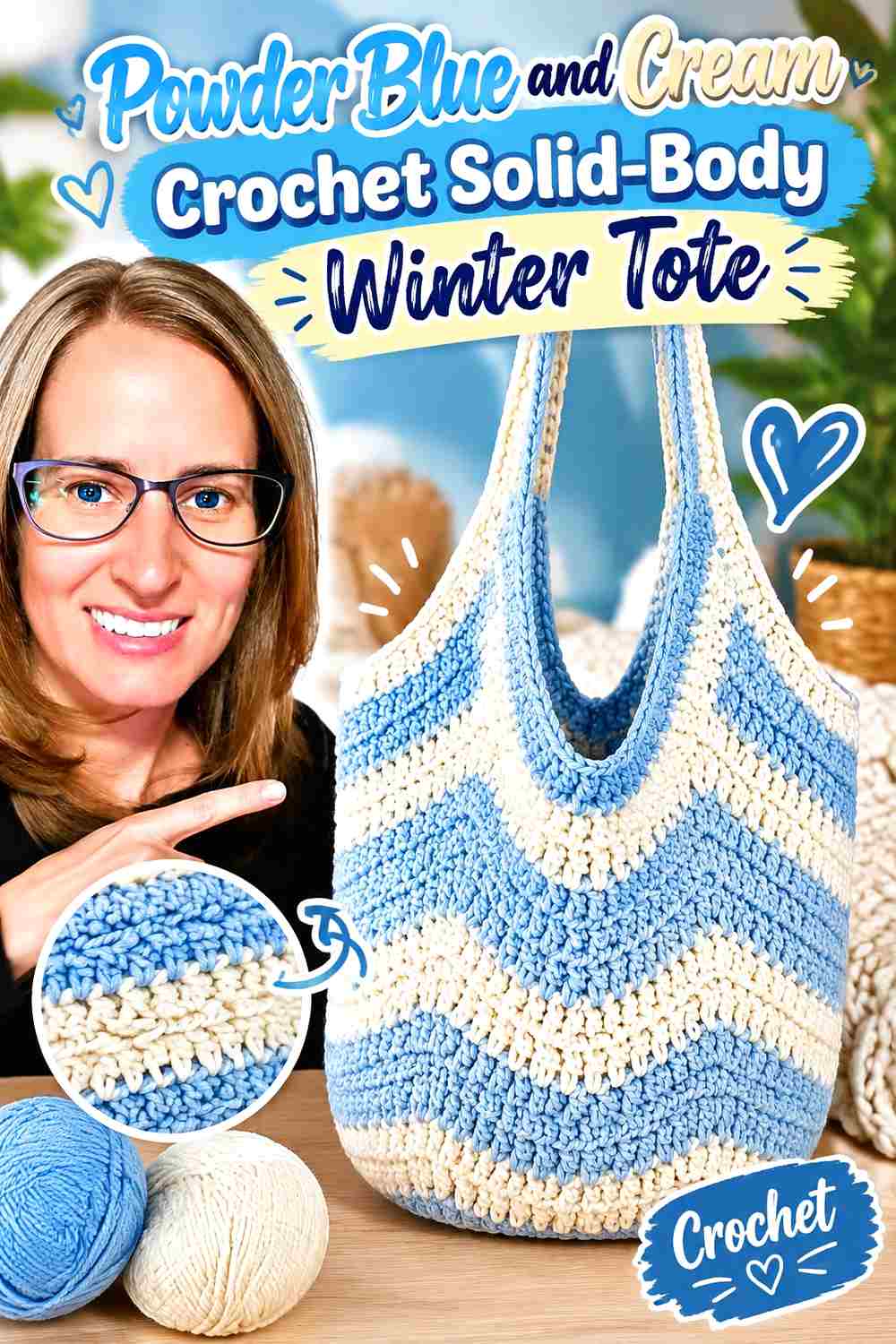
A solid-body tote gives powder blue a large uninterrupted field, while cream can define the top, straps, pocket, or one simple border.
Powder Blue Should Remain Continuous Across the Tote Body
Use blue over most of the solid fabric so the bag stays visually calm and lets the stitch definition carry the surface interest.
The body does not need multiple horizontal colors simply because the construction is plain.
Cream Can Soften the Powder Blue Handle Area
Use cream where the handles begin or around one small pocket if you want a warmer pale accent.
Keep enough blue around these features so cream remains supportive rather than equal.
Creator Credit: Crochet with Clare
14. Powder Blue And Steel Gray Crochet Rich Texture Winter Tote
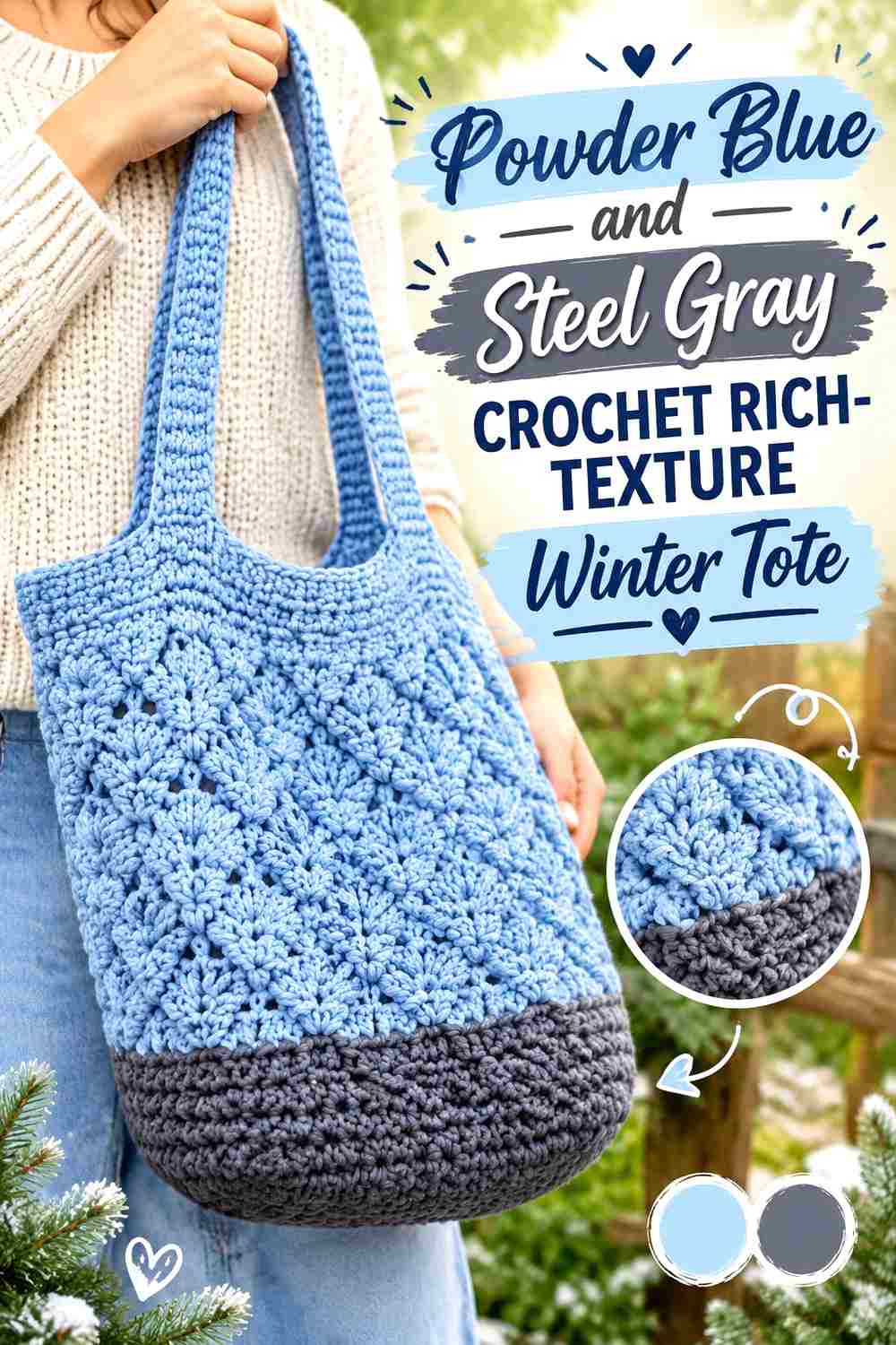
A highly textured tote benefits from a controlled palette. Powder blue should cover most raised stitch sections, while steel gray can separate a few structural bands or edge areas.
Powder Blue Lets Rich Tote Texture Create Natural Shadows
Use one blue field across the most detailed stitches so ridges, clusters, and raised sections remain easy to read.
Changing to gray every time the texture changes can make the bag look overly segmented.
Steel Gray Can Organize Powder Blue Textured Sections
Use gray only where one major stitch area transitions into another or where the top edge needs stronger definition.
That makes the accent explain the structure rather than decorate it randomly.
Creator Credit: Yarnspirations
15. Powder Blue And Deep Cranberry Crochet Beach Style Winter Tote
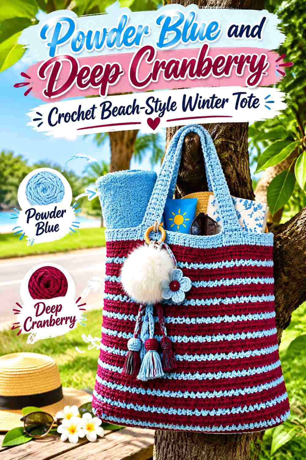
Deep cranberry creates the strongest warm contrast in this group. Powder blue can dominate the roomy tote while cranberry appears around the handles, one border, or a controlled lower accent.
Powder Blue Should Keep the Large Tote From Becoming Color-Heavy
A spacious bag provides plenty of surface, so preserve broad powder-blue sections rather than alternating equally with cranberry.
The pale main color keeps the tote connected to the winter theme even when the construction was originally designed for warmer-weather use.
Deep Cranberry Can Give Powder Blue Handles a Winter Accent
Use cranberry around the handles or upper border where it creates a clear focal area without taking over the body.
One deep warm accent can be enough; avoid adding several additional reds or greens that would turn the tote into a general holiday palette.
Creator Credit: Bag-O-Day Crochet
Which Powder Blue Winter Tote Palette Should You Choose?
For the lightest winter palette, combine powder blue with winter white, pearl ivory, cream, oatmeal, soft gray, or frost gray. These combinations keep the bag airy and give stitch texture or granny motifs more visual importance than strong color contrast.
For greater definition, navy, misty navy, charcoal, steel gray, and deep teal work well around the base, straps, joins, or outer edges. Since these shades carry more visual weight, they usually work best in smaller areas.
Dusty blush softens the cool palette with a muted warm accent, while deep cranberry provides the strongest contrast. Use these warmer shades selectively when powder blue should remain clearly dominant.
Construction should also guide the palette. Mesh totes benefit from a consistent main-color field, granny-square totes need repeated color roles across motifs, chunky bags can become visually heavy with too many dark sections, and highly textured totes usually need fewer color changes.
Conclusion
Powder blue is versatile enough for classic totes, mesh market bags, granny-square constructions, chunky cord bags, and textured everyday carriers. Its pale cool character also gives a second color plenty of room to change the finished look without replacing the main shade.
Use white and ivory when you want a snowy, light finish, gray and navy when the base or handles need more definition, oatmeal when you want to warm the palette, and teal or cranberry when a stronger accent is useful.
Before finalizing color placement, look at the tote as a whole rather than one panel at a time. Handles, joins, bases, and borders can collectively make a supporting shade more prominent than expected. Follow each credited creator’s tutorial for the exact construction and apply the powder-blue winter palette independently.
Frequently Asked Questions
What Colors Pair Well With Powder Blue Crochet Winter Totes?
Winter white, pearl ivory, cream, oatmeal, soft gray, frost gray, silver gray, navy, charcoal, deep teal, blush, and cranberry can all work. Choose the supporting shade according to whether you want a pale tonal tote, stronger structural definition, or a warmer accent.
Should Powder Blue Cover Most of a Winter Tote?
For a powder-blue-focused bag, usually yes. Give blue the broadest body or motif area, then use the supporting shade on the base, handles, joins, border, or selected panels.
What Color Base Works With a Powder Blue Crochet Tote?
Navy, charcoal, steel gray, frost gray, oatmeal, and deep teal all create useful base treatments. Dark shades make the lower edge more defined, while pale neutrals keep the entire bag lighter.
How Can I Use Powder Blue in a Granny-Square Tote?
Repeat powder blue in the same position across each square—such as the center, outer round, or background. Consistent placement makes separate motifs feel like one coordinated tote.
Does Winter White Work Better Than Gray With Powder Blue?
They create different effects. Winter white produces a lighter, snowier palette, while gray gives the tote more muted structure and can define bases, seams, or straps without creating a stark contrast.
Where Should a Dark Accent Go on a Powder Blue Tote?
The base, handles, outer edge, motif joins, or one structural band are useful locations. Choose one or two related areas instead of distributing the dark shade evenly through the entire body.
Can a Summer or Market Tote Tutorial Be Adapted Into a Powder Blue Winter Tote?
Yes. The construction can remain the same while the color direction changes independently. A denser color palette, winter-inspired accent, or different styling does not mean the creator used those exact shades, so follow the original tutorial for construction and treat the powder-blue scheme as your own adaptation.