Cobalt and turquoise can create a strong geometric crochet pillow without needing a long list of extra colors. Cobalt can supply the darker visual anchor, while turquoise can break up large shapes, highlight repeats, or move across the pillow as a brighter supporting color.
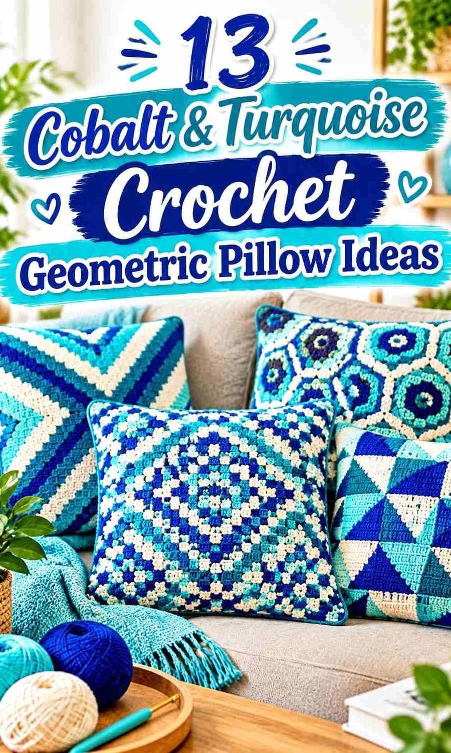
The main challenge is separation. Because cobalt and turquoise can sometimes sit closer in lightness than expected, small diamonds, checks, or mosaic lines may lose definition even though the hues look different in the skein. A cream, charcoal, navy, gray, or carefully controlled warm accent can give the geometry more structure.
The 13 ideas below use cobalt and turquoise as the continuing theme while changing the dominant color, supporting neutrals, contrast level, motif arrangement, and geometric direction. The linked tutorials support the underlying crochet pillow or colorwork concepts; the cobalt-and-turquoise palettes are independent color adaptations.
Quick List
- Cobalt Turquoise And Ivory Diamond Mosaic Crochet Pillow
- Cobalt Turquoise And White Stepped Mosaic Crochet Pillow
- Cobalt Turquoise And Navy Banded Mosaic Crochet Pillow
- Cobalt Turquoise And Charcoal Infinity Crochet Pillow
- Cobalt Turquoise And Oatmeal Offset Mosaic Crochet Pillow
- Cobalt Turquoise And Coral Harlequin Crochet Pillow
- Cobalt Turquoise And White C2c Geometric Crochet Pillow
- Cobalt Turquoise And Slate Cable Cross Crochet Pillow
- Cobalt Turquoise And Mustard Color Block Crochet Pillow
- Cobalt Turquoise And Pale Aqua Gingham Crochet Pillow
- Cobalt Turquoise And Soft Gray Plaid Crochet Pillow
- Cobalt Turquoise And Cream Granny Square Crochet Pillow
- Cobalt Turquoise And Ink Diamond Texture Crochet Pillow
Give Cobalt and Turquoise Different Jobs on the Pillow
Using equal amounts of cobalt and turquoise everywhere can weaken a geometric design because neither shade establishes a clear visual hierarchy. Instead, decide which blue will cover the larger shapes before planning the smaller motifs.
A cobalt-led pillow can feel darker and more defined, especially when turquoise appears inside diamonds, narrow bands, or repeated centers. A turquoise-led surface gives the pillow more brightness, with cobalt acting as an outline, border, join, or smaller repeated shape.
For a balanced two-color design, use the geometry itself to separate them. Large cobalt blocks beside smaller turquoise details will usually read more deliberately than switching colors unpredictably from one shape to the next.
Check Cobalt and Turquoise Value Contrast Before Crocheting Small Geometry
Different hues do not automatically create strong light-and-dark separation. Put the cobalt and turquoise yarns side by side and view them from a distance. A grayscale photo can also help reveal whether the two shades are close in value.
If they merge, you do not necessarily need to abandon the pairing. Insert a lighter cream, ivory, or pale aqua between important shapes, or use a very dark navy, charcoal, or ink border to define the design.
This is particularly useful for mosaic lines, small diamonds, gingham checks, and narrow C2C sections, where weak value contrast can make carefully crocheted geometry harder to see.
Repeat Cobalt and Turquoise Consistently Across the Pillow Surface
Geometric pillows depend heavily on repetition. Once cobalt is assigned to a particular diamond, stripe, corner, or motif center, repeat that relationship often enough for the design to look intentional.
The same applies to turquoise. If it appears only once in one isolated corner, it may feel disconnected. Repeating turquoise in several motif centers, narrow bands, or edge details helps connect the entire pillow face.
Borders matter too. A border can repeat the dominant blue for continuity or use the darkest palette color to contain a busier geometric center.
1. Cobalt Turquoise And Ivory Diamond Mosaic Crochet Pillow

This palette gives cobalt the strongest visual weight while using turquoise to interrupt the darker diamond structure. Ivory works as the separating shade, especially around narrow pathways or smaller diamond details where cobalt and turquoise alone may not produce enough value contrast. On a geometric pillow face, keep cobalt across the broadest areas and allow turquoise to appear in repeated interior shapes rather than dividing the surface exactly in half.
Let Cobalt Form the Main Diamond Structure
Cobalt works well across the largest connected areas because it gives the repeating diamonds a clear visual foundation. When the same cobalt shape returns across the pillow, the eye can follow the pattern even when turquoise details change direction inside it.
Avoid scattering cobalt into many tiny disconnected pieces. Larger cobalt sections make the design easier to read and give the smaller turquoise shapes a stronger background.
Use Turquoise and Ivory to Separate Cobalt Details
Place turquoise where you want a noticeable change without completely breaking the cool-blue palette. Ivory can then sit between selected cobalt and turquoise sections when the two blues appear too similar in value.
This three-level approach—dark cobalt, brighter turquoise, light ivory—is particularly useful around narrow diamond tips and pathways where color boundaries need to remain visible from across the room.
Creator Credit: Concrete Gems Crochet
2. Cobalt Turquoise And White Stepped Mosaic Crochet Pillow

A stepped mosaic layout gives cobalt and turquoise repeated opportunities to trade emphasis without making the pillow look randomly striped. Use cobalt as the broader field and let turquoise create shorter angular movements through it. White can be reserved for the smallest steps or a narrow outer frame, giving the two stronger blues breathing room while keeping the pillow distinctly color-led rather than neutral-led.
Keep Cobalt Across the Larger Mosaic Field
When the geometry contains many short lines and stepped turns, a consistent cobalt field helps organize them. It prevents every small turquoise change from becoming an independent focal point.
If you want the finished pillow to feel darker, extend cobalt into the outer edge as well. For a lighter result, stop cobalt before the final border and let white frame the surface.
Let Turquoise Trace the Cobalt Step Pattern
Turquoise is useful for repeated stepped lines because it is related enough to cobalt to keep the palette cohesive while still providing a hue change. Keep those turquoise paths consistent in width wherever the design allows.
White should remain secondary. Too much white can change the pillow from a cobalt-and-turquoise idea into a mostly neutral pillow with blue accents.
Creator Credit: MOSAIC LOOP
3. Cobalt Turquoise And Navy Banded Mosaic Crochet Pillow
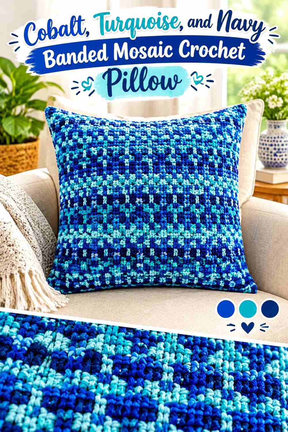
This is a darker interpretation of the cobalt-and-turquoise theme. Cobalt can lead the middle-value sections, turquoise can brighten selected geometric bands, and navy can provide the deepest lines or border. The result depends less on a pale neutral and more on controlled dark-to-bright contrast, so make sure the cobalt is visibly different from the navy before committing to a large pillow front.
Use Cobalt Between Navy and Turquoise Bands
Cobalt can act as a bridge between very dark navy and clearer turquoise. Rather than placing navy directly beside turquoise throughout the entire design, use cobalt in some intermediate sections to keep the pillow from becoming a simple dark/light stripe arrangement.
This works especially well when geometric bands change direction because cobalt can maintain continuity between one turquoise feature and the next.
Keep Navy Narrow Around Cobalt Geometry
Navy has enough visual weight to overpower both main blues if it covers too much of the surface. Reserve it for outlines, narrow bands, selected corners, or the outer pillow edge.
If your cobalt yarn is already extremely dark, compare it directly with navy first. When the two collapse into the same value, replace navy with a darker charcoal or reduce its role.
Creator Credit: 2LOOPZ crochet
4. Cobalt Turquoise And Charcoal Infinity Crochet Pillow
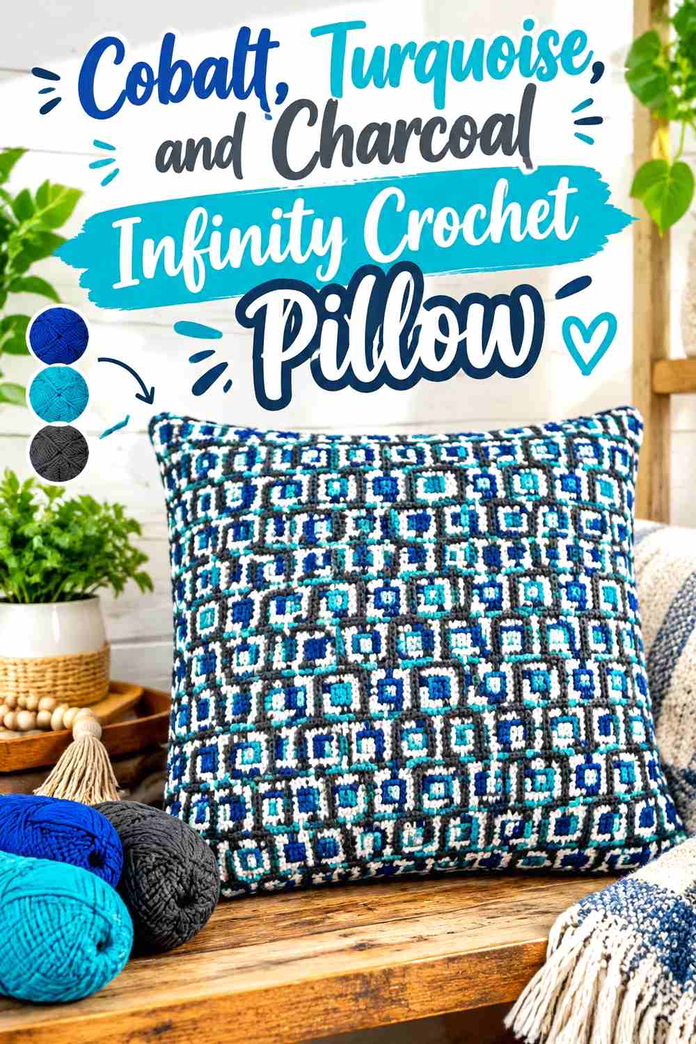
An infinity-style geometric surface benefits from strong line continuity. Turquoise can carry the repeating line so the eye can follow it around the pillow, while cobalt fills larger surrounding sections. Charcoal provides a dark interruption at selected boundaries without introducing another competing hue. This palette works particularly well when the geometric design depends on one line appearing to travel through or around another.
Let Turquoise Carry the Continuous Infinity Line
Use turquoise for the line you most want the viewer to follow. Repeating the same turquoise through each turn makes the geometry easier to understand and keeps the pillow from reading as unrelated blocks.
Avoid changing that primary line between cobalt and turquoise too frequently. The continuity of the color is part of what allows the repeated geometric movement to remain visible.
Use Charcoal to Define Cobalt Intersections
Charcoal can separate places where cobalt and turquoise cross or come very close together. A narrow dark boundary may be enough; the charcoal does not need to occupy a large percentage of the pillow.
Repeating charcoal around the outer edge can also connect those small internal dark details to the finished border.
Creator Credit: Lanas y Ovillos in English
5. Cobalt Turquoise And Oatmeal Offset Mosaic Crochet Pillow
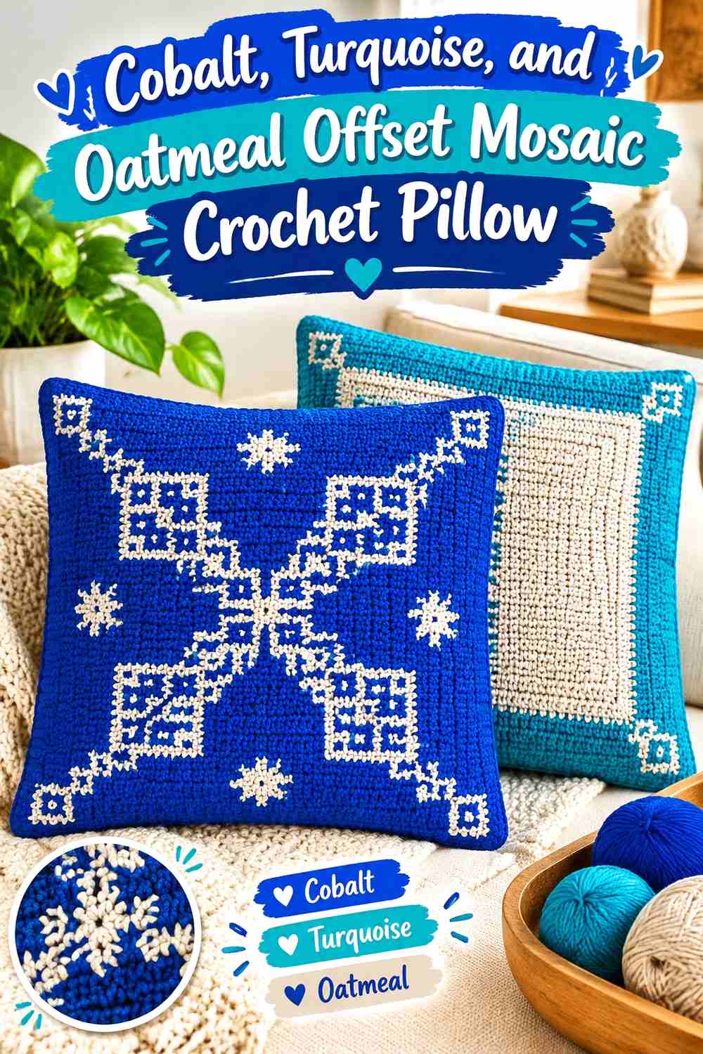
Oatmeal softens the transition between two saturated blues without creating the sharper contrast of bright white. Make turquoise the larger background for this idea, then place cobalt into repeated offset squares, bars, or stepped motifs. Oatmeal can occupy spaces between those stronger shapes so the pillow retains clear geometry while looking less stark than a blue-and-white combination.
Let Turquoise Cover More of the Pillow Surface
A turquoise-led version immediately distinguishes this pillow from cobalt-dominant schemes. Use turquoise across the broad background areas so cobalt becomes the darker repeated feature rather than the base field.
This distribution is particularly effective when cobalt motifs repeat at regular intervals because each dark unit becomes easy to locate against the brighter turquoise.
Oatmeal Can Keep Cobalt and Turquoise From Competing
Place oatmeal beside smaller cobalt details when turquoise sits immediately beyond them. The neutral break keeps the two saturated blues from competing for the same narrow visual space.
Oatmeal can also work as the outer border if you want the pillow edge to recede rather than becoming another dark geometric frame.
Creator Credit: crochet-crosia
6. Cobalt Turquoise And Coral Harlequin Crochet Pillow

Harlequin diamonds create an opportunity for a controlled warm accent. Keep cobalt and turquoise responsible for most of the diamond field, then use coral in a smaller number of repeated shapes. Coral should act as punctuation rather than receiving an equal third of the pillow, otherwise the original cobalt-and-turquoise focus can quickly disappear.
Alternate Cobalt and Turquoise Across the Harlequin Field
Alternating the two blues across adjoining diamonds makes the geometry itself responsible for color distribution. Keep the sequence predictable enough that repeated shapes remain connected visually.
If the cobalt and turquoise are similar in value, consider placing the lighter of the two beside coral more often so the warm accent does not disappear against a similarly weighted background.
Repeat Coral Sparingly Between Cobalt Diamonds
Coral works better here as a repeated accent than as a large background. Try placing it at predictable intervals—such as selected central diamonds or recurring edge details—rather than scattering it randomly.
A small coral repeat gives the pillow another point of contrast while leaving cobalt and turquoise clearly dominant.
Creator Credit: Bag-O-Day Crochet
7. Cobalt Turquoise And White C2c Geometric Crochet Pillow
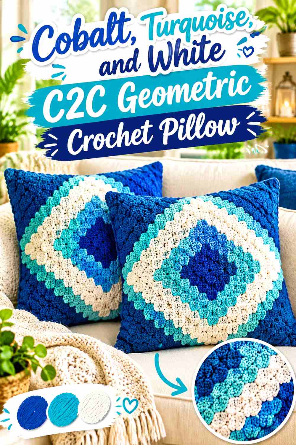
Corner-to-corner sections can divide a pillow into strong diagonal shapes. Use cobalt for one major directional block and turquoise for another, then let white separate selected corners or form a central break. The diagonal construction gives the two blues room to occupy large areas, so the colors remain distinct even without extremely high contrast between individual stitches.
Give Cobalt and Turquoise Separate C2C Sections
Large cobalt and turquoise sections make more sense than switching between the two colors every few small blocks. Assign each shade a clear part of the geometric layout so the pillow reads from a distance as an intentional composition.
You can repeat the same cobalt placement diagonally across opposite corners and mirror the turquoise areas for stronger visual balance.
White Can Separate Cobalt at the Center
A white central section or narrow diagonal break prevents large cobalt and turquoise fields from blending into one continuous blue mass.
Keep the white proportion controlled if you want the finished pillow to remain strongly blue. A wide white background changes the emphasis dramatically, while a smaller white divider mainly clarifies the geometry.
Creator Credit: The Crochet Crowd
8. Cobalt Turquoise And Slate Cable Cross Crochet Pillow

Geometric cables add a second layer of information because the pillow depends on both color and raised texture. Cobalt can occupy the cable-heavy sections, turquoise can fill neighboring squares, and slate can control joins or quieter background areas. Avoid using every color equally inside every textured square; the cable shapes are easier to see when individual sections have a clear primary color.
Keep Cobalt on the Strongest Raised Cable Sections
Cobalt gives raised cable geometry a solid color field, reducing competition between texture and multiple small color changes. When the stitch structure already creates crosses, diagonals, or intersecting lines, large single-color areas let that texture do more of the visual work.
If cobalt is very dark, check the pillow in normal room light to make sure the raised detail remains visible rather than disappearing into shadow.
Use Turquoise and Slate to Separate Cobalt Squares
Turquoise can identify neighboring geometric units while slate works as a quieter join or transition color. This prevents every square from demanding equal attention.
For a cleaner modular look, repeat the same slate treatment anywhere squares meet instead of introducing different joining colors across the pillow.
Creator Credit: HanJan Crochet
9. Cobalt Turquoise And Mustard Color Block Crochet Pillow

A color-block pillow gives the palette fewer but larger decisions. Make cobalt the biggest block, turquoise the second-largest, and mustard a much smaller accent. Because each color occupies a broad uninterrupted area, the placement of the blocks matters more than creating intricate stitch-level contrast.
Let Cobalt Occupy the Largest Color Block
A broad cobalt section gives the pillow an obvious visual anchor. Position turquoise beside or diagonally across from it rather than dividing the two blues into many thin strips.
Large blocks also make it easier to judge the real relationship between your cobalt and turquoise yarns before adding the mustard accent.
Keep Mustard Smaller Than the Turquoise Block
Mustard introduces strong hue contrast, so it does not need much surface area to become noticeable. Use it as a smaller rectangle, narrow bar, corner, or repeated trim rather than giving it equal status with cobalt and turquoise.
If mustard feels too dominant, reduce its area before muting the blue shades. Preserving strong cobalt and turquoise is the central goal of this scheme.
Creator Credit: Crazy Cool Crochet
10. Cobalt Turquoise And Pale Aqua Gingham Crochet Pillow
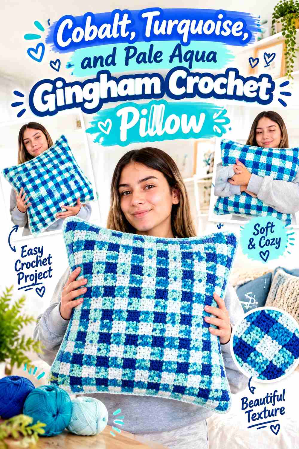
Gingham depends on controlled shifts between light, medium, and dark areas. Pale aqua can provide the lightest value, turquoise can form the middle range, and cobalt can create the darkest checks. This makes the three colors feel related while still giving the grid enough visual structure to read clearly.
Use Cobalt as the Darkest Gingham Check
Reserve cobalt for the darkest recurring checks rather than spreading it unpredictably across the grid. Consistent placement helps establish the gingham rhythm and keeps the surface from resembling random patchwork.
Check the arrangement before joining or finishing the pillow so the darkest cobalt squares are distributed evenly rather than clustering on one side.
Pale Aqua Should Stay Lighter Than Turquoise
The usefulness of pale aqua comes from its separation from turquoise. If both yarns have nearly the same lightness, the grid can lose one of its visual levels.
When substituting pale aqua, choose another light blue-green that remains clearly lighter than the turquoise rather than simply choosing a different turquoise hue.
Creator Credit: crochet daniela
11. Cobalt Turquoise And Soft Gray Plaid Crochet Pillow

Plaid lets cobalt and turquoise intersect through horizontal and vertical color relationships. Cobalt can form the stronger dark bands, turquoise the brighter crossing bands, and soft gray the quieter spaces between them. The gray is particularly useful when you want more separation than a two-blue plaid provides without making the pillow as high-contrast as a white-backed version.
Keep Cobalt Bands Visually Heavier Than Turquoise
Use cobalt for the bands that should define the main plaid framework. Turquoise can cross them in narrower or less frequent bands, creating clear layers instead of two equally strong grids fighting for attention.
Before crocheting the full pillow face, arrange the three yarns together to make sure the soft gray is sufficiently different from both blues.
Soft Gray Gives Turquoise Plaid More Breathing Room
Soft gray can occupy the quieter spaces between turquoise and cobalt intersections. This gives the stronger colors distinct areas to enter and leave the pattern.
Repeating the same gray at the border can work well when the center already contains many cobalt-and-turquoise crossings and does not need another highly saturated edge.
Creator Credit: Just Be Crafty
12. Cobalt Turquoise And Cream Granny Square Crochet Pillow
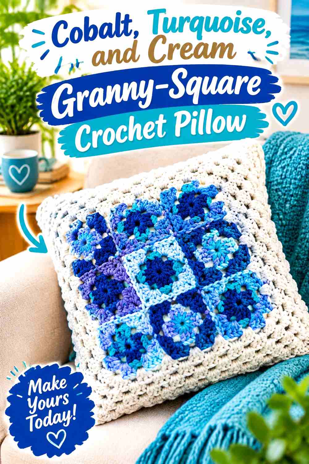
A modular granny-square pillow allows the cobalt-and-turquoise palette to be distributed motif by motif. Instead of making every square identical, alternate which blue takes the center and which forms the surrounding section, then use cream consistently to connect the motifs. This produces variety without losing the repeated square structure.
Alternate Cobalt and Turquoise Granny-Square Centers
Some motifs can begin with cobalt while others begin with turquoise. Repeat the arrangement deliberately across the pillow face so the color changes form a larger geometric layout once the squares are joined.
Avoid making every square use a completely different sequence. Too many sequences can make the pillow read as scrap-based patchwork rather than a controlled cobalt-and-turquoise design.
Cream Can Unify Cobalt and Turquoise Motifs
Using cream in the same outer area of multiple squares creates a consistent visual boundary around changing cobalt and turquoise centers.
Cream is also useful for joins when you want the individual square shapes to remain obvious. If you prefer a more continuous blue surface, use cobalt or turquoise for the joins instead and keep cream inside the motifs.
Creator Credit: American Crochet Association
13. Cobalt Turquoise And Ink Diamond Texture Crochet Pillow

This final scheme combines geometric color placement with pronounced diamond texture. Let turquoise occupy most of the base surface, use cobalt for the principal diamond, and bring in a near-black ink shade only where stronger definition is needed. Because texture already makes the center prominent, the darkest shade should be controlled rather than surrounding every raised detail.
Let Cobalt Define the Main Textured Diamond
Putting cobalt directly into the primary diamond creates a strong focal shape without needing several extra colors. Turquoise around it keeps the overall pillow connected to the two-blue theme and provides visible hue separation.
If your cobalt and turquoise are very close in value, place them beside each other in a small sample first to ensure the diamond remains clear once the texture is added.
Use Ink Around Turquoise Only Where Definition Is Needed
Ink can sharpen selected boundaries, but it should not become a heavy frame around every blue element. A narrow dark line, small repeated detail, or restrained border is usually enough to give the cobalt-and-turquoise geometry additional structure.
If ink overwhelms the pillow, replace some of it with cobalt rather than adding another new shade.
Creator Credit: Tamara Kelly – Moogly
Conclusion
Cobalt and turquoise can support very different geometric crochet pillow directions depending on which color leads and what third shade controls the contrast.
For crisp, clearly separated geometry, the ivory, white, and cream combinations provide the strongest light break around the two blues. Navy, charcoal, slate, and ink move the palette in the opposite direction by adding darker outlines and frames. Oatmeal and soft gray create a quieter neutral transition, while coral and mustard introduce smaller warm accents for readers who want the blue palette to feel less strictly tonal.
Before committing to a full pillow front, compare the actual yarns together and check whether the important motifs remain visible. The exact tutorial can guide the construction, while the dominant, supporting, accent, and border colors can be adapted to create the cobalt-and-turquoise balance you want.
Frequently Asked Questions
Should cobalt or turquoise dominate a geometric crochet pillow?
Either can lead. Cobalt is useful when you want darker, more defined fields or borders, while turquoise can make a broader pillow surface appear brighter. The important decision is giving one color a clear role rather than automatically using both in equal amounts.
How can I tell whether cobalt and turquoise have enough contrast?
Place the yarns together and look at them from several feet away. You can also photograph them in grayscale. If their lightness looks nearly identical, small geometric details may merge even though one yarn is cobalt and the other turquoise.
What neutral works well between cobalt and turquoise crochet motifs?
White and ivory create stronger light contrast, while oatmeal and soft gray produce a quieter transition. Charcoal, navy, or ink can be useful when you want the neutral to define an edge rather than lighten the design.
Can I use only cobalt and turquoise for a geometric crochet pillow?
Yes, particularly when the geometry contains large blocks, broad stripes, or substantial motifs. For smaller checks, mosaic lines, or narrow diamonds, first confirm that the two yarns have enough visual separation without a third shade.
How should I substitute a turquoise shade without changing the whole palette?
Choose a replacement that preserves turquoise’s original role. If turquoise was the brighter supporting color, select another blue-green that remains clearly lighter or brighter than the cobalt. Matching the contrast relationship matters more than finding an identical named shade.
Should the crochet pillow border be cobalt or turquoise?
Use cobalt when you want a stronger, darker frame around the pillow. Turquoise works when the center already contains substantial cobalt and the edge needs to feel lighter. A neutral border can be better when both blues already appear heavily across the geometric surface.
How can I keep a multicolor geometric crochet pillow from looking too busy?
Give the colors a hierarchy. Let cobalt or turquoise dominate, assign the second blue a supporting role, and keep any neutral or warm accent to a clearly defined purpose such as joins, outlines, motif centers, or the border. Repeating the same placement logic across the pillow usually creates more cohesion than continually introducing new color arrangements.