Harvest Gold is especially useful for a crochet pumpkin seat cushion because it sits between bright yellow and deeper orange-brown fall shades. It can cover broad pumpkin lobes without looking as intense as a vivid yellow, while darker greens, browns, burgundy, charcoal, and plum can define the ridges, center, or outer edge.
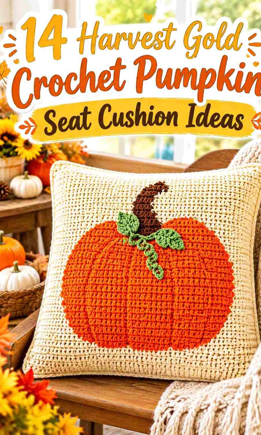
The key is deciding where Harvest Gold should remain uninterrupted. On a shaped pumpkin cushion, frequent color changes can compete with the segmented silhouette. On a square or rectangular cushion with a pumpkin motif, stronger contrast may be useful because the pumpkin needs to remain distinct from its background.
The tutorials credited below support pumpkin pillow, cushion, or closely related pumpkin-cushion construction concepts. When making a piece intended for regular sitting rather than decorative chair or bench use, check the original tutorial’s construction, insert, filling, thickness, and closure before deciding whether that format suits the intended seat.
Quick List
- Harvest Gold And Cream Crochet Pumpkin Seat Cushion
- Harvest Gold And Olive Green Crochet Pumpkin Seat Cushion
- Harvest Gold And Rust Crochet Pumpkin Seat Cushion
- Harvest Gold And Deep Brown Crochet Pumpkin Seat Cushion
- Harvest Gold And Sage Crochet Pumpkin Seat Cushion
- Harvest Gold And Burgundy Crochet Pumpkin Seat Cushion
- Harvest Gold And Charcoal Crochet Pumpkin Seat Cushion
- Harvest Gold And Pumpkin Orange Crochet Pumpkin Seat Cushion
- Harvest Gold Terracotta And Oatmeal Crochet Pumpkin Seat Cushion
- Harvest Gold Moss And Walnut Crochet Pumpkin Seat Cushion
- Harvest Gold And Dusty Teal Crochet Pumpkin Seat Cushion
- Harvest Gold And Plum Crochet Pumpkin Seat Cushion
- Harvest Gold Ivory And Espresso Crochet Pumpkin Seat Cushion
- Tonal Harvest Gold And Clove Crochet Pumpkin Seat Cushion
Keep Harvest Gold Visible Across the Pumpkin Shape
A pumpkin cushion usually depends on visible lobes, ridges, or a recognizable pumpkin motif. Harvest Gold should therefore occupy enough uninterrupted space for the eye to recognize it as the dominant color rather than just another stripe.
On a sculpted cushion, consider keeping several neighboring lobes Harvest Gold and concentrating the supporting color in narrower ridges, the center indentation, stem, or outer edge. On a flat cushion front, Harvest Gold can form the pumpkin itself while a contrasting background provides separation.
The cushion’s placement also matters. Details along the very center may become less visible once someone sits on the cushion, while sidewalls, front edges, and outer pumpkin lobes remain easier to see. Put important accent colors where they can still contribute when the cushion is in place.
Use Light and Dark Contrast to Protect Harvest Gold Texture
Harvest Gold and another warm shade can be different in hue but surprisingly similar in lightness. Rust, camel, muted orange, and some olive tones may visually merge with it once worked into textured crochet.
If ridge definition matters, compare the yarns side by side before starting. A grayscale photo can help show whether the colors have meaningful light-dark separation. Strong separation is particularly helpful when an accent outlines a small pumpkin motif or narrow ridge.
Not every cushion needs high contrast. A tonal pumpkin can look intentionally soft when the lobes are defined primarily through crochet texture. The important point is to decide whether color or texture should do most of the separating.
Plan Harvest Gold Around the Seat Edge and Pumpkin Center
The outer edge is a useful location for the darkest supporting color because it can frame Harvest Gold without interrupting the main sitting surface. Deep brown, charcoal, espresso, burgundy, and plum can all work this way.
The center indentation offers another controlled accent point on dimensional pumpkins. Repeating the same dark color in the stem can connect the top and center without spreading the accent across every lobe.
For motif cushions, the equivalent locations are the background, border, joining lines, and cushion side or back. Keeping these areas quieter lets a Harvest Gold pumpkin remain the focal point.
1. Harvest Gold And Cream Crochet Pumpkin Seat Cushion
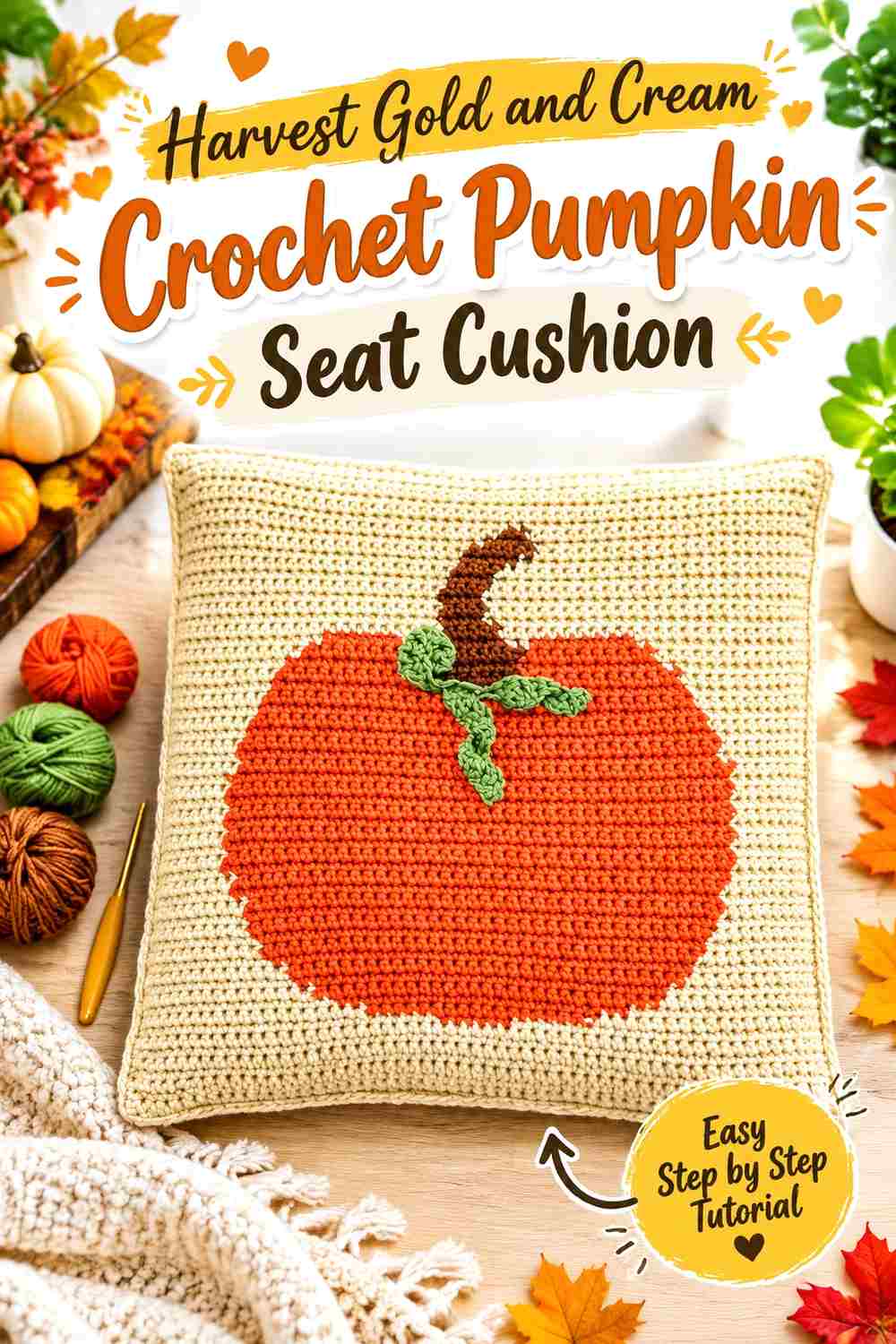
Harvest Gold can cover the main pumpkin surface while cream provides the lightest contrast in the collection. This combination is particularly useful when the cushion relies on visible ridges or a textured pumpkin motif because cream can separate details without introducing another saturated fall color. Keep Harvest Gold dominant across the central sitting area and move most cream toward the lobe divisions, motif background, or outer finishing edge.
Keep Harvest Gold Across the Largest Pumpkin Lobes
Use Harvest Gold for the broadest areas rather than alternating every pumpkin section equally with cream. Larger continuous gold areas make the pumpkin identity easier to read and prevent a shaped cushion from turning into a striped object.
If the cushion uses a flat pumpkin motif instead, Harvest Gold can fill the entire pumpkin while cream becomes the surrounding field. That arrangement gives the motif plenty of separation without complicating its internal texture.
Let Cream Reveal Harvest Gold Ridge Definition
Cream can sit beside Harvest Gold around raised lines, a narrow outer border, or selected divisions between lobes. The lighter value makes those structural changes easier to see, particularly when the gold yarn and stitch texture are both visually dense.
Avoid using cream on every ridge automatically. A few controlled areas of light contrast can preserve a more unified Harvest Gold surface.
Creator Credit: Jo to the World Creations
2. Harvest Gold And Olive Green Crochet Pumpkin Seat Cushion

Olive green gives Harvest Gold an earthy botanical partner without pulling the cushion away from autumn colors. Harvest Gold should still cover most pumpkin lobes or the main motif, while olive can handle the stem, narrow separators, back panel, or outer edge. Because medium olive and Harvest Gold can be similar in value, their placement matters more than simply choosing two different hues.
Keep Harvest Gold Dominant Beside Olive Green
Reserve most of the visible sitting surface for Harvest Gold and use olive in smaller structural locations. A completely equal gold-and-green split can make the cushion read as general color blocking rather than a gold pumpkin with botanical accents.
For a flat pumpkin-front cushion, an olive background can work if the Harvest Gold motif remains noticeably lighter or warmer. Check the two yarns together before committing to a large panel.
Use Olive Green to Ground Harvest Gold at the Stem and Edge
Olive makes sense around the stem because the color already relates visually to leaves and vines without requiring extra decorative pieces. Repeating a little olive along the cushion edge can stop the stem from looking like an isolated patch of green.
Keep the repetition restrained. Harvest Gold should remain the first color the eye registers when the cushion is placed on a chair or bench.
Creator Credit: crochetcakes
3. Harvest Gold And Rust Crochet Pumpkin Seat Cushion
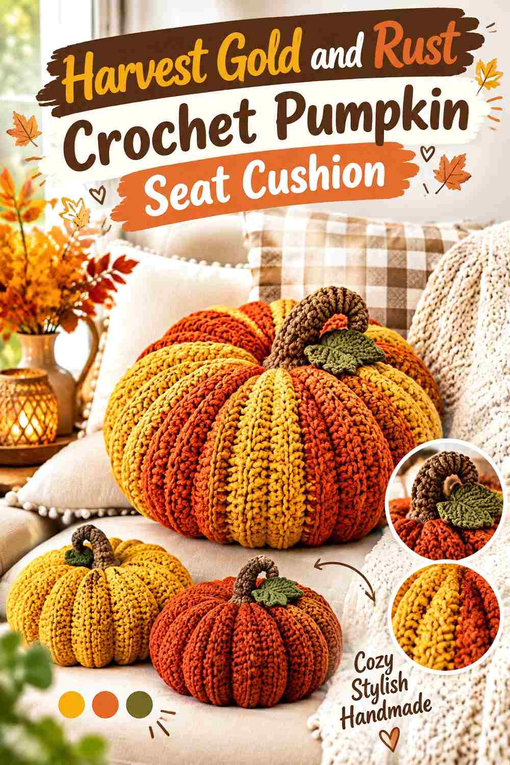
Harvest Gold and rust create a close warm-color relationship rather than strong light-dark contrast. That makes this palette useful when the pumpkin ridges or crochet texture should define the cushion more strongly than obvious color blocking. Harvest Gold can cover the main lobes, with rust concentrated in selected alternating sections, the center, or the lower edge.
Give Harvest Gold More Area Than Rust
If Harvest Gold and rust are used in equal-width sections, the finished pumpkin may read as striped. Keeping Harvest Gold across several connected lobes allows rust to deepen the shape without becoming a second dominant color.
This approach also protects textured ridges. The eye can follow the crochet surface across a larger gold field rather than stopping at every color change.
Check Rust Against Harvest Gold Before Coloring Narrow Ridges
Rust can be darker than Harvest Gold, but some muted golds and light rusts sit close together in value. Compare the yarns in grayscale if narrow ridge lines need to remain obvious.
If the values are too similar, use rust in broader side sections instead. Let physical crochet texture define the smaller divisions.
Creator Credit: David Owen Creates
4. Harvest Gold And Deep Brown Crochet Pumpkin Seat Cushion
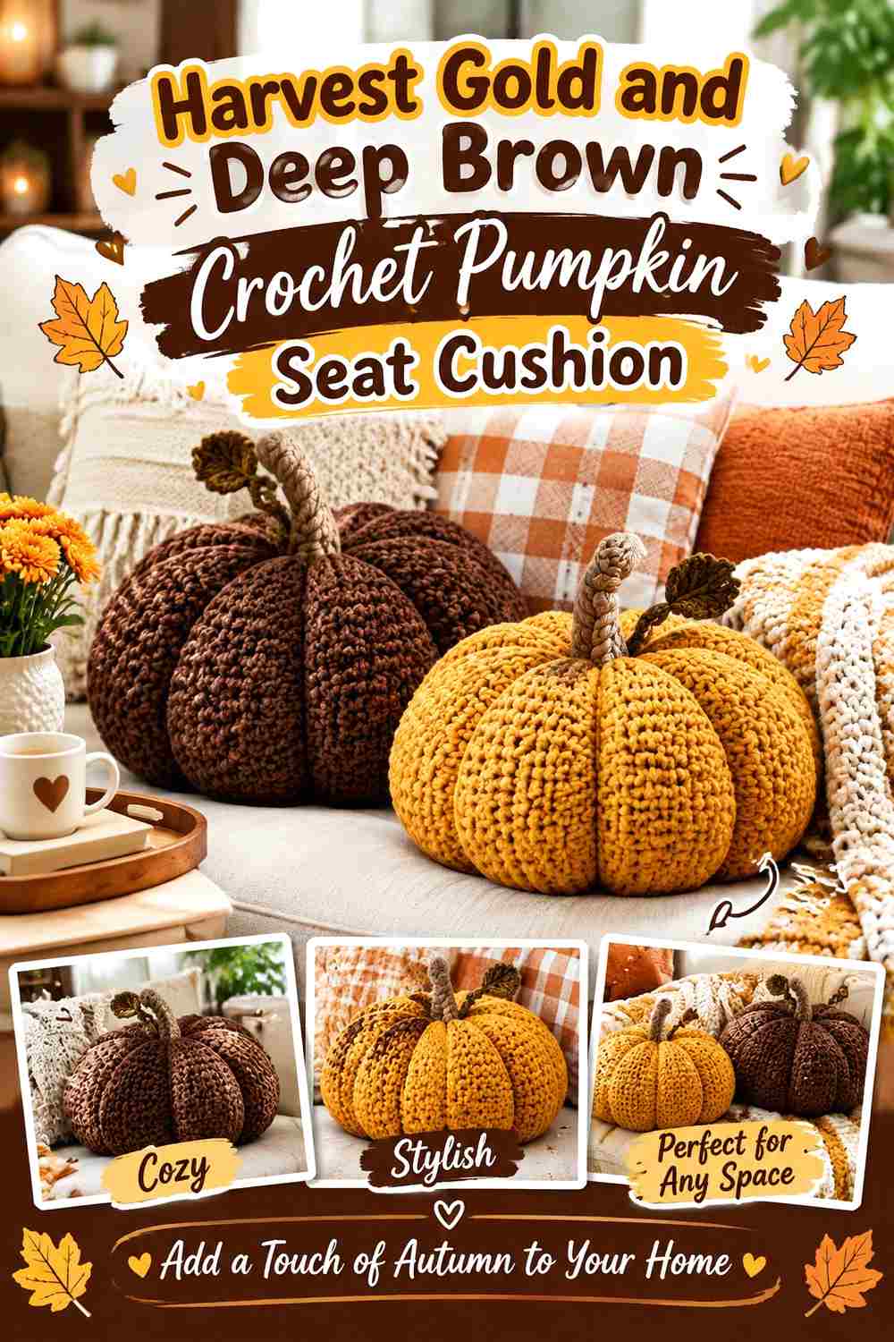
Deep brown gives Harvest Gold one of its strongest traditional harvest contrasts. Rather than spreading brown through every lobe, concentrate it around the outer edge, central indentation, stem, or pumpkin-motif background. This keeps the sitting surface warm and gold while still giving the cushion enough dark structure to define its silhouette.
Let Harvest Gold Carry the Main Cushion Surface
Use Harvest Gold across the areas that remain most visible from above. Broad gold coverage keeps the cushion from becoming visually heavy, which can happen quickly when deep brown occupies the same amount of surface.
On a square cushion, Harvest Gold can form the pumpkin while brown provides the surrounding field or joining lines.
Frame Harvest Gold With Deep Brown Instead of Over-Striping It
A dark outer border creates a clear endpoint for Harvest Gold and can visually contain a rounded or square cushion. The same brown can then reappear in the stem to connect the border with the pumpkin’s center.
Avoid outlining every individual lobe unless a highly graphic result is intentional. Too many dark lines can overpower the softer pumpkin texture.
Creator Credit: Crochet With Tiffany
5. Harvest Gold And Sage Crochet Pumpkin Seat Cushion

Sage creates a softer botanical contrast than olive. Pair it with Harvest Gold when you want the cushion to remain light and muted rather than strongly autumnal from a distance. Harvest Gold can dominate the pumpkin body, while sage works around the stem, leaf-inspired accents, quiet side panels, or edging.
Keep Harvest Gold Stronger Than Sage Across the Pumpkin Body
Because both colors can be fairly soft, give Harvest Gold more surface area to maintain a clear hierarchy. A mostly gold pumpkin with smaller sage interruptions reads more deliberately than an even alternation of similarly muted shades.
If the sage is particularly pale, it can also serve as a background for a Harvest Gold pumpkin motif.
Use Sage to Soften Harvest Gold Without Losing the Pumpkin Outline
Sage works well at the outer edge when cream feels too bright and olive feels too dark. It can provide separation while keeping the overall palette subdued.
Check the cushion from a normal room-viewing distance before finishing. If the Harvest Gold pumpkin starts disappearing into the sage, increase the contrast at the border or stem rather than adding more colors.
Creator Credit: Sirin’s Crochet
6. Harvest Gold And Burgundy Crochet Pumpkin Seat Cushion

Burgundy introduces a deeper red direction while Harvest Gold keeps the pumpkin unmistakably warm. This pairing works especially well when burgundy remains a concentrated anchor rather than a second full-surface color. Consider using it around the center, edge, alternate side lobe, or stem while Harvest Gold covers the broad seat area.
Let Harvest Gold Balance the Visual Weight of Burgundy
Burgundy is substantially darker than Harvest Gold, so it can attract attention even in a smaller amount. Give gold more total coverage if you want the cushion to remain harvest-gold-led.
On a pumpkin-motif cushion, a burgundy background can provide dramatic separation, but the gold pumpkin should remain large enough that the dark field does not become the dominant impression.
Repeat Burgundy Sparingly Around Harvest Gold Details
A burgundy center and narrow outer edge can create a connected palette without adding dark lines through every ridge. This works particularly well when the cushion already has pronounced crochet texture.
If burgundy appears only in the stem, it may feel detached. One small repetition elsewhere can integrate it without competing with Harvest Gold.
Creator Credit: MJ’s Off The Hook Designs
7. Harvest Gold And Charcoal Crochet Pumpkin Seat Cushion

Charcoal moves Harvest Gold toward a more graphic, neutral-backed look. The contrast is useful for pumpkin motifs, joins, and defined cushion edges, but charcoal can easily become visually dominant if it spreads across large lobes. Use Harvest Gold for the pumpkin itself and treat charcoal as framing or background.
Keep Harvest Gold Central Against Charcoal
A Harvest Gold pumpkin surrounded by charcoal becomes easy to identify because the warm motif and cool-dark field separate clearly. This approach is particularly useful on square or granny-style cushion fronts.
For a sculpted pumpkin, keep charcoal around the lower edge or stem rather than alternating it through every lobe.
Use Charcoal to Define Harvest Gold Without Hiding the Crochet Texture
Thin charcoal divisions can make gold sections look sharper, but too many dark outlines may cause the cushion to resemble a graphic illustration rather than a softly textured pumpkin.
Where the crochet already creates deep ridges, allow shadow to do part of the work. Add charcoal only where the Harvest Gold silhouette genuinely needs more definition.
Creator Credit: Valeria Chérie
8. Harvest Gold And Pumpkin Orange Crochet Pumpkin Seat Cushion

Harvest Gold and pumpkin orange create an analogous warm palette with little need for a neutral. The distinction comes from keeping Harvest Gold lighter and more dominant while orange adds deeper warmth around selected lobes or borders. This is a good direction when obvious pumpkin color is wanted without relying on one flat orange surface.
Use Harvest Gold as the Lighter Pumpkin Base
Place Harvest Gold through the main body so the cushion does not become visually dense. Pumpkin orange can then deepen the sides, lower lobes, or narrow textured sections.
This light-to-deep transition can help a shaped cushion look more dimensional even when the crochet construction itself stays consistent.
Keep Pumpkin Orange Separate Enough From Harvest Gold
Some pumpkin oranges may be very close to a dark Harvest Gold. If both yarns merge from a short distance, the color change will not contribute much to ridge visibility.
In that case, use the orange for larger side areas and let the crochet texture define smaller Harvest Gold lobes rather than forcing alternating stripes.
Creator Credit: Posh Pooch Designs
9. Harvest Gold Terracotta And Oatmeal Crochet Pumpkin Seat Cushion
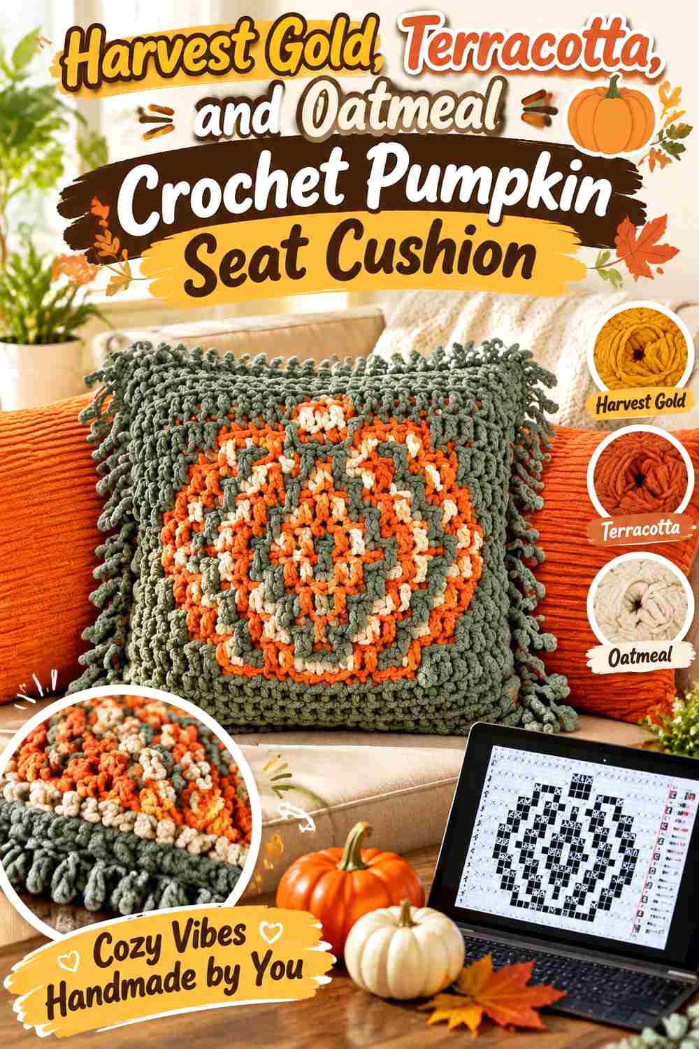
This three-color palette gives each shade a different task. Harvest Gold can dominate the pumpkin body, terracotta can deepen selected lobes, and oatmeal can separate or frame the warm colors. The light neutral is particularly useful if Harvest Gold and terracotta are too close in value to show important texture on their own.
Keep Harvest Gold Between Terracotta and Oatmeal
Harvest Gold works naturally as the middle value and visual bridge. Use it across the largest section, with terracotta adding deeper warmth and oatmeal providing the lightest break.
Avoid dividing the cushion into three equal bands. That weakens the pumpkin shape and makes the palette itself more noticeable than the seasonal form.
Use Oatmeal to Clarify Harvest Gold and Terracotta Ridges
Place oatmeal where the eye needs a pause, such as a narrow outer border, a selected ridge, or the background around a pumpkin motif.
It does not need to appear beside every Harvest Gold section. One or two strategic light areas can provide enough separation for the entire three-color palette.
Creator Credit: Ginell’s Crochet Therapy
10. Harvest Gold Moss And Walnut Crochet Pumpkin Seat Cushion

Moss green and walnut brown create an earthy framework for Harvest Gold. Gold should remain across most visible pumpkin lobes, moss can support the stem and occasional side sections, and walnut can provide the darkest edge or central accent. Clear roles matter because three medium-to-dark earthy shades can become muddy if they are distributed evenly.
Keep Harvest Gold Brighter Than Moss and Walnut
Harvest Gold needs enough uninterrupted surface to lift this palette. If moss and walnut cover most of the cushion, the gold becomes a small accent rather than the main color promised by the design.
Use the brighter gold where the cushion catches the most light and keep the deeper colors around the perimeter or selected structural details.
Separate Harvest Gold From Walnut With Moss Only When Useful
Moss can serve as a transition between the bright gold and dark brown, but it does not need to appear between them everywhere. Direct Harvest Gold-to-walnut contrast may be more useful around a crisp border.
Use moss where a softer transition suits the stem, foliage-inspired detail, or sidewall.
Creator Credit: Yarn Stash with Marching North
11. Harvest Gold And Dusty Teal Crochet Pumpkin Seat Cushion
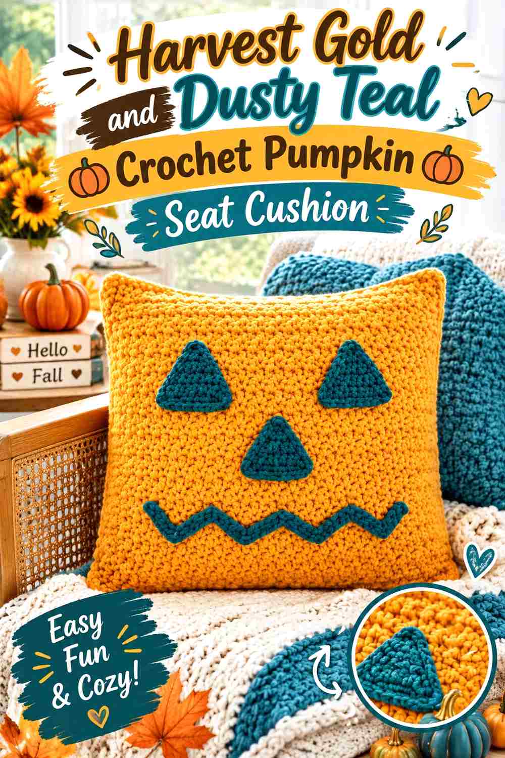
Dusty teal introduces the strongest cool-color direction in this collection. It can make Harvest Gold appear warmer by comparison, so a relatively small amount may be enough. Use gold across the pumpkin body and reserve teal for the background, edge, stem detail, or a limited number of lobes.
Let Harvest Gold Stay Dominant Beside Dusty Teal
Because gold and teal differ strongly in hue, equal coverage can make them compete. Give Harvest Gold the larger visual area when the cushion should still feel primarily harvest-inspired.
A teal background behind a Harvest Gold pumpkin motif is another option because it separates the colors without cutting the pumpkin itself into multiple sections.
Keep Dusty Teal Away From Every Harvest Gold Ridge
Repeating teal through all the pumpkin divisions may create a striped or outlined appearance. Instead, concentrate it around the cushion perimeter or one set of secondary details.
That gives Harvest Gold texture enough uninterrupted space to remain visible and prevents the cool accent from overpowering the seasonal shape.
Creator Credit: Maria’s Blue Crayon
12. Harvest Gold And Plum Crochet Pumpkin Seat Cushion

Plum gives Harvest Gold a rich dark counterpart without repeating the more traditional brown or burgundy combinations. Use it where the cushion needs definition: the outer edge, a stem, a narrow center, or selected side lobes. Harvest Gold should remain broad enough to keep the finished piece warm rather than predominantly purple.
Give Harvest Gold the Main Sitting Surface
Keeping Harvest Gold through the center and largest lobes makes the cushion easier to coordinate with other autumn neutrals. Plum can then sit toward the perimeter, where its dark value adds depth without dominating the area viewed from above.
This placement is especially useful if the central cushion area becomes partially covered during use.
Use Plum to Deepen Harvest Gold Pumpkin Shaping
Plum can emphasize a central indentation or selected ridge because it creates strong light-dark separation from gold. A little dark contrast often has more effect than a large plum panel.
If the cushion already has deep physical ridges, keep the plum narrow and allow the crochet texture to provide the remaining definition.
Creator Credit: Holly Auna
13. Harvest Gold Ivory And Espresso Crochet Pumpkin Seat Cushion
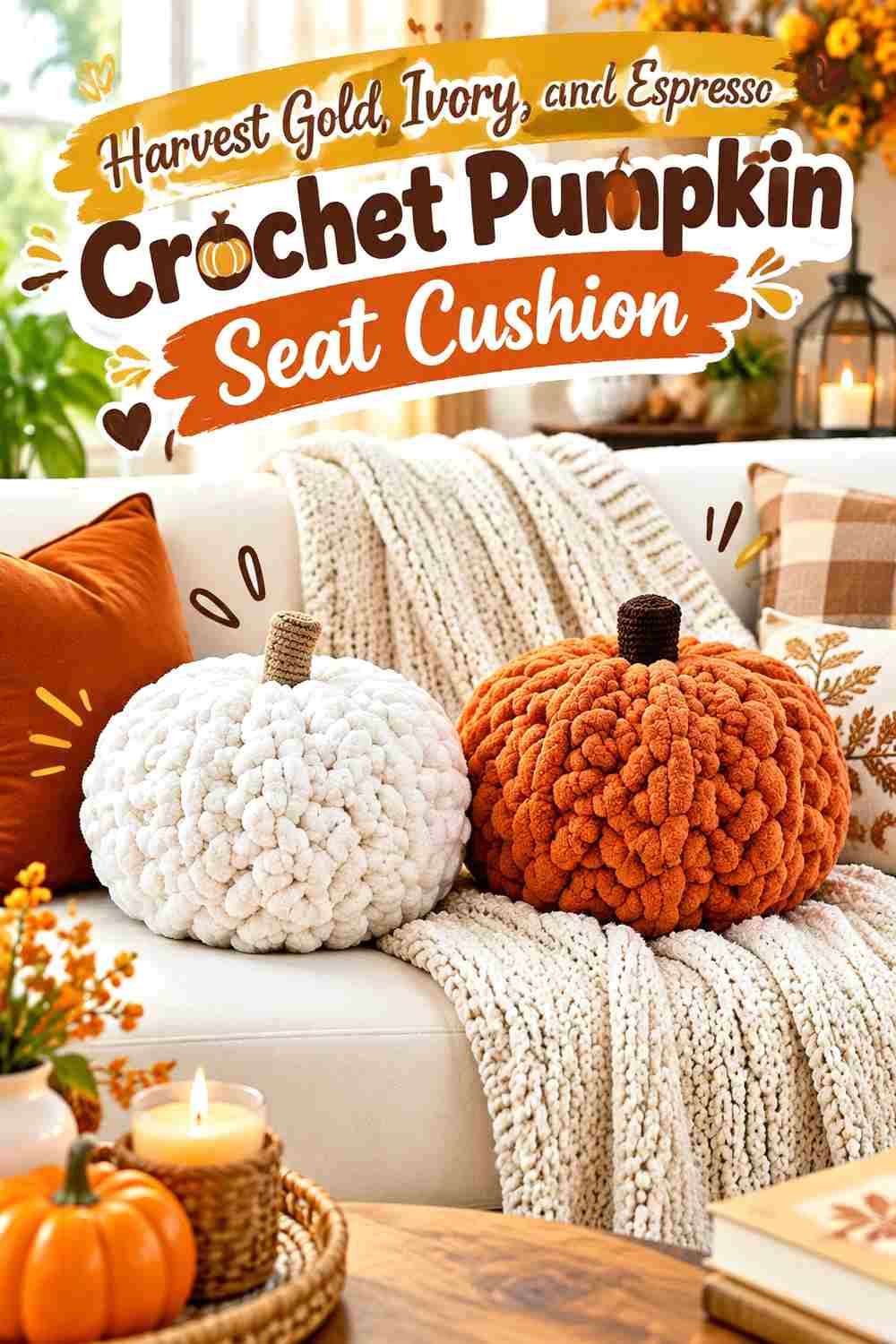
Ivory and espresso place Harvest Gold between a very light neutral and a very dark one. This gives the cushion a broad value range that can make pumpkin motifs and textured ridges easy to organize. Harvest Gold should cover the pumpkin body, ivory should provide breathing room, and espresso should remain the smallest but strongest anchor.
Keep Harvest Gold Between Ivory and Espresso
Harvest Gold acts as the visual middle of this palette, so give it the largest area. Ivory can surround or highlight it, while espresso defines selected endpoints.
This structure is especially useful on square cushions where the pumpkin, background, and border each need a distinct role.
Use Espresso Sparingly Around Harvest Gold and Ivory
A narrow espresso border, center accent, or stem can be enough to stabilize the lighter colors. Broad espresso sections can make the cushion look much darker and reduce the softer Harvest Gold effect.
If more definition is needed, first repeat a small espresso detail elsewhere rather than immediately increasing the width of the darkest section.
Creator Credit: Krafty Kitty
14. Tonal Harvest Gold And Clove Crochet Pumpkin Seat Cushion
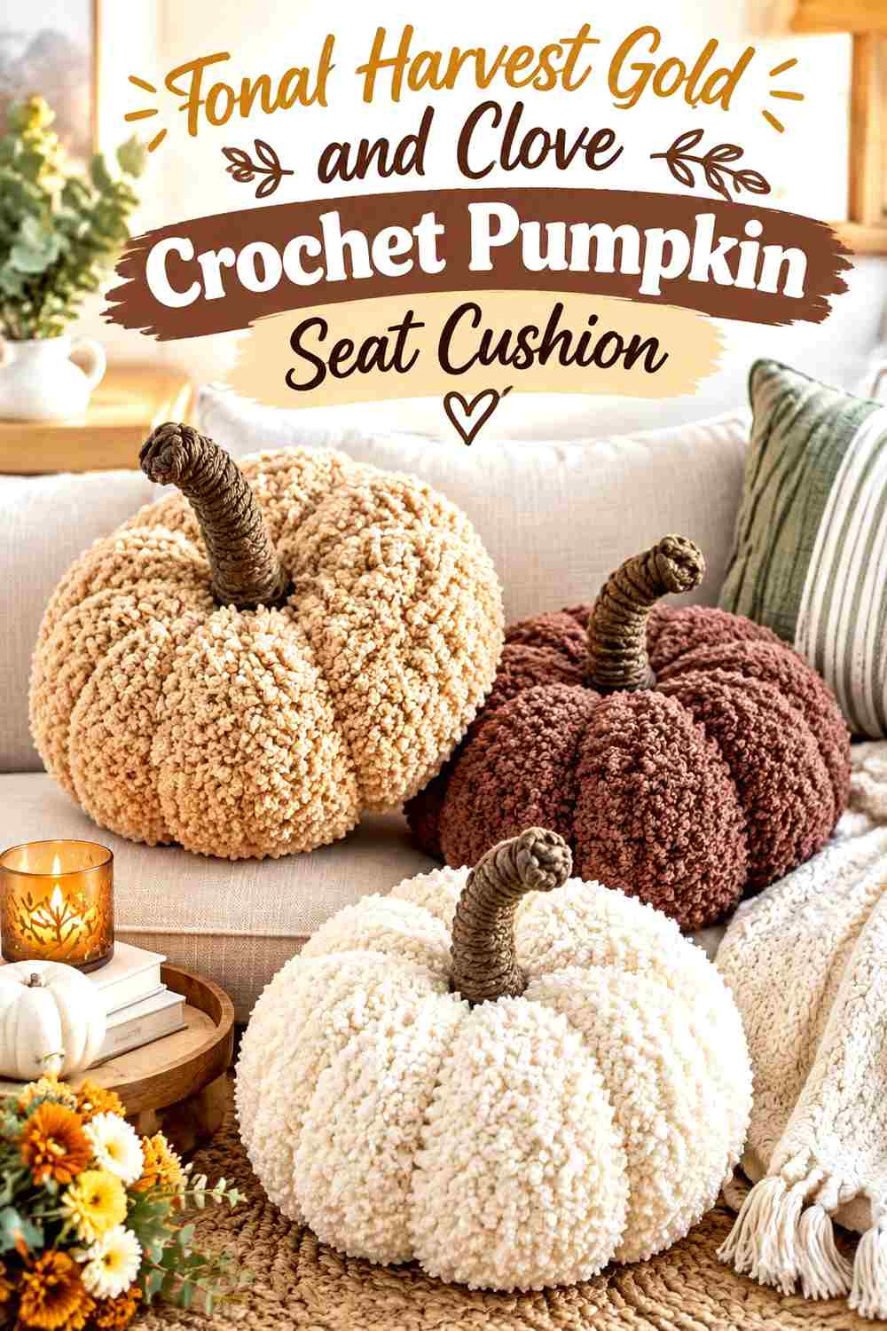
The final idea keeps the palette close to Harvest Gold itself. Combine Harvest Gold with a lighter wheat-gold and a deeper antique-gold direction, then use clove brown only at the stem, center, or outer edge. The result depends more on gradual tonal changes and crochet texture than on contrasting hues.
Make Harvest Gold the Middle Tone of the Pumpkin
Use Harvest Gold across most of the cushion, with the lighter gold reserved for selected raised areas and the deeper gold for side lobes or shaded sections. This creates variation while keeping the entire pumpkin visually connected.
Check all three gold shades in grayscale. They need some separation if the changes are meant to remain visible once the cushion is viewed from across the room.
Let Clove Brown Anchor the Harvest Gold Tonal Range
Clove provides a useful endpoint for a palette containing several related golds. Put it in the stem, center indentation, or a narrow outer edge rather than introducing dark brown throughout every lobe.
That single deep anchor can make the lighter Harvest Gold variations easier to read without turning the cushion into a brown-and-gold striped design.
Creator Credit: Dogwood Crochet US
Choosing Between These Harvest Gold Pumpkin Cushion Palettes
For the lightest result, Harvest Gold with cream, sage, or ivory gives the pumpkin plenty of visual space and can keep textured details readable. Harvest Gold with rust or pumpkin orange produces a more blended, warm-tonal effect in which the crochet ridges can do more of the shaping work.
Deep brown, burgundy, charcoal, plum, walnut, and espresso provide stronger definition. These shades are most effective when they remain secondary, especially on cushions where Harvest Gold should still cover the main sitting surface.
Dusty teal creates the clearest warm-cool contrast, while olive and moss offer quieter botanical support. For the most layered color plan, the terracotta-and-oatmeal or tonal-gold schemes provide three or more values without requiring several unrelated hues.
Conclusion
Harvest Gold works best on a crochet pumpkin seat cushion when its role is decided before the supporting colors are added. If you want visible ridges and a lighter overall finish, pair it with cream, oatmeal, ivory, or sage. For deeper autumn contrast, use brown, burgundy, charcoal, walnut, espresso, or plum around the outer edge and selected pumpkin divisions.
If you prefer a softer tonal pumpkin, rust, pumpkin orange, and neighboring gold shades can create variation without breaking the surface into sharp blocks. Olive, moss, and dusty teal move the palette in a different direction while still allowing Harvest Gold to remain the main pumpkin color.
Whichever palette you use, check the colors together before committing to the full cushion and consider which details will remain visible when the piece is actually placed on a chair or bench. Use the original tutorial for its exact construction and finishing information, then adapt the color placement without obscuring the pumpkin shape or crochet texture.
Frequently Asked Questions
What colors work well with Harvest Gold on a crochet pumpkin seat cushion?
Cream, oatmeal, ivory, brown, olive, sage, rust, burgundy, charcoal, plum, dusty teal, and pumpkin orange can all work with Harvest Gold. The useful choice depends on whether you want strong contrast, a tonal effect, or an earthy botanical direction.
Should Harvest Gold cover every pumpkin lobe?
Not necessarily. Harvest Gold can cover most lobes while another color marks selected sides, ridges, or the edge. Keeping several connected areas Harvest Gold usually gives the cushion a clearer dominant color than alternating every lobe equally.
How can I keep Harvest Gold crochet pumpkin ridges visible?
Use stitch texture, light-dark color contrast, or both. If a supporting color is supposed to define narrow ridges, compare it with Harvest Gold in grayscale first. Two different hues can still visually merge when their values are similar.
What is a good dark border color for a Harvest Gold pumpkin cushion?
Deep brown, espresso, charcoal, burgundy, walnut, clove, or plum can all provide dark definition. Keep the border relatively controlled when Harvest Gold should remain the main visual feature.
Can Harvest Gold and pumpkin orange be used on the same crochet cushion?
Yes. They create a close warm-color relationship, so the finished effect is more tonal than a Harvest Gold-and-charcoal or Harvest Gold-and-cream combination. Choose an orange that is noticeably deeper if you want the color change to help define the pumpkin sections.
Where should accent colors go on a Harvest Gold pumpkin seat cushion?
Useful locations include the outer edge, stem, center indentation, selected lobes, motif background, joining lines, or sidewall. Put important accents where they will still be visible once the cushion is positioned on the seat rather than concentrating every detail in the center.