A crochet sweater can take on a much stronger vintage direction when color and raised flowers are planned together. The important decision is not simply which flower color looks appealing. The sweater body, cuffs, neckline, sleeves, flower centers, petals, and any visible joins all compete for attention, so each shade needs a clear role.
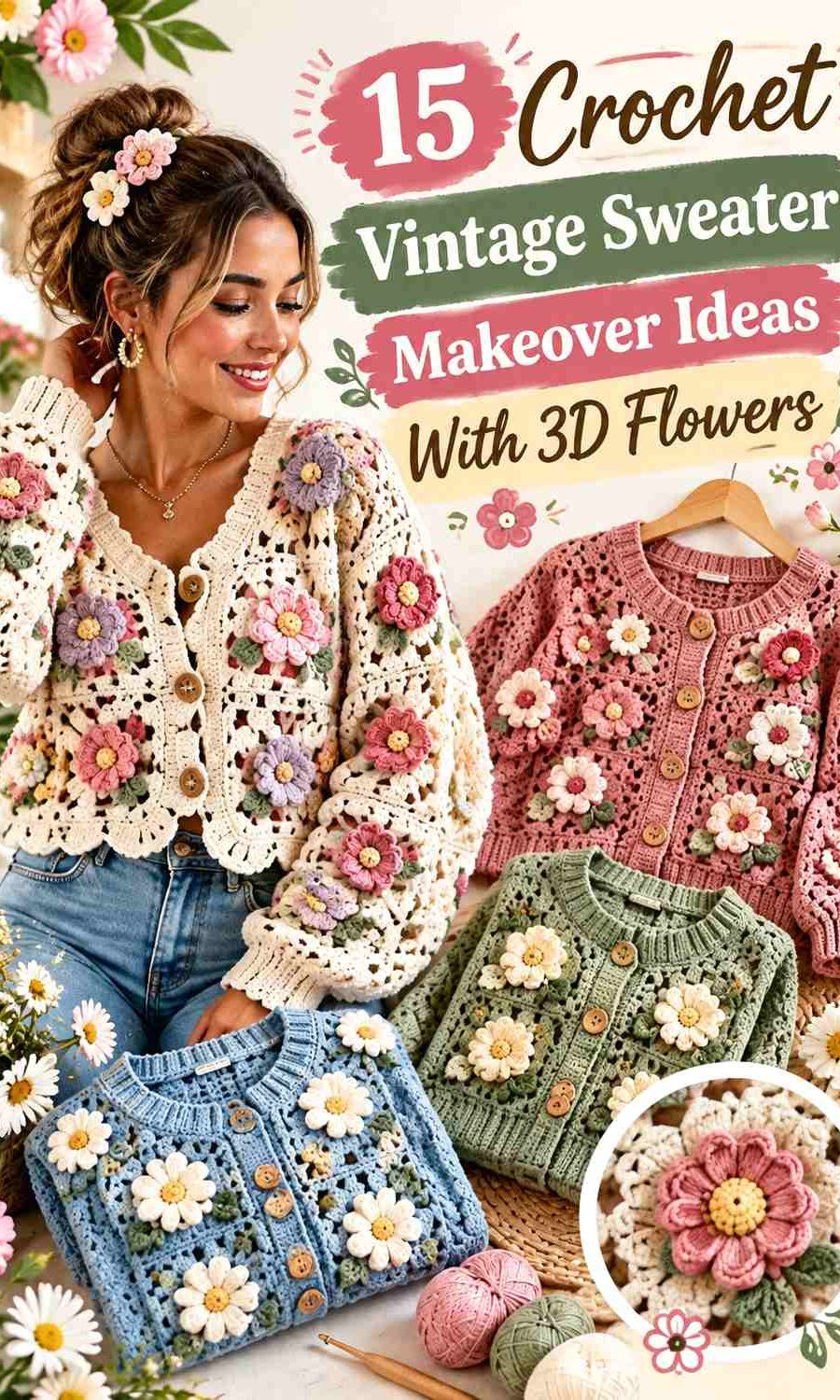
These 15 ideas use different vintage-inspired palettes for pullovers and cardigans with floral surfaces, granny-square flowers, puff flowers, roses, daisies, and appliqué-style embellishment. Some of the linked tutorials demonstrate floral garments directly, while others are useful construction references that can support an independently planned 3D-flower makeover. Follow each creator for exact construction details, then treat the color placement below as a separate design direction.
Quick List
- Antique Cream, Dusty Rose, and Moss Green Crochet Vintage Flower Sweater
- Faded Sage, Buttercream, and Blush Crochet 3D Flower Pullover
- Chocolate Brown, Rust, and Mustard Crochet Vintage Daisy Sweater
- Powder Blue, Ivory, and Soft Yellow Crochet Daisy Pullover
- Oatmeal, Burgundy, and Mauve Crochet Vintage Flower Cardigan
- Dusty Teal, Camel, and Cream Crochet Flower Square Cardigan
- Olive, Terracotta, and Antique White Crochet Sunflower Cardigan
- Lavender, Plum, and Cream Crochet Puffy Flower Cardigan
- Brick Red, Peach, and Oatmeal Crochet Ribbed 3D Flower Cardigan
- Charcoal, Dusty Pink, and Wine Crochet Puff Flower Cardigan
- Cocoa, Rose, and Sage Crochet Rose Granny Square Cardigan
- Mustard, Chocolate, and Cream Crochet Retro Daisy Cardigan
- Navy, Cornflower Blue, and Ivory Crochet Flower Granny Square Cardigan
- Forest Green, Cranberry, and Cream Crochet Vintage Flower Sweater
- Black, Antique Cream, and Muted Gold Crochet Vintage Daisy Cardigan
Let the Sweater Color Support the 3D Flowers
Raised crochet flowers already create shadows and visual depth, so they do not always need the brightest colors in the palette. A quieter sweater body can give dimensional petals more room to show. Antique cream, oatmeal, faded sage, cocoa, charcoal, and muted blue are especially useful when you want the flowers to be the first detail a viewer notices.
When the sweater body and flowers are close in value, texture rather than contrast becomes responsible for defining the motif. That can create a subtle vintage result, but test a few flowers against the actual sweater surface first. If the petals disappear from a normal viewing distance, either lighten the flower, darken its center, or add a small contrasting leaf or outline.
Plan 3D Flower Placement Around Sweater Structure
A sweater has several natural visual zones: the neckline, shoulders, upper chest, sleeve tops, cuffs, front edges, hem, and back panel. You do not need to cover all of them. A few carefully repeated flowers can look more deliberate than placing unrelated motifs wherever there is open space.
For a cardigan, pay particular attention to the two front panels. If one side carries noticeably more flowers or stronger colors, the garment can feel visually lopsided when worn open. On a pullover, the center front has more visual weight, so an asymmetric flower cluster can work if smaller color echoes appear on a sleeve or shoulder.
Keep Vintage Crochet Colors Muted Without Losing Contrast
A vintage palette does not have to mean that every shade is pale or brown. The more useful goal is controlled contrast. Dusty pink can sit beside burgundy, faded blue can work against navy, and mustard can stand out from chocolate without turning the sweater into a high-saturation rainbow.
When choosing substitutions, preserve the relationship between the colors. If the proposed flower is much lighter than the sweater body, choose another flower shade that keeps that light-dark difference. A grayscale photo of the yarns or finished swatches can help reveal when different hues are actually too similar in value.
1. Antique Cream, Dusty Rose, and Moss Green Crochet Vintage Flower Sweater

Antique cream gives this crochet sweater a quiet base that leaves plenty of room for dimensional dusty rose flowers. Moss green works best as a restrained supporting shade rather than an equal third color. Use it for leaves, small flower centers, or occasional details so the sweater reads as cream-and-rose first and botanical second.
Antique Cream Gives Dusty Rose Flowers a Clear Sweater Background
Let antique cream occupy most of the body and sleeves if you want the 3D flowers to stay easy to read. The light neutral creates separation around dusty rose petals without the sharper contrast of bright white. It is particularly useful across the chest and shoulder area, where flower shadows can otherwise blend into a medium-value sweater.
Dusty Rose Works Better in Repeated Sweater Flower Clusters
Instead of putting one dusty rose flower in every available space, repeat the color in a few purposeful areas. A chest cluster can be echoed near one cuff or along a shoulder, giving the makeover continuity without covering the entire sweater. Leave visible antique cream between flowers so each raised motif retains its outline.
Moss Green Should Stay Secondary to Antique Cream and Dusty Rose
Moss green can quickly make the sweater more botanical, but large equal blocks of green may pull attention away from the flowers. Keep it to leaves, centers, or small accent sections unless a greener vintage look is intentional. If your moss yarn is almost as dark as the dusty rose, place antique cream between them where possible to keep the details separated.
Creator Credit: BELINA BELLWOOD
2. Faded Sage, Buttercream, and Blush Crochet 3D Flower Pullover

Faded sage creates a soft botanical base for a vintage pullover, while buttercream brings lightness to the flower details. Blush can appear in smaller amounts to keep the palette from becoming entirely green and neutral. This scheme works especially well when the floral surface is open or textured because the three colors differ without producing harsh transitions.
Faded Sage Can Lead the Pullover Without Hiding the 3D Flowers
Use faded sage across the larger body panels and sleeves. Its muted character gives the pullover a distinct color while still behaving almost like a neutral behind dimensional details. Before repeating the flowers, place a finished buttercream or blush motif against the sage and check it from several feet away.
Buttercream Keeps Faded Sage Floral Texture Visible
Buttercream is useful around petals, flower centers, or small decorative edges because it is lighter than faded sage. That value difference helps openwork and raised petals stay recognizable. If you substitute another pale neutral, preserve the gentle warmth rather than moving to a very stark white unless stronger contrast is the goal.
Blush Adds Vintage Warmth Without Competing With Faded Sage
Blush should work as a small accent in this palette rather than covering equal amounts of the sweater. Try it in selected flower centers or a few petals so the eye moves between repeated points of warm color. Keeping sage dominant prevents the pullover from shifting into an all-pastel look.
Creator Credit: Hannah Drapinski
3. Chocolate Brown, Rust, and Mustard Crochet Vintage Daisy Sweater
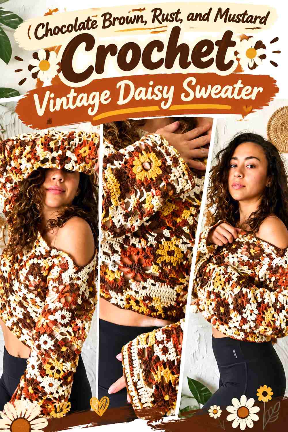
Chocolate brown gives this sweater the darkest base in the collection. Rust brings a softer warm transition, while mustard supplies the clearest flower accent. The result can feel strongly retro without needing many colors, especially when mustard is reserved for the areas that need the most visual attention.
Chocolate Brown Makes Mustard 3D Flowers More Graphic
A dark chocolate sweater body creates immediate value contrast with mustard petals. This is useful if the flowers are relatively small or scattered, because they will remain visible without needing a large motif. Keep enough brown surface exposed between flowers so the garment does not become a continuous field of yellow.
Rust Bridges Chocolate Brown and Mustard on the Sweater
Rust sits comfortably between the deepest and brightest shades in this scheme. Use it for flower centers, selected petals, or a narrow trim when the jump from brown to mustard feels too strong. Repeating rust in two or three garment areas makes it look intentional instead of like an isolated extra color.
Mustard Needs Controlled Placement Against Chocolate Brown
Because mustard is much lighter than chocolate brown, even a small quantity can dominate. Concentrate it on the flower shapes you want viewers to notice first rather than distributing it evenly across every cuff, border, and motif. If you want a quieter makeover, replace mustard with a deeper ochre while keeping it visibly lighter than the chocolate base.
Creator Credit: Emma Warrender
4. Powder Blue, Ivory, and Soft Yellow Crochet Daisy Pullover
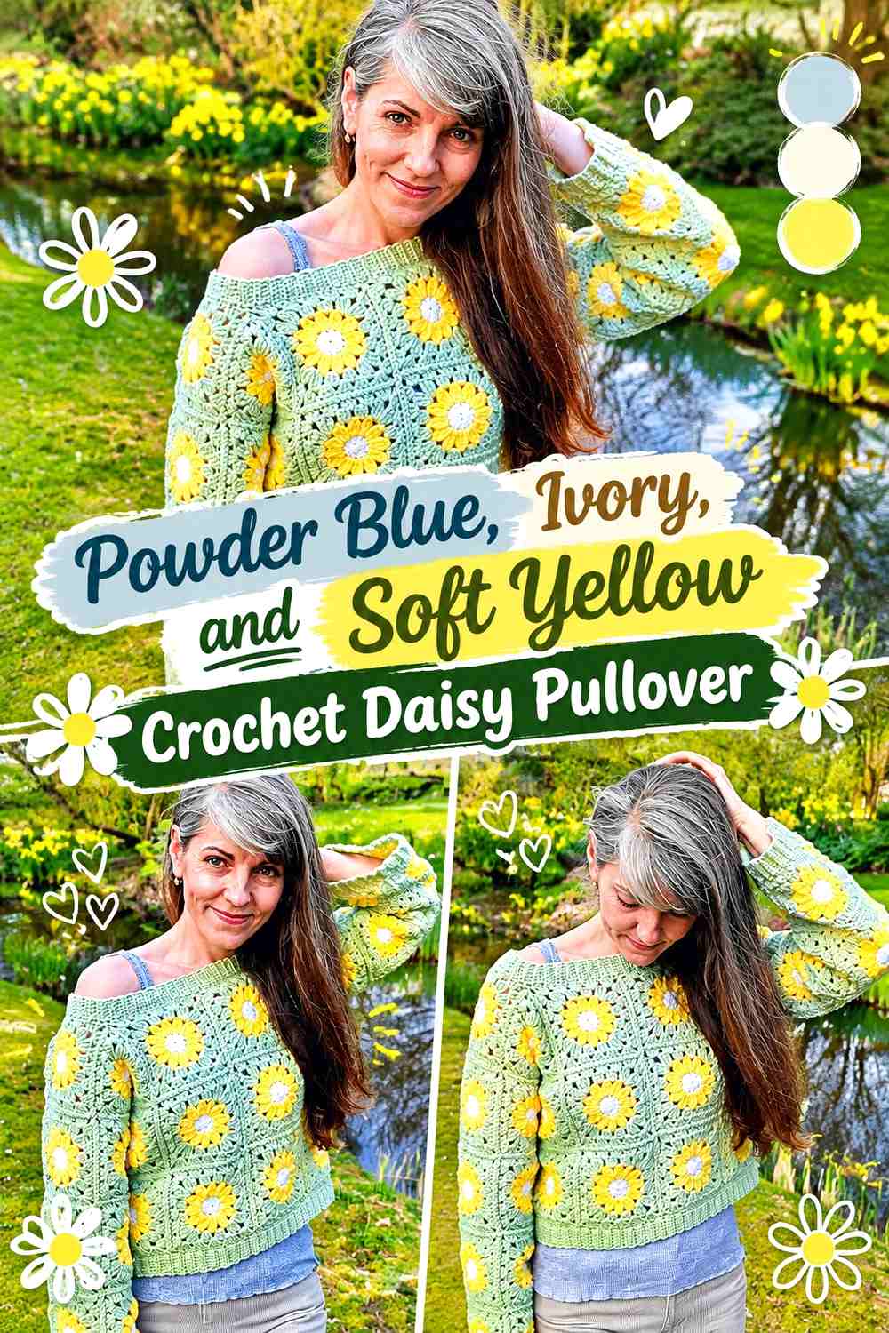
Powder blue changes the vintage direction from earthy to softly nostalgic. Ivory can define petals or joins, while soft yellow gives daisy centers a recognizable point of warmth. This palette works best when blue remains clearly dominant so the small yellow details do not scatter the eye across the pullover.
Powder Blue Should Cover the Main Crochet Pullover Surface
Let powder blue establish the body, sleeves, and largest background sections. A consistent blue field gives repeated flowers a common visual base and prevents a motif sweater from looking fragmented. If the blue is extremely pale, compare it directly with ivory before committing; the two shades still need enough separation for the flowers to show.
Ivory Can Outline Powder Blue Daisy Motifs Without Harsh Contrast
Ivory petals create a softer transition than pure white against powder blue. Use the lighter neutral where the flower shape needs to remain clear, especially across the front and sleeves. If the petals and blue background merge in low light, a slightly deeper blue background is often more useful than making the ivory brighter.
Soft Yellow Works Best as a Small Powder Blue Sweater Accent
Soft yellow has enough warmth to define flower centers without taking over the whole palette. Repeat it consistently in centers or tiny details instead of introducing unrelated yellow stripes elsewhere. That limited use keeps the cardigan’s vintage flower theme coherent.
Creator Credit: Crochet & Yara
5. Oatmeal, Burgundy, and Mauve Crochet Vintage Flower Cardigan
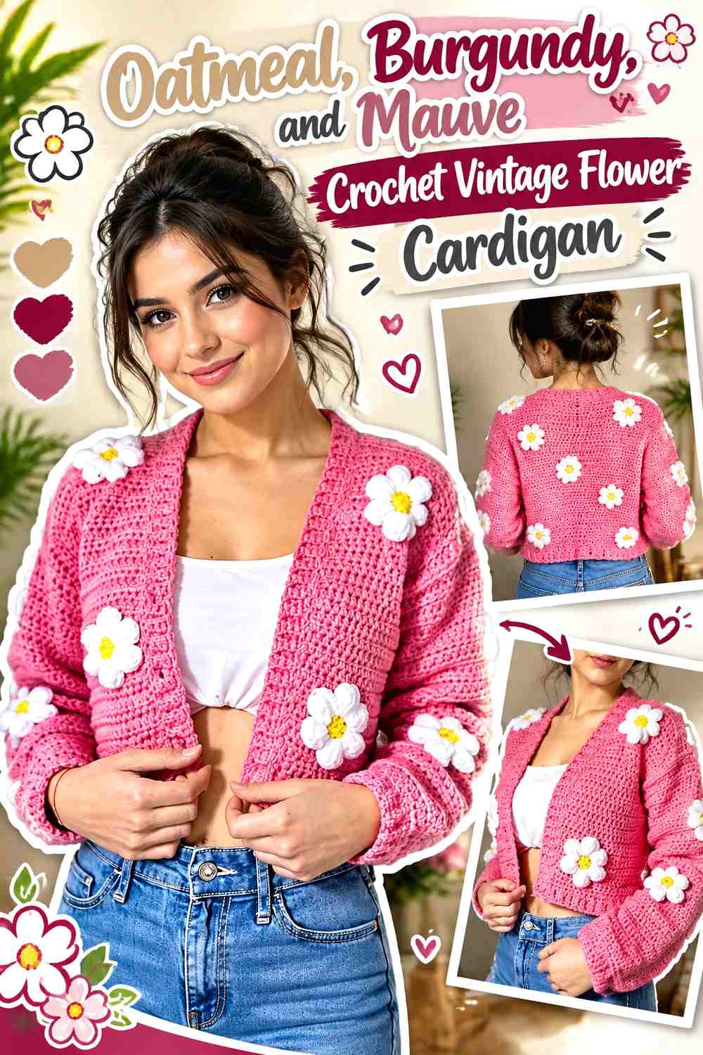
Oatmeal gives an open cardigan a quiet neutral frame, burgundy supplies depth, and mauve softens the transition between them. The palette suits a makeover where flowers sit mainly on the fronts, shoulders, or sleeves because burgundy can direct attention to those specific zones.
Oatmeal Keeps Burgundy Flowers Distinct on Open Cardigan Panels
An oatmeal body prevents the two front panels from becoming visually heavy when the cardigan is worn open. Place burgundy flowers with enough neutral space around them to preserve the shape of each motif. Oatmeal can also continue through the neckline and front border so the edges do not compete with the floral surface.
Burgundy Can Anchor Oatmeal at the Cuffs or Hem
If burgundy appears only inside flowers, it can look detached from the rest of the cardigan. A small repeat at the cuffs, narrow hem, or another finishing detail can connect the palette without turning burgundy into a second dominant color. The repeat does not need to be large; it simply needs to feel deliberate.
Mauve Softens the Jump Between Burgundy and Oatmeal
Use mauve inside selected petals or smaller flowers when burgundy against oatmeal feels too dramatic. The medium-value pink-purple acts as a bridge between the deep accent and neutral background. Keep some flowers predominantly burgundy so the makeover still has a clear dark anchor.
Creator Credit: karelly Crochet
6. Dusty Teal, Camel, and Cream Crochet Flower Square Cardigan
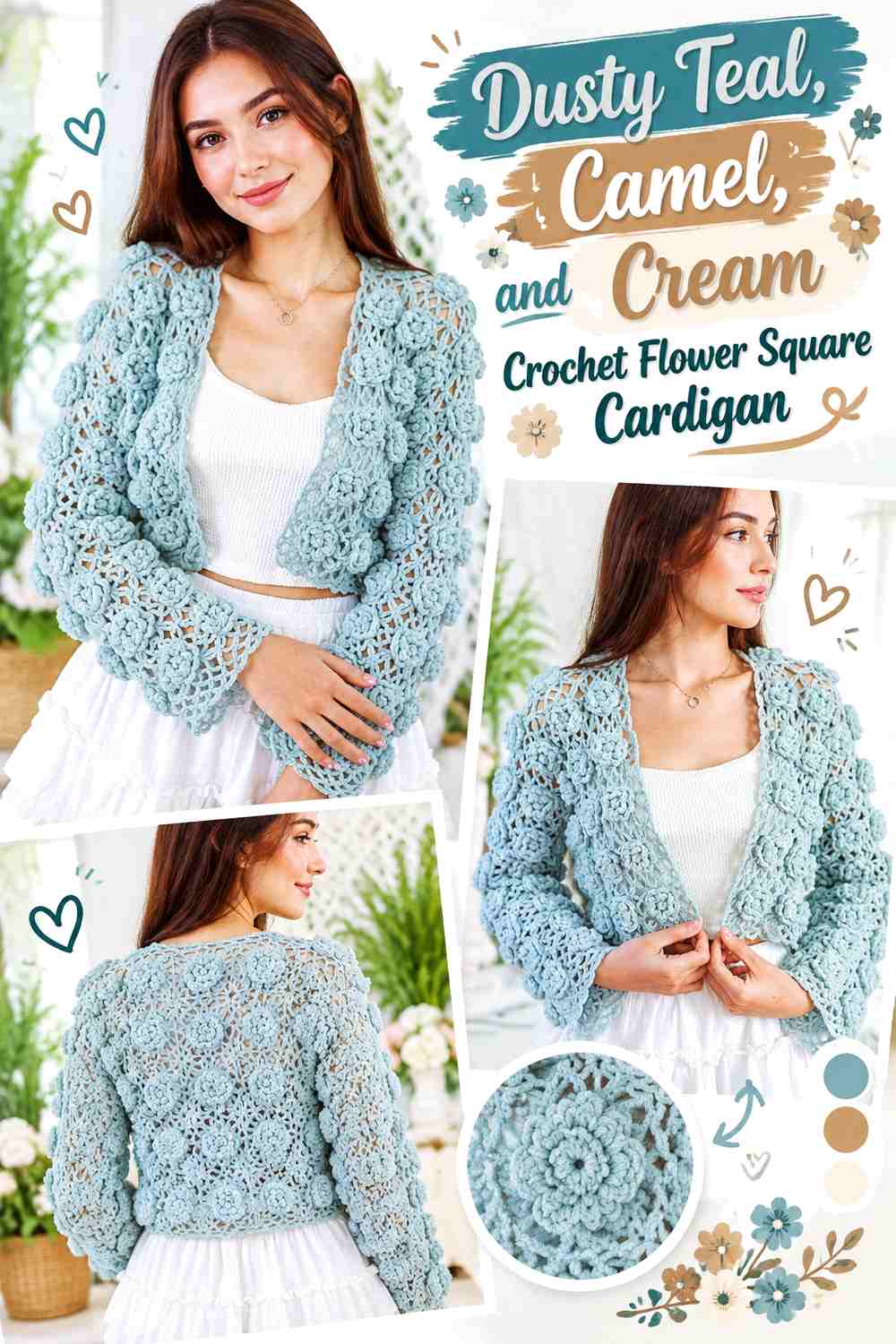
Dusty teal gives flower squares a cool vintage foundation, camel contributes warmth, and cream separates the two. On a modular cardigan, color placement matters twice: inside each flower square and across the full garment layout.
Dusty Teal Can Unify the Crochet Flower Square Backgrounds
Using dusty teal repeatedly around the outer portions of the flower squares can make individual motifs read as one cardigan rather than unrelated blocks. Continue teal into selected borders or edges when useful. A consistent outer color is especially helpful if the flower centers vary.
Camel Adds Warmth Without Overpowering Dusty Teal
Camel can appear in flower centers, alternate petals, or a few accent squares. Keep it below dusty teal in total visual area so the cool background remains the main impression. If your camel is close to the teal in value, insert cream between the colors where flower definition matters most.
Cream Keeps Dusty Teal and Camel Flower Squares Legible
Cream works as the separating color in this palette. It can define petal edges, motif centers, or parts of the join when two medium-value colors begin to merge. On the front panels, make sure the cream placement is reasonably balanced from left to right before joining the squares permanently.
Creator Credit: Chenda DIY
7. Olive, Terracotta, and Antique White Crochet Sunflower Cardigan

This sunflower palette moves away from literal bright yellow and dark brown. Olive gives the cardigan an earthy body, terracotta creates warm petals or centers, and antique white adds enough lightness to keep the floral structure readable. The result can feel more vintage and wearable while retaining a clear flower theme.
Olive Creates a Stronger Vintage Base Than Bright Green
Use olive around the cardigan body, flower-square backgrounds, or joins when you want the garment to feel earthy rather than spring-bright. Because olive can be a medium or dark value, test it against terracotta before making many motifs. If they merge, let antique white separate important petal or center areas.
Terracotta Gives Olive Sunflower Motifs a Muted Warm Accent
Terracotta can replace brighter sunflower tones when you want a quieter retro effect. Use it consistently in one flower role—such as petals or centers—rather than moving it randomly between motif parts. Consistency makes repeated flower squares easier to read across sleeves and front panels.
Antique White Opens Up Olive and Terracotta Flower Squares
Antique white is most useful where the sunflower needs visual breathing room. A light border, petal detail, or small center transition can stop olive and terracotta from becoming one dense warm block. Avoid spreading the white equally everywhere if you want olive to remain the main cardigan color.
Creator Credit: Kristine’s Day
8. Lavender, Plum, and Cream Crochet Puffy Flower Cardigan
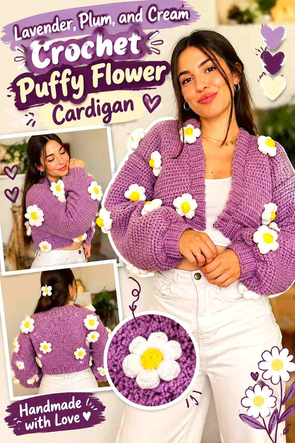
Lavender gives a puffy-flower cardigan a soft main field, while plum provides the darkest points and cream offers highlights. Because raised flowers naturally cast shadows, this palette can use relatively close hues and still retain texture.
Lavender Lets Puffy Crochet Flowers Show Through Texture
Use lavender across a large share of the cardigan if you want the surface texture to carry more of the design than extreme color contrast. Dimensional petals will create their own small highlights and shadows. Check the finished flower against the cardigan while it is hanging vertically, since texture can read differently once the garment is no longer flat.
Plum Should Define Selected Lavender Flowers, Not Every Detail
Plum can create strong flower centers or a few full motifs, but repeating the darkest shade everywhere may make the cardigan feel spotty. Concentrate plum around focal flowers or a controlled section of the sleeves and front. Repeat it just enough that the color does not look accidental.
Cream Can Give Lavender and Plum Flowers More Separation
Cream is the correction color when lavender and plum begin to feel too dense. Use it for smaller petals, centers, or narrow accents around the most detailed flowers. A cream cuff or border can also balance the flowers, but keep the treatment narrow if you want the cardigan body to remain lavender-led.
Creator Credit: NoteswNat
9. Brick Red, Peach, and Oatmeal Crochet Ribbed 3D Flower Cardigan
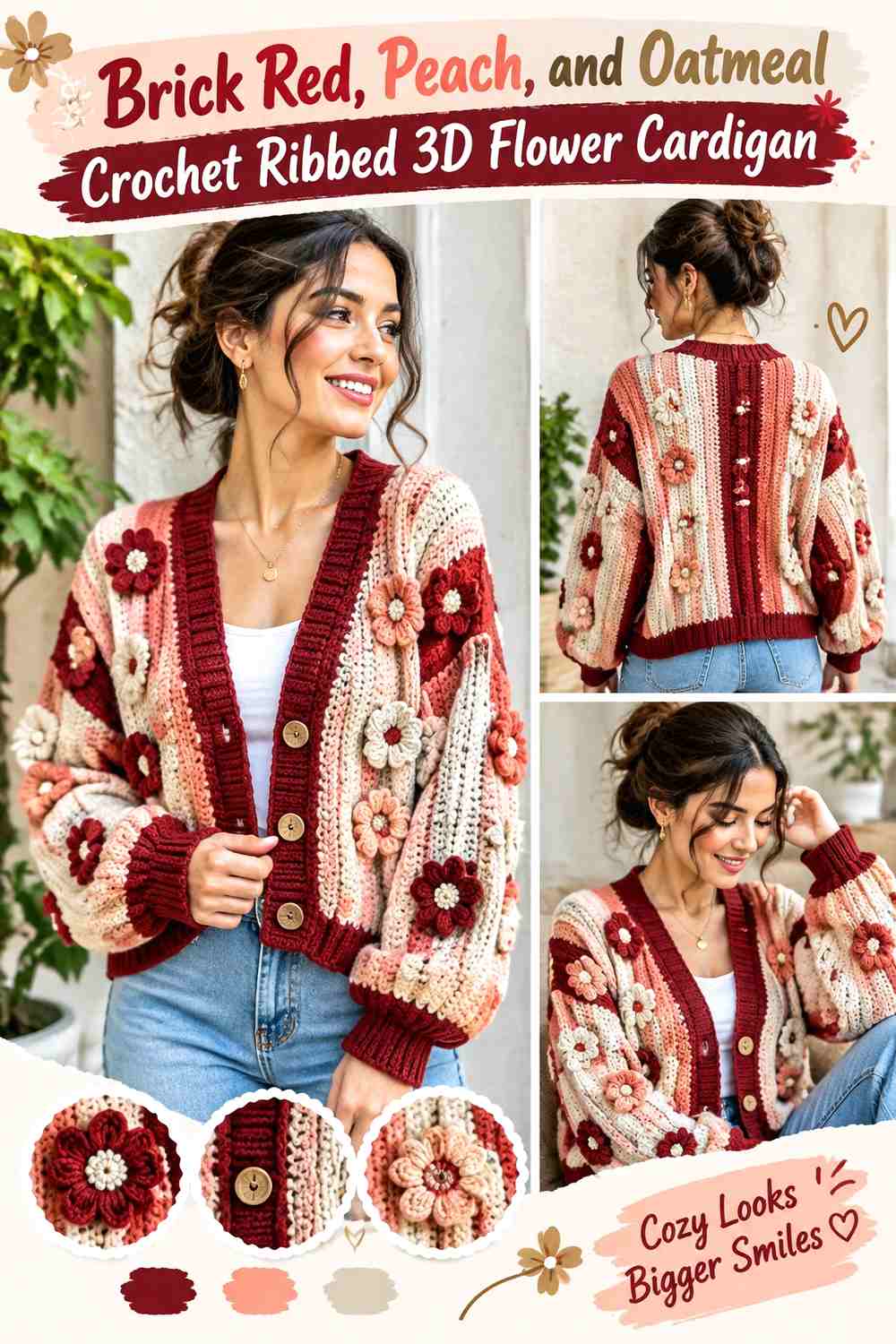
Brick red creates a substantial vintage base for a ribbed cardigan, while peach lightens the raised flowers and oatmeal provides a neutral buffer. The combination works well when the cardigan already has strong linear texture because the flower palette can remain simple.
Brick Red Can Carry the Ribbed Crochet Cardigan Body
Let brick red dominate the ribbing and main panels instead of adding multiple colors to the base structure. The consistent dark warm field gives 3D flowers a clear surface to sit against. It also prevents the ribbing and flowers from competing as two separate color patterns.
Peach Softens 3D Flowers Against Brick Red
Peach creates a lighter, warmer contrast than cream alone. Use it across the majority of flower petals if you want the raised motifs to look distinct without becoming extremely bright. For stronger vintage depth, use peach alongside a few brick-red petals rather than making every flower identical.
Oatmeal Can Separate Peach Flowers From Brick Red Ribbing
Oatmeal works well in centers, small petals, or subtle cardigan trim. Its neutral role helps when peach and brick red start to feel too close or overly warm. If oatmeal is used on the front edging, repeat a small amount in the flowers so the border connects with the rest of the makeover.
Creator Credit: Shyler crochets
10. Charcoal, Dusty Pink, and Wine Crochet Puff Flower Cardigan

Charcoal makes this the moodiest palette in the group. Dusty pink keeps the puff flowers visible, while wine gives selected motifs a deeper color connection to the dark cardigan body. The scheme works best when pink carries most of the flower area and wine remains selective.
Charcoal Makes Dusty Pink Puff Flowers Easy to Read
A charcoal base gives dusty pink a strong value difference, which is helpful for smaller puff flowers. Keep the body and sleeves mostly charcoal if the flower clusters are meant to be the makeover feature. Too many additional light trims can reduce the impact of the flowers.
Dusty Pink Should Repeat Across the Charcoal Cardigan
Place dusty pink in more than one garment zone so the flower embellishment looks integrated. A front cluster can be echoed on the opposite sleeve, upper back, or cuff. The repeats do not need to match exactly; they simply need to make the pink feel distributed rather than attached to one isolated spot.
Wine Can Deepen Dusty Pink Flowers Without Competing With Charcoal
Wine works well for flower centers or occasional petals. Because it is darker than dusty pink, it creates extra depth inside raised motifs while still remaining distinguishable from charcoal. If your chosen wine is nearly as dark as the sweater body, keep dusty pink between the two colors where possible.
Creator Credit: INDI DIY
11. Cocoa, Rose, and Sage Crochet Rose Granny Square Cardigan
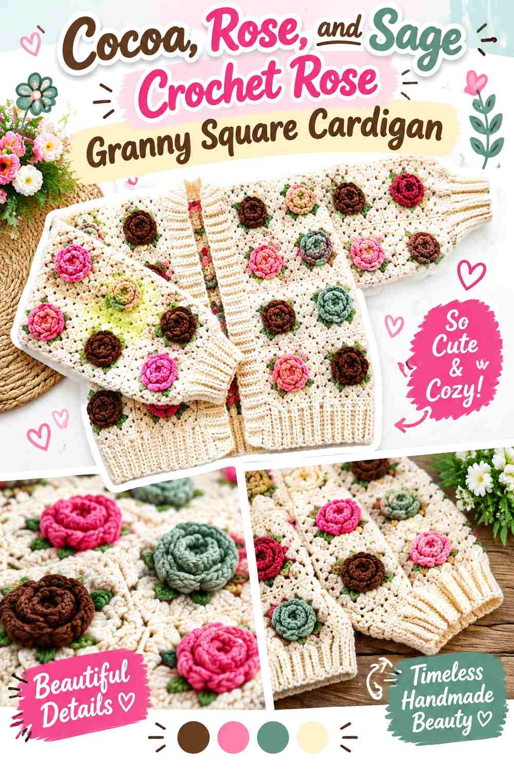
Rose motifs already have more internal detail than simple daisies, so this palette keeps the surrounding colors restrained. Cocoa can frame the granny squares, rose leads the flowers, and sage provides a botanical accent without turning every square into a multicolor block.
Cocoa Gives Rose Granny Squares a Defined Cardigan Frame
Use cocoa around the outer square edges or as a consistent joining color if you want the rose motifs to stay organized. A repeated dark frame can make the grid easier to see across the front, back, and sleeves. Avoid adding several unrelated dark border colors, which can distract from the roses.
Rose Should Remain the Main Flower Color Against Cocoa
Give rose the largest share of the dimensional flower itself. Variations within the pink family can add depth, but the motif should still read as a rose rather than a random multicolor center. If the rose shade is very dark, add a lighter petal section so it remains distinct from cocoa.
Sage Adds a Controlled Botanical Accent to Cocoa and Rose
Sage can work in leaves, small background sections, or occasional centers. Keep it visually secondary so the cardigan does not shift from a rose palette into equal pink-and-green color blocking. Repeating sage in several small places will feel more connected than putting one large green section on a single panel.
Creator Credit: Pimdao Crochet
12. Mustard, Chocolate, and Cream Crochet Retro Daisy Cardigan
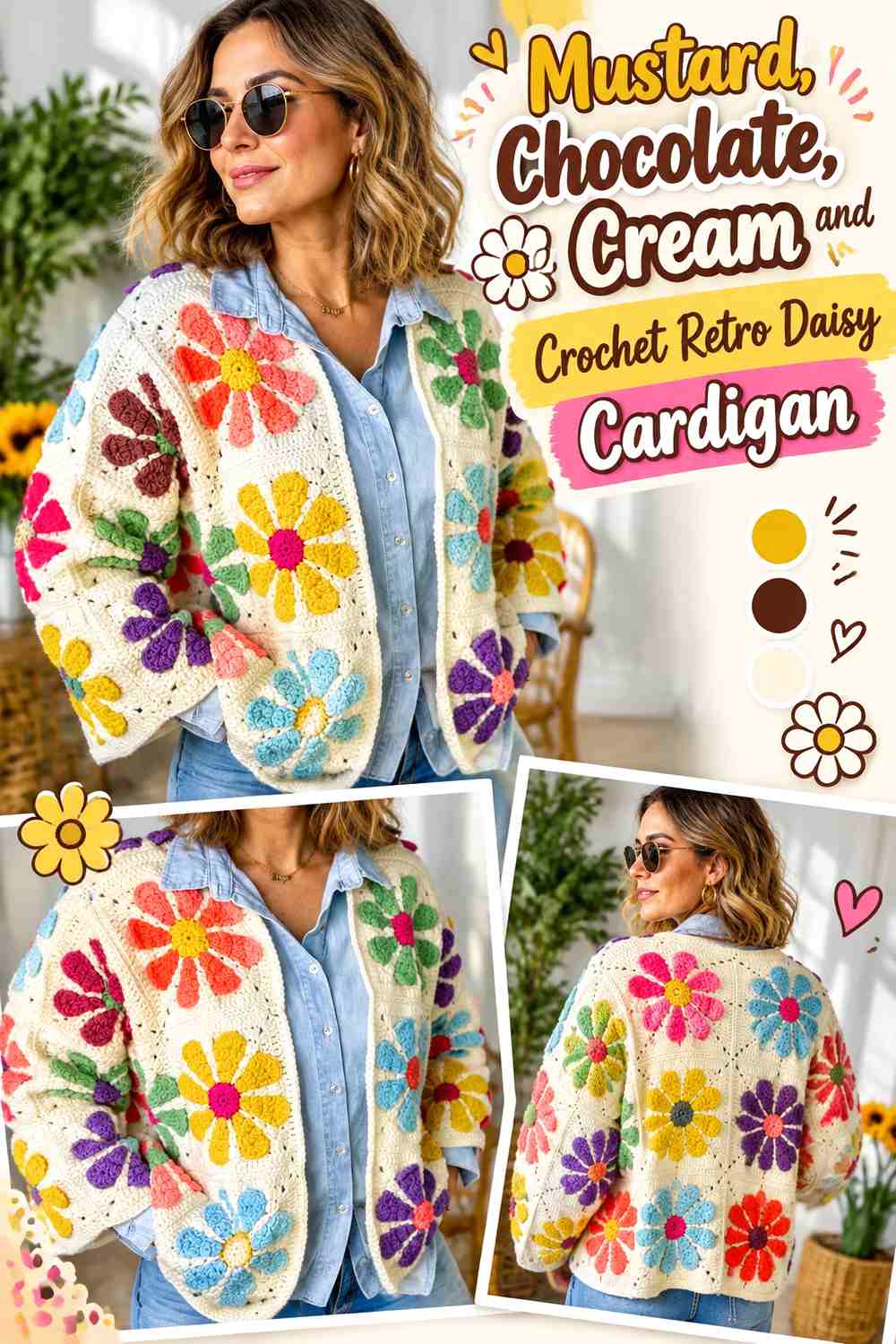
Mustard, chocolate, and cream create one of the clearest 1970s-inspired directions in the collection without requiring a rainbow palette. Mustard can lead the cardigan, chocolate anchors the joins or centers, and cream gives each daisy enough light space to remain visible.
Mustard Can Lead the Retro Crochet Cardigan Surface
Use mustard as the repeated background or one of the largest visual areas if the goal is a warmer vintage statement. Because mustard is already noticeable, the flower pattern does not need many additional strong colors. A controlled three-color scheme keeps repeated granny squares from looking overly busy.
Cream Keeps Mustard Daisy Petals From Looking Heavy
Cream is useful for petals because it creates a clear light break against mustard. If you reverse the placement and use cream as the cardigan background, the finished result will feel much lighter and less autumnal. Decide which overall direction you prefer before producing a large set of motifs.
Chocolate Gives Mustard and Cream Daisy Squares Definition
Chocolate can define centers, joins, or selected borders. Use it where the square structure needs visual weight, especially around the cardigan edges or between lighter motifs. Avoid letting chocolate occupy so much of the flower that the cream petals lose their clean outline.
Creator Credit: Frisian Knitting tutorials
13. Navy, Cornflower Blue, and Ivory Crochet Flower Granny Square Cardigan

A blue-on-blue floral cardigan gives the vintage theme a cooler direction. Navy supplies the darkest frame, cornflower blue carries the main flower color, and ivory keeps detailed motifs readable. The limited hue family can make a busy granny-square layout feel more controlled.
Navy Can Organize Cornflower Blue Crochet Flower Squares
Navy is useful as an outer square color, join, or front-edge shade because it gives the repeated grid a consistent anchor. Keep it away from the smallest flower details if those details need to stay visible. On sleeves, repeating the same navy framing strategy can help the garment feel connected to the body panels.
Cornflower Blue Gives Navy a Softer Vintage Transition
Cornflower blue can lead the petals or middle sections of each flower motif. Its lighter value prevents the cardigan from becoming too dark while still keeping the palette tonal. If you substitute another blue, choose one clearly lighter than navy so the motif structure does not disappear.
Ivory Keeps Navy and Cornflower Blue Motifs Separated
Ivory should appear where the eye needs a visual pause: flower centers, selected petals, or narrow square sections. Because it is the lightest color, even small amounts will be noticeable. Repeat it consistently instead of placing large ivory sections randomly across a few squares.
Creator Credit: Kunuz Crochet & Knitting
14. Forest Green, Cranberry, and Cream Crochet Vintage Flower Sweater

Forest green and cranberry create a richer vintage sweater palette, but cream prevents the combination from becoming too dark. Keep green dominant, use cranberry for the flower statement, and reserve cream for separation and highlights.
Forest Green Gives Cranberry Flowers a Deep Sweater Background
A forest green sweater body provides enough darkness for cranberry flowers to feel rich rather than bright. Because both colors can be medium-to-dark, test them together before repeating the motif. If their grayscale values are similar, cream becomes essential around the petal edges or centers.
Cranberry Should Be Concentrated in the Main Flower Areas
Use cranberry where you want the floral makeover to attract attention—across a shoulder, upper chest, sleeve, or selected panel. Avoid adding cranberry stripes and cuffs everywhere unless a stronger two-color sweater is intentional. Restricting it primarily to flowers keeps the makeover theme clear.
Cream Can Rescue Low Contrast Between Forest Green and Cranberry
Cream is not merely decorative in this palette; it can solve visibility problems. A cream center, small outer petal, or nearby accent can keep cranberry flowers distinct from dark green. Use it selectively so the sweater still reads as forest green and cranberry rather than green and cream.
Creator Credit: Annie Ahmed’s Crochet Corner
15. Black, Antique Cream, and Muted Gold Crochet Vintage Daisy Cardigan
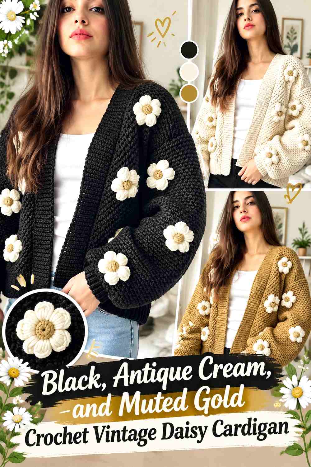
Black creates the highest-contrast vintage base in the collection. Antique cream keeps the daisy petals clear, while muted gold adds warmth to centers and small details. This palette works particularly well when the flower arrangement is disciplined, because every light motif will be highly visible against black.
Black Makes Antique Cream Crochet Daisies the Main Cardigan Feature
Use black across the main body or background if you want flower shapes to read immediately. The strong light-dark difference means you can use fewer flowers and still create a noticeable makeover. Leave black negative space around raised daisies rather than covering every panel.
Antique Cream Softens the Contrast Against Black
Bright white would create a sharper graphic effect, while antique cream gives the cardigan a softer vintage direction. Use the cream consistently for petals or motif borders so the daisies remain recognizable. If the cardigan includes ribbing or edging, black usually keeps the floral surface more dominant than a broad cream border would.
Muted Gold Adds Warm Centers Without Competing With Black
Keep muted gold to flower centers, tiny details, or a narrow repeated accent. Because black makes even medium-value colors look stronger, you do not need much gold to make it visible. If the chosen gold feels too bright, move toward ochre or a softened mustard while preserving enough difference from black.
Creator Credit: Elif Hobi
How to Choose Between These Vintage 3D Flower Sweater Palettes
Choose antique cream and dusty rose when you want a light romantic vintage look, or faded sage and blush when you prefer a softer botanical direction. Chocolate, rust, mustard, olive, terracotta, and cocoa work well for earthier retro makeovers, while lavender, powder blue, dusty teal, and cornflower create cooler alternatives.
For stronger contrast, the charcoal-and-pink, forest-green-and-cranberry, or black-and-antique-cream palettes make raised flowers particularly visible. For a subtler makeover, choose neighboring values such as lavender and plum or navy and cornflower, then use cream or ivory only where the motifs need more separation.
The flower placement matters as much as the palette. A few repeated clusters can preserve more of the original sweater surface, while flower granny squares or allover floral construction turn the motifs into the garment’s main visual structure.
Conclusion
A successful crochet vintage sweater makeover with 3D flowers starts with a clear color hierarchy. Decide which shade belongs to the sweater body, which belongs to the flowers, and which color exists only to provide definition. That simple distinction prevents three-color palettes from becoming visually crowded.
For a softer result, start with antique cream and dusty rose, faded sage and buttercream, or powder blue and ivory. For an earthy retro sweater, compare chocolate and mustard, olive and terracotta, or cocoa and rose. For a more dramatic floral layer, charcoal and dusty pink, forest green and cranberry, or black and antique cream provide stronger contrast.
Use the linked creator tutorials for the exact crochet construction, motif, joining, sizing, and finishing information that applies to each project. Plan your palette separately, make a small color test when possible, and check the flower visibility before repeating the same combination across an entire sweater.
Frequently Asked Questions
How can I make 3D crochet flowers stand out on a vintage sweater?
Create enough light-dark contrast between the flowers and the sweater surface. The hues do not have to be opposites, but the petals should remain distinguishable from the background. If the colors are similar in value, use a lighter center, darker outline, contrasting leaf, or visible neutral space around the motif.
Should 3D flowers match the crochet sweater cuffs and edging?
They can, but they do not need to. Repeating one flower color in a narrow cuff or edge can connect the palette, while keeping the edging in the main sweater color puts more attention on the flowers. Avoid adding every flower color to every finishing area unless a strongly multicolor look is intentional.
How many colors work well for a vintage crochet flower sweater?
Three colors often provide enough variety for a dominant sweater shade, a flower color, and a supporting accent, but there is no fixed requirement. Two-color palettes can look very controlled, while larger palettes require more planning so several strong shades do not compete in equal amounts.
How can I check whether two vintage yarn colors have enough contrast?
Place the yarns or finished swatches side by side and look at them from a distance. A grayscale phone photo can also help reveal whether two different hues have nearly the same light-dark value. If they merge, introduce a lighter or darker shade around the flower details that need definition.
Can I add 3D crochet flowers to only one part of a sweater?
Yes. A shoulder cluster, upper-chest arrangement, sleeve detail, cuff accent, or cardigan-front arrangement can create a clear makeover without covering the whole garment. Repeat a small amount of the same color elsewhere if the main cluster feels visually isolated.
What should I preserve when substituting colors in a vintage flower palette?
Preserve the role of each shade rather than searching for an exact color name. If the sweater body is a muted medium tone, replace it with another muted medium tone. If the flower is much lighter than the body, keep that light-dark relationship so the motif remains visible after the substitution.