Frost blue gives a granny square cardigan a cool, softened base that can move in several directions depending on the supporting colors. Pair it with white or cream and the cardigan becomes lighter and clearer. Add navy, charcoal, or deep teal and each square gains a stronger frame. Warm neutrals, pinks, and muted greens can soften the cool blue without taking attention away from it.
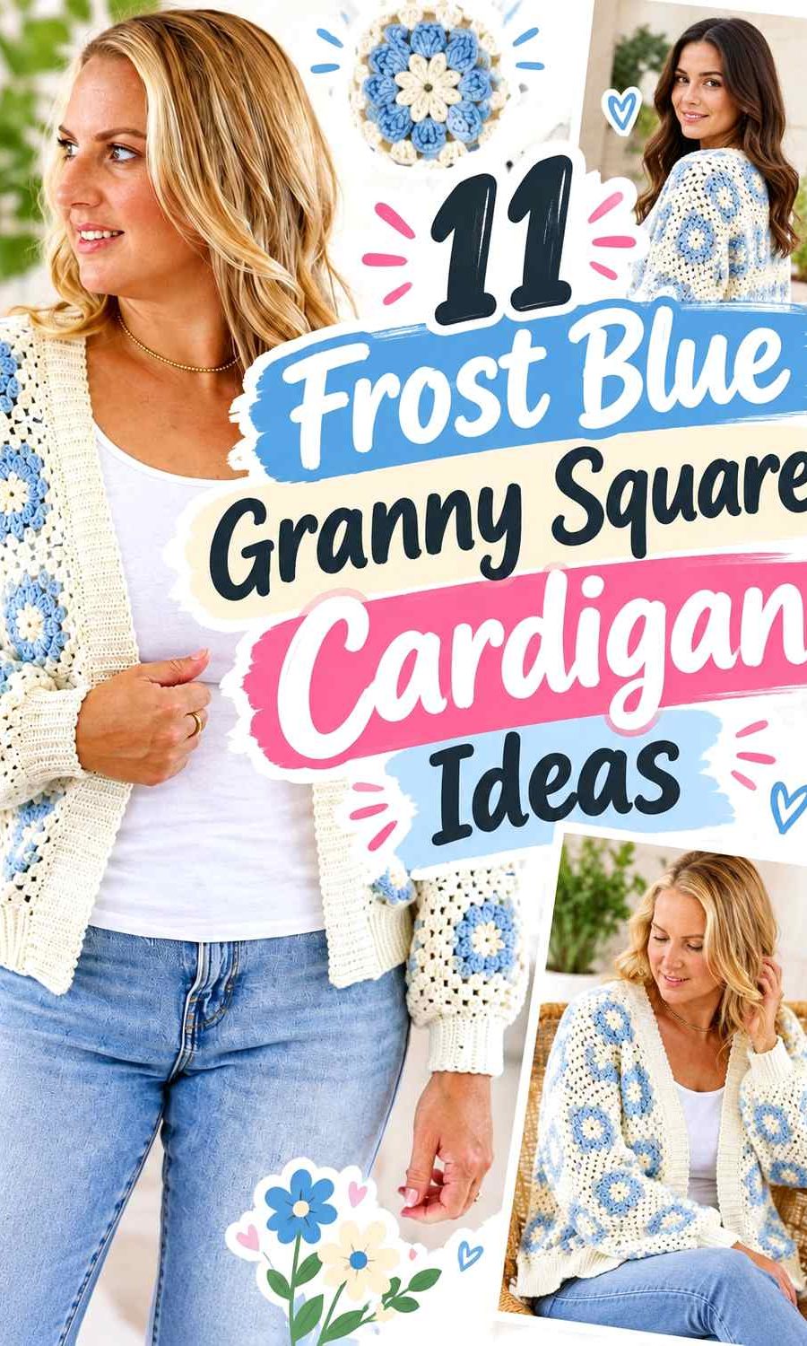
Granny square cardigans are especially useful for color planning because the palette can be controlled at several levels. Frost blue can fill motif centers, outer rounds, joining areas, whole squares, sleeves, cuffs, or the front band. That means two cardigans can use the same main blue and still look very different simply because the supporting colors occupy different parts of the garment.
The ideas below keep frost blue central while varying motif contrast, joining color, panel balance, edging, and accent placement. The credited tutorials support the cardigan construction concepts; the frost blue palettes are independent color directions you can adapt to a compatible project.
Quick List
- Frost Blue And Cream Crochet Floral Granny Square Cardigan
- Frost Blue And Navy Crochet Cropped Granny Square Cardigan
- Frost Blue And Blush Pink Crochet Daisy Granny Square Cardigan
- Frost Blue And Soft Gray Crochet Zippered Granny Square Cardigan
- Frost Blue And Mustard Crochet Sunflower Granny Square Cardigan
- Frost Blue And Charcoal Crochet Patchwork Granny Square Cardigan
- Frost Blue And Lavender Crochet Retro Daisy Granny Square Cardigan
- Frost Blue And Snow White Crochet Buttoned Granny Square Cardigan
- Frost Blue And Sage Green Crochet Relaxed Granny Square Cardigan
- Frost Blue And Camel Crochet Giant Granny Square Cardigan
- Frost Blue And Deep Teal Crochet Traditional Granny Square Cardigan
Decide Where Frost Blue Should Appear in the Granny Squares
Frost blue does not have to occupy every part of every motif. If you want the cardigan to read immediately as blue, repeat frost blue consistently in a major area such as the outer round of each square or across most motif backgrounds. That creates continuity even when the centers change color.
Using frost blue only in small motif centers creates a different effect. The cardigan may read first as cream, charcoal, or another dominant border color, with frost blue acting more like an accent. Before making a large stack of squares, arrange several sample motifs together and check which color appears to control the overall panel.
The front panels deserve particular attention because they are viewed separately on an open cardigan. A balanced color rhythm on the back can look uneven when divided between two fronts, so plan the whole garment rather than treating each square as an isolated color exercise.
Use Frost Blue Joins to Control a Multicolor Cardigan
The joining color can influence the finished cardigan almost as much as the motif colors. Frost blue joins create a softer grid when the squares already contain pale or muted shades. Charcoal or navy joins produce stronger outlines and make individual motifs easier to distinguish.
For a frost-blue-centered cardigan, repeating the blue in the joins can also connect squares that use different accent colors. This is especially useful with floral motifs, where cream, pink, yellow, or green centers could otherwise make the garment feel visually scattered.
Check the value of the join against the outer round of each square. A join that is nearly identical in lightness can blend into the motif edge, while a darker or lighter join produces a more visible patchwork structure. Neither result is automatically preferable; the important part is choosing it intentionally.
Keep Frost Blue Visible Across the Sleeves, Cuffs, and Front Edge
A cardigan can lose its color hierarchy if the body follows one palette and the sleeves introduce an unrelated arrangement. Repeat frost blue somewhere on both sleeves so they remain connected to the front and back panels.
The front band, cuffs, and lower edge are useful places for another repetition. If frost blue already dominates the squares, you might use a secondary shade for the edging. If frost blue appears only inside the motifs, a frost-blue front band or cuff can strengthen its role and pull the garment together.
1. Frost Blue And Cream Crochet Floral Granny Square Cardigan
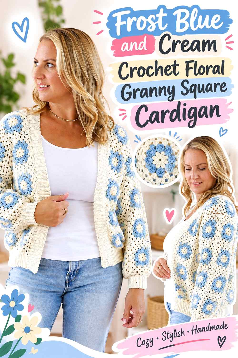
Frost blue and cream create a low-stress way to introduce floral motifs without making every flower compete for attention. Let frost blue cover a substantial part of the square backgrounds or outer rounds, then use cream to separate flower details from the blue. On a cardigan, repeating that same relationship across the front, back, and sleeves keeps the floral surface cohesive rather than turning each panel into a different color story.
Frost Blue Should Repeat Around the Floral Granny Squares
If frost blue appears in the outer area of most floral squares, it becomes a visual bridge between different flowers. That repetition is especially useful across the shoulders and sleeves, where motif placement can otherwise appear fragmented once the cardigan is assembled.
Keep the frost-blue placement consistent enough to establish a rhythm, but the flower centers do not all need identical treatment. The key checkpoint is whether the blue still forms a recognizable thread from one square to the next when several motifs are viewed together.
Cream Can Keep Frost Blue Flower Details From Merging
Use cream where smaller flower elements need more separation from frost blue. A cream petal, center, or narrow motif round can create a lighter break without introducing another saturated color.
If your frost blue yarn is very pale, check the two yarns side by side before making many motifs. A pale blue and warm cream may produce a deliberately gentle effect, but if their values are almost identical, small floral details can become less distinct.
Frost Blue Edging Can Reconnect the Floral Cardigan Panels
When the motifs already contain several cream details, using frost blue along the front opening or lower edge can return attention to the article’s main color. It also prevents cream from becoming dominant simply because it appears in every flower.
Creator Credit: Bella Coco
2. Frost Blue And Navy Crochet Cropped Granny Square Cardigan
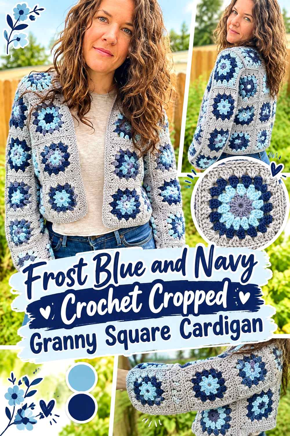
A cropped granny square cardigan gives frost blue and navy a compact area in which to create a clear light-dark hierarchy. Frost blue can lead across the majority of the motifs, while navy provides darker centers, outer rounds, joins, or edging. Because the cardigan body is shorter, repeated dark bands can quickly occupy a large percentage of the visible surface, so navy works particularly well when used with restraint.
Frost Blue Should Cover More of the Cropped Cardigan Than Navy
Let frost blue occupy the larger motif areas if you want the cardigan to remain visibly frost blue. Navy can then define selected rounds or the edges of the cardigan without splitting the shorter body into heavy dark blocks.
This balance matters around the lower edge. A very wide navy band on a cropped body can visually shorten the blue section even further, while a narrower navy finish keeps the frost-blue motifs prominent.
Navy Can Give Frost Blue Granny Squares a Clearer Outline
Navy is useful when pale frost-blue squares need stronger definition against one another. Consider using it in the final motif round or joining area rather than inserting navy randomly into every part of the square.
A repeated dark outline creates an intentional grid across the cardigan. If you prefer a softer patchwork surface, move navy toward smaller centers or cuffs and let frost blue handle the joins.
Frost Blue Cuffs Can Balance a Navy Cardigan Edge
If navy already frames the body, frost-blue cuffs can stop the darker color from surrounding the entire garment. This keeps some uninterrupted blue at the ends of the sleeves and reinforces the main palette color when the cardigan is viewed from the front.
Creator Credit: Off the Beaten Hook
3. Frost Blue And Blush Pink Crochet Daisy Granny Square Cardigan
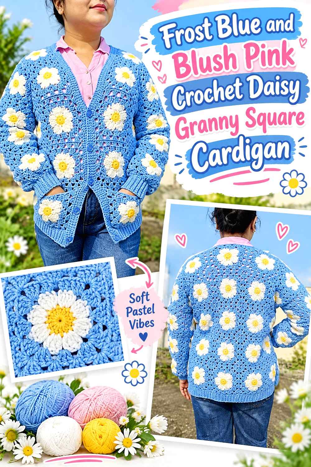
Frost blue and blush pink create a softer floral direction for a daisy granny square cardigan. Frost blue can establish the background or repeated outer border, while blush gives flower centers or selected petals a warmer shift. A light neutral can still be added in tiny amounts when a daisy shape needs extra definition, but the cardigan will look more controlled if blue and blush remain the two obvious palette leaders.
Frost Blue Should Anchor the Daisy Granny Square Background
Using frost blue consistently around the daisies helps the flowers read as part of one cardigan instead of a collection of unrelated motifs. This is particularly useful when squares continue onto the sleeves or pockets, where an inconsistent background can interrupt the visual flow.
Lay several completed motifs next to each other before joining. The test is whether you notice the frost-blue field first and the daisy variation second.
Blush Pink Can Warm Frost Blue Without Dominating the Daisies
Blush is most effective when its role is clear. Use it for flower centers, selected petal sections, or occasional motif rounds rather than filling every available area with pink.
If the blush becomes equal in area to frost blue, the cardigan may read as a balanced blue-and-pink patchwork rather than a frost-blue design. That can be intentional, but decide before repeating the arrangement across all panels.
Frost Blue Pockets Should Coordinate With the Cardigan Motif Grid
When pockets are part of a granny square cardigan, their color placement can either blend into the panel or become a deliberate feature. Keeping frost blue in the pocket’s outer area can help it connect with surrounding squares, even if the daisy center introduces blush.
Before attaching pockets, place them against the completed front panels and check whether the motif direction and blue borders line up visually.
Creator Credit: Cute Crochet
4. Frost Blue And Soft Gray Crochet Zippered Granny Square Cardigan
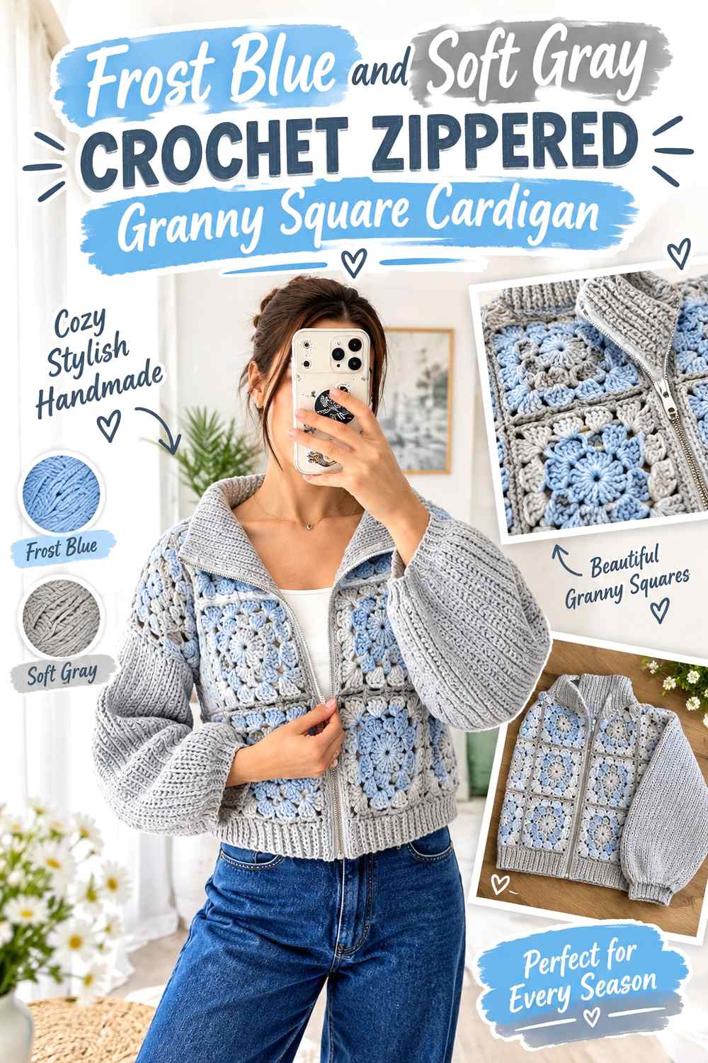
Frost blue and soft gray create a restrained palette that works well with a more defined zip-front cardigan. Frost blue can dominate the granny squares while gray supports the joins, cuffs, and front edges. Because the zipper already creates a strong vertical line through the cardigan, the color scheme does not need another aggressive divider.
Frost Blue Should Remain Continuous Beside the Zipper
Keep enough frost blue close to both sides of the front opening that the two cardigan panels still look connected when the zipper is open. If gray takes over wide bands beside the closure, the blue squares can appear pushed away from the center.
A narrower gray edge provides separation without turning the entire front into a gray frame.
Soft Gray Can Join Frost Blue Granny Squares Quietly
Soft gray is useful when you want the square layout visible but do not want dark seams. A medium or light gray joining area can sit close enough to frost blue for a blended surface while still creating a subtle boundary.
Check the yarn values before committing. If gray and frost blue are nearly identical, decide whether an almost seamless transition is actually what you want.
Frost Blue Cuffs Can Prevent Too Much Soft Gray at the Edges
If gray is already present around the zipper and joins, using frost blue at the cuffs can keep the cardigan from becoming edge-heavy. Alternatively, use mostly blue cuffs with a narrow gray detail so the sleeve finish references the front without copying it exactly.
Creator Credit: nora.moon.crochet
5. Frost Blue And Mustard Crochet Sunflower Granny Square Cardigan

Mustard gives frost blue one of the strongest warm-cool contrasts in this collection. It suits a sunflower motif because a relatively small yellow area can remain noticeable against the blue. Frost blue should handle most backgrounds or outer motif rounds, while mustard stays concentrated where the flower shape needs attention.
Frost Blue Should Surround the Mustard Sunflower Motifs
A consistent frost-blue background gives the mustard flowers enough negative space to stay readable. If mustard expands through several outer rounds as well as the flower centers, the cardigan can quickly become yellow-led.
Keep frost blue visible between neighboring flowers so the eye can distinguish individual granny squares instead of seeing one uninterrupted warm field.
Mustard Needs Clear Limits Against Frost Blue
Mustard is visually assertive, so start with smaller areas and evaluate several squares together. A sunflower center or petal area may provide all the warm color the cardigan needs.
If the accent feels disconnected, repeat a very small mustard detail elsewhere rather than increasing the size of every flower. Controlled repetition is usually more effective than simply adding more yellow.
Frost Blue Joins Can Calm a Busy Sunflower Cardigan
Frost-blue joins are particularly useful when mustard flowers already provide plenty of contrast. The blue grid connects the squares to the background and avoids introducing a third strong outlining color.
If you choose a darker join instead, check whether the combination of dark outlines and mustard flowers makes the cardigan busier than intended.
Creator Credit: LoopsByLisa
6. Frost Blue And Charcoal Crochet Patchwork Granny Square Cardigan
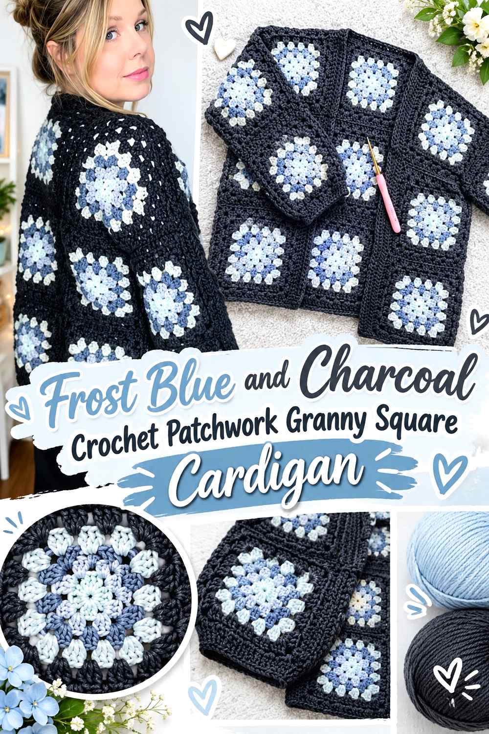
Charcoal can give a frost-blue patchwork cardigan a distinctly graphic grid. Let blue occupy the motif interiors while charcoal frames the squares, joins panels, or finishes the cuffs. This is a higher-value-contrast option than soft gray, so the square layout becomes a visible part of the garment from farther away.
Charcoal Can Frame Frost Blue Granny Squares Without Taking Over
The final round of each square is an effective place for charcoal because it outlines the motif while leaving the center visibly frost blue. When all squares share the same charcoal boundary, even small variations inside the motifs can look more connected.
Avoid automatically repeating charcoal through every round. The darker color gains visual area quickly once dozens of square borders are placed together.
Frost Blue Needs Enough Uninterrupted Area in a Charcoal Grid
A cardigan made from small motifs can contain a surprising amount of joining color. Look at an entire front or back panel rather than judging one square. If charcoal dominates once the pieces are assembled, increase the frost-blue area inside future squares or reduce the dark border width in a compatible layout.
Frost Blue Front Edging Can Soften the Charcoal Patchwork Effect
If charcoal already defines every square, using frost blue around the front opening can prevent another dark outline from enclosing the whole cardigan. This creates a quieter outer boundary while preserving the charcoal grid inside the garment.
Creator Credit: Selina Veronique Crochet
7. Frost Blue And Lavender Crochet Retro Daisy Granny Square Cardigan
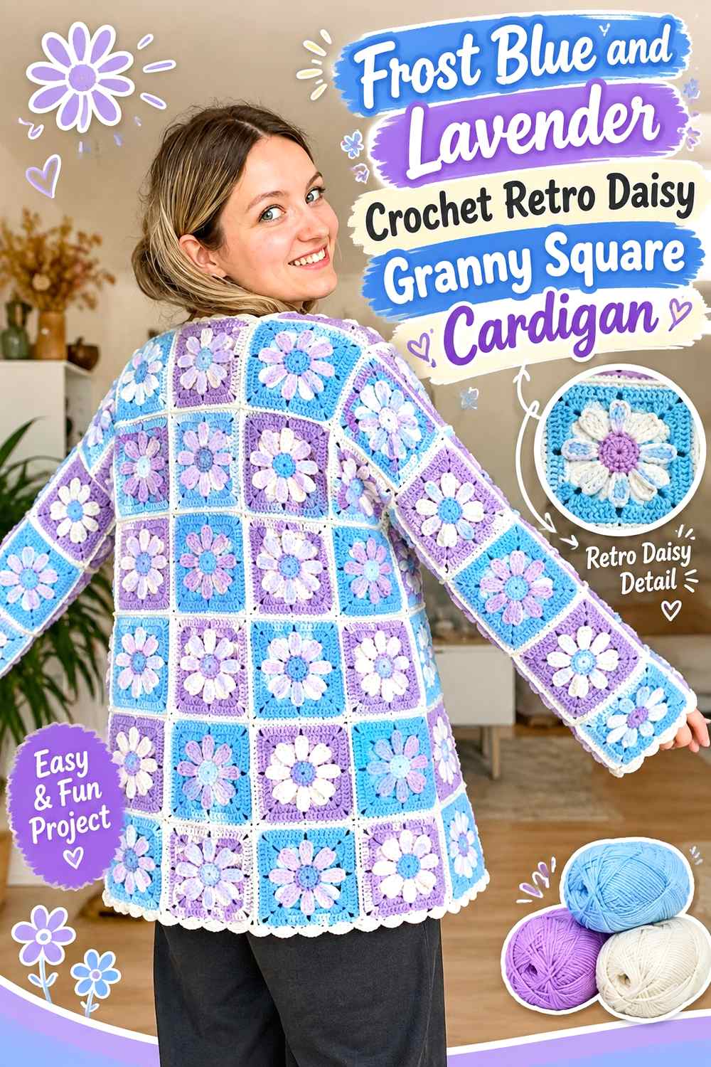
Frost blue and muted lavender keep a retro daisy cardigan within a cool, softened family. Because the two hues can be close in value, this palette is less about dramatic contrast and more about controlled color transitions. Frost blue should repeat in a consistent part of each square so the lavender does not blur the cardigan’s main color identity.
Frost Blue Should Define the Retro Daisy Square Structure
Use frost blue for an outer motif round or another repeated structural area. This gives the cardigan a recognizable blue framework even when lavender occupies the daisy itself.
On the front panels, check that frost-blue rounds appear in a balanced rhythm on both sides. A retro motif can look intentionally irregular, but the main color should not disappear from one side of the garment.
Lavender Needs Enough Separation From Frost Blue Daisies
Muted lavender and frost blue can be visually close. If the flower needs to remain obvious, compare the yarns in grayscale or place the sample square at normal viewing distance.
If the motif disappears, choose a lavender that is noticeably lighter or darker while keeping its muted character. The important feature to preserve is the cool blue-purple relationship, not an exact commercial shade.
Frost Blue Cuffs Can Keep Lavender From Spreading Too Far
When lavender already appears repeatedly in flower motifs, frost-blue cuffs and edging can restore a calmer outer frame. That gives the cardigan a clear color hierarchy: frost blue supplies continuity while lavender supplies motif variation.
Creator Credit: by kristine
8. Frost Blue And Snow White Crochet Buttoned Granny Square Cardigan
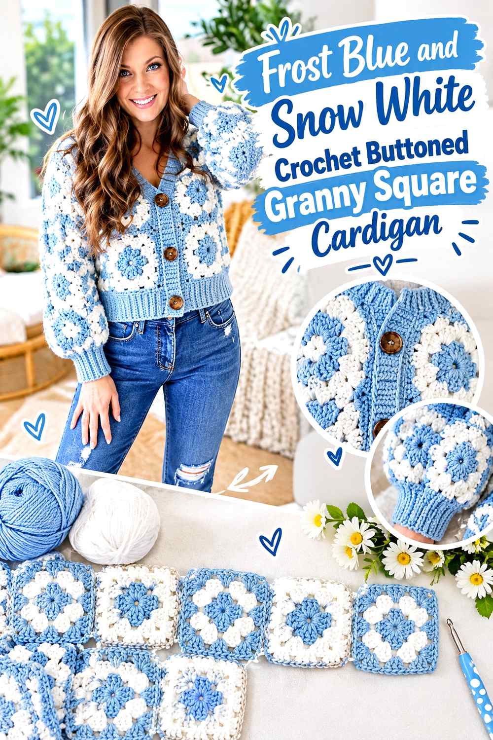
Snow white gives frost blue crisp value contrast and can make the structure of a buttoned granny square cardigan particularly clear. Frost blue can dominate the motifs, while white appears in centers, borders, or the front band. Because the button area naturally attracts attention, consider how much additional white is needed before repeating it around every other edge.
Frost Blue Should Lead the Buttoned Granny Square Panels
Use frost blue across enough of the front motifs that the cardigan still reads as one blue garment when it is closed. A consistent blue outer round can help individual squares meet visually across the buttoned front.
This is especially important when the interior motifs contain several white details, because closing the cardigan brings both front panels together and increases the amount of visible pattern in the center.
Snow White Can Clarify Frost Blue Motifs Around the Front
White can separate blue motif rounds and make small granny-square details easier to distinguish. Use it where that contrast contributes something specific, such as around motif centers or on a controlled front band.
If every square has a wide white border and the cardigan also receives white cuffs and edging, the white may become more visually dominant than expected.
Frost Blue Ribbing Can Balance Snow White Button Details
A frost-blue cuff or lower band can provide a solid visual rest after repeated white accents in the motifs. If the front band is white, blue sleeve finishes can also distribute the main color toward the outer edges of the cardigan.
Creator Credit: MJ’s Off The Hook Designs
9. Frost Blue And Sage Green Crochet Relaxed Granny Square Cardigan
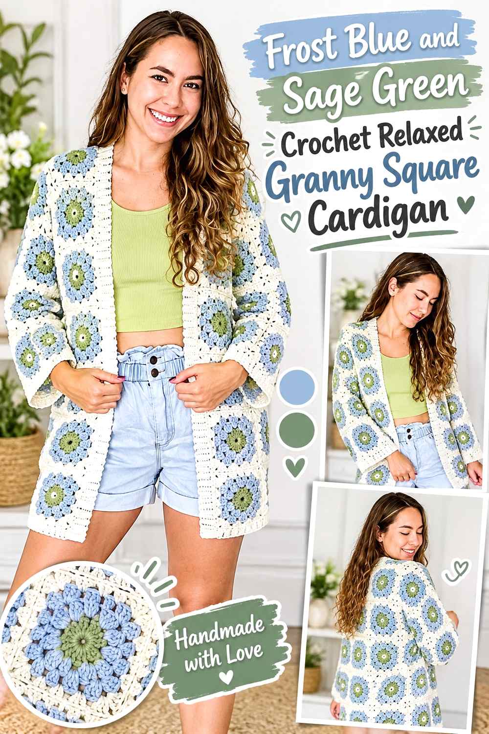
Frost blue and sage green create a muted analogous-feeling direction without requiring the two colors to match closely. Use frost blue as the repeating anchor across the cardigan and sage as a supporting motif color. Because both shades are softened, the result depends heavily on value contrast and deliberate placement rather than dramatic hue differences.
Frost Blue Should Repeat Across a Relaxed Cardigan’s Larger Panels
A relaxed cardigan can show a broad field of squares across the back and sleeves. Repeating frost blue at regular intervals stops sage from collecting in one area and making the garment look unintentionally divided.
Arrange completed motifs in approximate panel positions before joining. This makes it easier to spot a sleeve, shoulder, or front section that has lost too much frost blue.
Sage Green Should Support Frost Blue Instead of Matching It Too Closely
If sage and frost blue have almost identical lightness and saturation, the motif changes may be difficult to see. That can work for a very blended cardigan, but it is worth checking before committing to a large number of squares.
For clearer differentiation, preserve the muted green character while choosing a sage that is slightly lighter or darker than the blue.
Frost Blue Edging Can Unify Sage Green Sleeves and Body Panels
Using frost blue along the outer cardigan edge creates a common boundary around mixed blue-and-green motifs. This is especially useful when sleeve placement differs slightly from the body panel arrangement.
The border does not need to be heavy. Even a visually modest repeated blue edge can reconnect the palette around the garment.
Creator Credit: Yarnmaide
10. Frost Blue And Camel Crochet Giant Granny Square Cardigan
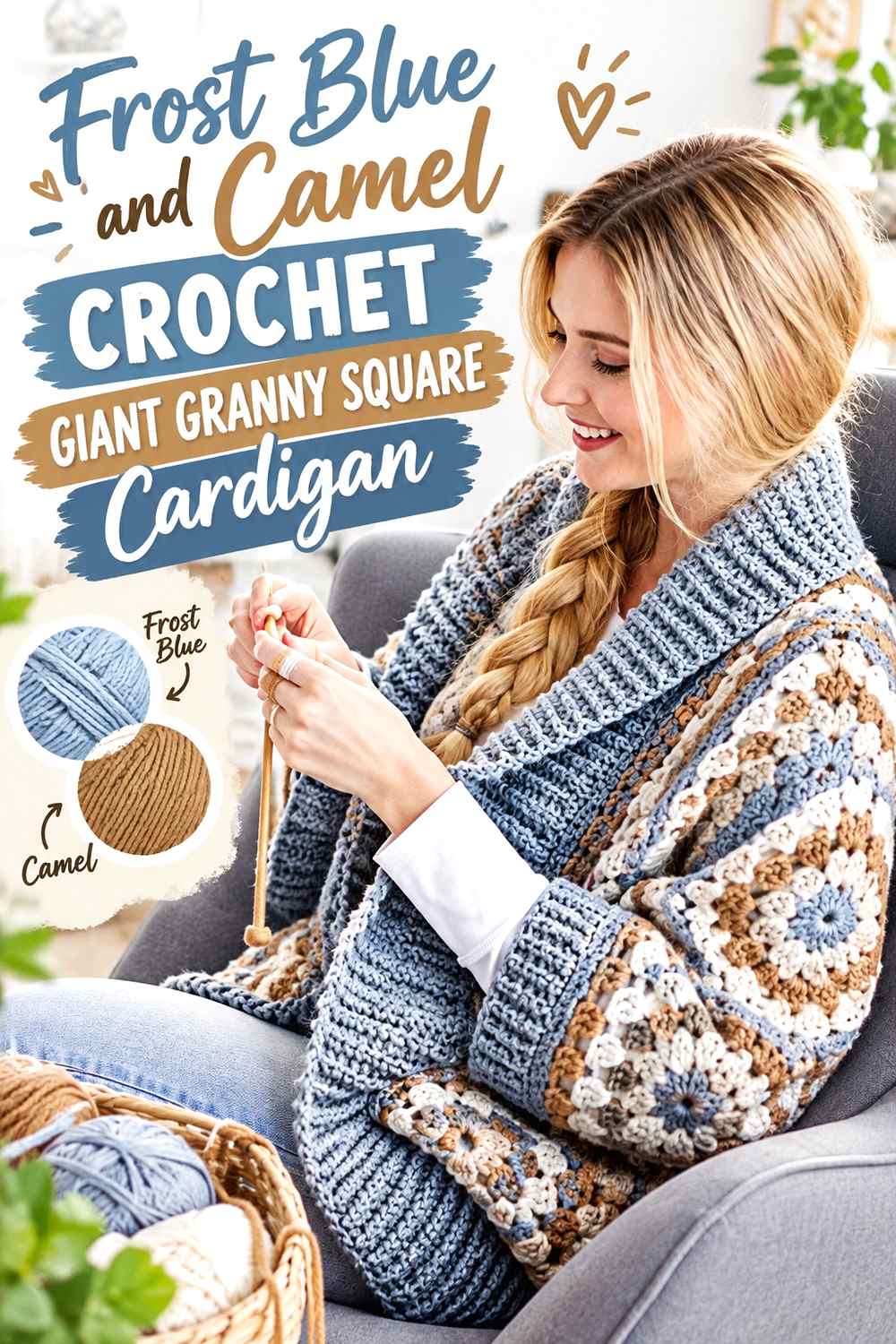
A giant granny square construction magnifies every color decision because each round occupies a broad visible area. Frost blue and camel provide a cool-versus-warm neutral contrast that can remain wearable without becoming dull. Use frost blue for the largest share of the oversized square and camel for selected rounds rather than alternating the two mechanically in equal widths.
Frost Blue Needs the Largest Visual Share in Giant Granny Squares
With oversized motifs, one broad camel section can change the perceived dominant color of the whole cardigan. Plan the round distribution while looking at the finished square as a complete unit rather than deciding color changes one round at a time.
If the cardigan is meant to read as frost blue, keep the most visually expansive areas blue.
Camel Can Break Up Large Frost Blue Areas Without Harsh Contrast
Camel introduces warmth but does not create the severe outline of black or charcoal. Use it when a giant frost-blue square needs a visual break while retaining a softened overall palette.
A small amount of camel may look insignificant in a yarn ball but become substantial once the motif grows, so reassess the color balance as the square expands.
Frost Blue Cuffs Can Keep Camel From Framing the Whole Cardigan
If camel appears prominently in the giant squares, keep the cuffs or front finish frost blue to reinforce the main color. This prevents warm edging from enclosing already-large camel sections and shifting the entire garment toward the tan side of the palette.
Creator Credit: Yarnspirations
11. Frost Blue And Deep Teal Crochet Traditional Granny Square Cardigan
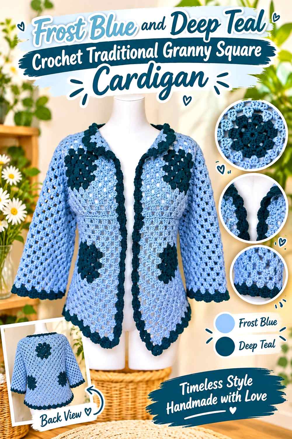
Deep teal gives frost blue a darker related accent without moving into a completely neutral palette. This combination is useful for a traditional granny square cardigan because teal can define the square structure while frost blue remains prominent inside each motif. The contrast is stronger than frost blue with dusty blue but softer in character than blue with black.
Deep Teal Can Define Frost Blue Traditional Granny Squares
Use teal for a repeated outer round or join if you want each traditional square to remain clearly visible. The darker outline creates separation across the body and sleeves while keeping the overall color story within blue-green territory.
Because every motif contributes its own teal boundary, keep an eye on the assembled panel rather than judging the amount from a single square.
Frost Blue Should Reappear Beyond the Granny Square Centers
If frost blue exists only in tiny centers while teal covers borders, joins, cuffs, and edging, teal will likely become the dominant color. Expand frost blue into another round or use it in the front finishing area if you want the cardigan to retain a clearly icy-blue identity.
Frost Blue and Deep Teal Need Contrast Around the Cardigan Edges
The front opening and cuffs are useful places to check whether the two colors remain distinct under normal lighting. Dark frost blue and muted teal can move closer together than expected.
If the edge detail disappears, preserve the same palette direction but increase the value difference between the two yarns.
Creator Credit: Nati Crochet
Comparing the 11 Frost Blue Granny Square Cardigan Palettes
For the clearest light contrast, pair frost blue with snow white or cream. These combinations make small motif changes easier to see and can lighten a cardigan containing many repeated squares.
Navy, charcoal, and deep teal create darker frameworks. Navy keeps the palette distinctly blue, charcoal emphasizes a neutral patchwork grid, and deep teal adds a blue-green direction. All three are useful when you want joins or motif edges to remain obvious.
Blush pink, lavender, and sage green produce softer color transitions. Blush introduces warmth, lavender keeps the cardigan cool, and sage adds a muted green note. These combinations benefit from checking light-dark value because different hues can still merge when their lightness is similar.
Mustard provides the strongest warm accent, especially in flower motifs, while camel offers a quieter warm neutral. Both work most effectively when frost blue retains the larger visual area.
Conclusion
The most important decision is not simply which shade looks attractive next to frost blue. Decide what job the second color should perform on the cardigan.
Choose cream or snow white when you want light separation around motifs. Navy, charcoal, and deep teal can define square borders and joins more strongly. Blush, lavender, and sage create softer transitions, while mustard and camel introduce warmth at very different intensities.
Then plan where frost blue will repeat across the complete garment. A consistent blue outer round, joining area, cuff, or front edge can connect separate granny squares into one color story. Before joining everything permanently, arrange enough motifs to represent a front panel, sleeve, or part of the back. That larger view makes it much easier to catch color imbalance than judging squares one at a time.
Use the original creator tutorials for exact construction, sizing, assembly, and finishing information while adapting the frost-blue palette to the yarns and contrast relationships you want.
Frequently Asked Questions
What colors work well with frost blue in a granny square cardigan?
Cream and white create lighter contrast; navy, charcoal, and teal provide darker definition; blush, lavender, and sage create softer color relationships; and camel or mustard add warmth. The useful choice depends on whether the supporting color needs to define motifs, blend with frost blue, or act as a small accent.
Should frost blue go in the center or border of a granny square?
Either can work, but the visual result is different. Frost blue centers make it a localized motif color, while repeated frost-blue outer rounds can connect many squares and make the whole cardigan read more clearly as blue. If frost blue is the main color you want people to notice, give it enough repeated visual area beyond tiny centers.
What joining color should I use with frost blue granny squares?
A frost-blue join creates continuity and a softer grid. Cream or white makes the divisions lighter, while navy, charcoal, or deep teal creates stronger outlines between motifs. Choose the join after arranging several squares together because its visual impact becomes much larger across a full cardigan panel.
How can I tell if two colors have enough contrast with frost blue?
Place the yarns together and look at them from a distance. You can also photograph them in grayscale to compare their light-dark values. Two different hues may still have similar value and visually blend, which matters when the colors need to define small flowers, borders, or motif rounds.
Should every frost blue granny square use the same color order?
Not necessarily. Changing the order can create controlled patchwork variation, but keep at least one repeated element if you want the cardigan to feel connected. For example, different centers can still share a frost-blue outer round or the same joining color.
How can I keep a multicolor frost blue cardigan from looking too busy?
Give the colors different roles. Let frost blue dominate, choose one supporting shade for substantial motif areas, and keep stronger accents in smaller sections. Repeating the same joining or border color also helps multiple square combinations feel related.
Where else should frost blue appear besides the granny squares?
The cuffs, front band, neckline edge, lower border, pocket edges, or sleeve finishing can repeat frost blue. These areas are particularly useful when the motifs contain several supporting colors and the cardigan needs a stronger visual connection between its separate panels.