Snowdrop White is a natural main color for a crochet snowflake window charm because it keeps the six-point shape recognizable while leaving plenty of room for subtle winter accents. Against glass, however, color behaves differently than it does on a table or Christmas tree. Bright daylight can reduce the visibility of a pale motif, while a darker window after sunset can make the same white stitches stand out strongly.

That makes placement of the supporting color important. Ice blue can define outer points, silver gray can emphasize openwork, and navy or charcoal can add enough contrast for the snowflake to remain readable against a bright daytime view. Softer shades such as blush, lavender, mint, and warm ivory create quieter changes when you want Snowdrop White to remain visually dominant.
The credited tutorials below teach standalone crochet snowflakes or hanging snowflake motifs that can be adapted as window charms. The proposed Snowdrop White palettes are independent color directions, so follow each creator’s tutorial for the actual snowflake construction and plan the color placement separately.
Quick List
- Snowdrop White And Ice Blue Crochet Snowflake Window Charm
- Snowdrop White And Silver Gray Crochet Snowflake Window Charm
- Snowdrop White And Frost Mint Crochet Snowflake Window Charm
- Snowdrop White And Champagne Gold Crochet Snowflake Window Charm
- Snowdrop White And Icy Lavender Crochet Snowflake Window Charm
- Snowdrop White And Midnight Navy Crochet Snowflake Window Charm
- Snowdrop White And Blush Pink Crochet Snowflake Window Charm
- Snowdrop White And Pewter Crochet Snowflake Window Charm
- Snowdrop White And Crystal Teal Crochet Snowflake Window Charm
- Snowdrop White And Soft Sage Crochet Snowflake Window Charm
- Snowdrop White And Cranberry Crochet Snowflake Window Charm
- Snowdrop White And Charcoal Crochet Snowflake Window Charm
- Snowdrop White And Pale Aqua Crochet Snowflake Window Charm
- Snowdrop White And Warm Ivory Crochet Snowflake Window Charm
- Snowdrop White Dusty Blue And Silver Gray Crochet Snowflake Window Charm
- Snowdrop White And Deep Plum Crochet Snowflake Window Charm
Let Snowdrop White Control the Snowflake Silhouette
Snowdrop White should normally cover most of the snowflake when it is the defining color of the charm. Keep the center, main spokes, or broadest stitch sections white, then use the supporting shade where the construction naturally changes at points, picots, outer arches, or a hanging loop.
A small hanging snowflake has less visual space than a blanket motif or pillow panel. Giving every round a different color can divide the shape into rings instead of allowing the eye to read one complete snowflake.
Check Snowdrop White Against the Actual Window
A palette that looks clearly separated on a dark table may behave differently against daylight. Before making several charms, hold one sample against the intended window and view it from across the room.
Snowdrop White may need a medium or dark accent if the outdoor background is consistently bright. Against a darker view, softer colors such as mint, blush, pale aqua, or ivory may provide enough distinction without turning the charm into a strongly outlined motif.
Keep Snowdrop White Points and Hanging Details Balanced
Window charms are viewed vertically, so uneven points, twisting loops, and off-center color placement are more noticeable than when a snowflake lies flat. Finish and shape the motif before deciding exactly where the hanging loop should sit.
If you make a group of charms, use Snowdrop White as the repeated element and change only the supporting colors. That gives a window display variety while keeping the individual snowflakes visually related.
1. Snowdrop White And Ice Blue Crochet Snowflake Window Charm

Ice blue creates a classic cool contrast without challenging Snowdrop White for dominance. Keep most of the center and spokes white, then place ice blue around selected tips or the final outer details. Against glass, the blue can help the pointed silhouette remain visible during the day while still keeping the charm light.
Snowdrop White Should Fill Most of the Ice Blue Snowflake
Use Snowdrop White across the connected center so all six arms belong visually to the same motif. Ice blue works better as a repeated outer accent than as alternating white-and-blue spokes, which can break the snowflake into separate segments.
Snowdrop White Looks Clearer With Ice Blue at the Outer Points
Place ice blue where the snowflake reaches its widest outline if you want the perimeter to show more clearly against daylight. Keep the blue narrow enough that the motif still reads as a white snowflake with an icy edge rather than a blue snowflake with white details.
Creator Credit: Anita Louise Crochet
2. Snowdrop White And Silver Gray Crochet Snowflake Window Charm

Silver gray keeps the palette neutral while giving Snowdrop White more definition. This pairing works particularly well on openwork snowflakes because gray can mark the outer structure without introducing a strong colored band around the motif.
Snowdrop White Can Keep Silver Gray Openwork Looking Light
Use Snowdrop White across the center and most open loops, then reserve silver gray for a final section or selected points. Too much gray can make a delicate charm look heavier when it is backlit.
Snowdrop White Needs Visible Separation From Silver Gray
Very pale gray may disappear beside white when the charm hangs in front of a bright sky. Test the two yarns at the window before committing, and choose a slightly deeper gray if the distinction is lost from normal viewing distance.
Creator Credit: Pattern and Craft
3. Snowdrop White And Frost Mint Crochet Snowflake Window Charm

Frost mint gives Snowdrop White a soft green-blue accent that feels lighter than forest or emerald tones. Keep the mint around small outer details or a narrow final section so the window charm retains its snowy appearance.
Snowdrop White Should Surround Frost Mint Snowflake Details
A large white center gives the pale mint enough context to remain recognizable. If both shades alternate in equal amounts, the low contrast may make the entire motif appear like one washed-out color from across the room.
Snowdrop White Can Separate Frost Mint Points From the Hanging Loop
If mint appears on the outer points, return to Snowdrop White for the hanging loop. This avoids creating one visually heavier mint section at the top of an otherwise balanced six-point motif.
Creator Credit: The Crochet Crowd
4. Snowdrop White And Champagne Gold Crochet Snowflake Window Charm

Champagne gold introduces warmth without moving too far away from the pale winter palette. It is most effective in controlled details, such as a center accent, selected picots, or a thin outer edge, while Snowdrop White handles the main snowflake structure.
Snowdrop White Should Dominate Champagne Gold Snowflake Points
Gold becomes noticeable quickly beside white, so a small amount can be enough. Keep the long spokes Snowdrop White and concentrate champagne around their ends if you want the accent to catch attention without changing the entire motif.
Snowdrop White Can Prevent Champagne Gold From Looking Too Heavy
Avoid filling the center and entire outer edge with gold at the same time. Leaving one of those structural zones Snowdrop White creates more breathing room and preserves the light window-charm effect.
Creator Credit: HappyBerry Crochet
5. Snowdrop White And Icy Lavender Crochet Snowflake Window Charm
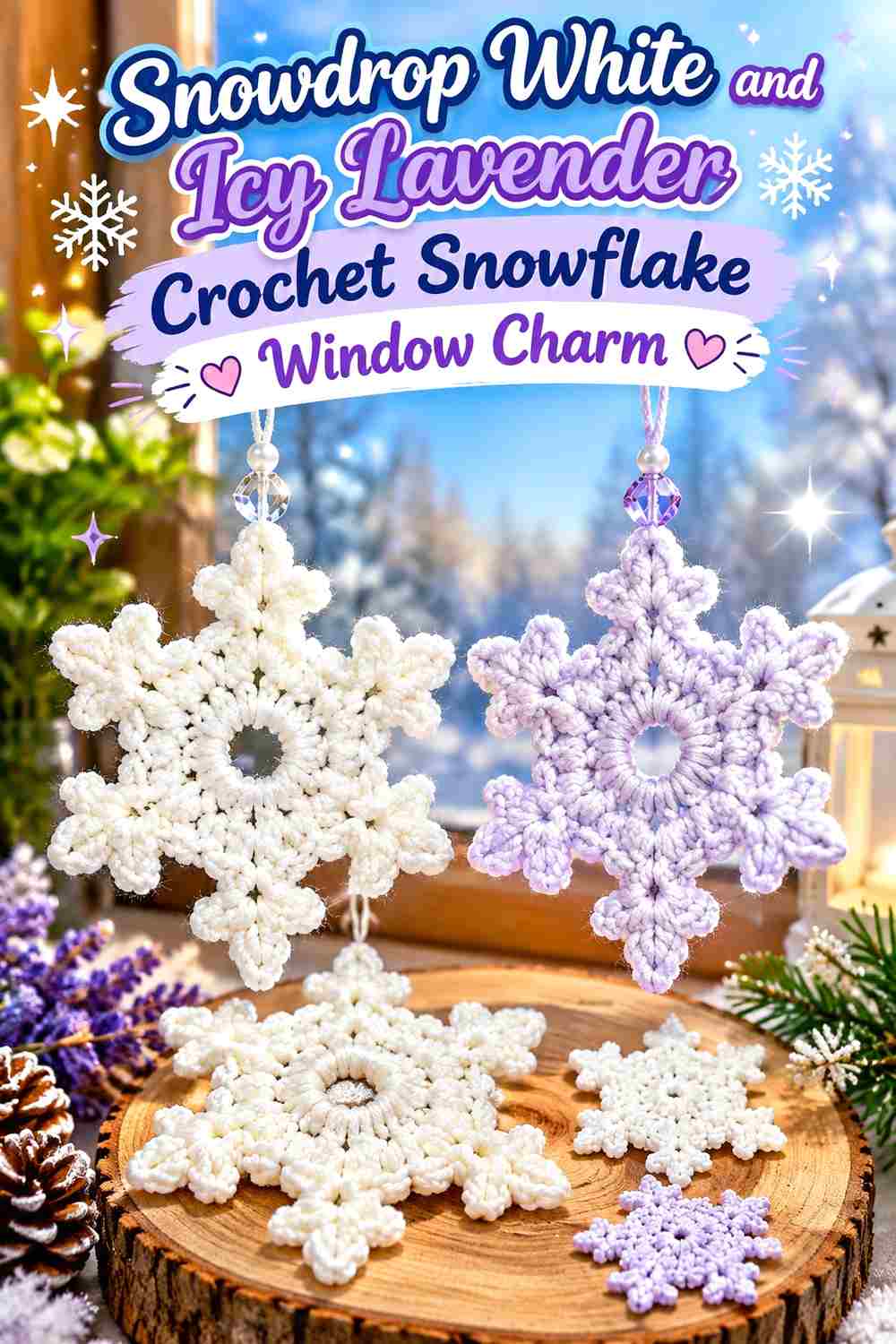
Icy lavender offers a subtle purple direction while staying light enough for a snowy palette. It works especially well when the snowflake has noticeable outer loops or raised sections that can carry the accent without interrupting the white center.
Snowdrop White Gives Icy Lavender a Clear Snowflake Background
Keep the central geometry white and place lavender farther toward the perimeter. This helps the purple act as a frost-like accent instead of changing the motif into a lavender ornament.
Snowdrop White Should Return After Icy Lavender Outer Details
If several tips use lavender, make the hanging loop Snowdrop White. Returning to the dominant color at the top keeps one purple point from appearing more important simply because it supports the charm.
Creator Credit: Jayda InStitches
6. Snowdrop White And Midnight Navy Crochet Snowflake Window Charm

Midnight navy provides much stronger contrast than the previous pastel combinations. This makes it useful for a window that receives strong daylight, where a completely pale snowflake may become difficult to distinguish.
Snowdrop White Needs More Surface Area Than Midnight Navy
Use Snowdrop White on most of the snowflake and keep navy to narrow outer points, a small center, or another clearly defined structural detail. Because navy is dark, even a limited amount can visually carry significant weight.
Snowdrop White Can Keep Midnight Navy From Dividing the Six Snowflake Arms
Avoid coloring alternating full arms navy if you want the motif to read as one white snowflake. Repeating smaller navy accents at the same location on all six arms gives contrast while preserving symmetry.
Creator Credit: Hooked by Robin
7. Snowdrop White And Blush Pink Crochet Snowflake Window Charm

Blush pink gives the window charm a softer winter direction that can work beyond strictly Christmas decor. The low-intensity pink is most useful at the center or outermost points, leaving Snowdrop White to form the recognizable snowflake body.
Snowdrop White Should Frame a Blush Pink Snowflake Center
A small blush center can introduce color without interfering with the six-arm outline. Surrounding it immediately with Snowdrop White prevents the pink from spreading visually into the rest of the motif.
Snowdrop White Makes Blush Pink Outer Points Look More Delicate
If you prefer the pink at the perimeter, limit it to small repeated tips rather than an entire broad final section. The white space between those accents helps each point stay distinct.
Creator Credit: Sirin’s Crochet
8. Snowdrop White And Pewter Crochet Snowflake Window Charm
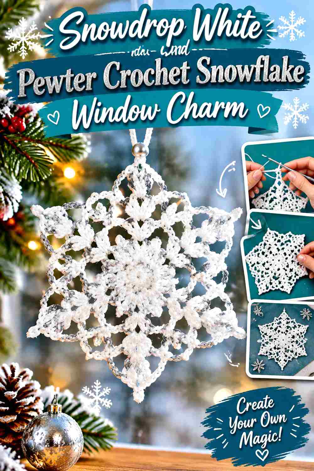
Pewter is deeper than silver gray and creates a more defined neutral frame. It works well when the snowflake has detailed points that might otherwise disappear against a bright window.
Snowdrop White Can Brighten a Pewter Snowflake Perimeter
Use pewter only on enough of the outer edge to define the silhouette, while keeping the spaces between the points Snowdrop White. This prevents the final round from reading as one dark ring.
Snowdrop White Should Separate Repeated Pewter Point Accents
Place white sections between every pewter accent rather than grouping several dark details together on one side. Balanced repetition is particularly important on a hanging motif because gravity fixes the viewing orientation.
Creator Credit: The Purple Poncho
9. Snowdrop White And Crystal Teal Crochet Snowflake Window Charm

Crystal teal introduces a more noticeable color while still staying within a cool winter palette. Because teal can become visually dominant quickly, Snowdrop White should cover the center and most of the spokes.
Snowdrop White Should Keep Crystal Teal on the Snowflake Perimeter
Restrict teal to the outer points or a narrow decorative section if you want a white-led result. Large teal center sections can make the finished charm read primarily as a colored ornament.
Snowdrop White Can Balance Crystal Teal Against Bright Glass
If teal looks especially strong in daylight, reduce its visual area rather than adding a third shade. More Snowdrop White usually restores balance more cleanly than introducing another competing accent.
Creator Credit: naztazia
10. Snowdrop White And Soft Sage Crochet Snowflake Window Charm

Soft sage produces an understated botanical winter palette. It is less icy than mint but still muted enough to support Snowdrop White without making the snowflake look strongly green.
Snowdrop White Should Separate Soft Sage Snowflake Points
Use sage at regular intervals and leave Snowdrop White between the green areas. This keeps the snowflake’s six-point symmetry clearer than a random distribution of small sage stitches.
Snowdrop White Can Keep Soft Sage Window Charms Light
Avoid using sage for both the center and entire outer edge unless you intentionally want a stronger green presence. One concentrated sage location is usually enough to distinguish the palette.
Creator Credit: GoldenLucyCrafts
11. Snowdrop White And Cranberry Crochet Snowflake Window Charm
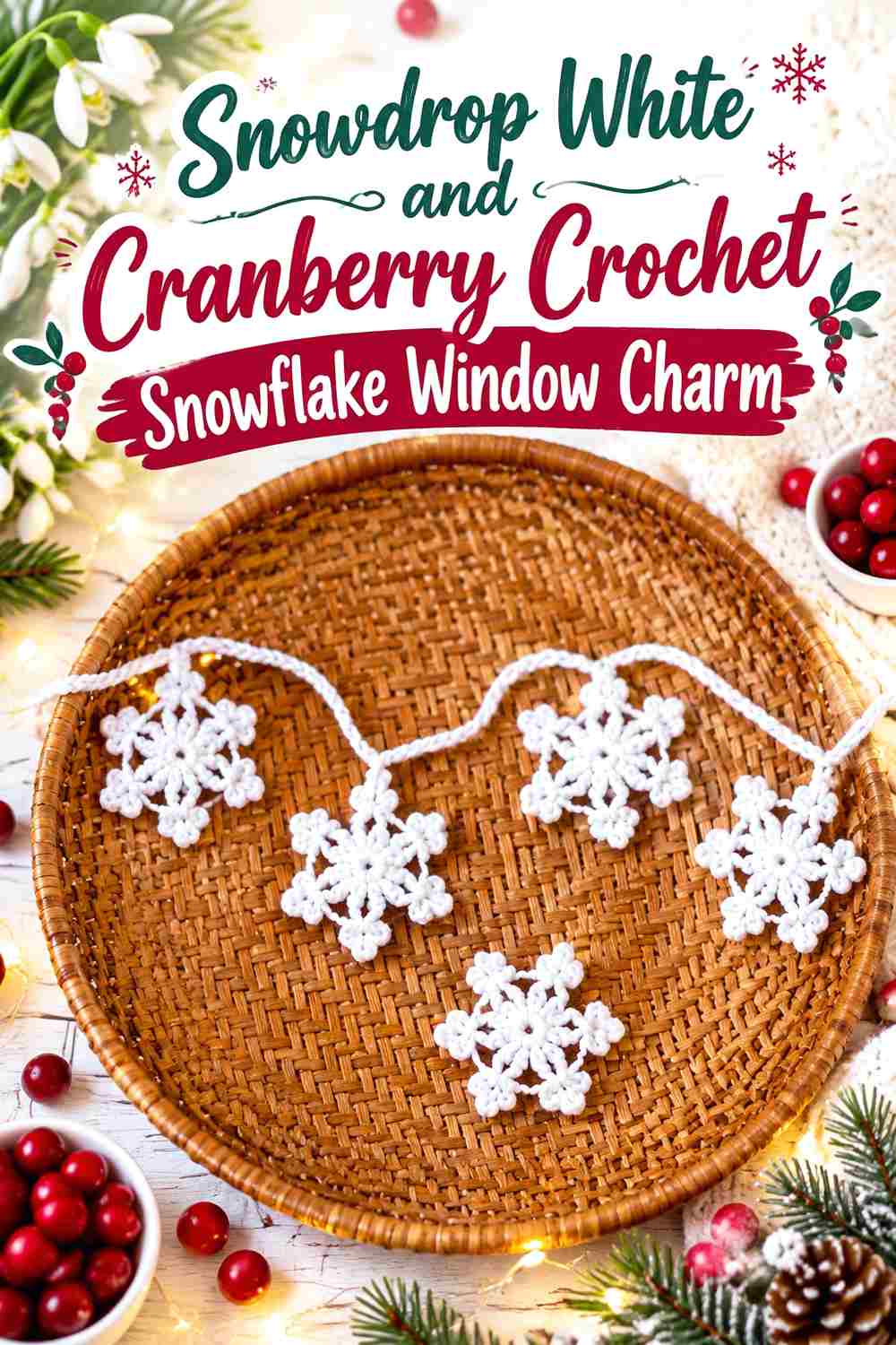
Cranberry creates the strongest traditional holiday accent in the collection. Its depth against Snowdrop White makes small amounts highly visible, which is useful for a compact charm where subtle accents might disappear from across the room.
Snowdrop White Should Limit Cranberry to Small Snowflake Details
Keep most of the spokes white and place cranberry at the center, tiny points, or another repeated detail. Large red sections can quickly shift the motif from snowflake-first to holiday-color-first.
Snowdrop White Can Create Space Between Cranberry Accents
Do not place every cranberry detail directly beside another one. White sections between the accents allow each red point to remain deliberate instead of forming a nearly continuous ring.
Creator Credit: Moara Crochet
12. Snowdrop White And Charcoal Crochet Snowflake Window Charm

Charcoal gives Snowdrop White maximum definition without using pure black. This palette is particularly useful for windows with very pale outdoor backgrounds because the darker accent can preserve the snowflake outline.
Snowdrop White Needs to Remain Dominant Beside Charcoal
Limit charcoal to the tips, center ring, or another compact area. Equal white and charcoal coverage can make the charm read more like a graphic geometric motif than a Snowdrop White snowflake.
Snowdrop White Can Use Charcoal to Define the Smallest Points
Apply the dark shade where narrow picots or pointed ends risk disappearing visually. The contrast is strongest when charcoal sits beside white rather than beside another medium-tone color.
Creator Credit: Crochet with Yarnhild
13. Snowdrop White And Pale Aqua Crochet Snowflake Window Charm

Pale aqua creates a gentle blue-green tint that remains closer to Snowdrop White than teal or navy. The palette works well when the charm’s open spaces and overall shape should do more visual work than the color contrast itself.
Snowdrop White Should Cover the Largest Pale Aqua Snowflake Sections
Use white throughout the main structure and let aqua appear in one controlled zone. Frequent pale aqua changes may be too subtle to justify the extra visual interruption.
Snowdrop White and Pale Aqua Need a Window-Light Check
Hold both colors against the glass during daylight before making multiple charms. If aqua becomes indistinguishable from white, choose a slightly deeper aqua or move the accent to a broader outer section.
Creator Credit: Bag-O-Day Crochet
14. Snowdrop White And Warm Ivory Crochet Snowflake Window Charm

Warm ivory creates the most tonal pairing in the collection. Instead of relying on obvious color contrast, this palette uses a slight warm-cool difference to separate the center or edging from the Snowdrop White main structure.
Snowdrop White Needs Broad Placement Beside Warm Ivory
Because the colors are close, divide them into clear areas rather than tiny alternating stitches. A Snowdrop White center with an ivory final section is easier to read than repeated one-stitch color changes.
Snowdrop White Should Stay Visibly Cooler Than Warm Ivory
Choose an ivory with enough warmth to distinguish it from the main white when the yarns sit together. If the two look identical on the window, the extra color change adds complexity without producing a meaningful visual difference.
Creator Credit: Crochet Craftsman
15. Snowdrop White Dusty Blue And Silver Gray Crochet Snowflake Window Charm
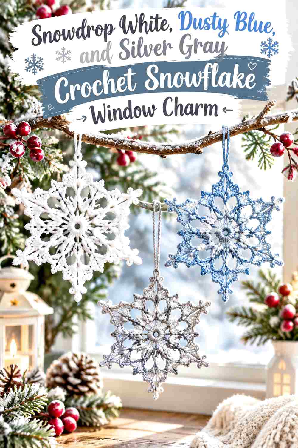
This three-color palette works best with a strict hierarchy. Snowdrop White should form the main motif, dusty blue can act as the supporting color, and silver gray should remain the smallest accent around selected points or a narrow center detail.
Snowdrop White Should Dominate Dusty Blue and Silver Gray
Do not divide the snowflake evenly into thirds. Give Snowdrop White most of the visible area so the other colors function as layers of winter contrast rather than three competing motifs.
Snowdrop White Can Use Dusty Blue on Larger Snowflake Sections
Of the two supporting shades, dusty blue can occupy the broader accent area because it is easier to distinguish from Snowdrop White. Use it on an outer section or repeated spokes while keeping those changes symmetrical.
Snowdrop White Needs Silver Gray as the Smallest Accent
Reserve silver gray for a center ring, narrow tips, or the hanging loop. Keeping it limited prevents two secondary colors from overwhelming a small window charm.
Creator Credit: Crochetpedia
16. Snowdrop White And Deep Plum Crochet Snowflake Window Charm
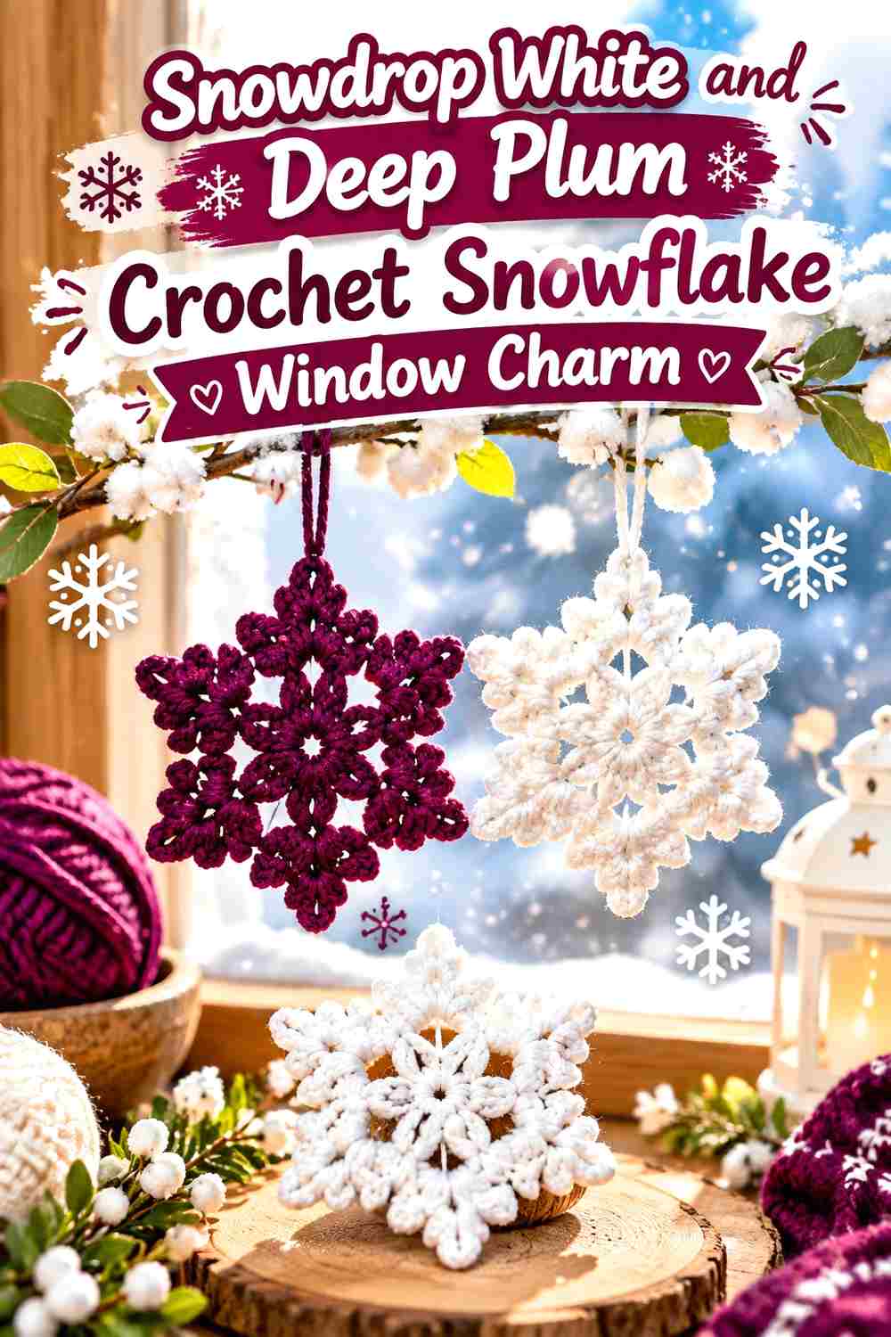
Deep plum creates an unconventional dark contrast while retaining a softer appearance than black. It can work well in a winter window where you want the snowflake to remain visible against daylight but prefer purple over navy or charcoal.
Snowdrop White Should Control the Deep Plum Snowflake Body
Keep the center and long spokes Snowdrop White, then use plum at selected tips or a narrow edge. The dark purple carries enough visual weight that it does not need to cover a large area.
Snowdrop White Can Separate Deep Plum Accents Around All Six Points
Repeat the same amount of plum at each point rather than concentrating it on only one side. Symmetrical placement keeps the hanging snowflake visually balanced and avoids making one arm look heavier.
Creator Credit: Ichigocrochet
How to Compare the Snowdrop White Snowflake Window Charm Palettes
For the strongest daylight definition, midnight navy, charcoal, pewter, deep plum, cranberry, and crystal teal create the clearest separation from Snowdrop White. These pairings are useful when the view outside the window is pale or brightly lit.
Ice blue, frost mint, icy lavender, blush, soft sage, and pale aqua keep the charm much lighter. With these palettes, check the finished motif against the actual glass because subtle differences that are obvious in your hand may become much quieter once backlit.
Silver gray and warm ivory are useful when you prefer an almost neutral window display. Champagne gold introduces a warmer accent, while the Snowdrop White, dusty blue, and silver combination gives you a controlled three-color option without abandoning the snowy foundation.
Conclusion
Choose the supporting shade according to what the window needs. If Snowdrop White disappears against strong daylight, navy, charcoal, pewter, plum, teal, or cranberry can give the points more definition. If the glass already provides a dark background, softer ice blue, mint, blush, lavender, sage, or aqua may be enough.
Color placement matters as much as color selection. Keep Snowdrop White across the center or main spokes, repeat accents symmetrically around the six points, and test the charm vertically before making a full set. Once the palette is established, follow the credited tutorial for the exact crochet construction and use the color plan as your independent adaptation.
Frequently Asked Questions
What colors work well with Snowdrop White on a crochet snowflake window charm?
Ice blue, silver gray, mint, lavender, pale aqua, navy, charcoal, teal, blush, cranberry, and soft sage can all work. Lighter colors create a subtle frosted effect, while darker accents help the snowflake remain visible against bright glass.
How can I make a Snowdrop White crochet snowflake visible in a sunny window?
Use a medium or dark accent around selected points, the center, or the outer edge. Navy, charcoal, pewter, teal, or plum can add definition while still allowing Snowdrop White to cover most of the motif.
Should Snowdrop White be used in the center or the points?
Using Snowdrop White through the center and main spokes is a reliable way to keep it dominant. Supporting colors can then define outer points, picots, or a final edge without breaking the snowflake into unrelated sections.
Can I use two very pale colors with Snowdrop White?
Yes, but check them against the window rather than judging them only in the skein. Pale aqua, ivory, mint, or blush may look distinct on a table but become much closer to Snowdrop White when strong daylight passes around the motif.
How many colors should a Snowdrop White snowflake window charm use?
Two colors are often enough for a small motif. If you use three, give them different roles: Snowdrop White as the dominant shade, one supporting color for larger accents, and a third shade for very limited details.
Should every snowflake in a window display use the same accent color?
Not necessarily. You can keep Snowdrop White consistent across the whole display and vary the second color from charm to charm. Repeating the same white foundation helps different accent palettes look like one coordinated collection.
Where should the darkest color go on a Snowdrop White window charm?
Use it where extra definition is most useful, such as selected outer points, a narrow center, or another repeated structural detail. Avoid letting a dark shade occupy every outer section if you still want the charm to read primarily as Snowdrop White.