Burgundy is especially useful in a granny square sweater because it can do more than cover the largest areas. It can define square centers, form repeated outer rounds, connect motifs through the joining color, or anchor cuffs and neckline edging. Changing where Burgundy appears can make two sweaters with similar square construction look completely different.
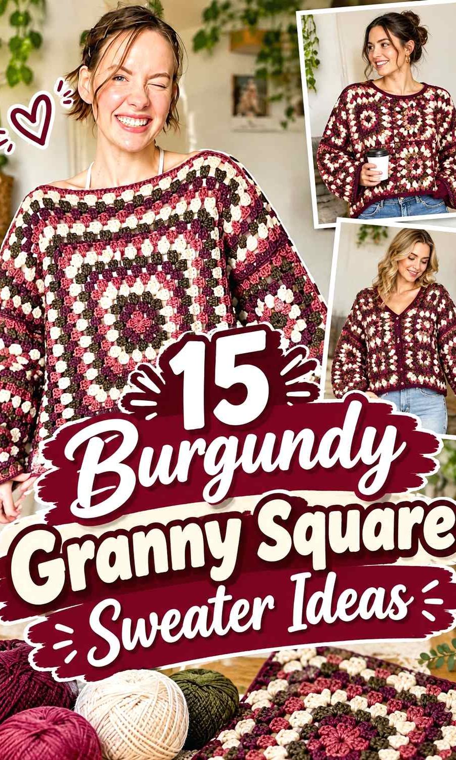
The main challenge is keeping the motifs organized. Burgundy paired with cream can produce strong light-dark separation, while Burgundy with dusty rose or mauve creates a softer tonal transition. Charcoal, navy, and black make the palette considerably darker, while camel, sage, olive, and oatmeal move the sweater toward warmer or earthier combinations.
The 15 ideas below use different square layouts, sweater shapes, motif styles, and color hierarchies. The credited tutorials support the crochet construction concepts; the Burgundy palettes are independent color adaptations.
Quick List
- Burgundy And Cream Classic Crochet Granny Square Sweater
- Burgundy Blush And Ivory Patchwork Crochet Granny Square Sweater
- Burgundy And Camel Crochet Granny Square Cardigan Sweater
- Burgundy And Charcoal Long Sleeve Crochet Granny Square Cardigan Sweater
- Burgundy Dusty Rose And Cream Floral Crochet Granny Square Sweater
- Burgundy And Oatmeal Ribbed Crochet Granny Square Cardigan Sweater
- Burgundy Olive And Tan Cocoon Crochet Granny Square Cardigan Sweater
- Burgundy And Black Bishop Sleeve Crochet Granny Square Cardigan Sweater
- Burgundy Soft Pink And Cream 3d Rose Crochet Granny Square Cardigan Sweater
- Monochrome Burgundy One Color Crochet Granny Square Cardigan Sweater
- Burgundy Mauve And Ecru Rose Crochet Granny Square Cardigan Sweater
- Burgundy Mustard And Espresso Crochet Granny Square Cardigan Sweater
- Burgundy Ivory And Taupe Cropped Crochet Granny Square Cardigan Sweater
- Burgundy Navy And Gray Relaxed Crochet Granny Square Sweater
- Burgundy Sage And Cream Classic Crochet Granny Square Sweater
Decide Where Burgundy Belongs Inside Each Granny Square
With granny square sweaters, color distribution starts inside the motif rather than at the garment edge. Burgundy can form the center, an intermediate round, the outermost round, or several consecutive rounds. Each choice changes how much Burgundy appears once many squares are assembled.
Burgundy centers surrounded by lighter colors create repeated dark focal points. Burgundy outer rounds have a different effect: they visually connect adjacent squares and can make the garment look more Burgundy overall, even when the centers contain several other shades.
Before making the full set of motifs, place one completed square beside several copies or yarn samples. A color balance that looks reasonable in one square can become much stronger when repeated across an entire torso and both sleeves.
Use Burgundy Joins and Outer Rounds to Control the Sweater
The joining color can become one of the most visible colors in a granny square garment. Burgundy joins against cream, blush, sage, or oatmeal can create a dark grid that emphasizes every motif. Using a lighter joining color has the opposite effect and lets Burgundy inside the squares stand apart.
Think about the outer square round and the join together. If both are Burgundy, the completed motifs may visually merge into a larger dark field. If the outer round is cream and the join is Burgundy, each square receives a light boundary before the darker grid appears.
Neither approach is automatically better. Choose according to whether you want individual squares to remain obvious or prefer Burgundy to visually unite the sweater.
Balance Burgundy Across the Body, Sleeves, Cuffs, and Neckline
A granny square sweater can look balanced while the motifs are lying flat but change once the pieces move onto the body and sleeves. Check the distribution by garment section rather than simply counting how many squares use each palette.
If the torso contains many Burgundy-heavy squares, lighter sleeves can prevent the whole garment from becoming visually dense. Alternatively, repeating Burgundy at the sleeve cuffs and neckline can reconnect lighter sleeve motifs to a darker body.
For cardigan sweaters, the front opening adds another color-placement opportunity. Burgundy edging can frame pale motifs, while cream or oatmeal edging can soften a cardigan already dominated by Burgundy squares.
1. Burgundy And Cream Classic Crochet Granny Square Sweater
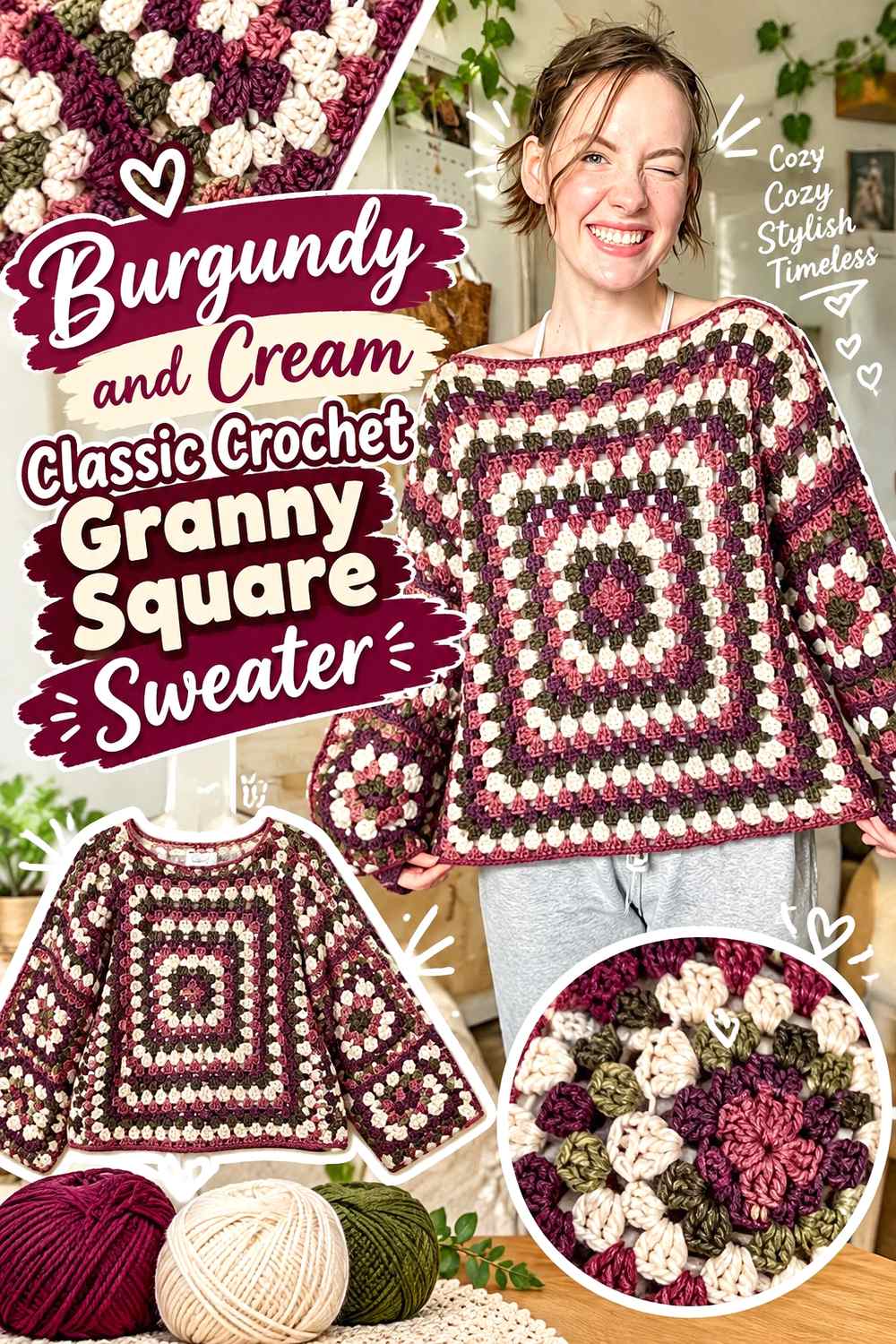
This classic direction uses Burgundy as the visual anchor and cream as the main separator. Burgundy can fill the square centers and return in selected outer rounds, while cream gives each motif enough light space to remain recognizable once the sweater is assembled.
Because the contrast is strong, you do not need equal amounts of both colors. Let Burgundy repeat consistently through the torso and sleeves while using cream to protect the square structure from becoming one continuous dark surface.
Burgundy Centers Give the Crochet Granny Squares a Clear Focal Point
Starting each motif visually with Burgundy creates repeated dark centers across the sweater. Surrounding those centers with cream makes the square structure easy to follow and prevents adjacent Burgundy areas from running together.
When arranging the finished motifs, check that the Burgundy centers are distributed across the sleeves as well as the body. Concentrating them only on the torso can make the sleeves look disconnected.
Cream Can Keep Burgundy Crochet Granny Square Joins From Looking Too Heavy
If Burgundy already occupies several rounds within each square, consider a cream outer round or cream join. The lighter boundary keeps individual motifs visible and reduces the amount of dark color where four squares meet.
For a more Burgundy-dominant version, reverse the idea and join cream-centered squares with Burgundy. The important choice is whether the join should separate the motifs or visually connect them.
Creator Credit: HayHay Crochet
2. Burgundy Blush And Ivory Patchwork Crochet Granny Square Sweater
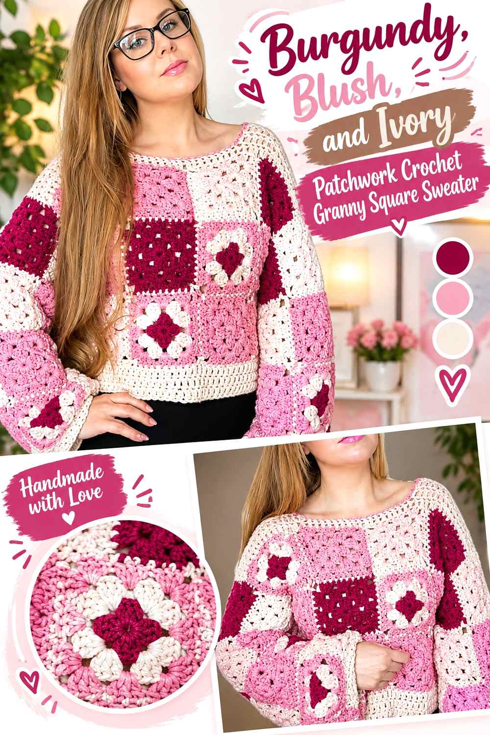
A patchwork sweater gives Burgundy, blush, and Ivory more freedom than a strict two-color layout. Burgundy can provide the darkest repeated color, blush can bridge the transition, and Ivory can keep the overall collection of squares from becoming too saturated.
The most useful approach is to vary the internal square arrangement while preserving the same hierarchy. Burgundy should remain easy to find across the garment even if individual motifs place it in different rounds.
Burgundy Should Repeat Across Every Major Patchwork Crochet Sweater Section
Place Burgundy-containing squares on the front, back, and both sleeves rather than grouping the darkest motifs in one area. Repetition across the complete garment makes the palette look planned instead of divided into separate color zones.
Lay the motifs in their intended sweater positions before joining. If one sleeve looks noticeably paler, exchange an Ivory-heavy square for one with a stronger Burgundy presence.
Blush and Ivory Can Create Breathing Room Around Burgundy Crochet Squares
Blush softens the jump between Burgundy and Ivory, making it useful in middle rounds. Ivory works better when a definite light break is needed around a dark center or outer round.
Avoid giving blush and Ivory identical jobs in every square. Let one act as a transition and the other as the lightest separator so the three-color hierarchy remains clear.
Creator Credit: Selina Veronique
3. Burgundy And Camel Crochet Granny Square Cardigan Sweater
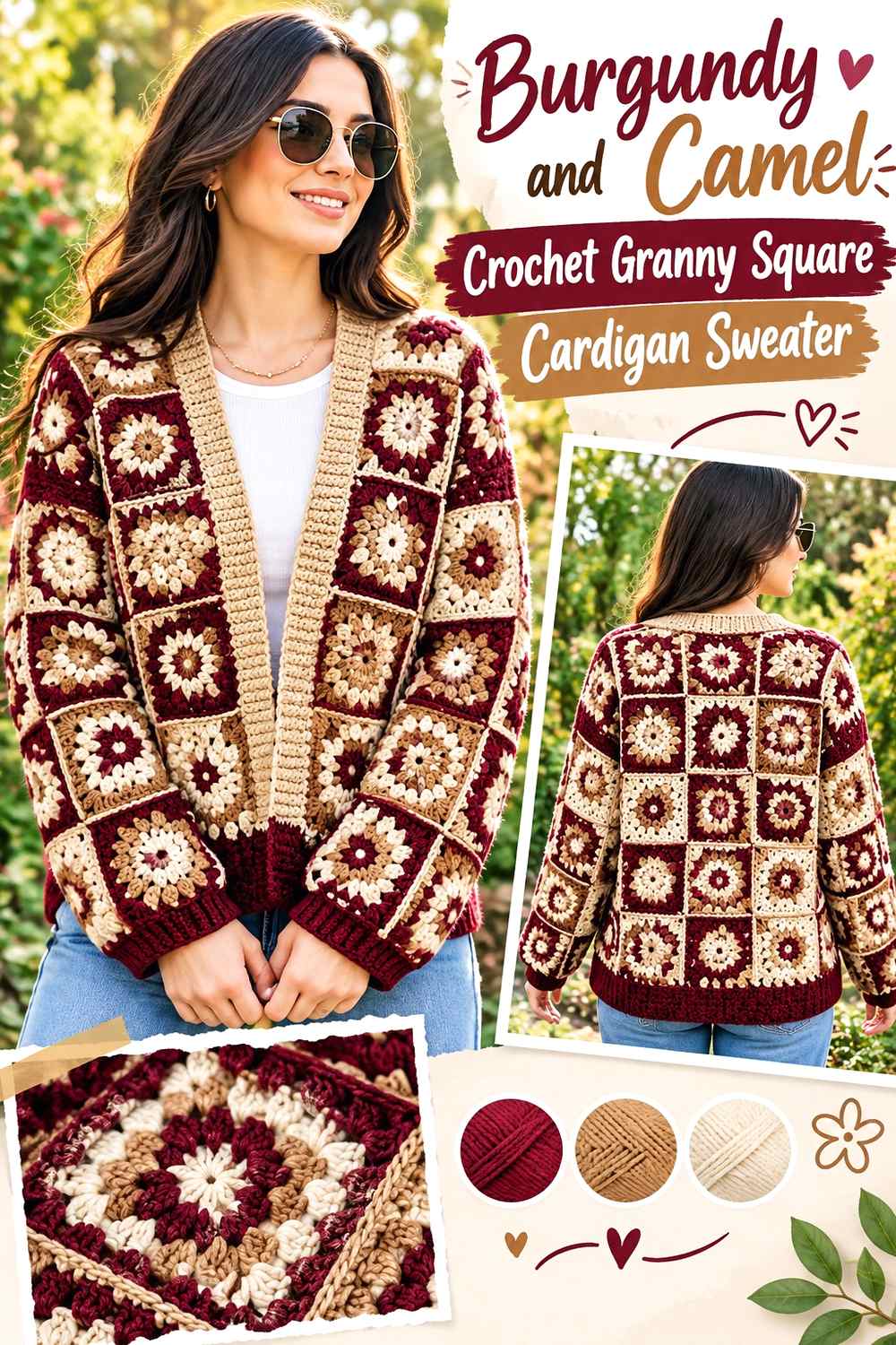
Camel gives Burgundy a warmer neutral partner than cream. In a cardigan, Burgundy can dominate the motifs while Camel takes over selected outer rounds, front edging, or cuffs.
The open front already creates a strong vertical break, so avoid adding unnecessary wide color blocks through the center of the motifs. Let the granny squares provide the variation and use Camel to organize the finishing.
Burgundy Can Lead the Main Crochet Granny Square Cardigan Panels
Keep Burgundy visible through most of the squares forming the back and front panels. That repeated dark red gives both halves of the open cardigan a common color even though they are physically separated.
Before joining the front motifs, compare them side by side. One front panel should not accidentally become much more Camel-heavy than the other unless asymmetry is intentional.
Camel Can Warm Burgundy Crochet Granny Square Cardigan Edging
Camel around the front opening creates a softer boundary than black or charcoal. It can also be repeated at the cuffs to connect the cardigan edges without putting another large color block through the motifs.
If your Camel is relatively dark, compare it with Burgundy from a distance. Enough value difference should remain for narrow edging to be visible.
Creator Credit: Lallaulab
4. Burgundy And Charcoal Long Sleeve Crochet Granny Square Cardigan Sweater
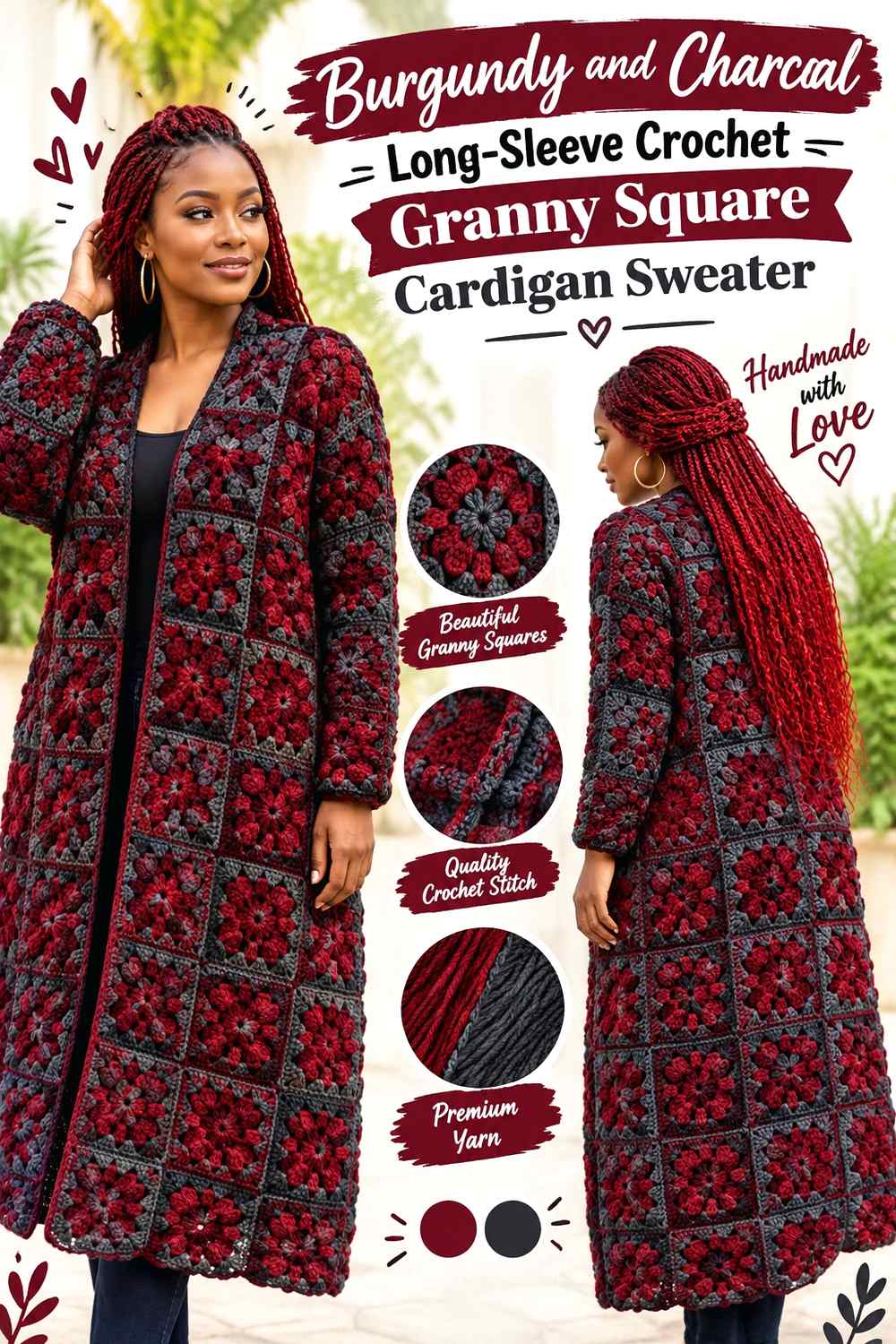
Burgundy and Charcoal produce one of the darkest combinations in this collection. Use Burgundy as the principal motif color and Charcoal as a controlled structural shade around joins, cuffs, or selected square rounds.
Long sleeves give Charcoal more opportunities to accumulate visually, so evaluate the complete sleeve layout rather than deciding from a single square.
Burgundy Needs Enough Area to Stay Distinct From Charcoal Crochet Squares
If both yarns are dark, give Burgundy larger or more frequent areas instead of alternating tiny sections of Burgundy and Charcoal. Broader Burgundy rounds make the red character easier to recognize.
A grayscale photo can reveal how similar their values are. If they merge almost completely, use Charcoal mainly for broad finishing rather than small motif details that depend on contrast.
Charcoal Can Define Burgundy Crochet Granny Square Sleeve Cuffs
A Charcoal cuff can provide a clean dark endpoint to Burgundy-heavy sleeves. Repeating a narrow amount along the cardigan opening helps the cuff color feel connected to the rest of the garment.
If the overall sweater becomes too dark, replace some Charcoal outer rounds with a lighter neutral rather than reducing Burgundy, since Burgundy is the intended anchor.
Creator Credit: Myzayi Yunus
5. Burgundy Dusty Rose And Cream Floral Crochet Granny Square Sweater
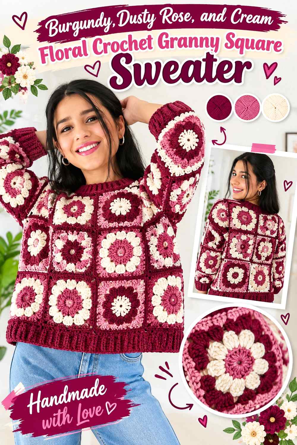
Floral squares give each color a more specific job. Burgundy can define flower centers or petals, Dusty Rose can extend the floral transition, and cream can form the background that turns the flower into a clearly readable square.
This palette works best when the flower and background do not have similar values. Cream creates enough separation for Burgundy floral elements to remain visible across the assembled sweater.
Burgundy Can Make Floral Crochet Granny Square Centers More Defined
Use Burgundy where you want the flower motif to carry the most visual weight. A Burgundy center or repeated petal section becomes a consistent focal point when many squares are placed across the body.
Keep that Burgundy placement reasonably consistent if the sweater already has several other variables. Too many different flower arrangements can make the garment look busier than necessary.
Cream Can Separate Burgundy and Dusty Rose Crochet Flowers From the Sweater Join
A cream outer area gives Burgundy and Dusty Rose flowers space before the motifs meet. This is especially helpful when you intend to join the squares with Burgundy or another darker shade.
If the joining color is also cream, consider adding Burgundy at the neckline or cuffs so the main color does not become confined only to motif centers.
Creator Credit: Leonela Cevallos
6. Burgundy And Oatmeal Ribbed Crochet Granny Square Cardigan Sweater
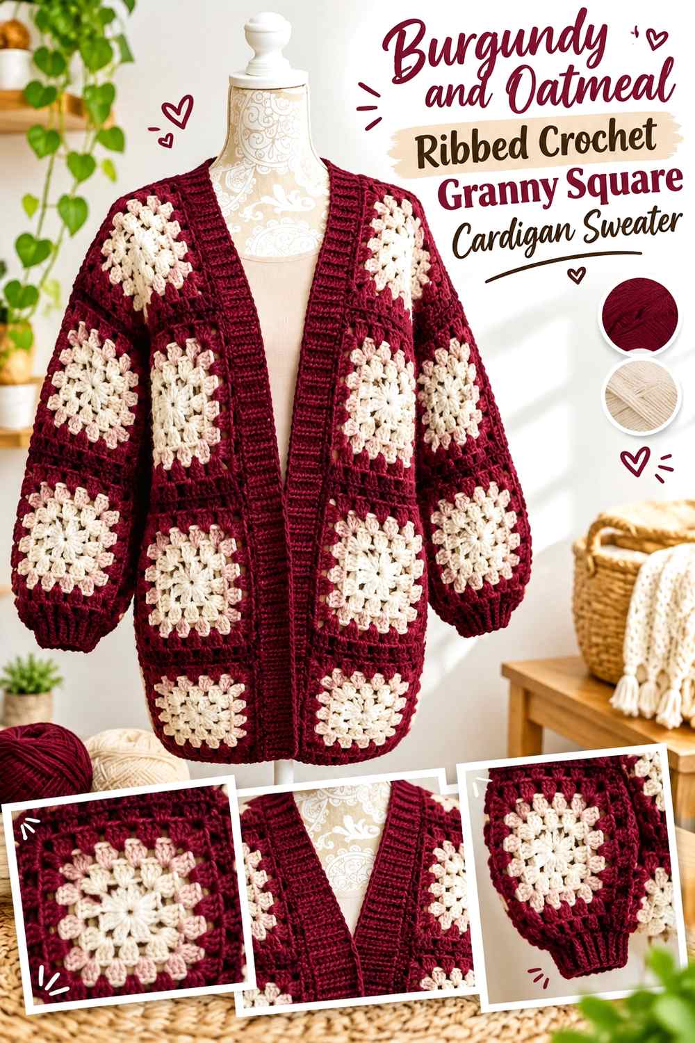
Oatmeal gives Burgundy a lower-contrast alternative to bright cream. It works especially well on a cardigan with ribbed cuffs, hem, or front band because the color change can coincide with a visible texture change.
Let Burgundy control the square field and use Oatmeal around the finishing sections. That keeps the garment clearly Burgundy-led while allowing the ribbing to form a softer frame.
Burgundy Outer Rounds Can Unite the Crochet Granny Square Cardigan
Using Burgundy on the outer round of multiple motifs helps connect squares that may contain more Oatmeal toward their centers. Once joined, those repeated Burgundy edges can make the body read as a larger coordinated surface.
Be careful if the join is Burgundy too. Outer rounds plus joins can create a substantial dark grid, so test a few connected motifs before committing to the entire layout.
Oatmeal Can Lighten Burgundy Crochet Cardigan Ribbing
Oatmeal cuffs and front ribbing provide a lighter break from Burgundy without the crispness of bright white. This works well when the cardigan already contains strong geometric lines from the square layout.
If the Oatmeal edging begins to dominate, reduce its width before changing the motif palette. The granny squares should remain the main color story.
Creator Credit: Be Ewenique Boutique
7. Burgundy Olive And Tan Cocoon Crochet Granny Square Cardigan Sweater
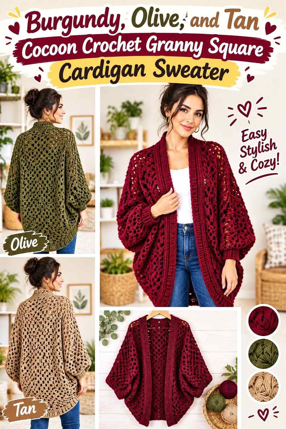
A cocoon cardigan concentrates much of its construction into a large square-based area, so repeated color bands can become especially prominent. Burgundy should carry the strongest share, Olive can provide an earthy counterpoint, and Tan can separate the two deeper colors.
Because the central square contributes so much to the finished cardigan, test the complete three-color relationship early rather than waiting until the outer rounds.
Burgundy Should Return Regularly Through the Cocoon Crochet Granny Square
If the motif grows through repeated rounds, bring Burgundy back often enough that later Olive and Tan sections do not change the cardigan into an Olive-led project.
You can vary band width while maintaining that hierarchy. A broader Burgundy region followed by smaller Olive and Tan sections keeps the main color obvious without requiring a rigid sequence.
Tan Can Prevent Olive and Burgundy Crochet Rounds From Merging Visually
Olive and Burgundy can both carry medium-to-dark visual weight. Placing Tan between selected areas gives their boundary more separation and makes the expanding granny structure easier to read.
You do not need Tan between every Burgundy and Olive section. Occasional light breaks may provide enough organization without making the cocoon look heavily striped.
Creator Credit: Shyler crochets
8. Burgundy And Black Bishop Sleeve Crochet Granny Square Cardigan Sweater
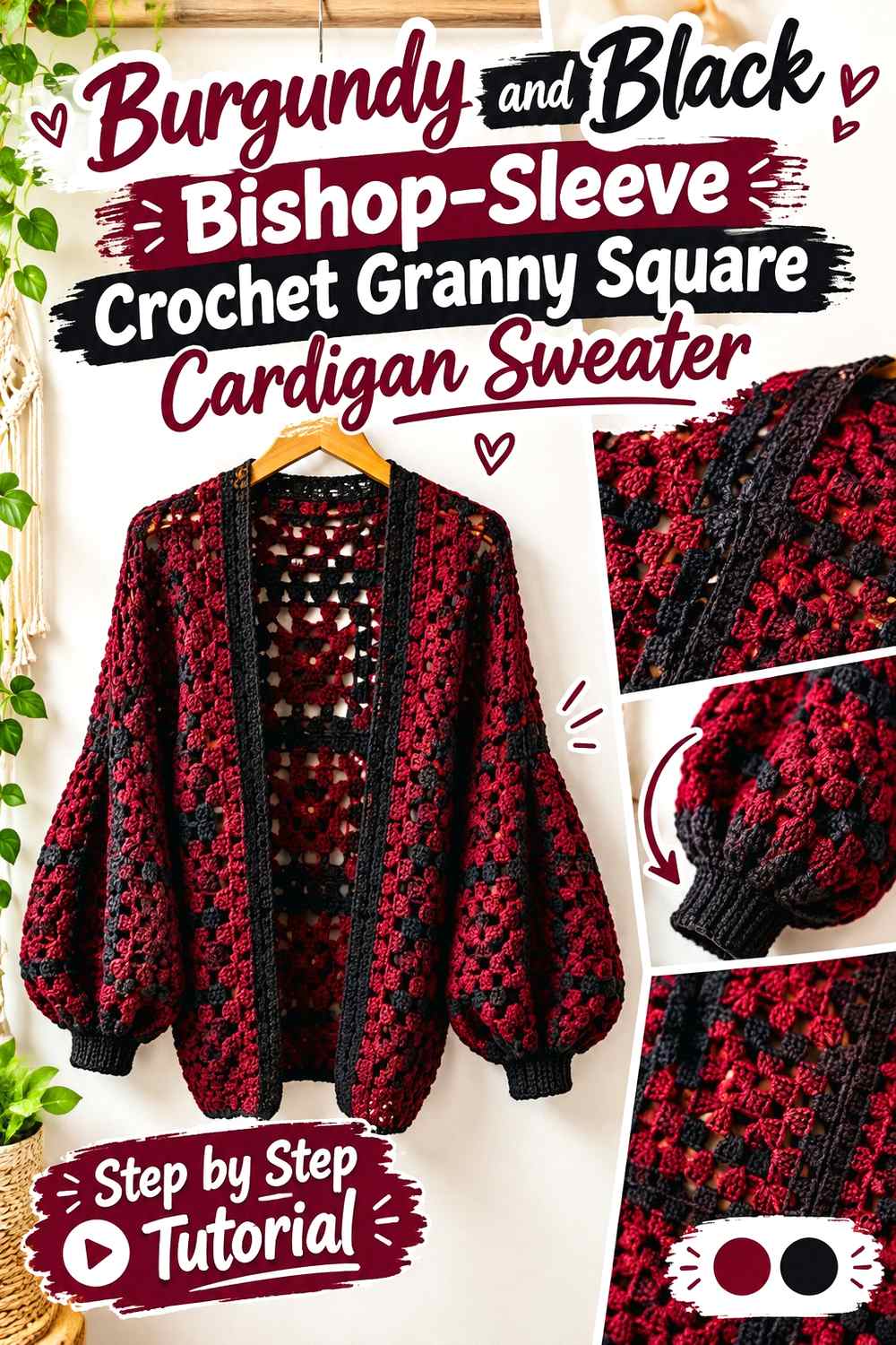
Bishop sleeves add volume to the garment, so a Burgundy-and-Black palette needs controlled dark-color placement. Let Burgundy dominate the large granny square body and most of the sleeves while Black defines selected edges.
A broad Black sleeve section can appear particularly heavy on a fuller sleeve. Concentrating the darkest shade near the cuff keeps the volume visible without letting Black take over.
Burgundy Should Cover Most of the Bishop-Sleeve Crochet Granny Square Area
Repeat Burgundy through the sleeve motifs so the expanded sleeve shape remains connected to the body. If Black appears in every square at equal strength, the sleeve can become darker than intended.
Compare both sleeves before final joining. Their Burgundy distribution should feel reasonably balanced when viewed as complete garment sections.
Black Can Sharpen Burgundy Crochet Granny Square Cuffs Without Filling the Sleeves
A Black cuff creates a strong endpoint and can visually contain the fuller sleeve shape. Repeat a small amount of Black around the cardigan opening if you want to connect that dark finish to the torso.
If Black feels too severe beside Burgundy, charcoal is an easy directional substitute because it preserves the dark role while lowering the contrast slightly.
Creator Credit: Stitchcraftsco
9. Burgundy Soft Pink And Cream 3d Rose Crochet Granny Square Cardigan Sweater
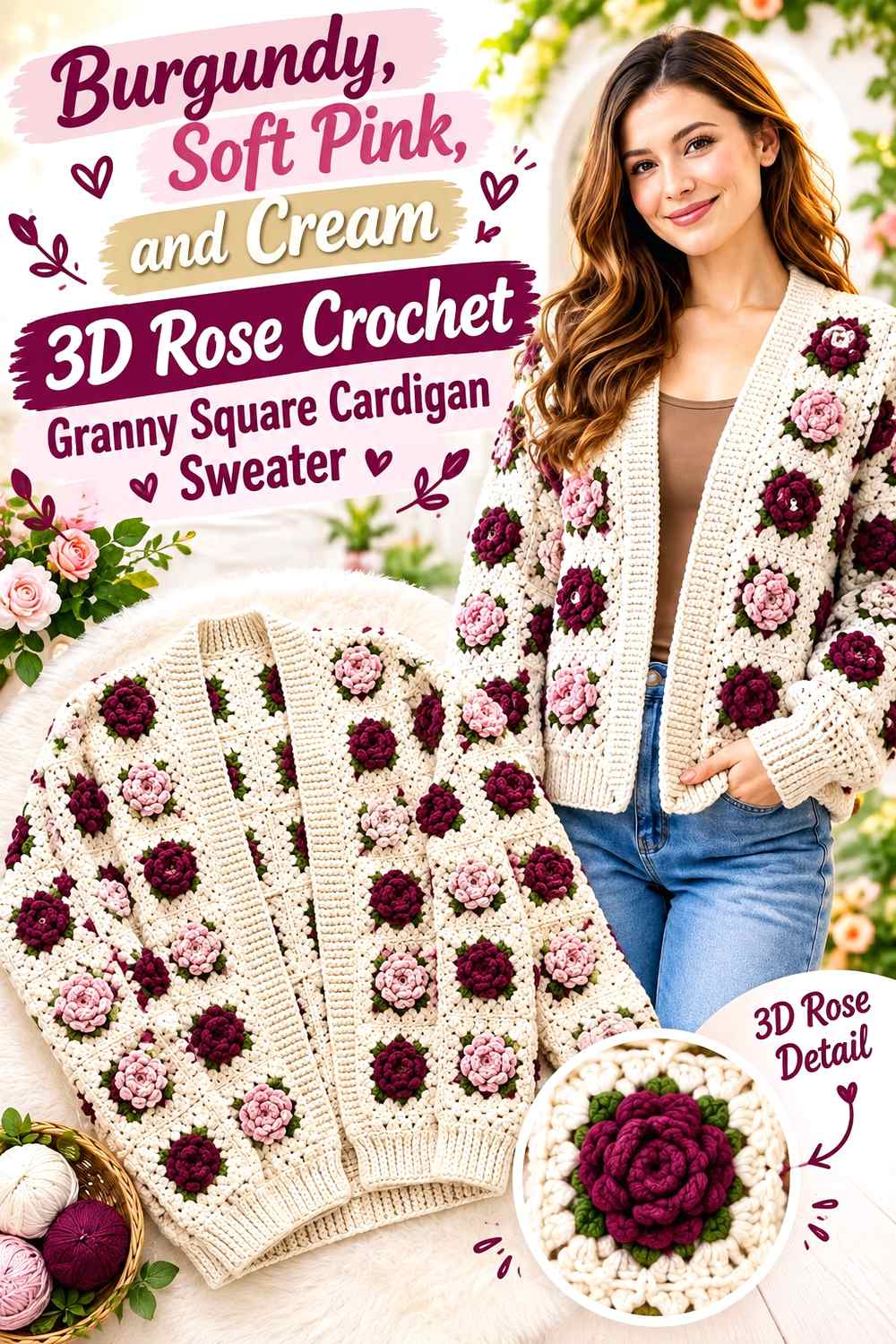
Dimensional rose motifs already add substantial surface detail, so the color hierarchy should remain straightforward. Burgundy can form the deepest floral sections, Soft Pink can reveal the layered petal shape, and cream can provide a quieter square background.
Keep the joins relatively restrained. A complicated fourth joining color would compete with both the dimensional texture and the three-color palette.
Burgundy Gives 3D Rose Crochet Granny Squares Their Darkest Floral Anchor
Use Burgundy in the flower where you want the greatest depth and strongest repetition. A dark floral center surrounded by Soft Pink creates visible tonal progression without relying on unrelated hues.
Check how much Burgundy remains visible from normal viewing distance. Deep sections can become partly hidden by raised petals, so the square may need Burgundy elsewhere if it should remain the dominant garment color.
Cream Can Give Burgundy 3D Crochet Roses More Background Separation
A cream square background allows the raised Burgundy and Soft Pink flower to stand apart from the surrounding motif. This keeps neighboring dimensional flowers from visually running into one another.
For a more Burgundy-heavy cardigan, use Burgundy for the join or front edging after keeping the motif background cream. That returns the anchor shade outside the flower itself.
Creator Credit: Crochet With Hayat
10. Monochrome Burgundy One Color Crochet Granny Square Cardigan Sweater
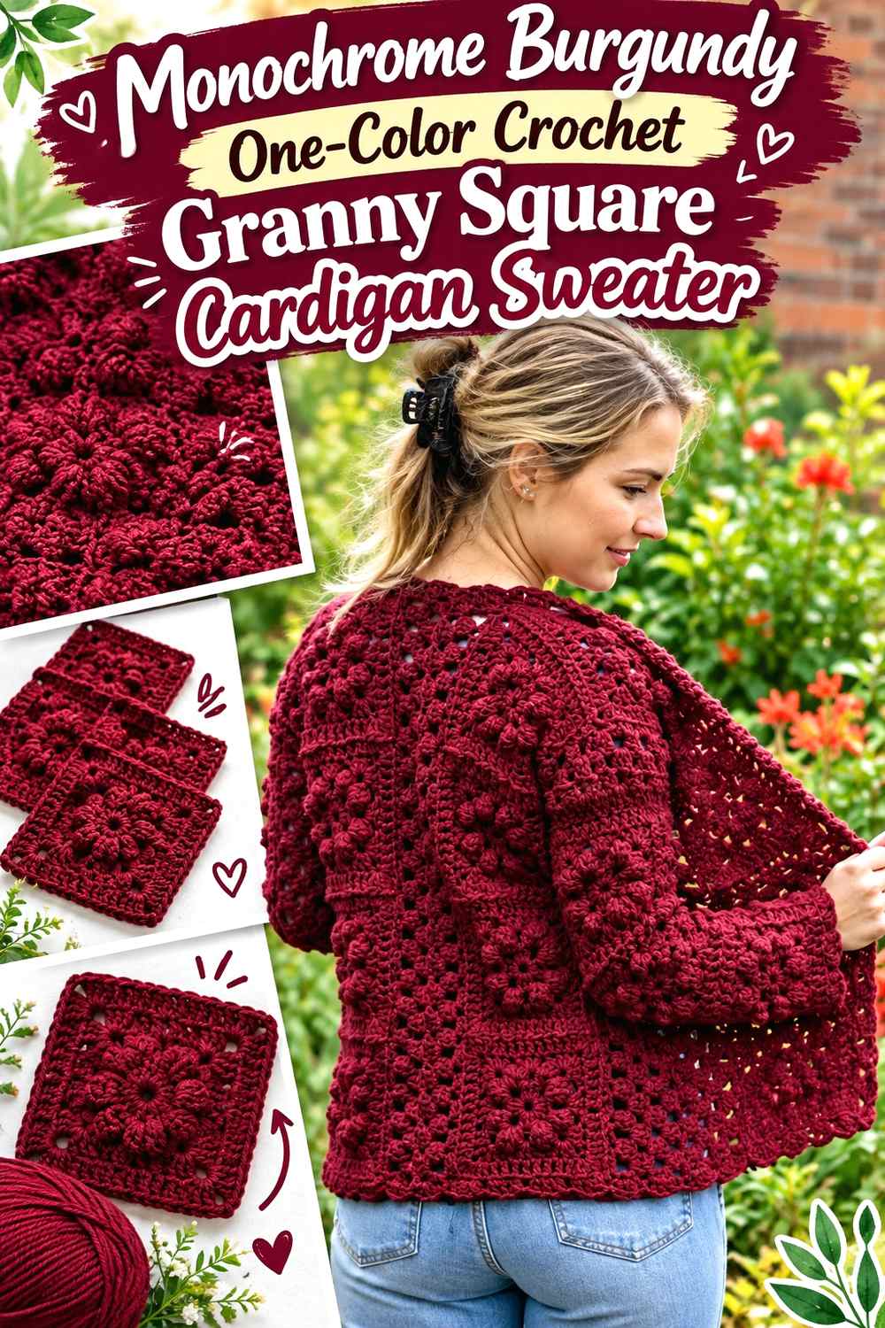
A one-color granny square cardigan proves that motif structure can provide enough visual variation without a contrasting palette. Burgundy covers the centers, outer rounds, joins, and finishing while shadows within the clusters reveal the individual squares.
The key consideration is motif visibility. Without color changes, the spaces, joins, raised texture, and direction of the crochet have to do all the separating.
Burgundy Texture Must Define a One-Color Crochet Granny Square Sweater
Before making many motifs, view a completed Burgundy square under several lighting conditions. If the cluster structure remains readable, the monochrome approach can let texture replace color contrast.
Joining technique also matters visually. A flatter join keeps attention on the square texture, while a more visible join may create its own grid even though everything is Burgundy.
Burgundy Cuffs and Borders Should Support the Monochrome Crochet Squares
With no secondary color available, use changes in texture or stitch density to separate the edging from the granny square field. Burgundy ribbing can look distinct from Burgundy clusters even without changing hue.
Avoid adding an unrelated color solely because the sweater seems too simple in the skein. Assemble a few Burgundy motifs first; repetition often creates more visual movement than one square suggests.
Creator Credit: Colour Ceilidh Crochet
11. Burgundy Mauve And Ecru Rose Crochet Granny Square Cardigan Sweater
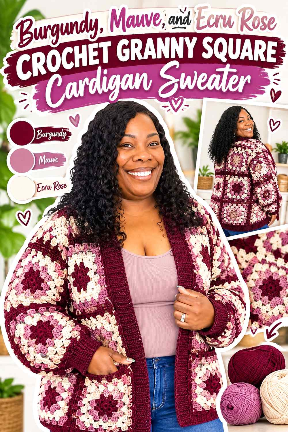
Burgundy, Mauve, and Ecru create a tonal floral direction with three clearly different value roles. Burgundy supplies depth, Mauve creates the middle transition, and Ecru keeps the repeated rose squares from becoming overly dark.
Because the palette is closely related through its softened colors, consistent placement is more important than adding further accents.
Burgundy Should Remain the Deepest Color in the Rose Crochet Granny Squares
Place Burgundy where you want the eye to return across the cardigan—often within the rose or another repeated motif section. Mauve can surround it without creating the abrupt contrast that cream would.
If Burgundy and Mauve are too similar when worked, replace Mauve with a slightly lighter muted purple-pink rather than adding a fourth color.
Ecru Can Frame Burgundy Rose Crochet Granny Squares Without Competing
Ecru works well around the outside of floral squares because it gives the darker rose motif a clean boundary. Repeating that light frame also helps neighboring motifs remain separate after joining.
If the cardigan becomes too pale overall, use Burgundy for the join or outer edging while preserving Ecru immediately around the flowers.
Creator Credit: TL Yarn Crafts
12. Burgundy Mustard And Espresso Crochet Granny Square Cardigan Sweater
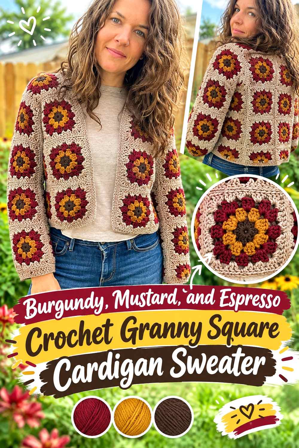
This is one of the richest, warmest palettes in the collection. Burgundy should remain the dominant saturated color, Mustard can brighten selected motif rounds, and Espresso can provide small amounts of dark definition.
All three shades can carry substantial visual weight, so avoid giving each one equal coverage. A Burgundy-led hierarchy prevents the squares from becoming three competing blocks.
Burgundy Needs More Visual Area Than Mustard in the Crochet Granny Squares
Use Mustard as a repeated accent rather than allowing it to occupy every outer round. Because it contrasts strongly with Burgundy, even relatively small amounts remain noticeable across a complete cardigan.
If Mustard begins to dominate, move it toward motif centers where each occurrence occupies less overall area.
Espresso Can Define Burgundy Crochet Granny Square Joins in Small Amounts
Espresso can create a dark grid around Burgundy-heavy motifs, but a wide dark join may make the cardigan considerably heavier. Test several connected squares before using Espresso throughout the full layout.
If the grid looks too strong, keep Espresso at the cuffs or front band and use Burgundy itself for the square joins.
Creator Credit: Off the Beaten Hook
13. Burgundy Ivory And Taupe Cropped Crochet Granny Square Cardigan Sweater
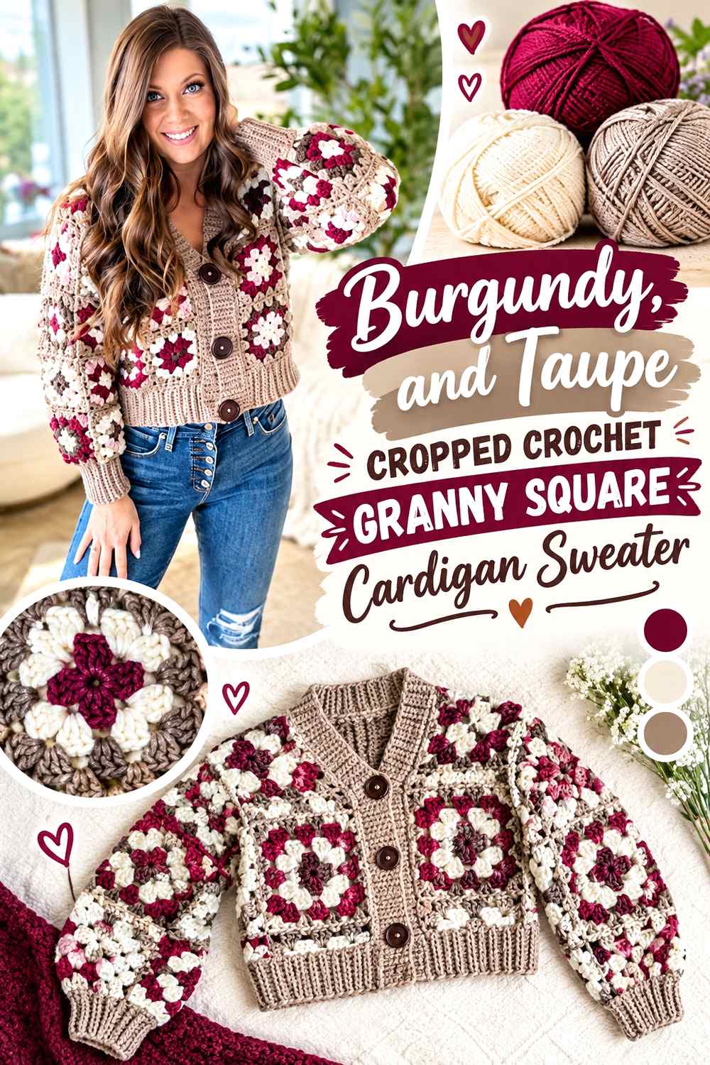
A cropped cardigan gives every motif more visual importance because fewer vertical rows of squares may occupy the torso. Burgundy can anchor the motifs, Ivory can create the clearest light contrast, and Taupe can bridge the two without making the cardigan excessively bright.
Keep the upper body distribution especially balanced. With a shorter silhouette, one Burgundy-heavy row can affect a much larger proportion of the finished garment.
Burgundy Should Repeat Evenly Across the Cropped Crochet Granny Square Body
Spread Burgundy centers or outer rounds across both front panels and the back. Avoid concentrating several dark motifs at one side of the opening unless an intentionally asymmetric layout is planned.
Arrange the complete cropped body before joining so you can judge Burgundy by garment section rather than by individual square.
Ivory and Taupe Can Control Contrast Around Burgundy Crochet Square Edges
Ivory gives Burgundy the clearest separation, while Taupe creates a softer intermediate step. One useful arrangement is Burgundy inside the motif, Taupe in a middle area, and Ivory closer to the outer edge.
If that makes every square too light, reverse the final two roles and let Burgundy return in the outer round or join.
Creator Credit: MJ’s Off The Hook Designs
14. Burgundy Navy And Gray Relaxed Crochet Granny Square Sweater
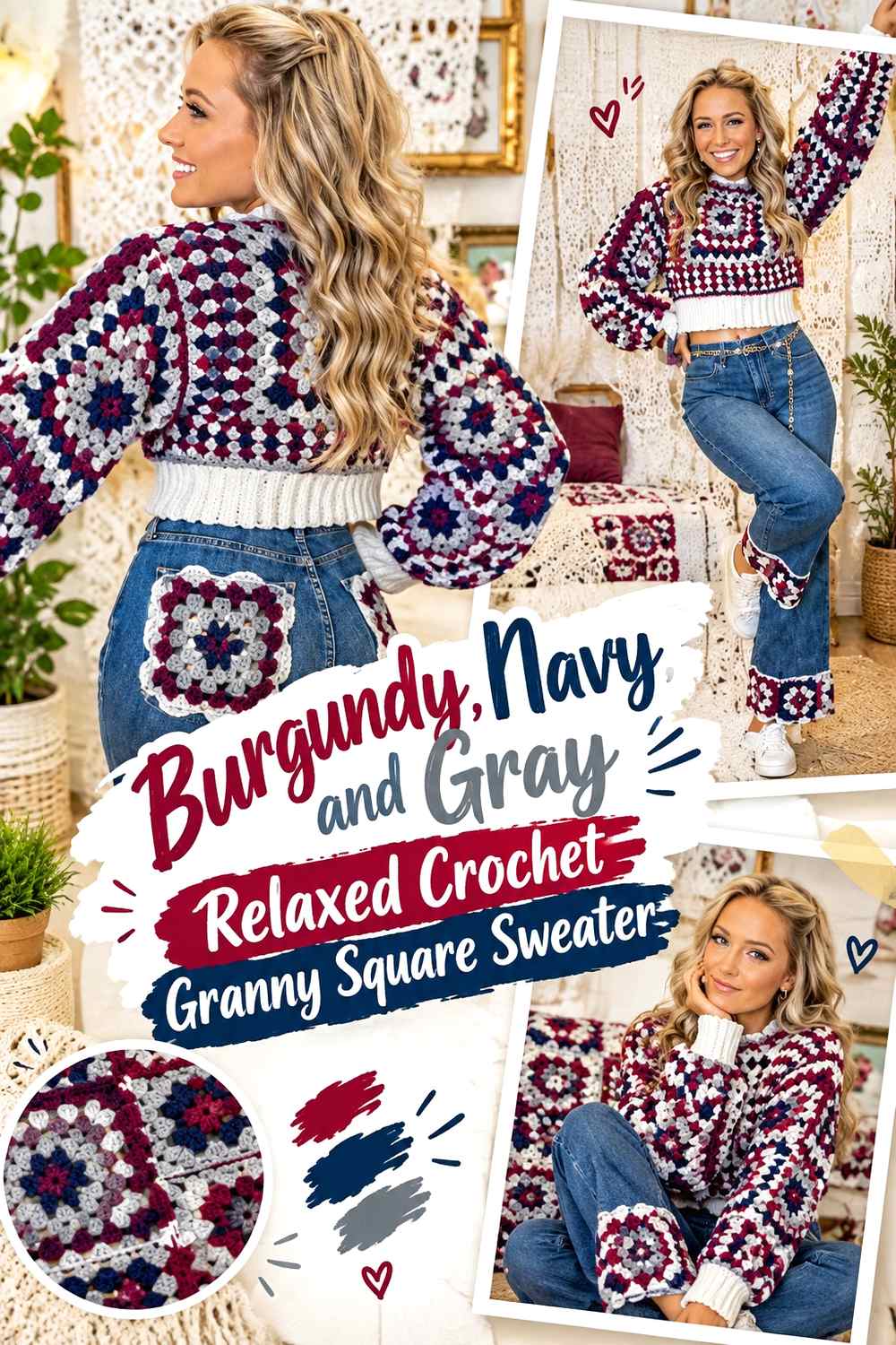
Navy creates a cool dark partner for Burgundy, while Gray keeps the two deep colors from merging throughout the sweater. This palette works best when Gray has a clear separating role instead of simply receiving the same area as Burgundy and Navy.
The relaxed sweater shape can carry broad granny square sections, so check how the dark motifs distribute across the shoulders and sleeves as well as the torso.
Burgundy and Navy Crochet Granny Squares Need Gray Value Separation
Burgundy and Navy may look clearly different in hue while remaining similarly dark. A medium or lighter Gray between them can reveal the square rounds more clearly.
Use a grayscale photo of a test motif if necessary. If Burgundy and Navy merge but Gray remains distinct, the neutral is doing useful structural work in the palette.
Burgundy Should Reappear on the Relaxed Crochet Granny Square Sleeves
Do not allow Navy-heavy sleeve motifs to make the arms look unrelated to a Burgundy-led torso. Repeat Burgundy in centers, outer rounds, or cuffs so the main color travels through the entire garment.
Gray can then act as the recurring separator on both body and sleeves, keeping the two darker colors organized.
Creator Credit: Emily Ann Roberts
15. Burgundy Sage And Cream Classic Crochet Granny Square Sweater
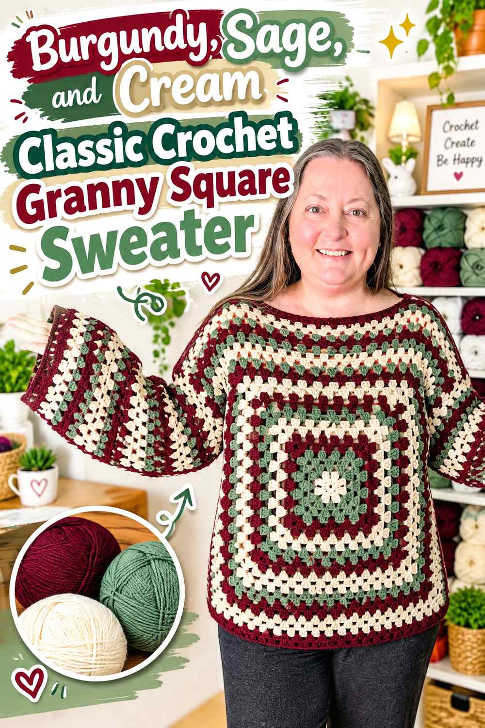
Burgundy, Sage, and Cream combine a deep warm-red anchor with a muted green and a light neutral. Cream is especially useful here because Burgundy and Sage can both carry enough visual weight to compete when placed directly beside each other repeatedly.
Use Burgundy most consistently, Sage as the secondary motif color, and Cream wherever small details need stronger separation.
Burgundy Should Anchor the Classic Crochet Granny Square Sweater Layout
Keep Burgundy recurring through all major garment areas, whether it appears in square centers, outer rounds, or both. This prevents Sage-heavy sections from shifting the sweater toward a green-dominant result.
Before joining, view the front, back, and sleeve layouts together. Adjust individual squares if one section has noticeably less Burgundy than the others.
Cream Can Separate Sage From Burgundy Crochet Granny Square Rounds
A Cream round between Burgundy and Sage makes both colors easier to distinguish and lightens the motif. It is especially useful in smaller squares where each round occupies a meaningful share of the design.
For a darker version, reduce Cream rather than removing it from every motif. A limited light repeat can preserve square definition while allowing Burgundy to cover more area.
Creator Credit: Hooked on Homemade Happiness
Comparing the 15 Burgundy Granny Square Sweater Palettes
For the strongest light-dark contrast, Burgundy with Cream, Ivory, Ecru, or Oatmeal makes square centers, outer rounds, and joins easier to separate visually. These combinations are useful when individual motif definition is a priority.
Burgundy with Dusty Rose, Blush, Mauve, or Soft Pink creates a more tonal transition. In those palettes, a light neutral becomes especially useful when floral details or neighboring rounds need clearer boundaries.
Camel, Olive, Tan, Sage, and Mustard move Burgundy toward an earthy or warm multicolor direction. These schemes benefit from assigning each color a different role rather than giving every shade the same number of rounds.
Black, Charcoal, Navy, and Espresso create the darkest combinations. When using them, check light-dark value as well as hue. A color can look very different from Burgundy in the skein but still merge with it once repeated in small crochet clusters.
The monochrome Burgundy option relies on a different strategy altogether: texture, openings, joins, and finishing replace color contrast. It is the clearest choice when you want the granny square construction to provide the visual variation while Burgundy remains uninterrupted.
Conclusion
Burgundy can take several roles in a granny square sweater, and choosing that role before making dozens of motifs makes the final color layout much easier to control. Burgundy centers create repeated focal points, Burgundy outer rounds connect motifs, and Burgundy joins can turn separate squares into a darker unified grid.
For higher contrast, pair Burgundy with Cream, Ivory, Ecru, or Oatmeal. For a softer tonal sweater, Blush, Dusty Rose, Mauve, and Soft Pink create more gradual transitions. Earthy colors such as Camel, Olive, Sage, Tan, and Mustard produce more complex palettes, while Black, Charcoal, Navy, and Espresso make the overall garment substantially darker.
Before joining the complete sweater, arrange the squares in their intended front, back, and sleeve positions. Check Burgundy distribution by garment section, not just by total motif count. That simple layout check can reveal an overly dark sleeve, an unbalanced front panel, or a joining color that is becoming more dominant than intended.
Frequently Asked Questions
What colors work well with Burgundy in a granny square sweater?
Cream, Ivory, Oatmeal, Ecru, Blush, Dusty Rose, Mauve, Camel, Taupe, Sage, Olive, Mustard, Charcoal, Navy, Black, and Espresso can all support Burgundy differently. Pale neutrals create clearer value contrast, while related pinks and reds create a softer tonal result.
Should Burgundy go in the center or outer round of a crochet granny square?
Either placement can work, but they produce different effects. Burgundy centers create repeated dark focal points. Burgundy outer rounds make adjacent squares feel more connected and can increase how Burgundy-dominant the finished sweater appears.
What joining color works with Burgundy granny squares?
Use Burgundy when you want the joins to visually connect the motifs into a darker field. Cream, Ivory, Oatmeal, or another lighter neutral can keep individual Burgundy-heavy squares more distinct. Choose the join after viewing several completed motifs together rather than from one square alone.
How can I keep a Burgundy granny square sweater from looking too dark?
Increase the visual share of a lighter supporting color around motif backgrounds, outer rounds, joins, cuffs, or neckline edging. You do not necessarily need to reduce Burgundy dramatically; strategically placed light separation can make dark motifs easier to read.
How do I check whether Burgundy and another dark color have enough contrast?
Place the yarns side by side and view them from several feet away. A grayscale photo can also reveal their light-dark relationship. Burgundy and Navy, Charcoal, Espresso, or Black may differ strongly in hue while having less value contrast than expected.
Should every Burgundy granny square use the same color order?
No. A sweater can use several square arrangements while still feeling coordinated. Keep a consistent hierarchy—for example, Burgundy as the dominant shade and Cream as the lightest separator—and repeat those roles across the front, back, and sleeves.
How can I make a one-color Burgundy granny square sweater interesting?
Let crochet structure provide the variation. Cluster openings, square corners, visible joins, ribbing, cuffs, and edging can create changes in texture and shadow even when every part uses Burgundy. Assess several connected squares before deciding that another color is necessary.