Jade and cream give a crochet checkerboard cushion a clear two-color structure without the severity of a black-and-white grid. Jade provides the stronger visual anchor, while cream opens up the surface and makes individual squares easier to distinguish. Changing the proportion, scale, edging, or placement of those two colors can make the same basic checker concept look substantially different.
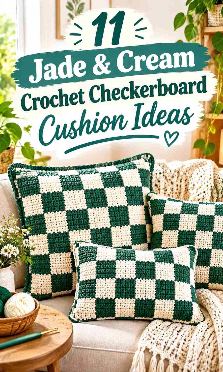
The main decision is whether you want a strict two-color checkerboard or a softer gingham-style interpretation. Large jade-and-cream blocks create a graphic cushion face, while smaller checks add more movement. A third shade such as pale sage, dark forest green, or oatmeal can create another value level, but it should have a defined role so the jade-and-cream pairing remains obvious.
The tutorials below support checkerboard, plaid, gingham, modular-square, or cushion construction. Their original colors vary; the jade-and-cream palettes here are independent adaptations rather than claims about the colors used by each creator.
Quick List
- Classic Jade And Cream Crochet Checkerboard Cushion
- Cream Led And Jade Framed Crochet Checkerboard Cushion
- Jade Cream And Pale Sage Crochet Gingham Checkerboard Cushion
- Jade And Cream Chunky Crochet Checkerboard Cushion
- Jade Cream And Forest Green Crochet Plaid Checkerboard Cushion
- Jade And Cream Surface Grid Crochet Checkerboard Cushion
- Jade Cream And Soft Sage Panel Crochet Checkerboard Cushion
- Jade And Cream Modular Motif Crochet Checkerboard Cushion
- Jade And Cream Granny Square Crochet Checkerboard Cushion
- Jade Dominant And Cream Modular Crochet Checkerboard Cushion
- Jade Cream And Oatmeal Retro Crochet Checkerboard Cushion
Decide Whether Jade or Cream Should Lead the Cushion
A strict checkerboard may contain similar amounts of both colors, but the border, back panel, seam, or surrounding decor can still establish a dominant shade. A jade border makes the entire cushion feel greener and gives the grid a defined outer frame. A cream border lightens the finished edge and lets the checkerboard center carry more visual weight.
You can also alter the apparent balance by changing check size. Large jade blocks feel heavier than the same amount of jade divided into many smaller checks because each uninterrupted green area carries more visual weight.
Before crocheting the full front, place the two yarns beside each other in the room where the cushion will be used. Jade varies widely from muted green to blue-green, so the actual value relationship with cream matters more than the shade names alone.
Keep Jade and Cream Checkerboard Corners Aligned
Checkerboards depend on clean repetition. If color changes or joined motifs drift out of alignment, the eye notices the interrupted grid quickly because every surrounding square creates a reference point.
For row-based colorwork, check the width of the first few jade and cream blocks before continuing across a full cushion panel. For modular designs, lay the squares flat before joining and compare their finished dimensions.
A contrasting border can conceal minor edge irregularities, but it cannot correct checks that become progressively wider or narrower through the center of the cushion. Treat the grid itself as the main design feature.
Use Jade and Cream Borders to Control the Finished Look
A border does more than finish the edge. Jade can contain a light-heavy checkerboard and connect scattered green squares into one visual frame. Cream can soften a dark jade-heavy design and create separation between the patterned front and surrounding furniture.
For a strict two-color cushion, repeat one of the existing shades instead of automatically adding a third border color. If you do introduce another green or neutral, repeat it somewhere inside the check pattern so the edge does not feel disconnected.
1. Classic Jade And Cream Crochet Checkerboard Cushion

This is the most direct interpretation: alternate jade and cream across a regular grid and keep the blocks similar in visual size. Neither color needs an additional accent, so the success of the cushion depends on crisp color changes, consistent checks, and a border that supports rather than interrupts the pattern. Jade can take the outer edge if you want the finished piece to read greener overall.
Keep Jade and Cream Checks Equal for a Classic Grid
Use the same visual dimensions for jade and cream blocks when you want the checkerboard itself to be the focal point. Unequal checks can work intentionally, but small accidental differences are much more noticeable in a strict alternating layout.
Step back from the cushion front periodically. A grid that appears aligned at close range can reveal uneven blocks more clearly from across the room.
Let Jade Frame the Cream Checkerboard Corners
A jade outer edge gives the checkerboard a clear stop and prevents cream squares along the perimeter from visually fading into pale surrounding upholstery.
If jade already occupies the majority of the outside checks, a cream border can create a lighter alternative. Choose the border according to the finished color balance rather than automatically matching the first square.
Creator Credit: lexie
2. Cream Led And Jade Framed Crochet Checkerboard Cushion
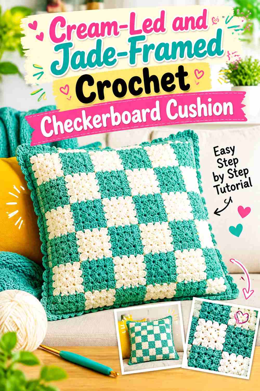
A cream-led checkerboard uses the lighter shade beyond the grid itself. Keep alternating jade and cream checks on the front, then use cream for the back panel or broad outer area and reserve jade for a narrower frame. This preserves a strong checker pattern while giving the completed cushion a lighter overall appearance.
Give Cream More Surface Beyond the Jade Checks
Rather than changing the checker sequence, increase cream through the border, back, or surrounding panel area. The grid remains recognizable, but the finished cushion feels less visually dense.
This approach is useful when the jade is particularly deep or saturated and already attracts enough attention in relatively small blocks.
Use Jade Edging to Contain the Cream-Led Cushion
A narrow jade edge can reconnect all of the separated green checks at the perimeter. It creates a clear boundary without requiring jade to take over the cushion surface.
Avoid making the jade border so wide that it begins to compete with the checkerboard. The central grid should remain the main geometric feature.
Creator Credit: Priscilla Pate
3. Jade Cream And Pale Sage Crochet Gingham Checkerboard Cushion
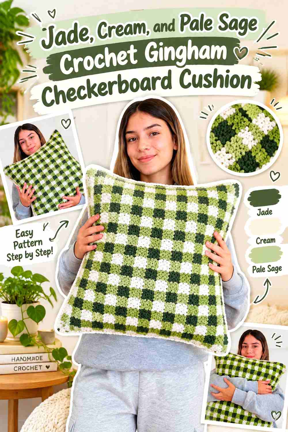
Adding pale sage changes a strict checkerboard into a softer gingham direction. Jade becomes the darkest green, pale sage supplies the middle value, and cream remains the lightest. The three shades need obvious value separation for the gingham structure to remain clear; otherwise jade and sage can visually merge into a general green field.
Keep Jade as the Darkest Gingham Check
Use jade where the grid needs its strongest anchor. Repeating the darkest green at consistent intersections gives the cushion a recognizable rhythm instead of allowing all three shades to compete equally.
If your jade is relatively light, choose a sage that remains noticeably softer and lighter rather than simply selecting another medium green.
Let Cream Stay Lighter Than Jade and Pale Sage
Cream provides the clearest separation in this palette. Keep it in predictable parts of the gingham repeat so the eye can distinguish the light, medium, and dark areas.
If cream occupies too little space, the two greens may dominate and reduce the checked effect. Increase cream before introducing a fourth color.
Use Pale Sage to Bridge Jade and Cream Checks
Pale sage is most useful as an intermediate color. It should visually connect the strong jade checks and light cream areas without becoming the new dominant shade.
When substituting sage, preserve that middle-value role. The exact green matters less than keeping it clearly between jade and cream in lightness.
Creator Credit: crochet daniela
4. Jade And Cream Chunky Crochet Checkerboard Cushion

Larger checks make jade and cream feel bolder because each uninterrupted color field occupies more of the cushion face. This direction works especially well when you want the cushion to read clearly from farther away. Because fewer checks are visible overall, inconsistent dimensions can also become more obvious.
Make Jade and Cream Blocks Large Enough to Read Clearly
Choose a check scale that leaves several complete blocks visible across the front rather than making each square so oversized that the design reads as simple color blocking.
The right balance depends on the cushion construction. Evaluate the completed first row or strip against the intended pillow shape before committing to the remaining surface.
Keep Cream Corners Crisp Against Chunky Jade Checks
Chunkier fabric can make transitions look softer, especially when the yarn itself has a plush surface. Pay attention to the visual corners where four checks meet because those intersections establish the grid.
If cream begins bleeding visually into jade because of fuzzy texture, larger checks may produce a clearer result than trying to create a finer grid.
Creator Credit: Passo a Passo Crochê & Artes
5. Jade Cream And Forest Green Crochet Plaid Checkerboard Cushion
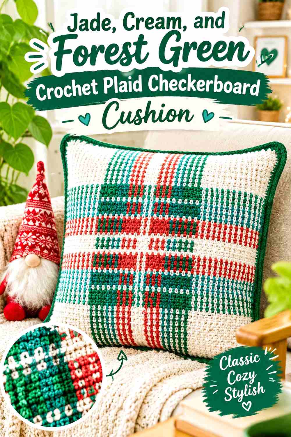
Forest green adds a deeper value to jade and cream, moving the cushion toward buffalo plaid rather than a pure two-color checkerboard. Jade should occupy the medium-green role, forest should remain the darkest shade, and cream should provide the lightest checks. This three-level hierarchy matters more than the exact green names.
Keep Forest Green Darker Than the Jade Checks
Forest green should create the deepest intersections or blocks rather than competing with jade at the same apparent value. If the two greens look almost identical in grayscale, the plaid loses one of its visual levels.
In that case, either choose a deeper forest green or remove it and return to a simpler jade-and-cream grid.
Let Jade Carry More Plaid Area Than Forest Green
Jade is the identifying color of this palette, so use it across more of the visible green sections. Forest green works better as a smaller dark anchor than as an equal competitor.
This keeps the finished cushion recognizably jade and cream even though a third color supports the plaid structure.
Keep Cream Visible Between Jade and Forest Green
Cream prevents the two greens from creating an overly dark surface. Place it consistently enough that light checks repeat across the entire pillow rather than clustering in one area.
A cream edge can further lighten the scheme, while a jade border will make the finished cushion feel greener.
Creator Credit: Just Be Crafty
6. Jade And Cream Surface Grid Crochet Checkerboard Cushion
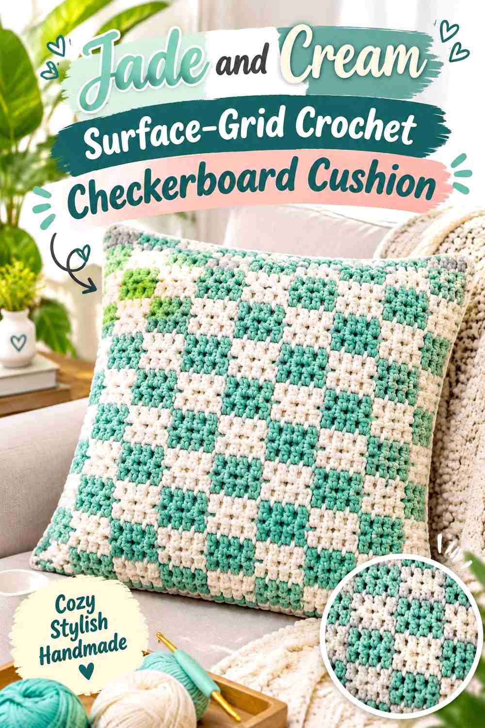
Instead of building every square through repeated color changes, this direction treats the grid lines themselves as part of the design. A broad jade or cream base can carry contrasting lines that divide the surface into visible checks. The concept is useful when you want the checker structure to feel lighter and less solid than a fully alternating block pattern.
Let Cream Create Open Space Around Jade Grid Lines
A cream-dominant background gives jade lines enough contrast to establish the checker structure without filling half the cushion with green blocks.
Keep the jade grid regular. If the vertical and horizontal spacing changes, the surface may begin to resemble irregular stripes rather than a checkerboard.
Repeat Jade Along the Cream Cushion Edge
Using jade again at the border ties the grid lines to the perimeter and prevents them from appearing like a separate layer placed over the cream cushion.
For a softer result, finish in cream and let jade exist only inside the grid. That gives the pattern less visual weight around the outside.
Creator Credit: MJ’s Off The Hook Designs
7. Jade Cream And Soft Sage Panel Crochet Checkerboard Cushion
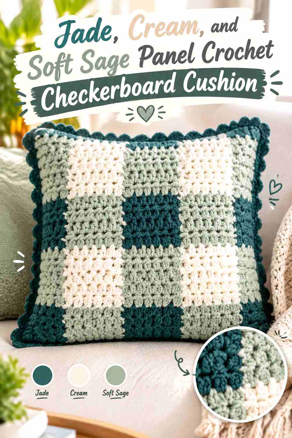
A panel-built cushion makes it possible to create the checkerboard from repeated strips rather than changing colors constantly across a single row. For the jade-and-cream palette, use soft sage as a limited intermediary so alternating strips create a gingham-style grid once assembled.
Keep Jade and Cream Panel Widths Consistent
The individual strips determine the eventual square dimensions. If one jade-and-cream panel is visibly wider than another, the finished checkerboard can become distorted after joining.
Compare the strips side by side before permanent assembly and correct obvious differences while they are still separate.
Use Soft Sage Between Jade and Cream Panels
Soft sage can create the middle-value checks produced where the panel sequence changes. It works most effectively when it remains noticeably different from jade.
Choose a muted lighter green if substituting. Another deep green would reduce the visual distinction between the intermediate and darkest checks.
Let Jade Define the Outer Cream Panel Grid
A jade border gives the assembled strips a unified frame and can visually contain small seam differences along the outside edge.
If the cushion already has numerous jade checks around its perimeter, use cream instead to prevent the edge from becoming excessively dark.
Creator Credit: Sigoni Macaroni
8. Jade And Cream Modular Motif Crochet Checkerboard Cushion

This version creates the checkerboard from separately made modules. Some squares can be plain jade and others plain cream, or individual motifs can contain smaller jade-and-cream checks. Modular construction makes layout planning especially important because you can rearrange the pieces before committing to the joins.
Alternate Jade and Cream Modules Before Joining
Lay every square flat and establish the entire checker sequence first. This makes it easier to catch duplicated colors, clusters, or accidental breaks in the alternating layout.
Take a quick photo of the arrangement before moving the pieces. That gives you a reference while joining without requiring written assembly instructions.
Use Jade or Cream Joins Without Breaking the Checker Pattern
A visible jade join adds dark lines between all modules, which makes the grid more pronounced. Cream joins create a lighter network and allow the alternating squares to receive more attention.
Choose one approach consistently. Switching join colors unpredictably can make the seams look like a separate pattern competing with the checks.
Keep Jade and Cream Motif Details Simpler Than the Grid
If individual modules contain additional texture or motifs, keep their color changes restrained. The checkerboard arrangement already provides strong repetition.
A highly detailed motif inside every square can reduce the clarity of the larger jade-and-cream grid when the cushion is viewed from a distance.
Creator Credit: The Turtle Trunk
9. Jade And Cream Granny Square Crochet Checkerboard Cushion

Granny squares provide a straightforward modular route to a checkerboard surface. Make one repeated jade square type and one cream square type, then alternate them across the front. The square construction adds visible crochet texture, so the colors themselves can stay simple.
Alternate Jade and Cream Granny Squares Predictably
Use a strict alternating layout if you want the granny-square construction to read as checkerboard rather than general patchwork.
Before joining, view the complete arrangement from a distance and confirm that jade and cream do not accidentally form same-color pairs along one row or edge.
Keep Jade and Cream Outer Rounds Consistent
If each square contains more than one color, use consistent outer-round logic. For example, jade-dominant squares can end in jade while cream-dominant squares end in cream.
Changing the outer color randomly can blur the boundaries that create the larger checker effect.
Choose Jade or Cream Joins According to Contrast
A jade join emphasizes individual cream squares but may visually merge into jade squares. Cream does the reverse.
A neutral-looking seam is not always necessary. Decide whether you want the joining grid to be clearly visible or to recede behind the alternating motifs.
Creator Credit: Jewels and Jones
10. Jade Dominant And Cream Modular Crochet Checkerboard Cushion
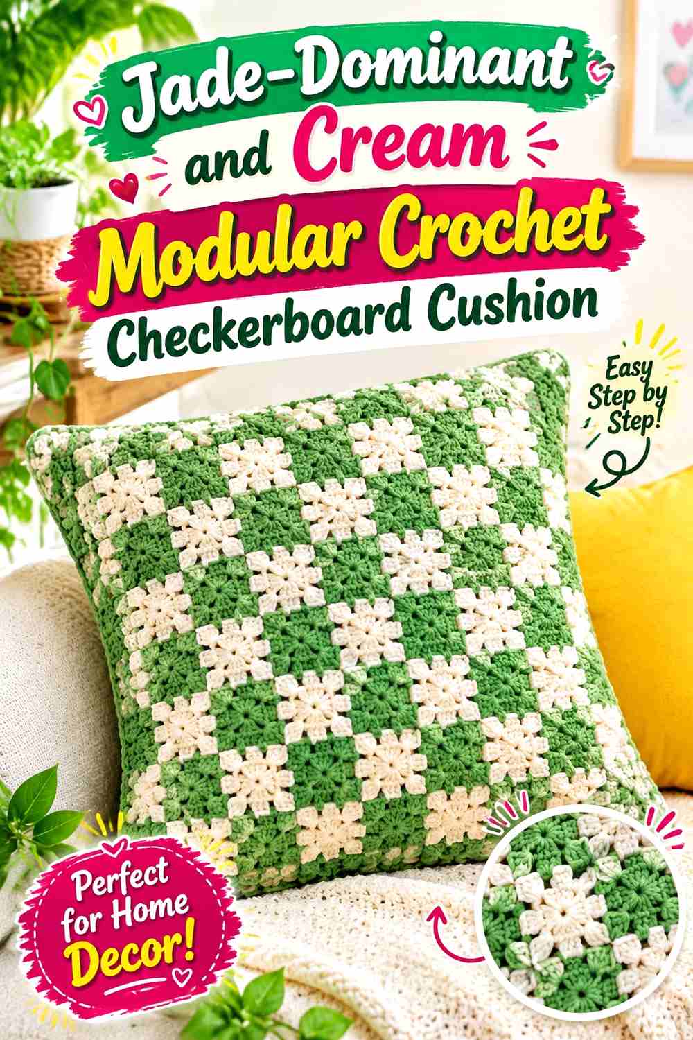
This modular version intentionally gives jade more overall visual area. Use jade on the outer portions of the motifs or around the full cushion while cream appears in alternating centers or selected complete squares. The checkerboard remains visible, but the final piece reads distinctly green.
Let Jade Surround the Cream Checkerboard Modules
A jade outer round, joining color, or border can connect multiple separate green areas into one continuous framework.
This is useful when cream squares otherwise appear too isolated against a modular surface. The repeated jade gives them a consistent background relationship.
Keep Cream Large Enough to Read Against Jade
Do not reduce cream to tiny centers if you still want a recognizable checkerboard. Each light area needs enough surface to form an obvious repeated square.
If the cream areas start reading as dots instead of checks, enlarge them or reduce the width of the surrounding jade.
Creator Credit: Jayda InStitches
11. Jade Cream And Oatmeal Retro Crochet Checkerboard Cushion

Oatmeal gives the final idea a warmer neutral transition. Keep jade as the strongest color, cream as the clearest light check, and oatmeal in selected modules or narrow details. The softer neutral reduces the starkness of an all-cream background without introducing another strong hue.
Keep Jade as the Retro Checkerboard Anchor
Use jade in the most repeated dark areas so the cushion still reads as a jade-led checkerboard. A consistent jade border can reinforce that hierarchy.
Avoid dividing the dark role between jade and several additional greens. The retro effect comes more from clear geometric repetition than from adding numerous shades.
Separate Cream and Oatmeal Checks Clearly
Cream and oatmeal can be quite close in value, especially under warm indoor lighting. Place the yarns together before assigning them to adjacent squares.
If they look almost identical, use oatmeal only for the back, seam, or border rather than forcing two nearly indistinguishable light checks into the front grid.
Use Cream to Keep Jade Texture Visible
Where the crochet surface has pronounced clusters or joining ridges, cream can provide the cleaner visual break around jade.
This is especially useful at motif intersections, where several textured edges meet and a dark-heavy color arrangement can make the grid look denser than expected.
Creator Credit: B.Hooked Crochet
Comparing the Jade and Cream Checkerboard Directions
For the clearest graphic effect, choose the classic two-color, cream-led, chunky, or granny-square versions. These rely mainly on jade-versus-cream contrast and keep additional colors out of the main grid.
For a softer checker pattern, the pale-sage gingham and soft-sage panel ideas add an intermediate green. They work best when jade remains noticeably darker than the added sage.
The forest-green plaid produces the deepest palette because it introduces a shade darker than jade. The oatmeal version goes in the opposite direction by adding another light earthy neutral.
Construction also changes the look. Row-based checkerboards create a continuous fabric, while joined squares make every module boundary part of the cushion’s surface. Neither approach is inherently better; the important question is whether you want the checks themselves or the joins between them to receive more attention.
Conclusion
Jade and cream can support much more than one standard checkerboard cushion. The same two colors can produce a high-contrast classic grid, a lighter cream-led surface, a chunky oversized checker, a modular granny-square arrangement, or a softer gingham effect.
Start by choosing the role of jade. Use it as an equal checker color for a balanced grid, increase it through borders and joins for a greener cushion, or reserve it for the darkest gingham intersections when working with a third shade.
Cream should remain visibly light enough to separate the checks and preserve the grid. When adding sage, forest green, or oatmeal, give that third shade one defined job rather than allowing all three colors to compete equally. Use the linked tutorials for their original construction details and adapt the palette independently.
Frequently Asked Questions
Should jade or cream dominate a crochet checkerboard cushion?
Neither has to dominate in the central grid, but the border, joins, and back can establish an overall hierarchy. Use jade around the edge for a greener, more defined result or cream when you want the cushion to feel lighter.
How can I tell whether jade and cream have enough contrast?
Place the actual yarns next to each other and view them from several feet away. You can also photograph them in grayscale. Cream should remain clearly lighter than jade if you want individual checks to read easily.
What third color works with a jade and cream checkerboard cushion?
Pale sage creates a softer green transition, forest green adds a darker level, and oatmeal introduces a warmer light neutral. Keep the third color secondary so jade and cream remain the identifiable pairing.
Should the border of a jade and cream cushion be jade?
A jade border works well when you want to frame the grid and connect separated jade checks around the edge. Cream is useful when the center already feels dark or jade-heavy. Either choice can work; judge the complete front before deciding.
How large should jade and cream checkerboard squares be?
The useful scale depends on the cushion and construction method. Larger checks create a bolder, simpler graphic effect, while smaller checks create more movement. Test enough of the first row or arrange several sample modules so you can evaluate the proportion on the intended cushion size.
How do I keep a jade and cream checkerboard from looking uneven?
Keep the check dimensions consistent, monitor tension around color changes, and compare modular squares before joining. For joined designs, laying the entire front out first also helps reveal mismatched sizes or breaks in the alternating sequence.
Can I use granny squares for a jade and cream checkerboard cushion?
Yes. Alternate jade-dominant and cream-dominant granny squares across the front, and decide whether the joining color should emphasize or recede behind the grid. Keeping the motif layout predictable helps the finished surface read as checkerboard rather than general patchwork.