## Introduction
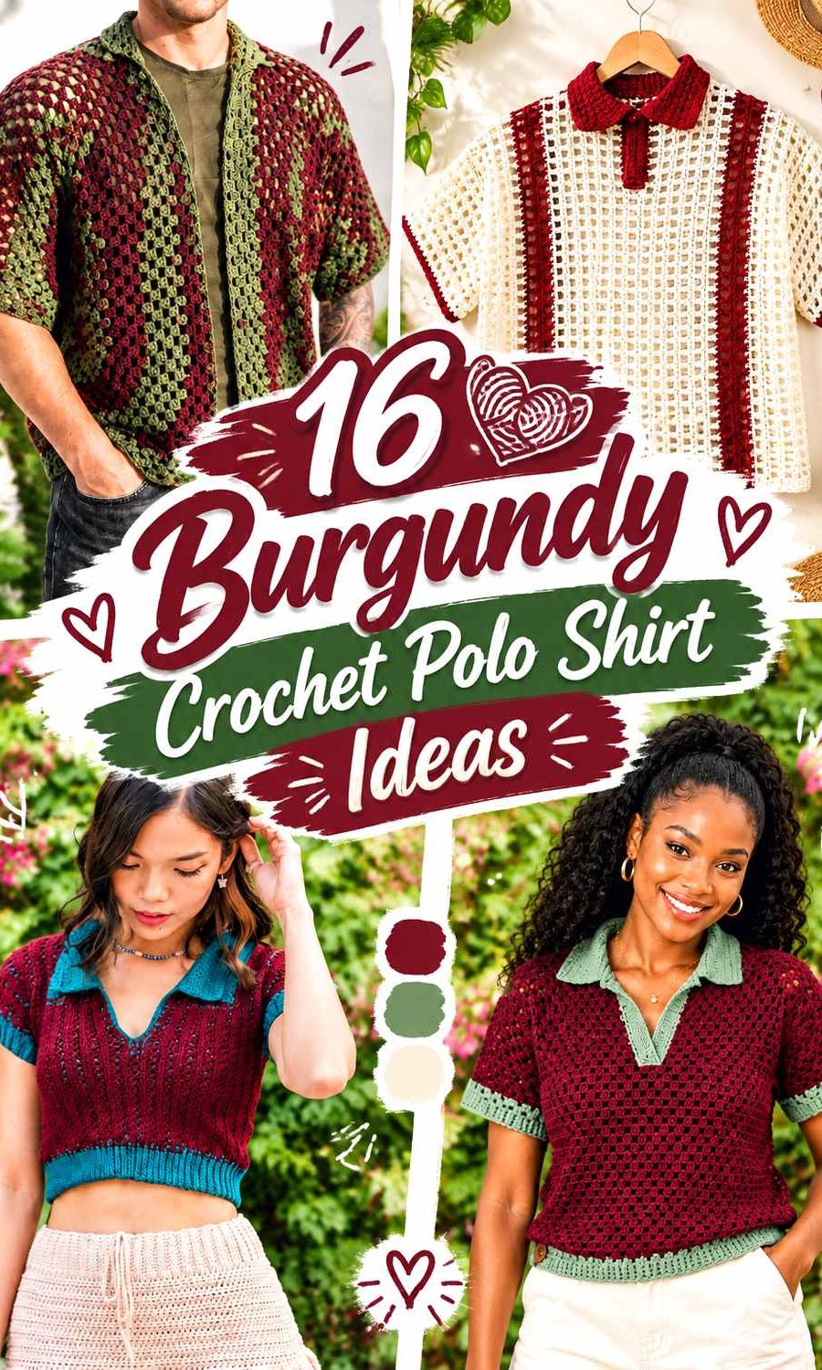
Burgundy gives a crochet polo shirt enough depth to define the collar, placket, sleeves, and stitch texture without limiting you to an all-dark garment. The bigger decision is what you place beside it. A pale neutral can sharpen the polo details, another muted color can soften the contrast, and a dark supporting shade can create a much more understated shirt.
These 16 ideas keep burgundy as the common thread while changing the supporting colors, their proportions, and their placement. The linked tutorials provide construction references for polo or closely related collared crochet shirts; the burgundy palettes are independent color adaptations, so you can apply them without assuming the original creator used the proposed colors.
Quick List
- Burgundy And Cream Crochet Polo Shirt
- Burgundy And Camel Crochet Polo Shirt
- Burgundy And Dusty Rose Crochet Polo Shirt
- Burgundy And Charcoal Crochet Polo Shirt
- Burgundy And Navy Crochet Polo Shirt
- Burgundy And Sage Crochet Polo Shirt
- Burgundy And Mustard Crochet Polo Shirt
- Burgundy And Blush Pink Crochet Polo Shirt
- Burgundy And Oatmeal Crochet Polo Shirt
- Burgundy And Black Crochet Polo Shirt
- Burgundy Ivory And Taupe Crochet Polo Shirt
- Burgundy And Teal Crochet Polo Shirt
- Burgundy And Soft Gray Crochet Polo Shirt
- Burgundy And Rust Crochet Polo Shirt
- Burgundy And Olive Crochet Polo Shirt
- Burgundy And Pale Blue Crochet Polo Shirt
Decide Where Burgundy Should Lead on a Crochet Polo Shirt
Burgundy does not have to cover every part of the shirt to remain the main color. On a classic polo, it can fill the front and back body while a supporting shade defines the collar, placket, sleeve edges, or hem. This arrangement keeps the garment recognizable as burgundy while giving the neckline enough contrast to stand apart from the body.
For a quieter effect, keep the collar burgundy and introduce the second color only through narrow trim or repeated stripes. If the shirt uses openwork, granny clusters, or another visibly textured fabric, compare the colors from a short distance as well as close up. Colors that appear different as yarn balls can become much less distinct once the stitches visually mix.
Use Burgundy Contrast to Protect the Collar and Placket
The collar and center-front opening are usually among the first areas people notice on a polo shirt, so contrast should help rather than hide them. A cream, oatmeal, pale blue, or soft gray collar can create clear separation from a burgundy body. Charcoal, navy, black, and olive produce a lower-key transition while still changing the visual frame around the neckline.
If you are unsure whether two colors have enough light-and-dark separation, photograph the yarns together and view the image in grayscale. For small placket details or narrow sleeve edging, stronger value contrast is generally easier to see than two shades of similar darkness.
1. Burgundy And Cream Crochet Polo Shirt

Burgundy can cover the main torso and sleeves while cream defines the collar, placket, and narrow sleeve finish. This gives the polo a clear light-and-dark hierarchy without breaking the body into too many sections. It is particularly useful when the crochet fabric has visible stitch texture because cream around the neckline separates those details from the deeper main field.
Burgundy Works Well Across the Main Crochet Polo Body
Keeping burgundy continuous across the front and back makes the shirt read as one cohesive garment instead of a collection of contrasting sections. If you want cream accents, concentrate them near structural features rather than inserting them randomly through the torso. A continuous burgundy body also leaves room for the collar shape and placket to become the main color contrast.
Burgundy Gains Definition From a Cream Collar and Placket
Cream can be most effective where the amount is controlled. Try it on the folded collar and placket, then decide whether the sleeve edges need the same repetition. Repeating cream once or twice away from the neckline can connect the palette, but covering every edge may reduce burgundy’s dominance.
Creator Credit: WOWder
2. Burgundy And Camel Crochet Polo Shirt

Camel gives burgundy a warmer, more muted partner than bright cream. Let burgundy remain dominant through the torso and use camel on the collar, a narrow placket border, or selected sleeve details. Because both colors carry substantial visual weight, their placement matters more than simply dividing the garment equally.
Burgundy Should Stay More Prominent Than Camel on the Polo
A roughly equal burgundy-and-camel split can make the eye move back and forth without a clear focal point. Keeping most of the shirt burgundy gives camel a defined supporting job. The collar is especially useful because its compact area allows camel to influence the shirt without taking over the entire front.
Burgundy and Camel Need Enough Separation Around Crochet Edges
Depending on the exact shades you choose, dark camel and burgundy can approach similar values. Place the yarns next to one another before committing to narrow stripes or detailed edging. If the distinction feels weak, use a somewhat lighter camel rather than adding an unrelated third color solely to rescue the contrast.
Creator Credit: FTK Crochet
3. Burgundy And Dusty Rose Crochet Polo Shirt

Dusty rose creates a tonal transition rather than the sharp break you get from cream or black. Burgundy can anchor the body while dusty rose appears across the collar, sleeve trim, or broader stripes. This palette is useful when you want visible color variation but prefer the two shades to feel related.
Burgundy Needs More Surface Area Than Dusty Rose for a Clear Lead
If dusty rose occupies half the front, the shirt can start reading as a two-color garment rather than a burgundy polo. Use burgundy across the largest panels and let dusty rose interrupt it in controlled areas. A dusty rose collar plus one repeated sleeve detail can be enough to establish the relationship.
Burgundy and Dusty Rose Benefit From a Light-Dark Check
Pink and red-family shades can look obviously different in hue while still sitting close in value. That matters around small crochet details. Check the yarns in grayscale if you want the collar or placket to remain clearly outlined; choose a noticeably lighter dusty rose when stronger definition is important.
Creator Credit: TCDDIY
4. Burgundy And Charcoal Crochet Polo Shirt
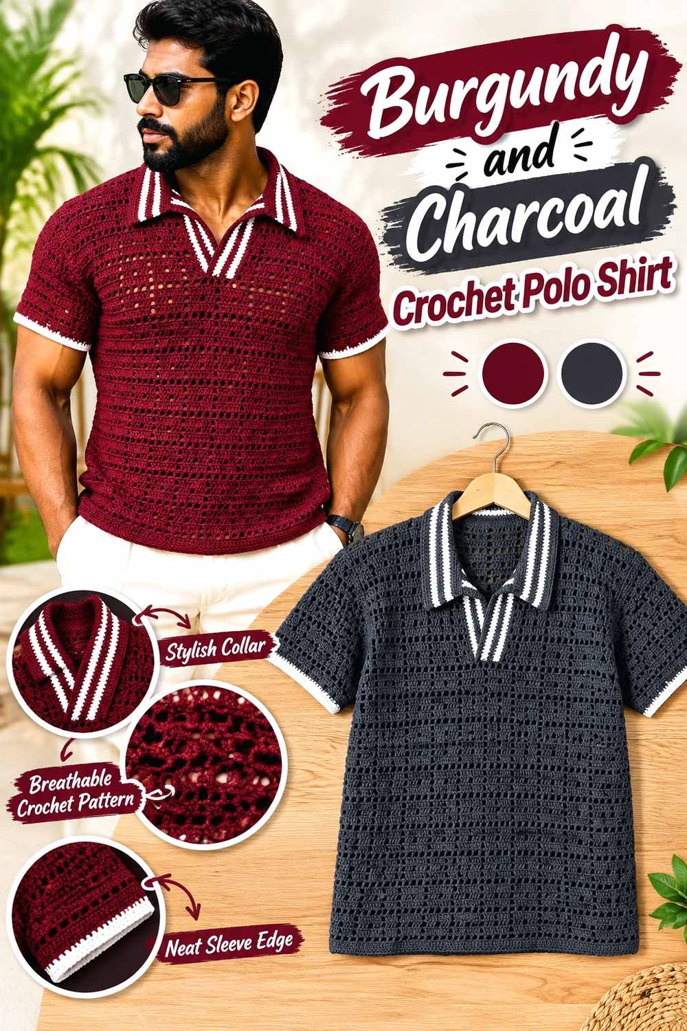
Charcoal shifts burgundy toward a darker, restrained polo palette. Burgundy can still cover the body, but charcoal works well on the collar and placket where its cooler darkness creates a subtle boundary. Because neither shade is light, the effect relies more on hue difference than high value contrast.
Burgundy Keeps the Charcoal Crochet Polo From Becoming Too Dark
If charcoal spreads across large sleeves, collar, hem, and body panels at once, it can compete strongly with burgundy. Keep charcoal concentrated around selected edges while allowing burgundy to remain uninterrupted across the larger surfaces.
Burgundy and Charcoal Need Extra Contrast for Small Polo Details
A narrow charcoal line beside dark burgundy may disappear from a normal viewing distance. If a detail needs to be obvious, make the charcoal section broader or choose a charcoal that remains visibly distinct. For subtle framing, however, that low contrast can be an intentional advantage.
Creator Credit: Ascarcrochets
5. Burgundy And Navy Crochet Polo Shirt

Burgundy and navy create a dark two-color shirt without relying on black. Burgundy can dominate the torso while navy defines the collar, sleeve cuffs, or lower edge. Both colors carry considerable depth, so clear repetition and placement are more important than high contrast.
Burgundy Should Be Separated Clearly From Navy at the Polo Neckline
The collar is not the place to let two dark shades visually merge if you want its shape to remain obvious. Test burgundy and navy beside each other under the lighting in which the shirt is likely to be worn. A somewhat lighter or clearer navy can preserve the distinction without changing the palette.
Burgundy Can Repeat Beside Navy Instead of Adding a Third Color
If a navy collar feels disconnected, you do not automatically need cream or white. Bring navy back in a narrow sleeve or hem treatment while keeping burgundy between those accents. Repetition makes the navy look deliberate while preserving the two-color concept.
Creator Credit: HookedByJessica
6. Burgundy And Sage Crochet Polo Shirt
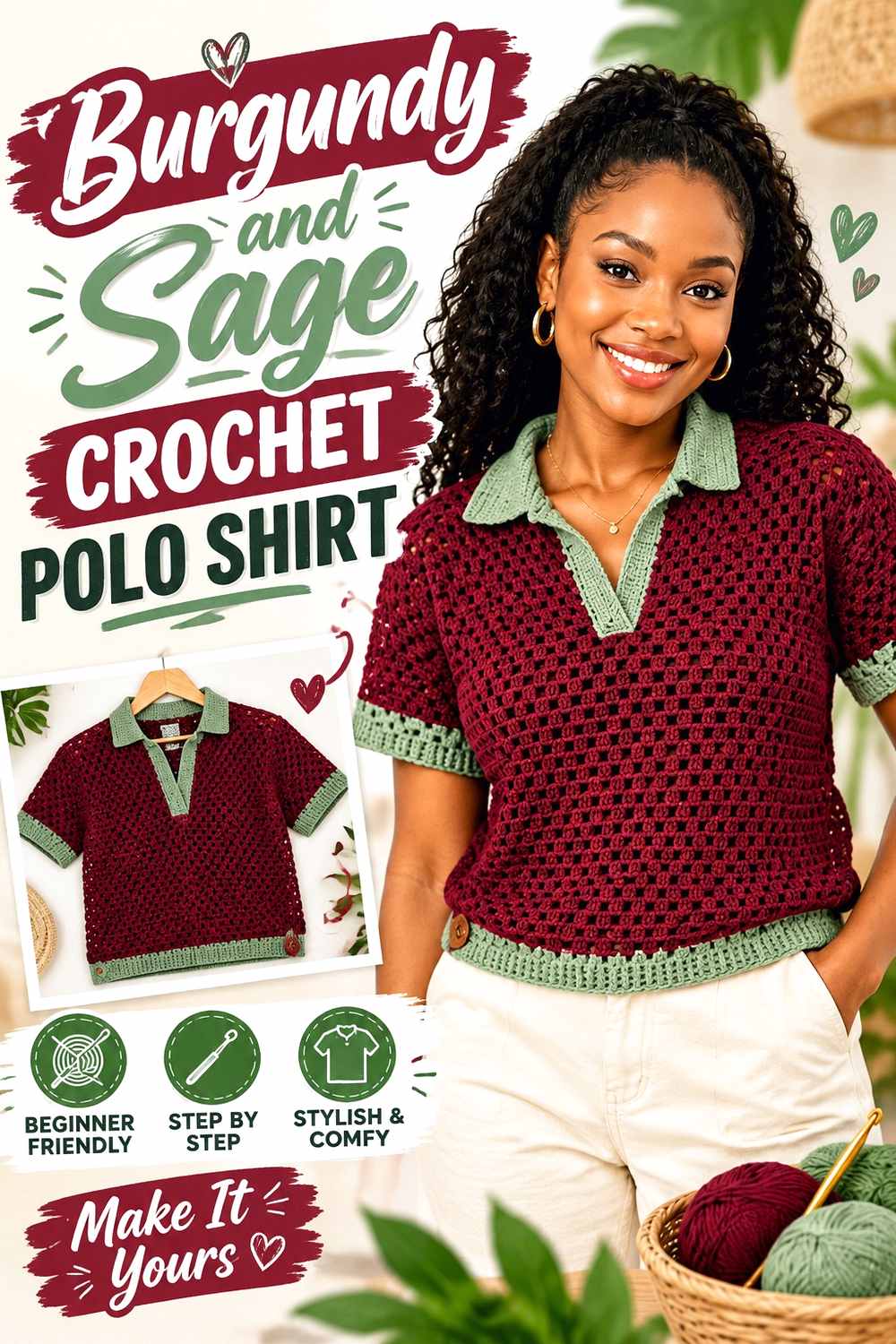
Sage introduces a muted green contrast that is noticeably different from burgundy without becoming excessively bright. Use burgundy across the principal body sections and let sage appear around the collar or in measured stripes. The muted quality of sage helps the two colors share the garment more comfortably than a very vivid green might.
Burgundy Can Anchor Sage Stripes Across a Crochet Polo
If you want striped sections, make burgundy the shade that appears most consistently through the torso. Sage can interrupt that field at deliberate intervals. Avoid placing many narrow sage stripes close together unless you intentionally want the stripe pattern, rather than burgundy, to become the main feature.
Burgundy Looks More Cohesive When Sage Repeats Beyond the Collar
A sage collar alone can feel isolated on an otherwise solid burgundy shirt. Repeating sage once at the sleeve ends or hem can connect the neckline to the rest of the garment. Keep those repetitions narrow if burgundy is supposed to remain visually dominant.
Creator Credit: Creative Hands by SHAY
7. Burgundy And Mustard Crochet Polo Shirt
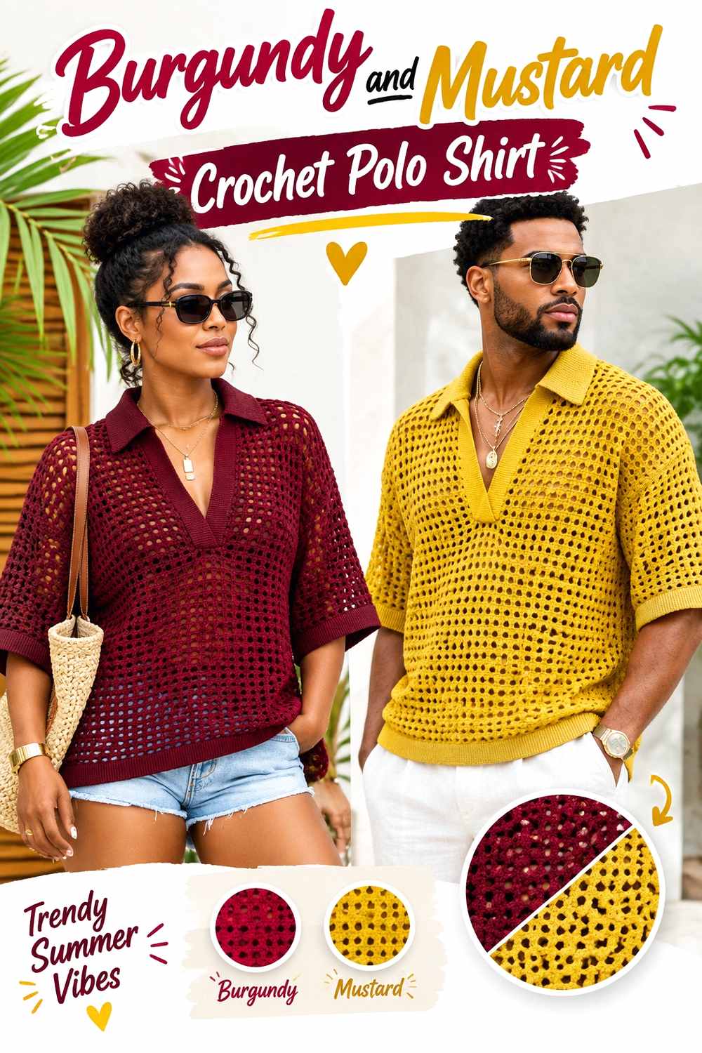
Mustard gives burgundy a stronger warm accent than camel or oatmeal. Rather than dividing the shirt evenly, use burgundy as the large field and treat mustard as a concentrated feature around the collar, placket, cuffs, or occasional stripe.
Burgundy Needs to Outweigh Mustard on the Polo Surface
Mustard can attract attention quickly when placed against deep burgundy. Limiting it to smaller areas lets the brighter supporting color highlight the garment’s structure rather than becoming the first thing the viewer sees across every panel.
Burgundy Can Use Mustard to Emphasize the Crochet Collar
A mustard collar against a burgundy body creates a clear neckline focal point. If that feels too strong, reverse the idea: keep the collar burgundy and use mustard as a narrow outer edge or placket detail. That retains the warm contrast at a smaller scale.
Creator Credit: Honey Loop Stitches
8. Burgundy And Blush Pink Crochet Polo Shirt
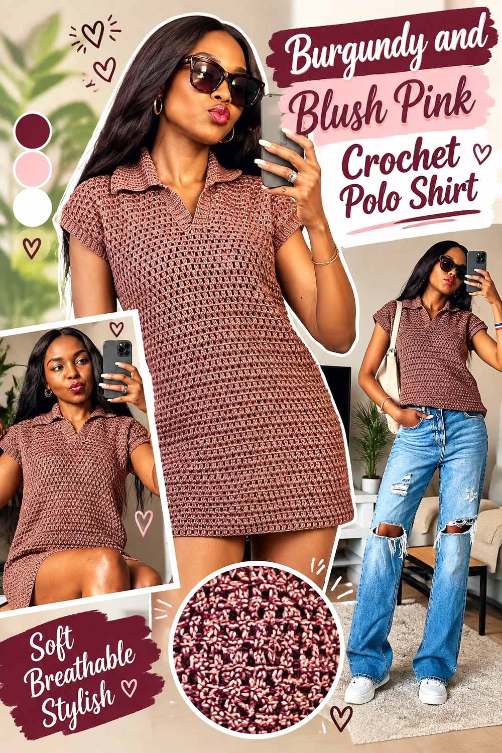
Blush pink produces more value contrast than dusty rose while keeping the palette within a related red-and-pink family. A burgundy body with a blush collar can make the neckline much more visible, especially when the shirt uses a dense or textured stitch pattern.
Burgundy Looks Stronger When Blush Pink Stays Near the Polo Edges
Keep large body panels burgundy and place blush pink on the collar, sleeve ends, or placket if you want the darker color to retain its visual weight. Blush becomes much more dominant when used across broad torso stripes.
Burgundy and Blush Pink Can Separate Small Crochet Details Clearly
Because blush is considerably lighter than deep burgundy, it can be useful around narrow edging and other small areas that might disappear in a darker combination. That does not mean every seam needs pink; use the lighter color where definition actually contributes to the shirt.
Creator Credit: AC Crochets
9. Burgundy And Oatmeal Crochet Polo Shirt
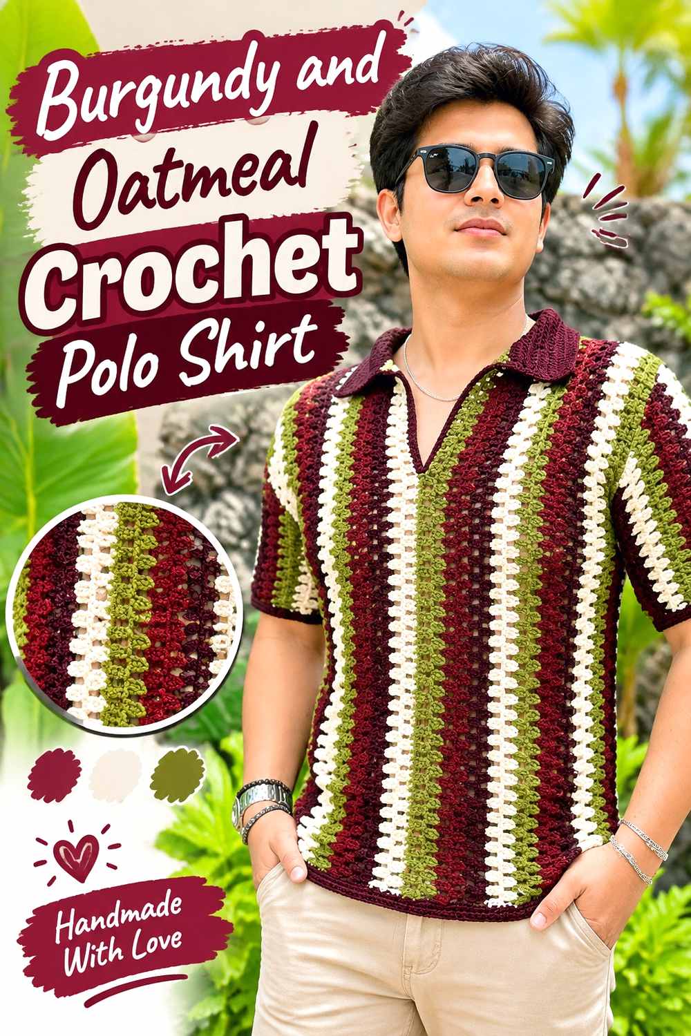
Oatmeal provides a softer neutral contrast than clean cream. It works particularly well when you want burgundy to remain rich without surrounding it with a very bright light shade. Consider burgundy for the body and oatmeal for a collar, sleeve edging, or a limited lower border.
Burgundy Stays Dominant Beside a Narrow Oatmeal Collar
An oatmeal collar creates enough separation to define the neckline while remaining visually quieter than stark white. Keep the collar proportion balanced with the body; an unusually deep oatmeal section can shift the garment toward a color-blocked look.
Burgundy and Oatmeal Can Keep Crochet Texture Easy to Read
If the shirt contains raised or clearly patterned crochet, a lighter oatmeal section can make that texture more noticeable around the neckline. Use the contrast where the stitch detail deserves attention rather than changing colors simply because another edge is available.
Creator Credit: Laura Cepeda English
10. Burgundy And Black Crochet Polo Shirt
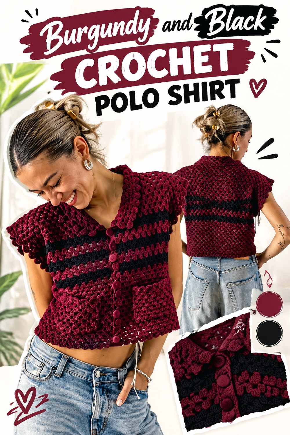
Black produces one of the darkest burgundy polo combinations. The strongest approach is usually to assign the colors separate jobs rather than alternating them constantly. Burgundy can cover the body while black frames the neckline and selected edges.
Burgundy Prevents Black From Taking Over the Crochet Polo
A black collar, placket, cuffs, and hem can collectively occupy more visual space than expected. Start with the collar and one repeated black element. Add more only if the body still clearly reads as burgundy.
Burgundy and Black Need Width When Contrast Is Subtle
Deep burgundy and black may merge from a distance, especially in shadow. A very thin black trim might therefore disappear. If you want the black to register clearly, use it across a collar or broader band rather than depending on a single narrow line.
Creator Credit: BELINA BELLWOOD
11. Burgundy Ivory And Taupe Crochet Polo Shirt
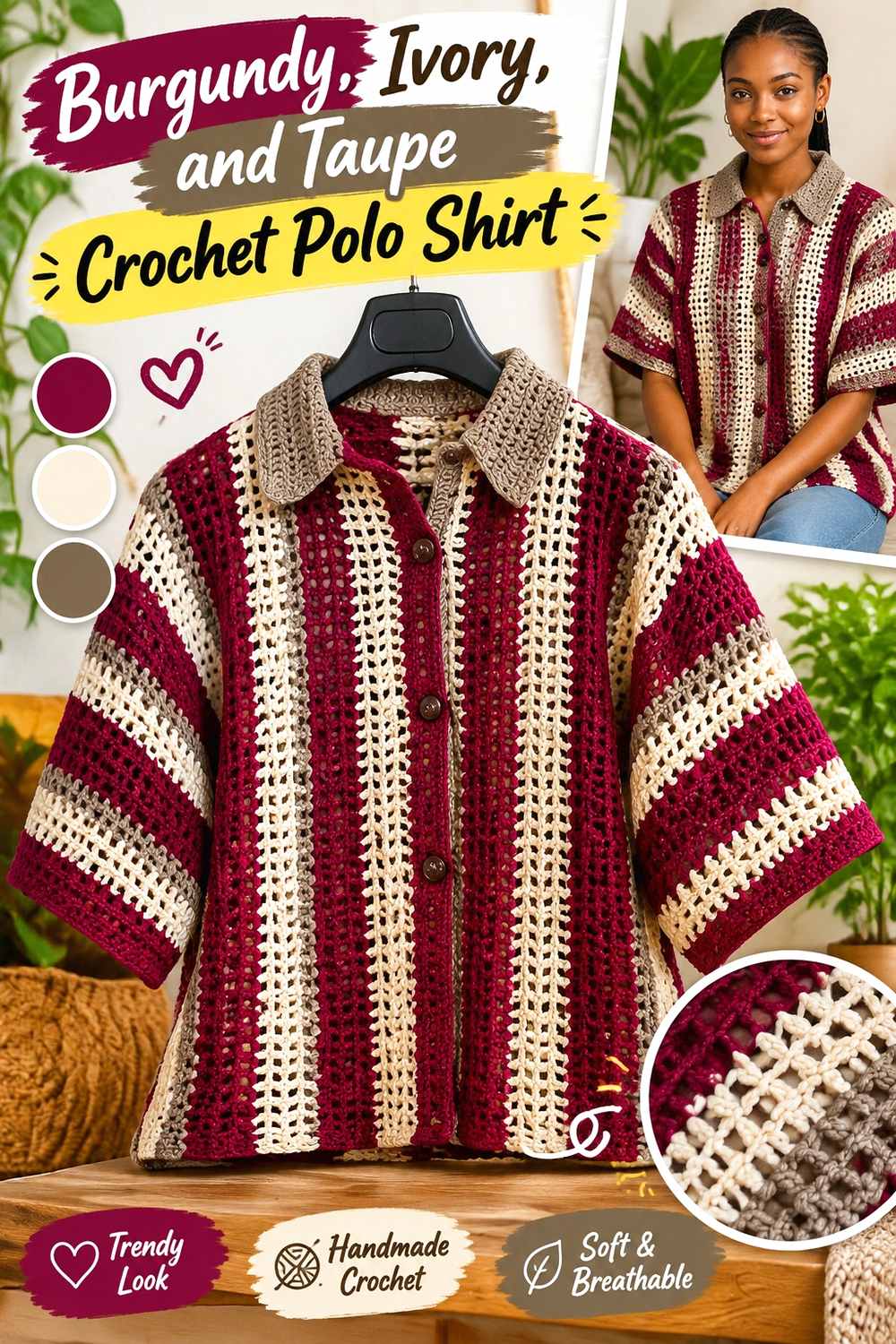
Adding ivory and taupe gives burgundy two supporting neutrals with different jobs. Burgundy can lead the torso, ivory can supply the lightest definition around the collar or placket, and taupe can bridge the two through sleeve or hem details.
Burgundy Should Remain the Largest Area in a Three-Color Polo
Three-color garments can become fragmented when every shade receives equal space. Keep burgundy responsible for the body, then assign ivory and taupe specific secondary areas. A clear hierarchy makes the palette easier to read.
Burgundy Benefits When Ivory and Taupe Do Different Jobs
Avoid stacking ivory and taupe together everywhere. Ivory is useful when strong light-dark separation is needed, while taupe can create a softer transition. For example, ivory might outline the neckline while taupe appears at the sleeve edge, leaving burgundy to connect the garment.
Creator Credit: ZoeCrochetR
12. Burgundy And Teal Crochet Polo Shirt
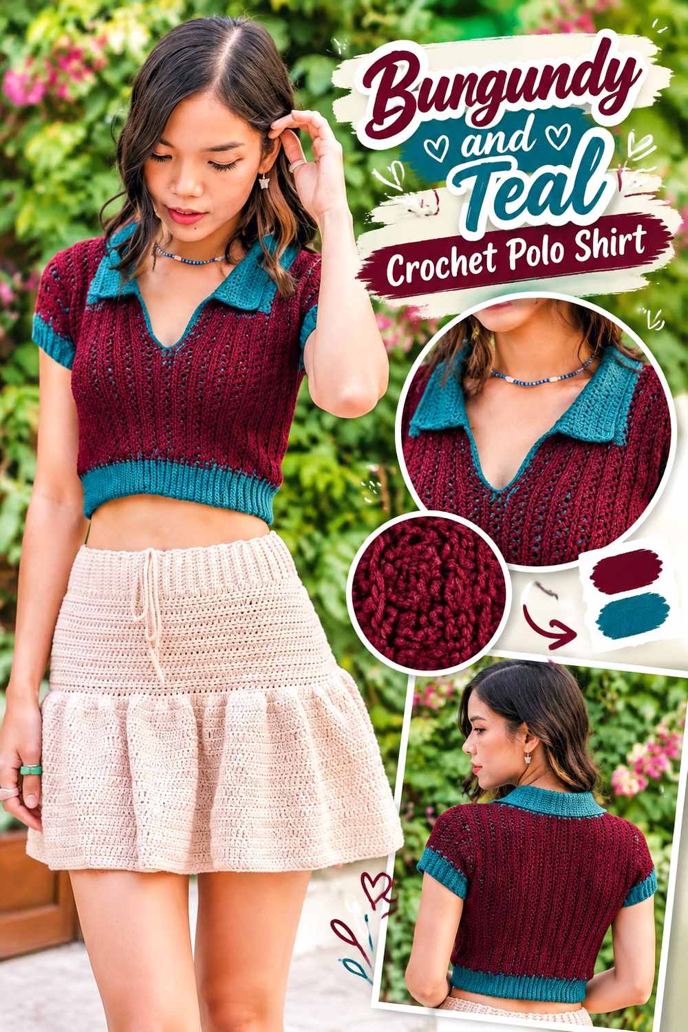
Teal creates one of the clearest hue contrasts in this collection. Because both colors can be saturated, controlling their proportions is important. Let burgundy occupy the body and use teal in deliberate sections rather than scattering equal amounts across every panel.
Burgundy Needs a Clear Hierarchy Beside Teal
If burgundy and teal appear in equal-width stripes throughout the shirt, the stripe pattern can become more important than either color. For a burgundy-led polo, keep teal to the collar, placket, cuffs, or a smaller number of broad accent bands.
Burgundy and Teal Can Share Open Crochet Without Extra Colors
On mesh or openwork fabric, the gaps already add visual activity. Burgundy and teal provide enough difference on their own, so a third accent may make the surface unnecessarily busy. Evaluate the shirt over the intended underlayer before deciding whether more contrast is really needed.
Creator Credit: Chenda DIY
13. Burgundy And Soft Gray Crochet Polo Shirt

Soft gray cools burgundy without producing the heavy effect of charcoal. It can provide a clean collar, subtle cuffs, or narrow stripes while leaving the torso distinctly burgundy.
Burgundy Becomes More Defined Beside a Light Soft Gray
A lighter gray can outline the neckline without the brightness of white. This makes it useful for a shirt where you want the collar clearly visible but still restrained. Keep burgundy around the placket if you prefer the center front to blend more gently into the torso.
Burgundy Can Use Soft Gray to Highlight Crochet Ribbing
If the polo has visibly ribbed sleeve edges, collar work, or hem texture, soft gray can isolate those sections from a burgundy body. Use the change where texture already creates a structural boundary rather than switching colors in the middle of an otherwise uninterrupted panel.
Creator Credit: ByKaterina Designs
14. Burgundy And Rust Crochet Polo Shirt
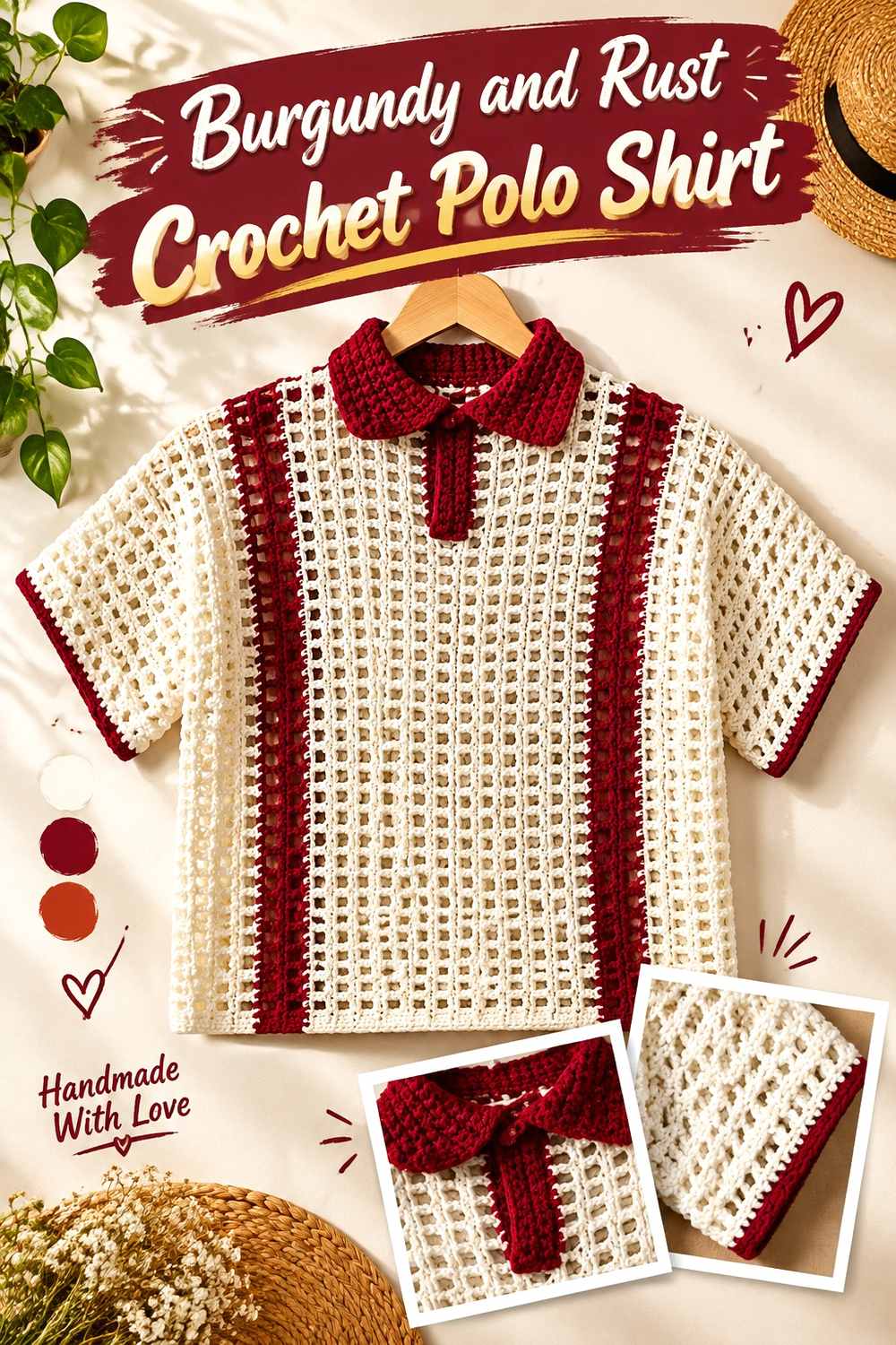
Rust keeps the palette warm and closely related without moving into pink. Because burgundy and rust can be fairly close in both warmth and depth, this idea works particularly well when you want a blended, autumnal direction rather than sharp contrast.
Burgundy Should Be Darker Enough Than Rust to Preserve Polo Details
Compare the two yarns before using rust for a narrow collar or placket. If they are nearly identical in value, those details may disappear. A somewhat lighter or more orange-leaning rust can create enough separation while retaining the warm relationship.
Burgundy and Rust Work Well in Broader Crochet Sections
Low-contrast colors often perform better when given enough area to be recognized. A rust collar or sleeve section can be more successful than a tiny rust outline. Keep burgundy across the body so the second warm shade reads as an intentional block.
Creator Credit: LaDenser Crochets
15. Burgundy And Olive Crochet Polo Shirt
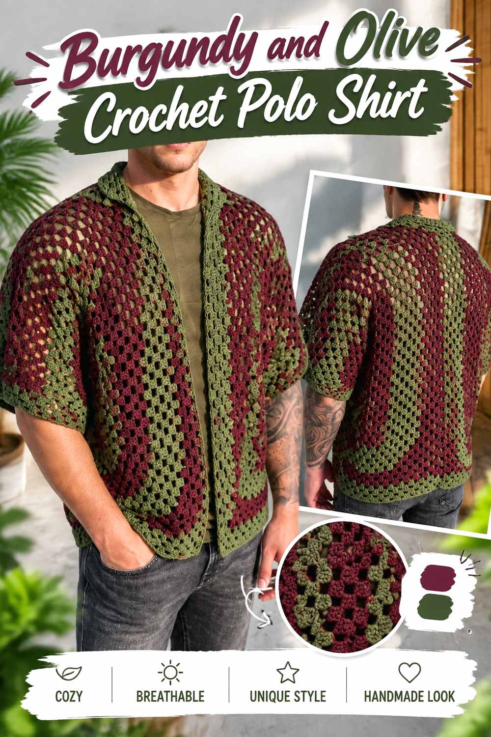
Olive gives burgundy an earthy green counterpart with less brightness than sage. Both colors have considerable visual weight, making this a useful palette when you want contrast based more on hue than on dramatic light-and-dark separation.
Burgundy Should Frame Olive Carefully Around the Collar
An olive collar can work well against burgundy, but check the values first. If the olive is very dark, broaden the collar or use a slightly lighter olive so its outline remains apparent against the burgundy neckline.
Burgundy and Olive Suit Repeated Granny or Open Crochet Sections
When the shirt has strong clustered texture, alternating large burgundy and olive sections can make the construction itself more visible. Avoid changing color at every small opportunity; fewer repeated areas generally keep the polo shape easier to read.
Creator Credit: Kenikse Crochet
16. Burgundy And Pale Blue Crochet Polo Shirt
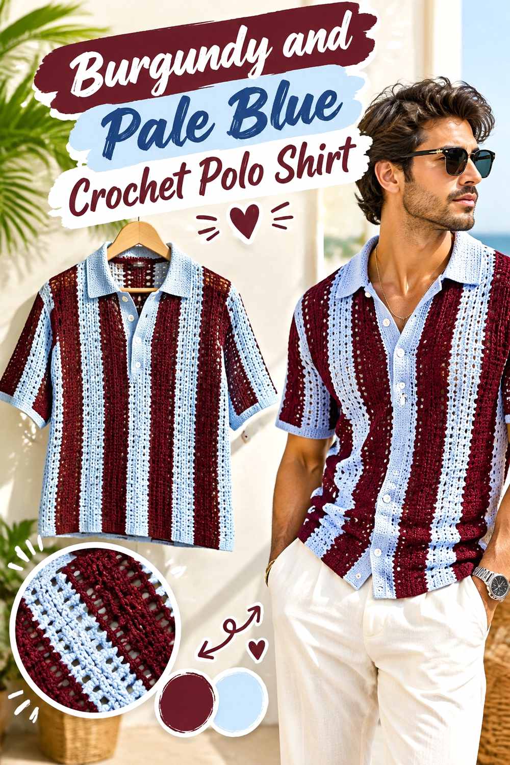
Pale blue gives burgundy a cool, light counterpoint that is noticeably different from cream and gray. Burgundy can carry the body while pale blue concentrates attention at the collar, placket, sleeve edges, or selected mesh sections.
Burgundy Gains Crisp Separation From Pale Blue at the Polo Neckline
Pale blue is light enough to distinguish a collar clearly from a burgundy body without relying on white. This makes it useful for small neckline details where a darker supporting shade might visually disappear.
Burgundy Should Repeat Around Pale Blue Without Over-Striping the Shirt
If pale blue appears at the collar, repeat it once elsewhere rather than covering the entire polo with alternating stripes. A sleeve edge or narrow hem accent can connect the palette while burgundy remains the color that defines the garment from a distance.
Creator Credit: ShylerCrochets
Conclusion
The right burgundy crochet polo shirt palette depends on how much contrast you want the collar and other shirt details to carry. Cream, oatmeal, blush, pale blue, and soft gray create clearer light-and-dark separation. Camel, dusty rose, sage, and rust produce softer transitions. Navy, charcoal, black, and olive make the shirt darker and more restrained, while mustard and teal give burgundy a stronger accent relationship.
Whatever palette you choose, decide which color owns the body before placing accents. Then repeat the supporting shade only where it helps define the collar, placket, sleeves, hem, stripes, or crochet texture. Use the original creator tutorials for their exact construction and finishing methods while treating these palettes as independent color plans.
Frequently Asked Questions
What Colors Work With Burgundy on a Crochet Polo Shirt?
Cream, oatmeal, camel, dusty rose, blush, soft gray, pale blue, sage, olive, teal, mustard, navy, charcoal, rust, and black can all create useful relationships with burgundy. The better choice depends on whether you want strong value contrast, a tonal transition, or a darker overall shirt.
Should Burgundy Be the Collar Color on a Crochet Polo Shirt?
It can be, especially when the body uses stripes or another supporting shade. If most of the shirt is burgundy, however, a contrasting collar is an effective place to introduce the second color because it defines the neckline without requiring a large amount of accent yarn.
How Can I Check Whether Burgundy Has Enough Crochet Color Contrast?
Place the yarns side by side and look at them from a distance. A grayscale photo is another useful check because it removes hue and makes light-and-dark differences easier to judge. This is particularly helpful before using two colors on narrow plackets, trim, or small collar details.
Can a Burgundy Crochet Polo Shirt Use Three Colors?
Yes, but give the colors different roles. Burgundy can dominate the body, one shade can support the collar or sleeves, and a third can appear in smaller edging or repeated details. Equal amounts of all three can make the polo visually fragmented unless that effect is intentional.
How Do I Substitute a Color in a Burgundy Crochet Polo Palette?
Preserve the role of the shade you are replacing. If cream was intended to provide strong light contrast, choose another noticeably lighter neutral. If sage was meant to be a muted supporting color, replace it with another softened shade rather than a highly saturated green.
Why Can Burgundy Look Different Once It Is Crocheted Into a Polo Shirt?
Crochet texture changes how much light, shadow, and background space appear around a color. Dense stitches can produce a more continuous burgundy field, while mesh or clustered stitches allow the background or underlayer to participate visually. Check a useful-size swatch rather than judging the entire palette only from unused yarn.