Oxblood sits between deep red, burgundy, and brown, giving a crochet vest enough color to feel distinctive while remaining dark enough for easy layering. The main challenge is deciding whether to let that richness cover most of the vest or break it up with a lighter neutral, another dark shade, or a carefully controlled accent.
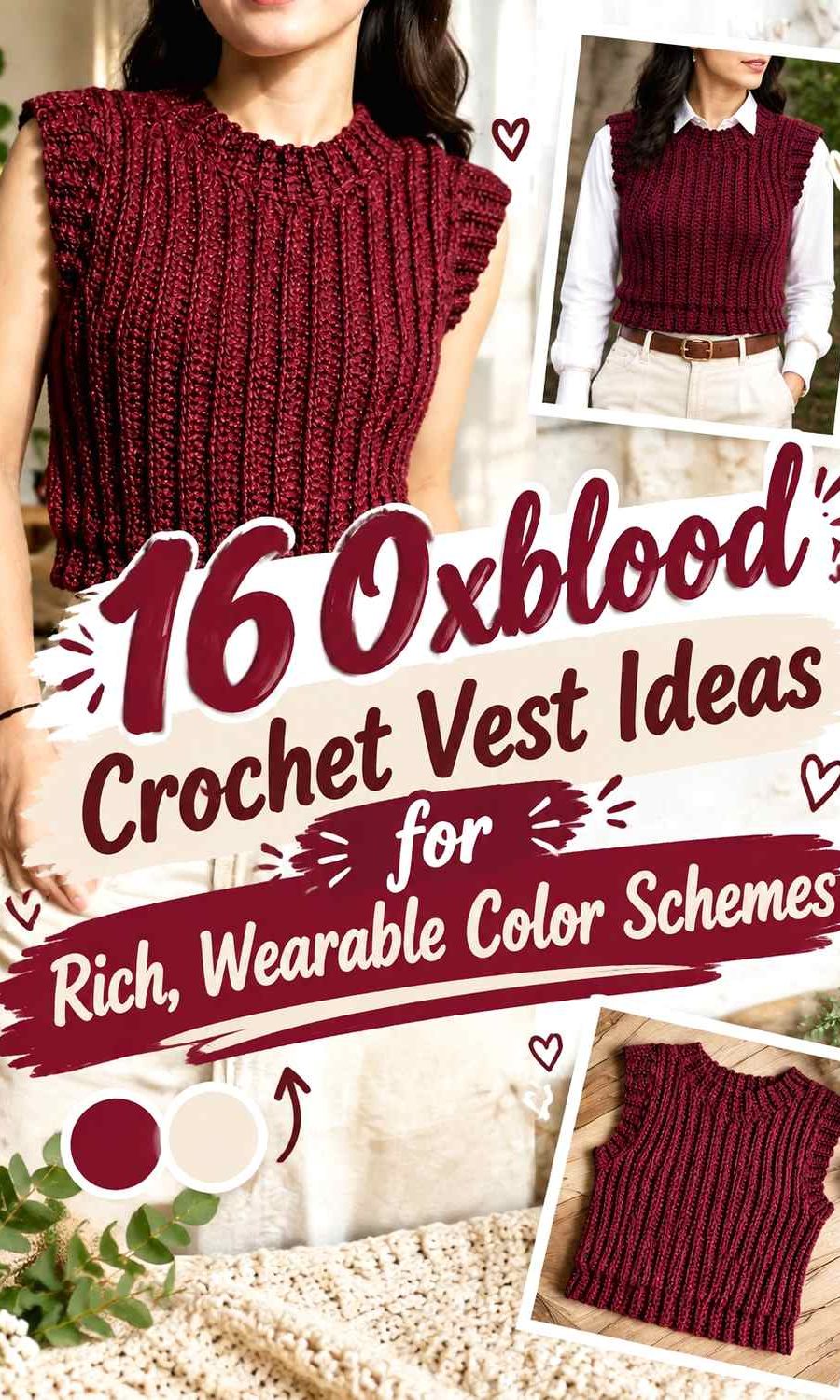
Color placement matters especially on vests because the neckline, armholes, hem, front panels, and motif joins remain highly visible. Cream edging can sharpen an oxblood silhouette, charcoal can make it quieter, and mustard or cobalt can turn small sections into deliberate focal points. Granny-square and checkerboard vests need a different approach again because color becomes part of the surface structure rather than simple finishing.
These 16 ideas use oxblood as the consistent anchor while changing contrast, temperature, placement, and visual balance. The linked tutorials support the vest construction concepts; the oxblood palettes below are independent color adaptations and should not be assumed to be the colors used by the creators.
Quick List
- Oxblood And Cream Ribbed Crochet Sweater Vest
- Oxblood And Charcoal V Neck Crochet Vest
- Oxblood And Dusty Rose Cropped Crochet Vest
- Oxblood And Camel Granny Square Crochet Vest
- Oxblood And Black Everyday Crochet Vest
- Oxblood And Ivory Checkerboard Crochet Vest
- Oxblood And Navy Boxy Crochet Sweater Vest
- Oxblood And Plum Turtleneck Crochet Vest
- Oxblood And Taupe Simple Crochet Vest
- Oxblood And Sage Chunky Ribbed Crochet Vest
- Oxblood And Soft Gray Classic Crochet Sweater Vest
- Oxblood And Rust Textured Crochet Vest
- Oxblood And Mustard Patchwork Crochet Vest
- Oxblood And Cobalt Chunky Crochet Vest
- Oxblood And Blush Granny Square Crochet Vest
- Oxblood And Bone Contrast Trim Crochet Vest
Decide How Much of the Crochet Vest Should Be Oxblood
If the finished garment should clearly read as an oxblood vest, keep oxblood on the largest uninterrupted sections. That might mean the whole body of a ribbed vest, most granny-square backgrounds, or both main panels of a simple pullover.
Supporting colors can then be assigned to areas with a natural structural purpose. Armhole borders, V-neck ribbing, hems, motif centers, joins, and shoulder sections all provide places to introduce a second shade without weakening the oxblood identity.
A more balanced two-color vest is also possible, but equal color distribution produces a very different effect. Checkerboards and patchwork can handle that approach more naturally than a classic solid sweater vest.
Check Light-and-Dark Contrast Against Oxblood
Cream, ivory, bone, pale gray, and blush create obvious separation from oxblood. They are useful when you want neckline shaping, ribbing, or individual motifs to remain easy to distinguish.
Black, charcoal, navy, plum, and dark brown create a much subtler relationship. When using those shades, give them enough area to register. A broad black hem or charcoal panel may work better than a tiny dark stripe that almost disappears into oxblood.
Viewing the yarns from several feet away is a useful check. A grayscale photo can also reveal whether two different hues are actually very similar in lightness.
Use Oxblood Where the Vest Needs Visual Weight
Because oxblood is dark and visually substantial, its location can affect how the garment is read. An oxblood body with pale edging feels grounded in the center, while an ivory body framed by oxblood creates a much more outlined appearance.
On motif vests, placing oxblood around square edges or joins can organize several lighter colors. On solid vests, keeping oxblood through the torso and moving lighter accents toward the neckline or armholes usually preserves a stronger dark core.
1. Oxblood And Cream Ribbed Crochet Sweater Vest

Oxblood works especially well on a ribbed vest because the surface does not need many colors to stay visually interesting. Let oxblood cover most of the body, then use cream to clarify the neckline, armholes, or lower edge. The large oxblood field preserves the deep-red character, while the lighter neutral prevents the finishing details from disappearing into the body.
Keep the cream controlled rather than outlining every edge automatically. A cream neckline and hem will create a more graphic vest than cream used only at the armholes.
Cream Can Separate Oxblood Ribbing at the Vest Edges
Dark yarn can make narrow ribs less visible from a distance. Cream finishing beside oxblood provides a clear stopping point and makes the garment outline easier to read.
Use cream where the ribbing contributes most to the vest’s shape. If the neckline is already the strongest feature, repeating cream at the armholes may be enough without also adding a wide contrasting hem.
Oxblood Should Remain the Largest Ribbed Vest Color
The strong contrast between cream and oxblood means cream does not need equal surface area. Keeping the lighter shade secondary prevents it from dividing the vest into several competing bands.
If you want an even darker result, reduce cream to narrow finishing areas while leaving the main ribbed fabric entirely oxblood.
Creator Credit: VivCrochets
2. Oxblood And Charcoal V Neck Crochet Vest

Oxblood and charcoal create a low-contrast V-neck vest with a quieter appearance than cream or white would provide. Use oxblood through the main front and back, then place charcoal around the V-neck, armholes, or hem.
Because both colors are dark, width matters. A charcoal border that is too narrow may appear almost black against oxblood instead of reading as a deliberate second color.
Charcoal Can Give the Oxblood V-Neck a Subtle Frame
The V-neck is naturally one of the strongest lines on the garment. Charcoal edging can define that shape without creating a bright outline across the chest.
Compare the two yarns under typical indoor lighting before deciding on border width. If they merge too much, widen the charcoal area instead of immediately adding a third color.
Oxblood Keeps the Charcoal Crochet Vest From Looking Flat
Charcoal and black can dominate a wardrobe layer visually, but oxblood introduces a warmer dark note while staying easy to coordinate with neutral shirts underneath.
Keep most of the front oxblood if you want that distinction to remain visible. Reversing the proportions would shift the vest toward charcoal with a red accent.
Creator Credit: Krafty Station
3. Oxblood And Dusty Rose Cropped Crochet Vest

A cropped vest gives every color change more impact because there is less vertical body space available. Oxblood can cover the torso while dusty rose sits at the hem, neckline, or selected upper section.
Dusty rose is lighter but less stark than cream, creating visible separation without turning the vest into a sharply outlined design.
Dusty Rose Softens the Edge of an Oxblood Cropped Vest
A dusty rose lower band can provide a lighter finish without making the short body look heavily divided. Keep the band relatively restrained if preserving a strong oxblood center is the priority.
Another option is to move dusty rose upward to the neckline and armholes, leaving the cropped hem oxblood for a more uninterrupted lower edge.
Oxblood Needs Enough Space Above Dusty Rose on a Cropped Vest
Too many repeated bands can make a short garment look visually segmented. Establish the oxblood field first and treat dusty rose as a finishing color rather than alternating it continuously.
If you substitute a brighter pink, reduce its coverage because higher saturation will compete more strongly with the oxblood.
Creator Credit: Yarnalina
4. Oxblood And Camel Granny Square Crochet Vest
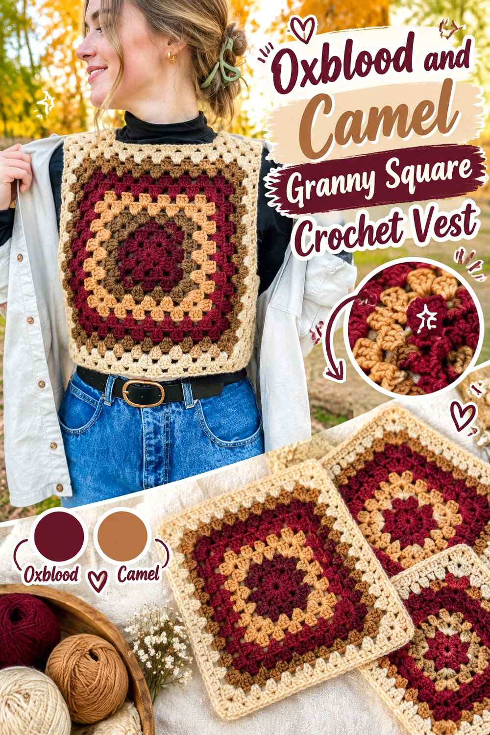
Camel adds warmth without approaching oxblood too closely in value. On a granny-square vest, use oxblood for repeated outer rounds, joins, or the majority of motifs while camel lightens selected centers.
Planning the whole layout before joining is more important than judging individual squares. A camel-heavy front and oxblood-heavy back can make the finished vest feel unbalanced even when each motif works on its own.
Oxblood Joins Can Organize Camel Granny Squares
Using oxblood around motif edges or between squares creates a repeated dark framework. That allows camel centers to vary without making the vest look disconnected.
The dark outline is especially useful when several motifs meet around the shoulders or neckline, where the garment shape needs to remain clear.
Camel Should Repeat Across the Oxblood Vest
Avoid placing all camel motifs in one cluster unless deliberate asymmetry is the goal. Distribute the lighter neutral through the front, back, and shoulder areas so it participates in the entire garment.
If your camel substitute is very pale, use it more sparingly because the contrast with oxblood will become stronger.
Creator Credit: HayHay Crochet
5. Oxblood And Black Everyday Crochet Vest

Oxblood and black create one of the darkest palettes in the collection. Keep oxblood across the main vest surface and reserve black for edging, shoulders, side sections, or a lower band.
The combination works through subtle temperature and hue differences rather than strong light-and-dark contrast, so small black details need deliberate placement.
Black Can Ground the Oxblood Crochet Vest Hem
A black lower edge gives oxblood a defined stopping point without introducing a pale or colorful accent. It also creates continuity if black is repeated at the neckline or armholes.
Keep the black distribution simple. Many thin black stripes can visually interrupt the oxblood more than one substantial finishing section.
Oxblood Needs Clear Separation From Black in Small Vest Details
Some oxblood yarns appear extremely dark, especially indoors. If your chosen shade approaches black, place the yarns side by side before planning narrow borders.
When the difference is minimal, use black in wider areas or allow texture to separate the sections rather than expecting hue alone to do the work.
Creator Credit: Ler Crochet
6. Oxblood And Ivory Checkerboard Crochet Vest

Ivory creates enough contrast with oxblood for a checkerboard pattern to remain immediately visible. Because both colors occupy repeated blocks, decide whether oxblood or ivory should visually lead before arranging the checks.
For an oxblood-focused vest, use the dark red for the ribbing and other finishing areas even if the central checkerboard gives both shades similar space.
Oxblood Ribbing Can Anchor an Ivory Checkerboard Vest
Repeating oxblood around the neckline, armholes, and hem creates a continuous frame around alternating ivory blocks. That keeps the garment tied to the main color rather than allowing the pale checks to take over.
The border also provides a clean transition where checker blocks are interrupted by neckline shaping.
Ivory Makes Oxblood Checker Placement Easy to Read
High value contrast exposes alignment quickly. Check where the oxblood and ivory blocks meet the neckline and side edges before finishing because any unintended shift will be more obvious than it would be in a tonal palette.
If bright ivory feels too sharp, move toward bone or oatmeal while keeping enough separation from oxblood for the checks to remain distinct.
Creator Credit: CROCHET BY BEV
7. Oxblood And Navy Boxy Crochet Sweater Vest
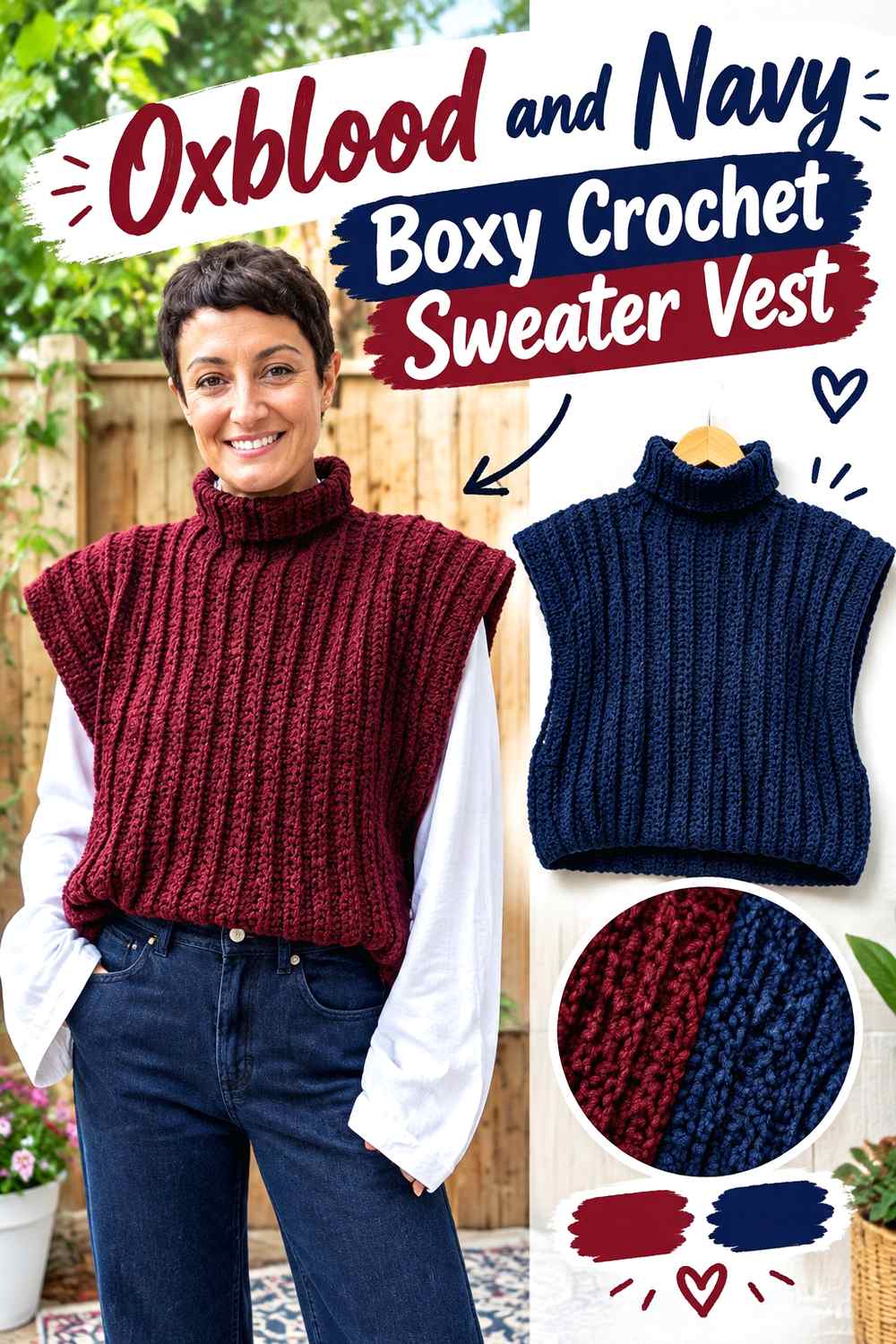
Navy gives oxblood a cool dark partner, making this palette useful when you want two recognizable colors without strong brightness contrast. A boxy vest has enough uninterrupted surface for broader color areas, so consider an oxblood torso with navy shoulders, trim, or lower sections.
Avoid relying on very thin navy stripes. Dark blue needs enough space beside oxblood to read clearly.
Navy Can Cool the Edges of an Oxblood Boxy Vest
Using navy on the neckline and armholes introduces a cooler boundary around the warmer oxblood body. That difference is subtle enough to preserve the relaxed, dark overall appearance.
Repeat navy at least twice so one isolated blue section does not look accidental.
Oxblood Should Control the Largest Boxy Vest Panels
A boxy silhouette creates broad front and back surfaces. Keeping those areas oxblood gives the garment a consistent main color while navy works as the structural support.
If you want a more evenly divided vest, use full navy sections rather than adding many small stripes throughout the oxblood.
Creator Credit: JeggoCrochet
8. Oxblood And Plum Turtleneck Crochet Vest

Plum stays close to oxblood in richness while shifting toward purple. That makes the combination especially suitable for a turtleneck vest where the collar can carry a second dark color without producing a bright band around the neck.
Use oxblood for the body and plum for the collar, or reverse a smaller amount of plum through the hem and repeat it at the neckline.
Plum Can Separate the Collar From an Oxblood Turtleneck Vest
A tall collar occupies more visual space than ordinary neckline ribbing. Making it plum clearly distinguishes that area while preserving a dark overall palette.
Compare the two yarns before starting. If the plum is almost identical to oxblood in value, the difference may appear mainly at close range.
Oxblood Keeps a Plum Crochet Turtleneck Grounded
Allow oxblood to dominate the torso so the plum collar remains a deliberate focal area rather than the start of an evenly divided two-color garment.
A small repeat of plum at the hem can connect the collar to the rest of the vest without reducing the oxblood body too heavily.
Creator Credit: Hey Carrie
9. Oxblood And Taupe Simple Crochet Vest

Taupe gives oxblood a neutral contrast that is softer than cream and warmer than gray. It works particularly well when you want the vest to stay understated while still giving the edges visible definition.
Keep oxblood through the body and place taupe around the neckline, armholes, or a lower finishing band.
Taupe Can Lighten Oxblood Without Creating a Sharp Outline
The muted neutral separates from oxblood but does not produce the strong graphic effect of ivory. That makes taupe useful when the crochet texture should remain as noticeable as the color contrast.
Choose a taupe that is visibly lighter than oxblood if it will be used in narrow edging.
Oxblood Should Repeat Around Taupe Vest Details
If taupe covers a broader hem or neckline, bring oxblood back at the outermost edge where practical. This can stop the lighter neutral from visually replacing the main shade at important boundaries.
The goal is not to outline every taupe section, but to maintain the oxblood identity across the finished vest.
Creator Credit: 🧶Mihankushea🧶
10. Oxblood And Sage Chunky Ribbed Crochet Vest

Muted sage contrasts with oxblood through both hue and lightness, creating a clearly two-color vest without the brightness of cobalt or mustard. On a chunky ribbed surface, use sage selectively because larger stitches already carry considerable visual weight.
Oxblood can fill the main panels while sage marks the neckline or broad finishing areas.
Sage Can Reveal Oxblood Ribbing at the Vest Boundaries
A sage cuff-like armhole finish or neckline border makes the dark ribbed body easier to distinguish from its edges.
Because chunky surfaces make every color section visually substantial, keep the sage placement intentional rather than scattering narrow bands throughout the vest.
Oxblood Prevents Sage From Dominating the Chunky Vest
A lighter green can attract attention quickly beside oxblood. Preserve a larger uninterrupted oxblood body if the garment should still read primarily as deep red.
For a darker variation, substitute a muted olive-sage shade while maintaining enough lightness difference to remain visible.
Creator Credit: By StellaM
11. Oxblood And Soft Gray Classic Crochet Sweater Vest
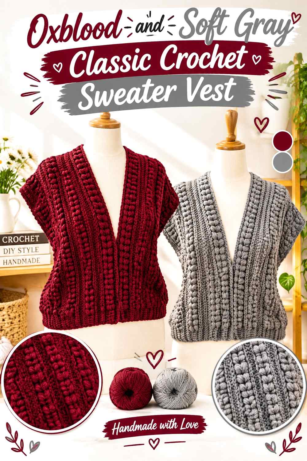
Soft gray provides neutral contrast without warming the palette. Use oxblood over most of a classic sweater-vest body and let gray handle the neckline, armholes, or a restrained stripe.
This is a useful middle ground between high-contrast ivory and very dark charcoal.
Soft Gray Can Define Oxblood Armholes Without Overpowering Them
Armhole edging creates two strong vertical curves on a vest. Soft gray makes those lines visible while remaining quiet enough to leave oxblood in control.
Repeating the same gray at the neckline can make the finishing look coordinated without requiring an additional color.
Oxblood Should Remain Continuous Across the Gray-Trimmed Vest
If the body contains too many gray bands, the eye will begin reading the garment as striped rather than oxblood with neutral finishing.
For a classic appearance, reserve gray for a limited number of structural areas and leave the main torso uninterrupted.
Creator Credit: Sirin’s Crochet
12. Oxblood And Rust Textured Crochet Vest

Rust sits close to oxblood on the warm side of the palette but is usually lighter and more orange. That makes it useful for tonal color blocking where you want warmth without introducing a neutral.
Use oxblood as the deepest field and rust around textured bands, selected panels, or the hem.
Rust Can Highlight Texture Beside an Oxblood Vest Panel
If a textured section deserves more visibility, shifting it from oxblood to rust creates separation without abandoning the warm palette.
Keep the change connected to a structural feature rather than introducing rust randomly. A broad textured band will generally read more intentionally than several unrelated rust patches.
Oxblood Gives Rust a Darker Crochet Vest Anchor
Rust can appear relatively bright once placed beside oxblood. Keeping the back and most front areas oxblood prevents the orange-brown shade from controlling the garment.
When substituting rust, preserve its warmer and lighter relationship to oxblood rather than choosing another wine red that visually disappears.
Creator Credit: Cat Kemble
13. Oxblood And Mustard Patchwork Crochet Vest
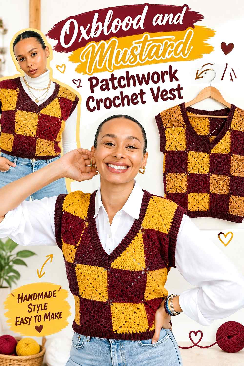
Mustard creates a strong warm contrast with oxblood and suits a vest built from multiple square sections. Use oxblood as the repeated grounding color while mustard appears in selected squares, centers, or bands.
Because mustard attracts attention quickly, distributing it across the full garment is more important than using a large amount.
Mustard Should Repeat Across the Oxblood Patchwork Vest
Place mustard in several separated locations rather than concentrating it on only one front panel. Repetition allows the eye to travel across the vest and keeps a single bright block from becoming disproportionately important.
Oxblood can fill the remaining sections and serve as the joining or border color.
Oxblood Joins Can Control a Mustard Crochet Vest Palette
When individual squares contain stronger colors, oxblood joins create a consistent framework. This is particularly useful around armholes and shoulders where several patchwork sections meet.
If mustard feels too prominent, reduce the number of mustard sections before changing the oxblood distribution.
Creator Credit: Crochet with Aisha
14. Oxblood And Cobalt Chunky Crochet Vest

Cobalt gives oxblood the strongest cool-color contrast in this collection. On a substantial crochet vest, use it as a controlled accent instead of dividing the garment equally unless a bold color-blocked effect is intentional.
Oxblood can cover the body while cobalt appears at the neckline, hem, shoulders, or a broad central band.
Cobalt Needs Controlled Space Beside an Oxblood Chunky Vest
A saturated blue can compete with oxblood even when used in a smaller amount. Start by assigning cobalt to one structural feature and repeat it once elsewhere for connection.
Avoid scattering small cobalt details across every edge because the color may begin to fragment the heavier surface.
Oxblood Gives Cobalt a Dark Crochet Vest Background
Large oxblood areas allow cobalt to appear crisp rather than overwhelming. The dark red also keeps the palette from becoming a simple primary-looking red-and-blue combination.
If cobalt feels too strong, shift toward a slightly deeper blue while maintaining clear separation from oxblood.
Creator Credit: KnitcroAddict
15. Oxblood And Blush Granny Square Crochet Vest
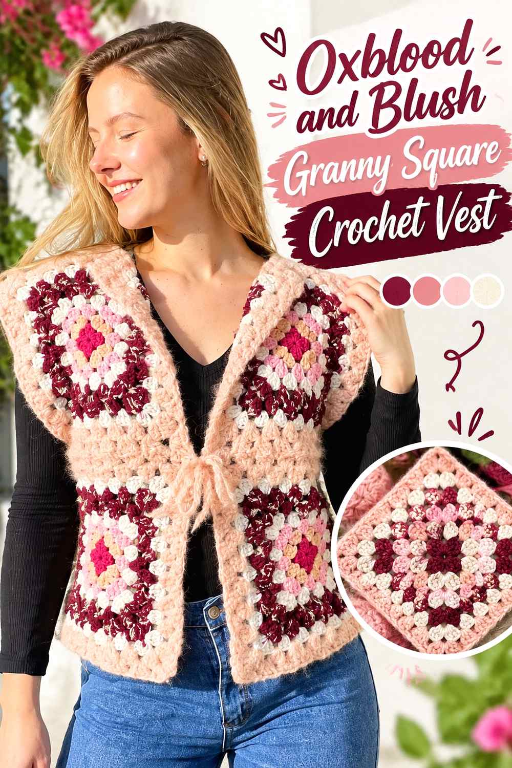
Blush creates a softer motif contrast than ivory while remaining clearly lighter than oxblood. Use oxblood on outer rounds, joins, and selected full squares, then place blush toward motif centers or smaller repeating areas.
This lets the square construction remain visible without creating the highly graphic appearance of black-and-white crochet.
Blush Centers Can Lighten Oxblood Granny Squares
A blush center surrounded by oxblood draws attention toward the middle of each motif. Repeating that arrangement creates consistency even when individual squares vary slightly elsewhere.
If the blush is extremely pale, consider limiting its area so the overall vest does not become lighter than intended.
Oxblood Joins Keep Blush Granny Squares Connected
Oxblood joining yarn can create one dark framework around all the motifs. That is especially useful when blush occupies several centers because the repeated red-brown borders keep the layout visually grounded.
Check the full motif arrangement before joining so blush does not accidentally cluster on only one side.
Creator Credit: lerugi crochets
16. Oxblood And Bone Contrast Trim Crochet Vest

Bone is slightly softer than bright white but still creates substantial value contrast with oxblood. That makes it particularly effective for a vest where the trim itself is part of the design.
Keep oxblood across the front and back panels, then use bone around the neckline, armholes, and possibly the lower edge for a clearly framed silhouette.
Bone Can Create a Clean Frame Around an Oxblood Vest
Because all three major vest openings are visually important, repeating bone at the neckline and armholes can connect them into one finishing system.
A bone hem adds an even stronger frame. Leave it oxblood instead if you want the contrast concentrated around the upper body.
Oxblood Needs More Surface Area Than Bone Trim
Bone has much greater lightness, so relatively narrow edging can still appear prominent. Keep the central panels oxblood and resist widening every pale border simply because space is available.
If the contrast feels too strong, substitute a warmer oatmeal or deeper beige while preserving a noticeable difference from oxblood.
Creator Credit: Leelee Knits
Comparing the 16 Oxblood Crochet Vest Color Directions
For strong contrast, look toward oxblood with ivory, cream, bone, mustard, cobalt, or soft sage. These combinations make neckline trim, granny-square placement, checkerboards, and edging easier to distinguish from a distance.
For a more restrained vest, charcoal, black, navy, and plum stay closer to oxblood in overall darkness. These palettes benefit from larger color sections because narrow accents can merge visually.
Camel, taupe, soft gray, dusty rose, blush, and rust fall between those extremes. They provide recognizable color changes without making every border or motif the strongest feature on the vest.
The construction matters too. Checkerboards can support relatively equal areas of two colors, while a classic pullover often looks more cohesive when oxblood stays dominant. Granny-square and patchwork vests benefit from deliberate repetition across the entire garment rather than deciding on colors one motif at a time.
Conclusion
Oxblood can take a crochet vest in several directions without losing its rich, dark identity. Pair it with cream, ivory, or bone when you want clear edging and motif definition. Use charcoal, black, navy, or plum for a darker tonal result. Camel, taupe, gray, blush, and dusty rose soften the transition, while mustard, sage, rust, and cobalt create more noticeable accents.
Choose the placement before choosing the final proportions. On a plain vest, neckline and armhole trim may be enough. On granny squares, checkerboards, and patchwork, the color relationship needs to be planned across the whole front, back, and shoulder area.
Once the palette is settled, use the linked creator tutorial for the exact construction and adapt only the color distribution to suit the oxblood scheme you want.
Frequently Asked Questions
What colors pair well with oxblood in a crochet vest?
Cream, ivory, bone, camel, taupe, gray, black, charcoal, navy, plum, sage, mustard, rust, cobalt, blush, and dusty rose can all work depending on the amount of contrast you want. Light neutrals create the clearest separation, while dark colors produce a more tonal effect.
Should oxblood be the dominant color in an oxblood crochet vest?
Keeping oxblood dominant is the clearest way to make the garment read as an oxblood vest. It can cover the main body while supporting shades appear in ribbing, borders, motifs, joins, or selected panels. Checkerboard and patchwork designs can divide the colors more evenly if that is the intended visual effect.
How can I tell whether a dark accent has enough contrast with oxblood?
Place the yarns beside each other and view them from normal wearing distance rather than only up close. A grayscale photo can help reveal whether their lightness is almost identical. If the shades merge, increase the accent’s surface area or choose a slightly lighter alternative.
Is cream or black better for edging an oxblood crochet vest?
They create different results. Cream clearly outlines the neckline, armholes, and hem, while black creates a darker, quieter frame. Choose based on whether you want the finishing to stand out or blend more closely with the oxblood body.
How should I place oxblood in a granny square vest?
Oxblood can work as the joining color, outer motif round, repeated center shade, or dominant square color. Using it consistently in one structural role is an effective way to connect multiple motifs. Lay out all the squares before joining so the oxblood distribution remains balanced across the garment.
Can I make an oxblood vest with three colors?
Yes. Give the colors distinct roles instead of dividing them equally by default. For example, oxblood can cover most of the body, a neutral can support larger finishing areas, and a stronger accent can appear only in motif centers or small repeated details.
What can I substitute if I cannot find the exact oxblood yarn color?
Choose a deep muted red with a burgundy or brown-leaning appearance and preserve its relationship with the other colors. What matters most is whether it remains darker or warmer than the supporting shades in the intended palette, rather than matching a particular commercial shade name.