Cranberry is deep enough to give a crochet sweater vest visual weight, but it does not have to make every project look dark or heavily autumnal. Pairing it with cream can emphasize ribbing, blush can create a softer transition, navy can support geometric colorwork, and mustard can turn cranberry into a stronger retro statement.

The most useful choice is not simply which second color you like. Think about where cranberry will sit on the vest: across the main panels, inside granny-square centers, around a V-neck, through stripes, or beside contrasting ribbing. The linked tutorials provide construction references, while the cranberry palettes below are independent color adaptations. This collection treats color hierarchy, contrast, placement, and substitution as part of planning the finished vest.
Quick List
- Cranberry And Cream Ribbed Crochet Sweater Vest
- Cranberry And Charcoal V Neck Crochet Sweater Vest
- Cranberry And Blush Cropped Stripe Crochet Sweater Vest
- Cranberry And Oatmeal Granny Square Crochet Sweater Vest
- Cranberry And Dusty Pink Checkerboard Crochet Sweater Vest
- Cranberry Navy And Cream Argyle Crochet Sweater Vest
- Cranberry And Soft Beige Button Up Lace Crochet Sweater Vest
- Cranberry And Black Contrast Trim Crochet Sweater Vest
- Cranberry And Camel Boxy Crochet Sweater Vest
- Cranberry And Heather Gray Turtleneck Crochet Sweater Vest
- Cranberry And Ivory Mesh Crochet Sweater Vest
- Cranberry Sage And Cream Patchwork Crochet Sweater Vest
- Cranberry Rose And Cream Floral Motif Crochet Sweater Vest
- Cranberry And Chocolate Chunky Ribbed Crochet Sweater Vest
- Cranberry Wine And Mauve Tonal Crochet Sweater Vest
- Cranberry And Mustard Retro Crochet Sweater Vest
Make Cranberry the Anchor Without Flattening the Sweater Vest
Cranberry usually works most clearly when its role is decided before the vest is started. On a plain pullover, it can cover most of the front and back while a lighter shade defines the neckline, armholes, and lower ribbing. On a motif vest, cranberry can repeat through centers or outer rounds instead of occupying every section equally.
Texture matters too. A dark, saturated-looking yarn can make subtle ribbing, cables, or raised crochet less obvious from a distance. When texture is an important part of the sweater vest, place a noticeably lighter supporting color near the textured area or allow the stitch direction to remain uninterrupted by excessive color changes.
Check Cranberry Contrast Before Planning Motifs and Trim
Two yarns can look different in hue while remaining close in lightness. Cranberry beside dark brown, navy, charcoal, or wine can therefore produce much less separation than cranberry beside cream, oatmeal, blush, or pale gray.
That is not necessarily a problem. Low contrast can suit a tonal vest, but checkerboards, argyle diamonds, small floral motifs, and narrow stripes usually need intentional value differences if their shapes are meant to remain obvious. Place the yarns side by side and, when useful, view them in grayscale before assigning colors to an entire front panel.
1. Cranberry And Cream Ribbed Crochet Sweater Vest

Use cranberry across most of a ribbed sweater vest when you want the stitch texture and garment shape to carry the design. Cream can then work as a controlled supporting color around the neckline, armholes, or hem. Keeping the lighter shade near the edges separates the deep cranberry body from the clothing underneath and prevents the trim from disappearing into the main panel.
Let Cranberry Carry the Ribbed Crochet Sweater Vest Body
A mostly cranberry body gives directional ribbing room to remain continuous rather than breaking the texture into multiple color sections. That is particularly useful across the front panel, where frequent color changes could compete with the strong vertical or horizontal movement created by the ribbed surface.
If the cranberry yarn is very dark, inspect the fabric from a few feet away as well as close up. The ribbing does not need high color contrast, but you should still be able to see enough shadow and stitch definition for the texture to remain part of the finished vest.
Use Cream to Separate Cranberry at the Neckline and Armholes
Cream has a practical role when placed around cranberry openings. A narrow cream neckline can clearly outline the sweater-vest shape, while repeating cream at the armholes or lower edge makes the contrast look planned rather than isolated.
If a full cream frame feels too strong, reduce its visual share instead of introducing another color. A thinner cream treatment around selected edges can preserve cranberry as the dominant shade while still giving the vest enough light-dark separation.
Creator Credit: VivCrochets
2. Cranberry And Charcoal V Neck Crochet Sweater Vest

Cranberry and charcoal create a much darker sweater vest than cranberry and cream, so their placement needs more control. Let cranberry occupy the main front and back panels, then use charcoal selectively at the V-neck, armholes, or lower edge. This keeps the palette deep while still allowing the cranberry body to remain identifiable as the main color.
Keep Cranberry Dominant Around a Charcoal V-Neck
A V-neck already forms a strong visual line down the center front. If charcoal is used there, it can frame cranberry without needing to spread across large areas of the vest.
Avoid giving charcoal equal coverage unless a deliberately dark two-tone result is the goal. Because both shades can carry considerable visual weight, a broad charcoal neckline plus large charcoal panels may reduce the distinction between the main color and the trim.
Check Cranberry and Charcoal Value Before Finishing the Vest
Some cranberry and charcoal yarns can be surprisingly close in value. Place them together before assigning charcoal to narrow details. If the difference nearly disappears in grayscale, the edging may read more like a tonal shift than a clear outline.
That can suit a restrained sweater vest, but if you want the V-neck shape to remain obvious over a dark underlayer, select a charcoal that gives enough separation from the cranberry body to define the opening.
Creator Credit: Krafty Station
3. Cranberry And Blush Cropped Stripe Crochet Sweater Vest

Blush changes cranberry more gently than cream does. On a cropped sweater vest, use cranberry as the main field and allow blush to appear in a few deliberate stripes, at the hem, or through the ribbing. Because a cropped body has less vertical space, the number and width of color sections matter more than they would on a longer garment.
Give Cranberry More Space Than Blush on a Cropped Vest
A short vest can quickly look divided into many small bands if cranberry and blush alternate too frequently. Keeping wider areas of cranberry and fewer blush interruptions lets the body retain a clear main color.
Decide the intended hem position before placing the final stripe. A blush band that looks balanced on an unfinished panel may sit too close to the neckline or hem once the cropped proportions are complete.
Use Blush to Soften Cranberry Without Losing Stripe Definition
For visible stripes, choose a blush that is clearly lighter than cranberry rather than another deep berry pink. This keeps the color relationship connected while allowing the bands to remain recognizable.
If you prefer a quieter result, use blush only at the lower ribbing and one upper accent area. Repeating it in two separated places can connect the palette without turning the entire sweater vest into evenly alternating stripes.
Creator Credit: Yarnalina
4. Cranberry And Oatmeal Granny Square Crochet Sweater Vest
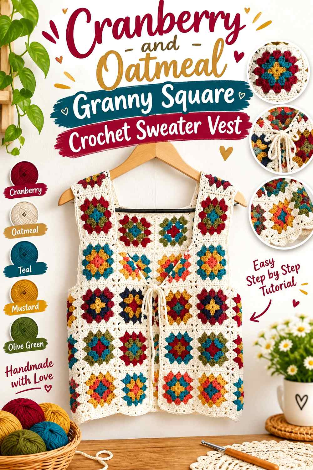
A granny-square sweater vest gives cranberry several possible roles. It can fill motif centers, appear in selected outer rounds, or dominate some squares while oatmeal controls the joins and borders. Oatmeal is softer than bright white, so it provides light-dark separation without creating an extremely sharp frame around every motif.
Repeat Cranberry Through the Granny Square Vest Instead of Clustering It
If cranberry appears in only one part of the vest, that section can feel heavier than the rest of the motif grid. Repeat cranberry across the front and back so its visual weight is distributed through the garment.
The repeats do not have to be identical. Cranberry can occupy a center in one square and an outer round in another, provided the finished arrangement still gives the color a clear rhythm across the vest.
Let Oatmeal Separate Cranberry Granny Squares and Joins
Oatmeal works especially well when used around motif edges or joins because it can create breathing room between repeated cranberry sections. This becomes useful at the shoulders and around the armholes, where several motifs may meet within a small area.
Before joining everything, place multiple completed squares together. Check whether the oatmeal boundaries are wide enough to keep neighboring cranberry areas distinct without becoming so dominant that the vest starts reading as oatmeal with small cranberry accents.
Creator Credit: crochetwithprachi
5. Cranberry And Dusty Pink Checkerboard Crochet Sweater Vest
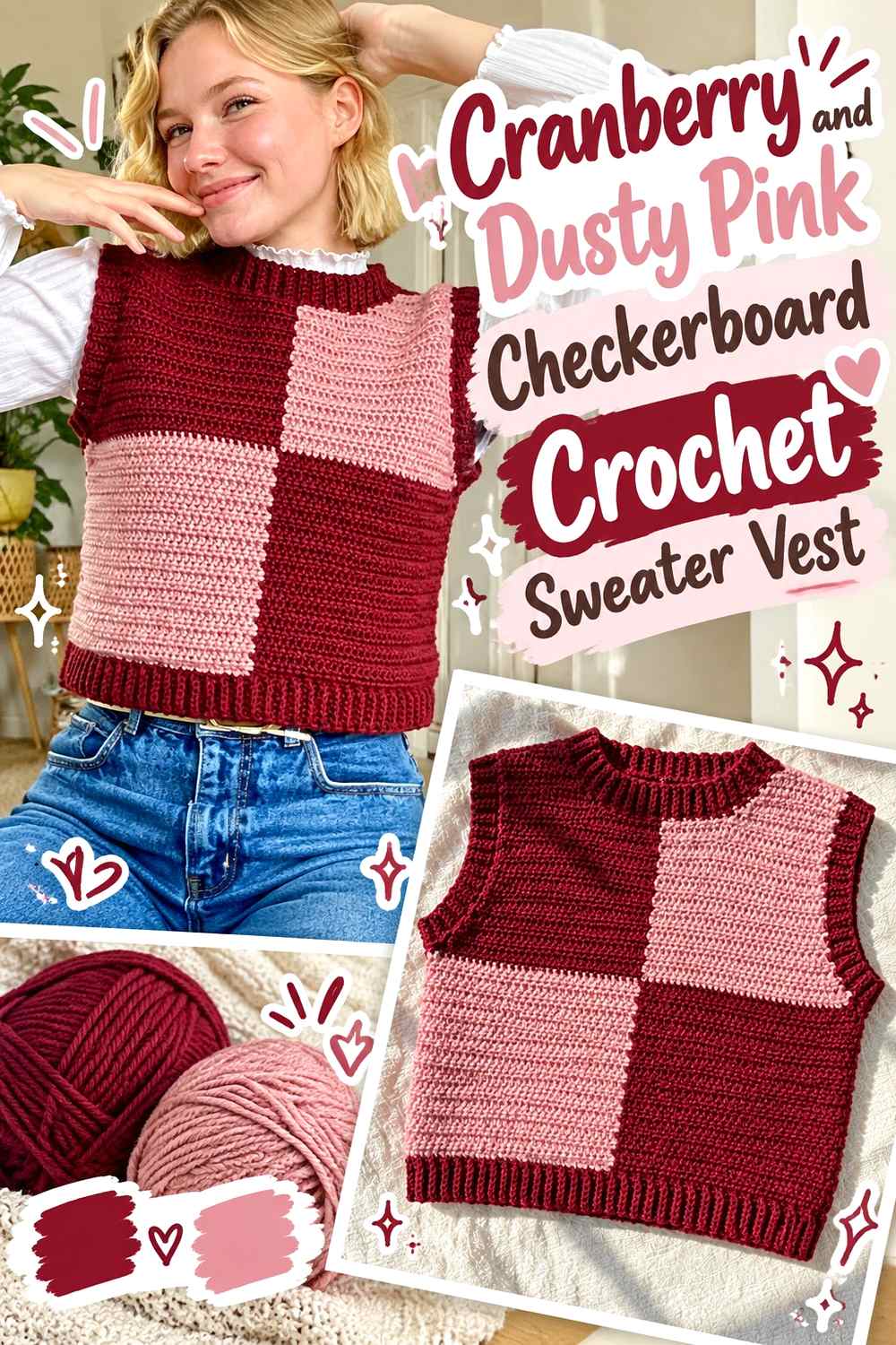
Checkerboard color placement makes the relationship between two yarns impossible to ignore. Cranberry and dusty pink keep the design within the same broad color family while still allowing a lighter and darker block structure. The key is choosing a dusty pink that remains visibly lighter than cranberry once the colors are crocheted into larger sections.
Make Cranberry the Dark Anchor in the Checkerboard Vest
Treat cranberry as the deeper anchor and dusty pink as the lighter block color. That hierarchy helps the check pattern remain organized even though both shades share red or pink undertones.
Before committing to the full front, place a small sample of the two colors at normal viewing distance. If cranberry and dusty pink blend into a single mid-dark surface, move to a lighter or more muted pink rather than adding a third color simply to rescue the pattern.
Keep Cranberry Checker Placement Balanced Near the Neckline
The checkerboard becomes less regular as the sweater vest approaches armhole and neckline shaping. Pay attention to which cranberry blocks remain visible near the upper front instead of judging the design only across the straight torso section.
If one shoulder ends with much more cranberry than the other, the vest may appear visually heavier on that side even when the garment itself is symmetrical. Evaluate color balance before final finishing.
Creator Credit: HayHay Crochet
6. Cranberry Navy And Cream Argyle Crochet Sweater Vest

Argyle benefits from clear color hierarchy. Cranberry can carry the main diamonds, navy can provide the deeper background, and cream can act as the lightest separator or smaller accent. Without the cream, cranberry and navy may be close enough in value that the diamond geometry becomes much more subtle.
Give Cranberry Argyle Diamonds Enough Separation From Navy
Before planning an entire front panel, compare cranberry and navy in both normal color and grayscale. If they collapse into nearly the same dark value, the cranberry diamonds may disappear into the background from a short distance.
That is useful if you want subdued argyle. For a clearer graphic, keep navy around the cranberry shapes but allow a lighter color to touch important edges or crossing details so the geometry remains recognizable.
Use Cream Sparingly to Clarify Cranberry Argyle Lines
Cream does not need the same surface area as cranberry or navy. A smaller amount can provide enough light contrast to define intersections, narrow accent lines, or selected trim.
Keep the cream placement connected to the argyle design rather than adding it randomly around the vest. If cream appears in the front colorwork, repeating a restrained amount at the neckline or hem can make the finishing feel related to the main cranberry-based graphic.
Creator Credit: flotjetops
7. Cranberry And Soft Beige Button Up Lace Crochet Sweater Vest
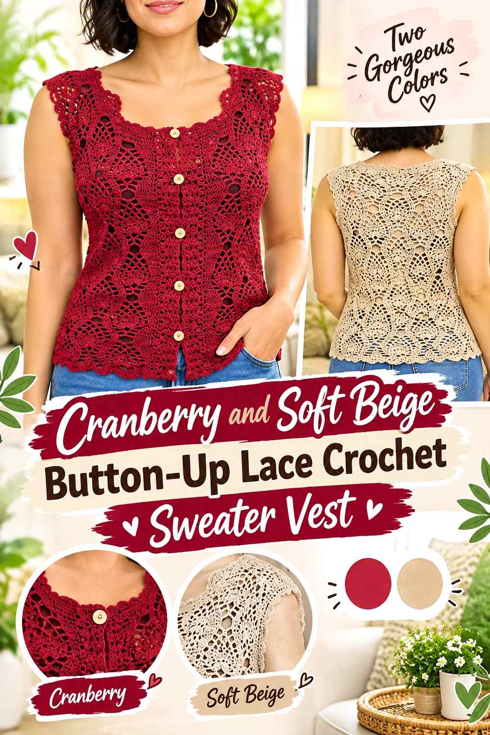
A button-up vest creates two strong front edges, so color placement around those edges matters as much as the body color. Cranberry can cover the main lace or textured sections while soft beige defines the front bands, neckline, or decorative edging. The lighter shade can also make open crochet details easier to distinguish along the outline.
Keep Cranberry Continuous Across the Main Button-Up Vest Panels
Let cranberry occupy enough of both front sections that the open-front construction still reads as one coordinated garment. Large beige sections on only one side could make the vest look visually unbalanced when worn open.
Lay the two fronts beside each other before final finishing. Compare the amount and position of cranberry, especially around the V-shaped neckline and lower hem where color differences become easy to notice.
Use Soft Beige to Frame Cranberry Button Bands and Lace Edges
Soft beige can separate a cranberry lace edge from the clothing beneath it and make scalloped or decorative finishing more visible. Because the vest already has buttons and an open front, the beige does not need to become another large panel.
Repeat the beige deliberately along related edges. A front band and matching neckline treatment usually feels more connected than introducing beige in one isolated area and nowhere else.
Creator Credit: Ler Crochet
8. Cranberry And Black Contrast Trim Crochet Sweater Vest

Black makes cranberry look deeper rather than lighter, so this sweater vest depends on restrained placement. Use cranberry across the majority of the body and reserve black for the neckline, armholes, hem, or another clearly defined finishing area. The result can remain graphic without turning most of the garment into one dark visual block.
Keep Black Narrow Enough for Cranberry to Lead the Vest
Wide black ribbing can visually reduce the cranberry area, especially around a smaller or cropped sweater vest. Decide whether black is supposed to frame the garment or become a second major body color.
For a cranberry-led design, keep enough uninterrupted cranberry between the neckline, armhole, and hem treatments. That open field makes the main color easy to identify even when every outer edge is dark.
Check Cranberry and Black Trim Against the Planned Underlayer
A black edge can disappear against a black shirt while remaining very clear over cream, gray, or another lighter layer. Since a sweater vest is normally viewed together with the clothing beneath it, test the cranberry-and-black combination over likely underlayers before deciding how broad the trim should be.
A narrow black outline may provide enough definition without requiring additional stripes or motifs.
Creator Credit: CROCHET BY BEV
9. Cranberry And Camel Boxy Crochet Sweater Vest
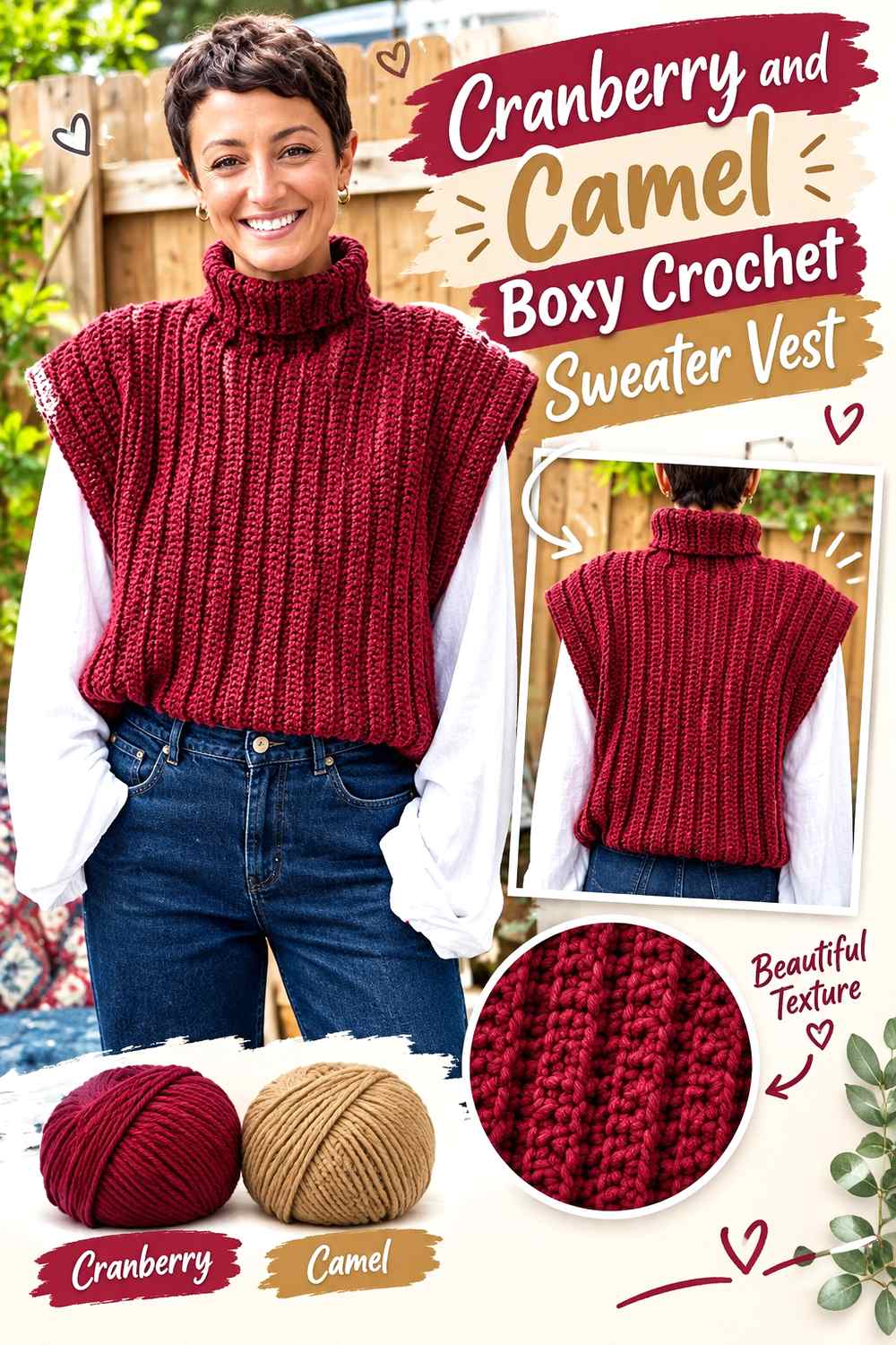
Camel adds warmth and medium-light contrast without the sharpness of cream. On a boxy sweater vest, cranberry can cover the broad front and back surfaces while camel appears at the lower hem, around the openings, or through restrained side accents. The roomy silhouette already supplies visual volume, so the palette does not need many additional divisions.
Let Cranberry Cover the Broad Boxy Sweater Vest Panels
A boxy vest provides a wide area of uninterrupted fabric. Using cranberry across that surface keeps the silhouette readable and gives the color enough room to look intentional rather than like an oversized accent.
If camel is added through broad side panels, assess the vest from the front as well as laid flat. Sections close to the side seams can partially turn away from the viewer when worn, changing the apparent cranberry-to-camel balance.
Use Camel to Warm Cranberry Ribbing Without Over-Dividing the Vest
Camel can give cranberry a lighter boundary at the hem or neckline while staying within an earthy palette. It is especially useful when cream feels too high-contrast but brown would be too close in darkness.
Keep camel repeated in at least two related areas if it is used as trim. A camel hem paired with a small camel neckline detail can feel more deliberate than one isolated band at the bottom.
Creator Credit: JeggoCrochet
10. Cranberry And Heather Gray Turtleneck Crochet Sweater Vest

A turtleneck puts a large amount of crochet around the upper part of the vest, giving the collar unusual color importance. Use cranberry through the torso and heather gray through the collar when you want the neckline to interrupt the deep body color, or reverse smaller details by repeating cranberry along the collar edge.
Keep Cranberry Strong Through the Body Below the Gray Turtleneck
A tall gray collar creates a noticeable block above the chest. Maintaining cranberry across most of the body keeps the garment from splitting into several similarly sized color zones.
If gray is also repeated at the hem, keep those areas proportionally smaller than the cranberry torso. This preserves the main-color hierarchy while connecting the upper and lower finishing.
Use Heather Gray to Give Cranberry Turtleneck Texture More Separation
Heather gray can provide a medium-light transition rather than the sharp contrast of white. That makes it useful around thick collar texture, where the stitches themselves already create significant visual detail.
Before committing to the color change, place gray next to the specific cranberry yarn. Some dark heather grays may sit close to cranberry in value, producing a tonal rather than clearly contrasting collar.
Creator Credit: Hey Carrie
11. Cranberry And Ivory Mesh Crochet Sweater Vest

Open mesh changes the way cranberry behaves because the underlayer remains visible through the crochet. Cranberry can form the main mesh body while ivory appears through edging, selected bands, or the garment worn beneath it. If ivory is actually crocheted into the vest, keep its placement tied to the openings so the contrast supports the mesh rather than obscuring it.
Test Cranberry Mesh Over the Actual Underlayer
Cranberry mesh over ivory clothing will look much more defined than the same vest over another berry or dark red layer. That means the underlayer effectively becomes part of the color composition even though it is not crocheted into the vest.
Before deciding that the cranberry yarn itself lacks contrast, view a sample over several likely base-layer colors. This is more useful than evaluating openwork only against a tabletop.
Use Ivory to Define Cranberry Mesh Edges Without Closing Them In
Ivory edging can clarify the neckline and armholes of a cranberry mesh vest, but an overly wide or dense border may visually overpower the open fabric.
Keep the ivory treatment proportional to the mesh. A relatively restrained edge can give the cranberry surface a clear boundary while allowing negative space to remain the defining feature of the vest.
Creator Credit: 🧶Mihankushea🧶
12. Cranberry Sage And Cream Patchwork Crochet Sweater Vest
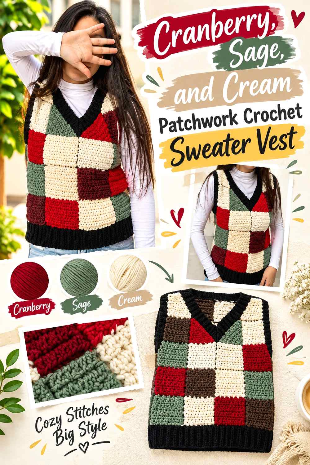
Patchwork allows cranberry to share the vest with more than one supporting shade without forcing all three colors into equal amounts. Use cranberry as the strongest repeating block, sage as the muted secondary color, and cream as the visual rest area that separates darker sections.
Repeat Cranberry Patchwork Blocks Across More Than One Vest Area
One large cranberry section can dominate a patchwork front if the remaining blocks are all lighter sage and cream. Repeat cranberry in another part of the front or back so its weight feels distributed rather than accidental.
The repeats do not need to mirror each other. An asymmetric patchwork arrangement can still feel balanced when similar color weight appears in more than one region.
Let Cream Separate Cranberry and Sage Patchwork Sections
Cranberry and sage are different hues, but depending on the yarns selected they can still sit fairly close in value. Cream provides a useful buffer when you want each block to remain distinct.
Try placing cream between several cranberry and sage sections before assembly. If every block is separated with cream, however, the vest may start to look like a cream grid with colored inserts. Use the lightest shade where separation is most helpful rather than automatically outlining every section.
Creator Credit: Süris Vlogs
13. Cranberry Rose And Cream Floral Motif Crochet Sweater Vest

A floral motif vest lets cranberry appear inside repeated small shapes rather than one continuous panel. Cranberry can define darker petals or motif centers, rose can create the softer transition, and cream can provide an outer round, join, or background that keeps neighboring flowers from visually running together.
Use Cranberry Where the Floral Motif Needs Its Darkest Definition
Small crochet flowers can lose their internal shapes when every color sits at a similar value. Assign cranberry to the part of the motif that benefits from the strongest dark anchor, then keep rose noticeably lighter.
Check several completed motifs together rather than judging one flower alone. Repetition changes how much cranberry is visible across the finished sweater vest.
Keep Cream Around Cranberry Floral Motifs for Clearer Spacing
Cream can give individual cranberry-and-rose flowers a visual boundary before they are joined into the vest. This is particularly useful around the shoulders and neckline, where several motif edges may meet closely.
If cream becomes too dominant, reduce its coverage within each motif instead of eliminating it entirely. A narrower cream outer section can still separate cranberry flowers without turning the vest into a mostly neutral garment.
Creator Credit: BELINA BELLWOOD
14. Cranberry And Chocolate Chunky Ribbed Crochet Sweater Vest

Cranberry and chocolate create one of the darkest palettes in this collection. On a chunky ribbed vest, use cranberry as the main body color and chocolate as a controlled trim or lower accent. Thick texture already gives the garment considerable visual weight, so keeping the palette simple prevents the color treatment from competing with the ribbing.
Give Cranberry Enough Surface Area Beside Chocolate Ribbing
Chocolate trim can look nearly as strong as cranberry when both yarns are deep. Give cranberry a noticeably larger share of the body so the palette still has a clear lead color.
This matters most around wide ribbing. A deep chocolate hem, neckline, and armhole border can collectively occupy more visual space than expected once the vest is assembled.
Compare Cranberry and Chocolate Before Using Them in Small Details
Tiny chocolate accents may disappear against cranberry if the colors are close in value. That is not a concern when you want a subtle tonal effect, but it makes narrow stripes or small geometric details less useful.
For this palette, broader trim generally communicates the second color more clearly than many tiny scattered accents. Check the yarns together before deciding how small the chocolate sections can reasonably be.
Creator Credit: By StellaM
15. Cranberry Wine And Mauve Tonal Crochet Sweater Vest

A tonal berry vest uses color variation without leaving the cranberry family. Let cranberry occupy the largest area, wine provide the darkest anchor, and mauve create the lightest break. The success of this palette depends less on contrasting hue and more on maintaining enough value difference for each shade to keep its role.
Keep Cranberry Between Wine and Mauve in the Tonal Vest Hierarchy
Cranberry works well as the middle step between deeper wine and softer mauve. Use it across most of the body, then reserve wine for smaller dark details and mauve for areas where you want the fabric to visually open up.
Avoid choosing three berry shades that look nearly identical once crocheted. Lay them side by side first and confirm that cranberry remains recognizably separate from both its darker and lighter partners.
Use Mauve to Keep Cranberry and Wine Edges From Blending Together
When cranberry and wine meet directly, the transition can become very subtle. Mauve can provide separation around a neckline, stripe, or selected ribbing section without moving the palette into an unrelated color family.
Do not distribute all three shades equally by default. A tonal sweater vest usually reads more clearly when cranberry remains dominant and the other berry shades have specific supporting jobs.
Creator Credit: Sirin’s Crochet
16. Cranberry And Mustard Retro Crochet Sweater Vest
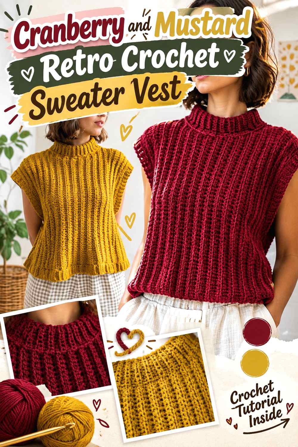
Mustard creates one of the clearest hue changes against cranberry in this collection. Because both colors can be visually strong, the sweater vest benefits from an unequal distribution. Cranberry can remain the main body color while mustard appears through trim, selected stripes, motif sections, or another repeated accent.
Keep Cranberry Dominant When Mustard Is the Strong Accent
Equal amounts of cranberry and mustard can create a very active surface. If the goal is a cranberry sweater vest, give cranberry the larger uninterrupted areas and let mustard punctuate the design.
A mustard hem plus a smaller repeat near the neckline can be enough to establish the retro color direction. Additional stripes should have a clear purpose rather than being added simply because a second color is available.
Repeat Mustard Carefully Through the Cranberry Vest
A small mustard section placed only once can feel disconnected from a cranberry body. Repeat it in another controlled position so the eye can link the two areas.
The repeat can be much smaller than the first accent. For example, a more noticeable lower treatment can be supported by a narrow neckline detail, allowing cranberry to remain visually dominant while mustard still feels integrated into the garment.
Creator Credit: passtschon
Conclusion
The main decision is how much contrast you want cranberry to have. Cream, oatmeal, ivory, and soft beige create the clearest light-dark separation and are useful when ribbing, granny-square borders, lace edges, or mesh openings need definition. Blush, dusty pink, rose, mauve, and wine keep the sweater vest within a related berry range and suit softer or more tonal transitions.
Charcoal, black, chocolate, and navy move the palette darker, so they work most clearly when cranberry receives the larger share of the garment. Sage, camel, and mustard create more noticeable hue changes and can be useful when you want patchwork, trim, or geometric details to become part of the sweater vest’s identity.
Whichever palette you choose, assign the colors before finishing the neckline, armholes, and hem. Those edges frame a sleeveless garment and can change the apparent balance of the whole vest. Use the linked creator tutorial for the exact construction while treating the cranberry color plan as a separate design decision.
Frequently Asked Questions
What colors create clear contrast with a cranberry crochet sweater vest?
Cream, ivory, oatmeal, pale gray, and other noticeably lighter shades can create strong value separation from cranberry. The exact result depends on the yarns themselves, so compare them side by side rather than relying only on color names.
Can I make a cranberry crochet sweater vest with another dark color?
Yes. Cranberry can work with charcoal, navy, black, chocolate, or wine, but the result will usually have less light-dark separation. If you want necklines, checks, or motifs to remain distinct, compare the two colors in grayscale before deciding where the darker supporting shade belongs.
Should cranberry cover most of a crochet sweater vest?
It should if you want the finished piece to read clearly as a cranberry sweater vest. Cranberry does not need to cover every section, though. On granny-square, patchwork, floral, checkerboard, or argyle designs, repeating cranberry strategically can establish it as the anchor while leaving room for supporting colors.
How can I keep cranberry granny squares from looking too busy on a sweater vest?
Give the palette a hierarchy. Repeat cranberry consistently, then use a quieter neutral such as oatmeal or cream around selected motif edges, joins, or borders. Avoid giving several saturated shades equal visual area unless that deliberately busy effect is what you want.
What should I do if cranberry and another yarn color look too similar?
Decide whether you actually want a tonal effect. If not, replace the supporting shade with one that is clearly lighter or darker while preserving its general warmth, coolness, or muted quality. This is especially important for checkerboards, argyle, narrow stripes, and small motifs where shape visibility depends on value contrast.
Does cranberry need the same placement on the front and back of a crochet sweater vest?
Not necessarily. The front can carry stronger cranberry motifs or colorwork while the back remains quieter, or the two panels can repeat the same palette more evenly. What matters is that the difference looks intentional. Before assembly, lay the panels together and check how cranberry is distributed across the shoulders, side seams, and lower edge.