Crochet knot pillows already have a strong sculptural presence, so color does more than decorate the surface. It can make the over-and-under path of the knot easier to read, emphasize a bow center or braided crossing, soften a bulky silhouette, or turn the pillow into a stronger graphic accent on a sofa.

The ideas below range from quiet neutrals to deeper jewel tones and warm earthy combinations. Each linked tutorial supports the pillow construction or knot concept, while the suggested palette is an adaptable color direction you can apply to your own project.
Quick List
- Warm White and Charcoal Crochet Tube-Knot Pillow
- Oatmeal and Olive Green Crochet Sculptural Knot Pillow
- Terracotta and Sand Crochet Chunky Knot Pillow
- Deep Teal and Camel Crochet Loop-Knot Pillow
- Black and Cream Crochet Graphic Knot Pillow
- Sage and Mushroom Taupe Crochet Soft-Contrast Knot Pillow
- Navy and Ivory Crochet Bow-Knot Pillow
- Burgundy and Dusty Rose Crochet Bow-Knot Pillow
- Slate Blue and Greige Crochet Bow-Knot Pillow
- Mustard and Espresso Crochet Tunisian Bow-Knot Pillow
- Emerald and Warm Beige Crochet Bow-Knot Pillow
- Rust and Espresso Crochet Braided-Knot Pillow
- Charcoal, Soft White, and Olive Crochet Celtic-Knot Pillow
- Plum and Pearl Gray Crochet Tube-Knot Pillow
- Clay, Soft Peach, and Stone Crochet Scandinavian Knot Pillow
Use Light-and-Dark Contrast to Keep a Crochet Knot Readable
A knot pillow depends on overlapping forms. When the crochet tube bends behind itself, natural shadows help explain which section sits in front, but color can strengthen that effect. Two different hues may still visually merge if they are similar in lightness.
Before committing to a two-color version, place the yarns together and view them from several feet away. A grayscale photo is another useful check. If both shades become nearly identical in grayscale, expect a softer, more blended knot rather than sharply separated crossings.
High contrast is not automatically better. A quiet modern room may benefit from a tonal knot pillow, but in that case it is especially useful to keep the shape uncluttered instead of adding many short color changes.
Place Color Around the Crochet Knot Crossings With a Purpose
Longer color sections generally preserve the continuous, tubular appearance of a sculptural knot better than many small stripes. A supporting color can occupy one outer arc, a section that disappears behind the main loop, or a deliberately repeated portion of the tube.
If you want the knot path to be especially obvious, position a color transition near a major crossing rather than directly in the busiest cluster of overlaps. The eye can then follow one color into the knot before another section takes over.
Bow pillows work differently. Their center band is already a natural color break, so it can carry the darkest, lightest, or most contrasting shade without fragmenting the two larger bow sections.
Coordinate a Crochet Knot Pillow With a Modern Sofa
Judge the pillow against the actual sofa or chair rather than looking at the yarn palette alone. A charcoal knot can disappear against equally dark upholstery, while warm white or oatmeal can give the same shape a clearer silhouette. On a pale sofa, deep teal, navy, burgundy, or black creates much stronger separation.
A patterned sofa usually gives the knot pillow enough visual activity in the background already. In that setting, one dominant color plus a restrained secondary shade can keep the sculpture legible. On plain upholstery, a stronger two- or three-color arrangement has more room to become the focal accent.
1. Warm White and Charcoal Crochet Tube-Knot Pillow
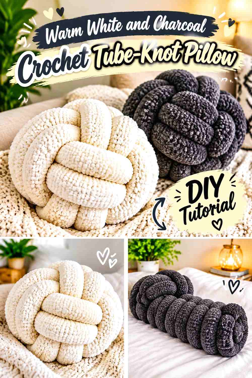
Warm white keeps the long crochet tube visually light, while charcoal can be reserved for a smaller section that moves through one of the principal crossings. That unequal distribution is important: using the two shades fifty-fifty can divide the pillow into competing halves instead of preserving one continuous sculptural form.
This palette is particularly useful when you want a neutral knot pillow that still has enough contrast to explain its construction from across the living room.
Let Warm White Control the Crochet Knot Silhouette
Keep warm white across most of the outer loops and exposed upper curves. A lighter dominant field makes the shadows created by the physical crossings easier to notice without requiring several decorative colors.
Against a medium or dark sofa, warm white also gives the complete knot outline more separation from the upholstery.
Use Charcoal to Clarify One Important Warm White Crossing
Instead of scattering charcoal into short stripes, place it across one longer tube section or secondary loop. The darker value can identify where that section travels under or around the warm white portion.
If the contrast feels too graphic for the room, substitute charcoal with a softer deep gray while preserving a noticeable light-dark difference.
Creator Credit: Dreamcrochets
2. Oatmeal and Olive Green Crochet Sculptural Knot Pillow
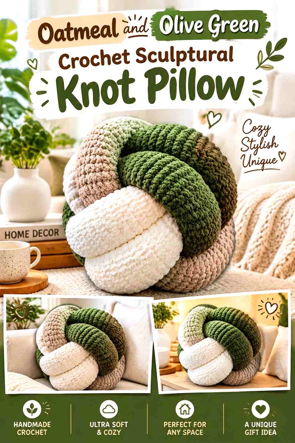
Oatmeal and olive green create a quieter earthy combination than stark white and dark green. Olive can lead the main body of the crochet knot, while oatmeal appears on an outer loop or selected crossing where extra definition is useful.
Because both colors are muted, the pillow can remain substantial without becoming a highly graphic accent.
Keep Olive Green Dominant Across the Crochet Knot Body
Use olive across the longest uninterrupted sections so the eye still reads one principal sculpture. Oatmeal works better as supporting color than as a series of equally spaced stripes.
If the pillow will sit beside other green accents, compare the shades together first. Olive does not need to match them exactly, but deliberate variation generally looks more controlled than several nearly matching greens.
Place Oatmeal Where Olive Green Loops Need More Separation
An oatmeal section near an interior loop can prevent overlapping olive sections from visually merging. This becomes especially helpful when the pillow is viewed head-on and several curves occupy the same small area.
For an even softer result, choose an oatmeal shade closer in value to the olive; for clearer crossings, retain more light-dark separation.
Creator Credit: Les AMIgurumis de Yara
3. Terracotta and Sand Crochet Chunky Knot Pillow
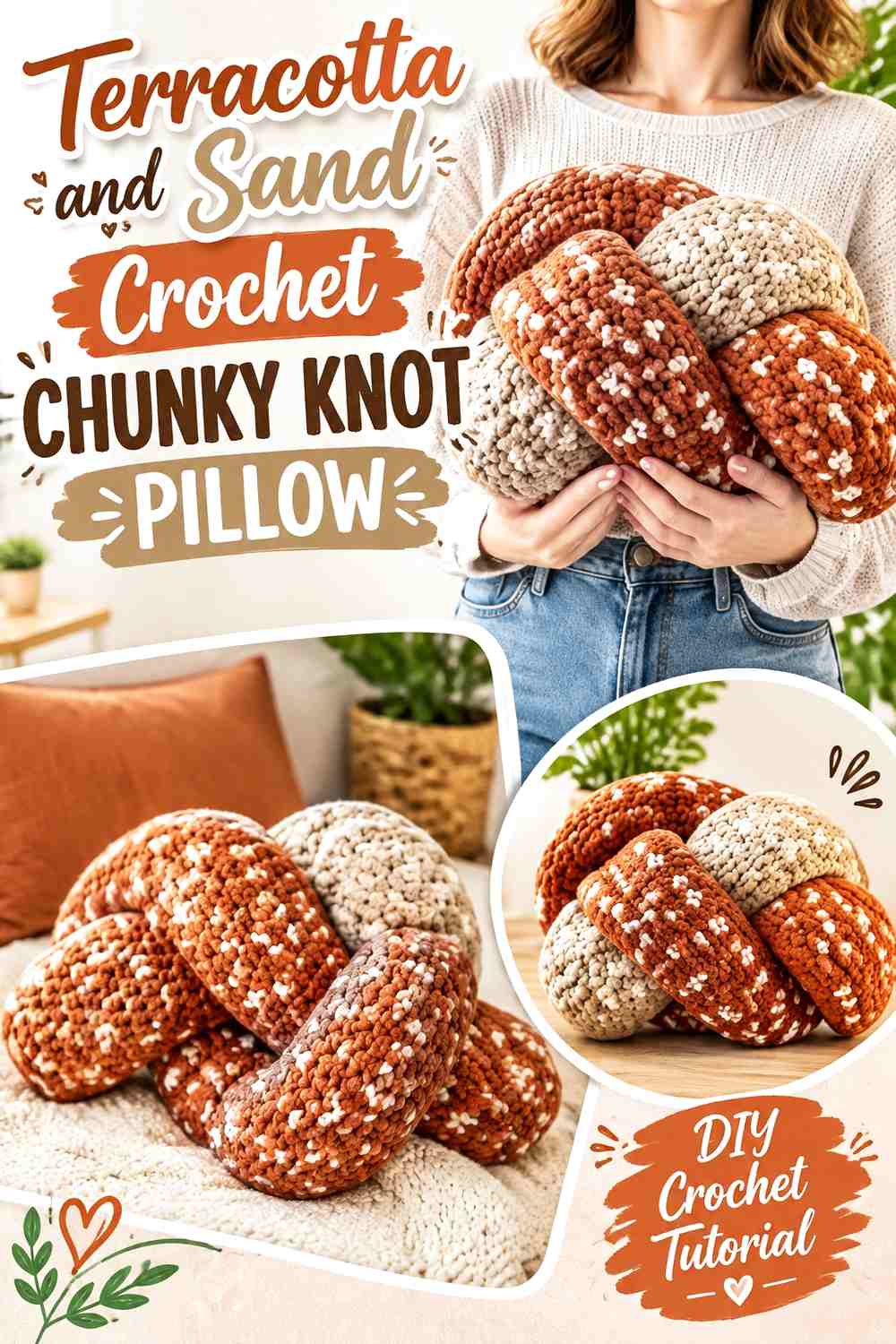
Terracotta gives a chunky knot pillow a strong warm foundation, while sand introduces enough lightness to keep the bulky loops from reading as one uninterrupted mass. The combination suits a room that already contains warm wood, beige upholstery, or other softened earth colors without requiring exact color matching.
Let terracotta remain visually dominant and use sand to expose the pillow’s changes in direction.
Let Terracotta Follow the Largest Crochet Knot Curves
Large terracotta sections suit the scale of a chunky tube because they allow the rounded form and stitch texture to remain visible. Too many frequent transitions can make a broad tube look segmented.
If you substitute terracotta, preserve its medium-to-deep warm character rather than replacing it with a very pale orange that would reduce its distinction from sand.
Use Sand at Terracotta Crossings That Look Too Heavy
Place sand where two terracotta sections would otherwise overlap visually. The lighter interruption can make the front and back paths easier to distinguish, particularly in the center of a compact knot.
Sand can also occupy a smaller outer arc if you want the pillow to look asymmetrical rather than evenly divided.
Creator Credit: Kayla
4. Deep Teal and Camel Crochet Loop-Knot Pillow

Deep teal supplies the visual weight in this palette, while camel adds a warmer medium-light counterpoint. Instead of treating both shades as equal stripes, use teal for the core of the looping form and camel for one secondary route through the knot.
This approach keeps the pillow modern and graphic without relying on black or white.
Deep Teal Can Anchor the Largest Crochet Knot Loop
Place deep teal across the broadest visible curves and central mass. Its depth makes those sections feel visually grounded, which can be useful on cream, beige, or pale gray seating.
On a dark sofa, check that the teal remains distinguishable from the upholstery before giving it most of the surface.
Camel Can Separate Deep Teal Without Creating a Stark Break
Camel offers less severe contrast than bright white, so it can clarify a teal crossing while keeping the overall palette warm enough for wood-heavy or neutral living rooms.
For substitution, prioritize a camel that remains clearly lighter than the teal. Two similarly dark shades may look attractive side by side as yarn but lose the crossing distinction once knotted together.
Creator Credit: Tiffany Weng
5. Black and Cream Crochet Graphic Knot Pillow

Black and cream create the most architectural palette in this collection. Because the value difference is strong, every color transition becomes noticeable, so placement needs more restraint than it would in a tonal combination.
Use black as a deliberate structural accent rather than chopping the crochet tube into many alternating blocks.
Keep Cream Across Enough of the Crochet Knot to Preserve Breathing Room
Cream can cover the outer loops and several long curves, giving the black portions a quieter background within the pillow itself. This also allows the natural shadows between cream sections to remain part of the design.
On black or charcoal seating, increasing the cream share can stop the pillow’s outer edge from disappearing.
Concentrate Black Around One Cream Knot Route
A long black section traveling through a cream-dominant knot creates a much clearer visual path than multiple short black bands. It can emphasize one under-over movement without obscuring the pillow’s continuous tube construction.
If pure black feels overly severe, a near-black brown or charcoal can preserve most of the value contrast.
Creator Credit: Lu’s Handicrafts
6. Sage and Mushroom Taupe Crochet Soft-Contrast Knot Pillow

Sage and mushroom taupe are intentionally close in visual strength, making this an option for a living room where a highly contrasting pillow would feel too dominant. Sage can lead the visible loops, while taupe appears in larger supporting sections.
Because the palette is subtle, the actual shape and shadow of the crochet knot must do more of the visual work.
Give Sage the Largest Crochet Knot Surface
Keeping sage dominant avoids an indecisive half-and-half arrangement. Use it across the outer arcs and let mushroom taupe enter as one or two broader sections.
The muted green remains recognizable while the neutral prevents the whole pillow from becoming a single-color statement.
Check Mushroom Taupe and Sage in Grayscale Before Final Placement
Two muted shades can look clearly different in hue while being almost identical in value. That is not necessarily a problem, but it produces a blended knot rather than clearly separated loops.
If important crossings disappear in your test, choose a slightly lighter taupe or slightly deeper sage instead of adding an unrelated third accent.
Creator Credit: Les artistes du crochet
7. Navy and Ivory Crochet Bow-Knot Pillow
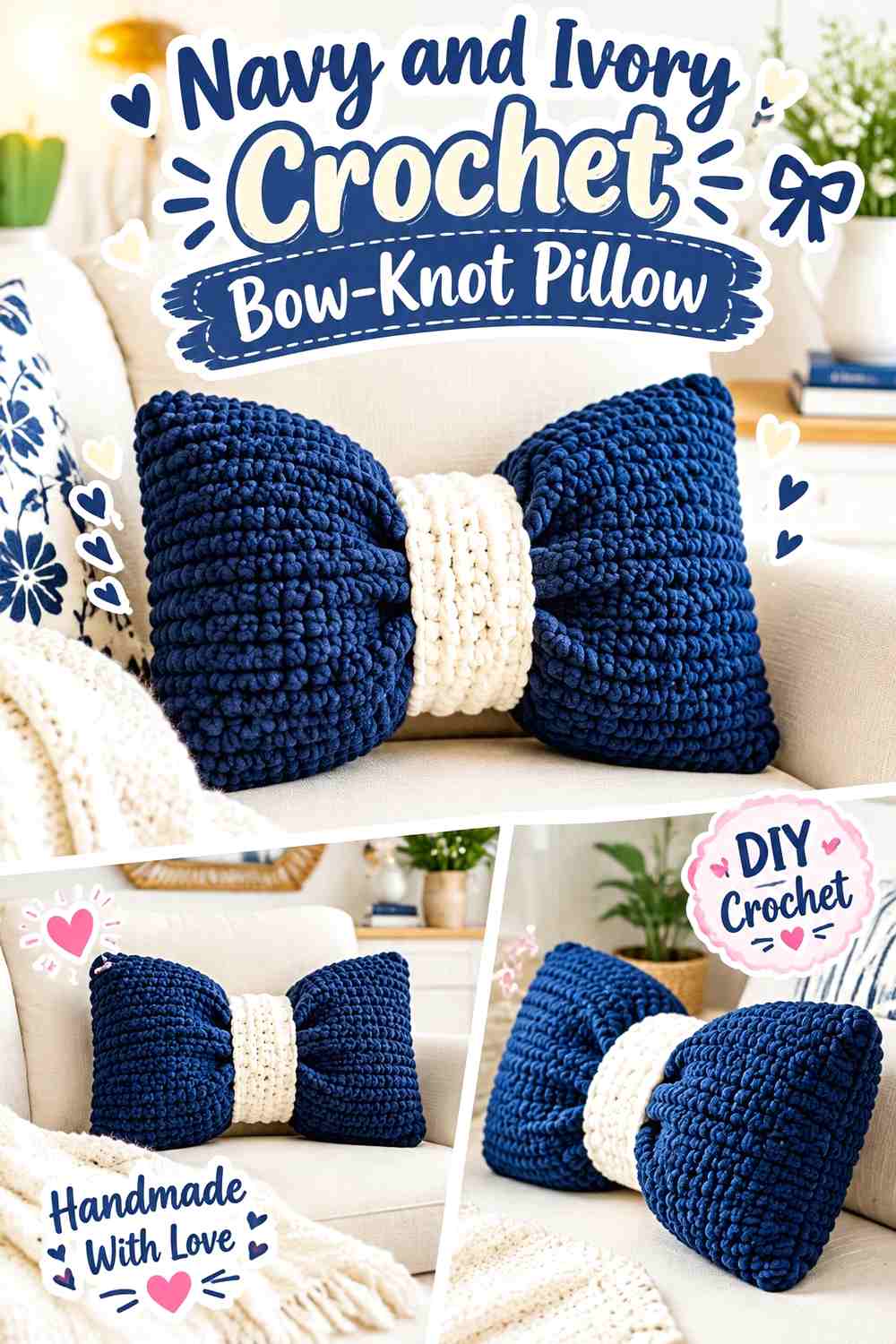
A bow-shaped knot gives color a natural focal point: the center wrap. Navy can dominate the two broad bow sections, while ivory defines the middle band and, if desired, a small amount of edging.
That placement emphasizes the cinched construction without covering the whole pillow in alternating color.
Let Navy Carry Both Crochet Bow-Knot Sides
Repeating navy on both sides creates visual balance around the center. Because the two halves already create a strong silhouette, keeping their color consistent prevents the pillow from feeling unnecessarily divided.
Navy also provides strong separation on light neutral sofas, where the bow outline can become part of the room’s graphic structure.
Use Ivory to Define the Navy Crochet Bow-Knot Center
The center is the most logical place for ivory because it visually explains where the pillow is gathered. A narrow light band against navy draws attention to the pinch point without competing with the broad bow sections.
If bright ivory feels too sharp, substitute a warmer cream while keeping it clearly lighter than navy.
Creator Credit: My Rainbow Crochet
8. Burgundy and Dusty Rose Crochet Bow-Knot Pillow
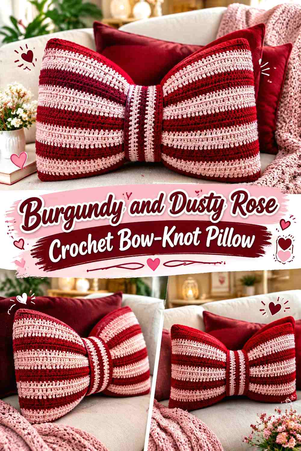
Burgundy supplies depth while dusty rose creates a softer transition than cream or white. The palette can therefore make a bow-knot pillow feel rich without giving its center a hard graphic outline.
Use burgundy for the broad form and dusty rose where the bow narrows.
Keep Burgundy Across the Main Crochet Bow-Knot Panels
The large bow sections give burgundy enough uninterrupted space to read as the dominant color. This is more effective than repeatedly alternating burgundy and dusty rose across the width.
On a dark sofa, make sure the burgundy silhouette remains visible; if it blends too closely, position a lighter pillow behind it or increase the dusty rose presence.
Dusty Rose Can Make the Burgundy Crochet Bow-Knot Center Easier to Read
A dusty rose center band marks the narrowest point and creates moderate rather than extreme contrast. Repeating a small amount of dusty rose elsewhere is optional; the center itself is already a visually logical isolated accent.
When substituting pink, choose one that stays noticeably lighter than burgundy so the two colors do not collapse into a single dark block.
Creator Credit: Crochê da Alessandra
9. Slate Blue and Greige Crochet Bow-Knot Pillow

Slate blue and greige suit a restrained modern palette where both cool and warm neutrals already appear in the room. Slate blue can cover the main bow, while greige defines the middle and keeps the shape from looking overly cool.
The result depends more on controlled value difference than vivid color contrast.
Slate Blue Gives the Crochet Bow-Knot a Quiet Focal Color
Use slate blue continuously across the two large sides so the bow remains one coherent object. Its softened character makes the unusual silhouette the main feature instead of the saturation of the yarn.
If your sofa is blue-gray, compare the actual yarn against it so the outer bow edges do not disappear.
Greige Can Soften the Slate Blue Crochet Bow-Knot Center
Greige is useful when white would create more contrast than the room needs. Position it at the center wrap, where even moderate value separation can make the gathering visually clear.
Choose a greige that differs enough from slate blue in lightness; two equal-value muted colors can look flatter once viewed from across the room.
Creator Credit: Chubby Cheeks
10. Mustard and Espresso Crochet Tunisian Bow-Knot Pillow

Mustard and espresso create a stronger warm contrast, making them useful when the pillow is intended to become a noticeable accent rather than blend quietly into the seating. Mustard can dominate the broad bow surface while espresso controls narrower details.
The darker center also prevents the warm yellow from occupying every part of the sculpture equally.
Let Mustard Lead the Crochet Tunisian Bow-Knot Surface
Use mustard across the largest panels so its color reads as a deliberate block rather than a scattering of small accents. If the room already has several strong warm colors, reduce competing accents around the pillow rather than complicating the crochet palette.
A more muted ochre can replace mustard when you want less saturation while preserving the warm direction.
Espresso Gives the Mustard Crochet Bow-Knot a Strong Center Anchor
Use espresso for the central band or another limited structural area. Its darkness clearly marks the compression point and gives the broad mustard sections a visual boundary.
Avoid distributing espresso into many tiny stripes unless a busier look is intentional; the center provides enough dark contrast on its own.
Creator Credit: Nicki’s Homemade Crafts
11. Emerald and Warm Beige Crochet Bow-Knot Pillow

Emerald gives this bow-knot pillow a stronger saturated direction, while warm beige keeps it connected to common neutral upholstery. Let emerald remain the statement color and use beige where you need visual relief.
The unequal balance is especially important with a stronger green: too much competing accent color can weaken its role.
Keep Emerald Dominant on the Crochet Bow-Knot Wings
The broad sides provide enough space for emerald to read clearly. A continuous field also makes the stitch surface easier to see than frequent beige interruptions would.
Against deep green seating, however, reverse the balance or choose a lighter green so the outer bow shape remains distinct.
Warm Beige Can Frame the Emerald Crochet Bow-Knot Center
Warm beige at the central wrap separates two emerald sides without producing the starkness of white. It can also echo beige, tan, or natural wood elsewhere in the room without requiring an exact shade match.
If the beige is very close to the surrounding sofa color, that can make the emerald bow appear even more isolated and graphic.
Creator Credit: Verônica Crochê
12. Rust and Espresso Crochet Braided-Knot Pillow
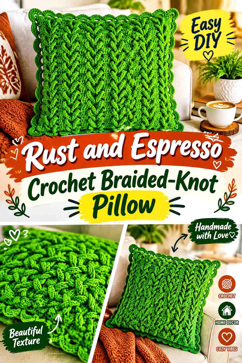
A braided pillow creates several repeated crossings, so a dark tonal palette can emphasize depth without turning every overlap into a different-colored event. Rust should carry most of the braid, while espresso appears selectively where stronger definition is needed.
This keeps attention on the interwoven structure rather than on a stripe pattern.
Repeat Rust Through the Major Crochet Braided-Knot Sections
Using rust repeatedly along the visible braid gives the eye a consistent path through multiple crossings. Because a braid already contains visual repetition, the color plan does not need to add another complicated rhythm.
For a quieter version, choose a softened rust rather than changing the placement strategy.
Reserve Espresso for the Deepest-Looking Rust Crochet Crossings
Espresso can be concentrated around an underside section or repeated sparingly at a few crossing points. The dark shade then reinforces the natural shadow pattern of the braid.
If espresso occupies too much of the pillow, rust may stop reading as the dominant color, so compare the full piece from a distance while planning distribution.
Creator Credit: Professor Neddy Ghusmam
13. Charcoal, Soft White, and Olive Crochet Celtic-Knot Pillow
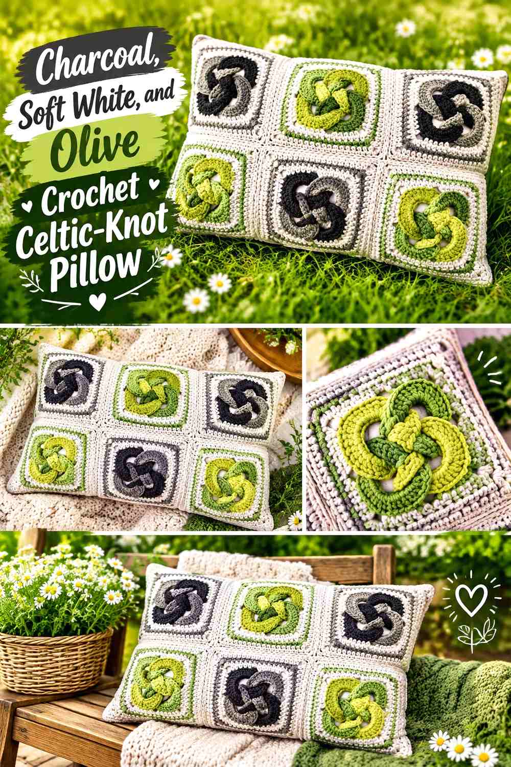
A Celtic-knot pillow places the knot on the pillow surface rather than shaping the entire cushion from one long tube. That changes the color problem: the interlocking motif must remain distinct from both its neighboring rings and the background.
Charcoal can provide the field, while soft white and olive distinguish the linked knot elements.
Soft White Should Separate the Crochet Celtic Knot From Charcoal
A soft white ring or knot section gains strong visibility against charcoal, which helps preserve the interlocking path. This is particularly valuable at intersections where several motif lines meet.
If you reduce the contrast, check that the knot remains recognizable from normal sofa-viewing distance rather than only at close range.
Olive Can Add a Third Crochet Celtic-Knot Layer Without Competing With Soft White
Use olive as a controlled secondary motif color instead of spreading all three shades equally across the background. Soft white remains the lightest separator, charcoal provides the dark frame, and olive adds color without destroying the hierarchy.
If your olive is nearly as dark as charcoal, keep it away from the smallest intersections where the distinction matters most.
Creator Credit: HandmadebyRaine
14. Plum and Pearl Gray Crochet Tube-Knot Pillow
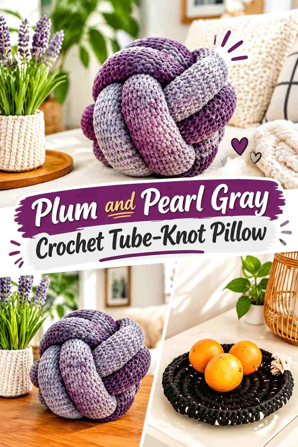
Plum gives a tube-knot pillow deep color without the neutrality of black or charcoal, while pearl gray introduces a cooler light supporting shade. The pairing works especially well when you want a dramatic pillow but still need its interior crossings to remain readable.
Use plum generously and treat pearl gray as a directional marker through the knot.
Let Plum Define the Main Crochet Knot Volume
Long plum sections reinforce the rounded tube and give the pillow visual weight. Keeping those areas uninterrupted also prevents the deep color from becoming a sequence of disconnected accents.
On similarly dark upholstery, evaluate the complete silhouette before committing to a plum-heavy balance.
Pearl Gray Can Reveal Where the Plum Crochet Knot Changes Direction
Place pearl gray on an inner arc, crossing, or secondary loop where two plum sections would otherwise touch visually. The lighter shade can explain the knot route without requiring white.
If pearl gray seems too cool beside the rest of the room, a warmer pale gray can take the same role as long as the value separation from plum remains clear.
Creator Credit: Linda Seel (Linda loves)
15. Clay, Soft Peach, and Stone Crochet Scandinavian Knot Pillow
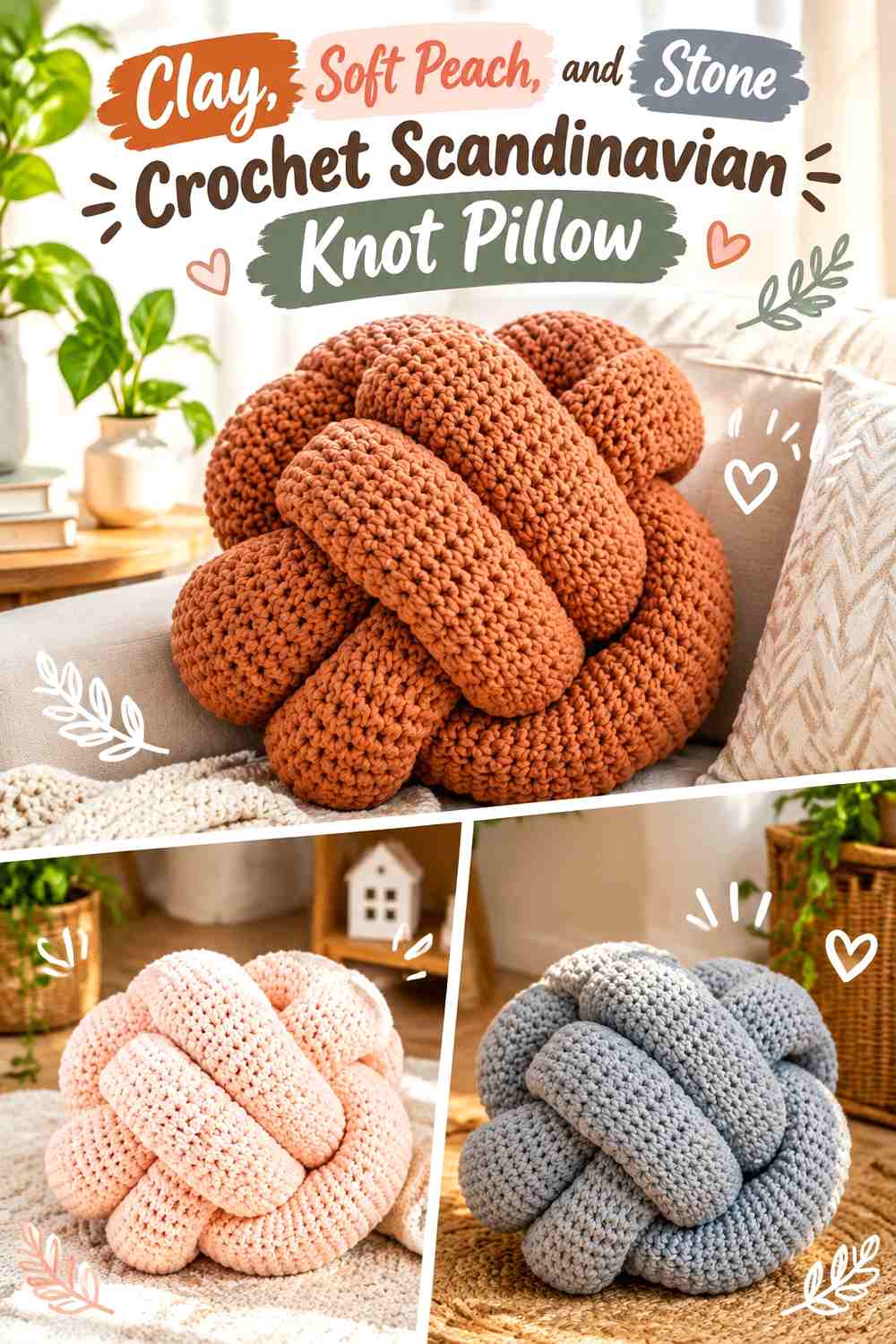
Clay, soft peach, and stone provide a three-color alternative that remains more restrained than a bright multicolor knot. Clay can control the primary tube, stone provides a neutral structural break, and soft peach works as the smallest transition color.
The key is unequal distribution. Giving all three colors identical space would make the long crochet tube look more like repeated color blocking than one knotted sculpture.
Keep Clay Dominant Across the Crochet Scandinavian Knot
Clay should occupy the longest visible runs, including at least one large outer curve. This establishes a clear base color before stone or soft peach appears.
If you substitute clay, preserve its medium warm value so it remains sufficiently distinct from the lighter supporting colors.
Use Stone and Soft Peach Sparingly Around Clay Crochet Knot Crossings
Stone can separate two major clay sections, while soft peach works in a smaller connecting area. That creates a clear three-level hierarchy rather than three competing focal colors.
Check the peach and stone together before starting. If they are almost identical in value, let their distinction remain subtle and rely on clay for the main contrast.
Creator Credit: Fios Pingouin
Which Crochet Knot Pillow Palette Fits Your Living Room?
For the strongest graphic contrast, start with black and cream, warm white and charcoal, or navy and ivory. These combinations make the outer silhouette and major knot divisions especially noticeable.
For a quieter neutral room, sage and mushroom taupe, slate blue and greige, or oatmeal and olive keep the color changes softer and allow the pillow’s physical curves to provide more of the definition.
If you want a warmer focal accent, terracotta and sand, rust and espresso, mustard and espresso, or clay, peach, and stone introduce color without requiring an extremely bright palette. For deeper color, teal and camel, burgundy and dusty rose, emerald and beige, and plum and pearl gray offer stronger saturation while retaining a clear supporting neutral.
Conclusion
The most effective color scheme for a crochet sculptural knot pillow depends on what you want the knot itself to do in the room. Strong light-dark palettes emphasize crossings and make the silhouette more graphic. Tonal combinations keep attention on curves, shadows, and crochet texture. Three-color palettes can add more movement, but they benefit from a clear dominant, supporting, and accent hierarchy.
Before settling on a palette, compare the yarn against the sofa, check the colors from several feet away, and pay particular attention to the center where loops cross. That is where a good color plan does the most work.
Use the credited tutorials for their exact construction methods, then adapt the color distribution to the visual role you want the finished pillow to play in your living room.
Frequently Asked Questions
How many colors work well in a crochet sculptural knot pillow?
One to three colors are usually enough to create a clear editorial direction. With two or three colors, assigning one shade the dominant role helps preserve the continuous knot silhouette. More colors can work, but frequent equal-sized changes may make the tube look fragmented.
How can I tell whether two yarn colors have enough contrast for a crochet knot?
Place the yarns side by side and view them from a distance. You can also photograph them and convert the image to grayscale. If they become almost indistinguishable, expect a softer tonal effect at the crossings. If one remains noticeably lighter, the knot path should receive stronger visual separation.
Where should the darkest color go on a crochet knot pillow?
There is no universal placement, but a dark shade can be useful on a secondary loop, an underside section, a bow center, or selected crossings. Keeping it concentrated often provides more structural definition than scattering it into many short stripes.
Can a crochet knot pillow match the sofa too closely?
It can, especially when both pillow and upholstery have similar value. The shape may lose its outer silhouette even when the colors are technically different. Compare the actual yarn against the sofa and decide whether you want blending or deliberate contrast.
How do I substitute one color without changing the whole crochet knot palette?
Preserve the role of the shade you are replacing. If it is the light supporting color, choose another shade that remains noticeably lighter than the dominant yarn. If it is the deep anchor, maintain enough darkness to define the intended crossing or center.
Should a multicolor crochet knot pillow use equal amounts of every color?
Not necessarily. A dominant-supporting-accent arrangement often keeps a sculptural knot easier to follow. One color can cover most of the tube, a second can identify a major loop, and a third can appear only at a transition or selected crossing. Equal distribution is better reserved for a deliberately striped or color-blocked look.