Crochet doilies become much more than table linens when color, mounting, and wall contrast are planned together. A cream lace doily inside a dark wood frame emphasizes every open stitch, while dusty rose against oatmeal creates a softer vintage-inspired display. Even a simple circular doily can look completely different when stretched inside a hoop, layered over fabric, grouped with smaller motifs, or mounted in a shadow box.
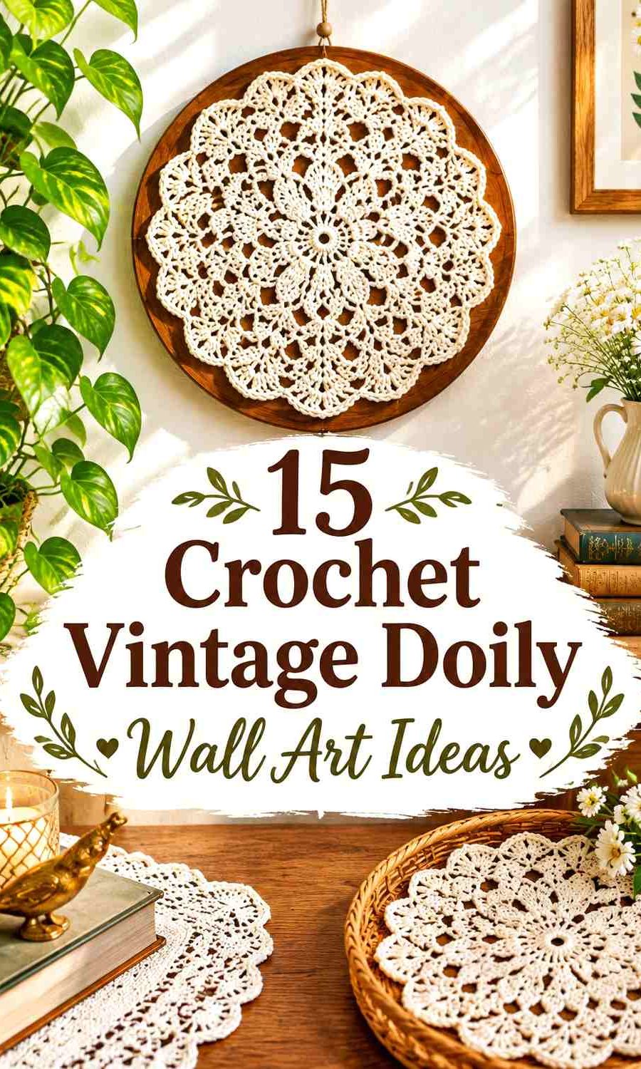
For wall art, the background should help the crochet remain visible. Pale lace can disappear against a white wall, and dark lace can lose detail on deep paint colors. Frames, hoops, backing fabric, and narrow contrasting borders give you additional ways to create separation without changing the doily itself.
The tutorials below support the crochet doily, lace motif, mandala, or hoop-display concept. The palettes and wall-art arrangements are independent adaptations, so the linked creators are not being credited with the exact color combinations proposed here.
Quick List
- Antique Cream and Walnut Crochet Vintage Doily Wall Art
- Ivory and Dusty Rose Crochet Vintage Hoop Doily Wall Art
- Sage Green and Oatmeal Crochet Vintage Botanical Doily Wall Art
- Burgundy and Blush Crochet Vintage Layered Doily Wall Art
- Navy and Ivory Crochet Vintage Gallery Doily Wall Art
- Terracotta and Cream Crochet Vintage Cottage Doily Wall Art
- Lavender and Plum Crochet Vintage Romantic Doily Wall Art
- Mustard and Olive Crochet Vintage Retro Doily Wall Art
- Dusty Teal and Cream Crochet Vintage Brass-Hoop Doily Wall Art
- Charcoal and Ivory Crochet Vintage Gothic Doily Wall Art
- Faded Blue and White Crochet Vintage Doily Triptych
- Cocoa Brown and Oatmeal Crochet Vintage Shadow-Box Doily Wall Art
- Peach, Coral, and Cream Crochet Vintage Layered Doily Wall Art
- Muted Pink, Sage, Faded Blue, and Cream Crochet Vintage Doily Gallery Wall
Choose Doily and Background Colors Together
Do not choose the crochet color without considering the wall or backing behind it. Ivory lace may look detailed on walnut, charcoal, sage, or faded blue but visually flatten against an equally pale background. A dark burgundy doily can create strong definition on cream backing yet lose its finer openwork on chocolate brown.
You do not necessarily need strong hue contrast. Light/dark contrast can be enough. Oatmeal crochet against deep walnut creates a restrained neutral display while still keeping the lace pattern visible.
Let Frames and Hoops Become Part of the Palette
A frame is not just a mounting device. Dark wood can ground pale lace, brass-toned hoops can warm teal or cream, and simple natural wood can keep terracotta, sage, or dusty rose from becoming overly decorative.
For a gallery grouping, repeat one frame or hoop finish across different doily colors. That repeated element can connect several motifs without forcing every crochet piece to use the same palette.
Protect the Open Crochet Lace From a Busy Background
Intricate lace needs visible negative space. Highly patterned fabric behind an equally detailed doily can make the open stitches difficult to distinguish. Solid or subtly textured backing usually gives the motif clearer boundaries.
If you are displaying a sentimental or older handmade doily, consider a mounting approach that does not require permanently gluing the crochet to the backing. The wall-art arrangement should support the lace without making the display itself the only way the piece can ever be used.
1. Antique Cream and Walnut Crochet Vintage Doily Wall Art

Antique cream and dark walnut create a strong light-and-dark relationship that suits detailed circular lace. Keep the doily cream and let a walnut-colored frame or mounting surface provide most of the darker color. This preserves the traditional single-color appearance of the crochet while giving the open spaces enough contrast to remain visible on the wall.
A single larger doily works especially well here because the dark frame already creates a clear boundary. Avoid adding several competing accent colors around the lace unless the surrounding room needs them.
Antique Cream Shows More Crochet Detail Against Walnut
Place the cream doily over a dark, plain backing rather than another pale neutral. The open sections become part of the visual design because the walnut color shows through them.
If the cream yarn is particularly warm, choose a similarly warm dark-brown frame rather than introducing a noticeably cool gray-brown that changes the understated palette.
Walnut Should Frame Antique Cream Without Covering the Lace Edge
Leave visible space between the outer lace points and the frame. That dark margin helps scallops, picots, and other decorative edges stay readable instead of visually colliding with the frame.
For a group of smaller cream doilies, repeat the same walnut finish so the wall display remains connected.
Creator Credit: NotikaLand crochet and knitting
2. Ivory and Dusty Rose Crochet Vintage Hoop Doily Wall Art

Dusty rose gives an ivory doily a softer alternative to brown or black contrast. Use ivory for most of the lace and bring dusty rose into the hoop wrap, backing fabric, or selected crochet rounds. The result stays light while giving the circular motif enough color separation.
This direction works particularly well for one medium hoop or a pair of coordinated hoops because the pink does not need to cover a large wall area to influence the finished palette.
Ivory Should Remain the Main Crochet Lace Color
Let ivory occupy most of the doily if you want the openwork to remain the first thing the viewer notices. Dusty rose can become more prominent at the outer edge without taking over the central pattern.
If the wall itself is ivory, use dusty rose backing behind the entire doily rather than relying on a narrow pink border.
Dusty Rose Can Define an Ivory Doily Inside the Hoop
A dusty rose hoop wrap or fabric background creates a clear circular boundary around pale crochet. Keeping the pink outside the most intricate lace also prevents the radial pattern from becoming visually fragmented.
For multiple hoops, repeat dusty rose in different amounts rather than making every doily identical.
Creator Credit: Giani Art
3. Sage Green and Oatmeal Crochet Vintage Botanical Doily Wall Art

Sage green and oatmeal create a muted botanical direction without requiring flower appliqués or several strong colors. Oatmeal can form the main doily, while sage appears in the outer crochet section, frame backing, or neighboring smaller motif.
This pairing works well when the doily contains floral-looking radial shapes because the green suggests a botanical connection without claiming that the stitches represent a particular plant.
Oatmeal Keeps Sage Green Doily Details Soft but Visible
Use oatmeal through the more intricate center when you want the stitch pattern to remain light. Sage can then define selected outer sections or the background.
Check the two yarns side by side first. If both are very pale, deepen the sage rather than introducing a third dark color just to outline the motif.
Sage Green Works Well Behind an Oatmeal Crochet Doily
A solid sage backing gives oatmeal lace more definition while keeping the overall contrast moderate. It is particularly useful for displaying several small doilies together because the same backing can visually unite motifs with different edge shapes.
Natural wood around the sage can remain secondary rather than becoming another dominant color.
Creator Credit: cc crochet
4. Burgundy and Blush Crochet Vintage Layered Doily Wall Art

A layered wall piece gives burgundy and blush distinct jobs. Let a larger burgundy motif provide the dark outer silhouette and position a smaller blush doily or lace motif over the center. The lighter top layer prevents the display from becoming one heavy dark circle.
Keep some burgundy visible between the blush motif and the outer edge so the two pieces can still be distinguished.
Burgundy Should Create the Outer Crochet Doily Anchor
The darkest color works well at the back because it gives the layered wall art a defined perimeter. Against a pale wall, the burgundy edge will remain visible without needing another border.
If the frame is also dark, include a narrow light margin between the burgundy crochet and frame so their edges do not merge.
Blush Needs Enough Burgundy Showing Around the Center
Choose a blush motif noticeably smaller than the burgundy piece. Covering almost the entire dark doily removes the contrast that makes layering worthwhile.
Blush can also appear in one small hanging element beneath the main circle if you want to repeat the lighter color without adding another full doily.
Creator Credit: Knitting Love 💗
5. Navy and Ivory Crochet Vintage Gallery Doily Wall Art
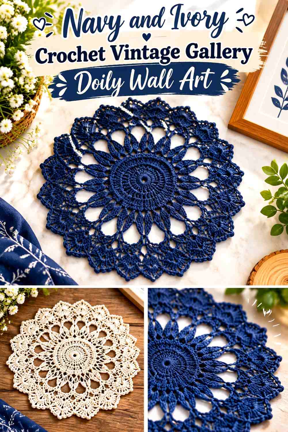
Navy provides a strong alternative to black for a high-contrast wall arrangement. Use ivory for most doilies and introduce navy through one statement motif, narrow crochet borders, or matching backgrounds behind selected pieces.
A gallery grouping benefits from repetition. If one frame contains navy lace, repeat navy somewhere in at least one neighboring display so it looks intentional rather than isolated.
Navy Can Anchor Several Ivory Crochet Doilies
Place the navy piece near the center or lower part of the gallery arrangement where its visual weight can balance multiple pale motifs.
Do not make every small doily navy. Ivory needs enough repeated surface area to preserve the airy quality associated with lace wall art.
Ivory Keeps Navy Vintage Doily Displays From Feeling Too Dark
Use ivory for larger or more intricate motifs where stitch visibility matters most. Their pale surface can provide visual breaks between navy accents.
On a dark blue wall, reverse the balance and use ivory for nearly every outer edge so each piece stays visible.
Creator Credit: Olga Poltava
6. Terracotta and Cream Crochet Vintage Cottage Doily Wall Art

Terracotta gives vintage-style lace a warmer, earthier setting than dusty pink or beige. Keep cream as the main crochet color and use terracotta as the backing, outer round, frame accent, or neighboring smaller doily.
This palette suits a mixed wall arrangement because terracotta can connect crochet with wood, pottery, or other warm decor without requiring the lace itself to become heavily multicolored.
Cream Should Carry the Detailed Crochet Doily Center
Use cream where the stitch pattern is most intricate. The light neutral helps small open spaces remain visible against terracotta.
If you want color inside the crochet, reserve terracotta for one or two outer sections instead of changing color repeatedly through every round.
Terracotta Can Warm the Cream Doily Border
A terracotta backing or outer crochet round gives the cream center a clear edge. Keep enough cream near the transition so the darker warm color does not visually compress the lace.
With several doilies, alternate cream-dominant and terracotta-dominant pieces rather than making every arrangement identical.
Creator Credit: Kristines Crochets
7. Lavender and Plum Crochet Vintage Romantic Doily Wall Art

Lavender and plum create tonal contrast within the same general color family. Lavender can occupy most of the lace, while plum defines the hoop, outer section, or backing. This keeps the display colorful without introducing several unrelated hues.
The darker plum is especially useful around openwork edges where pale lavender might otherwise disappear against a light wall.
Lavender Should Cover Most of the Crochet Doily Surface
Let lavender carry the center and larger lace sections so the piece remains visually light. If plum spreads across too much of the motif, it can overpower delicate openings.
Use a slightly muted lavender when you want a softer vintage-inspired direction rather than a brightly saturated purple.
Plum Can Give Lavender Crochet Lace a Defined Outer Edge
Put plum behind or immediately around the palest lace points. The value change will make scalloped edges easier to distinguish.
If the wall itself is dark, move lavender to the outermost visible section and use plum deeper inside the motif instead.
Creator Credit: mum2makes
8. Mustard and Olive Crochet Vintage Retro Doily Wall Art

Mustard and olive give a crochet doily a warmer retro-inspired palette without requiring bright primary colors. Mustard can lead the central motif while olive provides outer rounds, hoop wrapping, or the backing.
Because both shades can sit in a similar middle-value range, check their contrast before committing to fine color changes inside intricate lace.
Mustard Needs Clear Separation From Olive Crochet Rounds
If the two yarns look similar in grayscale, avoid alternating them through tiny sections. Give mustard a larger uninterrupted center and olive a broader outer area instead.
This block-style color distribution allows both shades to remain recognizable from across the room.
Olive Can Ground a Mustard Crochet Doily Hoop
Use olive around the outer hoop or in the backing so mustard stays visually centered. A natural wood hoop can also sit comfortably between the two colors without becoming the main focal point.
For a pair of wall pieces, reverse the palette on the second doily while keeping the same olive-and-mustard relationship.
Creator Credit: The Loopy Stitch
9. Dusty Teal and Cream Crochet Vintage Brass-Hoop Doily Wall Art
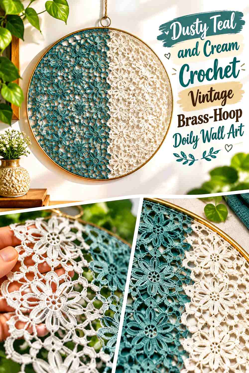
Dusty teal gives vintage lace a cooler color direction, while cream keeps the center light. A brass-toned hoop can act as the warm accent without requiring a third yarn color.
Let cream dominate the most open crochet sections and use teal where the motif needs stronger definition, particularly near the edge.
Dusty Teal Should Define the Cream Crochet Doily Perimeter
A teal outer round can create a clean transition between cream lace and the hoop. This is especially useful when the wall behind the piece is pale.
Keep teal away from every tiny center detail if you want the doily to remain primarily cream.
Cream Keeps Dusty Teal Visible Inside a Brass-Toned Hoop
Cream provides visual space between the cool teal and warm hoop finish. Without that lighter separation, the two stronger elements may compete around the perimeter.
If the hoop itself is visually prominent, keep tassels or hanging details cream rather than introducing additional colors below the doily.
Creator Credit: Crochet Swan
10. Charcoal and Ivory Crochet Vintage Gothic Doily Wall Art

Charcoal and ivory turn traditional lace into a more dramatic wall piece while keeping the palette simple. Ivory can form the intricate center, with charcoal used in a broad outer round or dark mounting surface.
The strongest effect comes from clear value separation rather than adding several dark colors. Leave enough ivory visible that the crochet construction can still be appreciated.
Charcoal Should Frame the Ivory Crochet Doily
Use charcoal around the perimeter or as a backing behind the pale motif. Its purpose is to make the lace openings easier to see, not to cover every detailed round.
A matte black or charcoal frame can extend the dark boundary when the wall itself is light.
Ivory Needs Visible Space Inside Charcoal Wall Art
Keep the ivory center large enough that the finished piece does not read as mostly dark from normal viewing distance.
If you use hanging fringe or small secondary motifs, repeat ivory there so the light color appears in more than one part of the wall composition.
Creator Credit: Jayda InStitches
11. Faded Blue and White Crochet Vintage Doily Triptych
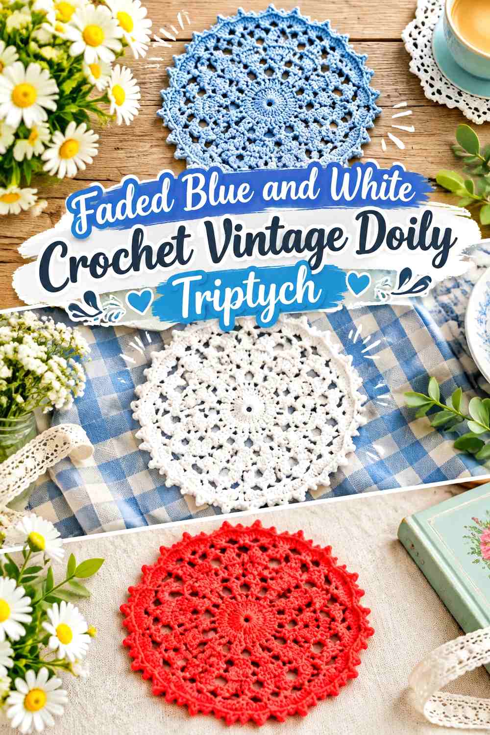
Three coordinated doilies can create a wall-art triptych without requiring each motif to be identical. Use faded blue as the repeated color and white as the lighter partner, then change their proportions across the three pieces.
One doily might be mostly white, the middle piece blue-dominant, and the final piece balanced between the two. Repetition keeps the set connected even when the patterns differ.
Faded Blue Should Repeat Across All Three Crochet Doilies
Include blue somewhere in every panel so the triptych reads as a set. The placement can change from center to border without losing that connection.
Avoid introducing a different accent color in each panel. Pattern variation already provides enough visual difference.
White Can Keep Faded Blue Crochet Lace Open and Light
Use white around the most detailed lace sections, particularly when the blue is medium or dark. The lighter shade prevents three adjacent doilies from becoming one continuous blue block.
On a white wall, give each panel a faded-blue margin or backing so the white outer lace remains visible.
Creator Credit: Crochet with Clare
12. Cocoa Brown and Oatmeal Crochet Vintage Shadow-Box Doily Wall Art

A shadow box can emphasize the depth of crochet lace while keeping the palette restrained. Use oatmeal for the doily and cocoa brown for the backing or frame. The deep neutral showing through every opening makes the stitch structure part of the artwork.
This treatment works especially well for one detailed doily because the enclosure already gives it a strong visual boundary.
Oatmeal Should Stay Lighter Than the Cocoa Crochet Background
Choose an oatmeal shade with enough light/dark difference from cocoa that the smallest lace sections remain visible.
If both colors are muted medium neutrals, the intricate center may flatten. Lighten the oatmeal rather than adding a stark white accent that changes the palette.
Cocoa Brown Should Surround the Oatmeal Doily Evenly
Leave a consistent brown margin around the outer edge so the shadow box does not make the crochet appear cramped.
If the doily has an irregular scalloped perimeter, that visible cocoa space becomes particularly useful for showing every point and curve.
Creator Credit: Naztazia
13. Peach, Coral, and Cream Crochet Vintage Layered Doily Wall Art
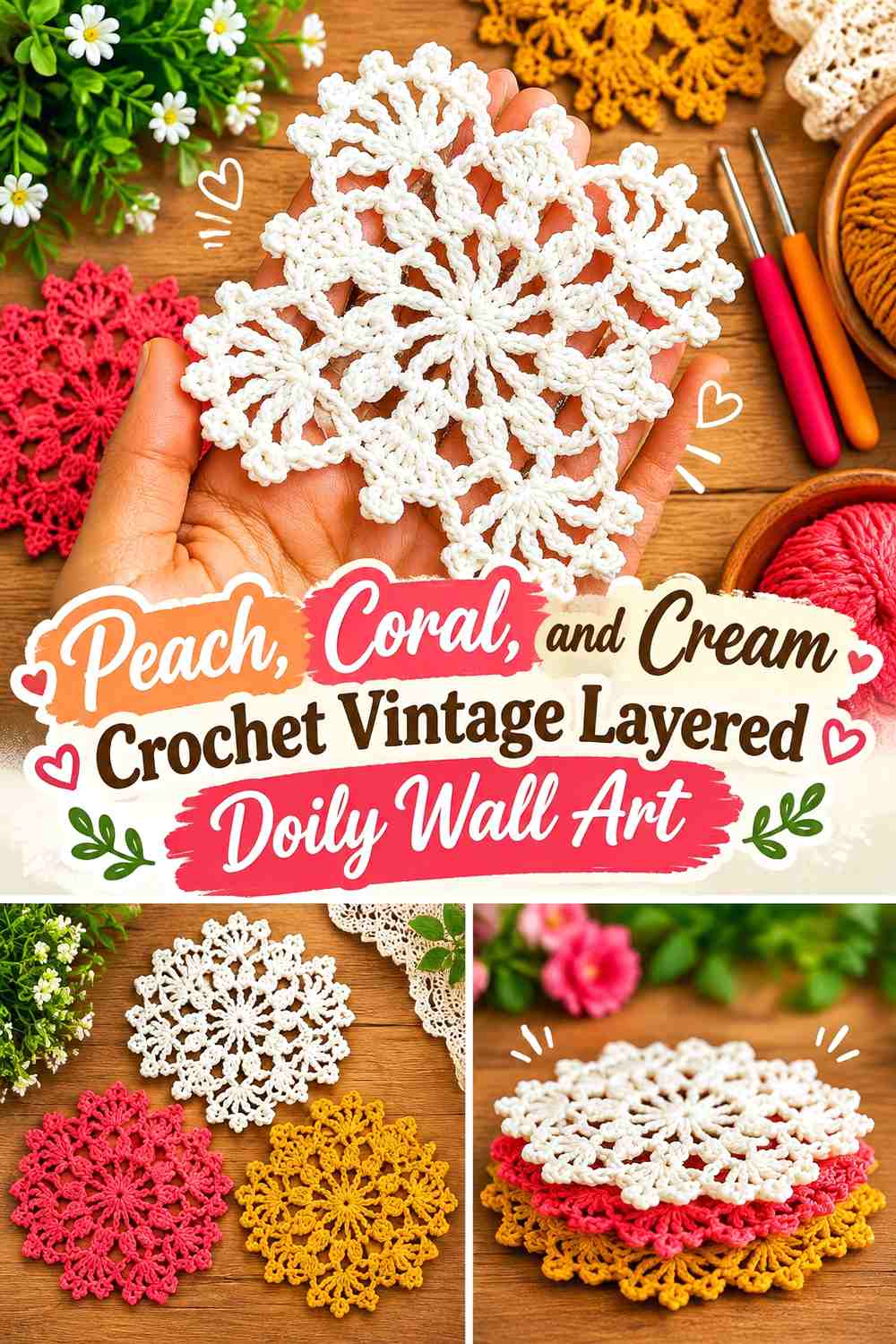
Peach and coral provide a warmer layered palette than traditional white lace. Let cream form the largest back doily, coral define a medium layer, and peach occupy the smallest central motif.
The three colors need a visible size hierarchy as well as a color hierarchy. If all three pieces are nearly the same diameter, the display can look like mismatched edges rather than deliberate layering.
Cream Should Provide the Largest Crochet Doily Layer
Use cream as the broadest background motif so coral and peach have a neutral area around them. This prevents the two similar warm shades from merging.
On a cream wall, add a thin coral outer detail or contrasting backing behind the large doily.
Coral Needs More Visual Weight Than Peach in the Doily Center
Let coral form a noticeable middle ring while peach stays smaller. The stronger coral creates a transition between cream and the softer center.
If peach and coral are too close in value, increase the visible cream between the two layers instead of adding another color.
Creator Credit: HiruHandmade Crochet
15. Muted Pink, Sage, Faded Blue, and Cream Crochet Vintage Doily Gallery Wall
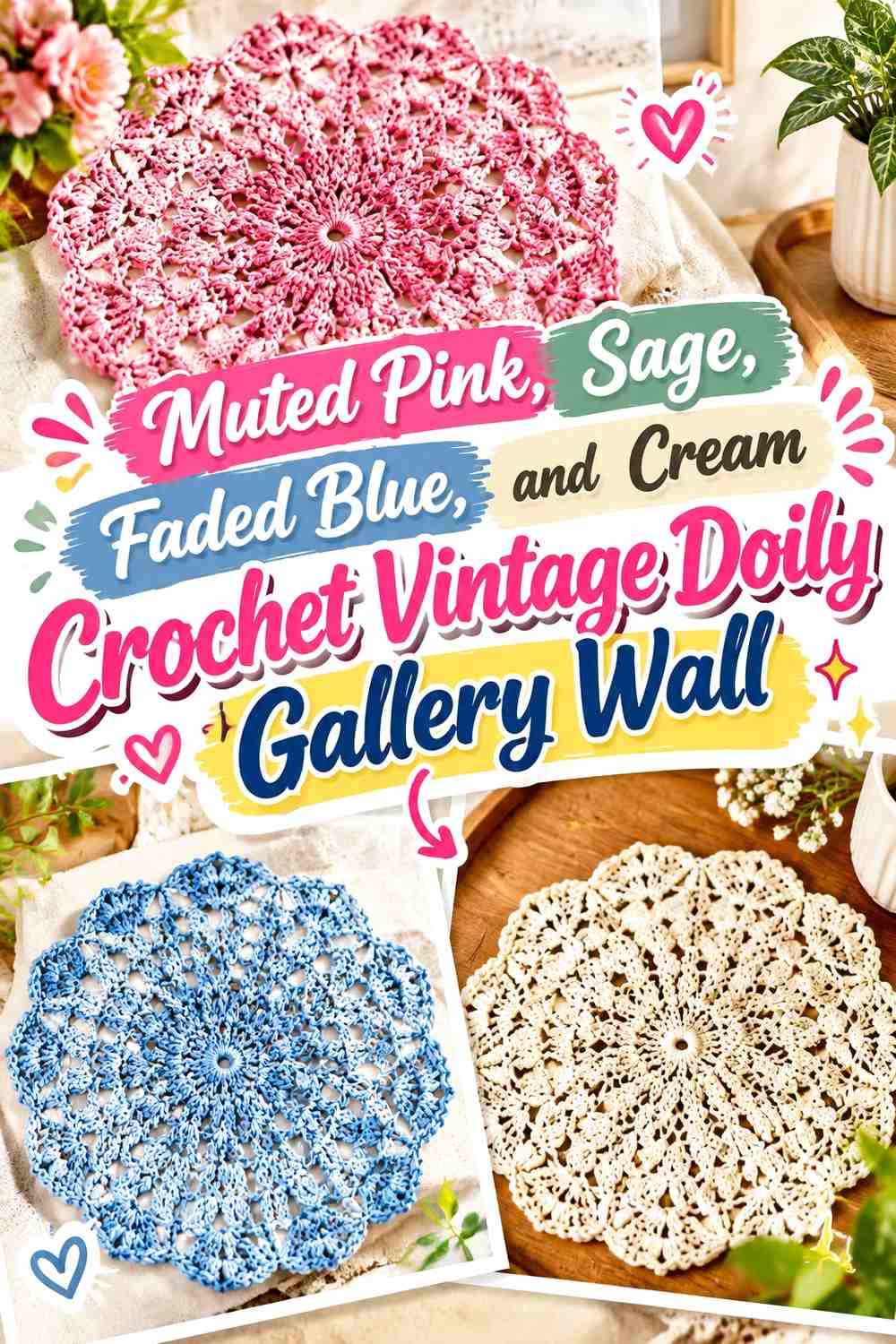
A gallery wall is one of the few doily displays where four colors can work without making an individual motif too busy. Instead of putting all four shades into every piece, assign each doily one dominant color and repeat cream across the collection.
For example, one piece can be sage and cream, another faded blue and cream, and another muted pink with a cream border. The repeated neutral connects the group while allowing each doily to retain its own identity.
Cream Should Connect the Muted Pink, Sage, and Faded Blue Doilies
Repeat cream in every wall piece—as a crochet border, central motif, backing, or frame margin. That repetition is more effective than trying to distribute all four yarn colors equally across each doily.
It also gives the eye a resting point between the muted colors.
Muted Pink, Sage, and Faded Blue Need Uneven Gallery Placement
Avoid lining the three colored doilies in strict color blocks. Distribute them so the same shade does not dominate one side of the arrangement.
Use differences in motif size as well as color to create balance. A larger faded-blue piece may need two smaller pink or sage doilies elsewhere in the grouping rather than another equally large motif beside it.
Creator Credit: Crochet Jewel
Which Vintage Doily Wall Art Color Scheme Should You Choose?
For the most traditional-looking direction, antique cream with walnut or cocoa with oatmeal keeps the crochet largely neutral and lets the lace pattern provide the detail. Ivory and dusty rose, burgundy and blush, or lavender and plum add more romantic color without requiring a highly saturated display.
If you want stronger contrast, navy and ivory, charcoal and ivory, or forest green and antique white make individual motifs easier to see from across a room. Sage, terracotta, dusty teal, and faded blue provide more muted color when you want the wall art to sit alongside other decor rather than become the darkest feature on the wall.
For multiple doilies, repeat one neutral or one frame finish across the collection. The patterns themselves already create plenty of variation, so the color scheme should give the group a connection rather than making every piece compete.
Conclusion
Vintage-inspired doily wall art can range from one cream lace piece in a dark frame to an entire collection of muted crochet motifs. The most important color decision is contrast: the doily, backing, wall, and frame should not all sit at the same visual value if you want fine lace details to remain noticeable.
Choose antique cream and walnut for a restrained display, burgundy or plum for richer color, dusty rose or faded blue for a softer direction, and charcoal or forest green when stronger definition is the priority. For gallery walls, use cream or another repeated neutral to connect different doily colors without making every motif identical.
Before mounting the crochet, test the finished doily against its intended backing and wall. A small change in background color or frame margin can reveal lace details that were almost invisible before. Use the linked creator tutorial for the original crochet construction and adapt the color and mounting approach to the wall-art arrangement you want.
Frequently Asked Questions
What color makes a white crochet doily stand out on a wall?
A medium or dark backing usually gives white or ivory lace clearer separation. Walnut brown, sage, dusty blue, navy, charcoal, and muted terracotta can all work depending on the surrounding palette. The important factor is enough light/dark contrast to keep the open crochet visible.
Can I use colored yarn for vintage-style crochet doily wall art?
Yes. A vintage-inspired wall display does not have to be white or cream. Dusty rose, faded blue, muted green, burgundy, plum, oatmeal, and other softened shades can work well, especially when a neutral is repeated somewhere in the motif, frame, or backing.
Should a crochet doily match the wall color?
It can coordinate with the wall without matching it exactly. If the doily and wall have almost identical lightness and color, the decorative edge and open lace may disappear. A contrasting hoop, backing, or frame can solve that problem without changing the crochet.
Are embroidery hoops useful for crochet doily wall art?
They can provide a circular frame that suits round lace and keeps the outer shape visually defined. Before mounting, check that the doily sits evenly within the hoop and that the outer lace details remain visible rather than being crowded against the edge.
How can I make several crochet doilies look coordinated on one wall?
Repeat at least one visual element. That could be cream borders, identical wood frames, matching hoops, the same backing color, or a limited palette such as sage, dusty rose, faded blue, and cream. The doily patterns themselves can vary.
What background works behind a detailed crochet doily?
A solid or subtly textured background generally allows intricate openwork to remain easier to distinguish than a highly patterned surface. Pick a backing that contrasts enough with the yarn to show both the center pattern and decorative outer edge.
Should I use one large crochet doily or several small ones for wall art?
One large motif creates a clearer single focal point and works well in a frame, hoop, or shadow box. Several smaller doilies provide more flexibility for a gallery wall but need stronger repetition in color, backing, or frame style so the arrangement feels connected.