Poetcore crochet works especially well for book lovers because the aesthetic can be built from accessories that already belong around reading and writing: book sleeves, bookmarks, journal covers, glasses cases, fingerless gloves, shawls, pencil pouches, mug cozies, and small carry pieces. The strongest color schemes tend to feel collected rather than overly coordinated, combining aged neutrals with deeper shades that suggest ink, leather bindings, dried flowers, old paper, and library shelves.
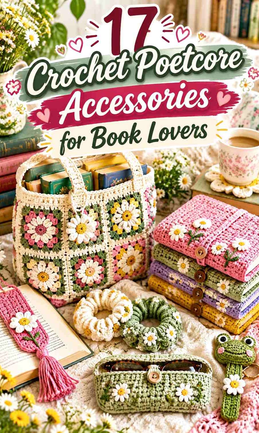
Color placement matters as much as the palette. A parchment book sleeve can use oxblood only at the closure, while an ink-blue pair of reading gloves may need oatmeal at the cuff to keep the texture visible. On small accessories, one dark shade can quickly dominate, so it often works better to give the neutral the largest area and reserve the richest color for edges, motifs, ties, pockets, or closures.
The tutorials below support the construction of each accessory. The poetcore palettes are independent editorial adaptations, so use the linked creator for the actual crochet method while planning your colors separately.
Quick List
- Parchment and Oxblood Crochet Book Sleeve
- Faded Rose and Moss Crochet Pressed-Flower Bookmark
- Library Brown and Antique Cream Crochet Glasses Case
- Ink Blue and Oatmeal Crochet Fingerless Reading Gloves
- Ivory and Plum Crochet Lace Collar
- Heather Gray and Burgundy Crochet Lace Reading Shawl
- Sepia and Sage Crochet Journal Cover
- Deep Green and Parchment Crochet Annotation Pouch
- Antique Rose and Ecru Crochet Lace Scrunchie
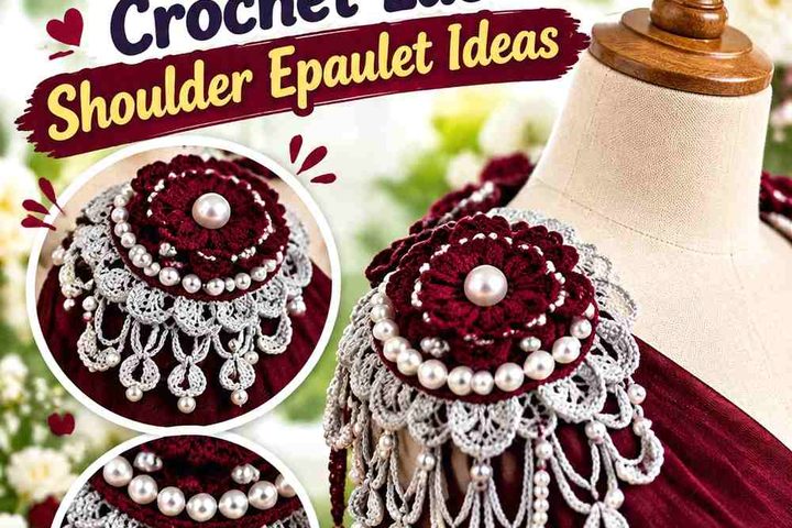
- Wine Red and Old Gold Crochet Flower Brooch
- Charcoal and Antique White Crochet Book Cover With Pencil Pocket
- Mustard and Walnut Crochet Sunflower Book Cover
- Moss Green and Parchment Crochet Classic Book Cover
- Dusty Blue and Cream Crochet Pom-Pom Bookmark
- Black Tea Brown and Flax Crochet Reading Phone Pocket
- Faded Lilac and Ink Navy Crochet Mini Reading Scarf
Build a Poetcore Crochet Palette Around Paper, Ink, and Binding Colors
Parchment, flax, ecru, oatmeal, antique cream, and muted beige make useful base colors because they resemble the quieter neutrals associated with old pages and stationery without requiring every accessory to be brown. These shades also give lace, ribbing, flowers, and textured stitches enough visual room to show.
Deep colors can then function like ink or bookbinding accents. Oxblood, burgundy, plum, forest green, charcoal, navy, and walnut work particularly well when they occupy less area than the neutral. On a small bookmark or glasses case, a narrow dark border may provide all the definition the palette needs.
Keep Crochet Texture Visible in Dark Literary Colors
Ink blue, wine, charcoal, cocoa, and deep green can create a rich poetcore direction, but very dark yarn can make subtle stitch changes harder to see. If texture is important, place a lighter color beside ribbing, lace, shells, puff details, or an important border.
A quick grayscale check can also help. Two colors that seem very different—such as burgundy and forest green—may still be similar in value. If they visually collapse together, introduce parchment, cream, sage, or another lighter supporting shade where the crochet detail needs separation.
Use Accent Colors Where Book-Lover Accessories Need Definition
Small reading accessories have natural places for contrast. A book sleeve has a flap, closure, border, or pocket. A glasses case has an opening and button area. Fingerless gloves have cuffs and thumb openings. Journal covers have edges, pockets, and ties.
Placing the darkest or most saturated color in those structural zones makes the palette useful rather than decorative for its own sake. It also lets the accessory keep a literary, subdued look without becoming visually flat.
1. Parchment and Oxblood Crochet Book Sleeve
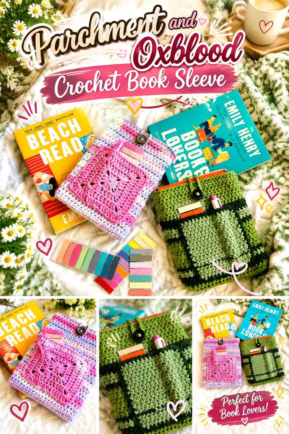
Parchment gives a crochet book sleeve the look of aged paper, while oxblood adds the deeper tone of a dark book binding. Keep parchment across most of the sleeve so the book-sized surface stays quiet, then use oxblood at a closure, pocket, narrow stripe, or upper edge where the stronger shade can define the construction.
Parchment Should Lead the Crochet Book Sleeve Surface
A large parchment field lets crochet texture show without making the sleeve compete with the book itself. If the sleeve includes a pocket or flap, continuing parchment through that section keeps the accessory visually unified rather than dividing it into several color blocks.
Oxblood Can Define a Parchment Closure Without Taking Over
Oxblood has enough depth to become the focal color even in small amounts. Use it around a button loop, flap edge, pocket border, or another repeated detail. If you extend oxblood across half the sleeve, the design will read as dark red first and parchment second, so decide which direction you want before adding broad stripes.
Creator Credit: Strong Earth Creations
2. Faded Rose and Moss Crochet Pressed-Flower Bookmark

A flower bookmark is already strongly connected to the page, so the poetcore treatment can stay restrained. Faded rose works well for petals, moss for stems and leaves, and a small neutral center can be added if the pink and green are close in value.
Faded Rose Keeps the Crochet Bookmark Floral but Muted
Choose faded rose rather than a highly saturated pink when you want the bookmark to feel like a dried flower pressed between journal pages. Because the motif is small, the petal color will still be noticeable without needing a brighter tone.
Moss Should Stay Narrow Beside Faded Rose Petals
The stem and leaf sections are visually long even when they use little yarn. Keeping moss confined to those botanical parts preserves the flower hierarchy and stops the green from competing with the faded rose head.
Creator Credit: Make It Yourself By Papari
3. Library Brown and Antique Cream Crochet Glasses Case

Library brown gives a glasses case a bookbinding-like base, while antique cream can lighten the opening, closure, or woven texture. This palette suits an accessory that may live beside notebooks, pens, and books in a reading bag because the dark neutral hides neither the purpose nor the crochet surface.
Library Brown Can Carry the Dense Crochet Glasses Case Body
Use library brown over the main case if you want a compact, leather-inspired visual direction. On dense textured crochet, a single dark field can look especially cohesive, but check the stitches under normal indoor light to make sure the surface does not become visually flat.
Antique Cream Can Clarify Library Brown at the Case Opening
A narrow antique-cream edge, button loop, or small closure detail creates a clear top to the case. The lighter shade can also be repeated once near the bottom if the upper contrast otherwise feels disconnected from the rest of the accessory.
Creator Credit: Day’s Crochet – Modern Crochet Patterns
4. Ink Blue and Oatmeal Crochet Fingerless Reading Gloves
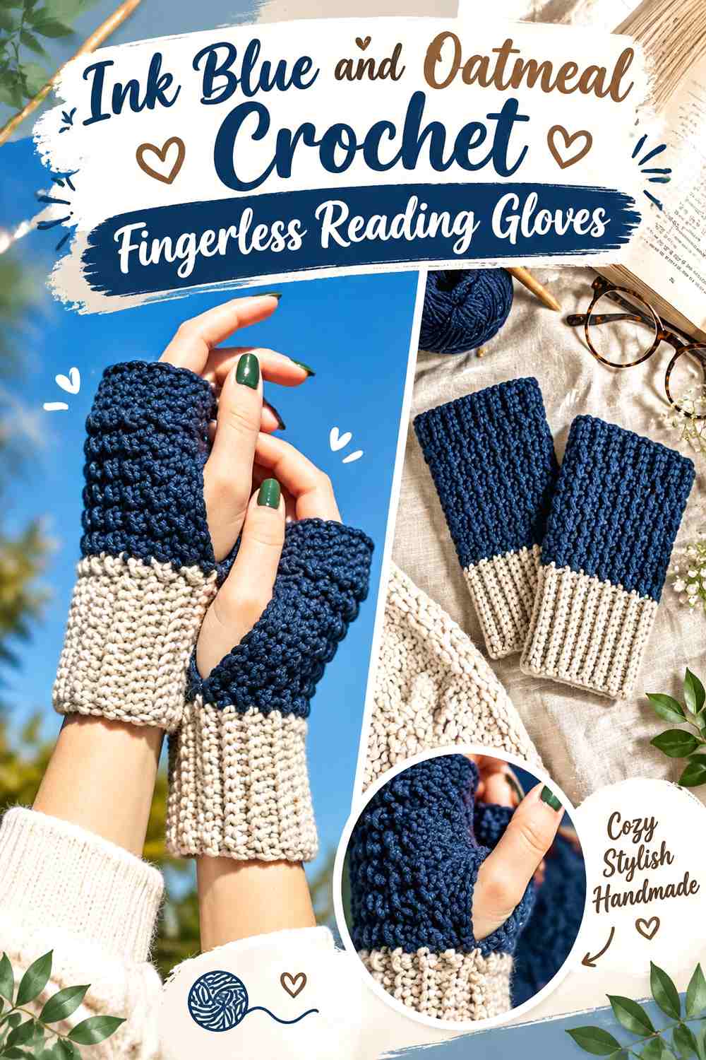
Fingerless gloves suit readers because the hands stay uncovered at the fingertips for holding pages, typing notes, or handling a mug. Ink blue creates the dominant literary color, while oatmeal can keep the cuffs, ribbing, or thumb area more visible.
Ink Blue Works Best Across the Main Crochet Glove Panels
Let ink blue cover most of each glove if you want a clear dark-ink effect. Repeating the same dominant color on both hands also prevents a small contrast section from making the pair look mismatched.
Oatmeal Can Reveal Ink Blue Ribbing at the Cuffs
A narrow oatmeal cuff or edge creates light-dark separation exactly where the texture changes. If you want a subtler result, use oatmeal only as a thin finishing line rather than a broad block.
Creator Credit: HayHay Crochet
5. Ivory and Plum Crochet Lace Collar

An ivory lace collar creates a delicate vintage base, while plum gives the poetcore palette enough depth to avoid looking purely bridal or pastel. The plum can sit at the ties, outer points, or a narrow inner neckline rather than filling the entire lace surface.
Ivory Lets the Crochet Lace Collar Pattern Stay Visible
Because lace depends on open spaces, ivory is useful when you want the arches and pointed edging to remain easy to read. It also layers clearly over many dark blouses, dresses, and sweaters without requiring a complex multicolor repeat.
Plum Can Frame Ivory Lace at the Neckline or Ties
Use plum where the collar begins or closes if you want the darkest shade close to the face without overwhelming the lace. A plum outer edge creates a stronger statement, while plum ties or a narrow neckline band keep the overall collar ivory-led.
Creator Credit: POSITIVITY WITH CROCHET
6. Heather Gray and Burgundy Crochet Lace Reading Shawl

Heather gray acts as a quiet manuscript-like neutral, while burgundy adds the depth of an old clothbound volume. On a larger accessory such as a shawl, the balance matters more because even a narrow contrast band can become visually prominent when repeated across a wide edge.
Heather Gray Should Carry Most of the Crochet Reading Shawl
A gray field keeps the lace repeat continuous and gives the shawl an understated reading-room quality. It also allows the openings and drape to provide visual interest instead of relying on many color changes.
Burgundy Can Give Heather Gray a Defined Shawl Edge
Reserve burgundy for a border, selected repeat, or narrow outer section if you want the darkest color to frame the shawl. Using burgundy through every lace section can reduce the calm neutral effect and make the accessory feel much heavier.
Creator Credit: TLH Patterns
7. Sepia and Sage Crochet Journal Cover

Sepia creates an aged-paper or old-photograph direction, while sage introduces a quiet botanical accent. On a journal cover, the colors can be distributed between the exterior panel, edge, spine area, or closure without interrupting the practical flat surface needed for writing.
Sepia Can Make the Crochet Journal Cover Feel Like an Old Binding
Let sepia dominate the outside if you want the cover to feel substantial and bookish. Its medium-dark value also gives lighter sage details enough contrast to be noticed without requiring white.
Sage Can Soften Sepia Along the Journal Edges
Use sage at a narrow border, tie, or small decorative section. The green introduces the botanical side of poetcore while keeping the main journal surface quiet enough to sit beside papers, pens, and other reading materials.
Creator Credit: CrochetSoiree
9. Deep Green and Parchment Crochet Annotation Pouch

A small drawstring pouch can hold page flags, sticky notes, clips, pens, or other reading accessories. Deep green gives it a dark botanical base, while parchment can lighten the drawstring channel and cords so the opening remains visually clear.
Deep Green Can Lead the Crochet Annotation Pouch Body
Keep most of the pouch deep green if you want the accessory to feel connected to mossy, library-like poetcore colors. Because the body is small, avoid adding several other dark shades that would compete for the same limited space.
Parchment Can Make the Deep Green Drawstring Area Easier to Read
Parchment cords or a narrow upper band create a useful break between the pouch body and gathered opening. Repeating a tiny parchment detail near the base can connect the top contrast to the rest of the design.
Creator Credit: VivCrochets
10. Antique Rose and Ecru Crochet Lace Scrunchie

A lace scrunchie can bring poetcore color into a reading outfit without adding another large wearable layer. Antique rose gives the ruffles a faded floral effect, while ecru can appear in the inner round or selected lace details.
Antique Rose Should Carry the Crochet Scrunchie Ruffle
Because the ruffle is the visible part when worn, keeping it antique rose establishes the palette immediately. Avoid dividing every lace repeat between colors if you want the shape of the ruffle to stay continuous.
Ecru Can Lighten Antique Rose Near the Inner Edge
A small ecru round near the elastic creates a quiet highlight rather than another dominant band. This works especially well when the outer rose is muted and the two colors remain clearly different in value.
Creator Credit: MJ’s Off The Hook Designs
11. Wine Red and Old Gold Crochet Flower Brooch

A small flower brooch can be pinned to a cardigan, reading shawl, tote, or book sleeve. Wine red gives the petals the deepest color, while old gold can define the center without the brightness of lemon yellow.
Wine Red Gives the Crochet Flower Brooch a Dark Floral Focus
Let wine red occupy most of the petals so the brooch has one clear visual identity. On a small motif, mixing several strong petal colors can make the flower look fragmented rather than layered.
Old Gold Should Stay Central Beside Wine Red Petals
Keep old gold in the center or one narrow inner detail. That concentrated warm point creates contrast while preserving the wine-red flower as the main feature.
Creator Credit: Crochet con Lillo
12. Charcoal and Antique White Crochet Book Cover With Pencil Pocket
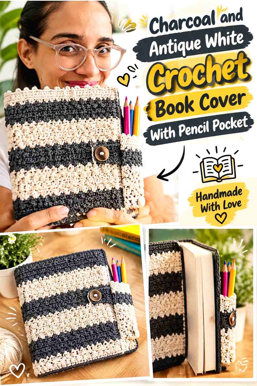
Charcoal gives a book cover a dark notebook-like exterior, while antique white can identify the pencil pocket, trim, or closure. This contrast is particularly useful on a design with more than one functional section because the colors can visually separate the book compartment from the smaller accessory pocket.
Charcoal Should Keep the Crochet Book Cover Visually Unified
Use charcoal across the largest front and back sections so the book cover still reads as one object even when it includes a pocket. Dark continuous panels also give small antique-white details more impact.
Antique White Can Define the Charcoal Pencil Pocket
Place antique white along the pocket opening, closure, or a narrow border so readers can immediately distinguish the smaller storage section. Avoid making the whole pocket light if you want the book cover to remain charcoal-led.
Creator Credit: Miss Padme – Lau
13. Mustard and Walnut Crochet Sunflower Book Cover

Mustard and walnut create one of the warmest poetcore palettes in the collection. The sunflower motif gives mustard an obvious decorative role, while walnut can anchor the centers, joins, or surrounding book-cover structure.
Mustard Should Stay Focused on the Crochet Sunflower Petals
Keeping mustard concentrated in the petals preserves the floral structure and stops the entire cover from becoming yellow. If additional rounds are needed around the motif, move into a quieter neutral or darker walnut rather than continuing mustard indefinitely.
Walnut Can Ground Mustard Across the Book Cover Joins
Walnut works well between sunflower squares or around the outer structure because it creates definition without introducing another hue. If the brown and mustard feel too close in value, a small cream transition can help, but the two-color version remains the more restrained poetcore option.
Creator Credit: Mavis and Flo
14. Moss Green and Parchment Crochet Classic Book Cover

A classic crochet book cover can carry a quieter palette than a floral version. Moss green gives the main exterior a botanical, old-library tone, while parchment can define the interior panels, edge, or fastening detail.
Moss Green Can Make the Crochet Book Cover Feel More Like a Binding
Use moss over the broad outer panel so the color reads as the cover rather than a stripe or decoration. The muted green is dark enough to feel substantial while still allowing stitch texture to remain easier to see than it might in black.
Parchment Can Keep Moss Green Edges From Feeling Heavy
A parchment border or inside panel introduces a lighter paper-like contrast. Keeping the light color near the book opening also creates a natural visual transition between the crochet cover and the pages inside.
Creator Credit: Secret Yarnery
15. Dusty Blue and Cream Crochet Pom-Pom Bookmark
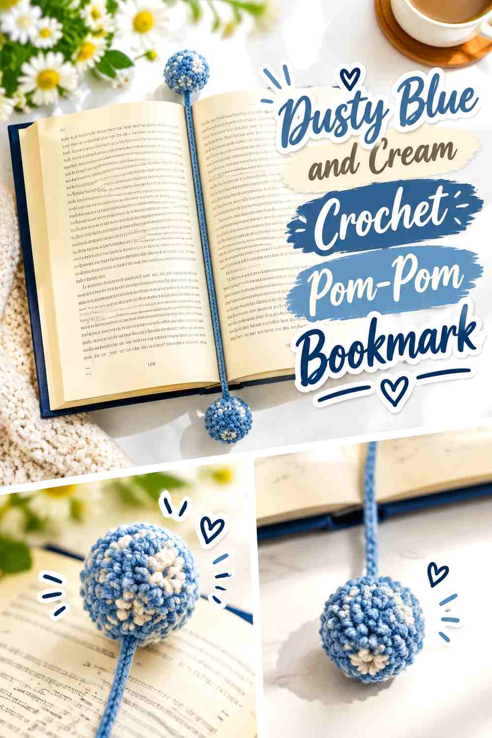
A pom-pom bookmark gives book lovers a softer, less floral alternative. Dusty blue can carry the cord and one end, while cream can create the second pom or a smaller contrasting detail.
Dusty Blue Keeps the Crochet Bookmark Quiet Against Book Pages
A muted blue cord does not compete strongly with printed text or illustrated covers. Because the bookmark is narrow, the color itself becomes noticeable without needing stripes or extra embellishment.
Cream Can Give Dusty Blue Pom-Poms Clear Separation
Using cream at one end or within one pom creates an obvious distinction between the two finishing details. If both shades are very pale, compare them in grayscale so the bookmark does not read as a single washed-out color.
Creator Credit: Crochet With Julie
16. Black Tea Brown and Flax Crochet Reading Phone Pocket
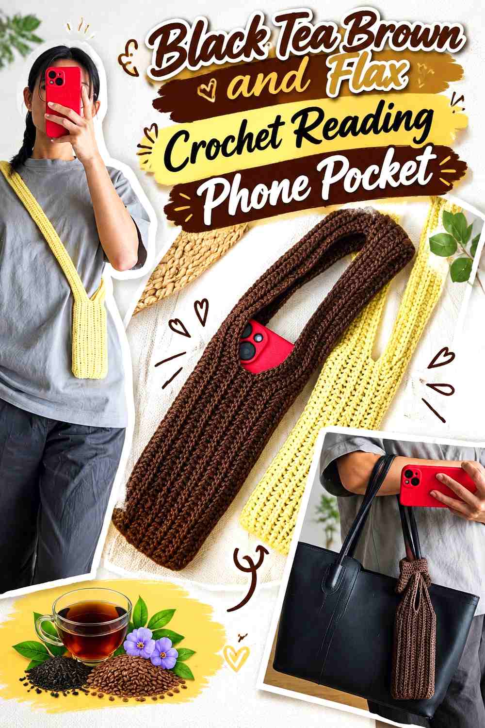
A phone pocket is useful for readers who keep notes, audiobooks, dictionaries, or reading apps nearby without wanting the phone loose beside a stack of books. Black tea brown gives the pouch a deep warm base, while flax can define the opening or strap.
Black Tea Brown Can Lead the Crochet Phone Pocket Body
Use the brown across the main pocket so the accessory has a calm leather-and-paper color direction. The narrow shape does not need several dark shades; one consistent field will make the construction look cleaner.
Flax Can Separate the Black Tea Brown Strap From the Pocket
A flax strap, upper edge, or small tie gives the top of the pouch definition. If the phone pocket is worn crossbody, repeating flax through the full strap makes the contrast more prominent, while a brown strap with only flax edging creates a subtler result.
Creator Credit: ABoC Studio
17. Faded Lilac and Ink Navy Crochet Mini Reading Scarf
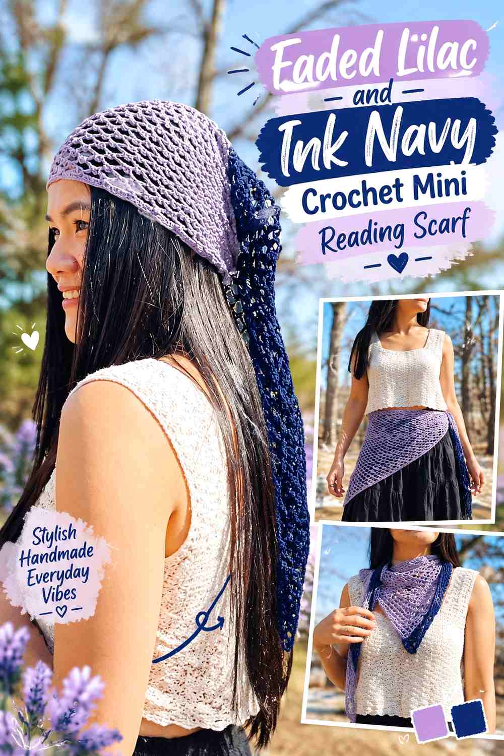
A small scarf can add softness around the neckline without the scale of a full shawl. Faded lilac keeps the openwork light, while ink navy can frame the edge or ties and connect the palette back to darker literary colors.
Faded Lilac Should Carry the Crochet Mini Scarf Openwork
Keeping the central lace or mesh field lilac lets the stitch pattern remain continuous. The softened purple also offers a floral poetcore direction without relying on pink or burgundy.
Ink Navy Can Give Faded Lilac a Sharper Scarf Border
A narrow navy edge creates clear value contrast and can make the triangular or scarf shape easier to read. Keep navy limited if you want the accessory to remain light; a broad dark border will visually reduce the amount of lilac even when the stitch count has not changed.
Creator Credit: KnitcroAddict
Which Poetcore Crochet Palette Fits Your Reading Style?
For an old-library direction, start with parchment and oxblood, library brown and antique cream, sepia and sage, or black tea brown and flax. These palettes keep the strongest colors close to leather, wood, ink, and aged paper.
For a more botanical poetcore look, faded rose and moss, antique rose and ecru, mustard and walnut, or moss green and parchment bring flowers and foliage into the collection without relying on bright garden colors.
If you prefer cooler literary colors, ink blue and oatmeal, heather gray and burgundy, faded lilac and navy, or dusty blue and cream create a quieter reading-room effect. Ivory and plum sits between the two directions, combining light lace with a deeper floral accent.
Conclusion
Poetcore crochet accessories work best when the colors feel connected to the way the object is used. Parchment belongs naturally on book sleeves and covers, darker ink tones can define gloves and scarves, and faded florals make sense on bookmarks, brooches, and lace details.
You do not need to use every literary color in one project. A two-color palette often gives small accessories better definition than a complicated mix. Let the quieter shade occupy most of the surface, then use oxblood, burgundy, moss, plum, navy, walnut, or another deeper color where the accessory has a natural edge, closure, motif, pocket, or border.
Use the linked tutorials for exact construction and sizing, then test the proposed colors together before committing to the whole project. The strongest poetcore collection will feel related without making every accessory identical.
Frequently Asked Questions
What colors make crochet accessories look poetcore?
Parchment, antique cream, flax, oatmeal, sepia, library brown, moss, burgundy, oxblood, plum, ink blue, charcoal, and faded floral shades all work well for a literary vintage direction. The key is usually a restrained hierarchy rather than using all of them at once.
Which poetcore crochet accessory is most useful for a book lover?
A book sleeve, bookmark, journal cover, glasses case, or annotation pouch has the most direct connection to reading. Fingerless gloves, mug cozies, shawls, and small scarves are more about making the reading setup or outfit feel cohesive.
How can I keep dark poetcore crochet colors from hiding stitch texture?
Pair the dark shade with a lighter border, cuff, motif center, or edge where the texture needs more definition. You can also compare the colors in grayscale to see whether the light-dark contrast is strong enough.
Should a crochet book sleeve match the book cover?
It does not need to. A neutral sleeve in parchment, moss, brown, or charcoal can work across many books. If you want stronger coordination, repeat one color from a favorite edition only in the closure or pocket rather than designing the entire sleeve around a single cover.
Can faded pink and green still look poetcore instead of cottagecore?
Yes. The difference comes from the overall palette and object styling. Dusty rose with dark moss, parchment, oxblood, charcoal, or library brown tends to feel more literary and aged than pink combined with several bright garden pastels.
What is a good two-color poetcore palette for beginners?
Parchment with oxblood, oatmeal with ink blue, cream with library brown, or moss with parchment are straightforward combinations because each gives one light or muted base and one clearly darker accent. That makes placement decisions easier.
How do I make several crochet accessories look like one poetcore collection?
Repeat color roles rather than making every item identical. For example, parchment can dominate the book sleeve, appear only as a border on a moss book cover, and become a drawstring on a dark green pouch. Using the same colors in different proportions creates connection without repetition.