A cottagecore crochet phone case works best when the lace pattern, small accessory scale, and color palette support one another. Creams, faded greens, dusty florals, muted blues, mushroom browns, and softened yellows can create the vintage botanical direction, but the colors still need enough separation for shells, mesh, granny motifs, scallops, and floral openings to remain visible.
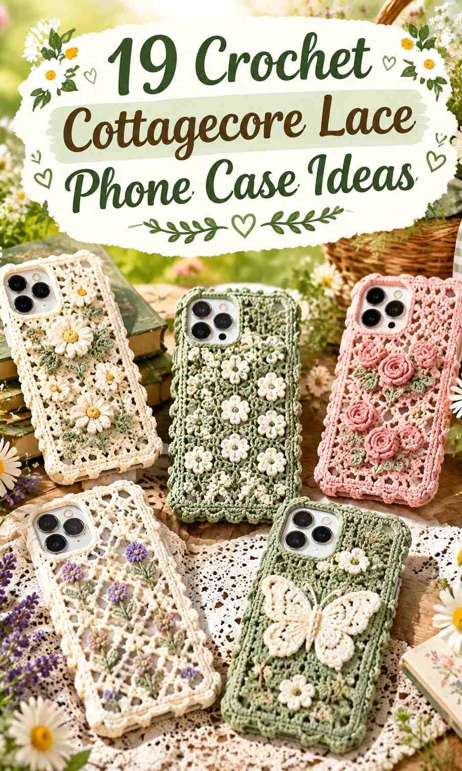
Open crochet introduces another color consideration: the phone or protective case may show through the holes. A dark device behind cream lace creates much stronger definition than a beige phone behind oatmeal lace, for example. That background can become part of the finished palette even though it is not yarn.
The tutorials below support the phone-pouch or decorative construction concept. The cottagecore palettes are independent adaptations, so use each creator’s tutorial for the actual construction details while planning the color placement separately.
Quick List
- Ecru and Sage Scalloped Crochet Lace Phone Case
- Oatmeal and Olive Diamond-Mesh Crochet Phone Case
- Antique Cream, Dusty Rose, and Moss Crochet Floral Lace Phone Case
- Buttercream and Lavender Shell-Lace Crochet Button Phone Case
- Flax and Forget-Me-Not Blue Crochet Window-Lace Phone Case
- Ivory, Blush, and Sage Crochet Granny-Square Lace Phone Case
- Mustard, Cream, and Chocolate Crochet Sunflower Lace Phone Case
- Old Rose, Ecru, and Moss Crochet Puff-Flower Phone Case
- Mushroom Brown, Cream, and Soft Peach Crochet Lace-Panel Phone Case
- Linen, Sage, and Terracotta Crochet Slim Lace Phone Case
- Soft White, Meadow Green, and Chamomile Yellow Crochet Mesh Phone Case
- Dusty Blue, Cream, and Rust Crochet Shell-Lace Phone Case
- Parchment, Olive, and Burgundy Crochet Lace Phone Holder
- Cocoa, Blush, and Antique Cream Crochet Button Lace Phone Case
- Lilac, Cream, and Sage Crochet Two-Square Lace Phone Case
- Natural Linen, Dusty Pink, and Moss Crochet Lace-Inset Phone Sleeve
- Cream, Faded Blue, and Berry Crochet Tassel Lace Phone Case
- Oatmeal, Forest Green, and Butter Yellow Crochet Lace-Band Phone Case
- Antique White, Plum, and Sage Crochet Pocket-Style Lace Phone Case
Let Cottagecore Neutrals Show the Lace Pattern
Cream, ecru, oatmeal, linen, and antique white are useful cottagecore base colors because their quiet appearance leaves room for openwork to become the decorative feature. On a small phone pouch, however, using several nearly identical neutrals can make scallops, shells, joins, and motif borders visually merge.
Give closely related neutrals different jobs. An oatmeal body can have a lighter cream lace band, or an ecru mesh panel can sit inside a slightly darker linen border. The difference does not have to be dramatic, but it should be visible enough for the lace structure to read.
Consider the Phone Color Behind Crochet Lace
Mesh and other openwork reveal whatever sits underneath them. Before deciding that two yarn colors provide enough contrast, place the actual phone—with its usual protective case—behind your lace sample.
A black or navy phone case can make cream, pale yellow, dusty pink, and sage openings look much more defined. A pale phone case can soften those same colors. If the device creates more contrast than you want, a more covered crochet section or a closely related color can make the effect quieter.
Keep Cottagecore Accent Colors Small on a Phone Case
A phone pouch has much less surface area than a tote or cardigan. Dusty rose, mustard, plum, burgundy, terracotta, or berry can therefore become dominant even when used sparingly.
A practical color hierarchy is to let one neutral or muted green cover the largest area, use a floral shade for the decorative lace or motif, and reserve the darkest or brightest shade for centers, borders, closure details, or small repeats. This keeps the cottagecore palette recognizable without making every inch compete for attention.
1. Ecru and Sage Scalloped Crochet Lace Phone Case
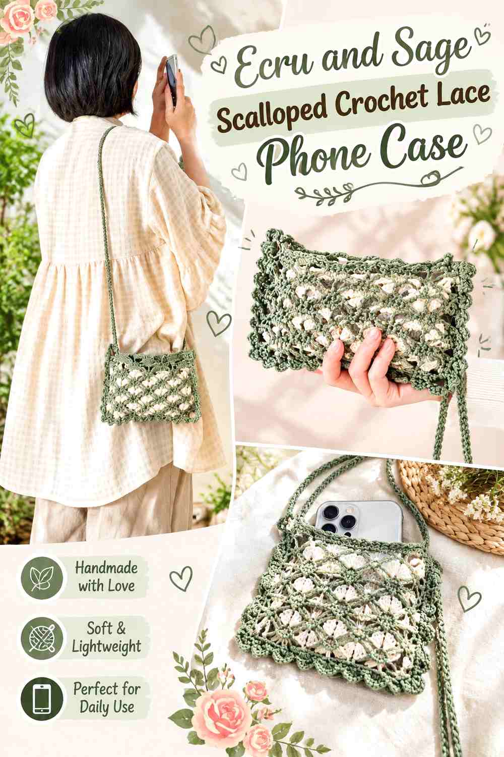
Ecru gives scalloped lace a softly aged appearance, while sage provides enough color to define the upper edge, strap, or selected scallops. Let ecru occupy most of the openwork if the lace itself is meant to be the focal point. Sage can then frame the delicate surface without turning the case into a green accessory.
Ecru Keeps Scalloped Crochet Lace Light and Visible
Use ecru across the main decorative panel where the repeated curved edge needs to remain obvious. If the phone underneath is also very light, compare the empty and filled case before settling on the palette because some of the lace definition may disappear once the device is inserted.
Sage Can Give Ecru a Clear Phone Case Border
Sage works well around the opening or other firmer-looking edges because it visually separates the pale lace from its surroundings. Keep the green narrower than the ecru surface if you want the final case to read as heirloom-inspired lace rather than a sage pouch with cream trim.
Creator Credit: Cocona Crochet
2. Oatmeal and Olive Diamond-Mesh Crochet Phone Case
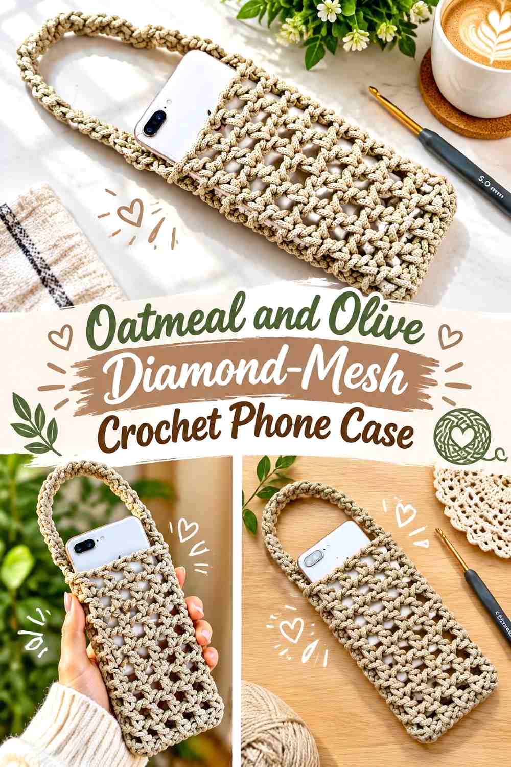
Oatmeal creates a natural-looking mesh field, while olive brings a darker botanical note to the phone case. The stronger olive is useful around areas where the open diamond pattern needs a visual boundary, especially when the phone itself is pale.
Oatmeal Lets Diamond Mesh Carry the Main Phone Case Surface
Keep oatmeal across most of the mesh when you want negative space to remain the primary feature. Because the phone shows through open diamonds, test the oatmeal against the device rather than judging the yarn by itself.
Olive Can Ground the Oatmeal Strap and Upper Edge
Olive has enough visual weight to distinguish a strap or top border from the airy oatmeal center. Repeating a small amount near the bottom can keep the dark green from looking attached only to the top of the case.
Creator Credit: Toh Handmade
3. Antique Cream, Dusty Rose, and Moss Crochet Floral Lace Phone Case

Antique cream can form the quiet background, dusty rose can identify the floral portions of the lace, and moss can supply small leaf-like or edging accents. Keep the dusty rose concentrated around the flower shapes so the botanical feature remains recognizable on the narrow phone-case surface.
Dusty Rose Should Mark the Important Floral Lace Areas
Instead of spreading dusty rose evenly through every row or edge, give it a clear decorative role. A centered flower, repeating floral band, or small group of motifs gives the color a reason to be there and leaves enough antique cream around it for separation.
Moss Can Connect Dusty Rose Flowers to Antique Cream
Use moss in smaller areas around dusty rose rather than giving pink and green equal coverage. On a tiny accessory, a little green repetition can establish the botanical cottagecore direction without turning the case into strong two-color blocking.
Creator Credit: Crochet ByLarissa
4. Buttercream and Lavender Shell-Lace Crochet Button Phone Case

Buttercream gives shell texture a warm neutral base, while lavender can identify selected shells, the closure area, or a narrow lace band. The color pairing is gentle, so check their light-dark difference before repeating lavender across intricate details.
Buttercream Can Keep Shell-Lace Texture Easy to Follow
Let buttercream cover the larger shell-stitch area when the curved texture is already decorative enough. A continuous neutral field prevents frequent color changes from breaking the shell shapes into unrelated sections.
Lavender Can Bring Attention to the Buttercream Closure Area
A lavender border or small closure accent can give the top of the case definition without competing with every shell below it. If your lavender is very pale, place it directly beside buttercream first to confirm that the two shades do not visually merge.
Creator Credit: Vivi Crochet
5. Flax and Forget-Me-Not Blue Crochet Window-Lace Phone Case

Flax provides a natural cottagecore neutral, while forget-me-not blue adds a faded floral color without overwhelming a small open panel. This palette is particularly useful when the phone visible through the opening already introduces a strong dark or bright background.
Flax Can Frame the Open Crochet Phone Window
Use flax around the denser portions so the opening remains the feature rather than another block of color. Its warmer neutral character also gives cool blue accents more distinction.
Forget-Me-Not Blue Works Best as a Flax Lace Accent
Keep the blue around a selected edge, floral detail, or short decorative section. Too much blue beside a visible blue phone can flatten the contrast, so judge the palette with the actual device behind the crochet.
Creator Credit: Viky Pace
6. Ivory, Blush, and Sage Crochet Granny-Square Lace Phone Case

A granny-style phone case gives color a natural place to change between motif center, surrounding rounds, and outer border. Blush can lead the decorative center, ivory can open up the lace, and sage can frame the finished motif.
Blush Should Stay Central Inside Ivory Granny Lace
Keeping blush near the motif center prevents the small phone case from becoming evenly pink. Ivory around it creates breathing room and makes the center feel like a flower-inspired feature instead of a general color block.
Sage Can Unite Ivory and Blush at the Phone Case Edge
Use sage as an outer framing color or another controlled repeat. Its darker value can give the two lighter colors a defined perimeter, especially if the phone underneath is also pale.
Creator Credit: Coc Tips & Tricks
7. Mustard, Cream, and Chocolate Crochet Sunflower Lace Phone Case

A sunflower motif naturally suits a cottagecore phone accessory, but the three-color palette needs hierarchy on such a small surface. Let cream or another neutral cover the surrounding case, use mustard for petals, and keep chocolate concentrated in the flower center or a narrow repeat.
Mustard Should Carry the Sunflower Against Cream
Give mustard the largest share of the flower itself while allowing cream to remain visible around the petals. That neutral space helps each petal keep its outline instead of turning the front into one dense yellow shape.
Chocolate Needs a Smaller Role Beside Mustard
A dark center creates clear separation, but chocolate does not need to continue across every border and strap. Keeping it concentrated around the flower lets the sunflower remain the visual anchor.
Creator Credit: Emnash Threads
8. Old Rose, Ecru, and Moss Crochet Puff-Flower Phone Case
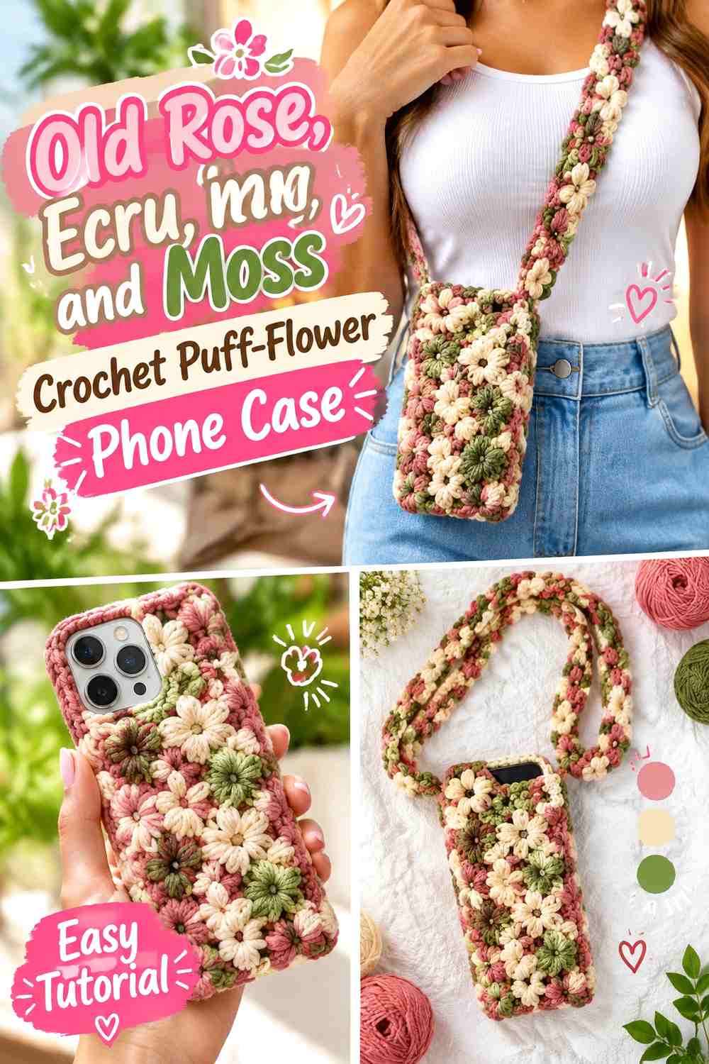
Old rose gives dimensional crochet a muted floral color, ecru creates lighter separation, and moss adds a botanical supporting shade. Because puff texture already adds visual weight, the palette can remain restrained.
Old Rose Makes Puff Flowers Distinct From Ecru
Use old rose on the raised areas you want noticed first. An ecru background lets their depth and shadow remain visible without adding another strong contrasting hue.
Moss Should Support Old Rose Rather Than Match Its Coverage
Moss can work in small edges, connecting details, or selected accents around the flowers. Keep it secondary so the phone case still reads as rose-led rather than becoming a balanced pink-and-green checker.
Creator Credit: CozyCreativeCrochets
9. Mushroom Brown, Cream, and Soft Peach Crochet Lace-Panel Phone Case

Mushroom brown creates an earthy case body, cream can define the lace insert, and soft peach introduces a restrained floral accent. This palette suits a phone case where openwork is concentrated in one section instead of covering every structural area.
Mushroom Brown Can Frame a Cream Lace Panel
Use the deeper neutral around the panel so its open spaces remain obvious. This also gives the phone case a more grounded cottagecore direction than using cream across every surface.
Soft Peach Can Highlight Cream Without Challenging Mushroom Brown
Add peach to a small motif, upper band, or decorative repeat within the cream area. Because peach is lighter and warmer than mushroom brown, even a small amount can be noticeable on a phone-sized accessory.
Creator Credit: Blog do crochê
10. Linen, Sage, and Terracotta Crochet Slim Lace Phone Case
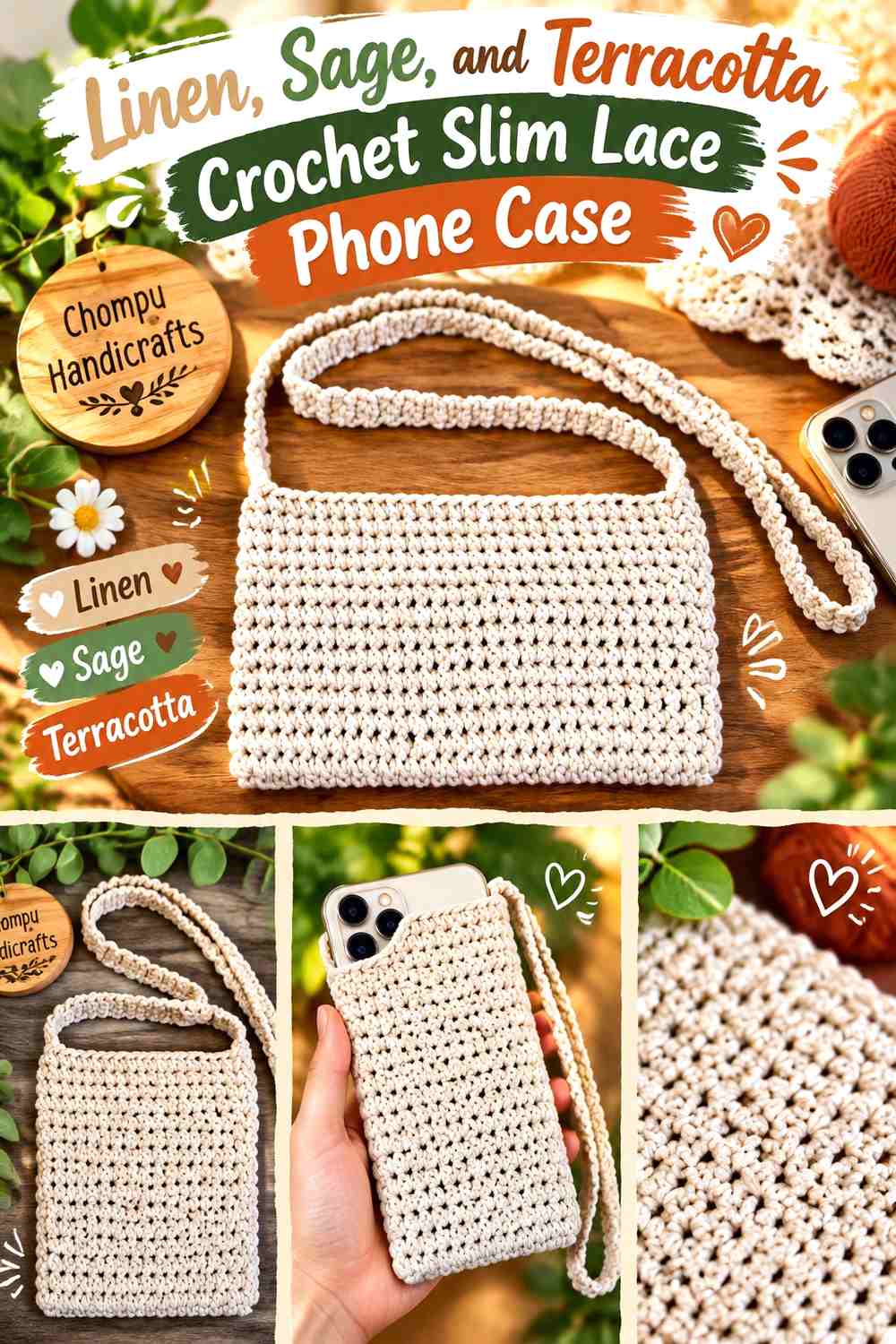
Linen can dominate a narrow crossbody case while sage and terracotta provide botanical and earthy accents. The slim silhouette benefits from vertical or centrally placed color because too many horizontal changes can visually shorten the case.
Linen Can Keep a Slim Lace Phone Case Visually Quiet
Use linen through most of the body if you want openwork to provide the main decoration. Its neutral field also makes small sage or terracotta details easier to repeat without overcrowding the surface.
Terracotta and Sage Need Unequal Roles Against Linen
Choose one accent to lead. Terracotta can mark a flower or decorative band while sage remains limited to edging, or the balance can be reversed. Giving both colors equal space can make a very narrow case feel striped rather than botanical.
Creator Credit: Chompu Handicrafts
11. Soft White, Meadow Green, and Chamomile Yellow Crochet Mesh Phone Case
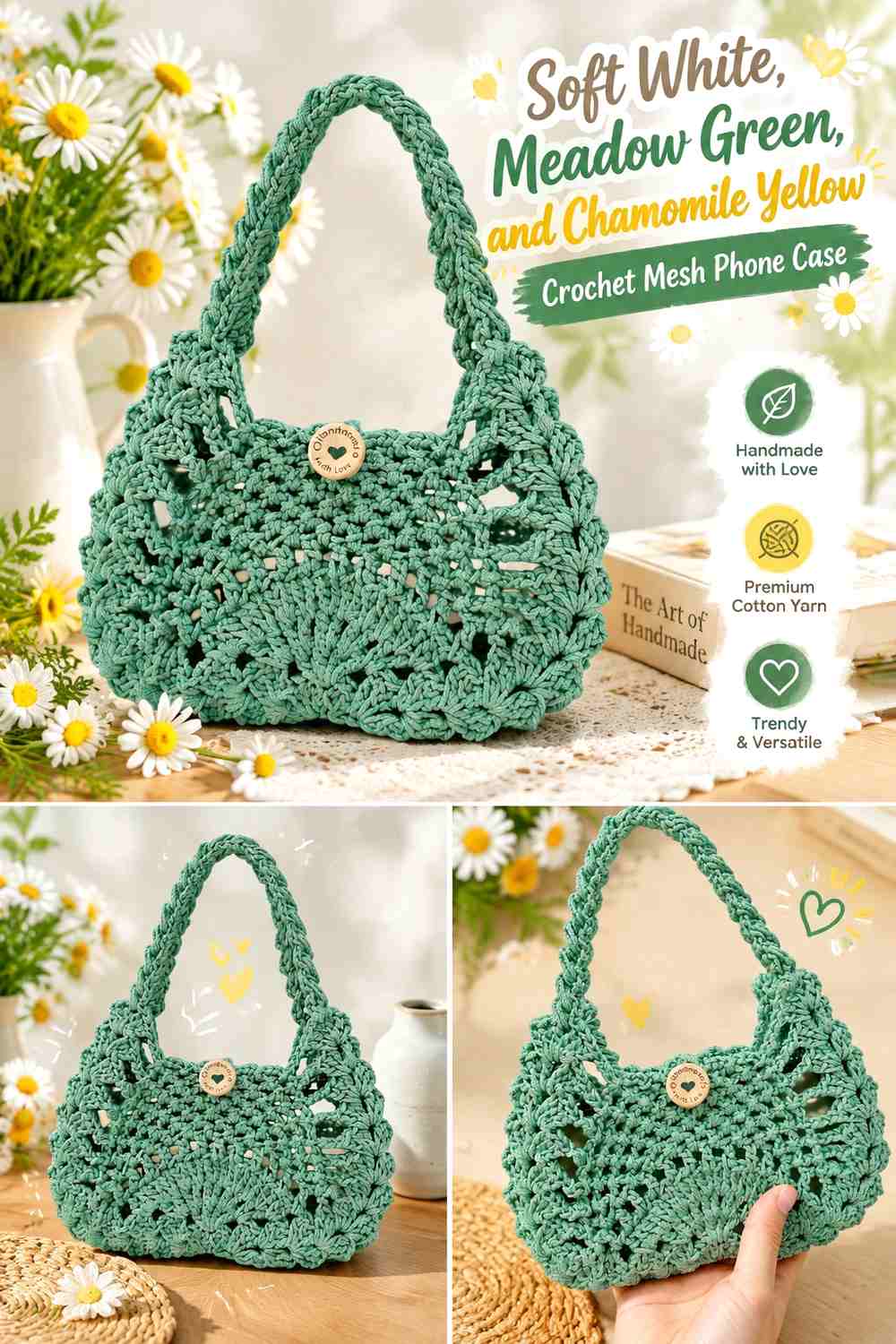
Soft white keeps an open mesh body light, meadow green introduces a fresh cottage-garden color, and chamomile yellow can create tiny floral focal points. The yellow should remain the smallest color because its warmth can become noticeable quickly against white.
Soft White Lets Meadow Green Mesh Stay Airy
Use white strategically around the green rather than filling every open section with multiple colors. A pale border or repeated white band can make the green mesh pattern clearer when the phone underneath is dark.
Chamomile Yellow Should Stay Small Beside Meadow Green
Yellow centers, tiny flowers, or a short decorative repeat can establish a meadow-inspired palette without competing with the entire mesh surface. If the yellow becomes as visually large as the green, the case may lose its calm cottagecore hierarchy.
Creator Credit: MIMI Handmade
12. Dusty Blue, Cream, and Rust Crochet Shell-Lace Phone Case

Dusty blue gives shell lace a muted cool base, cream provides the lightest separation, and rust introduces one earthy contrast. This is useful when you want cottagecore color without relying on the more common pink-and-sage pairing.
Dusty Blue Can Lead the Crochet Shell Texture
Keep dusty blue across the main shell field so the repeating shapes read as one continuous surface. Cream can then be introduced around selected rows, edges, or adjoining sections rather than breaking every shell into multiple colors.
Rust Gives Dusty Blue a Controlled Warm Accent
Use rust in one clearly repeated feature—such as a narrow edge or small floral detail. The warm-cool contrast is already strong enough that large rust sections are unnecessary.
Creator Credit: Sharon Lee
13. Parchment, Olive, and Burgundy Crochet Lace Phone Holder
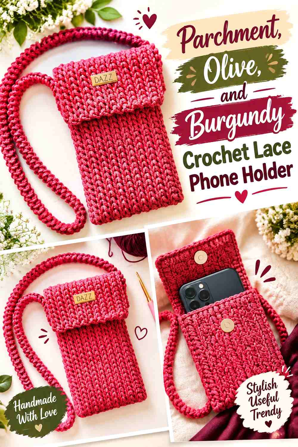
Parchment acts as the aged neutral, olive supports the botanical direction, and burgundy supplies a dark floral accent. Because a phone holder may include areas that need to remain visually simple, concentrate the strongest colors away from already complicated openings.
Parchment Keeps Olive Lace From Becoming Too Dark
Use parchment beside olive wherever the openwork needs clear separation. This is especially useful if the phone or protective case underneath is dark and would otherwise make olive details less distinct.
Burgundy Should Be a Small Accent Beside Olive
A little burgundy can suggest berries or dried garden flowers without taking over the holder. Keep it to a focused motif, border repeat, or another small area and allow parchment to separate it from olive when the two darker colors begin to merge.
Creator Credit: Dazz Crochê
14. Cocoa, Blush, and Antique Cream Crochet Button Lace Phone Case

Cocoa gives this phone case a darker natural base, blush supplies the floral color, and antique cream keeps decorative details from becoming visually heavy. The contrast works well for a case where lace appears near a buttoned top or selected panel.
Cocoa Can Give Blush Lace a Strong Cottagecore Background
Let cocoa occupy a significant share of the denser case body. Blush will remain easy to notice against it, so you can keep the pink to a relatively small decorative section.
Antique Cream Can Separate Blush From Cocoa Near the Button
A cream edge or small motif around the upper area creates a lighter transition between dark cocoa and blush. It can also keep the closure zone visually readable instead of combining several strong colors immediately around the button.
Creator Credit: Silvana Crochet Studio
15. Lilac, Cream, and Sage Crochet Two-Square Lace Phone Case

Two visible square motifs make color placement especially important because the centers become natural focal points. Lilac can lead the motif centers, cream can open the surrounding lace, and sage can frame the outer edges.
Lilac Centers Give Cream Lace a Clear Focal Point
Keep the strongest lilac concentration near the center rather than distributing it evenly across every round. This preserves the motif structure and gives the eye one obvious place to begin.
Sage Can Frame Lilac and Cream on Both Phone Case Squares
Use the sage role consistently across the two main motifs so they look related before assembly. If one square has much heavier green coverage, the two sides can feel visually mismatched even when their construction is identical.
Creator Credit: Crochet Musings
16. Natural Linen, Dusty Pink, and Moss Crochet Lace-Inset Phone Sleeve

A simple phone sleeve gives a narrow lace insert more importance because the rest of the surface remains restrained. Natural linen can cover the dense body, dusty pink can lead the lace feature, and moss can provide a tiny botanical repeat.
Natural Linen Makes a Dusty Pink Lace Inset More Noticeable
Keeping the majority of the sleeve neutral gives one decorative pink section enough contrast to matter. The inset does not need to cover the entire front to establish the cottagecore theme.
Moss Should Echo Dusty Pink Without Widening the Lace Area
A small moss flower center, edge, or repeat can connect the pink lace to a botanical palette. Avoid adding a broad green band unless you want the case to shift from a subtle inset design to obvious color blocking.
Creator Credit: ABoC Studio
17. Cream, Faded Blue, and Berry Crochet Tassel Lace Phone Case

Cream creates a neutral body, faded blue gives the lace a quiet vintage color, and berry provides a small darker accent that can connect the decorative top and tassel area.
Faded Blue Can Lead the Lace Without Overpowering Cream
Use faded blue where the open pattern needs the most attention and allow cream to frame it. The softer blue is especially effective when the phone itself is dark enough to show through the openings.
Berry Can Connect a Cream Tassel to Faded Blue Lace
A small amount of berry near the closure or tassel can give the upper section a focal color. Repeat only a little elsewhere if needed; a large berry field would change the entire character of the cream-and-blue scheme.
Creator Credit: Chenda DIY
18. Oatmeal, Forest Green, and Butter Yellow Crochet Lace-Band Phone Case
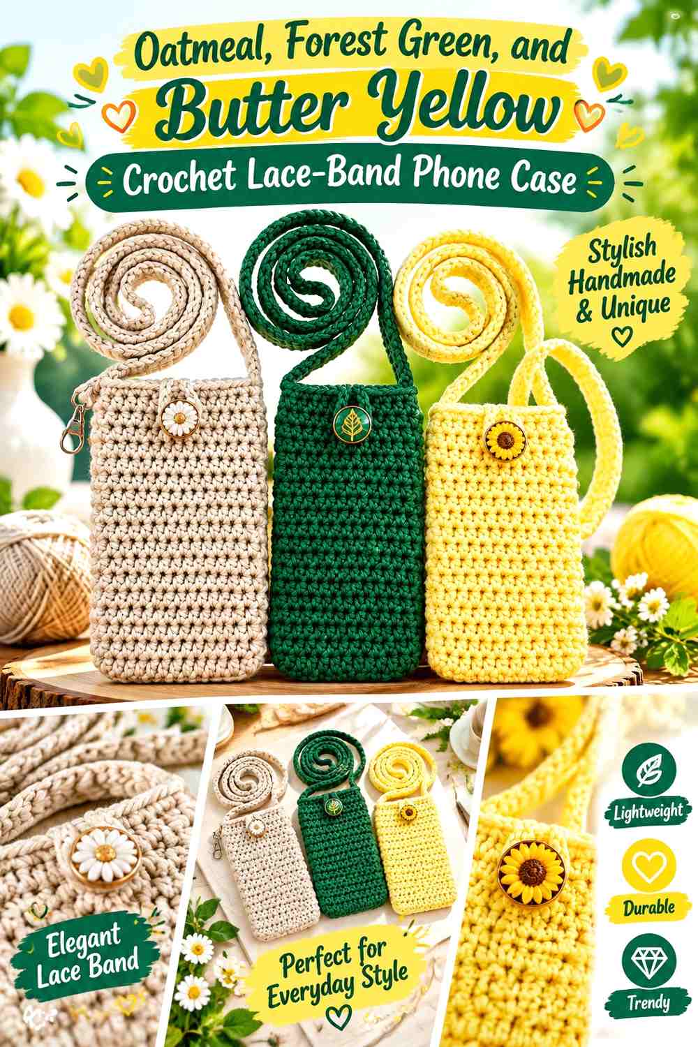
Oatmeal keeps the main phone case natural and restrained, forest green provides the deepest cottage-garden shade, and butter yellow adds a small floral highlight. A narrow openwork band is enough to carry all three colors without making the body overly busy.
Oatmeal Should Remain Dominant Around Forest Green Lace
Use the neutral above and below the green section so the lace band looks intentional rather than like the entire case changed color midway through. The oatmeal also provides a lighter boundary around dark forest green.
Butter Yellow Can Lighten a Forest Green Lace Band
A small yellow motif, center, or repeated point inside the green area can prevent a dark band from becoming visually heavy. Keep yellow limited so the phone case remains oatmeal-and-green first.
Creator Credit: Secret Yarnery
19. Antique White, Plum, and Sage Crochet Pocket-Style Lace Phone Case
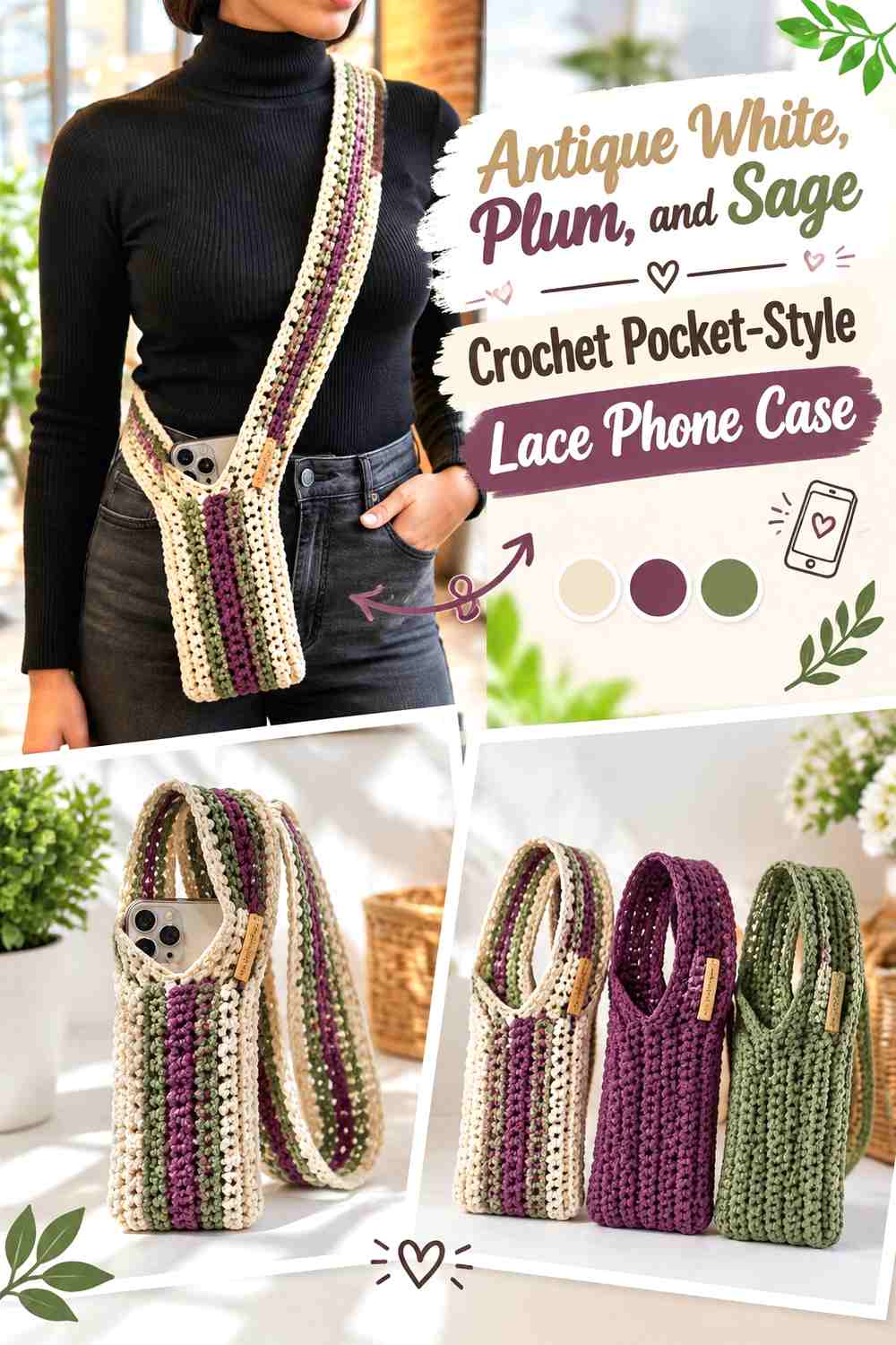
Antique white gives a straightforward phone-pocket shape a vintage foundation, plum creates the darkest floral note, and sage supplies the botanical support. This palette is useful when the construction is simple enough for color and one selected lace pattern to provide most of the character.
Antique White Gives Plum Lace Maximum Definition
Use antique white around a plum lace section when you want the decorative repeat to remain easy to see without introducing several intermediate colors. The strong value difference is particularly helpful for small motifs.
Sage Can Soften Plum on an Antique White Phone Case
A small sage repeat can keep plum from feeling disconnected from the cottagecore theme. Place the green near a floral motif, border, or another intentional detail instead of adding isolated green stitches throughout the case.
Creator Credit: MirrymasCrafts and Mirrymascrochet
Which Cottagecore Lace Phone Case Palette Should You Choose?
For the lightest heirloom direction, compare ecru and sage, buttercream and lavender, or natural linen and dusty pink. These schemes keep pale neutrals dominant and let the lace structure provide much of the visual interest.
For a more botanical phone case, antique cream with dusty rose and moss, oatmeal with olive, or soft white with meadow green and chamomile yellow gives foliage colors a clearer role. These palettes are particularly useful when floral lace, granny motifs, or appliqué-like details are involved.
For deeper cottagecore color, mushroom brown with peach, cocoa with blush, parchment with burgundy, or antique white with plum creates stronger contrast. Those darker accents can help small flower centers, borders, and lace panels remain visible without requiring more colors.
Conclusion
The cottagecore look comes from more than choosing cream, sage, or dusty pink yarn. On a crochet phone case, the useful question is where each color belongs. Let one neutral or muted shade control the largest surface, use the floral or botanical shade where the lace needs emphasis, and keep the strongest accent for small details.
Choose ecru, oatmeal, linen, and cream palettes when you want the lace pattern to dominate. Dusty rose, lilac, faded blue, and peach create softer floral directions, while olive, forest green, moss, cocoa, plum, burgundy, and terracotta give the case more depth.
Most importantly, judge openwork with the actual phone inside it. The visible device can change the contrast dramatically. Follow the linked creator tutorial for the original construction, then adapt the color hierarchy only after you know how your chosen lace looks around your own phone.
Frequently Asked Questions
What colors make a crochet phone case look cottagecore?
Cream, ecru, oatmeal, linen, sage, olive, dusty rose, muted blue, lavender, mushroom brown, rust, and softened yellow can all support a cottagecore direction. The palette works more convincingly when one shade dominates and the stronger floral or botanical colors are used selectively.
Should cottagecore crochet lace be cream or colored?
Either approach can work. Cream or ecru makes the openwork itself the focus, while colored lace can emphasize a floral panel, shell band, or granny motif. If the lace is strongly colored, a neutral border can prevent a phone-sized project from feeling overly busy.
How do I know whether two yarn colors have enough contrast for lace?
Place them side by side and look at them from a short distance. You can also take a grayscale photo to compare their light-dark values. Colors can look very different in hue yet still merge if their values are similar.
Does the color of my phone matter with an open crochet case?
Yes. Mesh, granny openings, and other lace expose the phone or its protective case underneath. A dark phone can create strong contrast behind cream lace, while a light phone may make pale yarn look more subtle. Test the finished openwork with the actual device before finalizing the palette.
Should the strap match the cottagecore lace phone case body?
It does not have to. Matching the dominant body shade creates a quieter look, while using sage, brown, plum, or another supporting color can visually frame the accessory. Keep the strap color connected to a shade already used on the case so it does not look unrelated.
Can I add flowers to a crochet lace phone case?
Yes, but consider the scale and thickness. A single flower, floral granny center, or small repeated motif can reinforce the cottagecore theme without covering the openwork. Large raised embellishments may add bulk, so position them where they do not make routine access to the phone awkward.
Does a crochet lace phone case protect a phone from drops?
Do not assume that decorative crochet lace provides impact protection. Treat it primarily as a handmade sleeve or carrying pouch unless a specific construction has been independently designed and tested for protective performance. Using your normal protective phone case inside the crochet pouch is a more cautious approach.