Pastel colors can give crochet food keychains a playful, candy-like look, but small food shapes still need enough contrast to remain recognizable. When blush, mint, lilac, butter yellow, powder blue, cream, and peach are all similarly light, tiny layers such as frosting, rinds, pits, toppings, crusts, and leaves can visually blend together.
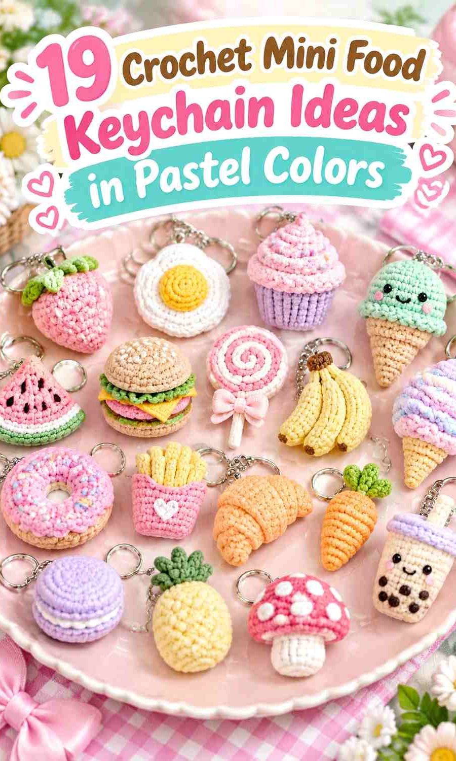
The most useful pastel palettes therefore have a hierarchy. One soft shade should cover the main food shape, a second should identify an important layer or topping, and a third can provide definition in smaller areas. A cream filling can separate two pastel macaron shells, for example, while a slightly deeper sage leaf can keep a blush strawberry from becoming an undefined pink charm.
Each tutorial below supports the miniature food or keychain construction concept. The pastel palettes are independent adaptations, so follow the creator for the actual crochet construction and use the color guidance here to plan your own version.
Quick List
- Blush Pink, Pistachio, and Cream Crochet Strawberry Keychain
- Lavender, Buttercream, and Powder Pink Crochet Cupcake Keychain
- Mint, Peach, and Oatmeal Crochet Ice Cream Keychain
- Butter Yellow and Soft White Crochet Fried Egg Keychain
- Lilac, Cream, and Sage Crochet Mushroom Keychain
- Pistachio, Mint, and Peach Crochet Avocado Keychain
- Butter Yellow, Powder Pink, and Cream Crochet French Fries Keychain
- Peach, Cream, and Sage Crochet Pizza Keychain
- Lavender, Mint, and Cream Crochet Macaron Keychain
- Soft Peach, Buttercream, and Powder Blue Crochet Pancake Keychain
- Oatmeal, Blush, and Cream Crochet Croissant Keychain
- Buttercream, Mint, Blush, and Lilac Crochet Burger Keychain
- Cream, Pastel Pink, and Baby Blue Crochet Cookie Keychain
- Lemon Chiffon, Pistachio, and Cream Crochet Lemon Keychain
- Blush, Lilac, and Sage Crochet Cherry Keychain
- Dusty Lilac, Cream, and Soft Cocoa Crochet Boba Keychain
- Watermelon Pink, Seafoam, and Cream Crochet Watermelon Keychain
- Pastel Coral, Sage, and Cream Crochet Apple Keychain
Keep Pastel Crochet Food Recognizable at Keychain Scale
Changing realistic food colors is part of the fun, but a miniature charm has less room for visual explanation than a larger amigurumi. Preserve the food’s most recognizable color boundaries even when changing the hues. A pastel burger still benefits from clearly separated bun and filling layers, while a watermelon still needs a visible difference between its center and rind.
If two pastel yarns look distinct in the skein but merge after crocheting, compare their light-dark values. A cream band, slightly deeper green, soft brown, or another controlled separator can restore clarity without abandoning the pastel direction.
Give Every Pastel Color a Specific Food Detail
Avoid spreading three or four pastel shades randomly across a mini food charm. Assigning colors to parts makes the finished keychain easier to understand. Mint might always mean a leaf or lettuce, blush might define fruit or frosting, and cream might separate layers.
This matters especially for foods with multiple components. Pizza toppings, burger fillings, cupcake frosting, boba pearls, and macaron filling all remain clearer when their colors have consistent jobs.
Check the Keychain Attachment Against the Pastel Palette
The top of a mini food keychain naturally attracts attention because the hardware or hanging loop sits there. If that area also contains the strongest accent color, the top can become visually heavier than the food itself.
Where possible, continue the main food color into the attachment area or use a supporting shade already present elsewhere. The keychain should still read as a strawberry, donut, lemon, or other miniature food before the eye notices the hanging point.
1. Blush Pink, Pistachio, and Cream Crochet Strawberry Keychain
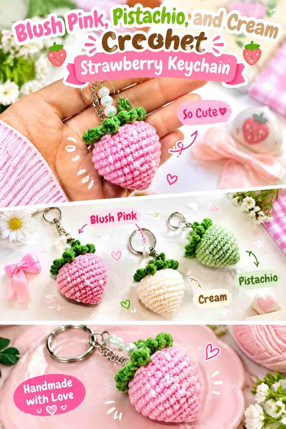
Blush pink gives the strawberry body a softer alternative to traditional red, while pistachio keeps the leafy top recognizable. Cream works best as a tiny seed or highlight color rather than a third large block. The important relationship is between the pink fruit and green top, so keep that distinction obvious even when both shades are muted.
Blush Pink Should Cover Most of the Crochet Strawberry
Let blush remain uninterrupted across most of the berry so the tapered fruit shape stays easy to read. Too many contrasting seed colors can make such a small surface busy, so use cream sparingly and allow the crochet texture to provide much of the detail.
Pistachio Needs Enough Contrast Above Blush Pink
Choose a pistachio that remains visibly different from blush in both hue and value. The leafy crown is a small feature, and an extremely pale green can disappear next to cream hardware loops or light backgrounds.
Creator Credit: Greenfairymari
2. Lavender, Buttercream, and Powder Pink Crochet Cupcake Keychain
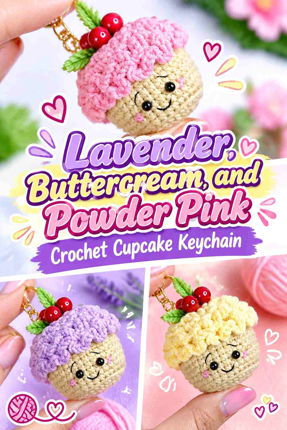
Lavender can form the cupcake wrapper, buttercream can lead the frosting, and powder pink can appear as a smaller decorative accent. Keeping the wrapper and frosting clearly different is particularly important because those two stacked sections create the recognizable cupcake silhouette.
Lavender Gives the Crochet Cupcake a Defined Base
Use lavender through the full wrapper area rather than alternating it repeatedly with the frosting shade. A consistent lower color helps the cupcake look stacked instead of becoming one rounded pastel object.
Buttercream Keeps Powder Pink Cupcake Details Visible
Buttercream creates a light neutral field where powder-pink berries, ruffles, or other small embellishments can remain noticeable. If the pink is extremely pale, use it in one concentrated area instead of scattering tiny details that disappear into the frosting.
Creator Credit: DidyToys
3. Mint, Peach, and Oatmeal Crochet Ice Cream Keychain
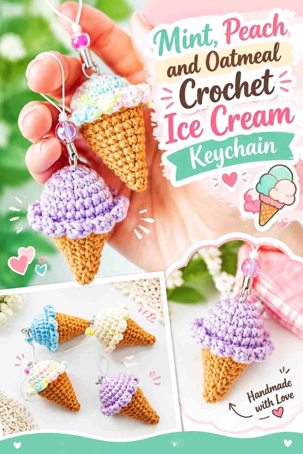
Mint creates the main ice-cream color, peach provides a second dessert accent, and oatmeal can represent the cone without introducing a strong brown. This palette stays pastel while preserving the important boundary between scoop and cone.
Mint Should Lead the Crochet Ice Cream Scoop
Use mint over most of the rounded ice-cream section so it becomes the first color noticed. Peach can appear as a smaller topping, second scoop detail, or decorative repeat without dividing the main shape into too many equal pastel sections.
Oatmeal Separates Mint and Peach From the Crochet Cone
A warmer oatmeal base prevents the cone from disappearing into pale mint or peach. If the oatmeal is too close to cream, test the three colors side by side before crocheting because a slightly deeper neutral may make the silhouette clearer.
Creator Credit: NHÀ LEN
5. Butter Yellow and Soft White Crochet Fried Egg Keychain
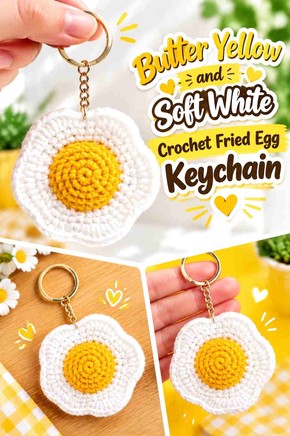
A fried egg needs only two main colors, which makes it ideal for a very restrained pastel scheme. Soft white carries the irregular outer shape, while butter yellow creates the raised center. The difference between them should be noticeable enough for the yolk to remain the focal point.
Soft White Should Stay Dominant Around the Butter Yellow Center
Leave a generous white area around the yolk so the egg silhouette does not look like a simple yellow circle. The irregular outer edge is part of what identifies the food at miniature scale.
Butter Yellow Needs a Clear Edge Against Soft White
A very pale yellow may disappear into warm white yarn. If that happens, choose a slightly deeper butter shade rather than introducing an unrelated outline color, preserving the simple two-color character.
Creator Credit: Jaslyn Lim
6. Lilac, Cream, and Sage Crochet Mushroom Keychain
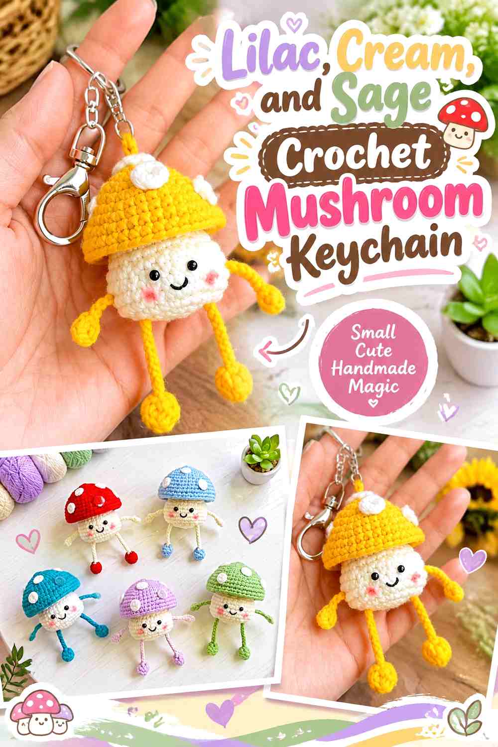
Lilac creates a fantasy pastel mushroom cap, cream keeps the stem light, and sage can appear in spots or small secondary details. Because the cap and stem provide the main silhouette, they should remain clearly separated even if both colors are soft.
Lilac Should Carry the Crochet Mushroom Cap
Keep lilac concentrated above the cream stem so the cap remains a distinct horizontal visual mass. Scattering lilac onto every part of the mushroom can weaken that important cap-to-stem division.
Cream and Sage Should Support the Lilac Mushroom Shape
Use cream for the stem and sage only where a small accent is needed. If sage becomes as visually large as lilac, the mushroom can start to read as a general multicolor character rather than a simple pastel food-inspired charm.
Creator Credit: Crochet Everyday
7. Pistachio, Mint, and Peach Crochet Avocado Keychain

An avocado naturally relies on layered greens, making it particularly adaptable to pastel colors. Pistachio can define the outer area, mint can fill the inner flesh, and peach can replace a traditional brown pit for a softer, more whimsical result.
Pistachio Should Stay Darker Than Mint on the Crochet Avocado
The two greens need enough separation to preserve the layered fruit shape. If they are nearly identical in value, the avocado can flatten into a single green oval.
Peach Gives Mint and Pistachio a Clear Avocado Center
Keep peach concentrated in the pit so the eye has one warm focal point. Because peach contrasts with both greens, even a small center can provide enough definition without adding another dark shade.
Creator Credit: Espléndido Ganchillo
8. Butter Yellow, Powder Pink, and Cream Crochet French Fries Keychain
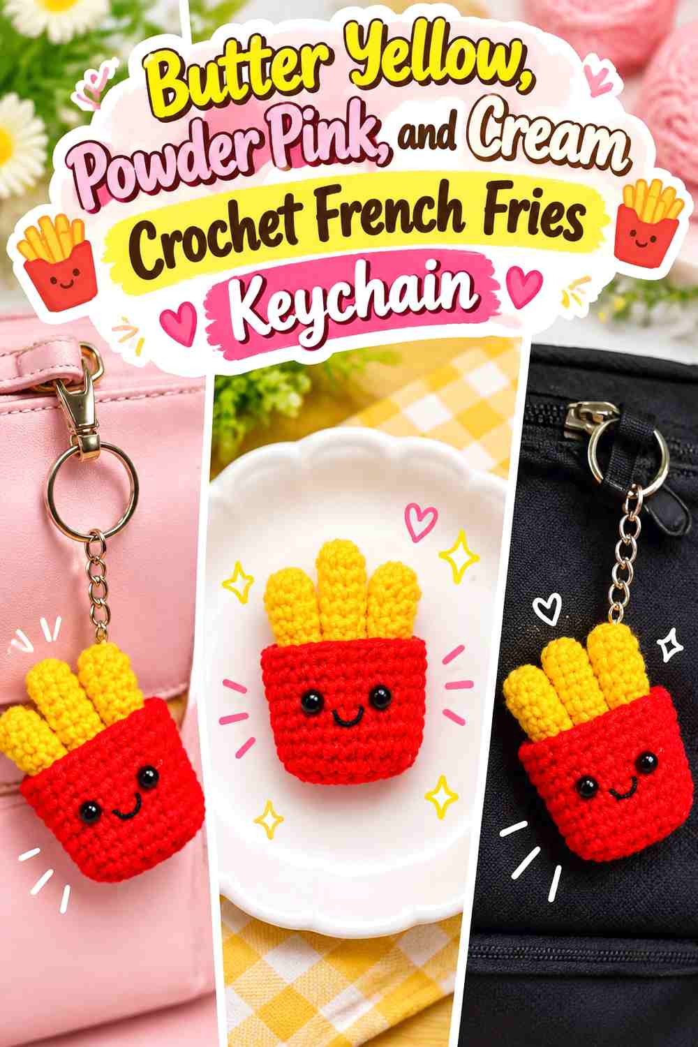
Butter yellow can cover the fries themselves, while powder pink creates a pastel carton and cream adds a small secondary detail. The fries need to stay visually separate from the container so the bundle still reads immediately as a food charm.
Butter Yellow Should Rise Clearly Above the Powder Pink Carton
Keep the yellow pieces uninterrupted through their visible upper sections. If pink or cream repeats heavily across the fries, their long narrow shapes may become less recognizable.
Powder Pink Can Carry the Crochet Fries Carton Without Competing
Let the carton remain mostly pink and reserve cream for a tiny motif, edge, or face detail if desired. A simple container color gives the multiple yellow fry shapes enough room to stay legible.
Creator Credit: Furry Yarn
9. Peach, Cream, and Sage Crochet Pizza Keychain
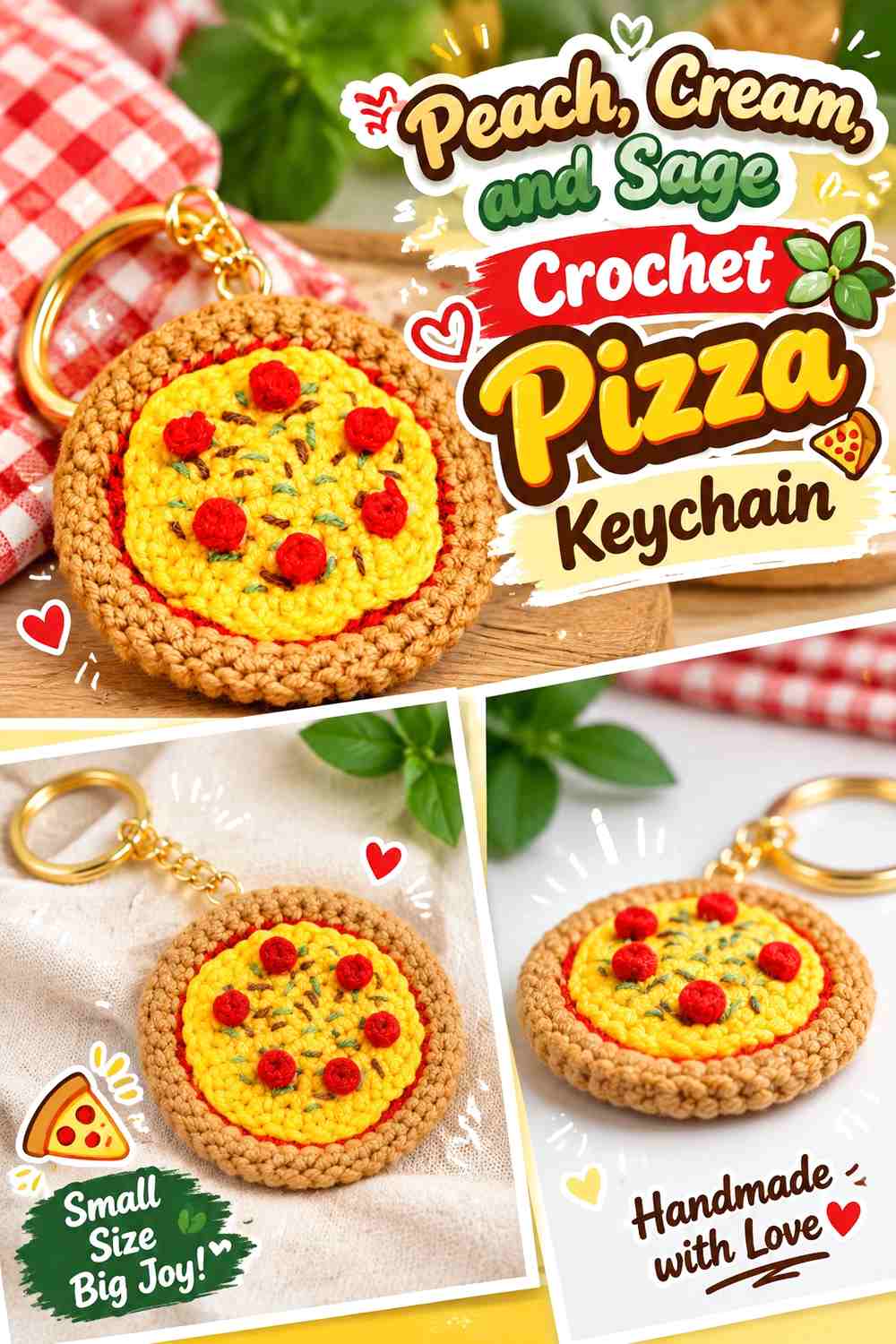
Peach can stand in for the main cheese surface, cream can define the crust, and sage can mark selected toppings. This softer interpretation still works if each color remains tied to a specific pizza layer.
Peach Should Cover the Largest Crochet Pizza Surface
Use peach as the broad central field so the small toppings remain secondary. Keeping the cheese area consistent also preserves the triangular or circular pizza shape instead of fragmenting it into many pastel patches.
Sage Toppings Need Cream or Peach Space Around Them
Place sage details with visible background between them rather than clustering every accent together. On a tiny pizza, clear gaps make each topping more readable and keep the palette from becoming visually muddy.
Creator Credit: SpringDay DIY
10. Lavender, Mint, and Cream Crochet Macaron Keychain

Macarons are well suited to soft colors because the layered structure provides natural separation. Lavender can form the two shells, cream can create the filling, and mint can appear as a small decorative accent or an alternative shell detail.
Lavender Should Repeat Across Both Crochet Macaron Shells
Using the same lavender above and below makes the macaron look intentionally paired. If the shells use completely different strong colors, the tiny charm can start to resemble stacked pieces rather than one pastry.
Cream Needs to Separate Lavender From Mint
Keep a visible cream band through the center when mint is introduced elsewhere. That lighter neutral protects the layered macaron look and prevents two cool pastel colors from visually merging.
Creator Credit: Little Crochet Farm
11. Soft Peach, Buttercream, and Powder Blue Crochet Pancake Keychain
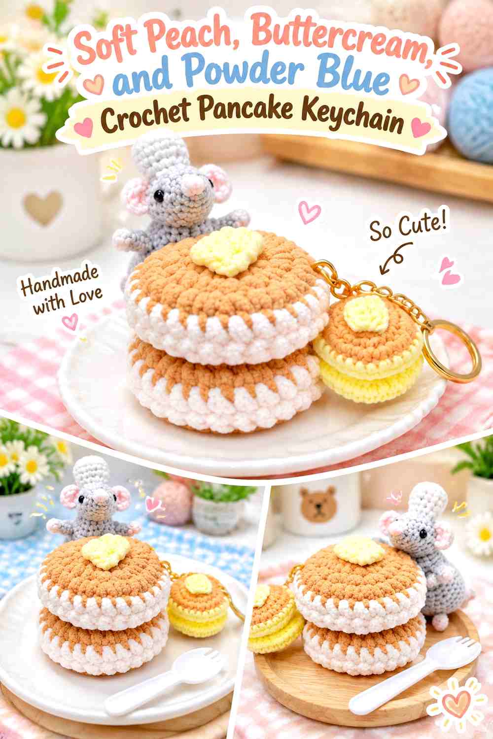
Soft peach gives a pancake stack a warm pastel body, buttercream can define the top butter detail, and powder blue can provide a deliberately whimsical syrup or decorative accent. Give the peach stack the greatest visual area so the food shape stays recognizable.
Soft Peach Should Keep the Crochet Pancake Stack Unified
Use peach consistently across the pancake layers rather than alternating every layer with another color. Repeated warm disks are what make the miniature read as a stack.
Buttercream and Powder Blue Need Small Roles on Soft Peach
Keep buttercream on the top detail and powder blue confined to one drizzle, edge, or small accent. Those smaller color zones preserve the pancake shape while still giving the keychain a more imaginative pastel palette.
Creator Credit: Monua DIY
12. Oatmeal, Blush, and Cream Crochet Croissant Keychain
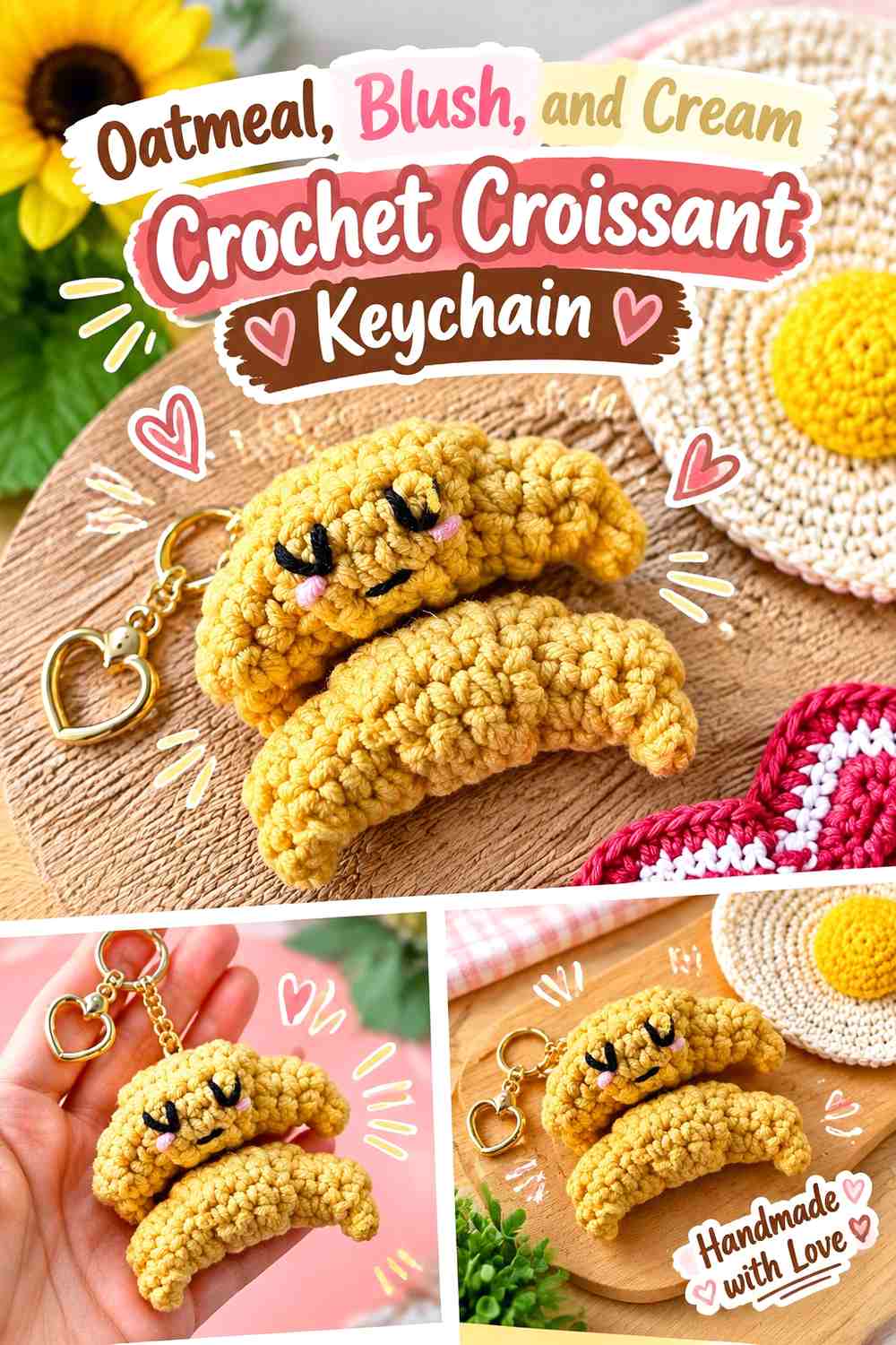
Oatmeal is the most natural-looking pastel neutral for a croissant, while blush and cream can introduce a sweet decorative interpretation. Because the croissant’s curved folds carry much of its identity, color changes should reinforce rather than interrupt those ridges.
Oatmeal Should Cover Most of the Crochet Croissant Folds
A continuous oatmeal field lets the rolled form create its own highlights and shadows. Frequent stripes can visually cut across the curves and make the small pastry look less cohesive.
Blush and Cream Work Better as Small Oatmeal Croissant Accents
Use blush as a tiny filling, drizzle, or decorative touch and cream as a lighter highlight if wanted. Keeping both secondary allows the croissant’s curved oatmeal silhouette to remain the main feature.
Creator Credit: nat does crochet
13. Buttercream, Mint, Blush, and Lilac Crochet Burger Keychain
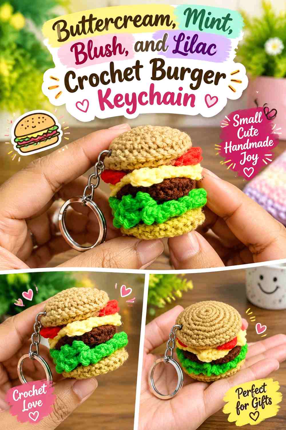
A burger has more stacked sections than most mini food charms, so four pastel colors can work if every shade has a fixed job. Buttercream can define the buns, mint can represent lettuce, blush can mark tomato, and lilac can create one playful filling layer.
Buttercream Should Frame the Pastel Crochet Burger Layers
Use the same buttercream above and below so the top and bottom buns visually hold the other colors together. This repeating neutral helps the charm remain burger-like even when the fillings are unconventional.
Mint, Blush, and Lilac Need Thin Separated Burger Layers
Keep each filling color narrow enough that the burger reads as a stack rather than three large blocks. Clear boundaries between mint, blush, and lilac are more important than making every layer equally thick.
Creator Credit: Made With Love By Daisy
14. Cream, Pastel Pink, and Baby Blue Crochet Cookie Keychain

Cream creates a pale cookie base, while pastel pink and baby blue can replace traditional dark chocolate chips with a softer candy-cookie look. The contrast should remain strong enough that the tiny chip details do not disappear into the surface.
Cream Should Remain the Main Crochet Cookie Color
Use cream across nearly all of the round cookie body so the small colored details have a clear background. A patchwork base would make the chip placement harder to distinguish.
Pastel Pink and Baby Blue Chips Need Visible Contrast on Cream
Choose pink and blue shades that are at least slightly deeper than the cream. If all three colors have nearly identical value, reduce the number of chips and group them more deliberately so the decoration still reads.
Creator Credit: Divine Crochets
15. Lemon Chiffon, Pistachio, and Cream Crochet Lemon Keychain

Lemon chiffon gives the fruit its main identity without using a strong bright yellow. Pistachio can form the leaf, while cream works as a small highlight if the fruit needs more definition.
Lemon Chiffon Should Cover the Full Crochet Lemon Body
Keep the fruit mostly one yellow shade so the pointed or oval citrus silhouette remains clear. Large cream sections can make the food look striped rather than lemon-like.
Pistachio Gives Lemon Chiffon a Clear Leaf Accent
A pistachio leaf provides the most useful color change because it explains the top of the fruit. If the green is very pale, select one that still separates from the yellow rather than relying on hue alone.
Creator Credit: HappyYarny
16. Blush, Lilac, and Sage Crochet Cherry Keychain
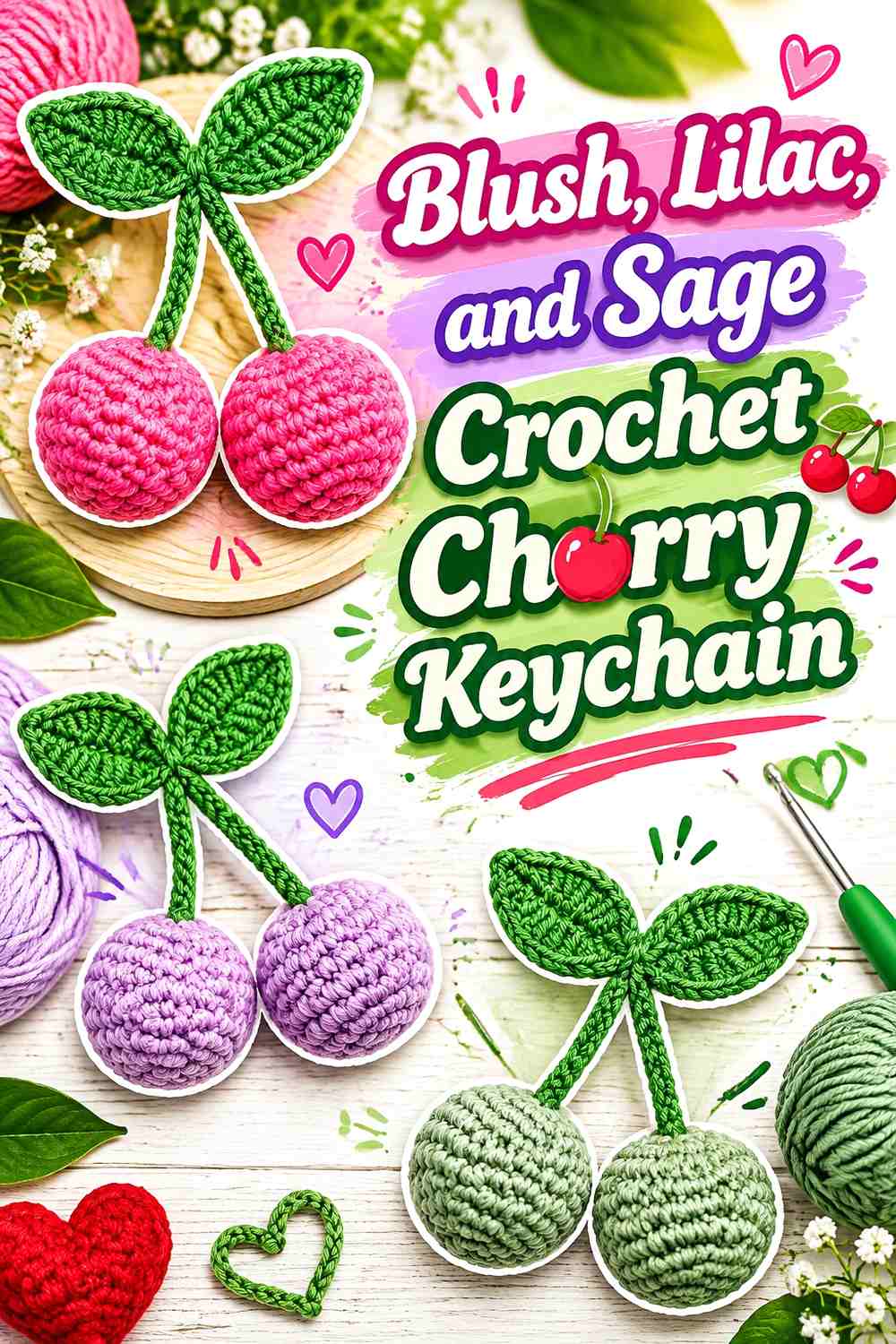
Two cherries offer a natural opportunity for related pastel shades. One can be blush and the other lilac, while sage connects both through the stems or leaves. The pair will feel intentional if the two fruit colors have similar softness but remain visibly different.
Blush and Lilac Can Split the Crochet Cherry Pair
Using one color per cherry gives the palette clearer structure than mixing both shades across each tiny fruit. It also makes the paired design visually interesting without requiring extra embellishment.
Sage Should Connect the Blush and Lilac Cherries
Keep sage through the stems or leaf section so the two differently colored fruits still feel attached to one botanical unit. A consistent green connection is more useful here than adding another pastel accent.
Creator Credit: Amy’s DIY Frugal Life
17. Dusty Lilac, Cream, and Soft Cocoa Crochet Boba Keychain

Dusty lilac can lead the drink color, cream can define the lid or upper section, and soft cocoa can identify the boba pearls. The slightly darker pearl shade is important because the small circles need more definition than the broad cup surface.
Dusty Lilac Should Dominate the Crochet Boba Cup
Use lilac through most of the drink body so the keychain has one obvious pastel flavor direction. A continuous cup color also gives scattered pearls a predictable background.
Soft Cocoa Pearls Need Clear Contrast Against Dusty Lilac
Keep cocoa limited to the pearl details rather than extending it into broad bands. The darker repeated dots provide enough visual structure to identify the drink without making the palette feel heavy.
Creator Credit: Dose of Kawaii (Erica)
18. Watermelon Pink, Seafoam, and Cream Crochet Watermelon Keychain

Watermelon pink supplies the fruit center, seafoam replaces a brighter rind green, and cream provides the pale separating layer. This is one palette where maintaining the three-part color order matters more than using realistic saturation.
Watermelon Pink Should Cover the Main Crochet Fruit Interior
Give pink the broadest central area so the keychain still reads as a watermelon slice. Keep any seed details restrained because tiny dark marks can become disproportionately strong against a pastel field.
Cream Should Separate Watermelon Pink From Seafoam
Do not eliminate the pale dividing band just because all three colors are soft. Cream creates an important transition between pink flesh and seafoam rind and makes the layered edge easier to read.
Creator Credit: DIY Yarn Crafts
19. Pastel Coral, Sage, and Cream Crochet Apple Keychain

Pastel coral gives an apple more warmth than blush without moving into a strong true red. Sage keeps the leaf understated, while cream can provide a tiny highlight or optional decorative feature.
Pastel Coral Should Keep the Crochet Apple Body Simple
Let coral cover the rounded fruit without frequent color changes so the indentation and apple silhouette remain the main defining features. The softer shade is distinctive enough on its own.
Sage and Cream Should Stay Small Beside Pastel Coral
Use sage for the leaf and cream only if the charm needs another point of contrast. The apple is one of the simplest food shapes in the collection, so excessive accents can work against its clean outline.
Creator Credit: Shelen Crochet
Which Pastel Mini Food Keychain Palette Should You Choose?
For the softest candy-inspired colors, the baby-blue donut, lavender macaron, lilac mushroom, blush strawberry, and dusty-lilac boba keychains keep cool or rosy pastels at the center of the design.
If you prefer warmer pastels, look at the peach pancake, oatmeal croissant, lemon-chiffon lemon, pastel-coral apple, or peach pizza. These schemes use warm light colors while still preserving enough contrast around the important food details.
For the most colorful charms, the burger, cupcake, fries, watermelon, and cherry ideas use several pastels at once. They work because each shade has a specific job rather than being distributed randomly across the whole keychain.
Conclusion
Pastel mini food keychains work best when softness does not erase the food structure. A pale palette can still have hierarchy: one color can dominate the main food body, another can identify a topping or layer, and a third can define the smallest detail.
If you want a simple starting point, the lemon, fried egg, croissant, apple, and strawberry use relatively clear color roles. Macarons, donuts, cupcakes, and boba are good choices when you want dessert-inspired pastels, while pizza, burgers, fries, and watermelon give you more opportunities to coordinate multiple miniature layers.
Before making a full set, place the yarn colors together and check whether adjacent parts will remain distinguishable. Follow each linked creator for the exact crochet construction, then adapt the palette without changing the visual clues that make each tiny food recognizable.
Frequently Asked Questions
How many pastel colors should I use on a crochet mini food keychain?
Two or three colors are enough for many designs, while layered foods such as burgers or cupcakes can support more. The important point is to give every shade a clear role instead of using several pastels in equal amounts.
How can I stop pastel crochet food details from disappearing?
Increase the light-dark difference between adjacent areas. A slightly deeper sage leaf, soft cocoa boba pearl, cream macaron filling, or clearer pastel crust can make small details easier to identify without abandoning the soft palette.
Can I replace realistic food colors with completely different pastels?
Yes, especially when the food has a strong silhouette. Preserve the important layer relationships so the item remains recognizable. A blue donut still has its center opening and frosting area, while a pastel burger still needs clearly separated buns and fillings.
Which pastel colors work well together for crochet food keychains?
Blush with pistachio, lavender with cream, mint with peach, baby blue with pink, lemon chiffon with sage, and dusty lilac with soft cocoa all provide useful combinations. Check the actual yarns together because two shades with different names can still have nearly identical lightness.
Should every crochet mini food keychain in a set use the same pastel palette?
No. A collection can feel coordinated by repeating two or three colors in different roles. Mint might be an avocado color on one charm, a burger lettuce layer on another, and a macaron shell accent on a third.
Where should I attach keychain hardware on pastel crochet food?
Use the attachment point shown or supported by the chosen tutorial rather than guessing from appearance alone. Visually, keeping the hanging area in the main or supporting palette color usually prevents the hardware connection from becoming an unrelated focal point.
Can I mix pastel and darker colors in the same crochet food keychain?
Yes. One controlled darker detail can improve readability, particularly for seeds, centers, eyes, outlines, or boba pearls. Keep the darker shade limited so the overall keychain still reads as pastel.