A crochet book sleeve gives embroidered flowers a useful background because the broad front panel can carry botanical decoration without needing an allover multicolor crochet pattern. The strongest cottagecore versions usually keep the sleeve itself relatively quiet, then use embroidery to add roses, daisies, sprigs, vines, or scattered meadow-style flowers.

Color contrast is especially important because embroidery sits directly on crochet texture. Dusty rose petals can disappear on a similarly toned oatmeal surface, while tiny sage leaves may lose definition on a green sleeve. A lighter or darker base gives the stitched flowers enough separation to remain visible without making the palette harsh.
Placement matters too. Flowers can sit in one lower corner, climb along a side seam, form a small wreath around a closure, or scatter across the front while leaving the book-opening area less decorated. The linked tutorials below support the crochet book sleeve or cover construction. The embroidered floral palettes and placements are independent adaptations rather than claims about the creators’ original designs.
Quick List
- Ecru, Dusty Rose, and Sage Crochet Wild-Rose Book Sleeve
- Oatmeal, Lavender, and Moss Crochet Lavender-Sprig Book Sleeve
- Antique Cream, Cornflower Blue, and Butter Yellow Crochet Forget-Me-Not Book Sleeve
- Soft Sage, Ivory, and Blush Crochet Meadow-Daisy Book Sleeve
- Cocoa, Dusty Pink, and Olive Crochet Rose-Vine Book Sleeve
- Linen, Terracotta, and Moss Crochet Cottage-Poppy Book Sleeve
- Dusty Blue, Cream, and Sage Crochet Chamomile Book Sleeve
- Mushroom Brown, Old Rose, and Cream Crochet Woodland-Flower Book Sleeve
- Parchment, Plum, and Olive Crochet Violet Book Sleeve
- Flax, Butter Yellow, and Sage Crochet Buttercup Book Sleeve
- Ivory, Peach, and Eucalyptus Green Crochet Blossom Book Sleeve
- Oatmeal, Burgundy, and Dusty Rose Crochet Heirloom-Rose Book Sleeve
- Cream, Faded Blue, and Moss Crochet Tiny-Botanical Book Sleeve
- Sage, Antique White, and Mauve Crochet Wreath-Flower Book Sleeve
- Caramel, Cream, and Faded Red Crochet Folk-Flower Book Sleeve
- Soft Gray, Lavender, and Ivory Crochet Violet-Sprig Book Sleeve
- Natural Linen, Coral, and Leaf Green Crochet Garden-Flower Book Sleeve
- Dusty Teal, Cream, and Blush Crochet Scattered-Floral Book Sleeve
Choose a Crochet Base Color That Lets Embroidered Flowers Show
The sleeve color is the background for every embroidered detail. Ecru, cream, oatmeal, linen, parchment, faded blue, and soft gray give small flower colors relatively clear edges without forcing the sleeve into bright white.
Darker bases such as cocoa, mushroom brown, plum, or dusty teal can work too, but embroidery colors need more deliberate value contrast. Pale petals may remain clear while dark green stems disappear, so test the entire flower palette against the crochet fabric rather than checking each yarn separately.
Keep Embroidered Flowers Clear on Crochet Texture
Crochet already has loops, ridges, and small shadows. Very tiny embroidery details can become visually lost when they sit over a highly textured section. Place the most important flowers where the crochet surface gives them enough uninterrupted background to read.
The embroidery also does not need to cover the full sleeve. One corner cluster or a narrow climbing vine can create a stronger botanical focal point than filling every available stitch with different flowers.
Use Cottagecore Flower Colors in Unequal Amounts
A useful cottagecore hierarchy is one quiet sleeve color, one main flower color, and one supporting leaf or flower shade. Dusty rose can lead while sage stays in stems and leaves; lavender can form the flowers while moss remains secondary; blue petals can use only tiny butter-yellow centers.
This unequal distribution keeps the sleeve botanical rather than turning it into general multicolor decoration. It also makes it easier to substitute scraps without changing the overall palette.
1. Ecru, Dusty Rose, and Sage Crochet Wild-Rose Book Sleeve
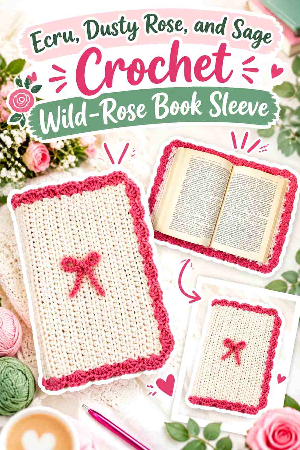
Ecru creates a light cottagecore foundation that lets dusty rose flowers become the main embroidered feature. Sage should stay concentrated in leaves, stems, or tiny connecting details so the book sleeve reads as ecru-and-rose first rather than an equal pink-and-green pattern.
Dusty Rose Should Lead the Embroidered Flowers on Ecru
Use dusty rose in the largest flower heads or the center of a lower-corner cluster. Leaving visible ecru between petals and neighboring motifs keeps the embroidery readable against the crochet surface.
Sage Can Give Dusty Rose a Direction Across the Ecru Sleeve
A few sage stems can lead the eye upward from a corner or along one side without requiring flowers across the whole cover. Keep green away from the opening if you want the top of the sleeve to remain visually simple.
Creator Credit: ElyseCrochets 💌
2. Oatmeal, Lavender, and Moss Crochet Lavender-Sprig Book Sleeve

Oatmeal provides a warmer background than cream, while lavender creates the obvious floral color and moss supplies the stems. This scheme works well with narrow embroidered sprigs because the muted purple stays visible without creating a large block of saturated color.
Lavender Sprigs Should Repeat Lightly Across Oatmeal
Use several small lavender groups rather than one very dense purple patch if you want a meadow-like surface. Visible oatmeal between sprigs keeps the book sleeve soft and prevents the embroidery from becoming a solid band.
Moss Needs Enough Contrast Against the Oatmeal Crochet Base
Muted green can become visually quiet on oatmeal. Choose a moss shade that stays clearly darker than the base so stems remain connected to their lavender flowers from normal viewing distance.
Creator Credit: Crochet Rainbows & Butterflies
3. Antique Cream, Cornflower Blue, and Butter Yellow Crochet Forget-Me-Not Book Sleeve
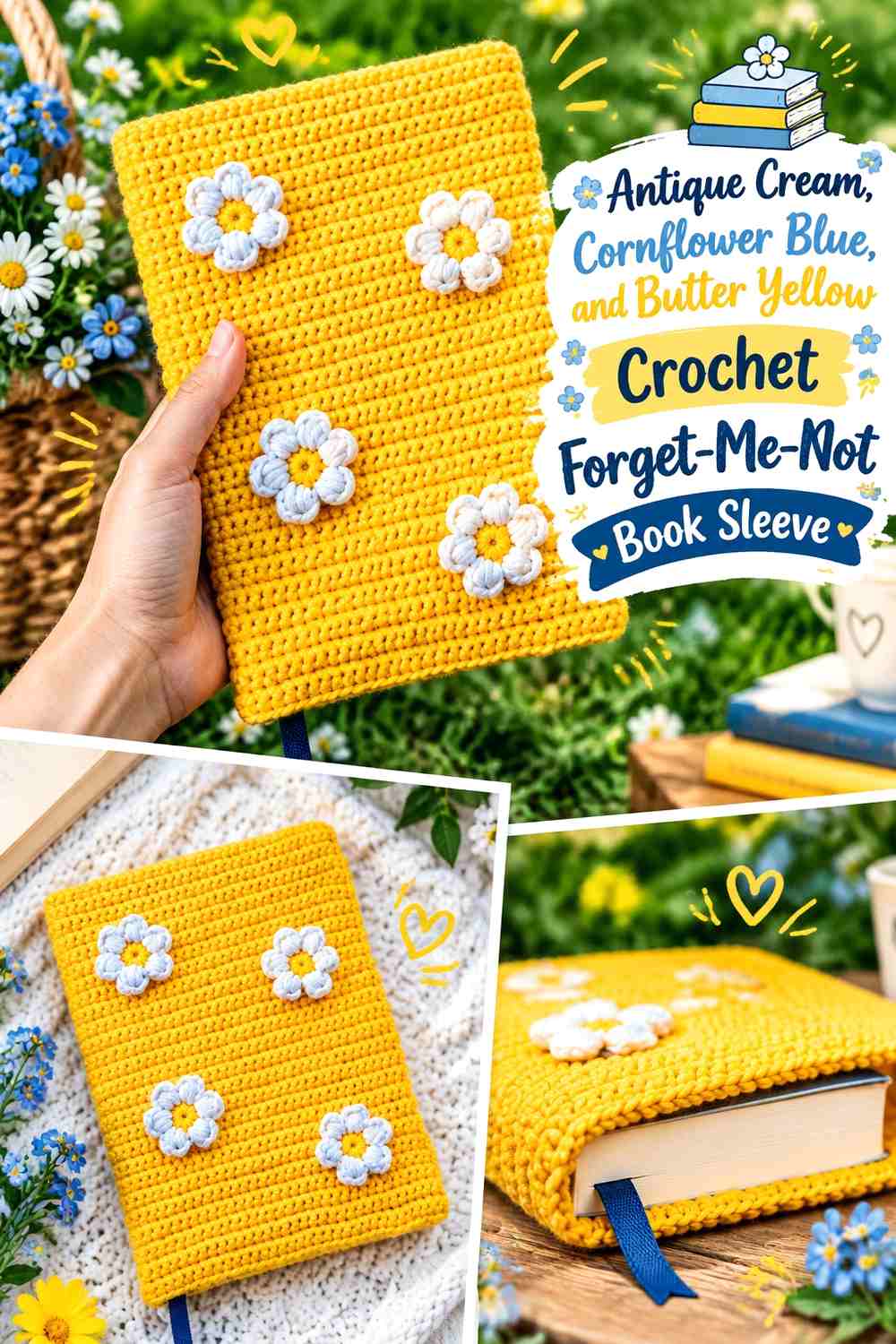
Antique cream gives tiny blue flowers enough open visual space, while butter yellow can identify their centers. Because the yellow is the smallest accent, even a limited amount can make repeated blue embroidery look more detailed.
Cornflower Blue Should Carry the Main Embroidered Flower Pattern
Repeat blue flowers in several small clusters rather than mixing many different petal colors. A single flower family keeps the tiny embroidery recognizable on a book-sized surface.
Butter Yellow Should Stay Small Against Cornflower Blue and Antique Cream
Use yellow only where the flower centers need definition. Large yellow areas would compete with the petals and weaken the cool blue cottagecore direction.
Creator Credit: Needleworksofi
4. Soft Sage, Ivory, and Blush Crochet Meadow-Daisy Book Sleeve

Soft sage can cover the crochet sleeve while ivory flowers brighten the front panel and blush supplies occasional softer accents. Since the background itself is green, avoid adding a second similarly valued leaf shade unless the stems need clear definition.
Ivory Daisies Need Visible Space on the Soft Sage Sleeve
Scatter the ivory motifs with enough green around each flower to preserve individual petal shapes. An overly dense field can turn several small daisies into one irregular light patch.
Blush Should Accent Ivory Rather Than Compete With Soft Sage
Use blush in a few flower centers or selected secondary blooms. Keeping it smaller than ivory creates variety without turning the meadow into an equal white-and-pink pattern.
Creator Credit: Dariarsii
5. Cocoa, Dusty Pink, and Olive Crochet Rose-Vine Book Sleeve

Cocoa gives the sleeve a darker earthy base that makes dusty pink embroidery immediately visible. Olive can form a climbing vine, but it needs enough contrast from cocoa to keep the botanical structure clear.
Dusty Pink Roses Can Become the Main Focal Point on Cocoa
A few larger pink flowers are enough against a dark background. Concentrate them along one side or lower corner instead of filling the entire cocoa panel.
Olive Should Stay Lighter or Darker Than the Cocoa Background
Test the green directly on the crocheted sleeve before embroidering a long vine. If the two values merge, shift the olive lighter so the stem remains visible between the dusty pink flowers.
Creator Credit: Mahum
6. Linen, Terracotta, and Moss Crochet Cottage-Poppy Book Sleeve
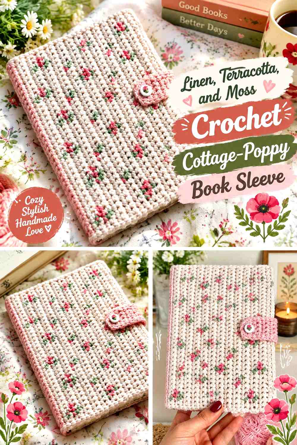
Natural linen creates a simple textile-like base, terracotta supplies a warm floral focal color, and moss keeps the stems muted. The palette has an earthy cottagecore direction without relying on pink.
Terracotta Flowers Should Stay Concentrated Against Linen
Use the strongest terracotta on a few identifiable flowers rather than distributing it through every seam and edge. The warm color will already stand out noticeably against the light sleeve.
Moss Can Connect Terracotta Flowers Without Covering the Linen Base
Keep leaves and stems narrow so plenty of linen remains visible. That negative space lets the embroidered flower silhouettes stay clear against the crochet texture.
Creator Credit: artist1c_kat
7. Dusty Blue, Cream, and Sage Crochet Chamomile Book Sleeve
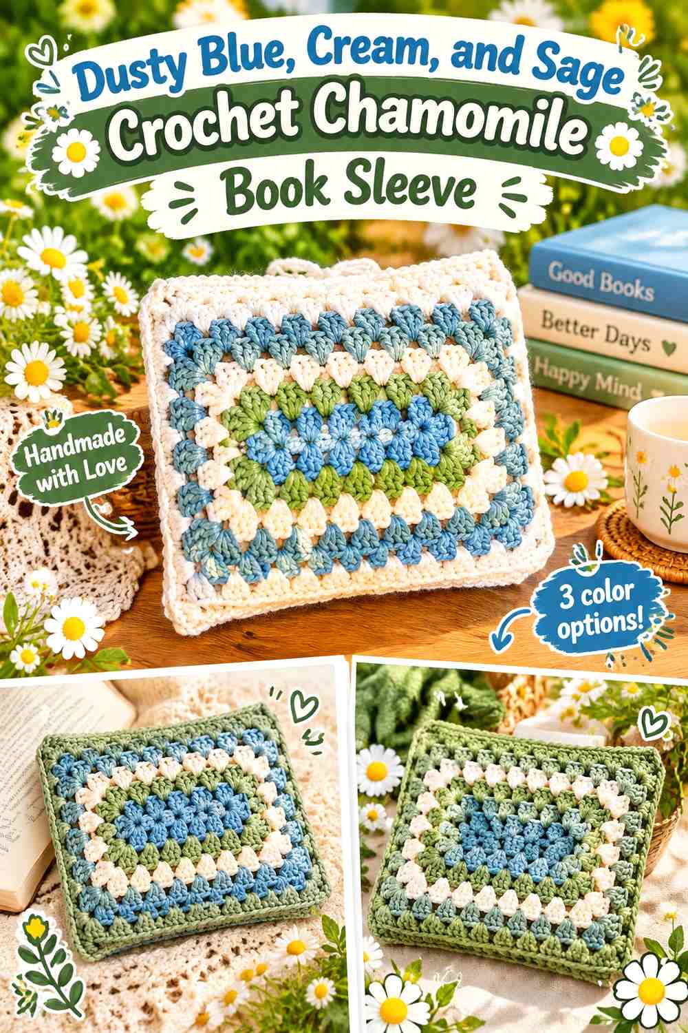
Dusty blue turns the book sleeve into a cool cottagecore background, while cream flowers and small sage stems soften the look. This palette benefits from keeping the embroidered flowers pale but not identical to the crochet base.
Cream Chamomile Flowers Need Clear Edges Against Dusty Blue
Use cream petals in small repeated groups with visible blue around each motif. The cool background naturally separates them, so heavy outlines are unnecessary.
Sage Should Stay Secondary to Cream on Dusty Blue
A few stems and leaves are enough to establish the botanical connection. Large green areas could compete with the blue base and reduce the quiet two-tone character of the sleeve.
Creator Credit: Ashten Stitches
8. Mushroom Brown, Old Rose, and Cream Crochet Woodland-Flower Book Sleeve
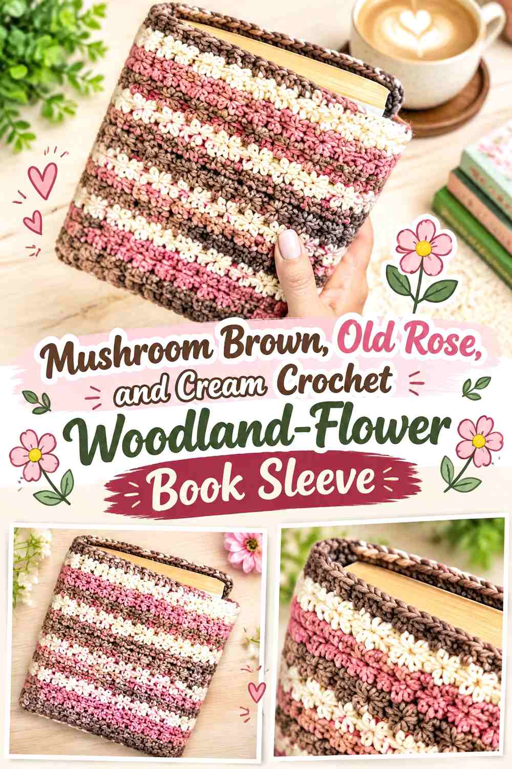
Mushroom brown gives the sleeve a woodland-neutral base, old rose supplies the main petals, and cream can add tiny pale flowers or centers. This works well when you want cottagecore to feel earthy rather than pastel.
Old Rose Gives Mushroom Brown a Warm Embroidered Focal Color
Place the old-rose flowers where they can form one coherent botanical cluster. Because brown and muted rose both have visual weight, keep enough plain mushroom crochet around the embroidery.
Cream Can Lift Old Rose Details From Mushroom Brown
Use cream as the lightest accent in centers or a few companion flowers. It should help with separation rather than occupy as much area as the old rose.
Creator Credit: Secret Yarnery
9. Parchment, Plum, and Olive Crochet Violet Book Sleeve

Parchment makes a softly aged neutral base, while plum gives embroidered violets enough depth to become the main focal point. Olive belongs primarily to leaves and stems, with the light sleeve separating the two darker colors.
Plum Violets Should Remain the Darkest Embroidered Feature
Concentrate plum inside the flowers rather than extending it broadly into edging or the closure. This helps the embroidery remain the feature readers notice first.
Olive Needs Parchment Between Dense Plum Flower Groups
If several violets sit close together, use visible parchment space and smaller olive leaves to keep the cluster from becoming one dark purple-green mass.
Creator Credit: Kendall Tai
10. Flax, Butter Yellow, and Sage Crochet Buttercup Book Sleeve

Flax creates a natural fiber-like background, butter yellow gives the flowers a gentle warm accent, and sage keeps the embroidery botanical without adding a highly saturated green.
Butter Yellow Should Repeat in Small Flowers Across Flax
Because both colors are warm and light, position the flowers in clear groups rather than using isolated tiny stitches everywhere. The clustered yellow creates enough visual concentration to stay visible.
Sage Can Add Contrast Where Butter Yellow Meets Flax
Use sage leaves immediately beside some flowers when the yellow petals are too close to the sleeve’s value. The green helps define the floral cluster without requiring a darker yellow.
Creator Credit: The Yarnling
11. Ivory, Peach, and Eucalyptus Green Crochet Blossom Book Sleeve

Ivory keeps the sleeve light, peach provides a warmer floral alternative to pink, and eucalyptus green creates muted leaves. This palette suits a small branch-like embroidery placed diagonally across one corner.
Peach Blossoms Should Form the Main Embroidered Line on Ivory
Repeat peach along a clear branch or cluster instead of scattering it evenly across the whole sleeve. Directional placement makes a limited number of flowers feel more intentional.
Eucalyptus Green Should Stay Muted Beside Peach and Ivory
Use the green in leaves and stems without expanding it into broad embroidered blocks. The sleeve should still read as light ivory with peach flowers.
Creator Credit: Sirin’s Crochet
12. Oatmeal, Burgundy, and Dusty Rose Crochet Heirloom-Rose Book Sleeve

Burgundy and dusty rose can create layered-looking floral color without requiring several unrelated shades. Oatmeal gives both enough contrast and keeps the sleeve connected to a soft vintage cottagecore palette.
Burgundy Should Anchor the Dusty Rose Embroidered Flowers
Use burgundy in the deepest flower areas or in a few smaller blooms so the embroidery has a dark visual anchor. Avoid letting it dominate every rose.
Dusty Rose Should Occupy More Floral Area Than Burgundy on Oatmeal
The softer pink keeps the sleeve from becoming visually heavy. Oatmeal between the two flower shades helps preserve individual motifs and petal groups.
Creator Credit: Brianna Nicole
13. Cream, Faded Blue, and Moss Crochet Tiny-Botanical Book Sleeve

Cream creates an open background for very small botanical embroidery, while faded blue and moss can form tiny flowers and stems. The restrained palette works especially well when the sleeve itself has a simple surface.
Faded Blue Should Repeat in Recognizable Groups on Cream
Several tiny blue flowers close enough to read as one sprig will usually be clearer than isolated stitches spread from edge to edge. Keep the cream visible around each group.
Moss Should Connect Faded Blue Without Becoming a Second Main Color
Use narrow green stems and a few leaves to connect the embroidered flowers. The smaller green share lets the faded blue remain the decorative identity.
Creator Credit: chantelle
14. Sage, Antique White, and Mauve Crochet Wreath-Flower Book Sleeve

A small embroidered wreath works naturally around a button, flap, or central upper detail. Sage can form the crochet background, antique white can lighten some flowers, and mauve can create the main repeated blooms.
Mauve Should Lead the Embroidered Wreath Against Sage
Repeat mauve at several points around the circular arrangement rather than placing it only on one side. Balanced flower color helps the wreath read clearly even when the flower sizes vary.
Antique White Can Keep Mauve Visible on the Sage Sleeve
Use the pale shade in small companion flowers or accents between mauve sections. It lightens the wreath without taking over the green-and-purple relationship.
Creator Credit: Crochet Corner In
15. Caramel, Cream, and Faded Red Crochet Folk-Flower Book Sleeve
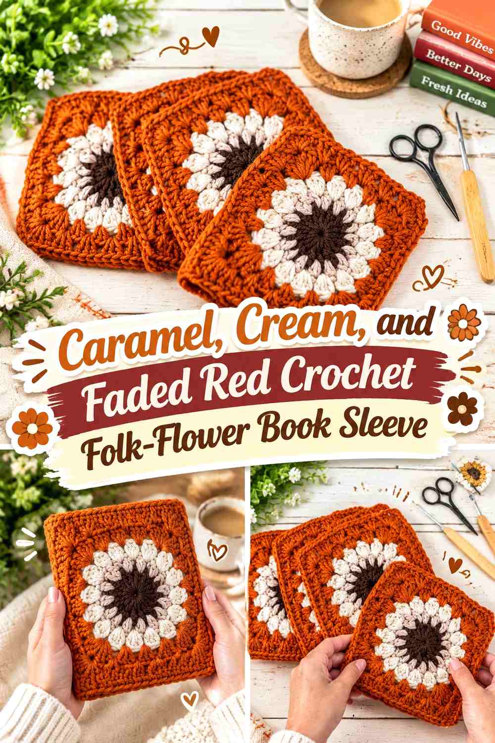
Caramel gives the sleeve a warm rustic base, cream adds pale separation, and faded red creates embroidered flowers with a folk-inspired cottage feel. The red should stay softened rather than bright if you want the overall palette to remain earthy.
Faded Red Flowers Should Stay Bold Enough Against Caramel
Choose a red that remains visibly deeper than the brown-beige sleeve. If the two colors merge, use cream around selected flowers or centers instead of switching to a much brighter red.
Cream Should Separate Faded Red From the Caramel Crochet Surface
A few pale petals or small stitches can create breathing room inside a dense flower cluster. Cream is especially useful where several warm shades sit close together.
Creator Credit: Mavis and Flo
16. Soft Gray, Lavender, and Ivory Crochet Violet-Sprig Book Sleeve
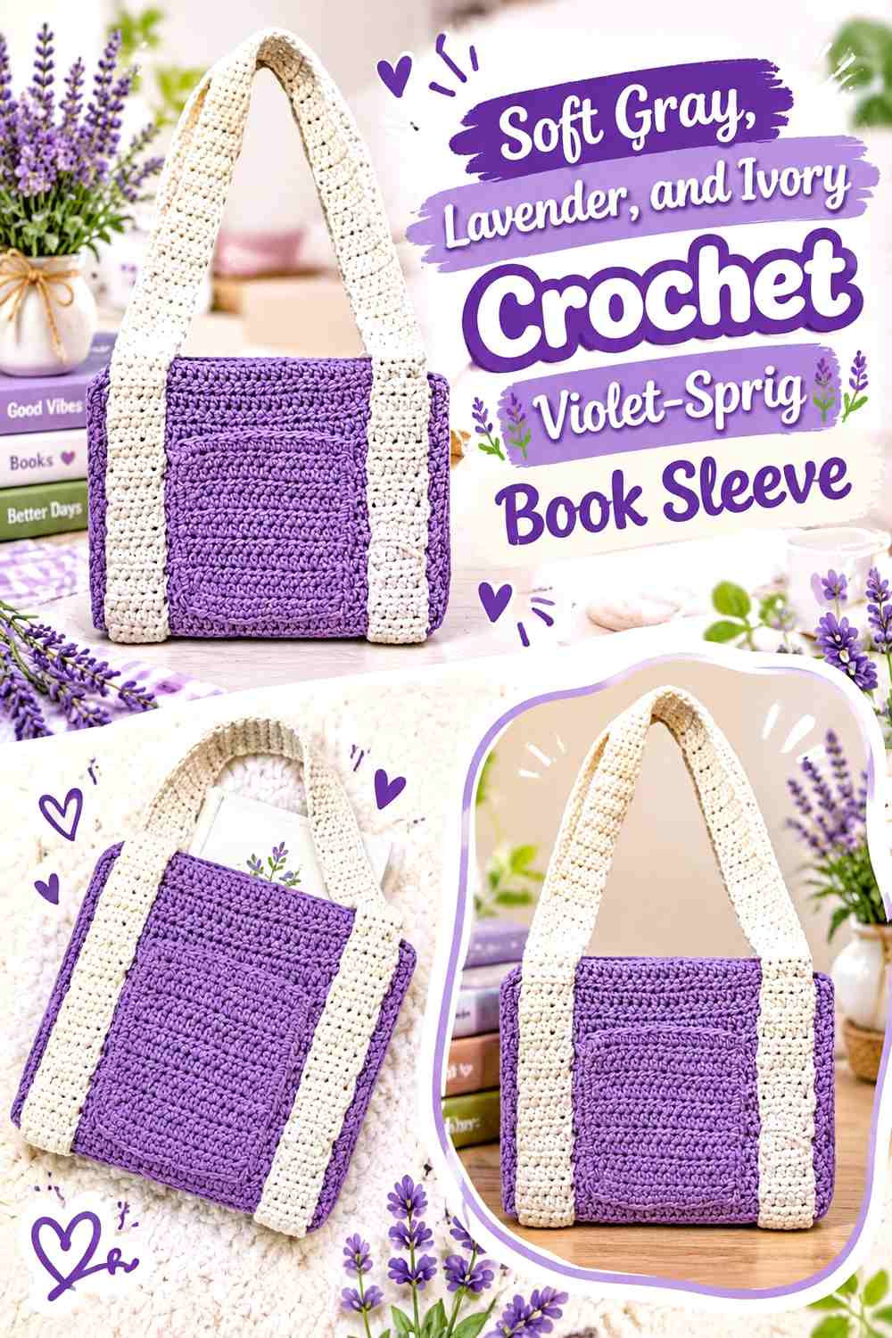
Soft gray provides a cool neutral that allows lavender flowers to stay gentle rather than disappearing into a pastel base. Ivory adds a light highlight and can keep the embroidered sprigs from feeling uniformly purple.
Lavender Sprigs Need Repetition Across Soft Gray
Place lavender in several related groups, such as one larger lower cluster and a smaller echo near the opposite side. That repetition makes the floral placement feel planned without creating an allover pattern.
Ivory Should Stay Smaller Than Lavender on Soft Gray
Use ivory for tiny companion flowers or centers rather than matching the lavender flower count. The purple should remain the primary botanical color.
Creator Credit: It KenKen
17. Natural Linen, Coral, and Leaf Green Crochet Garden-Flower Book Sleeve
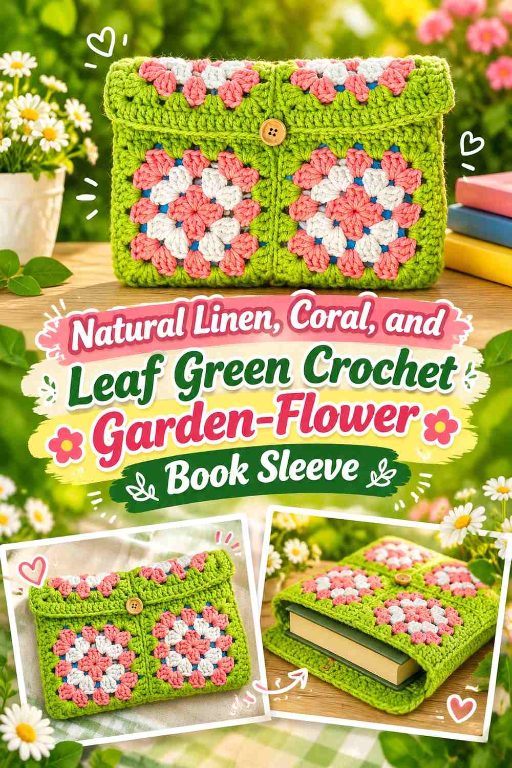
Natural linen acts as the quiet fabric-like base, coral provides a warmer garden color, and leaf green gives the embroidery clearer botanical structure. This palette can support a slightly bolder floral cluster without losing its cottagecore direction.
Coral Flowers Can Form One Focal Corner on Natural Linen
Concentrate most of the coral in one corner cluster and allow only a few smaller flowers to move outward. This gives the sleeve a strong focal point while preserving plenty of plain crochet.
Leaf Green Should Create a Clear Path Between Coral Flowers
Use the green to connect rather than surround every bloom. A few stems and leaves create movement across the linen background without making the front overly dense.
Creator Credit: jana
19. Dusty Teal, Cream, and Blush Crochet Scattered-Floral Book Sleeve

Dusty teal creates the darkest cool background in the collection, cream provides the lightest flowers, and blush gives a softer secondary bloom. Because both embroidery colors contrast well with teal, the floral placement can remain relatively sparse.
Cream Flowers Should Lead Against Dusty Teal
Use cream for the largest or most repeated flowers so the embroidered pattern remains visible on the dark crochet surface. A few widely spaced motifs may be enough.
Blush Should Break Up Cream Without Covering Dusty Teal
Add blush in selected flowers or centers rather than alternating pink and cream mechanically. Keeping visible teal between motifs prevents the front from becoming overly pale.
Creator Credit: Jess Crafting
Which Cottagecore Embroidered Book Sleeve Palette Should You Choose?
For the lightest cottagecore look, start with ecru and dusty rose, antique cream and cornflower blue, ivory and peach, or flax and butter yellow. These palettes leave plenty of pale crochet around the embroidery and make the botanical details feel delicate.
For an earthier sleeve, cocoa with dusty pink, mushroom brown with old rose, caramel with faded red, or oatmeal with burgundy gives the flowers more depth. Keep the darkest shades concentrated so the book sleeve does not become visually heavy.
Cooler palettes such as dusty blue with cream, soft gray with lavender, or dusty teal with blush work well when you want cottagecore without relying on beige and pink. Sage and olive can still appear in stems and leaves to preserve the botanical direction.
Conclusion
A cottagecore crochet book sleeve with embroidered flowers works best when the crochet base and embroidery do different visual jobs. Let the sleeve provide a stable background, then use the flower colors where you want attention: a corner cluster, climbing side vine, small central wreath, or scattered botanical sprigs.
Ecru, cream, linen, oatmeal, and parchment are useful when you want flowers to lead. Cocoa, mushroom brown, dusty blue, gray, sage, and teal create more distinctive backgrounds but require closer attention to embroidery contrast.
Before embroidering the full front, test a small flower and leaf combination against the completed crochet surface. The yarn can look different once it sits over textured stitches. Follow the linked creator tutorial for the book-sleeve construction, then adapt the embroidery placement to the actual front panel, opening, flap, tie, or closure.
Frequently Asked Questions
What crochet book sleeve colors work well with embroidered flowers?
Cream, ecru, oatmeal, linen, parchment, sage, faded blue, mushroom brown, soft gray, and dusty teal can all work. Choose the base according to the flower colors so the petals and stems remain clearly visible.
Should I embroider the flowers before or after assembling the crochet book sleeve?
Plan the decoration around the construction used by your chosen tutorial. In general, it is easier to judge placement when you know exactly which area will become the visible front, but the best stage for adding embroidery depends on how that particular sleeve is assembled.
How many flower colors should I use on a cottagecore book sleeve?
Two or three embroidery colors are often enough. One can lead the flowers, another can handle leaves and stems, and a third can add centers or smaller companion blooms. More colors can work, but they need a clear hierarchy.
How can I keep embroidered flowers visible on textured crochet?
Use stronger light-dark separation and avoid making every detail extremely small. Place important motifs on areas where the crochet texture does not visually compete with the flower shape.
Can I embroider only one corner of a crochet book sleeve?
Yes. A corner cluster can be more effective than an allover pattern because it leaves negative space around the flowers and keeps the sleeve opening visually uncluttered.
What green works well with cottagecore embroidered flowers?
Sage, moss, olive, eucalyptus green, and muted leaf green all work well. Choose the green based on contrast: pale flowers on a light sleeve may need a somewhat darker stem, while dark flowers can use a softer sage.
How can I make several embroidered book sleeves look like a matching collection?
Repeat one or two colors while changing the dominant base. For example, sage can appear as embroidery on an ecru sleeve, become the crochet base on another sleeve, and return as a small leaf color on a dusty-blue version. That repetition connects the set without making every design identical.