A chunky crochet pet blanket has enough surface texture to look interesting without needing bright color. Cream, oatmeal, taupe, gray, camel, brown, and black can create everything from quiet tonal blankets to strongly framed two-color designs.
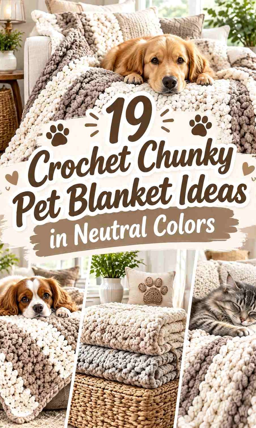
For a pet blanket, color placement also has a practical visual role. A contrasting border can define the edges of a blanket used on a pet bed or favorite sofa spot, while a light-and-dark stripe sequence can make a simple chunky stitch pattern more noticeable. Tonal neutrals put more emphasis on the oversized crochet texture itself.
The palettes below are editorial adaptations. The credited videos provide useful chunky crochet blanket construction references; the creators are not being credited with these exact pet-size palettes. Adjust the dimensions to the space your pet actually uses, follow the selected tutorial for construction, check the yarn manufacturer’s care information, and avoid loose fringe, tassels, or other details if your pet is likely to pull or chew them.
Quick List
- Cream and Taupe Crochet Chunky Pet Blanket
- Oatmeal and Charcoal Crochet Chunky Pet Blanket
- Camel and Ivory Crochet Chunky Pet Blanket
- Mushroom and Espresso Crochet Chunky Pet Blanket
- Stone Gray and Cream Crochet Chunky Pet Blanket
- Greige and Black Crochet Chunky Pet Blanket
- Sand and Mocha Crochet Chunky Pet Blanket
- Pewter and Oatmeal Crochet Chunky Pet Blanket
- Ecru and Slate Gray Crochet Chunky Pet Blanket
- Chestnut and Beige Crochet Chunky Pet Blanket
- Warm Gray and Off-White Crochet Chunky Pet Blanket
- Ivory and Graphite Crochet Chunky Pet Blanket
- Putty and Camel Crochet Chunky Pet Blanket
- Charcoal and Heather Gray Crochet Chunky Pet Blanket
- Almond and Espresso Crochet Chunky Pet Blanket
- Linen and Soft Brown Crochet Chunky Pet Blanket
- Mushroom, Cream, and Charcoal Crochet Chunky Pet Blanket
- Oatmeal, Camel, and Chocolate Crochet Chunky Pet Blanket
Let Chunky Crochet Texture Guide the Neutral Palette
Thick stitches already create visible ridges, shadows, and dimension, so a chunky pet blanket does not need many colors to keep the surface interesting. A single light neutral can emphasize shadows between stitches, while a dark neutral can make the whole blanket appear more visually solid.
When combining two close neutrals, compare their lightness before deciding where each belongs. Mushroom and taupe may look clearly different in skeins but blend once crocheted. That softer result can be useful for tonal blankets, but choose stronger light-dark contrast when you want stripes, blocks, or borders to remain obvious.
Use the Border to Control a Neutral Pet Blanket Palette
A pet blanket border occupies relatively little surface area but can strongly affect the finished look. A charcoal edge around oatmeal creates a defined frame, while a cream edge around beige gives a softer transition.
For a blanket that will be moved between a pet bed, sofa, crate area, or floor cushion, a simple border also keeps the palette visually contained. Avoid automatically adding several decorative border colors; chunky fabric already brings substantial visual weight.
Plan Neutral Colors Around the Blanket’s Everyday Location
A blanket intended for a favorite upholstered chair may benefit from a contrasting neutral so it remains visually separate from the furniture. A blanket sitting inside a pet bed can use closer tonal colors if you want the two pieces to look coordinated.
Do not treat matching as an exact-color exercise. Maintaining warm, cool, light, or dark relationships is usually more useful than trying to reproduce a particular commercial yarn shade.
1. Cream and Taupe Crochet Chunky Pet Blanket
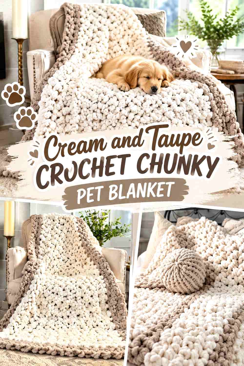
Cream can cover most of this blanket while taupe provides enough definition for a border or a small group of broad bands. The combination remains light and quiet, so the chunky stitches can carry more of the visual interest. If the blanket will sit on a similarly pale pet bed, the taupe edge also gives the piece a clearer boundary.
Taupe Can Frame a Cream Chunky Pet Blanket
Use taupe around the outer edge when you want to preserve a mostly cream center. The slightly deeper neutral separates the blanket from surrounding pale upholstery without dividing the main surface into many color changes.
Cream Keeps Taupe Chunky Texture Looking Light
If you introduce taupe bands, leave the larger sections cream. A high share of cream prevents the heavier-looking taupe from taking over the blanket and keeps raised chunky stitches easy to inspect.
Creator Credit: The Reclaimed Heirloom YouTube tutorial
2. Oatmeal and Charcoal Crochet Chunky Pet Blanket

Oatmeal with charcoal offers much stronger contrast. Let oatmeal dominate the sleeping surface and use charcoal for a border or limited stripe sequence. Because charcoal carries substantial visual weight, relatively little is required to make the color plan obvious.
Charcoal Gives an Oatmeal Pet Blanket a Defined Edge
A charcoal border can clearly frame an oatmeal center, which is useful when the blanket sits on another neutral surface. Keep the border comparatively narrow if you want oatmeal to remain the unmistakable main color.
Oatmeal Prevents Charcoal Stripes From Becoming Too Heavy
If you prefer bands rather than a solid border, space charcoal sections between wider oatmeal areas. Equal-width dark and light stripes create a much more graphic result than an oatmeal-led palette.
Creator Credit: CJ Design YouTube tutorial
3. Camel and Ivory Crochet Chunky Pet Blanket

Camel gives the blanket a warm neutral foundation, while ivory provides the lightest points. A camel body with ivory edge rows produces a softer result than brown with bright white and works particularly well when you want the chunky surface to remain visually warm.
Ivory Can Brighten a Camel Chunky Pet Blanket Border
Keep ivory around the perimeter when you want the edge to appear lighter than the center. Because ivory has much less visual weight than camel, it can define the blanket without creating a dark frame.
Camel Should Dominate Beside Ivory Chunky Bands
If ivory appears inside the main field, make those bands narrower than the camel sections. This preserves the warm camel direction and prevents the light shade from visually splitting the blanket into equal blocks.
Creator Credit: Sweet Creek Patterns YouTube tutorial
4. Mushroom and Espresso Crochet Chunky Pet Blanket

Mushroom and espresso create an earthy light-and-dark relationship without moving outside a brown-neutral family. Mushroom can fill the center, while espresso marks the perimeter or selected corners. This scheme is especially useful when you want obvious definition without introducing gray or black.
Espresso Gives Mushroom Chunky Crochet a Strong Frame
Use espresso sparingly around a mushroom body. Its darker value is enough to create a pronounced edge, so you do not need large espresso sections unless you specifically want color blocking.
Mushroom Can Separate Espresso Pet Blanket Details
If espresso appears at more than one point, leave mushroom between those accents. This prevents several dark sections from visually joining into one heavy area and keeps the soft mushroom surface dominant.
Creator Credit: Diving Ducks Crochet YouTube tutorial
5. Stone Gray and Cream Crochet Chunky Pet Blanket
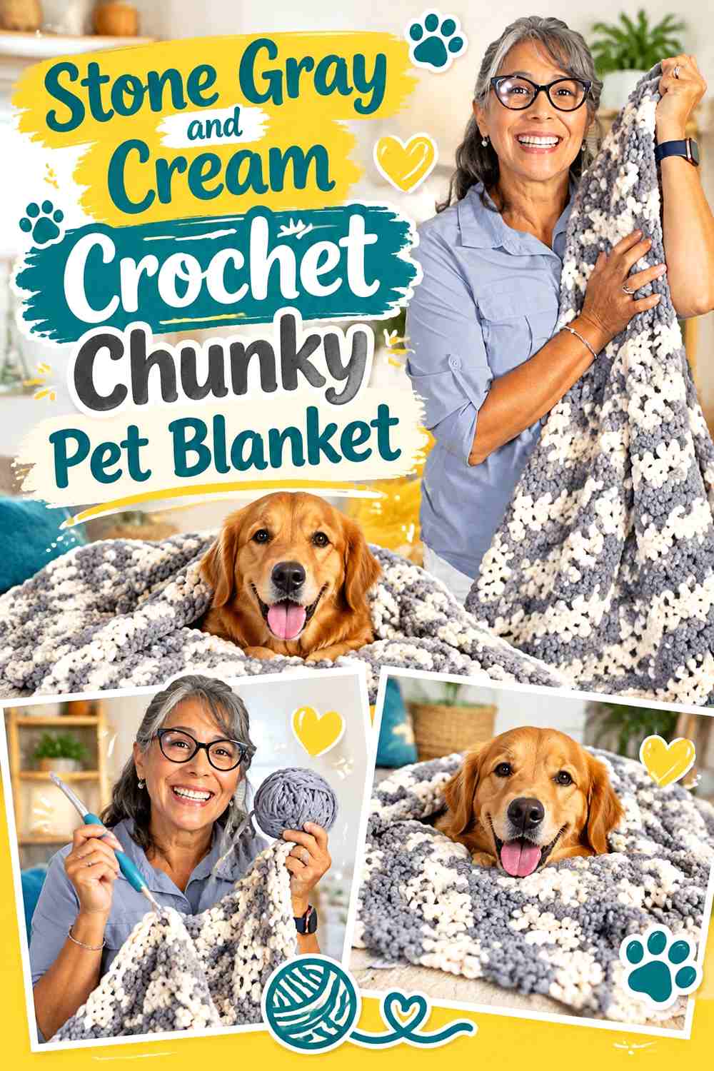
Stone gray provides a cooler main color, while cream adds a warmer light neutral. Use gray across the main surface and cream at the edge or as occasional wide bands when you want the crochet texture to remain noticeable without a stark black-and-white effect.
Cream Softens a Stone Gray Chunky Pet Blanket
A cream border can make a broad stone-gray center look less visually heavy. Keep the transition simple so the edge supports the texture rather than becoming the blanket’s dominant feature.
Stone Gray Can Anchor Cream Chunky Stripes
When cream is used inside the field, return to stone gray between every light section. The repeated gray gives the blanket a clear backbone and keeps the lighter bands connected to one consistent base color.
Creator Credit: Uri Designs Studio YouTube tutorial
6. Greige and Black Crochet Chunky Pet Blanket

Greige gives black a softer partner than white or pale cream. Let greige cover most of the blanket and reserve black for one strong border, a pair of broad end bands, or another deliberately limited area.
Black Needs Restraint on a Greige Chunky Pet Blanket
A little black creates a large amount of contrast. Using it around every stripe and edge can fragment a small pet blanket, so concentrate the darkest neutral where you specifically want definition.
Greige Keeps Black Crochet Edging From Overpowering the Center
Leave a substantial greige center when using a black perimeter. The uninterrupted mid-tone area gives chunky stitch texture room to show instead of making the blanket read primarily as a black frame.
Creator Credit: Bella Coco YouTube tutorial
7. Sand and Mocha Crochet Chunky Pet Blanket

Sand and mocha keep the blanket firmly in a warm brown family while providing more contrast than a single beige shade. Sand can carry most of the field, and mocha can be repeated at both short ends or around the border.
Mocha Adds Depth to a Sand Chunky Pet Blanket
Place mocha where you want the eye to stop, such as the outer edge or broad end sections. Because it is darker, it can create structure without requiring frequent color changes through the center.
Sand Gives Mocha Crochet Texture More Breathing Room
Keep wide stretches of sand between mocha sections. The lighter neutral allows the thick stitches and their shadows to remain part of the design instead of making color contrast the only visible feature.
Creator Credit: The Crochet Crowd YouTube tutorial
8. Pewter and Oatmeal Crochet Chunky Pet Blanket

Pewter and oatmeal mix a cooler gray with a warmer pale neutral. Oatmeal can act as the larger surface while pewter outlines the edge, or you can reverse that distribution for a darker blanket with a lighter frame.
Pewter Creates Clear Definition Around an Oatmeal Pet Blanket
A pewter perimeter gives the pale center a more visible boundary without reaching the intensity of black. This works well when the blanket itself needs to stand apart from a cream or beige pet bed.
Oatmeal Can Highlight Pewter Chunky Crochet Texture
For a pewter-dominant version, place oatmeal in a few broad sections rather than narrow repeated lines. Larger light areas provide enough contrast to make the thick stitch surface easier to read.
Creator Credit: Yarnspirations YouTube tutorial
9. Ecru and Slate Gray Crochet Chunky Pet Blanket
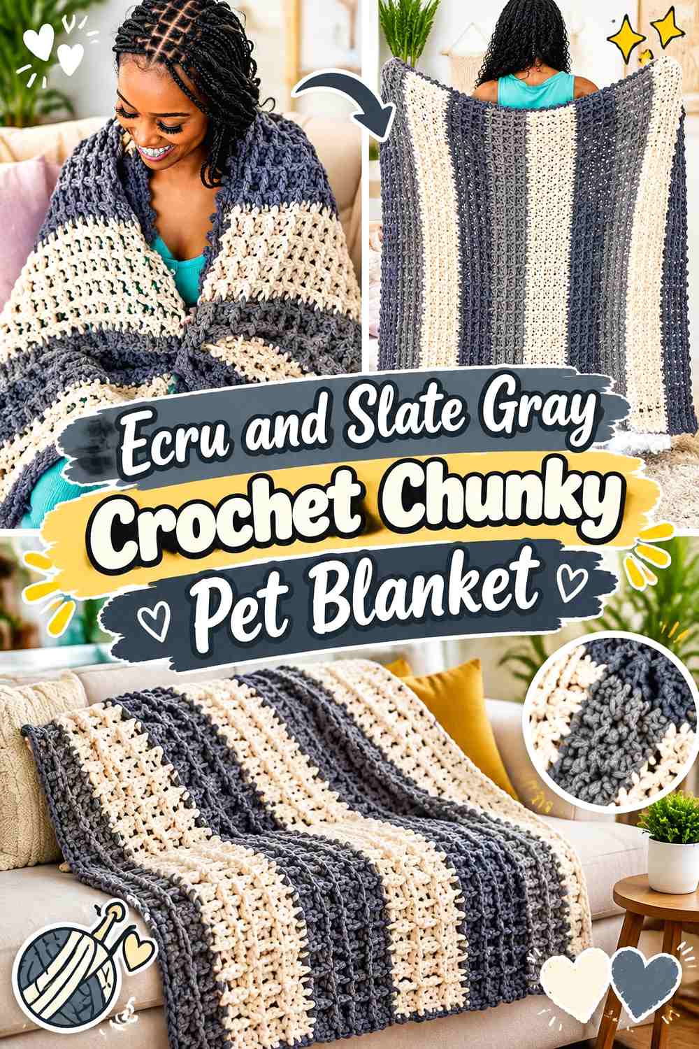
Ecru offers a warmer alternative to pure white, while slate gray supplies substantial but not extreme contrast. An ecru center with slate edging creates a clean neutral blanket without making the boundary as severe as black would.
Slate Gray Can Ground an Ecru Chunky Pet Blanket
Use slate along the outer edge or in one substantial end section. Its darker value gives the pale ecru field enough structure that the blanket does not visually disappear against similarly light surroundings.
Ecru Keeps Slate Gray Chunky Bands From Looking Too Dense
If slate becomes a stripe color, let ecru bands remain wider. That distribution protects the lighter overall direction and stops the blanket from becoming predominantly gray.
Creator Credit: TL Yarn Crafts YouTube tutorial
10. Chestnut and Beige Crochet Chunky Pet Blanket

Chestnut and beige reverse the usual light-body, dark-border formula when chestnut is allowed to dominate. Use beige for a lighter edge or a few soft bands so the blanket remains rich and brown without becoming visually flat.
Beige Can Lighten a Chestnut Chunky Pet Blanket Edge
A beige perimeter reduces the apparent weight of a dark chestnut center. It also keeps the blanket within one warm-neutral family, avoiding the cooler effect that gray would introduce.
Chestnut Should Stay Dominant Around Beige Pet Blanket Accents
Keep beige to selected areas rather than dividing the field equally. The deeper chestnut then remains the background against which the lighter chunky details are noticed.
Creator Credit: Jewels and Jones YouTube tutorial
11. Warm Gray and Off-White Crochet Chunky Pet Blanket
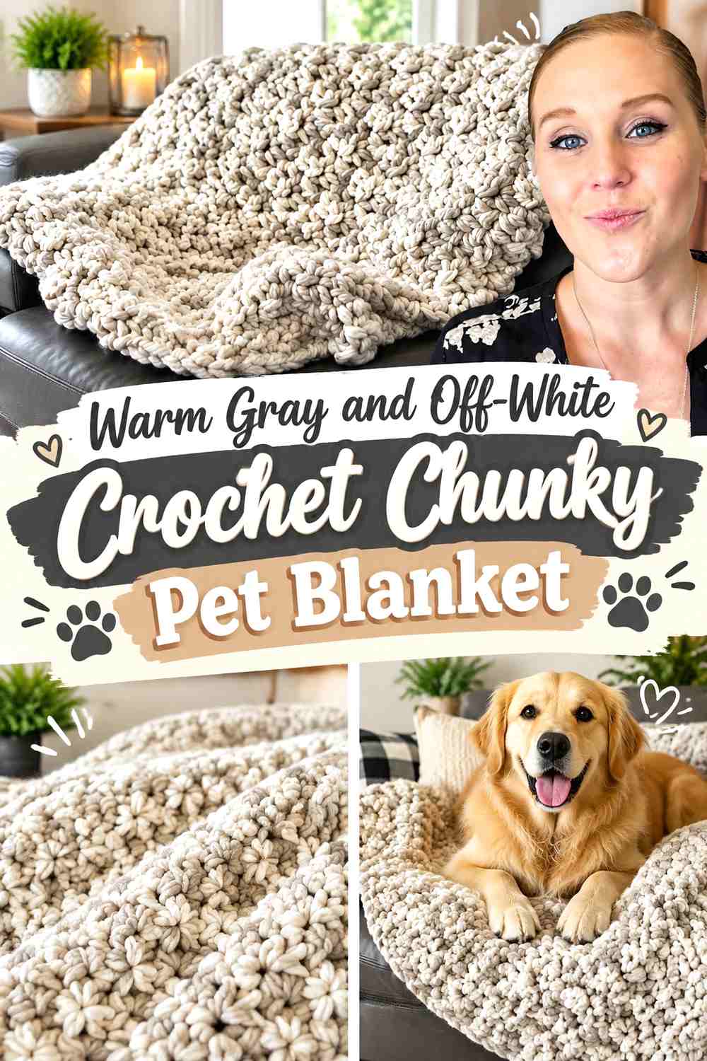
Warm gray and off-white create a quiet contrast suited to a pet blanket where you want the crochet texture to remain more prominent than the color changes. Warm gray can occupy most of the surface, with off-white outlining it or appearing as occasional breaks.
Off-White Can Separate Warm Gray Chunky Crochet Sections
A light border or band lets adjacent gray sections remain visually distinct. Keep off-white concentrated rather than scattered so it acts as a deliberate separator.
Warm Gray Keeps Off-White Pet Blanket Edges Soft
Use warm gray again immediately inside an off-white border. That transition maintains the neutral relationship and prevents the light edge from becoming disconnected from the main blanket.
Creator Credit: Crochet With Tiffany YouTube tutorial
13. Ivory and Graphite Crochet Chunky Pet Blanket
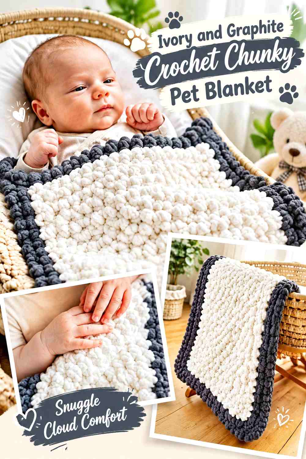
Ivory with graphite gives the strongest light-dark contrast in this group without using pure white and black. Ivory can dominate the sleeping surface while graphite forms a controlled frame.
Graphite Makes an Ivory Chunky Pet Blanket Look More Defined
Use graphite at the edge when the blanket needs clear separation from another pale textile. Because the color difference is substantial, even a narrow border will be visually noticeable.
Ivory Needs Plenty of Space Beside Graphite Crochet Details
Do not overuse graphite merely because it coordinates well. Keeping most of the blanket ivory preserves the light center and prevents the dark edging from becoming the dominant visual feature.
Creator Credit: Maisie and Ruth YouTube tutorial
14. Putty and Camel Crochet Chunky Pet Blanket
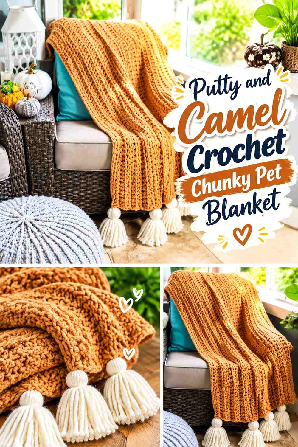
Putty and camel offer subtle temperature contrast: putty leans quieter and grayer, while camel adds warmth. Because the values can be similar, color placement should use larger areas instead of relying on thin stripes.
Camel Works Best in Broad Areas Against Putty
Use camel as an end block or generous border rather than a series of very narrow lines. The larger area makes the warm-neutral shift easier to see against the subdued putty.
Putty Can Keep Camel Chunky Crochet From Becoming Too Warm
Let putty occupy most of the central surface when you want the blanket to remain balanced rather than entirely brown. Its muted quality gives the camel sections a clear reason to exist.
Creator Credit: MJ’s Off The Hook Designs YouTube tutorial
15. Charcoal and Heather Gray Crochet Chunky Pet Blanket
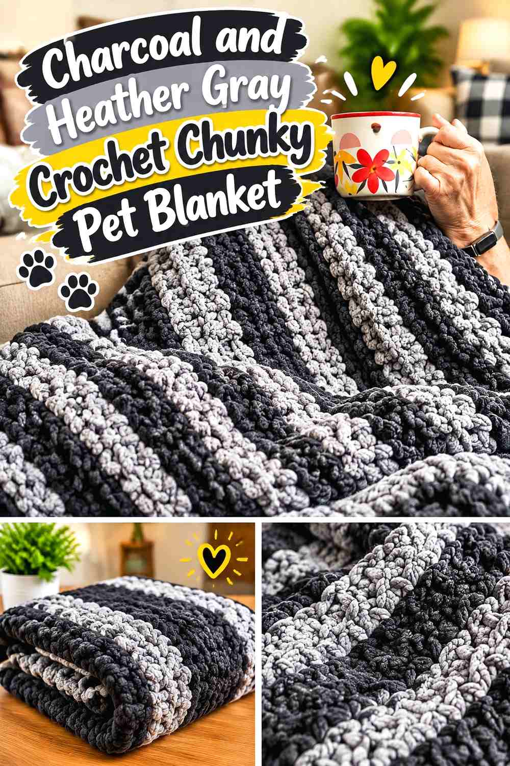
This dark monochromatic scheme uses value rather than hue to create separation. Heather gray can cover most of the blanket, while charcoal defines the border or selected bands. The result puts substantial emphasis on the chunky stitch pattern.
Charcoal Needs Clear Contrast From Heather Gray
Compare the yarns before starting. If the charcoal and heather gray are nearly identical in lightness, the border may disappear into the center and produce an almost single-color blanket.
Heather Gray Can Keep a Charcoal Pet Blanket From Looking Solid
Use heather gray across the wider areas so the darker charcoal has visible breaks. This gives the blanket dimension without introducing a pale neutral that would change its deeper overall direction.
Creator Credit: Play Hooky with Me YouTube tutorial
16. Almond and Espresso Crochet Chunky Pet Blanket

Almond with espresso combines a pale creamy beige and a very dark brown. The contrast is strong enough for a simple two-color plan: almond body, espresso border, or a reversed version if you prefer a deeper center.
Espresso Can Anchor an Almond Chunky Pet Blanket
Use espresso around the outside when the almond center needs definition. Because espresso is so much darker, keep the border proportionate to the pet blanket rather than allowing it to consume a large share of the surface.
Almond Keeps Espresso Crochet Accents From Feeling Heavy
If espresso also appears inside the field, leave broad almond areas between the darker sections. The light neutral creates visual breathing room and keeps the blanket from becoming a sequence of heavy brown blocks.
Creator Credit: Marching North YouTube tutorial
17. Linen and Soft Brown Crochet Chunky Pet Blanket

Linen and soft brown give you one of the most understated palettes in the collection. Linen can lead the surface, while soft brown adds just enough depth at the edge to make the blanket look intentionally two-color.
Soft Brown Gives Linen a Quiet Chunky Crochet Border
Choose a medium soft brown rather than the deepest chocolate when you want the transition to remain gentle. The border will still define the linen center but will not create a heavy outline.
Linen Should Stay Broad Beside Soft Brown Pet Blanket Details
Let linen occupy most of the usable center. If soft brown is repeated, keep those additions narrow so the overall blanket remains light and calm.
Creator Credit: AllAboutAmi YouTube tutorial
18. Mushroom, Cream, and Charcoal Crochet Chunky Pet Blanket
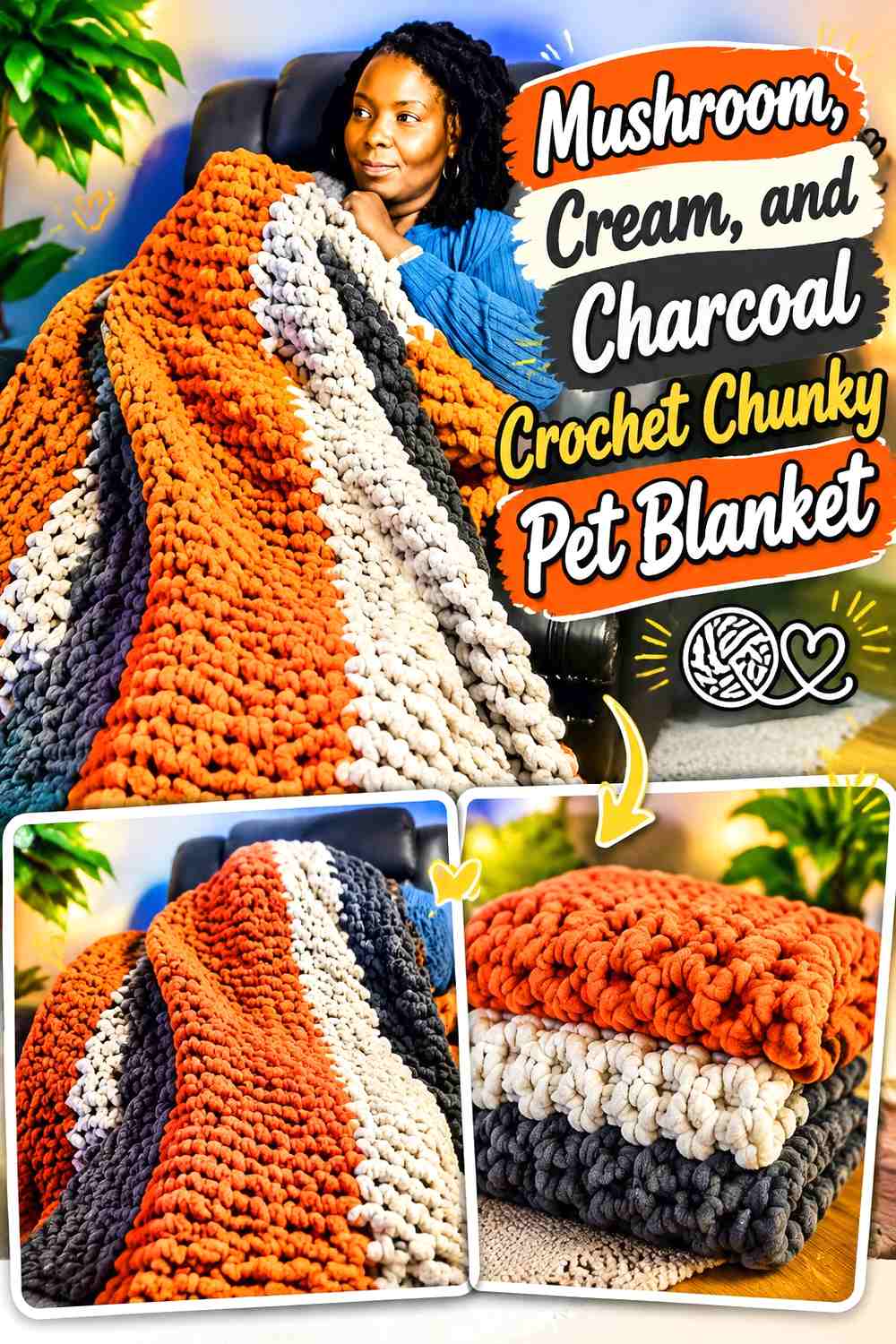
Three neutral colors work best when each has a distinct role. Mushroom can dominate the main field, cream can lighten selected bands or blocks, and charcoal can provide a narrow outer frame. Avoid repeating all three in equal proportions, which would make a small pet blanket unnecessarily busy.
Cream Should Support Mushroom Rather Than Compete With Charcoal
Use cream as the lighter secondary color within the mushroom field. Because charcoal already creates strong definition, cream does not need to appear in every section.
Charcoal Can Frame Mushroom and Cream Chunky Crochet
A narrow charcoal perimeter brings the two lighter neutrals together. Keeping charcoal mainly at the edge prevents it from interrupting the softer mushroom-and-cream relationship across the sleeping surface.
Creator Credit: Dress it up Debra YouTube tutorial
19. Oatmeal, Camel, and Chocolate Crochet Chunky Pet Blanket
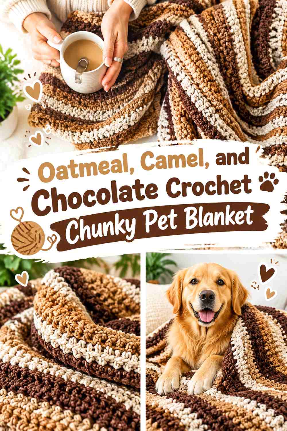
This palette moves from light oatmeal through medium camel to dark chocolate. Use oatmeal as the largest field, camel for broader secondary sections, and chocolate as the smallest defining accent. That three-step value structure keeps the colors easy to distinguish despite their related warmth.
Camel Bridges Oatmeal and Chocolate Chunky Crochet
Place camel between some of the lightest and darkest areas when you want a smoother transition. The medium neutral prevents every chocolate section from creating an abrupt jump against oatmeal.
Chocolate Should Be the Smallest Oatmeal and Camel Accent
Reserve chocolate for the border, selected end rows, or another limited detail. Its dark value will still provide definition even when it occupies much less space than oatmeal and camel.
Creator Credit: Life and Yarn YouTube tutorial
Which Neutral Chunky Pet Blanket Palette Should You Choose?
For a light blanket with gentle definition, cream and taupe, linen and soft brown, or camel and ivory keep the surface bright without eliminating contrast. These palettes work particularly well when you want oversized crochet texture to provide most of the visual interest.
For stronger framing, choose oatmeal and charcoal, ivory and graphite, almond and espresso, or greige and black. The darker accents can make borders and end sections immediately visible, so they usually work best in smaller proportions.
For a tonal brown direction, sand and mocha, cocoa and taupe, chestnut and beige, or oatmeal, camel, and chocolate maintain warmth while still offering different levels of value. Charcoal and heather gray provides the darkest monochromatic alternative.
Conclusion
Neutral colors can give a chunky crochet pet blanket just as much visual variety as a bright palette. The difference comes from hierarchy: decide which shade owns the main sleeping surface, which supports it, and whether the border should blend in or clearly frame the blanket.
Choose cream and taupe or linen and soft brown for subtle contrast. Move toward oatmeal and charcoal or ivory and graphite when you want a clearly defined border. For a layered warm palette, oatmeal, camel, and chocolate gives you three distinct neutral values without introducing unrelated color.
Use the credited tutorial that best matches the blanket construction you want, then adapt the overall dimensions and neutral placement for your pet’s actual sleeping area. Check care information for the yarn you select and keep the finished blanket free of loose decorative elements when chewing or pulling could be an issue.
Frequently Asked Questions
Which neutral colors show chunky crochet texture most clearly?
Light-to-medium solid neutrals such as cream, oatmeal, camel, and gray can make shadows between chunky stitches easier to notice. Very dark colors can still show strong texture, but fine stitch details may be less obvious depending on lighting and yarn surface.
Should a chunky pet blanket have a contrasting border?
It does not have to. A contrasting charcoal, brown, or gray border provides a stronger visual frame, while a tonal border keeps the blanket quieter. Choose according to how much you want the edge to stand apart from the center.
How many neutral colors should I use in a crochet pet blanket?
Two colors are enough for most border, stripe, and block arrangements. Three colors can work well when each has a clear role—for example, a light dominant shade, a medium supporting shade, and a dark accent.
How do I tell if two neutral yarn colors have enough contrast?
Put the yarns beside each other and compare their lightness rather than only their names. A grayscale photo is a useful check. If the shades become almost identical in grayscale, expect a softer tonal transition in the finished blanket.
Can I make a chunky pet blanket in one neutral color?
Yes. A solid cream, oatmeal, camel, gray, taupe, or brown blanket places the emphasis on chunky stitch texture. A single-color version can also be useful when the stitch pattern itself already creates strong ridges or raised details.
Should I add tassels or fringe to a chunky crochet pet blanket?
For a pet blanket, a simple finished edge is generally the more practical choice if the animal tends to chew, paw, or pull at loose items. If a tutorial includes decorative fringe, it can be omitted when adapting the construction for pet use.
How should I substitute a neutral color in a pet blanket palette?
Preserve the color’s role. Replace a dark border shade with another clearly dark neutral, or substitute one pale dominant neutral for another pale neutral. Maintaining the light-dark relationship usually preserves the original palette effect better than matching an exact color name.