A crochet retro daisy room divider turns repeated floral motifs into something larger than ordinary granny-square decor. Because the finished panel hangs vertically, color has to work across the full height: daisy centers need enough contrast to stay visible, background colors need to connect neighboring squares, and the lower section should not become noticeably darker or heavier than the top.

Retro palettes are especially useful for this kind of project because mustard, avocado, burnt orange, chocolate, teal, dusty pink, cream, and rust can be redistributed from square to square without losing the overall theme. One divider might repeat identical daisies in a consistent grid, while another can rotate the dominant background color while keeping one joining shade constant.
The linked tutorials teach retro daisy or related daisy granny-square motifs rather than complete floor-to-ceiling room dividers. Use the original tutorials for motif construction, then plan the hanging layout, joins, color distribution, and finished panel dimensions separately.
Quick List
- Mustard, Cream, and Avocado Retro Daisy Crochet Room Divider
- Burnt Orange, Cream, and Chocolate Retro Daisy Crochet Room Divider
- Mustard, Rust, and Olive Retro Daisy Crochet Room Divider
- Teal, Cream, and Mustard Retro Daisy Crochet Room Divider
- Dusty Pink, Burnt Orange, and Cream Retro Daisy Crochet Room Divider
- Avocado, Tangerine, and Cream Retro Daisy Crochet Room Divider
- Chocolate, Mustard, and Ivory Retro Daisy Crochet Room Divider
- Powder Blue, Rust, and Cream Retro Daisy Crochet Room Divider
- Plum, Ochre, and Blush Retro Daisy Crochet Room Divider
- Brick Red, Oatmeal, and Olive Retro Daisy Crochet Room Divider
- Cobalt, Mustard, and Warm White Retro Daisy Crochet Room Divider
- Terracotta, Sage, and Cream Retro Daisy Crochet Room Divider
- Black, Cream, and Burnt Orange Retro Daisy Crochet Room Divider
- Camel, Turquoise, and Coral Retro Daisy Crochet Room Divider
- Burgundy, Peach, and Cream Retro Daisy Crochet Room Divider
- Pistachio, Terracotta, and Ivory Retro Daisy Crochet Room Divider
- Navy, Ochre, and Rust Retro Daisy Crochet Room Divider
Plan Retro Daisy Colors Across the Full Room Divider
A room divider is viewed as one large vertical surface, so evaluate the palette beyond the individual granny square. A square that looks balanced by itself can create a heavy band when the same dark background repeats across an entire row.
Before joining, lay out the motifs in the same orientation they will have when hanging. Check whether mustard, orange, brown, teal, or another strong shade gathers accidentally in one area. Moving only a few squares can create a much more even color flow without changing the motifs themselves.
Keep Retro Daisy Centers Visible From Across the Room
Small daisy centers can disappear more quickly than petals once multiple squares are joined. Light/dark value matters as much as hue. Mustard against cream may need a darker surrounding background, while chocolate against rust may need a lighter petal color.
Step several feet away from a sample motif before committing to a large batch. A grayscale photo can also reveal whether the center, petals, and background are too similar in value.
Use the Joining Color to Control the Daisy Room Divider Grid
The joining shade becomes a repeated line across the entire divider. A dark join creates a pronounced tiled grid, while cream, oatmeal, or a color already used in the square makes the divisions quieter.
If the daisies already use three strong retro colors, introducing a fourth high-contrast joining color can make the panel busy. Repeating one existing background or neutral usually creates a more unified hanging.
1. Mustard, Cream, and Avocado Retro Daisy Crochet Room Divider
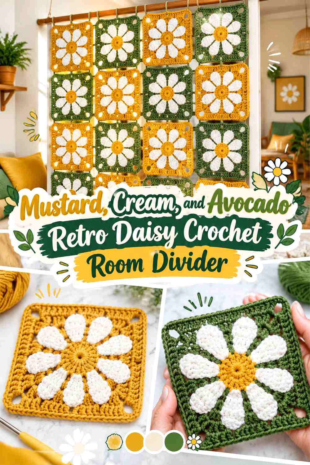
Mustard centers, cream petals, and avocado backgrounds create a direct 1970s-inspired starting point. Avocado can carry most of the visual area because it surrounds each flower, while cream keeps the petals distinct and mustard provides a smaller warm focal point. For a large divider, repeat the same flower colors but vary avocado only if you can preserve consistent contrast from row to row.
Keep Mustard Centers Small Against Cream Daisy Petals
Mustard does not need much surface area to establish the retro color direction. Keeping it concentrated in the center allows the cream petals to remain clearly recognizable even when many motifs are viewed together.
If mustard and avocado are close in value, the cream petals become particularly important because they keep the flower from visually collapsing into its background.
Repeat Avocado Through the Crochet Room Divider Joins
Using avocado for both the square backgrounds and selected joining areas can make the panel read as one continuous green field dotted with daisies. This is useful when you want the floral motifs to stand out more than the grid.
A contrasting cream join would create a much more segmented effect, so choose it only when you want every square boundary emphasized.
Creator Credit: Creggy’s Crochet
2. Burnt Orange, Cream, and Chocolate Retro Daisy Crochet Room Divider
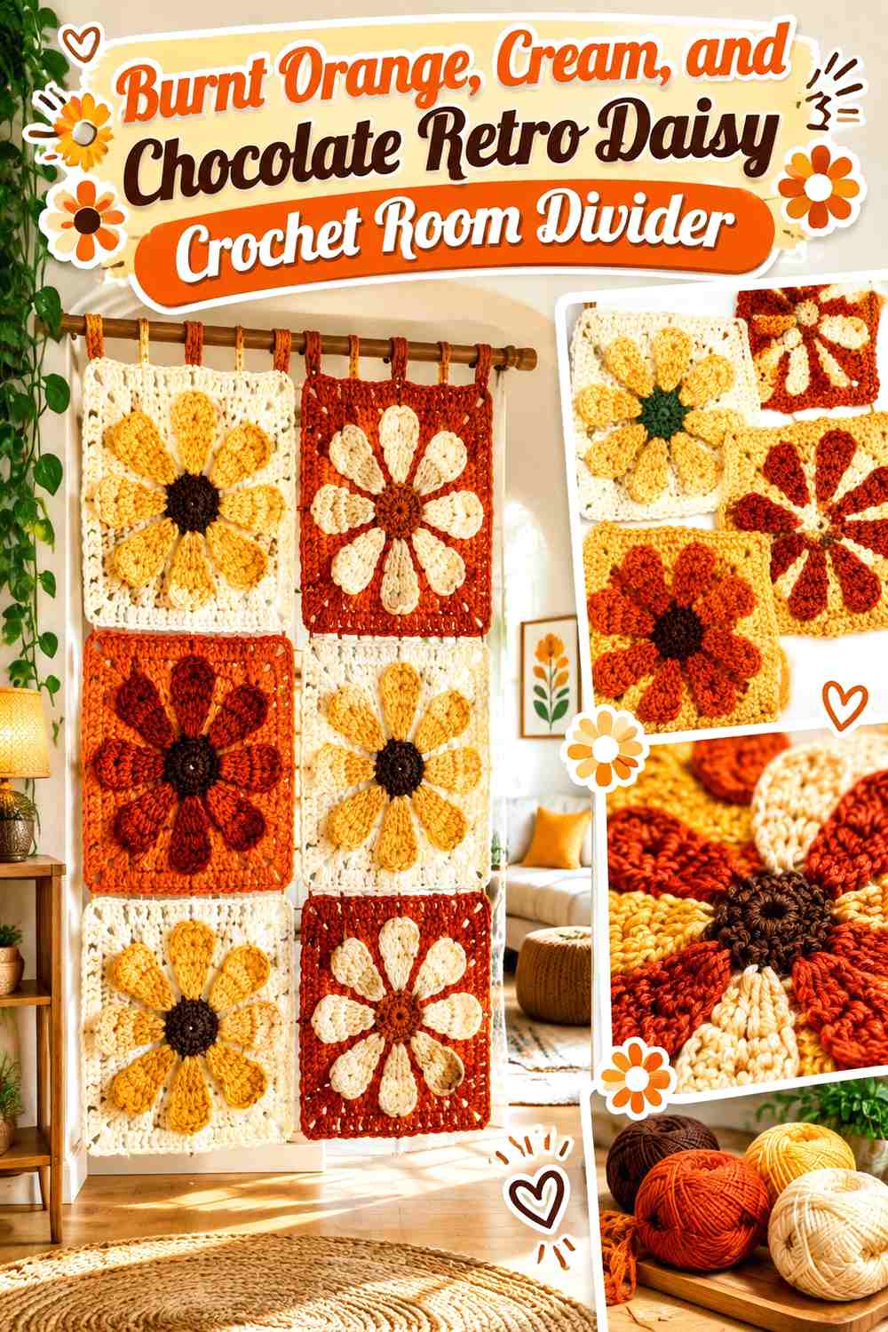
Burnt orange gives this divider the strongest warm surface, cream keeps the daisy petals readable, and chocolate provides controlled dark definition. Let orange dominate the square backgrounds and reserve chocolate for flower centers, selected frames, or occasional rows rather than distributing it equally.
Let Burnt Orange Lead the Crochet Daisy Backgrounds
Broad burnt-orange backgrounds create continuity across a large hanging. Cream daisies then become clearly visible without needing several additional colors.
If every square also receives a heavy chocolate border, the grid may become stronger than the flowers. Keep the darkest shade subordinate when the daisies should remain the focal point.
Use Chocolate to Anchor Cream and Burnt Orange Near the Divider Edges
Chocolate works particularly well on an outer border or selected edge motifs because it can define the panel against a light wall.
Repeating a little chocolate through the interior daisy centers prevents that dark perimeter from looking unrelated to the rest of the divider.
Creator Credit: Pattern Princess
3. Mustard, Rust, and Olive Retro Daisy Crochet Room Divider
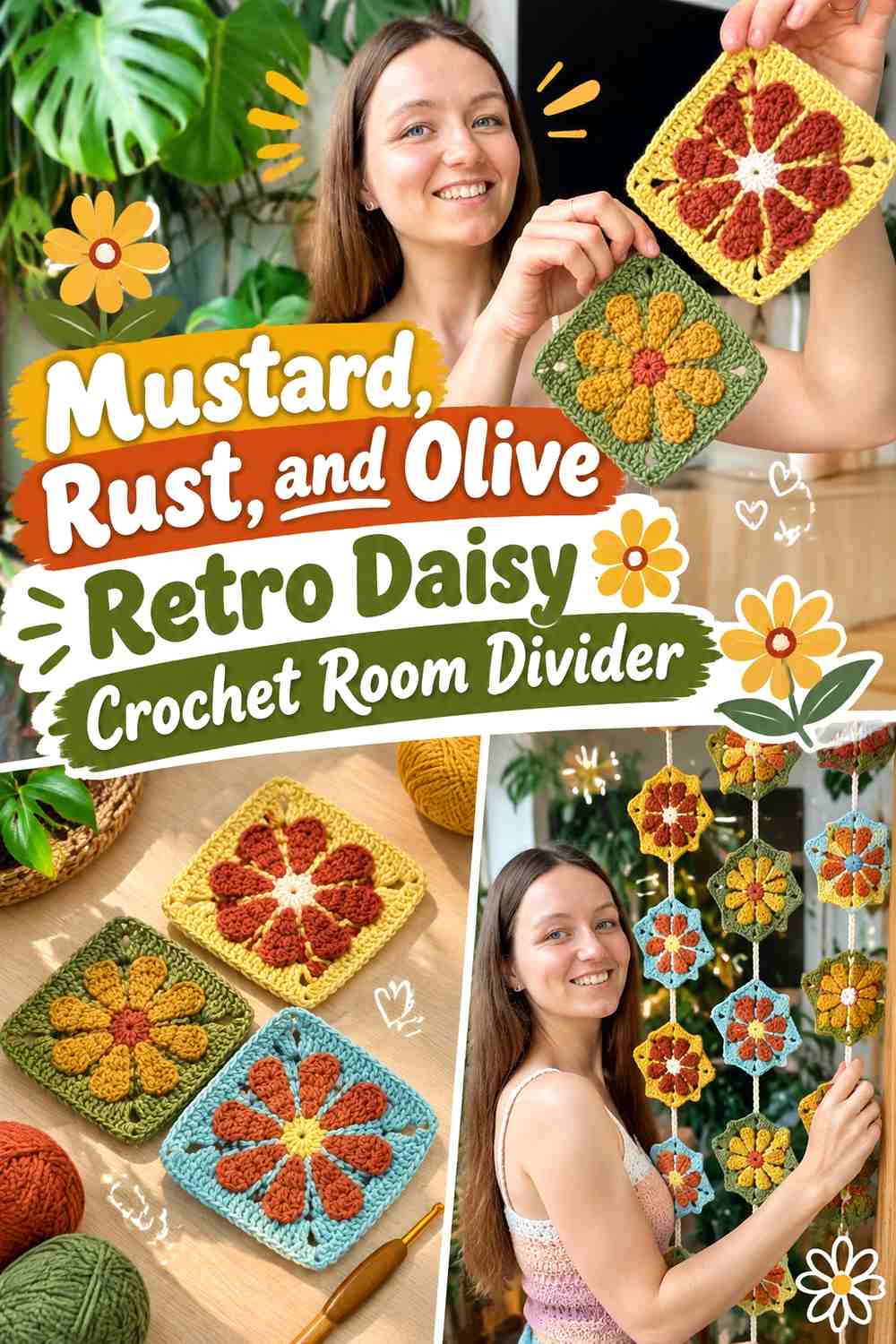
This palette stays almost entirely within earthy midtones, so color hierarchy becomes especially important. Mustard should provide the lightest visual note, rust can define the flower, and olive can connect the square backgrounds.
Use Mustard Where Rust and Olive Daisy Sections Need Contrast
Rust and olive are different hues but can be similar in value. Mustard at the flower center or petal level can provide the visual separation needed to keep the motif recognizable.
Do not scatter mustard randomly across the background if its main job is to clarify the flower.
Keep Olive Consistent Across Rust Retro Daisy Rows
Repeating one olive background through several rows gives a large room divider more continuity. Rust can then change position within the flowers without making the panel look disconnected.
For a more varied panel, change the flower colors before changing the background of every square.
Creator Credit: by Kristine
4. Teal, Cream, and Mustard Retro Daisy Crochet Room Divider
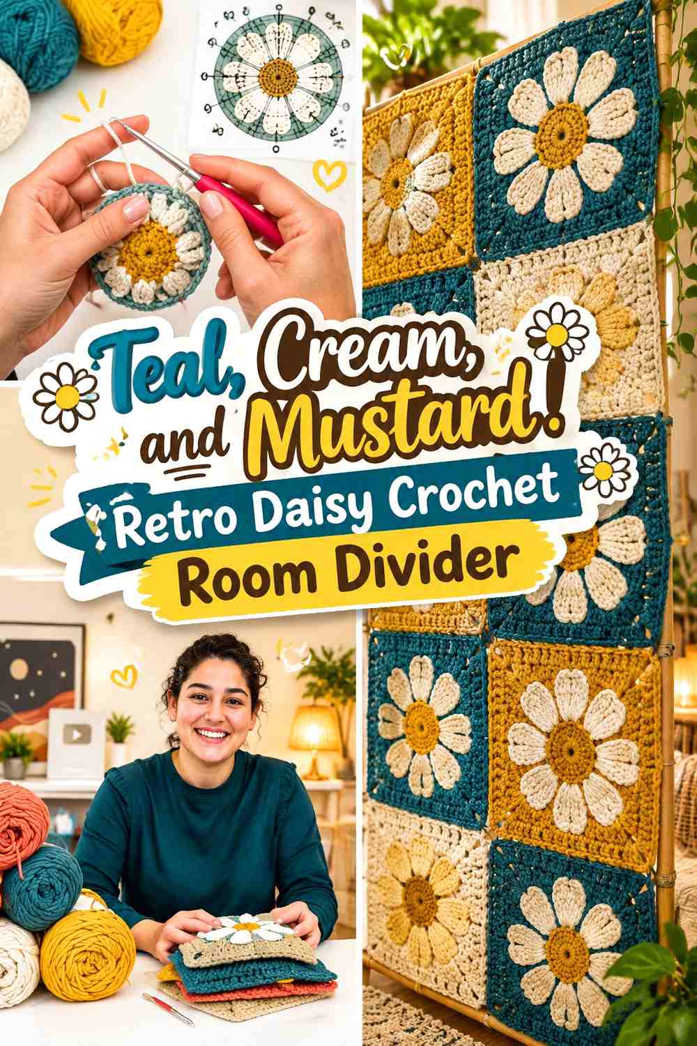
Teal gives this palette a cooler dominant field, while mustard introduces the retro warmth and cream prevents both stronger hues from competing directly. This works well when you want the divider to look colorful without being mostly orange, rust, or brown.
Put Cream Between Teal and Mustard Daisy Details
Cream petals provide a clear break between mustard centers and teal backgrounds. That three-step color structure remains readable even when the finished hanging is viewed from farther away.
If you replace cream with another pale neutral, preserve enough lightness to keep the flower outline visible.
Repeat Teal Down the Crochet Room Divider Instead of Across One Band
Avoid putting all the teal-heavy squares in one horizontal row. Repeating teal from the top through the bottom distributes its visual weight and helps the eye travel vertically through the divider.
Creator Credit: Elyse Myers
5. Dusty Pink, Burnt Orange, and Cream Retro Daisy Crochet Room Divider
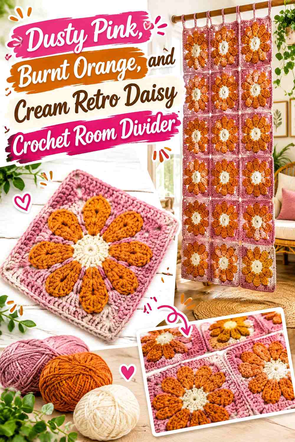
Dusty pink softens the usual orange-heavy retro palette. Burnt orange can define centers or selected petals, while cream provides a consistent neutral that prevents neighboring pink and orange shapes from merging.
Let Dusty Pink Cover More Space Than Burnt Orange
Dusty pink can handle the square background or larger flower sections because its muted character is less visually aggressive. Burnt orange becomes more noticeable when it appears in smaller repeated amounts.
This balance is particularly useful over a large hanging surface.
Repeat Cream Through Dusty Pink and Burnt Orange Daisy Rows
Cream can serve as the one constant color while pink and orange change roles from square to square. That creates variety without making every row feel like a different palette.
Creator Credit: Adore Crea Crochet
6. Avocado, Tangerine, and Cream Retro Daisy Crochet Room Divider
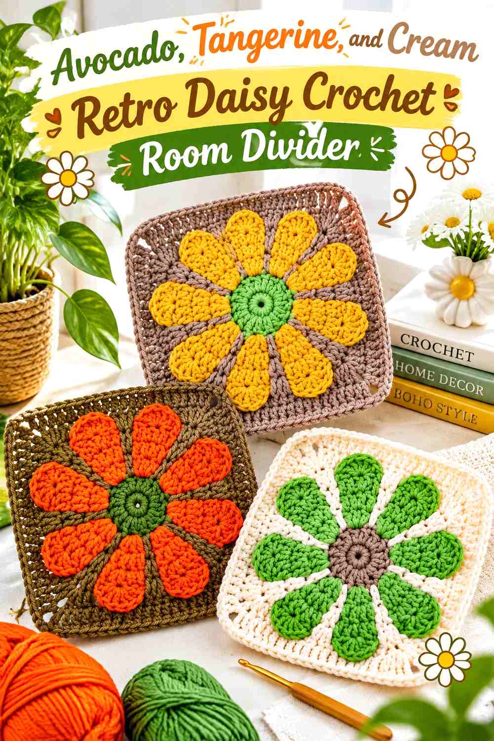
Avocado and tangerine provide a stronger complementary contrast than closely related earthy shades. Cream should act as the stabilizing color so the entire divider does not become an equal competition between bright green and orange.
Keep Tangerine Smaller Than Avocado Across the Crochet Divider
Use tangerine in daisy centers, selected petals, or occasional background squares rather than letting it cover half of every motif. Avocado can carry more visual area without making the whole panel feel overly warm.
Use Cream Around Tangerine Daisy Motifs on Avocado Backgrounds
Cream gives tangerine a lighter boundary before the flower reaches the green background. That distinction matters when the divider is viewed against a room full of furniture and other colors.
Creator Credit: Sirin’s Crochet
7. Chocolate, Mustard, and Ivory Retro Daisy Crochet Room Divider
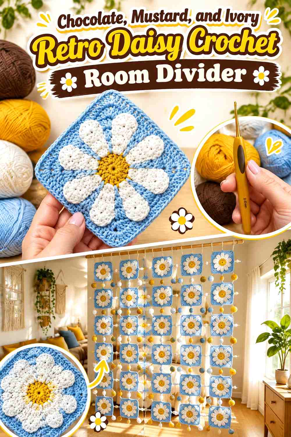
Chocolate makes a strong grid or background color, mustard provides a warm flower accent, and ivory keeps the overall panel from becoming too dark. This palette benefits from leaving substantial ivory visible.
Use Ivory to Keep Chocolate Crochet Squares From Feeling Heavy
If chocolate covers every background and join, a tall panel can become visually dense. Ivory borders, alternate backgrounds, or connecting rows can lighten the grid without losing the retro brown palette.
Repeat Mustard Daisy Centers Through Chocolate and Ivory Sections
Keeping the mustard centers consistent is an effective way to connect dark and light squares within the same divider. The eye recognizes the repeated flower center even when the surrounding background changes.
Creator Credit: Crochetclubstore
8. Powder Blue, Rust, and Cream Retro Daisy Crochet Room Divider
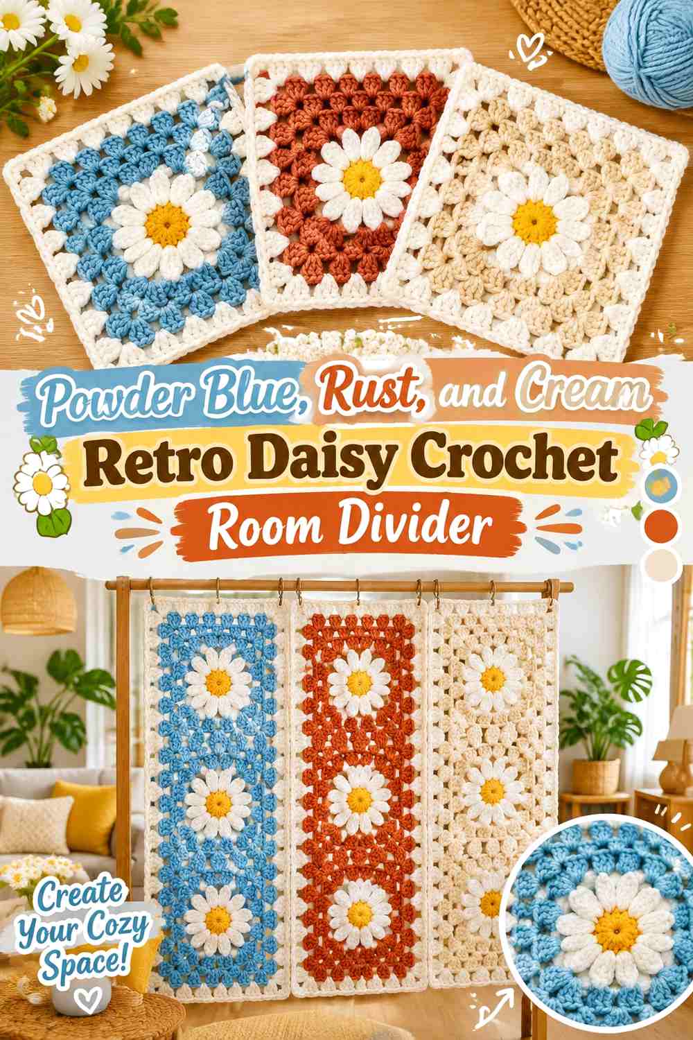
Powder blue shifts this divider toward a softer mid-century color direction. Rust supplies the warm contrast, while cream keeps the transition from cool blue to earthy orange-brown from becoming abrupt.
Let Powder Blue Create Large Quiet Areas Around Rust Daisies
Use blue consistently across several neighboring square backgrounds instead of treating it as a tiny accent. That allows rust flowers to become the focal color without making the panel predominantly warm.
Keep Cream Visible Between Powder Blue and Rust Crochet Sections
Cream can appear in petals, borders, or joins. Its role is especially useful where narrow rust details would otherwise disappear against a medium-value blue.
Creator Credit: Jayda InStitches
9. Plum, Ochre, and Blush Retro Daisy Crochet Room Divider
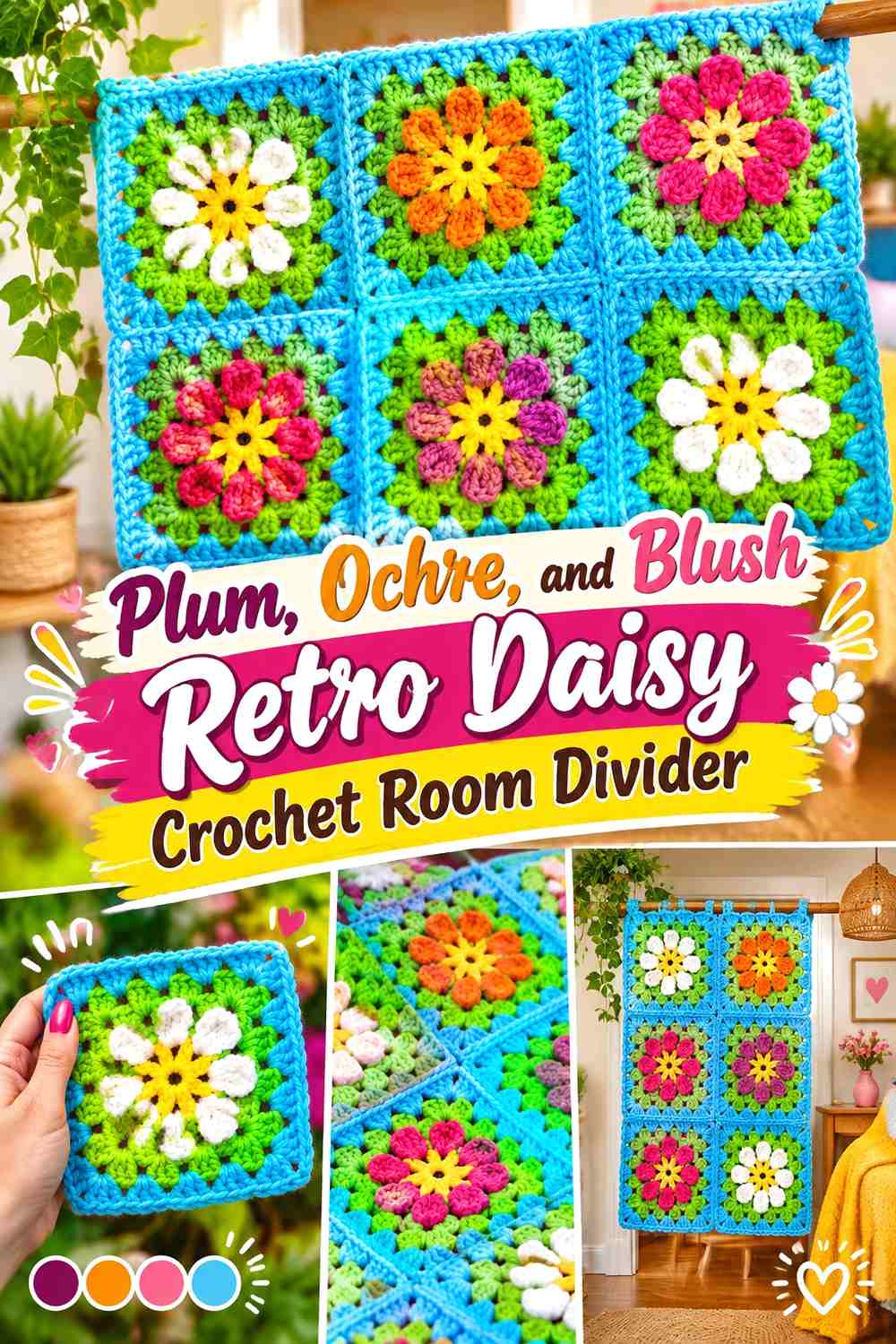
Plum creates a deeper retro alternative to brown, while ochre supplies warmth and blush keeps the combination from becoming overly dark. Because plum carries significant visual weight, use it strategically through the panel instead of creating one dense lower section.
Distribute Plum Daisy Backgrounds From Top to Bottom
Alternate plum-led squares with blush-led ones so the deepest color travels throughout the full divider. Concentrating plum along the bottom can make the panel appear visually bottom-heavy.
Use Ochre to Connect Plum and Blush Retro Daisy Motifs
Ochre can remain consistent in flower centers or a particular petal round while plum and blush exchange dominant roles. That repeated warm detail keeps the changing square colors connected.
Creator Credit: naztazia
10. Brick Red, Oatmeal, and Olive Retro Daisy Crochet Room Divider

Brick red provides a muted warm focal color, oatmeal creates the lightest space, and olive gives the divider its botanical retro base. This palette suits a panel where you want strong color without extremely bright saturation.
Keep Brick Red Smaller Than Olive Across the Crochet Divider
Brick red can become dominant quickly when repeated across many motifs. Use it in flower centers, selected petals, or occasional backgrounds while olive occupies more of the overall grid.
Use Oatmeal to Separate Brick Red From Olive Daisy Sections
Oatmeal is useful in petals and joining lines because it gives the two deeper earthy colors a visible boundary.
If the divider hangs against a pale wall, keep some olive or brick red along the outer edge so the panel itself remains defined.
Creator Credit: Make & Do Crew
11. Cobalt, Mustard, and Warm White Retro Daisy Crochet Room Divider

Cobalt makes this one of the bolder room-divider options. Mustard supplies the vintage warmth, while warm white prevents a blue-and-yellow combination from looking too stark.
Use Cobalt as a Repeating Crochet Daisy Background
Cobalt backgrounds can create a strong visual rhythm when repeated through selected columns. Keeping some neighboring squares warm white prevents the whole divider from becoming one uninterrupted dark-blue surface.
Place Mustard Centers Against Warm White and Cobalt Strategically
Mustard will behave differently against each background. It appears more strongly separated from cobalt and more subtly against warm white.
Use that difference intentionally: cobalt-backed daisies can become focal motifs while white-backed daisies provide visual rest.
Creator Credit: RaffamusaDesigns – Crochet Patterns and Tutorials
12. Terracotta, Sage, and Cream Retro Daisy Crochet Room Divider
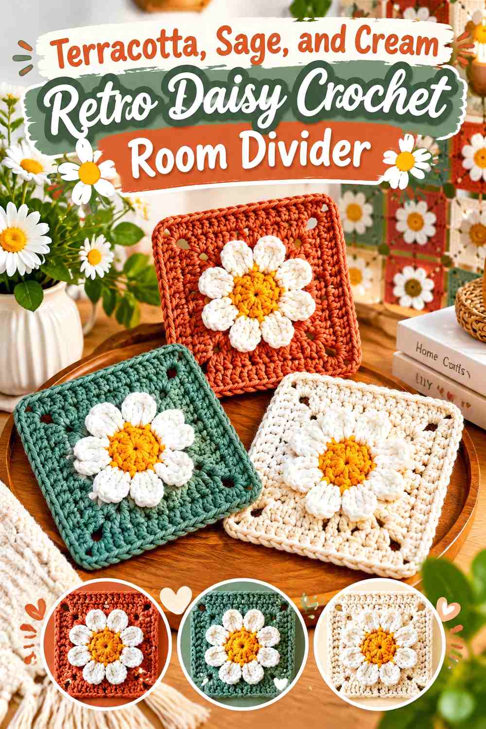
Terracotta and sage create an earthy warm-cool relationship, while cream keeps the flowers readable. Sage can carry more of the backgrounds, with terracotta concentrated in the daisy centers and selected petals.
Let Sage Connect Terracotta Crochet Daisies Across the Panel
A repeated sage background or join makes multiple terracotta flowers feel like part of one continuous composition. This is particularly useful on an open room divider where the spaces between motifs are also visible.
Keep Cream Petals Clear Against Sage and Terracotta
Cream should remain noticeably lighter than both surrounding colors. If the chosen sage is very pale, consider using terracotta immediately around parts of the flower so the cream petals do not disappear.
Creator Credit: VivCrochets
13. Black, Cream, and Burnt Orange Retro Daisy Crochet Room Divider

Black creates the sharpest grid in the collection, so it needs the most restraint. Cream should occupy substantial surface area, with burnt orange supplying the main retro accent.
Keep Black Narrow Around Cream Crochet Daisy Squares
Use black as a joining line, occasional background, or perimeter rather than covering every large square area. A little black repeated throughout the panel is enough to create strong definition.
Repeat Burnt Orange Through Cream Daisy Centers
Burnt orange centers keep the panel warm even when black defines the structure. Repeating that same orange from top to bottom prevents the high-contrast black grid from becoming the only feature visible at a distance.
Creator Credit: Spreeberry
14. Camel, Turquoise, and Coral Retro Daisy Crochet Room Divider
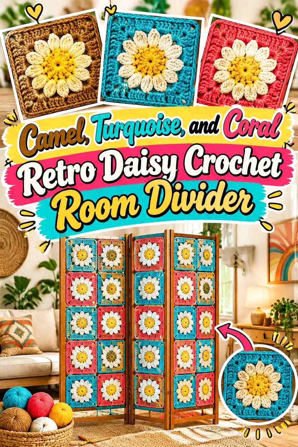
Camel creates a warm neutral foundation while turquoise and coral deliver the strongest color. Instead of giving both accent hues equal area, let turquoise carry the larger secondary role and reserve coral for focal daisy details.
Use Camel to Calm Turquoise Crochet Daisy Backgrounds
Camel joins or alternating backgrounds create neutral sections between saturated turquoise motifs. This makes a large divider easier to coordinate with the surrounding room.
Keep Coral Smaller Than Turquoise Across the Daisy Panel
Coral can repeat in flower centers or selected petals without covering entire rows. Because it contrasts noticeably with turquoise, small amounts remain visible even across a large hanging.
Creator Credit: Jackie Wall Studio
15. Burgundy, Peach, and Cream Retro Daisy Crochet Room Divider
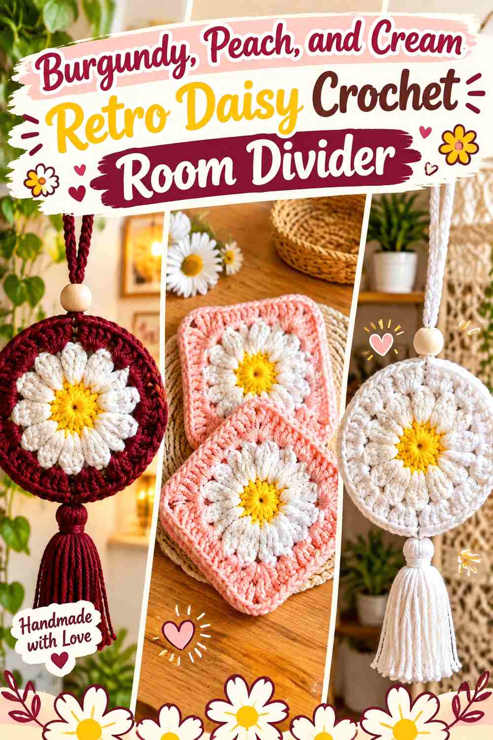
Burgundy provides depth, peach introduces a lighter warm color, and cream gives both enough breathing room. For a tall divider, distribute burgundy carefully so one portion of the hanging does not become much darker than the rest.
Spread Burgundy Daisy Details Vertically Through the Divider
Rather than placing burgundy backgrounds in one row, repeat darker motifs at intervals down the panel. Peach or cream squares between them can keep the vertical rhythm balanced.
Use Cream to Separate Burgundy From Peach Crochet Flowers
Peach and burgundy already have strong value contrast, but cream can stop the transition from becoming too abrupt. It is particularly useful as a petal shade or quiet join.
Creator Credit: keifa krochets 🧶
16. Pistachio, Terracotta, and Ivory Retro Daisy Crochet Room Divider
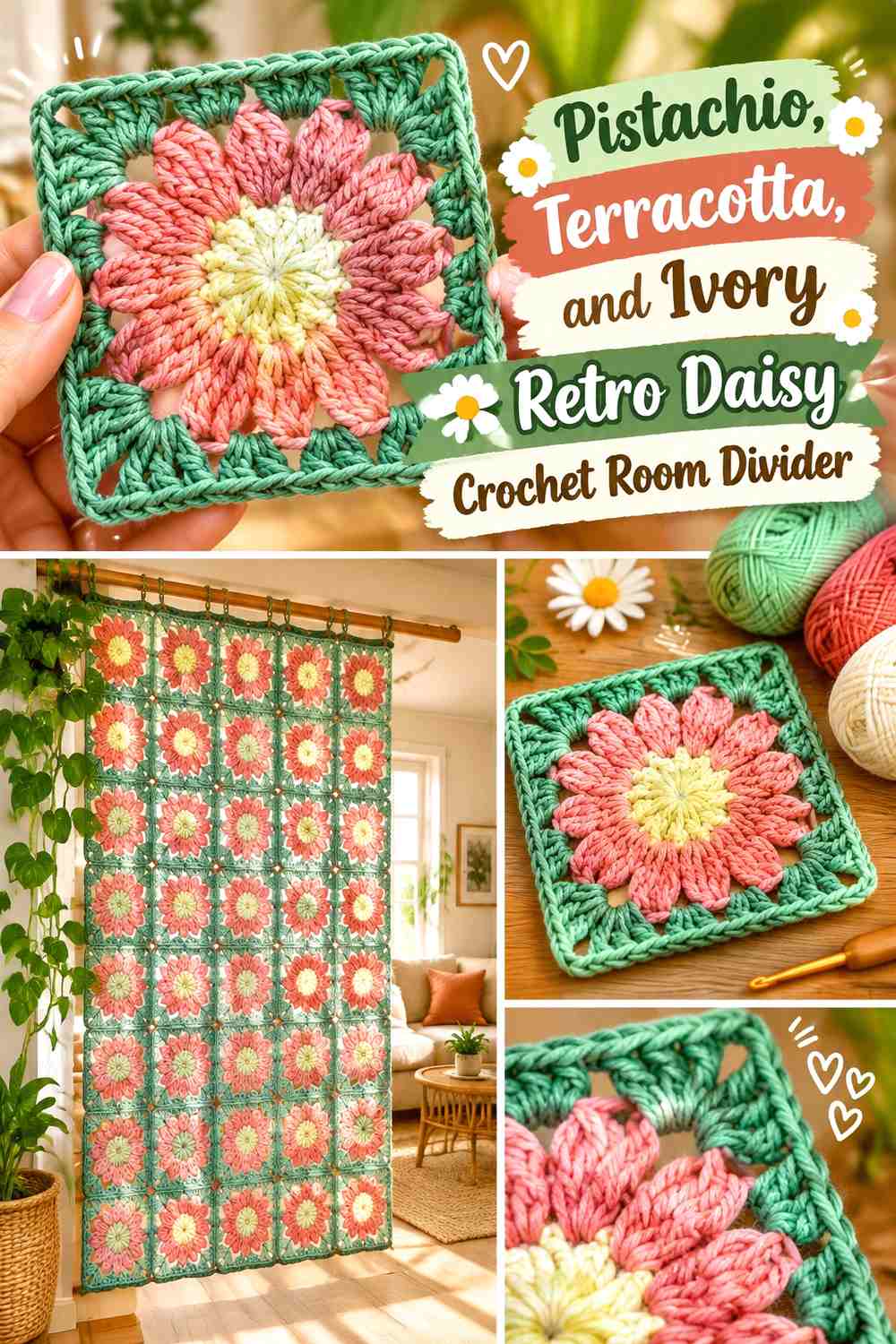
Pistachio makes this version lighter than avocado or olive, while terracotta maintains the 1970s warmth. Ivory works as the neutral connector and should be used where the pale green needs clearer definition.
Let Pistachio Cover More Crochet Room Divider Backgrounds
A pistachio-led grid keeps the large hanging visually light. Terracotta can then become the repeated flower accent without filling too much of the panel.
Put Ivory Around Terracotta Daisies on Pistachio Squares
Ivory petals create a soft intermediate layer between the warm center and cool-green background. If pistachio is extremely pale, make sure the ivory remains visibly different enough to preserve the flower outline.
Creator Credit: PurlnHook
17. Navy, Ochre, and Rust Retro Daisy Crochet Room Divider
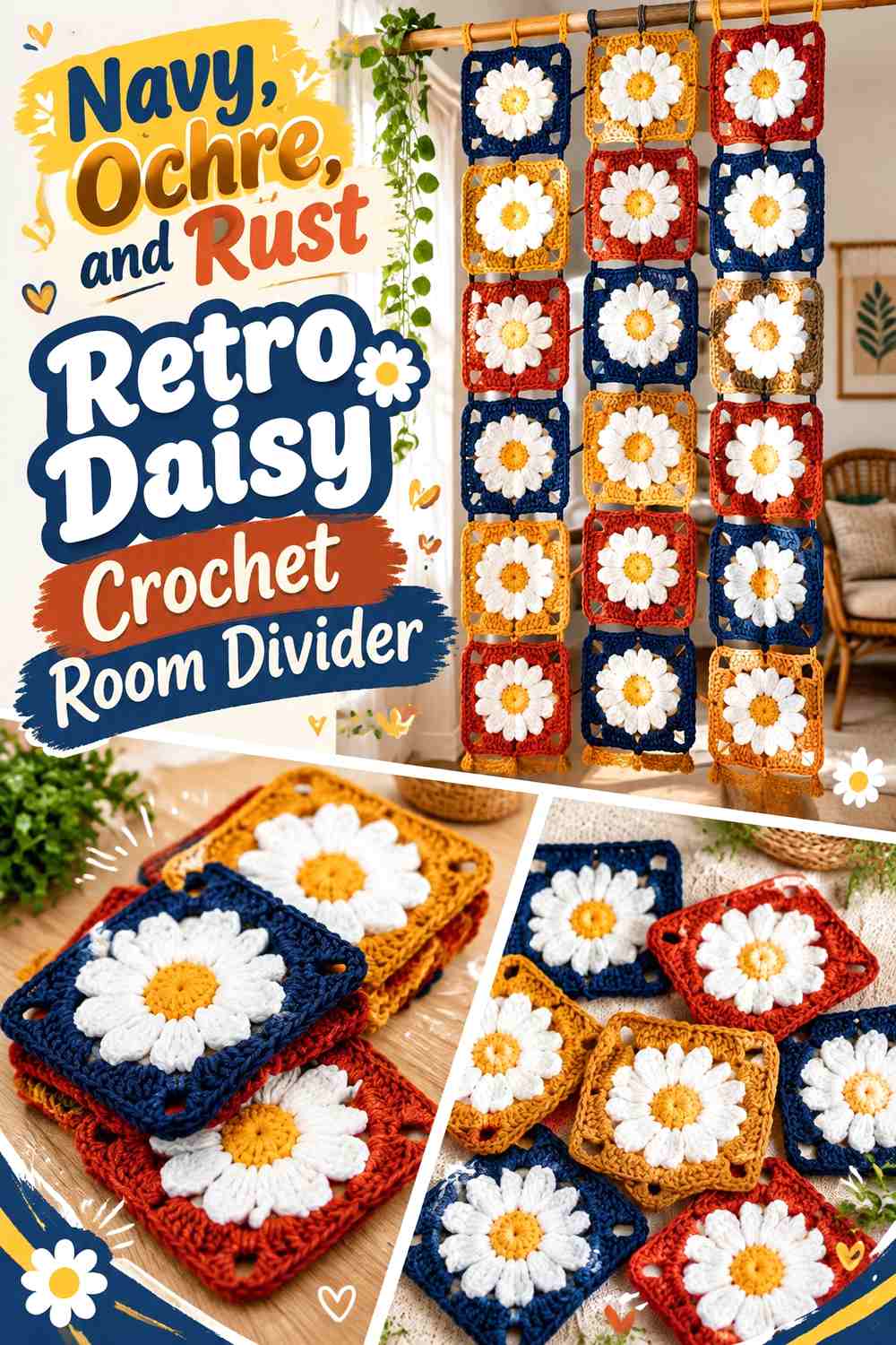
Navy provides a darker alternative to chocolate or black, while ochre and rust keep the panel unmistakably warm and retro. Because all three shades can carry substantial visual weight, protect some open space within the motif grid instead of making every join and border equally dense.
Let Ochre Brighten Navy Crochet Daisy Backgrounds
Ochre centers or petals remain highly visible against navy and can guide the eye through the divider. Repeat ochre regularly instead of concentrating it at the center of the panel.
Keep Rust Secondary to Navy and Ochre Across the Room Divider
Rust works particularly well as a middle-value bridge between dark navy and lighter ochre. Use it in selected petals, joins, or alternate flower centers rather than assigning all three colors equal amounts.
This gives the palette a hierarchy and keeps the daisies recognizable from farther away.
Creator Credit: Crafting Happiness Crochet
Which Retro Daisy Crochet Room Divider Palette Should You Choose?
For the most recognizable 1970s direction, mustard with cream and avocado, burnt orange with cream and chocolate, or mustard with rust and olive gives the strongest earthy retro reference.
For a lighter divider, powder blue with rust and cream, terracotta with sage and cream, or pistachio with terracotta and ivory gives more visual breathing room. These combinations are particularly useful when the divider will hang in front of a darker wall or when you want the open spaces between motifs to remain noticeable.
Cobalt with mustard, camel with turquoise and coral, and black with cream and burnt orange create the strongest graphic impact. Burgundy, plum, chocolate, and navy provide deeper alternatives when the room needs a more grounded hanging, but distribute those colors vertically rather than collecting them near the bottom.
Conclusion
A successful retro daisy crochet room divider needs to work both as a collection of individual flowers and as one large hanging panel. Start with the daisy itself, but judge the palette again after several motifs are placed side by side.
Mustard, cream, avocado, and burnt orange create the most recognizable vintage direction. Teal, cobalt, powder blue, sage, and pistachio can cool that palette, while chocolate, burgundy, plum, navy, or black add stronger definition.
Most importantly, decide which color will connect the complete divider. A repeated background or joining shade can unify dozens of changing daisies far more effectively than making every flower identical. Use the linked creator tutorials for the individual motif construction, then plan your final layout, panel size, joins, and hanging arrangement for the specific space where the divider will be used.
Frequently Asked Questions
What colors work best for a retro daisy crochet room divider?
Mustard, avocado, burnt orange, rust, chocolate, cream, teal, dusty pink, and olive all suit a vintage-inspired direction. You do not need to use all of them. Three well-defined color roles usually create a more controlled panel than many equally strong shades.
Should every retro daisy square use the same colors?
No. You can keep one color constant and rotate the others. For example, every motif could use cream petals while mustard, rust, teal, and avocado change between the centers and backgrounds. The repeated cream would keep the divider connected.
What joining color works best for a crochet daisy room divider?
Use a dark join such as chocolate, navy, or black when you want the grid to be obvious. Cream, oatmeal, or a repeated background shade creates a quieter transition. Compare several joined samples because the joining color repeats across far more of the finished panel than it does in one square.
How do I stop a crochet room divider from looking too busy?
Reduce the number of competing background colors, repeat one joining shade, and leave some visual breathing room between strongly colored sections. You can also organize color changes in columns or loose repeats instead of making every square completely different.
How can I keep daisy motifs visible from across the room?
Prioritize light/dark value contrast between the center, petals, and square background. Cream petals against chocolate, navy, teal, olive, or terracotta usually create clearer separation than three medium-value colors used together. Test a few motifs from normal viewing distance before making the full set.
Should darker crochet squares go at the bottom of the divider?
Not automatically. Putting all chocolate, burgundy, plum, black, or navy motifs at the bottom can make the panel visually bottom-heavy. Distributing darker squares through the full height generally creates better balance unless a deliberate gradient is the goal.
Can I combine different retro daisy granny-square tutorials in one room divider?
You can, but first compare the finished dimensions and visual density of the motifs. Squares that will be joined into one panel need compatible sizing or an intentional method of equalizing them. For the most predictable grid, using one motif construction and creating variety through color is often the simpler approach.