Crochet wall panels can carry geometric color especially well because the whole surface is visible at once. Diamonds, stepped lines, circles, arches, raised cables, bobbles, and negative space all become more noticeable when the palette gives each shape a clear visual role.
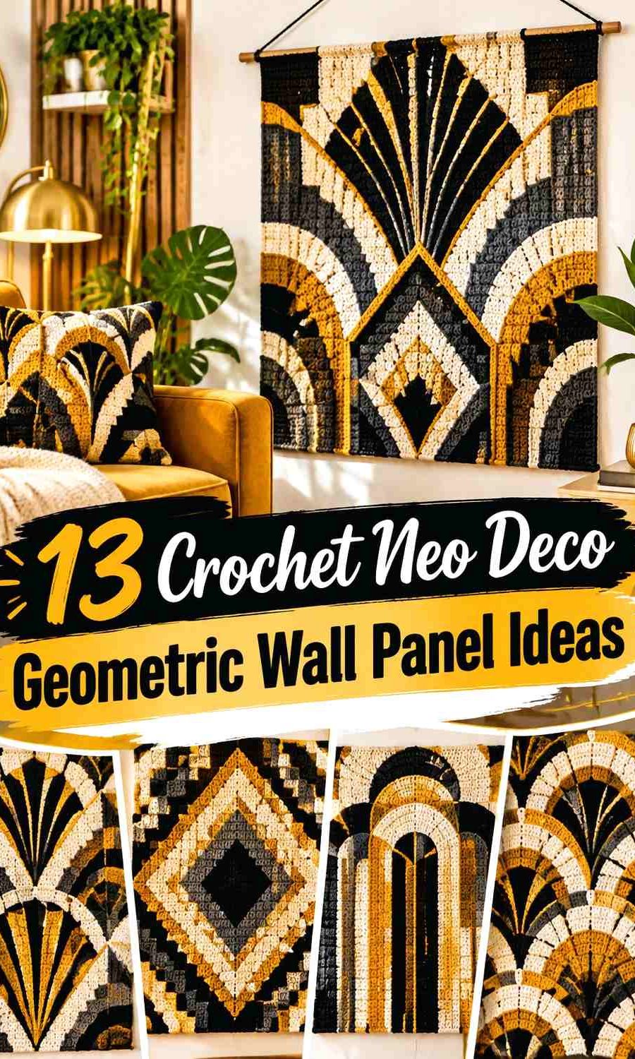
For this collection, Neo Deco means a contemporary geometric direction built from strong symmetry, repeated shapes, dark anchors, refined neutrals, and controlled accent colors. The idea is not to cover every panel with equal amounts of several shades. Instead, one color establishes the field, another builds the geometry, and a smaller accent can sharpen selected lines, borders, or fringe.
The tutorials below support different wall-hanging and panel constructions. The color schemes are independent adaptations, so the credited creators are not being presented as the source of the proposed palettes.
Quick List
- Black, Warm White, and Ochre Crochet Stepped Diamond Wall Panel
- Emerald, Cream, and Charcoal Crochet Cable Grid Wall Panel
- Burgundy, Dusty Rose, and Cream Crochet Diamond Bobble Wall Panel
- Deep Teal, Camel, and Ecru Crochet Tunisian Line Wall Panel
- Charcoal, Bone, and Rust Crochet Mock-Macramé Wall Panel
- Terracotta, Sand, and Soft Black Crochet Tapered Wall Panel
- Plum, Pearl Gray, and Beige Crochet Banded Wall Panel
- Navy, Ivory, and Mustard Crochet Circle Grid Wall Panel
- Sage, Charcoal, and Cream Crochet Puff Geometry Wall Panel
- Olive, Oatmeal, and Espresso Crochet Framed Wall Panel
- Cobalt, Warm White, and Rust Crochet Wave Wall Panel
- Petrol Blue, Camel, and Cream Crochet Tapestry Wall Panel
- Espresso, Ecru, and Muted Gold Crochet Graphic Wall Panel
Build a Neo Deco Crochet Palette Around a Clear Dark Anchor
A dark anchor is useful when a wall panel contains several geometric elements. Black, charcoal, navy, espresso, burgundy, or deep teal can define the outer frame, create a repeated line, or occupy the largest background area while lighter shades carry the motif.
The dark shade does not always need to dominate. On a dark-painted wall, reversing the hierarchy and making cream, ecru, sage, or warm white the main field may give the complete crochet panel a clearer silhouette.
Avoid dividing three strong colors into equal visual thirds unless that balanced block effect is intentional. Neo Deco geometry usually reads more cleanly when one color establishes the structure and the others have specific jobs.
Use Light-and-Dark Contrast to Protect Crochet Geometry
A diamond can disappear even when its yarn color is completely different from the background if both colors have similar lightness. The same issue affects narrow arches, bobble lines, cable crossings, and thin tapestry shapes.
Compare the yarns side by side before beginning the panel. A grayscale photo can help reveal whether the motif and background have enough value separation. For very small geometric details, stronger light-dark contrast is generally more useful than simply choosing different hues.
Texture also matters. Raised cables and bobbles create their own shadows, so they may tolerate a more restrained tonal palette than flat tapestry colorwork.
Treat the Wall Color as Part of the Crochet Color Scheme
A wall panel does not exist against a blank background. The paint or wallpaper surrounding it becomes another large color field.
A black-and-cream crochet panel can look very graphic on a pale wall but more blended on charcoal paint. Emerald can become the main focal color on warm white, while cream may become more important if the wall is dark green or navy.
Test the yarn against the intended wall whenever possible. This is particularly useful around the outer edge because a beautifully defined internal motif can still lose impact if the whole panel blends into its background.
1. Black, Warm White, and Ochre Crochet Stepped Diamond Wall Panel
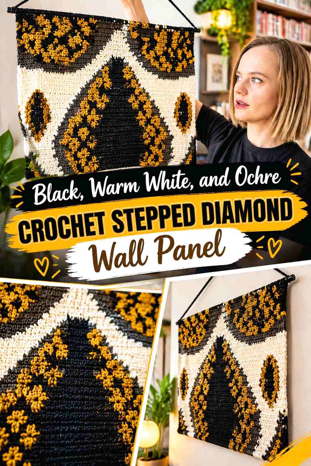
Black establishes the strongest architectural structure in this palette, while warm white creates the open field needed for a stepped diamond to remain readable. Ochre works better as a controlled accent than as a third equal block, especially if you want the panel to feel geometric rather than striped.
Use black around the principal diamond or stepped line, warm white across most of the surrounding crochet fabric, and ochre at selected corners, small interior blocks, or fringe details.
Let Warm White Give the Black Crochet Diamond Enough Negative Space
A black diamond needs room around its edges. Keeping warm white on both sides of the major lines prevents separate black sections from visually joining into one large dark mass.
This becomes especially important near the center, where several diagonal steps may approach each other.
Keep Ochre Smaller Than Black in the Warm White Crochet Panel
Ochre can repeat at two or three strategic points so the color looks intentional without competing with the main black geometry. A narrow ochre step, small center shape, or limited fringe section is enough.
If ochre starts occupying as much surface as black, the viewer may begin reading two competing patterns rather than one main geometric composition.
Creator Credit: Sonya Needlehands
2. Emerald, Cream, and Charcoal Crochet Cable Grid Wall Panel
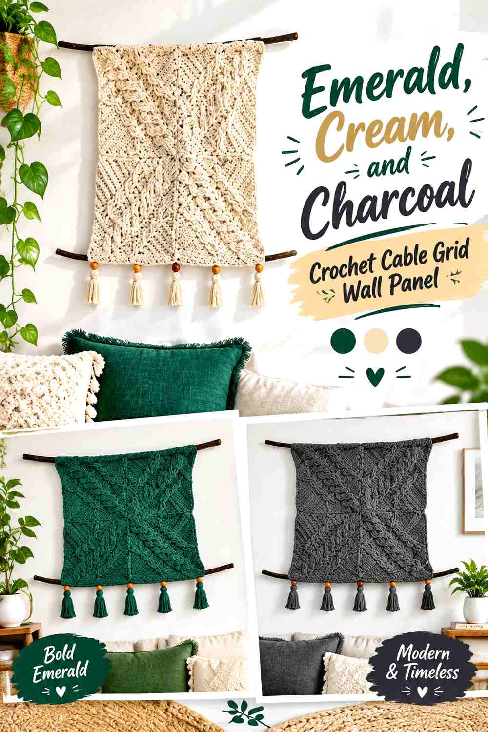
A square-based cable wall panel naturally creates a grid, making it a strong foundation for a more structured Neo Deco palette. Emerald can carry the featured cable areas, cream can open up selected squares, and charcoal can visually connect the separate motifs.
The useful decision here is not simply which color goes in each square, but how the four sections relate once they are assembled into one larger panel.
Repeat Emerald Across the Crochet Cable Grid Instead of Isolating It
Place emerald in more than one part of the grid so the eye moves across the full wall panel. One isolated green square can feel detached, while a repeated emerald cable creates continuity.
Cream can occupy the remaining major surfaces without competing with the cable relief.
Use Charcoal to Connect Cream and Emerald Crochet Squares
Charcoal is most effective in smaller structural areas such as joins, selected borders, or repeated cable details. Its darkness can visually connect the grid while giving cream and emerald stronger separation.
Avoid surrounding every square with a very heavy charcoal frame if the cables themselves are already dense; too many dark boundaries can make each motif feel boxed in.
Creator Credit: HanJan Crochet
3. Burgundy, Dusty Rose, and Cream Crochet Diamond Bobble Wall Panel
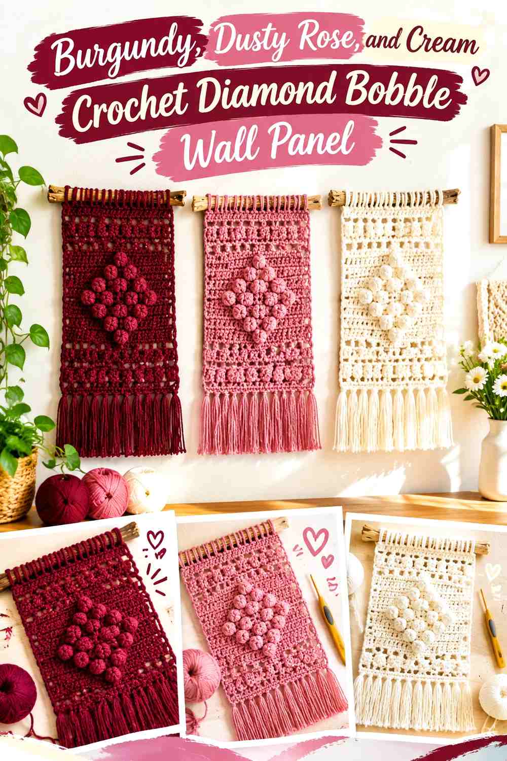
Raised bobbles already produce a geometric effect through texture, so this palette can remain softer than a flat tapestry design. Burgundy gives the diamond visual depth, dusty rose creates a gentler transition, and cream keeps the surrounding field open.
Rather than changing the entire background repeatedly, use color to reinforce the bobble geometry that is already present.
Burgundy Can Strengthen the Crochet Diamond Without Covering the Whole Panel
Use burgundy around the central diamond, selected bobble lines, or another major geometric path. Concentrating the darkest color in the motif helps the eye recognize its shape quickly.
A burgundy background with cream bobbles could also work, but it would create a much heavier panel and a stronger dark-wall effect.
Dusty Rose Can Bridge Burgundy and Cream Crochet Bobbles
Dusty rose is useful between the deepest and lightest values. It can occupy a secondary diamond, a short band, or a limited group of bobbles where a direct burgundy-to-cream change feels too sharp.
Keep enough cream visible around smaller raised details so the relief does not become lost in several similar midtones.
Creator Credit: Love & Stitch
4. Deep Teal, Camel, and Ecru Crochet Tunisian Line Wall Panel

Tunisian crochet creates a firm-looking surface that can support simple embroidered or colorworked geometry without requiring many shades. Deep teal provides the visual anchor, camel introduces warmth, and ecru supplies the lightest spacing color.
This palette suits arrows, stepped lines, narrow diamonds, or repeated vertical marks where clean spacing matters more than large color blocks.
Keep Deep Teal as the Main Crochet Tunisian Field
A deep teal background allows camel and ecru geometry to appear as deliberate marks instead of competing background sections. It also gives the narrow wall panel a stronger single-color silhouette.
On a dark wall, reverse the arrangement and let ecru dominate while teal moves into the motif.
Use Camel Between Deep Teal and Ecru Crochet Lines
Camel can soften the jump from very dark teal to light ecru. Place it in a second line, smaller arrow, or interior band rather than outlining every ecru element.
That restraint prevents the panel from turning into a series of three-color stripes.
Creator Credit: Noor’s Knits
5. Charcoal, Bone, and Rust Crochet Mock-Macramé Wall Panel
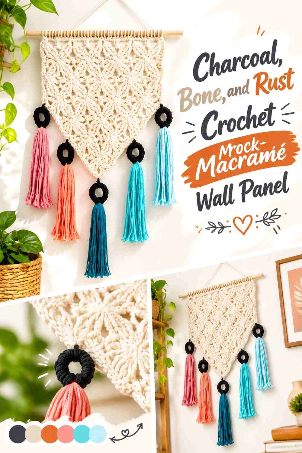
A mock-macramé construction relies heavily on raised and connected crochet texture, so the color plan should support the structure rather than hide it. Bone can cover most of the open and raised sections, charcoal can define selected structural lines, and rust can become the small warm accent.
This arrangement gives the knot-like geometry enough contrast without turning every texture change into a color change.
Let Bone Reveal the Charcoal Crochet Structure
Bone is light enough to expose shadows around raised stitches. If charcoal is restricted to key connecting sections, those dark areas can emphasize the panel’s strongest vertical or diagonal geometry.
A charcoal-heavy version will feel substantially denser, so increase the light-color share if the panel begins looking visually closed.
Keep Rust Away From Every Charcoal Crochet Crossing
Rust works better as a repeated accent than as an outline around the entire structure. A few rust tassels, small wrapped details, or a limited geometric band can warm the charcoal-and-bone combination.
Repeating rust in two separated locations usually feels more connected than introducing it only once at the bottom.
Creator Credit: Yarnspirations
6. Terracotta, Sand, and Soft Black Crochet Tapered Wall Panel
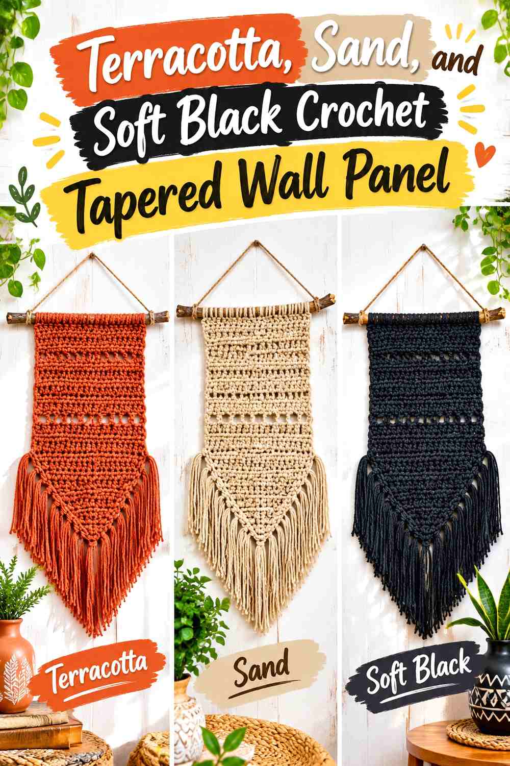
A tapered panel already has a strong geometric silhouette, so the colors can emphasize its horizontal divisions. Terracotta works well as the dominant field, sand creates breathing room, and soft black can mark one or two narrow structural bands.
The triangular lower section should remain visually connected to the upper panel rather than looking like a separately colored attachment.
Continue Terracotta Into the Crochet Tapered Lower Shape
Carrying terracotta through both the rectangular and narrowing portions helps the whole piece read as one wall panel. Sand can interrupt it with broader horizontal sections, but terracotta should reappear below.
This repetition is more cohesive than assigning one color exclusively to the top and another exclusively to the bottom.
Use Soft Black as a Narrow Divider Between Terracotta and Sand
A slim dark band can give two warm shades a cleaner break. It works particularly well above the tapered section or around an openwork band where the geometry changes.
Keep soft black limited if the panel is small; broad dark sections can visually shorten the lighter central area.
Creator Credit: You Should Craft
7. Plum, Pearl Gray, and Beige Crochet Banded Wall Panel

Plum gives this palette its strongest color identity, while pearl gray and beige create two different neutrals rather than one simple light background. The panel can use broad bands, open sections, and repeated stitch textures to create geometry without relying entirely on tapestry colorwork.
The key is making pearl gray and beige serve different jobs.
Give Plum the Strongest Crochet Wall-Panel Bands
Use plum where you want the eye to stop: a central stripe, repeated geometric band, or key lower section. It should occupy fewer but more intentional areas than the neutrals.
If plum appears in every narrow row, the visual rhythm can become busy and reduce the impact of the larger shapes.
Separate Pearl Gray and Beige Across the Plum Crochet Panel
Pearl gray can support cooler openwork or upper sections, while beige can sit nearer the fringe or warmer lower area. Keeping them in separate visual zones allows two light neutrals to remain distinguishable.
If the two shades are extremely close in value, treat them as a tonal transition instead of expecting strong geometry from the difference alone.
Creator Credit: Bloodimaryart Crochet
8. Navy, Ivory, and Mustard Crochet Circle Grid Wall Panel
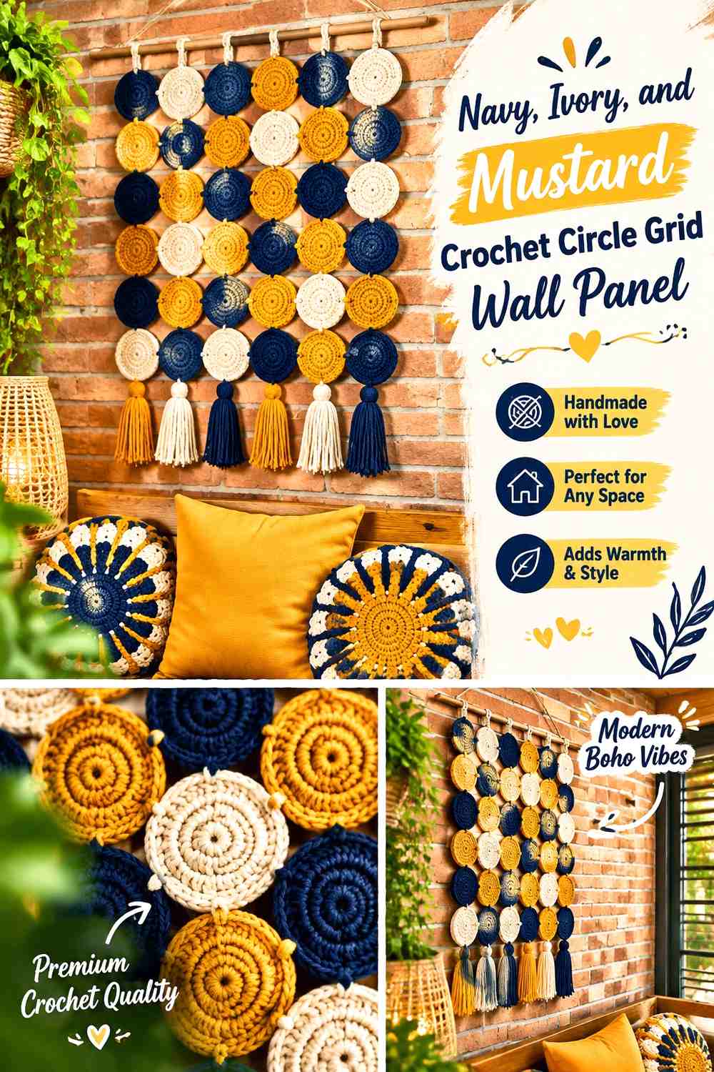
Repeated circles provide a different type of Neo Deco geometry from diamonds and stepped lines. Navy can unify the panel, ivory can keep individual circles distinct, and mustard can mark selected centers or a smaller group of motifs.
The repetition already creates rhythm, so color does not need to change in every circle.
Repeat Navy Across Enough Crochet Circles to Hold the Grid Together
Navy works well on outer rounds, selected full motifs, or another repeated structural position. Using it consistently helps many individual circles read as one wall installation.
If every circle follows a completely different palette, the panel will move away from the controlled Neo Deco direction and toward a more eclectic look.
Use Mustard Inside Ivory Crochet Circles as a Small Focal Accent
Mustard can be strongest in the centers because small circular accents repeat clearly without overwhelming the navy structure.
Ivory should remain around enough mustard sections to stop adjacent warm accents from visually merging.
Creator Credit: The Crochet Crowd
9. Sage, Charcoal, and Cream Crochet Puff Geometry Wall Panel

Sage gives a quieter base than emerald or teal, making it useful when raised puff stitches are intended to provide most of the visual interest. Cream can highlight selected puff areas, while charcoal supplies the sharpest graphic definition.
This is a good palette for a room where the wall art needs structure without becoming an extremely saturated focal point.
Let Sage Cover Most of the Crochet Wall-Panel Field
A sage background allows both cream and charcoal details to remain distinct. Because sage has its own recognizable color, the panel does not need many additional shades.
Use large uninterrupted sage areas around the raised motif so the puff geometry has space to register.
Reserve Charcoal for the Smallest Sage and Cream Crochet Details
Small geometric shapes often need the strongest contrast. Charcoal can define a central mark, narrow line, or small repeated accent where sage and cream might look too soft.
If the motif begins to feel fragmented, reduce the number of charcoal accents rather than adding another color.
Creator Credit: Jo to the World Creations
10. Olive, Oatmeal, and Espresso Crochet Framed Wall Panel

Olive and oatmeal provide an earthy base, while espresso gives a narrow framed construction much-needed depth. This combination works especially well when the crochet wall piece includes open spaces because the wall behind it becomes visible as part of the composition.
Treat the outer frame and internal crochet motif as two separate color decisions.
Use Olive Across the Main Crochet Motif Inside the Frame
Olive should control enough of the central fabric that the piece still has one obvious main color. Oatmeal can occupy open or lighter sections without competing for equal visual weight.
If the wall itself is olive or deep green, reverse those roles so the panel remains visible.
Put Espresso Where the Oatmeal Crochet Panel Needs a Strong Boundary
Espresso can appear close to the outer frame, central gathering point, or another structural edge. This dark boundary helps oatmeal remain visible instead of visually leaking into a pale wall.
Avoid filling every open section with espresso; the contrast works because the darkest shade is controlled.
Creator Credit: Day’s Crochet – Modern Crochet Patterns
11. Cobalt, Warm White, and Rust Crochet Wave Wall Panel
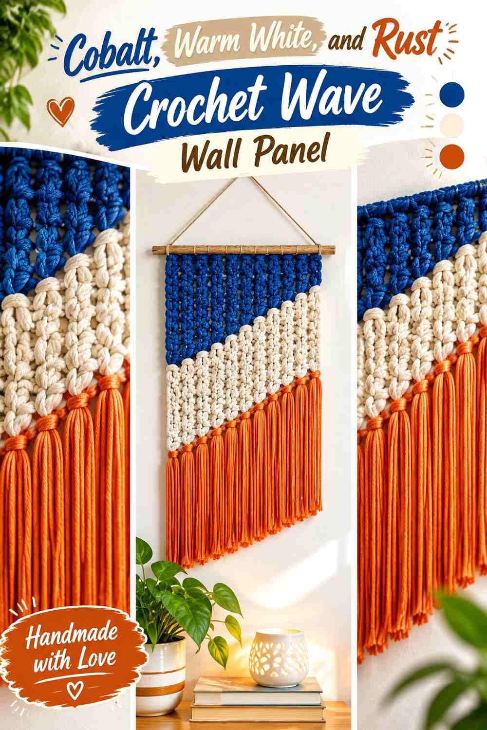
Cobalt and rust create a stronger hue contrast than most of the palettes above, so warm white needs to act as the visual buffer. A modern wall hanging with changes in stitch height, bobbles, and elongated texture already contains considerable movement; the colors should organize that movement.
Use cobalt for the largest cool sections, warm white between strong colors, and rust as the smaller warm interruption.
Give Cobalt the Largest Crochet Wave Sections
Broad cobalt areas create a clear color identity and can emphasize long rises, dips, or angular stitch changes. This is more controlled than alternating cobalt and rust every few rows.
Warm white can separate the larger sections so the texture remains legible.
Keep Warm White Between Cobalt and Rust Crochet Bands
Placing warm white directly between the strongest hues reduces the chance that the panel feels crowded. It also protects smaller bobbles or open stitchwork from getting lost where cobalt and rust meet.
For a quieter adaptation, substitute a softened blue for cobalt while maintaining its darker role.
Creator Credit: yokieB Crochet & Knit
12. Petrol Blue, Camel, and Cream Crochet Tapestry Wall Panel
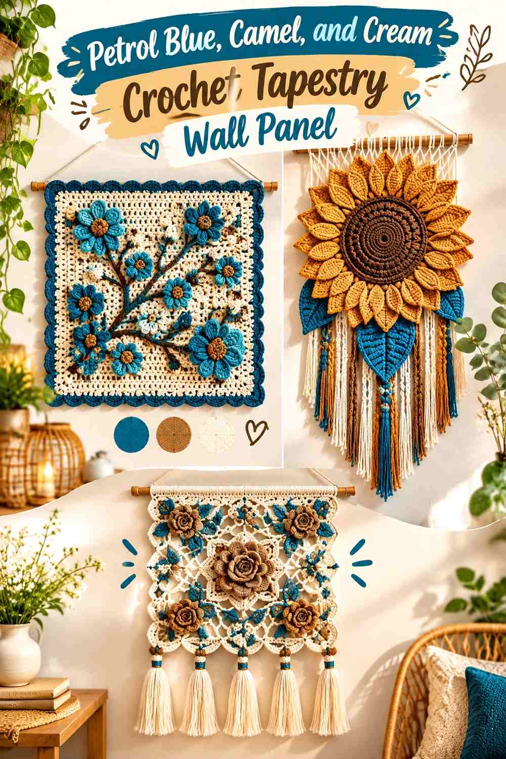
Petrol blue can make a strong background for a flat tapestry panel, while camel provides the main geometric shape and cream adds the lightest internal detail. The combination is especially useful for stacked rectangles, arches, offset diamonds, or stepped blocks.
Because tapestry colorwork is flatter than cables or bobbles, value separation becomes more important.
Keep Petrol Blue Continuous Around the Camel Crochet Geometry
A continuous petrol-blue field helps separate multiple camel shapes without requiring dark outlines around each one. This creates cleaner negative space and makes the panel easier to read at a distance.
Breaking the blue background into many unrelated color blocks would reduce that effect.
Use Cream Only Where Camel Crochet Shapes Need Extra Definition
Cream can sit inside a camel arch, split a large rectangle, or create one smaller contrasting step. It does not need to surround every camel motif.
Before starting, compare camel and cream in grayscale. If they are too similar, make one noticeably lighter so small interior details do not disappear.
Creator Credit: Latest Designs
13. Espresso, Ecru, and Muted Gold Crochet Graphic Wall Panel
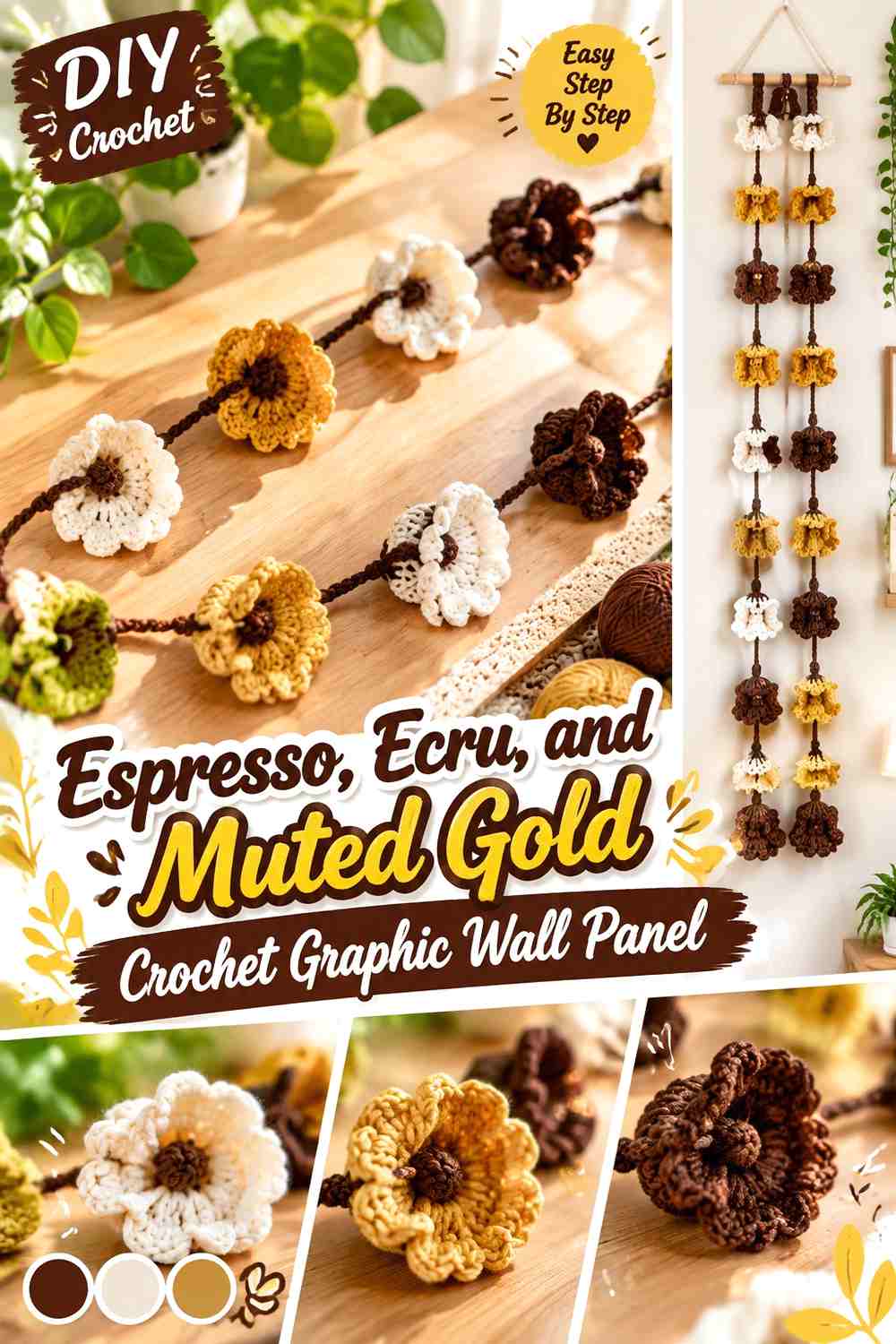
Espresso, ecru, and muted gold create a warm alternative to the familiar black-white-yellow graphic palette. Espresso should provide the strongest lines, ecru should control the negative space, and muted gold can appear in the smallest repeated blocks.
This scheme suits stepped rectangles, split diamonds, stacked arches, or another simplified geometric composition.
Let Ecru Create Space Around the Espresso Crochet Shapes
Use enough ecru between dark forms to keep each shape individually readable. If espresso blocks touch too often, several separate motifs can collapse into one oversized dark area.
Ecru can also continue into part of the fringe so the bottom edge does not become visually heavier than the panel.
Repeat Muted Gold Across Two or Three Espresso Crochet Details
A small accent becomes more intentional when it reappears. Muted gold might occupy a center rectangle and then return in a narrow lower step or selected fringe group.
Keep espresso as the darkest structural color so the accent does not become responsible for defining every edge.
Creator Credit: Devi Little World
Which Neo Deco Crochet Wall Panel Palette Should You Choose?
For the strongest graphic direction, black, warm white, and ochre or espresso, ecru, and muted gold create clear dark-light structure. They work particularly well for diamonds, stepped blocks, and other flat geometry.
For richer color, emerald, cream, and charcoal, deep teal, camel, and ecru, or petrol blue, camel, and cream keep a strong dark anchor while introducing a more distinctive main hue.
If you want a quieter wall piece, sage, charcoal, and cream or olive, oatmeal, and espresso let texture and negative space carry more of the design. Burgundy and dusty rose or plum and pearl gray move toward a softer tonal effect while still providing enough contrast for raised or larger-scale motifs.
Conclusion
A Neo Deco crochet wall panel works best when the geometry and palette support each other. Flat tapestry shapes usually benefit from clearer value contrast. Bobbles, cables, and dimensional stitches can often handle subtler tonal differences because their shadows add another layer of definition.
Choose the palette by deciding what should be noticed first. Use the darkest shade to define structure when you want crisp graphic lines, give the lightest shade enough space to protect negative areas, and keep the strongest accent controlled so it directs the eye instead of competing with the whole panel.
Before committing to the full piece, compare the yarn against the intended wall and check the colors from several feet away. Then use the credited tutorial for the exact construction while adapting the color distribution to your own geometric layout.
Frequently Asked Questions
How many colors should I use in a Neo Deco crochet wall panel?
Two or three colors are enough for many geometric panels. A three-color scheme becomes easier to control when one shade dominates, a second builds the main geometry, and the third is reserved for smaller accents or borders.
Which color should be the background of a geometric crochet wall panel?
Choose the color that gives the important motifs enough separation. A dark background can make cream, camel, blush, or sage geometry stand out, while a light background can give black, burgundy, navy, or teal shapes more definition.
How can I stop small crochet diamonds from disappearing into the background?
Check light-dark value rather than hue alone. Two very different colors can still merge if their values are similar. Increase the contrast around small diamonds, narrow steps, or thin arches while allowing larger motifs to use softer contrast.
Should the crochet wall-panel fringe match the background or accent color?
Either can work, but it changes the visual weight. Matching fringe to the background extends the main color downward and usually feels more unified. Using the accent color creates a stronger bottom edge, so it is worth keeping that accent restrained elsewhere.
Can I use a dark Neo Deco crochet wall panel on a dark wall?
Yes, but the outer silhouette may need help. Introduce a lighter border, light upper attachment area, or enough cream or ecru near the perimeter to separate the crochet piece from the wall.
What should I do if three crochet wall-panel colors feel too busy?
Increase the visual area of one color and reduce the strongest accent. You can also place the lightest neutral between two stronger hues instead of allowing all three to meet repeatedly throughout the panel.