A crochet pumpkin becomes much more useful as fall decor when you plan it as part of a table centerpiece rather than as a single isolated ornament. Different pumpkin heights can create the shape of the arrangement, while color determines whether the display feels rustic, neutral, botanical, traditional, or more contemporary.
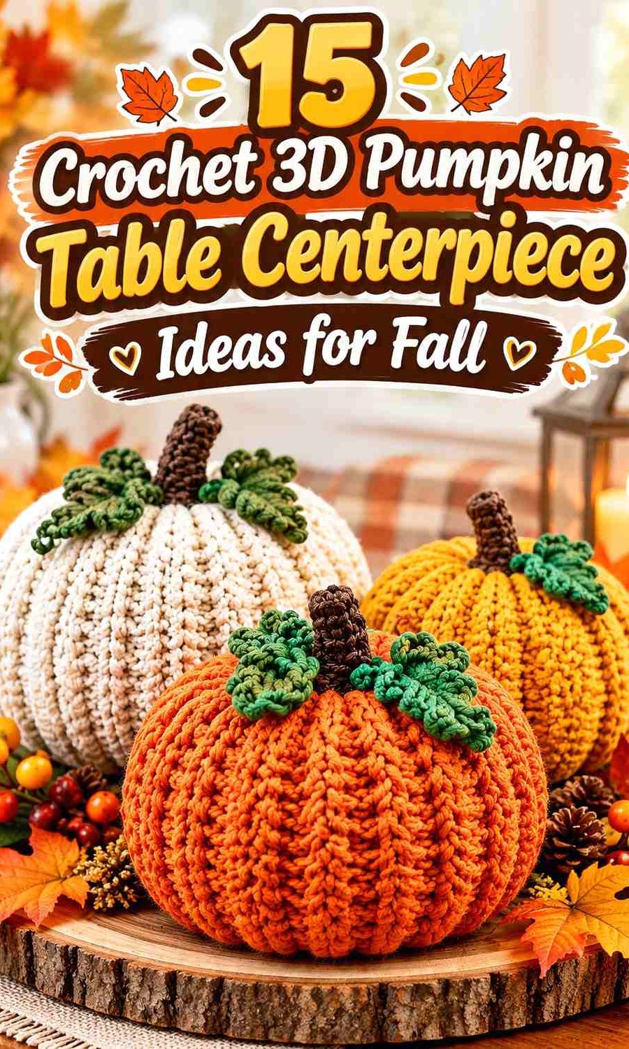
For a centerpiece, the pumpkin body usually deserves the largest share of color. Stems, leaves, vines, bows, or smaller companion pumpkins can then carry darker or contrasting shades. This keeps the arrangement readable from across a dining or coffee table instead of turning several small fall colors into one busy cluster.
The tutorials below support different three-dimensional pumpkin constructions, including ribbed, stacked, rustic, plush, and amigurumi-style forms. The palettes are independent adaptations, so the credited creators are not being presented as the source of these exact color schemes.
Quick List
- Terracotta, Oatmeal, and Walnut Crochet Ribbed Pumpkin Centerpiece
- Sage, Cream, and Espresso Crochet Stacked Pumpkin Centerpiece
- Burnt Orange, Camel, and Olive Crochet Rustic Pumpkin Cluster
- Mustard, Rust, and Cocoa Crochet Low Pumpkin Centerpiece
- Dusty Teal, Warm Beige, and Chestnut Crochet Modern Pumpkin Centerpiece
- Ivory, Mushroom, and Olive Crochet Neutral Pumpkin Trio
- Burgundy, Blush Clay, and Oatmeal Crochet Harvest Pumpkin Centerpiece
- Cinnamon, Sand, and Forest Green Crochet Textured Pumpkin Centerpiece
- Moss, Ecru, and Terracotta Crochet Botanical Pumpkin Cluster
- Pumpkin Orange, Taupe, and Espresso Crochet Classic Fall Centerpiece
- Clay, Cream, and Charcoal Crochet No-Sew Pumpkin Centerpiece
- Rust, Mustard, and Cocoa Crochet Country Pumpkin Trio
- Olive, Camel, and Oatmeal Crochet Knit-Look Pumpkin Centerpiece
- Copper, Cream, and Deep Teal Crochet Mini Pumpkin Centerpiece
- Soft White, Caramel, and Sage Crochet Country Table Centerpiece
Give a Crochet Pumpkin Centerpiece One Dominant Fall Color
A centerpiece containing several pumpkins does not require every pumpkin to be a completely different shade. Repeating one dominant color across the largest or most visible pieces can make the arrangement feel connected.
Then use one supporting shade to change the visual weight. Cream, oatmeal, sand, or camel can lighten the group, while walnut, cocoa, espresso, charcoal, or deep green can provide definition.
A third color works best when it has a smaller job, such as stems, leaves, vines, a single mini pumpkin, or one contrasting piece within a larger trio.
Use Light and Dark Values to Show 3D Crochet Pumpkin Ridges
Pumpkin shaping creates natural shadows, but color can help those sections remain visible. Deep ribbing on a solid terracotta or sage pumpkin may already create enough definition, while a very soft or fuzzy surface can make the ridges appear less pronounced.
When combining several similar earthy shades, compare them from across the room. Terracotta, rust, and medium brown can look clearly different in skeins but merge into one warm block once the pumpkins sit together.
If that happens, introduce a lighter pumpkin such as oatmeal, cream, or ecru rather than adding another medium-dark autumn color.
Plan Crochet Pumpkin Colors Around the Table Surface
The table is effectively another large color in the centerpiece. Dark walnut wood can make cocoa or espresso pumpkins disappear around their lower edges, while pale stone or white tables can reduce the impact of cream pumpkins.
Use contrast selectively. A dark wood table may benefit from oatmeal, sage, camel, or cream among the pumpkins. A pale table can carry stronger terracotta, burgundy, forest green, teal, or rust forms.
For a dining table, also consider visual height. A cluster can look substantial without every pumpkin being tall, and lower pieces preserve sightlines across the table more easily.
1. Terracotta, Oatmeal, and Walnut Crochet Ribbed Pumpkin Centerpiece
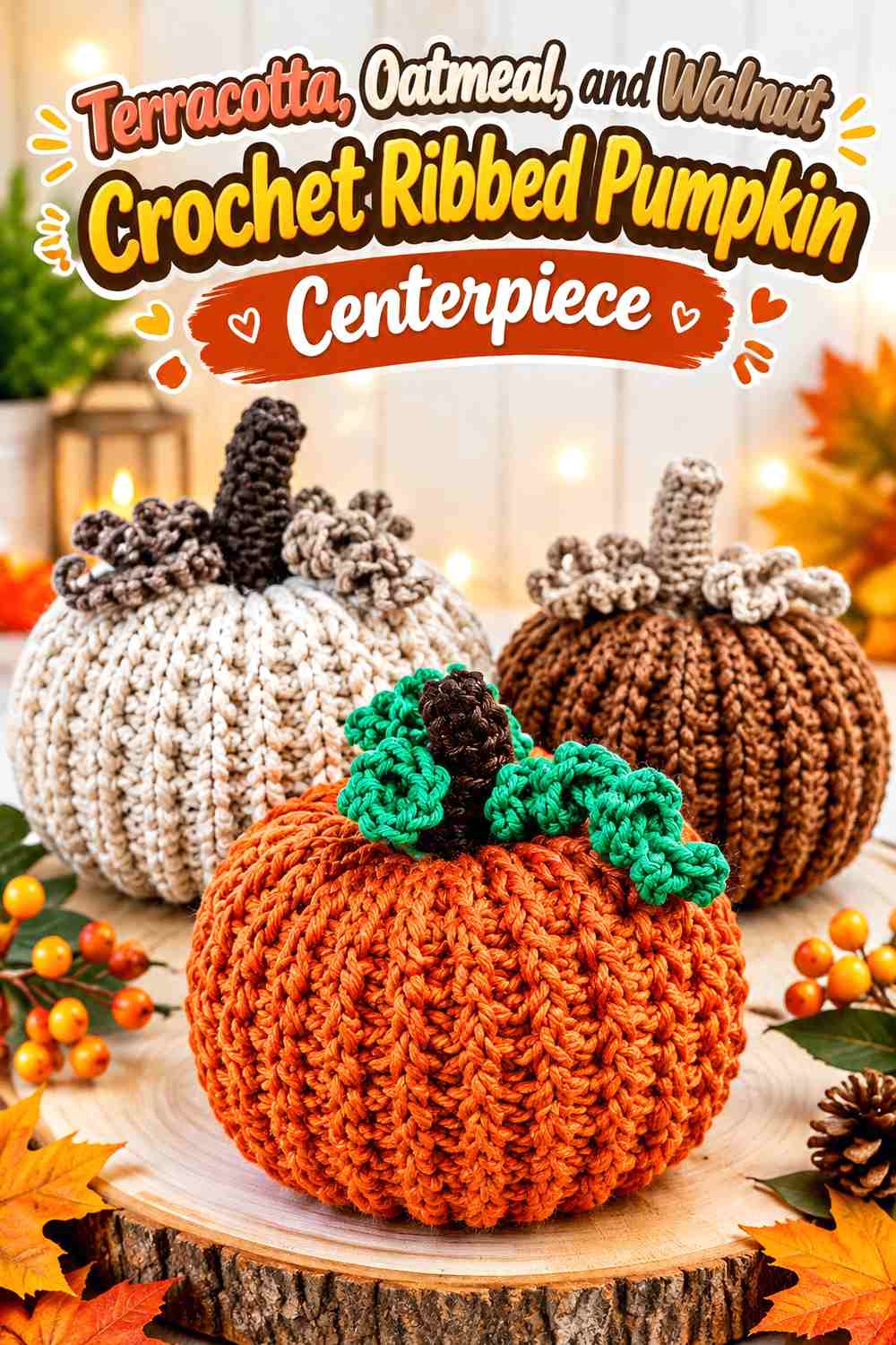
Terracotta can lead this centerpiece, with oatmeal providing a lighter companion and walnut reserved for stems or one small grounding pumpkin. A ribbed construction makes this palette especially useful because the solid body colors allow shadows to define the pumpkin sections.
Use the largest pumpkin in terracotta, place oatmeal beside it rather than directly behind it, and keep walnut limited so the centerpiece remains warm rather than predominantly brown.
Let Terracotta Carry the Largest Crochet Pumpkin
Giving terracotta to the largest pumpkin makes the centerpiece read as a fall arrangement immediately. Keep the body largely one color so the vertical ridges remain uninterrupted.
If the table itself contains strong orange or red tones, move oatmeal closer to the front edge of the display to separate the pumpkins from the surface.
Use Oatmeal and Walnut to Separate the Terracotta Crochet Pumpkins
An oatmeal companion creates the strongest value break, while walnut works better on stems or a smaller pumpkin. This three-level arrangement prevents multiple medium warm shades from visually collapsing together.
If walnut feels too heavy, keep it only at the tops of the pumpkins.
Creator Credit: Küma Tutorials — YouTube tutorial
2. Sage, Cream, and Espresso Crochet Stacked Pumpkin Centerpiece

A stacked centerpiece benefits from clear color separation between levels. Sage can occupy the largest lower pumpkin, cream can lighten the middle, and espresso can appear on the smallest top pumpkin or stem.
That arrangement creates a visible progression instead of allowing all three stacked forms to blend into one tall mass.
Keep Sage on the Broadest Crochet Pumpkin Layer
Placing sage on the bottom gives the stack a calm, grounded base. Because the lowest pumpkin has the greatest visual width, it establishes the main color without needing additional green accents elsewhere.
If the table is already green or gray-green, use cream at the base and move sage upward.
Let Cream Separate Sage From Espresso in the Crochet Pumpkin Stack
Cream is especially useful between two darker values. It keeps the sage lower pumpkin and espresso upper details from touching visually and making the stack look top-heavy.
For a softer version, replace espresso with medium cocoa while preserving the dark-light-dark progression.
Creator Credit: Winding Road Crochet — YouTube tutorial
3. Burnt Orange, Camel, and Olive Crochet Rustic Pumpkin Cluster
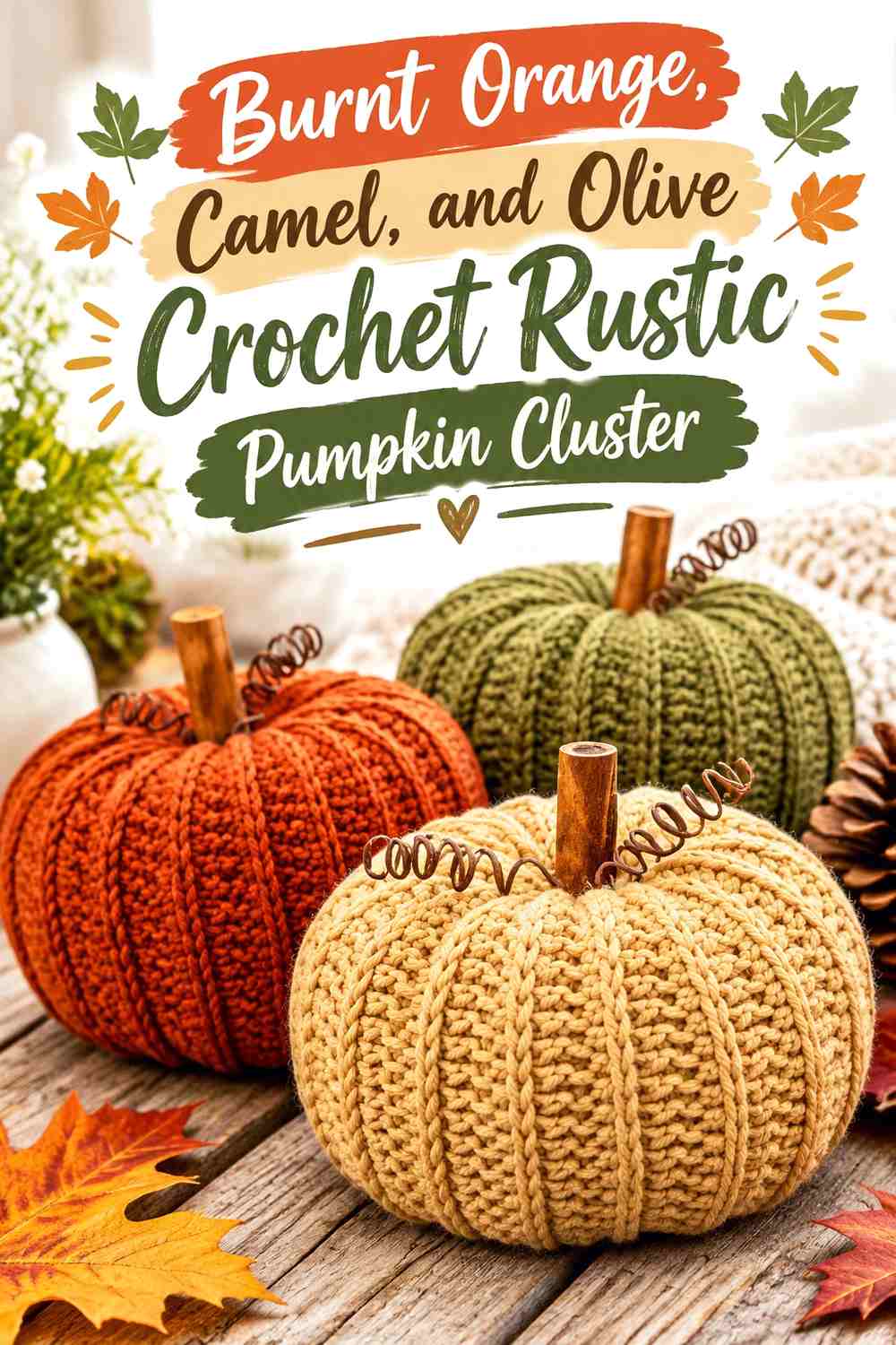
Burnt orange provides the traditional autumn anchor, camel softens the grouping, and olive adds a botanical note that can be repeated in stems or leaves. The useful difference from a classic orange display is the larger neutral share.
Let burnt orange dominate one or two pumpkins rather than every piece in the cluster.
Use Burnt Orange as the Focal Crochet Pumpkin Color
Position the strongest burnt-orange pumpkin where it can be seen from the main viewing side of the table. Surrounding it with camel prevents multiple warm pumpkins from merging into one saturated block.
The color is already visually strong, so it does not need contrasting stripes across the pumpkin body.
Keep Olive Smaller Than Camel Around the Burnt Orange Crochet Pumpkins
Olive works well on stems, leaves, vines, or one smaller pumpkin. That limited use connects the display to a natural fall palette without turning it primarily green.
If your table runner is olive, reduce the green further and let camel create more separation.
Creator Credit: Yarn and Chai — YouTube tutorial
4. Mustard, Rust, and Cocoa Crochet Low Pumpkin Centerpiece
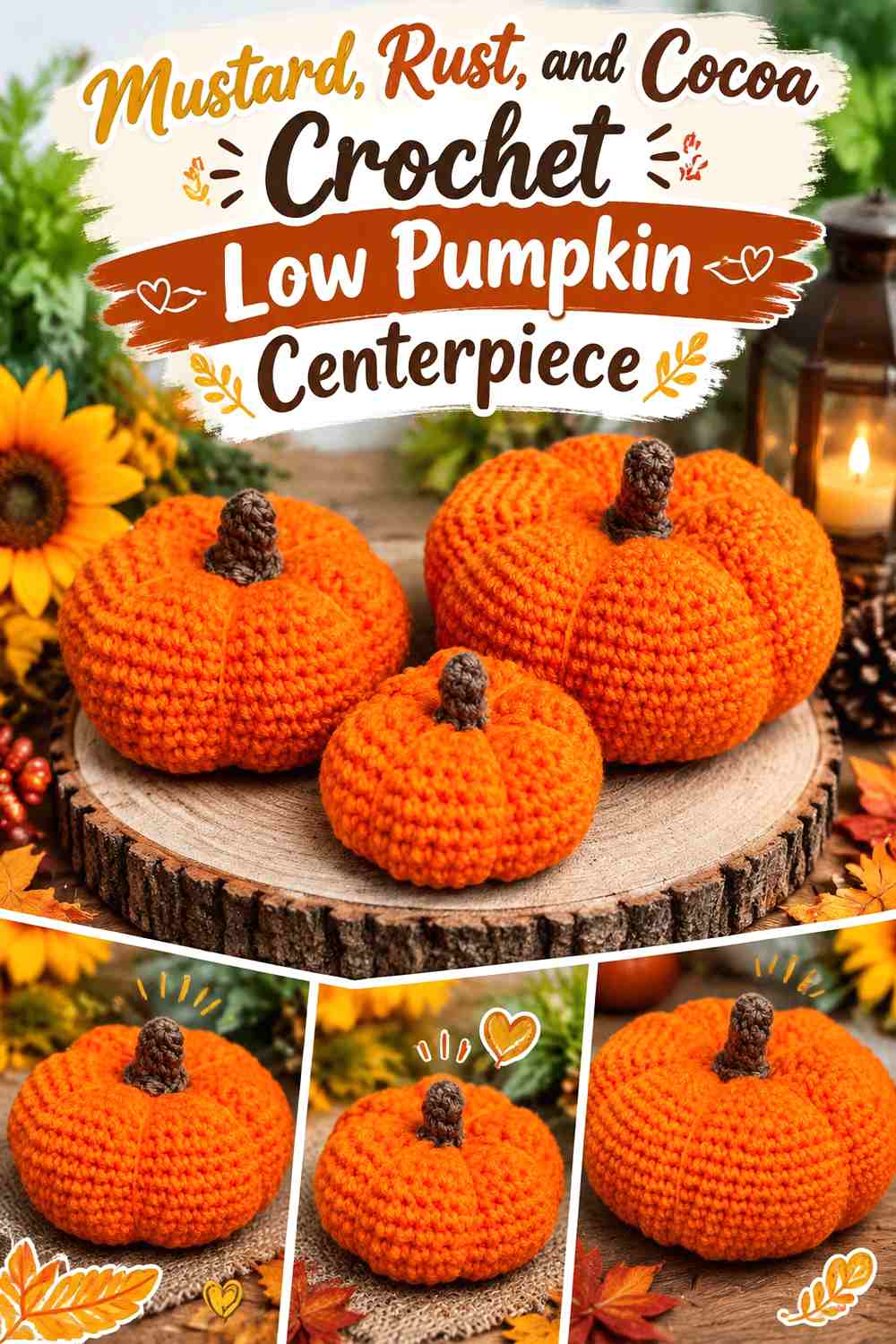
Mustard can brighten a low tabletop grouping, while rust provides the richer secondary pumpkin and cocoa anchors the stems. Because mustard and rust are both warm, they benefit from unequal visual weight.
Use mustard on the widest low pumpkin and rust on a smaller companion rather than dividing every pumpkin into both colors.
Give Mustard the Widest Crochet Pumpkin Shape
A broad mustard pumpkin can spread color horizontally without creating excessive centerpiece height. Its shape becomes especially useful on a dining table where a tall centerpiece would interrupt sightlines.
Keep the body solid so the rounded sections remain the main texture.
Let Cocoa Define the Rust and Mustard Crochet Pumpkin Stems
Cocoa gives both warm body colors a clear dark finishing point. Repeating the same stem color also connects pumpkins that otherwise use different body shades.
If the arrangement feels overly warm, introduce a cream table runner instead of adding another yarn color to the pumpkins.
Creator Credit: Crafty Crochet Castle — YouTube tutorial
5. Dusty Teal, Warm Beige, and Chestnut Crochet Modern Pumpkin Centerpiece
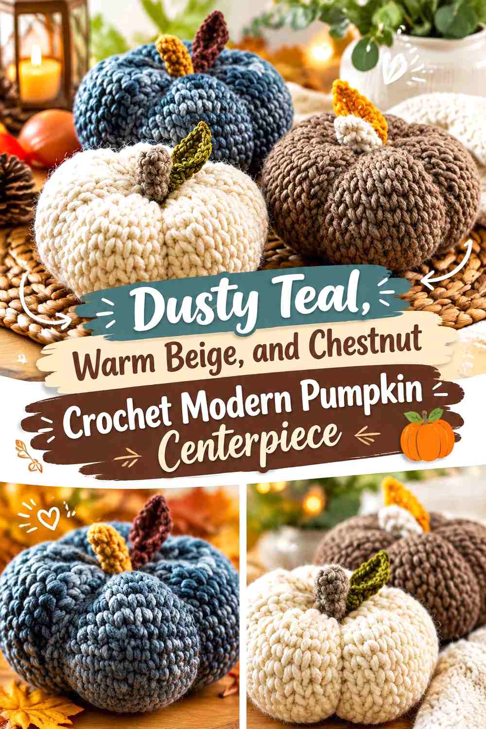
Dusty teal moves the centerpiece away from the most traditional orange palette while still working comfortably with brown and natural neutrals. Warm beige can become the supporting pumpkin color, while chestnut keeps stems and smaller forms grounded.
The muted teal should remain the main statement rather than appearing only as a tiny accent.
Let Dusty Teal Lead the Crochet Pumpkin Group
Use dusty teal on the largest or most central pumpkin so the alternative fall color looks intentional. A tiny teal pumpkin surrounded by brown and beige can appear disconnected.
On a dark table, place warm beige directly beside the teal so their outlines remain distinct.
Use Chestnut to Ground Warm Beige and Dusty Teal Crochet Pumpkins
Chestnut stems create a common dark detail across both body colors. It can also work on one mini pumpkin placed low in the arrangement.
Avoid using chestnut on every large pumpkin; the centerpiece is more modern when teal and beige retain most of the visible surface.
Creator Credit: B.Hooked Crochet — YouTube tutorial
6. Ivory, Mushroom, and Olive Crochet Neutral Pumpkin Trio
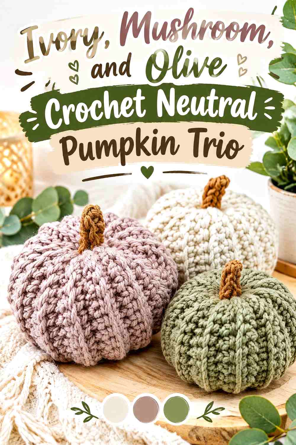
Ivory and mushroom provide a softer neutral foundation, while olive prevents the centerpiece from becoming entirely beige. This palette works particularly well when you want fall decor that can sit beside existing wood, linen, stone, or cream table settings.
Give each shade a different visual role rather than using equal amounts of all three.
Keep Ivory as the Lightest Crochet Pumpkin in the Trio
An ivory pumpkin can break up two deeper companions and preserve the individual rounded silhouettes. Position it where the arrangement looks darkest rather than automatically placing it in the middle.
Against an ivory tablecloth, mushroom should reach the outer edge of the grouping.
Let Olive Add Depth Beside the Mushroom Crochet Pumpkin
Olive provides color without the saturation of bright green. Use it on one substantial pumpkin or repeat it in stems and leaves rather than scattering small green details everywhere.
If olive and mushroom appear too similar in value, make the olive distinctly darker.
Creator Credit: Bella Coco — YouTube tutorial
7. Burgundy, Blush Clay, and Oatmeal Crochet Harvest Pumpkin Centerpiece
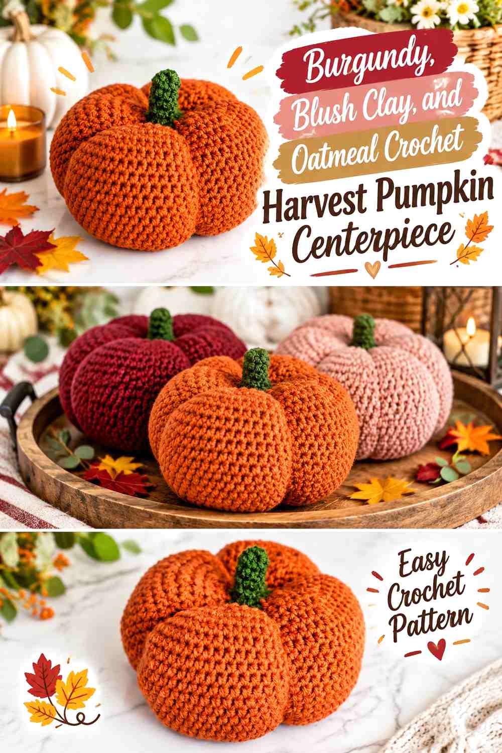
Burgundy brings a deeper harvest direction, while blush clay softens the transition to oatmeal. This palette can work especially well when orange would compete with existing red, plum, or brown dining-room accents.
Keep burgundy concentrated because it has substantially more visual weight than the other two colors.
Use Burgundy on One Main Crochet Pumpkin Instead of the Whole Cluster
One substantial burgundy pumpkin gives the arrangement a dark focal point without making every piece equally heavy. Place blush clay beside it to keep the transition warm.
Several large burgundy pumpkins together can visually compress the centerpiece, especially on a dark table.
Let Oatmeal Open Up the Burgundy and Blush Clay Crochet Display
Oatmeal can be used on a smaller foreground pumpkin or a medium companion between the two darker shades. Its lighter value gives the ridges and outer silhouette more room to show.
A slightly warmer oatmeal works particularly well if the centerpiece sits on natural wood.
Creator Credit: The Turtle Trunk — YouTube tutorial
8. Cinnamon, Sand, and Forest Green Crochet Textured Pumpkin Centerpiece
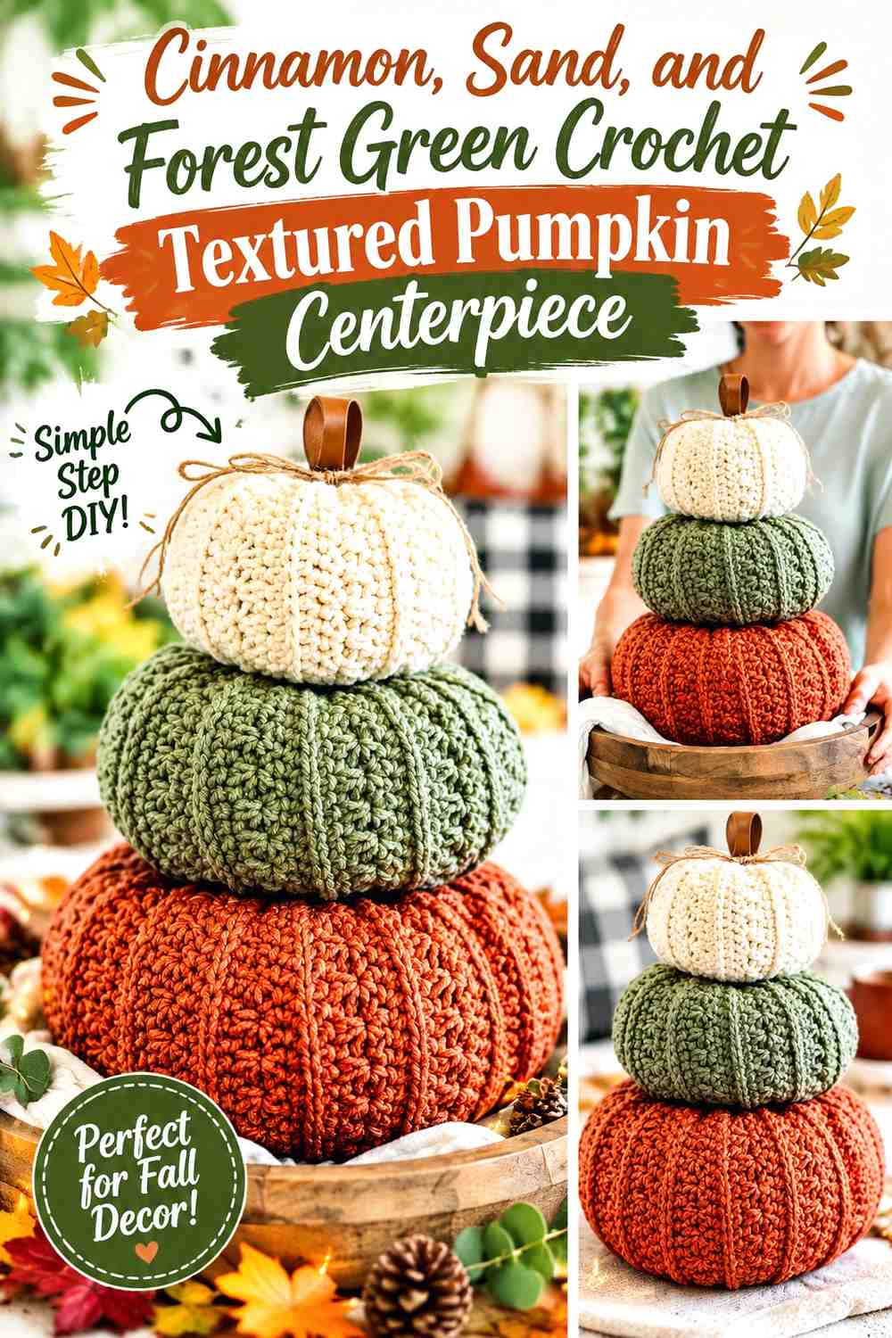
Cinnamon creates a medium warm body color, sand supplies the light counterpoint, and forest green works as the darkest botanical accent. A strongly textured pumpkin benefits from this restrained color approach because the stitch surface already provides visual complexity.
Keep the deepest green away from most of the pumpkin bodies unless you want a darker centerpiece overall.
Let Cinnamon Show the Crochet Pumpkin Texture
Use cinnamon across an uninterrupted pumpkin surface so ridges, raised stitches, or shaping remain visible. Too many color changes can compete with the physical texture.
If the table is reddish wood, position a sand pumpkin at the front to prevent the cinnamon from blending into the surface.
Use Forest Green Above the Sand and Cinnamon Crochet Pumpkins
Forest green makes sense at stems, leaves, or a compact top detail because it visually connects the pumpkin forms without covering the textured body.
If the centerpiece includes several leaves, repeat green consistently instead of introducing multiple unrelated greens.
Creator Credit: Briana K — YouTube tutorial
9. Moss, Ecru, and Terracotta Crochet Botanical Pumpkin Cluster
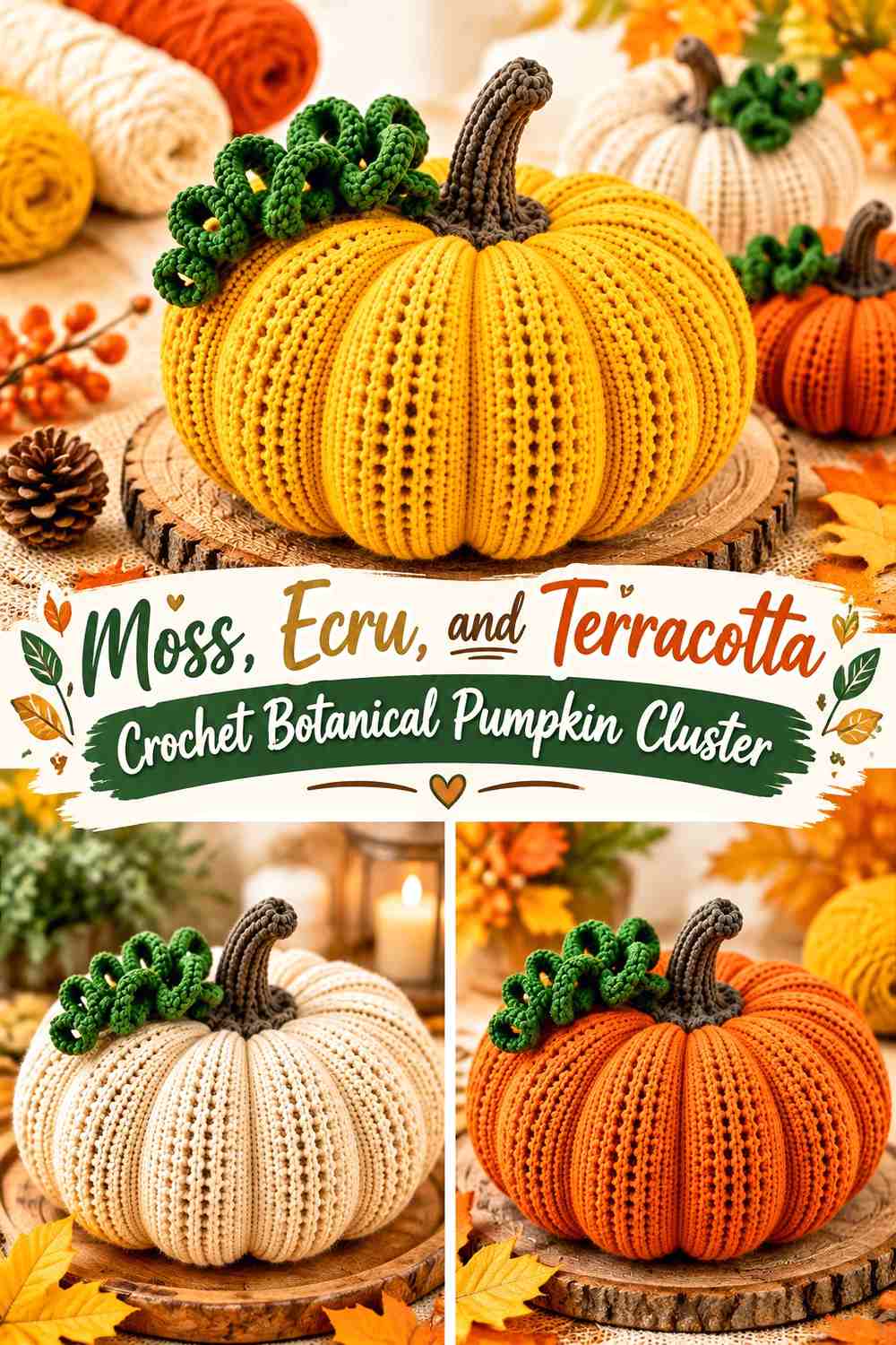
Moss gives the centerpiece its dominant botanical direction, ecru lightens the arrangement, and terracotta introduces a smaller warm fall note. This palette is useful when surrounding decor already contains plants, olive linens, or natural wood.
The warm accent should remain controlled so moss still defines the group.
Give Moss the Largest Crochet Pumpkin Surface
Use moss on the largest pumpkin or on two related pieces with different proportions. Repeating the main green makes the cluster look intentional rather than like leftover yarn colors gathered together.
On a green table runner, place ecru toward the outside of the centerpiece.
Keep Terracotta Smaller Than Ecru Around the Moss Crochet Pumpkins
Terracotta works well on one mini pumpkin or a narrow accent because even a small amount creates noticeable warmth beside green.
If terracotta is used on a large pumpkin too, reduce other orange-toned table accessories so it does not take over the centerpiece.
Creator Credit: Tuba Crochet — YouTube tutorial
10. Pumpkin Orange, Taupe, and Espresso Crochet Classic Fall Centerpiece
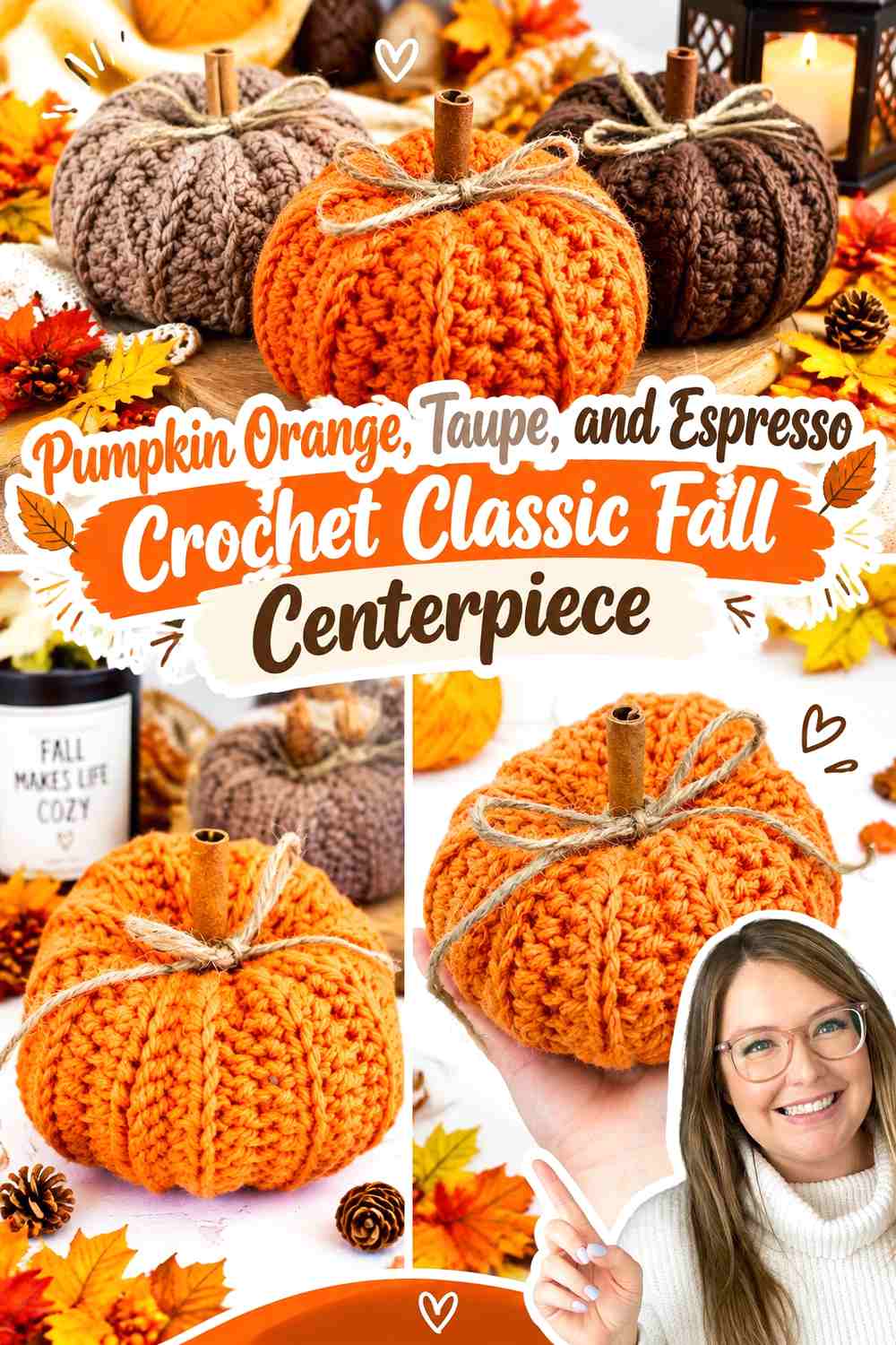
Pumpkin orange keeps this arrangement unmistakably seasonal, taupe provides a quieter companion, and espresso finishes the stems with strong definition. The palette feels classic without requiring every pumpkin to be orange.
A mix of orange and taupe also gives the individual 3D forms more separation when several pumpkins are grouped closely.
Let Pumpkin Orange Remain the Main Crochet Centerpiece Color
Use pumpkin orange on the largest or most central form. Allow taupe to occupy one neighboring pumpkin rather than striping or alternating the body.
That keeps the traditional fall color strong while giving the eye a neutral rest.
Repeat Espresso Across the Pumpkin Orange and Taupe Crochet Stems
Matching dark stems can visually connect pumpkins of different body colors. Espresso is deep enough to stand out against both orange and taupe without introducing another bright accent.
If the table itself is espresso brown, a medium walnut stem can offer slightly more separation.
Creator Credit: Just Be Crafty — YouTube tutorial
11. Clay, Cream, and Charcoal Crochet No-Sew Pumpkin Centerpiece

Clay gives this centerpiece an earthy main color, cream provides a lighter pumpkin, and charcoal adds a modern dark accent. The strong neutral contrast suits a clean table arrangement with fewer surrounding decorations.
Let clay and cream carry most of the volume, with charcoal appearing in smaller amounts.
Keep Clay Broad Across the Crochet Pumpkin Bodies
Clay can be used on the central pumpkin and one smaller companion without making the group too repetitive. The warm muted color also allows shaping lines to remain visible.
Place cream next to clay when the arrangement needs more light near the tabletop.
Use Charcoal Sparingly With Cream and Clay Crochet Pumpkins
A charcoal mini pumpkin or dark stem creates a strong anchor, but too much charcoal can pull attention away from the warmer fall colors.
If you use charcoal on a full pumpkin, keep the remaining pieces noticeably lighter so the group does not become visually dense.
Creator Credit: Club Crochet — YouTube tutorial
12. Rust, Mustard, and Cocoa Crochet Country Pumpkin Trio
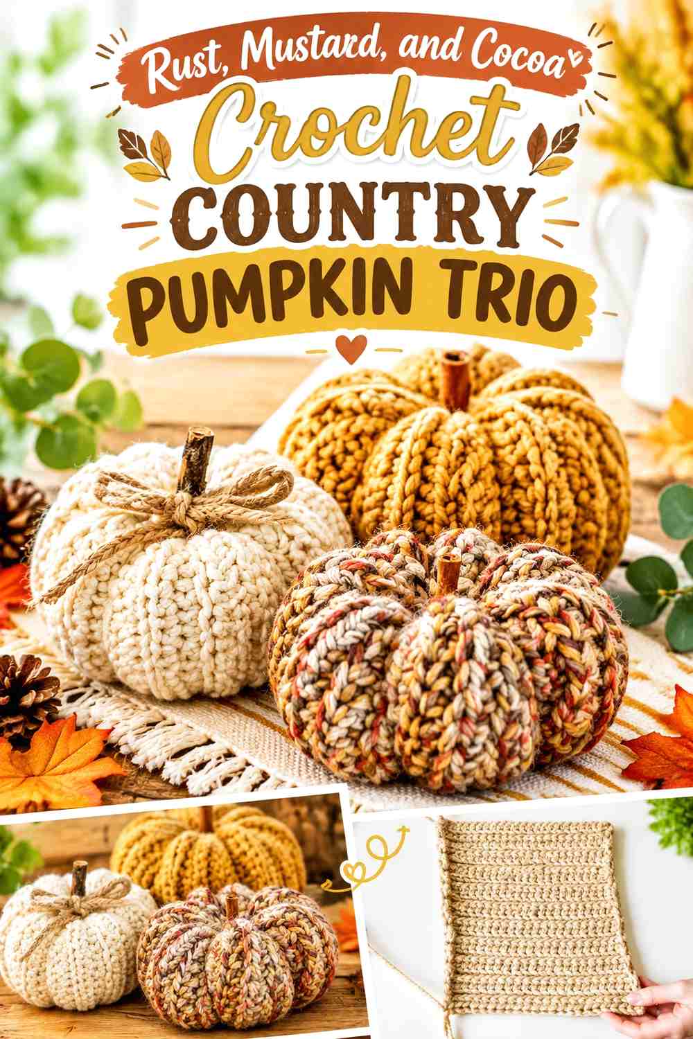
Rust and mustard create a richer traditional fall pairing, while cocoa supplies the common dark detail. Because the two body colors are both strong, use one as the primary shade and the other as a smaller companion.
A trio can use two rust pumpkins and one mustard pumpkin, or reverse that balance depending on the surrounding table decor.
Let Rust Establish the Main Crochet Country Pumpkin Color
Rust has enough depth to anchor a rustic tabletop display. Use it on the largest pumpkin or repeat it at two different heights so the eye travels through the centerpiece.
If the table is very dark, bring mustard to the front edge of the grouping.
Use Cocoa to Connect Mustard and Rust Crochet Pumpkins
A repeated cocoa stem or small top detail gives two saturated body colors a shared finishing element.
Keep the cocoa concentrated at the top rather than adding broad dark bands that interrupt the rounded pumpkin sections.
Creator Credit: Sewrella — YouTube tutorial
13. Olive, Camel, and Oatmeal Crochet Knit-Look Pumpkin Centerpiece
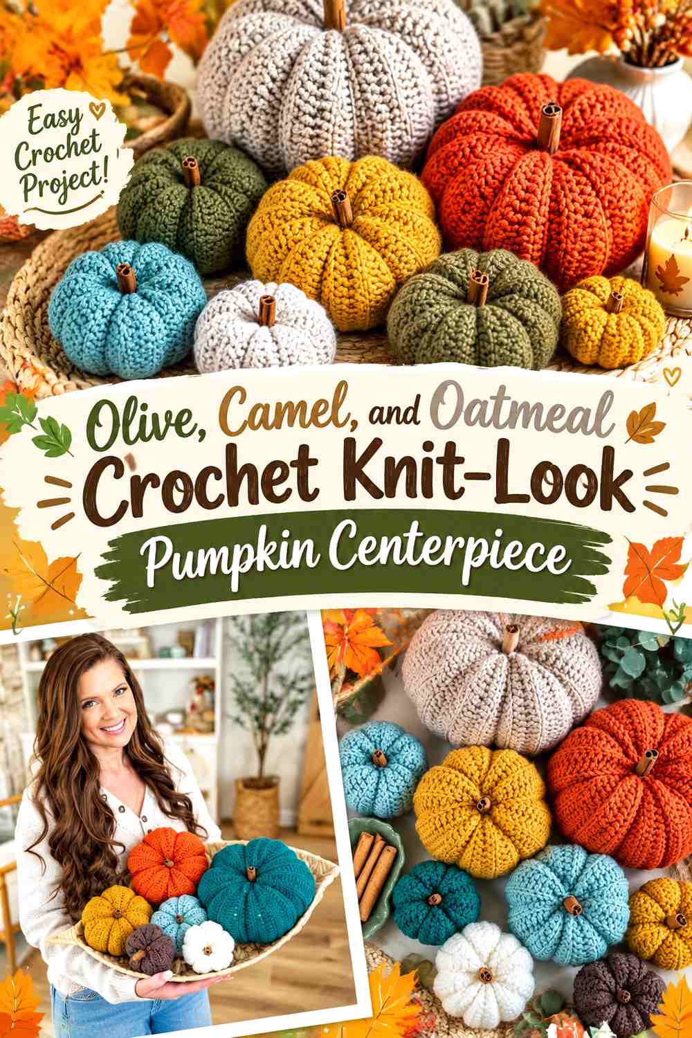
Olive, camel, and oatmeal create a quiet farmhouse-style centerpiece in which texture can do more of the work. Olive provides the main color, camel introduces warmth, and oatmeal supplies the lightest pumpkin.
This palette is especially useful when the crochet surface already has strong knit-like vertical definition.
Use Olive on the Most Textured Crochet Pumpkin
A solid olive field allows the ribbed or knit-like surface to remain readable without additional color changes. Place it near oatmeal so the edge of the pumpkin stays distinct.
If the centerpiece sits on an olive runner, use camel as the largest piece instead.
Let Oatmeal Separate Olive From Camel in the Crochet Pumpkin Group
Oatmeal creates a clean visual break between two mid-value earthy shades. A smaller pale pumpkin positioned slightly forward can keep the entire centerpiece from looking uniformly dark.
If you want a softer result, choose oatmeal rather than bright white so all three colors retain an earthy relationship.
Creator Credit: MJ’s Off The Hook Designs — YouTube tutorial
14. Copper, Cream, and Deep Teal Crochet Mini Pumpkin Centerpiece
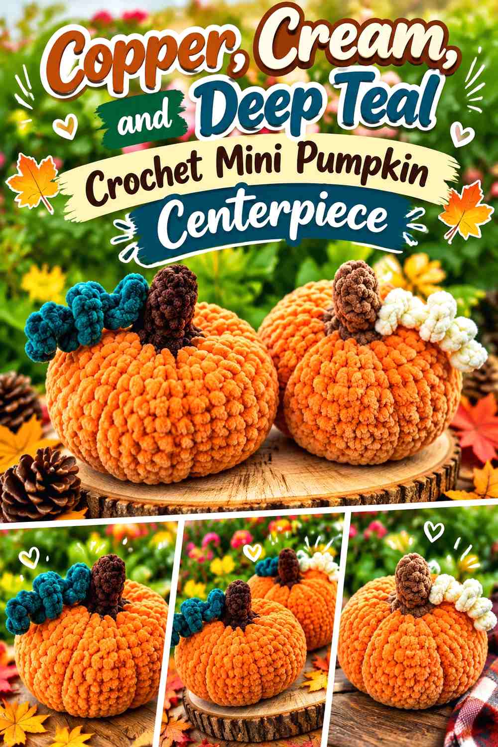
A grouping of mini pumpkins can tolerate stronger color variety because each individual form occupies less visual space. Copper can provide the warm fall lead, cream can lighten the cluster, and deep teal can create one contrasting statement pumpkin.
Keep the teal smaller in quantity so the arrangement still reads as autumnal rather than predominantly cool.
Repeat Copper Across More Than One Crochet Mini Pumpkin
Using copper on several mini pumpkins gives the group a clear color rhythm. Varying their positions is more effective than making every copper piece the same visual height.
Cream can sit between them to prevent the warm shapes from merging.
Keep Deep Teal to One or Two Crochet Pumpkins Beside Cream
Deep teal has strong visual weight against copper, so a small amount is enough. Position it where the grouping needs a darker anchor rather than automatically in the center.
If the table is already blue-green, increase cream and reduce teal further.
Creator Credit: Alinna Crochets ♡ — YouTube tutorial
15. Soft White, Caramel, and Sage Crochet Country Table Centerpiece
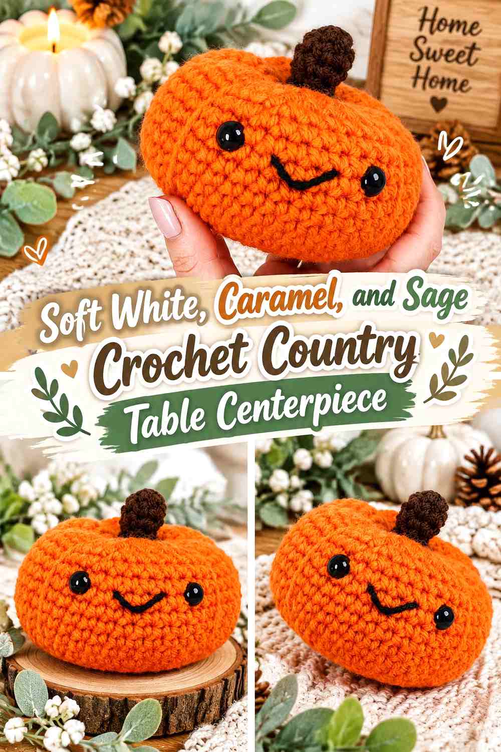
Soft white creates the lightest pumpkin bodies in this collection, caramel brings warm contrast, and sage provides the botanical supporting shade. This palette works especially well when you want fall decor that can transition into a neutral dining room without relying heavily on orange.
The key is preventing the soft-white pumpkins from disappearing against pale linens.
Use Caramel Beside Soft White Crochet Pumpkins for Table Definition
A caramel pumpkin placed at the front or side of the group gives the pale forms a visible boundary. This is particularly useful on cream tablecloths or light wood.
Keep soft white on the larger pumpkin if you want the centerpiece to remain visually airy.
Let Sage Add a Botanical Accent to Soft White and Caramel Crochet Pumpkins
Sage can appear on one medium pumpkin, stems, or leaves. Repeating it in more than one location connects the botanical detail without requiring equal green coverage.
If the room already has a lot of sage, use the green mainly at the stems and let caramel become the stronger supporting color.
Creator Credit: Hooked by Robin — YouTube tutorial
Which Crochet 3D Pumpkin Centerpiece Palette Should You Choose?
For a traditional fall table, pumpkin orange and taupe, rust and mustard, terracotta and oatmeal, or burnt orange and camel keeps the seasonal direction recognizable without making every piece the same orange.
For a softer neutral table, ivory and mushroom, olive and oatmeal, or soft white and caramel allows the three-dimensional pumpkin shape and ribbing to become the main visual feature.
If you want a more modern fall centerpiece, dusty teal and warm beige, clay and charcoal, or copper and deep teal introduces cooler or darker accents while still working with brown stems and natural table materials.
The deepest palettes—such as burgundy and blush clay or cinnamon and forest green—work well when you want the centerpiece to carry more visual weight. Balance those colors with oatmeal, cream, sand, or another lighter pumpkin so the individual 3D forms remain distinct.
Conclusion
A strong crochet pumpkin centerpiece depends on hierarchy. One pumpkin or color should lead, supporting pieces should create changes in height and value, and stems or leaves should connect the group without introducing unnecessary extra shades.
For a low dining-table display, use wider pumpkins and keep the strongest colors toward the center or front. For a coffee table or console, a stacked trio can create more vertical structure. In either case, compare the pumpkin colors against the actual tabletop before deciding how much cream, brown, green, or orange the arrangement needs.
The credited tutorials provide the construction starting points. Use them for the exact crochet methods, then adapt your colors and grouping to the visual weight, contrast, and fall-table style you want.
Frequently Asked Questions
How many colors should I use in a crochet pumpkin table centerpiece?
Two or three main body colors are usually enough for a coordinated display. Stems and leaves can repeat one additional dark or botanical shade, but they do not need to introduce a new color on every pumpkin.
Should all the crochet pumpkins in a centerpiece be the same color?
No. Using one repeated dominant color plus one or two supporting colors can create more depth while still keeping the arrangement connected. If every pumpkin is different, repeating the same stem or leaf color can help unify them.
How can I make crochet pumpkin ridges more visible?
Solid body colors let the physical ribbing and shadows remain clear. If the texture looks flat, choose a yarn color that contrasts more strongly with the table or neighboring pumpkins rather than adding multiple stripes across the body.
Which crochet pumpkin colors work well on a dark wood table?
Oatmeal, cream, camel, sage, soft white, sand, and muted mustard can keep the centerpiece visible against dark wood. Deeper colors can still be included, but placing a lighter pumpkin next to them helps define their edges.
How should I arrange three crochet pumpkins for a centerpiece?
Try varying their visual height or width rather than lining them up identically. One larger anchor with two smaller companions usually creates clearer hierarchy, while a stacked arrangement works when you want more height.
Should crochet pumpkin stems all match?
They do not have to, but repeating a stem color such as walnut, cocoa, espresso, or olive can connect pumpkins made in different body colors. This is especially helpful in a multicolor centerpiece.
How can I replace a fall pumpkin color without changing the whole palette?
Preserve the role of the color. Replace a light pumpkin with another light neutral, a dark anchor with another deep shade, or a warm accent with another medium warm tone. Maintaining the light-dark hierarchy is more important than matching an exact hue.