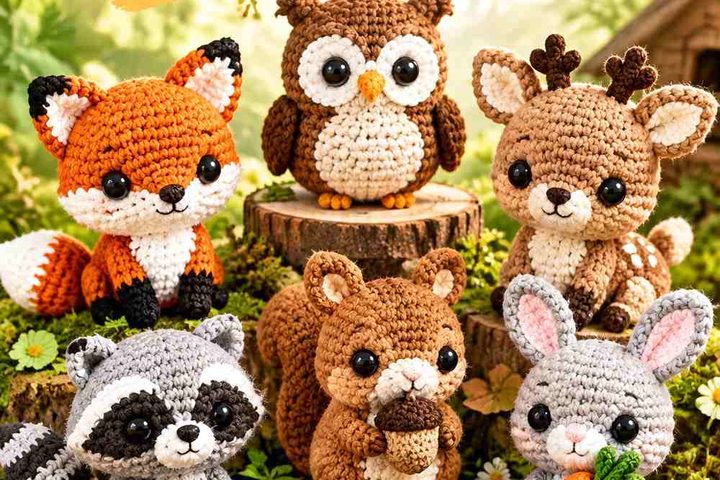
A winter book nook feels more intentional when the crochet decorations relate to both the books and the surrounding shelf. Tiny books, cocoa mugs, sweaters, snowmen, houses, and winter ornaments can add texture without taking over the reading display, especially when their colors repeat shades already used across book spines or nearby decor.

Scale and contrast matter in such a compact area. A dark pinecone can disappear against walnut shelving, while a pale snowflake can vanish beside cream book pages. Giving each little decoration one dominant shade and one or two supporting colors helps its shape remain recognizable without turning the shelf into a collection of unrelated bright accents.
The credited tutorials below support the individual crochet objects or ornament concepts. The winter palettes and book-nook styling are independent adaptations, so the creators are not being presented as users of these exact color combinations.
Quick List
- Deep Navy, Parchment, and Cranberry Crochet Mini Book Stack
- Cocoa Brown, Cream, and Dusty Blue Crochet Hot Cocoa Mug
- Oatmeal, Forest Green, and Cranberry Crochet Mini Sweater
- Dusty Blue, Ivory, and Charcoal Crochet Mini Beanie
- Snow White, Icy Blue, and Rust Crochet Snowman
- Forest Green, Cream, and Muted Gold Crochet Mini Tree
- Burgundy, Oatmeal, and Sage Crochet Winter Gnome
- Warm White, Chestnut, and Slate Blue Crochet Little House
- Chocolate Brown, Frost White, and Pine Green Crochet Pinecones
- Pine Green, Cranberry, and Cream Crochet Mini Wreath
- Burgundy, Cream, and Dusty Rose Crochet Mini Stocking
- Icy Blue, Winter White, and Silver Gray Crochet Snowflake
- Deep Teal, Warm White, and Ochre Crochet Winter Star
Build a Connected Winter Palette Across the Book Nook
A small shelf display usually looks more cohesive when colors repeat across different objects. You might use cream on a mug, snowman, wreath, and star while changing the dominant shade of each decoration. The repeated neutral links the projects without requiring everything to match.
The books should also count as part of the palette. If your shelf already contains dark green, burgundy, navy, and brown spines, you may need fewer strong crochet colors. On a pale shelf with neutral books, deeper crochet accents can provide the definition instead.
Protect Small Crochet Details With Light and Dark Contrast
Tiny decorations are often viewed from farther away than they are crocheted, so small details can disappear. A charcoal beanie brim against dusty blue remains readable because the values differ, while two similarly pale blues may blend even though their hues are technically different.
Place finished color samples beside the actual books and shelving before making a complete set. If an important feature disappears, change its lightness or darkness before adding another unrelated color.
1. Deep Navy, Parchment, and Cranberry Crochet Mini Book Stack
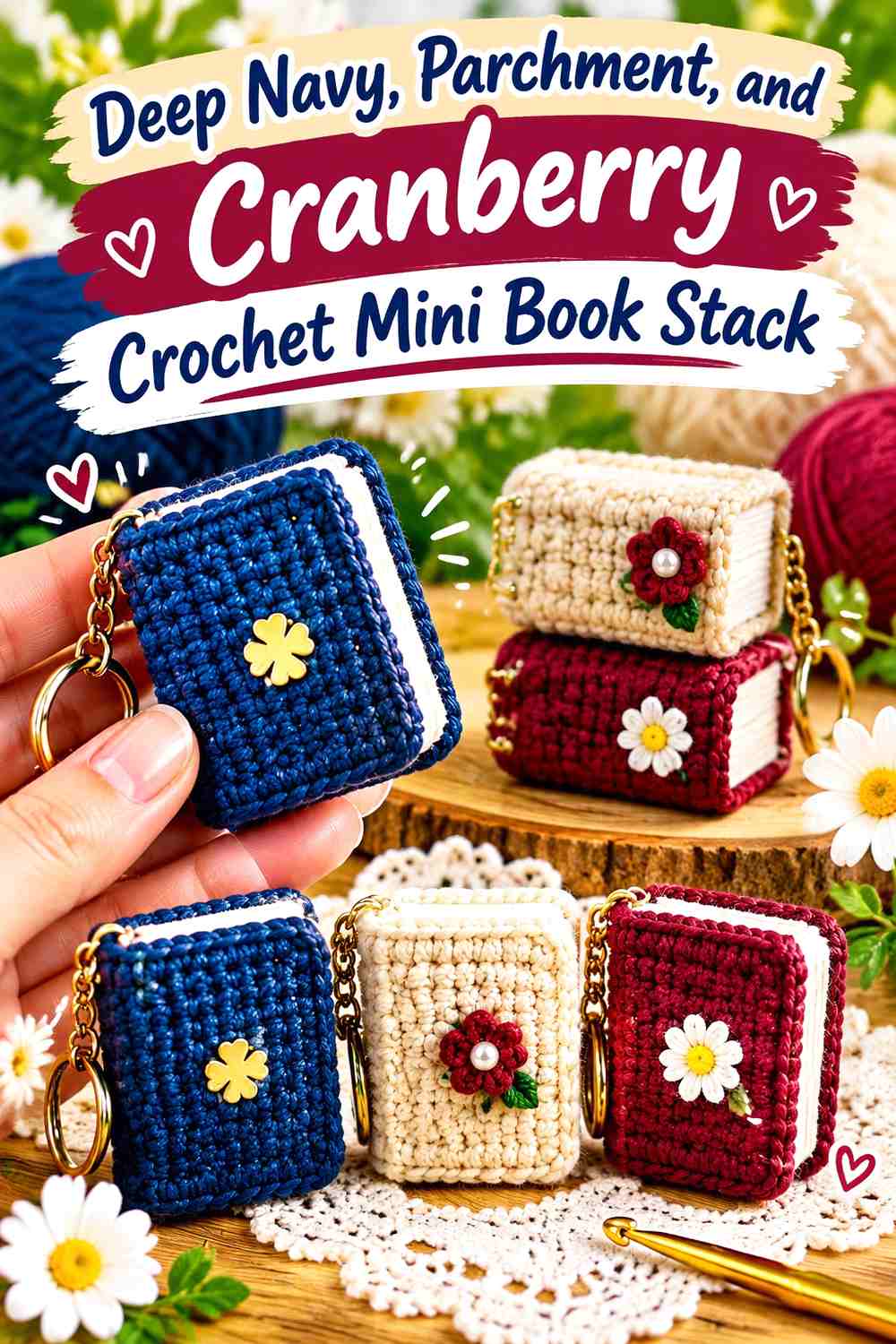
A crochet mini book is an especially natural fit for a book nook because it repeats the subject of the display at a much smaller scale. Use deep navy for the main cover, parchment for the pages, and cranberry on a second cover or narrow spine detail. A few tiny books stacked horizontally can fill a gap below taller decor without covering full-size book titles.
Deep Navy Gives the Crochet Mini Books a Clear Cover Shape
Use deep navy on at least one complete cover rather than scattering it across every miniature book. A solid dark cover creates a recognizable rectangle against light page edges and prevents the tiny object from becoming visually fragmented.
If your shelving is nearly black, move the navy book beside lighter spines or give it a wider parchment page section so its outline remains visible.
Parchment Keeps Cranberry Crochet Book Spines Distinct
Parchment works best as a repeated page color because it can connect books with different covers. Place cranberry on one cover or spine while keeping parchment between the two dark colors.
This lets you create a small mismatched stack while still making the books look like one coordinated winter set.
Creator Credit: Hobbysel Crochet
2. Cocoa Brown, Cream, and Dusty Blue Crochet Hot Cocoa Mug

A tiny crochet mug can become the main “reading break” detail in the nook. Cocoa brown suits the drink or mug body, cream can suggest a lighter topping or rim, and dusty blue gives the object a cooler winter accent. Position it near a small book stack rather than directly in front of book titles so it reads as decor instead of shelf clutter.
Cocoa Brown Should Anchor the Crochet Hot Cocoa Mug
Let cocoa cover the main cup or the largest visible area. The warm brown immediately separates the mug from snowy white winter decorations and gives the shelf a useful darker midpoint.
On very dark wood, place cream behind or above the brown section so the mug silhouette does not merge into the shelf.
Dusty Blue Can Give the Cream Crochet Cocoa Detail a Winter Accent
Use dusty blue on the handle, a small mug detail, or another repeated accent rather than dividing the whole cup equally between brown and blue.
Cream should remain the lightest point. That light-dark hierarchy helps small mug features stay legible among book spines.
Creator Credit: Furry Yarn
3. Oatmeal, Forest Green, and Cranberry Crochet Mini Sweater
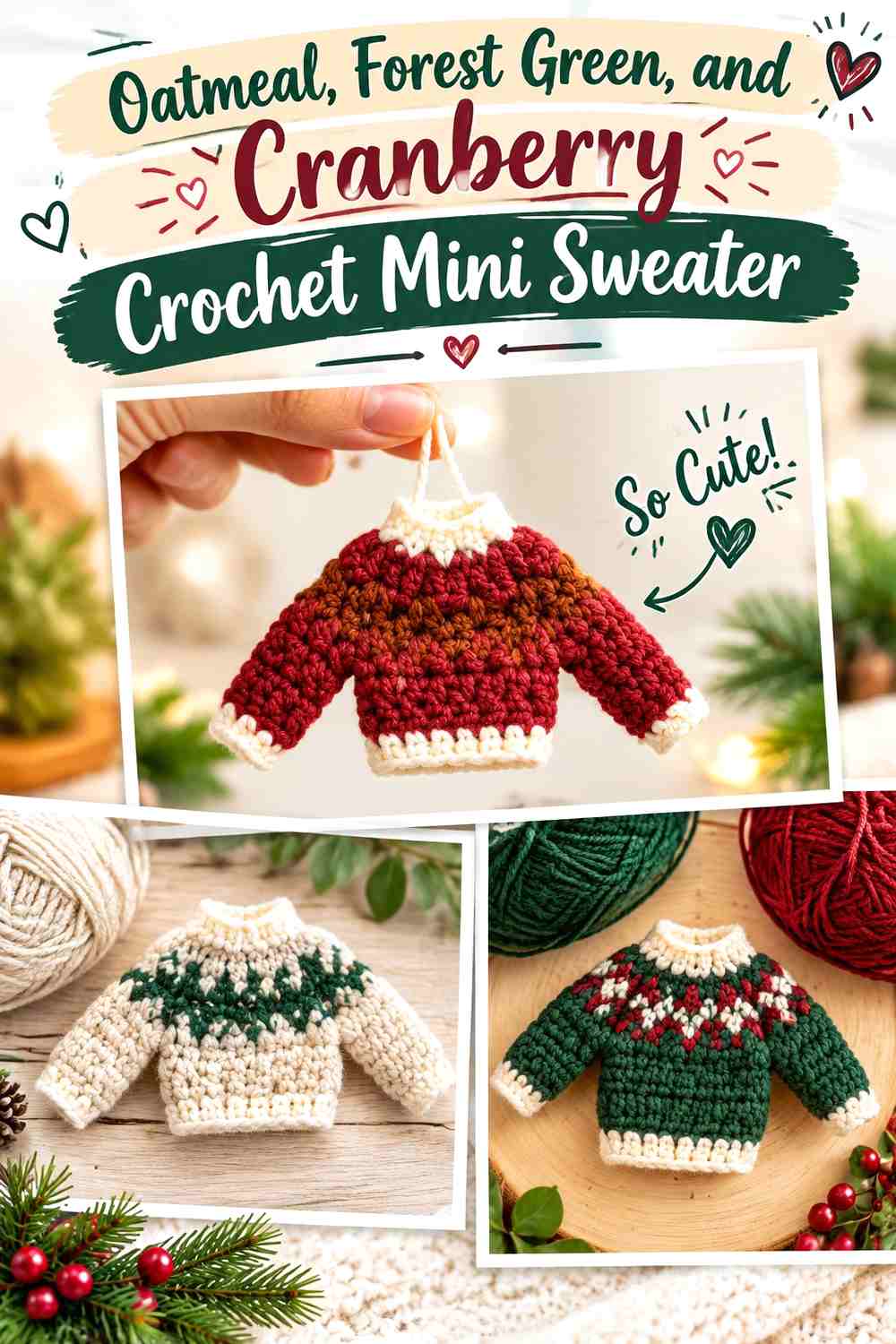
A miniature sweater can be draped over a shelf peg, leaned against a book stack, or placed flat behind another small decoration. Oatmeal creates a warm neutral body, forest green can define cuffs or a winter motif, and cranberry provides a smaller festive accent.
Oatmeal Gives the Crochet Mini Sweater Room for Forest Green Details
Use oatmeal over most of the sweater body so small green patterning has enough plain fabric around it. A miniature garment has little surface area, so covering every section with multiple colors can make the sleeves and body harder to distinguish.
Against cream-colored books, move more forest green toward the sweater edges to restore definition.
Cranberry Should Accent the Oatmeal and Forest Green Crochet Sweater
Keep cranberry limited to a narrow band, tiny motif, or repeated trim detail. A little dark red can establish the winter palette without competing equally with forest green.
If the sweater sits near several cranberry book spines, reduce the red in the crochet piece and let the books supply more of that color.
Creator Credit: Sweet Softies
4. Dusty Blue, Ivory, and Charcoal Crochet Mini Beanie
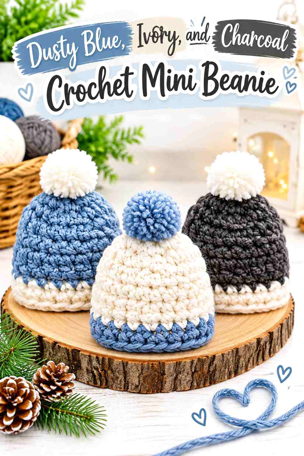
A mini beanie adds a recognizable cold-weather shape without occupying much horizontal shelf space. Dusty blue can cover the crown, ivory can appear in a pom-pom or narrow detail, and charcoal gives the brim enough visual weight to keep the hat grounded beside pale pages.
Dusty Blue Should Dominate the Crochet Mini Beanie Crown
Keep most of the crown one dusty blue shade so the tapered or rounded hat silhouette remains obvious. Small stripes may be useful, but too many color changes can make a tiny hat look shorter and busier.
If the surrounding books are blue, place the beanie against a cream or brown spine for better separation.
Charcoal Makes the Ivory and Dusty Blue Crochet Beanie Easier to Read
A charcoal brim gives the pale crown a strong lower boundary. This is particularly useful when the beanie sits upright against white pages or light shelving.
Keep ivory concentrated near the top or in another small feature so it does not compete with the pale blue body.
Creator Credit: It’s So Corinney
5. Snow White, Icy Blue, and Rust Crochet Snowman
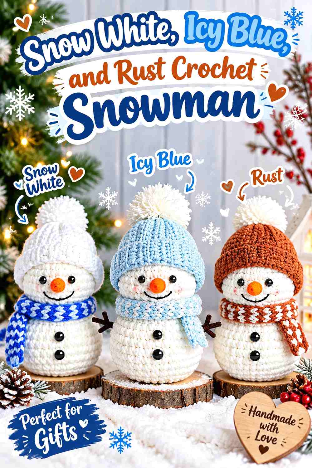
A tiny snowman brings a clear winter character into the book nook without needing a traditional red-and-green palette. Snow white can dominate the body, icy blue can define the scarf or hat, and rust works as a very small warm accent around the face.
Snow White Needs Icy Blue Contrast Around the Crochet Snowman
A mostly white snowman can disappear against cream books or pale shelf backing. Give icy blue enough visible area around the head or neck to separate the white body from its surroundings.
If your book nook has a dark background, you can reduce the blue because the shelf already creates strong body contrast.
Rust Should Stay Small Against the Icy Blue and Snow White Crochet Snowman
Rust works best as a controlled warm point rather than a large third color. On a tiny face, even a very small warm detail can attract attention.
Keep the larger winter accessories icy blue so the snowman remains connected to the colder palette instead of becoming primarily orange-and-white.
Creator Credit: Crochet Everyday
6. Forest Green, Cream, and Muted Gold Crochet Mini Tree
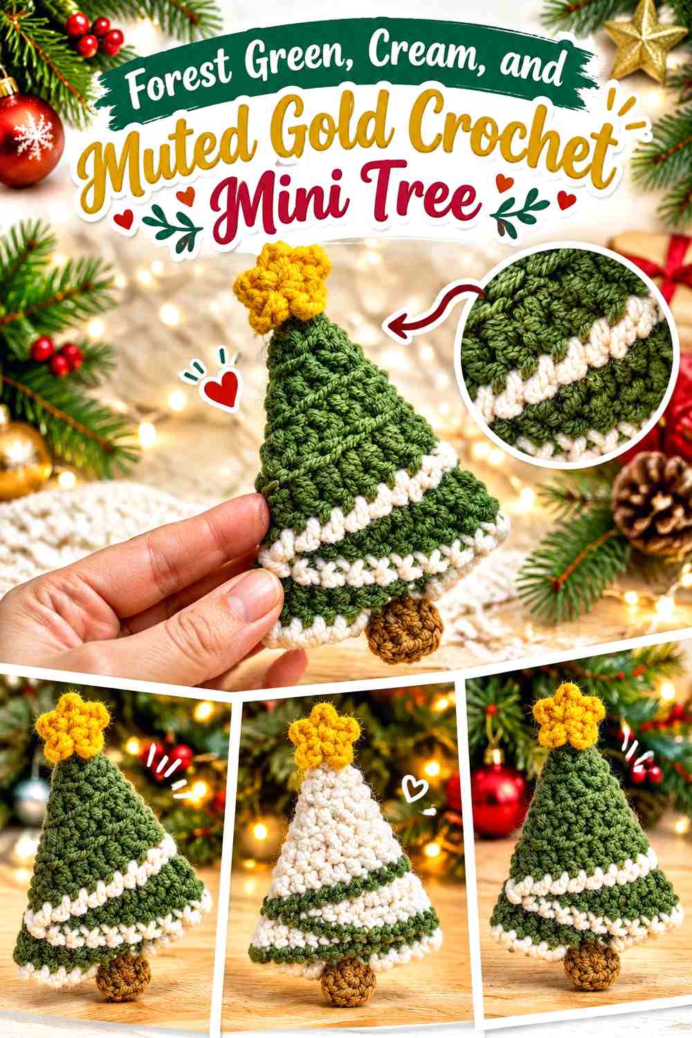
A small crochet tree provides useful height at the back of a book nook. Forest green should form the main triangular silhouette, cream can suggest pale winter details, and muted-gold yarn can be limited to the topper or tiny repeated accents.
Forest Green Should Keep the Crochet Mini Tree Silhouette Unbroken
Use green across most of the tree so its tapered shape remains clear between vertical book spines. Too many cream stripes can visually divide the tree into separate horizontal sections.
Place the darkest green tree beside lighter books if the shelf itself is also dark.
Muted Gold Should Highlight the Forest Green and Cream Crochet Tree Sparingly
Reserve muted gold for a topper or a few small points. Because warm yellow tones attract attention against green, very little is needed to establish an accent.
Cream can do the quieter balancing work across the tree, leaving gold as the focal detail rather than a competing third field.
Creator Credit: Kane Crochet
7. Burgundy, Oatmeal, and Sage Crochet Winter Gnome
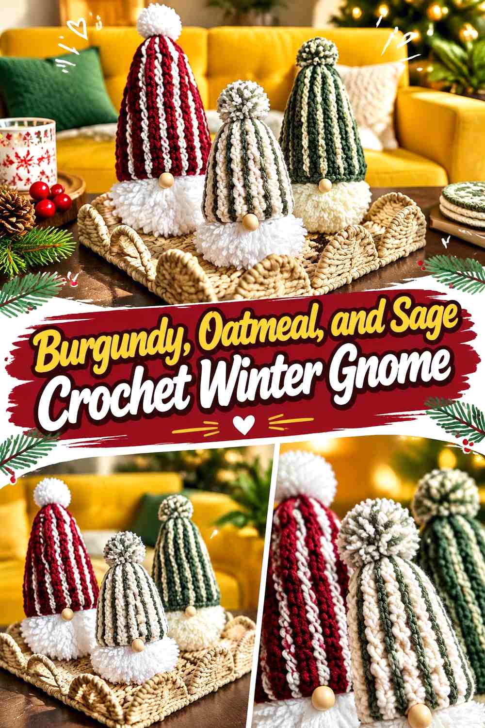
A winter gnome works well at one side of a book nook because its tall hat adds vertical movement without hiding many book spines. Burgundy can lead on the hat, oatmeal can form the beard or body area, and sage can appear as a restrained secondary winter color.
Burgundy Gives the Crochet Winter Gnome a Strong Book-Nook Focal Point
Use burgundy over the hat or another large upper section so the eye has a clear color to follow. A tall hat can support deeper color without making the lower shelf feel visually heavy.
If several nearby books are burgundy, place the gnome beside lighter covers or increase oatmeal around the face.
Sage Should Support Burgundy and Oatmeal on the Crochet Gnome
Use sage for small hat details, sleeves, or another repeated feature rather than splitting the gnome evenly into green and red.
Oatmeal between the two stronger colors helps keep the face and beard area readable at shelf-viewing distance.
Creator Credit: Blue Star Crochet
8. Warm White, Chestnut, and Slate Blue Crochet Little House

A little crochet house can turn the book nook into a miniature winter scene. Warm white works well on the walls, chestnut can establish the roof, and slate blue can mark a door, window, or another small detail without adding a bright primary color.
Warm White Makes the Chestnut Crochet House Roof More Visible
Keep the main house body pale so the darker roof creates a clear top edge. This contrast is especially helpful when the house sits low between stacks of books and only part of its silhouette is visible.
Against a white shelf backing, move more slate blue to the outer details so the pale house does not disappear.
Slate Blue Can Give the Warm White Crochet House a Cold-Weather Accent
Use slate blue around one or two features rather than covering an entire side of the house. Small repeated blue details can suggest the winter palette while chestnut keeps the house grounded and warm.
This balance prevents the miniature scene from becoming entirely brown-and-cream.
Creator Credit: Jess Crafting
9. Chocolate Brown, Frost White, and Pine Green Crochet Pinecones
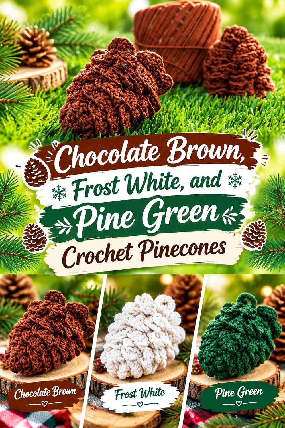
Crochet pinecones add texture rather than another smooth stuffed shape. Chocolate brown can dominate the scales, frost white can appear at selected tips, and pine green can be introduced through a small leaf or nearby crochet sprig.
Chocolate Brown Should Preserve the Crochet Pinecone Texture
Keep most of the raised surface brown so light and shadow can emphasize the layered construction. Alternating every scale between colors would make the texture harder to read from across the shelf.
On dark wooden shelving, position pinecones near cream books or winter-white crochet accents.
Frost White Can Give Chocolate Brown Crochet Pinecones a Snowy Edge
Use white only at selected outer areas when you want a frosted effect. A small light accent can reveal individual scales without turning the pinecone into a striped object.
Repeat pine green nearby rather than forcing it into every scale; the green works better as a supporting botanical color.
Creator Credit: Passione Uncinetto
10. Pine Green, Cranberry, and Cream Crochet Mini Wreath

A miniature wreath creates useful negative space because its open center breaks up a shelf full of solid amigurumi pieces. Pine green should dominate the ring, cranberry can become a small bow or repeated accent, and cream can provide a quieter light detail.
Pine Green Should Define the Crochet Mini Wreath Ring
Keep enough uninterrupted green around the circumference that the opening remains instantly recognizable. If cranberry and cream divide the ring into many short sections, the circular structure can become less obvious.
Avoid positioning the wreath directly against another round object that fills its center visually.
Cranberry Can Give the Pine Green Crochet Wreath a Clear Top
Place cranberry in one concentrated area such as a bow-like detail or small cluster. This establishes the wreath’s orientation and prevents it from looking like an undirected green circle.
A smaller cream accent can lighten that area without competing with the red.
Creator Credit: Samia Alexan Crochet
11. Burgundy, Cream, and Dusty Rose Crochet Mini Stocking
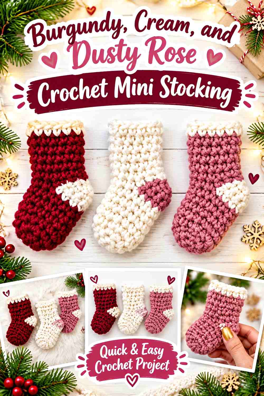
A miniature stocking works well hanging from a shelf edge, tiny peg, or decorative ladder within a larger book nook. Burgundy can form the main sock, cream can separate the cuff, and dusty rose offers a softer third shade when you want less traditional winter color.
Burgundy Should Carry Most of the Crochet Mini Stocking
Use burgundy continuously through the foot and leg so the tiny stocking silhouette stays clear. Frequent color changes around the heel and toe can make a small object look visually fragmented.
Cream at the top gives the eye an immediate boundary between the stocking and whatever it hangs from.
Dusty Rose Can Soften Burgundy and Cream Crochet Stocking Details
Add dusty rose to one controlled section—a toe, heel, or small decorative stripe—rather than giving it equal coverage.
Because burgundy and dusty rose belong to a similar color family, cream is useful between them whenever more visual separation is needed.
Creator Credit: naztazia
12. Icy Blue, Winter White, and Silver Gray Crochet Snowflake

A flat snowflake can occupy vertical space without taking up valuable shelf depth. Icy blue can cover the main radial structure, winter white can emphasize selected points, and silver gray can add enough depth to keep the motif visible against pale books.
Icy Blue Should Control the Crochet Snowflake’s Main Shape
Use icy blue through most of the arms so the eye reads one continuous radial motif. Tiny alternating color changes can interfere with the symmetry that makes the snowflake useful as a background decoration.
Hang or lean it where the star-like outline has plain space around it.
Silver Gray Can Keep Icy Blue and Winter White Crochet Points Visible
Use gray near the center or on a restrained outer detail if the two pale colors blend into the shelf. The darker neutral gives openwork more definition without replacing icy blue as the main winter shade.
On dark bookshelves, you may need less gray because the background already supplies contrast.
Creator Credit: Crochet Craftsman
13. Deep Teal, Warm White, and Ochre Crochet Winter Star

A crochet star can finish the nook as a simple geometric accent above or behind the smaller three-dimensional pieces. Deep teal gives the star a strong winter base, warm white lightens selected details, and ochre provides a small warm counterpoint.
Deep Teal Should Keep the Crochet Winter Star Points Connected
Let teal run from the center through most of each point so the entire motif remains visually unified. A star’s outline is more important than complicated internal color changes when it is placed behind books or other decorations.
Against dark shelving, a warm-white outer detail can restore the point definition.
Ochre Should Accent Deep Teal and Warm White Crochet Star Details
Use ochre at the center or another small repeated point rather than dividing every star arm equally. Its warmth naturally attracts attention, so a limited amount is usually sufficient.
This small ochre accent can also connect visually with chestnut, rust, camel, and other warm tones used elsewhere in the book nook.
Creator Credit: Kristines Crochets
Which Cozy Winter Book Nook Color Direction Should You Choose?
For a classic reading-nook atmosphere, deep navy, parchment, cocoa brown, forest green, chestnut, and cream work naturally with book pages and wood shelving. The mini books, cocoa mug, tree, house, and pinecones fit particularly well in this direction.
For a colder snowy palette, combine dusty blue, icy blue, slate, silver gray, and winter white. Use these colors on the snowman, beanie, snowflake, and selected house details while repeating warmer brown elsewhere so the entire display does not become one pale blue field.
If you prefer richer winter color, burgundy, cranberry, deep teal, forest green, and ochre can become the focal shades. Keep cream or oatmeal repeating between them so individual small decorations do not compete for equal attention.
Conclusion
A cozy crochet winter book nook works best when every small object has a reason to be there. Mini books reinforce the reading theme, a cocoa mug introduces a familiar winter ritual, clothing pieces add soft texture, and snowflakes, trees, pinecones, and snowmen establish the season.
Keep the full shelf in mind while choosing colors. Books, shelving, and wall color already contribute large visual areas, so crochet accents rarely need every winter shade at once. Give each decoration a dominant color, repeat a few neutrals throughout the collection, and reserve your strongest accents for focal pieces.
Use the credited tutorials for their individual crochet constructions, then adapt the colors and shelf arrangement independently to suit your own winter book nook.
Frequently Asked Questions
What colors work well for a cozy crochet winter book nook?
Deep navy, forest green, burgundy, cocoa brown, icy blue, dusty blue, cream, oatmeal, and warm white can all work well. Choose several repeating colors rather than giving every decoration an unrelated palette.
How many crochet decorations should I put in a small book nook?
Use the available shelf space as the guide. A few distinct pieces with visible space around them usually show their shapes better than many tiny objects covering book titles and overlapping one another.
How can I make dark crochet decorations visible on a wooden shelf?
Place them beside lighter book spines or add a light supporting color such as cream, oatmeal, parchment, or frost white. Increasing light-dark contrast is often more effective than adding another strong hue.
Which crochet decoration fits a book nook theme most directly?
Mini crochet books create the clearest connection to reading, while a cocoa mug, miniature sweater, beanie, house, or winter character can build the cozy seasonal setting around them.
Can I mix icy winter blues with warm brown crochet decorations?
Yes. Icy blue and dusty blue can supply the snowy direction, while cocoa, chestnut, and chocolate brown keep the display visually warm. Repeating cream between both groups helps connect them.
How do I keep a multicolor crochet book nook from looking cluttered?
Choose a limited repeating palette and assign colors different roles. One or two neutrals can appear throughout the display, while deeper accent colors are reserved for particular objects such as the tree, gnome, books, or stocking.
Should flat crochet snowflakes and stars go in front of or behind the books?
They generally work well where their full silhouettes remain visible, such as against the shelf backing or slightly behind smaller three-dimensional pieces. Avoid covering their outer points with several objects, because the recognizable shape is part of their decorative value.