A paw print gives a crochet Christmas pet stocking an immediate focal point, but the strongest designs do more than place a paw shape on an unrelated stocking. The stocking body, cuff, heel, toe, hanging loop, and paw motif can each take a different color role so the finished piece looks coordinated rather than decorated as an afterthought.

Classic red, forest green, and white create an unmistakable Christmas direction, while cranberry and oatmeal make the same concept softer. Navy with white turns the paw into a high-contrast graphic feature, and sage with cream creates a quieter pet stocking that can fit more neutral holiday decor.
The creator credits below include direct pet and paw-print stocking tutorials as well as full crochet Christmas stocking tutorials that can serve as construction references. The color schemes and paw-print placements described here are editorial adaptations unless they already appear in the credited tutorial.
Quick List:
- Classic Red, Forest Green, and White Crochet Paw Print Pet Stocking
- Cranberry Red and Cream Crochet Fair-Isle Paw Print Pet Stocking
- Evergreen, Cherry Red, and White Crochet Paw Print Pet Stocking
- Burgundy and Oatmeal Crochet Pet Stocking With a Paw Appliqué
- Navy and Snow White Crochet Paw Print Pet Stocking
- Sage Green, Cream, and Dusty Rose Crochet Paw Print Pet Stocking
- Deep Teal and Ivory Crochet Paw Border Pet Stocking
- Charcoal and Mustard Crochet Paw Print Pet Stocking
- Rust, Cream, and Chocolate Brown Crochet Paw Print Pet Stocking
- Powder Blue, White, and Silver Gray Crochet Paw Print Pet Stocking
- Plum, Lilac, and Cream Crochet Paw Print Pet Stocking
- Candy-Cane Red, White, and Blush Crochet Paw Print Pet Stocking
- Taupe, Dusty Blue, and Cream Crochet Paw Print Pet Stocking
- Forest Green, Camel, and Cream Crochet Paw Print Pet Stocking
- Winter White, Red, and Sage Crochet Hexagon Pet Stocking With Paw Prints
- Black, Red, and White Crochet Graphic Paw Print Pet Stocking
- Red, Green, Cream, and Gold Crochet Multicolor Paw Print Pet Stocking
Give the Paw Print Enough Contrast on a Crochet Pet Stocking
A paw print usually contains several relatively small shapes, so it needs more color separation than a broad stripe or cuff. A cream paw on burgundy can remain readable from across the room, while dusty rose on blush creates a much subtler motif that may be better for a tonal design.
Compare the yarns by lightness as well as hue. Red and green may look completely different as colors but can still sit close together in value. If a small paw loses definition, use a lighter or darker motif color, increase the surrounding background area, or simplify the number of additional colors near it.
The stocking leg usually offers the largest uninterrupted place for a paw motif. The toe can also work well for a playful paw-pad arrangement, while the cuff gives you a useful place to repeat the motif color without placing another large paw beside the first.
Let the Cuff, Heel, and Toe Support the Paw Print Colors
A contrasting cuff can help connect the paw motif to the rest of the stocking. For example, a cream paw on a cranberry body can be repeated with a cream cuff, while the heel and toe remain cranberry. That keeps cream clearly secondary.
For a busier three-color palette, divide the roles more carefully. Red can dominate the stocking, white can form the paw prints, and green can stay at the cuff and hanging loop. Giving each color a job is usually clearer than putting all three into every section.
The toe is particularly useful when the pet theme itself is shaped like a paw. A group of contrasting pads near the bottom can make the stocking look pet-specific even when the rest of the construction follows a traditional Christmas stocking shape.
Keep Paw-Print Pet Stockings Practical Around Pets
A pet stocking is decoration rather than clothing, so the practical issue is where and how it hangs. Use a secure hanging loop and consider placing the filled stocking where a pet cannot pull it down, particularly when it contains food, toys, or items with packaging.
Flat crochet paw motifs or colorwork keep the surface relatively simple. If you add bells, buttons, bows, beads, or dangling ornaments, consider whether an interested dog or cat could reach, chew, or pull them. Color contrast can create plenty of decoration without relying on loose pieces.
1. Classic Red, Forest Green, and White Crochet Paw Print Pet Stocking

Classic red works well as the dominant stocking color because it gives a white paw print plenty of surrounding contrast, while forest green can be reserved for the cuff, hanging loop, or a narrow transition. Keeping the body mainly red prevents three traditional Christmas colors from competing equally.
White Makes the Classic Red Paw Print Easy to Read
Place white in the paw pads or central paw motif and leave enough uninterrupted red around it. A clean red field gives the small rounded shapes more definition than a heavily striped background would.
If white already occupies a large paw motif, keep the heel and toe predominantly red so the neutral does not take over the stocking.
Forest Green Should Support Classic Red From the Cuff
Use forest green at the top where the stocking already changes visually. This gives the third color a clear role and keeps it away from the detailed white paw shapes.
A small forest-green hanging loop can repeat the cuff color without introducing another green section lower on the stocking.
Creator Credit: The Crochet Crowd
2. Cranberry Red and Cream Crochet Fair-Isle Paw Print Pet Stocking

Cranberry and cream create a softer Christmas palette than bright red and white. Cranberry can carry most of the stocking, while cream forms repeated paw prints across one controlled colorwork area. Keeping the cuff mostly cranberry prevents the lighter motifs from spreading through every section.
Cream Paw Prints Need Consistent Space Across Cranberry Red
Repeated cream paws will look more connected when the amount of cranberry between them stays visually consistent. Avoid adding extra cream stripes immediately above or below the paw-print band, because that can blur the boundary around the motifs.
The deeper cranberry background also gives small cream details more room to remain distinct.
Cranberry Red Should Continue Beyond the Cream Paw-Print Section
Let cranberry return above and below the motif area rather than allowing the colorwork to occupy the entire stocking leg. Those solid sections give the eye a break and make the paw pattern feel deliberate.
If you want a cream cuff, keep it narrower than the total cranberry body so the stocking remains clearly red-led.
Creator Credit: Jayda InStitches
3. Evergreen, Cherry Red, and White Crochet Paw Print Pet Stocking
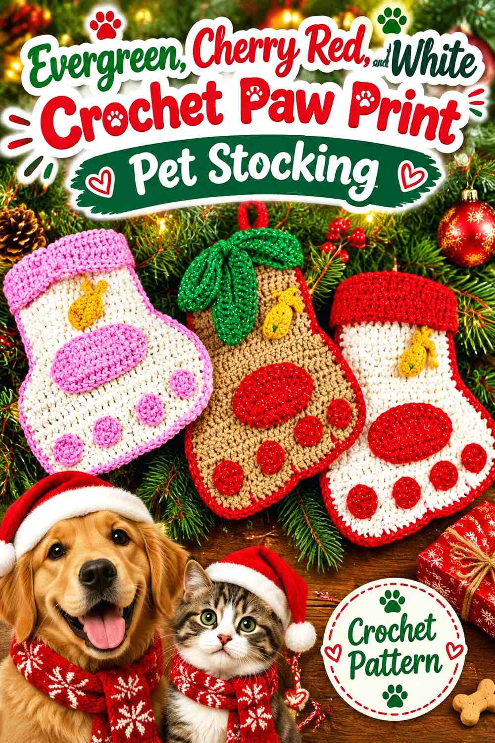
Evergreen gives the stocking an especially strong Christmas base, while white can form the paw print and cherry red can appear in a toe, cuff, or small pet-specific accent. The green body should remain the largest color area so the red functions as a supporting holiday note rather than splitting the stocking evenly.
White Paw Pads Stand Out Clearly on Evergreen
A white paw near the toe or lower leg will normally have enough light-dark separation from evergreen to remain readable. Keep the nearby green area relatively plain instead of surrounding the motif with multiple red stripes.
That open green field lets the rounded paw pads remain the obvious pet feature.
Cherry Red Should Repeat Sparingly Against Evergreen and White
Use cherry red where it can frame the design, such as the cuff or heel. If red appears in every border plus the paw motif, the stocking may become visually divided into three equal colors.
Keeping the red areas larger but fewer creates a cleaner Christmas palette.
Creator Credit: Sara Sach Crochet Designs
4. Burgundy and Oatmeal Crochet Pet Stocking With a Paw Appliqué
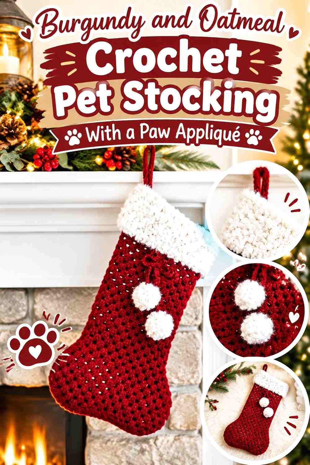
Burgundy and oatmeal work well when you want a deeper, less saturated Christmas stocking. Burgundy can cover the stocking body while a flat oatmeal paw appliqué becomes the light focal point. A matching oatmeal cuff can repeat the motif color without requiring additional paw prints.
Oatmeal Gives Burgundy Paw Appliqués Strong Separation
A pale oatmeal paw can stand out clearly against burgundy without producing the crisp red-and-white effect of a brighter neutral. Keep the appliqué on an uninterrupted burgundy section so its outline stays easy to recognize.
If the oatmeal is especially warm, it can also soften the overall Christmas palette.
Burgundy Should Return Around an Oatmeal Cuff and Paw
When both the paw and cuff are oatmeal, preserve burgundy through the heel, toe, and most of the leg. That maintains a clear dominant/supporting relationship.
Avoid adding a third dark accent unless it contributes a specific detail; burgundy already provides enough visual weight.
Creator Credit: Sweet Creek Patterns
5. Navy and Snow White Crochet Paw Print Pet Stocking
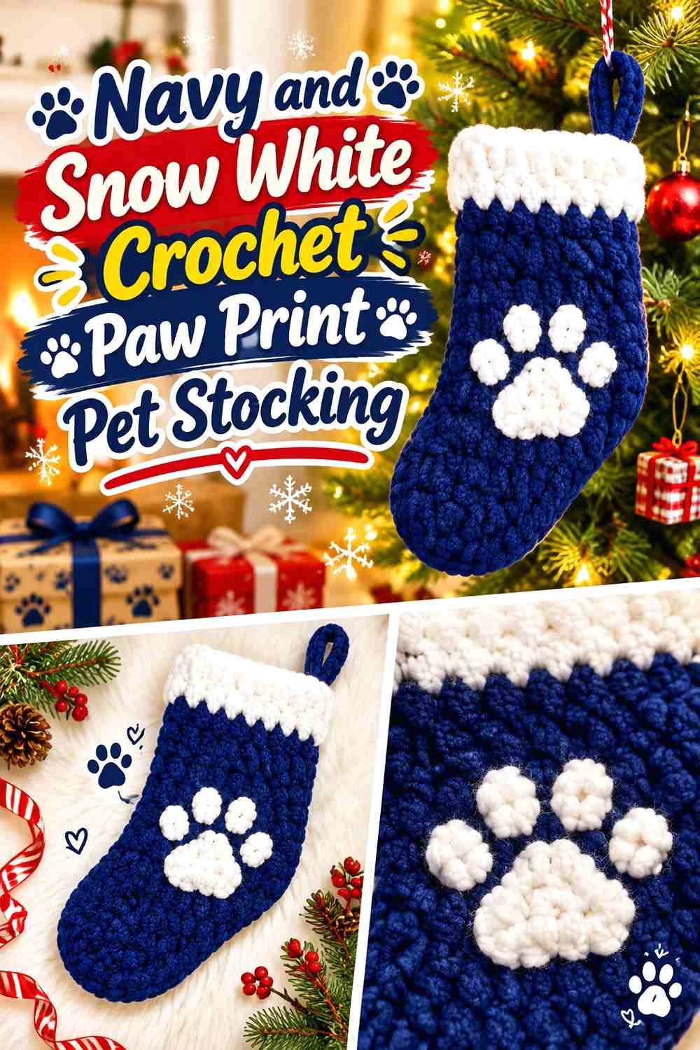
Navy and snow white create one of the strongest graphic combinations in the collection. A large white paw can become the main decorative feature while navy continues across the body, heel, and toe. This palette also works when you want a winter rather than strictly red-and-green Christmas direction.
Snow White Can Become the Main Paw Feature on Navy
Give the white paw plenty of navy negative space instead of surrounding it with other white motifs. Strong contrast means you do not need multiple decorative layers to make the pet theme obvious.
A single substantial paw often has more impact than many small white shapes on a compact stocking.
Navy Should Control the Snow White Cuff and Toe
If the cuff is white, keep the toe navy or vice versa. Making every major finishing section white can reduce the amount of navy that visually frames the motif.
One large white feature plus one supporting repeat usually creates enough connection.
Creator Credit: Crafter Frog
6. Sage Green, Cream, and Dusty Rose Crochet Paw Print Pet Stocking

Sage creates a muted body color, cream supplies light paw-print contrast, and dusty rose adds a gentle third accent. The cleanest approach is to reserve rose for one structural area—such as the cuff—rather than inserting it into every paw.
Cream Paw Prints Need a Noticeable Sage Green Background
Very pale sage can sit close to cream, so compare the yarns before working small paw pads. A slightly deeper sage may make the motif clearer while keeping the palette soft.
Leave sage visible between individual cream paw elements so they do not merge into one pale patch.
Dusty Rose Can Finish the Sage and Cream Stocking at the Cuff
A dusty-rose cuff gives the palette another color without competing directly with the cream paw motif. Because the cuff is already a separate structural zone, the rose looks purposeful rather than randomly introduced.
Repeat only a small amount of rose elsewhere if the top feels disconnected.
Creator Credit: naztazia
7. Deep Teal and Ivory Crochet Paw Border Pet Stocking
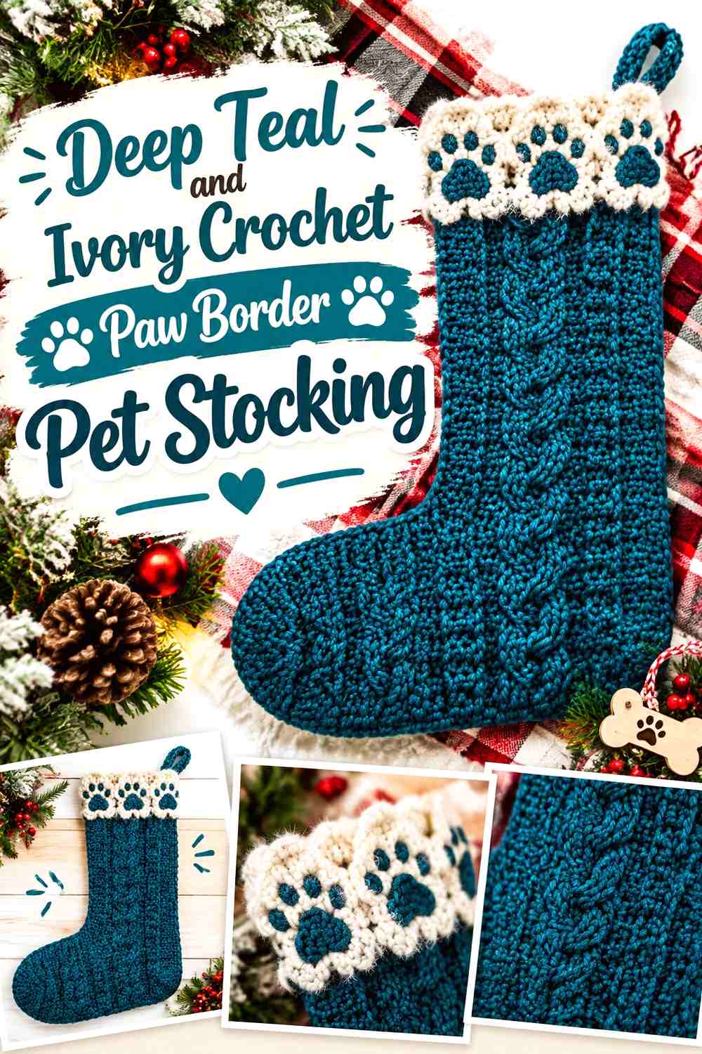
Deep teal and ivory work particularly well for a paw-print border because the value difference helps several smaller motifs remain distinct. Keep teal across most of the stocking, then place a controlled row of ivory paws rather than scattering them from heel to cuff.
Ivory Paws Can Form One Clear Border on Deep Teal
A single band of ivory paws gives the stocking a repeated pet theme without covering the entire surface. Leave teal above and below the band so each motif retains a clear background.
If the paw row sits near the cuff, keep the actual cuff teal or only lightly edged in ivory.
Deep Teal Should Stay Dominant Around the Ivory Paw Border
Use teal through the toe, heel, and most of the leg. Ivory already has strong visual presence against a dark background and does not need equal surface area.
This balance is especially useful when the stocking fabric itself has noticeable crochet texture.
Creator Credit: Sierra Fontaine
8. Charcoal and Mustard Crochet Paw Print Pet Stocking
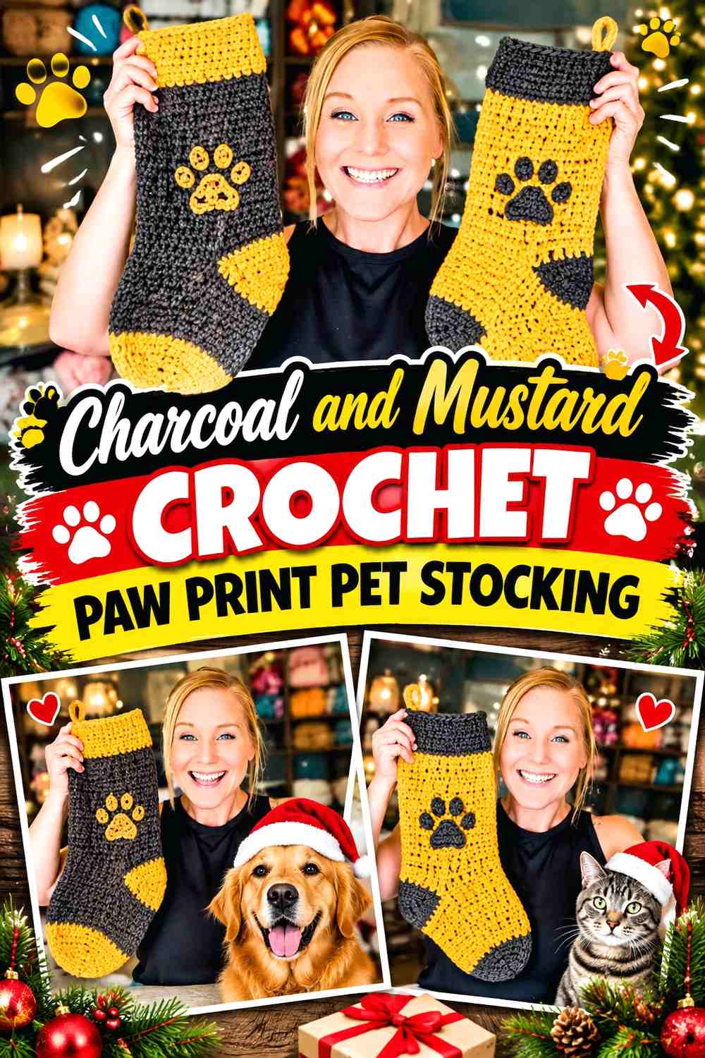
Charcoal provides a neutral field while mustard creates an unexpected but highly visible paw motif. The combination feels more modern than traditional red and green, yet a small cream accent at the cuff can still connect it to Christmas decor if desired.
Mustard Paw Prints Need Only a Small Area Against Charcoal
Mustard attracts attention quickly on charcoal, so a central paw or a few repeated pads can provide enough color. Avoid filling large heel, toe, and cuff sections with mustard unless you intentionally want a nearly equal two-color stocking.
The darker field makes small mustard shapes easier to distinguish.
Charcoal Can Keep a Mustard Paw Stocking From Looking Overdecorated
Let charcoal continue through most of the cuff and toe if the paw motif is already substantial. The quiet neutral gives the stronger accent somewhere to stand out.
A narrow mustard cuff edge is often enough to reconnect the motif with the top of the stocking.
Creator Credit: Crochet With Tiffany
9. Rust, Cream, and Chocolate Brown Crochet Paw Print Pet Stocking
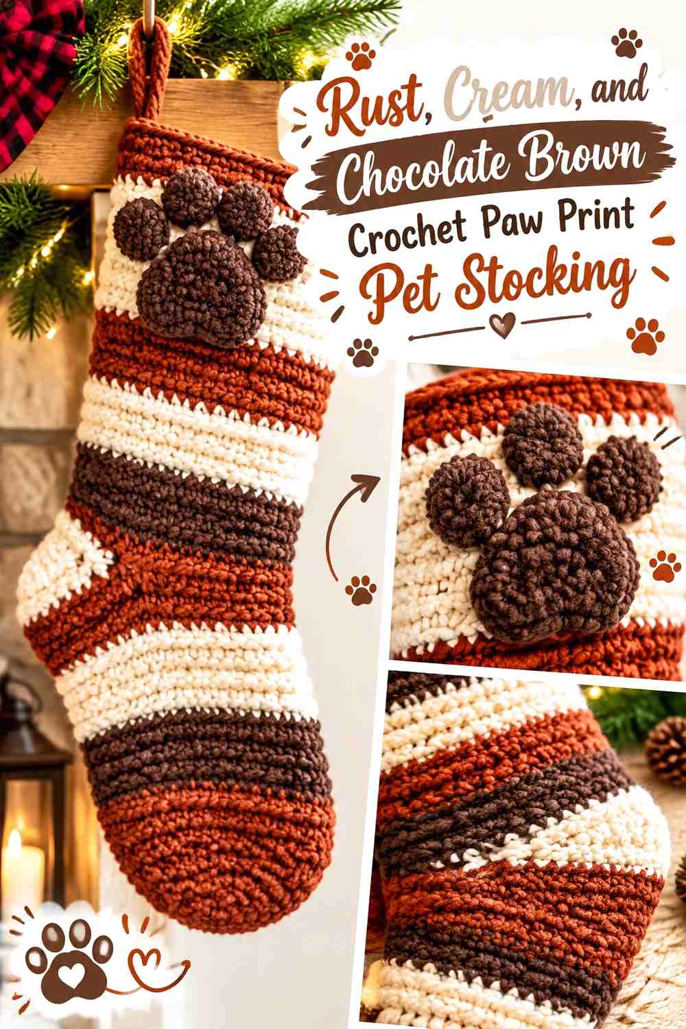
Rust, cream, and chocolate brown create an earthy Christmas palette. Rust can lead across the stocking body, cream can form the paw print, and dark brown can define the cuff, heel, or narrow motif outline where additional separation is useful.
Cream Keeps the Rust Paw Print Visible
Place cream paws against an uninterrupted rust background so the pale shapes remain distinct. This is especially useful if the stocking uses rich texture, because cream can provide color contrast without requiring many changes across the body.
Keep the cream area smaller than rust if you want the stocking to retain its warm autumn-to-Christmas character.
Chocolate Brown Can Frame Rust and Cream Without Competing
Use dark brown at the cuff or heel instead of outlining every cream paw pad. One strong brown structural section is usually enough to ground the warmer palette.
If the brown becomes too widespread, the stocking can lose the clearer rust-led hierarchy.
Creator Credit: Rich Textures Crochet
10. Powder Blue, White, and Silver Gray Crochet Paw Print Pet Stocking

Powder blue, white, and silver gray create a winter-focused pet stocking that does not depend on traditional Christmas red or green. Blue can cover most of the stocking, white can make the paw print, and gray can separate the cuff or heel from the pale body.
White Paws Need Enough Contrast Against Powder Blue
Extremely pale blue can nearly disappear beside white. If the paw print becomes too subtle, choose a slightly deeper powder blue rather than surrounding every motif with a dark outline.
The goal is to preserve the light winter palette while keeping the paw readable.
Silver Gray Can Separate Powder Blue From a White Cuff
Use gray in a narrow transition or heel section where two very light colors need more structure. This prevents white and blue from visually merging without turning gray into a third dominant color.
A gray hanging loop can provide one small repeat elsewhere.
Creator Credit: Jo to the World Creations
11. Plum, Lilac, and Cream Crochet Paw Print Pet Stocking
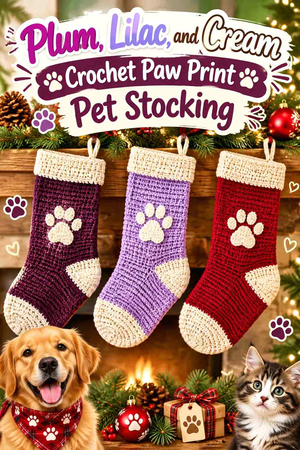
Plum gives this stocking its deepest color, lilac creates a softer secondary area, and cream offers the clearest paw-print contrast. Use plum for the body, cream for the paw, and lilac at the cuff or heel rather than distributing all three equally.
Cream Paw Prints Can Brighten a Plum Stocking
A cream motif will become the lightest and most visible element against plum. Keep the surrounding body simple so the paw remains the obvious decorative focus.
If you want multiple paws, reduce their scale rather than adding large cream blocks elsewhere.
Lilac Can Bridge Plum and Cream at the Cuff
Lilac works well between the dark body and light motif because its value sits between them. A lilac cuff softens the jump without needing to appear inside the paw itself.
Keep enough plum visible directly below the cuff to maintain the deeper main color.
Creator Credit: Rocco Baby Crochet
12. Candy-Cane Red, White, and Blush Crochet Paw Print Pet Stocking
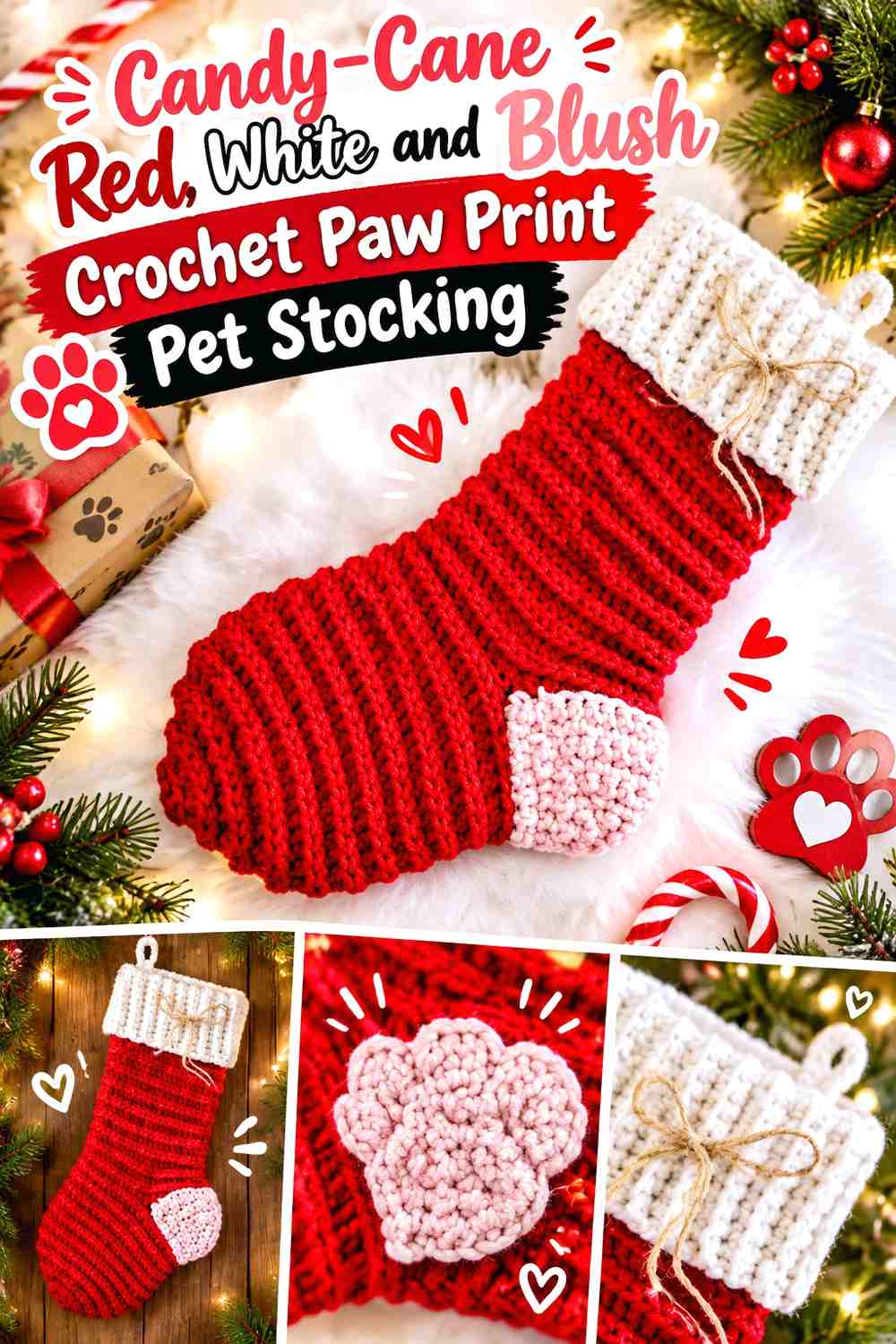
Candy-cane red and white create a lively Christmas base, while blush gives the pet stocking a softer third color. Red can remain dominant, white can form the primary paw, and blush can appear as a small secondary paw or cuff detail.
White Should Separate Candy-Cane Red From Blush Paw Details
Red and blush are related hues, so white is useful when both appear in the same motif area. A white paw with a blush center, for example, creates a clearer hierarchy than several red and pink shapes touching directly.
Keep the exact arrangement simple so the motif still reads as a paw first.
Candy-Cane Red Needs Enough Space Around White and Blush
Let red dominate the stocking leg and toe. Because white and blush are both light, too much of them can turn the design pastel-heavy rather than clearly Christmas red-led.
A mostly red heel is an easy way to preserve the hierarchy.
Creator Credit: Passionate Crafter
13. Taupe, Dusty Blue, and Cream Crochet Paw Print Pet Stocking

Taupe provides a neutral foundation, dusty blue brings muted color, and cream supplies a light paw motif. This combination works when you want a pet stocking that coordinates with understated Christmas decor rather than high-saturation red and green.
Cream Paw Prints Need a Defined Taupe Background
Place the cream motif directly on taupe rather than over a dusty-blue stripe. The neutral background keeps the paw clear while allowing blue to serve a separate structural role.
If taupe and cream are very close in value, select a slightly deeper taupe for the main body.
Dusty Blue Can Define the Taupe and Cream Cuff
Use dusty blue at the cuff or heel where a medium-value color can separate the two neutrals. That gives the palette depth without inserting blue into every paw pad.
A small blue hanging loop can repeat the cuff if desired.
Creator Credit: Through The Loop Yarn Craft
14. Forest Green, Camel, and Cream Crochet Paw Print Pet Stocking
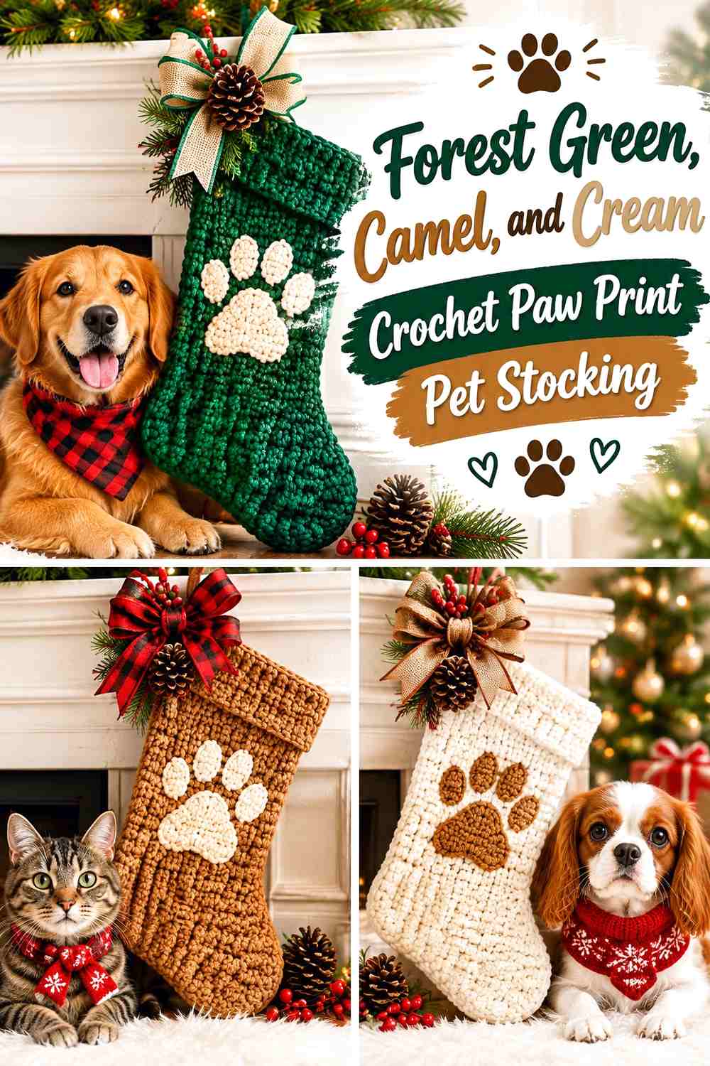
Forest green creates a dark holiday base, camel warms the cuff or heel, and cream makes the paw print highly visible. Unlike a red-and-green stocking, this palette leans more rustic while still feeling appropriate for Christmas.
Cream Paw Prints Stand Out Strongly on Forest Green
Use cream on the central paw or repeated toe pads and leave enough forest green around them for clean separation. Strong contrast means the motif can remain relatively simple.
Avoid surrounding the paw with additional camel outlines unless they solve a real visibility problem.
Camel Can Warm the Forest Green and Cream Stocking Cuff
A camel cuff gives the top of the stocking a softer transition than white would. It also allows cream to remain specifically associated with the paw motif.
Keep camel confined mainly to the top or heel so forest green continues to lead.
Creator Credit: Hectanooga1
15. Winter White, Red, and Sage Crochet Hexagon Pet Stocking With Paw Prints
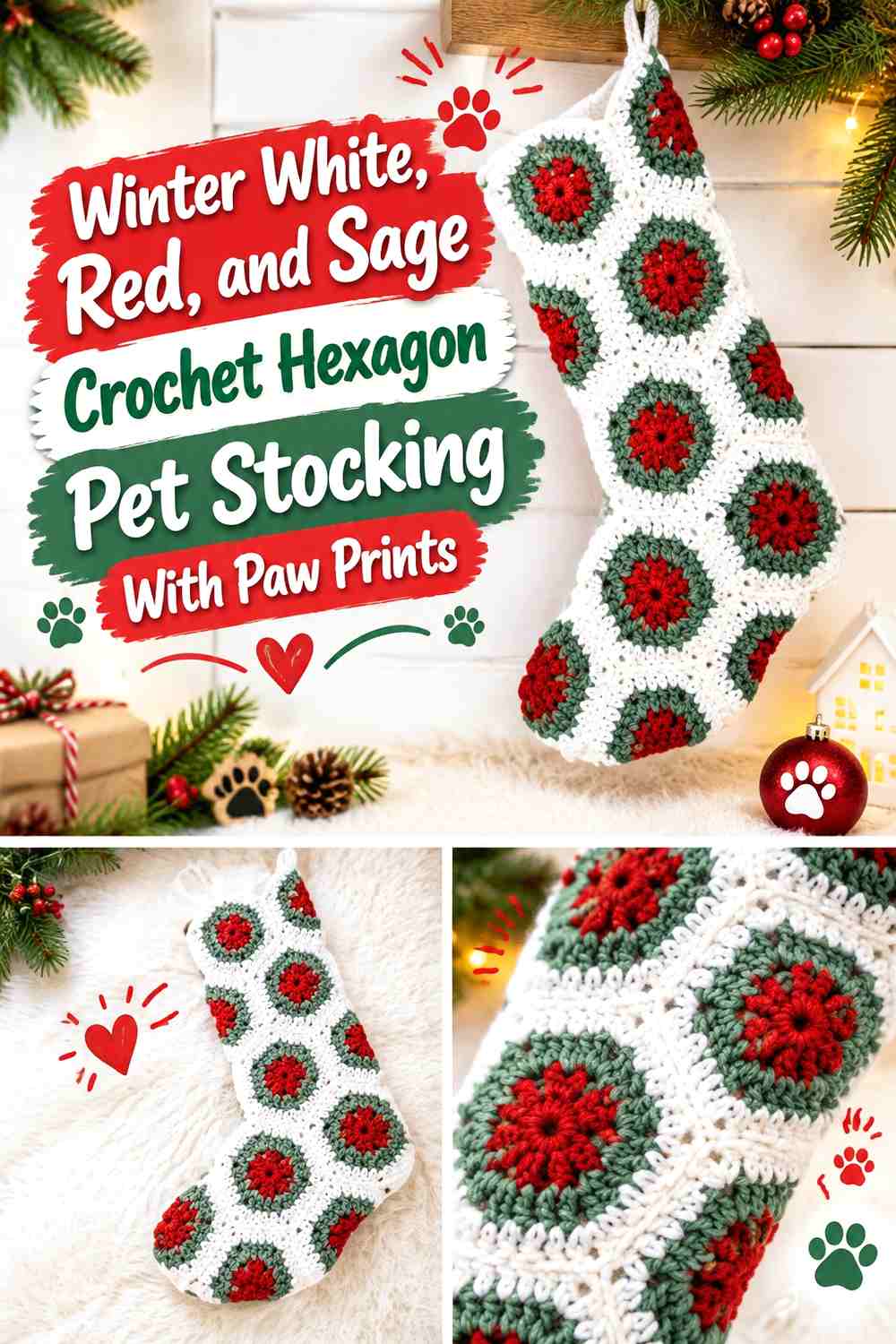
A motif-based stocking creates more natural places to distribute color. Winter white can act as the connecting background, while red and sage appear in selected hexagons or panels. Paw prints should still have a consistent placement so they do not disappear among the geometric sections.
Red Paw Prints Need Consistent Winter White Hexagon Backgrounds
Place red paws on white-centered areas rather than shifting the background color behind every motif. A shared white field helps repeated paw prints look like part of one design.
Sage can then appear in surrounding motifs or borders without interfering with the paw silhouette.
Sage Should Support Red and Winter White Without Filling Every Hexagon
Use sage in selected outer motif sections or joins rather than giving all three colors equal coverage in every unit. Repetition matters more than complete symmetry.
If the stocking already contains many motif boundaries, keep the cuff relatively simple.
Creator Credit: Bella Coco
16. Black, Red, and White Crochet Graphic Paw Print Pet Stocking

Black, red, and white produce the highest-contrast palette in the article. Black can cover the stocking body, white can create the main paw, and red can be concentrated in the cuff or the central pad of the motif.
White Creates a Crisp Paw Print on Black
Use the black body as uninterrupted negative space around the white paw. This color relationship is already strong enough that the motif does not need another outline.
If you add several white paws, keep them separated so they remain individual shapes rather than a continuous light pattern.
Red Should Accent the Black and White Paw Rather Than Compete
Reserve red for one deliberate area such as the cuff, heel, or center of a larger paw. Red already carries substantial visual weight against black and white.
Keeping it controlled prevents three high-contrast colors from making the stocking unnecessarily busy.
Creator Credit: MJ’s Off The Hook Designs
17. Red, Green, Cream, and Gold Crochet Multicolor Paw Print Pet Stocking
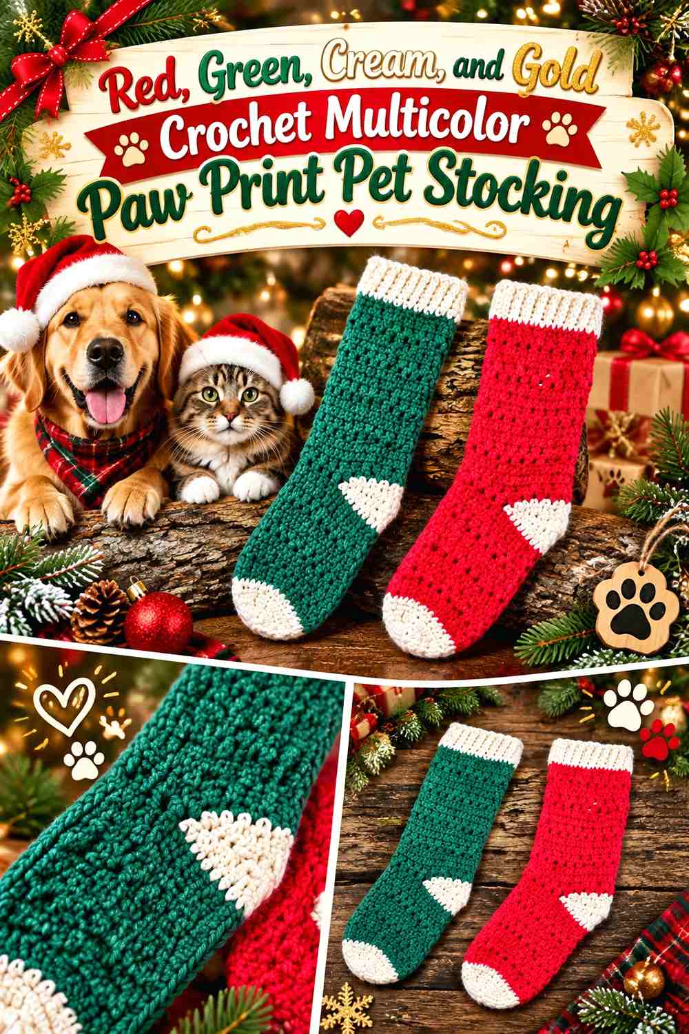
A four-color Christmas pet stocking needs especially clear hierarchy. Red can dominate the body, cream can form most paw prints, green can occupy the cuff and selected secondary motifs, and gold can remain the smallest accent.
Cream Paw Prints Should Unite the Red and Green Stocking
Using the same cream for each paw motif creates repetition across a multicolor design. This is useful when red and green already occupy several separate areas.
Avoid giving each paw a completely different color combination; a repeated cream motif helps organize the stocking.
Gold Should Stay Smaller Than Red, Green, and Cream
Use gold as a narrow edge, small paw center, or restrained hanging-loop detail rather than a fourth equal block. Its role is to add a small warm highlight, not another major color field.
If the stocking starts to look crowded, reduce the gold first and preserve the clearer red-green-cream hierarchy.
Creator Credit: Ophelia Talks Crochet
Which Paw Print Christmas Pet Stocking Palette Should You Choose?
For the most traditional Christmas direction, choose classic red, forest green, and white or evergreen, cherry red, and white. These palettes make the holiday theme obvious before the viewer even focuses on the paw motif.
Navy and white, black-red-white, and deep teal with ivory give paw prints the strongest graphic contrast. They are useful when the pet motif itself should be the first feature noticed.
For a softer or more neutral display, sage with cream and dusty rose, taupe with dusty blue, forest green with camel, or burgundy with oatmeal reduce saturation while keeping enough contrast for the paw to remain visible.
If you want a more decorative stocking, the winter-white hexagon idea or the red-green-cream-gold scheme introduces more color. In both cases, consistent paw placement becomes important because the background already contains several visual changes.
Conclusion
A crochet Christmas pet stocking becomes much easier to plan when the paw print has a defined color role. Start with the stocking body, choose a paw color that remains visible against it, and then decide whether the cuff, heel, toe, or hanging loop should repeat that accent.
Classic red, green, and white gives you the most familiar Christmas result. Navy with white or black with white creates stronger graphic contrast, while sage, taupe, burgundy, and oatmeal move the design toward softer holiday decor.
For repeated paws, keep the surrounding background consistent. For one statement paw, leave enough plain stocking surface around it. Use the credited tutorials for the actual stocking construction and treat the palettes and paw placements as independent adaptations rather than replacements for the creators’ instructions.
Frequently Asked Questions
What color should the paw print be on a crochet Christmas pet stocking?
Choose a shade with enough light-dark contrast against the stocking body. White or cream works clearly against navy, burgundy, forest green, charcoal, and other darker colors. On a cream stocking, use a deeper red, green, blue, or brown paw instead.
Where should I place a paw print on a crochet pet stocking?
The broad leg area gives a single statement paw the most surrounding space. Smaller paws can also work in a repeated border or around the toe, where a group of pads can reinforce the pet theme.
Can I add paw prints to a regular crochet Christmas stocking tutorial?
Yes, when the stocking has a suitable area for independent colorwork or a securely attached flat appliqué. Follow the original tutorial for shaping and construction, then plan the paw motif around the available surface rather than altering the heel, toe, or structural seams unnecessarily.
How can I stop small crochet paw prints from disappearing?
Compare the motif and background yarns for value contrast. If they are too similar, lighten or darken one color, simplify the surrounding pattern, or give the paw more background space. A grayscale photo can help reveal whether two different hues are actually close in lightness.
Should the paw-print color match the stocking cuff?
It can, but it does not need to. Matching the cuff and paw creates a clear repeated accent. Using different colors can also work when each has a distinct role—for example, cream paws with a green cuff on a red stocking.
How many colors work well in a paw-print pet stocking?
Two colors can create the clearest design, while three allow you to separate the paw, body, and cuff. Four colors can work when one remains dominant and the others have clearly smaller roles. Equal amounts of several strong Christmas colors can make a small stocking look fragmented.
Are buttons, bells, and dangling decorations necessary on a crochet pet stocking?
No. Contrasting paw prints, cuffs, heels, and toes can provide enough decoration on their own. If the stocking will hang where a pet can reach it, flat crochet details also avoid adding loose decorative pieces that may invite chewing or pulling.