A crochet miniature bookshop feels more convincing when the decorations help tell a reading-centered story. Tiny book stacks establish the setting immediately, while a reading chair, rug, coffee mug, shop cat, plant, basket, lamp, and wall bunting make the space feel occupied instead of looking like shelves filled with unrelated props.

Color can connect all of those objects without making them match exactly. Burgundy can move from a book cover to bunting, forest green can repeat in plants and textiles, and parchment or oatmeal can soften stronger shades throughout the shop. That repetition is especially useful at miniature scale, where too many isolated bright colors can make a small scene appear crowded.
The tutorials credited below support the individual crochet miniatures or their underlying construction concepts. The bookshop placements and palettes are independent adaptations, so the creators are not being presented as using these exact color schemes.
Quick List
- Burgundy, Parchment, and Forest Green Crochet Mini Book Stack
- Deep Teal, Cream, and Rust Crochet Mini Reading Chair
- Oatmeal, Navy, and Mustard Crochet Mini Checkerboard Rug
- Dusty Rose, Moss Green, and Cream Crochet Mini Reading Cushion
- Terracotta, Sage, and Soil Brown Crochet Mini Potted Plant
- Powder Blue, Cocoa Brown, and Cream Crochet Mini Coffee Mug
- Charcoal, Ivory, and Rust Crochet Mini Bookshop Cat
- Camel, Oatmeal, and Olive Crochet Mini Storage Basket
- Mustard, Burgundy, and Cream Crochet Mini Bookshop Bunting
- Deep Teal, Blush, and Sage Crochet Mini Flower Vase
- Rust, Navy, and Parchment Crochet Mini Bookshop Tote
- Antique White, Moss Green, and Camel Crochet Mini Café Tablecloth
- Ochre, Charcoal, and Cream Crochet Mini Reading Lamp
- Plum, Oatmeal, and Sage Crochet Mini Granny Throw
- Chestnut, Cream, and Dusty Blue Crochet Mini Bookshop Owl
Build the Miniature Bookshop Around a Repeating Color Family
Start with two or three colors that can reappear throughout the scene instead of treating every miniature as a separate palette. Parchment, cream, oatmeal, camel, and other warm neutrals are particularly useful because they can move between book pages, cushions, baskets, rugs, and tabletop pieces without demanding much attention.
Then choose several deeper colors for focal objects. Burgundy book covers, a teal chair, forest-green plants, and a plum throw can all coexist when one or two neutrals repeatedly separate them.
Use Color to Create Different Zones Inside the Tiny Bookshop
A miniature bookshop often benefits from several small visual zones. The reading corner can carry deeper textiles, the counter can use warmer baskets and mugs, and the shelves can rely on multicolored book spines with only a few decorative objects.
Do not distribute every accent color evenly. A mustard bunting can remain primarily near the upper wall, while sage and forest green stay concentrated around the plant area. This creates variation without making the shop look disconnected.
Check Scale and Contrast Before Filling Every Bookshop Shelf
Miniature crochet can become visually heavy quickly. Compare the first finished object with the shelves, counter, and furniture before making several coordinating pieces. If the chair, basket, mug, and plant all use similarly thick-looking fabric, leave more open space between them rather than filling every gap.
Contrast matters as well. Dark decorations can disappear against walnut-colored shelving, while cream objects can merge into pale walls. Adjust the supporting color or placement before adding another hue simply to solve a visibility problem.
1. Burgundy, Parchment, and Forest Green Crochet Mini Book Stack
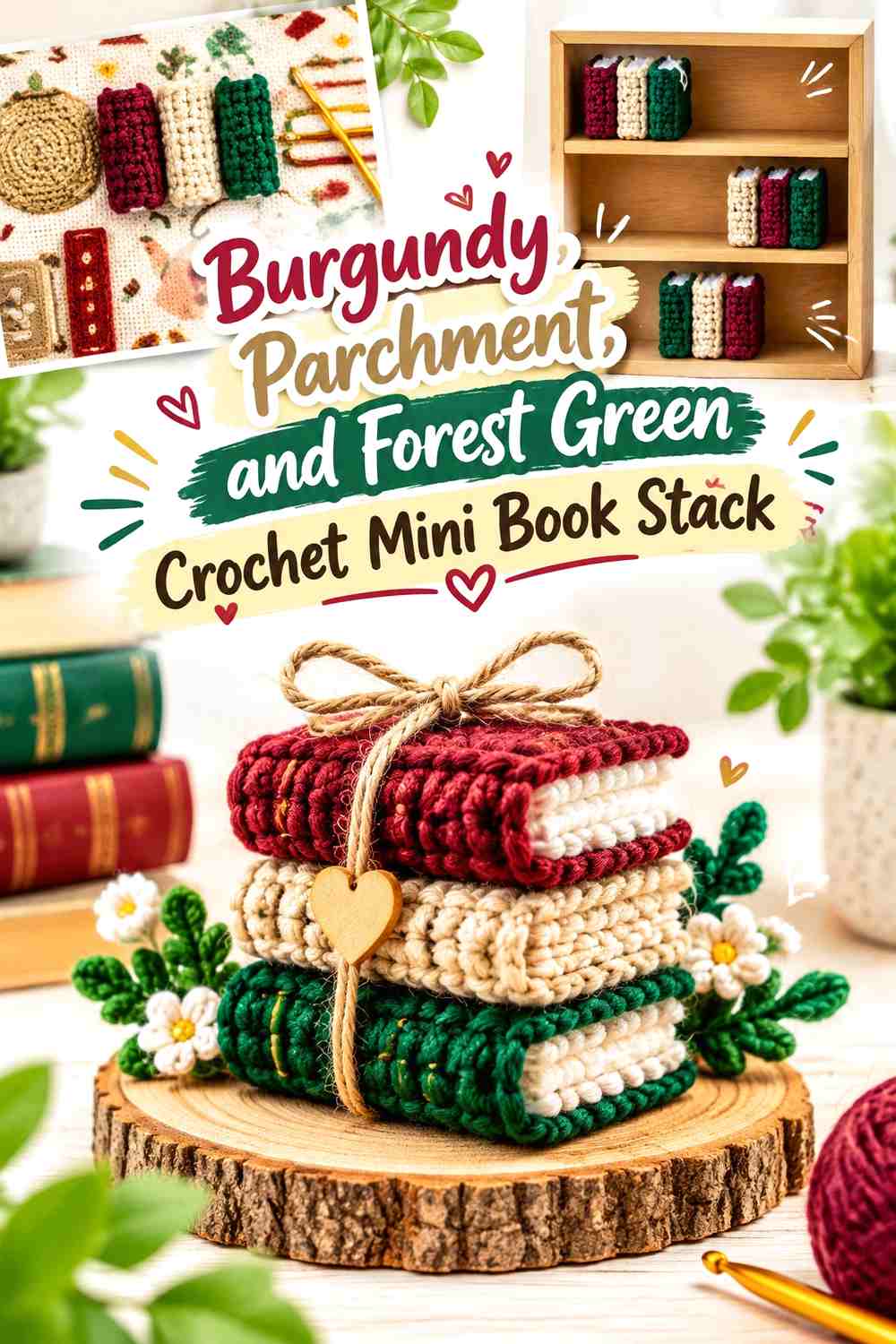
Burgundy can lead the covers in this crochet miniature book stack, while forest green gives a second cover enough distinction to make the stack look collected rather than identical. Parchment works naturally between them as the page color. Keep the strongest colors on the covers and let the pale page edges create repeated horizontal breaks when the books are stacked.
Burgundy Should Give the Crochet Mini Books a Clear Cover Color
Use burgundy over an entire visible cover instead of scattering dark red across several tiny details. A solid color plane makes the rectangular book silhouette easier to identify among more rounded miniatures such as mugs, plants, and cushions.
For a larger stack, repeat burgundy on more than one book but separate those covers with parchment or forest green so they do not visually merge.
Parchment Should Separate Burgundy and Forest Green Crochet Book Covers
Keep parchment consistent across the page sections even when the covers change. That repeated light neutral helps several miniature books look like one set without forcing every cover to match.
Place the darkest book near a lighter shelf backing when possible. On very dark shelving, a wider visible parchment edge can protect the book silhouette.
Creator Credit: Jesscrafting
2. Deep Teal, Cream, and Rust Crochet Mini Reading Chair
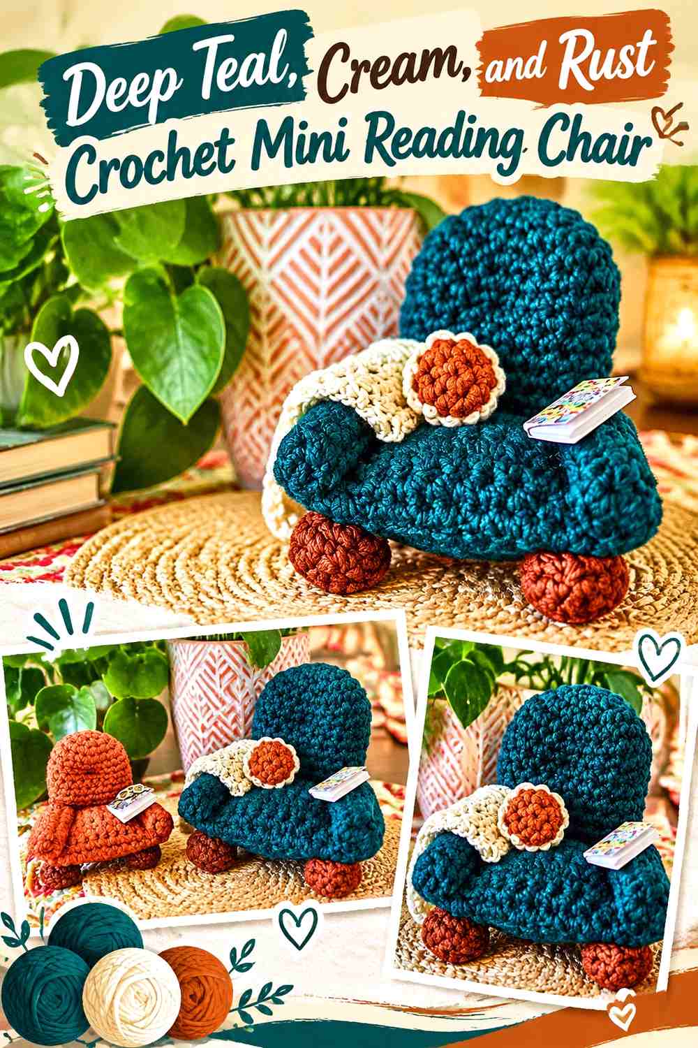
A reading chair can become the strongest object in a tiny bookshop corner, so give it one dominant upholstery color. Deep teal can cover most of the chair while cream appears on a small cushion or selected detail. Rust works best as the smallest accent, perhaps repeated nearby in book spines or another reading-corner textile.
Deep Teal Should Keep the Crochet Mini Reading Chair Visually Solid
Use teal continuously over the major seating areas so the chair remains easy to identify from several viewing angles. Too many color blocks across the seat, arms, and back can make miniature furniture appear pieced together rather than upholstered.
If the chair sits in front of dark shelving, position the cream accent where it helps separate the back or seat edge from the background.
Cream and Rust Can Warm the Deep Teal Crochet Reading Corner
Use cream as the lighter break and rust as a smaller warm accent. A cream cushion with a restrained rust detail gives the teal chair more depth without introducing a completely unrelated palette.
Repeat one of those colors in a nearby rug or book cover so the chair belongs to the bookshop rather than feeling like a stand-alone miniature.
Creator Credit: Wind Rose Fiber Studio
3. Oatmeal, Navy, and Mustard Crochet Mini Checkerboard Rug
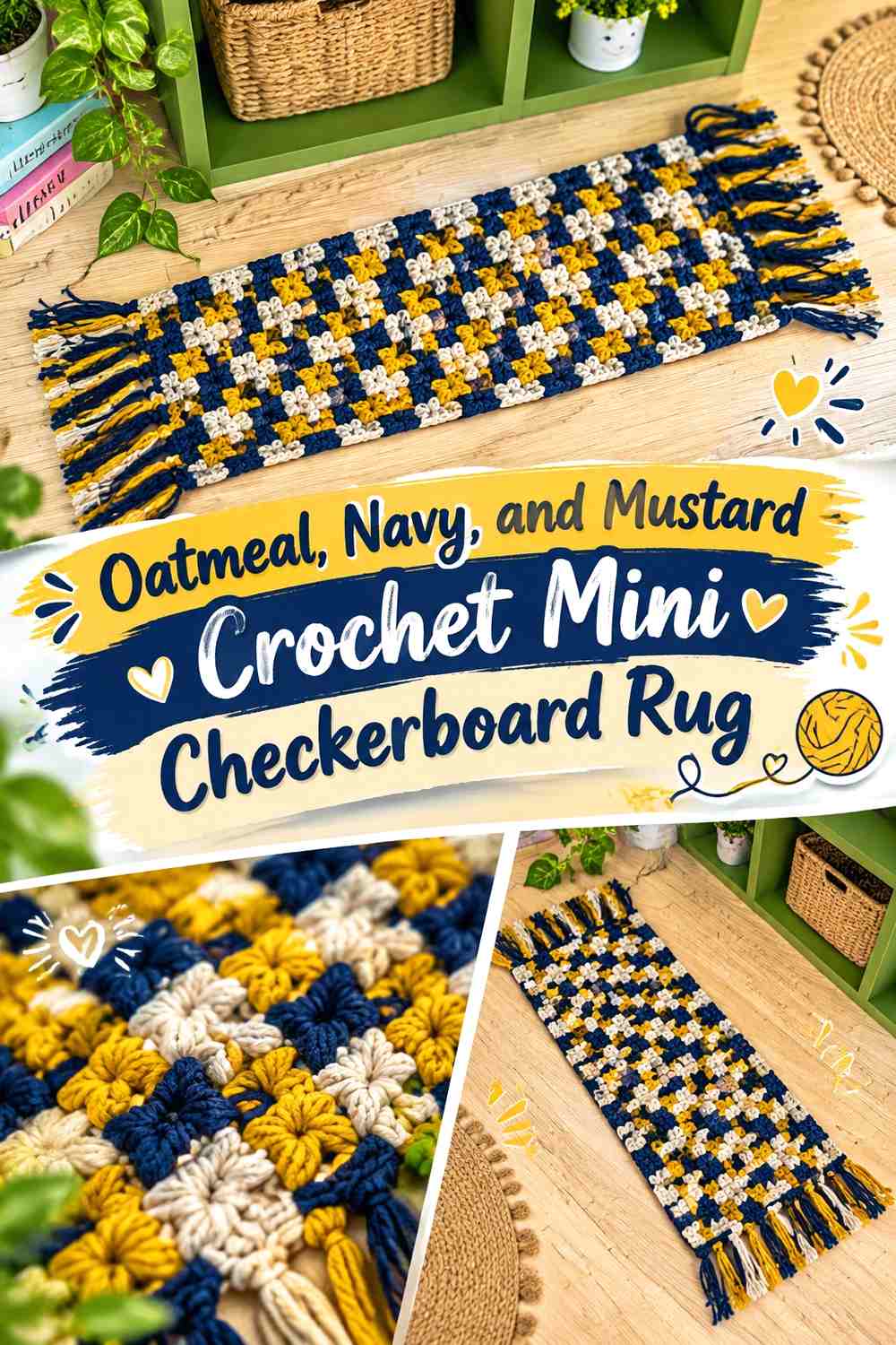
A narrow rug can visually define the reading aisle without consuming shelf or counter space. Oatmeal and navy give the checkerboard clear light-dark contrast, while mustard can appear in a narrow border or selected squares if you want a warmer bookshop accent.
Navy Should Give the Oatmeal Crochet Checkerboard Enough Contrast
Make sure the navy squares remain noticeably darker than oatmeal. At miniature scale, weak contrast can make a checkerboard look like uneven texture rather than an intentional repeating pattern.
Place the rug where enough of its surface remains visible. Hiding most of the checkerboard beneath furniture removes the color repetition that gives the floor piece its character.
Mustard Should Accent the Navy and Oatmeal Crochet Rug Sparingly
Use mustard along a border, fringe concept, or a controlled portion of the pattern rather than turning the rug into three equal checkerboards.
This lets mustard connect visually with wall bunting or book spines elsewhere while navy and oatmeal continue to define the actual floor pattern.
Creator Credit: Daring Daisy
4. Dusty Rose, Moss Green, and Cream Crochet Mini Reading Cushion

A small cushion can soften the miniature chair or window-seat area without taking up another large footprint. Dusty rose can dominate the cushion face, moss green can provide a restrained botanical detail, and cream can define the outer edge or another small feature.
Dusty Rose Should Keep the Crochet Mini Cushion Distinct From the Chair
Choose dusty rose when the chair is teal, brown, olive, navy, or another noticeably different shade. A cushion that closely matches its chair can disappear visually, particularly when the miniature is viewed from outside a display box.
Keep the rose surface relatively simple if other nearby textiles already contain strong patterns.
Moss Green Can Connect Dusty Rose Crochet Cushions to Bookshop Plants
A small moss detail lets the cushion relate to nearby greenery without turning the whole reading corner green.
Cream can serve as the lightest separator between rose and moss when those two muted colors appear too close in value.
Creator Credit: Loy Dollhouse
5. Terracotta, Sage, and Soil Brown Crochet Mini Potted Plant
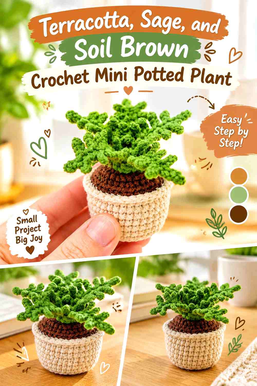
A miniature plant introduces vertical color between book spines and gives the shop a natural break from rectangular shelves and stacked books. Terracotta can form the pot, sage can dominate the leaves, and soil brown should remain mostly inside the upper opening.
Sage Should Make the Crochet Mini Plant Visible Against the Books
Use one recognizable green across most of the leaves instead of giving every leaf another shade. Shape and placement already provide botanical variation, so a consistent sage color keeps the plant from becoming overly detailed.
Against green book covers, move the plant beside burgundy, cream, navy, or brown spines to restore separation.
Terracotta Should Ground Sage Crochet Leaves at Shelf Level
The warm pot color gives the plant a clear lower boundary and prevents the leaves from appearing to grow directly out of the shelf.
Keep soil brown concentrated inside the pot. Spreading another dark brown through the leaves would weaken the clean terracotta-and-sage relationship.
Creator Credit: Crochet Everyday
6. Powder Blue, Cocoa Brown, and Cream Crochet Mini Coffee Mug

A tiny coffee mug works naturally on a bookshop counter or side table because it introduces a familiar reading-and-coffee detail. Powder blue can make the cup visible among warm wood colors, cocoa brown can define the drink, and cream can add a small light accent.
Powder Blue Should Keep the Crochet Mini Coffee Mug Separate From Brown Shelving
Use powder blue across the cup body and handle so the silhouette remains clear against wood-toned counters. A brown mug beside brown shelves may require a much lighter rim or background to stay recognizable.
Turn the mug so at least part of the handle remains visible from the main viewing angle.
Cocoa Brown and Cream Should Define the Powder Blue Crochet Mug Top
Keep cocoa concentrated at the opening so it reads as the darkest surface. Cream can provide a smaller light detail if desired, but the top should not become more visually complicated than the cup body.
This blue-brown relationship also gives the bookshop a cooler accent without introducing a highly saturated color.
Creator Credit: The Pudgy Rabbit
7. Charcoal, Ivory, and Rust Crochet Mini Bookshop Cat

A tiny cat can turn a static bookshop into a scene that feels inhabited. Charcoal works well as the main body color, ivory can lighten the muzzle or another compact detail, and rust can create a very small collar, bow, or nearby cushion accent.
Charcoal Should Keep the Crochet Mini Bookshop Cat’s Silhouette Simple
Use charcoal over most of the body rather than dividing a tiny cat into several equal markings. At miniature scale, ears, tail, and body shape already provide plenty of identifying detail.
If the cat sits against dark shelves, position it on a cream rug, lighter chair, or pale stack of books so the outer silhouette remains visible.
Ivory Should Reveal Charcoal Crochet Cat Facial Details
Concentrate ivory around the smallest features that would otherwise disappear. A light muzzle or chest patch can provide more useful contrast than several scattered pale markings.
Keep rust as the smallest color so the cat remains charcoal-led and does not compete with more colorful objects around the shop.
Creator Credit: Luaji Crochet
8. Camel, Oatmeal, and Olive Crochet Mini Storage Basket

A small basket can hold miniature books, rolled textiles, paper-like props, or other counter details while introducing useful warm texture. Camel should define the basket itself, oatmeal can lighten the rim, and olive can appear on the contents rather than competing with the container.
Camel Should Give the Crochet Mini Basket a Clear Container Shape
Keep camel continuous around the sides so the basket reads as storage rather than another multicolored decorative object.
If it sits on a brown shelf, use the oatmeal rim where it can outline the top opening and keep the basket from disappearing into the background.
Olive Should Stay Inside the Camel Crochet Bookshop Basket
Use olive for a rolled textile, tiny greenery, or another item placed inside the basket. Keeping the green mostly above the rim helps the viewer distinguish container from contents.
Oatmeal can repeat inside as a second pale filler if the basket needs more separation from nearby dark books.
Creator Credit: LittleMaggieShop
9. Mustard, Burgundy, and Cream Crochet Mini Bookshop Bunting

Mini bunting can fill otherwise empty wall space above shelves without taking up floor or counter area. Mustard can lead the flags, burgundy can create deeper repeated points, and cream can prevent the strand from turning into one uninterrupted row of strong warm colors.
Mustard Should Carry Most of the Crochet Mini Bunting Flags
Use mustard frequently enough that the garland has one clear primary color from end to end. If every flag is a different shade, the tiny strand may resemble random scraps rather than intentional shop decor.
Cream Should Separate Mustard and Burgundy Crochet Flags
Place cream between some of the darker warm colors to create pauses along the strand. A burgundy connecting cord can also provide continuity if the wall behind the garland is pale.
If the bookshop wall is dark, reverse that relationship and use a lighter cream or mustard cord for visibility.
Creator Credit: Bella Coco Crochet
10. Deep Teal, Blush, and Sage Crochet Mini Flower Vase

A flower vase can sit on the sales counter or reading table as a taller decorative point between low books and mugs. Deep teal can make the vase body substantial, blush can lead the flowers, and sage should stay primarily in the stems and leaves.
Deep Teal Should Keep the Crochet Mini Vase Distinct From the Flowers
Use teal over the complete vessel rather than introducing flower colors into the vase surface. This creates a clear visual break where the container ends and the floral arrangement begins.
On dark furniture, give the vase enough pale surroundings that its outer profile remains visible.
Blush and Sage Should Rise Clearly Above the Deep Teal Crochet Vase
Let blush occupy the blooms while sage creates narrow stems or leaves. The contrast in both hue and shape makes the floral top easier to read.
If you add more than one flower, repeat blush rather than introducing several extra blossom colors into such a small arrangement.
Creator Credit: Tukitaki
11. Rust, Navy, and Parchment Crochet Mini Bookshop Tote

A tiny tote or handbag can suggest a shopper has just arrived or is leaving with books. Rust can dominate the bag body, navy can define handles or a small stripe, and parchment can suggest a light insert, tag, or nearby miniature book.
Rust Should Give the Crochet Mini Bookshop Tote a Strong Body Color
Use rust across most of the bag so its silhouette remains clear even when displayed beside colorful book stacks. Handles and openings are already small, so they do not need several additional hues.
Navy Can Define the Rust Crochet Tote Handles
A darker navy handle creates enough contrast to remain visible against the warm bag. Keep parchment in the supporting role, especially if a tiny book or paper-like detail peeks from the opening.
This makes the bag look connected to the shop merchandise rather than like an unrelated fashion accessory.
Creator Credit: Nala Mini
12. Antique White, Moss Green, and Camel Crochet Mini Café Tablecloth

A miniature tablecloth can create a bookshop café or reading-table zone without adding another stuffed object. Antique white works well across the main lace surface, moss green can introduce a restrained edge detail, and camel can come from the visible table or nearby chair.
Antique White Should Leave Some Camel Table Surface Visible
Do not let the pale crochet completely hide the table underneath. Visible camel or wood-toned surface around the edges helps the cloth look like a textile laid over furniture instead of a floating lace panel.
Moss Green Should Accent the Antique White Crochet Tablecloth Lightly
Use moss along a narrow edge or repeated detail rather than turning the entire tablecloth into green-and-white striping.
A small green accent can connect the café table to nearby plants while antique white continues to provide the delicate reading-area textile.
Creator Credit: HelgaRo
13. Ochre, Charcoal, and Cream Crochet Mini Reading Lamp
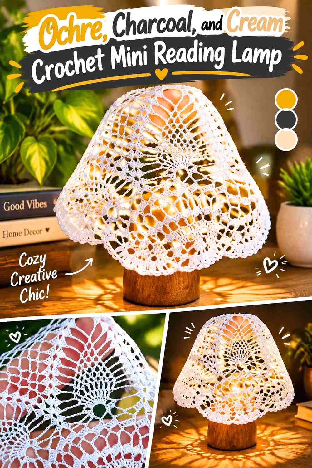
A decorative miniature lamp adds height to a side table and instantly signals a reading corner. Ochre can form the shade, charcoal can create the base, and cream can provide a small transition where the two areas meet.
Ochre Should Make the Crochet Mini Lamp Shade the Focal Area
Use ochre across the entire shade so its silhouette remains recognizable from the front and side. A multicolored shade can become disproportionately busy beside tiny books and a patterned throw.
Charcoal Should Ground the Ochre Crochet Reading Lamp
Keep charcoal in the narrower lower structure where it gives the lamp visual stability. Cream can be limited to a small joining detail if more contrast is needed.
Treat the crochet lamp as decorative unless you are working with components specifically designed and safely intended for an illuminated miniature setup.
Creator Credit: Lanzagurumi Canarias
14. Plum, Oatmeal, and Sage Crochet Mini Granny Throw
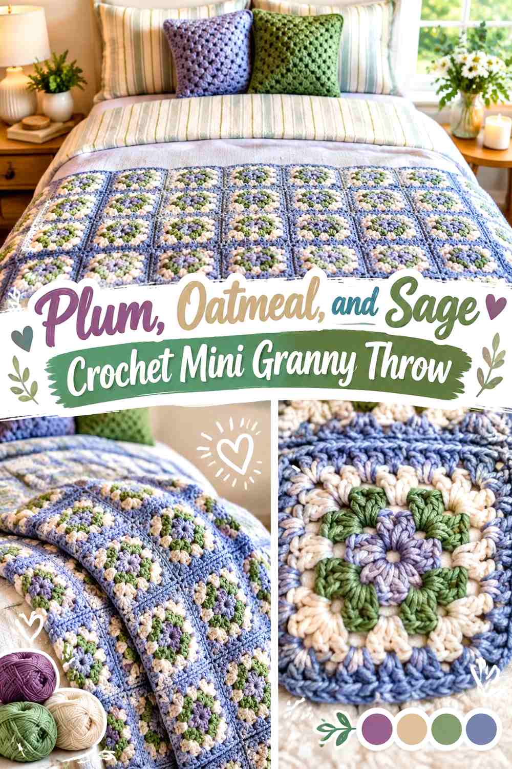
A tiny granny-style throw can be folded over the reading chair, displayed in a basket, or draped across a small bench. Plum can lead the motifs, oatmeal can provide the lightest repeated color, and sage can connect the throw visually with the shop’s plants.
Plum Should Give the Crochet Mini Granny Throw Its Main Color Rhythm
Repeat plum throughout the motif arrangement rather than concentrating it in one corner. A miniature throw needs consistent color distribution because even one unusually dark section can make the tiny textile look visually uneven.
Oatmeal Should Separate Plum and Sage Crochet Motifs
Use oatmeal regularly between the two colored shades. The neutral gives small motif boundaries more definition and prevents plum and sage from visually merging when the throw is folded.
When the reading chair already carries a strong color, keep the throw palette limited rather than adding another bright accent.
Creator Credit: Julie Warren
15. Chestnut, Cream, and Dusty Blue Crochet Mini Bookshop Owl
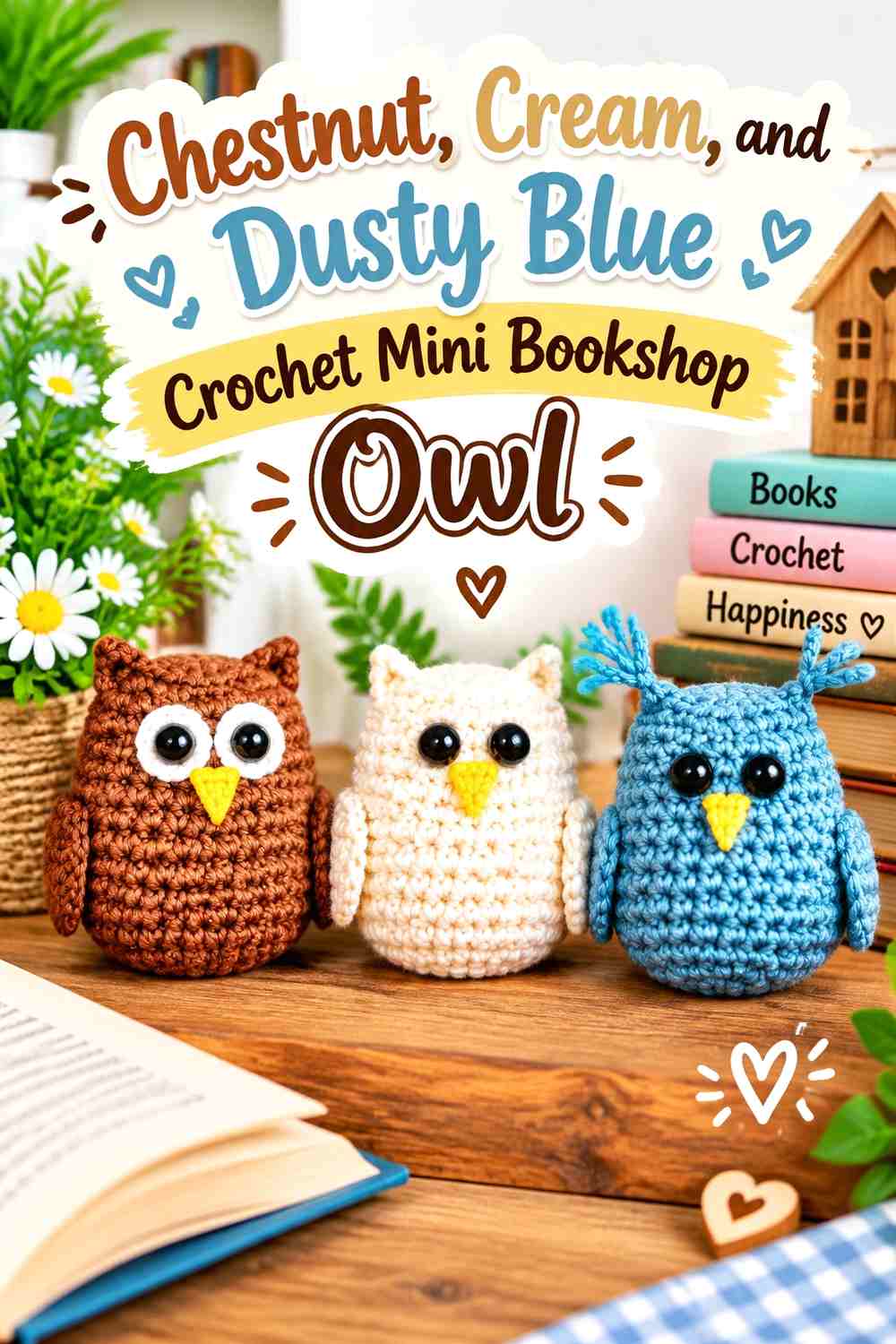
A tiny owl can become a children’s-section mascot, sit beside storybooks, or occupy the top of a shelf as a small character detail. Chestnut creates the warm body color, cream makes the eye area readable, and dusty blue can be reserved for one restrained bookshop accent.
Chestnut Should Keep the Crochet Mini Owl Warm and Shelf-Friendly
Use chestnut through most of the body so the owl remains visually simple among multicolored books. Its large eye area already creates substantial facial detail, so the body does not need several additional shades.
Cream Should Define the Chestnut Crochet Owl Face
Place cream where the eyes need the strongest contrast. On a very small figure, light facial framing can communicate the owl more effectively than multiple decorative body colors.
Dusty blue can appear in a tiny companion book, scarf-like detail, or nearby shelf accent rather than competing with the cream face.
Creator Credit: 5 Little Monsters
Which Crochet Miniature Bookshop Decorations Work Best Together?
For a cozy reading corner, combine the deep-teal chair, dusty-rose cushion, plum granny throw, ochre lamp, and oatmeal-and-navy rug. The repeated cream and oatmeal neutrals keep those richer colors from competing within a small area.
For the sales counter, the powder-blue mug, teal flower vase, camel basket, and rust tote add more function without duplicating the reading-corner furniture. Position the tiny book stack nearby to make the setting unmistakably bookshop-focused.
The bunting, potted plant, cat, lace-covered café table, and owl work best as secondary storytelling elements. You do not need all 15 pieces in one miniature shop. Select several with different heights and shapes, then leave enough empty shelf and floor space for the actual books to remain the main feature.
Conclusion
A convincing crochet miniature bookshop is less about filling every corner and more about choosing objects that explain the space. Mini books establish the shop, the chair and lamp create a reading zone, the basket and tote suggest shopping, and the mug, plant, cat, bunting, flowers, and textiles add the smaller lived-in details.
Use color to connect those separate functions. Repeat a few neutrals throughout the shop, keep one or two deeper shades in each zone, and move selected accents—such as sage, burgundy, or mustard—from one object to another. This creates a coordinated interior without making all of the crochet decorations identical.
Before building a full collection, compare each finished piece with the actual shelves and furniture. Miniatures that are attractive by themselves can still be too visually heavy once placed together.
Frequently Asked Questions
What colors work well in a crochet miniature bookshop?
Warm neutrals such as cream, oatmeal, parchment, camel, and brown work well around books and wood-toned furniture. Burgundy, teal, forest green, plum, mustard, rust, and dusty blue can then provide smaller focal colors.
Which crochet miniature should I make first for a bookshop scene?
A stack of books gives the clearest connection to the setting. From there, choose one larger anchor such as a reading chair or rug before adding smaller counter and shelf decorations.
How can I stop a crochet miniature bookshop from looking cluttered?
Use fewer pieces and leave visible space around them. One chair, a rug, several books, a plant, and a few counter details often create a clearer scene than filling every shelf with another three-dimensional crochet object.
How can I coordinate several crochet miniatures without making them match?
Repeat selected colors in different roles. Sage can be a plant color in one area and a throw accent in another, while cream can move from a cushion edge to a tablecloth and book pages.
How do I keep dark crochet miniatures visible against wooden shelves?
Place them beside lighter books or use a noticeably lighter supporting shade around an important edge. Cream, parchment, oatmeal, and dusty blue can provide useful separation from brown or nearly black shelving.
Can I mix miniature crochet projects from tutorials made at different scales?
You can use them as construction references, but compare each finished or developing object with the same miniature furniture before combining them. Changing yarn or hook size can alter both dimensions and the apparent thickness of the crochet, so visual proportion matters more than assuming every “mini” project will automatically match.
What should be the main focal point in a miniature crochet bookshop?
Usually the books or reading area should lead. Let the chair, rug, book stacks, or shelving zone carry the strongest visual weight and keep smaller pieces such as mugs, plants, baskets, and animals in supporting roles.