A retro crochet messenger bag gets much of its character from how color is distributed across the body, flap, sides, joins, and strap. Rust, mustard, avocado, teal, brown, cream, and faded blue immediately suit a vintage-inspired direction, but using all of them equally can make a compact crossbody bag look visually crowded.

Patchwork gives those colors clear places to live. One shade can repeat around every square, another can appear only in centers, and the darkest color can define joins or the flap edge. The strap also matters: repeating a body color there can make the bag look connected, while a completely new strap color may feel detached from the patchwork.
The tutorials below include granny-square totes, shoulder bags, crossbody bags, flower-square bags, and other modular bag constructions. Not every creator makes the exact messenger-bag adaptation described here, so use each tutorial for its original construction and treat the flap, palette, patch layout, and retro styling as independent adaptations.
Quick List
- Rust, Mustard, Olive, and Cream Crochet 1970s Patchwork Messenger Bag
- Avocado Green, Burnt Orange, Brown, and Cream Crochet Retro Crossbody Bag
- Teal, Mustard, and Coral Crochet Puff-Square Messenger Bag
- Denim Blue, Cherry Red, and Cream Crochet Granny Messenger Bag
- Chocolate Brown, Peach, and Sage Crochet Flower-Square Messenger Bag
- Plum, Mustard, and Olive Crochet Retro Granny Messenger Bag
- Sunflower Yellow, Brown, and Moss Crochet Floral Messenger Bag
- Black, Cream, and Rust Crochet Checkerboard-Style Messenger Bag
- Dusty Rose, Burgundy, and Oatmeal Crochet Daisy Messenger Bag
- Cobalt, Apple Green, and Tangerine Crochet Pop-Art Messenger Bag
- Camel, Teal, and Brick Red Crochet Patchwork Messenger Bag
- Navy, Mustard, and Cream Crochet Geometric Messenger Bag
- Moss Green, Terracotta, and Oatmeal Crochet Retro Crossbody Messenger Bag
Give Every Patchwork Bag a Repeating Color
A patchwork messenger bag can contain several colors without looking random when one shade repeats in every motif. Cream borders around multicolor granny squares, brown centers across sunflower motifs, or olive joins between warm squares can give the eye a consistent element to follow.
This matters especially across a flap. The flap sits over the body, so completely unrelated color placement can make the front look like two separate projects. Repeat at least one body color in the flap or its edging.
Use Darker Colors Where the Messenger Bag Needs Visual Definition
Deep brown, navy, black, plum, or burgundy can make useful join, edging, side-panel, or strap colors because they visually separate brighter motifs. That does not mean the darkest color always needs to form the entire border.
If a dark join creates too strong a grid, move it to the strap and outer edge while using cream, oatmeal, or another lighter shade between the squares. The result will look softer while retaining enough definition around the bag silhouette.
1. Rust, Mustard, Olive, and Cream Crochet 1970s Patchwork Messenger Bag
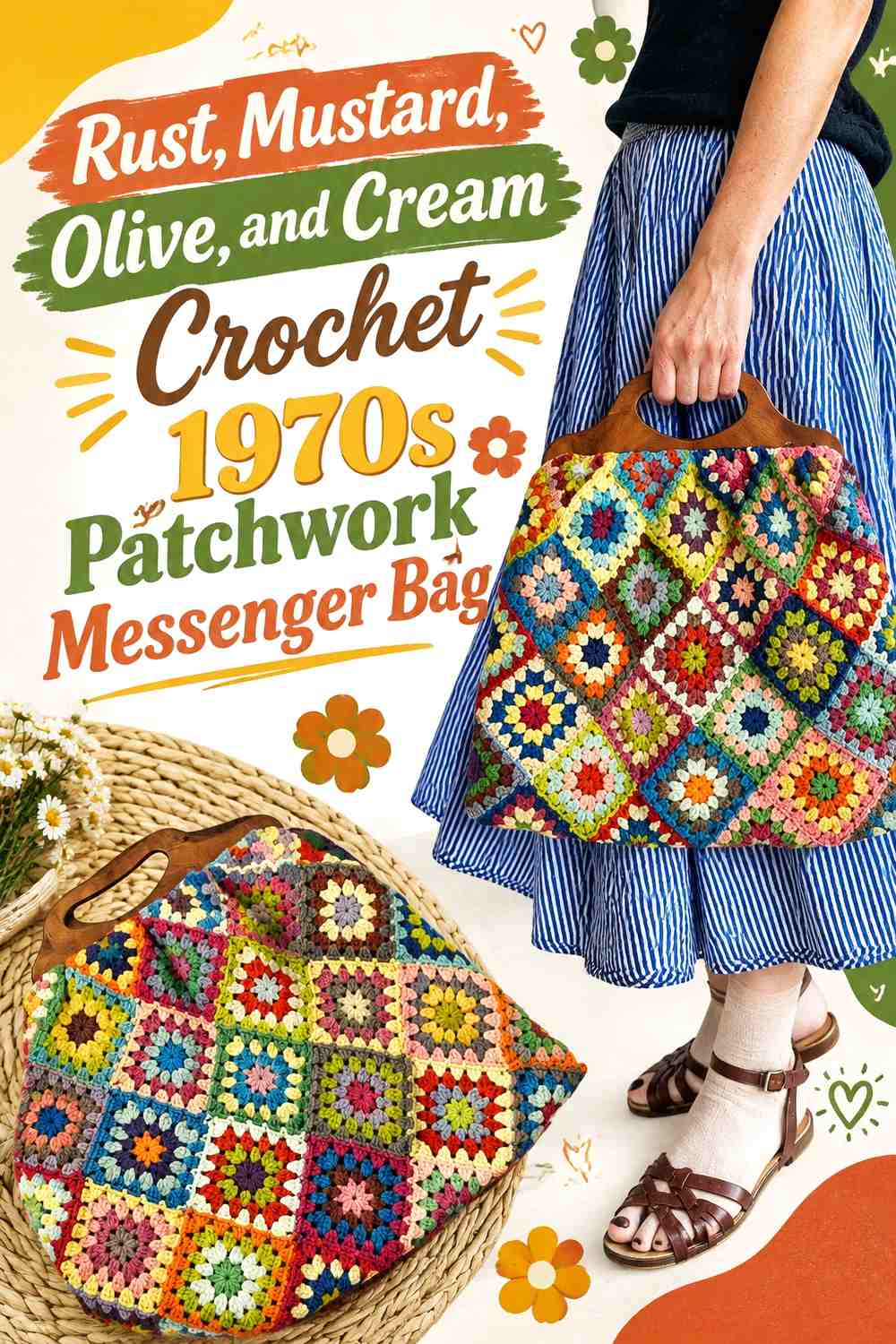
Rust can lead this palette across the larger granny-square rounds, while mustard supplies smaller warm sections and olive introduces the characteristic earthy green. Cream works best as the repeated connector—around motif edges, at joins, or along the flap border—so the three stronger colors do not compete directly everywhere.
For a messenger adaptation, use the most balanced square arrangement on the main front and let the flap repeat fewer colors. A cream-edged rust-and-olive flap can look more intentional than trying to reproduce every body-square combination on top.
Rust Should Lead the Mustard and Olive Crochet Patchwork
Give rust more surface area than mustard so the warm colors have a hierarchy. When both occupy every square equally, the patchwork can become visually noisy once the flap overlaps the front.
Olive works well in alternate centers or intermediate rounds where it can interrupt the warm palette without taking over.
Cream Can Connect Rust, Mustard, and Olive Across the Messenger Flap
Repeat cream around each square or along the final flap edge. The neutral creates continuity even when the square centers vary.
If the strap is multicolored, let cream appear there too, but avoid changing color every few inches; broader color sections usually look more retro and less fragmented.
Creator Credit: Zeens And Roger Crochet
2. Avocado Green, Burnt Orange, Brown, and Cream Crochet Retro Crossbody Bag
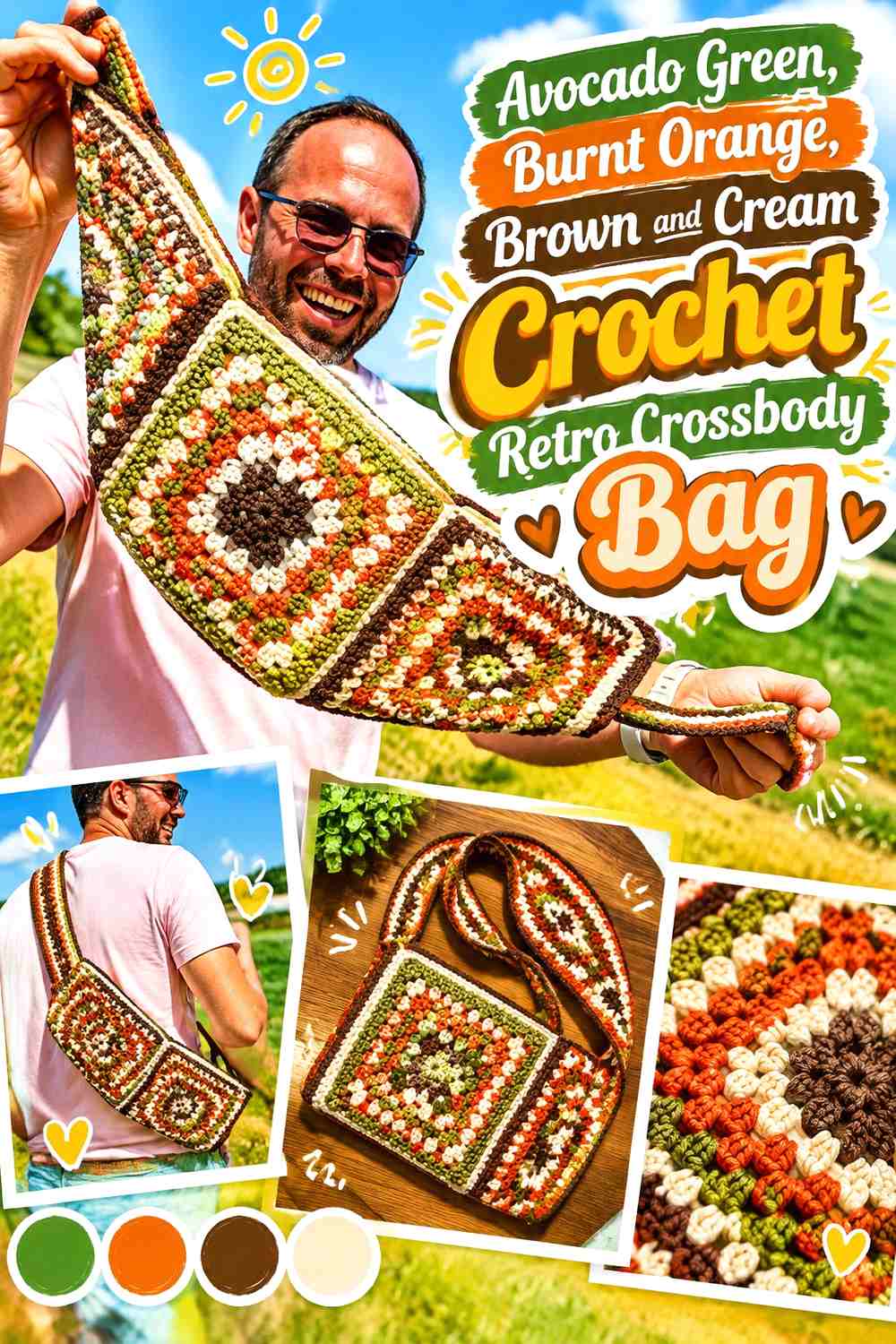
Avocado green and burnt orange establish a strong vintage palette, while brown can provide the deepest shade and cream keeps the squares readable. Let avocado repeat across the body and use orange more selectively in centers or alternating motifs.
For a compact messenger bag, brown works especially well along the sides, flap edge, or strap because it gives the colorful square panel a darker structural frame without making every join heavy.
Avocado Green Should Repeat More Often Than Burnt Orange in the Crochet Body
Use green as the connecting color across several squares so the bag reads as avocado-led rather than as a collection of unrelated warm motifs.
Burnt orange can then become the stronger accent in selected centers, keeping the 1970s influence visible without overwhelming the front.
Brown Should Frame Avocado Green and Burnt Orange Without Hiding Cream
Reserve brown for edges, strap sections, or a narrow join. Cream still needs visible space between brown and the two saturated colors, particularly in smaller motifs.
A brown-dominant flap can work when the body is highly multicolored because it gives the upper section a calmer visual weight.
Creator Credit: Totally Fierce Crochet & Knooking
3. Teal, Mustard, and Coral Crochet Puff-Square Messenger Bag

Teal provides the darkest cool anchor in this three-color scheme, mustard supplies a retro golden accent, and coral adds a warmer contrasting note. A textured or puff-centered square benefits from controlled color placement because the stitch texture already creates visual detail.
Use teal around the square perimeter or joins, then let mustard and coral vary inside the motifs. That creates a consistent outer grid while preserving playful centers.
Teal Should Define Mustard and Coral Crochet Puff Squares
A teal outer round can give each textured square a clear boundary. This is especially useful on the flap, where puff texture and multiple colors might otherwise compete.
If teal feels too dominant across the whole bag, keep the side panels or strap in a lighter neutral derived from the palette rather than adding another saturated color.
Mustard and Coral Need Unequal Roles Against Teal
Let mustard appear more frequently while coral acts as the smaller accent, or reverse that hierarchy. What matters is avoiding an exact 50/50 split inside every square.
A consistent accent pattern will make the messenger front look planned even when individual motifs vary.
Creator Credit: MJ’s Off The Hook Designs
4. Denim Blue, Cherry Red, and Cream Crochet Granny Messenger Bag
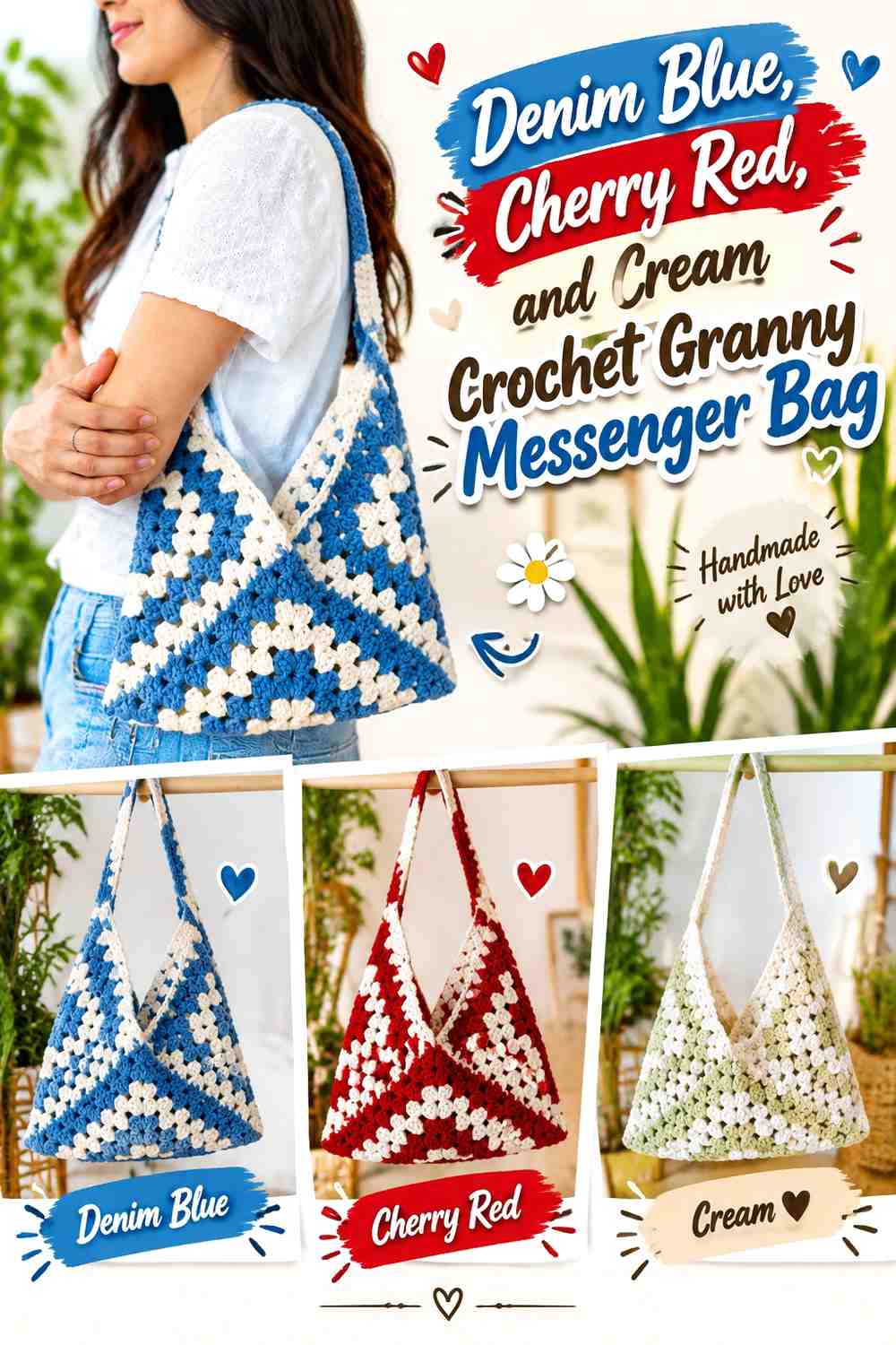
Denim blue creates a softer retro base than navy, while cherry red gives the patchwork a bright focal color. Cream can separate the two and keep small granny-square openings visually clear.
Use blue on the strap and bag sides if you want the red squares to remain concentrated on the front. Repeating blue outside the patchwork also makes the messenger silhouette feel cohesive.
Denim Blue Should Carry More of the Crochet Messenger Bag Than Cherry Red
Let blue cover broad square rounds, side areas, or the strap so the bag has a stable cool base.
Cherry red is most effective in centers, selected squares, or a flap motif rather than covering every possible edge.
Cream Should Separate Cherry Red From Denim Blue Granny Squares
Use cream where blue and red meet if their saturation makes the front feel too dense. A cream outer round can also make different square centers look more coordinated.
On a cream-dominant flap, repeat red in one focal motif so the upper portion still connects visually to the body.
Creator Credit: VivCrochets
5. Chocolate Brown, Peach, and Sage Crochet Flower-Square Messenger Bag

Chocolate brown gives flower squares a strong retro outline, while peach can carry the petals and sage can provide a quieter botanical contrast. Keep brown at the centers, joins, or outer rounds rather than spreading it across every flower petal.
For a messenger flap, one or two larger flower-square motifs can be easier to read than a dense grid of tiny blooms. Leave some sage or neutral background visible around the flowers.
Peach Should Stay Brighter Than Chocolate Brown Crochet Flower Centers
Use peach across the petal area and brown mainly in the flower center or square border. This keeps the motif identifiable when several squares sit side by side.
If the peach is pale, sage can sit between the flower and brown edge to soften the jump without adding cream.
Sage Should Connect Peach Flowers Across the Chocolate Brown Messenger Bag
Repeat sage in the same structural zone on every square, such as an outer floral round or square background.
That repetition can also continue onto the strap or flap edge, giving the green a functional connection beyond the motifs.
Creator Credit: Jo to the World Creations
6. Plum, Mustard, and Olive Crochet Retro Granny Messenger Bag
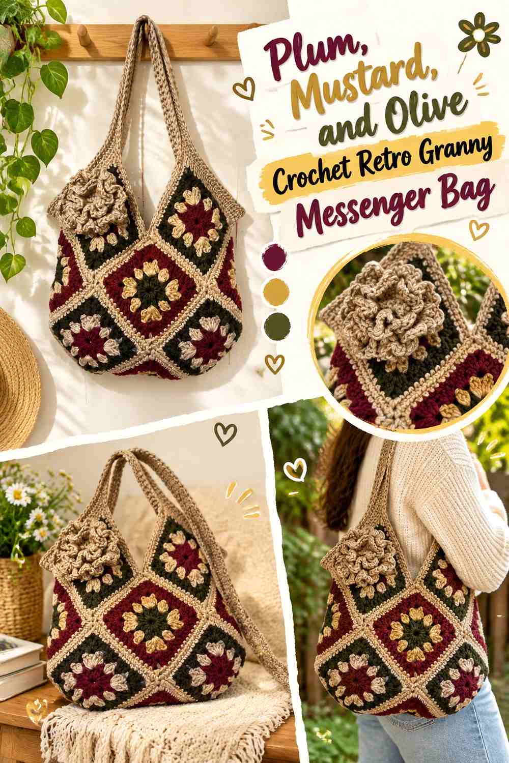
Plum gives this bag a deeper retro base than brown, while mustard and olive create warm-and-earthy contrast. Because all three colors carry visual weight, it helps to assign plum the framing role rather than using each shade equally in every square.
A plum strap can visually connect the top, sides, and patchwork body while leaving mustard and olive free to vary inside the motifs.
Plum Should Frame Mustard and Olive Crochet Granny Squares
Use plum around selected square edges, joins, or the outer bag perimeter. The darker purple helps mustard remain bright and keeps olive from visually disappearing into the join.
Avoid making the entire flap solid plum unless the body is especially busy; repeating a few mustard or olive details keeps the two sections related.
Mustard Should Stay More Visible Than Olive Against Plum
Let mustard provide the brighter focal sections and use olive as the middle-value support. This produces clearer depth than placing the two equally across every motif.
If the finished front feels too dark, increase mustard rather than introducing a fourth light color.
Creator Credit: Bag-O-Day Crochet
7. Sunflower Yellow, Brown, and Moss Crochet Floral Messenger Bag

Sunflower motifs naturally suit retro patchwork, but the bag should still have a clear color hierarchy. Use brown for the flower centers, sunflower yellow for the petals, and moss for square backgrounds, joins, or side sections.
A messenger flap can carry one statement sunflower arrangement while the body uses a repeating grid. Keeping moss consistent around both sections prevents the flap from looking like a separate accessory.
Sunflower Yellow Should Stay Concentrated Around Brown Crochet Centers
Give yellow enough uninterrupted petal area that each floral square remains identifiable. Brown should stay compact so it anchors the flower rather than becoming the dominant patch color.
If the flowers begin to merge from a distance, increase the visible moss between neighboring motifs.
Moss Should Frame Sunflower Yellow Across the Messenger Bag Flap
Use moss around the outer square area, flap edge, or strap so the bright yellow stays focused in the flowers.
A moss-heavy side panel can also provide visual rest beside a densely floral front.
Creator Credit: Ganchuladas
8. Black, Cream, and Rust Crochet Checkerboard-Style Messenger Bag

Black and cream can create the graphic structure of a checkerboard-inspired patchwork, while rust prevents the palette from becoming purely monochrome. Use rust in selected centers or flap squares rather than inserting it into every black-and-cream section.
This is a stronger retro direction than the earthy palettes, so leave the strap relatively simple. A black strap with a narrow rust or cream detail can carry enough connection without becoming another patchwork field.
Black Should Define Cream Crochet Squares Without Overpowering Rust
Keep black at joins, alternating square rounds, or the bag perimeter. Too much black through the centers can reduce rust to an insignificant accent.
Cream needs broad enough areas to preserve the checkerboard contrast from normal viewing distance.
Rust Should Interrupt Black and Cream in Planned Messenger Bag Squares
Place rust at regular intervals or on the flap focal motif rather than scattering it randomly.
A controlled rust repeat keeps the bag retro and warm while maintaining the clarity of the black-and-cream grid.
Creator Credit: Alanya Crochet
9. Dusty Rose, Burgundy, and Oatmeal Crochet Daisy Messenger Bag

Dusty rose and burgundy give a flower-square bag a moodier retro direction than bright pink. Use oatmeal in the daisy petals or square background, dusty rose as the main floral color, and burgundy for centers, joins, or the flap border.
Because burgundy is dark, keep it concentrated. A wide burgundy grid around every small flower can make the body look heavier than the flap.
Dusty Rose Should Carry More Crochet Flower Area Than Burgundy
Let dusty rose occupy the broader petal or square sections, with burgundy used for small centers or selected outer edges.
Oatmeal should remain visible around both colors so the floral motif does not collapse into a dark pink patch.
Oatmeal Can Keep Dusty Rose and Burgundy Visible on the Messenger Flap
Use oatmeal as the repeated light color through the flap motif and body squares. The shared neutral connects different arrangements more effectively than making every flower identical.
If the strap is burgundy, add a small oatmeal tab or edge near the bag attachment to keep it from appearing visually detached.
Creator Credit: Crochet Jewel
10. Cobalt, Apple Green, and Tangerine Crochet Pop-Art Messenger Bag

Cobalt, apple green, and tangerine create a brighter retro palette inspired by bold graphic color rather than earthy seventies tones. Give cobalt the structural role around square edges, then alternate green and orange inside the patchwork.
A small messenger bag benefits from keeping the flap simpler than the body. One large green-and-orange square on a cobalt field can be clearer than repeating every color change across the entire flap.
Cobalt Should Contain Apple Green and Tangerine Crochet Patchwork
Use cobalt around the edges or joins so the two brighter colors have a stable boundary. Its darker value helps separate adjoining green and orange motifs.
If cobalt covers too much of the front, increase apple green rather than adding a pale fourth shade that changes the graphic direction.
Tangerine Should Stay Smaller Than Apple Green Against Cobalt
Use tangerine as the strongest accent in centers, corners, or selected squares. Apple green can occupy a larger supporting area without competing as aggressively with cobalt.
Repeating one tangerine detail on the strap can connect it to the patchwork without making the strap multicolored throughout.
Creator Credit: Sweet Softies
11. Camel, Teal, and Brick Red Crochet Patchwork Messenger Bag
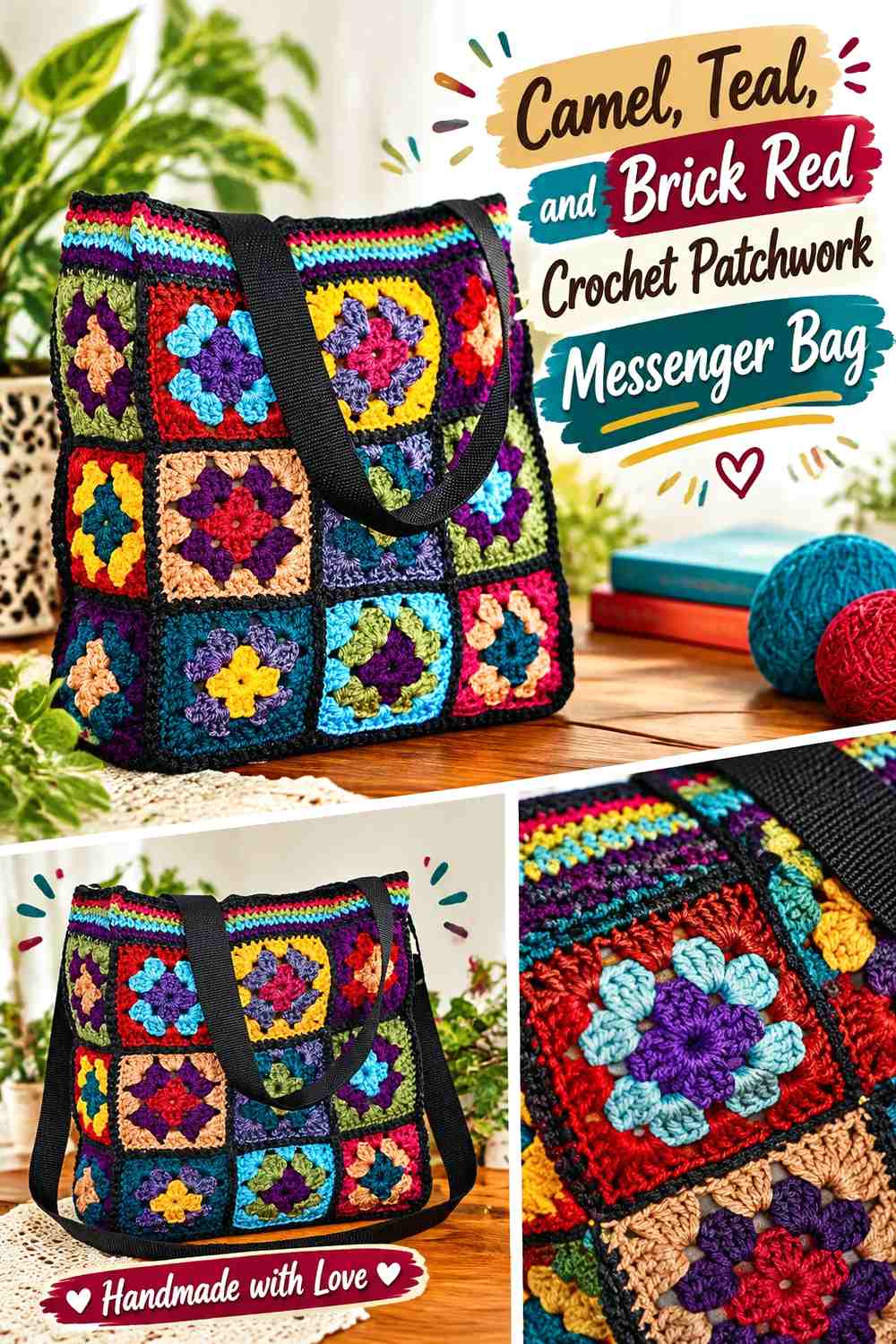
Camel gives teal and brick red a warm neutral background, producing a vintage bag that is colorful without being as bright as cobalt or tangerine palettes. Use camel around the square edges, teal as the strongest cool shade, and brick red in centers or alternate motifs.
This palette is particularly useful for a messenger adaptation because camel can continue onto the strap and side panels, giving the patchwork front a quieter frame.
Camel Should Connect Teal and Brick Red Crochet Squares
Repeat camel around most motifs so the body reads as one patchwork panel rather than separate colored blocks.
The same camel can define the flap edge and strap, making those structural areas visually related to the squares.
Teal Should Stay More Prominent Than Brick Red on the Messenger Body
Let teal cover the larger internal rounds while brick red remains concentrated in smaller focal areas.
If both colors receive equal coverage, the front can feel split between warm and cool sections rather than intentionally layered.
Creator Credit: Patricia Fentie
12. Navy, Mustard, and Cream Crochet Geometric Messenger Bag

Navy, mustard, and cream create a clean retro palette where the square geometry can take more attention than floral motifs. Use navy as the darkest outline, mustard inside selected square rounds, and cream wherever the patchwork needs open visual space.
For a flap, continue the navy border around the perimeter but let cream or mustard occupy the center. A completely navy flap may look detached from a lighter body.
Navy Should Give Mustard and Cream Crochet Squares a Clear Grid
Use navy around motif edges or joining lines to emphasize the patchwork construction.
If that grid becomes too dominant, reduce the width of navy rather than removing it entirely; the dark color is useful for defining the messenger shape.
Cream Should Keep Mustard Visible Inside Navy Messenger Bag Panels
Place cream beside mustard where smaller geometric sections need separation. Navy and mustard already create strong contrast, so cream does not need to occupy half the bag.
Repeating cream on the flap and body is enough to link the two surfaces.
Creator Credit: Crochets4U
13. Moss Green, Terracotta, and Oatmeal Crochet Retro Crossbody Messenger Bag

Moss green and terracotta provide a softer earthy retro combination, while oatmeal keeps the bag from becoming too dark. Let moss cover the largest square areas, terracotta provide warm centers or selected motifs, and oatmeal repeat along outer rounds.
For the messenger adaptation, oatmeal is particularly useful around the flap and opening because it creates a visual break between two moss-heavy sections.
Moss Green Should Lead the Terracotta Crochet Patchwork
Use moss through most of the body or square backgrounds so terracotta remains a controlled warm accent.
If terracotta spreads through every outer round, the bag can become orange-led even when the intention is a muted woodland-retro palette.
Oatmeal Should Separate Moss Green From Terracotta on the Messenger Flap
Place oatmeal between the two earthy colors when their light/dark values are close. A light flap edge can also make the opening easier to distinguish from the body.
Carry a small amount of oatmeal into the strap or side panel so the neutral does not appear only on the front.
Creator Credit: NATESSA | Sacred Crochet Art
Which Retro Patchwork Messenger Bag Palette Should You Choose?
For a strong 1970s direction, rust, mustard, avocado, olive, brown, cream, and terracotta create the clearest earthy combinations. The first, second, seventh, and thirteenth ideas keep those colors organized through repeating neutrals and darker framing shades.
For brighter retro color, cobalt with apple green and tangerine or teal with mustard and coral gives the bag more graphic energy. Keep one shade on the joins or edges so the multicolor squares remain easy to distinguish.
If you prefer a softer vintage bag, dusty rose with burgundy and oatmeal or chocolate with peach and sage can provide patchwork detail without making every motif highly saturated. Floral squares work especially well here because the colors can take natural roles as centers, petals, and backgrounds.
Conclusion
A retro crochet messenger bag does not need a completely different construction for every color scheme. The patchwork itself can create meaningful variety through square centers, borders, joining colors, flap placement, side panels, and strap accents.
For an earthy seventies look, start with rust, olive, mustard, avocado, or terracotta and use cream or oatmeal to control the contrast. For a bolder statement, cobalt, teal, coral, red, or tangerine can lead while navy, black, brown, or another dark shade defines the structure.
Before joining the final motifs, arrange the complete front and flap together. A square that looks balanced by itself may create an unintended color cluster once the flap covers part of the body. Check the palette as a finished messenger silhouette, then follow the credited tutorial for its original bag construction and adapt the color distribution independently.
Frequently Asked Questions
What colors make a crochet messenger bag look retro?
Rust, mustard, avocado green, olive, chocolate brown, cream, burnt orange, teal, faded blue, burgundy, and terracotta all work well for retro-inspired palettes. Brighter cobalt, tangerine, apple green, and coral can create a more graphic vintage direction.
How many colors should I use in a retro patchwork messenger bag?
Three or four main colors are usually enough to create visible patchwork while keeping the bag coordinated. Give one shade a repeating structural role in borders, joins, or backgrounds so the different squares still feel related.
Should the crochet messenger bag flap match the body exactly?
No. The flap can use fewer colors or a simpler square arrangement, but repeating at least one major body color helps it look connected to the rest of the bag.
What color works well for joining retro granny squares?
Cream, oatmeal, brown, navy, black, olive, and camel can all work depending on the palette. A darker join emphasizes the patchwork grid, while a lighter neutral creates a softer transition between squares.
How can I keep a multicolor messenger bag from looking too busy?
Choose one repeating color and avoid giving every shade equal visual area. You can also simplify the flap, strap, or side panels so the main patchwork body remains the most colorful section.
Should the strap repeat colors from the crochet patchwork?
Usually, yes. Repeating one body color on the strap helps it feel integrated with the bag. The strap does not need to reproduce every square color; one dominant or framing shade is often enough.
Do all the linked tutorials make the exact retro messenger bags described here?
No. The sources include granny-square totes, shoulder bags, crossbody bags, floral bags, and related modular constructions. Use each creator’s tutorial for the bag they actually demonstrate, then adapt the flap, patch arrangement, strap treatment, and retro color scheme to the messenger-bag concept.